A Year to Grow
3-Part Notebook System
Design Objective
Create a 3-part, organizational notebook system with a unique theme and patterns that can be sold to college students. The notebooks should be able to be used as a set or individually and will be sold through an in-store display. Any additional collateral should be designed for use with the notebook system and to enhance the display.

Design Brief
The “A Year to Grow” notebook series consists of a monthly planner, a moon planting guide & plant tracker, and a growing tips guide & journal. All three books were created to be cohesive so that they can be used as a set or independently. These books were created to provide experienced and new plant parents with an aesthetically pleasing way to keep track of all their personal and plant needs through an organizational system. Each notebook is plant themed with cohesive graphics and patterns. The notebooks were created with young adult women as the primary target audience. This can be seen through the typography and color choices. Neutral and muted colors were used to express the nature-like aspect of the design. Winlove, the primary typeface used for headings and specialty text, is script with feminine qualities to appeal to the target audience. The secondary typeface used for body copy, Roboto, is sans serif, which compliments the artistic nature of the script type. The additional collateral contains stickers and pens with graphics and patterns that were used in the design of the notebooks. An additional “Plant Your Thoughts” notepad was also created to engage the customer even more by allowing them to write down anything they want on seed paper and plant it!


Magic 8 Ball Screen Printing Process
Design Objective
Create a one-color design inspired by an art movement. This design is to be screen printed onto a shirt and tote bag.

Design Brief
Surrealism, a cultural movement with illogical scenes and artwork, inspired the design. The overall scene of the design is not realistic in the sense of logical reasoning. It features a floating hand holding a Magic 8 Ball with galaxy goo dripping from it. Three tarot cards are placed behind the 8 ball to help the design remain balanced as well as add to the scene of the graphic. Galaxy elements are added above the hand, which adds to the surrealist aspect of the design. Since this is a one-color design, only one screen was needed to print this piece. The production process from sketch, to digital, then the final printed pieces is shown here.


Foothills Col-LAB-oratory
Maker Space Branding

Design Objective
Create branding for the Foothills Col-LAB-oratory at the Catawba Science Center. Include iconography, branded challenge templates and extra collateral to be used for the space.
Design Brief
The Foothills Col-LAB-oratory is a maker space for children at the Catawba Science Center in Hickory, North Carolina. It is a place where young people will learn and play while highlighting STEM careers in and around the foothills area. The blue and orange that are used in the logo were already implemented in the space. By using the same colors that are in the space, the room will feel fully branded and immersive for the children using it. The typography chosen for the branding is unique and makes it easily recognizable for a child’s space. The typeface used for “Col-LAB-oratory” is thicker, with slight tilts in the letterforms, which appeals to the younger target audience. The typeface used for “Foothills,” is thinner with rounded edges to relate to the strokes used throughout the logo. The logomark represents many aspects of the Col-LAB-oratory. The beaker bottle represents the science aspect of STEM. The foothill mountains relate to the name and location of the Col-Lab-oratory, and the sun gear rising behind the foothills expresses the building aspect of the space. The icons are an intentional addition to the logomark because icons will be used throughout the space. Each icon represents the weekly themes that are introduced to the children: Magnets, Build, Balance, and Motion. The objects chosen to represent each theme are easily recognizable to children. Themed templates that will be used to create weekly STEM challenges were designed using the iconography featured in the logo. A wall graphic was created with a foothills pattern and the logo.





Ocean Issue Posters
Social Issue Poster Campaign
Design Objective
Design a 3-part, 11”x17” poster campaign that raises awareness of a social issue with accompanying descriptions. A brand with contact information is to be created to be the face of the campaign. The posters must include separate, but cohesive, imagery and include a texture. The images used should be manipulated to effectively blend into the design.
Design Brief
This poster series was created to raise awareness of three different issues that are harming the world’s oceans. The topics include oil spills, overfishing, and coral bleaching. A brand was created to be the face of this campaign with the logo and contact information on the posters to learn more. Each poster features the same layout with all of the text at the bottom. Repeating the same layout and effect throughout ensures that the posters remain cohesive while still being independent. All the posters feature a heading and a short description of each issue. The title and description are both center aligned while the logo and contact information are aligned to the margins. This keeps the posters balanced and appealing to the viewer’s eye. Although the posters have different topics, they all have a vignette effect around the edges on the top half. The vignette was created with imagery that relates to each issue and adds more texture and interest to the design. It also emphasizes the images in the center, which is the focal point. They all have a cool color palette and a faint water texture to represent the aquatic aspect of the topic. Each poster gets darker at the bottom where the text is to give the illusion of how the ocean gets darker as it gets deeper. The dark hues in the imagery add to the feeling of devastation that is being evoked.


Trexoprine Pharma Branding

Design Objective
Create a brand identity and packaging for a prescription weight-loss medication. Further expand the project by designing a trade show booth with a marketing angle. Further collateral will be designed to be used during the trade show.
Design Brief
Trexoprine is a prescription weight-loss medication that can be used in conjunction with an exercise regimen to lose weight and be able to keep it off. The marketing message for the brand can be summed up in the words “kick the urge to the curb.” Careful color and font choices allow the brand’s identity to come through in the logo. Many people view their weight-loss journey as trying to start fresh, like a new day. This idea is what inspired the concept behind the logo. The tittle of the ‘i’ in Trexoprine was used to represent a sun rising behind the letters, creating a new day. The gold was used to represent the color of the sun and allow for a more positive connection with the brand. The light blue compliments the gold and symbolizes the sky that the sun is rising in. Forma DJR Micro, the typeface used for the branding, is sans serif with rounded corners. This typeface allows the branding to feel warmer and welcoming to the viewer. The packaging was designed using the brand guidelines and further expresses the marketing message of the brand. To further expand the project, a trade show booth was designed to be used at the 2023 BIO International Convention in Boston, Massachusetts. Flats, digital mockups, and a scale model were created for both a 10’x10’ and a 10’x 20’ booth.
Forma DJR Micro
ABCDEFGHIJKLMNOPQRSTUVWXYZ
abcdefghijklmnopqrstuvwxyz


Joker Illustration
Digital & Hand Drawn Illustration
Design Objective
Create an illustration with your choice of subject and mediums. Make this into a digital and hand drawn version.

Design Brief
For this piece, a Venetian-style court jester mask was chosen for the subject matter. Graphite, charcoal, and black micro liner pens were used to create the illustration. By using a combination of these mediums, it allowed the stark contrast of black and white where needed while still being able to shade in the mid-tones and gray areas. This also helps to make sure the mask looks more realistic and threedimensional. Multiple techniques were used to achieve the desired look. Shading and linework were used to create shadows and texture to the mask.


Night Owl Drive-In
Manipulated Type Logo & Marketing Case Study
Design Objective
Create a manipulated 2-color typographic logo for a drive-in movie theater. Include a digital marketing case study, marketing campaign, and website design.

Design Brief
Night Owl Drive-In is a modern twist on the classic drive-in theater. The name Night Owl stems from the fact that our target audience tends to be Night Owls because the movies start later in the evening. The brand personality is carefree and modern while still being respectable. The logo features typography manipulated into a shooting star to embrace the night theme and add more visual appeal. The color and type choice make this a successfully manipulated typographic logo. Multiple fonts were used and manipulated to create the name “Night Owl” in the logo to achieve the desired appearance. Abril, the primary typeface used in the branding, is used in two weights: Abril and Abril Fatface. It is a modern, serif typeface with high contrast between thick and thin strokes which well represents the brand’s personality. The dark blue was used in the branding to represent the dark night sky and the yellow was used to represent the stars at night. This evokes the feeling of watching a movie under the stars. This project was expanded into a digital marketing case study and marketing campaign. This included designing four visually appealing email campaigns, variabledata printed postcards, a multimedia piece, and creating profiles and content for Facebook, Instagram, and Tiktok. Keeping the brand’s voice and identity in mind was crucial in making the campaign cohesive and successful. A desktop and mobile website prototype was created with a user-friendly interface.


Bookworm Buddy
Design Objective
Conceptualize and design a unique app that solves a problem. Design a visually appealing user interface and a functional prototype. Create a UX process booklet showcasing research, design components, user interface, and user-testing survey results.

Design Brief
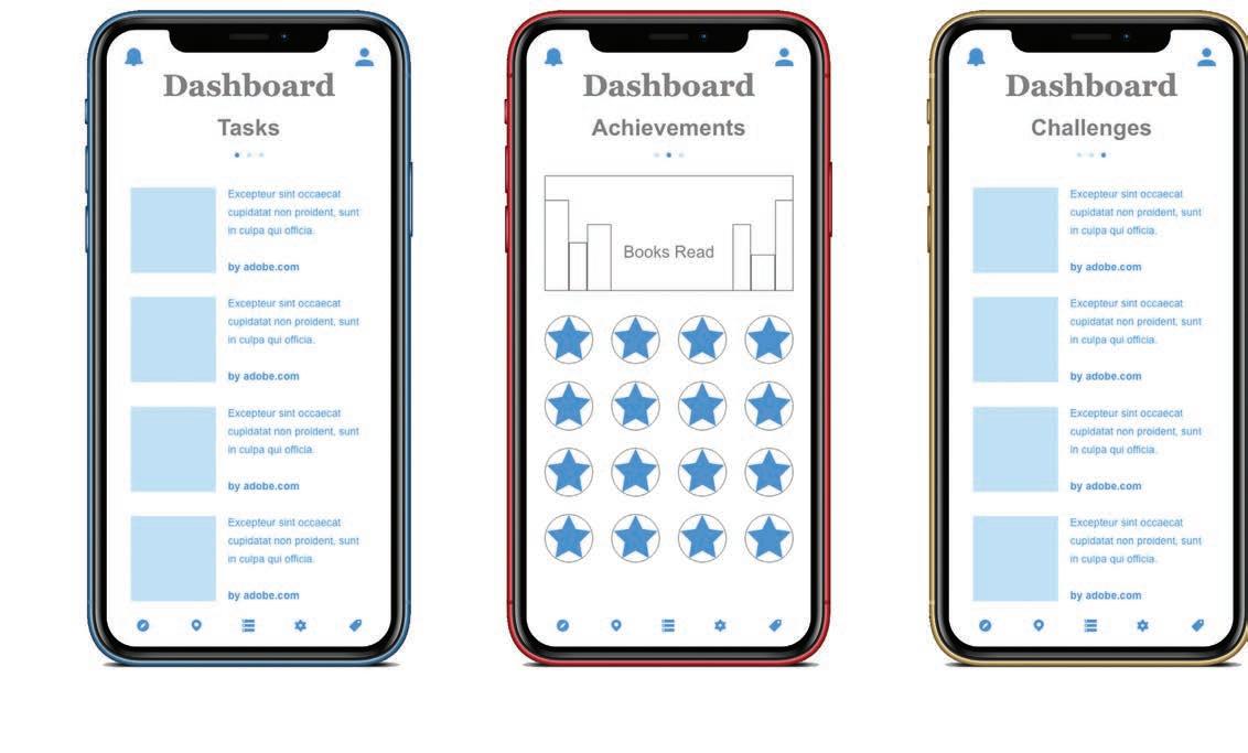
Bookworm Buddy is an app that helps children, guardians, and teachers everywhere by making the reading experience more enjoyable and engaging for young people. Bookworm Buddy allows children to have fun and express themselves by customizing and playing with their own unique character while completing their reading tasks. The enjoyable and user-friendly interface is easy to navigate across all ages. The visually appealing and rewarding interface encourages young people to engage more frequently with the reading process. Teachers and guardians can easily connect with students and assign reading tasks directly through the app. Students can easily log on and see their tasks, achievements and challenges by swiping from left to right on the home screen. By completing their reading tasks, challenges, and quizzes, students will receive Buddy Bucks. They can use these Buddy Bucks to better customize their characters to their liking by purchasing new clothes, hairstyles, and accessories. They can then play with their characters and explore their classroom world while engaging with their peers. The typeface used in the logo was created specifically for Bookworm Buddy to fully capture the childlike nature of the app. Green and purple are the primary colors in the branding and were chosen for their gender-neutral qualities. Green symbolizes growth and the nature aspect of the bookworm. Purple is often associated with fantasy and imagination which is inspired by reading.
Blambot pro bb

ABCDEFGHIJKLMNOPQRSTUVWXYZ
Moniker Basic

ABCDEFGHIJKLMNOPQRSTUVWXYZ
abcdefghijklmnopqrstuvwxyz


AI: Friend or Foe of Graphic Designers?

Magazine Spread & Cover
Design Objective
Design a three-spread magazine layout that is usable for both print and digital. The article for the magazine must be original and include a secondary article. A magazine cover and accompanying imagery will be designed to enhance the spreads.
Design Brief
This article details the relationship between AI and Graphic Designers and answers the question “Is AI a friend or foe to graphic designers?” The color and typography chosen for the headings represent the technology aspect of the article. Text wrapping was used on spread two to add to the visual appeal of the article. The secondary article is better separated from the main article by using a transparent overlay behind it with leading lines. Graphic Design USA was used as the brand for this magazine. The cover features technology and AI elements to better relate the cover to the featured article. The imagery on the cover was manipulated to add visual appeal and bring the piece together. A blue photo filter was used to add to the tech mood of the design.

Esscents
Graphically Reduced Logo & Animated GIF Series
Design Objective
Create a 2-color logo that highlights a graphically reduced object in its simplest form. Include a branded pattern, packaging, and animated GIFs.
Design Brief
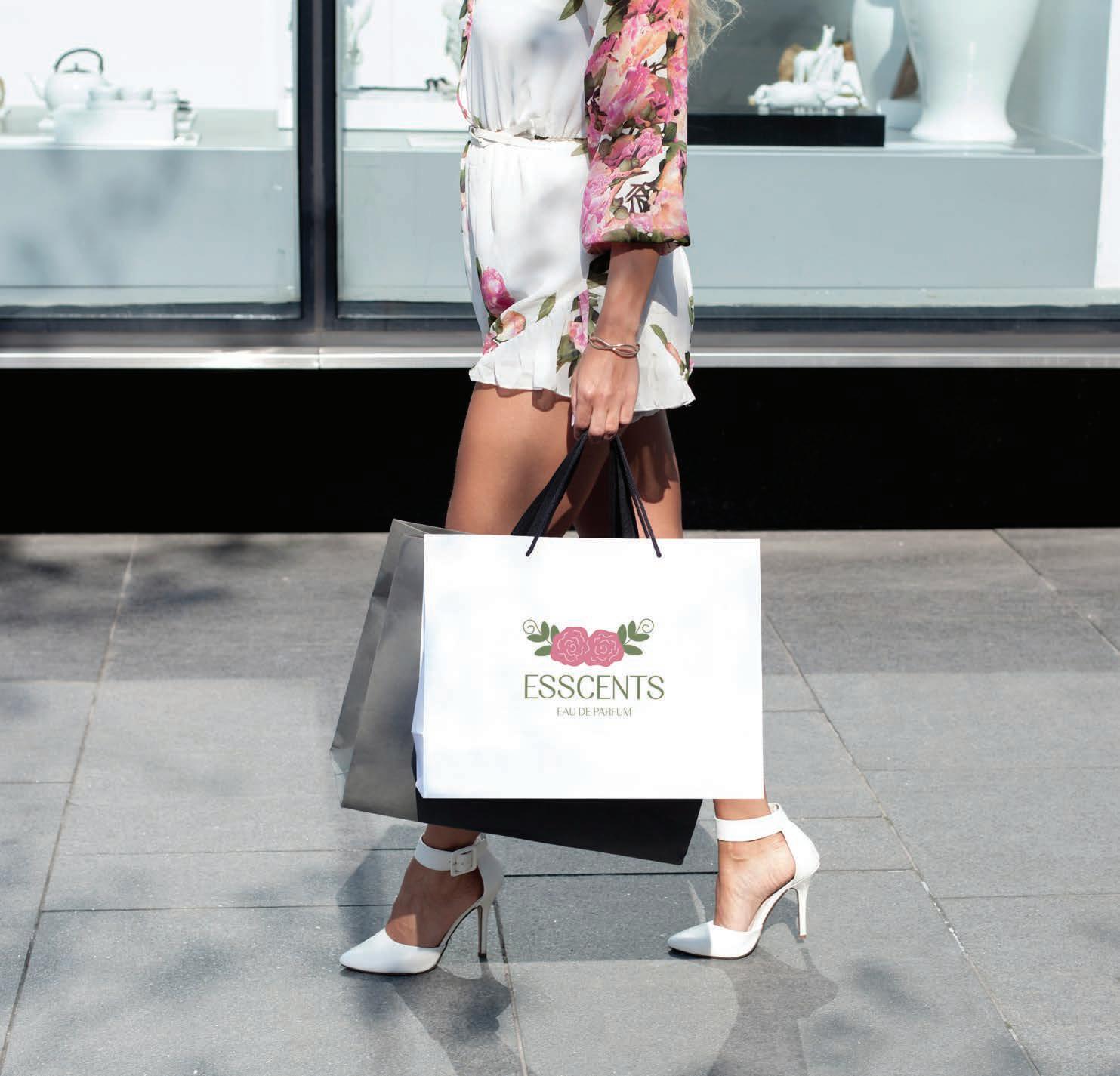
Esscents, a play on the words Essence and Scents, is a woman-owned fine fragrance company. A feminine brand voice is utilized to better connect with the primary target audience, women ages 25-40. Many of the perfumes are sold in refillable vintage-style bottles. This is reflected in the logomark which was created by graphically reducing flowers and a perfume bottle. Pink and green were used in the logo to appeal to the target audience as well as express the woman-led aspect of the brand. The pattern is used throughout branded assets to increase brand recognition with customers. Three separate, but cohesive animated GIFs were created as a social media campaign to highlight the new floral fragrances in their spring collection. Flowers were used throughout the GIFs to express this and to better connect them to the logo. In all of the GIFs, the perfume bottle is mostly stationary with the accompanying objects moving. This helps add emphasis to the bottle, which is the focal point. Since pink is the primary color in the branding assets, it was used throughout the GIF series to reinforce brand recognition. Small purse spray bottles were designed as well as packaging for their new candles that will be launched soon.
EAU DE PARFUM
EAU DE PARFUM
CMYK: 9:38:17:0
227,169,178
CMYK: 18:75:35:1
204,97,123
66:39:87:27
83,105,60


CVCC Red Hawk Spirit Shop
Environmental Graphics & Banner
Design Objective
Design window and wall graphics for CVCC’s Redhawk Spirit Shop. Create an additional banner to be used as a marketing piece.
Design Brief
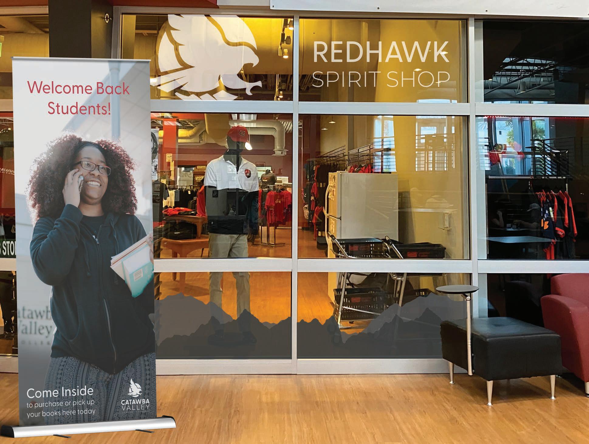
The Redhawk Spirit Shop is located inside the CVCC campus store along with the bookstore. Creating branded environmental graphics for both the windows and walls helps to better separate the spirit shop section from the rest of the campus store. The elements used to design the graphics are used throughout CVCC’s branding and marketing materials already. By using elements that are already implemented throughout the school, it allows the Spirit Shop to feel cohesive with the rest of CVCC.

Boise Miners Sports Branding
Design Objective
Create branding for a new NBA team with accompanying assets. Wayfinding and environmental graphics are to be created to be used in their arena. Design extra collateral to better expose the team and their name.
Design Brief
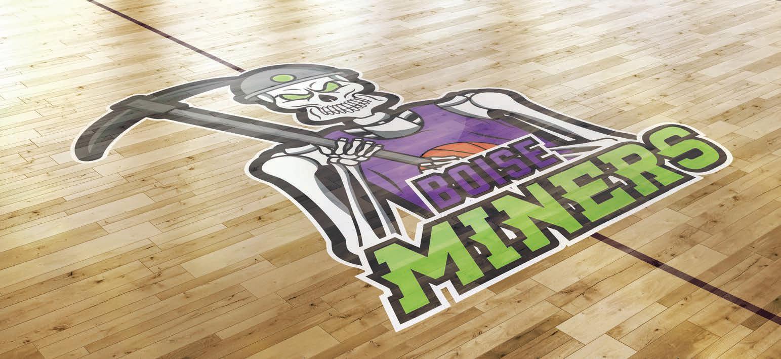
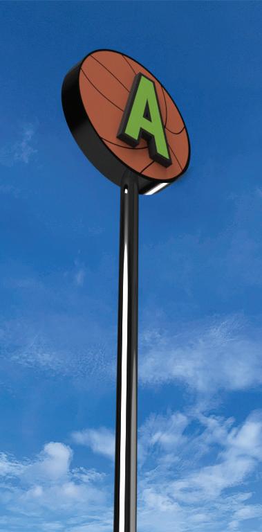
The Boise Miners is a new NBA team that will be located in Boise, Idaho. The name ‘Miners’ was chosen due to the rich mining history of Boise. Purple is the primary color in the branding and was used to represent the team’s power and ambition to be the best. Green was used to complement the purple and express the nature in the city. Gray is included to reflect the name and mining history of Boise. The typography has sharp edges with a slight skew to express a sense of movement and fierceness. Wayfinding elements were created to allow visitors to better navigate the arena and have a more enjoyable experience. Designing the home basketball court for the arena allows for a well-rounded experience for visitors at home games. A proposal booklet was created to better pitch the concept. A basketball jersey and fan merch were created to better establish the name and increase recognition.


