STUDIO
Anna Gantt
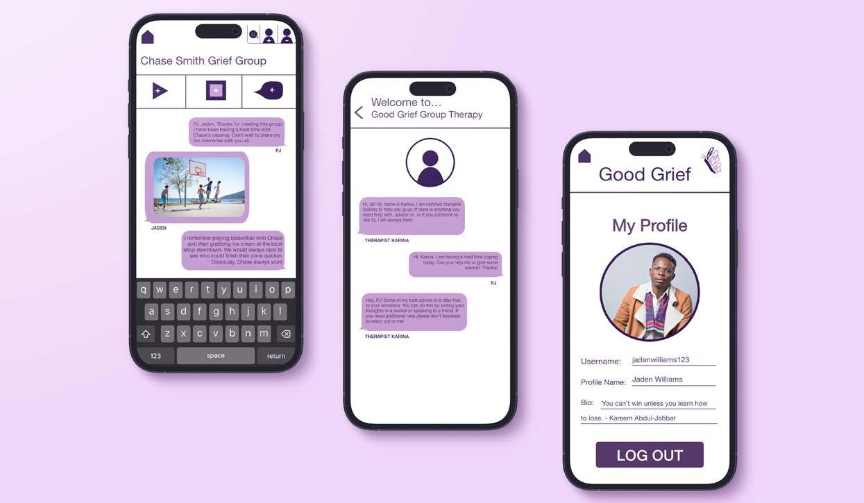
Good Grief: Application Design
Branding | User Interface + User Experience Design
DESIGN OBJECTIVE
Create an application that is new to the market. Make the navigation of the app easy-to-use but also engaging for the intended target audience. Include screen flow, prototypes, wireframes, and user testing to develop the target audience and gain a better understanding of personal design choices.
Mr.
CREATIVE BRIEF
Grief is a deep sorrow that is felt especially after death. However, the name of the app, Good Grief, is meant to express that the process of losing someone can be a balance between comfort and grief. Throughout the interface, I utilized different shades of purple to subliminally correlate to grief. Muted colors are proven to be most effective when grieving. Additionally, the use of a butterfly in the logo is a reminder that everyone is constantly transforming in life. Butterflies sometimes also appear after the death of a loved one. This can be interpreted as communication or a direct sign from the deceased. Signs such as these can symbolize joy, or relief. Ultimately, experiencing death, no matter the age, is an emotional rollercoaster that no one should have to face alone. Good Grief prioritizes healthy coping mechanisms during the many stages of grief and is important to help to heal and grow.
NnOoPpQqRrSsTtUuVvWwXxYyZz
Mr. Eaves Mod OT Heavy
AaBbCcDdEeFfGgHhIiJjKkLlMm
Helvetica Neue Regular
NnOoPpQqRrSsTtUuVvWwXxYyZz
AaBbCcDdEeFfGgHhIiJjKkLlMm
C: 25
M: 70
Y: 0
K: 64
C: 12
M: 33
Y: 0
K: 4
C: 14
M: 41 Y: 0
K: 64
Helvetica Neue Regular
NnOoPpQqRrSsTtUuVvWwXxYyZz
AaBbCcDdEeFfGgHhIiJjKkLlMm
C: 24 M: 70 Y: 0
NnOoPpQqRrSsTtUuVvWwXxYyZz
Mr Eaves Mod OT Heavy
AaBbCcDdEeFfGgHhIiJjKkLlMm
NnOoPpQqRrSsTtUuVvWwXxYyZz
Helvetica Neue Regular
AaBbCcDdEeFfGgHhIiJjKkLlMm
NnOoPpQqRrSsTtUuVvWwXxYyZz
K: 35
STUDIO
#451C5C LAVENDER
PANSY
#D7A3F4 ORCHID #4F365C IRIS #A642DB
+ + Post video to feed Post picture to feed Post story to feed Profile/ Member Search Home - + Encouragement Icon Send Back Good Grief Therapy Remove Member Add Member + C: 25 M: 70 Y: 0 K: 64 C: 12 M: 33 Y: 0 K: 4 C: 14 M: 41 Y: 0 K: 64 C: 24 M: 70 Y: 0 K: 35 PANSY #451C5C LAVENDER #D7A3F4 ORCHID #4F365C IRIS #A642DB Mr. Eaves Mod OT Heavy AaBbCcDdEeFfGgHhIiJjKkLlMm NnOoPpQqRrSsTtUuVvWwXxYyZz Helvetica Neue Regular AaBbCcDdEeFfGgHhIiJjKkLlMm NnOoPpQqRrSsTtUuVvWwXxYyZz + + Post video to feed Post picture to feed Post story to feed Profile/ Member Search Home - + + C: 25 M: 70 Y: 0 K: 64 C: 12 M: 33 Y: 0 K: 4 C: 14 M: 41 Y: 0 K: 64 C: 24 M: 70 Y: 0 K: 35 PANSY #451C5C LAVENDER #D7A3F4 ORCHID #4F365C IRIS #A642DB
AaBbCcDdEeFfGgHhIiJjKkLlMm
Eaves Mod OT Heavy


TO VIEW GOOD GRIEF APP PROTOTYPE
SCAN


STUDIO
Print + Digital Media Publication
Copywriting | Digital Layout + Design
DESIGN OBJECTIVE
Create an appealing magazine cover for a Print Magazine that incorporates what your specific article highlights. Using typography and visual hierarchy, create the layout for the given article. In the layout, include a sidebar with additional information about your related topic. All imagery chosen should be cohesive and enhance the article for readers.
CREATIVE BRIEF
The goal of this magazine was to inform individuals about the science behind the user experience. The article I wrote highlights what exactly facial recognition is, how it is beneficial to society, and includes interesting information about this technology. Including futuristic imagery and colors that subliminally correlate to the topic helps make the article more engaging to the audience. This project incorporates photo composition, photo manipulation, and layout design.
YOUR SOURCE OF TECHNOLOGY’S NEWEST TRENDS
FEATURED ARTICLES: THE FUTURE OF TECHNOLOGY, SCIENCE BEHIND THE USER EXPERIENCE, AND EXPANSIONS OF CREATIVE SKILLS & ENVIRONMENTS

PAGE 18

SCAN TO VIEW INTERACTIVE MAGAZINE


Lexinide: Pharmaceutical Brand


Branding | Packaging + Tradeshow Booth Design
DESIGN OBJECTIVE
Create a pharmaceutical brand that includes a logo, tagline, packaging, and trade show booth. Create a Photoshop mock-up, an Adobe Dimension mock-up, and a physical 1/10th scale model of the pharmaceutical trade booth. This project is intended to reinforce your design skills and test your ability to turn a concept into a functional print and digital job.
CREATIVE BRIEF
Lexinide is a pharmaceutical drug intended to help individuals that struggle with hypothyroidism. Hypothyroidism is a condition where the thyroid gland does not function correctly. The tradeshow booth incorporates rock stacking to attract attendees to learn more about Lexinide. The idea of stacking rocks subliminally shows that the individual’s life will “level up” or become better by taking this drug. Additionally, purple and green are gender neutral colors that cater to both men and women. Although the majority of people who struggle with hypothyroidism are women, men also struggle with this condition.
Natalie Collins
30

•
Content Creator • Fargo, ND

Lately, Natalie has struggled with fatigue, hair loss, and weight gain. She has not spoken to anyone about these issues because she believes this is a result of the aging process. However, after speaking with a few family members, Natalie realizes hypothyroidism runs in her family. Many loved ones such as her mom, aunt, and sister have been tested and diagnosed with this disease. Natalie also tested and has hypothyroidism. Each of her family members take a medicine but none of the women believe the drug properly treats their hypothyroidism. Natalie researched many hypothyroid treatments and found a recently discovered and trustworthy perscription called Lexinide. There are many great impressions from investors and doctors. Each of the women tested the drug for two months and experience great results. Lexinide is here to help cure and level up her life!

Xavier Davis
50 • Plumber • Richmond, VA
Xavier has lived with hypothyroidism for many years. As a hard worker, having a medication that effectively treats his fatigue and works all day is key. Xavier was diagnosed with hypothyroidism when he was only 23 years old. Because he did not know much about his diagnosis, he was very worried and thought his life was in danger. Luckily, he quickly started taking a drug to help treat his hypothyroidism. However, Xavier and his friends believe his medication is not working like it did when he first took it. With that being said, Xavier has been on the hunt for a new and improved perscription. One night after work, Xavier was watching TV and eating dinner when a commercial for Lexinide showed. He felt very encouraged by the inclusive advertising and wanted to give it a try. Xavier believes Lexinide is here to decrease his fatigue while at work and level up his life!
Emily Nguyen
42
• Pharmacist • Little Rock, AR
As a pharmacist, Emily has an extensive amount of knowledge on drugs. She knows what does and does not work for many different diseases. Additionally, she also struggles with hypothyroidism. Emily and her doctor have tested many perscriptions that attempt to cure her diagnosis, but have not found one that is reliable enough fight her hypothyroidism. As of recently, Emily’s symptoms have worsened, resulting in hair loss, shifts in her heart beat, and major weight fluctuation. She is worried that if her hypothyroidism is not properly treated with a certain medication, that there will be life altering changes. After many months of research, both independently and with her doctor, Emily found a medication called Lexinide that is new and suggested by many reliable medical professionals called Lexinide. Lexinide is here to be a dependable medication, help cure, and level up her life!
STUDIO
level up
LEXI NIDE LEXI NIDE

 #779E16
#CEFF57
#73069E
#E9CBF5
#779E16
#CEFF57
#73069E
#E9CBF5


Social Issue Poster Campaign Series
Poster Design | Photo Composition + Manipulation
DESIGN OBJECTIVE
Create a campaign series of photo manipulated posters that relate to a specific social issue. Additionally, create a logo that relates to the topic to help raise awareness to the series. Finally, stylize the posters by using appropriate fonts and imagery to create a suitable mood for the series.
CREATIVE BRIEF
Many people are negatively affected daily by the acts of others driving while preoccupied. Texting while driving, drinking while driving, and road rage are the three poor habits that lead to the social issue of distracted driving. Including photo manipulated, dark imagery, and devastating statistics help bring the appropriate mood to the posters subconsciously. Including an eye-catching font and a simple yet affective logo helps complete the posters.
CMYK: 0, 0, 0, 100
RGB: 0, 0, 0
Blue Highway LINOCUT REGULAR BOLD
CMYK: 0, 100, 100, 0
RGB: 237, 28, 36
STUDIO
TEXTING AND DRIVING


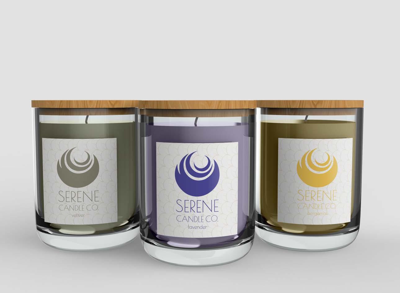
Serene: Packaging Series
Branding | Packaging + Collateral Design
DESIGN OBJECTIVE
Create a logo and design packaging for a series of products. Make the colors and logo for the series appropriate and visually attractive for the intended target audience.
CREATIVE BRIEF
Serene is a candle company designed to help those with anxiety. The top three scents that help reduce anxiety are lavender, vetiver, and bergamot. Using these scents as the top notes are proven to help reduce anxiety for the individual. Moreover, the name of the company, colors, logo, and pattern of Serene correlate to the calming elements of the series.
Poiret One Regular
SERENE CANDLE CO.
STUDIO
AaBbCcDdEeFfGgHhIiJjKkLlMm NnOoPpQqRrSsTtUuVvWwXxYyZz #1D223F 55: 47: 0: 75 #514EA1 50: 51: 0: 37 #93927E 0: 0: 8: 23 #FACD5A 0: 18: 64: 2
SERENE NAVY LAVENDER VETIVER BERGAMOT


ZOM-BEE: Visual Pun
Watercolor Illustration
DESIGN OBJECTIVE
Illustrate, digitize, and animate the visual pun of your choice. Include visually appealing and appropriate principles of design to make it recognizable. Additionally, digitize the drawing and animate the piece in order to create an element of motion.
CREATIVE BRIEF
Zom-BEE is the visual pun that I chose to illustrate. I incorporated features of both a zombie and a bumble bee. This helps the piece become recognizable to the viewer without making it too obvious. I also included the name of the visual pun on the illustration on the bottom in a font that correlates to the theme.


STUDIO

PUN
SCAN TO VIEW VISUAL
Madison Graters: Sports Branding
Branding | Wayfinding + Collateral Design
DESIGN OBJECTIVE
Create a fake professional sports team unique to the area. Include stylized branding, wayfinding, environmental graphics, and other collateral pieces. Effectively utilize color and design principles to create a National Hockey League to draw in a specific target audience.
CREATIVE BRIEF
The Madison Graters is a National Hockey League team from Wisconsin. The logo is a block of cheese wearing skates to make the branding playful and open for many demographics to love. I utilized shades of maroon and a deep yellow-gold color to represent the team. These colors are relevant because cranberries, wine, and cheese are what Madison, Wisconsin is known for, and those items are the related colors.

STUDIO


SCAN TO VIEW MADISON GRATERS SPORTS PROPOSAL
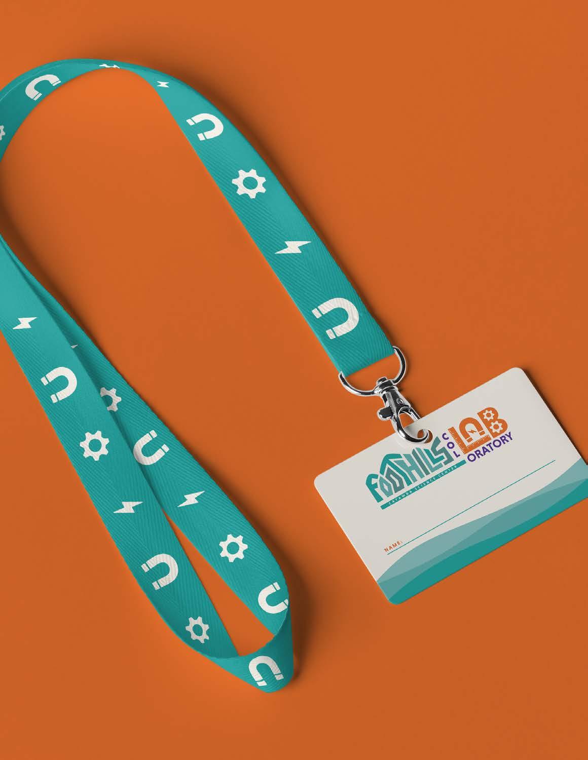
Foothills Col-LAB-oratory: Maker Space
Branding | Collateral Design
DESIGN OBJECTIVE
Create branding, flyers, and other collateral pieces for the Foothills Col-LAB-oratory located at the Catawba Science Center. Incorporate the appropriate theme to attract the target audience. Additionally, use suitable colors to tie in the logo with the created space.

CREATIVE BRIEF
The Foothills Col-LAB-oratory is a space for children to go to in order to think creatively, learn, and have fun. The logo represents the aspect of having fun while also including the tools used throughout the area. The teal, orange, and purple are complimentary to each other which creates visual attraction subtly to the audience as they navigate the space.
STUDIO


STUDIO
The Local Spread: Charcuterie Box
Branding | Social Media + Collateral Design
DESIGN OBJECTIVE
Create branding and design packaging, and curate social media pieces for The Local Spread charcuterie box. The branding, packaging, and social media pieces created must be cohesive to the aesthetic of the brand and entertaining to the target audience.
CREATIVE BRIEF
I created attractive branding and curated fun yet engaging social media pieces for The Local Spread. Furthermore, I created packaging mockups for the brand to realistically show the client a more finalized version of what the charcuterie box will look like.


Parrot: Illustration
Mixed Media Piece DESIGN OBJECTIVE
Find inspiration and create a detailed mood board for an illustration to gain a better understanding of what the piece might entail. Illustrate an image of your choice using any medium. Use this piece to challenge yourself but also showcase your strengths.

CREATIVE BRIEF
I illustrated a parrot to playfully challenge myself. Drawing animals while also including the correct blend of colors and textures is a task that I have tried only a few times, so I took this time to practice that skill again. I utilized different drawing techniques such as shading, cross-hatching, and blending to bring my piece to life.
STUDIO


