creative
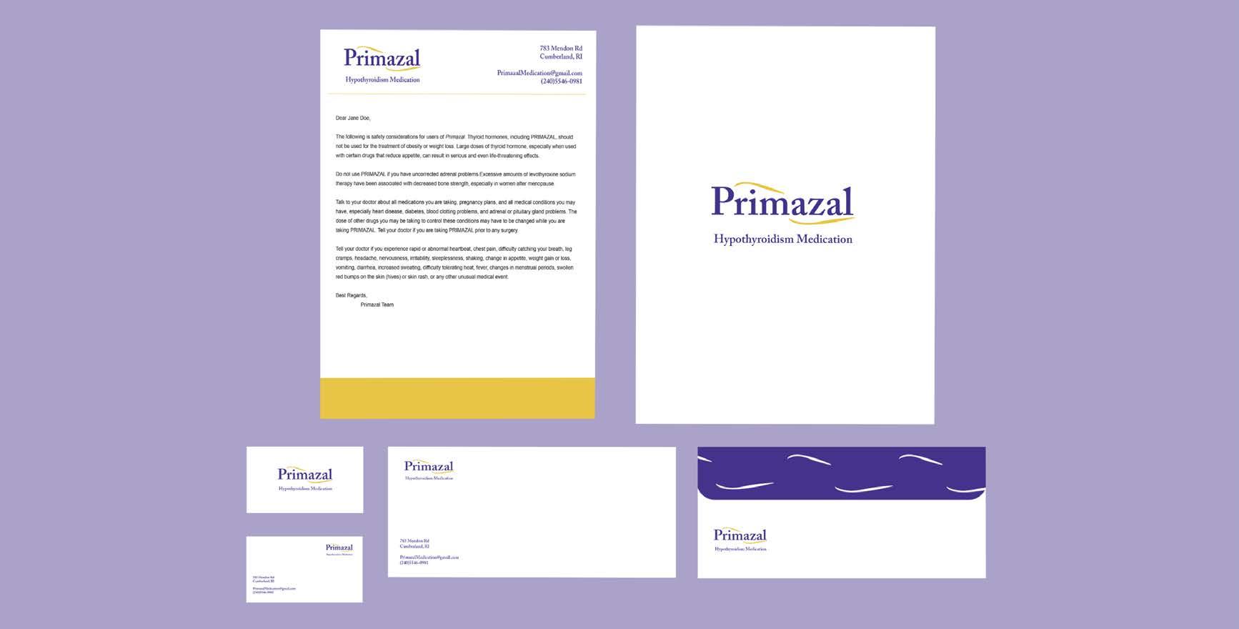
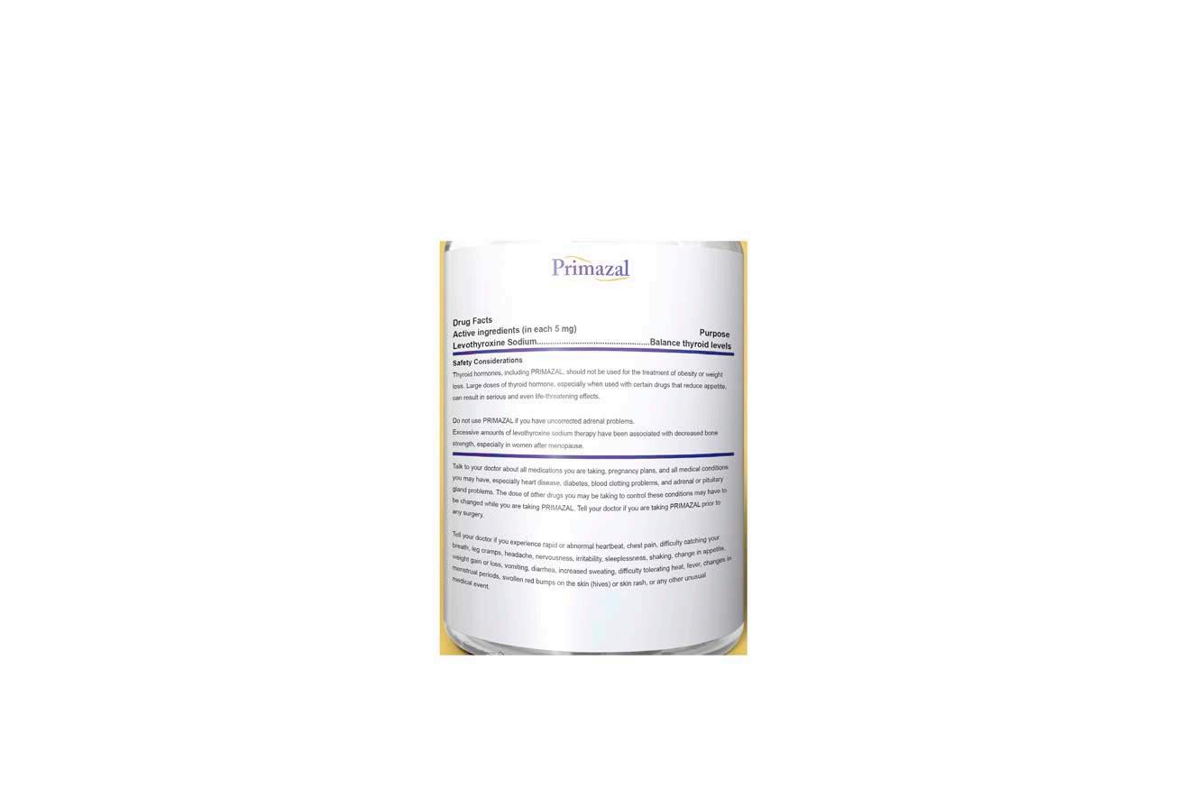
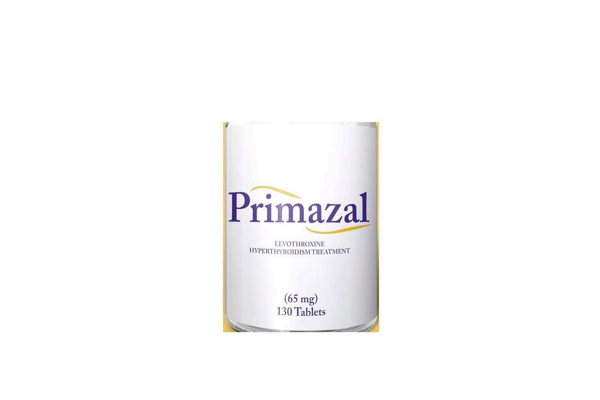
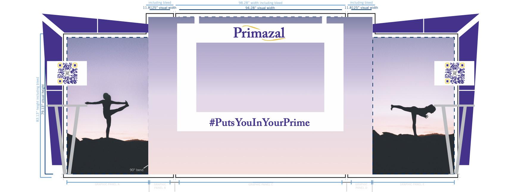
Primazal: Pharmaceutical Brand
Branding | Packaging Design | Tradeshow Booth
Design Objective
Design branding for a pre-existing pharmaceutical brand drug. Create a style guide, packaging mock-ups, identity packet, and a flat digital composition of a trade show booth.
Creative Brief
Primazal is a prescription medication that will help those who have hypothyroidism. The product slogan created was “puts you in your prime” to slightly hint at the name of the product. The colors of purple and yellow were used to stand out from competitors but also to calm the user down. The type used was somewhat simple to remain easily readable for the target audience. The booth will be used to promote the product in a unique and effective way. The booth will have a selfie station where people can take their picture, post the picture to their socials and in return, receive a free Prime drink. This idea is unique and will grab the attention of many people at the Bio International convention.

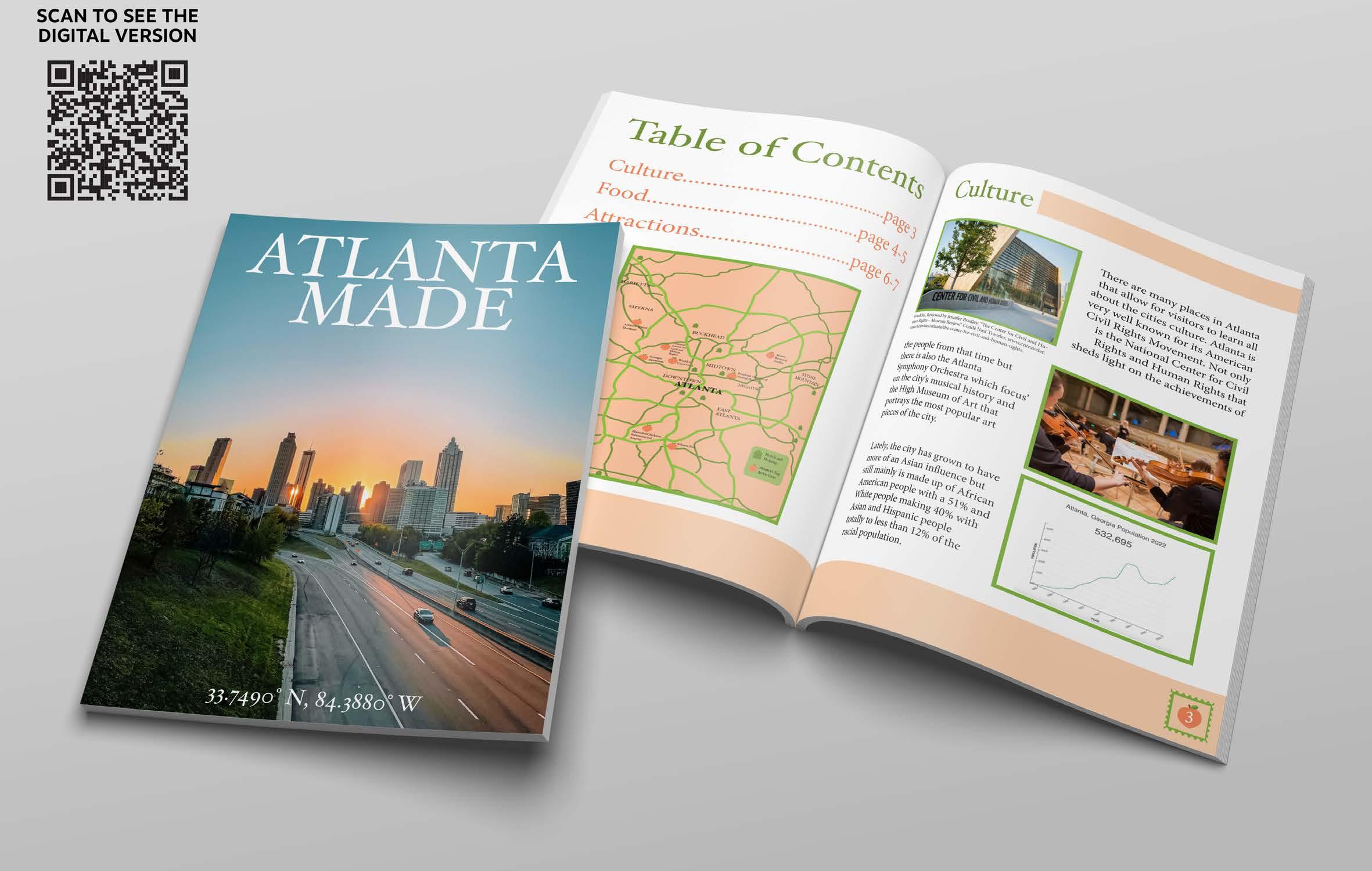
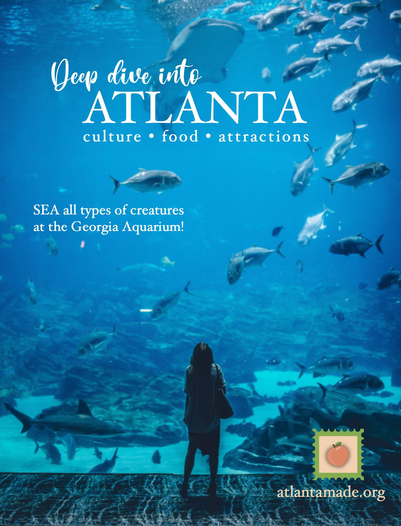
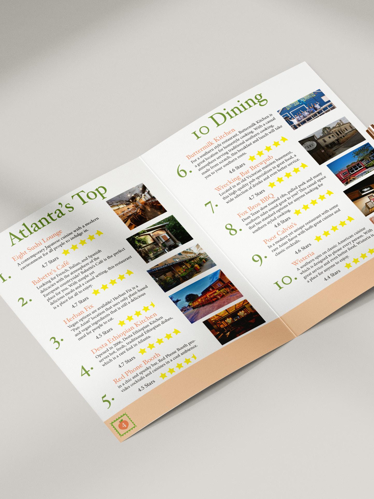
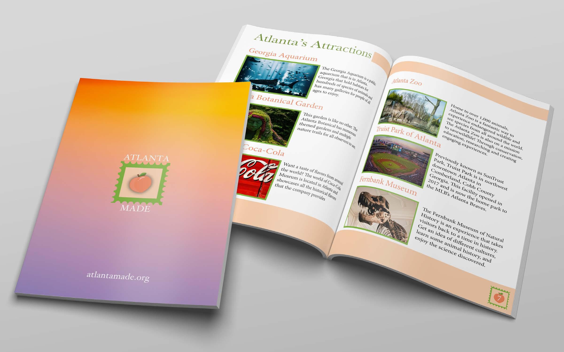
Atlanta Made: City Planning Guide
Branding | Digital Layout & Design
Design Objective

Design a city planning guide for tourists of the appropriate age demographic based off a city of choosing. Include attractions, restaurants, or other sites to entice tourists to visit the city. Make an attractive pamphlet that visitors will want to use while exploring the new city.
Creative Brief
Atlanta was the chosen city based on the fact that it’s an on-going growing city that many young people are moving to. The pamphlet includes a map of the city, an advertisement, a detailed list of attractions and restaurants, as well as delving deep into the history of the city. The logo is like a stamp with a peach symbolizing at their motto as the peach state. The orange shades also play into the peach prominence while utilizing green shades to visually contrast. The name used for the magazine was Atlanta Made due to the many opportunities that the city has to offer. The front cover photo was chosen to show the gorgeous skyline the city has while the back was shown to represent the beautiful sunsets that Atlanta is known for.
creative
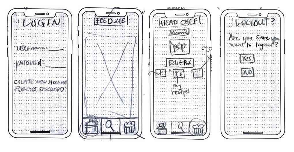
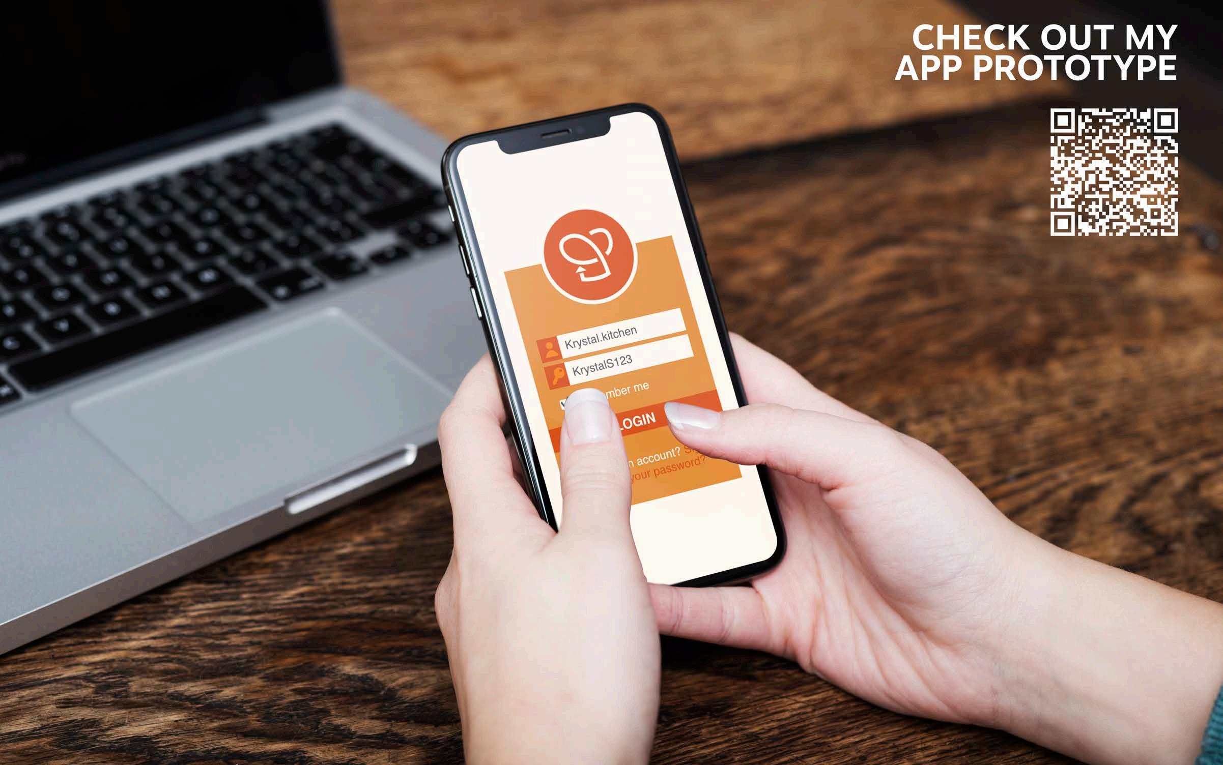
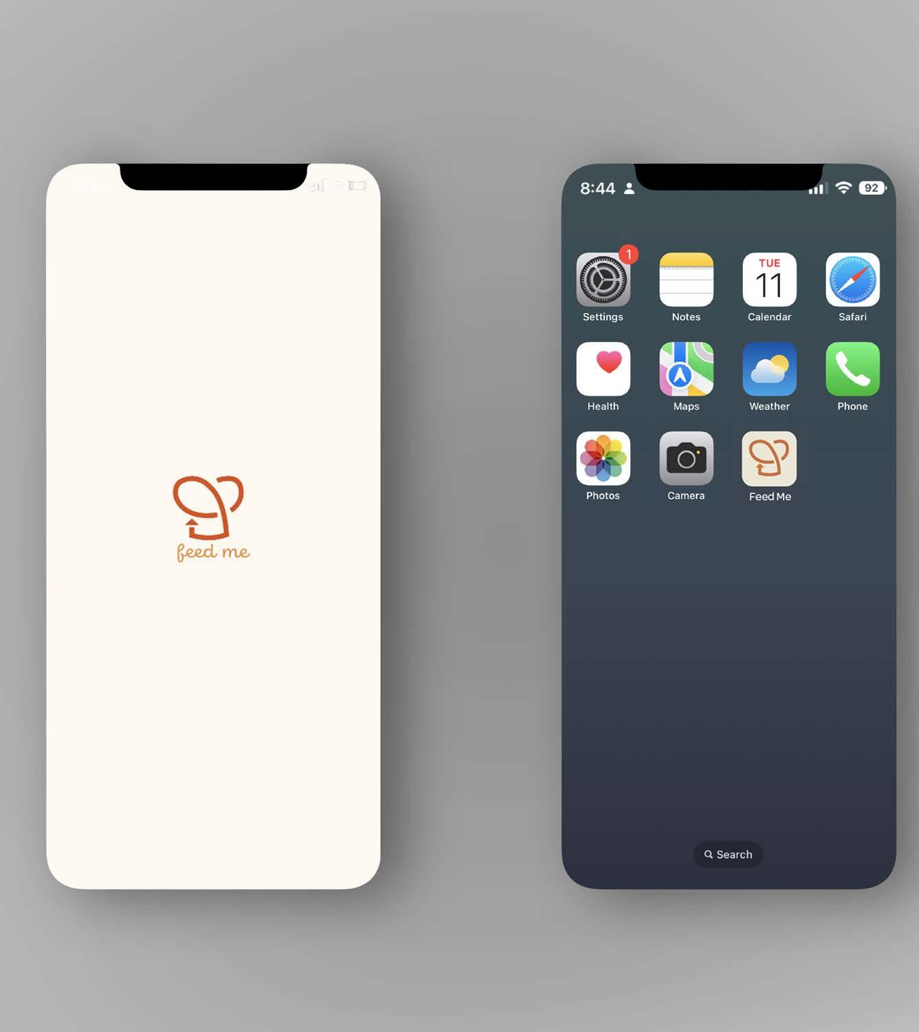
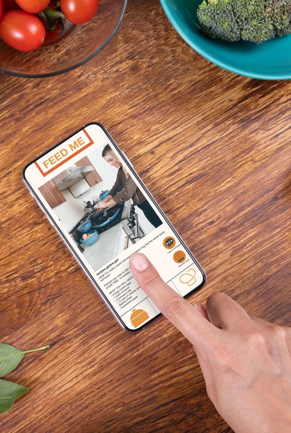
Feed Me: Application Design
Branding | UX/UI Design | User Testing
Design Objective
The app project was created with the intention of making a unique app that will help people cut down on time spent figuring out meal plans. Our app needed to include a monetization value, mock-up files, and Adobe XD files that represented my app.
Creative Brief
Feed Me is an app for people looking for new recipes. Whether it be for the family or for their health needs, the app has all the recipes to satisfy people’s cravings. This app will make money by having advertisements featured on the app. These ads will be based on brands that want to collaborate with the app through making recipes with their product. A special feature of the app is the “hashtag search” section. When users are looking for a specific recipe or food, they type in that keyword with a hashtag and see all types of different recipes show up. When creating content on the app, people have multiple different ways users can post their videos. Users can post a one to five-minute stepby-step video meal tutorials or a time lapse video of creators making the meal. The app target audience is not really limited to a certain group, but the app can help anyone looking for a quick and easy way to find recipes. Feed Me can make everyday life much simpler for many people by helping make decisions and finding alternative options for specific ingredients. The colors were chosen to be close to red to make users hungry. Through user experience, results showed that my app was easy to navigate and was user-friendly
Login Screen
Forgot Password Sign-inNew Account
“Recipe Feed”
“Find...”
“Interests” #’s Search Bar
“Foodies” “Feed Me Page”
nd recipes based on what #’s you search nd recipes/friends on the app buy products
“Head Chef” my recipes (create+) cookbook
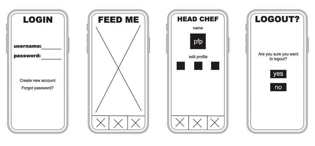
recipes reccomended and currated based on your searches
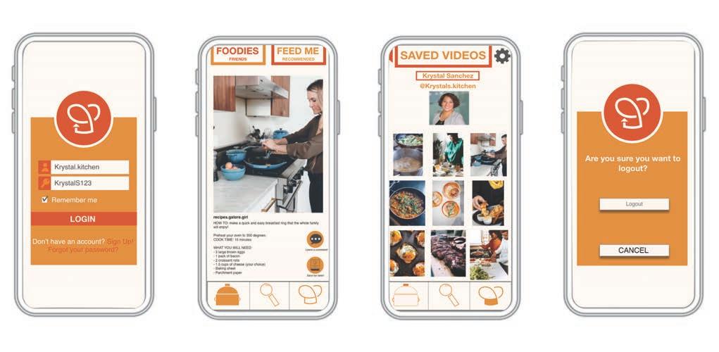
create new password advertisements share content to friends to other socials save to camera roll
recipes saved for later my videos make videos
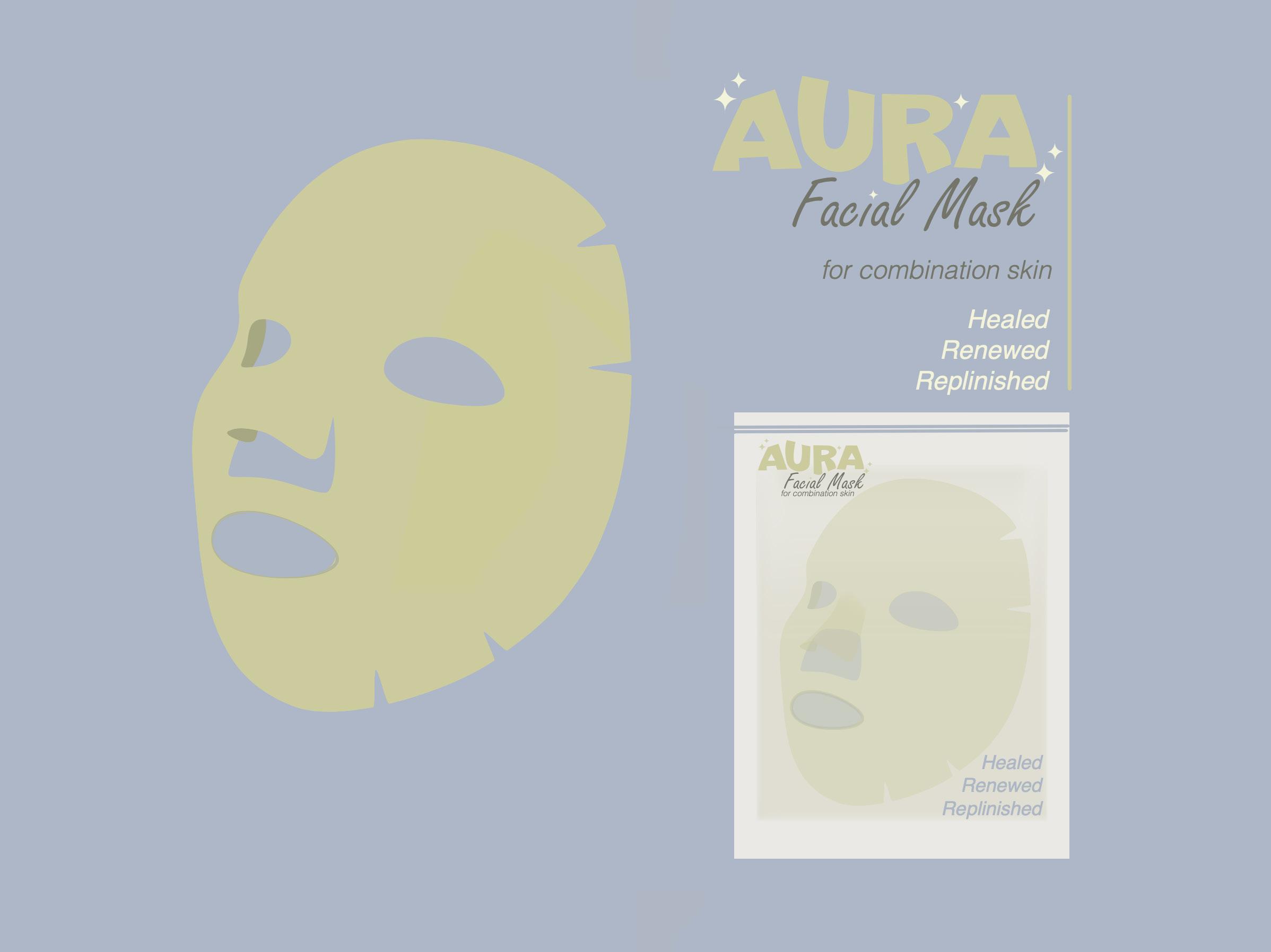
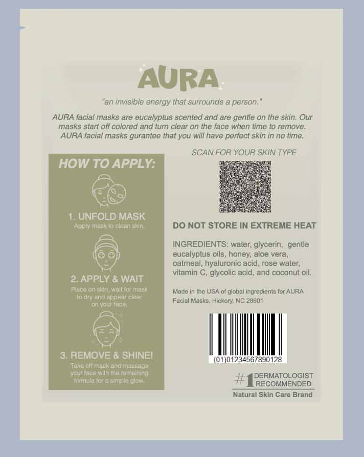
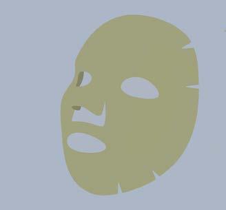
AURA: Product Series
Branding | Packaging Design | Animated Logo
Design Objective
Design a logo, branding, packaging, and style guide based off a product of my choosing. because I think I excelled at making logos and using Adobe Dimension. Create facial masks that will appeal to anyone while also remaining unique to the skincare market.
Creative Brief
AURA was created to be a unique, unisex brand that all people will enjoy. Skincare is a never dying industry but has grown to be super popular over the past couple of years. AURA is unique compared to other brands because the three assorted styles of masks are created with the intention of being specific to the user’s skin necessities. AURA has masks dedicated to dry, oily and combination skin types. Green was used because it is a calming, gender neutral color that all will enjoy. The type and wordmark were hand rendered and is a perfect yet simple addition to the packaging. AURA was created to make you feel confident in your skin.
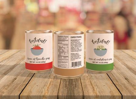
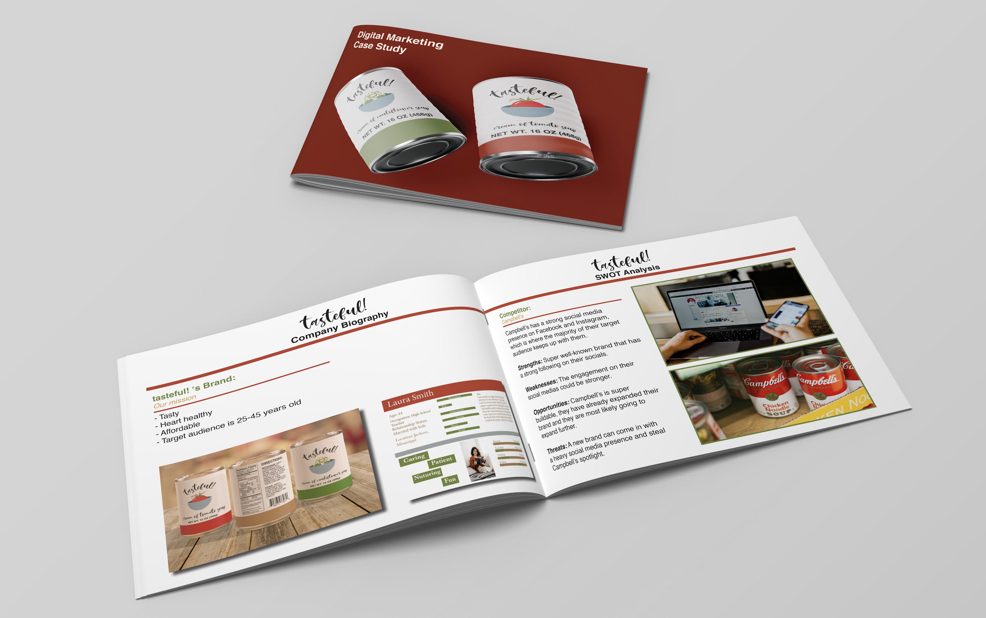
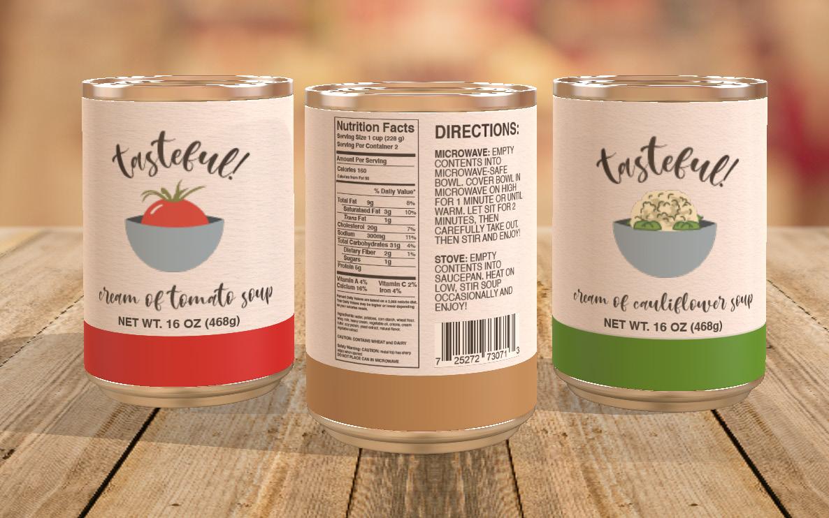
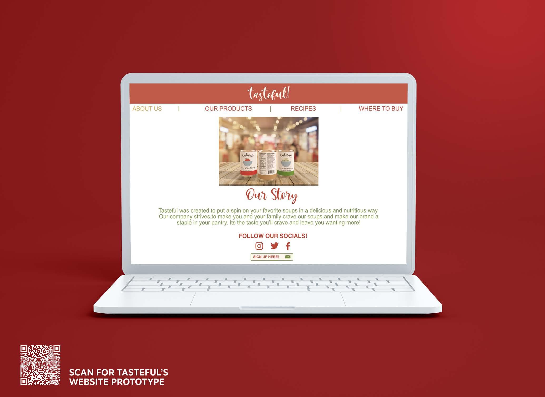
tasteful!: Packaging Series
Branding | Packaging Design |
Website Prototype | Digital Marketing Case Study
Design Objective
Design packaging and branding for a consumer product that will be sold in stores. Research competitors and create branding and flavors to carry throughout a series of soups. Design a style guide for the branding as well as mock-ups in Adobe Dimension of the final product.
Creative Brief
The name tasteful! to show that my brand is not only playful but is also delicious and healthy. Tasteful! is in Mishella Regular font which makes the word mark stand out from most of the other soup companies on the market. The tasteful! logo type is also curved to be around the mark rather than horizontally for even more consumer appeal. The nutrition label and directions are all in a sans-serif font so they can be legible at any distance. The logos are more illustrative to appeal to all ages. I chose the color palette of light blue, a toned-down red, muted brown, and a dull green to correlate the flavors of soup to the packaging. Red is for cream of tomato, brown for cream of potato and green for cream of cauliflower. The light blue was chosen for the bowl because it complements well with all the other colors used in the brand.
 SCAN TO SEE MY DIGITAL MARKETING CASE STUDY
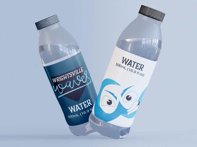
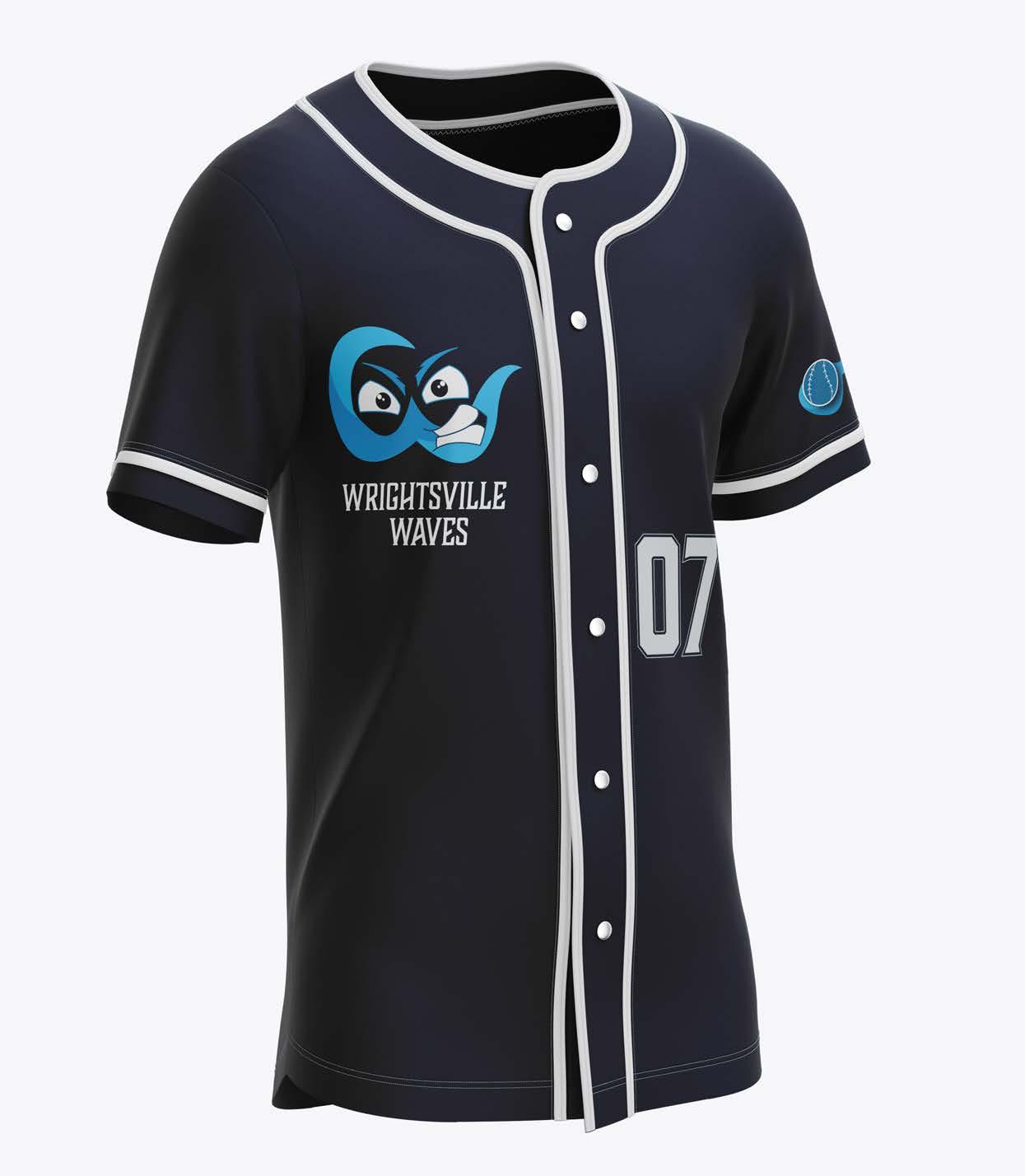
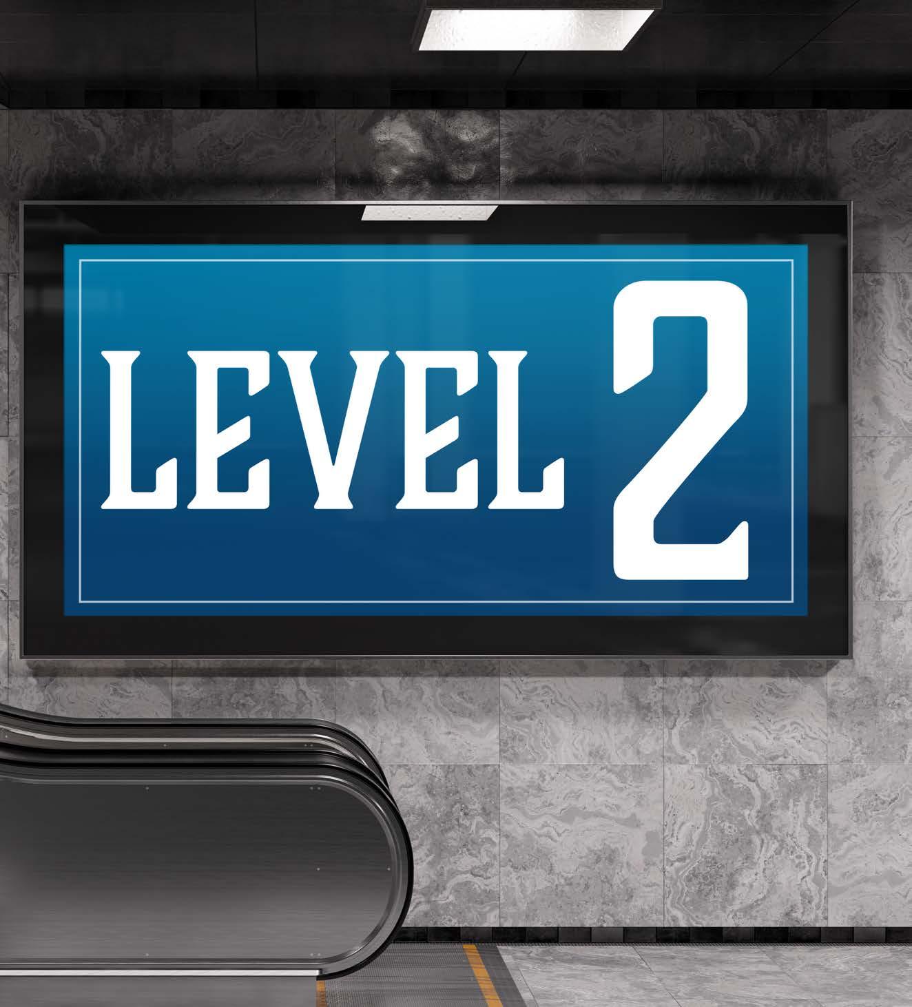
Wrightsville Waves: Sports Branding
Branding | Wayfinding and Environmental Graphics
Design Objective
Design sports branding for a new athletic team unique to the area. Create a style guide, collateral pieces, wayfinding and environmental graphics for the arena and team. Use suitable colors, type, and imagery for the branding identity.
Creative Brief
Wrightsville Beach, North Carolina was chosen because it is known to be a place where many people decide to retire or go to for vacations. The area needed more entertainment, other than the beach, so the Wrightsville Waves were created. Shades of blue were utilized to play into the ocean aspect of the town and white to contrast it. The type used was Boucherie Block bold because it reflected a sporty look that other athletic teams use. For the secondary mark, a unique script type was designed to make a different look that the team would have the option of using for other collateral pieces. The tertiary mark was also designed to be used for collateral pieces as well.
BOUCHERIE BLOCK (Bold)
TO SEE MY SPORTS BRANDING PROPOSAL
Jacob
Lucky
The Athlete
Age: 23
Job: MLB Athlete
Hometown: York, SC
Early Bird Night Owl
Easy Going Planner
Jacob Lucky has always been a natural born athlete. He was a tri-athlete in high school and set many school records. He played D1 college baseball at Clemson University which led him to be recruited to play professionally for the Waves.
Introvert Extrovert SCAN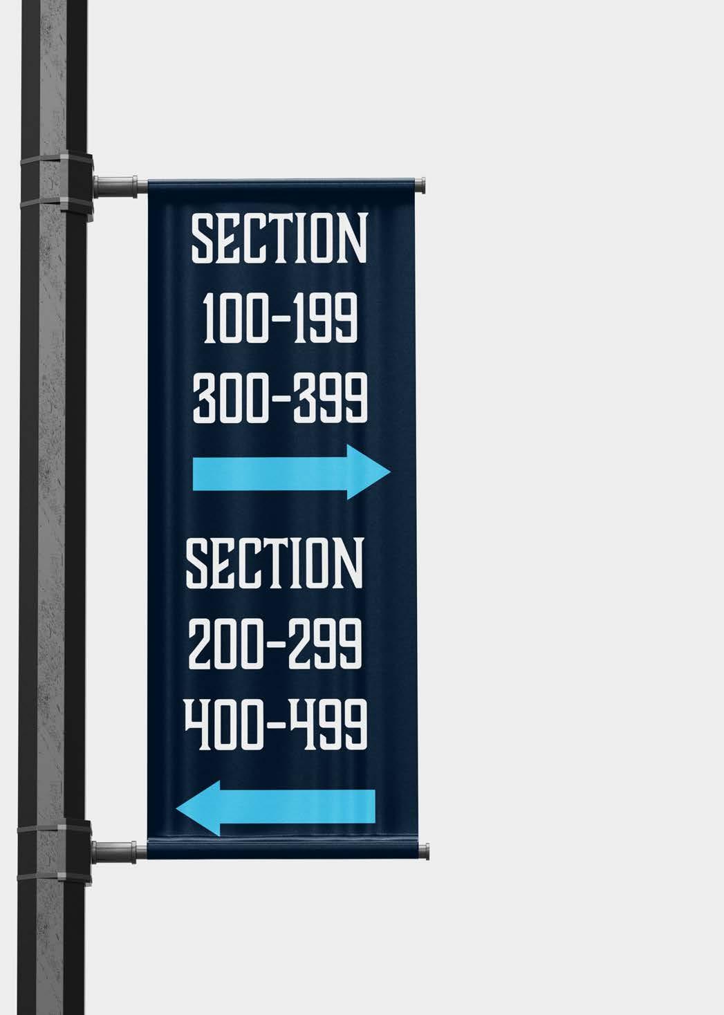
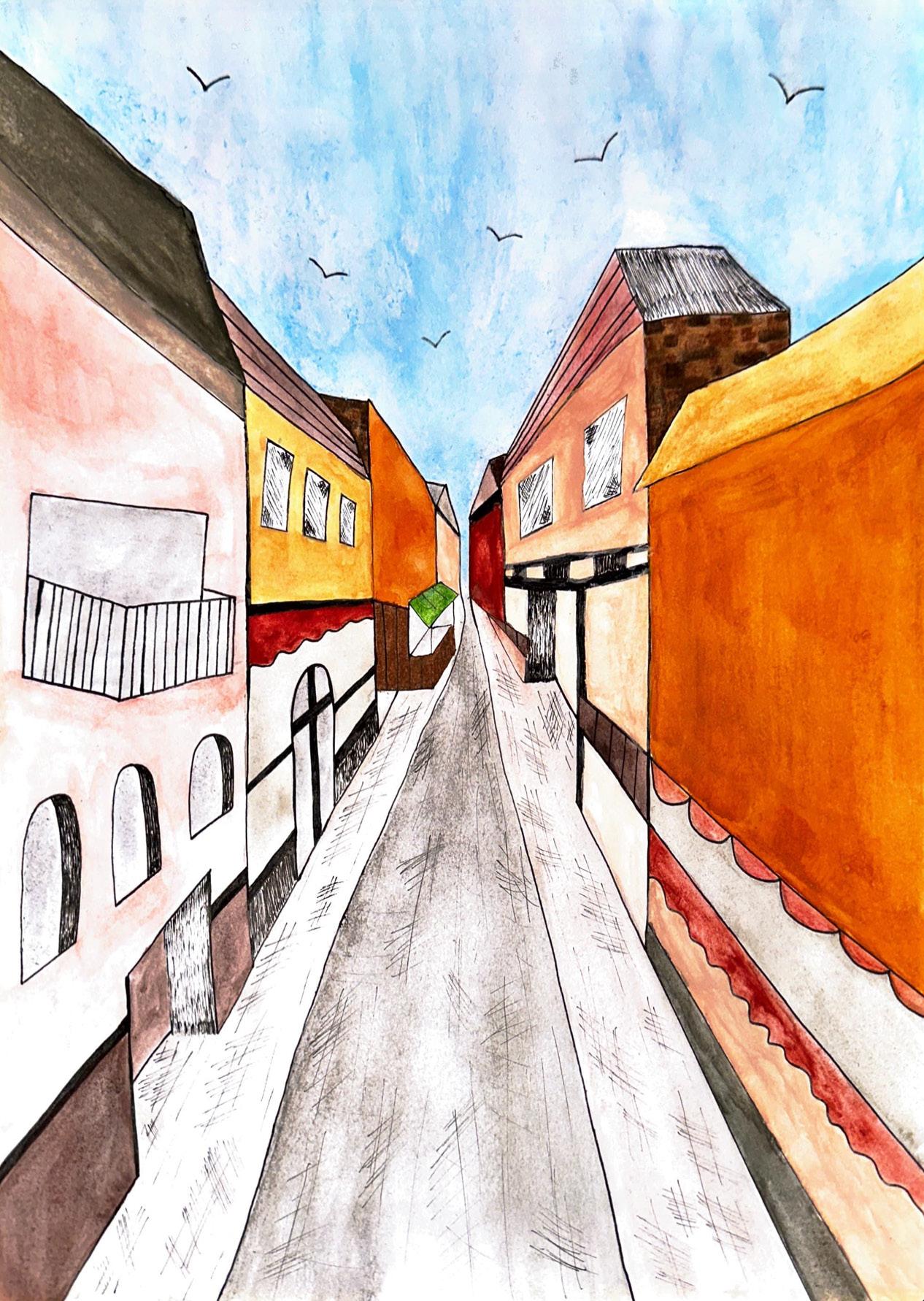
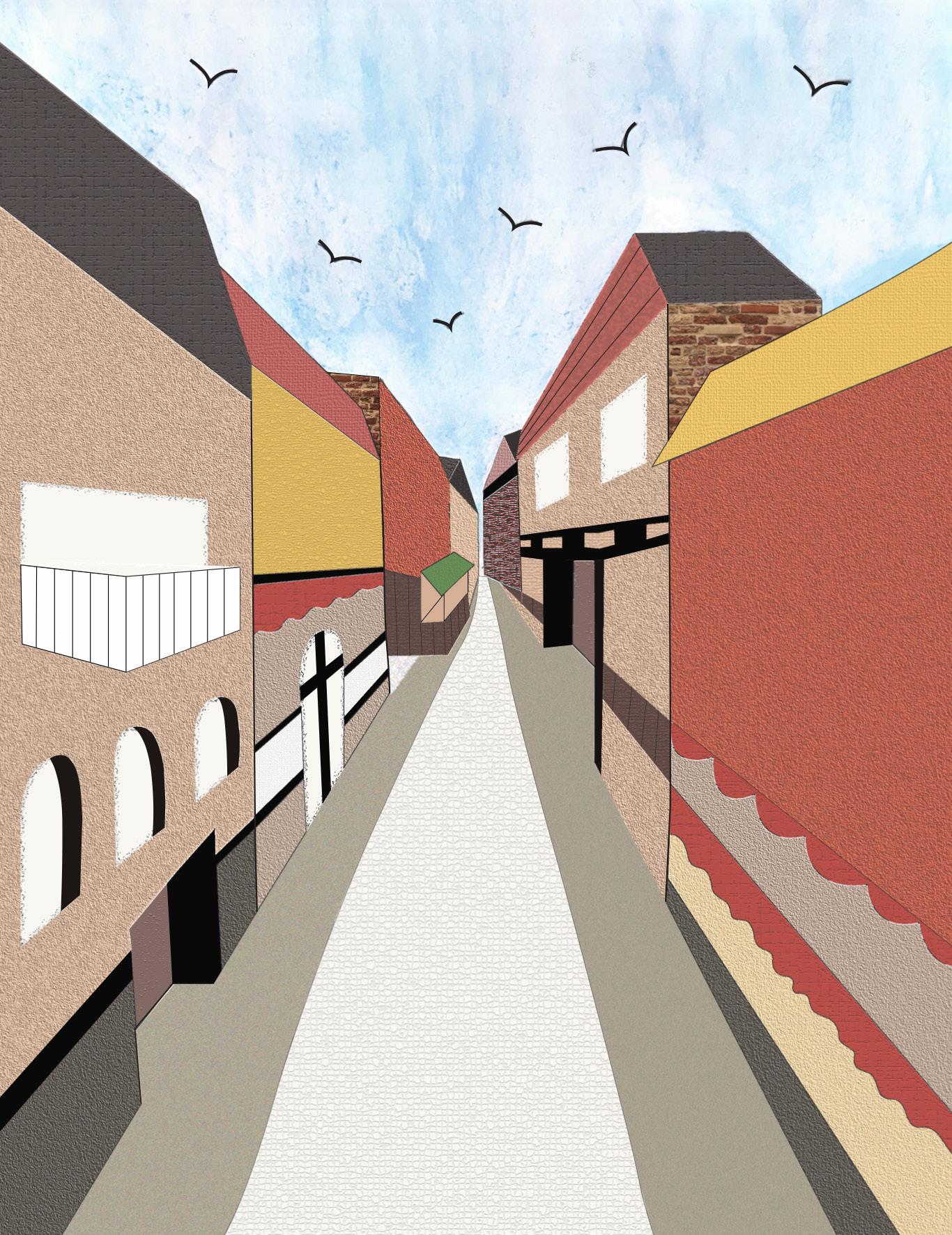
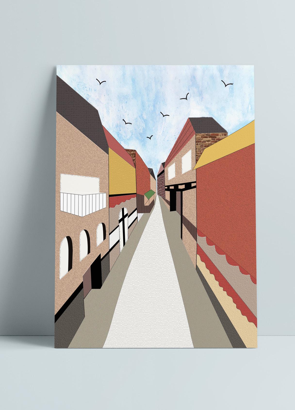
Final Illustration: One Point Perspective Italy
Watercolor | Digitization
Design Objective
Creative Brief
The subject I drew for my final piece is a one-point perspective of a street with multiple buildings. The mediums I used were black ink and watercolor because I wanted to challenge myself with a medium that I was not confident with. The black ink was used to create outlines on the buildings and help illustrate some of the smaller details such as cracks in the road and sidewalk as well as for the small birds in the sky. I used watercolor to make sky background along with adding a wash of color to the buildings and pavement color to the sidewalk and road. The drawing techniques I used were mainly cross-hatching, pressured line work. I would use the cross-hatching technique to add a textured look to some of the roofing on the buildings and to create shading on the windows. Pressured line was used to add dimension, depth, and variety to the piece. The color scheme I was aiming for was rustic, yet colorful.
creative
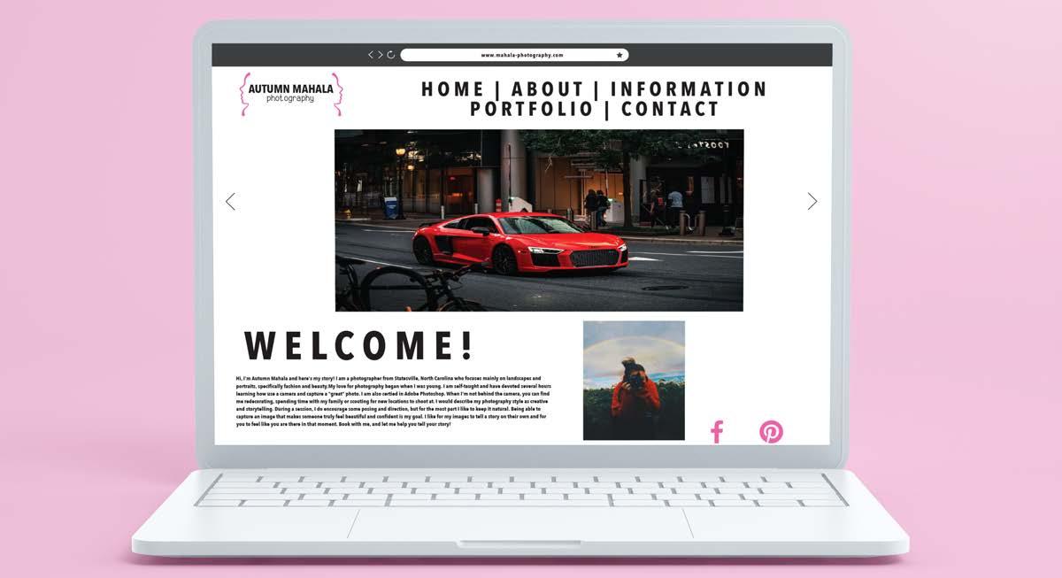
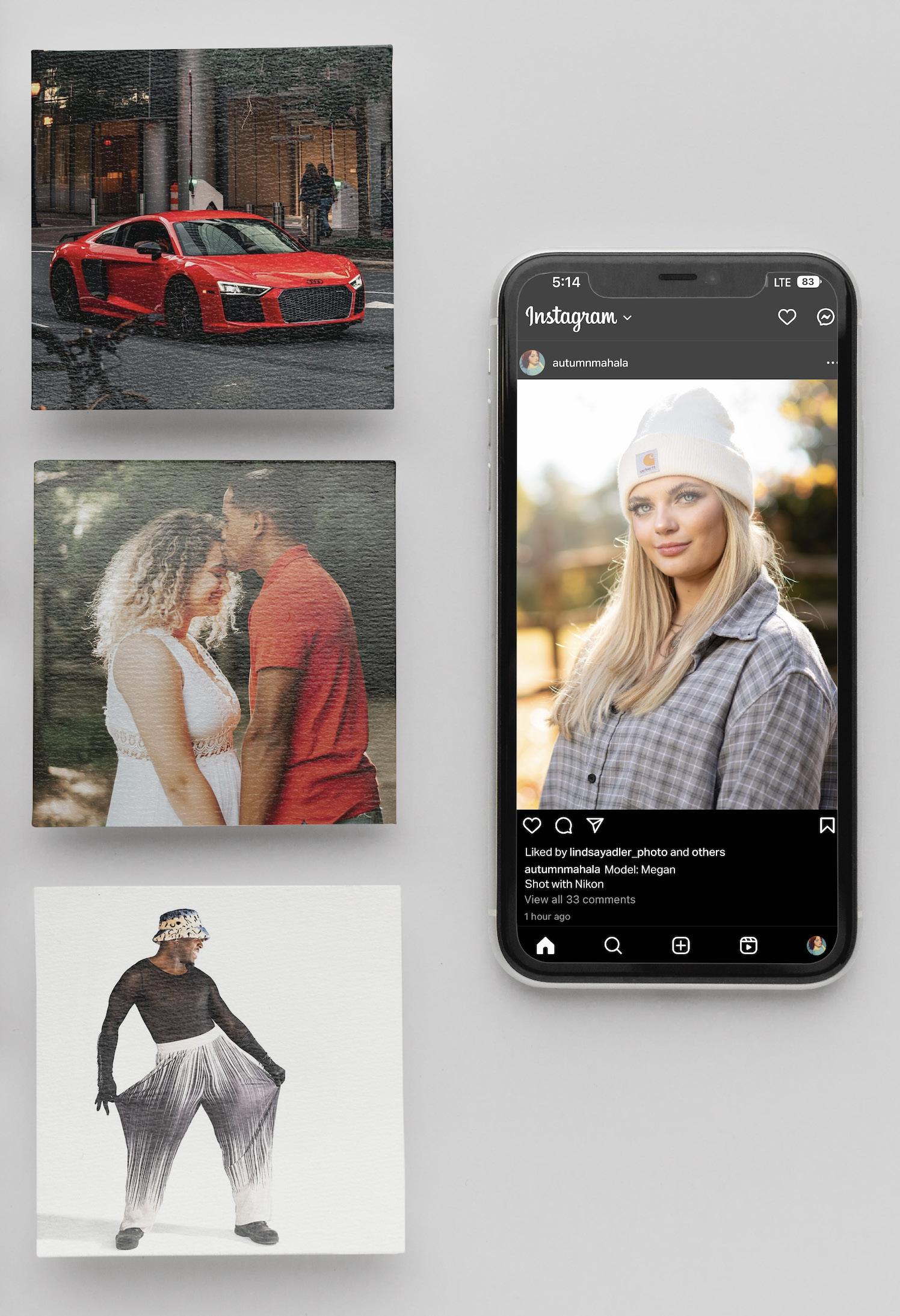
Autumn Mahala: Photography Branding
Branding | Collateral | Website Ideation
Design Objective
Design branding, an identity packet, website ideation and social media posts for senior photo student, Autumn Mahala. Make each component cohesive and visually appealing.
Creative Brief
The logo created was based off elements that Autumn mentioned she liked and photographed. The logo is simple, yet eye-catching to clients. She wanted to include neutral colors with a pop of pink to show her brand is fun and inviting. Her identity packet was created to be feminine and represent her personality through symbols she liked. Her microsite is user-friendly and appealing to viewers. Her social media content consists of her work to promote her photography and overall brand.

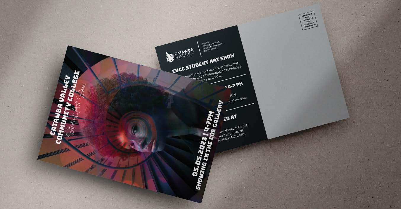
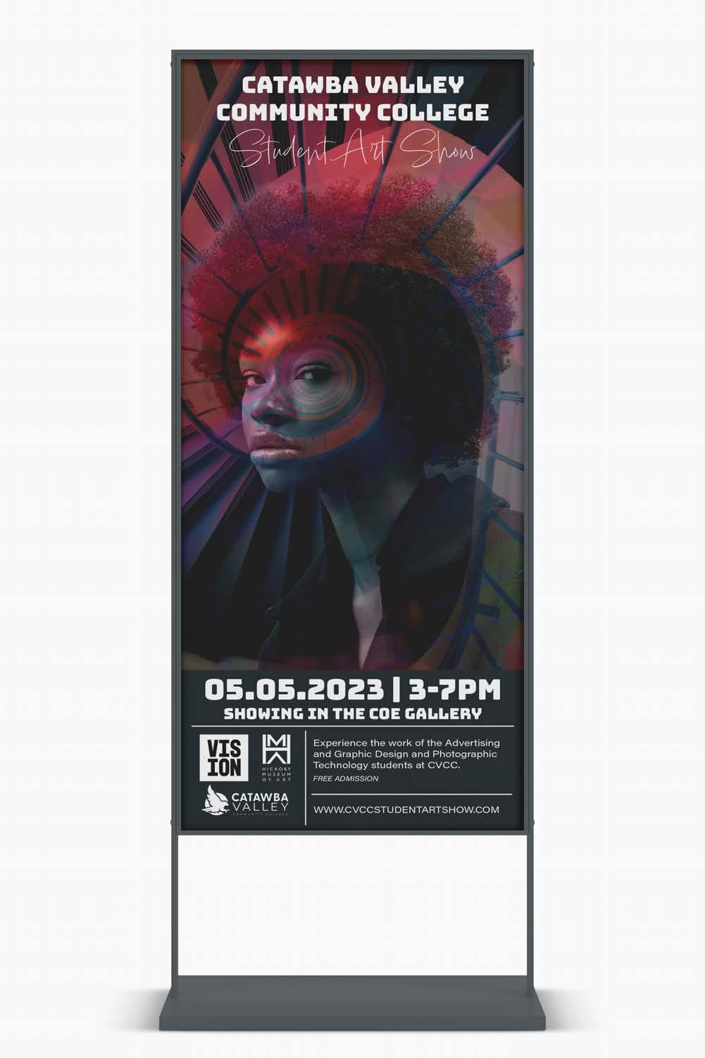
Catawba Valley Community ColLege Student Art Show
creative
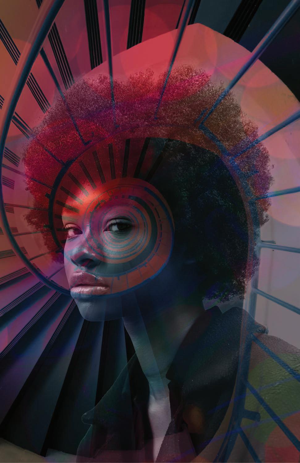
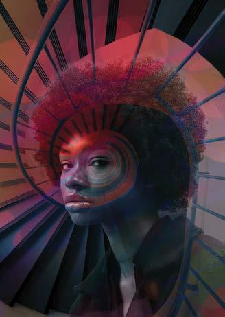
VISION: Photo Manipulation and Collateral
Collateral Design | Photo Manipulation
Design Objective
Design a banner, post card, and yard sign for the VISION art show. Create a clean design that is unique and eye-catching for viewers.
Creative Brief
The photo composite incorporated an image of a woman, a spiral staircase, and various images of colored lighting. The golden ratio was used into the design through using the image of the spiral staircase to lead to the woman’s eye. I also decided to use a color overlay on the image of the woman and the images of the colored lighting to add further dimension and details to the piece.
05.05.2023 | 4-7PM
Showing in the coe gallery
Experience the work of the Advertising and Graphic Design and Photographic Technology students at CVCC. WWW.CVCCSTUDENTARTSHOW.COM
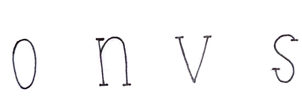
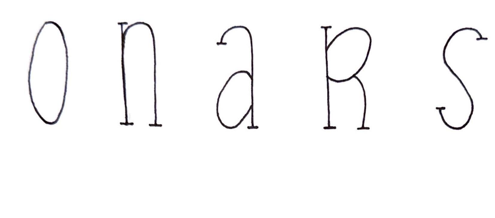
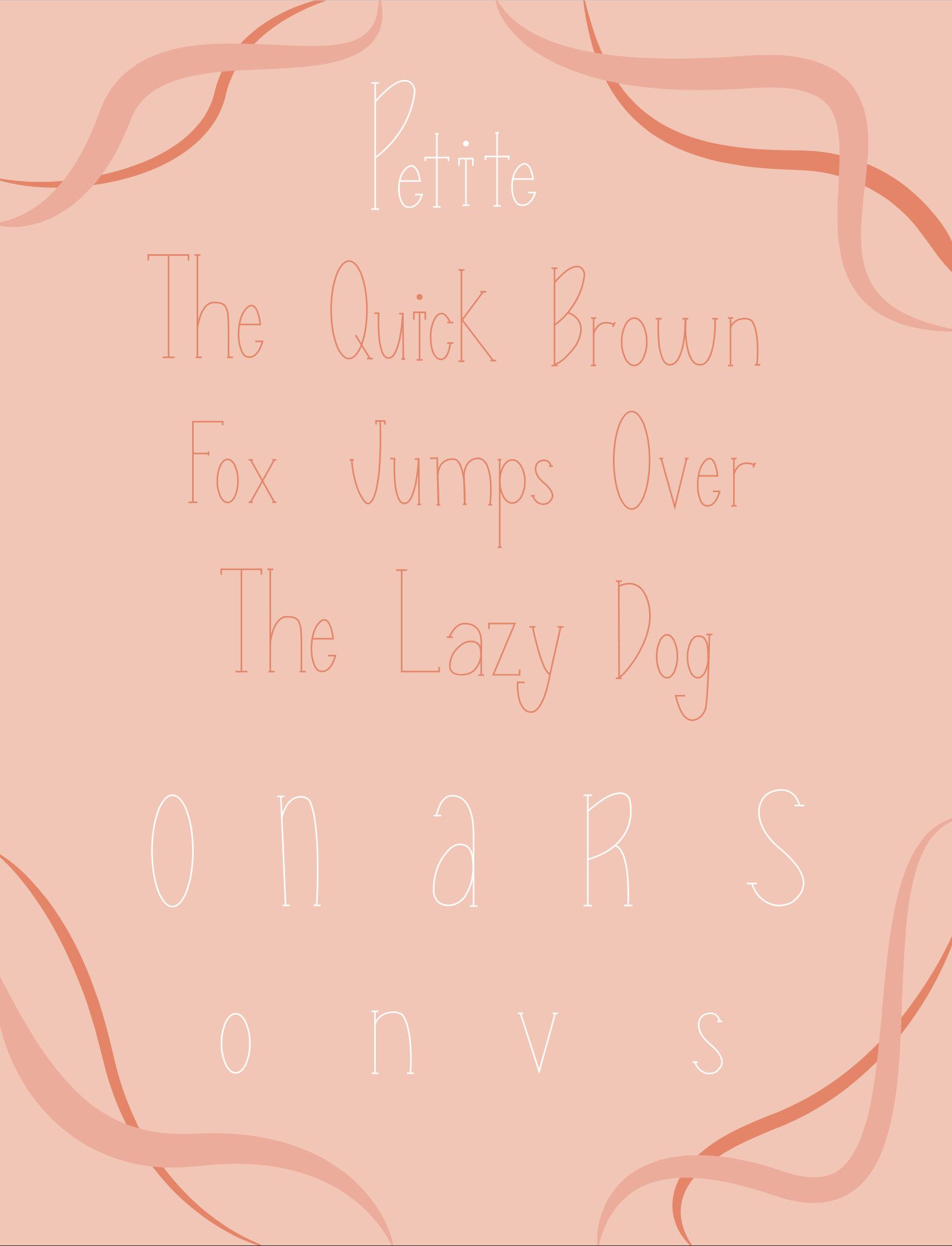
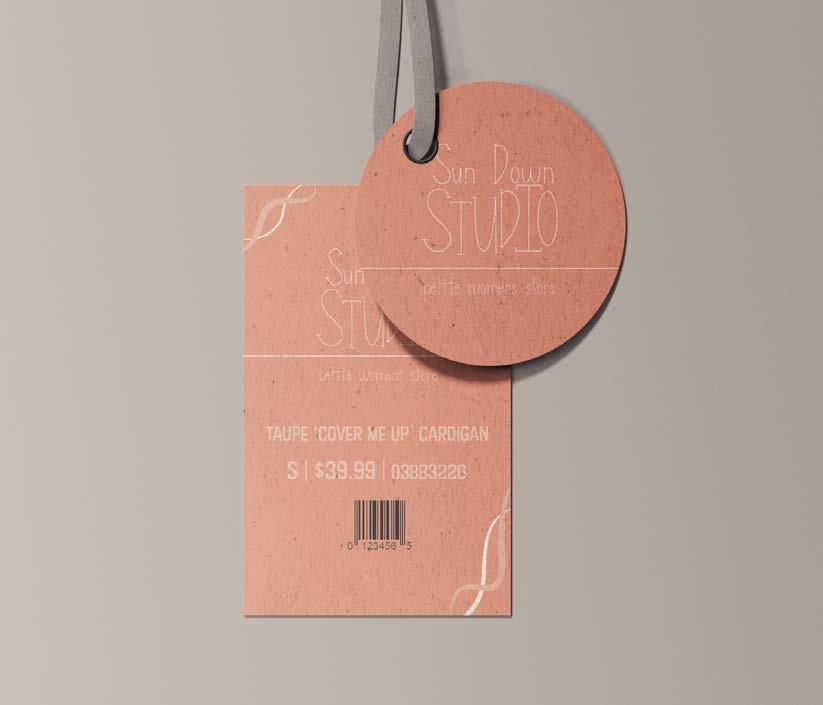
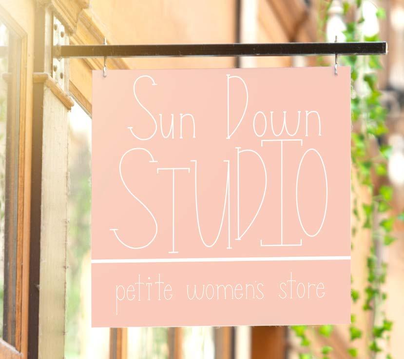
Petite: Unique Typeface
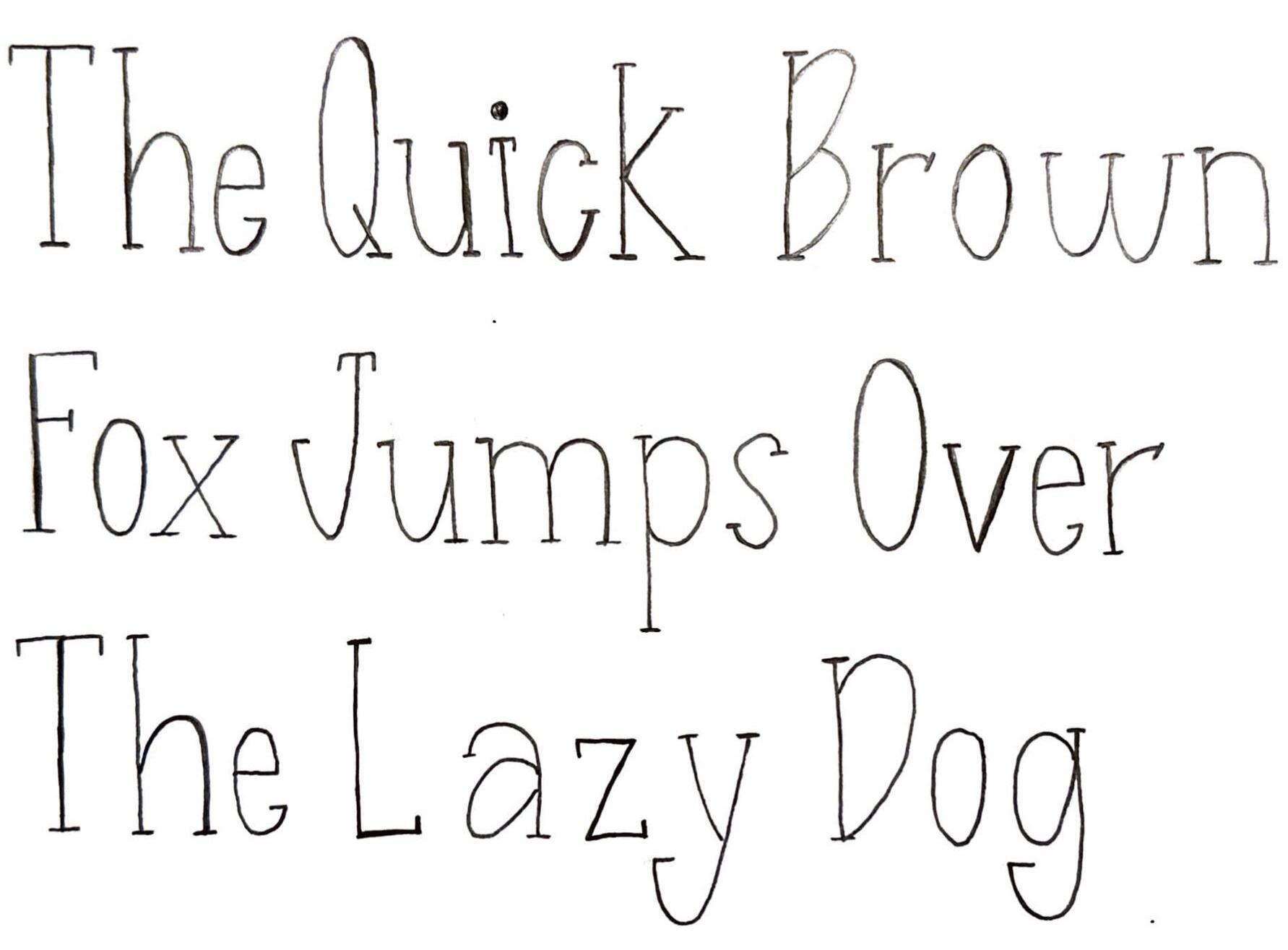
Typeface Creation | Type Specimen Poster | Collateral Design
Design Objective
Design a unique typeface that has special characteristics. Draw and digitize the type as well as create a typeface specimen poster and mockups in a natural scene where the type would be seen.
Creative Brief
The font I created is titled Petite due to the font’s thin structure. Petite is a narrow serif font that contains characteristics of the Geraldes typeface. This typeface could be used in modern areas like a café or trendy boutique. The double story “A”, narrow counter on the “O,” and the rounded vertices on the “W” and “M” are all specific to my typeface, Petite.