COLOR THEORY
CAROLINA GONZALEZ 4/21/2023 IND 5325
CULTURE
DESIGNERS
PERCEPTION
TABLE OF CONTENTS YOU + COLOR
+ COLOR
+ COLOR
THEORY
+ COLOR
+ COLOR
+ COLOR
+ COLOR
+ COLOR RETAIL + COLOR
+ COLOR HOSPITALITY + COLOR 3 5 11 13 18 20 27 29 31 37 44
MOVIES
HEALTH
BALANCE
WORKPLACE
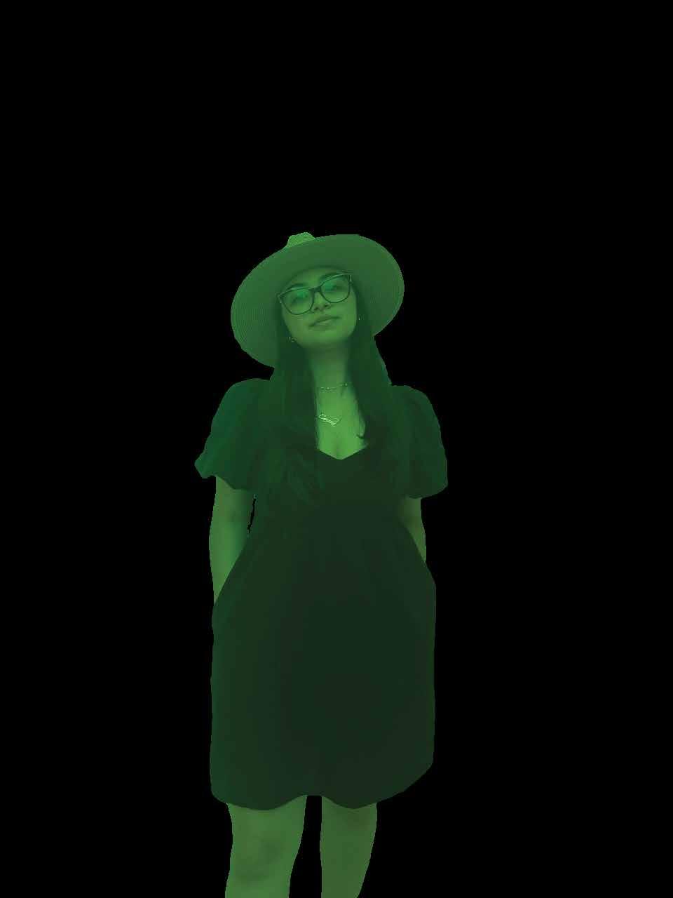
CAROLINA
WHY DESIGN?
I have always been a creative individual, whether it was through painting, music, drawing, or any other random hobby I decided to pick up. I began shadowing a family friend who is a licensed interior designer, and I quickly realized that this was my passion and I must continue with this route.
Ever since that day, I fully dove into my Interior Design Journey; I got a job at Floor and Decor as a Designer and applied for the Interior Architecture Graduate Program at FIU. It has been a fantastic journey, and I have met so many inspiring individuals along the way. I can genuinely say that I am doing what I love, and every day is a day I look forward to learning and growing.
AGE: BIRTHDAY: ZODIAC SIGN:
22 years old
ETHNICITY:
July 20, 2000
Cancer Colombian and Cuban
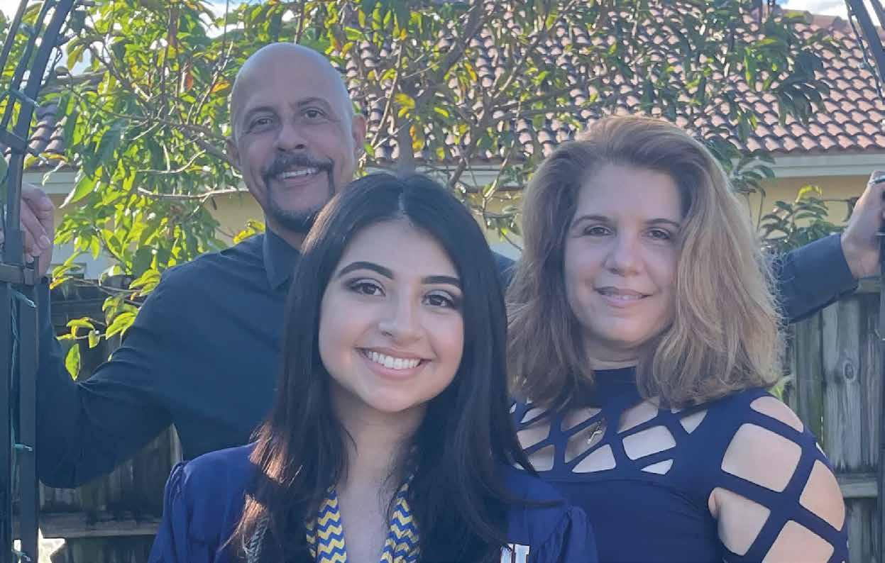
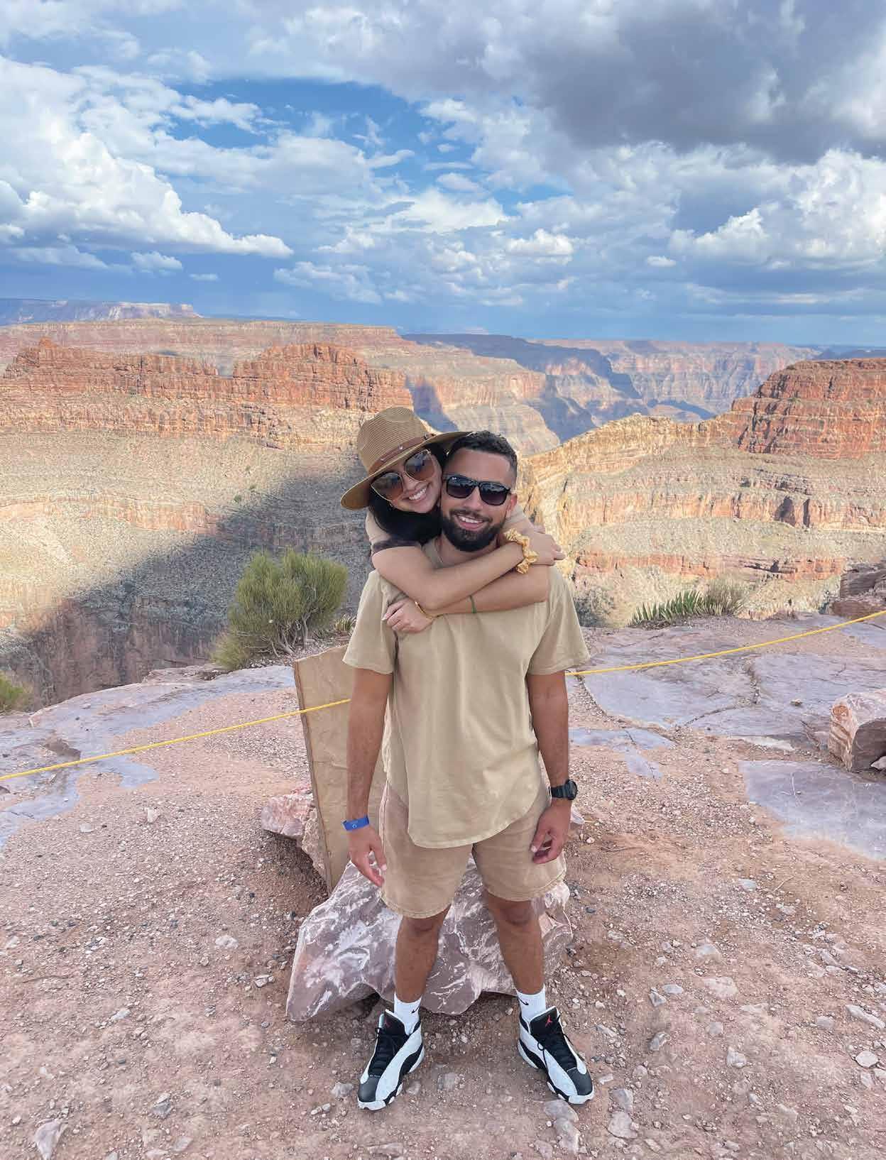
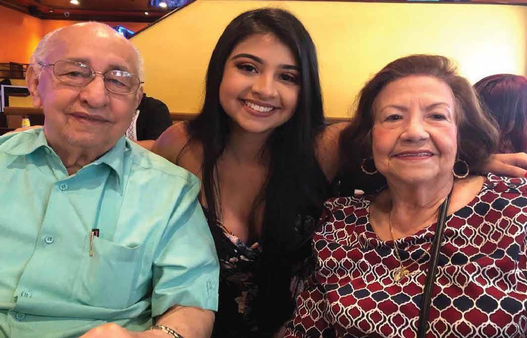
FAMILY AND FRIENDS
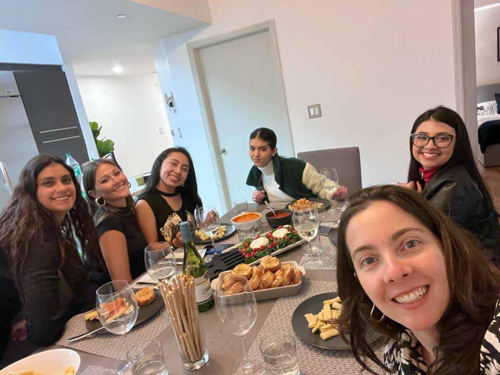

My family are what drive me to do better and follow my dreams. They are always there to support me and encourage me when I need it most. I am grateful to have them and many more not pictured here to call my family.
MODULE 1
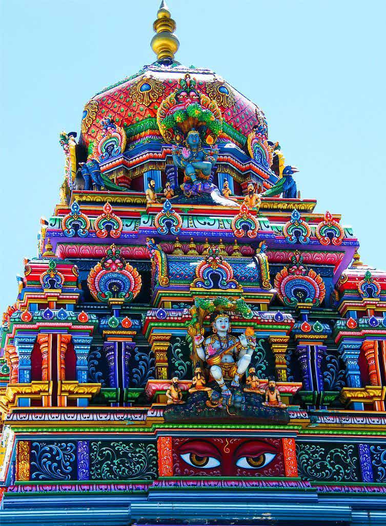
CULTURE + COLOR
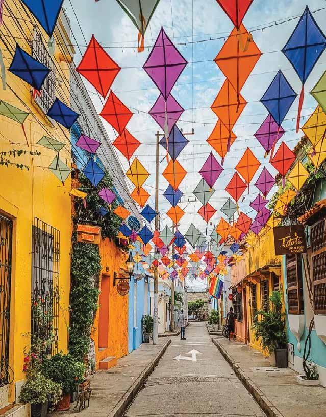
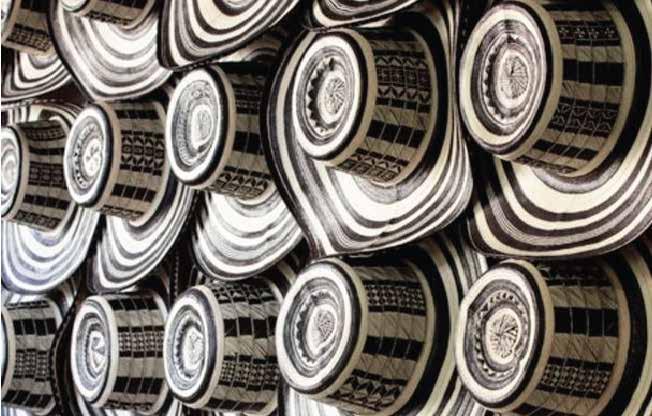
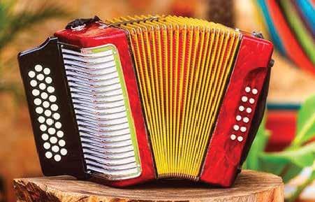
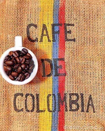
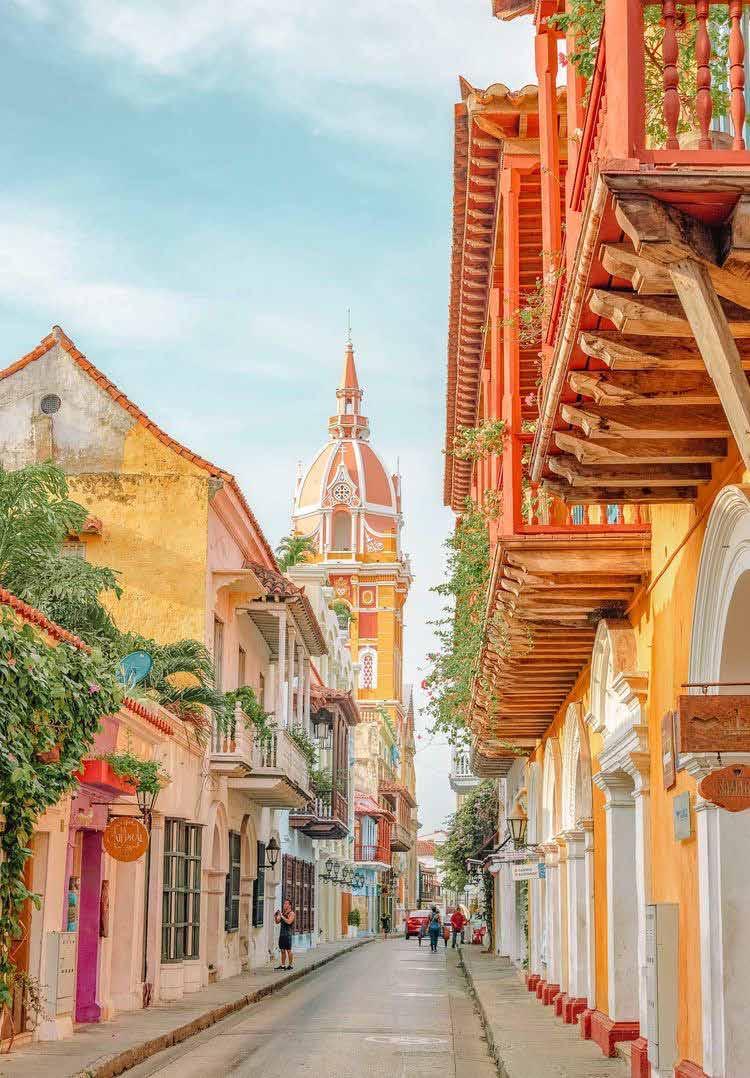
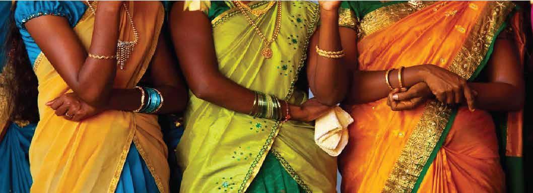
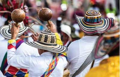
COLOMBIA
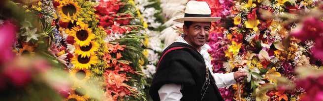
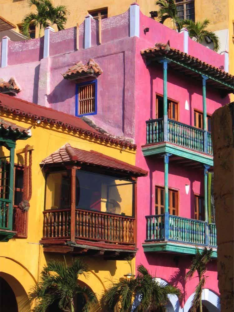
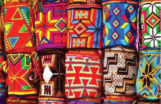
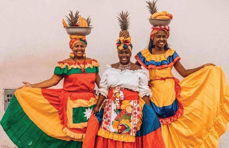
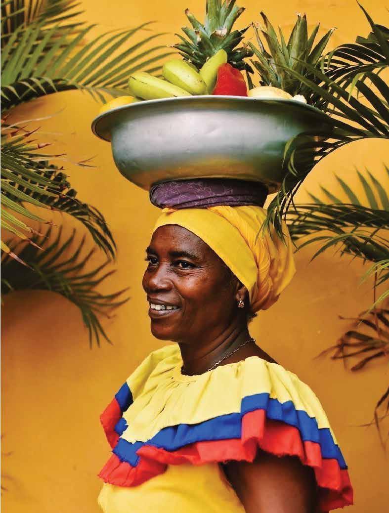
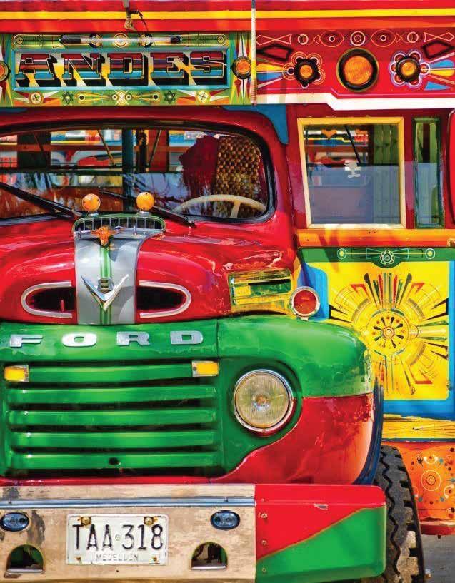
ANALYSIS
Colombia is represented through vivacious, vibrant, and versatile colors. From the colonial cities to the carnavals and wildlife, bold, bright and beautiful colors are present all around. The national flag also holds symbolic meaning for Colombian culture.
Yellow - symbolizes the country’s abundance of gold
Blue - signifies the country’s seas
Red - signifies the blood spilled fighting for Colombian independence
Much of Colombia’s color comoes from its rich biodiversity and natural environment. Green, for example, is represented by the country’s beautiful emeralds.
COLOR PALETTE
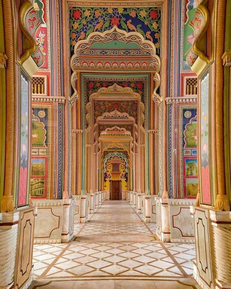
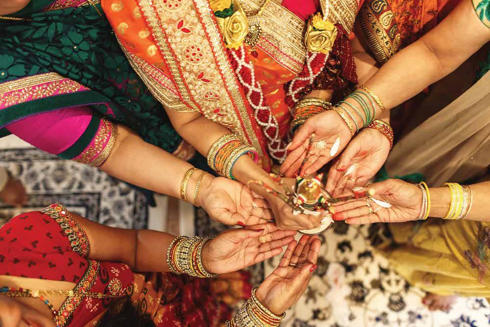
INDIA
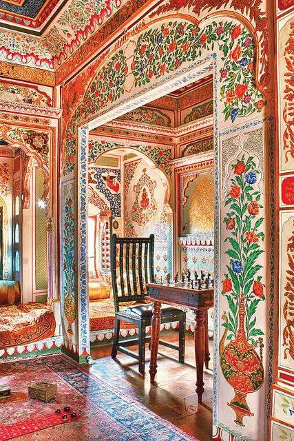
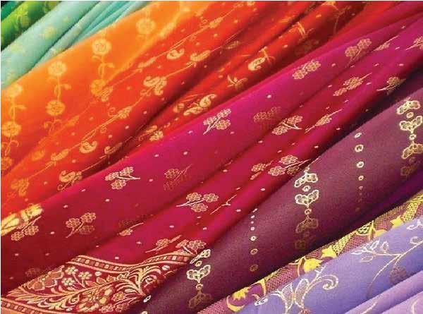
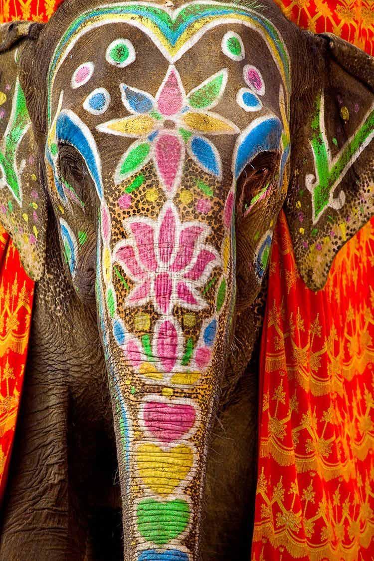
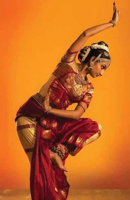
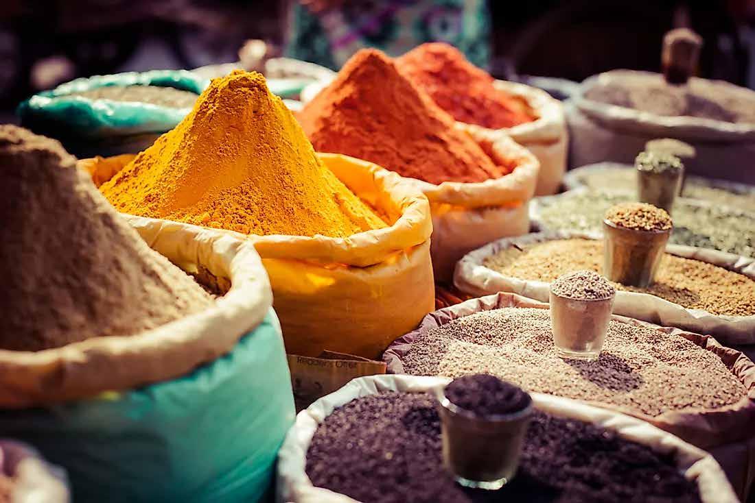
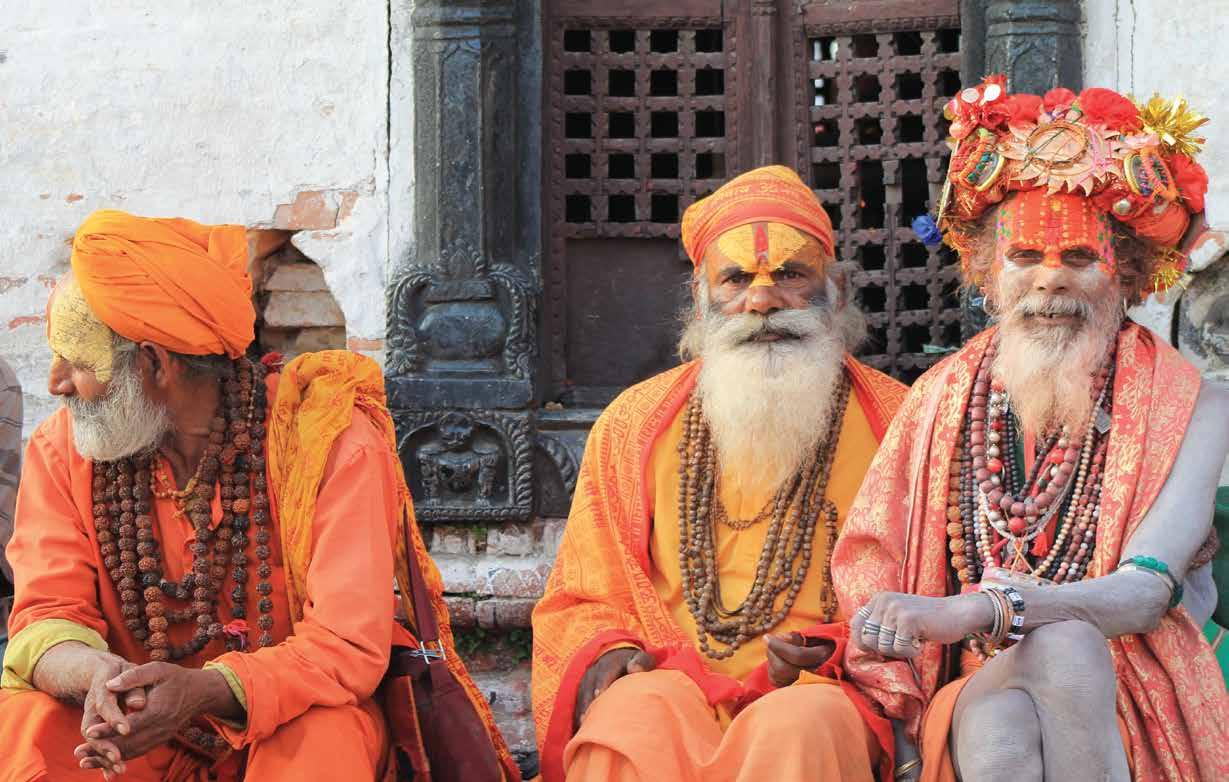
ANALYSIS
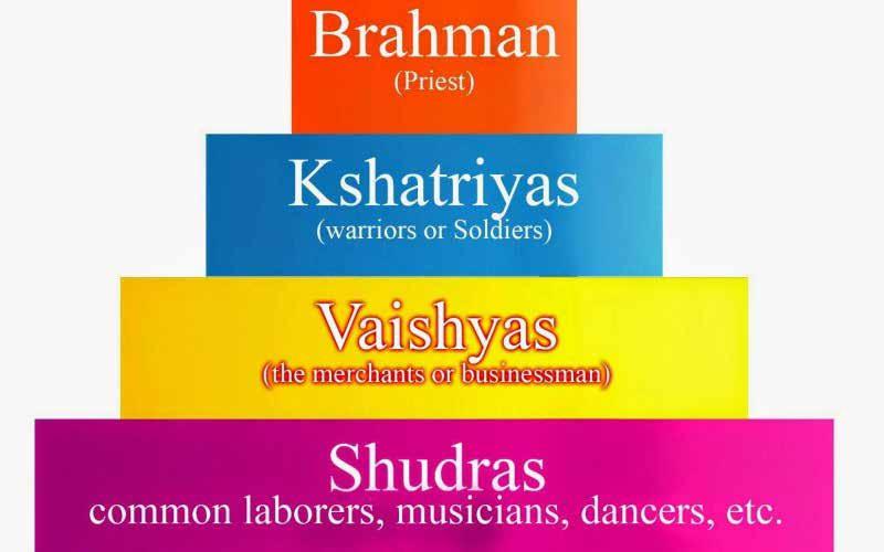
Indian philosophers believed there was a lonk between the creation of the Universe with the three Gunas. The three Gunas are tamas (darkness), rajas (passion), and sattva (essence).
Tamas - associated with the color black. Color of denial and negativity
Rajas - associated with red. Color of fire, anger, and passion
Sattva - associated with white. Color of purity and life
Indian traditions associated color with the emotional state. Early color symbolism also became distinctly linked to social groups, caste hierarchy, and birth.
COLOR PALETTE
CONCLUSION
Though these two cultures have their differences, they are both represented beautifull by their bold colors throughout their countries. Color has significant meanings for each country and play an integral part in their culture. This assignment has taught me the importance of color across borders and how essential it is in oure everyday lives.
Module 1 was an enlightening and fun assignment. I learned more about another culture through the beautiful colors they represented and viewed them in a new light. I also got the chance to see all the beautiful colors of my culture on one page, which was indeed a sight to see. I enjoyed learning more about both cultures and comparing the two. Finding similarities across cultures was an experience that I enjoyed very much.
MODULE 2 THEORY + COLOR
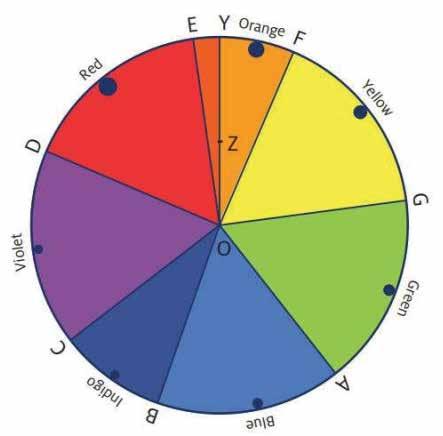
Isaac Newton was seen to be the first to present the color wheel as shown above. I would later be seen in many different ways but the color wheel consists of the visibile color of the spectrum constructed with their relative proportions, as seen when colored light is refracted.
WHAT IS COLOR THEORY?
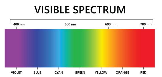
In this chapter we discovered what color theory is which is defined as, the study and practice of principles that are used to clarify the relationships between color and light in our visual experiences of art and design. Color is not seen as a tangible object rather, it is a powerful sensation that has the ability to enhance our physical environment. The colored light that we can see is called the visual spectrum depicted below.
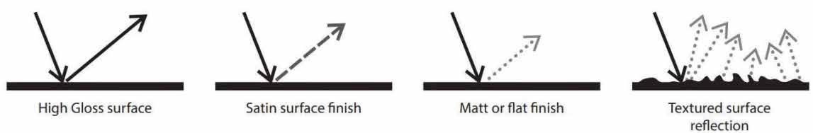
Different surfaces have different reflection characteristics. This chart visually sums up some of the most common surfaces and how light is reflected off them.
Three properties of light:
Reflection: occurs when light hits an object and light is reflected back from the object which results in the color we see
Diffraction: light is partially obstructed by an object
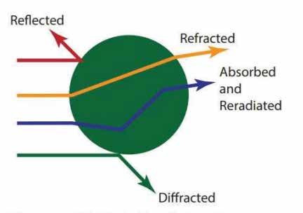
Refraction: causes light to bend
MODULE 3
DESIGNERS + COLOR
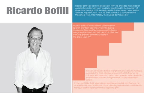
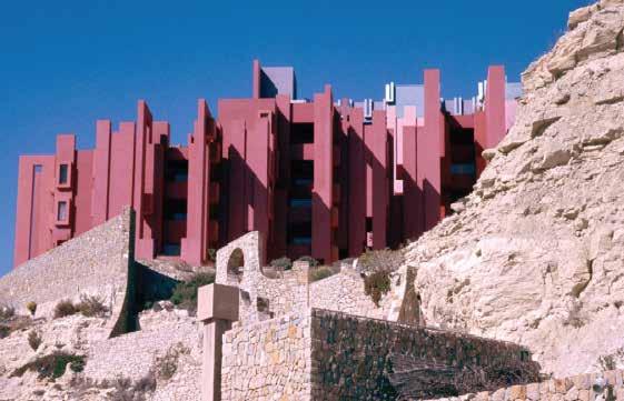
Ricardo Bofill
Ricardo Bofill was born in Barcelona in 1939. He attended the School of Architecture in his native city and later transferred to the University of Geneva.At the age of 19, he designed his first house and founded the Taller de Arquitectura in 1964. He is the author of a comprehensive theoretical work, most notably “La Ciudad del Arquitecto”
Ricardo Bofill is a world-famous postmodernist Spanish architect best known for introducing Modern Architectural Techniques and Profession Design inspired by classic touches of architecture from the splendor and artistic waste of the era of Louis XIV
The work of Ricardo Bofilli is strongly influenced by his heritage, especially the Arab-Mediterranean roots of Catalonia. His buildings, with their solid and massed volumes, often resemble the traditional kasbah - a high-walled, usually windowless fortress.
In the mid-1970s, Bofill abandoned Mediterranean folk architecture, he wanted to return to traditional urban planning elements and his interest in baroque spatial organization also began to grow
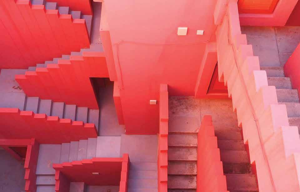
La Muralla Roja
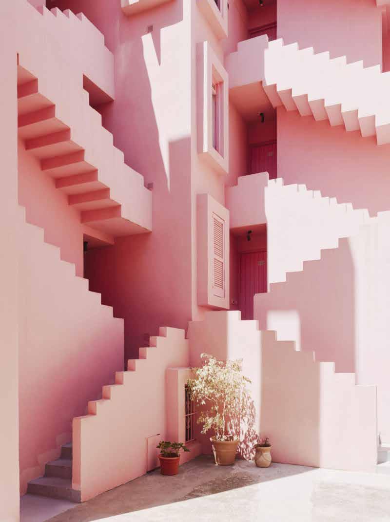
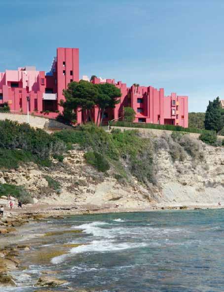
Where: Partida Manzanera, 3, 03710 Calpe, Alicante, Spain
When: Fully constructed by 1973
Was inspired by the Arab Mediterranean Architecture, particularly the adobe (clay brick) towers found in North Africa. Bofill deliberately deviated traditional architectural practice of dividing public and private spaces, by reinterpreting the Mediterranean tradition of casbah.
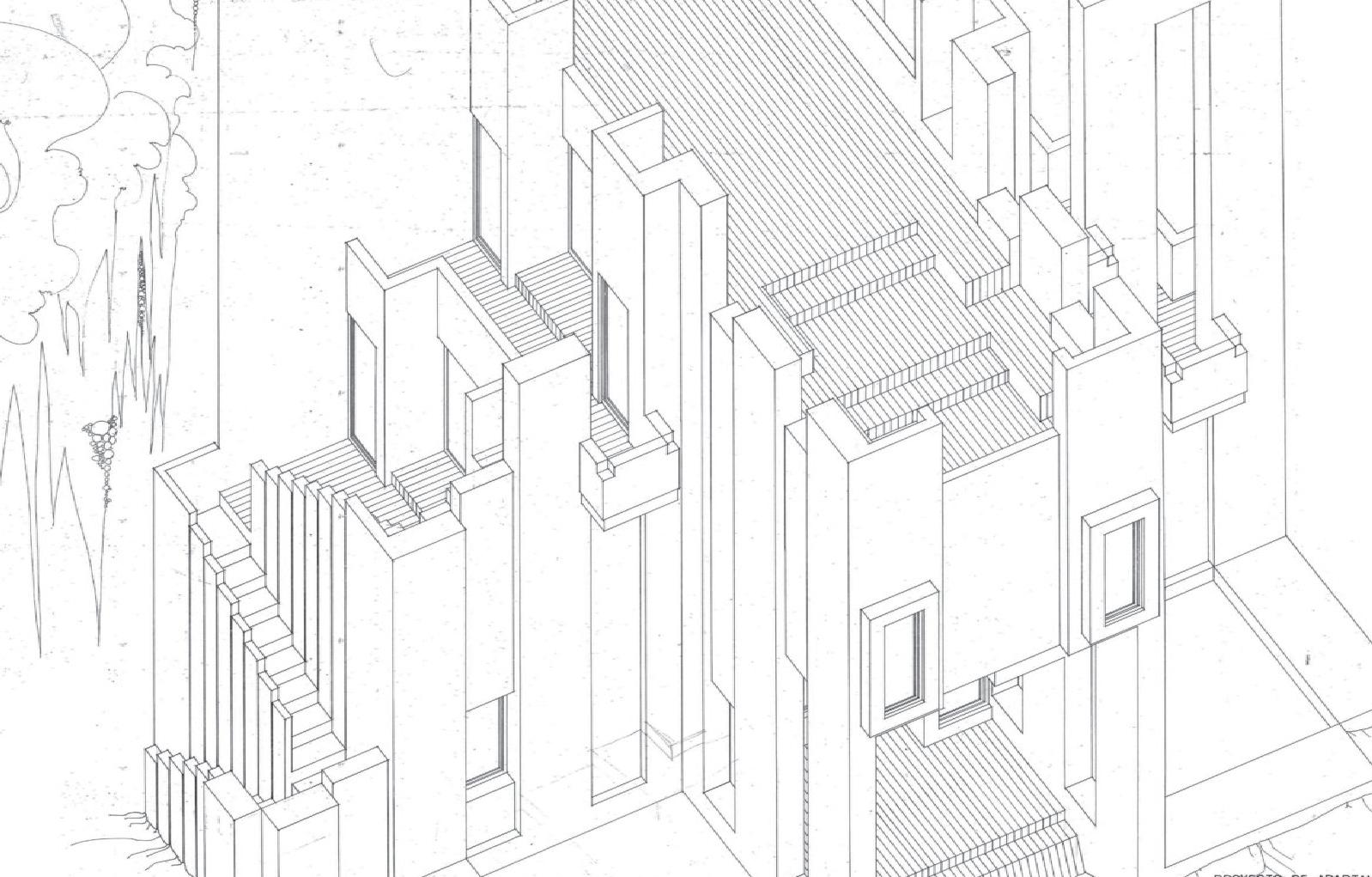
La Muralla Roja’s geometric plan was based on the typology of the Greek cross and is often described as a “Labyrinth.” The building evokes the contructivist achitecture style, which was developed in the Societ Union in the 1920s that incorporated ‘straight lines, cylinders, cubes and merged elements of the modern age.’
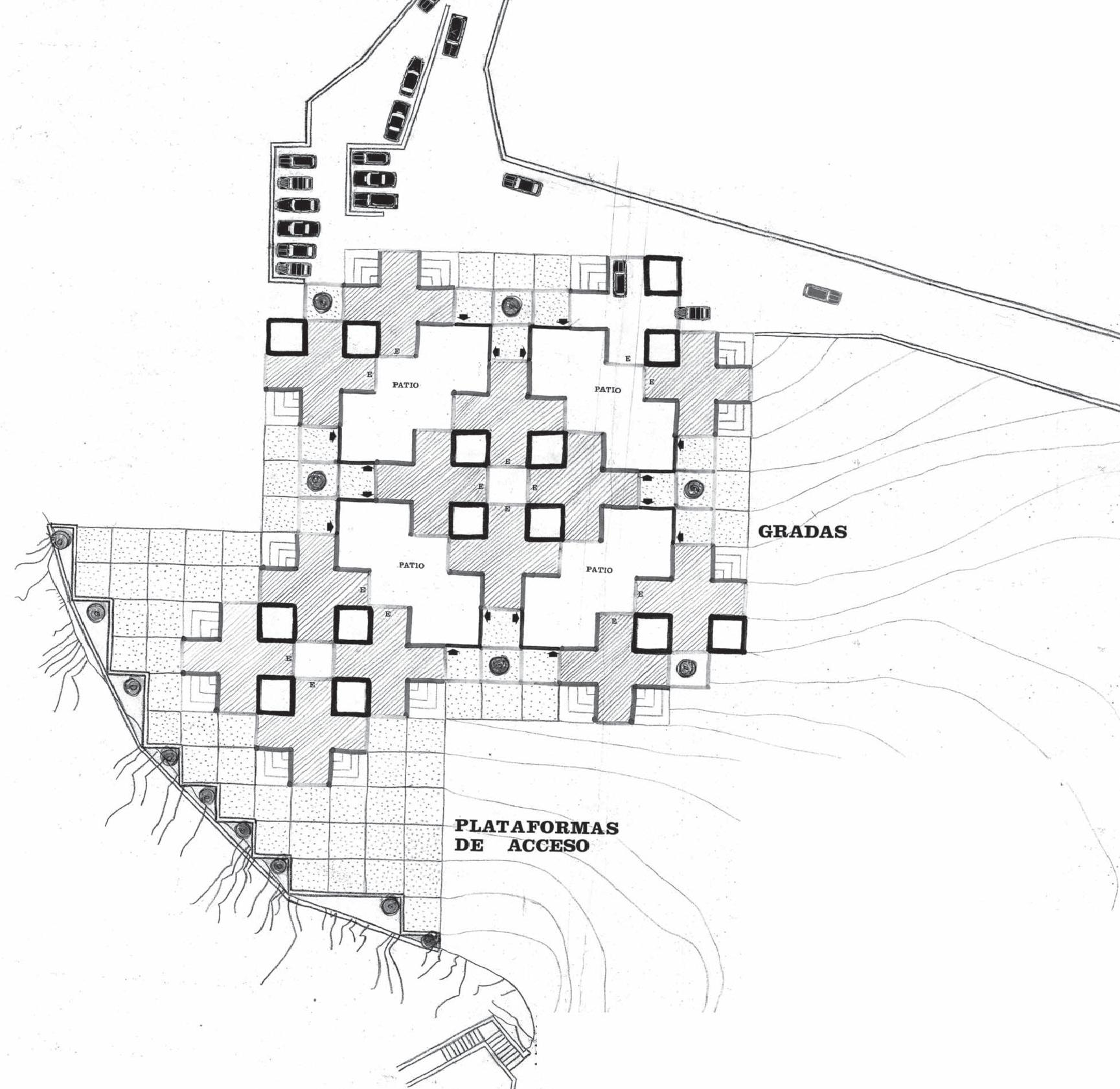
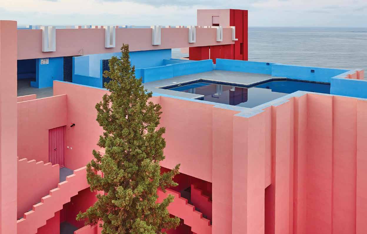
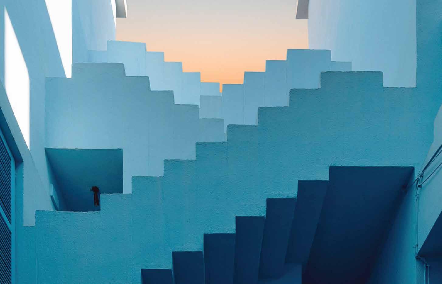
Clear seperation between exterior and interior to define common areas, courtyards and stairs which were painted with the blue hues.
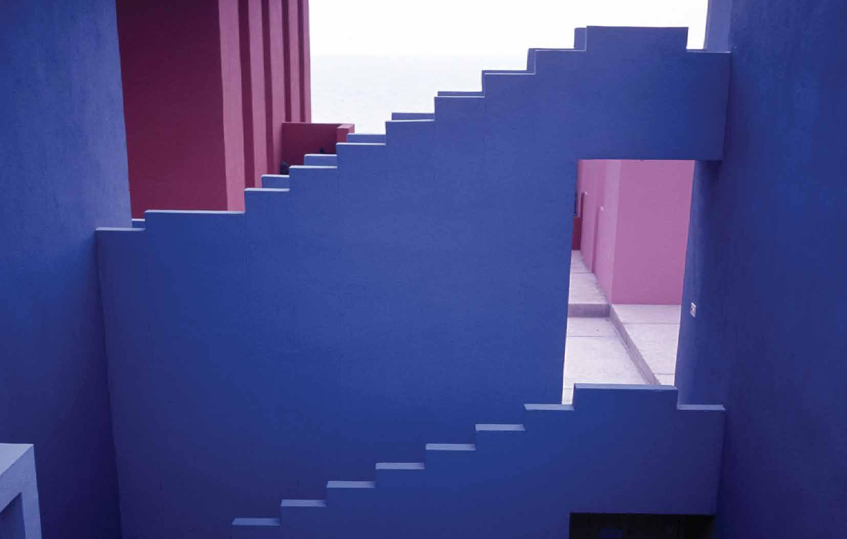
Red Hues painted on the exterior facadeto emphasise the structure’s bold contrast with the rocky landscape.
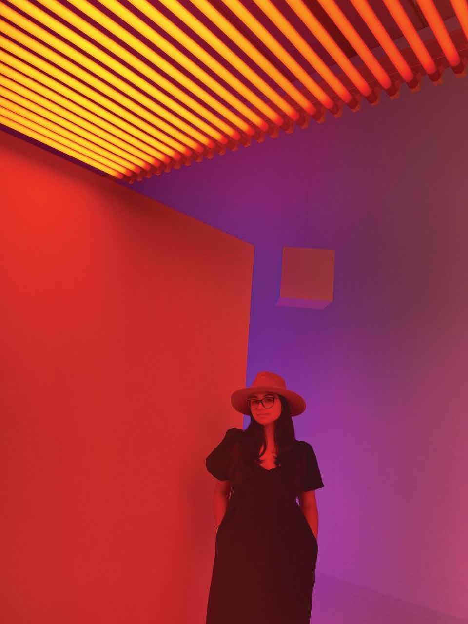
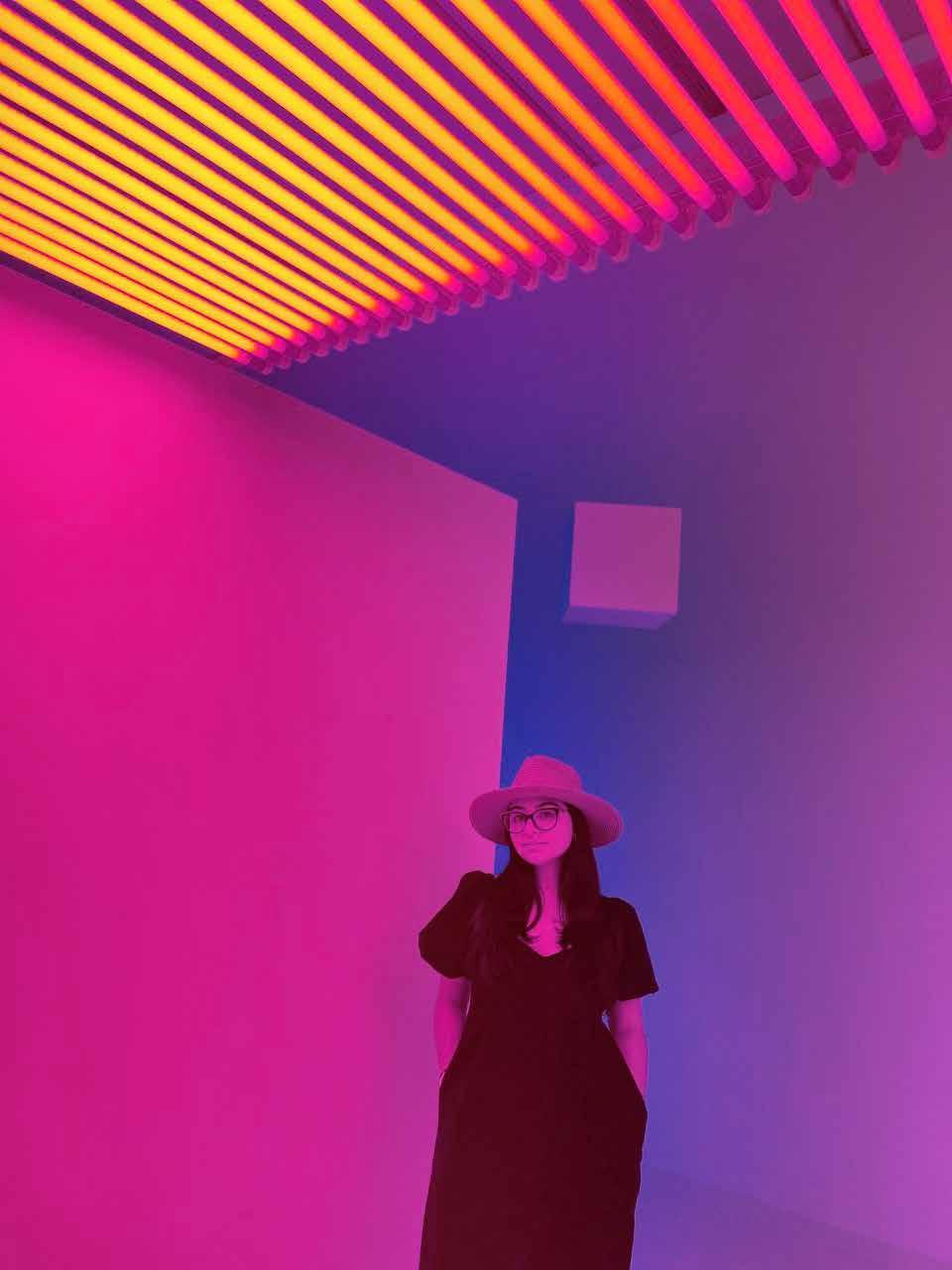
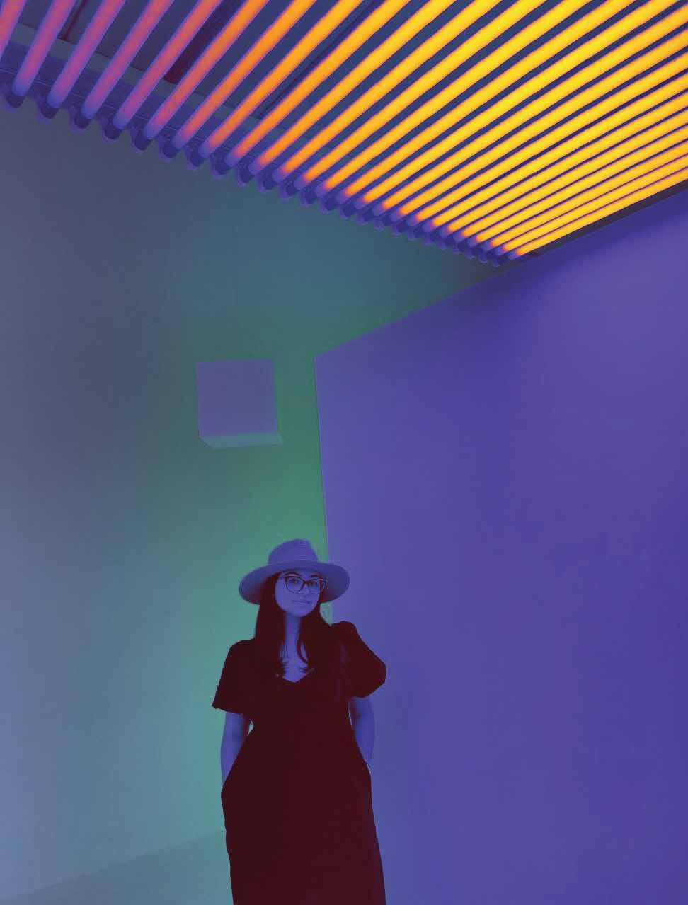
USE OF COLOR
Clever combination of color, light, and shadow work beautifully together to create a greater sense of the space. From different angles and times of the day, one is able to live a completely different experience which makes this project strikingly beautiful.
The play with light and shadow within the interior of the building allows for darker hues to appear and create a deeper contrast.
Blue Hues were applied in the interior to contrast and blend with the Mediterranean sky.
CONCLUSION
MODULE 4
PERCEPTION + COLOR
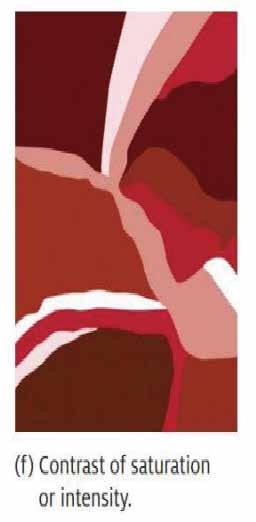
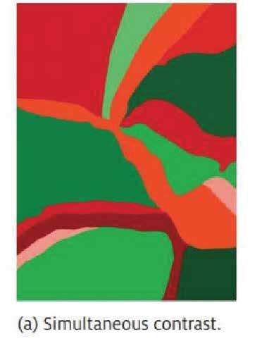
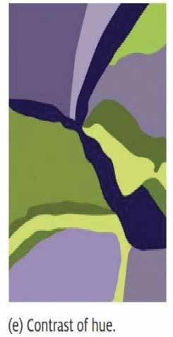
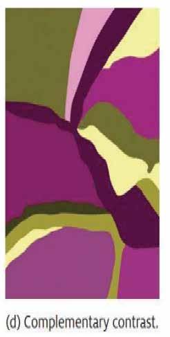
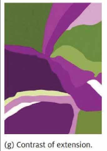
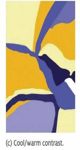
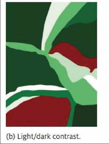
Seven types of color contrast identified by Itten. Designers can use these color contrasts to manipulate and control an interior space.
COLOR PERCEPTION
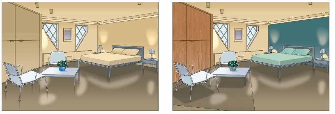
Color response is highly personal and different people may have different view points to the same color. Emotional responses to color vary from person to person. We use color to describe our emotions and feelings. The color red may have a negative emotion to one person but signify a positive emotion to another person.
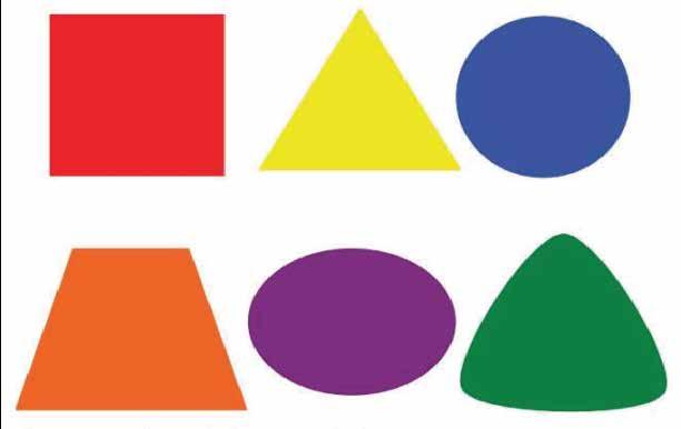
Color meanings also may vary from culture to culture. Color that is associated with certain objects or shapes can produce a strong psychological response between the object and the user. Color also has an association with shapes as we see in the image below.
MODULE 5 MOVIES+ COLOR
SUMMARY
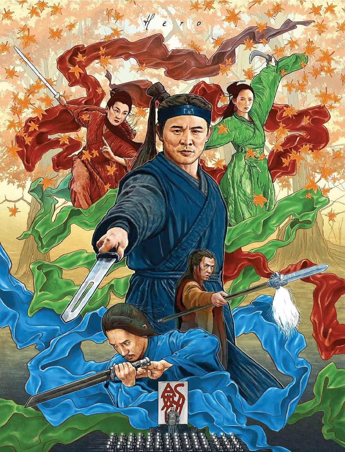
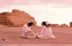
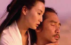
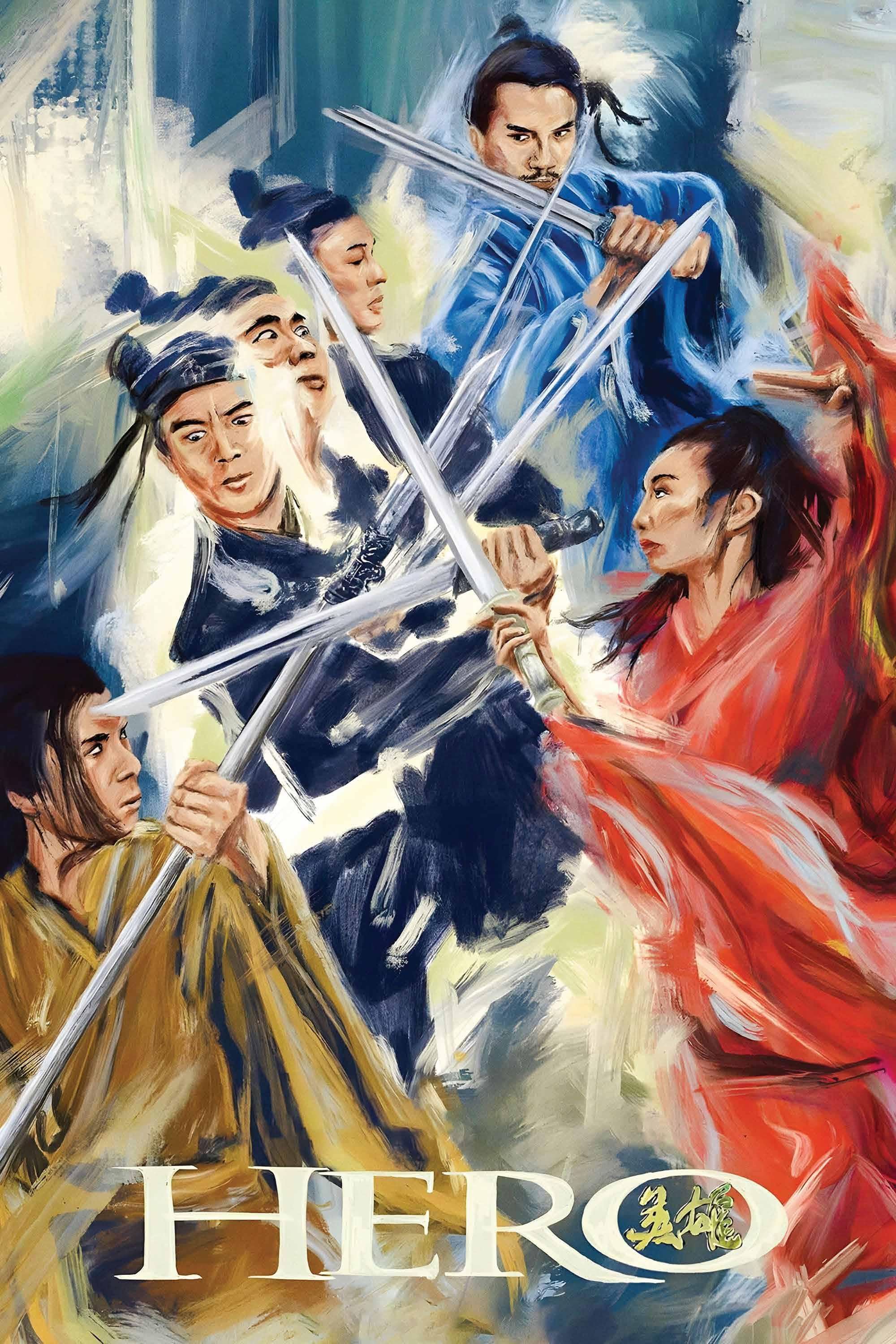
The Plot of the film “Hero” tells the story of a lone warrior known as “Nameless” who was summoned to visit the King of Qin because he claims he has killed the enemies of the King who are known as Sky, Broken Sword, and Flying Snow. However, when Nameless recounts his battles, the King begins to question some of the details, interjecting his take on these versions of events.
The movie uses five main colors as the main narrative elements: Black, Red, Blue, Green, and White. Zhang Yimou uses different colors to narrate the story from different perspectives which allows the audience to have a clear understanding of the story based on the vision of different characters and their situations. Therefore, the medium of shifting perspectives in the movie Hero is COLOR.
COLOR PALETTE
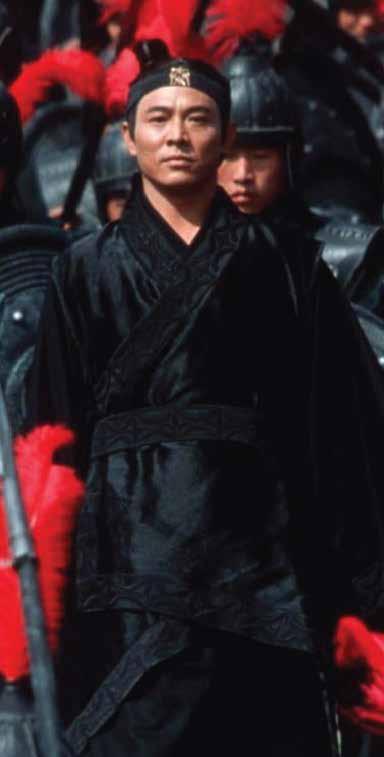
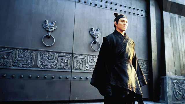
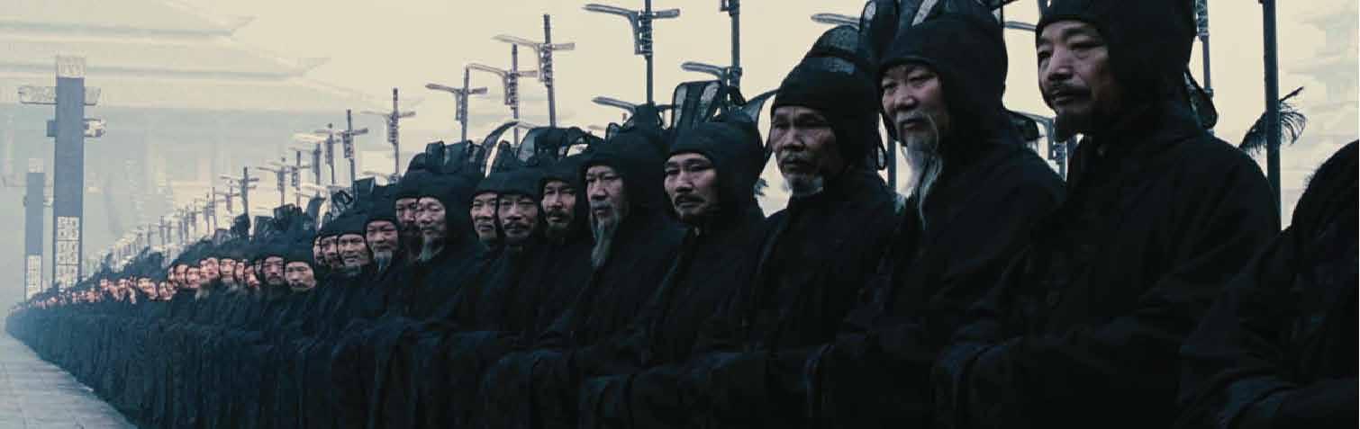
BLACK WORLD
In the beginning of the movie, Nameless enters the King’s palace where the soldiers, the King’s garb, and Nameless’s garb are all black. The amount of black in the scenes can give people a strong sense of oppression and demonstrates dissatisfaction and resentment of the people when the king waged war against the six states. Many of the scenes that involved black were still shots making the color black seem like a hard stone.
In Chinese culture, black is usually associated with death, sadness, lonliness, coldness. Black in this movie signifies the cold bloodedness and stillness of the Empire.

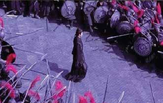
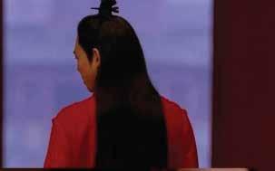
RED WORLD
The Red World signifies jealousy, lust, envy, and strong love. The falling leaves scene is the most classic representation of the collision of love and jealousy amongst Broken Sword, Flying Snow, and Moon. The red world can be seen as a fiery life.
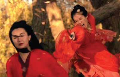
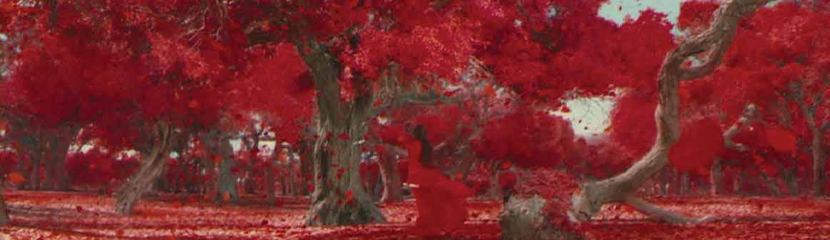
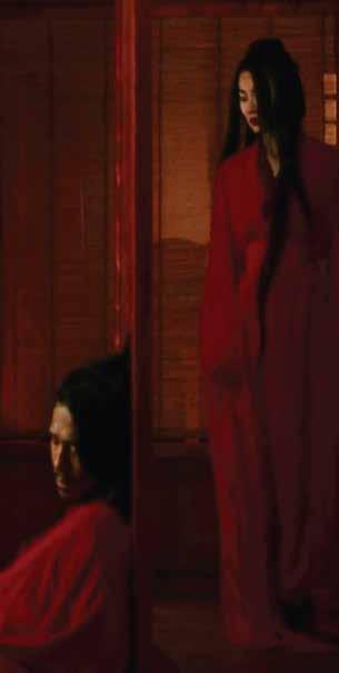
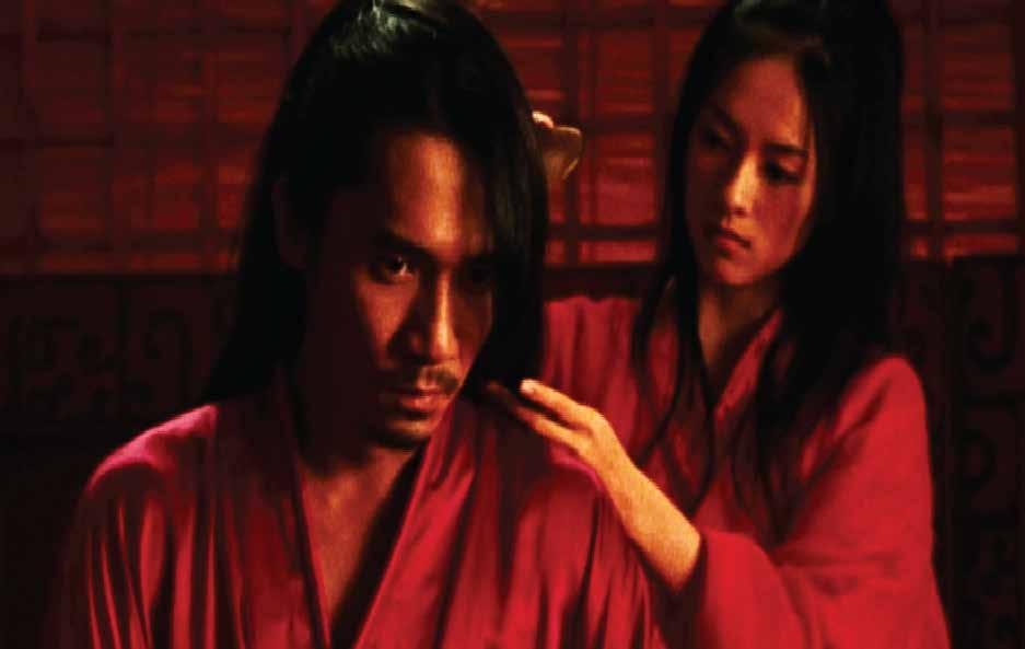
We see in the movie that the color red has different meanings for different characters. Therefore, the angry red of one character can be the lustful or passionate red of another.
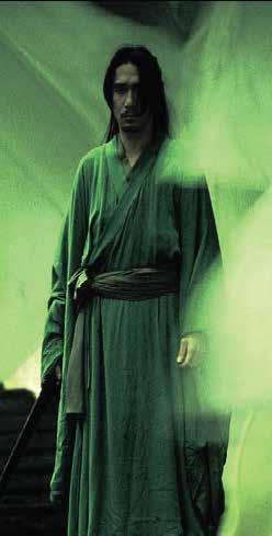
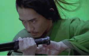
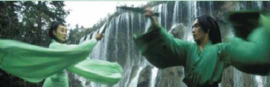
GREEN WORLD
The Green World is usually associated with beautiful landscapes covored in green trees and a peaceful river. Camera scenes in the movie are usually still to create a peaceful connection to the color green and demonstrates the happiness in the couple’s hearts.
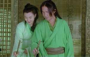
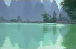
Green in the movie also symbolizes hope, happiness, and liveliness which are associated with nature.
WHITE WORLD
The White World signifies the pure world and a new beginning. This is made noticable with the white scenes and demonstrates a level of sadness as the audience experiences the pain the characters had to suffer in order to come to a new beginning.
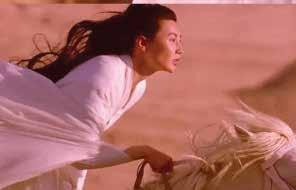
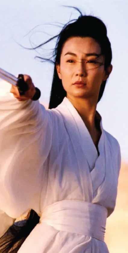
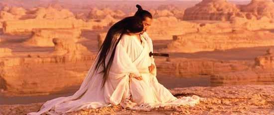
In Chinese culture, white is worn when people are in mourning. Therefore, these scenes signify the mourning for their countries independence and each other’s lives.
CONCLUSION
Through the use of the five main colors: Black, Red, Blue, Green, and White, Zhang Yimou is able to deliver a beautiful cinematic masterpiece that uses color to tell the tragic story of Chinese cultural events. The use of color distinguishes the perspectives of the characters from the film and allows the audience to be fully connected to the characters. The audience has a stronger emotional connection which is facilitated through the use of color throughout the film.
This experience was very fun and eye opening to take a deeper dive at how color can be used in movies. This movie is not a movie I would normally watch yet it has to be one of the most beautiful movies I have ever seen. The use of color was utilized to the director's advantage to distinguish scenes and characters in a remarkable way and allowed me get a deeper understanding of the storyline throughout the movie.
MODULE 6
HEALTH + COLOR
The manchester color wheel was designed to be a way to determine patient’s moods based on the color they choose on this wheel. It described common health issues such as healthy, anxious, or depressed.
COLOR AND HEALTH
One of the main topics of this chapter is hte idea that color selection may aid in supporting someone’s health and well-being. Certain colors can enhance our mood, mental health, and anxiety levels. Therefore, it is important that us as designers take into account the psychological aspect of colors to consider the affects it has on human behavior.
UNIVERSAL DESIGN
Defined as the practice of including all people dispite their disabilities. This means designing for ADA compliance in every space is important.
ADAPTABLE DESIGN
Designed as spaces that can be changed easily over time to take into consideration the needs of an individual. This may include adding wood blocks in a bathroom to support grab bars for a bathroom space.
VISITABILITY
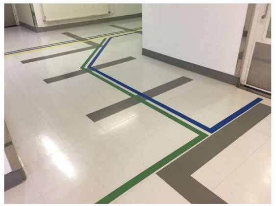
Wayfinding used in a Hospital floor to allow easy acces for patients and visitors to find their way around the space.
Means designing a space that allows users who may need a wheelchair to have full access to the first and ground level of an area. This provides access through removing steps and providing clear door widths for the passage of a wheelchair.
MODULE 7
BALANCE + COLOR
COLOR AND BALANCE
Palette balance is poor, lacks stimulation
Palette balance too darks which lacks stimulation
The term Balance refers to the relationship between different hues and how they relate with one another when each is considered equal in percieved visual weight. Therefore, a big part of balance is symmetry which is the arrangement of elements to be equally balanced on an implied axis. A state of beauty is percieved when symmetry and balanced occurs which is why it is important for designers to be familier with these terms.
CONTRAST
Contrast is opposition to create or emphasize the difference between two objects. High contrast is recommended for areas that have safety concerns, such as edges to prevent falls. Low Contrast is recommended in medical waiting rooms to minimize levels of anxiety or tension.
Palette balances light and dark values which adds interest
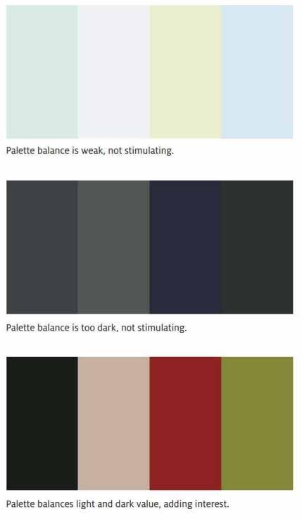
Lacks visual contrast and balance
Introduction of color, texture, adds visual contrast and balance
MODULE 8
RETAIL + COLOR
INTRODUCTION
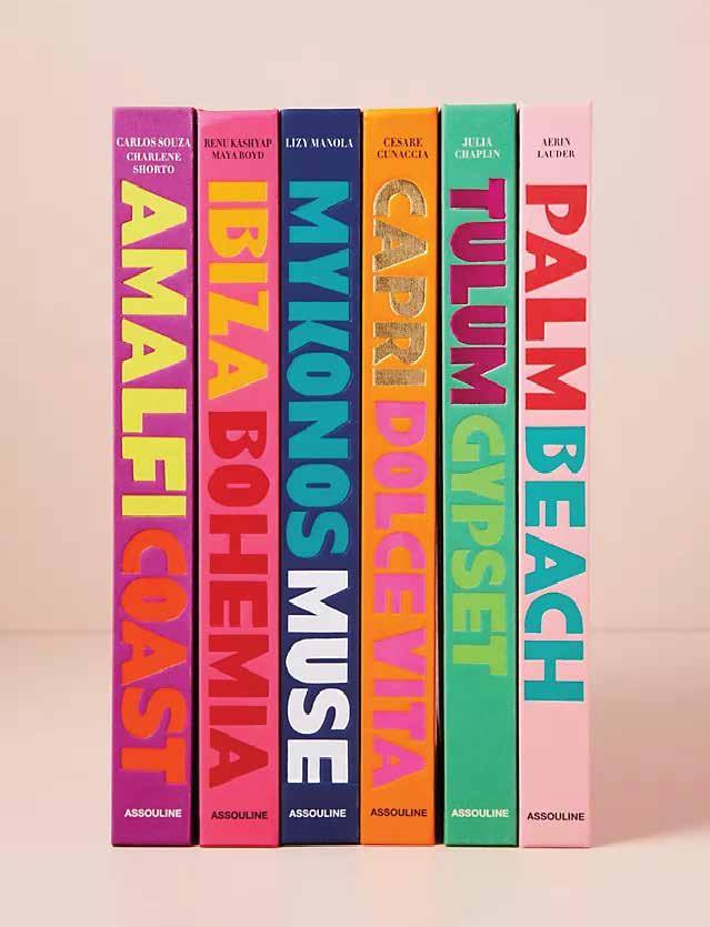
Assouline was founded in 1994 in Paris by Prosper and Martine Assouline. They are considered the first luxary brand on culture depicting travel, art, fashion and design stories. This brand began with a desire to create a new style for books using the couple’s experience to create visually rich stories and compelling narratives.
Visual emphasis through contrast is an essential tool in helping users find their way through a space. Designers use EMPHASIS as a tool for creating points of interest for aesthetic and orientation purposes.
When a composition has no emphasis, nothing stands out. As a result, designers use COLOR to emphasize guides that attract the user’s attention and deliver an intended message.
One of the fundamental principles of color used for design is through CONTRAST which is the visual, dimensional,or quantitative differences that distinguish one shape from another.
Through the examination of Assouline's (a book publisher and luxury lifestyle company) retail design, we will see how COLOR is used to CONTRAST visual elements within the store to create an overall EMPHASIS on the products and facilitating wayfinding.
CONTRAST OF HUE
To create a contrast in hue, you can select colors that are opposite one another on the color wheel which uses the paint at full intensity. Colors of lower intensity are seen as more subtle and enjoyed for secondary elements within a space.
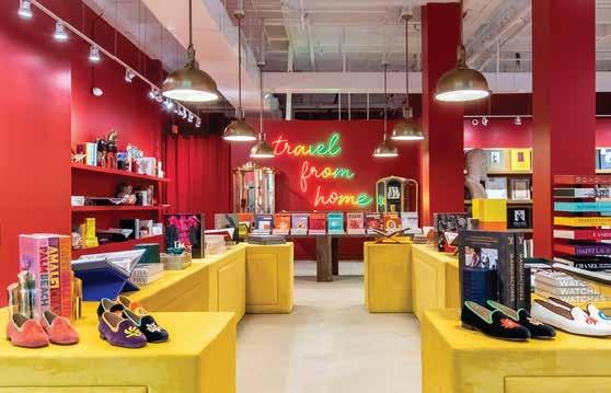
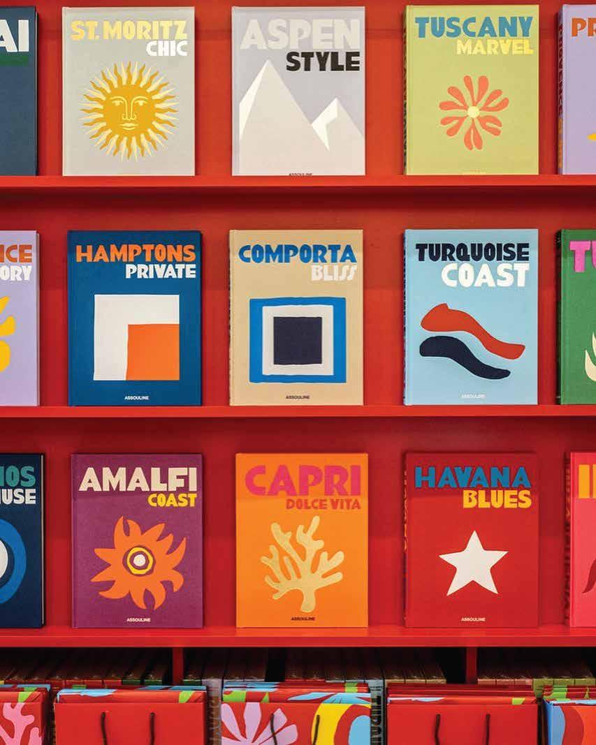
The yellow and red create the most intense contrast in hue within this retail space. In a retail space, thisis effective because it grabs customers’ attention, allowing that striking factor before they breeze through the product display. Other subtle intensities are contrasted with the products themselves against the red background.
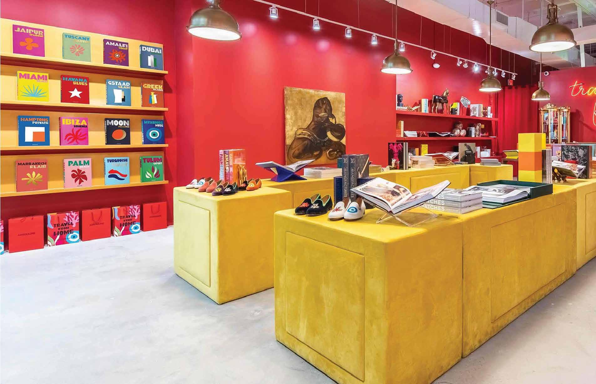
However, we see that if we take away this contrast in hue, then the products are blended, and there is novisual focus that draws your eyes to the products.
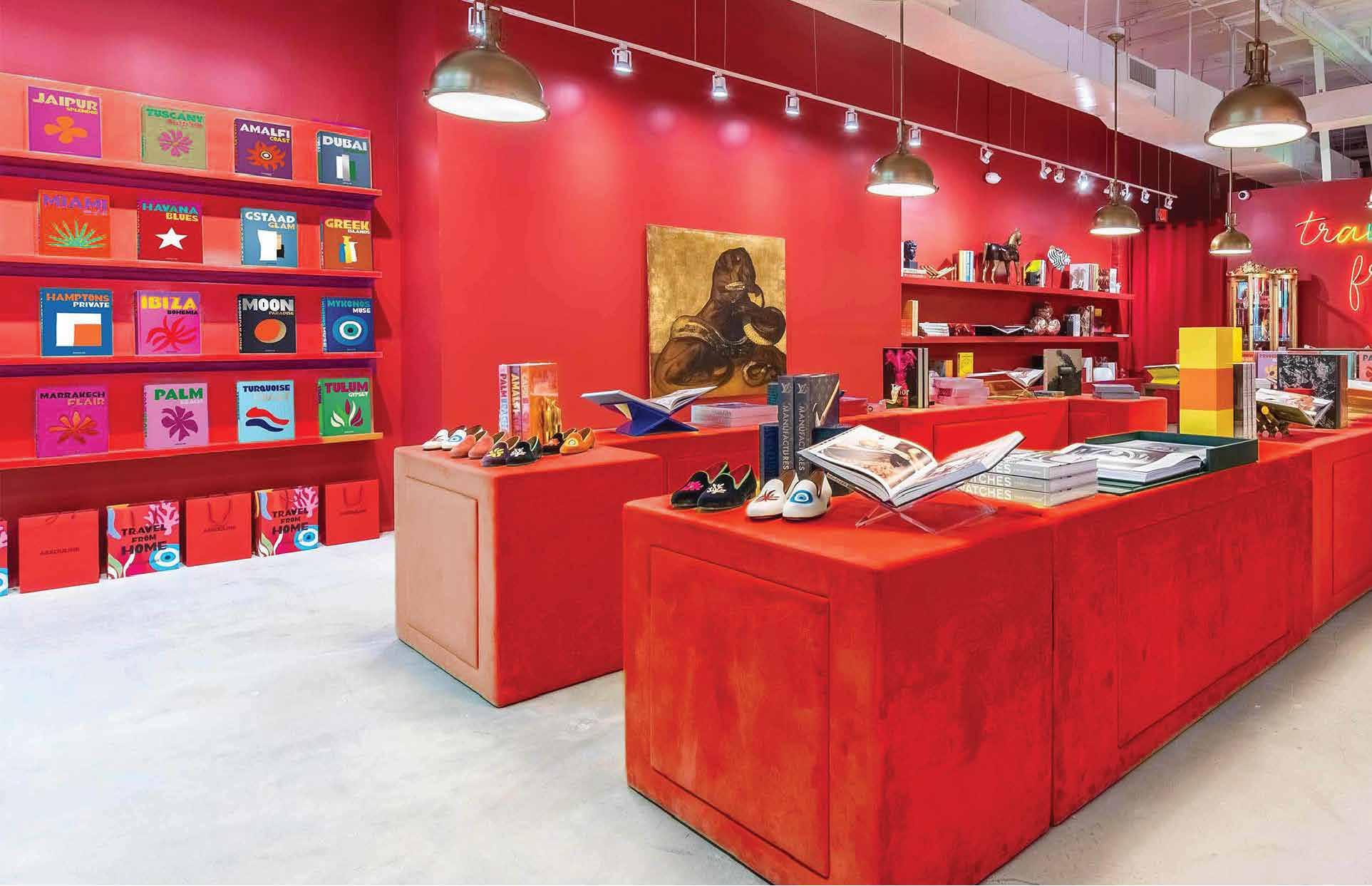
CONTRAST OF VALUES
Value Contrast is created with a light/dark contrast of black, gray, or white values. It is the relationshipbetween a light area and a dark area. This creates an added value within the space and allows for more depth in contrast.
This example shows value contrast with the white-painted ceiling and light-colored concrete on the floor. This creates a more profound contrast within the space and encourages customers to focus on the products. It allows their eyes to have a place to focus on, serving as a guide.
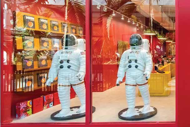
CONTRAST OF DESIGN FEATURES
Design features and design elements can also have a contrast with the interior of a space. This contrast will make the design element stand out and have more of a focal effect on the audience.
Here we see the contrast between the white astronauts and the red and yellow interior. This white of the astronaut suits is placed on purpose to create a focal point in the storefront, drawing customers into the store.
CONTRAST OF TEXTURE
The use of color and texture can create a nice contrast amongst materials that can be seen as rougher or smoother.
Within this example, we see the contrast in different textures to create a reading area that stands out amongst the products. The soft rug below makes the space warm and inviting while the metal, glass, and signature Assouline red leather chairs keep the level of sophistication the brand wants to convey.
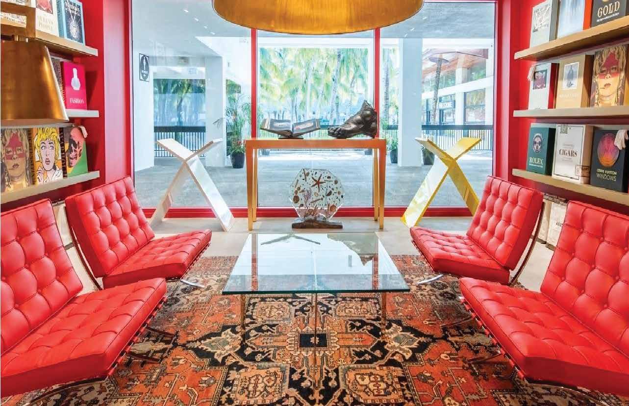
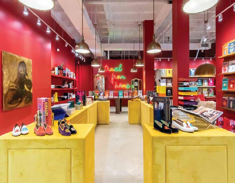
FOCAL POINT
A focal point is a single design element that receives the most visual emphasis in a room. It facilitates wayfinding by allowing visitors to be attracted to a space and walk toward the focal point. Focal points may be art or pieces of furniture.
Within this space, it is challenging to depict exactly where the focal point is since the interior provides much contrast and design elements that could be seen as a “focal point.” However, the iconic “travel from home” sign is a recurring design feature that is present in all of the Assouline stores and is seen as the focal point of the store, which encourages customers to go deeper within the store. By placing the sign at the end of the store, it intrigues the audience to see what is inside and take a closer look at the products.
CONCLUSION
Analyzing the different elements that make up contrast, we can see how successfully Assouline has delivered an interior design that adds emphasis on the products through color.
The luxary brand Assouline utilizes their signature red color, along with other complimentary colors in their retail space with intention for their customers. Their focus is to capture and retain their customers while guiding them within the space through their products and design features.
This assignment was fun and insightful. After reading the chapter, it helped me understand the elements of contrast the store I chose, Assouline, was intended to use within their retail space. The first time I visited this store in Bal Harbour I loved the use of color throughout the space and how much I wanted to buy a coffee table book but they are so expensive!! Maybe one day, but visiting that store is definitely like traveling around the world and I always enjoy visiting.
MODULE 9
WORKPLACE + COLOR
CORPORATE SPACE
Designed By: Gensler
Where: Midtown Manhattan in the Grace Building
Square Feet: 65,000
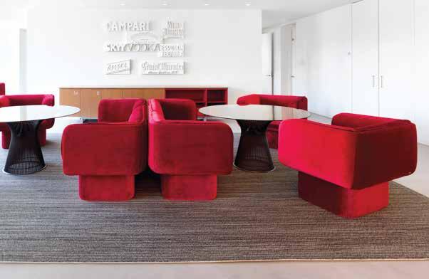
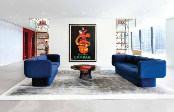
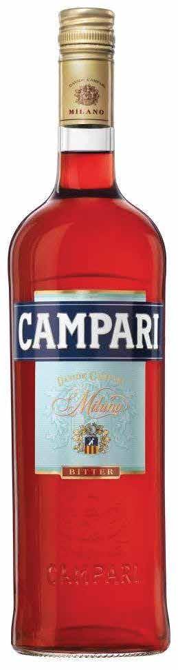
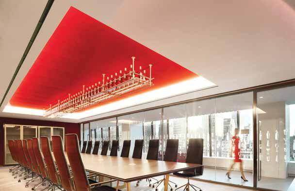
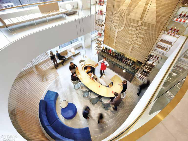
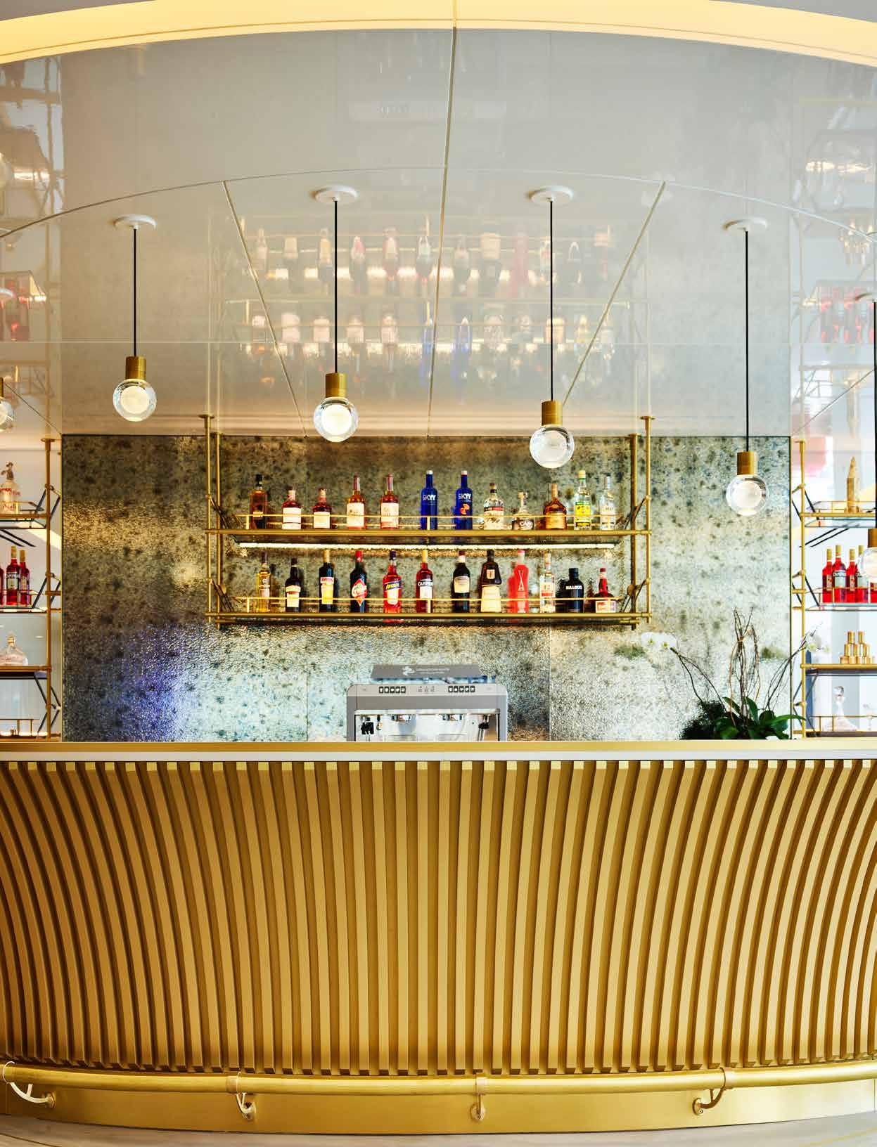
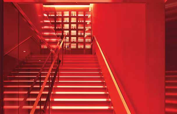
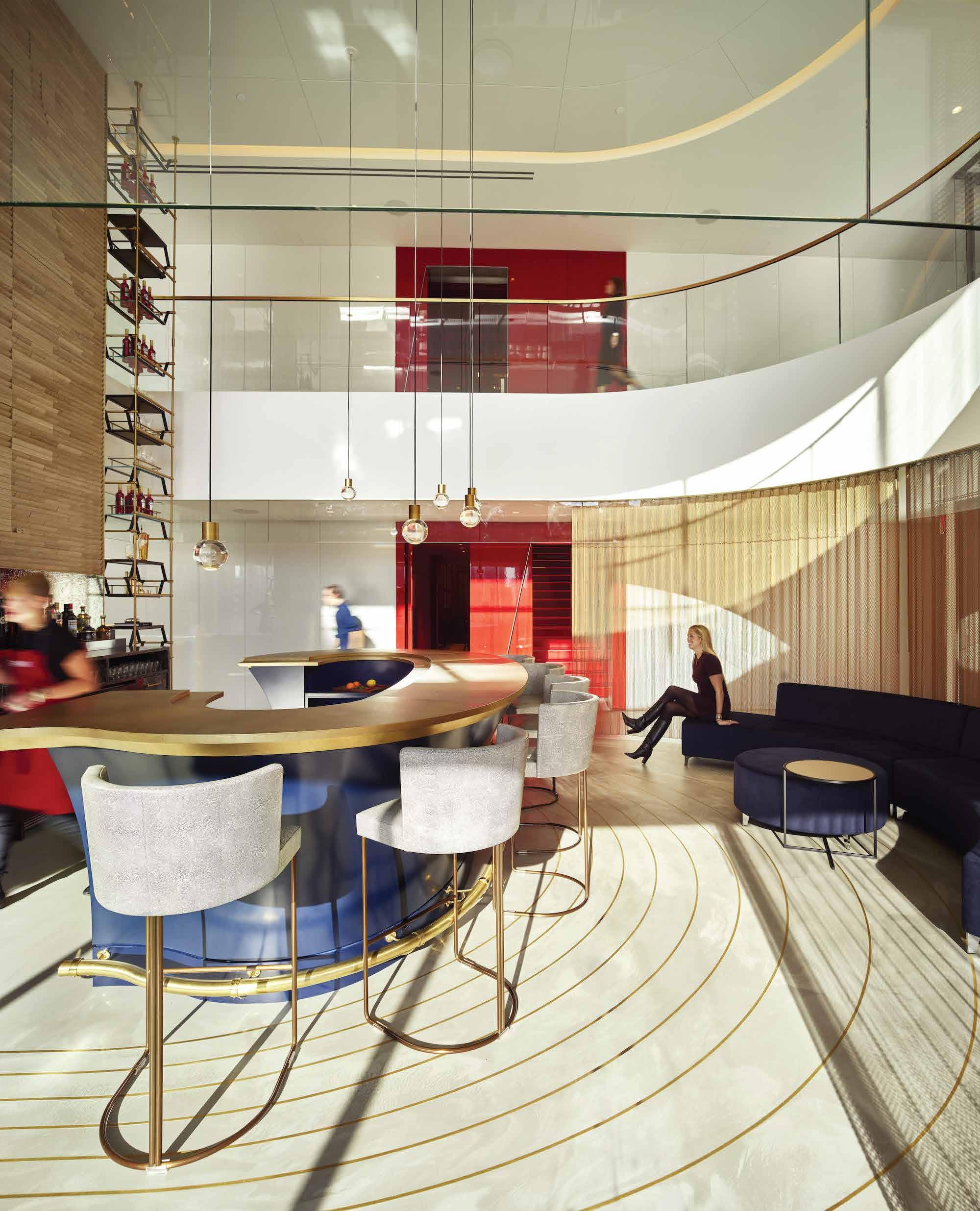
One key element that Gensler used when designing the interior for Campari is Value Contrast within the different work areas. Value Contrast is the relationship between a light area and a dark area which creates an added value within the space and allows for more depth in contrast. The pops of color against the white walls and concrete flooring give a greater contrast and adds plenty of focal points, establishing dominance within the space.
COLOR PALETTE
Creates UNITY within the space through the repetition of color to achieve a unified whole and reinforce the company brand.
LINES
VERTICAL LINES
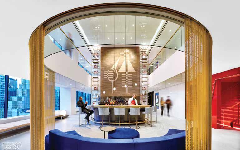
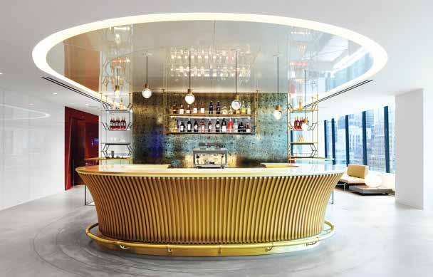
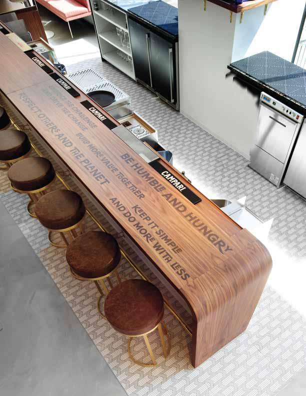
Characterized as STRONG and STABLE. They provide upward and downward movement to accentuate height and perception of a larger space. Gensler utilized vertical lines with the bar on the upper left to achieve that very effect and when added with brass/yellow colors, the power of vertical lines are reinforced.
CURVILINIER LINES
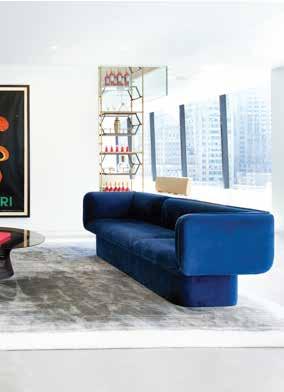
Characterized as SOFT, GENTLE, and FLUID. When combined with blue it is reminded of nature, water, and growth. The use of curved lines in the bar below might have been used to represent the fluidity of the Campari drink as it is poured into a glass. Curved lines are organic and peaceful and can be combined with right angles and straight lines to add contrast like they did with the bar on the upper left side.
In conclusion, we see that lines are used to frame a space such as the curved line on the bar overhead which helps to give the bar more of a dominant presence within this larger space.
SHAPE
C - SHAPE
One of the main shapes that is found throughout the Campari space is the C-shape which reinforces the brand’s identity. When the use of color and shape are combined, their meanings intensify and it gives a soul to the space. Through the addition of the brand colors, it creates a deeper meaning and appreciation for the brand.
RECTANGLE
The rectangle is a stable shape and is more visually interesting than a square. A rectangular room can provide more opportunities for spatial arrangement due to its complexity. Adding this shape in a conference room adds contrast by differentiating this area amongst the other curved areas. As a result, this establishes this area as being more strong and dominant due to its sharp corners.
PATTERN
REPETITION
Pattern is the repetitive arrangement of shapes and colors in a systematic horizontal, vertical, diagonal, or organic sequance. At Campari, the use of repetitive lines is shown throughout different spaces. The use of repetitive lines gives a sense of order and stability which is perfect for a work environment.
MONOCHROMATIC
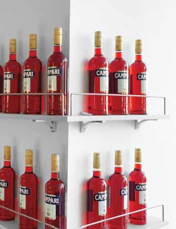
Defined as a single hue being selected with variations in tint, tones, and shades, to provide a variety in palette. The use of a monochromatic palette makes the viewer feel like they are inside a Campari bottle.
TEXTURE
Texture is very important to establish an emotional connection to our environment through the touch and feel of different surfaces and the emotions they bring. The sensory experience can either be calm through the feel of a smooth surface or stimulate the brain with a rough surface. These surface characteristics can be reinforced by color and add contrast to deepen the connection.
Smooth wood surface on bar is rich and inviting for employees to come and have a drink.
Soft surface on the velvet seating is calming and is reinforced with the blue color to further the calming experience.
CONCLUSION
VARIETY is a principle of design that is concerned with the combination of one or more color elements that use line, shape, texture, and/or pattern to create diversity and contrast in an interior space.
- Ron Reed
Through the use of line, shape, texture, and pattern, Gensler created a cohesive interior design which establishes brand identity for Campari. By utilizing Campari’s three primary colors against the white walls it establishes dominance and creates a deep contrast within the space.
MODULE 10
HOSPITALITY + COLOR
IDENTITY
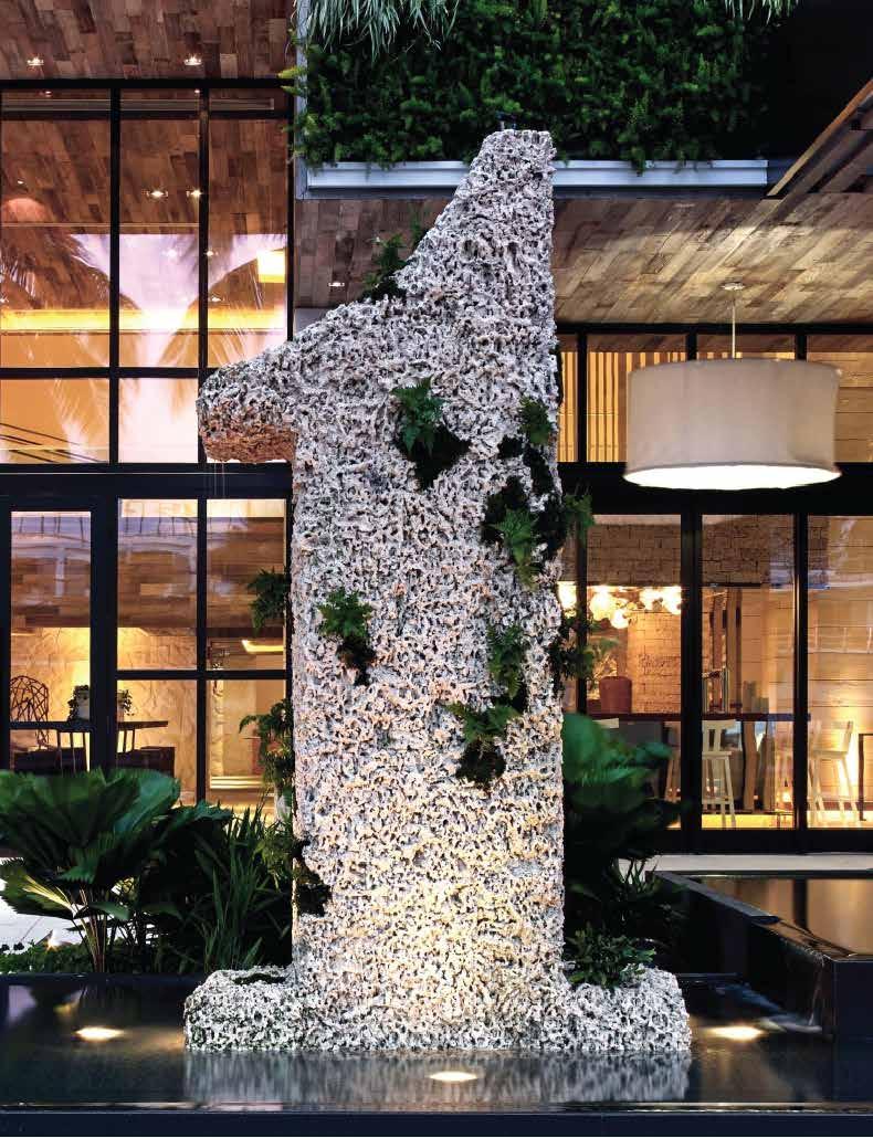
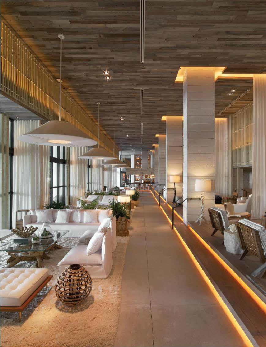
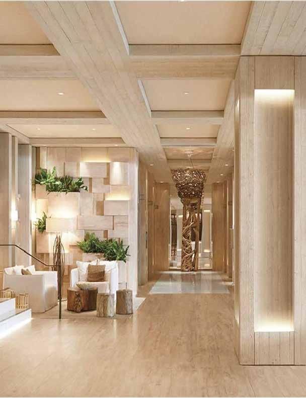
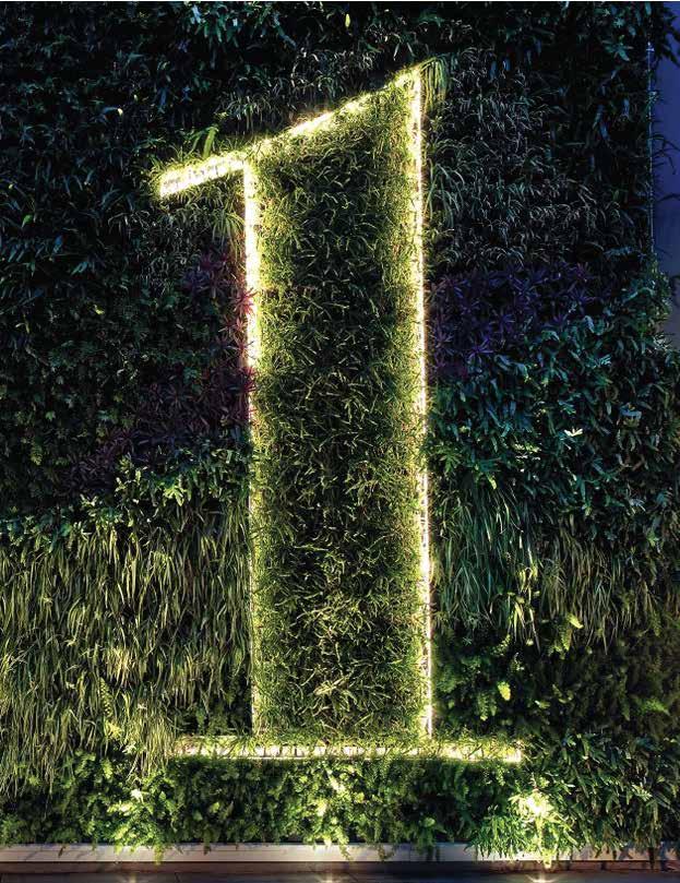
The beautiful beaches outside their doors inspire design for the 1 Hotel in South Beach. Their design and ethos push beyond the typical Art Deco aesthetic. They focus on the natural environment and emulate it through the intentional use of reclaimed wood and recovered materials. The 1 Hotel South Beach was designed to optimize energy efficiency using lighting controls, innovative ventilation systems, and solar energy.
THEIR PILLARS
ENVIRONMENT PEOPLE & EQUITY PROSPERITY

MAIN LOBBY
COLOR + LINE
The use of vertical lines is visible in the design of the main lobby, with some horizontal lines as well. The vertical lines accentuate the hall's height, directing the viewer to the ceiling where more design detailsare present. The strength and power of the vertical lines are reinforced with warm hues through lighting and material choices. Lines also serve as a guiding path toward the bar at the end of the photo.
COLOR + TEXTURE
The textures chosen for the Interior of the 1 Hotel are deeply rooted in their sustainability and environmental values. The surfaces are warm and smooth, with matte finishes to resemble the beach. The lighting placement is strategically placed to accentuate and enhance the textural quality of the different surfaces within this space.
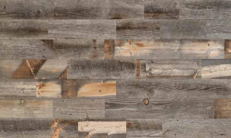
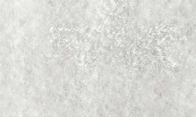
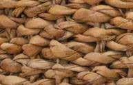
RATTAN SHAG RUG RECLAIMED WOOD
WAITING AREA
COLOR + SHAPE
In this photo and other spaces within the 1 Hotel, we see the dominant shape of the square and rectangles over curves. Using squares and rectangles may represent stability and security, much like how the environment provides us with security. The interesting point is that the square does not usually occur organically in nature and is seen as man-made. This is ironic since the Hotel is designed based on natural elements, yet it still calls attention to the artisan’s creativity.
COLOR + PATTERN
The 1 Hotel arranges these rectangle and square shapes repeatedly to form an overarching pattern throughout the different spaces in the Hotel. These shapes add dynamic variety and a dramatic focal point leading to the elevators.
COLOR PALETTE
CONCLUSION
As we further analyzed the use of line, shape, texture, and pattern, we understood the 1 Hotel’s intention of resembling the environment and incorporating those natural elements within the design, such as regional coral stone and furniture made from fallen trees in the South American rainforests. Sustainability is deeply rooted in their values, with every design element aimed at honoring the ocean. They are living proof that Luxury hospitality and sustainability can exist in harmony.
This oasis embodies the long-term resiliency of its many properties throughout the World and its strategy for growth and impact. Their mindful materials tell a story of past lives and inspire new ones.
This module was probably one of my favorites. Hospitality is one of my favorite types of design, and the hotel I got to analyze was a beautiful sight to see. Through this module, I could explore the design and the values and goals they strived to achieve through design. Sustainability is deeply rooted in their plans throughout the U.S., and I loved seeing their use of repurposed materials and sustainability practices here in Miami Beach.
FINAL CONCLUSION
Overall, this class has taught me so much more than just color. I learned how to apply color into the design world, I learned how to analyze color in my environment, and I learned how to graphically represent that in my class projects. This was an amazing class to take and I cherish every thing I learn and look forward to applying it in my future projects.
SOURCES
MODULE
BBC. (2019, June 19). What is India's caste system? BBC News. Retrieved April 21, 2023, from https://www.bbc.com/news/world-asia-india-35650616
Colombia's national symbols. Colombia Country Brand. (2021, February 16). Retrieved April 21, 2023, from https://www.colombia.co/en/colombia-country/colombias-national-symbols/
Color meanings in India: Find out what colors symbolize in Indian culture. Color Meanings. (2022, February 7). Retrieved April 21, 2023, from https:// www.color-meanings.com/color-meanings-indian-culture/ WorldAtlas. (2023, January 13). Flags, symbols & currency of Colombia. WorldAtlas. Retrieved April 21, 2023, from https://www.worldatlas.com/flags/colombia �
MODULE 3
Biography. (n.d.). Retrieved February 3, 2023, from http://architecture-history.org/architects/architects/BOFILL/biography.html
Building brilliance: La Muralla roja (the red wall) - LZF lamps. Building brilliance: La Muralla Roja (The Red Wall) - LZF Lamps. (n.d.). Retrieved February 3, 2023, from https:// blog.lzf-lamps.com/building-brilliance-la-muralla-roja-the-red-wall
The joyful aesthetics of pink (and blue) architectures: La Muralla roja by Ricardo Bofill. Irenebrination. (n.d.). Retrieved February 3, 2023, from https://www.irenebrination.com/ irenebrination_notes_on_a/2019/11/muralla-roja-ricardo-bofill.html
Leete, R. I. (2022, March 27). Bofill's La Muralla roja captured in evocative new photoseries by Andrés Gallardo. ArchDaily. Retrieved February 3, 2023, from https://www.archdaily.com/979079/bofills-la-muralla-roja-captured-in-evocative-new-photoseries-by-andres-gallardo
Ricardo Bofill architect: Biography, buildings, projects and facts. Famous Architects. (2015, December 17). Retrieved February 3, 2023, from https://www.famous-architects.org/ricardo-bofill/
MODULE 5
https://www.talenthouse.com/item/1924906/7978c5c3 � Hero. The Movie Database. (n.d.). Retrieved February 17, 2023, from https://www.themoviedb.org/movie/79/images/posters � Analytical Essay on Colour in film (2017). Alex Marshall. (2018, March 22). Retrieved February 17, 2023, from https://mralexmarshall.wordpress.com/portfolio/analytical-essay-on-colour-in-film-2017/
The "Hero" film: Shot-by-shot analysis: Free essay example. StudyCorgi.com. (n.d.). Retrieved February 17, 2023, from https://studycorgi.com/the-hero-film-shot-by-shot-analysis/
A look at the color narrative in "Hero". Newhouse Insider. (2017, November 13). Retrieved February 17, 2023, from https://newhouseinsider.syr.edu/2017/11/a-look-at-the-color- narrative-in-hero/#:~:text=In%20the%20movie%20Hero%2C%20there,logical%20cues%20in%20the%20movie. �
MODULE 8
Assouline arrives at the Bal Harbour Shops - oceandrive.com. (n.d.). Retrieved March 12, 2023, from https://oceandrive.com/assouline-bal-harbour
Assouline at Bal Harbour Shops Miami. Bal Harbour Shops. (2022, June 15). Retrieved March 11, 2023, from https://www.balharbourshops.com/store-directory/assouline/ �
MODULE 9
Gensler blends corporate space and cocktail bars at Campari's New York headquarters. Interior Design. (2022, December 20). Retrieved March 19, 2023, from https://interiordesign. net/projects/gensler-blends-corporate-space-and-cocktail-bars-at-campari-s-new-york-headquarters/
Inside look: Campari's stylish North American headquarters in New York. The Drink Nation. (n.d.). Retrieved March 19, 2023, from https://thedrinknation.com/articles/read/17151- Inside-Look-Camparis-Stylish-North-American-Headquarters-in-New-York# �
Reed, R. (2017). Color + design: Transforming interior space. Fairchild Books, an imprint of Bloomsbury Publishing Inc.
MODULE 10
Sustainability - 1 hotel south beach. (n.d.). Retrieved April 5, 2023, from https://www.1hotels.com/south-beach/sustainability �
Vinci, R. (2018, April 26). Architecture meets Perfect colour palette. Archilovers. Retrieved February 3, 2023, from https://www.archilovers.com/stories/26764/architecture-meets-perfect-colour-palette.html 1
Hero (2002). Talenthouse. (n.d.). Retrieved February 17, 2023, from