Brand identity
Inner East Community Support
Inner East Community Support (IECS) is a company focused on relieving the poverty, distress, sickness, disability, destitution, su�fering, misfortune, and helplessness experienced by individuals living or working in the Inner East region of Melbourne.
IECS’s vision is to improve people’s lives in Melbourne’s Inner East. It supports the Inner East community through developing, implementing, supporting and facilitating social and public welfare programs, projects and initiatives for the betterment and relief of individuals, groups and community organisations in the Inner East.
▪ Supporting and providing funding for the Inner East community;
▪ Collaborating with communities, organisations, business and government to advance and facilitate community wellbeing.
▪ Educating and increasing the awareness of individuals, communities, business and government, about the need for community support and services.
IECS is friendly, helpful and approachable with a professional, inclusive and encouraging approach. Key audiences for IECS include:
▪ Community groups, particularly those who will apply for IECS grants
▪ Volunteers, or people who want to assist with what we’re doing
▪ Likeminded people/groups in the area who share IECS’s goals
▪ Organisations who may want to provide funding down the track
▪ Organisations working in IECS’s identified areas of need, such as the disability support sector, public housing, domestic violence support
▪ Federal, State, Local Government
▪ Other charitable bodies, organisations, rotary clubs
▪ Professional bodies with a community-minded outlook
Engaging Respecting
Compassionate
IECS Primary logo - full colour
The primary IECS logo is full colour with subtle gradients and a tagline. This primary logo should only be used on a white background. In some instances the logo may be too small to display the tagline legibly, so an alternative logo without the tagline may be used.
IECS Primary logo with tagline
Logo 02 Support IEC
Helping our community thrive
IECS Primary logo without tagline
Logo 02
IECS Primary logo - �lat colour version
In some rare instances where a gradient may not be accurately reproduced, a �lat colour version of the logo may be used. Examples of this may include apparel, embroidery or vinyl decals. The full colour version is always the preferred version if possible.
IECS Primary logo - monochrome white or black
The full colour logo must never be used on an image or anything other than a white background. A white monochrome version may be used on solid colour backgrounds in certain circumstances. Only the approved brand colours may be used as a solid background colour. The black version must only be used on white backgrounds.
IECS white logo on solid colour
IECS black logo on white background
Approved background colours
IECS Primary logo - exclusion zone
The IECS logo must be used with an exclusion zone around it, ensuring it’s integrity in the design from other elements. The exclusion zone is equal to the capital E in the logo as indicated below. This is the minimum space allowed between the logo and other elements. No other elements should intrude into this boundary area.
IECS Primary logo exclusion zone
IECS Primary logo - minimum size
The IECS logo has minimum allowable size to ensure legibility and prominence. It has no maximum size limit.
Print use
Digital use
For the full primary logo with tagline, the minimum width is 60mm
For the full primary logo with tagline, the minimum width is 200 pixels
For the full primary logo without tagline, the minimum width is 40mm
For the full primary logo without tagline, the minimum width is 110 pixels
Logo 02
Incorrect logo usage
Consistency is key with branding. The IECS logo has been designed to work in a specific way across a range of mediums. In order to keep the branding consistent the logo should be used only as described. Below are examples of what NOT to do when using the logo.
Do not stretch or shrink the logo disproportionately.
Do not change the opacity of the logo.
Do not change the proportions of the logo.
Do not change the colours of the logo.

Do not use the colour logo over an image
Do not rotate the logo.
Primary colour palette
The colours indicated are to be used for most IECS design elements. Some elements require a gradient made of these colours. See the next page.
Secondary colour palette
Certain secondary design elements as well as text can use the secondary colour palette indicated below.
Extended colour palette
Extra colours can be utilised by using tints of the primary colours.
Brand elements 04
Rings
The rings element of the logo is used as a design element to further reinforce the branding across all media. The primary use of the rings is as a framing device for images and important information. The rings must always be used as solid colours with the gradient, never with a reduced opacity or layer style. A lighter grey version of the rings may be used to add depth or background interest to a design. Using the rings in the above mentioned manner is the only time the rings from the logo are allowed to be separated or otherwise manipulated. When locked up with the logo, the rings must never be moved, rotated or otherwise changed from the approved logo design.

Brand elements
Dotted lines
Dotted lines can be used in conjunction with the logo and a call to action within print or digital media. The dotted lines can be linked with the logo and a call to action to show connection and results. The dotted line may also be used apart from the logo but must always link a heading, phrase or similar important text element to another design element such as an image or other piece of text. The dotted line may not be used in isolation.


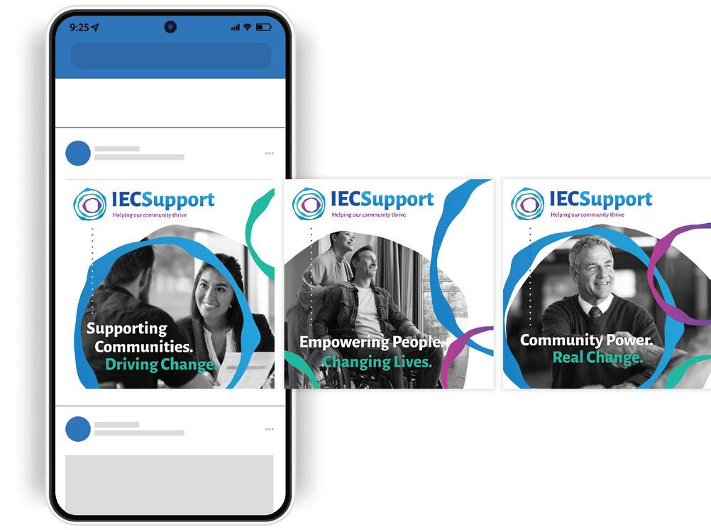
Dotted line used as a linking element on a social media post.
Typography
Typography
For general o�fice use on Mac or Windows based computers using Microso�t O�fice or similar so�tware please use the fonts below. These are standard computer fonts that are available to anyone without having to install or download new fonts. General use fonts for o�fice documents
Windows PC
HEADINGS - Calibri Bold
ABCDEFGHIJKLMNOPQRSTUVWXYZ
abcdefghijklmnopqrstuvwxyz 1234567890
BODY TEXT - Calibri Regular
ABCDEFGHIJKLMNOPQRSTUVWXYZ
abcdefghijklmnopqrstuvwxyz 1234567890
HEADINGS - Helvetica Bold Apple Mac
ABCDEFGHIJKLMNOPQRSTUVWXYZ
abcdefghijklmnopqrstuvwxyz 1234567890
BODY TEXT - Helvetica Roman
ABCDEFGHIJKLMNOPQRSTUVWXYZ
abcdefghijklmnopqrstuvwxyz 1234567890
Typography
Fonts for professionally produced print media
For all professionally designed media that will be printed, use the approved font below. This is available through Google Fonts, or Adobe Fonts.
HEADINGS - Alegreya Sans Bold
ABCDEFGHIJKLMNOPQRSTUVWXYZ
abcdefghijklmnopqrstuvwxyz
1234567890
BODY TEXT - Alegreya Sans Regular
ABCDEFGHIJKLMNOPQRSTUVWXYZ
abcdefghijklmnopqrstuvwxyz 1234567890
Aa
Alegreya Sans Bold example heading
Example of a paragraph body text in Calibri regular. Lorem ipsum dolor sit amet, consectetur adipiscing elit. Etiam sit amet felis tempus turpis tempor e�ficitur in et ligula. Curabitur eu arcu hendrerit, lacinia tortor nec, posuere erat. Vestibulum semper egestas lobortis.
Alegreya Sans Bold example sub-heading
Vivamus nec semper sapien, nec consequat lorem. Vivamus pulvinar venenatis nibh, vitae euismod sem facilisis ac. Pellentesque interdum ultricies bibendum. Morbi sit amet nisl vitae ante lobortis ultricies. Aenean elementum neque sed nunc iaculis vehicula.
Brand imagery
Brand imagery 06
Use of imagery and photography
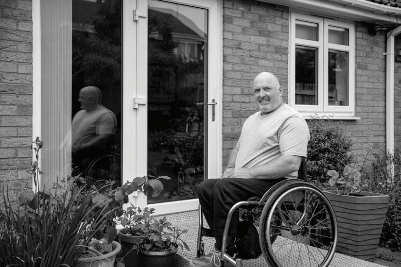
IECS imagery should always re�lect a positive, encouraging mindset. Any images used should ideally be real photographs, though icons and illustrations can be used in certain circumstances such as infographics. Images should be relevant and reflect people being helped and happy, being supported and looked after. Positive outcomes and wellbeing through dealing with IECS are paramount to the brand. Black and white imagery is to be used as the main element with the other brand elements (rings, logo, call to actions) bringing colour to the design. Colour imagery may be used, but as a secondary design element.


Brand imagery 06
Use of frames
The majority of imagery should be contained within a frame, made of the inner diameter of one of the ring elements. Where this is not applicable, isolated or full frame imagery may be used, but the primary design treatment of images should use the framing device. In advertising collateral, the framed image must be used with the rings to reinforce the brand.

Branding examples
Business cards are able to be customised with the correct contact details of the specific person required.
Text should follow the guidelines established here.
john@iecsupport.com.au
IECSupport.com.au
Branding examples 07
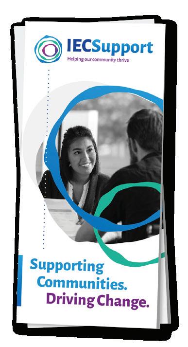
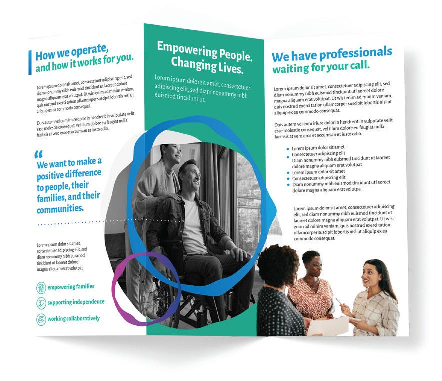
DL Trifold Flyer
DL sized flyers come in various sizes depending on amount of content. Shown here is an example of a trifold DL flyer.
Pull up banner


Branding examples 07
Social media tiles
Templates
Various sizes of templates for popular social media platforms such as Facebook and Instagram will be provided upon request.
Branding examples 07
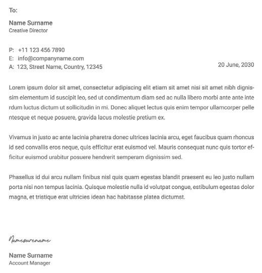
Letterheads
Positioning of the logo
Top left corner
Horizontal axis: On the margin
Vertical axis: On the margin
Body and heading text
Font: Calibri or Helvetica
Size: 12pt
Colour: Black
Footer
Contact details part of supplied letterhead template.
Graphic element is used to create link footer with the brand logo.
