
Style Guide

Tagline
Support from people who get it.
We provide mental health and wellbeing services and supports based on what matters to you.
About Candella
Support from people who get it.
Candella is a not-for-profit organisation that specialises in recovery-oriented mental health and psychosocial wellbeing.
We believe that quality mental health services should be available to as many people as possible. We provide services throughout Greater Melbourne.
We are a registered NDIS service provider. Our services are for people aged 18 and over with NDIS-managed, plan-managed or self-managed funding streams.

Our goal is a world in which you have every opportunity to thrive. A world that fully and wholeheartedly includes and respects you. A world in which you are free to be your true self, with no fear of judgement or discrimination. A world that gives you the best possible support for your mental health, when and where you need it, so that even when things are tough you know you are never alone in your journey.
— Aaron Ford, Founder
Our vision, mission and values
Our vision
Our vision is for all Australians to be able to access quality, stigma-free mental health services, supports and resources where, when and how they need it, so that they can thrive in the way that suits them best.
Our mission
Our mission is to make access to mental health and psychosocial wellbeing services inclusive and achievable for all by increasing our reach and positively impacting as many people and communities as possible.
Our values
Human
We care about people and their experiences. We embrace and celebrate diversity, prioritise inclusiveness and accessibility, and approach our clients as equals.
Capable
We make ourselves, each other and Candella ever more capable. We support our clients to build capability to safeguard their own mental health and wellbeing.
Effective
We do impactful things well. We strive to have a positive impact by making our services outcomes-focused and evidence-based.
What we do
We specialise in recovery-oriented mental health and psychosocial wellbeing. We offer flexible NDIS services tailored to the individual needs of our clients.
Our team includes skilled wellbeing facilitators, support coordinators and psychosocial recovery coaches.
Our approach to providing mental health support focuses on:
• engaging individuals
• building capacity
• supporting independence
• working collaboratively.

The Candella difference
The way we engage with our clients sets us apart. We call this The Candella Difference.
The Candella Difference centres around our ability to:
Be person-centred
We take a genuine interest in our clients – who they are, along with their values, goals and challenges.
Be relatable
We create connection wherever possible. This might be by matching supports and clients with a shared lived experience or interest, or simply by being genuine in our interactions.
Be respectful
We do not judge. We treat our clients with dignity and respect.
Our voice
Candella’s voice is human.
We are familiar, caring and approachable. We communicate empathically and realistically with our clients, without getting too personal. We are goal and outcome focused. We speak inclusively and communicate from a position of quiet, respectful authority.
The foundations of our voice
Audience-focused
We put our audience first and communicate clearly.
Consistent
We communicate consistently to reinforce our identity.
Inclusive
We foster an inclusive environment free from bias and discrimination, and this includes the language we use.
Straightforward
We use modern, everyday language that is easy to understand with clear calls to action.
The tonal elements of our voice
Authentic
We stick to our values, and we always tell the truth.
Caring
We are kind, friendly and conversational, but always professional
Definitive
We are experts who communicate with authority, confidence and humility.
Purposeful
We pursue positive outcomes in everything we do.
Some examples of our voice
When you choose Candella, you’ll be supported by people who get it.
We’re here for you! We’re here to support you in the way that works for you. We’ll listen and we’ll learn, and together we’ll make a plan to get you through.
Navigating the NDIS can be confusing. We know because we’ve been doing it for a while now! And we’ve learned a lot along the way. We’re here to help make your NDIS journey easier.
Our vision goal a world in which you have every opportunity to thrive. A world that fully and wholeheartedly includes and respects you. A world in which you are free to be your true self, with no fear of judgement or discrimination. A world that gives you the best possible support for your mental health, when and where you need it, so that even when things are tough you know you are never alone in your journey.
Bringing our voice to life
Plain English
We write in Plain English (also called Everyday English). This means communicating in a way that most people can understand. We use:
• simple words
• short, logical sentences
• minimal jargon and slang
• the active voice.
Easy Read
According to the OECD (Organisation for Cooperative Economic Development), one in eight Australian adults is functionally illiterate, and one in three lives with low literacy.1
Accessibility is important at Candella. This means that sometimes we will need to translate key resources from Plain English into an Easy Read format. Copy produced for Easy Readers has:
• sentences no more than 20 words long
• simple words and active language
• lots of white space
• guiding images (photo symbols)
• hard word definitions.
Scannable content
We make content easier to read and understand by:
• using informative headings and sub-headings
• creating lists
• writing short paragraphs
• placing hyperlinks on separate lines.
Inclusive language
We foster an inclusive environment free from bias and discrimination. This starts with the language we use. We:
• say ‘you’ and ‘your’ when talking to consumers, employees and the community
• use ‘we’ when referring to Candella as an organisation
• use simple contractions like ‘you’re’ or ‘you’ll’
• use respectful, gender-neutral language. 1.
Referring to employees
Use ‘employees’ or ‘people’ rather than ‘staff’, except where the word appears in a job title.
Referring to clients
We have chosen to refer to the people that engage our services as ‘clients’, not customers. Please avoid using the word customers.
Some of our clients are also ‘NDIS participants’. This is the right way to talk about their involvement with the NDIS.
Referring to culturally diverse people
‘Culturally diverse’ is the way we refer to people from culturally and linguistically diverse backgrounds.
Sexuality and gender
We respect, welcome and celebrate people of every gender, gender identity, intersex variation and sexual orientation.
Use gender-neutral terms such as: ‘they’, ‘Supervisor’, ‘firefighter’ and ‘Chairperson’.
Don’t assume pronouns such as ‘him’, ‘her’ or ‘they’ based on someone’s name, title or appearance.
If you don’t know, ask or use their name, or a gender-neutral term like ‘they’ or ‘person’.
At an individual level, if you are working with a client who identifies as gender diverse, please use their preferred term in any communication with and about them.
Referring to a person with disability
Disability does not define people. When we speak with or about people with disability, we use inclusive language that respects diversity and focus on the person, not the disability.
Avoid using the disability as an adjective that defines the person, unless that is their preference.
Use the word ‘disability’ as uncountable noun. This means it has no plural and only appears as a singular verb.
At an individual level, if you are working with a client who identifies as a person with disability but would prefer to use a different term, please use their preferred term in any communication with and about them.
Do use the terms ‘Person with disability’ and ‘People with disability’.
Do not use the terms ‘person with disabilities’, ‘people with disabilities,’ ‘a person with a disability’. These are all incorrect and should not be used.
Referring to Aboriginal and Torres Strait Islander people
Use capital letters as you do for proper nouns, such as Australian, Candella and Traditional Owners.
‘Aboriginal’ is the term for Aboriginal people. Use it as an adjective (describing word), rather than a noun (naming word), e.g. ‘Candella’s new strategy will support increased wellbeing for Aboriginal people’.
It’s important to remain aware that First Nations people are often called Aboriginal and Torres Strait Islander peoples. But there is significant diversity within these two groups.
There is a wide range of nations, cultures and languages across mainland Australia and throughout the Torres Strait. Given this diversity, respectful language use depends on what different communities find appropriate.
‘Aboriginal’ is a broad term that groups nations and custodians of mainland Australia and most of the islands, including Tasmania, K’gari, Palm Island, Mornington Island, Groote Eylandt, Bathurst and Melville Islands.
‘Torres Strait Islander’ is a broad term grouping the peoples of at least 274 small islands between the northern tip of Cape
York in Queensland and the south-west coast of Papua New Guinea. Many Torres Strait Islander peoples live on the Australian mainland. There are also 2 Torres Strait Islander communities at Bamaga and Seisia, within the Northern Peninsula Area of Queensland.
At an individual level, if you are working with a client who identifies as a First Nations person but would prefer to use a different term, please use their preferred term in any communication with and about them.
Do not use the term ‘indigenous’, ‘Indigenous’ or the abbreviation ‘ATSI’.
Do use the terms ‘Aboriginal and Torres Strait Islander peoples’, ‘First Nations people’, and ‘First Australians’.

Welcome to Country and Acknowledgement of Country
Welcome to Country is an important ceremony for many First Australians. An Acknowledgement of Country is a way of showing respect. Both are distinct practices with different requirements and meanings. Always capitalise both.
A Welcome to Country is a ceremony to welcome people onto the land of the custodians. A local traditional owner performs a Welcome to Country. The welcome can take many forms. It might offer safe passage to visitors or outline any responsibilities while on country.
Providing a Welcome to Country is a paid service. A traditional owner can assign a proxy if they are unable to attend unexpectedly, though this is rare.
An Acknowledgement of Country is something anyone can do. It is a way a person of any descent can pay respect to the local community and nation(s). It acknowledges the custodians of the land on which a meeting is being held. And it recognises the local community’s ongoing connection to, and care for, country. Some organisations also include acknowledgements in email signatures, websites and other materials.
Both are simple but important ways of paying respect. They redress the erasure of Aboriginal and Torres Strait Islander peoples on their own lands.
A-Z guide to style, punctuation & grammar
For guidance on style rules or decisions not covered in this A-Z, please defer to the Australian Government Style Manual, online at: www.stylemanual.gov.au
Acronyms
For all acronyms, spell the expanded form out fully at first mention, followed by the acronym in brackets; use the acronym only after this, e.g. Intensive Care Unit (ICU).
If an acronym is not widely recognised or if you are writing for an Easy Read audience, use the expanded form. Avoid full stops in acronyms or in abbreviations with all capital letters (NSW, WA).
There are some widely used and understood acronyms that do not need to be expanded at first use. Others are okay for staff to use internally but shouldn’t be used in outward-facing communication. See the table below for guidance.
Meaning
Abbreviations and contractions
Only use abbreviations and contractions of general terms if the abbreviation is the clearer and more common form.
Do not use a full stop after abbreviations, e.g. Vic, Tas. Contractions also don’t require a full stop because they end with the last letter of the expanded word for example, Qld, Pty, Ltd.
Active writing
Good writing uses an active voice to clearly communicate. When using the active voice, the subject performs the action denoted by the verb. Because the subject does or “acts upon” the verb in such sentences, the sentences are said to be in the active voice.
Active voice: Rebecca presented at the RUOK? Day forum.
Passive voice: The RUOK? Day forum was presented by Rebecca.
Ampersands (&)
Avoid using ampersands, except where space is limited in a table or a name includes an ampersand.
Apostrophes
Apostrophes are used:
• to show ownership or possession
• to show joint ownership
• to show two or more owners of different things
• in contractions
• to show plural abbreviations of one letter only
Avoid apostrophes:
• when referring to years and decades, use the expanded form, e.g. ‘the 1980s’, not ‘’80s’.
• when used for the possessive pronoun ‘its’, but do use one for the contraction ‘it’s’ (‘it is’)
• when making an abbreviation plural (TMVs not TMV’s).
Capitalisation
Capital letters should be kept to a minimum. Watch out for capitalisation of common nouns or names; if in doubt, prefer lower case to capitals. Note: internet and web are lowercase.
• Job titles should be capitalised, e.g. Chief Executive, Director.
• Professions should be lower case, e.g., dentist, communication advisor, laboratory technician, unless they are used in a specific person’s role or title.
• The names of organisations and institutions spelled out in full require capitals, e.g. Department of Health or University of Melbourne, but shortened forms used subsequently do not, e.g. the department, the university.
• Adjectives should not be capitalised e.g. federal, departmental.
• The word State is capitalised when referring to territorial divisions of Australia.
• Avoid using all caps for emphasis (e.g. DANGER).
Commas
Commas mark a break between different parts of a sentence. They make the sentence clear by grouping and separating words, phrases and clauses.
Use a comma:
• after a sentence connector (however, therefore, now, etc.)
• to eliminate ambiguity
• to separate items in a simple series
• after a quote where the carrier expression is part of the sentence (e.g. “Inclusiveness is one of our core values,” said Aaron.
• to separate non-defining clauses or phrases.
An Oxford comma is a comma after the second last item in a list and should only be used if it clarifies the meaning. Avoid using Oxford commas and break up your sentence instead.
Dates
Write without punctuation, e.g. Monday 6 July 2020 not 6th July, 2020.
It is not necessary to include the year in the date if the event will or has occurred in the current year. The year should be included when referring to events that occurred in previous years or will occur in future years.
Diagnosis, disease or illness names
These do not start with initial capitals, unless they contain proper nouns or are widely recognised acronyms, e.g. hepatitis B, German measles, ADHD.
Full stops
• Use a full stop at the end of a sentence, as a decimal point and at the end of an abbreviation.
• Ensure there is only one space between a full stop and the next sentence.
• Do not use a full stop between the initials of a person’s name.
Headlines and headings
Headlines, headings and sub-headings should be sentence case unless they contain a title or a name.
Hyphens (en dashes) and em dashes
Hyphens (en dashes) should be used in compound words to enable the reader to associate words correctly on the first reading (note the different meanings of ‘three-year-old buildings’ vs ‘three year old buildings’).
• While hyphens are used for compound words (an easy- touse power tool), they are not used when the qualifying words follow the noun (a power tool that is easy to use).
• When adjectives are combined with adjectives, a hyphen is used (high-quality).
• When adverbs are combined with adjectives, no hyphen is used (a thoroughly planned project).
• Spell ‘cooperate’ and ‘coordinate’ without a hyphen.
• Spans of numbers should be written as ‘15 to 20’, not ‘15-20’ or ‘between 15-20’.
Overall, avoid the use of en dashes (–). Use spaced em dashes ( — ) instead of en dashes (–) to break up sentences.
Em dashes (—)
You can use an em dash with spaces to add a related idea to a sentence instead of creating a new sentence.
Use sparingly and be careful the sentence does not become too long. Avoid using an em dash to put a separate thought in the middle of a sentence.
Italics
Avoid use of italics. Italics should only be used for titles of standards, books, magazines, newspapers and TV programs.
Latin words
Avoid the use of Latin abbreviations. Use Plain English where possible. If space is limited you can use ’e.g.’ (for example, in a table). Only do this if your audience can understand it.
Lists
Bulleted lists break up large blocks of text and make reading complex information easier.
Numbered lists are useful for information where the order of steps is important.
Lists should be written consistently, e.g. multi-sentence lists shouldn’t be combined with single sentence lists.
Single sentence lists
When we’re writing a single-sentence list, we:
• start with a stem sentence that all the points have in common
• start each point in lower case, and only use a full stop on the last point
• check that each point makes a full sentence when read with the stem.
If appropriate (i.e. if it reads well aloud):
• use ‘and’ or ‘or’ on the second-to-last point
• place a comma after the last word before the ‘and’ or ‘or’.
Multi sentence lists
Multi sentence lists are introduced by a full sentence that ends with a full stop.
• Each point in the list is also a complete sentence.
• Each point can be 1-3 sentences long.
• Each point begins with a capital letter and ends with a full stop.
Numbered lists
We use numbered lists for processes, where steps need to be done in order.
1. First, you do this
2. You do this next
3. To finish the process, you do this.
Measurement units
Abbreviated units of measurement do not need a full stop (kg, m, ha) and do not have an ‘s’ in the plural, e.g. ‘10cm’ not ‘10cms’. However, when units are spelled out in full, a plural ‘s’ is required for numbers greater than one, e.g. ‘0.5 metre’, ‘1.5 metres’ etc.
• Prefer % to percent or per cent.
• Ensure letters do not appear to flow into numbers.
• Unit names and symbols should not be mixed in the same expression, e.g. ‘km/h’ not ‘km/hour’.
• When writing measurements within a clinical setting unit names or symbols should be separated from associated figures by a space (16 mm). In all other instances do not put a space between number and measure.
Names and titles
When introducing a source within a piece of writing, use their full name (e.g. Dr John Smith) first, and then Dr Smith after that.
All sites should be spelled out in full.
Titles to be spelled out in full for the first mention. e.g., The Honourable David Davis.
Job titles should be capitalised.
Professions should be lower case, e.g., dentist, communication advisor, laboratory technician, unless they are used in a specific person’s role or title.
Numbers
Numbers one to nine are written in words, except to express time, sums of money, weight, distance, measurements, volume, percentages and ages, e.g. ‘6km’, ‘3kg’, ‘$8’, ‘3%’, or in comparative lists or series, e.g. ‘17 apprentices, 10 A-Grade electricians, and 4 engineers’.
• The numbers 10 upwards are written as numerals.
• Text containing two series of numbers are easier to read if one series is in numerals and the other in words, e.g. ‘there were six 2kg modules and twelve 9kg modules’.
• Four-digit numbers and above require a comma, e.g. ‘4,587’.
• Avoid starting a sentence with a numeral. Either spell them out or restructure the sentence.
• For decimal fractions, make sure there is a 0 in front of the decimal point, e.g. ‘0.25’, not ‘.25’.
• Units of currency: $USD or $AUD (for comparative reference); $15 (single stroke through ‘S’); 50c (no stroke through ‘c’).
Quotes and quotation marks
All quotes must be attributed to a person.
Use double quotation marks for all passages of direct speech. Use single quotation marks inside double and for terminology, e.g. ‘best-of-class’.
Singular/plural
Companies and organisations are single entities that take a singular verb, e.g. ‘Candella is a not-for-profit organisation’, not ‘Candella are a not-for-profit organisation.’
Spelling
Generally, prefer the first spelling in the Macquarie Dictionary. Use Australian spellings over American spellings (e.g., organise not organize; colour not color).
Underlining
Underlining should only be used where text is hyperlinked.
Underlining should never be used in headings or subheadings. Use bold instead.
Time
2.30 to 3.30pm not 2.30pm-3.30pm.
2pm not 2.00pm.
Web and email addresses
Web and email addresses should only be underlined when they are a hyperlink.
• Include the full address for web addresses. e.g.: www. candella.org.au
• If linking to a longer more complex address, use a clear description for the link, e.g. ‘read more about our policy”. Do not use ‘click here’.
• No full stop at the end of a web address at the end of a sentence.
Primary logo
The Candella primary full colour logo should be placed on a white background. The primary logo should be used unless it doesn’t fit or must be placed on a coloured background.
Ideally, the logo is placed above the heading and aligned to the same margin. For example, left aligned text and left aligned logo. Centered text, centered logo.

Minimum logo size
To ensure the elements of the logo are always legible it should never be reproduced at a size smaller than the 15mm dimension as shown. 15mm

Monochrome logo
The Candella logo may be used in white or black reversed out of one of the following brand colours.
Only these combinations may be used as they have been tested for accessibility colour contrast.


Clear space
Always follow the clear space specifications and use the logo files provided when using the Candella logo.

Logo misuse
Do not use effects on the logo.

Do not use different colours for the logo.

Do not change the composition of the logo.

Do not distort the logo.

Do not change the opacity of the logo.

Do not outline the logo.

Brand colours
Primary Colours
To check colour accessibility use he contrast checker below.
https://webaim.org/ resources/ contrastchecker/
Blue
Black Orange
Secondary Colours
Light Yellow
Light Blue
Light Purple
Icons
Using icons is a powerful way of communicating. They can help convey in a approachable and clear fashion where to find information both in a digital and real world setting.
Where possible line icons should be used as they are more accessible to a wider audience. Icons may be used to break up text as well as build visual recognition for information.


Graphic elements
The Candella brand is bright, bubbly, helpful and personable. The graphic element inspired by the icon in the logo are used to enhance layouts and branded material.
The logo icon as a solid colour
This element may be used overlapping other elements on the page in any solid brand colour. It may be rotated in any direction and may be used at any scale.
Extended half round frame
This image frame may be used either upright or on its side to enhance layouts and frame images around the subject.

Photography
The Candella imagery should reflect the brand’s inclusive, easy and hopeful aesthetic.
Images should:
• Reflect the diversity of Candella’s clientele
• Depict the nature of the services provided by Candella
• Avoid depicting physical touch between two people — maintaining a professional boundary
• Convey a sense of warmth and connection


Primary font
The font Rubik in varying weights form the basis of the Candella brand.
Rubik is a sans serif font family with slightly rounded corners, which fits nicely with the rounded corner theme of the candella brand.
Fonts may be downloaded via the links below: https://fonts.google.com/ specimen/Rubik
In some cases these it may not be possible to use these fonts due to digital limitations. For example in email signatures and EDMs. In these cases please use the Arial font family.
Rubik Bold
Rubik Bold Italic
Bb Cc Dd Ee Ff Gg Hh Ii Jj Kk Ll Mm
Oo Pp Qq Rr Ss Tt Uu Vv Ww Xx Yy Zz
Rubik Regular Aa Bb Cc Dd Ee Ff Gg Hh Ii Jj Kk Ll Mm Nn Oo Pp Qq Rr Ss Tt Uu Vv Ww Xx Yy Zz
Letterhead
Positioning of the logo
Top left corner
Horizontal axis: On the margin
Vertical axis: On the margin
Body and heading text
Font: Rubik Regular /Rubik Bold
Size: 12pt
Contact informtion
Font: Rubik Regular
Size: 9pt
Paper size A4
5mm rounded corners
Bottom right corner 5mm bevel.
Berman corner for people with impaired vision.

Dear client, Lorem ipsum dolor sit amet, consectetur adipiscing elit, sed do eiusmod tempor incididunt ut labore et dolore magna aliqua. Nulla posuere sollicitudin aliquam ultrices sagittis orci a. Faucibus interdum posuere lorem ipsum. Sed velit dignissim sodales ut eu sem.
Tincidunt augue interdum velit euismod in pellentesque massa. Purus faucibus ornare suspendisse sed. Urna duis convallis convallis tellus id interdum velit laoreet. Id semper risus in hendrerit. Sagittis orci a scelerisque purus semper eget duis at tellus.
Malesuada nunc vel risus commodo viverra. Magna fermentum iaculis eu non diam phasellus vestibulum. Malesuada proin libero nunc consequat interdum varius. Lectus mauris ultrices eros in cursus turpis massa tincidunt. Lectus vestibulum mattis ullamcorper velit. Dapibus ultrices in iaculis nunc sed augue. Adipiscing tristique risus nec feugiat in. Malesuada nunc vel risus commodo viverra. Magna fermentum iaculis eu non diam phasellus vestibulum. Malesuada proin libero nunc consequat interdum varius. Lectus mauris ultrices eros in cursus turpis massa tincidunt. Lectus vestibulum mattis ullamcorper velit.
Tincidunt augue interdum velit euismod in pellentesque massa. Purus faucibus ornare suspendisse sed. Urna duis convallis convallis tellus id interdum velit laoreet. Id semper risus in hendrerit. Sagittis orci a scelerisque purus semper eget duis at tellus.
Yours sincerely, Alex
Smith Director
(03) 8372 0403 support@candella.org.au candella.org.au PO box 2017, Belgrave VIC 3160 12.7mm 12.7mm
Business cards
Positioning of the logo
Centered on the front of the card
Name:
Font: Rubik Bold
Size: 14pt
Colour: Blue Position
Font: Rubik Reglar
Size: 12pt
Colour: Black
Contact information
Font: Rubik Reglar
Size: 9pt
Colour: Black
Paper size
90 x 50mm
5mm rounded corners Bottom right corner 5mm bevel.
Berman corner for people with impaired vision.
Alex Smith
Wellbeing Facilitator (03) 8372 0403 support@candella.org.au candella.org.au

Alex Smith
Wellbeing Facilitator (03) 8372 0403 support@candella.org.au candella.org.au
Alex Smith
Wellbeing Facilitator (03) 8372 0403 support@candella.org.au candella.org.au
Alex Smith
Wellbeing Facilitator (03) 8372 0403 support@candella.org.au candella.org.au
DL Brochure


Powerpoint


Pull-up banner


Social media posts


Candella
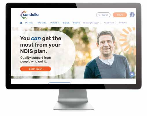
Website
This website is designed to meet WCAG guidelines for the latest 2.1 AA accessibility standards. We recommend accessibility tools be used where available, such as text-to-speech, font size increase and colour contrast.
The website must be responsive on all devices, meet the minimum colour contrast settings as specified in the Colours section of this guide.
