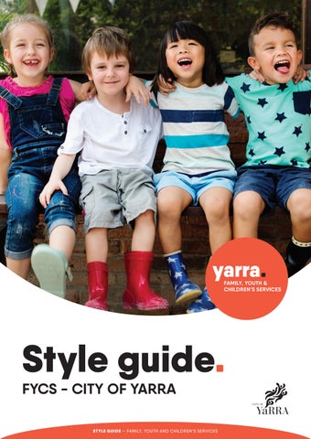
Style guide.
FYCS - CITY OF YARRA
Background.
The Family, Youth & Children’s Services (FYCS) provide a range of services to support families and children, as well as youth in the community of the City of Yarra.
A unique brand was required to help the community identify FYCS services within the City of Yarra. FYCS sought a consistent look with which to communicate and promote their diverse programs, activities and resources. Importantly this new brand had to sit well along side the existing City of Yarra logo - which holds long-standing equity within the community. As part of the brand creation focus groups were held with both FYCS staff and community members.
The brand strongly uses the element of a circle. The circle and warm orange colour is used to represent an approachable and welcoming service offering. People are invited in and are given a sense of belonging. The word ‘yarra’ is given emphasis to clearly connect this new brand with the City of Yarra name, giving it authenticity and trustworthiness.
The FYCS community is very diverse, filled with people from different cultures and all socioeconomic backgrounds. As such the graphic elements of the brand have been kept clean to appeal to this broad audience base.
This document aims to guide FYCS, the City of Yarra and external graphic designers on the appropriate use of the FYCS logos and style. Strong and consistent branding will help make the FYCS brand easily identifiable and increase positive community awareness. It will express the concepts of high standard and approachability in all communications, both to staff and customers.
Logo guidelines.
Primary logo
The City of Yarra Family, Youth and Children’s Services (FYCS) logo is made up of 4 key elements:
The overall circle which contains the text
Main word-mark ‘yarra’
Square full stop
Sub-text of ‘FAMILY, YOUTH & CHILDREN’S SERVICES’
These elements are always to be used together as shown and not altered in any way.
Alternative logo
When the logo is reversed out, the text elements are white or black, whilst the fullstop is in colour. The circular logo is NOT used if a reversed version of the logo is required.
Mono logo
When the logo is used in monotone all elements are either black or white and the circle is completely dropped.
White Black PMS 7417
White Black PMS 7417
White Black
Logo variation.
Colour variation
The primary logo is always the orange circle with the option of changing the colour of the full stop to any of the secondary colours.
The secondary colour palette has been used to add flexibility and excitement when needed. There are also three different text options depending on which service is being promoted; Family-, Youth- or Children’s Services.
Family, Youth & Children’s Services
Children’s Services
Services
Teal variation
Family
Yellow variation
Red variation
Grey variation
Steel variation
Alternative logo.
Alternative logo
When it is not possible to use a circle logo the alternate logo variation can be used instead. However here there is no option of using the secondary colour palette for the full stop.
Black Variation
White Variation
Colours.
Primary Colours
Orange
Spot Pantone 7417 C
CMYK 0 / 80 / 80 /0
RGB 220 / 80/ 52
HTML #dc5034
Black (Positive Logo)
Spot Pantone Process Black
CMYK 0 / 0 / 0 / 100
RGB 0 / 0 / 0
HTML #000000
White (Reversed Logo)
Spot White
CMYK 0 / 0 / 0 / 0
RGB 255 / 255 / 255
HTML #ffffff
Secondary Colours
Teal
Spot Pantone 3125
CMYK 89 / 0 / 20 / 0
RGB 00 / 178 / 202
HTML #00b0ca
Red
Spot Pantone 1797
CMYK 2 / 98 / 85 / 7
RGB 196/ 38 / 46
HTML #c4262e
Yellow
Spot Pantone 123
CMYK 0 / 21 / 88 / 0
RGB 253 / 200 / 47
HTML #fdc82f
Grey
Spot Pantone Cool Grey 3
CMYK 8 / 5 / 6 / 13
RGB 201 / 202 / 200
HTML #c9cac8
Steel
Spot Pantone 7545
CMYK 55 / 30/ 17 / 51
RGB 81 / 98 / 111
HTML #51626f
Logo size.
Clear Space
To maximise the visual impact of the FYCS logo, a ‘clearspace’ has been defined. The clearspace is the minimum area required around the logo which must stay clear of any other elements. Wherever possible use more than the minimum clear space shown.
The clearspace is defined by the height of the ‘a’ in ‘yarra’.
Minimum Size
To ensure the text and elements of the logo are always legible the logo should never be reproduced at a size small than the 12.5mm height as shown.
Misuse of Logo
No elements of the logo should be changed or altered in any way.
Moving elements
Distortion Colour change
Family, youth & children’s services
Logo Co-branding.
Often the FYCS logo will need to be displayed together with the City of Yarra logo. The following size and spacing relationships should be used.
The black City of Yarra logo is always to be used when co-branding is required. At a minimum one circle width should separate the two logos. The circle size is defined by the height of the ‘Y’ in ‘Yarra’ of the City of Yarra logo.
Horizontal relationship
Vertical relationship
The top of the City of Yarra logo lines up with the top of the FYCS circle as shown and the baseline of the ‘Children’s Services’ text alignes with the cap height of ‘Yarra’ in the City of Yarra logo.
For the alternative logo the ‘Family, Youth & Children’s Services’ lines up with the cap height of ‘Yarra’ in the City of Yarra logo.
Logo positioning.
Co-Branding Materials
Over Photograph
Typically the FYCS logo is positioned in the bottom right corner of the header image and slightly overlapping the image, while the City of Yarra logo is positioned in the bottom right corner.
Without Photograph
FYCS logo is positioned in the top left corner if there is no header image while the City of Yarra logos is positioned in the top right corner.

Poster title.
A4 Poster
A4 Letterhead
Fonts.
The font family of QANELAS forms the basis of the FYCS City of Yarra brand.
Qanelas is available in several weights. Black is used for headings. Bold is used for secondary headings and Medium is used for body copy, contact details etc. Bold and Medium are also often used together, where emphasis is needed. The condensed weights are not to be used. The Thin weight is also not used due to potential legibility issues.
QANELAS LIGHT
ABCDEFGHIJKLMNOPQRSTUVWXYZ abcdefghijklmnopqrstuvwxyz 1234567890 !@#$%^&*()
QANELAS REGULAR
ABCDEFGHIJKLMNOPQRSTUVWXYZ abcdefghijklmnopqrstuvwxyz 1234567890 !@#$%^&*()
QANELAS MEDIUM
ABCDEFGHIJKLMNOPQRSTUVWXYZ abcdefghijklmnopqrstuvwxyz 1234567890 !@#$%^&*()
QANELAS SEMIBOLD
ABCDEFGHIJKLMNOPQRSTUVWXYZ abcdefghijklmnopqrstuvwxyz 1234567890 !@#$%^&*()
QANELAS BOLD
ABCDEFGHIJKLMNOPQRSTUVWXYZ abcdefghijklmnopqrstuvwxyz 1234567890 !@#$%^&*()
QANELAS BLACK
ABCDEFGHIJKLMNOPQRSTUVWXYZ abcdefghijklmnopqrstuvwxyz 1234567890 !@#$%^&*()
QANELAS THIN
ABCDEFGHIJKLMNOPQRSTUVWXYZ abcdefghijklmnopqrstuvwxyz 1234567890 !@#$%^&*()
QANELAS ULTRA LIGHT
ABCDEFGHIJKLMNOPQRSTUVWXYZ abcdefghijklmnopqrstuvwxyz 1234567890 !@#$%^&*()
QANELAS EXTRABOLD
ABCDEFGHIJKLMNOPQRSTUVWXYZ abcdefghijklmnopqrstuvwxyz 1234567890 !@#$%^&*()
QANELAS HEAVY
ABCDEFGHIJKLMNOPQRSTUVWXYZ abcdefghijklmnopqrstuvwxyz 1234567890 !@#$%^&*()
Microsoft fonts.
Custom Font download
The Qanelas family is available for purchases on this website or you can download the two demo fonts free (Qanelas Black and Qanelas Thin): www.tinkov.info/qanelas.html
Microsoft Fonts
If a system does not allow for the installation of new fonts Arial can be used instead:
Download selected fonts
Click the download button to download a zipped file of the selected fonts.
Note: At the time of writing the download URLs were correct, but they may change in the future. If they have changed simple search for the font name using your favourite browser.
Stationery.
Letterhead
CONTACT DETAILS
Font: Qanelas Bold & Qanelas Medium Size: 8.5pt / 11pt
Kerning: 0
Colour: Black & Orange
Space After: 1mm
FOOTER WEBSITE URL
Font: Qanelas Black Size: 10pt
Kerning: 50 Colour: White Style: ALL CAPS
Collateral templates.
Word Templates of the following core collateral have been created for use by FYCS. These include:
A3 Poster
A4 Poster
A5 Flyer
DL Invite
Postcard
Newsletter
PowerPoint Presentations
As these are Word templates Arial font is used throughout. The following pages detail the layout and font use of these templates.


Contact Details
The contact details are always treated in same way on all collaterals with the City of Yarra logo attached. The logo can be placed next to the contact details or underneath.
Flyer title.
FLYER SUBTITLE
In enim justo, rhoncus ut, imperdiet a, venenatis vitae, justo. Nullam dictum felis eu pede mollis pretium. Integer tincidunt. Cras dapibus.
Lorem ipsum dolor sit amet, consectetuer adipiscing elit. Aenean commodo ligula eget dolor.
SUBHEADING
Lorem ipsum.
Aenean commodo.
Aenean massa.
Contact us
Yarra City Council T // (03) 9280 1940 E // contact@yarracity.vic.gov.au W // www.yarracity.vic.gov.au
Invite title.
INVITE SUBTITLE
In enim justo, rhoncus ut, imperdiet a, venenatis vitae, justo. Nullam dictum felis eu pede mollis pretium. Integer tincidunt. Cras dapibus. Vivamus elementum semper nisi. Aenean vulputate eleifend tellus.
Lorem ipsum dolor sit amet, consectetuer adipiscing elit. Aenean commodo ligula eget dolor. Aenean massa. Cum sociis natoque penatibus et magnis dis parturient montes, nascetur ridiculus mus.
In enim justo, rhoncus ut, imperdiet a, venenatis vitae, justo. Nullam dictum felis eu pede mollis pretium.
Integer tincidunt. Cras dapibus. Vivamus elementum semper nisi. Aenean vulputate eleifend tellus.
Lorem ipsum dolor sit amet, consectetuer adipiscing elit. Aenean commodo ligula eget dolor. Aenean massa. Cum sociis natoque penatibus et magnis.
DAY, DATE MONTH YEAR
Time // Lorem ipsum dolor sit amet.
Venue // Lorem ipsum dolor sit amet. Guest Speaker // Lorem ipsum dolor sit amet. Access // Lorem ipsum dolor sit amet. RSVP // Lorem ipsum dolor sit amet.
Yarra City Council PO Box 168 Richmond VIC 3121
T // (03) 9205 5555 E // info@yarracity.vic.gov.au W // www.yarracity.vic.gov.au
WWW.YARRACITY.VIC.GOV.AU
WWW.YARRACITY.VIC.GOV.AU
CONTACT DETAILS
Font: Arial Bold / Arial Regular
Size: 8.5pt / 11pt
Kerning: 0
Colour: Black
Space After: 1mm
Yarra City Council PO Box 168 Richmond VIC 3121
T // (03) 9205 5555
E // info@yarracity.vic.gov.au W // www.yarracity.vic.gov.au
Typography - Front

TITLE AND SUBTITLE
Title and subtitle as per front of DL Flyer
BODY TEXT & BULLETED LIST
Font: Arial Regular / Arial Bold (intro paragraph)
Size: 9pt / 13pt
Kerning: 0
Colour: Black
Space After: 3mm
Bullet: Black Square
Bullet Font: Wingdings
Bullet Size: 6pt
Bullet Indent: 3mm
CALL TO ACTION HEADING
Font: Arial Bold
Size: 11pt / 13pt
Kerning: 0
Colour: Orange
TITLE
Font: Arial Bold
Size: 40pt / 42pt
Kerning: 0 (or as required)
Colour: Black with coloured full stop to match logo colour variation used. (Orange, Teal, Red, Yellow, Grey or Steel)
SUBTITLE
Font: Arial Bold
Size: 16pt / 20pt
Kerning: 0
Colour: Black
Style: ALL CAPS
Typography - Back
Space After: 1mm
Style: ALL CAPS
Cras dapibus. Vivamus elementum semper nisi. Aenean vulputate eleifend tellus. Lorem ipsum dolor sit amet, consectetuer adipiscing elit. Aenean commodo ligula eget dolor.
FOOTER WEBSITE URL
Font: Arial Bold
Size: 7pt
Kerning: 50
Colour: White
Style: ALL CAPS
DL Flyer or Brochure
Layout - Front
Invite
title. INVITE SUBTITLE
MARGINS
The front and back of the DL flyer/brochure use the same margins:
Left & Right 10mm
Top & Bottom 15mm
DOTTED LINE SEPARATOR
A dotted line in secondary colour palette to match the logo chosen is used to separate the heading from the body text
HEADER IMAGE
The header image is always placed in a circle
LOGO SIZE AND POSITION
Line up the centre of the ‘children’s services’ with the bottom line of the header image shape. The logo should be on the right side of the page Layout - Back
INVITE SUBTITLE
In enim justo, rhoncus ut, imperdiet a, venenatis vitae, justo. Nullam dictum felis eu pede mollis pretium. Integer tincidunt. Cras dapibus. Vivamus elementum semper nisi. Aenean vulputate eleifend tellus.
Lorem ipsum dolor sit amet, consectetuer adipiscing elit. Aenean commodo ligula eget dolor. Aenean massa. Cum sociis natoque penatibus et magnis dis parturient montes, nascetur ridiculus mus.
In enim justo, rhoncus ut, imperdiet a, venenatis vitae, justo. Nullam dictum felis eu pede mollis pretium. Integer tincidunt. Cras dapibus. Vivamus elementum semper nisi. Aenean vulputate eleifend tellus. Lorem ipsum dolor sit amet, consectetuer adipiscing elit. Aenean commodo ligula eget dolor. Aenean massa. Cum sociis natoque penatibus et magnis.
DAY, DATE MONTH YEAR
Time // Lorem ipsum dolor sit amet.
Venue // Lorem ipsum dolor sit amet.
Guest Speaker // Lorem ipsum dolor sit amet.
Access // Lorem ipsum dolor sit amet.
RSVP // Lorem ipsum dolor sit amet.
A5 Flyer
Typography
TITLE
Font: Arial Bold Size: 40pt / 48pt
Kerning: 0
Colour: Black with coloured full stop to match logo colour variation used. (Orange, Teal, Red, Yellow, Grey or Steel)
SUBTITLE
Font: Arial Bold, All Caps Size: 17pt / 21pt
Kerning: 0
Colour: Black
CONTACT US
Font: Arial Regular Size: 17pt
Kerning: 0
Colour: Orange Space After: 2mm
CONTACT DETAILS
Font: Arial Bold / Arial Regular
Size: 8pt / 11pt
Kerning: 0
Colour: Black
Space After: 0.5mm
BODY TEXT AND BULLETED LIST
Font: Arial Bold (intro text)
Arial Regular
Size: 9pt / 13pt
Kerning: 0
Colour: Black Space After: 3mm
Bullet: Black Square
Bullet Character: Wingdings Regular
Bullet Size: 6pt
Bullet Indent: 3mm
SUBHEADING
Font: Arial Bold, All Caps Size: 11pt / 13pt
Kerning: 0
Colour: Orange Space After: 1mm
FOOTER WEBSITE URL
Font: Arial Bold Size: 7pt
Kerning: 50
Colour: White
Style: ALL CAPS
Flyer title.
In enim justo, rhoncus ut, imperdiet a, venenatis vitae, justo. Nullam dictum felis eu pede mollis pretium. Integer tincidunt. Cras dapibus.
Lorem ipsum dolor sit amet, consectetuer adipiscing elit. Aenean commodo ligula eget dolor. SUBHEADING
Lorem ipsum.
Aenean commodo.
Aenean massa.
Contact us Yarra City Council T // (03) 9280 1940 E // contact@yarracity.vic.gov.au W // www.yarracity.vic.gov.au
TITLE AND SUBTITLE
Kept to a maximum of 2 lines and use the dotted line to separate the heading from the body text.
LOGO SIZE AND POSITION
Line up the centre of the ‘children’s services’ with the bottom line of the header image shape. The logo should be on the right side of the page
DOTTED LINE SEPARATOR
A dotted line in secondary colour palette to match the logo chosen is used to separate the heading from the body text
CITY OF YARRA LOGO AND CONTACT DETAILS
The City of Yarra logo always sits underneath the contact details.
MARGINS
10mm on all edges
A4 Poster
Typography
Poster title.
BODY TEXT
Font: Arial Regular
Size: 11pt / 14pt
Kerning: 0
Colour: Black
Space After: 3mm
TITLE
Font: Arial Bold Size: 55pt / 65pt
Kerning: 0
Colour: Black with coloured full stop to match logo colour variation used. (Orange, Teal, Red, Yellow, Grey or Steel)
SUBTITLE
Font: Arial Bold, All Caps Size: 21pt / 25pt
Kerning: 0
Colour: Black, All Caps
CONTACT US
Font: Arial Regular Size: 21pt
Kerning: 0
Colour: Orange
Space After: 2mm
CONTACT DETAILS
Font: Arial Bold / Arial Regular
Size: 9pt / 12pt
Kerning: 0
Colour: Black
Space After: 0.5mm
FOOTER WEBSITE URL
Font: Arial Bold, All Caps Size: 10pt
Kerning: 50
Colour: White
A4 Poster Layout
Poster title.
TITLE AND SUBTITLE
Kept to a maximum of 2 lines and use the dotted line to separate the heading from the body text.
LOGO SIZE AND POSITION
Line up the centre of the ‘children’s services’ with the bottom line of the header image shape. The logo should be on the right side of the page
DOTTED LINE SEPARATOR
A dotted line in secondary colour palette to match the logo chosen is used to separate the heading from the body text
CITY OF YARRA LOGO AND CONTACT DETAILS
The City of Yarra logo always sits underneath the contact details.
MARGINS
15mm on all edges
Layout — other formats.
Postcard
The same layout principles as shown for A5, A4 and DL documents apply for all other document sizes, namely:
Logo Positioning
FYCS logo is positioned ideally in the bottom right corner of the header image and slightly overlapping the image while the City of Yarra logo is positioned in the bottom right corner.
Major Heading
The main heading goes under the header image or at the top of the page if there is no image.
When there is body text underneath the main heading and subheading. A dotted line is used to separate the heading from the body text. The dotted line has the same colour as the full stop in the FYCS logo used.
Postcard title.
POSTCARD
Postcard title.
POSTCARD
LOGO AND CONTACT DETAILS
The City of Yarra logo is always attached to the contact details.
Layout — secondary colours.
PowerPoint Presentation
The same layout principles as shown for A4, A5 and DL documents apply for all other document sizes.
Pullout Quote
The quotation marks in the pullout quote uses the secondary colour palette to give the pull out quote some extra excitement and affinity.
Line Icons
The line icons use the secondary colour palette and can be used as is or placed within a circle. Please use only line icons (no fill) and if possible, include some dotted strokes in the icon.
ALTERNATIVE LOGO
For multi-page documents please use the alternate logo variation for footers of follow-on pages. This logo works especially well for multi-page documents where you want the logo to be visible at all times but not take attention away from the content.
Example slides
Design elements.
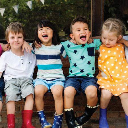
Circular Image Crop
Cover or lead-in images are cropped in a circular frame and bleed off the top, right and left edge of the page. Images can also be cropped in circles and the whole circular image shown, as is the case in the PowerPoint slide example. If this is the case no component of the image bleeds off the edge of the page, but the entire circle is shown.
However circular image crops should not be used in excess as this can clutter a layout. Image crops are rather used as a feature or highlight. Images can also be used in ‘typical’ rectangles.
Postcard title.
slide title.
slide title.
Icon Style
Only line based icons (without fill) are to be used. A dotted element or dotted lines/strokes should be included where possible to reference the circular nature of the brand. Icons can either be placed as they are or inside of a solid circle using any of the brand colours.
Footer
The footer ellipse is used to highlight important information. Usually the website address is placed in the footer, but other text may also appear. It is always in the corporate orange.
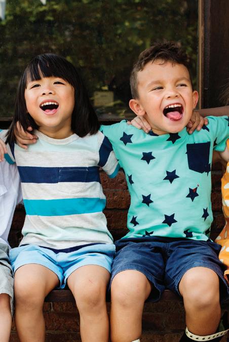
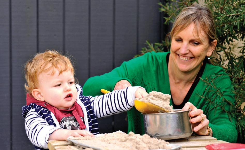
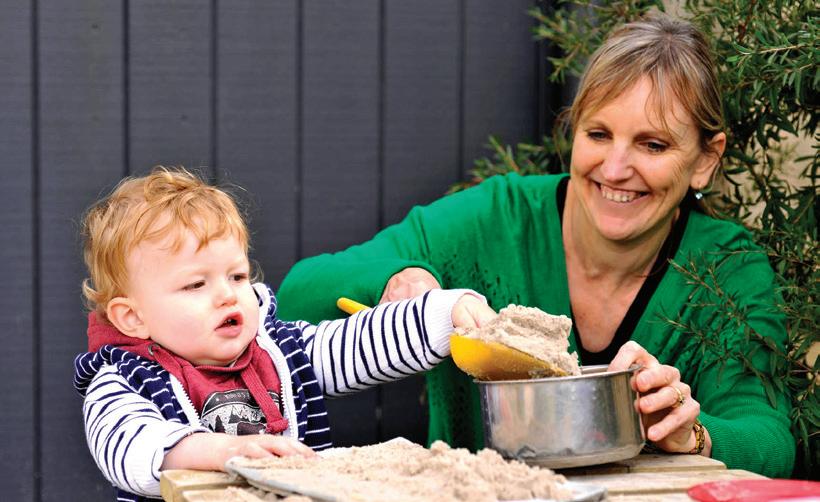
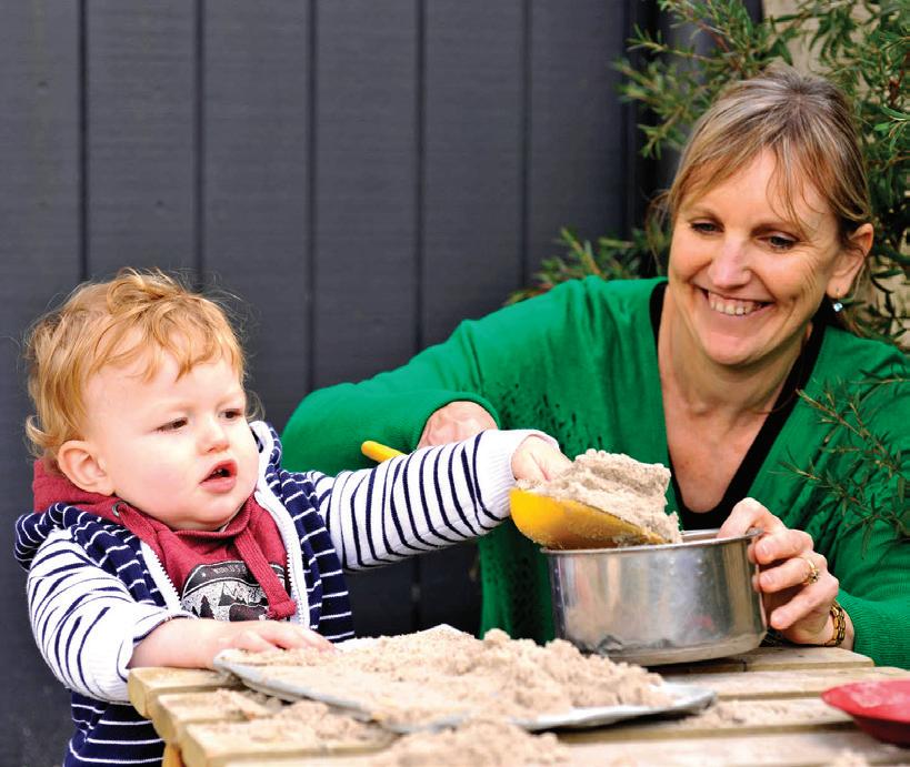
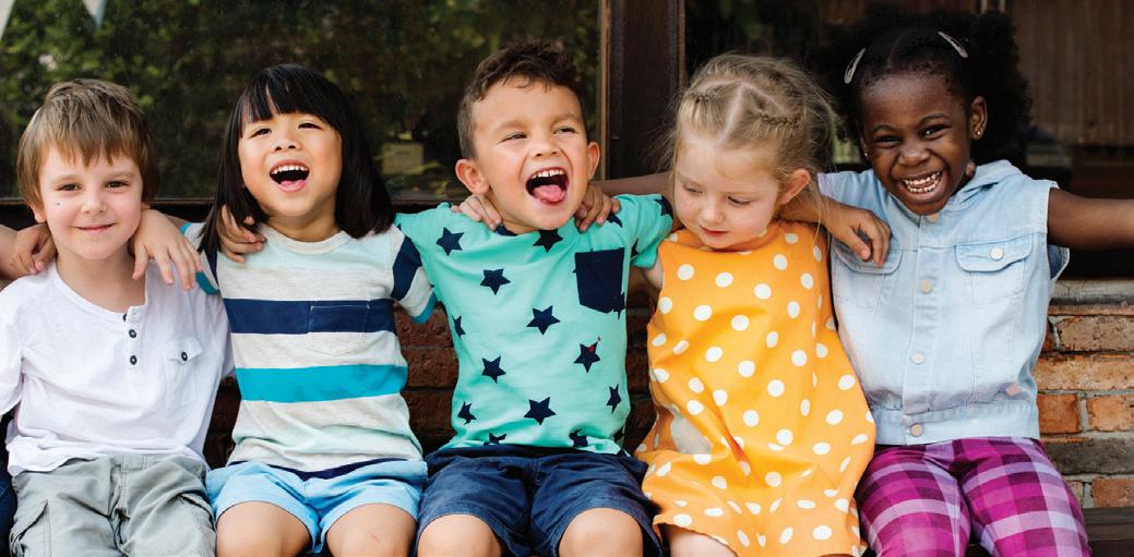
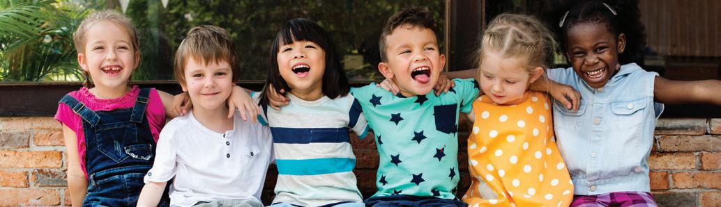
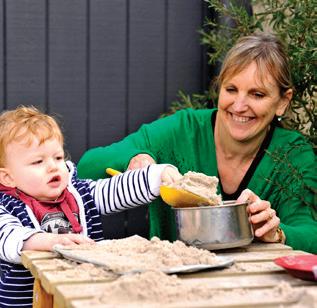
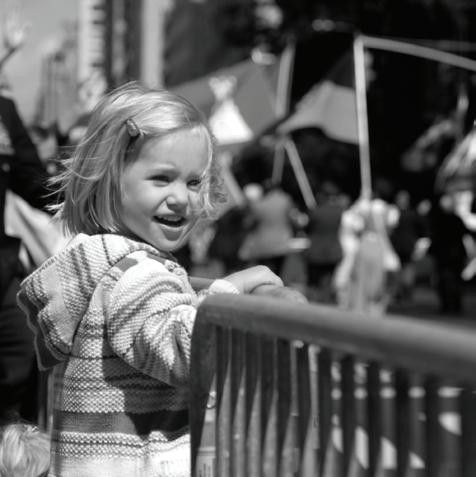
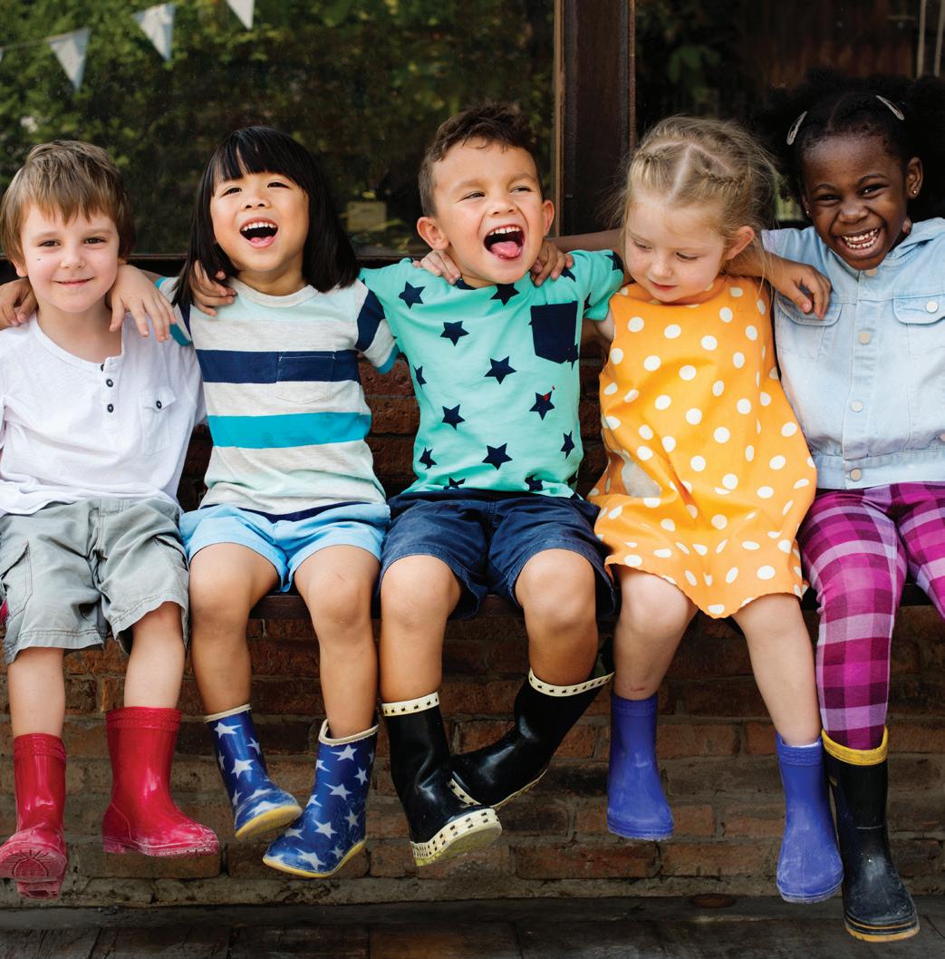
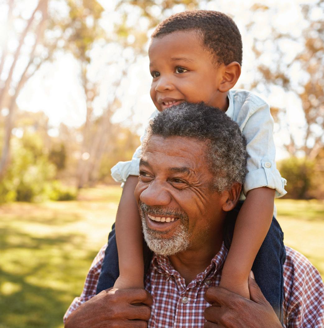
Imagery.
Images
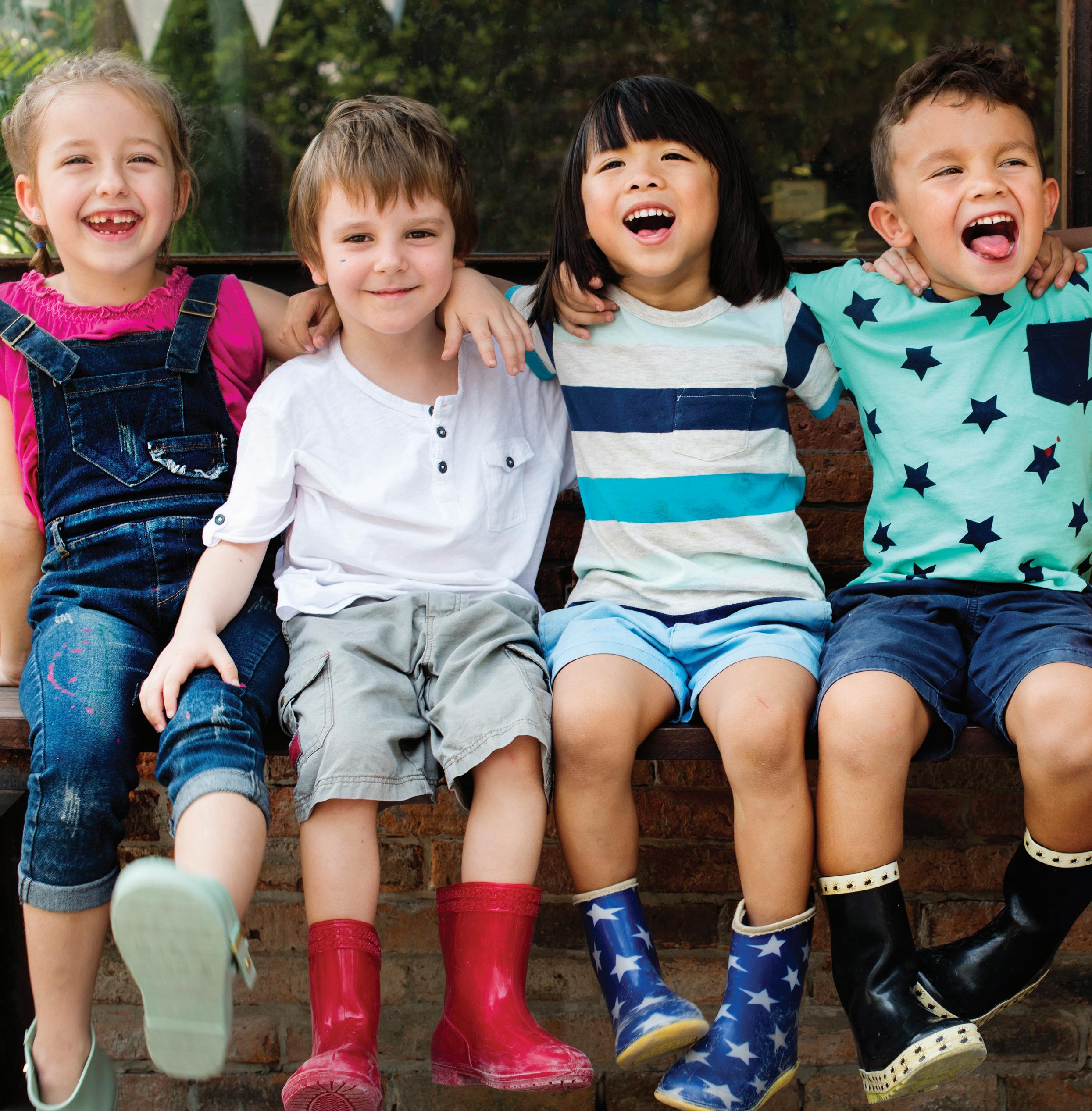
Imagery is an important part of the FYCS brand as it brings out the family oriented services, our vision and values. All images should convey at least two of the following qualities: family, youth, children, trust, happiness, fun and helpful. Images should always be in colour. When the logo will be placed over an image, the image shouldn’t be busy to keep a clean look and to allow maximum logo readability.
Style
Images of individuals should never be taken from above. The focus should be on the positive emotion. Images of multiple people should be happy and show interaction.
Size and Positioning
Since imagery is an important part of the FYCS brand it must be a prominent element in all FYCS branding. FYCS material should be visual and engaging to get the brand’s message across effectively, this means that all images should be as large as the layout allows, while ensuring adequate white space for text and other elements for an overall clean, professional look. Please ensure that the position of the image creates balance between it and the rest of the content.

This style guide was prepared for the City of Yarra by Blick Creative
1st floor/382 Queens Pde
Clifton Hill Victoria 3068
t. +61 3 9482 7077
e. info@blickcreative.com.au www.blickcreative.com.au