Logo guidelines
Primary logo
The Whitehorse Manningham Libraries logo is made up of 2 different elements:
• Illustration of 4 ‘doors’
• Text element ‘Whitehorse Manningham Libraries’ set in Roboto Thin and Roboto Light
These elements are always to be used together as shown and not altered in any way.
Reversed logo
When the logo is reversed out, the text elements are white, whilst the logo icon is in colour.
MONO logo
When the logo has to be used in monotone all elements are either black or white.
Logo variation
The primary logo can be either landscape or stacked, with or without the tagline ‘open for discovery’. The logo can also mention the branch location for branch-specific branding.
General – Landscape
With tagline – Landscape
– Portrait
tagline – Portrait
With location – Landscape
With location – Portrait
With location and tagline – Landscape
With location and tagline – Portrait
Locations: Extensions/Sub-branding
At times, Whitehorse Manningham Libraries will need to show the location name separate from the brand mark (for example when listing locations and phone numbers on stationary such as the letterhead.) These sub-brands may be used with or without the tagline.
Colours
PRIMARY COLOURS
Red Coated Uncoated
Light Yellow Coated Uncoated
Spot Pantone 173 C Pantone 1665 U
CMYK 0 / 80 / 94 / 1 0 / 55 / 68 / 10
RGB 210 / 73 / 42 299 / 104 / 73
HTML #d2492a #e56849
Orange Coated Uncoated
Spot Pantone 7401 C Pantone 7401 U
CMYK 0 / 5 / 25 / 0 0 / 10 / 35 / 0
RGB 241 / 227 / 187 254 / 229 / 165
HTML #f1e3bb #fee5a5
Black
Spot Pantone 144 C Pantone 130 U
CMYK 0 / 52 / 100 / 0 0 / 37 / 81 / 3
RGB 233 / 131 / 0 247 / 155 / 46
HTML #e98300 #f79b2e
Yellow Coated Uncoated
Spot Pantone Process Black
CMYK 0 / 0 / 0 / 100
RGB 30 / 30 / 30
HTML #000000
Spot Pantone 123 C Pantone 115 U
CMYK 0 / 21 / 88 / 0 0 / 19 / 82 / 0
RGB 253 / 200 / 47 255 / 206 / 46
HTML #fdc82f #ffce2e
Logo Size
Clear space
To maximise the visual impact of the WML logo, a ‘clearspace’ has been defined. The clearspace is the minimum area required around the logo which must stay clear of any other elements. Wherever possible use more than the minimum clear space shown.
The clearspace is defined by the height of the Light Yellow Door in the graphic.
Minimum Size
To ensure the text and elements of the logo are always legible the logo should never be reproduced at a size small than the 12mm height shown.
Misuse of logo
Whitehorse Manningham Libraries

Logo Co-branding
Whenever the size of the collateral allows, the WML logo will need to be displayed together with the City of Whitehorse and City of Manningham logos. If this is the case the following size and spacing relationships should be used.
As the WML logo is multicoloured, the black or white City of Whitehorse/City of Manningham logos are to be used when co-branding is required.
The Council logos must be used together as a ‘lock up’ with the "Proudly owned by" text as shown and cannot be separated nor any part omitted.
The lock-up is situated either in the top right or bottom right of collateral. Maximum sizing of the lock-up is relative to the top of the WML logo icon and the bottom of the text block. Minimum spacing is shown below. Along with the final WML logo files, mono and reversed versions of the lock up were provided to WML.
Horizontal relationship
Logo Positioning
Co-Branding Materials
Where possible, when co-branding is required the WML logo is positioned in the top left while the City of Whitehorse/City of Manningham logos are positioned in the bottom right or top right.
Ideally the WML logo is positioned in an irregular black shape. See the Layout section on page 21 for more information.
Logo orientation
Always use the landscape version of the logo with the tagline, only use the stacked/portrait version if the landscape orientation will not fit.


Fonts and Typography
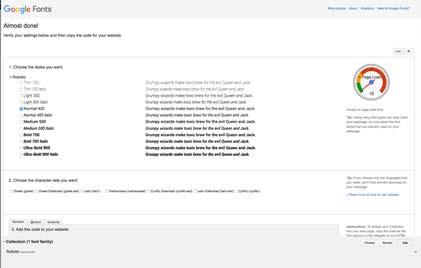
The font family of ROBOTO forms the basis of the Whitehorse Manningham Libraries brand.
Roboto is available in several weights. Bold is used for headings. Regular is used for secondary headings and Light is used for body copy, contact details etc. Regular and Light are also used together often, where emphasis is needed. The logo uses Thin and Light. The condensed and black weights are not to be used.
Roboto Thin
ABCDEFGHIJKLMNOPQRSTUVWXYZ
abcdefghijklmnopqrstuvwxyz 1234567890
Roboto Light
ABCDEFGHIJKLMNOPQRSTUVWXYZ
abcdefghijklmnopqrstuvwxyz 1234567890
Roboto Regular
ABCDEFGHIJKLMNOPQRSTUVWXYZ
abcdefghijklmnopqrstuvwxyz 1234567890
Roboto Bold
ABCDEFGHIJKLMNOPQRSTUVWXYZ
abcdefghijklmnopqrstuvwxyz 1234567890
Roboto Condensed
ABCDEFGHIJKLMNOPQRSTUVWXYZ abcdefghijklmnopqrstuvwxyz 1234567890
Roboto Black
ABCDEFGHIJKLMNOPQRSTUVWXYZ abcdefghijklmnopqrstuvwxyz 1234567890
Custom Font Download
The Roboto family is available for free for commercial use and can be downloaded for use here:
www.fontsquirrel.com/fonts/roboto and for web:
www.google.com/fonts#UsePlace:use/Collection:Roboto

Microsoft Fonts
Download selected fonts
Click the download button to download a zipped file of the selected fonts.
Note: At the time of writing the download URLs were correct, but they may change in the future. If they have changed simple search for the font name using your favourite browser.
If a system does not allow for the installation of new fonts Arial can be used instead:
ARIAL
Arial - Regular ABCDEFGHIJKLMNOPQRSTUVQXYZ abcdefghijklmnopqrstuvqxyz 1234567890
Arial - Bold ABCDEFGHIJKLMNOPQRSTUVQXYZ abcdefghijklmnopqrstuvqxyz 1234567890
Headlines & Titles
To keep the brand consistent, always use the ROBOTO font family as specified, this includes headings. If ROBOTO is unavailable see previous section regarding 'Microsoft Fonts' or use a simple sans serif font. Bold is used for headings, but it can be combined with Light for emphasis. Regular is used for secondary headings. Regular can be combined with Light, where emphasis is needed. The condensed and black weights are not to be used.
Do not use any fonts for headlines that do not suit the WML brand, see images for reference.
Correct font choice for headings
Incorrect font choice for headings
lynne.alderton@wml.vic.gov.au
Layout and phrasing of contact details
Examples of address and contact details on stationery items
Addresses
Vic
Technical Services
379 Whitehorse Rd, Nunawading, Vic 3131
PO Box 3083
Nunawading, Vic 3131
Phone 03 9872 8608
Fax 03 9872 8644
Example: Close up of Contact Details on WML Business Card.
For brand consistency, whenever Victoria is mentioned in an address it must be abbreviated as Vic, do not use victoria, Victoria, VIC or vic.
Rd Road must be abbreviated to Rd, do not use road or Road.
St
Street should be abbreviated as St
Place
The only exception is Place, which should be Place, not pl or Pl.
Phone Number
Phone
Phone must always be written as Phone, do not use Tel, Telephone, Ph, P or phone.
03
Use 03 in front of phone and fax number, always display it without brackets ie. 03, not (03).
Stationery
Business Card
Name
Font: Roboto Regular
Size: 10pt
Colour: Black
Lynne
Alderton
Coordinator Collections & Technical Services
lynne.alderton@wml.vic.gov.au
www.wml.vic.gov.au
Technical Services
379 Whitehorse Rd, Nunawading, Vic 3131 PO Box 3083 Nunawading, Vic 3131
Phone 03 9872 8608 Fax 03 9872 8644
Position
Font: Roboto Light
Size: 8pt
Colour: Black
Text
Font: Roboto Light
Size: 8pt/10pt
Colour: Black
Space after: 1mm
Contact type M/E/T/F
Font: Roboto Light
Size: 8pt/10pt
Colour: Black
Website url
Font: Roboto Bold
Size: 8pt/10pt
Colour: Black
Library Card
Name/Signature
Font: Roboto Light
Size: 6pt
Colour: Black
Signature
www.wml.vic.gov.au
Blackburn 9896 8400
Box Hill 9896 4300
Bulleen 9896 8450
Doncaster 9877 8500
Nunawading 9872 8600 The Pines 9877 8550
Website URL
Font: Roboto Bold
Size: 8pt
Colour: White
Vermont Sth 9872 8650
Warrandyte 9895 4250
Locations
Font: Roboto Regular
Size: 8pt/10pt
Colour: White
Space after: 1mm
Phone
Font: Roboto Light
Size: 8pt/10pt
Colour: White
Space after: 1mm
Contact Details
Font: Roboto Light (Phone
Number in Roboto Regular)
Size: 9pt / 10pt
Colour: Black
Space after address: 1mm
Website URL
Font: Roboto Bold
Size: 10pt
Colour: Black
Space after: 2mm
ABN
Font: Roboto Light
Size: 7pt
Colour: Black
Footer Locations
Font: Roboto Regular
(Location)/Roboto Light (Phone)
Size: 8pt / 10pt
Colour: White
With Comp Slip
Contact Details
Font: Roboto Light (Phone Number in Roboto Regular)
Size: 9pt / 10pt
Colour: Black
Space after address: 1mm
Website URL
Font: Roboto Bold
Size: 10pt
Colour: Black
Space after: 2mm
ABN
Font: Roboto Light
Size: 7pt
Colour: Black
DL Contact Details
Font: Roboto Light (Phone
Number in Roboto Regular) Size: 9pt / 10pt
Colour: Black Space after address: 1mm
Website URL
Font: Roboto Bold Size: 10pt
Colour: Black Space after: 2mm
C4 Contact Details
Size: 12pt / 13pt
C4 Website URL
Font: Roboto Bold Size: 13pt
B4 Contact Details
Size: 14pt / 15pt
B4 Website URL
Font: Roboto Bold Size: 15pt
Signage
Monday Closed
Tuesday 10am - 5pm
Wednesday 1pm - 8.30pm
Thursday 10am - 5pm
Friday 10am - 5pm
Saturday 9.30am - 5pm
Sunday Closed
Phone
Logo
Full width logo reverse in a black header background. The header ‘points’ to the location.
Location
Location with tagline.
Opening Hours/Phone Number
List of opening hours for the branch in Roboto Light.
The phone number of the branch is in Roboto Regular.
Co-Branding
The Council logo lock-up sits in line with the phone number. It is the width of the ‘doors’ icon.
Website URL
Website URL in Roboto Bold in white. It sits in the black asymmetrical footer.
www.wml.vic.gov.au
Layout
A3/A4 Poster: Variation 1
Council logos bottom right corner
Free Program for fun
Meet

Logo
Logo should always be in the top left corner, reversed, in an irregular black shape with one point. If Council logos are placed at the bottom, then this shortened black shape should house the WML logo.
Logo Container

There are two types of logo containers – a shortened one to house just the WML logo, and a longer/full length one to house both the WML logo and Council logos lock-up.
Text
Text can be either black or white and placed in any kind of irregular shape in the brand’s colours.
The shape must be solid (no transparency) and have only straight edges and angled points (no curves).
The text/shape combination can be either right or left, however the council lock-up must be on the right, and must be clearly visible.
A3/A4 Poster: Variation 2
Council logos top right corner


Logo/Co-Branding
Logo should always be in the top left corner, reversed, in an irregular black shape with one point. If Council logos are placed at the top, then this longer black shape should house all the logos.
‘Doors’ Icon as a Feature
Icon
In some cases, such as the back of stationary or large banners, the ‘doors’ icon can be used as a feature graphic. The following rules apply to its usage:
• It must be the feature graphic
• It cannot be used with another graphic or imagery
• It must be cropped (either to right or left)
• It can never be rotated.
• It must be either on a white or black background.

Use of other elements as a Feature

Use of graphic elements
To keep the branding consistent, do not use any other graphic elements, symbols or icons as a design feature. See examples below for incorrect usage of elements.
Stick to use of solid irregular shapes in the brand’s colours and the 'Doors' icon as discussed previously.
It is also best to keep the layout as clean as possible through the use of white space - do not crowd the layout with too many elements or excessive text.
This style guide was prepared for Whitehorse Manningham Libraries by Blick Creative
1st floor/382 Queens Pde
Clifton Hill Victoria 3068
t. +61 3 9482 7077
e. info@blickcreative.com.au www.blickcreative.com.au
