

Style Guide
A new brand identity has been created for Bendigo Community Health Services. It includes a logo, graphic devices, colour palette, typefaces and language guide.
These guidelines have been designed to ensure the Bendigo Community Health Services identity is used in a correct and consistent way, and to provide a cohesive and easy to understand design system for our audiences.

Section 1: Visual identity
Logos
Logo lockups
Simple with clean lines and shapes, the brandmark of the tree represents BCHS in the community, with the canopy forming a heart (also a B). This symbol embodies strength, growth, and interconnectedness, aligning with its mission to bring health and wellbeing to the people they serve.
Primary logos
Please use these logos whenever possible, they best represent the brand name and will fit on most material. Prioritise the Primary version, this allows more space for the rest of the design. If you have a higher amount of empty space then use the Primary stacked version.
Secondary logos
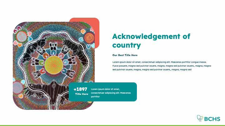
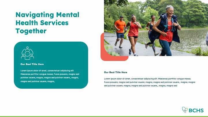
These logos are to be used in situations where the primary logos may not fit or work as well. For example, the acronym logos can be used at the bottom of a page to display the brand in a subtle way - as shown in the Powerpoint template. The vertical stacked logo could be used in social media profile images and situations that call for a centre-aligned logo.
Primary logos
Secondary logos
Logo colour variations
Full colour
Main version to be used on a white or pale green background.
Mono Black
For use where colour is not available or when a single colour is needed, for example uniform embroidery.
Reversed White
For use on dark backgrounds. To keep your design AA Accessible, use this on the dark teal, teal and dark purple backgrounds.
Logo space and size
Clear space
The logo must be used with clear space around it, ensuring it’s integrity in the design from other elements. The exclusion zone is equal to the capital B in the logo as indicated. This is the minimum space allowed between the logo and other elements. No other elements should intrude into this boundary area.
Minimum sizes
The logo has a minimum allowable size to ensure legibility and prominence.
It has no maximum size limit.
Minimum print size Minimum digital size
Incorrect logo usage
Consistency is key with branding. The logo has been designed to work in a specific way across a range of mediums.
In order to keep the branding consistent the logo should be used only as described.
Here are examples of what NOT to do when using the logo.
Do not resize any parts of the logo. The logo must be resized so all elements scale together.
Do not squash or stretch the logo.
Do not move any part of the logo.
Do not rotate the logo.
Do not recolour the logo.

Do not use the full colour logo over an image.
Logo placement
Primary placement
It is important that the logo is consistently positioned. The preferred placement of the logo is at the top left of all material.
Secondary placement
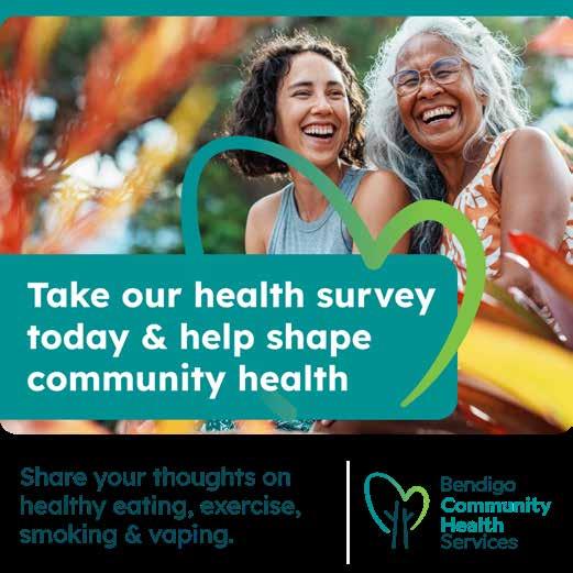
If the logo and brand is secondary it can be placed in the bottom right corner. An example is social media posts where the brand is already implied in the account name and on internal pages of a Powerpoint style presentation where the full logo is already shown or on the first page of a presentation.

Graphic elements
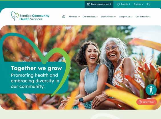
Full colour heart
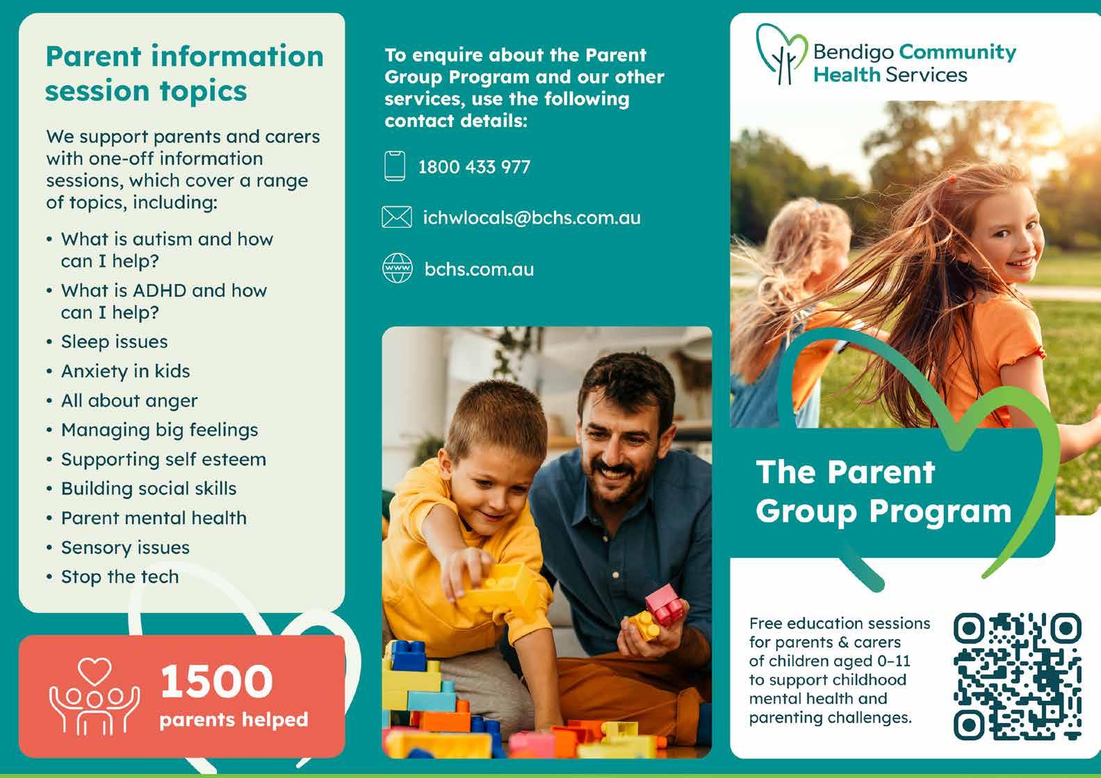
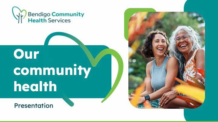
This element is derived from the logo and matches the gradient colours of the logo (Teal to Lime). It is to be used in combination with the teal rounded box to highlight the main heading of the material, or on its own to add movement and vibrancy to a design.
The primary use of this heart is to wrap around the rounded box containing the main heading.
The secondary use of this heart is to bring vibrancy to branding materials when there is available space.
Watermark heart
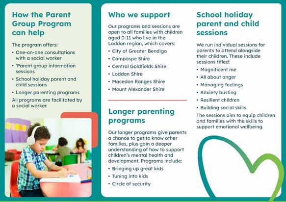
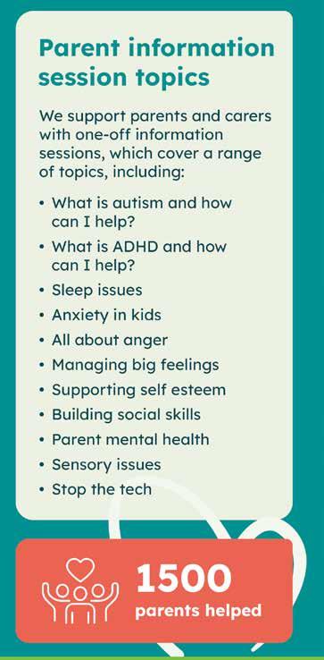
This element should be used to add visual interest to branding materials when there is available blank space. It can be positioned behind text, but the overlap should be minimal, as demonstrated in the brochure, business card, and presentation examples on the right.
When used on a white background, it should be in the pale green brand colour.
When used on a pale green background, it should be reversed to white.



Full colour heart
Watermark heart
Graphic elements
Rounded boxes
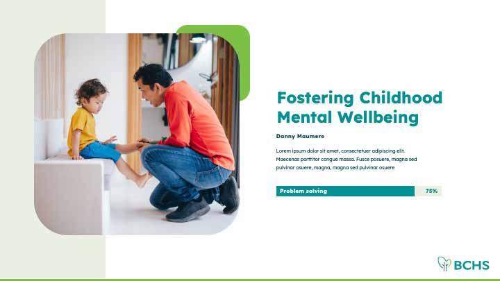
The rounded corners reflect the heart shape of the logo, with a larger top left corner and smaller top right corner.As a general rule, the top-right corner radius should be half the size of the other corners. For example, if the corner radius is 6mm or 60px, the top-right will be 3mm or 30px.
These boxes are to be used as:
• A background to highlight the main heading, with the full-colour heart element wrapped around the right side (see page 10 for more information).
• Backgrounds for call-out text, statistics, and infographics.
• Accents under the corner edge of images to add pops of colour.
• A frame for images when possible. If using the rounded corner frame isn’t feasible, a rectangular frame or standard rounded corner frame without differing radius values can be used.
Only use brand colours, and ensure colour contrast meets AA Accessibility standards (see page 14 for compatible colour combinations).
Rounded boxes




Graphic elements
Icons
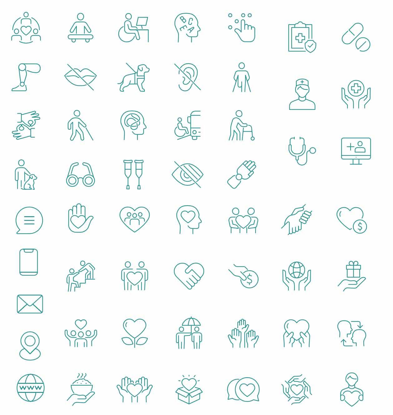
These are to be teal, outlined icons with a fine weight.
If on a dark background, these should be white.
Bottom/Top Border
This is to be used at the bottom or top of the design to bring in some brightness and reflect the lime in the logos.
Please use the Lime colour only.
Separator Lines
These can be used horizontally or vertically to separate content or to lead the eye to important content. You can see this in action in the Brochure examples, Website footer and for the page numbers on the Contents page of this document.
Please use the Pale Green and Coral colours only.
Icons
Bottom/Top Border

Separator Lines

Section 2: Colours
Colour palette
Primary colours
Please use these colours the most.
• Teal is for headings and rounded background boxes.
• Dark teal is for body text.
• Lime as a highlight (such as a top or bottom border).
• Pale green as a background and for the watermark heart element.
Secondary colours
These colours are to be used for decorative rounded boxes and service categories on the BCHS website. The Teal to Lime gradient should only be applied to the full-colour heart shape, which is taken directly from the logo.
AA Accessibility
It is important for inclusion of all people to meet AA Accessibility colour contrast standards. These colours have been tested to pass these standards in certain combinations, it is important you stick to only these combinations.
*This colour combination can only be used for text that is 16pt/18px or larger. For text smaller than this, the combination will not meet accessibility standards.
Primary colours
Secondary colours Accessible background and foreground colours (AA WCAG Standards)
Use the Teal and Lime colours together to create this.

Section 3: Typography
Typefaces
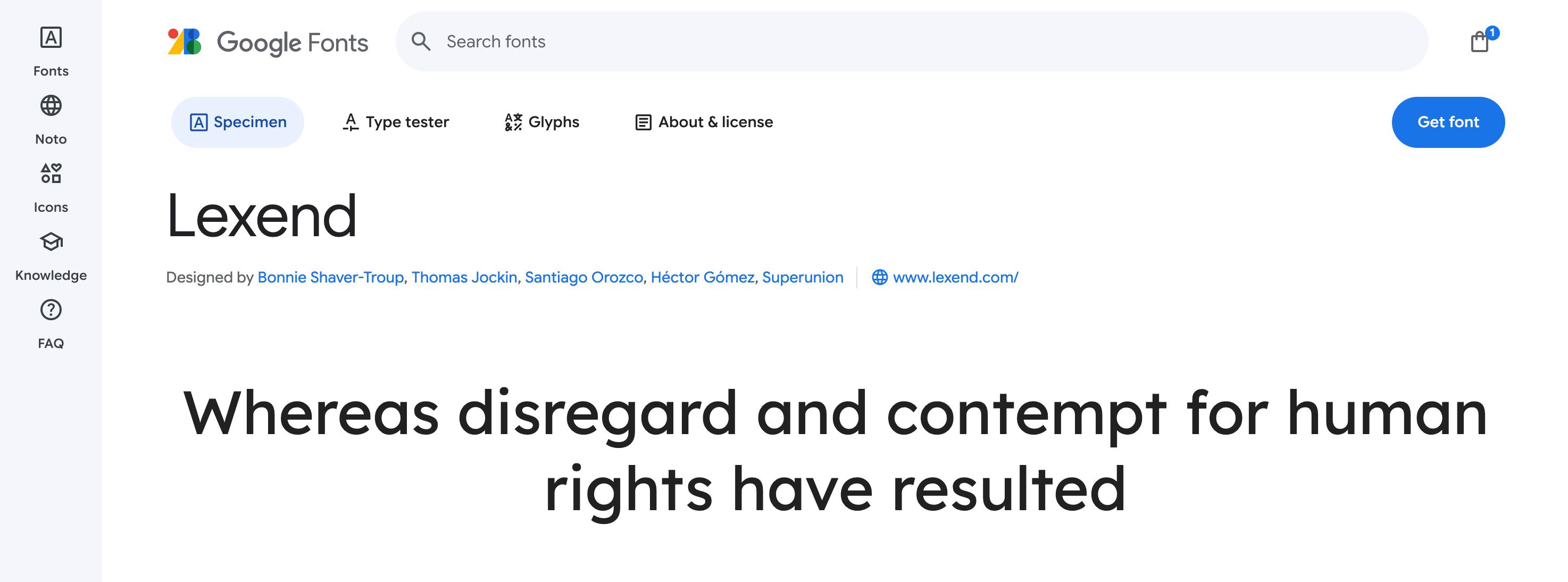
The BCHS brand uses the free Google Font named Lexend.
This typeface is freely available for anyone to use on a desktop computer. You can download it here:
https://fonts.google.com/specimen/ Lexend
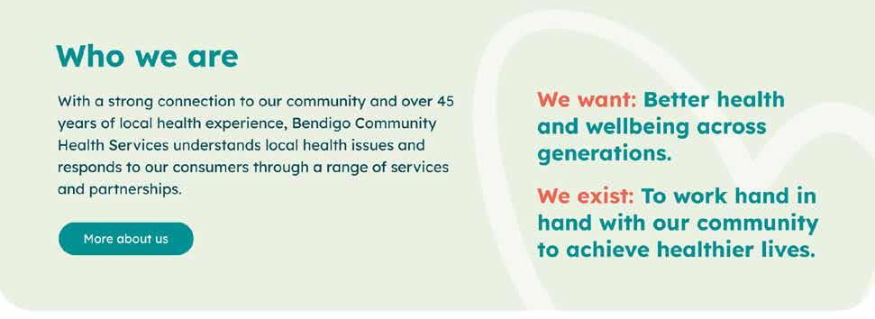
Highlighting text: You can use the coral brand colour to highlight or differentiate important words. This is seen on the BCHS website in the example below:
Minimum print font size: 8pt (ideally 12pt)
Minimum website font size: 14px
Headings - Lexend Bold
Subheadings - Lexend Bold
Highlight text remaining text
- Lexend Bold
Body - Lexend Regular

Section 4: Language
Language and tone of voice
At Bendigo Community Health Services (BCHS), our language and tone reflect our commitment to being approachable, inclusive, and supportive. We want everyone in our community to feel welcome, heard, and empowered to take control of their health.
Language guidelines
Use “We” and “You”
We speak directly to our community. Using “we” creates a sense of partnership, while “you” engages individuals, making the message feel personal.
Example: “We’re here to support you” or “Together, we can work on a plan to manage your health.”
Positive Framing
Whenever possible, frame messages positively to inspire confidence and action.
Example: Instead of “Don’t ignore your health issues,” we say “Take the first step towards better health.”
Inclusive Language
Reflect the diversity of the community by using gender-neutral terms and avoiding assumptions about people’s backgrounds or experiences.
Example: “We care for everyone, no matter who you are.”
Supportive Calls to Action
Encourage people to reach out and take advantage of our services in a way that feels achievable and welcoming.
Example: “Get in touch with our team today to start your journey to better health.”
Tone of voice
Warm and Friendly
We speak with care and compassion, using a welcoming tone that makes people feel comfortable reaching out. Our language should always reflect kindness and understanding, ensuring that everyone knows they are valued and supported.
Inclusive and Non-Judgmental
We ensure that no one feels excluded. Our copy reflects diversity, encouraging everyone—regardless of their background, income, or health needs—to access our services without hesitation.
Clear and Straightforward
Health can be complicated, but our language shouldn’t be. We prioritize clear, plain language to ensure that our message is easily understood by everyone, avoiding jargon and overly technical terms.
Empowering and Encouraging
We focus on positive and hopeful messaging. BCHS is here to help, and we want people to feel empowered to take that first step towards improving their health. Our language reflects optimism, encouraging individuals to make healthy choices with our support.
Professional yet Accessible
While we maintain a professional tone, we avoid being too formal. We aim to balance professionalism with warmth, making sure our communications remain friendly and accessible.
Section 5: Imagery
Brand imagery
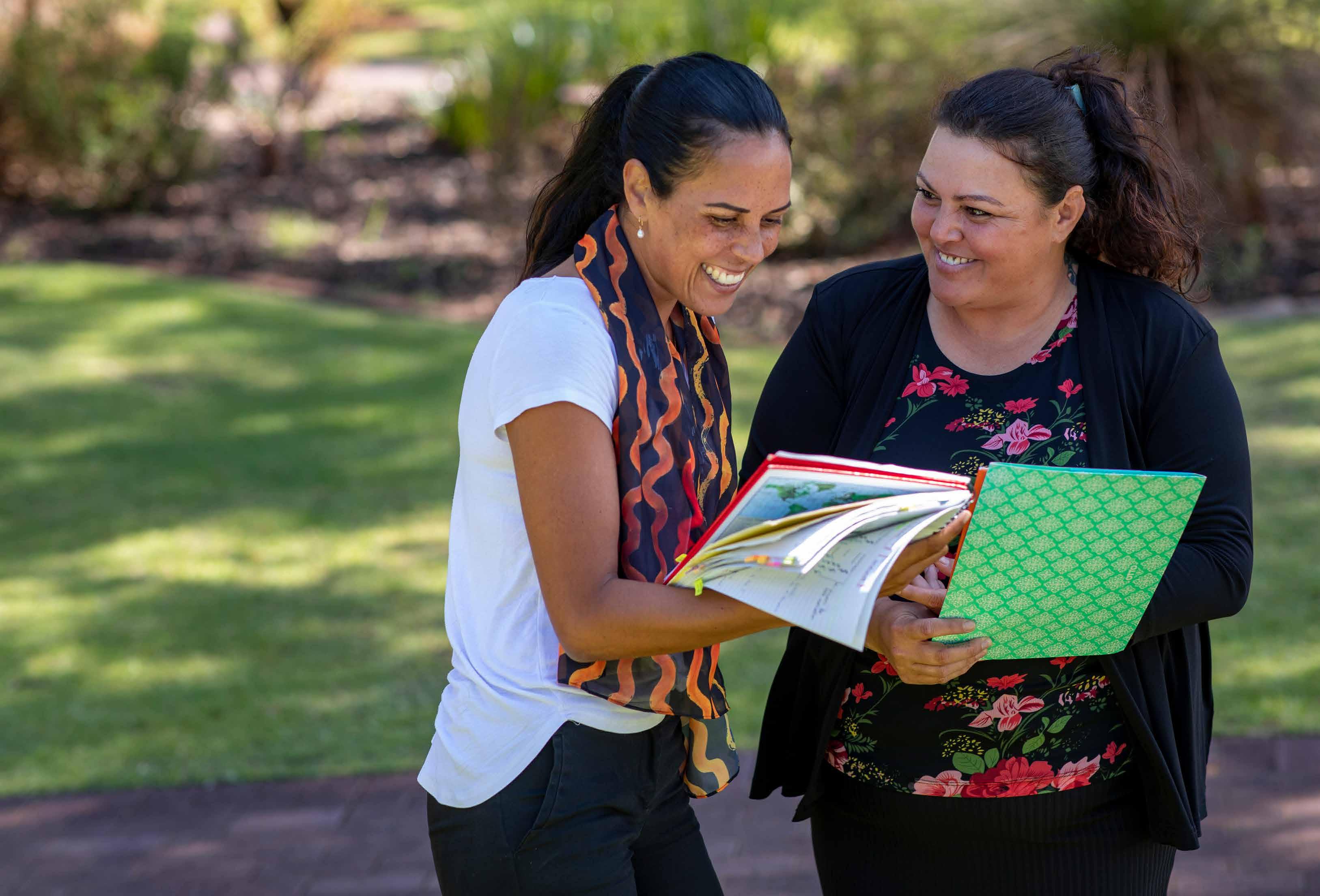
BCHS brand imagery should reflect the organisation’s values of care, inclusivity, and community connection. Photos should feel authentic and relatable, featuring real people in natural, everyday settings. The imagery must be diverse, representing individuals of all ages, backgrounds, and abilities.
Warmth and compassion are key themes, with photos showing friendly healthcare professionals and positive, supportive interactions.
Lighting should be bright and natural to evoke a healthy, welcoming atmosphere. Community-focused shots, such as group activities or health workshops, should highlight the collective spirit and belonging that BCHS fosters.
Overall, the imagery should emphasise BCHS’s commitment to improving health through approachable, compassionate care, making everyone in the community feel seen, supported, and empowered.




Section 6: Branding examples
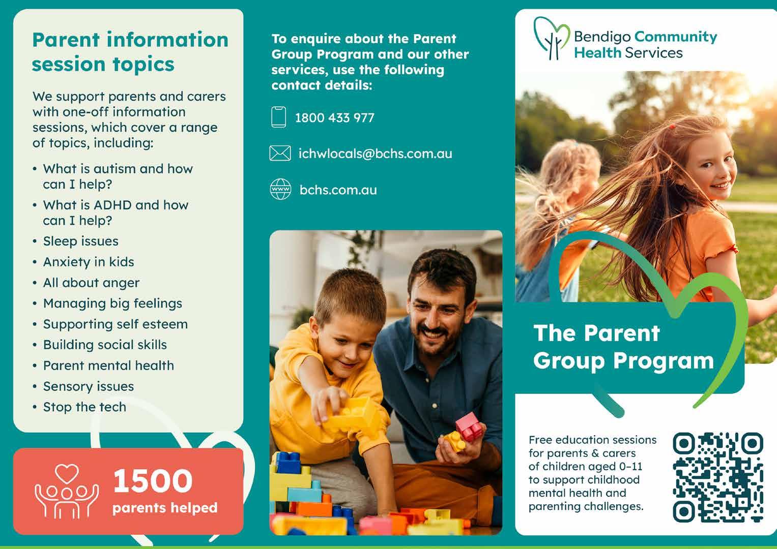
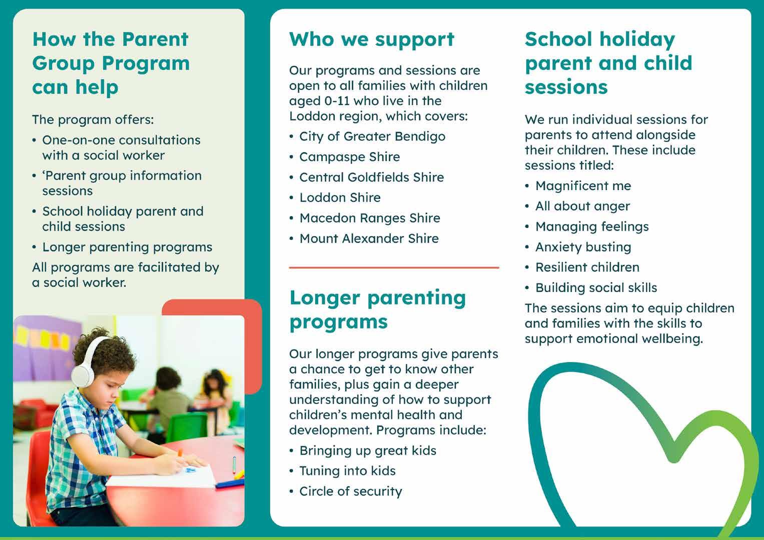
Brochures
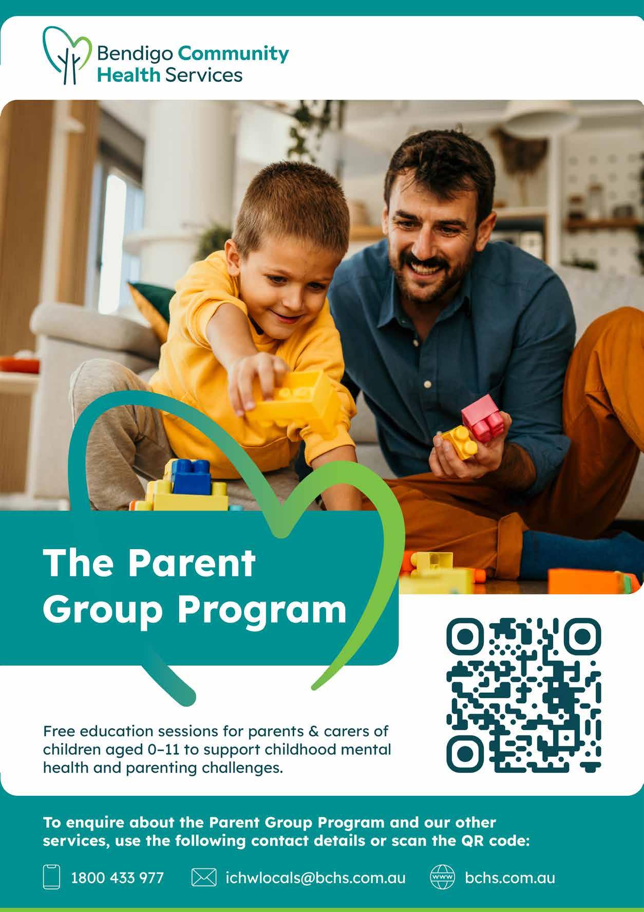
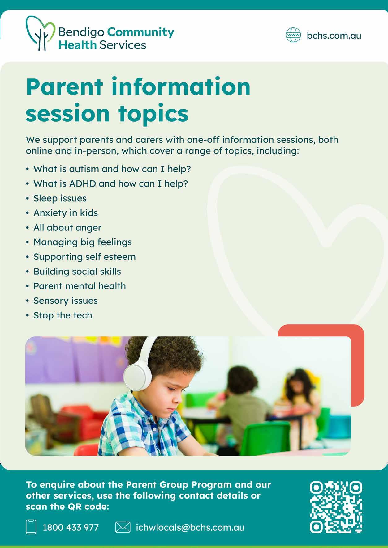
A4 Flyers
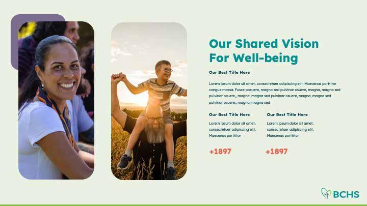
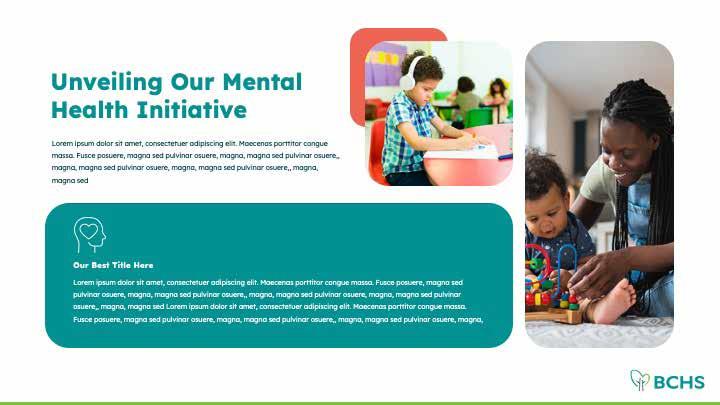
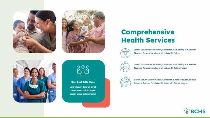
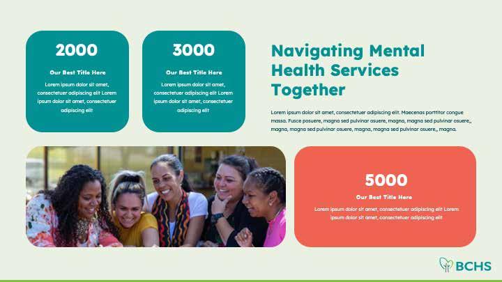
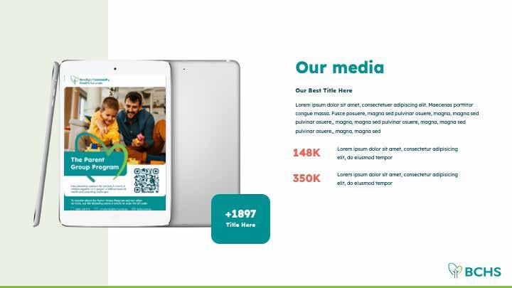
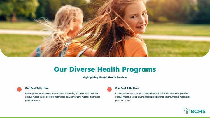
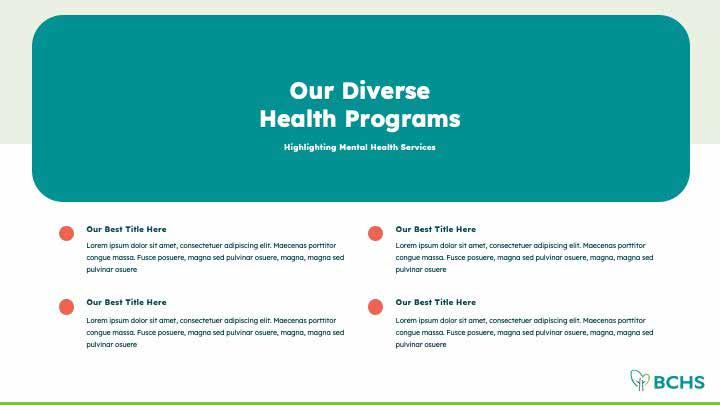
Presentation/Powerpoints







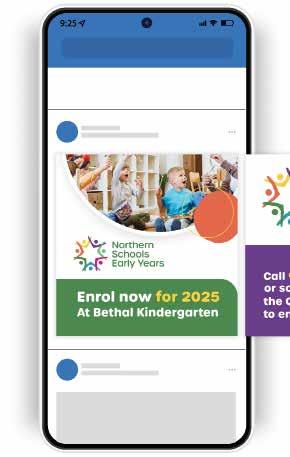
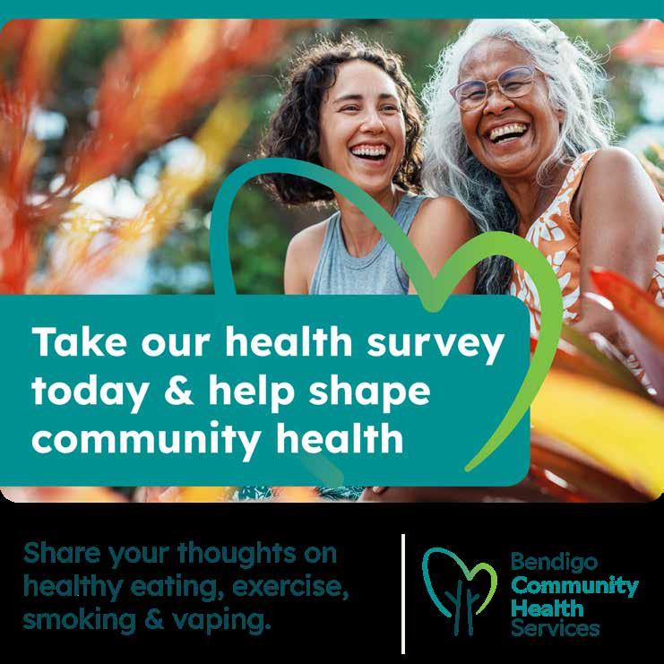
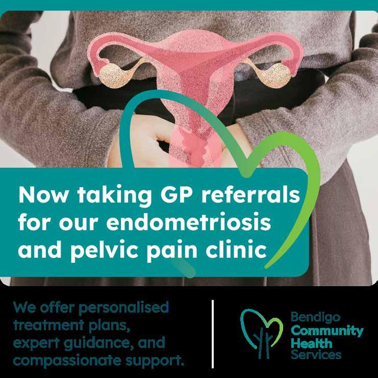
Social Media

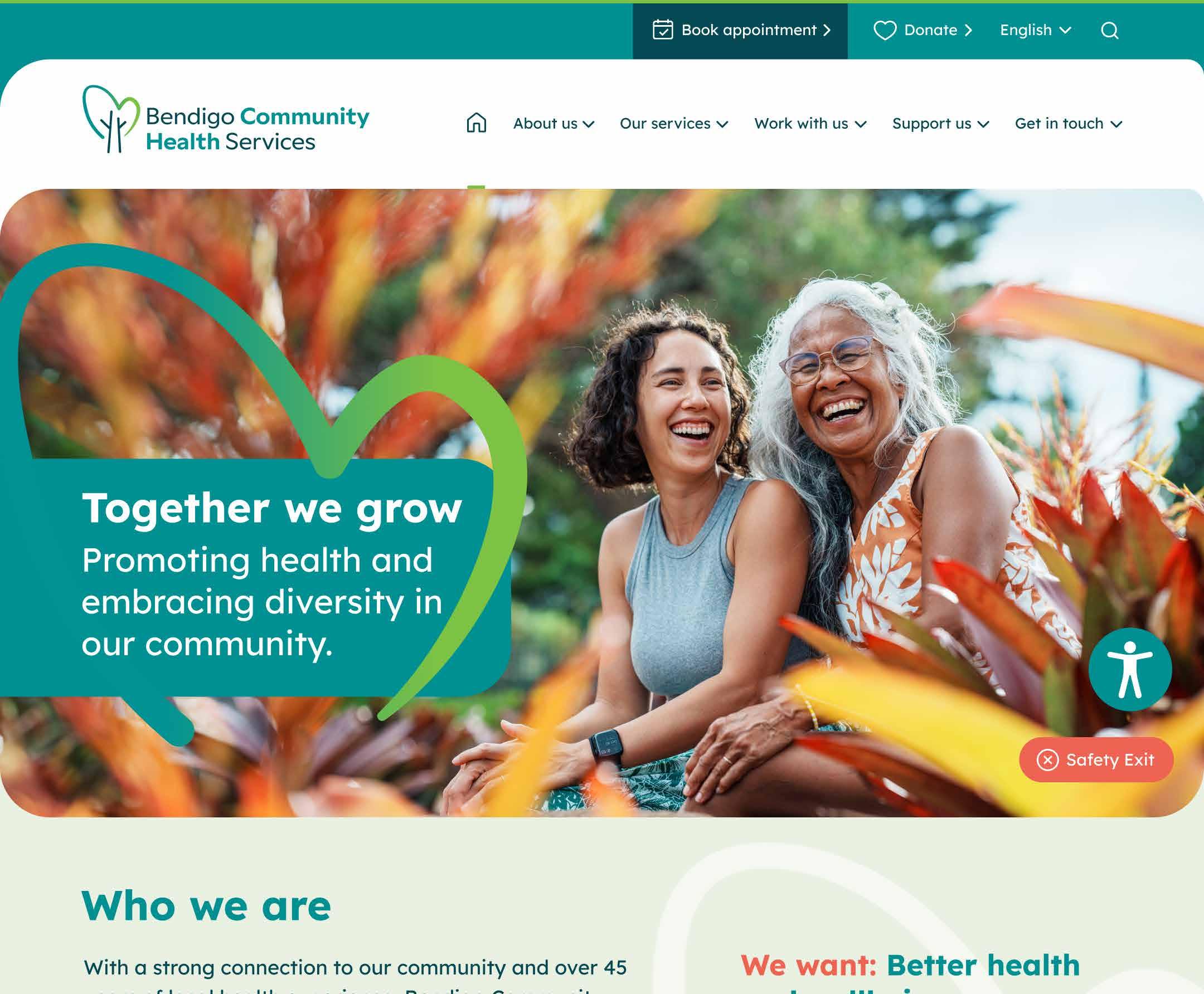
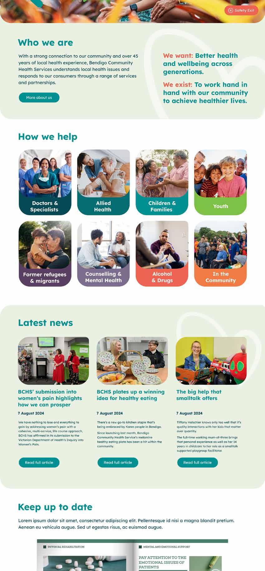
Website
Thank you
For any information relating to our brand or style guide please contact Bendigo Community Health Services via the following details:
Email: bchcomms@bchs.com.au
Phone: 03 5406 1200
Mail: PO Box 1121, Bendigo, Victoria, 3552
This style guide was prepared for BCHS by Blick Creative:
Website: blickcreative.com.au
Email: info@blickcreative.com.au
Phone: 1300 076 691

