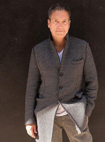
Alex Watson and his brand Renais | CEO of the Shakespeare Globe Theatre Stella Kanu
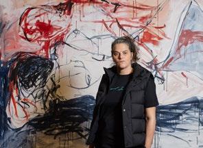
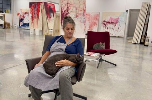
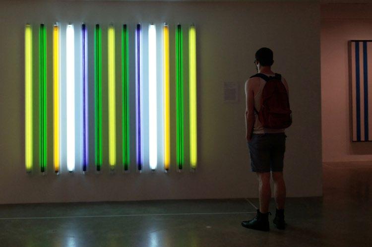
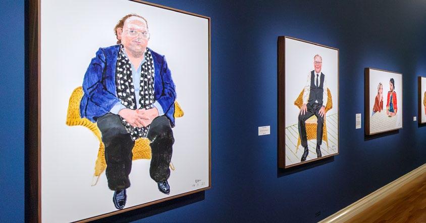
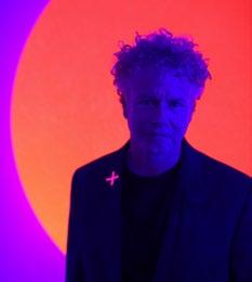
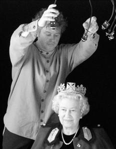
Tracey Emin with Arturo Galansino | Contemporary artists Chris Levine and Michael Craig-Martin
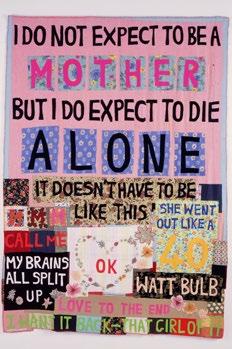
Now what’s more important than sex to me is Love, definitely Love, it has to be Love. The chances of having both at the same time are pretty rare, especially for me.
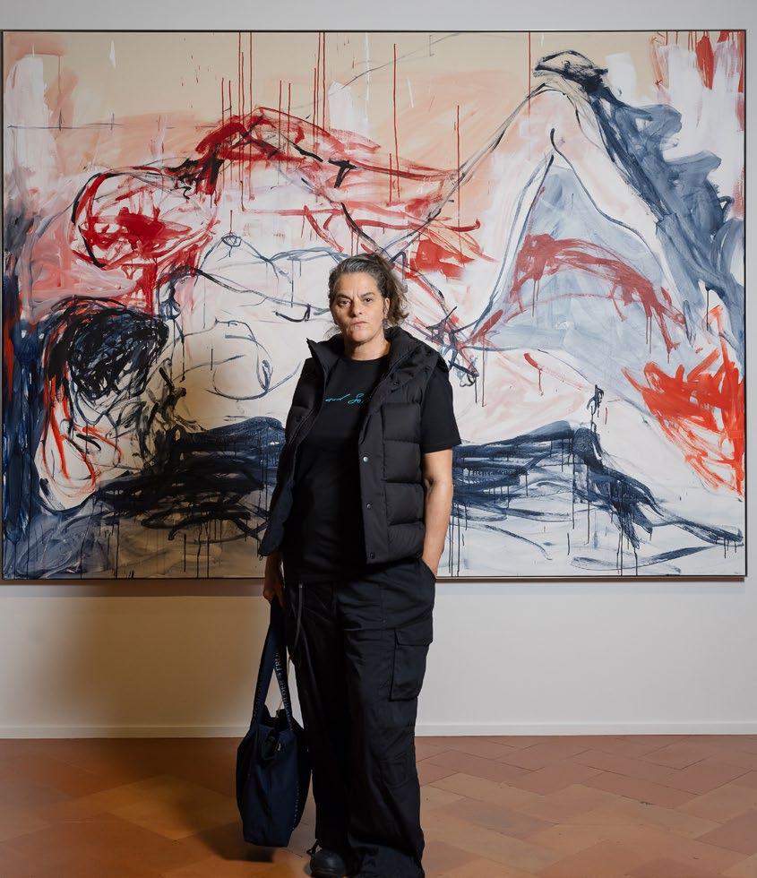
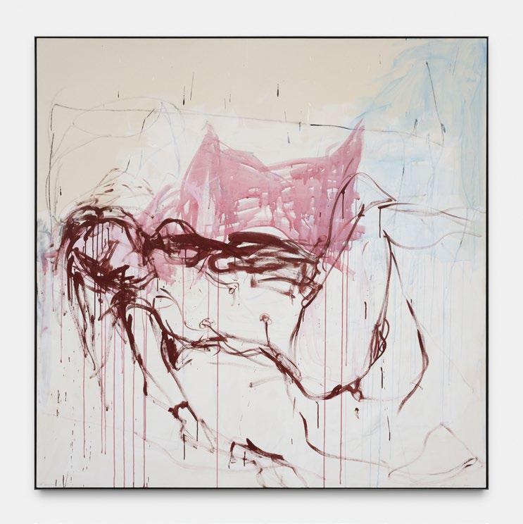
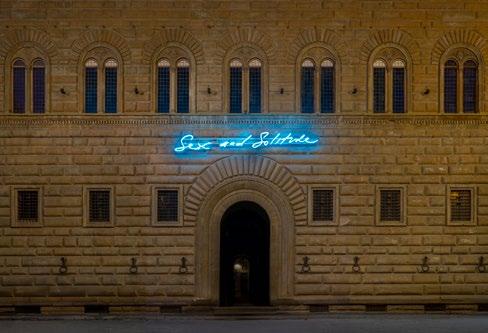
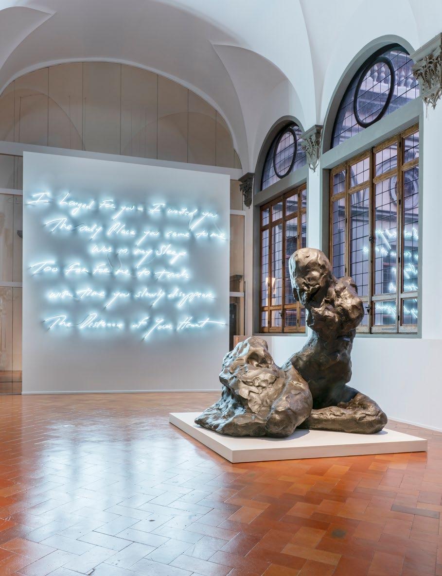
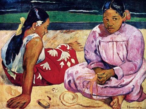
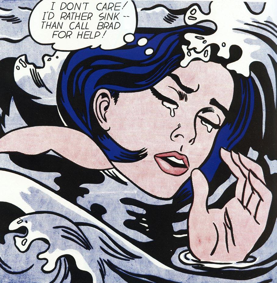
TRACEY EMIN
SEX AND SOLITUDE
The shape of beauty.
Ferrari invite you to discover the Ferrari Roma Spider. A timelessly elegant high-performance car, encapsulating a contemporary take on the chic, pleasure-seeking Italian lifestyle of the 1950s and 60s.
Contact your Official Ferrari Dealer to discover more.
Fuel economy and CO2 results for the Ferrari Roma Spider in mpg (l/100km) combined: 14.7 (19.2) – 29.7 (9.5). CO2 emissions: 437 –217 g/km. Figures shown are for comparability purposes; only compare fuel consumption and CO2 figures with other cars tested to the same technical procedures. These figures may not reflect real life driving results, which will depend upon a number of factors including the accessories fitted (post-registration), variations in weather, driving styles and vehicle load.
note Editors
“When I’m creating, painting, writing, thinking; that’s when I feel really fantastic.”
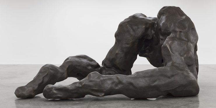
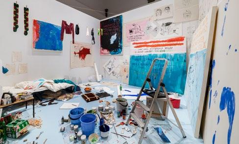
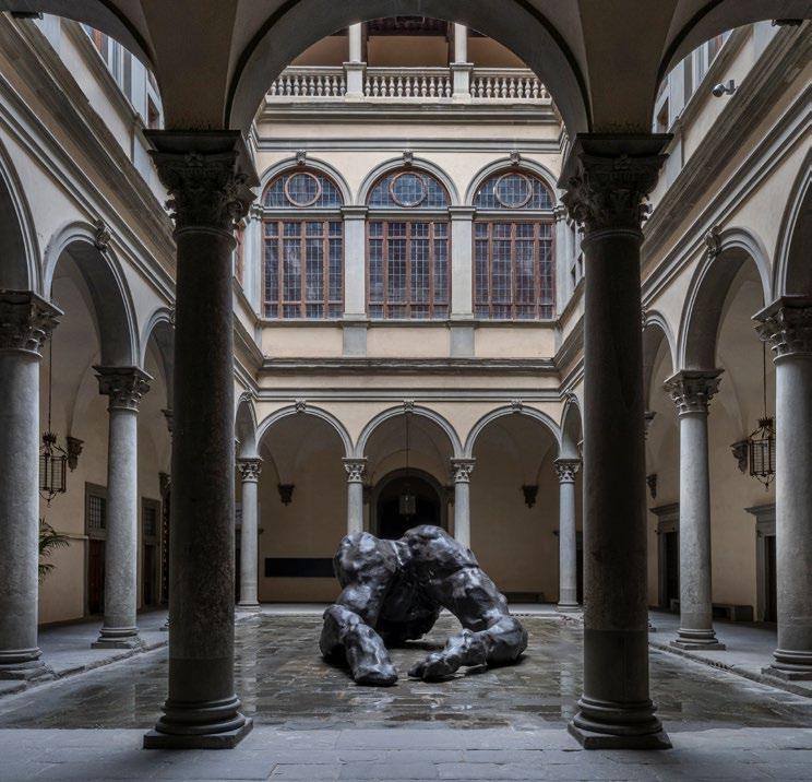
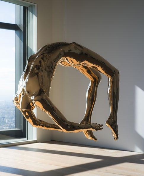
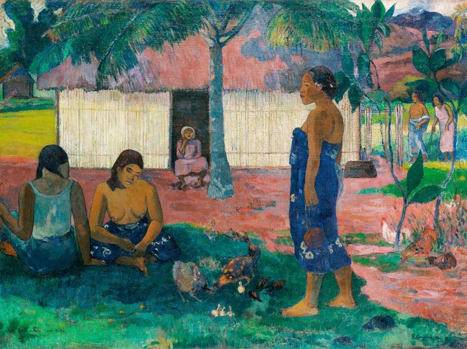
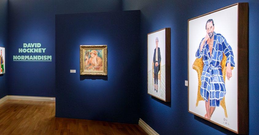
Travelling to Florence to visit Tracey Emin’s first solo exhibition in Italy was an immensely inspirational experience. It was as if every inch of this architectural marvel was begging to be filled with Emin’s pieces, which fit the space so perfectly. Seeing the fusion between the history of the Renaissance and Tracey’s large bronze sculptures was truly magical, and having the honour to welcome Tracey to Issue 5 of the Art & Culture Magazine, and feature her interview with the remarkable curator Arturo Galansino, is certainly one of the highlights that I’m so proud to present for this edition.
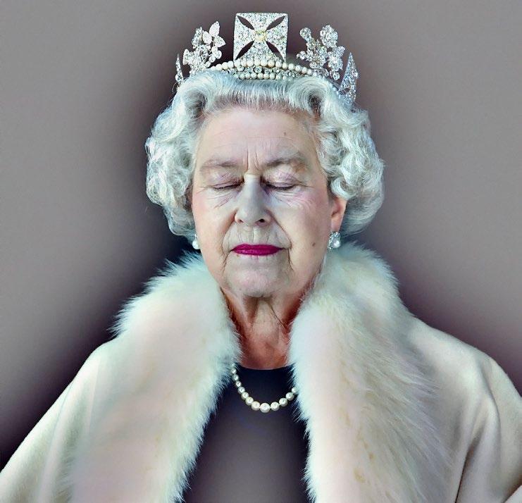
Issue 5 of the Art & Culture Magazine continues to open its horizons in collaboration with some amazing and iconic figures in the art world that have something to say, and use their art to do so. Welcoming the incredible contemporary artists Chris Levine and Michael Craig-Martin, we explore their work and professional journey that continues to inspire and leave the gallery-goer wanting more. Having been selected as the Queen’s portrait artist in 2004, Chris recounts his experience styling and sitting with the Queen of England in a fun and engaging interview filled with the stories that have shaped his career in the art world.
Tracey Emin Tracey Emin
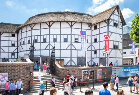
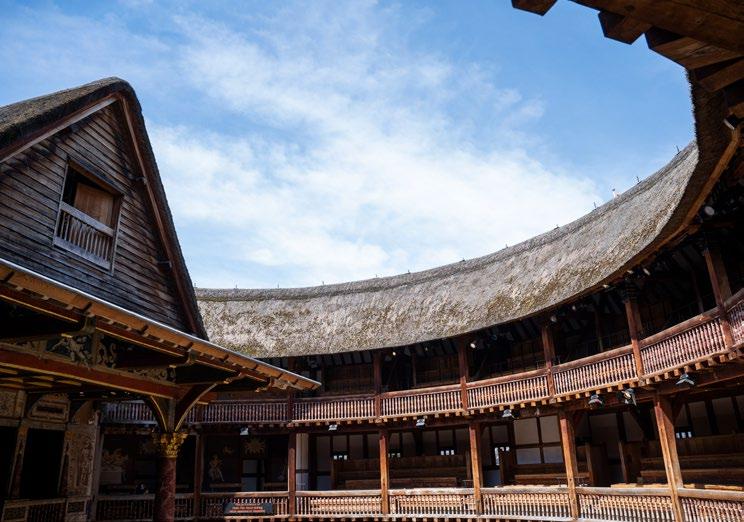
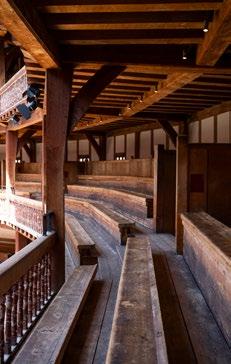
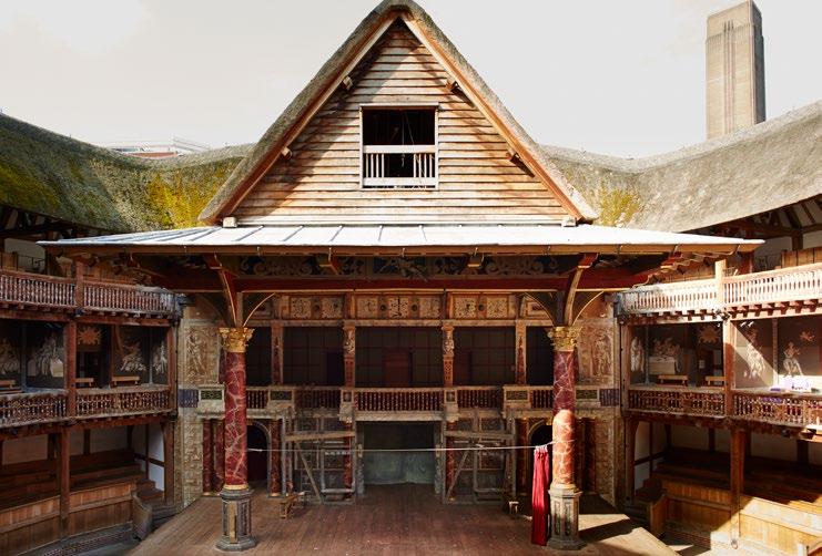
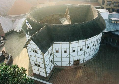
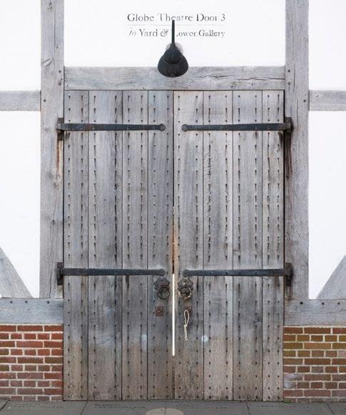
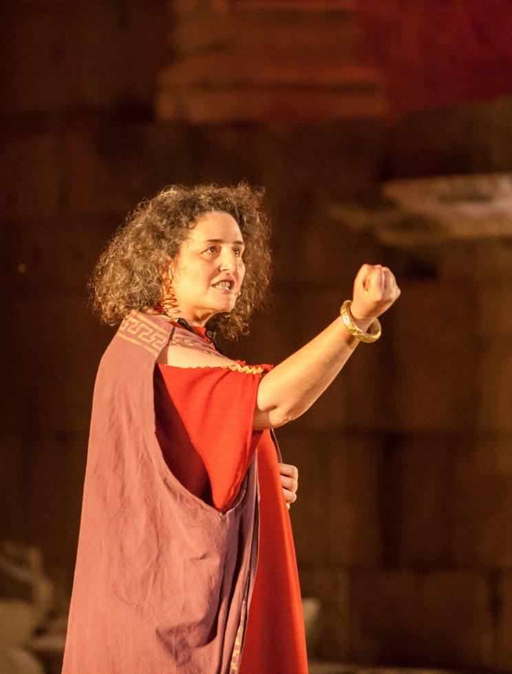
Joined by the wonderful CEO of the Shakespeare Globe Theatre Stella Kanu, she opens up in a candid conversation about her experiences in the world of the performing arts. With an exciting programme of plays and events set to take place at the Shakespeare Globe this year, Stella bestows upon us exclusive commentary and unmissable highlights for the remainder of 2025 in the city of London.
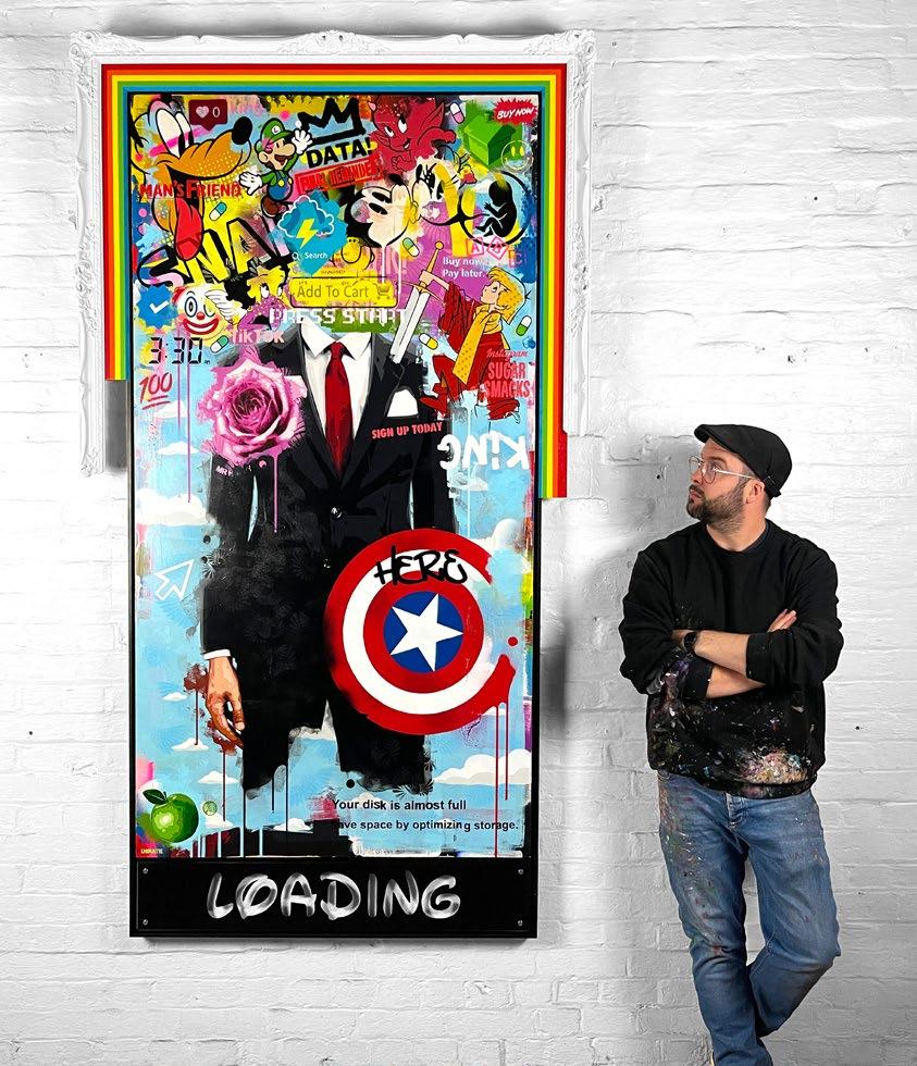
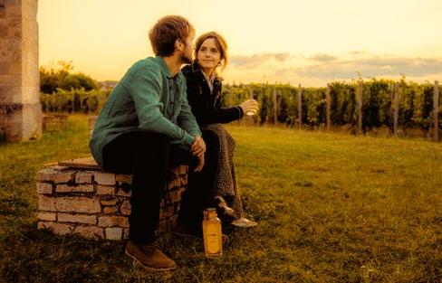
Meeting with Alex Watson to discuss his brand Renais, a project he’s currently working on alongside his sister Emma Watson, has also been one of my most unforgettable interviews that I’ve had the privilege to conduct. In the same way that the story behind a wine or any product is what truly makes it special, the same can be said for a work of art. Diving into the history and the context of an artwork will ultimately shape your perception of it
and infuse that sense of magic we feel when connecting with creativity and expression.
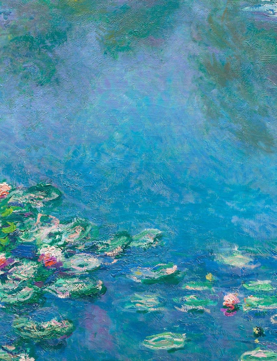
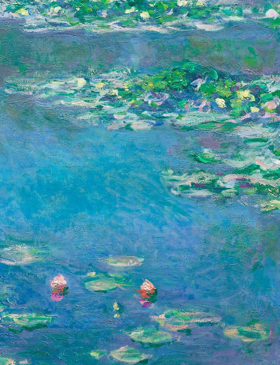
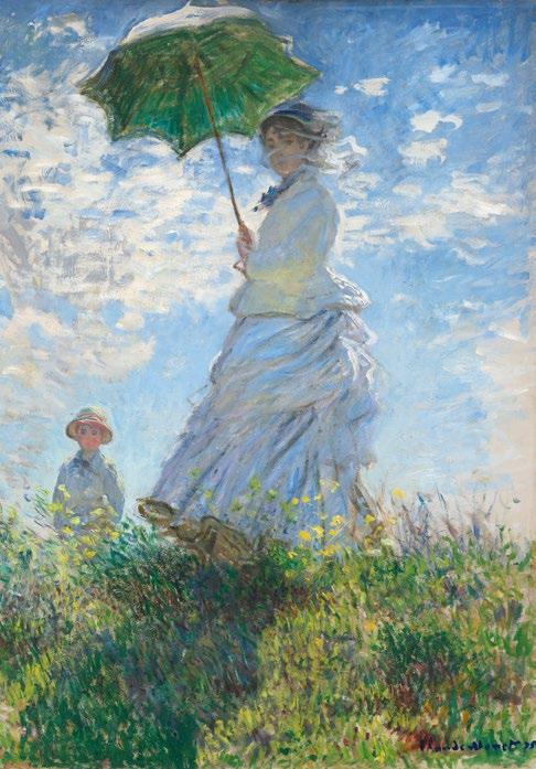
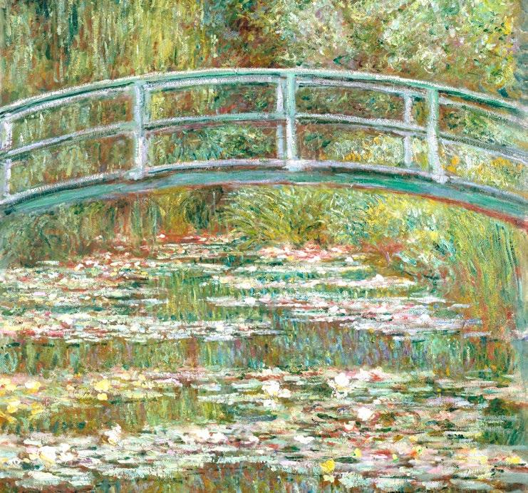
From Monet’s Impressionist works painting ‘en plein air’ on long summer days in Southern France, to Francis Bacon’s Freudian Psychoanalysis peppered throughout his body of work, Issue 5 explores various cultural movements that have trailblazed the global art stage throughout the ages. From discovering the origins of Art Nouveau and Neo-Plasticism, to tracing our way back to the art of Ancient Egypt, Issue 5 presents a plethora of themes and topics throughout the history of art to engage and shed light on the artists that have paved the way for today’s contemporary climate.
Curating each and every page with the utmost love and care for you dearest reader, we hope that Issue 5 of the Art & Culture Magazine continues to open up a world of innovation, individuality and inspiration.
Tammy
With love always, (Editor in Chief)
Tracey Emin Interview with Arturo Galansino
NOUVEAU
Le Style Mucha
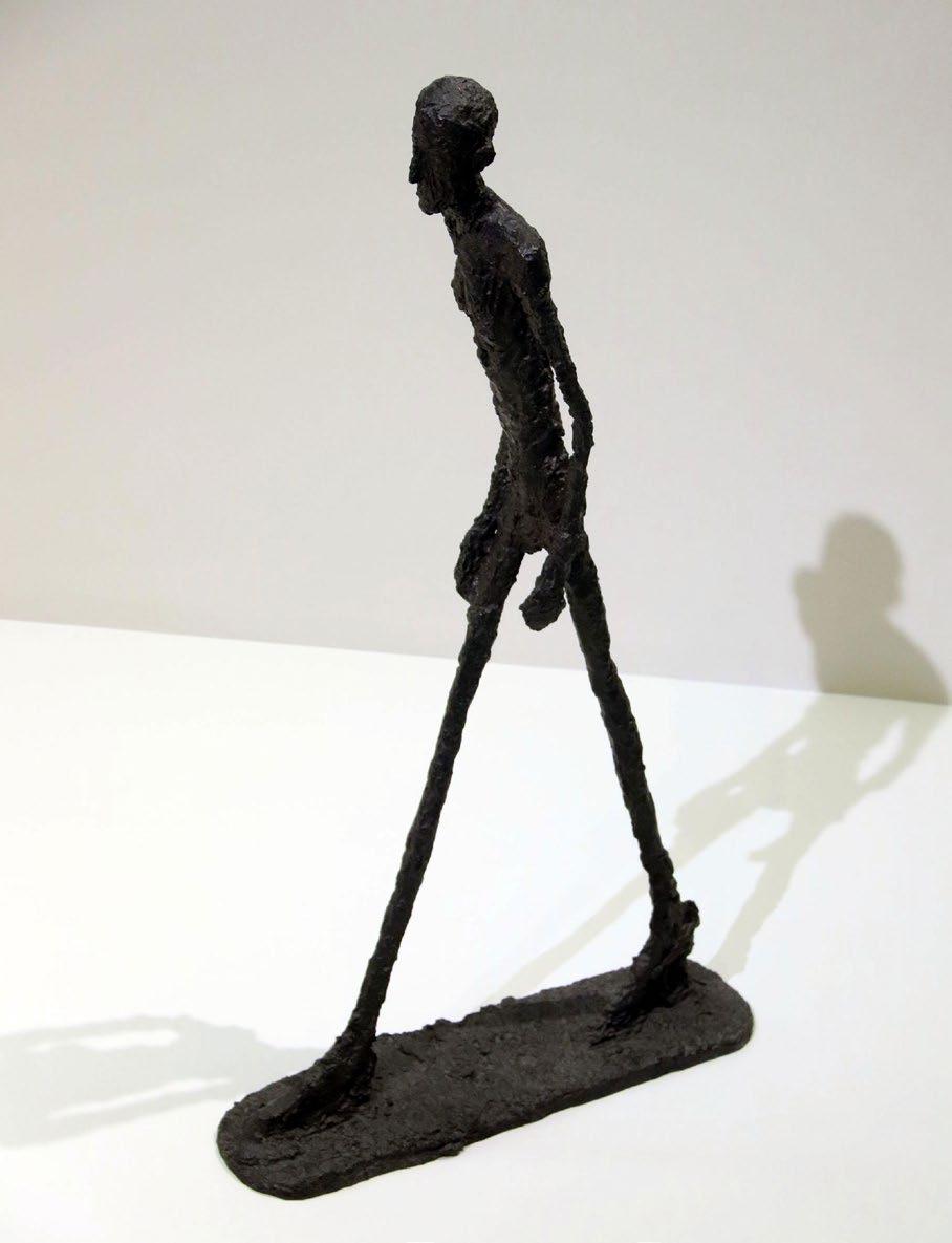
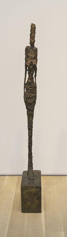
68 Alberto Giacometti Sculpting the Void
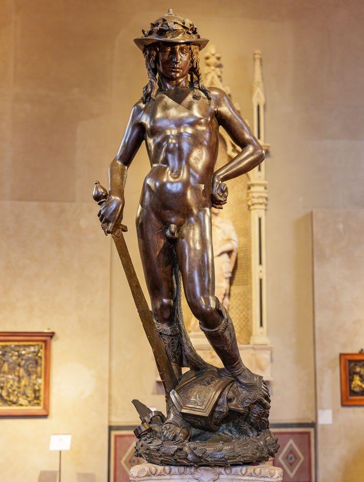
72 Donatello’s David The Art of Contrapposto
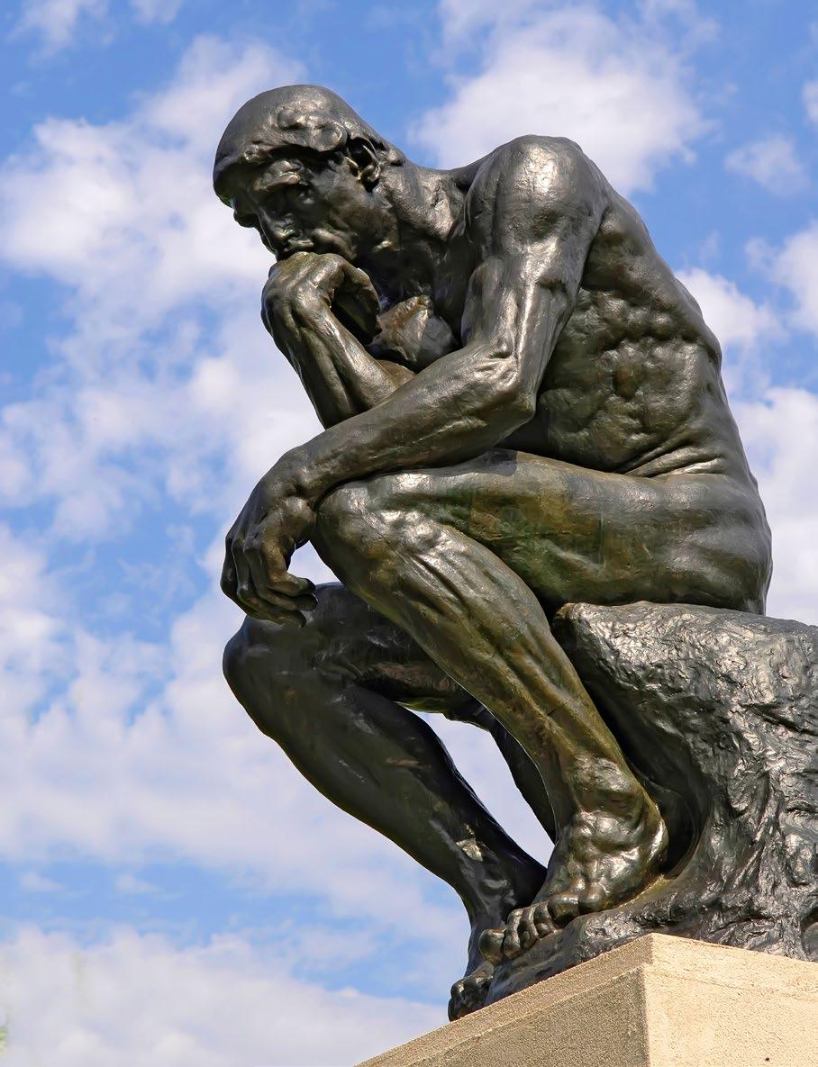
74 What is The Thinker Thinking?
78 Cubism in Sculpture Capturing the Spirit Beyond the Canvas
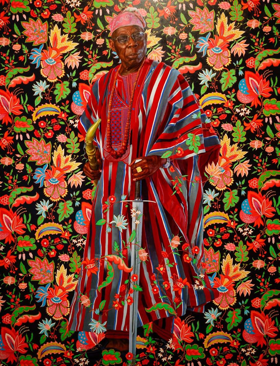
80 The Cell Series Louise Bourgeois 96 KEHINDE WILEY
SECTION 3 Photography, Film & Video
86 FEATURE INTERVIEW
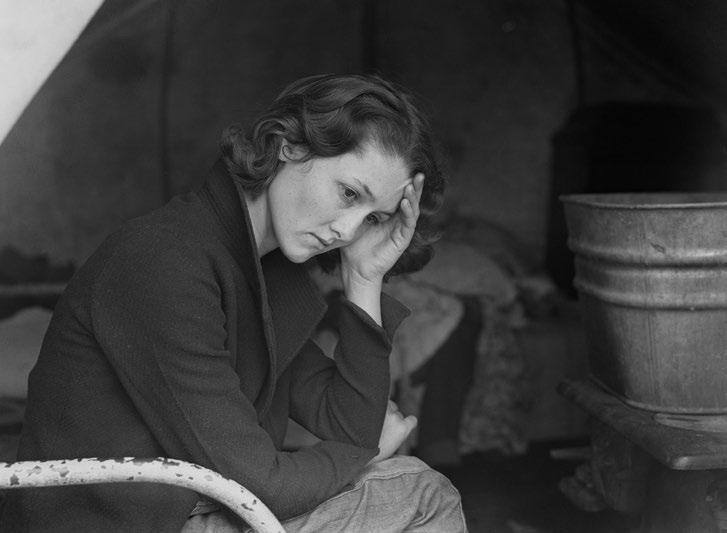
90 Dorothea Lange & The Role of Photography for Social Justice
92 Rembrandt‘s Influence Modern Art and Cinema
98 Humour in Bergman’s The Seventh Seal 100 Nosferatu A Symphony of Horror 102 Clay & Curiosity The Timeless Art of Stop-Motion
104 Painting to Pixels The Aesthetic Evolution of Video Games
106 Cultural Nostalgia Why we Long for the Past
Photorealism
Alex Watson Tantalising the Tastebuds
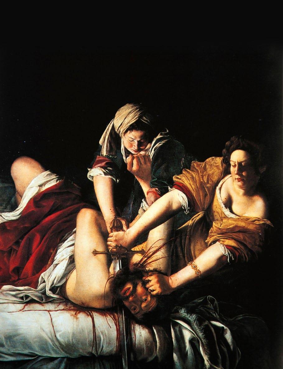
130 Artemisia Gentileschi
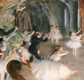
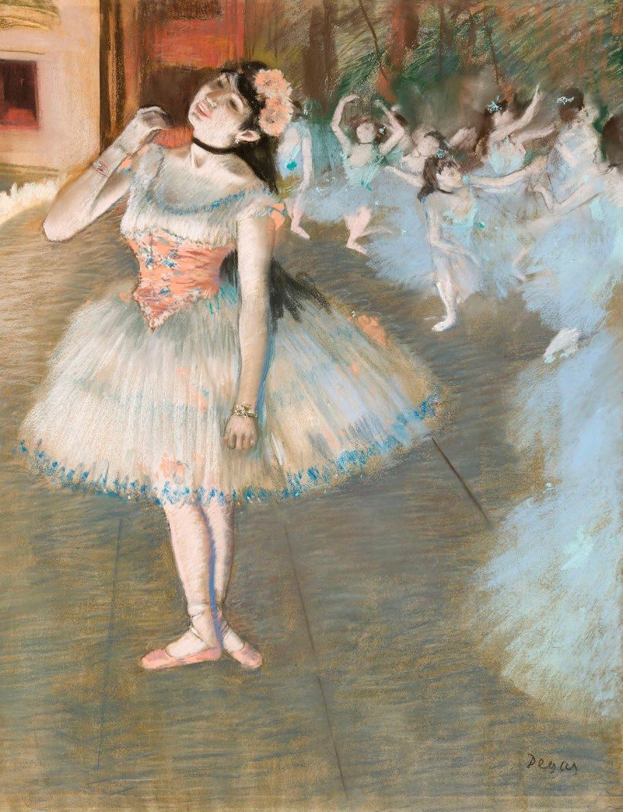
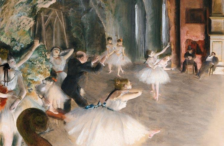
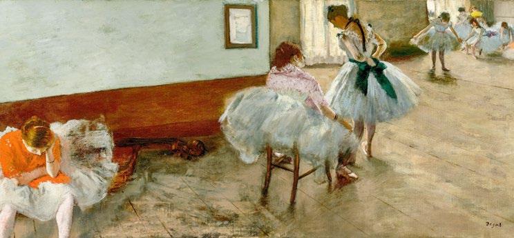
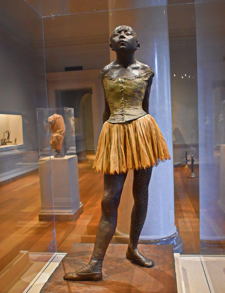
DEGAS
Stella Kanu & Shakespeare’s
Editor in Chief
Tamara Bell tamara@outsideinmedia.com
Assistant Editor
Sophie MacDonald sophie@outsideinmedia.com
Magazine Designer
Emma Long Graphic Design emma@outsideinmedia.com emmadesign.co.uk
Contributors
Tamara Bell
Aiden Bell
Francis Devincenzi
Jo Ward
Francesco Scalici
Sophie Macdonald
Amber Williams
Ian Law
Arturo Galansino
Anthony Loddo
Photography
Artist photography supplied by the artists
Specific photo credits on the article pages
Stock photography by Alamy, Shutterstock & Unsplash
Cover image
Artwork by Michael Dargas
Art&Culture Magazine
Published by Outside In Media a trading name of Art Space Ltd, 120a Irish Town, Old Police Station, Gibraltar, GX11 1AA.
The name Art & Culture Magazine is a mark of Art Space Ltd, used under exclusive licence. No part of this publication may be reproduced without written permission from the publisher.
Art & Culture Magazine places great importance on the accuracy of the information contained within this publication but cannot accept responsibility for any errors or omissions. Views expressed by contributors and/ or correspondents do not necessarily reflect those of the publisher. Neither Art & Culture Magazine nor Art Space Ltd is responsible for any claims made, or material(s) used in advertisements.
For permission to copy cuttings for internal or client use, please contact a&c@outsideinmedia.com
RatioGolden
& The Fibonacci Sequence
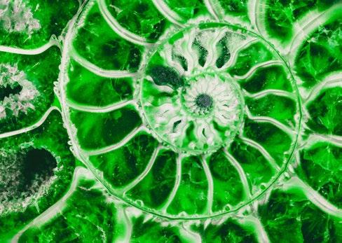
The Fibonacci sequence is a series of numbers, in which each number is the sum of the two preceding ones before it, starting with 1 and 1. For example: 1, 1, 2, 3, 5, 8, 13, 21, 34, and so on. These numbers can be seen in various forms of expressive art, namely in musical rhythmic sequences, sculptural carving, paint works and more.
We can see and use the Fibonacci sequence by following a rotating proportion of a specific number within the golden ratio. An example of this is the number 1.618, which appears frequently in nature, often linked to spiral patterns, such as those found in snail shells, curling waves, sunflower
seed arrangements, or even the formation of swirling galaxies. It represents a mathematical principle that has long been associated with harmony and balance, influencing not only the natural world, but also the various forms of art and design, due to its pleasing visual appearance.
“Often linked to spiral patterns, such as those found in snail shells, curling waves, sunflower seed arrangements, or even the formation of swirling galaxies.“
Many sources attribute the Fibonacci Sequence to Leonardo Fibonacci, a mathematician born in Pisa, Italy, in 1170 A.D. However, it is debated whether he was truly the first to conceive of this sequence. Evidence suggests that similar concepts appeared in ancient Sanskrit texts long before Fibonacci’s time. These texts supposedly introduced the sequence to the Western world, and it is believed that Fibonacci’s work could have possibly built upon and further explored these earlier ideas.
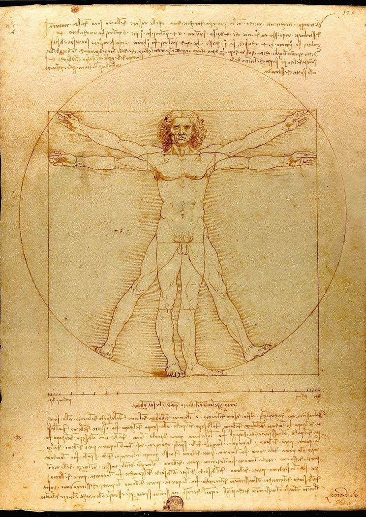
Leonardo da Vinci incorporated precise proportions in his Vitruvian Man to reflect the Fibonacci sequence, demonstrating how mathematical principles can define perfection. A key aspect of his work was with the use of the golden ratio, aiming for a visual representation where every element of the figure’s physique and proportions adhered to the most ideal and aesthetically pleasing measurements. The circles in the drawing, with diameters that align with Fibonacci numbers, grow progressively larger like the number examples above, illustrating the exponential growth inherent in the sequence and showcasing the interplay between mathematics, art, and beauty. More examples in da Vinci’s work can be observed is his commonly renowned, Mona Lisa, wherein her image contains rectangles that frame the face with dimensions that are Fibonacci numbers, and form the Golden Ratio as well.
VITRUVIAN MAN Leonardo da Vinci
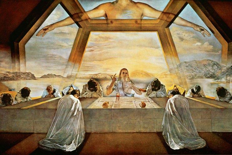
THE SACRAMENT OF THE LAST SUPPER
Furthermore, in the late 1940s, following a difficult period of civil war in his home country of Spain, Salvador Dalí, one of the most influential painters of the 20th century, experienced a profound shift in his artistic vision. Returning to themes rooted in Christian and traditional values, Dalí intertwined his deepening fascination with Freudian psychoanalysis and mathematics into his art, inspired by his personal meeting with Sigmund Freud in the late 1930s. This
“Has the Fibonacci sequence been over-romanticised in art, or does it truly resonate as a profound echo of something far more intricate woven into the fabric of the cosmos? ”
combination of faith, psychology, and scientific precision is strikingly evident in his piece, TheSacramentoftheLastSupper, which can be observed on display at the National Gallery of Art in Washington DC, USA.
Drawing on the aesthetic principles of the Italian High Renaissance, Dalí modelled his work with an intricate mathematical structure, incorporating the Fibonacci sequence and golden spirals in his depictions of men, symmetrically placed around a table, the same figure repeated in perfect mirror images on either side of Christ. These elements mirror the proportion observed in Leonardo da Vinci’s Vitruvian Man, showcasing Dalí’s homage to the contradictory, yet thought-provoking relation of spirituality and science within his art, which perhaps alludes to the art of God’s creation of humanity, and how human life could be deemed as his masterpiece.
After nine arduous months of work, Dalí unveiled his masterwork, explaining the intricate geometric patterns by stating that he “wanted to materialise the maximum of luminous and Pythagorean instantaneousness based on the celestial
communication of the number twelve.” This reference highlights the significance of the number 12, seen in various natural and cultural cycles. 12 hours in a day, 12 months in a year, and 12 zodiac signs encircling the sun, and so on. Dalí mirrored this symbolism in his painting, where 12 men, representing the disciples, surround Jesus Christ, the central figure.
A question now remains. Has the Fibonacci sequence been over-romanticised in art, or does it truly resonate as a profound echo of something far more intricate woven into the fabric of the cosmos? Is it a symbolic code, a kind of celestial fingerprint, guiding us towards an understanding of the spiritual connection we share with one another, akin to an innate reflection of nature itself, mirrored in the biology of our planet and its natural phenomena? Or should we instead question its necessity and utility in artistic expression, viewing it as little more than a niche fascination rather than a universal truth? Either way, it is certainly unusual and thought provoking and perhaps its secrets will never be understood.
By Aiden Bell
Salvador Dalí
Agnes
Ecology Denes
& The Intersection of Art and
The most enduring art confronts and unsettles. Whether it poses a challenge to artistic conventions or social attitudes, artwork that is not content with simply adhering to the status quo or emulating the masters drives innovation.
There is a risk that contemporaries eschew or ignore the revolutionary potential of such art: the questions it might pose, and painful realities it seeks to unveil, are not necessarily conducive to mainstream appeal. It is in this relative obscurity that Agnes Denes, now in her early nineties, continues to experiment with modes of art that fuse the ecological and philosophical, the empirical and ethereal. Her assertion in 2019 that ‘art has to be strong enough to make room for itself encapsulates her artistic ethic. An unflinching conviction for the necessity of the paradoxical in the face of perceived capitalist excess; the urgency of redressing ecological decline; an appreciation of impermanence. All these themes infuse her work and impart an existential warning to humanity.
Born in Budapest in 1931, Denes settled in New York as a student and has lived in the city ever since. Although her polymathic focus has seen her engage with mathematics, philosophy, biology and language, she began studying painting at Columbia University. It was here that she became aware of the limitations of the ‘edge of the canvass’ and decided to ‘step off ’ into different representations of reality. Engaging with mediums beyond painting is hardly revolutionary in and of itself, but her penchant for combining the provocative and the poignant in representations of space has ensured her experimental work carved a niche through the intersection of art and ecology. Going ‘into the landscape’ immerses those who engage with her art, confronting
them with an immediacy that other visual representations may not as urgently convey.
Her first explicit engagement with environmental concerns was her 1968 public art performance Rice/Tree/Burial, which was re-enacted in 1977 on a larger scale. Each component of the performance is rife with symbolism. In her own words, the planting of rice denoted the ‘beginning’, the setting of something into motion, as encapsulated in a ‘universal’ grain. Her chaining of trees symbolised linkage and connection, but also interference with growth and the need for ‘selection’ in the artistic process. Burial of her poetry was intended as a means of forming the ‘essence of thinking processes’, acting as a metaphor for human consciousness and the transmission of ideas. Central to this ‘progression’ is a dialectic dynamic, one that deploys evolutionary theory in seeking to form the ‘Event’ (objective reality), as contrasted to the reality we perceive which is permanently in flux and inherently interdependent.
Growth and decline
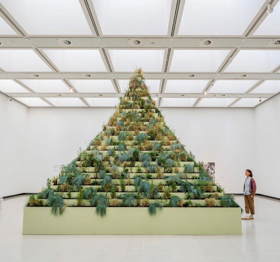
Discernible in this public ritual are various threads: the literary, the scientific, and the philosophical. The varied symbolism of each act holds significance when considered in isolation, but only by viewing the ritual holistically does one fully appreciate the cyclical process of decay and rebirth that Denes is seeking to mimic. Growth and decline are central motifs of her work, nowhere more powerfully demonstrated than in her most well-known piece, Wheatfield – A Confrontation (1982). Commissioned
by the Public Art Fund, Denes and her collaborators planted $158 worth of wheat grain in a two-acre lot in Lower Manhattan. Over the course of two months, the wheat grew and flourished, a golden summer spectacle accessible to all, juxtaposed between glass and concrete. In the distance, both the Statue of Liberty and the Twin Towers could be seen, visceral colossi dedicated to the allure and inequality of American capitalism.
Unmediated greed
The genius of the project derives from its simplicity. On land valued at roughly four-anda-half billion dollars, the brief contradiction of a pastoral scene in the heartland of urban America exposed the violence of unmediated greed. The wheat, once fully grown, was threshed and transported to twenty-eight cities across the globe, composing an exhibition entitled The International Art Show for the End of World Hunger. Her political intent is clear, decrying a perceived mismanagement of natural resources and seeking to expose the vast underlying social and economic inequalities that characterise so much of the modernity. To a twenty-first century reader this is perhaps trite, but the forcefulness of the imagery wrought by the project cannot be understated considering the artist's contemporary setting, which saw the advent of unregulated neoliberalism.
It is difficult to do justice to the scope of her oeuvre in one article. Her Morse Code Message, produced over six years from 1969 to 1975, betrays a Humanist ethic in
translating Biblical passages into morse code, as white plastic attached to a black plexiglass background. Her rejection of a ‘language’ identifies the dots and dashes as a ‘universal’ medium, making it theoretically intelligible across national and linguistic divides. From 1992 to 1996, she was commissioned by the Finnish government to design an artificial mountain populated by trees, built in Ylöjärvi according to a mathematically determined spiral pattern. Each tree was planted by a volunteer, who was given custodianship of the tree for four-hundred
years transferable across generations, signifying the need for individual and collective responsibility in ensuring ecological regeneration.
In 2024, an arts programme in Basel re-enacted Wheatfield in the Messenplatz, a concrete plaza in the city centre. While only four decades have passed since Denes’s original piece, the climate crisis has continued apace, and the existential threat posed by ecological decay is more pronounced than ever. The Los Angeles wildfires in January 2025, which threatened
and destroyed art galleries and private collections across California, provide a terrible vindication of her musings on impermanence. The relationship of humans with the natural environment is strained to breaking point. The existential threat has become so acute that perhaps the value of art is reaching its limits as a call to action. Instead, perhaps her Human Dust (1969) can serve as a stark final warning against maintaining mankind’s current conceit in its relationship to nature.
By Francis Devincenzi
THE LIVING PYRAMID Agnes Denes
Ancient Egyptian Art
Modern variations of art can sometimes serve as a reflection of humanity’s cumulative history and the cultural evolution that has unfolded over millennia. It weaves together centuries of collective knowledge, traditions, and forms of expression, creating an invisible tissue that connects the past to the present.
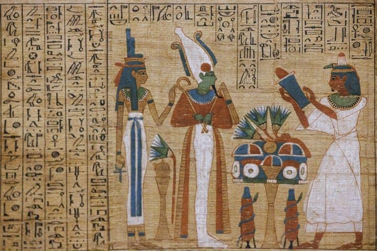
Among these influences, Ancient Egyptian symbolism stands out as a profound and enduring source of inspiration, with its iconic imagery, such as the scarab beetle and Eye of Horus continuing to resonate in the modern artistic landscape, offering current artists an unending library of inspiration to explore themes of spirituality, life, death, and transformation, and inject them into their ideas.
During ancient Egypt’s reign, art primarily served as a way to convey profound symbolisms connected to the pantheon of gods and the afterlife, both of which were held in the highest regard. Only those deemed worthy of such honour, individuals whose status was considered noble or Godlike, were adorned with richly colourful clothing and body paints, or make-up, to mirror specific terms associated with their purpose, clearly distinguishing them from the peasantry in society.
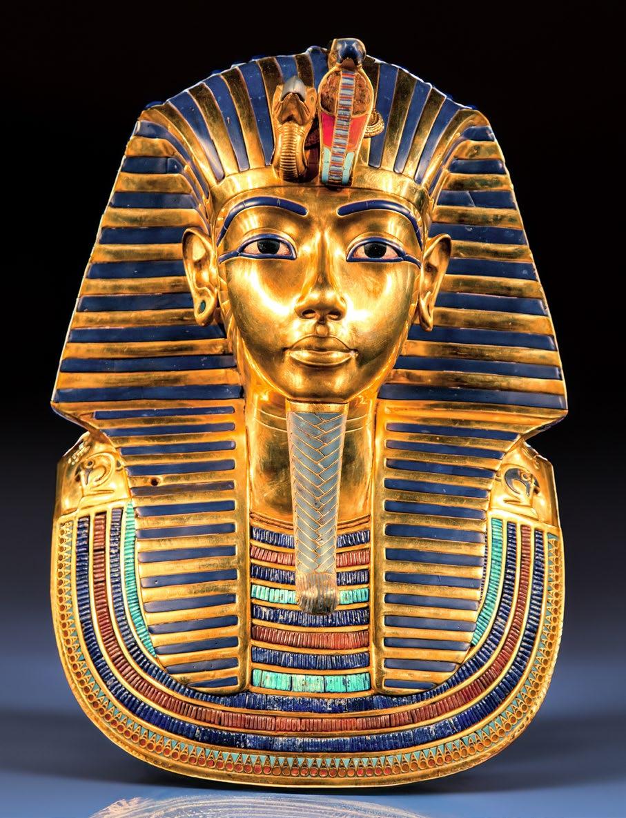
An example of this can be seen in the renowned Cleopatra, reigning Queen of the Ptolematic Kingdom of Egypt, in 51 to 30 BC. She is noted by historians researching certain artefacts that attest to her appearance as having worn distinctive silver and golden traditional ancient Egyptian garments, peppered with blue, black, and green highlights which are believed to be worn by the nobility. This can also be seen again, replicated on the wall bound hieroglyphs of the earlier Great King Tutankhamun’s tomb, and sarcophagus itself, as well as other examples that have been excavated throughout Egypt over centuries.
Gold, including red and yellow (Desher) symbolised the flesh of the gods, alluring to its imperishable nature, that it would entitle the adorned to live on for eternity in the after-life, whereas silver (Hedj) elements represented bones and purity, linking a sense
Photo by Calin Stan on
Unsplash
of humanity to the equation. Black (Kem), was meant to represent the fertile soil of the River Nile, associated with rebirth. Green (Wahdj) was the colour of fresh vegetation, signifying growth and resurrection. Lastly, blue (Irtyu), the colour of water, stood to signify fertility. The fact that these colours are repeatedly represented throughout ancient Egyptian attire and architecture is no mere mistake, but an intentional and integral visual language which conveyed their complex belief system.
Intricate patterns
Artworks, jewels, gold and other treasures, decorated in similar ways, were left inside the tombs to accompany one into the afterlife. This is evident in the intricate patterns that are finely chiselled into the sarcophagi of the once-ruling Pharaohs and other esteemed figures within the empire, which we can see today, thousands of years after their creation. These individuals, by virtue of their close association with the gods, were elevated to a divine-like status, making them deserving of such elaborate decoration.
Given their profound reverence for the gods, it is unsurprising that the artists of ancient Egypt depicted their deities with carefully chosen imagery. These two-dimensional archaic drawings were representations often painted across the entry way and inner walls of the tombs, as if telling a grand story of the deceased, featuring idealised, gilded skin tones and colour palettes that emphasised their divinity and concepts that are fitting of a ruler, along with their equally esteemed priests, or politicians. Similarly to how the pantheon of gods were depicted with great reverence, the honour bestowed upon a king or Pharaoh through the symbolic art decorating their tomb, and the treasures left within, reflected their societal importance.
The regal splendour depicted in this imagery was believed to mark identity, ensuring that in the afterlife, otherworldly spirits would recognise the status of the deceased lying within and welcome them.
Egyptian engineering
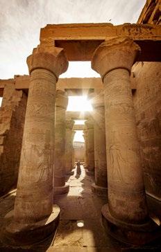
The significance and expression of death in ancient Egyptian society is vividly illustrated by the iconic pyramids of Giza. These monumental structures, standing proudly after more than 4,000 years, are revered as one of the Seven Wonders of the World.
Experts believe the Great Pyramid, known to be the first and most largely intact of the
three, was built as a tomb for the Pharaoh Khufu, a ruler known for his formidable reign. Constructed over an estimated span of 26 years, the pyramid remains an enduring testament to ancient Egyptian engineering and remains a marvel in our time.
The sheer scale of this project would test even today’s architectural prowess, with the precise methods used continuing to intrigue and challenge modern scholars. Transporting and positioning the massive
sandstone, granite, and mud bricks, some weighing several tons, presented immense logistical challenges. To overcome these, ancient workers likely built barges to float the stones down the river Nile and dug canals to transport them closer to the site of construction. Advanced tools such as pulley systems and other mechanical innovations which mark the ever-growing boundaries of human intelligence, would have played a crucial role, enabling the movement and placement of roughly 300 blocks per day. The ingenuity and determination required to complete such a feat continues to inspire awe and admiration, which is a testament to the scale of importance connected to the Egyptian view of life after death.
Life and death
As is clearly observed, the art of the ancient Egyptian era was very important to them in many forms, and was used to forge an innate bond to the spiritual world that conceived it. The same importance in sacrifice and death can be seen having spread its influence to other religious
ideologies across the globe. Drawing a parallel to the Mayan site of Chechen Itza, these places of worship and sacrificial ritual reinforced the cyclical connection between life and death that is seen in ancient Egypt, and continues to stand the test of time for both its beauty and awe-inspiring architecture.
By Aiden Bell
“Art primarily served as a way to convey profound symbolisms connected to the pantheon of gods and the afterlife, both of which were held in the highest regard.”
Stories
in Stone
Mosaics of the Byzantine Empire
There is something timeless about a mosaic. While they are still being uncovered in the ancient Roman ruins of Pompeii, a city destroyed before the end of the first century, a glance at the ceiling of the Mayakovskaya metro station in the heart of Moscow reveals that even Soviet futurists were drawn to using tesserae as a medium for their art.
There is something inherently accessible about the process of creating a mosaic (perhaps a point of allure for communist craftsmen): the considered placement of enough coloured glass and stone to create an image, seeing the whole emerge from the individual. They can be found across a plethora of historical periods and geographical locales. Their appeal derives from their paradoxical simplicity and complexity, allowing artists to create images on different scales of patterned detail with everyday materials.
Perhaps the quintessential image of a mosaic, however, derives from the Byzantine period. When this period began is difficult to ascertain. The Byzantines themselves considered themselves Romans, having constituted the eastern half of the Roman Empire until the late fifth century, its rulers subsequently portraying themselves as Rome’s inheritor. Across a thousand years of Byzantine rule in Constantinople, their relationship to mosaics shifted dramatically. Unsurprisingly, early Byzantine mosaics were
strongly influenced by Roman mosaics that had adorned villas and public baths. Many Byzantine mosaics were commissioned for similar purposes, as symbols of opulence in houses, where mosaics might be created in the form of a calendar, as was found in the remains of a fifth-century abode in Thessaloniki. One fourth-century floor mosaic depicts a peacock, which was associated with luxury and used to represent paradise and renewal. The wealthiest patrons might even commission portable mosaics, small enough to hold in one’s hands. What immediately differentiated Byzantine mosaics from their Roman predecessors, however, was their use in churches and places of worship. Early Christianity found its most powerful benefactors in the forms of the Byzantine emperors, and accordingly much of their art centred around this new religion.
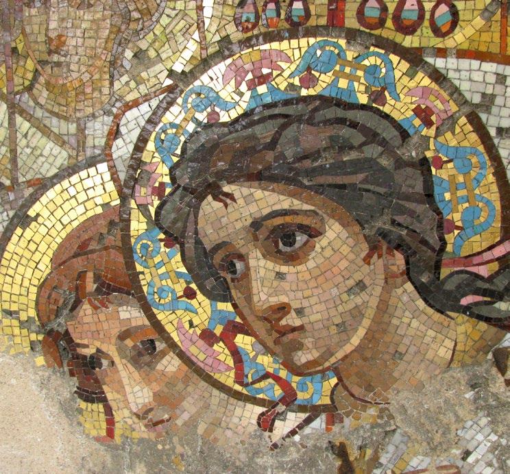
In the chancel of the Basilica of San Vitale in Ravenna, mosaics convey the resplendent imagery of a political entity at the height of its power, fusing the glory of church and state in artistic representations of emperors and their courts. Justinian I, who had reconquered the Italian peninsula after the fall of the western Roman Empire, is centred in one mosaic, gazing powerfully out at the viewer with a determination that still impresses his restored dominion. Adorned in a purple robe, conveying his imperial might, he is also haloed: no clearer image could convey his desire to portray himself as defender of the faith. Flanked to his left by the bishop of
Ravenna and his clergy, and to his right by soldiers, his assertion of supremacy is total. The golden backdrop conveys a sense of heavenliness and ethereality, dazzling with its richness. Above the mosaic of Justinian in the apse is a mosaic of Christ astride the world, affirming his position as the True King: but the commonality implied by the golden backdrop places the emperor and saviour in a similar, if not the same, plane. The detail of the mosaics is astonishing, as is the depth and variety of colour used in constructing the human figures, who are intricately adorned.
This fusion of church and state in art was a difficult one to sustain, however. The enduring tension that characterised relations between the two pillars of early medieval life meant that Justinian’s triumphalism, depicted so gloriously in the striking golds
“The detail of the mosaics is astonishing, as is the depth and variety of colour used in constructing the human figures, who are intricately adorned.”
and reds and blues at Ravenna, was shortlived. Into the eighth and ninth centuries, the two Iconoclastic Controversies condemned the use of religious imagery as idolatrous. Imperial edicts formally forbid their production or veneration. Consequently many early Byzantine artworks, including countless mosaics, were destroyed in the name of religious fervour. The Hagia Sophia, an architectural Byzantine wonder built under Justinian, suffered the destruction of many of its early mosaics, though into the eleventh and twelfth centuries a revival saw it become the site of some of the most ubiquitous portrayals of Christ: as in the Deisis mosaic, which has been
endlessly reproduced in a variety of forms. Its subsequent conversion into a mosque saw many mosaics again covered up under Ottoman rule, but the process was an uneven one, and now much Christian and Islamic imagery is layered over each other, reflecting its storied history.
So profound was the appeal of Byzantine aesthetics, particularly the mosaic, that even their enemies begrudgingly conceded their artistic value. Roger II, the first Norman king of Sicily, was openly hostile to the Byzantines, but still chose to use Greek artists in the creation of a mosaic in the apse and presbytery at Cefalu. Roger
himself is portrayed in mosaic in the Church of Santa Maria dell’Ammiraglio in Palermo, receiving his crown from Christ: the powerful legitimising symbolism fusing art, power and religion was too strong to ignore. The geographic scope of the Byzantine domains meant that mosaics were popularised over a considerable area, across the Mediterranean and into the Balkans. Ironically, many of the best-preserved early Byzantine mosaics remain in Italy, its historical motherland. Therefore, the glory of Byzantium is preserved, stories in stone scattered across the outposts of its former empire.
By Francis Devincenzi
LHOUETTE
When it’s all said and done, I want people to be able to look at a piece and say, “that’s definitely a Lhouette“.
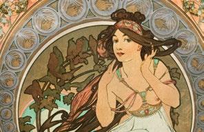
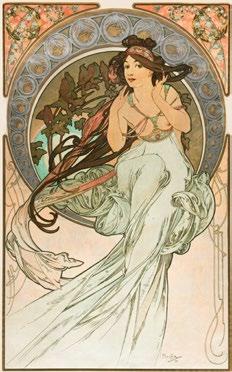
Le Style Mucha Art Nouveau
When you think of Art Nouveau you most likely picture images of idealised, beautiful slender women with long tendrils of hair and flowing garments set amongst natural forms such as plants and flowers in a highly decorative manner.
Art Nouveau stands as one of the most celebrated art and design movements within the Modern Art era during the 20th century. The Art Nouveau movement reached its peak popularity throughout the Belle Epoque era which lasted from 1890 to 1910.
Art Nouveau started as a design trend in Belgium before it quickly reached European countries and extended to America and it went on to become a truly international style. Aubrey Beardsley pioneered Aestheticism with his expressive organic line illustrations while William Morris led the Arts and Crafts movement to embed vital floral styles into applied arts in England. Art Nouveau on the European continent developed through Paul Gauguin and Henri de Toulouse-Lautrec’s expressive line experiments in painting. The English term for Art Nouveau was the ‘Modern Style’ while American Art Nouveau earned the name ‘Tiffany Style’.
High-quality craftsmanship
Art Nouveau emerged as a reaction of artists who refused the harsh and rigid aesthetics of historical art education from the 17th to the 19th century and opposed the substandard quality and appearance of mass-produced goods from that era. This reaction resulted in high-quality craftsmanship which transformed everyday objects into revered pieces of art. This movement stressed the design of useful objects that achieved equal measures of aesthetic appeal and practical functionality. The Art Nouveau Style showcased a romantic
return to nature through floral decoration alongside representations of the female form and sensual flowing shapes.
Czech painter and graphic designer, Alphonse Mucha, was vital in shaping the Art Nouveau movement along with his work as a poster artist and illustrator, so much so that the Art Nouveau style became known as ‘Le Style Mucha’ during his time in Paris. The artist used muted pastels to create paintings of beautiful women who stood amidst botanical environments. He embraced Art Nouveau principles by incorporating floral designs
and decorative elements along with sensual natural shapes.
The progression of the Industrial Revolution led to the advancement of complex printing methods. Throughout the early 1800s Parisian streets displayed an abundance of printed posters.
Colour lithography
In the 1890s Jules Chéret became known as the ‘father of the modern poster’ through his introduction of colour lithography into the art world. Through the use of innovative techniques and technologies the artists Henri de ToulouseLautrec, Georges de Feure, and Mucha perfected this art form which became both a strong advertising instrument and visually striking artwork. In addition to his artistic pursuits Mucha took photographs which he transformed into templates for his colour lithography prints.
The distinction between mass-produced items and fine art disappeared while Art Nouveau floral motifs turned into a significant element of daily life. TheSeasonsseries from 1896 was Mucha’s first set of decorative panels and it became one of his most popular series.
Despite struggling with financial problems
Mucha received a major opportunity in December 1894 when actress Sarah Bernhardt reached her peak in popularity and needed an artist to create a new poster for her Gismondaperformance.
In an impromptu decision Maurice de Brunhoff, who headed the company, brought in Mucha to create the advertisement which emerged as a grand poster featuring romantic elements along with swirling forms and mosaic designs. Mucha gained widespread fame through his Parisdistributed artwork which led to a sustained contract with Bernhardt. Mucha became an overnight sensation in Parisian art circles after his poster created a sensation throughout the Parisian art community. The poster created by Mucha in 1896 for Sarah Bernhardt’s character Lady of the Camellias stands as a celebrated masterpiece of the genre.
The communist government that ruled Mucha’s birthplace after his death rejected his paintings because they went against the principles of communism. Eventually, Mucha would fade into obscurity. In 1963 the Victoria and Albert Museum in London hosted its inaugural major exhibition dedicated to recognising his complete body of work. Soft
pastel coloured erotic female figures and natural elements within paintings returned to their prominent place. During the 1960s and 1970s Mucha’s art became iconic in hippie movements which embraced themes of nature and love.
The designs of Mucha also served as inspiration for Pop artists who modelled album covers after his work, such as the famous LettheSunshineIn by The Supremes which came out in 1969. Marcus Mucha, the great-grandson of the artist, confirmed that his work remains modern and serves as inspiration for numerous artists today.
Many of us who lived through the 1970s will recall decorating our walls with mirrors and posters that showcased Mucha’s artwork. More than one hundred years since its inception Art Nouveau remains capable of uplifting souls while providing spiritual nourishment during times of upheaval.
By Jo Ward
“More than one hundred years since its inception Art Nouveau remains capable of uplifting souls while providing spiritual nourishment during times of upheaval.”
Precisionism A Visual Dialogue & Art Deco
Two very interesting art forms that have not necessarily had as much mainstream attention as other genres of art such as Cubism and Expressionism are Precisionism and Art Deco. In this article I will discuss the relationship between Precisionism and Art Deco, diving into architecture, painting and even elements of graphic design.
Art Deco and Precisionism, two styles defined during a pre- and post-World War environment yet share a variety of similarities and influences with each other. Although these genres did not share the same mainstream success of movements like Cubism and Abstract Expressionism of the 1920s – 1930s, the value of Precisionism and Art Deco as genres for commercial and architectural wealth during this period cannot be understated.
The mainstream aspect of these genres gives us an indication as to why artists from Precisionism and Art Deco might not have grown to become household names as others in today’s pop culture and art world. Names like Pablo Picasso, Da Vinci and Van Gogh have become synonymous with their respective styles and to some degree, the very spokespeople for them. Their works of art are objects to be admired, telling their story and showcasing raw, unfiltered artistic expression of their time.
Beyond painting
In the case of art during the Renaissance period, one could state that its influence came partially from religious adoration, a focus on symbolism and themes of life and death. This art, was to some degree, a product of its time. While Precisionism and Art Deco have not shared the same artistic fame, it’s interesting to me that artwork which falls under this category of artistic expression has a function that’s almost beyond painting itself.
As I mentioned previously, the commercial success is where I believe this genre finds its footing. The influence of earlier Cubist and Futurist movements perpetuated these genres to define the style of the upper class of the 1930s. In other words, Precisionism and Art Deco are both genres that perpetuated the style of the late 20s and 30s, from advertisements to product design to architecture and more.
In Issue 4 of the Art & Culture Magazine I discussed the significance of colour and composition in relation to graphic design, mainly focusing on the works of Saul Bass and his poster designs which framed iconic movies such as The Shinning and Vertigo. If we briefly analyse the style of these posters, we can easily see how Bass draws influence from Cubism and Precisionism, engaging with straight lines, geometric patterns and
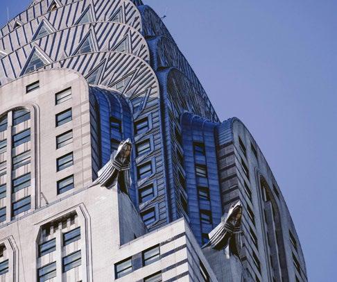
CHRYSLER BUILDING
Photo by William Wachter on Unsplash
simple compositions that culminate in a sort of two-dimensional effect.
Like Bass’s work, advertisements of the late 1930s focused heavily on typography and its relationship with imagery used. Tag lines for products that aimed to sell the consumer
on the experience were common for companies to explore. Coca-Cola, the tobacco industry as well as automobile companies all drew from elements of Precisionism and Art Deco as a way to highlight a luxury lifestyle and to present a product as the ‘future of tomorrow’. The practice of Art Deco and Precisionism as a visual dialogue throughout this era really cemented itself as the style of the future, the modernisation of the early 20th century and the visual style was used to highlight the lavish and the rich.
Cultural influences
When it came to architecture, this form of extravagance was even more focused. Buildings of this nature adopted the Art Deco style with many façades drawing influence from a variety of cultures and their respective artistic practices. Egyptian symbolism, Japanese watercolour paintings and Chinese pottery are but some of the visual arts which have become the bedrock for the movement. The repetitive nature of pattern-work, the use of icons as symbols of strength and patriotism, and the combination of line and curve to create buildings which represent the modern America. These details can be seen in buildings like the iconic Chrysler building, Walker Tower and Rockefeller Plaza as well as many more.
Artists that focus on paintings under the Precisionism genre also bare witness to a variety of parallels between Cubism and Impressionism. As mentioned earlier, the colours used, the composition, the subject matter and the manipulation of light almost give paintings of this period a near photorealistic approach yet keep to strict linework and simple colour separation. One clear example of this is the work of Ralston Crawford and his paintings of factory rooftops and industrial buildings. The linework is precise and the contrast of colours is very high and dominating.
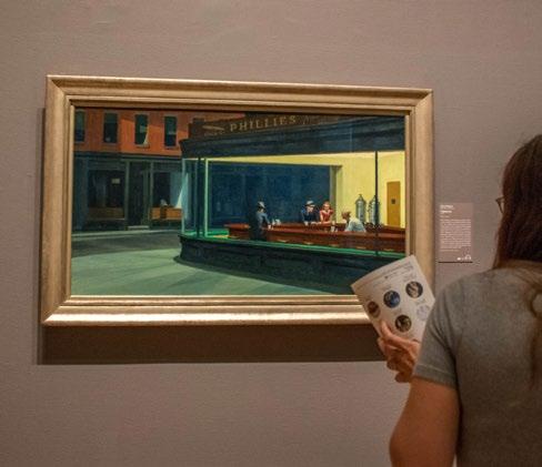
Paintings of the early Precisionist period seemed to be slightly more abstract in nature and when observing them thoroughly, many give the impression to be precursors of bigger projects. More akin to architectural sketches and concept work than actual paintings. It’s not until we reach the work of Edward Hopper that we can really see the evolution of Precisionism, with his earlier works taking on a more fluid and painterly expression and later paintings of the 1940s and 50s focusing heavily on light manipulation and colour control. Paintings such as Nighthawks and High Noon best illustrate how these genres were so intertwined with early American visual dialogue.
By Francesco Scalici
“Paintings such as Nighthawks and High Noon best illustrate how these genres were so intertwined with early American visual dialogue.“
Photo by David Vives on Unsplash
ROCKEFELLER PLAZA
NIGHT HAWKS
Edward Hopper At the Art Institute of Chicago
The Art of Pointillism by Dot
Merging a countless number of meticulously placed dots on a canvas to create an image when viewed from afar is a tediously taxing and mechanical approach to painting which prevailed during the 19th and 20th centuries in Europe.
Stemming from the Neo-Impressionists whose approach to painting was highly centred around the preparatory and technical aspects of colour and design, a group of artists came to the fore, who laboured intensively on drawings and preparatory studies for years before putting paint to canvas. An emphasis on colour organisation
prevailed which created a juxtaposition to the Impressionist movement. From embracing the sense of dynamism and fluidity of paint, to the inference of a monumental sense of stillness, the Neo-Impressionists emphasised a static and unmoving quality in their artwork founded upon scientific study. As the first group of artists to pioneer
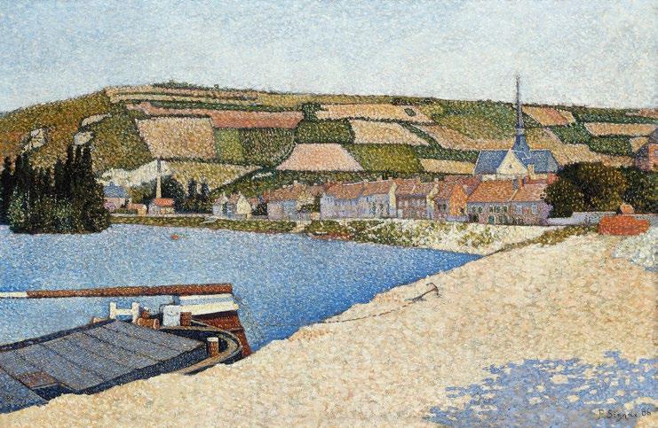
colour theories about how our eyes register different colour combinations, the Pointillist movement developed, whereby minute dots of colour applied on to a canvas created a shimmering and unified image. Led by artists such as Pissarro, Signac and Seurat, simple images capturing a banal moment in time were favoured. Scenes of leisure where
LES ANDELYS, CÔTE D’AVAL (1886)
people were often depicted engaging in everyday activities would mask the enormous amount of labour put into making the image come to life.
Focusing on the specific style of brushwork used to apply the paint, the Pointillist practice provides a sharp contrast to the act of blending pigments on a palette. With painting being an inherently subtractive process, Pointillist images often seem brighter and more vibrant due to the lack of diluted or mixed pigment and slight white colour of the canvas emanating through the individual dots of paint. Favouring oils as the preferred medium to create their artworks, this allowed for a lack of bleed between the dots of colour and to enhance the overall image from a visual standpoint.
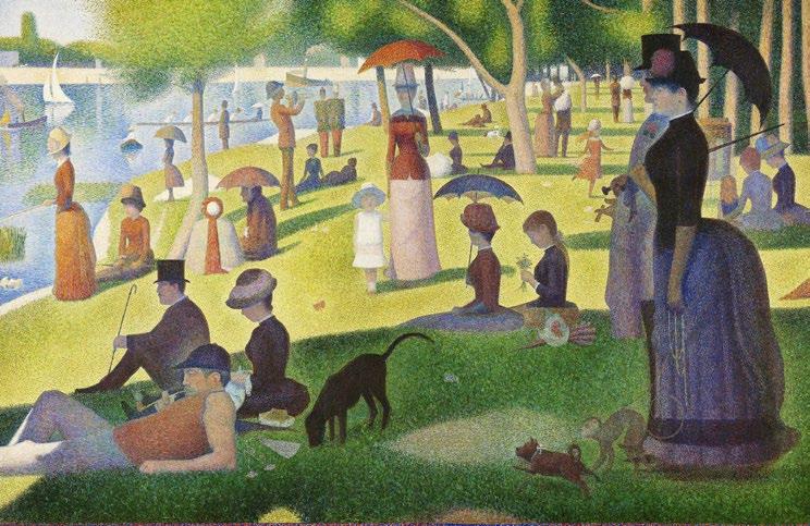
One of the most famous examples of Pointillism is Georges Seurat’s A Sunday Afternoon on the Island of La Grande Jatte, dating back to 1884-1886. Executed on a large canvas and housed at the Art Institute of Chicago, the painting depicts a number of Parisians at a park on the river Seine and offers both social and political commentary through the inclusion of subtle visual references spotted throughout the painting. Not only did Seurat meticulously focus on colour, form and light in this bold and vibrant large-scale work, but also adapted his scientific research when contrasting miniature dots of pigment that when unified optically in the human eye, were perceived as single shades and hues.
“Seurat’s notorious masterpiece became a running commentary of a capitalist dystopia used to critique the effects of modernisation on French society.“
Seurat’s notorious masterpiece became a running commentary of a capitalist dystopia used to critique the effects of modernisation on French society. While its visual properties are seen to bring much joy to its viewers, Seurat’s stance on Parisian society emanates through the inclusion of specific figures and characters. The artist curiously depicts a woman with a pet monkey on a leash on the right-hand side of the composition, while also including subtle nuances to prostitution among the bourgeoisie, evident in the area which was renowned as the location to procure this service. A seemingly relaxed and nonchalant scene filled with flaneurs and idle passers-by, is quick to become a depiction of an industrialised society inverting the utopic. The artist’s democratised mode of painting served as a societal critique brought to light through a rigid, mathematical and robotic technique.
Whether a ubiquitous science experiment or a politically charged portrayal of France’s rapid modernisation, Seurat’s A Sunday Afternoon on the Island of La Grande Jatte dissects social stigmas and brings to light scientific and political concerns in a colourful parody of dots on a canvas.
By Tamara Bell
Paul Signac
The Art of
Opticalillusion
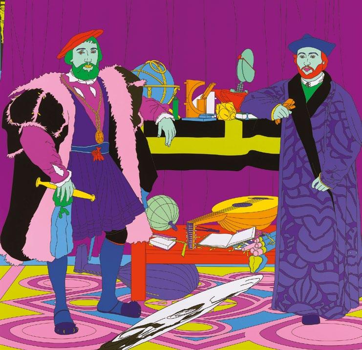
Filled with visual trickery throughout the ages, the history of art has seen fantastic optical effects and illusions from centuries long ago. Starting with famous works such as Hans Holbein the Younger’s The Ambassadors housed in the National Gallery, the oil on oak painting dating back to 1533 mobilised the tromp l’oeil effect or ‘trick of the eye’.
Stemming from Tudor times, TheAmbassador is a painting infused with symbolism and scientific references. Brimming with meticulously rendered objects, Holbein is renowned for incorporating one of the best-known examples of ‘anamorphosis’ in painting. Placed in the foreground of the composition is a distorted skull rendered in anamorphic perspective and creating a visual puzzle for the viewer to resolve by approaching the work from a particular angle. Representative of a vanitas or memento mori, Holbein encourages one’s contemplation of our looming and inevitable fate.
Precipitating unexpected optical effects in the viewer is something that artists have continually played with in a vast array of mediums. Whether directly on or outside of the confines of a canvas, the illusion of movement, depth or vibration led to the Op Art (abbreviated from Optical Art) movement. Gaining much acclaim for geometric works in the early to late 20th century, the movement crystallised with The Responsive Eye exhibition at the MoMA (Museum of Modern Art) in New York in 1965. The ‘perceptual abstractionists’ gained widespread notoriety for confounding the perceptual expectations of the viewer with their art. The phenomenon of visual trickery became overtly present, although having been nuanced in previous movements throughout history. This interest in the science of optics had in fact been seen in movements such as Pointillism, where discrete dots merge into one to create an image.
Typified by geometric abstraction, artists such as Bridget Riley progressed from figurative Pointillism to monochromatic lines and shapes that would recede, bulge, vibrate and move, causing undesired dizzying effects. These chromatic combinations were also employed by the artist Victor Vasarely, who commonly depicted two-toned zebras merging into one and further developed a visual language of matrices with bright colours dazzling its viewers. The Parisian artist pioneered a visual language which was later used in architecture and urban planning.
Volatile patterns
The lasting effects of the Op Art movement were to question the nature of perception and illusion of art and reality. Playing with how vision functions, artists created volatile patterns affecting how the retina receives and processes light, thereby creating after images and illusionistic three-dimensional space. Tracing Op Art’s foundations back to the movements of Neo-Impressionism, Cubism and Futurism, the concern for graphic effects and exotic optical illusions blended over into Abstract Expressionism. Minimalist in nature and consisting of a limited colour palette devoid of objects, the viewer’s raw emotion takes over the image characterised by aesthetic and order.
The blatant whimsical effects of Op Art not only played a significant part in the evolution of artistic styles and creativity, but also served as a pivotal movement where the subjectivity of art creation and
scientific study merged together as one. With simplistic monochromatic images being used as part of medical assessments, Op Art stimulated the brain in a way that immersed the viewer into an artistic experience, making this effect become the purpose of the art itself. As explained by the Professor Frank Popper, ‘Op artists managed to exploit various phenomena….the after-image and consecutive movement; line interference; the effect of dazzle; ambiguous figures and reversible perspective; successive colour contrasts and chromatic vibration; and in three-dimensional works different viewpoints and the superimposition of elements in space’ defined the core of this artistic movement.
Suffering and joy
Although a relatively short-lived movement, Op Art has brought creativity, artistry, and colour experimentation to the fore. As a pivotal movement which merged a highly subjective and expressive discipline with its juxtaposed counterpart, this fusion has served to herald a symbiotic relationship between the two and showcase how they are intrinsically linked to one another. As described by Goethe himself, ‘colours are light’s suffering and joy. When the eye sees a colour it is immediately excited and it is its nature, spontaneously and of necessity, at once to produce another, which with the original colour, comprehends the whole chromatic scale’.
By Tamara Bell
Art&Culture
LUXURY ART MAGAZINE
Never miss out on the latest edition of Art & Culture Magazine. Scan the QR code now and fill out the online form to get FREE digital magazines sent to your email in-box!
Art & Culture Magazine are excited to be working on a print subscription service. The paid subscription will be launching soon, and we’ll notify you by email as soon as it’s available.
Scan here to never miss out on the latest edition of Art & Culture Magazine
Art of the East
The art of the East has, for centuries, been rooted in interconnectivity. The creative landscapes of China, Japan and Korea, for example, share profound historical connections: while China has often been the referential culture in East Asia, worked stone and blades from the Palaeolithic and Neolithic periods indicate an artistic exchange between Eastern countries.
In part, this interaction was facilitated by land bridges that connected Japan with the continent, symbolically and physically uniting their artistic endeavours. From the exacting style of Chinese shanshui painting to the minimalist beauty of Japanese zen gardens and the decorative creativity of Korean Minhwa art, each artistic tradition differently reflects a world-view that is rooted in transcendence and balance. Nonetheless, in an era of fast-paced modernisation and globalisation, the art of the East has seen a preoccupation with the tension between preserving heritage and embracing change. Today, modern Asian artists, such as Ai Wei Wei and Senju, honour Eastern traditions while weaving the present into cultural narratives. Not only is the art of Eastern countries interconnected, the respective art of each country is also in tune with its individual identity and distinct evolutions.
Developments in Chinese art have often used subversive interpretations of traditional imagery to reflect changing political landscapes. Yang Yongliang, for example, blends the aesthetics of shanshui painting with strikingly modern photography of the Chinese landscape. Traditional shanshui, translated as ‘landscape painting’, is characterised by topo-graphical ink-andwash portrayals of mountainous scenes, populated with rivers and clouded by mists. Traditionally, shanshui paintings sought to represent the philosophical ideals of Taoism and Confucianism. However, as China underwent rapid industrialisation, its artists, like Yongliang, began to reinterpret these
panoramic scenes for a modern context. Yongliang’s series Phantom Landscape (2010) and Heavenly City (2011) showcase surreal landscapes, where mountains emerge from towering skyscrapers. His works critique urbanisation, and its degrading effects on the environment while maintaining the meditative beauty of Chinese gongbi (meticulous) paintings.
Comparatively, the breakthrough artist Ai Wei Wei incorporates traditional Chinese imagery to emphasise socio-political issues. Famously, his Dropping a Han Dynasty Urn (1995) shattered a two-thousand-year-old relic to symbolise the destruction of heritage amidst contemporary innovation. Ai Wei Wei’s controversial piece was the predecessor for one of Japan’s most celebrated artists,
ARTWORK AT THE MORI ART MUSEUM Takashi Murakami
Takashi Murakami. Japan’s artistic identity has long been recognised for its ability to balance tradition and reinvention. Its art embraces the idea of meaning ‘Sorrowful World’, as an earthly plane of death and rebirth, convention and subversion. Murakami exemplifies this duality; his work combines traditional Japanese techniques, such as those seen in Edo-period ukiyo-e woodblock prints, with anime and manga aesthetics. His Superflat movement critiques consumerism and the collapse of high and low art, while works like 727 (1996) juxtapose playful imagery with darker undertones, conveying both the charm and complexity of Japanese society.
Murakami’s piece Passing Through (1956), which depicts the artist jumping through and destroying a row of canvases, also acts as a statement of artistic preservation, by freezing a sacrificial moment of loss in time, a loss that leads to transformation
and renewal. The shock-factor behind Murakami’s piece seems to be a condition of the modern experience. Another prominent artist, Hiroshi Senju, interlaces the past and present through his large-scale waterfall paintings. Senju’s works have a timeless serenity to them: he uses Nihonga, which literally translates to ‘pictures of Japan’, to evoke the spiritual connection between humanity and nature, offering a contemplative escape from the chaos of modern life by harkening to traditional imagery.
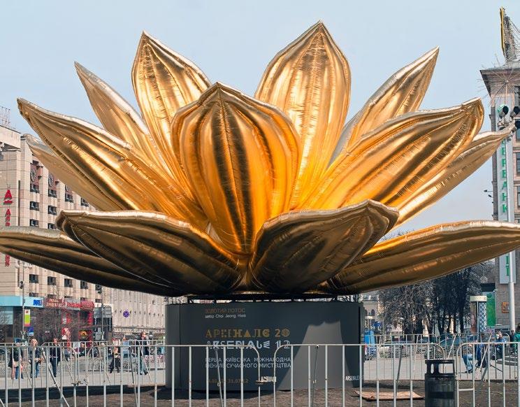
Bridging traditional symbols and the dynamism of modern life is also a characteristic of Korean art. The evolution of Korean art, such as developments in minhwa (folk painting) and bojagi (wrapping cloth), has been shaped by its history of resilience and cultural pride. Choi Jeong-hwa, a multimedia Korean artist, transforms traditional motifs into large-scale installations. His piece Breathing Flower, depicting a giant
inflatable lotus, symbolises both renewal and impermanence, and reflects the Buddhist influence on Korean art. Choi’s impressive work intertwines ancient symbolism and the urbanity of modern life, a feature common to the art of the East.
Despite their distinct traditions, China, Japan and Korea share deep artistic ties: their art offers profound windows into evolving Eastern identities, rooted in centuries-old traditions. Through the work of their artists, such as Ai Wei Wei and Murakami, we see the enduring power of heritage and its incorporation in an ever-changing modern society. Bridging the past and the present, the art of the East offers a rich tapestry of cultural expression, one that transcends borders and generations: one that will continue to show its face for generations of Eastern artists to come.
By Sophie Macdonald
GOLDEN LOTUS INFLATABLE INSTALLATION BY KOREAN ARTIST
Choi Jeong Hwa
Contemporary Indigenous Art
“Indigenous artists have emerged as powerful storytellers in contemporary art transforming how their cultures are represented.”
The term Indigenous art encompasses all artistic works created by native people, but it is frequently associated with communities from North America and Australia while similar art exists worldwide from places like the Amazon and Asia. The oldest human art form which still exists today is Rock art, and Australian examples have been aged to approximately 30,000 years old.
Following centuries of being undervalued and marginalised, native and Indigenous artists have now gained rightful global exposure through their counter narratives against Western historical records and increased recognition.
Beginning in the mid-20th century artists alongside activists started to reject conventional stereotypes through contemporary expressions to redefine Indigenous cultural perception. Early artists who broke new ground enabled future generations to experiment with different artistic mediums while addressing current societal challenges like land rights and environmentalism.
Indigenous art stood out at the 2024 Venice Biennale as artists from multiple continents responded to the main theme named ForeignersEverywhere. The first inhabitants of Australia, Canada, Finland and the U.S. used their poignant and emotive artwork to express the deep and destructive consequences of colonialism. Artists concentrated on how colonialism transformed Indigenous people into outsiders on their ancestral homelands.
Visual artist Archie Moore claimed the Golden Lion for Best National Participation with his exhibition Kith and Kin thus becoming the first Australian recipient of the top honour. The artwork stands out because of its medium featuring a massive family tree drawn with chalk across dark walls and ceiling to represent both documented and forgotten histories. The medium demonstrates both memory’s fleeting nature and how historical preservation operates selectively. The installation contains a reflective pool dedicated to remembering First Nations people who died in police custody while highlighting colonialism and systemic discrimination’s enduring effects.
Ronnie Tjampitjinpa entered the world on Pintupi territory in Muyinnga, Western Australia before building an artistic career lasting four decades. Since becoming a dedicated land claim activist in the 1970s, Tjampitjinpa produces intricate dot and line paintings that reveal tales of water and bushfire dreaming alongside the Tingari cycle stories about legendary Pintupi beings.
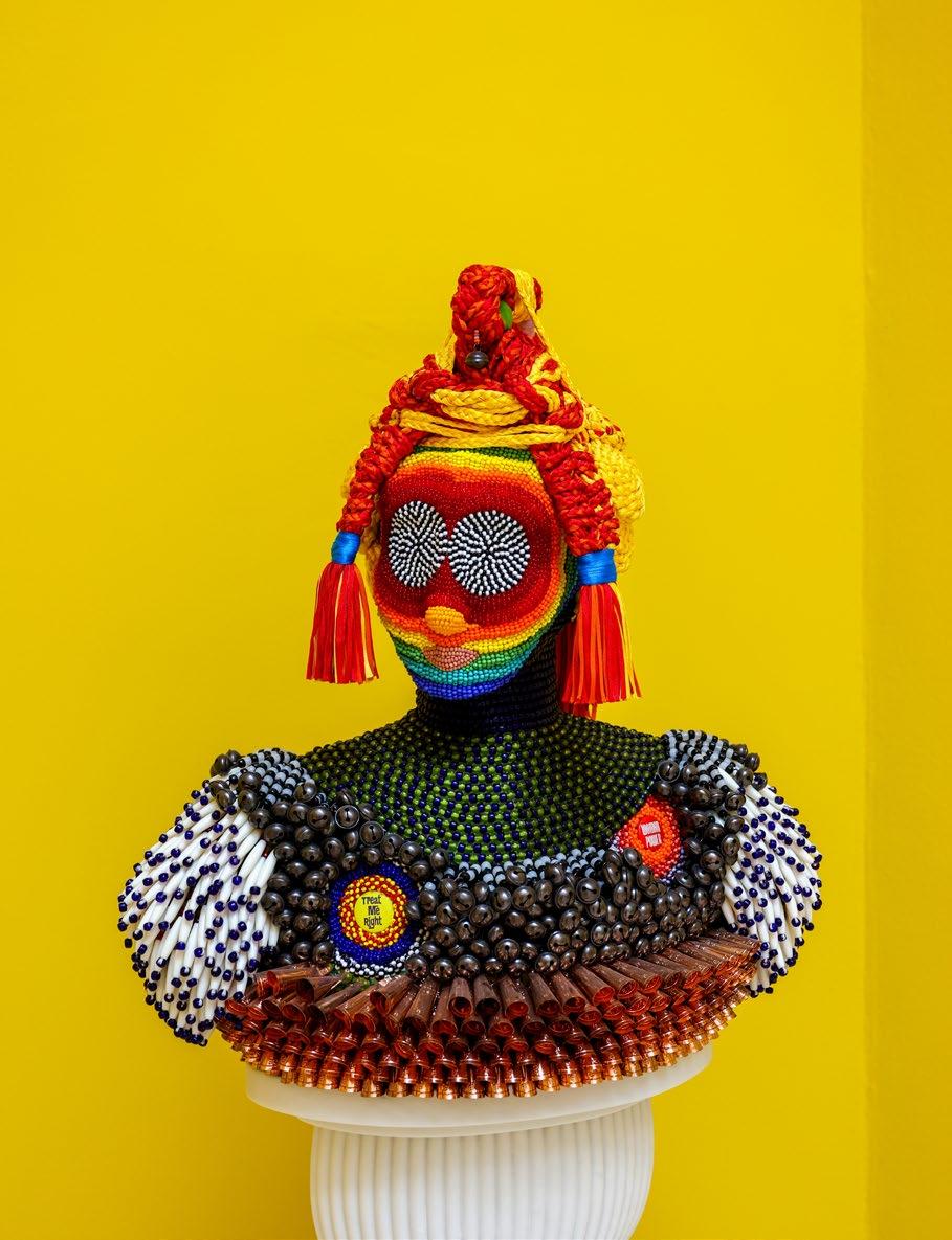
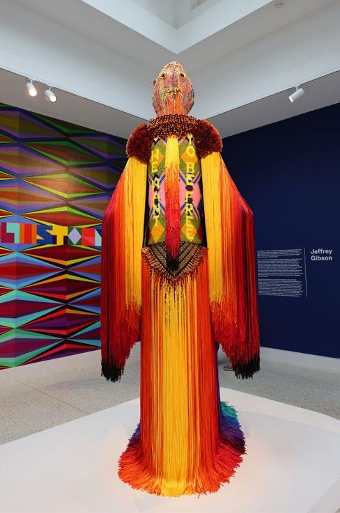
Jeffrey Gibson, who belongs to the Mississippi Band of Choctaw Indians and has Cherokee heritage, became the first Indigenous artist to represent the United States with a solo exhibition at the Venice Biennale. Gibson’s exhibition bore the name
“Following centuries of being undervalued and marginalised, native and Indigenous artists have now gained rightful global exposure.”
“The boundarybreaking work of these artists encourages audiences to explore their narratives and celebrate Indigenous cultural richness and identity.“
TheSpaceinwhichtoPlaceMe. The Summer 2024 Icons issue of Art in America featured Jeffrey Gibson’s beaded painting Born to be Alive (2023) on its cover. His artwork displays striking pure colour schemes combined with sharp geometric forms and optical designs. The artwork reveals simultaneous influences from modernist abstraction and Native American aesthetics. Gibson’s most notable artistic accomplishment includes punching bags embellished with colourful beadwork that deliver messages about artistic creation and cultural identity.
Julie Gough stands out as a Tasmanian Aboriginal multimedia artist who examines memory alongside history and belonging. Through her work Julie Gough combines her people’s historical stories to subvert colonial narratives while providing new ways to interpret history. She produces assemblages from discarded materials and found objects that address the reclamation of physical space and cultural identity.
The Tate has initiated a program to expand their Indigenous art collection through a four-year financial commitment from AKO Foundation for acquiring Sámi and Inuit artworks from Northern Europe. Future projects will emerge to examine and showcase the artistic achievements of Indigenous people across South Asia, Oceania and the Americas. The Tate declared their initiative will leverage existing acquisitions and custodianship partnerships to significantly increase contemporary Indigenous artists worldwide.
The acquisition will include Outi Pieski’s woven hanging installation Guržot ja guovssat / Spell on You! (2020) alongside its
Everywhere60th VeniceBiennale
complement piece Skábmavuođđu / Spell on Me! (2024). The artist created this work in 2024 while staying at Porthmeor Studios located in Cornwall. Finland-based visual artist Outi belongs to the Sámi community.
Institutions are now acknowledging both the past exclusion of Indigenous artists and the necessity to commemorate their artistic contributions through exclusive exhibitions and programming initiatives. Contemporary Indigenous art follows an inspiring path driven by historical depth and dedication to cultural restoration alongside resilience
and innovative practices. The practices of Indigenous artists create both enrichment within modern art circles and serve as a platform to challenge social narratives while advocating for justice and recognition. The boundary-breaking work of these artists encourages audiences to explore their narratives and celebrate Indigenous cultural richness and identity. The trajectory of contemporary Indigenous art shines with potential to amplify Indigenous voices while stimulating meaningful discourse.
By Jo Ward
THE SPACE IN WHICH TO PLACE ME
Power
The 60s Influence on the Arts Flower
The aftermath of World War II left deep scars on both military and civilian populations, with the 1940s and 50s marking a time of political and economic upheaval. The effects of the war were felt across Europe and America, as food shortages ensued, fuel was scarce, and other essential resources became increasingly strained.
This era of limited freedoms gave rise to a dissatisfied people, which was often reflected in art. In the years following the war, artistic expression was subdued, characterised by muted colours and basic forms. Paintings, political propaganda, fashion, and other creative outlets seemed to lack vibrancy, mirroring a general sense of monotony and constraint within the community.
In the 1960s a widespread change began to shape a new era and dawned a new-found political voice in the people. They had enough of war, enough of conformity and struggle. It was time to use their voices to break free from governmental control.
Consumer nature
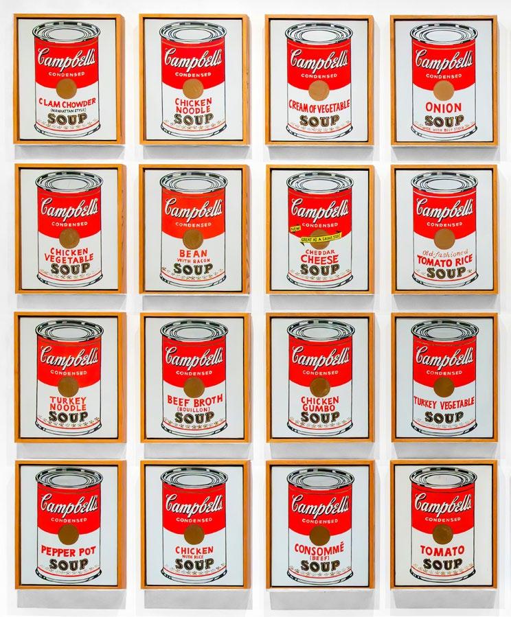
This different world simmering under the surface of the 1960s urged artists like Andy Warhol to spearhead a new style in artistic expression which exploded with colour. This was his response to the bland bygone post-world-war era, exhibiting its icons in a brighter, more vibrant manner, pushing him to the forefront of the modern Pop Art movement. His Campbell’s Tomato Soup being a stark reminder of humanities consumer nature, happy to conform at the whim of the government, or his prints of the universally recognisable Marilyn Monroe, immortalising her in a true psychedelic fashion.
It was a period that allowed individuals to express themselves however they wanted. The Civil Rights movement and antiwar protests shook nations awake. Women fought hard for their equal rights and equal pay, black communities rose up against racial discrimination and pacifists donning rainbow coloured tie-dye t-shirts rebelled against the American presence in Vietnam, preaching peace and love instead of war, and crafting the role of visual activism, which can be said to have influenced contemporary gorilla artists like Banksy and Mr Brainwash in our current times.
The music of renowned folk artists like Bob Dylan and Johnny Cash shifted to take on a more confrontational tone toward the US government, shedding light on national instability and the unjust causes of war.
Wes Wilson, in a similar vein shaped visual psychedelic poster art, which utilised bold, bubbly letters, swirling patterns and distorted typography, which was highly prevalent in the era and could be seen on the front cover of musical records and political flyers. One of his flyers strongly symbolises the Nazi swastika but by replacing the red and black with American flag colours, reading the words ‘Are we next? Be aware’, alluding to the United States’ thirst for war during the time, similar to Nazi Germany decades prior.
Shaping the modern world
These pioneers lit the road for the masses to follow, to wear the frills on their collars with pride, and loudly present themselves as they never had before. This truly has shaped the way the modern world works, and the resurgence of 1960s fashion and art can be seen echoed in the many ways we express ourselves in our art in its many forms today.
By Aiden Bell
CAMPBELL’S SOUP CANS Andy Warhol
Punk Rock The Revolution
Throughout history, revolutions have served as pivotal moments of political and social evolution, driving humanity to challenge oppression and fight for freedom and equality. The French Revolution of the late 18th century marked a turning point, inspiring profound global change and shaping the ideals of liberty and justice.
Artists played a crucial role in this transformative era. Jacques-Louis David, one of the most prominent figures of the revolution, became renowned for his powerful depictions of sacrifice, virtue, and patriotism, namely in The Death of Marat, which is one of his more renowned works characterised by its Neoclassical tendencies and virtuous subject matter. Similarly, Jean-Baptiste Greuze captured the same spirit through his emotionally charged works, emphasising moral themes and the importance of virtuous decisionmaking with regards to the patriarchal society of the era. Together, along with many other artistic pioneers, their art embodied the values and aspirations of a society in upheaval.
Dadaist art flourished in the early 20th century, born as a response to the changing modern age. Artists such as Marcel Duchamp challenged conventional notions of art by repurposing ordinary, mundane objects. Duchamp’s iconic piece Fountain, a porcelain urinal signed ‘R. Mutt,’ exemplifies this approach, transforming a banal object into a provocative statement. Other artists with shared values soon followed suit with
more examples of gritty, loud statement pieces that invoke a harsh sense of existential crises, preluding to a rejection of traditional values and questioning the necessity of craftsmanship in art and the role of the artist in society.
In the more recent late-20th century, a radical anti-political Punk movement emerged in the same vein, embodied not only through traditional visual arts but also through fashion, music, and style that represent one’s freedom of expression. This cultural rebellion became a powerful statement against authority, sending a defiant message to world leaders while uniting everyday people in an anarchistic wave of revolutionary spirit.
Empowering people
The streets of London and the rest of the United Kingdom quickly transformed into vibrant rivers of colourful spiked jackets, patches, and a variety of eclectic apparel. This empowered people to create their own clothes, rejecting the ideology of the polished and elegant consumer-driven fashion industry and denying its influence in shaping the future of fashion.
Glue and paste became essential tools for creating the wild, erratic hairstyles that defined the Punk movement, helping to craft looks that blurred the lines between genders. These unconventional styles were not just about hair. They represented a broader rejection of traditional gender norms and paved the way for androgynous fashion to enter mainstream social constructs.
Gender-neutral
David Bowie, with his gravity-defying hair and fluid, gender-bending style, is perhaps the most iconic example of this androgynous fashion shift. His look combined elements of both masculine and feminine aesthetics and challenged the conventional boundaries of gender in fashion and popular culture. Bowie’s ever-evolving appearance set a precedent for fashion as a form of selfexpression, where gender was no longer confined to rigid definitions.
On the other side of the spectrum, Joan Jett, the lead vocalist of Joan Jett and the Blackhearts, embraced a more masculine approach, challenging gender roles in her own way. With her signature leather jackets, blazers, and belts, which were
“With the rise of an iconoclastic Punk movement, artists began to create a new wave of provocative and boundary-pushing work that reflected their anti-establishment values and musically driven messages.“
items traditionally associated with men’s fashion, Jett broke away from the expected femininity of the era. Her bold look, combined with her confident, Punk Rock persona, helped redefine how women could express themselves through fashion and contributed to the normalisation of genderneutral clothing.
In their distinct ways, Bowie and Jett embodied Punk’s spirit of challenging societal expectations and using fashion to subvert traditional gender roles. Their influence helped pave the way for the mainstream acceptance of gender-fluid fashion, which continues to evolve today.
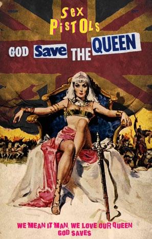
With the rise of an iconoclastic Punk movement, artists began to create a new wave of provocative and boundary-pushing work that reflected their anti-establishment values and musically driven messages. Among the most iconic figures of this era were The Sex Pistols, widely recognised for their 1977 hit God Save the Queen and its controversial visual imagery. One of the most striking depictions features Queen Elizabeth II overlaid on the Union Jack, which flutters in the background as a symbol of British nationalism. In
the foreground, the Queen’s portrait is rendered in a raw, print-press style, with a safety pin piercing her lips, serving as a bold metaphor for her silence amid the political and social unrest of the time. The piece is captioned with the confrontational slogan ‘GOD SAVE THE QUEEN, SHE AIN’T NO HUMAN BEING,’ amplifying its rebellious tone.
Cultural rebellion
Another controversial variation adapted the Queen’s face into blue and silver tones, mocking the colours of royalty, to coincide with her Silver Jubilee. This bold reimagining of a national symbol challenged both the monarchy and the societal structures it represented, cementing Punk’s role as a cultural rebellion.
The raw style of art that represents the era of Punk can be referred to as DIY (Do-ItYourself). It drew from a chaotic mix of torn newspaper headlines, political photographs, and magazine clippings, combined with hand-drawn elements, smeared ink, and distorted typography. These materials were assembled into gritty, unpolished collages and reproduced using cheap photocopy machines, giving the designs a deliberately
low-fi and rough-hewn aesthetic. The jaggedly ripped edges and imperfect forms reflect the minimalist, anti-commercial ethos of the movement, reinforcing the political messages of resistance and defiance.
Punk’s visual rebellion also spilled onto the streets through graffiti and stencil art, transforming public spaces into a canvas for political protest. Vandalising government or corporate property became an act of defiance, destabilising symbols of control. The ease of replication and the accessibility of these mediums made them a staple of Punk culture, much like modern guerrilla art.
This influence can be seen in the work of artists like Banksy, whose provocative stencils echo the Punk spirit. Banksy’s art that is so unapologetically critical of military and financial establishments serves as a gateway for anti-war and anti-authoritarian activism. His iconic pieces, sharp and subversive, hit like a steel fist in the face of oppression, continuing the legacy of Punk’s defiance in contemporary art.
By Aiden Bell
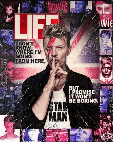
BOWIE 3D LIFE
Mr Sly
GOD SAVE THE QUEEN Linda Charles
The approach was one from passion. If it wins or fails, I want to do it anyway and take a holistic approach following hints of excitement.
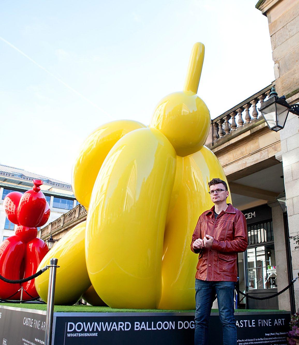
SEBASTIAN BURDON WHATSHISNAME
Michael
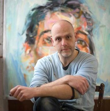
Conceptual Artist Craig-Martin
Welcoming an outstanding and incredibly influential conceptual artist to the Art & Culture Magazine, the iconic Michael Craig-Martin joins us for an interview about his work and personal journey in the art world.
Having exhibited his work in galleries and museums across the world such as the Centre Pompidou, the MoMA, the Whitechapel Gallery, the Serpentine and more recently, the Royal Academy, Michael is represented by the Gagosian Gallery and was even knighted during the Queen’s Birthday Honours for his services to art.
Q: Thank you so much for joining me Michael. Firstly, please tell us a little bit about yourself and the work that you do.
A: I have been working as an artist for 60 years. I consider being an artist to be one of life’s great privileges. Making art involves observing, responding, and most importantly, acting. I make my work using many forms and processes which include drawing, painting, sculpture, prints, installations and digital work. I believe that art should reflect what it is like to be alive now in the present
moment. Indeed, all art was contemporary once upon a time.
Q: Tell us a bit about your professional journey and how your work initially began to gain such recognition.
A: I had my first solo show at the Rowan Gallery in London in 1966. I gained some limited recognition early on which, as is the case with most artists, gradually grew as I produced more work and participated in more exhibitions. I was nearly 50 years of age before I made enough financially to live on without teaching. There was no single big moment, just a gradual increase in recognition and appreciation over many years of my life.
Q: When did you first develop an interest in art, and what message do you seek to convey to the viewer with your artwork?
A: I became interested in art, even wanting to become an artist professionally when I was about 14 years of age. It has been the absolute centre of my life for as long as I can remember. My work contains no messages therein per say. Art is about having a shared experience. If what I do resonates with the viewer, it is because I have touched upon something deep within the self.
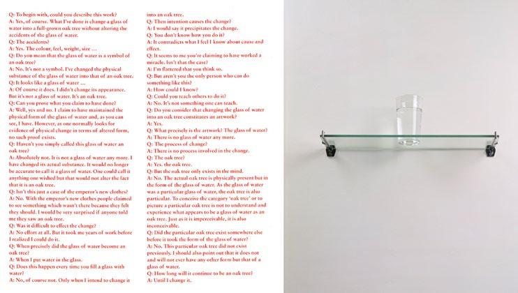
Q: One of your most notorious pieces is An Oak Tree, which I thoroughly enjoyed reading about. Could you tell us a little bit more about this piece, what inspired it,
and the message you are trying to convey with the work?
A: An Oak Tree (1973) consists of a glass of water on a glass shelf with an accompanying text in the form of an interview between artist (believer) and the viewer (sceptic). In the text I claim to have changed the glass of water into an oak tree without changing its appearance. There is no proof I succeeded, but also, none that I failed. Art is ultimately an act of the imagination. To experience art requires an act of faith by both the artist and the viewer.
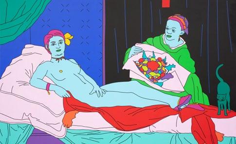
Q: I absolutely adore your piece which brings to light Holbein’s The Ambassadors in such a colourful and Pop Art way. Are there any specific time periods or movements within the history of art that you’re particularly interested in?
A: I have always been most interested in the art of the early Renaissance – a period of exceptional change and discovery. For similar reasons, I have always loved the Modernists and their constant drive to discover and innovate.
A: Some of my favourite artists would have to include Piero della Francesca, Michelangelo, Velázquez, Manet, Seurat, Duchamp, Picasso, Matisse, Magritte, Johns, Rauschenberg, Warhol, Guston, Richter, Judd, Nauman to name but a few!
Q: What are some of your favourite and most memorable artworks that you’ve created?
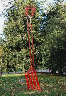
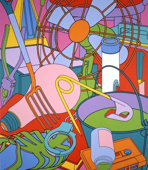
A: I have quite a few! Aside from AnOakTree (1973), I would say Reading with Globe (1980) which was a drawing made directly onto the wall with black adhesive tape. Also, the Always Now (1998) installation at the Kunstverein Hannover which fills the whole wall. Eye of the Storm (2002) which illustrates everyday objects swirled around. My Garden Fork (2017) sculpture, Untitled (with Grapes) (2000), and On the Shelf (1970) which was a conceptual piece. Lastly, Cosmos which is
a 360-degree immersive digital installation which brings the viewer into the world of objects spanning my artistic career.
Q: From painting, sculpture, printmaking, installations, drawings, and computer designs, which would you say is your favourite medium to work with and why?
A: Drawing has always been at the heart of everything I do. Painting has become my principal studio activity over the past 25 years but every medium certainly has its own pleasures.
“I have always been most interested in the art of the early Renaissance – a period of exceptional change and discovery. For similar reasons, I have always loved the Modernists and their constant drive to discover and innovate.”
Michael Craig-Martin
MY GARDEN FORK (2017) Michael Craig-Martin
Q: What challenges have you encountered throughout your career as an artist?
A: To value my own instincts and stay true to myself has certainly been a challenge. To be taken seriously by my peers and the knowledgeable art world whilst becoming independent of institutions. Becoming financially viable in the gallery world has also posed a challenge, and ultimately, the attempt to try and establish a rapport with as wide an audience as possible whilst also sustaining personally engaging creative work over the duration of my entire lifetime.
Q: Can you give us an insight as to any future projects that you have in mind or are currently working on?
A: I learned a lot from my Royal Academy retrospective last year and I think my new work will showcase that. I am working on some quite different and unique paintings, prints and other things so definitely watch this space!
By Tamara Bell
EYE OF THE STORM (2002) Michael Craig-Martin
Scan here to find out more about Michael Craig-Martin
Architectural Wonders of the World & GrandeurQuirk
Architecture, in its most profound form, is a blend of art and engineering, embodying human ingenuity and creativity. Around the world, remarkable structures stand as testaments to our quest for beauty, functionality, and innovation. From the quirky and unconventional to the grand and majestic, these architectural wonders captivate and inspire. Let’s embark on a journey to explore some of the most fascinating buildings across the globe.
Fallingwater, Pennsylvania
In the lush forests of Pennsylvania, Frank Lloyd Wright’s Fallingwater emerges as an architectural masterpiece seamlessly integrated with its natural surroundings. Built over a waterfall, this iconic house embodies Wright’s philosophy of organic architecture, which promotes harmony between human habitation and the natural world.
Fallingwater’s cantilevered design allows the house to extend over the water, creating a dynamic interplay between structure and environment. The use of natural materials such as local sandstone and the extensive incorporation of glass invite the surrounding
landscape into the living spaces, blurring the boundaries between indoors and outdoors. Fallingwater remains a quintessential example of how architecture can enhance our connection to nature.
The Guggenheim Museum, Bilbao
The Guggenheim Museum in Bilbao, Spain, is a symbol of contemporary architectural innovation. Designed by Frank Gehry, this stunning structure is renowned for its swirling forms and titanium cladding, which create a shimmering effect reminiscent of fish scales. Gehry’s use of advanced computer-aided design techniques allowed
for the realisation of this complex and fluid form, which defies conventional architectural geometry.
The Guggenheim Bilbao’s dynamic curves and reflective surfaces interact with the surrounding environment, particularly the nearby Nervión River, creating an everchanging play of light and shadow. Inside, the museum offers expansive gallery spaces that accommodate large-scale contemporary artworks. The Guggenheim has not only become an architectural icon but also a catalyst for urban regeneration, transforming Bilbao into a vibrant cultural destination.
The Sydney Opera House, Sydney
Perched on Bennelong Point in Sydney Harbour, the Sydney Opera House is one of the most recognisable and celebrated buildings in the world. Designed by Danish architect Jørn Utzon, this iconic structure is renowned for its sail-like shells that soar above the harbour, creating a dramatic and sculptural silhouette.
The innovative design of the Opera House was inspired by natural forms, including seashells and the hulls of ships. Its construction, which involved the use of pre-cast concrete panels and an innovative support structure, was a monumental engineering achievement. The interior spaces are equally impressive, with their elegant use of wood and sweeping views of the harbour. The Sydney Opera House is a masterpiece of modern architecture and a UNESCO World Heritage site, celebrated for its aesthetic and technical brilliance.
The
Burj Khalifa, Dubai
Rising from the desert sands of Dubai, the Burj Khalifa is the tallest building in the world, a pinnacle of modern engineering and design. Designed by Adrian Smith of Skidmore, Owings & Merrill, this skyscraper soars to a height of 828 metres, dominating the skyline with its sleek, tapering form.
The Burj Khalifa’s design is inspired by Islamic architecture, with its central spire reminiscent of the minaret of a mosque. The building’s exterior features a shimmering glass façade that reflects the changing light of the desert sun. Inside, the Burj Khalifa houses luxurious residences, office spaces, and the world’s highest observation deck, offering breathtaking views of Dubai and beyond. The skyscraper is a symbol of Dubai’s ambition and its transformation into a global metropolis.
By Amber Williams
This iconic structure is renowned for its sail-like shells that soar above the harbour, creating a dramatic and sculptural silhouette.
“Architects, sculptors, painters - we all must return to craftsmanship! For there is no such thing as ‘art by profession.’ There is no essential difference between the artist and the artisan. The artist is an exalted artisan.”
Walter Gropius, Bauhaus Manifesto, 1919
Look around you and you will see Bauhaus design in every aspect of life: architectural structures demonstrate Bauhaus design philosophy by combining geometric shapes and functional forms with primary colours and clean modern lines while featuring industrial materials and balanced asymmetry. Folding chairs and desk lamps demonstrate symmetrical proportions alongside tableware products that display straight lines.
Walter Gropius founded the Bauhaus school in Weimar Germany with the goal of combining artistic expression and functional design through innovative design principles that influenced global history.
Functionalism & simplicity
The enduring design principles established by the Bauhaus movement continue to influence modern design capabilities. The movement’s emphasis on functionalism and simplicity resulted in cleaner aesthetic standards that transformed both architecture and interior design. The movement’s integration of artistic vision with technological progress led to the development of innovative materials and methods that still maintain relevance today.
Walter Gropius along with Ludwig Mies van der Rohe and Josef Albers emerged as key leaders within the Bauhaus artistic movement. Under Gropius’s guidance the school developed its initial direction while Mies van der Rohe’s minimalist approach defined modernist architecture through his ‘less is more’ philosophy. Josef Albers established fundamental principles in colour theory and geometric abstraction that transformed both art and design education. The influence of these figures expanded the scope of possibilities in design and architectural development.
By following the Gesamtkunstwerk principle the Bauhaus aimed to unify all forms of art into one complete and cohesive vision. The movement developed an educational approach that supported the synergy
between creative imagination and industrial methods instead of treating them as distinct elements. Bauhaus principles required functional design that removed superfluous decoration to highlight how form and utility merge seamlessly with beauty.
The fundamental ideas of the Bauhaus movement maintain their substantial influence over modern art and design practices. Modernist furniture along with architecture and product design continues to hold popularity today because of the movement’s emphasis on practicality and intentional design. Today’s architecture for residential spaces and public structures incorporates Bauhaus-designed clean lines and open floor plans as fundamental elements along with multifunctional furniture.
During its emergence, the Bauhaus was established in Germany which was undergoing social reform movements, yet remained politically unstable after World War I. The Bauhaus emerged from a wider movement focused on societal reconstruction through improved living standards and innovative design approaches. The school
functioned in a dynamic innovative setting but encountered ongoing political difficulties which ended when radical political groups attacked its philosophies resulting in its closure in 1933.
Colour relationships
Josef Albers joined the Bauhaus faculty in Weimar in 1920 and soon established himself as a leading teacher whose artistic style was honed through intensive experimentation with colour theory and material properties. His Homage to the Square series is testament to his understanding of colour relationships which motivated many students and designers in modern fields.
Hungarian artist and educator László MoholyNagy joined the Bauhaus movement in 1923 and brought innovative avant-garde ideas to the group. His work demonstrated the integration of technology with artistic practices by showing how industrial materials could boost creativity.
While Paul Klee instructed colour theory at the Bauhaus school Wassily Kandinsky practiced his art as a faculty member. Pure abstract art became a key factor in earning Kandinsky recognition among modern art circles. During his move to Germany, Kandinsky merged geometric patterns from his Russian artistic background with Bauhaus theoretical concepts. In 1923 Composition VIII demonstrated Kandinsky’s mastery of geometric abstraction which became a defining feature of his time. Grohman explains how this work transforms geometric forms into numerical representations which create magical effects. In 1924, Kandinsky founded the artists’ association Die Blaue Vier (The Blue Four) group, the successor group to Der Blaue Reiter (The Blue Rider) group together with Alexej Jawlensky, Paul Klee and Lyonel Feininger.
VIOLET (1923) Wassily Kandinsky
Designed by Walter Gropius
Kandinsky’s teaching at the Bauhaus established a profound and enduring legacy among both the institution and its students. His work’s blend of emotional richness and formal precision generated a sustainable legacy that continued to motivate artists following the closure of the Bauhaus institution.
Paul Klee directed the Bauhaus educational program between 1921 and 1931 using teaching methods that merged functional design with artistic principles. He pioneered the art movement of Abstraction and Surrealism with his spontaneous ‘automatic’ drawings which became essential to his most celebrated works. In 1922, Paul Klee
created Senecio by combining geometric shapes and abstract patterns with vibrant colours to form a face image.
The influence of the Bauhaus movement expanded internationally due to its faculty and students relocating during World War II and in its aftermath. As members of the Bauhaus diaspora Moholy-Nagy and Albers continued the school’s teachings through their American work and educational activities. Art and architecture schools around the globe embraced the movement’s principles leading to a widespread Modernist movement that encouraged functionalism and the integration of artistic elements into everyday existence.
As a continuing force in modern design education and architectural practice, the Bauhaus Movement remains revolutionary in its influence while challenging today’s professionals and designers. The movement’s combination of artistic principles with industrial technology established a fundamental design language that serves as a foundational support for current disciplines while guiding sustainable design development that prioritises user-centred functionality and aesthetic value.
By Jo Ward
“The Bauhaus Movement remains revolutionary in its influence while challenging today’s professionals and designers.“
CANNESÎLE SAINTE-MARGUERITE
The underwater eco-museum consists of six statues submerged near the southern shore of Île Sainte-Marguerite.
Located about a hundred metres from the shore at a depth of four metres, they are accessible only to snorkellers equipped with a mask and snorkel.
will be focusing mostly on artists that have become staples of city life, known for their iconic styles and famous buildings. Below is an analysis on contemporary sculpture artists and architects that have produced some of the most iconic urban artworks of our time.
Sculpture and architecture: both these art forms share many similarities yet their execution can be drastically different. Initially we may think of sculpture as one narrow path, the artists that choose to explore sculpture usually tend to create works of art that are devoid of any function but rather focus on the creative process of bringing to light an idea. Salvador Dalí, Pablo Picasso and Alberto Giacometti are but only a few examples of artists that have explored the self and the human condition throughout their careers. At first glance Giacometti’s sculptures may seem rough, an amalgamation of materials put together to form a disfigured representation of the self. However, Giacometti is a great example of how sculpture differs from architecture in its most extreme from. Giacometti’s interest in his subjects led him to create work which focused on what he considered to be the ‘real’ person, resulting in pieces which demonstrated an emotional response. In my opinion, his work can be best described as controlled chaos! Sculptures which seem so fragile and delicate, yet somehow demonstrate the artist’s strength in the very construction and material used to build each piece.
There are of course other artists which seem to bridge this gap a little more between sculpture and architecture. Richard Serra and James Turrell, for example, immediately come to mind due to the scale of their work,
their relationship with the natural elements, their understanding and appreciation of space and the environment; but, despite this I again return to the word ‘function’. It is clear that the art produced by both of these masters does link sculpture and architecture in ways that seem to skew the notion of function. Yet, it is not the type of function that is clearly associated with traditional architecture. Richard Serra and James Turrell’s work allow us (the individual) to engage with the work, to walk through it, to touch it and to interact with it. Their works of art are pieces made with a specific artistic intention, each one adopts its own character and meaning and, in this regard, sculpture can have more of an individual impact as it does not concern itself with strict rules and regulations. Sculpture artists are free to create and interpret however they wish.
Yet, there is one artist which has become famous for his designs, an artist that really does bridge the gap between sculpture and architecture. Not only his style but his influence on urban design has become a highlight of the city in which he used to live in. This artist is of course the famed Antoni Gaudí, known for creating some of the most unique and iconic designs in Barcelona and responsible for the unfinished Sagrada Familia. A mind blowing 41,000 square metre church towering over Barcelona has become one of the top attractions for those visiting this cultural city in Spain.
Gaudí’s influences from the neo-gothic movement, natural forms and deep religious beliefs has led him to create some truly astonishing work.
His designs are a real amalgamation of sculpture and architecture with the Sagrada Familia being his masterpiece, Gaudí has proved that architecture (specifically contemporary architecture) is far more influenced by the free-flowing nature of sculpture work than in previous decades. His designs live outside that of the ‘public space’, like many sculptures dotted around a city, Gaudí’s work is less of an accessory to a building but rather the main focal point.
In an interview with Daniel Burren published on Modern Sculpture Artists, Burren states that ‘the first obstacle for any artist working in public spaces is the surrounding architecture, and the work becomes either responsive or resistant to that environment’. Burren refers here to sculptures which work alongside buildings and sculptures that aim to complement the natural environment as well as the buildings which tower in the nearby distance. Gaudí’s work is less of an accessory to the surrounding area but responsive to its environment. As Gaudí himself puts it ‘originality is returning to the origin’, a quote that I find to be a true representation of his work!
By Francesco Scalici
BARCELONA CITY PANORAMIC VIEW OF PARC GÜELL
Antoni Gaudí
GothicArchitecture
Evoking an image of a mysterious building, haunting venues and dark architecture, the Gothic style is far removed from the stereotypical associations attached to it. As a style which emerged in northern France in the early 12th century, Gothic tendencies combined a detailed observation of nature with expressive and sophisticated elegance.
WESTMINSTER
Spreading rapidly throughout Europe and permeating all traditional art forms to include painting, sculpture, textiles, architecture and illuminated manuscripts, the Gothic style stemmed from Romanesque architecture suffused with height, light and volume.
As one of the most significant architectural movements in Europe, the Gothic style can be traced back to the Middle Ages. Often constructed from heavy stone, the Gothic style of architecture can be easily identified by its recurring stylistic elements. These often include pointed arches, flying buttresses, ribbed vaults, stained glass windows and cavernous interiors. Commonly boasting tall and majestic structures, the Gothic style paid particular attention to detail and aesthetics. While form and function were of great importance, the lack of simplicity in Gothic architecture is a staple for these medieval wonders peppered around Europe, standing the test of time.
With stained glass windows presenting a canvas for Biblical stories to unfold and teach its visitors, Gothic cathedrals often exacerbated the complexities of its ribbed vaulting and fused together embellished colonnades, saintly statues, spires, carvings, gargoyles, and many religious motifs. These decorative elements are characteristic of the Gothic style of architecture, where ornate tendencies are skilfully crafted and overwhelm the structure both internally and externally.
With gargoyle heads serving both a functional and spiritual purpose, they were often used as rainwater management systems to channel water away from the building’s foundations as well as to protect the building from evil spirits, as Cathedral guards. Believed to be inspired by paganism, gargoyles serve as lessons of morality. While benevolence and purity may be found in the Cathedral they protect, sin and evil are never far away.
As one of the most iconic examples of Gothic style architecture in the world, the NotreDame Cathedral in Paris, France, is one of the earliest Gothic structures ever built. Dating back to 1163 and completed in 1345, the structure has stood the test of time, with blazing fires, and severe desecration during the French Revolution. Containing various relics associated with the Passion of Christ, this iconic masterpiece is embellished with symbolic details and saturated with rich political, social and
cultural history around every corner. Illustrating the Last Judgement on its façade along with many religious figures, the building’s exterior also pays homage to medieval science and philosophy. Peppered with alchemy symbols of transformation and stained glass windows depicting scenes from the life of Christ, NotreDame is a triumphant structure of didactic teachings. Its symbols, history and timeless beauty proudly stand as an example of the Gothic style of architecture, and most importantly, as a testament to the very fabric of Parisian society.
Travelling to the United Kingdom, Gothic style buildings exist in a plethora of towns
and cities. Some of the more prominent structures include the Palace of Westminster in London, and the Canterbury Cathedral in Kent. Serving as the seat of political power in Britain, the Palace of Westminster houses the British Parliament and showcases one of the earliest examples of Gothic Revival architecture in England.
Similarly, Canterbury Cathedral stands as a site of historical drama for the brutal murder of Thomas Beckett in 1170. As the Mother Church of the Global Anglican Communion, its history spans fourteen centuries, and continues to proudly stand as one of the most ornate and historically rich examples of the English Gothic architectural style, visited by many all over the world.
While Gothic architecture is deeply rooted in medieval history, politics, and the core values and beliefs of a society from very long ago, the style stands still, as a reminder of political upheaval and human creativity. This style of art and architecture showcases the artistry that human beings possess, and continues to flourish in its didactic teachings permeating through the ages. Bringing together people from all corners of the world, Gothic architecture is not just a showcase of ecclesiastical manifestation, but also, the metaphysical conception of light, scientific understanding, culture and human ingenuity.
By Tamara Bell
NOTRE DAME CATHEDRAL
CANTERBURY CATHEDRAL
Photo by William Wachter on Unsplash
Tracey
Interview with Arturo Galansino Emin
Welcoming the remarkable Tracey Emin to the Art & Culture Magazine, I am delighted to bring her first solo exhibition in Italy to the forefront of our fifth edition in collaboration with Fondazione Palazzo Strozzi.
Upon entering the palazzo in Florence, I was amazed at the sublime fusion created between the history of the venue infused with the weight of the Renaissance, and Emin’s striking contemporary sculptures dealing with themes of sex and solitude. It was as if every inch of this architectural marvel was begging to be filled with Emin’s pieces which fit the space so perfectly. Having been curated by Arturo Galansino, the viewer is navigated through the exhibit and Emin’s various thematic concerns which permeate each and every room in Palazzo Strozzi, creating a seamless blend of history and the present day.
Arturo Galansino: Let’s start with the title of the show, SexandSolitude. Your work has always been unapologetically open about sexuality, from periods of intense sexual activity to years of celibacy, and the profound impact of sexual trauma. How has your perception of sex evolved over the years, and how does it continue to inform your work?
Tracey Emin: Sex is very complicated for me, and it always has been. When I was younger, around fourteen or fifteen, sex was a vehicle, a way of getting somewhere, a way of moving, a way of exploring, a way of seeing the world through people, and feeling people. Then I realised that I was giving much more than I was receiving, and I wasn’t happy about it. At that time I went through a
period of celibacy again. Throughout my life I’ve gone through long periods of celibacy and abstaining. The longest was around ten years. I think I might be going through another period of that now. This time it’s different because of all the surgery that I’ve had. My body is very affected by everything that has happened to it. I also think our body has memory. My body’s been hurt by love and by sex and by surgery and by rape and by sexually transmitted diseases and by abortions. It’s like that part of my body is quite numb now, because of psychological and physical reasons. Now what’s more important than sex to me is love, definitely love, it has to be love. The chances of having both at the same time are pretty rare, especially for me.
AG: Talking instead about the idea of solitude, I’m thinking about how it manifests in many forms — whether as the loneliness of loss, the isolation of creation, or the introspection required for self-discovery. What’s your relationship with solitude?
TE: I love solitude. When I was younger, I used to think that I was lonely — because I was lonely — and I felt alone. And I didn’t understand how to use that feeling. I saw it as being a negative thing. Now, solitude for me is like one of the greatest, most amazing feelings. It’s like understanding
nature, understanding time, and being at one with myself. Being totally complete, mentally, physically, emotionally. And, my favourite moment of solitude is painting. When I’m creating, painting, writing, thinking; that’s when I feel really fantastic. And, without moments of solitude, I can’t be creative, it’s impossible. One thing is to be surrounded by people of warmth, by friendship and love. But to be creative I have to have solitude, I have to have that moment of isolation. And, that’s why I think I have insomnia. That’s why I think I have strange sleeping hours. When I fall asleep on a sofa or a chair and I wake
up in the middle of the night, that is one of my moments of solitude, when I feel like I’m the only person in the entire universe, that’s when I usually can think things that I normally wouldn’t. And, even being in bed has a problem because bed is very comfortable, and the moments of solitude I need have to be like fierce winds, like rain slashing, they have to be like sun burning, like walking in the desert. Solitude has to be this extreme to work. And that’s when I have my best thoughts, my best
ideas, my highest moments of creativity. But, it doesn’t have to hurt. And, that’s why when I was younger there was a confusion between loneliness and solitude. Loneliness is not solitude. Solitude is strength. There’s a massive difference between being stuck on the ridge of a mountain and not being able to go up or go down, and climbing to the summit, standing on the summit and feeling triumphant. It’s a massive difference.
AG: Palazzo Strozzi is a venue steeped in history. How does exhibiting your work in such a historic setting influence the way you think about your works? On a more personal note, what has your relationship with Italy been like over the years, and how has our country influenced you personally and artistically?
TE: I’ve shown in Italy quite a lot through my gallery, Lorcan O’Neill. But, I haven’t actually ever shown in an institutional space in Italy or had a solo show there. And, Palazzo Strozzi is extremely beautiful, architecturally, historically, where it’s placed, the shape of the rooms, everything. It really suits me, it’s fantastic. And so, I’m excited about seeing my work in that environment and also excited in showing in an institutional space in Italy, and in Florence! It’s incredible!
Steeped in so much art history and so much history. So, I’m also excited to be there. I have this thing, and I’ve had it for a long time: I won’t show in architectural spaces I don’t feel good about. My priority is showing in cities, towns, and countries that I feel good about. So, Palazzo Strozzi has everything for me — I’m really excited.
AG: Florence’s history with bronze sculpture, particularly from the Renaissance, is iconic. For example, the 15th century opened itself in this city with the famous contest to design the baptistery’s North door, which in a way kick-started the early Renaissance. You did something similar to Ghiberti with your recent project for the National Portrait Gallery’s bronze doors. How has working with bronze influenced your artistic expression? What challenges and discoveries have you encountered with this medium?
TE: For years I’ve wanted to make large bronze sculptures, figurative ones taken from my drawings, but I didn’t know how to, and I didn’t want to cheat, and I wanted to learn myself. And, then I became friends with Louise Bourgeois, Jerry Gorovoy, Scott Lyon Wall, and worked at an Art Foundry in New York where I learnt the lost wax technique and I started from scratch.
I started making tiny little bronze sculptures. And, now, years later, I’m working with AB Fine Art Foundry in London, making the hugest giant bronzes and I love them as much as the little ones. And, I love the fact that I’ve gone from tiny to giant and I’ve learnt so much. It’s really the only new thing I’ve learnt in the last twenty years and that’s because I had to find a way of going forward with my work. The history of bronze is pretty phenomenal because of the alchemic materials involved.
AG: You’ve created significant public art pieces. What do you believe is the role of public art, and how does creating for public spaces differ from making work for a gallery or a museum setting?
TE: Well, when I was younger, I used to get really angry about a lot of public art. I thought it was very male and bombastic, and I found a lot of it quite unattractive and a little bit embarrassing unless it was very conservative. I couldn’t understand why there wasn’t more public art that actually was emotionally fulfilling. And, then I realised that it’s because there’s very little room for emotion in the public realm. If anything, that would be considered dangerous. But, still, I wanted to try, so I started off by making extremely tiny public sculptures like Roman Standard, which is my bird on a pole and it’s very small, it’s like the size of a tiny bird. And, then there are the birds in Sydney, sixty-eight sculptures of tiny birds perched down one street in Sydney’s central business district. And, I did Baby Things in Folkstone, which are sculptures of baby clothes left
in different places. So, I wanted to make an emotional impact with public sculptures by making tiny feminine sculptures. And, then I decided to go the complete opposite, avoiding being macho. I still wanted it to be very feminine. And, now I’ve got a nine-meter high sculpture, The Mother, in Oslo, which is essentially my mother: an old lady kneeling. I’ve never seen a public sculpture or statue of an old woman before. So, I think I’ve really done something new and quite sensational in a way.
AG: Despite not being religious, you frequently draw on Christian themes, such as crucifixions and visitations, which feature prominently in this exhibition. What draws you to these motifs, and how do you reinterpret them through your personal lens?
TE: For me it’s not about Christianity, these stories and these symbols existed a long time before that. We all relate to the notions of sacrifice and suffering because in our lives we have to make choices and decisions. A lot of these images are a recognition of
universal themes such as illness, death, love. Going back to the National Gallery, when I was at college I would do my own interpretations of different iconic religious paintings, Depositions, the Wedding at Cana, Annunciations. I would do my own version of them because I was learning. As I’m older I understand that the Annunciation, for instance, isn’t about an angel coming down saying to someone that they’re pregnant.
It’s about the realisation of creativity in the beginning of something, maybe even the beginning of time. We can interpret it to whatever we want, and if we want to interpret it like sperm going into an egg, that’s fine too. But it’s about the beginning of something, it’s about the conception of a moment and that is something incredibly beautiful.
AG: We are lucky to have included several of your neons in the exhibition. How important is it to have these sentiments in lights instead of writing on a canvas or the writing within your blankets, for example?
TE: I grew up with neons. They were everywhere in Margate. Now there’s very little of it in Margate but so much of it in the rest of the world actually. I started making neon because I wanted to see more of it. And, you know, the thing is — be careful of what you wish for. Real neon contains argon and neon gases which actually make people feel good. They emanate, they radiate an energy. That’s why you used to have neons in casinos, brothels, bars, clubs, etc. Neon is a pulsing energy of electricity, so it’s alive, it’s a live thing, and that makes me feel good. The whole idea of neon is one thing, using my writing for it is another. It came about with Carl Freedman, the gallerist. Back in 1995 I had to make a sign for my museum and Carl said to me: ‘You like neon, why don’t you do it in neon?’ So, I wrote The Tracey Emin Museum and that was the first neon I made. I still have that neon. It’s very sweet and quite small, but it was the beginning of everything. Putting your name in lights has showed me how much my mum wanted me and how much
she didn’t want me in some ways. And, how much my mum wanted herself, how much she wanted her own independence. I was always taught to be independent. My mum put me on the pill when I was fourteen to make sure I didn’t get pregnant which I’ll always be grateful for, because there was a good chance I would have got pregnant. And, then I don’t know what would have happened to me or my life.
As for being a mother, it’s never been something which has been possible for me because I’ve never met anybody who wanted to have children with me until I was too old. When I was younger, I certainly didn’t give out the right signals to be the greatest mother on Earth. And, now I am a mother, I’m a mother
to two cats and I love being a cat mother. I was mother to my cat Docket for twenty years, and now I’m a mother to two cats and I’m a very, very good cat mother and that’s the way it should be.
AG: As an artist who has continually pushed boundaries, what do you hope your work will communicate to future generations? How do you see your legacy within the broader context of art history?
TE: I think a lot of young people get inspired by what’s fashionable and what’s appropriate for now. With art it shouldn’t be like that. Art should always be about what’s appropriate for yourself, forever. It should have sincerity and it should come from a genuine desire to answer questions yourself. I mean that’s what I do. My work was highly unfashionable for a long time. But it doesn’t matter because I knew it was the right thing for me to do. And, how you present something and the context of something is really important. You could be making the best art in the world but if it’s in the wrong context nobody will ever see it.
Alberto Giacometti, born in 1901 in the picturesque village of Borgonovo, Switzerland, was destined to become one of the most distinctive artists of the 20th century. Known for his tall, skeletal sculptures, Giacometti redefined how we think about the human figure - mainly that, well, it doesn’t have to look like a human at all to be meaningful.
If you were to meet one of his sculptures, you might think, ‘is that a person or an abstract tower of spaghetti with a few limbs thrown in for good measure?” But that’s exactly what made Giacometti’s work so compelling: it wasn’t just art, it was an existential crisis turned into visual form.
Giacometti’s early years were peppered with the usual stuff that shapes great artistsan artist father, some childhood art lessons, and a healthy dose of Swiss precision. But in the 1920s, after moving to Paris, he found himself in the throes of artistic rebellion, where Surrealists like Salvador Dalí and André Breton were concocting strange, subconscious worlds. For a time, Giacometti dipped his toes into Surrealism, creating biomorphic forms that seemed to melt in and out of space like the very idea of ‘reality’ itself was just a suggestion. Still, Giacometti wasn’t fully sold on creating weird shapes just for the sake of weirdness. After all, what was the point of making something ‘strange’ if it didn’t mean something deeper? So, he eventually ditched Surrealism and began the long journey into creating his signature thin, elongated figures - an artistic decision that was probably less about a personal diet and more about the human condition.
Now, let’s talk about these figures because you can’t talk about Giacometti without at least acknowledging the fact that his sculptures seem to defy basic biology. His human forms are taller, thinner, and more fragile than anyone who’s ever survived a
New York winter, yet they also radiate a certain power. These figures are walking, standing, but mostly seem to be endlessly striving toward something. It’s like they’re perpetually reaching for the last piece of pizza at a party, only they’re too malnourished to grab it.
“The longer you look at these thin statues, the more you realise they aren’t just thin for the sake of aesthetics - they’re thin because they represent something more profound.”
And that’s the thing: the longer you look at these thin statues, the more you realise they aren’t just thin for the sake of aesthetics - they’re thin because they represent something more profound. Giacometti wasn’t trying to make ‘beauty’ in the conventional sense. He was trying to make the viewer feel the isolation, the loneliness, and the everpresent distance we feel from each other, even when we’re in the same room. And let’s face it, if you’ve ever been at a party where you didn’t know anyone and found yourself awkwardly lurking by the snack table, you’ve felt that.
As Giacometti honed his craft, the figures grew taller, thinner, and more isolated. Take Walking Man (1960), for example. The figure, so frail that it feels like it might snap if you gave it a hug (or a solid gust of wind), walks with purpose through an empty space. But there’s a sense of separation. The figure’s long strides don’t indicate a friendly strollthey indicate an existential mission, like ‘I’m going somewhere, but I’m not sure where that is, and frankly, I don’t know if anyone else cares.’ It’s the sculpture equivalent of when you’re trying to exit a crowded room and someone blocks your path by talking about how long it takes to get to their office.
Now, one might wonder why Giacometti chose to elongate the human form to such extremes. Was he on a quest to make
the tallest man in the room seem like the loneliest? Perhaps. Or maybe he just found something deeply poetic about the way the body, whether thin and fragile or strong and imposing, always seems at odds with the space around it. There’s a strange beauty in how the figures almost seem to be walking away from us, reminding us that, no matter how close we are to someone, they’re always just a little bit beyond reach.
It’s this delicate balance between the figure and its space that was another part of Giacometti’s genius. He didn’t just sculpt bodies; he sculpted the void around them, too. The empty space around the figures was as important as the figures themselves. These were not statues of people hanging out in the park - they were solitary beings, wandering through an almost desolate landscape, with each sculpture whispering, ‘I’m here, but I’m alone.’ It’s like he took all the awkwardness of a family reunion, distanced it with years of silence, and made it the focal point of his art.
Despite his somewhat melancholic themes, Giacometti’s work leaves you with a strange sense of both recognition and wonder. It’s as though you’ve met these figures beforemaybe in a dream, or in a moment of personal introspection. They embody something profoundly human: the need to connect, the frustration of distance, and the inevitable movement of time. Although they may seem fragile, these figures hold an unsettling kind of power - reminding us that sometimes, the most meaningful things in life are the ones that seem the most fleeting.
In the end, Giacometti’s legacy is like his art: not quite whole, not quite fully realised, but always stretching, always reaching. And if you can look at one of his figures without feeling a little bit like you’ve just been through a deeply philosophical mid-life crisis - well, you might want to reconsider what kind of art you’re into.
By Ian Law
TALL FIGURE
Alberto Giacometti
Donatello’s
The Art of Contrapposto David
Nowadays, the term Renaissance is usually associated with Italy, and refers to an upheaval and dramatic change in politics, culture, art and social spheres throughout Europe during the 1400s to the 1600s. The term signifies re-birth, and is therefore emblematic of the cultural renewal which took place during this time frame.
Indeed, it was this cultural movement in Florence which spurred the revival of the sculptural tradition. The Renaissance was the driving force for this artistic medium which was paramount in establishing the character of a place such as a public building or a private courtyard.
The famous Italian Sculptor Donatello depicted the biblical hero of David as part of a private commission by the esteemed Medici family in the 1440s. The sculpture depicts David in contrapposto with one foot on Goliath’s severed head. Further to a visual analysis of the sculpture, Donatello’s David is equipped with nothing but a sword, hat and boots, which emphasises his nudity.
Donatello seems to pay tribute to the biblical narrative of David and Goliath as he depicts a youthful figure of David wearing what seems to be a shepherd’s hat. This particular detail reminds the viewer of David’s status as a shepherd boy, in which the figure’s hat is decorated with laurel which is a common symbol of victory attributed to the god Apollo.
Donatello highlights David’s heroism, strength and victory over the giant Goliath as well as his future victories as King of Israel. In this depiction of David, Donatello brings attention to the figure’s modelling after a Greco-Roman nude athlete, evident in the figure’s lithe male body, his youth, frailty, slender limbs and smooth, dreamy complexion. However, the artist simultaneously reinforces his valour,
heroism and bravery as he ultimately killed the giant and thus will become the future leader of the Jewish people.
According to the author Michael Greenhalgh, Donatello’s David is ‘a suitable image for the Florentines, their own military prowess, and vouchsafe their continuing survival as a state’ as he not only embodies the image of a warrior, but of a just god. This narrative of David which deals with victory, bravery and conquest can therefore be considered a suitable commission by Cosimo de’ Medici who sought to promote the Medici family as leaders of the Florentine Republic.
The Medici’s, being the de facto rulers of Florence at the time, possessed remarkable leadership skills, wealth and political astuteness. Thus, in the same way as David was the King and supreme leader of Israel, the Medici’s held a high social status and wanted to emphasise their importance and influence in society. By Donatello’s David being placed in the Medici courtyard for the public to see through the palace’s gates,
this message would have become a blatant statement to viewers of the outside world.
However, David not only embodies a sense of heroism and super-human prowess, but is also a ‘flamboyant and highly decorated exercise in sexual ambivalence’ according to Greenhalgh. Although Donatello’s David pays homage to the story of David and Goliath and emphasises the values of bravery, valour, heroism, strength and victory, it is a highly sexualised and erotic image of a youthful nude, evident in subtle symbolic references such as his feather and effeminate contrapposto. It is an artwork which deals with the theme of the victor over the vanquished, however, is erotic in style.
Donatello’s David, although a seemingly naïve shepherd boy of pastoral background, becomes the epitome of anatomical perfection, and is ultimately a symbol of both Medici rule and the city of Florence, its power, independence, and success as a Republic.
By Tamara Bell
“The famous Italian Sculptor Donatello depicted the biblical hero of David as part of a private commission by the esteemed Medici family in the 1440s.”
DAVID Donatello
The Thinker Thinking? What is
When hearing the name Auguste Rodin, one immediately visualises The Thinker (1904), one of the artist’s most famous and ground-breaking sculptures that became a pivotal fixture in the Modernist movement and heralded a new age of three-dimensional artistic creation.
Being Rodin’s first public artwork, TheThinker is synonymous with Philosophy, introspection and contemplation. To be viewed from below as the heroically sized figure sits on a plinth measuring 181cm, the idealised male nude is depicted in a state of muscular tension with his right elbow placed on his left thigh and holding the weight of his chin with his right fist. As he sits on a rock in deep thought, the artwork can be seen to shed light on French philosophies of the 19th century which were deeply political.
Heavily imbued with Enlightenment principles, many philosophers were critics of the church and state, and celebrants of progress and rationality. With the end of the ancient régime, ‘reason, nature, happiness, progress, liberty and freedom’ were the five main principles exacerbated by French philosophers and explored through artistic means by many. While Rodin makes us question what TheThinkeris indeed thinking, his covert political and social references are alluded to in one simple action: a pause for reflection.
THE THINKER Auguste Rodin
Initially named The Poet, The Thinker was created as part of a doorway in 1880 titled The Gates of Hell. Based on Dante’s Divine Comedy, Rodin carefully crafted this doorway with The Thinker at its centre, surrounded by Dante’s characters from his iconic poetic works. Critics have speculated the idealised male nude to be Dante contemplating his literary masterpieces, while others have thought the figure to reflect Michelangelo’s practice or even a self-portrait of Rodin himself. While The Gates of Hell had not yet been visually depicted in the art world, Rodin gained much inspiration from Lorenzo Ghiberti’s Gates of Paradise at the Baptistery of St. John in Florence. Rodin’s monumental bronze sculptural group depicts a scene from the first section of Dante’s poem where he wrote:
Through me the way into the suffering city,
Through me the way to the eternal pain,
Through me the way that runs among the lost.
Justice urged on my high artificer;
My Maker was Divine authority,
The highest Wisdom, and the primal Love.
Before me nothing but eternal things
Were made, and I endure eternally.
Abandon every hope, who enter here.
(Dante, Inferno, 3.1-9)
In the words of Rodin himself, he felt that working on The Gates of Hell ‘rendered [his] vision of Dante [and] had become too remote from reality. So [he] started all over again, working from nature, from [his] models’.
Created using the lost-wax casting technique, Rodin initially began by creating a model of The Thinker, followed by a mould to which molten wax was added. After undergoing a long and rigorous process, the mould allowed for various casts to be created, which led to a series of twenty-seven versions being created posthumously after the artist’s death in 1917. Renowned for his craftsman-like approach to sculpture, Rodin possessed the unique ability to infer turbulence, naturalism and physicality in his artworks.
THE GATES OF HELL
Auguste Rodin
Inspired by the work of the Italian masters Donatello and Michelangelo, Rodin’s trip to Italy in 1875 had a profound effect on his artistic practice. Stating that ‘it [was] Michelangelo [that] freed [him] from academic sculpture’, Rodin created The Age of Bronze sculpture upon his return. Modelled after Michelangelo’s Dying Slave, Rodin carefully and intrinsically studied human anatomy from all angles. Celebrating the Italian artist’s mastery of the human form, he began to observe the body in all postures. From being stood up, seated, at rest, in motion, and even climbing a ladder to gain additional perspective from above, Rodin also observed the body by candlelight to reflect upon the subtle nuances of human skin, musculature and proportion.
Human anatomical accuracy was at the heart of the artist’s work. While Michelangelo’s ability to work with Carrara marble presented an unparalleled execution of the human
form, Rodin’s accuracy of proportion in the bronze medium became revolutionary. Highlighting the figure’s veins and muscular curves pulsating through his skin with every mark and irregularity, this has the viewer almost expecting the lifelike male to come alive and break out of his contemplative state. Indeed, the bronze medium not only allows for such anatomical accuracy to be depicted, but is also representative of the figure’s plight, in a stagnant and impermeable moment in time. The figure is not only solidified by the heavy material that weighs him down, but also by his philosophies and thoughts which transcend the boundaries of time. In the same way that Rodin’s The Thinker is created for the outdoors to stand the test of time, the figure will never stop thinking and observing the cyclical nature of humanity’s shortcomings throughout the ages.
By Tamara Bell
“While Rodin makes us question what TheThinker is indeed thinking, his covert political and social references are alluded to in one simple action: a pause for reflection.”
THE KISS
Auguste Rodin
Cubism
Capturing the Spirit Beyond the Canvas in Sculpture
Cubism in sculpture is the art world’s answer to putting a bunch of objects in a blender and hoping they’d come out looking both cool and confusing. While Cubism in painting is famous for its fragmented perspectives and angular shapes, Cubist sculpture took these concepts and gave them a three-dimensional twist, often making viewers question what they were even looking at.
It’s as if artists took a magnifying glass to reality and shattered it into a thousand jagged pieces. But in the hands of these inventive sculptors, these pieces came together to form something new, bold, and not always easy to understand.
A visual riddle
The Cubist movement in sculpture kicked off thanks to a couple of trailblazers who were already busy making life interesting with their paintings. The first of these was, of course, Pablo Picasso. If you’re imagining Picasso only as a painter with a penchant for strange faces and surreal figures, then you’ve been missing out. In 1909 Picasso’s sculpture Head of a Woman changed the game. Imagine taking a face and breaking it up into sharp, geometric blocks, what you end up with isn’t a portrait, it’s a challenge. The sculpture was a bit like a visual riddle: a face you could see and yet not quite make sense of. Picasso made sure that Cubism wasn’t confined to the two-dimensional world of canvas; it was alive, thriving in the world of three-dimensional space.
Not far behind Picasso in the Cubist revolution was Georges Braque, his co-conspirator in the early 20th century art world. Braque’s approach was a little less wild and more about reimagining objects through cubes and fractured lines. One of his most significant works, Violin (1913), turned the familiar instrument into a puzzle of wooden forms,
reduced to flat planes that barely resembled a violin but still evoked its essence. It wasn’t about precision it was about capturing the spirit of the violin, fractured into an abstract form that only a true Cubist could appreciate. Braque’s contribution to Cubist sculpture showed that art didn’t need to be realistic to be powerful, it just needed to force the viewer to look at things differently.
If Picasso and Braque were the godfathers of Cubist sculpture, then Juan Gris was the quiet but incredibly talented third cousin. Gris is often remembered for his contributions to Cubist painting but he also dipped his toes into the sculptural pool. Gris’ sculptural works, like Man in a Café (1912), were a mix of smooth, well-organised planes and shapes that felt like a Cubist’s version of a well-tailored suit. His approach was clean and orderly compared to Picasso’s chaotic frenzy, which made Gris’ sculptures look like they could be the calm before the Cubist storm. Still, the geometric purity of Gris’ work, much like his paintings, asked the viewer to rethink familiar forms and isn’t that what Cubism was all about?
Filled with possibility
Let’s not forget Alexander Archipenko, who took Cubism into new territory with his work. The Golden Bird (1919) is a perfect example of his style: fragmented, open, and a little creepy. This bird wasn’t sitting pretty, it was flying in pieces, reconstructed from
blocks and shapes that barely seemed to make a coherent image. Yet somehow this abstraction still captured the essence of what a bird was supposed to be. Archipenko’s style helped prove that Cubism wasn’t just about creating strange, angular objects for the sake of it. It was about making art that was unpredictable, challenging and most importantly filled with possibility.
Reinvent the world
Cubist sculpture wasn’t just about shapes that made you think ‘what on earth am I looking at?’ It was also about experimentation, materials, forms and ideas. Artists weren’t just churning out sculptures made from traditional materials like marble and bronze. No, they played with metal, wood, glass, and even scrap. Cubism in sculpture was the art world’s way of saying, ‘why stick to the rules when we can make art that challenges how we see and think about everything?’ It wasn’t enough to simply represent the world in a new way. Cubist sculptors wanted to reinvent the world itself, shattering the very notion of what sculpture could be. Their work didn’t just push boundaries, it completely obliterated them, leaving behind a new, bold form of three-dimensional art that continues to make us question the world around us. One jagged angle at a time.
By Ian Law
Picasso made sure that Cubism wasn’t confined to the two-dimensional world of canvas; it was alive, thriving in the world of three-dimensional space.
HEAD OF A WOMAN Pablo Picasso
PART OF THE CELL SERIES
Louise Bourgeois
The Cell
Bourgeois Series
Louise
The American French artist known as Louise Bourgeois is widely regarded as one of the most influential sculpture and installation artists of the 20th century. Best known for pushing the boundaries of these two genres, her work ranges from thematic interpretations of sexuality, the unconscious and domesticity.
Her art in many cases seems to be an exploration of the self but more so an expression of her feeling in the present moment. At first her sculpture work may appear like an analysis of the grotesque, the materials used in combination with the overall shapes that have been formed, give the scope of her artworks a ghoulish feeling. Sculptures such as the famed Maman commonly photographed outside the Guggenheim Museum in Bilbao are representative of her surrealist like approach to creating sculpture. While this piece may demonstrate harsh and gothic elements, there is an awe of vulnerability surrounding it. The sculpture does indeed provoke a sense of fear, Bourgeois’ use of the material seems to rationalise her emotions, yet the sculpture itself is also reflective in nature. Akin to a gentile giant of some kind, Bourgeois pays homage to the role of the mother as a protector and carer of young. This piece also calls into question Bourgeois’ analysis of the self, as previously mentioned above. Former assistant Jeffry Gorovoy recalls his relationship with the artist in a retrospective interview published by the TATE. (Quote right.)
The act of chipping away, starting fresh and completely re-working a project after weeks of creating it rather than finding a solution is something of a regular occurrence throughout her artistic process. It seems that Bourgeois has a very clear goal in mind when creating sculptures and installations and The Cell Series is no exception to this. As previously stated, Louise Bourgeois’ work deals heavily with an investigation of the self, her aptitude for expressing past trauma or creating a piece which revolves around a difficult experience as is evident throughout her series. The series itself spans a rough twenty-year period and puts into practice the notion of entrapment, fear and possibly sexual themes through a variety of architectural spaces. Trauma and anguish are expressed using harsh materials with a variety of pieces targeting characteristics of mental or physical pain and pleasure. By displaying several cages that house a selection of objects or collection of sculptures within, Bourgeois aims to highlight the relationship one has with feelings of anguish and confinement. Likewise, we are given a perspective into the artist’s very own pain and how necessary it is for Bourgeois to communicate this to a broader audience. As she states that ‘each cell deals with fear. Fear is pain… each cell deals with the pleasure of the voyeur, the thrill of looking and being looked at’. The latter part
“She was very volatile; art kept her balance because she could oscillate between extremes. Louise was very clear about why she was doing the things she did, in terms of her art. She would transfer her emotional states into the material… She took the material as resistance that she was struggling against.“
Jeffry Gorovoy
of this statement is what sparks my curiosity the most, it seems like Bourgeois in this instance is asking the audience to surrender to pain and fear: to be both the viewer and the viewed.
Some of Bourgeois’ pieces which detail found objects also root themselves in memory and past experiences. Her influence from Marcel Duchamp’s work is also evident with sculptures of this nature. However, while some of Bourgeois’ more detailed pieces rely on the use of found objects more heavily, The Cells Series absorbs this and elevates it to a larger scale. In an article published by Haus Der Kunst’s website discussing the works of Louise Bourgeois, the notion of architectural spaces is discussed in relation to The Cell Series and what this means when exhibited.
“In almost theatrical scenes, these everyday objects, items of clothing, fabric, or furniture, along with singular sculptures by Bourgeois, create a charged barrier between the interior world of the artist and the exterior world that is the exhibition space.”
The personal and artistic value of Bourgeois’ work is undeniable. Her aptitude for creating work for so many years is not just a testament to her love of art but also her love of creating something with a clear goal of demonstrating personal feelings. The process of which is volatile, treating the art how she feels fit, one might even say that her artistic process is in fact a form of therapy for her. Yet, after much research we start to see what really makes her work special and what makes sculptures like Maman so iconic after so many years. Bourgeois’ relentlessness to ‘transform nasty work into good work, to transform hate into love’.
By Francesco Scalici
A HANGING SCULPTURE IN THE MORI ART MUSEUM
Louise Bourgeois
ROSS BAINES
The art of tantalising the tastebuds WatsonAlex
Stemming from a love for culinary delights and tantalising the tastebuds, siblings Alex and Emma Watson have founded Renais in an attempt to pave a new path for craft gin.
Established in 2023, Alex Watson joins the Art & Culture Magazine for a candid interview about his personal and professional journey, and inspiration to create a one-ofa-kind product stemming from a long family tradition of winemaking in the north of France. It has been a true pleasure to chat with Alex about his projects and dive into a nostalgic, wholesome, and heartwarming conversation surrounding Renais and its foundations.
Q: Alex, thank you so much for joining us. It’s such a pleasure to have you onboard the magazine for this special interview. For those who haven’t heard of Renais, could you start off by telling us a little bit about the brand and the reasons why both yourself and Emma have decided to embark upon this novel entrepreneurial journey together?
A: So, Renais is a luxury gin distilled from the grape skins which are left over from the winemaking process. The brand has really revolved around Emma and I’s family history of winemaking, and wanting to do something that carries on that legacy, and make our contribution as second-generation winemakers in the world of spirits that isn’t really being done.
Q: Having read a little bit about the gin and learning that it stemmed from a family tradition of winemaking, can you tell us a bit more about this, and those unique experiences you had growing up in the Domaine Watson Vineyard?
A: So, it was really a passion project of my dad’s that has really gotten out of hand as I would’ve described it. He was working as a lawyer in Paris in the 90s and his best friend and my god-father happened to be a winemaker in the village of Chablis. He spent the next thirty years embedding himself within the winemaking culture, planted his own vineyards, won some awards for the wine he was producing and ended up becoming the UK’s ambassador for the whole region, as a ‘pilier’ in Chablis. Emma and I were born in France and grew up there surrounded by French winemaking culture. It has ultimately influenced the brand and its values. I think what good wines do so well is convey a sense of place. What makes a wine compelling is its stories, the ‘terroir’ and all of these variables that go into shaping the product and the
flavour. Burgundy and Chablis specifically are beautiful examples of very particular ‘terroir’.
Q: What has your experience been like working together with your sister on this project, has it been easy working together with a relative, or has it brought along its challenges?
A: I think the nice thing about working with family is that you can always trust them. The great thing about working on this with Emma is that we both have our own strengths. Emma’s very creative and a great sounding board for all things sustainable. My background has been more involved with the drinks industry, so we certainly complement each other very well. Loosely getting to work with my dad and use him as a sounding board is also wonderful. It can be a very challenging business at times, and to get to do it with your family is very special.
Q: I’d love to know a little bit more about you as the Co-Founder of Renais. Can you tell us about your previous professional endeavours before embarking on this project, and any other personal or professional interests you’ve had prior to this?
A: Yeah for sure! So, the first thing I did after university was go to a grad-scheme in Hospitality Management. As a kid I always worked waiting tables or as a barback in the hospitality industry. I always enjoyed this, and then spent five or six years doing this
before working for Diageo, where you’re working with some of the most iconic gin brands in the world such as Tanqueray and Gordons. I loved my time there and then began to miss the reason why I’d worked in the drinks industry in the first place, which was this sense of place and people. I think Renais is my attempt to get some of that back. Outside of that I’m a big nature lover. I love skiing, fishing and just being outdoors!
Q: Deviating a little bit from the drinks industry, I recently learnt that you dabbled in the film industry and featured in the blockbuster Harry Potter and the Order of the Phoenix as one of the Gryffindor students. Can you tell us a bit about what this experience was like?
A: For sure! The funny thing is that if people Google me, what instantly comes up is that I’m listed as an actor. It’s extraordinary because I think I must have been on camera for about three seconds along with tens of thousands of extras that also qualify as actors. It was definitely fun, and during my school holidays I went to spend a couple of days on set as an extra in the film. It was like being in school, surrounded by hundreds of kids, where we had to have massive play areas, and every conceivable snack and game to entertain. It was great! Prior to that I’d also dabbled in the world of modelling. I shot a music video
for Pixie Lott, and a couple of other small projects. I am someone who definitely likes their privacy, so this has steered me to the world of hospitality and drinks.
Q: After having had various professional ventures, and having over a decade of experience working in the drink’s industry, what expertise have you brought to Renais, and what would you say is so special about this gin?
A: I’d be hesitant to call myself an expert, but I am a passionate enthusiast, and able to bring my experience and interests from the winemaking background together with the spirits to tell the story of a product and where it comes from. For me, great brands and great products tell good stories. We have a particularly nice one which just so happens to be true, so I think the combination of my life experiences has enabled me to build a brand and a product that resonates with people which I’m very grateful for.
Q: I loved seeing the various creative cocktails that really bring to light the honeyed palette of Renais. What inspired The Emma Spritz and LeBee’sKnees?
A: I think a part of it is what we’re trying to do within the gin category. Gin hasn’t had a large impact in the luxury sector, whereas every other category has luxury products that stand out. I think wanting to do something different from London dry really stands out with us. As you said, Renais’ flavour profile is honeyed and citrus, it’s mineral and complex. We wanted all of our serves to own all of the strengths of the liquid. The Emma Spritz is because my sister has a sweet tooth, and
we wanted to design something around this and our grandmother’s choice of elderflower. This incorporated Emma, and Chablis wine. It’s a family favourite cocktail! LeBeesKnees was created because it’s a very delicate citrus-forward cocktail that compliments Renais’ flavour profile very well.
Q: Can you walk us through the production process of Renais?
A: It starts with the winemaking, and after the grapes are pressed and the juices extracted, the grape skins or ‘pomace’ along with the stems are collected. There’s enough sugar in those to ferment them and distil a grape or juniper flavoured vodka effectively. This has the merit of being very sustainable. When you take something which is a biproduct of another it helps to reduce waste and is very energy efficient. It then produces this beautiful high quality-based spirit. We then collect that base spirit and take it back to the UK along with a number of other botanicals which for me reflect the ‘terroir’ of that region, such as limestone and rock salt which brings out the structure you see in a Chablis wine, and Chardonnay grape-juice along with some other delicate touches which make this gin, which is really unlike any other flavour profile of other gins on the market.
Q: What do you hope people experience when they taste Renais gin for the first time, and are tasting events or distillery tours on the cards for the future?
A: I hope that they can taste the story. I want them to taste the sense of place, the production process, and where it comes
from. That’s the goal, and the nice thing about Renais is that it’s quite delicate. You can sip it neat, which I always recommend someone to do. We have a few consumerfacing events this year, and we often do cocktail masterclasses due to this resurgence of people wanting to know how to make their drinks at home. There will be a combination of events and tasting opportunities for sure. What we tend to do is actually take people to the winery in Chablis for special occasions. This is really the brand’s home, and while I think distillery tours can be interesting for those interested in the distillation process, I think what people are really looking for is brand immersion, and I think this is best done at the winery.
Q: Can you tell us a bit about any future projects you may have on the horizon, and what future you foresee for Renais gin?
A: I would say we really like listening to our community and seeing what they engage with. They enjoy things like special editions, viewing art and creative projects that we do alongside the gin. I would say expect some more of those! We’re now in eleven countries and we have distribution lined up in a lot of others. We’ve exploded internationally very quickly, and my hope for the brand is that you can continue to find it in some of the very best cocktail bars, in the hands of bartenders making delicious drinks for people, or in the homes of wine and gin lovers. That’s my goal for the brand, and thank you so much for your time as well, it’s been a real joy to speak with you.
By Tamara Bell
Award winning gin, reborn from winemaking tradition
FOUNDED BY ALEX & EMMA WATSON
Dorothea
Lange
& The Role of Photography for Social Justice
The following article will analyse the work of American Photojournalist Dorothea Lange, her work during the Great Depression of the 1930s and its eventual impact on Photojournalism as a practice. Her work is truly extraordinary, as I will aim to discuss the photographs that best highlight how this medium can serve as a platform for social commentary and justice.
Before I begin an analysis of Lange’s work and the many images which have become so iconic in today’s photographic landscape, I would like to begin with a small commentary about the importance and value with which so many photographers place on photojournalistic projects and travel as a whole. Projects that are in many cases selffunded or formed out of pure curiosity of subject matter result in some of the most astonishing images of the 20th century.
One example of this is a love of discovery, and is evident in the work of German Photographer Thomas Hoepker. Most famous for his portraits of Mohammed Ali and professional relationship with the boxer, my interest in Hoepker’s work began with his project Coast to Coast, on assignment from a west German magazine called Kristall, Thomas Hoepker was given the green light to explore the Americas under a ‘no time limit constraint’! With the goal of documentation and journalism, he was to eventually create a photographic and written report of his time spent in the US. The ambitious 27-year-old then hired a car and travelled most of the mid-west, eventually making it to the pacific.
Whether or not it was Hoepker’s goal to create a project which dealt with elements of social critique and analysis, his work over this period reflects an unfiltered and raw insight to the characters and lives of the ordinary American working class. In some cases, commenting on the monotony and ignorance he had experienced, it becomes clear that Coast to Coast is as much a celebration of the diversity present in America but also a comparison of the differences between German life and American mentality. As Hoepker himself puts it:
‘…Yes, people were nice, friendly, spontaneous, more so than in our part of the world. But why were they so ignorant about other countries? Why so intolerant about other people, especially if they had dark skin?’
Hoepker is but one example of the many photographers which put travel and discovery at the top of their photographic list, yet walk away with something deeper; a critique, analysis or connection with the subject matter that breathes life into the image. As stated above, whether or not a
Middle-aged Mexican-American migrant woman, harvesting tomatoes in the Santa Clara Valley, California. Photo by Dorothea Lange 1938.
photographer seeks to explore the theme of social justice, it seems almost inevitable that some image, some frame or some moment in a photographer’s exploration will highlight this path.
The work of Dorothea Lange in particular, showcases just how powerful a photograph can really be. It goes without saying that we cannot discuss the work of Lange without also mentioning the Great Depression and more specifically, the Resettlement Administration of the 1930s. America during this period saw the country with mass unemployment, poverty, reduction in trade and capital as well as many other issues that prevented the overall economy from any substantial growth.
America was not the only country to be hit hard with unemployment and mass famine. Germany, the UK as well as other European countries suffered GDP loss. The Resettlement Administration in the US began in 1935 with the aim of setting up relief camps in California for migrant workers and displaced farming families. Dorothea Lange’s exploration of this is a key assessment of this time. As she brings to public attention the poverty surrounding the people of this period, her documentation of the resettlement camps is truly a personal piece of documentation.
Arguably her most famous photograph titled Migrant Mother, depicts a woman named Florence Owens Thompson holding her two children whose faces are covered and staring
aimlessly into the unknown and uncertain future. Lange’s method of photographing her subject allowed for conversations to flourish, even for just a short period her technique of talking with those that she aimed to photograph seemed to calm them before the shot. As she states when taking
the image of Florence: ‘…She had just sold the tyres from her car to buy food. There she sat in that lean-to tent with her children huddled around her, and seemed to know that my pictures might help her, and so she helped me. There was a sort of equality about it.’
The images that Lange produced were so impactful that when published in a San Francisco newspaper, the government rushed aid to support the families and migrant workers suffering famine and medical issues. Lange’s work during this time enacted real change and offered the photographic world a piece of history about the importance of photography and social justice. How can an image really make a difference? How can we as photographers seek to find ways of connecting with our subjects? Her work is an example to those interested in Documentary Photography, to let our intuitions and sense of exploration take over and to be open to projects that touch upon social and economic themes.
By Francesco Scalici
Sad daughter of unemployed Tennessee coal miner migrant workers camp near Sacramento, California, during the Great Depression. Photo by Dorothea Lange, 1936.
MIGRANT MOTHER 1936
Dorothea Lange
Rembrandt’s
Influence
Modern art and cinema
This article will discuss Rembrandt’s influence on films of the modern era which highlight symbolism and character development. I will be focusing on works of art which do seem to position Rembrandt’s subjects as the main character of a wider story, something which I feel has translated into modern cinema quite well.
The Dutch painter known simply by the name of Rembrandt has produced some incredible works of art during his lifetime, most notably of which is his portraiture work along with a variety of other scenes involving vast landscapes, dramatic interpretations of climactic moments accompanied with subtle shifts in character expression. Rembrandt’s talent for advertising his subjects as main characters allows them to take centre stage and command the canvas, so to speak. In Issue 4 of the Art & Culture Magazine, I discussed Caravaggio’s work and how the chiaroscuro effect was both a powerful tool for the purpose of mystery, symbolism and dramatisation, but also, a way of technically mastering light and dark within a scene.
I briefly went on to discuss how dramatic and almost theatrical Caravaggio’s work really is and how important the use of negative space was within the frame. With Rembrandt’s work,
I find that there is more emphasis placed on the subject itself. Unlike Caravaggio’s paintings which dramatise the environment around his subjects. Rembrandt’s artistic merit is in facial expressions, small shifts in body language and a more subdued use of darkness. His dramatic scenes are controlled, and while the chiaroscuro effect is still very much present, it is used as a way to elevate his subjects and bring a scene to life.
Three paintings which demonstrate this notion of storytelling and technical ability well are his 1628 Self-Portrait with Dishevelled Hair, TheRapeofGanymede and finally, Rembrandt’s The Prodigal Son in the Brothel painted in 1635. While diverse in subject matter and theme, all three paintings share the thread of theatrical expression and movement. In the latter painting The Prodigal Son in the Brothel, the artist showcases himself sharing an evening with his wife and posing in a rather peculiar manner.
“The painting is a great gateway into the similarities and influence of his work over modern cinema as the pose and expression are not only atypical, but the structure of the painting and character relationship is a key part of the experience.”
The painting is a great gateway into the similarities and influence of his work over modern cinema as the pose and expression are not only atypical, but the structure of the painting and character relationship is a key part of the experience. The painting seems to be a testament to Rembrandt’s own feelings towards his marriage, although the title of the work might suggest a deeper and more religious contradiction about his involvement in a brothel. The mannerisms and expressions of both characters in the painting suggest that Rembrandt aimed to portray his wife in a gentle light. The painting is also structured in a similar fashion to that of Las Meninas by Velásquez.
Rembrandt’s wife seems to be looking directly at the viewer, while Rembrandt’s attention is directed towards the corner of the painting, looking at something or someone who might have grabbed his attention. With a glass raised in hand, one might assume he’d be drunk, gently touching his wife’s lower back as she cracks a miniature smirk of embarrassment. The painting’s structure is akin to a snapshot and composed in such a way that is bares similarities with contemporary filmmaking. This painting is a great analysis of how Rembrandt structures storytelling, much like contemporary films which rely on symbolism and set designs to create theatrical environments and character development.
THE PRODIGAL SON IN THE BROTHEL Rembrandt
The 2021 film The Tragedy of Macbeth, directed by Joel Coen and starring Denzel Washington is a fantastic assessment of how artists like Rembrandt and his paintings serve as foundations for character development and contemporary set design. The film’s stylistic approach is also unique, shot completely in black and white and pays homage to Shakespeare’s many tropes of tragedy, love and death present in his original text of Macbeth. Upon watching the film, we see that much emphasis was given in set design and composition. Shots of specific characters give importance to elements of symbolism and the play of light and dark is evident in wider and more open environments. The film is a great representation of how facial expressions and dramatised lighting give rise to a theatrical viewing experience.
The Green Knight is another example of a great cinematic experience that encompasses many of the tropes found in paintings by artists such as Rembrandt. What I find to be of particular interest is how both films focus on the fact that good storytelling is at the forefront of an artistic project. Macbeth is a film which is based on a text written at a time when entertainment revolved around theatre, dance, mythology and so on. Likewise, TheGreenKnightfollows the account of a young man whose goal is to accept a challenge from a mythological creature known as the ‘Green Knight’. Much like Macbeth, the film pays homage to another character, ‘King Arthur’ and his relationship with the main protagonist of the story. The film again relies heavily on symbolism and set design, with many scenes being colour-graded in very specific ways to complement the time-period of the late 5th and 6th centuries.
Films such as those mentioned above are not the only ones to explore thematic aspects of storytelling, but it does seem to be a common factor. Contemporary films that aim to explore mythological, religious or historical events play well with painters such as Rembrandt and the influence that his and other artists alike provide.
By Francesco Scalici
“Contemporary films that aim to explore mythological, religious or historical events play well with painters such as Rembrandt and the influence that his and other artists alike provide.”
SELF PORTRAIT WITH DISHEVELLED HAIR
Rembrandt
FROM
A PAINTING
THE MAZE OF POWER EXHIBITION
Kehinde Wiley
PhotorealismWileyKehinde
This
article will discuss the works of Kehinde Wiley, best known for his contemporary portraits of African Americans depicted in traditional poses and settings.
Kehinde Wiley’s portraiture is completely different to any other that I have seen thus far. His approach is based in realism, capturing the natural beauty of an individual and portraying his subjects in a positive and strong light. However, the whole concept behind his work is what really interests me, and it is his inspiration of traditional master paintings that seem to complement his subject matter the most. Keeping to the photorealistic format, Wiley aims to portray African Americans in a grandiose and yet formal way. His official portrait of the former president of the United States, Barak Obama is a clear example of this.
Blending his love of colour and extravagance by incorporating a floral background, together with a classic pose from Obama results in an interesting combination of tradition and contemporary application. Upon reviewing this painting further, I find that Kehinde Wiley’s attention to detail is also impressive. At first, the subjects themselves might look slightly out of place, possibly not blending in with the environment around them and are more akin to collage work. Subjects might also appear to be floating and not
necessarily grounded to any specific part of the canvas or environment. However, looking closely at his work we do start to realise that this approach is somewhat intentional as it becomes evident with paintings like Portrait of Aissatou Dialo Gueye that the nature of his portraits is about the subject matter commanding the canvas. There are of course elements of each piece that do blend well with their respective environments, but achieving a perfect balance of tonality and subject matter is not the highlight. As stated on Kehinde Wiley’s website:
“Wiley’s portraits challenge and reorient arthistorical narratives, awakening complex issues that many would prefer to remain muted.”
His paintings clearly aim to subvert the expectation of who or how a traditional painting is supposed to look. It is clear that Wiley pays homage to classical paintings with strong poses and his use of iconography. He does this without neglecting the history and background of his own subjects, many of which are painted wearing their everyday clothes or showcasing their beliefs and values, their friendships with others and in some cases, objects that serve an emblematic function.
One painting which is of particular interest to me is DucD’Arenberg. When I first viewed this painting, I was initially reminded of another titled Napoleon Crossing the Alps, painted by French artist Jacques-Louis David. Both paintings share a variety of similarities. The overall tonality of Wiley’s painting however is subdued, paying more attention to the environment and lighting (a stark contrast to his other portraits consisting of brighter colours and repeated pattern-work). Yet, I find the painting to be a great analysis of the ‘modern hero’ and how Wiley communicates the strength and admiration of a young man, while similarly hinting at the possibility of an underlying issue with the portrayal of social class and justice.
This is but one example of why the work of Kehinde Wiley is so fascinating, seeking to empower an individual while also offering a critique of some kind. This is best observed with his 2012 exhibition titled A Maze of Power, an exhibition representing various African heads of state, painted in a variety of military and royal portraits. As stated on Kehinde’s website, the goal was to ‘illustrate each leader’s singular view of what it means to be a contemporary African leader’.
By Francesco Scalici
Scan here to find out more about Kehinde Wiley
The Seventh Humour in Bergman’s Seal
Can a film about a man’s tortured relationship with faith and God, as he encounters the ravages of the Black Death in the Middle Ages, be funny? Ingmar Bergman’s 1957 historical fantasy film The Seventh Seal is a meditation on the fear of life lived purposelessly, set against the back-drop of medieval Swedish society seeking to make sense of the plague.
It is perhaps best remembered for its opening scene. The knight Antonius Block (Max von Sydow) is shipwrecked as he returns from crusade with his squire Jöns. As he recuperates on a rock, he is approached by Death, cloaked in black and memorably portrayed with gravitas, severity, and detachment in equal measure by Bengt Ekerot. As Death approaches to claim him, the knight challenges him to a wager: as long as he holds out against him in a game of chess, he may continue living. Death accepts, and the game commences. Filmed in black and white and set amongst a bleakly beautiful seascape, the directness of the dialogue, captivating cinematography and rife symbolism has ensured the scene is one of the most celebrated of twentieth century cinema.
Existentialist thought
Such an introduction suggests that what follows will be equally as uncompromising, and indeed much of the film retains its seriousness in its thematic explorations. The seeming absence of God throughout the film despite the pleas of the knight, desperately searching for some degree of certainty as he teeters closer to the edge of oblivion, reverberates through many of the scenes. His frustration that God hides in a ‘fog of half-spoken promises and unseen miracles’ contrasts the seeming certainty displayed by the townsfolk and religious processionaries, who augur that the day of judgement is imminent. The knight is not a complete
surrogate for Bergman, but the director’s own struggles with faith are clearly mirrored. The son of a conservative Lutheran preacher who did not share his father’s faith, Bergman grapples with existentialist thought across his dramatic filmography.
Humour’s crucial role
Immediately prior to The Seventh Seal, however, Bergman had directed several comedies, including Smiles of a Summer Night (1955) which won the award for Best Poetic Humour at Cannes in 1956. Although the darker, more profound themes predominate, humour plays a crucial role in The Seventh Seal, as expressed by the knight’s squire Jöns and the comedy troupe whom they eventually encounter. Gunnar Björnstrand’s turn as the cynical but stoic squire, and Nils Poppe’s performance as the mischievous acrobat Jof, allow a lighter tone to permeate, grounding the
narrative in an everyday banter that is a useful counterpoise to the tragic nobility of the knight, who laments that he is ‘cut off from his fellow men’ and ‘living in a world of phantoms’.
Jöns is a hard-boiled character, embittered and disillusioned after what he perceives as a pointless ten years spent suffering in the name of a God in whom he no longer believes. His biting sarcasm emerges as he and a painter ridicule the cycle of fevered propaganda that inspired them to go abroad: ‘our crusade was so stupid only an idealist could have invented it’. When he saves a woman from being assaulted by a thief, he tells her ‘I’m a nice talkative man who only thinks good thoughts and commits honourable deeds’ before immediately kissing her himself. He desists but jokes ‘between us, I’m tired of that kind of love: it’s dry in the long run’. Hiding his deeper
“Filmed in black and white and set amongst a bleakly beautiful seascape, the directness of the dialogue, captivating cinematography and rife symbolism has ensured the scene is one of the most celebrated of twentieth century cinema.”
instincts behind black humour, it eventually caves as a pretence, and he coerces her into his service as a servant. His soliloquy on love, calling it the ‘blackest of all plagues: if you died from it there’d be some joy, but it always passes’ encapsulates his jaded world-view. His comedic moments obscure his role as one of the audience’s (medieval) moral arbiters, wherein his humour represents more implicit reflections on good and evil than the knight’s dance with Death.
Jof is wholly in contrast with the squire’s cynicism, good-hearted but naïve. The silliest humour in the film comes from him and his troupe, which includes his wife Mia and his collaborator Skat. Perhaps the most conventionally comical scene in the film comes when the three arrive at a town and begin a performance. Skat is booed off, but as Jof and Mia continue their song about a ‘black one dancing on the shore’, Skat and the blacksmith’s wife engage in a masterpiece of physical comedy,
courting each other with innuendos before disappearing off into the bushes. The whole exchange appears almost taken out of another film, but as Jof and Mia conclude their song (rife with its own risqué lyricisms) they are interrupted by a procession of flagellants, chanting hauntingly. Although there is a complete tonal shift, the preacher who leads them launches into a tirade against the dumbstruck villagers, mocking them as he rants ‘do you know, you confirmed idiots, that you are all going to die?’ in a scene that wouldn’t look out of place in Monty Python.
Witty repartees
When Skat and his new lover are caught by her lumbering husband, Plog (a name so utterly absurd it must also be a joke), they engage in a series of witty repartees, egged on by an amused Jöns. It contains an all-time great film insult: ‘if I were your lice-infested rags, I’d feel such boundless shame about my own person that I would immediately rid
nature of my own mortifying countenance’. The exchange is so well-acted in the comedic key that it is only when Skat, who escapes Plog’s wrath by faking his own suicide, is caught hiding in a tree by Death that the central themes return. As Skat scrambles to make excuses about his attendance at an upcoming performance, the hooded figure sawing down his refuge merely returns a wry smile and replies: ‘cancelled on account of a death’. Even the grim reaper has a sense of humour.
By Francis Devincenzi
ARTWORK FROM THE SEVENTH SEAL
Nosferatu
A Symphony of Horror
German Expressionism was born out of the fires of the First World War, when the medium of film itself was in its infancy. The seismic impact of that conflict was profoundly felt in the new Weimar Republic, and the 1920s presented a short window for social experimentation in culture and the arts.
Rejecting the realism that seemed too wedded to a delegitimised conservativism, filmmakers instead sought to capture the impression of emotions, using visual distortion, chiaroscuro lighting, and unconventional set design to draw viewers beyond the superficial and into the psyche of a beleaguered and war-haunted German society. The austerity of the inter-war period meant that pioneering works of cinema like Robert Wiene’s The Cabinet of Dr. Caligari (1920) and Fritz Lang’s Metropolis (1927) were made on shoe-string budgets compared to modern blockbusters. Despite this, they continue to exert considerable influence on modern cinema, and many films, consciously or otherwise, owe a debt to Weimar visionaries.
It was in this ferment of early cinema that Nosferatu: A Symphony of Horror (1922) set a marker for the horror genre in film. Its director, F.W. Murnau, has unintentionally become the progenitor of the vampire genre in visual media, a genre that has recently neglected its gothic roots in the mainstream in favour of romantic-fantasy (see the Twilight Saga, 2008-12) and comedy (What We Do in the Shadows, 2014). As an adaptation of Bram Stoker’s Dracula, Nosferatu mirrors the book’s narrative, following the travails of real-estate agent Thomas Hutter and his wife Ellen in their encounters with the castle-dwelling Count Orlok, who develops an obsession with Ellen and pursues her from his abode in the Carpathian Mountains. Portrayed by Max Schreck, Orlok’s realisation as a pallid, looming figure shrouded in black, remains arguably the defining interpretation of vampirism in film.
The film itself had a stunted and problematic release: Stoker’s estate was less than pleased at the extensive debt owed to his original story, and in 1925 a German court ordered existing copies of the film to be burnt. The censure was not total, and like its eponymous character, Nosferatu rose from the dead to become a cult classic. The image of Count Orlok’s shadow silhouetted against a wall as he ascends a staircase towards his prey, clawed hand menacingly outstretched, has become a celebrated and instantly recognisable still. Shadows are a recurring motif. As Orlok’s monstrous shadow engulfs Thomas in one scene, Ellen cries out from her own waking nightmare a thousand kilometres away, blurring the line between realities. The lack of dialogue, though perhaps disorienting to an uninitiated modern viewer, heightens the sense of nightmarishness and arguably
even allows for a greater degree of interpretative freedom.
The film culminates frantically: once Orlok arrives in the fictional town of Wisborg by sea and releases a plague, he stalks Ellen, who realises she must sacrifice herself to halt him. As she lays prostrate, Orlok hanging over her exposed neck with his fangs (another iconic image), the sun rises, and the monster is vanquished. In choosing to sacrifice herself, Ellen asserts her autonomy against his predations, a progressive theme not uncharacteristic of Weimar art.
“Like its eponymous character, Nosferatu rose from the dead to become a cult classic.“
Over a century later, few auteurs are as qualified to attempt a reimagining of Nosferatu as Robert Eggers. Having carved a niche for atmospheric, historical folk-horror in his debut film The Witch (2015), he has defied the Hollywood consensus in directing intricately realised visions of Lovecraftian horror and psychosexual torment in The Lighthouse (2019), and a marginally more mainstream Viking-age revenge flick in The Northman (2022) that nonetheless retains a meticulous authenticity.
With his credentials established, Nosferatu (2024) is a realisation of the director’s longterm ambition for his own take on Murnau’s story. In step with his filmography, his interpretation is a triumph of visual direction and cinematography. Obsessive attention to detail and a profound commitment to the setting produce sets and vistas oozing with visual depth, from the industrial-age streets
of Wisborg to the gloomy, mist-shrouded Romani village to the frost-bitten environs of Orlok’s castle. The world is rendered in immense detail, and it sticks the landing in immersing the viewer. Pentagrams drawn in blood glisten in candlelight, shadows dance around the periphery of the screen, thousands of live rats scurry through tunnels amidst the moans of the diseased. The creeping sense of dread and foreboding generated by the gradual introduction of the occult is palpable, and even before we are introduced to him the Count seems to inhabit every dark corner.
Much more explicitly than in the original, Eggers’ retelling is replete with sexual repression and desire. The film’s opening sequence mingles Ellen’s pleasured moans with her terrified screams as Bill Skarsgård’s Orlok rears over her like a wild animal. His moustachioed take on the Count, with his resonant Transylvanian accent and combover, is balanced between the terrifying and the pitiful. As the film progresses and he emerges from both his shadow and his clothes, he transforms from an unknown horror into a character in his own right. The ensemble cast are terrific. Nicholas Hoult convinces as Thomas, trembling in the sheer depth of his terror as he is ensnared in Orlok’s lair; Willem Dafoe, a regular collaborator of Eggers’, commands every scene he is in. LilyRose Depp as Ellen convulses and writhes in the throes of possession with a performance that matches (and is inspired by) those of Isabelle Adjani in Possession (1981) and Linda Blair in The Exorcist (1973). When she recommits her pledge to Orlok and sacrifices herself to him, their bodies intertwined and scattered with lilacs, the imagery is even more resonant than that a century earlier. Light pours through the window, the shadow banished: an act of heroism is an act of autonomy is an act of love.
By Francis Devincenzi
Clay
& Curiosity
The Timeless Art of Stop-Motion
In a cinematic graveyard dominated by digital effects and lifeless pixels, one particular medium refuses to stay buried: stop-motion animation. It’s an art form that is both charming and deliciously macabre, where characters aren’t born of algorithms, but crafted into existence by meticulous mortal hands.
And what material could be more fitting for such a task than clay. A substance both earthy and eerie, easy to manipulate and permanent, and as full of promises as a freshly dug grave. It’s through this craft that some of cinema’s most iconic, haunting and whimsical tales have been told. From jerky moving skeletons in Ray Harryhausen’s Jason and the Argonauts to the stitched-together inhabitants of Halloween Town in Tim Burton’s The Nightmare before Christmas, stop-motion and clay model characters exist in a peculiar limbo, not quite alive but far too animated to be dead. It’s here, in this uncanny valley of obscurity and weirdness, that Neil Gaiman’s Coraline found its natural home.
Stop-motion animation is a medium that thrives on contradictions. It’s both meticulous and chaotic, its characters both extremely fragile and immortal. Animators spend months building their works by hand. From tiny sets, sewing microscopic costumes, and coaxing lumps of clay, into expressive faces. Every movement, from a dramatic hand gesture to the delicate wink of an eyelash, must be manipulated frame by frame. This means crafting 24 separate poses for a single second of footage. Sounds simple enough, but imagine this, you’re on pose 23, teetering on the edge of triumph, when your character is the real villain of this story. It topples over, obliterating half the set and in the carnage loses a hand, or worse, a head. Somewhere off-screen a weary animator exhales a sigh so deep it could raise the
dead. This isn’t just animation; it’s a high stakes drama where glue guns and tweezers are wielded like weapons in an eternal battle against chaos.
What sort of madman would choose such a time-consuming process? Let me introduce you to director Henry Selick and Laika production company. After meeting Neil Gaiman just as he finished writing the novel, and as Gaiman was a fan of Selick’s previous works, he invited him to make a film adaptation. When looking for a design different from that of most animations, Japanese illustrator Tadahiro Uesugi became the concept artist. The essence of stopmotion is the artistic equivalence of stitching cobwebs into lace, maddening and magical in equal measure. Clay, with its pliability and texture, has long been the material choice for this genre. It can be smoothed, moulded and torn apart to create everything from wide,
childlike grins, to menacing smirks. Clay also carries a tactile quality, a sense of life. You can feel the artist’s fingerprints lingering in the material, and serves as a ghostly reminder that these were made by hand. So, it’s a no-brainer that stop-motion lends itself so well to tales of the bizarre and otherworldly.
When Laika studios set out to craft Coraline, they weren’t just creating a film, they were building an entire universe. One that felt as real and textured as the moss on a gravestone. The stage was divided into 50 lots and home to nearly 150 sets with 28 animators working at the same time to rehearse or shoot scenes. At the heart of their process was the star of this morbid tale Coraline. Once sculpted, she was cast into silicone to allow for flexibility. Internal mechanisms were built into her head, allowing animators to adjust her expression
with hair-thin precision. The result? A character whose every raised eyebrow or curled lip felt eerily alive.
Each puppet served as a Frankenstein masterpiece of engineering and artistry. Coraline alone required 207,336 possible face combinations and 28 identical puppets. Each one painstakingly crafted over 3-4 months to convey every expression possible. Her iconic blue hair was made from dyed mohair, (hair of the Angora Goat) and her yellow raincoat was sewn from fabric so thin it could slip through a needle’s eye. The film’s ‘other world’ with its sinister buttoneyed protagonists, was equally intricate. Artists sculpted every prop, from the spindly legs of the ‘other mother’ to the vivid, flowering plants in the magical garden. Each detail was designed to look familiar but slightly off. One of the biggest influences in the film was the colour palette, which was muted in reality and enhanced in the ‘other
world’ as similarly seen in The Wizard of Oz Beyond its technical brilliance, Coraline is steeped in folklore and cultural symbolism. At the heart of the story lies the ‘other mother’, a chilling figure who empties ageold fears of doppelgängers, changelings and maternal figures with less than maternal intentions. The use of buttons for eyes becomes an unsettling motif. Buttons have long symbolised domesticity and control. In Coraline, they are twisted into something oppressive; a visual metaphor for surrendering individuality in exchange for comfort. This sinister imagery draws on Victorian anxieties about industrialisation, where the rise of uniformity threatened to erase personal identity.
Coraline’s doll-like appearance further deepens the story’s folklore roots. Her exaggerated proportions and wide-eyed gaze recall the Japanese concept of ‘ningyo’, dolls believed to be vessels for
spirits. Like the ‘ningyo’, Coraline herself straddles two worlds: the familiar and the unnatural. When she ventures into the ‘other world’ it feels mythical. It’s too-perfect façade, the sumptuous meals, the dazzling colours, are all reminiscent of fairy tales in which temptations mask hidden dangers. It’s the gingerbread house, the siren’s song, the promise of paradise that leads to doom.
Coraline’s aesthetic revels in its imperfections. The characters’ textured faces, and occasional wobbly stitch gives the film a handmade charm that digital animation cannot replace. This medium amplifies the unease with realism blurring the line between fantasy and reality. It is not just a story, but rather, it leaves us with a sense of wonder; the dedication at the ability to take the mundane into a world so alive and how perfection is so terribly overrated.
By Anthony Loddo
“Once sculpted, she was cast into silicone to allow for flexibility. Internal mechanisms were built into her head, allowing animators to adjust her expression with hair-thin precision. The result? A character whose every raised eyebrow or curled lip felt eerily alive.”
Painting
The Aesthetic Evolution of Video Games to Pixels
We are living in a world where art has transcended traditional mediums like the masterpieces of Da Vinci or Rembrandt. These are timeless creations revered for centuries. While their paintings and sculptures remain iconic symbols of artistic genius, the concept of art has evolved, branching into diverse, modern forms that reflect the technology and creativity of our age.
One particularly fascinating medium that has risen to popularity, especially since the early 2000s, is video gaming. Within this realm, the art of 3D architecture and digital design has emerged as a new frontier, blending artistic expression with interactive storytelling. Video games are no longer just entertainment; they have become immersive, visual experiences that arguably rival traditional artistry, shaping the way we perceive and engage with art in the digital era and allowing the viewer to truly escape into another world that has been built meticulously, using thousands of tiny pixels and layers.
There are numerous practical applications for 3D architecture beyond its artistic appeal, particularly in professional fields. For instance, in urban planning and infrastructure, 3D models are used to create detailed visual representations of cities and towns. These models facilitate the planning of roads, parks, and public spaces, providing a clear and immersive way to explore and communicate ideas. Unlike traditional 2D methods, 3D architecture allows stakeholders to experience a project in a more engaging and realistic manner, making it easier to visualise the idea from the mind’s eye of the architect and refine concepts collaboratively.
This concept also applies to the creation of video game worlds in a story-driven and artistic sense. For decades, development companies have been crafting fully traversable virtual realms, allowing players to immerse themselves in diverse environments, interact with unique characters, solve challenges, and experience deeply engaging, story-driven narratives. However, only in more recent years has modern technology advanced to the point where creative minds can significantly enhance the realism and detail of their worlds, pushing the boundaries of immersion and interactivity. With the capability of highperformance computing, it is now possible to live inside a digitally rendered world that, within our lifetimes, was once only possible in the form of reading or film.
A prime example is the worldly renowned fantasy saga The Witcher, written by Polish author Andrzej Sapkowski. Originally gaining a devoted fan base through its novels, the series has expanded into award-winning video games and even a popular Netflix adaptation soon after. Spanning eight books and nearly one million words, The Witcher
Sagatells a story of Geralt of Rivia, a monster hunter navigating a perilous world in times of war and turmoil, while embarking on a quest in search of his lost daughter, who is hunted by otherworldly beings that wish to control special powers that lie within her blood. The series is celebrated widely for its detailed back lore, compelling characters, and immersive storytelling.
Building the world of The Witcher in 3D from the ground up was no simple feat. It required a dedicated team of up to 250 staff members, working tirelessly over the course of three and a half years, with a substantial budget of $81 million. The team was committed to faithfully representing every aspect of the books, meticulously analysing each character and how they were written, their quirks, traits, appearance, and relationships with Geralt, the main protagonist. They also paid careful attention to the linguistic nuances tied to each character’s country of origin within the game world, ensuring players could experience an authentic, immersive environment that reflected the depth of Sapkowski’s universe.
“The Witcher 3: Wild Hunt is widely regarded as a modern masterpiece, earning universal acclaim for its ability to evoke powerful emotions in its viewers.”
The Witcher 3: Wild Hunt is widely regarded as a modern masterpiece, earning universal acclaim for its ability to evoke powerful emotions in its viewers. This emotional resonance stems not only from its intricately woven narrative but also from its stunning representation of the environment. The game offers players the opportunity to explore vast, breathtaking landscapes, ranging from serene, sun-kissed meadows to haunting, storm ridden coastlines, each scene offering an entirely unique vibe. The artistry of these environments goes beyond mere aesthetics, they contribute deeply to the storytelling, reinforcing the tone and emotional depth of the game’s world through visual art. With each area meticulously crafted, the natural world in The Witcher 3 becomes more than just a backdrop. It is an
essential part of the viewer’s experience, providing moments of peace and awe, as well as reflecting the darker, more eerie aspects of the fictional world.
Some scenes within the game can be seen as a digital canvas that mirrors some of the work of iconic artists such as Claude Monet and Vincent Van Gogh, who are known for their ability to capture the beauty and emotion of the natural world in their uniquely styled works. Much like Monet’s landscapes, where light and bright colour play a crucial role, the game’s environments are imbued with a sense of depth and transience, whether it’s the soft, golden light of dawn filtering through trees or the ominous, misty atmosphere of a mountain pass. Similarly, just as Van Gogh’s signature swirling brushstrokes and vibrant colours create a view of an almost psychedelic parallel world, The Witcher 3 uses rich, dynamic landscapes to elicit magical feelings of otherworldliness at times, embracing its roots within the fantasy genre. The game’s world, like the masterpieces of these artists, becomes a living, breathing entity, where the environment itself serves as a means of emotional expression, blending narrative, an astounding musical soundtrack and stunning visual beauty in a way that leaves a lasting impact on the viewer.
This is just one example of how a world, crafted from the very fabric of imagination, can be brought to life through the medium of immersive 3D video art. A vast array of similarly ambitious works across countless genres await your discovery, each with the power to make you laugh, cry, or scream in fear. What mysteries could present themselves in the future of technological artistic expression?
By Aiden Bell
Cultural
Why we Long for the
Past Nostalgia
Nostalgia is more than just a bitter-sweet yearning for the past - it’s a powerful force that has shaped our identities, influences, cultural memory and inspired our creative minds. Whether it’s the joy of playing retro video games and appreciating how far we’ve come, or the simplicity of old board games we may bring out during family gatherings, or the tactile pleasure of collectible playing cards for the artistry.
Nostalgia is deeply woven into our lives, and this longing for the past still continues to manifest and inspire generations in education, where nostalgic art and traditional tools continue to play a significant role in how knowledge is shared. Beyond personal memories, nostalgia fosters a sense of continuity in a rapidly changing world, while vintage revivals breathe new life into cultural significance.
Why are we so drawn to the past?
Psychologically, it serves as an anchor in times of uncertainty or change. It offers comfort and a sense of identity in simpler times. For many, these artefacts act as portals of cherished childhood memories.
Retro toys and dolls before the digital age defined playtime. These items didn’t just entertain, but encouraged creativity, social interaction and storytelling. Barbie became a cultural icon, teaching the youth about fashion and role-play, whilst Lego challenged them to build and innovate. Board games like Monopoly continue to foster (or break apart) family bonding, reminding us of carefree times surrounded by loved ones. Retro video games remind us of the hours spent immersed in adventure and imagination. Pixelated graphics and catchy soundtracks evoke a sense of wonder, and re-released remastered versions and consoles capitalise this sentiment, making these experiences accessible to new generations.
Reinforce identity
As a millennial myself, collectible cards were also a staple in the playground culture of the 1990s and early 2000s. The joy in trading, organising and playing with these cards created lasting memories (the same can be said about marbles, let’s not lie). At its core, nostalgia is deeply personal yet universally felt. Research shows that nostalgia can reinforce identity, offer comfort and encourage social bonding. Nostalgia’s reach extends into classrooms where it influences how knowledge is imparted and remembered. While modern technology dominates education today, nostalgic art maintains a strong presence,
proving their value in fostering connection and engagement. Educational materials often use nostalgic art styles, such as mid 20th-century children’s book illustrations, to appeal to both young learners and their nostalgic parents. The imagery in works like Dr Seuss’ books or the Dick and Jane series remains effective for teaching basic concepts and life skills, thanks to its simplicity and charm. Classic board games like chess and scrabble teach strategic thinking and language skills, while retro video games have been adapted into learning experiences developing problem-solving skills and critical thinking.
Collective memory
Beyond education, nostalgic art has a profound impact on personal identity and collective memory. It serves as an anchor in a fast-paced world, reminding us of who we are and where we come from. Think about how a song like Yesterday by The Beatles or a film like Casablanca can transport someone back to a specific moment in their life. Nostalgic pieces often resonate because they evoke powerful emotional responses. It’s a communal experience, connecting people across generations. For instance, a family night with a classic Disney movie together or visiting a museum to see the sculptures of Michelangelo. These shared experiences can remind us that despite our
differences, there are common threads that unite us. However, nostalgia isn’t without its pitfalls. Overindulgence can romanticise the past and lead to a distorted view of history, where challenges and flaws are overlooked. An over reliance on traditional methods might hinder the adoption of innovative tools that better suit today’s learners.
Vintage aesthetics
The nostalgic revival of vintage aesthetics plays a key role in cultural memory. These revivals preserve traditions while reshaping how we connect with the past.
The resurgence of retro trends - from 1980s-inspired neon patterns to Y2K (year 2000 problem) fashion - reflects our longing to recreate and reinterpret the past. This phenomenon extends product design, where brands like Polaroid reimagine classic cameras for the Instagram generation, blending nostalgia with modern technology.
Television and film frequently revisit older eras, reviving characters and narratives that defined past decades. Shows like Stranger Things immerse viewers in 1980s culture (and have got the youth to fall in love with Kate Bush’s song RunningUpThatHill) while movies like Top Gun: Maverick reignite the excitement in classic films. These creations tap into collective nostalgia, blending it with fresh perspectives to appeal to both older fans and younger audiences curious about a time they never experienced.
The human experience
Ultimately, nostalgic art, whether it’s a faded photograph, a classic novel, or a jazz record, reminds us of the beauty and complexity of the human experience. By revisiting and reinterpreting these works, we preserve our cultural memory while inspiring new ways to look at the world. In doing so, we ensure that nostalgia remains not just a reflection of the past, but a vibrant part of our present and future.
By Anthony Loddo
When McLaren bought my bronze statue of Ayrton Senna in 2019 it’s when things really kicked off.
PAUL OZ
Stella Kanu
& Shakespeare’s Globe Theatre
Hosting this interview with Stella Kanu, CEO of the beloved Shakespeare’s Globe Theatre has been such an honour and a privilege. Stella is a pivotal figure in the contemporary world of theatre, and opens up with us about her background, professional journey and passion for the world of art and creative expression.
Providing an insight as to the Globe’s inner workings, future projects and theatrical masterpieces that have graced its stage, my interview with Stella has been an inspiring and uplifting conversation. Opening up this academically-charged treasure trove of behind-the-scenes anecdotes and iconic international productions, Stella’s devotion to the world of culture beams its shining light on the future of performance.
Q: Tell us a little bit about yourself and the work that you do.
A: I am a born Londoner and have been fortunate to have travelled all over the world for work and wanderlust. Mostly I have worked in arts and culture for most of my life devoting much of my career so far to improving the conditions in which art is made, whether that is leading companies through
periods of transformation or orchestrating influential campaigns or supporting artists and staff to produce their best work yet. I joined Shakespeare’s Globe as CEO having been in various executive roles running festivals, cultural venues and working with playwrights, directors and other producers putting on UK and international productions in some of the UK’s most iconic spaces with some of the worlds’ most exciting talent.
Q: How did you begin your journey in the world of theatre?
A: For me my job is less a career and more like a mission. I am inspired and curious
about theatre and the conversations it evokes. Like many children of immigrants during the 70s and 80s we had access to an entertainment world that gave us exposure to ‘the arts’ via television.
I had culture and theatre all around me. I read a lot including Shakespeare and for a while the full canon of writers, later I expanded to American, Black British and African playwrights and productions. I wrote poetry, lyrics, went to drama and painting classes, learnt to play bass guitar and sang in makeshift bands. I lived behind a working theatre, and it was a treasure trove of grit and heartfelt community arts.
While at university, studying my BA in writing, to earn money I did a lot of youth work, then began delivering projects engaging young people and community groups, sometimes I got to work with artists directly. It all kind of grew from there. I saw the power of the arts for myself, and how it changed other people’s lives.
Q: How did you initially get involved with the Shakespeare Globe?
A: My relationship with the Globe began a quarter of a century ago in 1999 when I was running a project with the theatre company Cardboard Citizens called 2001 Nights. The project was about engaging 2,001 young people with culture, which involved lots of visits to the Globe.
It has got to be one of the most exciting cultural venues in the world. We have much of our site designed with natural ecomaterials of wood, thatch and candles and a circular design that creates unique acoustics that enhance experiences for both actor and audience, making us one of the most uniquely environmentally designed theatres.
Q: Tell us a bit about the Shakespeare Globe, as a highly acclaimed replica of the venue which saw the famous playwright’s works since the 1600s.
A: In fact we are due to celebrate our 30-year anniversary in 2 years’ time. We keep Shakespeare alive for those who adore and know his work well. We are committed to igniting the imaginations of those who are curious about the work, and we try and help those young learners who are learning about Shakespeare and Shakespeare’s London in the 1500s/early 17th Century to love the way we teach it!
We have a team of in-house academics, librarians and archivists and we are home to one of the first folios which means we are thinking about the 400-year history all the time. Published seven years after Shakespeare’s death, the first folio is a true gift. It contains 36 plays, 18 of which had never been published. Before the folio, those 18 masterpieces existed only as handwritten prompt books and a handful of dispersed actors’ parts. If this remarkable book had not been printed, we’re unlikely ever to have known Twelfth Night, The Tempest, Macbeth and 15 more treasures. They helped establish Shakespeare as – in the words of Ben Jonson – a man ‘not of an age but for all time.’
We are using Shakespeare’s powerful storytelling to tell the stories that matter for today’s audiences, our in-house academics help us use the past to explore what is happening now and our collective futures. We prove that theatre has something to say beyond entertaining people, which we want to do, but we want to also inform stimulating conversation and engage in an experiment that questions what it means to be human.
Q: How does the Globe seek to foment creativity, culture and education through its various projects?
A: We have one of the largest, active theatre education departments in England. We
work with schools across London, the UK and internationally to make sure creativity, education and culture are connected in seamless thread. Our experienced teams are constantly looking for ways to make sure Shakespeare for all is a reality. In Autumn
2025 we will open our new Research and Collections, welcoming the public along with academics to engage with our library archive collections for the first time.
Q: Can you give us an insight as to any upcoming plays or events that will be taking place at the Globe in 2025?
A: For the winter season we move into our candlelit indoor theatre (people often don’t realise we have two theatres, one being London’s only candlelit theatre – yes with real candles!) It’s much smaller than the Globe space (which can hold up to 1600 people).
The Sam Wanamaker Playhouse is an atmospheric intimate space and this winter we have a mix of Shakespeare plays and early modern classics. We kick start with Shakespeare’s All’s Well That Ends Well where unrequited love gets a single wish, sticking with themes of love in his classic Cymbeline, where a secret marriage changes the fate of two ancient families. For the first time ever in the Sam Wanamaker Playhouse, we experience the work of Chekhov with Three Sisters, a masterful study of family legacy, misdirected love and the human condition.
Q: Do you have any favourite playwrights?
A: Loads, probably too many to print! Pre – 21st century I love the ‘Godmother of Black British Playwrights’, Winsome Pinnock who was the first black woman to have a play on at the National Theatre back in 1994, Debbie Tucker Green has a beautiful way with words – sparse and powerful. and I do like the classics like Ibsen, Chekov, and including those across the water August Wilson and Lorraine Lansbury.
Legendary icons like Wole Soyinka, Alan Bennett (Lady in the Van with the Late Maggie Smith) are nostalgic feel-good playwrights for me. I remember listening to Bennett’s radio plays and the monologues for BBCs Talking Heads which were formative for me.
Q: What are some of your favourite plays that have taken place at the Globe theatre?
A: Nothing may ever top the post covid AMidsummerNight’sDream I attended when covid restrictions were first lifted in 2021, but 2024 has been a bumper year. We welcomed over 10,000 people to watch our brilliant world première Princess Essex. A new writer, who also starred as the lead, Anne Odeke is a rare gem of a find. The whole cast were amazing, and great to hear so many Essex based accents on stage.
This Edwardian Vaudevillian musical set in Southend-on-Sea and telling the true story of Britain’s first black beauty Queen was a hit with audiences and critics alike. It’s currently nominated in two categories for a What’s On Stage Award!
We also won the UK Theatre Award for Excellence in inclusivity for our groundbreaking bilingual BSL production of Anthony and Cleopatra, and lead Nadia Nadarajah also picked up a major award
“Younger people are really relating to the themes of emotional health and understanding friendships and conflict.“
in the Asian Media Awards for ‘Outstanding Stage Performance’. This production saw deaf, hard of hearing and hearing audiences fill our building with high energy and animated sign language – a sight and sound I will never forget.
We’ve ended the season with some record breakers, our highest ever grossing production Much Ado About Nothing, which for me was a laugh a minute, starring Harry Potter star Ekow Quartey.
Q: Can you share some of your most memorable moments whilst working in such a pivotal and cultural career?
A: Being behind the scenes and seeing the moments when the ‘light-gets-in’ with young people. I particularly enjoyed the sneakpeek into the wardrobe department. The costuming at the Globe spans 400-years and the team work tirelessly to make sure our actors go on stage dressed to impress.
That’s the beauty of the Globe; over a period of 400 years there’s no way you could stage a Hamlet that’s the same as the first production of it. It must change by necessity. We’re not interested in ‘embalming’ Shakespeare; we want his work to be a tool for connecting across the world, and in an international sphere that’s always changing. With something like Romeo and Juliet which is a classic love story, younger people are really relating to the themes of emotional health and understanding friendships and conflict, but also at the heart of the play is simmering violence.
I also had the chance to work with the amazing actor Ruth Wilson, on a 24-hour durational performance piece I brought over from Australia in 2023. It involved Ruth repeating the same scene 100 times with 100 different non-actors, none of whom had seen the script!
By Tamara Bell
Medea Luis Alfaro’s
In 431 BC, at the City Dionysia festival in Greece, audiences would begin to gather for, unbeknownst to them, the first performance of Medea, a play that would become one of the greatest tragedies of the Western canon.
Three tragedians would compete at the City Dionysia annually, each writing a tetralogy of three tragedies and a satyr play. In 431, Euripides, Sophocles and Euphorion battled it out for first place, with Euripides presenting his tetralogy of Medea, Philoctetes, and Dictys, and his satyr, Theristai. While Euripides placed third, Medea has survived the vicissitudes of time, and its striking plot has continued to captivate audiences for centuries. In fact, the play holds the American Theatre Wing’s Tony Award record for most wins for the same female lead character in a play. It is a play which has seen much adaptation; its themes of suffering, agency, and betrayal encourage constant recontextualisation, and have often served as poignant, political metaphors.
The controversial yet ever-compelling play has also become a spring-board for artistic experimentation, with a notable example of its versatility being presented by Luis Alfaro’s Spanglish adaptation Mojada. Euripides’s Medea famously centres a foreign sorceress who is abandoned by her husband, Jason, for political gain; Jason marries Creon’s daughter before an enraged Medea enacts a harrowing revenge by killing Jason’s new wife, Creon, and her own children before escaping to Athens. Instead, Alfaro presents his Medea as an undocumented seamstress, who, after immigrating to America, struggles to assimilate in Boyle Heights. Characteristically, however, Alfaro’s Medea murders her child after she finds out her lover, Hason, has married a documented Mexican migrant for American citizenship.
In Mojada, the socio-historical roots of the tragic issue are consciously embedded in the collision between Spanish and English in the character’s dialogue: Alfaro reimagines the tension between revenge and the maternal instinct in Euripides’s play as the struggle between assimilation (English) and tradition (Spanish). He portrays a Medea who is burdened by coming to a country that rejects her culture and resists the Americanisation of her son’s identity. In the play, Hason tells Medea that she ‘can’t let the past be the future’, but, just as her Spanglish tongue is inflected by their past, so is her identity in exile. This tension is miniaturised through their son, Acan, who mediates between his mother’s Mexican identity and his father’s desire to become American. This is emphasised when Hason tells Acan to call him ‘dad’, not ‘papi’.
Just like his characters, who have one foot in Athens and the other in their ‘barrio’ (neighbourhood), Alfaro has spoken about feeling like he ‘always has one foot on each side of the border’. Alfaro came to the Greek tragedy after hearing a story from a thirteenyear-old girl in a poetry workshop about a revenge murder on the South Side of Tucson. Later that day, Alfaro purchased Sophocles’s Electra from a book shop and realised that the girls story mirrored the play. As a result, he endeavoured to ‘take the beats of the original play’ and adapt them to a contemporary issue. This relates adaptation to a piece of music that covers an old song, using the same beats but changing the tune. It is suggestive of how Alfaro views tragedy as a ‘moveable funeral banquet, always ripe for relocation and re-contextualisation in the latter-day Latino world’.
Alfaro’s work aligns with a long-standing Latin history of Greek adaptation. Cristian Figueroa’s Chilean Medea Mapuche (2010) transposes Medea into the Mapuche indigenous context of Chile, where Medea’s revenge serves as a metaphor for indigenous resistance to the historical exploitation of land and identities by colonial forces. Similarly, Reinaldo Montero’s Medea in the Mirrors (2002) reimagines Medea as a Black enslaved woman in colonial Cuba, exploring her relationship with Jason, a white European man, in the context of slavery and racial power dynamics.
Greek tragedy, in its classical or adapted form, continues to tap into the universal human experiences and emotions that remain deeply relevant across times and cultures. Tragedy’s perpetual relevance has also captured the minds of great philosophers, like Aristotle, Nietzsche and Hegel, endeavouring to investigate tragedy’s true essence. According to Hegel, the essence of tragedy lies in its portrayal of the collisions of men and forces that are conscious of the socio-historical roots that govern the tragic issue at play. It is the possibility to adapt Medea as a collision between assimilation and tradition, power and marginalisation, and defiance versus oppression that maintain its reputation as a Western classic.
By Sophie Macdonald
“Greek tragedy, in its classical or adapted form, continues to tap into the universal human experiences and emotions that remain deeply relevant across times and cultures.”
The Duchess John Webster’s of Malfi
The Duchess of Malfi is a Jacobean revenge tragedy by John Webster, first performed circa 1614, and published in 1623. Set in the court of Amalfi from 1504-1510, Webster’s play dramatically reveals the clandestine love affair between the titular Duchess and Antonio, her steward, with whom she marries and has children.
The marriage stands as an act of defiance against her controlling brothers, Ferdinand and the Cardinal, who unleash a brutal campaign of psychological torment on the duchess, leading to her tragic demise. Loosely based on the events that occurred during that time regarding Giovanna d’Aragona, Duchess of Amalfi, Webster’s play is quintessentially tragic. He interrogates the genre of tragedy itself head on, presenting it as a creation of those in power. By doing so, Webster encourages the audience to question whether we observe the tragedy of a family whose fates are intertwined, or a tragedy of self-destructive people; whether the identities of his characters are individual or relational.
Familial bonds
The dichotomy between the individual and the relational creates a conflict between the limits of the private and public selves of characters in the play. Interestingly, the notion that the self is explored through the interaction of relational bonds is epitomised in The Parable of the Belly, which details the body operating as a collective engine, where imbalance results in chaos. Familial bonds, and the destruction of them, are central to the play: estranged bonds between family members double as a body politic in The Duchess of Malfi, where the family outwardly operates as one public self. This indicates that the Duchess’s dissimulative, ‘fatal decision to marry’, consequently threatens the public image of Ferdinand and
the Cardinal, and complicates the separation of private and public notions of identity. Ferdinand, after discovering the marriage, claims he could ‘kill her now, / In you, or in myself’ to his brother, suggesting that they
are all connected. The Duchess’s act affects them all, and her indulgence in private desires catalyses the deaths of her brothers.
Dramaturgical events, such as the Duchess and Ferdinand’s mirror scene, emphasise the symbolic unity that is present between them. In Dominic Dromgoole’s 2014 production of The Duchess of Malfi at The Globe Theatre, Ferdinand is seen by the Duchess through her mirror, causing her to feel the ‘freezing presence of her own twin’. Suddenly, her identity becomes ‘wedded to the sudden awareness of external danger’, suggesting that Ferdinand’s invasion of her mirror signifies an attack on her very self. There is much doubling in the play - there are twins and mirrored reflections, meaning that when conflict arises in the play, there is almost a destruction of symmetry. Interestingly, the play has been referred to as a ‘tragedy of blood’. While the genre of tragedy certainly guarantees that there will be blood, it seems that, here, ‘blood’ refers to the substance that ties families together. The Duchess, who breaks away from her
“Interestingly, the play has been referred to as a ‘tragedy of blood’. While the genre of tragedy certainly guarantees that there will be blood, it seems that, here, ‘blood’ refers to the substance that ties families together.”
family, defies this bond, leaving her brothers as ‘two chained bullets’ who are ‘rotten, rotting others’. The idea that the brothers are chained and bound together supports the idea that they ‘create’ tragedy.
Dark and haunting
Notably, the 1614 production of The Duchess of Malfi would have likely been staged at The Black Friars, inviting the dramatisation of shadows and movements of light. The staging in The Black Friars was notoriously intimate, dark and haunting: highly fitting for this play’s doubling nature. In fact, John Russel Brown has even asserted that the play must have been written with this exact ‘theatre in mind’. This seems to have influenced Dromgoogle’s 2014 production, too, where the production’s positioning of candles around the stage and its use of lanterns enhanced its shadowy feel. This clever manipulation of light literally gives the characters a doubled self, conveying the idea that their public self, overshadows their private desires. To go even further, the same disapproval the audience might have felt towards Mary Stuart for her rash marriage to Bothwell after the murder of her previous husband, Lord Darnley, may have also been directed towards the Duchess. This means that the characters in the play may also exist as historical doubles, whose private thoughts destabilise their outward appearances.
Chaos ensues
When considering whether The Duchess of Malfi performed a tragedy of a combined, familial collective, or a tragedy of selfdestructive individuals, one could reflect on how private desires and public personas interact in the play. The individual versus the collective has become a centuries-long debate within the tragic genre, ultimately left open to the interpretation of the audience. Whether you think it is the individual actions of individuals that cause tragedy, or the actions of a broken family, the identities of the characters are destabilised in the play. It is undeniable that, no matter what you decide, deep and troubling chaos ensues.
By Sophie Macdonald
One of the most ambiguous and alluring images known to many is the GirlwithaPearl Earring, painted by the Dutch Golden Age artist Johannes Vermeer in 1665.
Find
out more about
‘the painter of light’ in the next issue of Art & Culture magazine.
PAUL WRIGHT
Lost Paradise
The grotesque aesthetics of the fall of man: John Milton’s ParadiseLost.
The enduring success of Milton’s Paradise Lost in popular culture, alongside its captivating prose, has been attributed to the popularity of Jacob Tonson’s illustrated volume. Upon initial release in 1667, the impact of Paradise Lost was lost among the tumult spurred by the plague of 1665 and the Great Fire of London, as well as the burdens of Milton’s defence of the execution of Charles I.
It is hardly a wonder, then, that its sales remained modest, and it wasn’t until Tonson transformed Milton’s unpretentious edition of the epic into one ‘Adorn’d with Sculptures’ that a dramatic increase in the poem’s popularity was prompted. Tonson’s folio was the first original literary work by an English author to be illustrated: it combined twelve sumptuous engravings, including Michael Burgesse’s striking illustrations for Book II. Burgesse portrays Satan as a gargoyle figure among other hybridised animals emerging from the caves of Hell. Burgesse depicts Hell as a ‘grotto’, and acts as a witness to what Milton’s first readers extracted from the poem. Chief among the multiple definitions of the word ‘grotesque’ is its sense as it being ‘of the grottoes’. This illustration, therefore, relates Paradise Lost and the aesthetics of the grotesque.
The origin of the word ‘grotesque’ has been widely associated with the rediscovery of the Emperor Nero’s Domus Aurea circa 1480. After a young Roman found himself in a grotto with walls embellished with The Fourth Style frescoes (wall paintings with colourful representations of still-life), curious artists, such as Raphael and Michelangelo, soon lowered themselves underground to feast on the wonder that sparked a grotesque renaissance. The word ‘grottesche’, as applied to these frescoes, soon appeared in an anonymous poem Antiquarie Prospettiche Romane (circa 1496-1498), and was used by Claudius Hollyband to define the grotesque as a ‘cavernous’. Up until Milton’s time, however, the term ‘grotesque’ remained unfixed. This ambiguity, in part, arose from the arrival of the grotesque style in England as contemporaneous to the classical style: the all’antica and the grottesco became definitionally co-constitutive.
Antique ornaments were included in many designs of Henry VIII’s tapestry collection, and in 1542 the King obtained a duplicate series of tapestries titled Grotesques of Leo X, which were inspired by the Domus Aurea and based on Raphael-school cartoons. By the end of the 16th-century, the aesthetic was affiliated with the imagination: Vitruvius’s De architectura established the grotesque’s ability to simultaneously attract and repel the human eye, to both terrify and intrigue. Combining an idea with which the eye is familiar with something that is unknown, like a gargoyle’s head, Vitruvius argues, produces an uncanny curiosity; like bad thoughts that linger, the mind returns to the horror that the groove inspires, a quality that Milton capitalises on, and Burgesse extracts, from his depiction of Satan. The definition of the grotesque presented by Randle Cotgrave (1611) represents it as existing ‘only to feed the eye’. In this sense, its cultural association with uncanny curiosities can be mapped onto the same inexplicable attraction to sin that Eve experiences in Paradise Lost; ‘delighted’ by Satan, Eve experiences an infamous temptation. Arguably, the allure of sin, a concept previously unknown in Paradise, becomes an abstractedly grotesque explanation for the Fall of Man.
To infiltrate Paradise, Satan infiltrates the creatures within it: Satan enters the body of a serpent through its mouth, and trans-
“The temptation to sin becomes a temptation into the unknown, one by which both the characters and the reader are convinced through an almost hypnotic journey through Paradise.”
forms a paradisiacal animal into one evil in essence. By blurring the soul of the serpent, Satan brings unknown feelings into the Garden of Eden. At the beginning of the epic, Adam is readily able to name creatures in Paradise, to know their essences and sounds, not just assign them convenient titles. In Paradise, there is no differentiation, then, between word and thing, but Satan’s violation of the serpent makes it so. He makes the serpent a hybrid beast, serpentlike in appearance, but a devilish inner-being. This suggests that Eve is not charmed by the serpent as a thing, but a hybrid beast with an obscured core. Eve’s inability to recognise the serpent’s corrupted nature is accentuated by poem’s change in diction post-Fall: Adam’s language starts to mimic a descension. By corrupting Adam and Eve’s ability to freely name, Satan infiltrates the straightforwardness of language and appearances in Paradise. He upends what is known to Adam and Eve, he enters into Paradise, a place familiar to them, and turns it grotesquely upside down.
The grotesque has been described as being able to look death in the eye and be beguiled by it, and, in Paradise Lost, to be enchanted
by Satan opens up the possibility of death after the Fall. Milton presents grotesque ideas as fatally inescapable in his description of Hell: his passage in Book II is brimming with grotesqueness, its caves and monstrous ‘half-length figures’ in the shapes of gorgons, hydras, and chimeras add to the incantatory verse, as if Milton has brewed together similar sounding words to create a trapping landscape. Rich assonance categorises the first six syllables of the octometric line ‘Rocks, caves, lakes, fens, bogs, dens, and shades of death’, which confines his reader in a jarring lyricism. Although Milton asyndetically divides his nouns, he, in turn, also creates a lyrical string between them and joins them in meaning and halfrhymes: ‘rocks’ are definitionally similar to ‘bogs’, ‘caves’ are to ‘dens’ and ‘lakes’ are to ‘fens’. This creates a pendulum effect, both in significance and sound. Milton mimics the power of the grotesque to capture the eye. The temptation to sin becomes a temptation into the unknown, one by which both the characters and the reader are convinced through an almost hypnotic journey through Paradise.
By Sophie Macdonald
Medieval & Geoffrey Chaucer Dream Poetry
Medieval dream poetry is deeply entwined with ideas of the subject, and of subjectivitywhere things exist in the mind of the poet, rather than an external world. Dream poetry purports to be a recording of a real dream experience: it uses phrases like ‘I
slept’, ‘this is what I saw’ and ‘now I am telling it to you’.
Nobody communicates this better than Geoffrey Chaucer in The House of Fame, where the poem’s narrator is a bookish clerk named Geffrey, who spends his days writing love poems while the world goes on outside his window. The obvious similarity between Geoffrey and Geffrey deliberately allies the author with the narrator: it blurs the lines between fact and fiction. While the majority of dream poems assume an unspoken association between dreamer and poet, The House of Fame makes this connection unambiguous. Chaucer compels us to draw lines between the two Geoffreys: he convinces us that the author and subject are one. It details a dream in which a poem is being written about memory and the subject ‘I’.
The poem begins with its dreamer composing poetry and is described as existing outside of the world around him:
Thou goost home to thy house anoon,
And, also dombe as any stoon,
Thou sittest at another booke
After falling asleep on a cold night, Geffrey finds himself in a glass temple, dedicated to Venus. The temple is adorned with brass engravings, each of with portray moments from Virgil’s Aeneid. The dreamer settles on scenes such as the fall of Troy, before recounting the doomed love affair between Dido and Aeneas. Once he ventures outside
the temple, he meets an eagle who carries him through the air. The dreamer presents some telling moments of authorial self-portrayal, and Jove sends him to The House of Fame, the dwelling place for all famous poets, build on a plateau of ice. He finds names of poets carved into the ice, and questions ‘What may ever laste?’ when these letters begin to melt away. After he enters the temple, Chaucer keeps employing this motif of memory and preservation when the House is filled with poets from all over the world, asking the goddess of Fame to make them remembered in perpetuity. The dreamer’s final location is the House of Rumour, a structure made of wicker, like a bird’s nest filled with sounds of speech and ballads, growing louder until a strange man arrives. In a fashion that is quintessentially Chaucerian, Chaucer ends the poem, just as the man is about to speak, undermining everything the poem has already said about preservation. It slips away, out of memory, like a dream.
Interestingly, the poem’s dream-like quality is, arguably, accentuated by the confusion faced by the dreamer when he realises the glass temple of Venus is not made out of glass or ice, but beryl:
But, nathales, alle the substance
I have yit in my remembrance:
For-whi, me thought, be Seynt Gyle, Alle was of ston of beryle,
Beryl is the name for a group of crystals, like goshenite, and has a magnifying quality. Medievalist Lotte Reinbold has provided fascinating accounts of the role beryl plays in this poem: she highlights how fitting it is that a building dedicated to Fame should be made of a material that makes this larger. Chaucer travelled widely in Italy, and the earliest pair of beryl spectacles date from 1285 in Pisa. It is plausible that Chaucer may have encountered monks or scholars using beryl and been interested in its distorting qualities. As well as magnification, beryl disfigures what you’re seeing, making it out of shape. One can question whether this beryl temple is Chaucer encouraging us to think about how we read; whether our memories of stories can become a false misremembering. It speaks to how memory functions — nothing is fixed; even if a story is preserved the reader will see something new in it, remember it differently.
Chaucer challenges our reliance upon the material text and the authoritative voice. He explores different versions of the subjective ‘I’, and how the reader shapes and informs the narratives they remember. The House of Fame is an incomplete dream poem about how poetry yields to a jumbling of the truth and what is remembered. Chaucer emphasises that what the poet intends and what the reader interprets may not always align, and, ultimately, the reader forgets the poetic ‘I’, replacing it with figments of their own imagination.
By Sophie Macdonald
“Chaucer emphasises that what the poet intends and what the reader interprets may not always align, and, ultimately, the reader forgets the poetic ‘I’, replacing it with figments of their own imagination.”
Surrealism and Wonderland
Lewis Carroll, a mathematician and Oxford Anglican deacon who used the pen name Charles Lutwidge Dodgson published Alice’s Adventures in Wonderland, an English novel for children, in 1865. Sir John Tenniel created original illustrations for the book which maintains its status as a revered classic.
Alice is a little girl who falls through a rabbit hole where she encounters the Cheshire Cat before she attends a tea party with the Mad Hatter. The book about a young girl’s dreamlike journey through an absurd world started as a charming children’s story but evolved into a cultural milestone that shaped literature alongside visual arts and philosophy and helped launch the Surrealist movement in the 20th century.
Carroll’s whimsical nonsense style that playfully challenges logic and reality established an early model for Surrealist thought which remains evident in artists like Salvador Dalí, René Magritte, and Max Ernst.
Surrealist artists drew inspiration from AliceinWonderland because it allowed imaginations to break free from rational boundaries and expectations which encouraged the exploration of irrational and dreamlike elements in their art. Alice explored her new surroundings before Surrealist movements became established while her dreamtime adventure in Wonderland suggests the potential for a Surrealist interpretation.
Although Surrealism began half a century after the publication of AliceinWonderlandin 1924 in Paris, it was loosely inspired by Dadaism. It sought to unleash the unconscious mind and explore the irrational, the dreamlike, and the fantastical and was an anti-art movement, opposed to the rational ways of thinking which it believed to have resulted in the First World War. Surrealism saw writers and artists experiment with automatic writing and drawing – exercises that discourage the censorship of thought and tap into the subconscious.
André Breton described Surrealism as ‘psychic automatism in its pure state’ with the goal of freeing the imagination from logical control. The link between AliceinWonderlandand Surrealism emerges from its power to free the imagination from logical boundaries which allowed Surrealist artists to adopt irrational and dreamlike themes in their creations. Alice’s deconstruction of her new reality pre-dates Surrealist movements and her Wonderland journey occurring in sleep suggests potential Surrealist interpretations of the tale.
Alice’s experiences in Wonderland present a world where the standards of reality no longer apply. Surrealist artists produced art that reflected dream logic by accessing subconscious thoughts and strange visuals which emerged when conscious thought ceased control. Dalí’s ThePersistenceofMemory(1931) and Magritte’s TheTreacheryofImages(1929) feature illogical combinations and strange transformations to produce dreamlike imagery that matches Alice’s experiences with impossible situations in Wonderland. In Max Ernst’s artwork TheElephant Celebes, a creature shaped like an elephant becomes the main feature of a surreal landscape.
In a 1961 lecture titled WhereDoWeGoFromHere, Marcel Duchamp predicted that tomorrow’s emerging artists ‘like Alice in Wonderland... will be led to pass through the looking glass of the retina, to achieve a more profound expression.’
Eight years later, an editor at Penguin Random House commissioned Dalí to illustrate Lewis Carroll’s fairy tale classic in an exclusive edition - featuring 12 artworks, 1 for each chapter of the book. The frontispiece for the book pictures Alice as a Surrealist muse with a giant skipping rope.
The unity of Carroll’s ability to deliver an unconventional fairytale and Dalí’s ability to push the limits of reality was an ingenious pairing. Author and expert on the works of Lewis Carroll, Mark Burstein, was the editor and art director of the deluxe 150thAnniversaryEditionofMartinGardner’s TheAnnotatedAlicepublished in 2015 (W.W. Norton).
In his forward he wrote:
“For both Carroll and the Surrealists, what some call madness could be perceived by others as wisdom. Even the creative processes of Carroll and the Surrealists were similar. The Surrealists practiced automatism in their writing and drawing; Carroll called the initial telling of the tale … ‘effortless’, saying that ‘every such idea and nearly every word of the dialogue, came of itself… when fancies unsought came crowding thick upon me, or at times when the jaded Muse was goaded into action more because she had to say something than that she had something to say‘”.
The Wonderland books cannot be considered Surrealist, but they were undeniably influential to some Surrealists – as witnessed by Dalí’s Alice drawings. The books share much in common with Surrealist art - strange creatures, illogical scenes, non sequiturs, unexpected juxtapositions, etc. - but they don’t come from the same place. At best, Carroll’s writing was an early ancestor of Surrealism.
By Jo Ward
Was the Surrealist Movement influenced by Carroll, or was it as Alice said loudly “stuff and nonsense!”
DANNY O’CONNOR
Artemisia
Painting her own Truth Gentileschi
JUDITH SLAYING HOLOFERNES Artemisia Gentileschi
Embodying a seismic shift in the art world is undoubtedly the famous female artist Artemisia Gentileschi. Reverting to the age-old questions surrounding the lack of female artists throughout the ages, Artemisia Gentileschi serves as one of the first and greatest female trailblazers of the art world to demolish patriarchal norms and standards.
Stemming as a result of institutional barriers that had previously denied women the same educational and professional opportunities as men, there has been an undeniable lack of female artists rising to greatness throughout the ages. Controversies surrounding gender inequality in the art world highlight Gentileschi as one of the most prominent pioneers of feminist art which so often has been marginalised and overlooked.
During a time of hardship where women were under-represented, Gentileschi was the first female painter to become a member of the Accademia di Arte del Disegno in Florence, Italy. Gaining an international clientele, Gentileschi’s Italian Baroque style was heavily infused with myths and allegories rendered with great naturalism, dimension and drama, understanding ‘that the representation of biblical or mythological figures in contemporary dress... was an essential feature of the spectacle of courtly life’ according to the Art Historian Marie Elizabeth Cropper.
Harnessing her female power and truth, Gentileschi’s brutal life experiences were documented in the form of painting. From repression, injustice and rape, Gentileschi’s horrors formed the basis of her biblical masterworks and served as a loud statement for oppressed women in the 17th century.
Constantly striving to fight against the male violence that dominated the world she lived in, Gentileschi’s famous painting of Judith Slaying Holofernes (1612-1613) is a Caravaggesque depiction that bares the weight of oppression, injustice and retribution served cold. After enduring the blame in court for protesting against rape, the artist’s self-portrait in the guise of Judith communicates a powerful personal vision. Embodying the form of an autobiography, Gentileschi takes a stance against misogyny and oppression in a heinous pre-modern world, and used the one tool of defence she possessed, that of a paintbrush.
Judith Slaying Holofernes was Gentileschi’s revenge. The grotesque realism with which the artist imbued the composition is suggestive of a hopeful camaraderie amongst women to retaliate against an unjust patriarchal society. Taking two women to tie down and murder Holofernes, Gentileschi brings to light a revolutionary implication in her dramatic scene. The tangible trauma and discomforting nature of the artist’s overall oeuvre sheds light on a hopeful equitable environment which continues to bring its challenges in modern day.
Recognised as a formidable and outstandingly skilled Caravaggisti, Gentileschi continues to hold the beacon of hope for women and artists alike. As a figure that continues to stand as a true icon of feminist freedom, Gentileschi’s works are not only admired for their dexterity, but for their powerful commentary surrounding an unjust society. Haunting her art are the scars endured at the hands of toxic masculinity, although reprimanded by the visceral power of her paintings. A woman, a fighter, a magnificent artist, Gentileschi continues to inspire and influence people from all walks of life to this very day.
By Tamara Bell
Hokusai’s
Great Wave
Capturing the Soul of the Sea
Katsushika Hokusai (1760-1849) was a Japanese artist specialising in ‘ukiyo-e’ (printmaking). His work has had an incredible effect across the art scene in Japan and around the world. His most celebrated creation lies in his series of TheThirtySixViewsofMount Fuji. The most famous image of the set is The Great Wave off Kanagawa. To this day, it remains one of the most iconic and enduring pieces in art history. Begun in 1830 when the artist was 70 years old, this print had established the rising popularity in landscape compositions.
THE GREAT WAVE OFF KANAGAWA Katsushika Hokusai
The Great wave off Kanagawa (created around 1831) depicts a towering wave in a single frozen moment. Its frothing white tips curling like dragon’s claws, loom above three humble boats called ‘oshiokuri-bune’. They were used for fishing and transporting goods, emphasising the working-class struggles against nature. The wave is nature’s raw power, majestic yet indifferent to human struggle. The boats are dwarfed by the sea, reminding us of life’s fragility. The sea is wild, fearless and free, yet in the distance, Mount Fuji rises calm and eternal, untouched by the chaos. It symbolises both spiritual wisdom and the unyielding strength of Japan’s cultural identity. The magical composition makes it feel as if each curve of the wave is whispering an ancient tale. Beyond the beauty of this piece lies a story of balance: the small against the mighty, the fleeting against the timeless.
Hokusai’s brush was guided not just by his obvious talent, but by a combination of technique and storytelling. He first sketched his vision, capturing the energy of the sea in sweeping, bold lines. He then delicately etched the design into the wooden block, and finally, the ink was carefully applied to the blocks layer by layer. A rare European pigment called Prussian Blue was newly introduced to Japan. It’s deep, rich hues gave
the wave its otherworldly beauty, an infinite depth, almost as if the wave itself held the mysteries of the world.
Like the ride it depicts, The Great Wave travelled far beyond Japan’s shores, washing into the hearts of artists around the world. When Japan opened its ports in the late 1800s, Western painters like Claude Monet and Vincent Van Gogh were enchanted by Hokusai’s bold lines and dreamlike compositions. This influence called ‘Japonisme’, reshaped European Art, inspiring the Impressionist and Post-impressionist movements with its simplicity, elegance and sense of wonder. Even today it appears everywhere; on posters, tattoos, emojis and pop culture. Its message remains universal: respect for nature, awe for its beauty and courage in the face of life’s storms.
Although The Great Wave became his most famous work, his life was filled with other masterpieces. His Thirty-Six Views of Mount Fuji series explored the sacred mountain from every angle; in mist, rain, sunlight and so on, as if he were painting the moods of the mountain itself. His art was not solely based on landscapes, as he also sketched animals, spirits and the fantastical. His Hokusai Manga which consisted of a
collection of sketches, was akin to an ancient cartoon storyboard, filled with humour and the endless curiosity of a wandering soul.
Art always has a way to outlast its creator. After his passing in 1849, his artwork still continues to inspire generations of artists and his work reflects that perfect blend of Japanese tradition with deep symbolism. The Great Wave is more than just a painting. It’s a serving reminder of something universal that resonates with each and every one of us. Like the fishermen in his print, we all at some point have to face a towering wave. We have to brace ourselves for the toughest of forces, but knowing that just beyond the chaos seems to be something or someone sturdy; Our own personal Mount Fuji. Hokusai has secured his place as one of the most prominent figures in the history of art. Perhaps, as you stand before that majestic wave, you may not see it as a picture, or a mere object hanging in a museum. It’s an idea, a feeling, a reminder that through the toughest of storms, there is beauty to be found. The wave never truly passes, but instead rolls forward carrying its message to new generations; the timeless beauty of the world that’s waiting to be captured.
By Anthony Loddo
ONE OF THE PRINTS FROM THIRTY-SIX VIEWS OF MOUNT FUJI Katsushika Hokusai
Gaugin’s
A Journey from Civilisation to Tahiti Escape
Paul Gauguin was a bit of an artistic rebel, an Impressionist turned Symbolist but with a knack for throwing in a little drama. Born in Paris in 1848, he first dipped his toes in the world of stockbroking before realising that wasn’t quite his vibe. Art was calling, and he answered in his late twenties.
Soon abandoning the business world for the messy, colourful chaos of painting. At first, he dabbled with Impressionism, but it wasn’t too long before he started doing his own thing. He used bold colours, flattened forms, and had a serious need to escape the humdrum of European life.
This is where it gets interesting. In 1891 Gauguin left France behind for the exotic allure of Tahiti. Why? Basically, he was over the whole European ‘civilisation’ thing and convinced that Tahiti was a place untouched
by the boring old world of modernity. He thought he’d find some sort of spiritual utopia there, free from the constraints of Western society. What he found was a land full of colour, culture, and inspiration but also a whole lot of problems.
Living in Tahiti wasn’t all sunshine and palm trees, Gauguin lived in poverty and struggled to sell his paintings. He was also a bit of a social outsider, his relationships with the locals were sometimes strained and his romantic entanglements with young Tahitian
women are now part of the controversial side of his legacy. But let’s not get bogged down in the drama. His art during this time was what really made waves.
In his works from Tahiti, such as Tahitian Women on the Beach and Where Do We Come From? What Are We? Where Are We Going? Gauguin took the island’s landscapes and people and turned them into vibrant, bold masterpieces that rejected reality in favour of something much more symbolic. Forget perspective and accurate depictions of the world, he was more about emotional depth, using vivid colours and simplified forms to tell a bigger story about life, spirituality, and identity.
Gauguin was convinced that the island represented some sort of Eden, an untouched paradise free from modernity’s constraints (although it’s worth noting that his version of ‘paradise’ was pretty much filtered through a Western lens of exoticism). It was about romance and rebellion as much as it was about art. He used the island as a stage for his own artistic freedom and despite his financial woes, his style flourished. His work from Tahiti was bold, daring and most of all, full of personality.
TAHITIAN WOMEN ON THE BEACH
Paul Gaugin
WHY ARE YOU ANGRY?
Paul Gaugin
As for Gauguin himself? He didn’t exactly have a happy ending. Despite his artistic breakthroughs his life in Tahiti wasn’t all smooth sailing. He battled poor health, loneliness, and a lack of funds. Still, after his death in 1903, Gauguin’s work found its place in Art History, influencing movements like Fauvism and Expressionism. Although his portrayal of the ‘primitive’ life on Tahiti has been critiqued for its colonial overtones, it’s clear that his time there was the turning
point in his artistic journey, creating a lasting legacy that continues to stir up conversation.
Whether you see him as a misunderstood genius or a colonial artist with questionable ethics, there’s no denying that Paul Gauguin’s time in Tahiti was a wild ride. It produced some of the most iconic, colour-drenched works in Modern Art History.
By Ian Law
“Paul Gauguin’s time in Tahiti was a wild ride. It produced some of the most iconic, colour-drenched works in Modern Art History.”
“People
call me the painter of dancing girls... my chief interest in dancers lies in rendering movement and painting pretty clothes.”
Edgar
Behind the Curtain Degas
Famous for his pastel drawings and oil paintings, the French Impressionist Edgar Degas became fascinated with inferring dynamism and movement in his artworks, as well as uncovering the complexities of the human psyche in isolation.
Taking a particular interest in the sordid underpinnings of the Paris Opera Ballet, Degas’ ballerinas have become cultural icons in the world of art for two reasons: his revolutionary method and skill in implementing organic elements to his work, and his subtle references to the gruelling realities of being a ballerina in the 1900s.
Deemed as a classical painter of modern life, Degas deviated from his historical paintings and developed an interest in the subject of ballet as from 1870. Considered a superb draftsman, the artist academically challenged himself throughout his career in classical Western art shifting to contemporary subject
matter in his early thirties. Gaining much inspiration from collecting artworks by the old masters which he admired, Degas was greatly influenced by the likes of Ingres, Delacroix and Daumier. Although
Edgar Degas
his restless approach to painting fluctuated between Impressionism and antiImpressionism, Degas’ raw portrayal of subject matter gained him an onrush of notoriety and acknowledgement in artistic circles.
The artist began changing his palette, brushwork and sense of composition which adopted an off-kilter approach to angles infused with an element of spontaneity and interest in photography. Distinguished by his conspicuously unfinished passages, Degas endeavoured to capture the insidious realities that lurked beneath the artifice of choreography. While the French Impressionists at the time focused on inferring a sense of movement through light and colour, Degas captured movement through the body in motion.
One of Degas’ most famous artworks is the sculpture titled Little Dancer Aged Fourteen. The artist depicted a candid lifesize version of the teenage ballerina Marie van Goethem using a variety of organic materials to include molten beeswax, paintbrushes (to serve as the dancer’s bones), plates, wood, ribbon, rope, cotton, and even real human hair and made-to-
measure garments. Posing a great challenge for conservators, the Little Dancer ‘can blow off with the slightest gust of air’ (-NGA).
While the sculpture was met with extensive criticism at the time, it is now celebrated for everything it was criticised for. As stated by the art critic Joris–Karl Huysmans, ‘the terrible reality of this statuette evidently produces uneasiness in the spectators; all their notions about sculpture, about those cold inanimate whitenesses... are here overturned. The fact is that with his first attempt Monsieur Degas has revolutionised the traditions of sculpture as he has long since shaken the conventions of painting’. Indeed, Degas not only demonstrated a futuristic and precarious approach to materials, but also brought to light the imperfections of the female form as well as that of a flawed Parisian society. Known as a ‘petit rat’, Degas cut through the kitschy artifice of Parisian ballet and uncovered a milieu of hardship and antagonism suffered by dancers like Marie van Goethem. Degas peeled back the layers in his artworks to uncover the sexual politics that took place at the foyer de la danse. With young female members of the corps de ballet joining the academy as teenagers, there existed
an unbalanced power dynamic where male patrons acted as financiers for the ballerinas who stemmed from impoverished backgrounds. Slowly becoming a gentlemen’s club, the foyer de la danse also served as somewhat of a brothel in a misogynist and patriarchal society.
Shedding light on the sinister undertones of a corrupt Parisian society, Degas’ Little Dancer most likely engaged in the sexually predatory economy of the ballet world to bring financial respite to her family. With most ballerinas stemming from the lower echelons of society, they quickly became sex workers in the sordid Paris Opera Ballet, which was sometimes even encouraged and deemed the norm by their families. Capturing the dark undercurrent of glittering ballets, Degas ultimately encapsulates and is celebrated for Marie van Goethem’s potential and determination. Against all odds, the Little Dancer stands still, proudly and unwaveringly, as a fixed reminder of the hardship and endurance of Parisian female dancers.
By Tamara Bell
THE DANCE LESSON
Edgar Degas
A LITTLE DANCER AGED FOURTEEN
Edgar Degas
AirEn Plein
With Claude Monet
Residing in his rustic green-coloured house among water lily ponds, bright orange fish and the rustling of poplar trees in the gentle breeze of southern France, Claude Monet revolutionised the art world in the 19th century. As a master of art, trailblazer, and pioneer of Impressionism, Monet was a key precursor of the Modernist movement, and revered for his ability to capture the light and colour of the natural world.
WATER LILLIES Claude Monet
Refining the practice of painting ‘en plein air’ (in the open air), his revolutionary brushwork and artistic fervour resulted in soaring fame and inspiration for a burgeoning group of artists during the second half of the 20th century. more....
Embodying the core tenets of the Impressionist movement, Monet prioritises light, colour, and the essence of movement over meticulous detail. His loose brushwork suggests form through light and colour, over rendering this with acute attention to sharp and linear edges. With thick brushstrokes varying in length and direction, Monet conveys the transitory nature of an outdoor landscape, as the sun sets and rises, and the weather shifts with every passing second. The energy with which his canvases are imbued, create a sense of immediacy, as the viewer witnesses the scene in real-time, in all its fluidity and impermanence.
Monet’s harmonious colour palette creates an interplay of warm and cool tones which capture a sense of tranquillity and vibrance. His gradations of colour blend seamlessly across his canvases, melting into each other and diffused by the misty atmosphere he often depicts. The lack of sharp definition and serene haze created, is characteristic of the artist’s body of work, where gentle ripples soften, water and sky converge, and the viewer partakes in a sensory experience of nature’s beauty.
In 1893, Monet, also a passionate horticulturist, purchased his famous home and plot of land in Giverny. Leading to a bucolic passion project, the artist planted a plethora of different flowers imported from South America, and even Egypt. His love for botany flourished alongside his artistic career. As Monet’s wealth grew, so did his garden evolve with it. According to the Art Historian Claude Roger-Marx, ‘Monet achieved a completely new, fluid, and somewhat audacious style of
painting in which the water-lily pond became the point of departure for an almost abstract art’. His Japanese bridge overlooking the pond became a pivotal and professionally defining subject in Monet’s work. Capturing the serene beauty of the bridge arching over the tranquil water and surrounded by lush greenery and vibrant blooming water lilies, the Giverny garden became one of the most iconic and celebrated bodies of work in the history of art. Monet’s signature loose brushwork blends harmoniously with the soft green foliage creating an immersive dreamlike atmosphere.
“Monet’s harmonious colour palette creates an interplay of warm and cool tones which capture a sense of tranquillity and vibrance.”
WOMAN WITH A PARASOLMADAME MONET AND HER SON
Claude Monet
Painting in situ within the landscape itself, Monet created much of his work using this method. Enabling artists to better capture the changing details of light and weather, the use of easels and portable canvases aided this artistic practice, prevailing in France during the 1830s. With the invention of the French box easel or field easel, highly portable easels with telescopic legs and built-in paint boxes and palettes gained popularity among artistic circles. With the added difficulty of weather conditions affecting how slowly or quickly specific pigments would dry, this became a valued aspect to the skill and technique required
to paint ‘en plein air’. Skilfully adding tonal contrasts and shadow by using a white umbrella to cover himself, Monet, the master of Impressionism changed the artistic landscape by challenging conventional ideas of representation.
Indeed, Monet’s fragmented brushstrokes, intuitive depiction of form, and radical departure from realism favouring the dynamic interaction between colour and light, became a cornerstone of modern art, shaping the contemporary art world as we know it today.
By Tamara Bell
BRIDGE OVER A POND OF WATER LILIES
Claude Monet
Mondrian’s Neo-Plasticism
As a pure representation of the human mind, art will express itself in an aesthetically purified, that is to say, abstract form... this new plastic idea will ignore the particulars of appearance, that is to say, natural form and colour.
Piet Mondrian
When we think of the work of Dutch artist Piet Mondrian (1872-1944), it is his abstract compositions characterised by the use of primary colours and basic geometric shapes that come to mind.
Born on 7th March 1872 in The Netherlands into a religious household, Mondrian’s unprecedented geometric art broke the boundaries of colour and his composition revolutionised modern painting, architecture, graphic art, fashion design, and much more. But Mondrian did not begin his painting career with black grids encasing rectangles of colour but instead started out as a talented realist painting Dutch farmhouses and sand dunes
His artistic creations evolved over time alongside societal and cultural developments. Between the 1880s and early 1900s he crafted works that portrayed naturalistic landscapes and pastoral scenes of his homeland with elements such as rivers and windmills. During the late 1900s and 1910s Mondrian maintained his subject matter but experimented with different styles and bright colour schemes. The move to Paris in 1912 allowed him to join artistic circles where he encountered the work of Picasso, Seurat, and Cézanne and became deeply influenced by Cubism which he started to adapt to his own artistic style.
Theo Van Doesburg started De Stijl (The Style) as a magazine which became a key platform for Mondrian who joined its main members during 1917. The art movement called De Stijl was equivalent to NeoPlasticism and included architects who tested abstract art boundaries through primary colours and basic forms. The movement aimed to break away from traditional practices by reducing shapes to their essential forms. The designation ‘plastic arts’ for painting and sculpture emerged during this period to differentiate them from written art forms such as music
and literature. The word ‘plastic’ denoted plasticity which describes materials that can be shaped into different forms rather than indicating the material, as plastic had existed since 1907.
By 1920, Mondrian had arrived at what would become known as the iconic aesthetic of Neo-Plasticism. The style incorporated only pure primary red, blue, yellow, grey, black and white, contained within a pure black lined grid on a pure white background as witnessed in Composition with Large Red Plane, Yellow, Black, Gray, and Blue (1921, Kunstmuseum Den Haag).
Mondrian was also a theorist and writer who believed that art reflected the underlying spirituality of nature. He simplified the subjects of his paintings down to the most basic elements, in order to reveal the essence of the mystical energy in the balance of forces that governed nature and the universe. The Neo-Plasticism movement went on to influence the Bauhaus artists, inspire Constructivism, and even affected artists many generations later who were associated with Minimalism.
In 1938, in the rise of fascism, Mondrian decided to leave Europe and move to New York. He was thrilled by the city, its dynamism and optimism, and fascinated by the dance craze and boogie-woogie jazz. The works he painted in his Manhattan studio are, according to many, his greatest
achievements. Broadway Boogie Woogie (1942-43, Museum of Modern Art, New York), is one of the last works he completed before his death which omits black and breaks his signature bars of colour into multi-coloured segments whilst illustrating his fascination with the grid layout of the streets in midtown Manhattan
In 1965, French designer Yves Saint Laurent paid tribute to Mondrian by designing cocktail dresses that evoked the painter’s abstract canvases. Their simple cuts, geometrical lines, and bold colours gave the designer’s collection a modern feel and proved to be incredibly successful. The dress featured on the September cover of French Vogue and signalled Yves Saint Laurent’s great leap forward. Biographer Laurence Benaïm calls it ‘the first haute couture dress to be…an object of consumption’ (Yves Saint Laurent: A Biography, 2002).
Piet Mondrian’s legacy lives on and his geometric compositions have captivated designers over the years who have repurposed the lines, grids and colours of his paintings on to houses, yachts, cars, in fashion and in advertising and adorning virtually anything else you can think of, turning these objects into works of art. No wonder that he is seen as one of the greatest modern artists of all time.
By Jo Ward
Every true artist has been inspired more by the beauty of lines and colour and the relationships between them than by the concrete subject of the picture.
Piet Mondrian
MICHAEL DARGAS
The demand for my art is often far greater than what I can physically create. I put an immense amount of detail into each piece, and I never want to compromise on quality.
JeanBasquiat The Chaotic Genius of Michel
Jean-Michel Basquiat was a whirlwind of creativity, a collision of cultures and an artist whose work defied the rules of high art while embracing the beauty of chaos. Born in Brooklyn in 1960, his art became an iconic symbol of the 1980s and continues to resonate today. Basquiat blended influences from African art, jazz music, and his own experiences into a dynamic, often enigmatic body of work. But what exactly shaped this visionary artist?
Let’s start with the one thing that instantly hits you about Basquiat’s art: the raw energy. His pieces often seem like a fight between order and disorder, the artist’s inner world spilled out onto the canvas. To understand where this boundless energy came from, we have to look at his early influences, ones that often seemed to come from a place of defiance and rebellion.
The first major influence on Basquiat was his Haitian-Puerto Rican heritage. His father, a Haitian immigrant, and his mother, of Puerto Rican descent, provided him with an intimate connection to African culture
from a young age. His mother nurtured his artistic side and made sure he was exposed to books, museums, and artistic practices. She introduced him to the works of famous African-American artists and this was foundational for Basquiat’s aesthetic. It wasn’t just about representing Black identity it was about diving into the rich cultural history and traditions of Africa, a continent whose contributions to art and society have often been overlooked or erased.
Basquiat’s interest in African art wasn’t just academic, it was deeply personal. In fact, much of his work draws from traditional African masks, sculptures, and figures. The powerful symbolism of these artefacts resonated with him, and you can see this in the forms and patterns in his art. The heavy, striking lines, the exaggerated facial features and the use of bright, bold colours all seem to channel the intensity of African masks, which have historically been used in ceremonies, rituals, and as representations of the divine. Basquiat’s paintings share that same raw power, just on a much more urban and modern stage.
Indeed, Basquiat wasn’t just staring at history. He was keenly aware of the world around him and constantly absorbing new sounds, images and experiences. Enter jazz music, the second major influence that coursed through his veins like a sonic bloodstream.
Basquiat, who lived in New York City during its vibrant cultural explosion, was surrounded by jazz’s transformative power. The music of greats like Charlie Parker, Thelonious Monk and Miles Davis was woven into his daily life. You can almost hear the rhythm of the saxophones and drums in his work, as the brushstrokes themselves take on a musical quality, pulsing and undulating with energy. There’s a certain improvisation to his art a lot like the unpredictable flow of jazz itself, where chaos and genius collide.
In fact, Basquiat’s art and jazz have so much in common that it’s almost impossible not to compare them. This improvisational spirit is reflected in Basquiat’s chaotic compositions. His works often feature an overlapping of symbols, fragmented words, and abstract figures not unlike a free jazz session, where each element doesn’t have to make sense, but still adds to the overall vibe. It’s no surprise that Basquiat was friends with jazz greats like Dizzy Gillespie and Charlie Parker’s widow, Chan Parker, and often incorporated music references in his art.
Jazz, much like Basquiat’s own work, was about breaking barriers and rejecting established norms. The music isn’t about pleasing the mainstream, it’s about creating something new, pushing boundaries and confronting an audience with something they didn’t know they needed. Basquiat did
Untitled(ELMAR), 1982
just that. His vibrant, often unpolished works were a critique of the art establishment, a visual expression of frustration at the system that had long ignored Black artists and their contributions to culture.
This rejection of the establishment though, wasn’t without its contradictions. While Basquiat used African art and jazz as tools to reclaim power his relationship with the art world was complicated. He was embraced by the elite galleries of the 1980s, yet he often played the role of the outsider. His work both critiqued and simultaneously entered the very spaces that he critiqued. It was as though Basquiat was using the art world’s own hunger for novelty to push his own agenda: to challenge the status quo while still making his mark within it.
But let’s not forget that Basquiat’s influences were deeply personal and deeply urban. He
grew up in the graffiti covered streets of New York and this became an integral part of his artistic DNA. The street art scene in the late 1970s and early 1980s wasn’t just a place for artistic rebellion, it was a place for self-expression, for telling stories that weren’t being heard in mainstream spaces. His tag: SAMO, was an underground declaration that the streets were his canvas.
The energy of street art with its hurried marks and explosive colour palettes, found its way into Basquiat’s larger works. And like his jazz inspirations, street art was full of noise, texture, and rhythm.
If you look closely, Basquiat’s works often seem like a collection of fragments: words, images, and symbols that don’t always have an obvious connection. In disjointedness they form a whole. Like jazz, it’s all about finding beauty in the unexpected. It’s exactly this blend of cultural influences from African
art, jazz music, street art, and his personal experience that made Basquiat’s art so revolutionary. He wasn’t just using these elements as decoration, he was making a statement, a form of cultural reclamation and an invitation to engage with his world on his terms.
Basquiat was certainly a product of his time, but more than that, he was a product of the influences that ran deep within him. From the African masks that whispered ancestral stories, to the wild rhythms of jazz that still vibrated through the streets of New York, Basquiat’s art was an exhilarating, unapologetic collision of ideas and influences. The result? Art that still feels as fresh and rebellious today as it did when he was alive. Proof that true creativity can never be contained.
By Ian Law
“Mimicking that of a cage, the figure’s ghastly facial expression is a harrowing rendition of a saintly individual, and provides an ironic juxtaposition between heaven and hell.”
STUDY AFTER VELÁZQUEZ’S PORTRAIT OF POPE INNOCENT X Francis Bacon
Francis
Bacon
& Freudian Psychoanalysis
Grappling with personal demons and known for their raw and psychologically driven works, the turbulent friendship between Francis Bacon and Lucian Freud transcended conventional camaraderie. With a dynamic flow of constantly evolving ideas and new inspirations manifesting themselves through art, their relentless journey of exploring the depth of human existence led to pivotal artistic breakthroughs.
With his rise to popularity in Dublin during the 1900s, Bacon’s highly distinctive yet controversial works garnered more recognition for their distorted and fragmented figures in surreal and emotionally vexed settings. Seeking to expose the raw realities of the human psyche and human condition, the artist explored the themes of isolation, violence, anxiety and the fragility of life. While Bacon’s body of work was deeply rooted in classical art and literature, his growing friendship with Freud annexed another dimension to his unnerving compositions.
Grandson to the highly acclaimed neurologist and founder of psychoanalysis Sigmund Freud, Lucian Freud displayed a commonplace interest in the mind and its innermost workings. As a recurrent theme within the family, Sigmund’s grandson often depicted the human body in a state of vulnerability, paying meticulous attention to detail in order to showcase an unfiltered portrayal of the body. By challenging traditional notions of beauty and aesthetics, Lucian Freud greatly explored the psychological complexities of his subjects, later to be filtered through the paintbrush and on to the canvas.
With a friendship that began to flourish during the 1940s, Bacon’s macabre lens through which he viewed his subjects, began to adopt a greater psychological influence. One of his most well-known portraits was the Study after Velázquez’s Portrait of Pope Innocent X (1953). Depicting the pope ‘in a sinister manner, in cavernous dungeons, afflicted by an emotional outburst and devoid of any authority’ according to the art critic Arim Zweite, Bacon’s highly unflattering oil painting has been the subject of great analysis on behalf of major scholars.
Rendered in the complimentary colours of purple and yellow, Pope Innocent X is depicted sitting at the high altar, with a large gaping mouth and surrounded by textured turbulence. Mimicking that of a cage, the figure’s ghastly facial expression is a harrowing rendition of a saintly individual, and provides an ironic juxtaposition between heaven and hell. While the subject of the artwork is traditionally meant to represent purity and benevolence,
Bacon’s gruesome interpretation almost transports the viewer into the depths of a hellish place. While the painting can be considered to hold strong social and political commentary, Bacon most certainly references previous pivotal artists that delved into the concept of existentialism and fragility of the human condition.
With the depiction of horizontal metal frames and draped curtains, one can draw many parallels with the work of Alberto Giacometti. Folding the figure into isolation, Giacometti too explored the themes of insignificance and loneliness of mankind driven by a looming existential fear. As a result of the Cold War, many artists and philosophers were preoccupied with the human condition and questioning one’s purpose and life experience, from birth and emotion to morality and death. With this alienation of modern active life, the depths of the human psyche that trail through Bacon’s work continued to develop and grow throughout
the years. While Freud had a significant impact on his art, Bacon’s Nietzschean declaration continued to prevail, in a thoughtprovoking visual depiction of a saintly representative on Earth.
Indeed, this turbulent friendship which gave rise to indulgence and vices also served as a key area of influence on the works of Francis Bacon. Encouraging the artist to deliver a physical manifestation of the darker inner workings of the mind, provided his artwork with a new visceral quality, amplifying the emotional impact of the subject matter. By conveying such intense emotions through his work, Bacon was able to strip away all social constructs and render his frenzied subjects into a state of vulnerability and human frailty, leaving us to confront harsh realities and peel back the layers of human existence through masterful creative dialogue.
By Tamara Bell
“By conveying such intense emotions through his work, Bacon was able to strip away all social constructs and render his frenzied subjects into a state of vulnerability and human frailty.”
NEXT ISSUE
Minimalist art considered the viewer’s experience towards the gallery surroundings in their work. This was brought to light in Flavin’s fluorescent light art.
Find out more about minimalist art and its pioneers in the next issue of Art & Culture magazine.
Buckle up. Luxury travel just got personal.
DROWNING GIRL Roy Lichtenstein
Roy & His Comic Book Influence Lichtenstein
Often referred to as the ‘Father of Pop Art’, Roy Lichtenstein is highly renowned for implementing the use of dots in his work to reflect the mechanical process of printing in evoking the aesthetics of comic books and popular culture.
As a titan of the Pop Art movement, Lichtenstein masterfully bridged the gap between what is known as ‘high’ and ‘low’ art, or otherwise, commercial culture and fine art. The artist challenged the conventions of art in the 1960s alongside other worldrenowned icons like Andy Warhol and Richard Hamilton.
Although Lichtenstein often looked towards the art historical canon for inspiration derived from the masters Picasso, Cézanne, Mondrian and Monet, his work became emblematic of a new artistic dialogue shaped by bold lines and ben-day dots mimicking that of a comic book strip. Delving into thematic concerns surrounding massproduction, replication and imitation, the artist would extract recognisable elements by the above artists and mould them to fit his own style and creative pursuits.
Transforming their iconic works to fit his distinctive pop idiom, Lichtenstein gave them a new dimension with his signature primary colour palette and overarching dialogue concerning plagiarism and the authenticity of mass-produced artwork. Indeed, Mondrian’s pursuit of beauty through minimalist abstraction was an ethos adopted by Lichtenstein, whereby his rigorous academic background endured his legacy as an intellectual and creative thinker.
Stating ‘my work isn’t about form. It’s about seeing. I’m excited about seeing things, and I’m interested in the way I think other people see things‘, Lichtenstein departed from traditional notions of fine art and embraced a deconstructed graphic language to recontextualise the fundamental preconceived ideas surrounding art creation. The artist celebrated mass media and consumer culture with artworks such as his famous Drowning Girl (1963). Encapsulating emotional intensity and a witty aesthetic, the artwork derived from the DC Comics series Secret Hearts where Tony Abruzzo depicts a drowning woman being swept away by a tumultuous wave. The speech bubble, ben-day dots and bold black outlines not only mimic the techniques of printing such mass-produced publications, but also serve as a tongue-in-cheek exploration of deep human emotion, feelings of isolation, and the paradox surrounding human relationships.
The melodrama and narrative complexity infused in Lichtenstein’s works are certainly rendered through a lens of irony and visual clarity. In his series titled Brushstrokes (mid 1960s), the artist deviated from such cinematic depictions and gave rise to a fusion between tradition and modernity. Combining broad sweeping brushstrokes and gestural movement with his classic comic book aesthetic, Lichtenstein both celebrated and parodied the commodification of art and the impact of mass media and mass-production on the art world.
Indeed, Lichtenstein’s oeuvre certainly captures the zeitgeist of the 1960s in his ability to challenge and raise thoughtprovoking burgeoning questions in the minds of many. His visionary approach blurred the parameters of different art forms and ultimately left the world questioning whether his work has enabled us to redefine what constitutes as high art in the contemporary art world.
By Tamara Bell
“I’M EXCITED ABOUT SEEING THINGS, AND I’M INTERESTED IN THE WAY I THINK OTHER PEOPLE SEE THINGS”
ROY LICHTENSTEIN
David
Swimming Through Life Hockney
An artist whose work is greatly celebrated for its fusion of playfulness and profound method of creation is the renowned British Pop artist David Hockney. From his vibrant Swimming Pool series bathed in the warm California sun, to his intimate portraits of loved ones and remarkable technical experimentation implemented in his work at the ripe age of eighty-seven, Hockney continues to test the waters of art creation today.
Born in Bradford, England in 1937, Hockney attended the Royal College of Art in London in 1959, and remarkably obtained his diploma despite refusing to produce an essay required of him to graduate. Hockey argued that he should solely be assessed on his portfolio of artworks, talent and growing reputation! Indeed, this serves to demonstrate the artist’s unique character and influence, which
has led him to become a pinnacle of British Pop art and a major icon in the art world today. His ground-breaking body of work serves as a timeless celebration of life, perspective, new technologies, colour and joy. Spanning over six decades, Hockney’s career is defined by a consistent determination to stay relevant and continue learning and experimenting. With the advancement of
technology, Hockney too has continued to grow and thrive, and seek to implement all creative methods and disciplines within his work. From using the camera lucida patented in 1806, to printmaking, painting, drawing and digital art by way of using an iPad, the artist has acquired a vast skillset and crafted a careful amalgamation of mixed mediums implemented in every canvas.
Not only is Hockney a trailblazer of mixed media, but also greatly recognised for his experiments with traditional perspective. His photo collages gained much notoriety for the depiction of various perspectives in one single image. These multiple viewpoints served as a way to deconstruct the space around him and draw attention to how one perceives and experiences their environment. This reassembling of spatial elements is evident in Hockney’s photo collage titled The Joiners (1982). This revolutionary technique of piecing together a mosaic of photographs to form a cohesive image served to challenge traditional notions of perspective among all mediums in art. Hockney fragments and reassembles the visual field to conceptualise ideas surrounding the intricacies of perception and representation. Indeed, The Joiners have reshaped contemporary art and photography not only casting a bright light on the artist’s pioneering spirit in his constant quest for innovation, but also encompassing the fluidity and multiplicity of ‘seeing’ as derived from a frozen and static moment in time.
Hockney’s methodical and intuitive approach to perspective is somewhat akin to a jigsaw puzzle. Embracing disjointed edges, nonlinear composition, and monochromatic colour, the artist harmonises his overall composition creating mood, depth and
places an emphasis on stylistic dynamism. His multifaceted perspective offers a more holistic and immersive experience to the viewer’s sense of space and time, with greater accuracy to the reality we experience as human beings.
With the advent of digital technology, Hockney began to experiment with the layering of brushstrokes and bold colours to create his compositions. Demonstrated in his utopian Swimming Pool series inspired by California real estate, the artist stated that he was struck ‘as he flew in over Los Angeles [and] looked down to see blue swimming pools all over, and [he] realised that a swimming pool in England would have been a luxury, whereas here they are not, because of the climate’.
Emblematic of blissful domesticity, Hockney’s fascination with the representation of water as a colourless element became an intense fixture in the artist’s overall oeuvre. Hockney arranges the elements in his series in flat, symmetrical geometric planes using intensely vivid acrylics. The haunting stillness of the artist’s canvases demonstrate his interest in ‘the more general problem of painting the water. It is an interesting formal problem; it is a formal problem to represent water, to describe water, because it can be anything. It can be any colour and it has no set visual description’ (- David Hockney).
Hockney’s restless technical experiments, interest in forms, and passion for bold colours stepped into the realms of conceptual art where his work led the viewer to question the reasoning behind the aesthetic. Stating that ‘in the end nobody knows how it’s done — how art is made. It can’t be explained. Optical devices are just tools. Understanding a tool doesn’t explain the magic of creation. Nothing can’, his fascination with technology also highlights its limitations. While his interest in various devices flourished in his process of art creation, capturing the essence of art remains impossible. As a highly subjective discipline whose core is to be experienced and appreciated, Hockney’s optical illusions certainly trailblazed the global art stage and the ways in which we perceive an image.
While Hockney is a pioneer of British Pop art and revolutionised creative methodologies deviating from a fixed perspective paradigm, the artist’s iconic saturated colours not only serve as his trademark, but capture an unparalleled feeling of love, joy, grandeur, and a celebration of the natural world in everyday moments.
By Tamara Bell
Robbie
Williams
From Pop to Paint
Robbie Williams has been a beloved British icon ever since he burst onto the music scene with Take That in 1991. However, it was his decision to break away from the chart-topping boy band and forge his own path that truly cemented his legacy. His debut solo album, Life Thru A Lens, was met with massive acclaim, featuring anthems like Let Me Entertain You and Angels, which are songs that, even today, the chanting of which can be heard echoing through the streets of London on a late Friday night, which is a testament to the longlasting impact that his musical legacy has made.
With his name shining in lights, Robbie quickly became one of the most celebrated figures in popular music at that time. His success seemed to embody the ultimate dream of any aspiring artist. Yet, beneath the dazzling exterior of fame and fortune, a darker reality lurked, one far removed from the glamour of the stage.
Following his departure from Take That in 1995, Robbie Williams opened up about the immense pressures of fame and the relentless demands of the music industry. To cope, he turned to excessive drinking and drug use, which were temporary escapes from the unrelenting stress of performing and creating for the masses. His departure from the group was, in many ways, inevitable, as his behaviour no longer aligned with the polished image of a boy band. With more money than he could have ever imagined at such a young age, it wasn’t long before his struggles spiralled into serious addiction and deep-rooted mental health battles.
Like many others, Robbie Williams turned to painting as a form of expression and healing, finding refuge in art during times of deep emotional turmoil. The therapeutic nature of creativity allowed him to bridge the gap between his struggles with mental health and his evolving contemporary artistic style.
This transition from music to visual art not only mirrored his personal journey, but also helped him redefine his sense of purpose.
Reflecting on his artistic outlet, he shared: ‘I love to express myself through my art, and over many years, it’s helped me with some of the challenges I’ve faced. It’s well documented that at times I’ve experienced poor mental health, and during these times, art and humour have been really useful tools for me.’
A number of Robbie’s works now adorn the walls of the Moco Museums in London and Amsterdam, featuring standout pieces like I Deserve Every Drop of Love and Your Mental Illness. These pieces, rich with psychological depth, are wrapped in a colourful, often humorous tone, reflecting his ability to find light in the darkest corners of his mind.
His signature style blends text and illustration to project his innermost insecurities through a lens of wit and satire. One striking example is a piece displaying a couple relaxing before the sea on a sandy beach and drinking red wine, in a bold cartoon-like style, like many of his other artworks. The overlaid words read ‘don’t mean to brag, but I can panic attack just about anywhere’. Another example of this comical style depicts a
character, again cartoon-like and colourful, standing on his hands, with the tagline ‘I was mentally ill before it was cool’. This fusion of humour and vulnerability not only offers insight into his personal battles but also invites the observer to find relatability and perhaps even comfort in shared struggles. It doesn’t stop there though, there are many other examples on display that present the same comedic psychological pattern.
There’s no word yet on whether Robbie’s works will move beyond the Moco Museum, or if more pieces are on the horizon from the pop-star-turned-painter. However, the pieces unveiled so far offer a fascinating glimpse into his artistic evolution, proving that his creativity extends far beyond music.
For those who are also grappling with addiction, depression, or anxiety, his art serves as a stark reminder that healing can take many forms. Whether through music, humour, or painting, Robbie Williams has shown that even in the darkest of moments, there is always a way to transform struggle into something meaningful. His journey is proof that no matter how turbulent the path, self-expression in its many forms can be the light at the end of the tunnel.
By Aiden Bell
TRACEY EMIN SEX AND SOLITUDE
Now, solitude for me is like one of the greatest, most amazing feelings. It’s like understanding nature, understanding time, and being at one with myself.
From having his work hanging in the permanent collection of the National Portrait Gallery, to surpassing auction prices by ten times at Sotheby’s, and being selected to create a portrait of the Queen, Chris Levine is a sensational artist I have had the pleasure to meet and speak with about his journey and creative mind. I am so honoured to have Chris be a part of the Art & Culture Magazine and share his inspirational and thought-provoking views on art and the world.
Q: Hello Chris! Thank you so much for joining me for this interview. I’ve been so excited to chat with you and meet you since I first saw your work at the Moco Museum in London. To start off with, could you please tell our readers a little bit about yourself and the work that you do.
A: It’s certainly been a long journey to this point! Simply, I’m an artist, and my work is fundamentally about light, which is something so crucial to us. Einstein said that ‘we are compressed light’, and light is my medium; my art form. I am quite hard to categorise. With all the work I do, it’s like different facets of a crystal. From a portrait, to a laser installation in the desert!
Q: Can you tell us a little bit about your professional journey and how your art initially began to gain such recognition when you first started out in this line of work?
A: I went to Chelsea Art School and did a degree in Graphics and then an MA in Computer Graphics at St Martins. I fell into Graphics at a time when I wanted to be an Architect at eighteen years of age after the passing of my father. I was actually the only one at Chelsea Art School to get into Graphics without firstly doing a Foundation course. When I fell into this it really developed my visual sensibility. While I was really into music at the time, the reality was that rehearsing whilst playing the drums in London halls of residence didn’t work out! The subject of my thesis later turned to holograms. While this is quite technical and gimmicky, I really felt that this would play out in my future. When I left University, I had a box of holographic samples which led to a project with a drug company at Loughborough University. The hologram I was commissioned to create now stands in the Science Museum collection, and this was my first job fresh out of my studies. I have never looked for my projects, but rather, out of the blue, my work has always found me!
Q: When would you say that you first developed an interest in ‘light art’, and what message do you seek to convey to the viewer with your artwork?
A: At University, my interest in holograms and light flourished. I really explored this and my thesis was about Creative Holography. To be good at making holograms stems from a very high order of science. Light waves and technicality came to my understanding and I was able to grasp its principles very well. I understood its potential without having to step into the laboratory. I started to become more interested in the lasers used to create holograms, and I often say that ‘stillness is a portal to the divine’. My work is born out of stillness, and makes it into an experience for the viewer. I want
LIGHTNESS OF BEING
my work to be transformative in a positive way. I have also meditated every day for the last 25 years. This lightness of being informs my art, as I have found a refuge within whilst times are dire and crazy. I realised that real peace is inside of us, and if I can take people to a meditative state with my work this serves as ‘a portal to the divine’.
Q: When I visited the Moco Museum in London, I simply fell in love with the multicoloured Queen Elizabeth II series. What did the process entail in creating these portraits, and what inspired this particular piece?
A: What I’m trying to do with my subject here is capture inner light. We are electrical beings, and everything is energy. As stated by Nikola Tesla, ‘one’s work is about frequency and vibration’ whether it’s a more conventional artwork hanging on a wall or otherwise.
Out of the blue I received a commission to create a portrait of the Queen. This was a turning point for me, as I was very much finished with the corporate world, and just wanted to do my own thing. It was Jersey’s 800th anniversary when they broke away from the Isle of France and
pledged allegiance to the crown. In 2004, a modern portrait was commissioned of the Queen to symbolise these 800 years into the future. I was appointed to do this by the curator Gordon Young, who’s a brilliant artist, and he put me forward as a wild card in a shortlist of household names after he’d seen my futuristic work.
I was commissioned to do one portrait which stands in the castle in Jersey, and I had two sittings with the queen and a private audience where I captured a lot of material.
Chris Levine
Images Courtesy Chris Levine Studio, 2025.
All the magic and all the work you saw at the Moco comes from that second sitting. With the first sitting, there was a lot of development, it was in the diary for three years, we got a special camera to shoot in 3D, and I only had one chance to get it right.
With the second sitting, I had hindsight. I went to see my good friend Mario Testino for advice, who gave me some pointers, and I made some slight tweaks beforehand. I also got to style the Queen. I had a call from Angela Kelley saying ‘what would you like ma’am to wear?’ It never crossed my mind that I’d get to choose what she wore, so when the Queen turned up on the day wearing the dress and the crown I had selected it was a surreal experience!
In over an hour I did the sitting, and although there were a few technical issues (which the Queen didn’t know about) all went very well. I laid on the floor thereafter and just thought ‘hallelujah, we’ve done it!’ As I was lying on the floor one of her aids came back in and told me that her majesty really enjoyed it! I then delivered the work which is a 3D image and now is my copyright. It’s been published all over the world, on the cover of Times Magazine, on currency and stamps, making me sort of the ‘Queen guy’!
Q: Are there any specific time periods, artists, or movements within the history of art that you’re particularly interested in?
A: It’s a tough question to answer as while I’m interested in all kinds of things, I try to take my work into its original territory and have it not be too referenced by anything. I want to take each challenge and take an evolutionary step forward, by not being too tied to any one movement.
Q: If you could collaborate with any artist (past or present) who would you choose and why?
A: Nice! Well, I’m hoping to do James Turrell’s portrait, and while I did a holographic artwork for David Bowie’s album The Buddah of Suburbia, a portrait of him would’ve been great. Takis, the Sculptor who worked with electromagnetism interests me so much, and also Annie Leibovitz and the Dalai Lama, the spiritual leader of our times.
Q: What are some of your favourite and most memorable artworks that you’ve created?
A: When I became one of the only Holographic Designers out there, I realised just how many opportunities existed in the UK for this. I made a lot of work for British Gas, Michelin and so on. I had the budget to work with the best Holographers in the world during the pre-internet era of the 1980s and 90s.
Pressing holograms into CDs at St Martins as part of my show is very memorable. In Chelsea I made this revolving block with holograms on the side lit by a stroboscope where on each side of the block it had an object but at slightly different angles. As it spun, you were seeing the images as a moving hologram on the side of this stationary block at my Graphic Design degree show in 1982.
There are things that I was thinking about then at Art School which I’m only really getting into now. Portraiture was never something I thought I’d get into, but I still feel as if I’ve come straight out of college, and part of me will never grow up. All the portraits I’ve done have come to me. The Queen came to me, and I poured my heart and soul into it. I’ve done some really
iconic subjects which have been amazing opportunities.
Q: From intimate exhibitions to large scale installations, which would you say is your favourite medium to work with and why?
A: I love to incorporate sound into my work, but not music. It’s all about sound as energy. Having played the drums, now I contrastingly try to get my audience to that sense of stillness. We’re so bombarded with information overload nowadays and it’s a meditative part of my practice and my life.
Q: Can you give us an insight as to any future projects that you have in mind or are currently working on?
A: For the 50th anniversary of Glastonbury I was going to do a big laser piece for the whole sight. It’s called the ly project which is an immersive sound and light experience which plays with the energy systems in the body and makes you feel good. We were going to do that in 2020 until Covid stopped production, but I’m hoping this will continue in the near future.
At the moment, I’ve been approached by developers in Germany with the most powerful laser display in the world. They want me to create something with it which is quite interesting. The beautiful thing about laser to me is that it’s a very pure and single frequency of light. It very quickly puts you into a meditative state and removes all the noise as you lock onto this. It also makes you think at what point does this become a military weapon, as it’s so powerful and one must be so careful with how to use it and follow health and safety regulations! It even has a built-in radar to make sure that anything that comes close to it makes it shut down. When using it in Germany we had to get aviation clearance and when the laser hit a cloud, it defused the light, and bathed the nearby town in green!
I’m also working with English Heritage to do something at Stone Henge, as I’m really interested in sacred sights. I recently did an installation in front of the Great Pyramid of Giza in Egypt. Immersive experiences that take a collective of people into a meditative state is what I’m really passionate about.
Visit www.chrislevine.com/store to acquire limited edition prints by Chris Levine or for private appointments at his Mayfair studio email studio@chrislevine
By Tamara Bell
SHE’S LIGHT (PURE)
EXHIBITION AT THE PYRAMID OF GIZA
DARK MOFO IN TASMANIA Chris Levine
Images Courtesy Chris Levine Studio, 2025.
LOVE FREQUENCY AT HOUGHTON HALL
Chris Levine
Images Courtesy Chris Levine Studio, 2025.
Sebastian Burdon
It has been such a pleasure interviewing Sebastian Burdon (‘Whatshisname’). Starting my interview with the burning question of why he carries this moniker, Sebastian answered that he ‘simply always had trouble remembering the names of artists. They remained anonymous while their artworks didn’t!’. Wanting to drive attention away from himself and towards his art, Whatshisname stands for art which is great, irrelevant of who made it.
Q. Tell us a little bit about yourself and the work that you do.
A. I have been living in London for the past 18 years, where I live, work and create. I work with a variety of mediums, from sculpture to print and everything in-between. My work falls into few categories, one being nostalgic work, and the other, humorous Pop Art, aiming to be thought-provoking.
Q. Tell us a bit about your professional journey and how your work initially began to gain such recognition.
A. Since I can remember I have always led a creative lifestyle, as a child I was very curious. I’d decompose things such as a clock or radio to see how it worked, and repurpose it. It was my way of being which then led to a greater adventure with art. This started when I was working as a graphic designer and animator in London. An artist called Mat Collishaw needed help with a project which I volunteered for. This led to me leaving the company, and networking behind the curtains of the art world. He encouraged me to do my own thing and I started creating my own sculptures. I gained recognition through perseverance, trying
to make the best work I can which seems to be resonating with a lot of people. This has always been something I wanted to do. The approach was one from passion. If it wins or fails, I want to do it anyway and take a holistic approach following hints of excitement.
Q. When did you first develop an interest in art, and what message do you seek to convey to the viewer with your artwork?
A. From an early age I was always building something mechanical or experimenting with graffiti in primary school and getting into trouble. This creative drive was apparent from the very beginning. Little did I know that every project was a form of self-expression, whether it be customising my clothes or expressing my inner feelings and attitude towards the world. I consider message by looking back at the body of work, looking back with bliss devoid of worry. Showing my sense of humour, good vibes and alternative look at the world.
Q. Are there any specific time periods or movements within the history of art that you’re particularly interested in?
A. I think ignorance is bliss! While movements are very important, I don’t wish to look into them specifically as I aim to not be influenced and invent my own movement and patterns. I don’t like seeing artists that
ONE SMALL STEP LIFT OFF
Sebastian Burdon
do similar things in a similar way, such as stencil art which you could place in one room and be unable to identify who made what. I get hints of inspiration but don’t want it to overtake my work.
Q. If you could collaborate with any artist, past or present, who would you choose and why?
A. That’s a good question! I enjoy viewing artist’s work on Instagram, I love Ron English, but when it comes to collaboration, I would select a different genre. It would be someone with a unique style that could be applied to my work, for example an illustrator or a musician whose work compliments mine. Two different universes intertwining, a sculptor and a band would be interesting to fuse together.
GONE BARE NECESSITIES
Q. What are some of your favourite and most memorable artworks that you’ve created?
A. My favourite one is the Pooping Balloon Dog. I had such a laugh when making it, and it took the world by storm. I found counterfeits of it all over the world in all sorts of mediums. It’s a very positive and fun thought-provoking work which a lot of people relate to. This nostalgia I felt towards childhood with my Gone series has impacted people. Collectors have been greatly moved
by the series who see it and remember watching these films with their parents who have now passed away.
Q. From intimate exhibitions showcasing your Gone series, to large scale public installations of your Balloon Dogs in Covent Garden, which would you say is your favourite medium to work with and why?
A. My favourite medium would always be something physical. I enjoy sculptures for their weight, and coldness. I like its kinaesthetic quality and feeling it with my hands and being able to work with it and mould it. With a background in 3-D animation, it contrasts greatly to having the physical tactile object in front of you and working it this way.
Q. Do you experience moments of creative blocks or artistic hardships, and if so, how do you handle these instances?
A. I got into a habit of writing down my new ideas for artworks and projects before they fade away, so I don’t normally have creative blocks, but I sometimes struggle with motivation. While I have more ideas
than I can execute, as long as I’m working on something I’m happy. I usually deal with this by taking breaks, starting with something very small to snowball and get me going, and procrastination will end when the momentum begins. There’s no way to be creative and productive all the time and overwhelm can occur. If you go to a gym every day for months, you will need recovery!
Q. Can you tell us a little bit more about the Barbary Macaque sculpture trail you’re currently working on?
A. It’s a very interesting project. It’s my first public art trail which is quite special. I’m creating these Barbary Macaque monkeys to be customised by artists, school / youth groups, and community groups. It’s quite unique and specific, hopefully to be very well received by the public. I am creating around twenty 1.5m tall ones, some 2m tall ones, and small ones which will be cast in resin for indoor spaces, and carry much more detail. They’ll be different materials, the small ones in poly-resin, the large ones in fibreglass, like a car finish. They will be clearcoated with large, smooth surfaces and white washed prepped for customisation. I’m starting this digitally to be printed as a 3-D prototype, and I’ll be making silicone and fibreglass moulds. The small ones will be different colours and the large ones will serve as a canvas for artists.
Q. What are your goals for the future? Are there any new techniques, subjects, or projects you’re excited to explore?
A. There’s only 12 months in the year, so I have to be quite picky about what to create. Sometimes I’ve waited too long and someone else comes along and creates it, so I have to be careful. I’m looking to experiment with cement and metal. They are heavy and rough durable materials, not everything lends itself to cement and it will be a first, but I want to do something quite tough and bring to life concepts relating to furniture and lamps in the near future. I’m also working on a new style of painting which references sinister Pop Art, and quite different to what we’ve seen before!
By Tamara Bell
FIND OUT MORE ABOUT SEBASTIAN BURDON HERE
“I had such a laugh when making my PoopingBalloonDogwhich took the world by storm. It’s a very positive and fun thought-provoking work which a lot of people relate to.”
JEFF BALLOONSKI JR RED Sebastian Burdon
Lee Tokeley
“Working predominantly with spray paint, LT66 uses a brush to create exquisite bespoke pieces on vintage newspaper.”
LT66ART.COM
East London Street Artist Lee Tokeley creates murals, and original artworks with spray paint and exquisite brushwork on vintage newspaper. After honing his craft for a number of years, Lee has been active on the streets since 2019. Also known as ‘LT66’, he enjoys using tools to create textured and diverse artworks that reflect popular culture.
Michael Dargas
Michael Dargas is a hyperrealist painter, renowned for his ability to capture human emotion with precision. His Honey Portraits in 2014 set him apart in its tension between realism and abstraction, and his groundbreaking technique solidified his status as one of the most innovative hyperrealist painters of his time. Dargas’ latest works, Serenityand Perspective, mark a new phase in his artistic journey, yet still link to themes of fluidity and perception.
Q. When did you first realise your skill and passion for creating art?
A. Ever since nursery, I was constantly drawing. Compared to my classmates, I noticed the level of detail I naturally put into every piece. That’s when I realised I had a skill I wanted to develop further.
Q. Do you have any other cultural interests aside from painting?
A. Absolutely. I love working on my Harleys - people often see my art and are surprised by my interest in mechanics. When I was younger, I was even part of the Hells Angels. Aside from that, I spend a lot of time mountain biking and rock climbing. Connecting with nature is really important to me.
Q. Tell us about your journey as an artist and how your work began gaining recognition.
A. I really became known when I started the trend of Honey Portraits. I was the first to paint in this style, and people instantly connected with it. They loved the unique effect and the way it captured light and movement.
Q. With regards to your iconic Honey Portraits, how did your interest in the fluidity of honey as a substance for experimentation begin?
A. Initially, I wanted to use gold, but since I obviously couldn’t pour molten gold onto my Model’s face, I turned to honey. It allowed me to capture a similar fluid, glowing effect while also adding an organic, lifelike movement to the portraits.
Q. What challenges have you faced in your profession?
A. Time. The demand for my art is often far greater than what I can physically create. I put an immense amount of detail into each piece, and I never want to compromise on quality.
Another challenge is the number of people who replicate my work without acknowledging how much time and effort goes into each painting.
FACADE 1 Michael Dargas
Q. What experience do you hope to evoke in the viewer, and what are your future goals?
A. I want my work to feel like a once-in-alifetime experience — something unforgettable. My goal is to have my art in museums, to leave a lasting mark as someone who created something never seen before.
Q. What are your favourite and least favourite mediums to work with, and why?
A. Besides oil, I love working with charcoal — it blends beautifully and allows me to create deep contrasts. On the other hand, I can’t stand working with acrylics because they dry too quickly for my style of painting.
Q. I know you’re particularly inspired by Caravaggio and Dalí. If you could collaborate with any artist, past or present, who would it be and why?
A. I’d love to collaborate with Dalí, but he wasn’t the type to collaborate often, which is part of what made him so original. That independence in his work is something I really admire.
Q. Do you have any memorable or funny anecdotes from your journey as an artist?
A. One of the most surreal moments was transitioning from being a tattoo artist to a full-time painter. Seeing people, tattoo artists and painters alike, who I once looked up to become fans of my work was an unreal experience.
Q. What projects are you currently working on or planning next?
A. I’m diving into Abstract Hyperrealism. My new series blends bold brushstrokes and abstract forms with hyper-realistic portraits, creating a balance where the two styles complement each other in a unique way.
By Tamara Bell
FIND OUT MORE ABOUT MICHAEL DARGAS HERE
ESSENCE OF SELF Michael Dargas
“I’d love to collaborate with Dalí, but he wasn’t the type to collaborate often, which is part of what made him so original.”
BOOTY Michael Dargas
Paul Wright
“I have spent the last 25 years developing a painterly language through which I seek to capture a vitality beyond the establishment of a mere ‘likeness’ to the subject”
Paul Wright is a contemporary British painter known for his dynamic and expressive portraiture. Born in Leicester, England, in 1973, Wright studied illustration at Falmouth School of Art, where he developed a foundation in traditional techniques before moving into fine art painting. He has built a reputation for his distinctive style, which combines loose, gestural brushwork with a focus on capturing the emotional essence of his subjects. Wright’s approach to painting is deeply intuitive. This spontaneity and freedom in his work are what make his portraits so compelling and resonant.
Marbella Art Fair
Art Space gallery presents a portfolio of artists at their Marbella art fair, bringing its cultural talent to the Costa del Sol for a limited time.
FRIDAY 1ST - SUNDAY 3RD AUGUST 2025
Anantara Villa Padierna Palace Benahavís
Marbella Resort
SCAN HERE FOR MARBELLA ART FAIR TICKETS
Lhouette
Ciaràn Robinson (Lhouette) is one of the UK’s most progressive proponents of urban pop. His multi-media approach incorporates classic pop cultural elements in his work, speaking directly to the contemporary landscape. He completed an art course at Birkbeck University of London, and has since held successful exhibitions in galleries and art fairs in London, Hong Kong, San Francisco and New York, and his success on the secondary market has seen his work sell at Christies, Sotheby’s and Bonham’s.
Q. When did you first realise your skill and passion for art creation?
A. I was always that kid in school who could draw. It was the one subject that really got me to focus. I’ve always been a bit of a conceptual thinker, constantly dreaming up ideas. But it wasn’t until I was 22 that I seriously committed. From that point on, every spare moment went into honing my craft, putting on shows, and elbowing my way into the art world.
Q. Do you have any other cultural interests aside from painting and/or sculpture?
A. I love to cook and I’m into property development. I’ve got a high aesthetic bar and a resourceful streak, so I’m pretty handy at making spaces look good!
Q. How did your work begin to gain recognition?
A. Things really took off when I was picked up by one of the UK’s major fine art publishers. I started out in a tiny corner of their warehouse back in 2012, and within five years, I’d become one of their top-selling artists. Not bad for a former doodler!
Q. What challenges have you experienced in this profession?
A. Navigating who to work with and when to say ‘no’ has been a big one. You quickly learn to spot the difference between genuine collaborators and people who just want to hitch a ride. Running an independent studio for eight years now has been its own balancing act — being a business owner and staying creatively fuelled isn’t always easy.
Q. What would you like to accomplish with your art and what are your future goals?
A. When it’s all said and done, I want people to be able to look at a piece and say, ‘that’s definitely a Lhouette.’ I’m also venturing into sculpture and looking at creating more immersive work, things that break the mould. Accessibility and innovation are key.
Q. What are your favourite and least favourite mediums to use?
A. Oil paints are a bit too slow for my liking. I’m more comfortable with fast-drying stuff like acrylics and aerosol paints. That said, I’m open to experimenting with all mediums throughout my career. Nothing’s off the table… except maybe glitter!
Q. Have any specific artists influenced your work?
A. Definitely. I’ve drawn a lot from the classic Pop Art icons, Warhol, Sir Peter Blake, Lichtenstein, Keith Haring, Basquiat. But, also more contemporary figures like Shepard Fairey, Takashi Murakami, KAWS, Jeff Koons, Grayson Perry. They’ve all played a part in shaping how I see the intersection of culture and art.
Q. Do you have any memorable or funny anecdotes from your journey as an artist?
A. One that stands out happened not long ago at Tesco. I noticed this guy kind of... lingering. He kept looking at me quite intensely, and since I was with my son, I started to get a bit paranoid. I thought, ‘have I upset someone somewhere down the line?’
He even followed us out into the car park, and just as I was mentally preparing to go full Karate Kid, he called out, turns out he was a collector who owns a few of my pieces! We ended up having a really lovely chat about art. Just goes to show… the art world will follow you, even to the frozen veg aisle!
Q. If you could collaborate on a project with any artist, past or present, who would it be and why?
A. Sigmar Polke. His piece Supermärkte really struck a chord with me. He’s not as widely known as some Pop Art heavy-
weights, but his critical, often satirical take on consumer culture was genius. Him and Gerhard Richter were like the pranksters of postwar European art poking fun at the absurdities of the modern world and not restricted by just one thing. There’s a lot of that satire in my own work too.
Q. What projects are you currently working on?
A. I’m working on my first major bronze sculpture. It builds on one of my most popular subversive female motifs Angel Cake I’ve developed her over the years in many different guises. I’m completely self-taught, so translating my visual language into bronze has been wild, but exciting.
We’re also expanding the print side of the studio, pushing in both directions with fine art sculpture and more accessible formats. And, I’ve started thinking beyond gallery walls, looking at public, experience-based art. After a decade and a half of sharpening my practical skills, I’m reconnecting with my more conceptual roots. It’s the start of something new.
By Tamara Bell
FIND OUT MORE ABOUT LHOUETTE HERE
ANGEL CAKE Lhouette
MISSION TO MARS Lhouette
Harry Brioche
“Harry is fascinated by the beauty of the English landscape with its ever-changing weather patterns and atmospheric conditions, which are in sharp contrast to the tropical idyll of his youth.”
HARRY BRIOCHE
Harry Brioche, a brilliant oil painter from Seychelles, captures the landscapes of British skies; skies that sharply contrast the scenes from which his family fled after the 1977 Coup D’etat. Brioche has had a successful career as an illustrator and graphic designer, and his company Tom Dick and Harry has worked with brands like Coca Cola and Dr.Martens. He also regularly features at annual exhibitions at the Mall Gallery in London.
FIND OUT MORE ABOUT HARRY BRIOCHE HERE
Paul Oz
Paul Oz is a contemporary British artist renowned for his dynamic, explosive style and bold use of colour. Specialising in expressive portraiture, Oz captures the intensity and charisma of iconic figures from the worlds of sport, film, and music. Celebrated for his collaborations with major brands and institutions, including Formula 1 teams and the BBC, Paul Oz bridges the gap between fine art and pop culture with striking visual impact.
Q. When did you first realise your skill and passion for art creation?
A. It was always within me from young. The years scribbling, playing with Lego and playdough I look upon now as fundamental development. I won a prize for a collage age 8, of some parrots in trees which my mother still has. I wanted to go to art college at 16 but didn’t have the grades, I was C’s in art
whilst I was A’s in maths and physics so was encouraged down the academic route and into an aerospace engineering degree instead, which I really didn’t enjoy. It seems though that if it’s what you’re meant to be doing, nature finds a way.
Q. Do you have any other cultural interests aside from painting and/or sculpture?
A. I’m a huge music and film fan, but the major passion which shapes everything I do is sport. I’ve competed and exercised daily the whole of my adult life, and it’s undeniably why I focus on celebrating sporting history and emotion in art.
Q. How did your work begin to gain such recognition?
A. If I look back, it’s been decades of baby steps which I think is important. Anybody can get a one-shot moment of fame especially in the social media world in which we now live, but it’s not going to last. Organic, gradual development and building your own brand and story is much healthier and more sustainable than a one hit wonder. My first small gallery show was in 2006, before I got made redundant from selling software. I wiggled my way into the first few events with F1 in 2010, and that side of things has continuously snowballed from there to dominate everything. When McLaren bought my bronze statue of Ayrton Senna in 2019 it’s when things really kicked off, they then commissioned a statue of all seven of their world champions, which I’m halfway through.
Q. What challenges have you experienced in this profession?
AMORE DE DEUS Paul Oz
“If it’s what you’re meant to be doing, nature finds a way.”
A. Since it really exploded in 2019, opening doors has been the easy bit, but then sticking to the path becomes trickier. As soon as you achieve any level of success even in a vocational career you then have the usual challenges of any small business, logistics, accounts and tax returns, contracts, procurement, endless emails and it becomes like running any other business. My shows and events with F1 are a massive logistical challenge especially.
Q. What would you like to accomplish with your art / what are your future goals?
A. I will be honest, I exceeded my own goals and expectations a long time ago. I can’t imagine any gigs bigger than those which I’m already working on. The confidence that recognition and acceptance has given me is the most inspirational bit. There is
no such thing as a crazy idea, I don’t really have any limits anymore, so it’s to push my limits conceptually with automotive art and especially sculpture.
Q. What are your favourite and least favourite mediums to use?
A. I don’t have any least favourite but I love the vibrancy of oil paint. I wouldn’t use anything else, but sculpture is where my mind is mostly spent. The challenges, risks, costs and lead times are so much greater with sculpture – but also the impact, longevity and the power of the result is incredible.
Q. Have any specific artists influenced your work, if so, which ones?
A. Not anybody specific, but the only art I would have on the wall is something I
LEWIS - NEW ERA
LECLERC - VEGAS 2
can’t fathom with how it was created. With sculpture I’m finding the middle ground between the workmanship and authenticity of Michelangelo and the conceptual side of Hirst – both sculptors who I think are mindblowing but for polar opposite reasons.
Q. Do you have any memorable / funny anecdotes to share with us from your journey as an artist?
A. The first that springs to mind was spending a week sleeping in a wardrobe in Monaco after a room booking error, also one where I actually missed the entirety of F1’s 1000th race in China! There was also the scam of an art exhibition in Singapore where I turned up alongside other artists and our work was apparently stuck in customs, among many others…
Q. If you could collaborate on a project with any artist (past or present), who would it be and why?
A. Ah definitely Michaelangelo. The man was a genius!
Q. What projects are you currently working on / will you be working on next?
A. I unfortunately can’t talk about two of the biggest long term projects yet, so watch this space! But the next driver statue for McLaren will be seen this summer. I’m also celebrating Pirelli’s 500th race in sculpture, launching a global project with F1 and Gordon Ramsay, and there’s also a Lewis Hamilton bronze that is almost finished too, which the world will see at Silverstone week in July.
By Tamara Bell
FIND OUT MORE ABOUT PAUL OZ HERE
“I’ve competed and exercised daily the whole of my adult life, and it’s undeniably why I focus on celebrating sporting history and emotion in art.”
SENNA EAU ROUGE Paul Oz
Dan Pearce
Don’t miss out on our Q&A with feature artist Dan Pearce in our next issue of Art & Culture Magazine.
Find out about his work so far and his exciting new show about to launch with 20 other creatives. It can be a long and lonely road for an artist to get recognised and I do believe you need a lot of luck.
Radical Honesty
A brand-new solo exhibition by global icon Robbie Williams, showing alongside the permanent collection of modern, contemporary, digital and immersive art at Moco Museum London.
“For Radical Honesty, I invite you to rejoice in all the things that make us human: anxiety, self-love, introversion, morning mirror pep talks. In a world obsessed with keeping it together, embracing the chaos might just be the most radical thing you can do.”