Art&Culture
Sophie Tea’s Art
Hans Ulrich Obrist Curates
Our bodies are always shifting and changing, so my work will always serve as a reminder that you are enough.
“The future is often invented with fragments of the past’ .”Hans Ulrich Obrist Tracey Emin
The creation of Issue 6 of the Art & Culture Magazine has been one of my most insightful editions yet. Meeting with some amazing and truly inspirational minds in the cultural sphere always keeps me on my toes and continuously learning and expanding my mind. Whether it’s a statement from the Serpentine’s Artistic Director Hans Ulrich Obrist that really resonates with me, or a wildly unique perspective on art and the world we live in offered by the notorious David Černý, as the magazine continues to grow, so do I on a very personal level.
Extending a special thank you to my amazing interviewees who I have had the privilege to speak with and include in Issue 6 of the Art & Culture Magazine; I am delighted to present various exclusive insights from cultural icons who continue to shape the art world today. From the daring and contentious installations of David Černý which greatly pushed political boundaries in the Czech Republic, to Liu

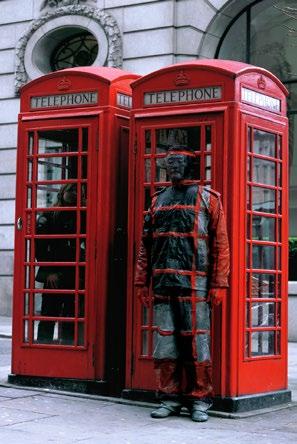
Bolin’s iconic pieces where he seamlessly blends into any given background, labelled as the ‘Invisible Man’. Diving into the importance of breaking down elitist barriers by bringing art into the public realm with Hans Ulrich Obrist has been eye-opening and such a fruitful academically charged experience. Finishing off Issue 6 with a remarkable interview with Sophie Tea and her revolutionary artistic endeavours, this edition is shaped by the most unique cultural perspectives on what art is, and its importance in the world today.
As we traverse a world of cultural literature, Issue 6 of the magazine presents a deep dive into a variety of academic reflections written by our wonderful students from the worldrenowned Courtauld University who specialise in the History of Art. From monumental sculpture work such as the Terracotta Army in China to analyses on the iconography of Star Wars and Studio Ghibli, Issue 6 provides a plethora of topics and thematic concerns for every art and culture lover.
Exploring various movements within the art historical timeline, we notice that ‘the future is often invented with fragments
of the past’. Issue 6 spans from the Dutch Golden Age all the way to the Fauvist style. Highlighting key artists who have shaped the art world, we present a variety of articles to include an exploration of Manet’s famous Olympia, Pop Art’s extravagant Richard Hamilton and Keith Haring, and our contemporaries such as Takashi Murakami and Zanele Muholi, whose creative outlook and activism has greatly influenced today’s visual language.
Crafted with the greatest care for all our faithful readers, as you turn each page, we invite you to pause, reflect, and let the work within spark your own imagination. Thank you for joining us on this journey through the ever-evolving world of art and culture.
With love always, (Editor in Chief)

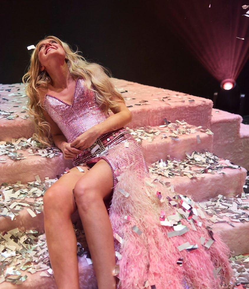
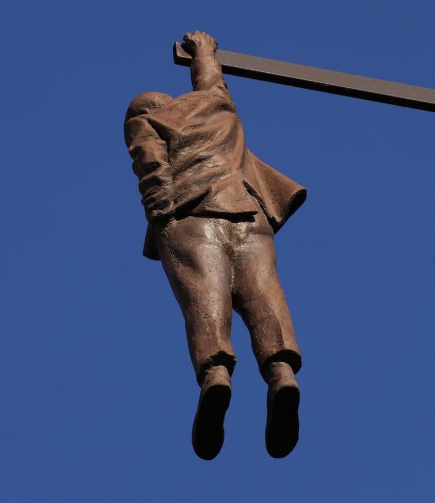
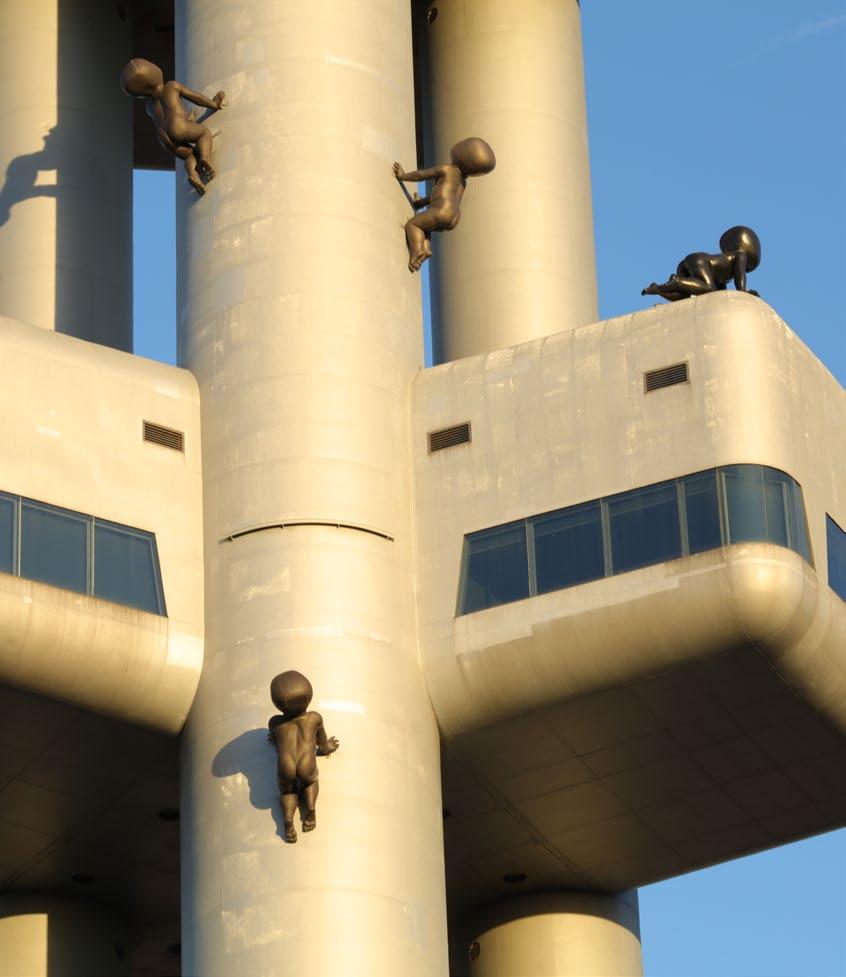
The 3 images within my editorial are taken from my travels.

Editor in Chief
Tamara Bell tamara@outsideinmedia.com
Assistant Editor
Sophie Macdonald sophie@outsideinmedia.com
Magazine Designer
Emma Long Graphic Design emma@outsideinmedia.com emmadesign.co.uk
Contributors
Tamara Bell
Aiden Bell
Francis Devincenzi
Jo Ward
Francesco Scalici
Sophie Macdonald
Anthony Loddo
Elinor Gass
Photography
Sophia Jactel
Malaika Rahimtoola
Evelyn Heis
Vuk Winrow
Kitty Perring
Maya Stoilova
Jessica James
Phoebe Noble
Artist photography supplied by the artists.
Specific photo credits on the article pages.
Stock photography by Alamy, Shutterstock, Unsplash & Pexels.
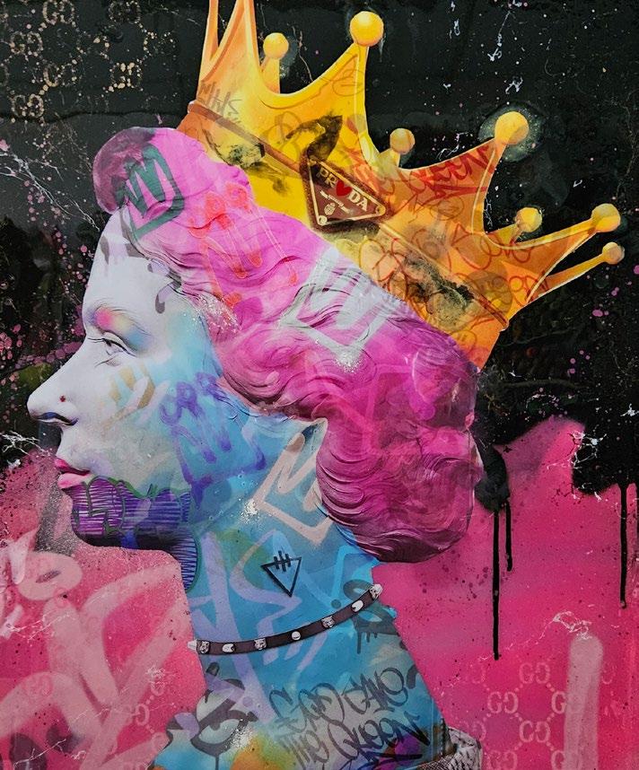
Cover image
Artwork by Dan Pearce.
Art&Culture Magazine
Published by Outside In Media Limited 7 Bell Yard London WC2A 2JR
Copyright © 2025. All rights reserved.
The name Art & Culture Magazine is a mark of Outside in Media, used under exclusive licence. No part of this publication may be reproduced without written permission from the publisher.
Art & Culture Magazine places great importance on the accuracy of the information contained within this publication but cannot accept responsibility for any errors or omissions. Views expressed by contributors and/or correspondents do not necessarily reflect those of the publisher. Neither Art & Culture Magazine nor Outside in Media is responsible for any claims made, or material(s) used in advertisements.
For permission to copy cuttings for internal or client use, please contact a&c@outsideinmedia.com
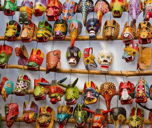
As early as 1500 BC a civilisation wrapped in deep and rich culture emerged in parts of Southern and Central America that we know today as Mexico, Guatemala, Belize, Honduras and El Salvador. Remnants of the Maya culture can be seen reflected in our modern day, despite evidence of their existence dating back as far as 3,500 years ago.
Similar to other civilisations, the Maya people worshipped a distinctive and intricate pantheon of gods and goddesses associated with various elements of divinity, life and the cosmos. Ix Chel, for instance, was revered as the goddess of health, medicine, childbirth and fertility. In stark contrast, Ah Puch was one God of death, being closely linked with the underworld. At the centre of their belief system stood the supreme creator deity, Itzamna, who was believed to be the omnipotent, almighty being that brought the world, humanity and the renowned Maya calendar into existence.
Maya people are known to have utilised art to not only worship their great deities, but as a profound means of expression and communication, relating to their daily lives, historical events and conveying early astrological knowledge.
They showcased ritualistic offerings manifested in both creative art and at times blood sacrifices, to their gods, kings and citizens of political importance. By melting down metals like gold and silver and carving out precious and regular stones, clay and ceramics indigenous to the region, sculptors would have formed pottery, figurines, masks, jewellery and other vessels to depict mythical scenes. Revelling in deep lore and stories of their culture they would have used bright paints derived from coals, minerals and plants mixed with thick tree sap, natural resins or animal fats to blend the substances

and adhere them to certain tricky surfaces like bark, stucco walls, smooth pottery and paper books.
Brushes made from wood and animal hair would have been used to apply these paints imbued with symbolic meaning, of contrasting colours. Frequently used in Maya art is yellow and red, which represented life and blood. These were made from clay-like minerals such as haematite for red tones
and limonite for citric and yellow tones. Also seen often is black, derived from crushed charcoal or soot and was used to depict dark and eerie scenes of the underworld. White was made from burning limestone, representing the zenith and broader cosmological beliefs, educating in the current stance of understanding and navigating the night sky. Greens and blues were more complex, combined from the anil plant and a distinctive type of clay called ‘palygorskite’ in order to cultivate a highly durable new turquoise colour, even in modern standards, for which is famously named ‘Maya blue’. This turquoise colour was used to represent divine entities and celestial phenomena, often associated with harvest, rain and the sky. This colour has stood through thousands of years of weathering and chemical degradation, allowing it to be seen even more vibrant today.
These brightly decorated artifacts, or even adorned animals and human sacrifices would be offered in payment for relief and protection from the pressing hardships of the current era, such as drought, famine and war. This same symbolic style of art was used to create shrines or worship and sacrifice, murals dedicated to specific geological, political and religious areas, sculptures of their kings and gods, or even on the grand walls of religious Maya structures and palaces, renowned for their layered pyramid shapes. Inscriptions, symbols and drawings of individuals with high status during the
period were discovered etched across the interiors of these monumental buildings, similar to that of the great pyramids of Ancient Egypt, telling us their great ancient stories. The figures painted can be seen adorned in the traditional attire, feasting, surrounded by servants or playing games, donning large meticulously detailed headpieces made from animal heads, beads and feathers. Inscribed even on gold and silver coins were not words of any particular language, but markings of glyphs, insects, faces and miniature scenes which had certain meanings. Through these records, the Maya preserved a legacy that would have otherwise been lost to the decay of the ages.
Echoes of this culture resonate in the present day in many forms of artistic expression. Influences of traditional weaving techniques, intricate embroidery and vibrant colours celebrate the indigenous Maya heritage in current fashion on global runways. Their style of wrapped skirts and rustic bohemian handbags and accessories made from sustainable materials and dyes, add a touch of artistic flare to the industry, reminding us to value human culture, craftsmanship and longevity over fast trends and meaningless media influences.
Contemporary artists often draw inspiration from ancient cultures such as the Maya and use their symbolic depictions, animals
and geometric patterns to convey a philosophical or spiritual meaning. Street artists, particularly in Latin America, continue to inspire others by challenging the mainstream narrative, incorporating Maya art and fusing it with modern styles. This empowers and reclaims their identity. They incite conversations with their art about their history and marry the identity of the past with the present.
By Aiden Bell
“Maya people are known to have utilised art to not only worship their great deities, but as a profound means of expression and communication.”

There are countless wondrous aspects about our world and the vast cultures inhabiting it. Perhaps the most astonishing of all are the gigantic monoliths and structures carrying secrets within, shrouded in mysteries, lurking beneath the soil for thousands of years waiting to be uncovered.
From the city of Pompeii preserving its architecture in ash for nearly two thousand years, or the pyramids raised by a long-lost race of ancient beings. These remnants of the past continue to captivate the imagination of those seeking answers to the what, why and how of the world and our species.
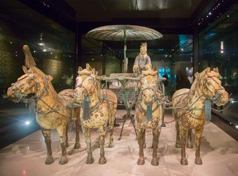
In March 1974 a group of Chinese farmers unearthed something that would change our view of ancient China and add yet another addition to the repertoire of Human-kind’s unbelievable marvellous feats. Yang Zhifa,
an ordinary farmer by trade, along with his family began to find simple fragments of pottery when digging a well for their village in Xiang, a region renowned for its underground rivers and springs. The deeper they found themselves digging for water, the more they found fragments of the Ancient Qin Metropolis, a tomb to house the remains of the first Qin Dynasty Emperor. Tiles, clay pots, chunks of millennia-old masonry came first which furthermore urged the archaeological community of China to investigate.
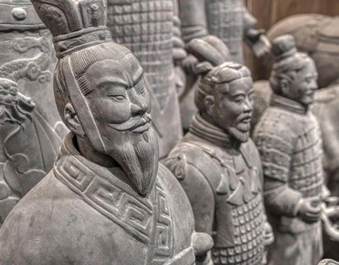
The official excavations have taken decades, the process of which is still ongoing over fifty years later with new discoveries still happening today. The contents of this underground metropolis housed over two thousand soldiers decorated in accurately represented armour and uniforms of the Qin Dynasty standing guard for their noble emperor resting in his tomb.
Although the figures were mostly military, there were some alternatives found, such as acrobats, musicians and government officials to keep him company. No two figures are alike, all of which with unique facial expressions, clothing, weapons, hairstyles and postures, some of which can still be seen with traces of colours, and although most of the pigment has faded to the ages, scientists have been able to recreate what those colours may have looked like with small processed samples of the remains using modern technology.
This extreme attention to detail is not only a testament to the craftsmanship and ambition of the government labourers and artisans who were instigated to construct this army of soldiers, but also to the grandiose importance of the emperor Qui Shi Huang himself, whose life after death not only required such protection, but to the scale and detail the likes of which has never been seen before. Although being only

13 years of age, most decisions regarding the structure of the tomb, as well as the construction and placement of the soldiers therein were made by the emperor’s advisors and officials.
To create an army of this scale, one can only imagine the toil and labour it took to achieve this feat. To sculpt the human figures alone would have taken a very long time, so it is thought that approximately three quarters of a million labourers were brought in from distant corners of the empire to work on the soldiers, including potentially conscripted workers, lending itself to the individuality of each sculpture, cultivated from the vast expanse of cultures across the whole of China.
Accompanying the Terracotta Army and the remains of the emperor Qui Shi Huang within his tomb were figurines of horses, cranes, swans and geese, to encompass his vision of the afterlife, ensuring an abundance and variety of life. Even remains from once living animals were excavated from the burial site revealing the highest number of species used for ritualistic purposes after death in the whole of the country despite this being a common practice during these times.
The craftsmen used highly developed tools for the era, utilising kilns to convert clay, made from compacted materials into hard and stable stone. The body parts for the soldiers were shaped and moulded separately before being joined together as
one and personalised with carving knives, detailing the hair, facial features and armour, whereas general template moulds would have been used to mass produce the body parts to maintain consistent proportions and uniformity.
The firing process would follow in the kiln which required a sophisticated air flow filtration system to achieve the desired result, hardening the soft clay. This demonstrates the in-depth knowledge of metallurgic and ceramic skills they
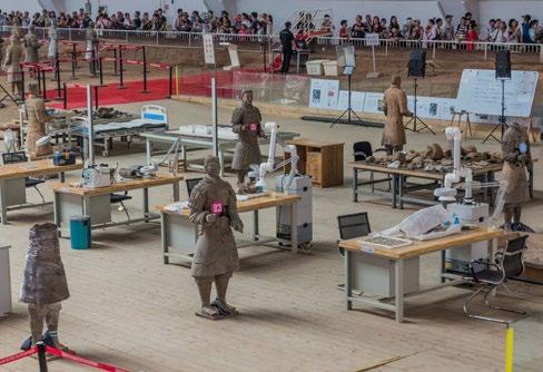
possessed. Once complete, the soldiers and their accompanying species of animals would have been beautifully painted by hand in bright colours, reflecting the afterlife that was meant for the young emperor.
Could this just be the beginning of the excavations of the Terracotta Army and if so, what other mysteries await our discovery of them, deep within the earth?
By Aiden Bell
“These remnants of the past continue to captivate the imagination of those seeking answers to the what, why and how of the world and our species.”

I began researching this article with a simple curiosity: how did sixteenth and seventeenthcentury portraits speak through objects, particularly through jewellery? I found myself returning again and again to the question of ownership and authorship within the paintings. Were these necklaces, brooches, and hairpieces drawn from the sitter’s own wardrobe items recorded in family inventories or dowries, or were they the artist’s inventions, imagined or borrowed from studio props?
In the process of researching these questions, I encountered an unexpected image: the Zodiac Man. By the early sixteenth century, the Zodiac Man had become a hallmark of medical astrology, widely reproduced, appearing in almanacs, calendars, and printed manuals. It dates back to the eleventh century but gained popularity in the thirteenth and fourteenth centuries as a visual guide linking zodiac signs to body parts; Aries ruled the head, Virgo the abdomen, Pisces the feet. The body was seen cosmologically, as an interconnected system.
Though its scientific authority waned in the late sixteenth and seventeenth centuries, replaced by observational anatomical illustrations, the Zodiac Man remained culturally influential. You may be wondering why a discussion of jewellery begins with such a figure. But there is, as they say, method in the madness. If we approach portraiture using the logic of the Zodiac Man, treating the body as a symbolic map, we open up a new way of reading adornment. What if the decorated body in portraiture is
not simply a display of fashion or status but a sequence of meaning, from head to waist, where each zone carries its own emotional, iconography and dynastic weight?
The Zodiac framework offers, in turn, a compelling structure for analysing how jewellery operates in portraiture, not as mere embellishment but as iconography and symbolism. If we begin with the logic of the Zodiac Man, where Aries governs the head, the seat of reason and identity, then it makes sense to start here. In Renaissance portraiture, the head was never neutral. It was charged with symbolism: the noblest part of the body and often the most adorned. Hair and headdresses acted as visual codes. Veiling for example signalled modesty, braiding - domestic virtue.
In the sixteenth and seventeenth centuries, neck and shoulder jewellery was more than decoration. It served as coded statements of power and communicated status, belief, identity, and marriage. Loose chains or multiple strands signalled grandeur, while religious or mythological pendants worn near
the heart expressed devotion or political meaning. Women displayed a broader range of styles than men, from close-fitting en esclavage necklaces adorned with delicate cameos and carved reliefs, to long strands of flat, geometric gold links. Lavinia Fontana’s Portrait of a Noblewoman offers a striking glimpse into Bolognese fashion. Her brush, as precise as a paparazzo’s lens, meticulously captures every gold stitch, lace flourish, and delicate jewel. Painted shortly after the sitter’s marriage, recent research into account books and family records suggests this attire closely mirrors a noble bride’s trousseau.
The portrait layers visual opulence: a brocaded gown woven with shimmering metallic threads, strands of pearls coiling elegantly across the bodice, and a heavy gold-linked necklace featuring a darkstoned cross likely garnet or jet resting close to the heart. Crosses were often part of a jewelled carcanet, and were a powerful symbol of religious devotion, dynastic ties, and wealth. Worn not only by women but also men and children, these crosses, positioned prominently on the chest, served as both spiritual and social emblems.
“The Zodiac framework offers, in turn, a compelling structure for analysing how jewellery operates in portraiture, not as mere embellishment but as iconography and symbolism.“
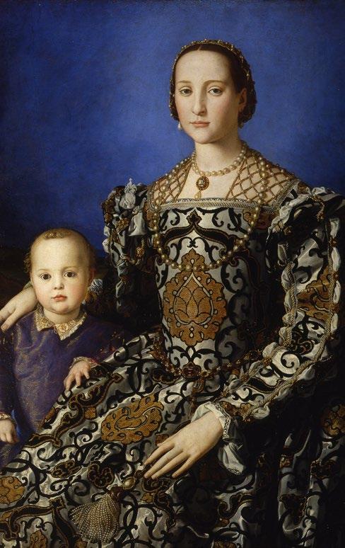
PORTRAIT OF ELEONORA DI TOLEDO WITH HER SON GIOVANNI
Another popular accessory of the time appears in Bronzino’s Portrait of Eleonora di Toledo with her Son Giovanni. She wears two pearl strands: a shorter one with a diamond pendant nestled at her throat and a longer ceremonial necklace of large Venetian pearls. Recorded in Medici inventories, this 50-pearl strand was likely a wedding gift from Cosimo de’ Medici, purchased by Eleonora’s mother-in-law, Maria Salviati, along with a diamond ring.
Fontana, too, uses pearls; she developed a unique way of painting their luminous surfaces to animate her sitters. Waistbelts marked wealth and status in portraiture, drawing attention to the waist as a symbolic boundary between the upper and lower body; the higher and baser instincts of humanity. Following the Zodiac Man’s logic, the waist is a transition zone, linking sovereignty and communication.
As fashion favoured a narrow waist, belts became prized accessories. Noblewomen’s trousseaux often included belts of gold thread, enamel, and precious stones. At the extremity of the body, the hands linked to the astrological signs Gemini and Virgo; symbols of intellect, dexterity, and communication. Hands also held rich expressive potential, called ‘the instrument of all instruments’, they communicate as clearly as words. Recurring gestures like offering a ring or touching fabric
form a shared visual vocabulary, a grammar of status, piety, and selfhood coded in both gesture and adornment.
In Fontana’s Marriage Portrait for example, the sitter’s hands gently touch a lapdog and a jewelled zibellino, symbols of fidelity, while rings and embroidery further narrate marital identity, class, and virtue. I began with a simple question: how did jewellery speak in sixteenth and seventeenth-century portraits?
I end with the recognition that decoration goes beyond adornment. It serves as a coded language that reveals identity, history, power and more. Whether real or imagined by the artist, these adornments bring portraits to life and add depth to our understanding and to the meaning communicated in these important objects.
By Kitty Perring
In the study of art history, the focus is often on the artists themselves, with a deep dive into visual analysis that leaves the viewer responsible for deciphering what makes a painting, sculpture, or other artwork unique. However, the success of the famous artists we recognise today can largely be credited to those who worked behind the scenes to endorse them and often risked harsh criticism for the works they chose to collect or exhibit.
The Impressionists and Post-Impressionists represent a group of artists from radically different financial backgrounds, and their long-lasting legacy — despite initial public rejection — offers a series of examples of how collectors and gallerists propelled their careers. For example, painters Claude Monet, Alfred Sisley, and Vincent van Gogh relied heavily on the financial and emotional support of collectors Gustave Caillebotte, Paul Durand-Ruel, and Johanna van GoghBonger, respectively.
Claude Monet struggled financially for many years, often relying on regular cash instalments from Gustave Caillebotte, whose upper-middle-class lifestyle made him happy to comply. Caillebotte would purchase artists’ work for two or three times the asking price, keeping Monet and Pissarro afloat during much of their careers. Despite Monet’s eventual acceptance by the public and subsequent wealth, he would not have been able to continue making his work
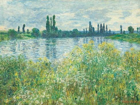
without the few supporters who bought his paintings at inflated prices, introduced his work to other wealthy patrons, and helped establish his place in the art historical canon. Emotional support was just as significant as financial support in many cases. Caillebotte frequently attended his friend’s auctions, displaying a conspicuous interest in Monet’s work in front of other connoisseurs. His intended bequest of 67 artworks to the French state after his death in 1894 paved the way for multiple Impressionists, resulting in the first state-run Impressionist exhibition and giving collector Ambroise Vollard the courage to host Paul Cézanne’s first solo show. Even throughout the 20th century, modern and contemporary artists would continue to celebrate the Impressionist works in this bequest through reproductions and reinterpretations.
Impressionist Alfred Sisley also relied heavily on external support. While he was initially able to paint for pleasure, his father’s business failed during the Franco-Prussian War, forcing Sisley to depend solely on the sale of his paintings for income. Paul DurandRuel loyally supported Sisley’s work from 1872 onward, continuing to buy and sell the artist’s paintings despite his own financial difficulties. At times, Durand-Ruel requested specific styles, subjects, and sizes of works from Sisley to appeal to the market he was selling to. Sisley’s continued struggle to sell his paintings led to an agreement with
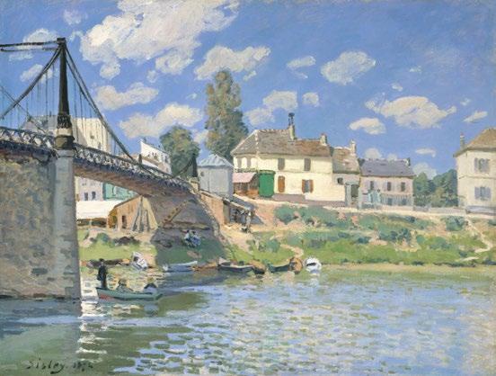
Durand-Ruel in 1880, in which Sisley sold at least 357 works to the collector between 1872 and 1886. During this time, Durand-Ruel faced his own financial challenges and was unable to sell Sisley’s paintings, leading to a fallingout between the two men that lasted for the rest of their lives. Nonetheless, DurandRuel’s unwavering support ensured Sisley’s posthumous success, contributed to the evolution of his technique, and secured the long-term conservation of his artwork.
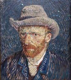
Another artist whose legacy relied heavily on the support of others was Vincent van Gogh. While his brother Theo provided financial assistance during Vincent’s lifetime, it was Theo’s wife, Johanna van Gogh-Bonger, who played a pivotal role in the distribution and recognition of his artwork after both Vincent’s and Theo’s deaths in 1890 and 1891. She collected and catalogued his work, sending paintings to various exhibitions, though initially with little success. Nevertheless, she dedicated the rest of her life to showing the world the beauty of Vincent’s work, including publishing a collection of his letters. These letters, along with the paintings she exhibited, shaped the perception of Van Gogh as a tortured artist plagued by misfortune, yet able to create profound beauty. While this perspective may oversimplify Van Gogh’s life, it illustrates the extent of Johanna’s influence in crafting his legacy.
While art history often centres on the genius of individual artists, the enduring legacies of now-famous artists such as Claude Monet, Alfred Sisley, and Vincent van Gogh reveal a far more complex ecosystem. The efforts of Gustave Caillebotte, Paul Durand-Ruel, and Johanna van Gogh-Bonger were not merely acts of patronage but also acts of belief— investments in talent that had yet to be fully recognised. These supporters took financial and reputational risks that ultimately shaped the trajectory of modern art. Their contributions remind us that the success of many celebrated artists depended just as much on those who believed in them behind the scenes as on their own creative brilliance. Reconsidering the role of collectors and promoters challenges us to expand our understanding of artistic legacy beyond the canvas itself.
By Elinor Gass
“Their contributions remind us that the success of many celebrated artists depended just as much on those who believed in them behind the scenes as on their own creative brilliance.”
In the landscape of public commemoration, monuments traditionally serve as permanent markers of collective memory, towering declarations of what a society chooses to remember and how it wishes to be remembered. Yet in 1986, artists Jochen Gertz and Esther Shalev-Gertz challenged this fundamental assumption with their revolutionary Monument Against Fascism, a work that questioned whether true remembrance might require forgetting the monument itself.
The concept of the counter-monument emerged from a profound dissatisfaction with traditional approaches to public memory. Conventional monuments impose a singular narrative, telling viewers not just what to remember but how to remember it. They create what might be called ‘official memory — sanitised, unified, and often disconnected from the messy complexity of individual experience.
Gertz and Shalev-Gertz recognised that this approach was particularly problematic when dealing with the Holocaust and fascism. How could any single monument adequately represent such incomprehensible horror? How could static bronze or marble capture the ongoing process of memory, with its contradictions, gaps, and personal variations? Their solution was radical: create a monument that would gradually erase itself, forcing visitors to engage actively with memory rather than passively consuming it.
The Monument Against Fascism began as a 12-metre-high lead-clad column installed in Hamburg-Harburg in 1986. Rather than presenting a finished statement about history, the artists created what was essentially a collaborative canvas. They invited citizens and visitors to add their names alongside those of the artists, transforming the monument from a closed artistic statement into an open democratic process.
The response was extraordinary and troubling in equal measure. Over the course of seven years, the monument accumulated 70,000 names, entries, and pieces of graffiti. This outpouring of public engagement demonstrated the hunger for alternative forms of memorialisation. Yet the responses revealed the complexity of memory itself: alongside respectful commemorations appeared swastikas, hateful messages, and even traces of gunshots in the lead coating.
“The responses revealed the complexity of memory itself: alongside respectful commemorations appeared swastikas, hateful messages, and even traces of gunshots in the lead coating.”
This vandalism was not a failure of the project but its most profound success. By creating space for authentic public response rather than prescribed reverence, the artists revealed the ongoing presence of fascist sentiment in contemporary society. The monument became a diagnostic tool, exposing the reality that the fight against fascism remains unfinished.
The most radical aspect of the work was its planned obsolescence. As each section of the column filled with inscriptions, it was gradually lowered into the ground until, by 1993, the monument had disappeared entirely. This process challenged every assumption about how public art should function. Rather than growing more prominent over time, accumulating symbolic power through permanence, this monument deliberately made itself invisible.
The sinking process created an urgent temporality. Visitors knew their opportunity to engage was limited, that the monument would soon be gone forever. This scarcity transformed the act of inscription from casual interaction into meaningful participation. Each signature became a conscious decision to be part of this disappearing record.
The disappearance of the monument forced a crucial recognition: memory is not a thing but a process. Traditional monuments suggest that memory can be fixed, preserved, and transmitted unchanged across generations. The counter-monument revealed this as an illusion. Memory lives in active engagement, in the ongoing work of remembering, not in passive encounter with permanent objects.
By removing the physical monument, Gertz and Shalev-Gertz transferred the responsibility for memory back to the community. The work could no longer serve as an alibi for remembrance—citizens could not point to the monument and claim they had fulfilled their obligation to remember. Instead, they had to carry the memory within themselves, making it part of their active consciousness rather than delegating it to public sculpture.
The project embodied a radically democratic approach to historical memory. Rather than accepting the authority of experts, institutions, or artists to determine appropriate forms of remembrance, it insisted that memory belongs to everyone who participates in it. The 70,000 contributions created a collective portrait of a community grappling with its past, complete with contradictions, conflicts, and complexities that no official narrative could capture.
This democratic approach acknowledged that memory is always contested terrain. Different groups remember differently, and any honest engagement with the past must account for these differences rather than smoothing them away. The graffiti and vandalism became part of the monument’s meaning, documenting not just good intentions but the ongoing struggle over historical interpretation.
In our current moment of widespread monument removal and contestation, the counter-monument offers a prescient model for thinking beyond traditional approaches to public memory. As communities across the world grapple with colonial statues, Confederate monuments, and other problematic commemorations, the Hamburg project suggests that the solution might not be replacement but process.
Rather than substituting one fixed narrative for another, the counter-monument points toward forms of memorialisation that remain open, participatory, and alive to contradiction. It suggests that the healthiest societies might be those that can hold memory lightly, as an ongoing conversation rather than a settled conclusion.
The ultimate success of the Monument Against Fascism lies in its planned failure to endure. By disappearing, it achieved something that no permanent monument
could: it made itself unforgettable precisely by becoming invisible. Visitors who engaged with the work during its seven-year existence carry memories that no conventional monument could have created.
This paradox reveals the profound insight at the heart of the counter-monument movement: sometimes the most powerful way to remember is to forget the monument and remember the process of remembering itself. In an age of monumental excess and memorial fatigue, Gertz and Shalev-Gertz offered a different path—one that trusts communities to carry memory forward through active engagement rather than passive consumption.
Their disappearing monument ultimately asks whether we need monuments at all, or whether we might find more authentic and democratic ways to engage with the past. In making itself absent, it made memory present in ways that permanent sculptures never could.
By Jessica James
Scan here to see the Monument AgainstFacism
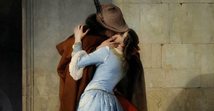
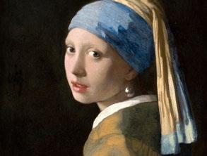
Kiss by
artist Francesco Hayez.
So, what is considered provocative, for me is not.
During the Belle Époque, posters and products travelled across regional, cultural, and hierarchical borders. Posters could be easily moved, copied, and reproduced, which distinguished them from other arts of the time. In Paris, the overwhelming quantity and diversity of the posters was specifically shocking, contributing to the role of posters as objects of cultural exchange and instruments of shaping national identity.
One major shift that contributed to the popularity of posters was the rise of imagebased advertising. Unlike traditional textheavy ads, which were accessible only to the literate and those fluent in the language, visual posters could reach a far broader audience, drawing people in with their bright, eye-catching colours and dynamic compositions. This democratisation of advertising sparked controversy. Wealthy men saw the widespread reach of these images as a threat to their exclusive role as the gatekeepers of information within their families and communities. Some voiced fears that women — and even children — exposed to these posters might begin to make their own choices as consumers and active participants in an increasingly informed society. Even if the product advertised was financially out of reach for the viewer, the poster still communicated a message of aspiration and inclusion — one shared across class, gender, and background.
Some poster artists of the time, such as Henri de Toulouse-Lautrec, embraced the public’s growing preference for image-based design to experiment with compositions and stylistic elements from abroad. At the end of the 19th century, following Japan’s forced opening to the West by American Commodore Perry, European markets were suddenly flooded with Japanese
goods, most notably ukiyo-e woodblock prints. These prints captivated European artists with their use of diagonal lines, flattened perspectives, bold colour blocks, and strong black outlines. Lautrec and other poster artists incorporated many of these features into their own poster designs, creating the stylistic designs of Art Nouveau.
Another reason these posters were so powerful in Paris was the newly passed Press Law of 1881, which allowed advertisements and posters to be freely posted without prior government authorisation. This ushered in what art historians refer to as ‘affichomania’, a term derived from the French word for poster, ‘affiche’. Suddenly, posters covered every blank wall and were plastered from top to bottom on Morris columns — cylindrical structures originally introduced in 1868 to regulate street advertising. But by 1881, with few restrictions remaining, posters proliferated throughout the city. While many embraced this explosion of visual culture, others were outraged by what they saw as a vulgar intrusion into daily life, lamenting the loss of the traditional beauty of Parisian streets.
The ‘New Woman’
The third reason these posters provoked societal tension was the emergence of the new woman. This archetype embodied independence, as the new woman asserted herself through her choices as both a consumer and an active participant in public life beyond the domestic sphere. Posters of the time did more than advertise products or experiences — they sold lifestyles and aspirations. Women in posters were often portrayed as autonomous, sexually liberated figures who welcomed the public gaze.
“Belle Époque posters redefined public spaces into a visual marketplace and changed the role of advertising forever.”
These women symbolised a bold departure from traditional female roles. They were independent consumers, navigating public space on their own terms. Seduction was a common technique in Belle Époque advertising, with female sexuality repeatedly used as a tool of persuasion, artists depicting women scantily clad and posed seductively to shock passers by into attention.
The rise of the new woman typically represented in these posters challenged traditional expectations of female modesty and domesticity, disrupting long-held Victorian ideals of femininity. While the early 19th century emphasised modesty, restraint, and domestic virtue, the Belle Époque celebrated a more liberated and visible woman. Advertisements capitalised on both fascination and anxiety surrounding these changes, portraying women as symbols of modernity and independence while simultaneously catering to the male gaze.
Posters didn’t just democratise public space — they also transformed the act of collecting art. Traditionally, collecting was reserved for wealthy men with access to oil paintings and sculpture. But with the rise of lithographic posters, art became more accessible. The ‘affichomania’ helped propel poster exhibitions and collecting into the
mainstream, inviting a much broader public to engage with visual culture. The practice of collecting expanded significantly with the rise of printed material, challenging and broadening traditional notions of what it meant to be a collector. Poster collectors were often labelled amateur art enthusiasts with a deep passion for visual culture, though not always regarded with the same seriousness as collectors of fine art. In response to this growing audience, some artists began producing limited edition prints specifically intended for private display rather than public advertising. These posters were printed on high quality paper and collected by dealers like Edmond Sagot,
whose gallery catered to a more affluent clientele that preferred their art unlinked from overt commercialism.
The explosion of poster art in Paris during the Belle Époque represented more than just an artistic trend; it provided visual documentation of a rapidly evolving society. Belle Époque posters redefined public spaces into a visual marketplace and changed the role of advertising forever, prompting reflection on how the world would look without image-based advertisements posted in public spaces today.
By Elinor Gass
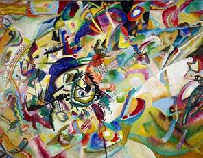
The Blue Rider movement emerged as a fundamental force in modern art development during the early 20th century. Munich artists established a new group by abandoning conventional art techniques to explore abstract spiritual painting methods. Blue Rider artists delivered strong spiritual and emotional messages through their use of bright colour palettes and enigmatic subject matter.
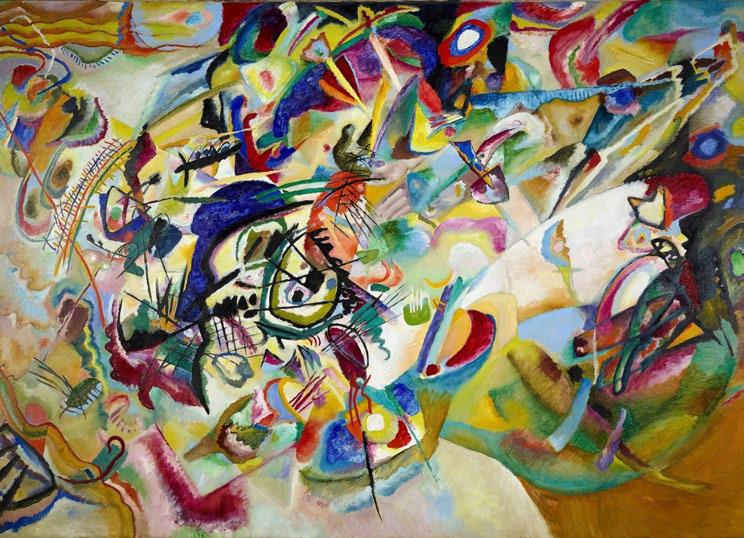
Wassily Kandinsky and Franz Marc founded the Blue Rider movement in 1911 which then became an integral part of European avantgarde art during the early twentieth century. The movement drew creative inspiration from Vincent van Gogh’s expressive use of colour and symbolism’s mystical themes through Post-Impressionist techniques. Marc and Kandinsky’s artistic collaboration developed through multi-sensory expressions which synaesthesia allowed. The integration of Russian folklore and German Romanticism principles led to the development of a pioneering abstract art style in the movement.
The Blue Rider movement established modern art by developing foundational abstract and expressionist principles. New artistic standards created by the Blue Rider movement during its existence paved the way for Abstract Expressionism and influenced artists like Jackson Pollock and Mark Rothko. The Blue Rider artists established a lasting legacy of spiritual elements which future generations used to create new emotional bonds between artworks and viewers. The movement of modern art developed its uniqueness by rejecting societal norms to pursue individual spiritual discovery.
The central artistic principle of Blue Rider artists focused on symbolic expression. Kandinsky and his artistic colleagues used colour and form selections to channel spiritual forces into their works and foment deep emotional connections with their audiences. The colour blue became a symbol for spiritual concepts and deeper meditation practices.
Kandinsky earned his reputation as the father of abstract art through his Russian painting which incorporated profound spiritual concepts. He understood that visual elements like colour and form could trigger deep emotional reactions in a similar way to music. Composition VII (1913) stands as Kandinsky’s major creation before World War I through its vibrant explosion of colours that moves with a dynamic swirl. This artwork demonstrates his belief that art functions as music while creating spiritual harmony.
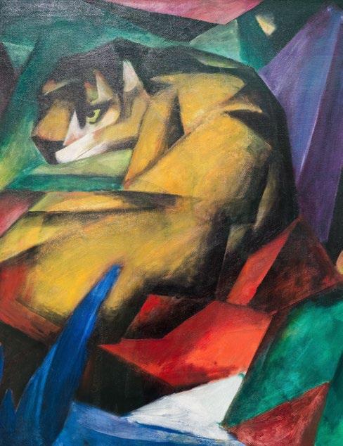
Through his animal portrayals Marc expressed purity and natural order to embody his vision of an ideal society. In his book Concerning the Spiritual in Art Kandinsky developed the
movement’s philosophical foundation by examining how various colours and shapes evoke emotions.
The Blue Rider movement included several prominent artists who joined alongside its founders Kandinsky and Marc. August Macke established the movement’s visual identity by using dynamic shapes together with vibrant colours.
As a German painter who partnered with Kandinsky for many years Gabriele Münter made key contributions to the Blue Rider group. Her artwork exhibited bold lines and flattened perspectives which demonstrated her dedication to folk art while rejecting academic norms.
“The Blue Rider artists established a lasting legacy of spiritual elements which future generations used to create new emotional bonds between artworks and viewers.“
more....
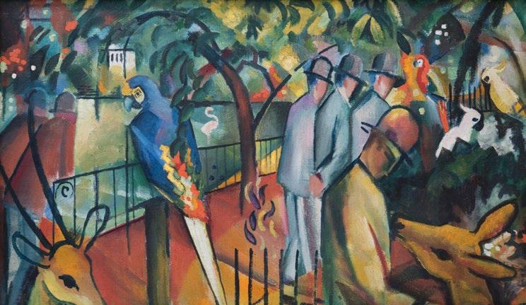
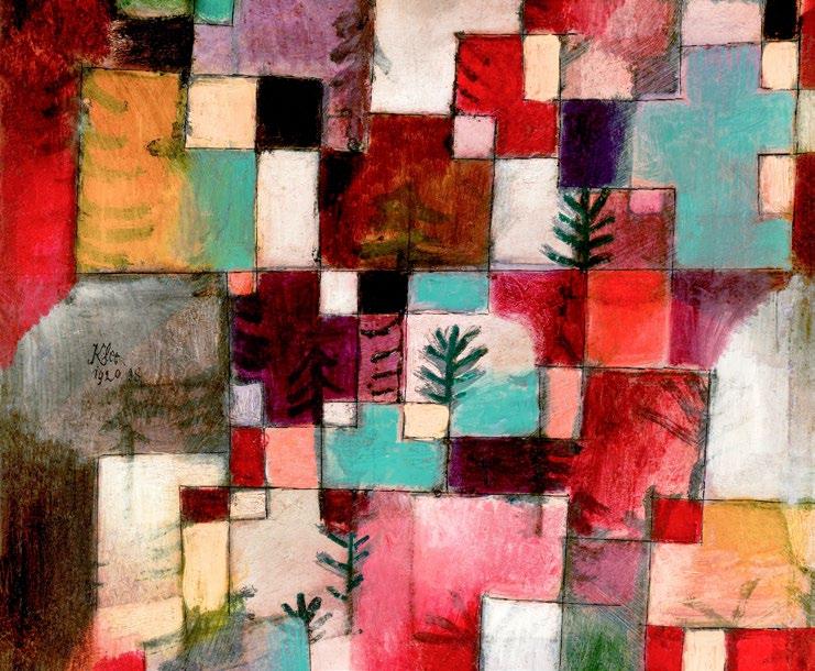
ZOOLOGICAL GARDEN I. (1912) Auguste Macke
The Blue Rider artists gathered at Münter’s house in Murnau which she maintained as their meeting place until the group dissolved and she preserved their artwork. Recent decades have seen a growing recognition for her dual contributions to art and archival preservation.
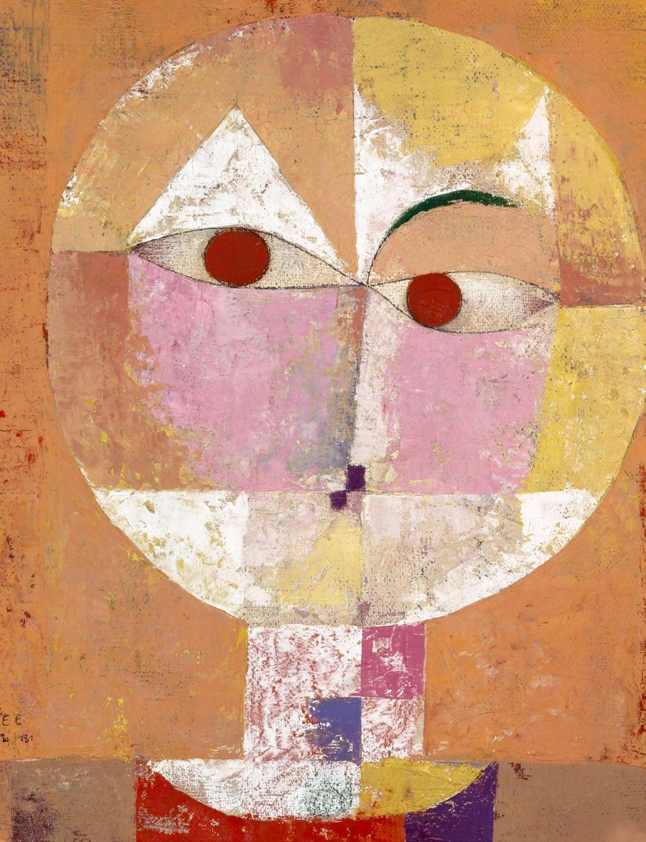
Paul Klee maintained only a loose affiliation with the Blue Rider group, yet he embraced their central principles especially through his symbolic imagery and abstract techniques. Klee’s Swiss origins led to artistic creations that challenge classification while being inspired by musical compositions and dream imagery. Klee’s paintings represent a playful yet deep spiritual vision through their whimsical yet mysterious forms. Senecio (1922) emerged from the remnants of Blue Rider but continues to embody the group’s spiritual and symbolic nature.
Upon its 1912 release the Blue Rider Almanac (Der Blaue Reiter Almanach) emerged as a vital publication for the artistic movement. The ground-breaking publication featured art theory essays with modern and non-Western art reproductions and critical perspectives from artists and composers under the editing of Kandinsky and Marc.
Through the Blue Rider Almanac the group expressed their belief in art as a universal language. The publication showcased a diverse collection of Bavarian glass paintings and African masks as well as Arnold Schoenberg’s musical compositions which displayed the group’s dedication to transcending cultural and artistic barriers.
Expressionism and the Blue Rider movement both focus on emotional expression rather than depicting Realism. Expressionism developed its unique style through strong colour schemes and distorted shapes that communicated profound emotional content. Blue Rider artists used their personal artistic vision and spiritual themes as tools for Expressionists to explore human psychology and the subconscious. The Blue Rider movement established Expressionism through its focus on emotional authenticity rather than realistic representation.
By Jo Ward
“Expressionism developed its unique style through strong colour schemes and distorted shapes that communicated profound emotional content.”
How can the one who knows nothing reveal everything? The figure of the fool – clown, jester, trickster, misfit – permeated artistic spaces from the thirteenth to the sixteenth centuries. Yet his existence wasn’t just for amusement and ridicule. This character, with his mismatched garb and outlandish actions, was a truth-teller: under his veil of hysteria was an entire subversive language, a social and moral commentary on the pitfalls of the human condition.
The fool was everywhere, interjecting classical tales, prancing around in disguise, and appearing as a comedic and moral disruptor in visual stories both sacred and profane. In the Louvre’s Figures of the Fool exhibition (2024-25) which closed earlier this year, the curators set out to demonstrate how this perplexing foolish figure was much more than a walking visual trope.
Over three hundred Northern European works brought together from ninety institutions populated the winding rooms of the newly renovated Hall Napoléon, offering visitors a chronological journey through the fool’s art historical lifetime. The physical experience of the exhibition mirrored the fool’s character: walls in rich jewel tones, framed life-sized sculptures and grand tapestries; carved ivory boxes sat in dramatically lit cases; illuminated manuscripts invited close scrutiny; tarot cards and tiny prints revealed the fool’s presence at the smallest scale. In one room, works were even arranged like a tiled floor, leading towards a rotunda display with paintings in arched niches. It was as if architecture itself was a foolish antic, cheekily leading you from one room to the next in anticipation of what might be around the corner.
In art, the fool was at once elusive and ubiquitous. The show opened with tiny illustrations in the margins of illuminated medieval manuscripts, showing fantastical creatures and foolish figures creeping around the edges of text. Immediately, the viewer was summoned to sharpen their vision and look closer. From there, fools emerged across mediums and in varying scale, appearing in household objects, tarot cards, ivory chests, and even stained glass. It seemed that any medium was a match for the fool, whose shapeshifting capabilities let him slither into visual tales both grand and quotidian.
“In life, and in art, he persists — emerging in unexpected corners to remind us, ‘it’s not that serious’. It turns out even those somber medievalists had a sense of humour.
A particularly poignant section explored the fool’s relationship with death. An entire gallery was devoted to ‘danse macabre’ imagery, where death appeared as a jester or a skeleton. In a watercolour copy of Basel’s famous 1439 Dance of Death, death cajoles and charms his mortal partners, gingerly grabbing their arms, interlocking hands, and luring them with theatrical flair into his choreography. The skeleton’s nimble and colourful sleights of hand are a visually striking marriage of the comic and the tragic. As the obliviousness of the mortal figures intermingles with the reverie and frivolous deceit of the dancing skeletons, one is reminded of the extremities of life both wildly absurd and dangerously fragile.
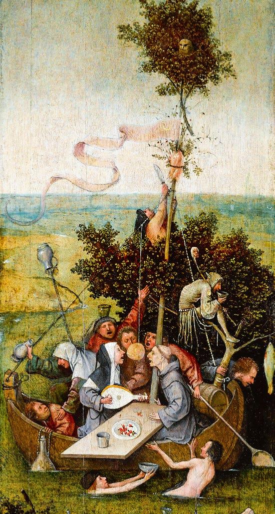
Throughout the show, visual exuberance abounded–whether in the rich textures of costume, the chaotic compositions of satirical etchings, or the grimaces in portraiture. Hieronymous Bosch’s The Ship of Fools (ca.1500-10) stood as a centrepiece: a chaotic tableau of gluttony with a group of revellers feasting and merrymaking on a small boat. In this scene of moral folly, however, the fool isn’t embroiled in the trouble. Rather, he crouches on the makeshift stern of the boat, his back turned to the partiers
as if to let them indict themselves, and thus prompting the viewer to wonder – are we the real fools? The exhibition poster captured this inversion perfectly. A fool in a donkeyeared cap peers through his splayed fingers, flashing a toothy smile at the viewer. In his mask of mockery, he reverses the narrative. Leading with his taunting grin, the fool turns his ‘costume’ to his advantage, reclaiming agency and becoming the one who delivers the punchline. Through satire and mockery, the fool was holding up a mirror to society’s flaws–its moral failings, hypocrisies, and sheer disorder. Writing about this exhibition thus adds a layer of meta-critique to the entire exercise, in analysing a figure whose very purpose was to judge. The fool’s witty antics, exposing human transgressions, were foils to idealised and constructed images in early modern art.
The exhibition also traced the fool’s disappearance during the Enlightenment — an era that sought to suppress irrationality — and his resurgence in the late 18th and 19th centuries, when romanticism and realism revived the figure as a symbol of individual truth and moral complexity. One of the final pieces, a strikingly unique self-portrait by Gustave Courbet, depicts the artist lunging towards the viewer in jester’s clothes. Here, the fool becomes the artist’s alter ego, a figure grappling with inner morality, torment and self-doubt. It was a dramatic and confrontational conclusion to a stimulating exhibition which forced us to turn inward, recognising the foolishness in us all.
Through art, the fool was licensed to dissent. Behind his salacious gestures and frivolousness, the fool exposed the disorder of the world, told new truths, chastised human weaknesses, and said what everyone around him could not. The deeply human themes underscoring this extensive and remarkable exhibition have far outlived the iconography of the fool himself. And yet, the fool still exists today as that traditionally comical, mischievous character we love to look for. He allows us to laugh at the serious, and to confront the serious through laughter. In life, and in art, he persists — emerging in unexpected corners to remind us, ‘it’s not that serious’. It turns out even those somber medievalists had a sense of humour.
By Sophia Jactel
Never miss out on the latest edition of Art & Culture Magazine. Scan the QR code now and fill out the online form to get FREE digital magazines sent to your email in-box!
Art & Culture Magazine are excited to be working on a print subscription service. The paid subscription will be launching soon, and we’ll notify you by email as soon as it’s available.

Scan here to never miss out on the latest edition of Art & Culture Magazine
The myth of what constitutes as modernity and ‘modern’ within art, history and various cultural fields can be considered a topic of contention, fluctuating from every era to the next. The field of Art History follows a primarily Western trajectory, often tracing a linear narrative proceeding from the Renaissance to Impressionists on to Abstract Expressionists. Hence, ‘modern’ within art history appears often considered a stop within this linear trajectory.
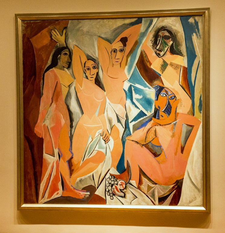
Within an art history textbook, Picasso’s Les Demoiselles d’Avignon often defines the following quintessentially modern moment. In contrast, modernity remains a term associated with further abstraction. However, with the context of unprecedented socio-cultural and political change, historians tend to deem nineteenth century as a period of modernity.
The traditional trajectory of art history and the modern can be considered centred on primarily Western development, reinforcing the structure whereby the West is the centre and any geography outside the following can be considered a periphery. Through positioning Picasso and his European contemporaries as the peak of artistic innovation, a plethora of global artistic histories appear derivative. Within this, there may be apparent spheres of contradiction where artists such as Gauguin draw inspiration from indigenous forms in varying global centres, however this form of cultural observation refuses to play global artists on par with Western civilisation.
Picasso-Manque
Global artists appear trapped in a double bind pertaining to the category of modern art. Partha Mitter, in reference to twentieth century South Asian artists, describes the ‘Picasso-Manque’ syndrome, where nonWestern artists either appear imitators or failed modernists. If a South Asian artist
utilised modern Western style, an artist was viewed as inherently unoriginal. If an artist expressed independent technique rooted in local tradition, their work was dismissed as lacking skill. Hence, colonial institutions exercised control over the definition of modern art and who may be deemed an innovator or artist.
The following framework negates the complexity and richness of modern artists outside of Europe and North America. Artists working across the globe, from South Asia to Latin America, functioned as more than mere imitators of Western models but rather engaged with modern art and modernity in their own ways, shaped by local histories, politics, and cultural shifts. Within the following context, art symbolised negotiation, resistance, and invention in contexts shaped by colonialism and global exchange.
In order to grapple with the modern as a distinct style, it is necessary to examine a previous colonial era. Within the context of South Asia, academic naturalism appears to be the artistic style primarily associated with colonialism. Partha Mitter describes this as a part of a larger institutional phenomena in the mid-nineteenth century, as part of an ostensible civilisation mission, including the establishment of colonial art schools. At colonial art schools, scientific and objective methods were promoted, prompting a focus
on measurement and precision. Drawing objects from real life or copying Old Master prints accounted for techniques expected to improve artistic tastes.
Raja Ravi Varma can be considered a key artist working within the following colonial framework. Although not a modern artist, Varma works within the environment of modernity, grappling with socio-cultural transformation within society, including the development of steam and print. Colonial art institutions hailed Varma as an artistic master, with him receiving numerous accolades and exhibiting overseas frequently.
Varma can be considered as an expert in terms of European academic realism; however, he utilised the following to depict South Asian mythological scenes. Varma’s usage of oil painting and realism coincides with a colonial framework; however, he displays agency through his adaptation of these tools to local narratives. Varma can also be considered in context of the emergence of a singular artist. His work, disseminated through chromolithographs, reached a large segment of society, cementing his status as an established art figure. However, with the emergence of cultural nationalist currents, Varma’s esteem did not stand the test of time. A new generation of artists within the Bengal
School vehemently criticised Varma’s work for being too Western or imitative, in spite of the integration of local tradition within a colonial framework. The Bengal School tends to be hailed as early modern Indian art, rooted in reflection, revival and anti-colonial imagination. The movement turned towards an indigenous style, as a means to resist colonial dominance. Their aim extended beyond returning to the past, aiming to reimagine tradition contributing to a future national cultural identity.
Homi K Bhabha, famed post-colonial theorist, offers a framework of a ‘third space’ to further analyse cultural interaction in terms of unequal power dynamics. Within this space, meaning continues to be constructed by individuals. In the third space, colonial subjects cannot be negated to simply absorb dominant forms. Local agents shape, reinterpret and transform interactions, which are termed as ‘hybrid’. A hybrid approach aims to provide nuance and further dissect the term modernity. Both terms, modernity and modern, engage with varying constructed
experiences related to history, culture and power, as opposed to being deemed a singular Western export. These terms are malleable chronologically, allowing for a multifaceted interpretation. Through this layered approach, modern art may be both local and global, resistant and transformed. Thus, modernism and modernity, diverge from a singular path, acting rather as a part of a network of entangled, situated and contesting, global processes.
By Malaika Rahimtoola
At first glance, the 1922 Bauhaus exhibition in Calcutta appears at a disjuncture in terms of geography. The monumental exhibition, organised by the Indian Society of Oriental Art, featured works by Paul Klee, Wassily Kandinsky, Lyonel Feininger, and Johannes Itten. The exhibition acted as one of the first major international showings of the European avant-garde outside the physical realm of Europe.
The exhibition arrived in India shortly after Bengal School founder Rabindranath Tagore’s visit to Germany in 1921, where he garnered the attention of the German intellectual elite. A reciprocal cultural action prompted the two-hundred and fifty Bauhaus works to travel to Calcutta, reflecting a growing affinity between German and Indian modernist circles. This inherently cosmopolitan encounter between two disparate geographies prompts reconsideration of the circulation, interpretation and reshaping of modernism in a non-Western context.
While the transcultural exchange surrounding the 1922 Bauhaus exhibition invites extensive discussion, there remains a scarcity of surviving material evidence to re-imagine the following exhibition in the contemporary. The building that housed the exhibition was demolished in the 1940s, as
noted by Regina Bittner, and the only known exhibition catalogue is preserved in Lahore. No photographs of the exhibition appear to have survived. Crucially, Stella Kramrisch’s detailed article in the Society’s journal Rupam remains a vital primary source, framing the exhibition within the broader context of Indian artists’ search for a cultural identity as they distance themselves from a colonial ideology.
The transcultural encounter reveals deeper ideological overlaps, in a turn toward abstraction, spiritual expression, and primitivism through a shared critique of industrial modernity. The Bauhaus, founded by Walter Gropius in Weimar Germany, acted as a bastion of European modernity. Situating this moment within the colonial art environment of India is critical in viewing the intersection between the Bauhaus and Indian artistic circles. The exhibition’s visual
language of abstraction provided a platform for confronting industrial crises of the modern age, as Indians turned away from a rigid colonial art outlook. An intermediary within this transcultural dialogue was Calcutta-based Austrian art historian and professor Stella Kramrisch, who resided at the University of Calcutta. Kramrisch served as a bridge between European modernist circles and Indian intellectuals and artists.
The arrival of the Bauhaus exhibition in Calcutta should be considered as more than a singular cultural event, acting as an emblem of a broader intellectual convergence. In the early twentieth century, Calcutta lost its status as the capital of British India (to Delhi). However, Calcutta remained a vital cultural, artistic, and intellectual hub. The city’s geographical and industrial position allowed for artistic transcultural exchanges. Transculturality remains evident in the work of Bengal School artists Abanindranath and Gaganendranath Tagore, who blended Japanese wash techniques, Mughal miniature styles, and Western artistic perspectives. Calcutta’s status as a cosmopolitan city rife with avant-garde experimentation allowed for the development of hybrid modernisms that sought to define an Indian identity beyond a rigid colonial construct.
“Calcutta’s status as a cosmopolitan city rife with avant-garde experimentation allowed for the development of hybrid modernisms that sought to define an Indian identity beyond a rigid colonial construct.” more....
This moment of convergence reflected a shared ideological opposition to academic naturalism, which acted as a tool of colonial aesthetics. As Partha Mitter argues, both the Bengal School and the European avantgarde perceived themselves as marginalised within their respective political contexts. The aftermath of the First World War and the humiliation relating to Treaty of Versailles left many German artists disillusioned, aligning their critiques with Indian anti-colonial sentiments. The Tagore family, particularly Rabindranath Tagore, emphasised the perceived cultural distance between Germany and Britain as they aimed to turn away from the Empire. German modernism hence resonated with Indian aspirations for a progressive cultural identity untethered to the British. Hence, stylistic rebellion in relation to colonial art techniques and political consequences both acted as factors in prompting increased engagement
with the Bauhaus’ critique of illusionism and embrace of abstraction.
Bauhaus thinkers and Indian aesthetic theorists share a profound philosophical interest in accessing and expressing an inner self. Kandinsky and Klee’s spiritual abstraction, which aimed to convey inner emotional states, paralleled the Indian aesthetic theory of ‘rasa’, which prioritised emotional essence over naturalistic representation. The critique of industrial life and subsequent alienation resonated with early Indian nationalist movements, such as ‘swadeshi’ (self-sufficiency), and Gandhi’s emphasis on village-based craft production as a form of resistance to colonial capitalism.
Calcutta’s role in this transcultural exchange invites a reconsideration of modernism’s geography. While a dominant narrative regarding modernism anchors itself on
centres such as Paris, New York, and London, equally significant networks that include Calcutta, Tehran, and Mexico City. The notion of modernism as an ideology bestowed by the West onto the East should be challenged, as modernism can be considered through the framework of global dialogue, shaped by actors across multiple centres of innovation. Indian artists, intellectuals, and institutions all possess power as local agents, as opposed to passive recipients of European ideas, critically interpreting, engaging and transforming Bauhaus works. This brief intersection of the Bauhaus in Bengal reflects a broader narrative of shared modernities where spiritual abstraction, anti-industrial aesthetics, and design reform unexpectedly converge across continents.
By Malaika Rahimtoola


Parody, in its simplest form is mimicry but with a twist. It’s usually an intentional copy of a particular style and reimagines it in a way that’s humorous. Inherently subjective, that’s what makes it all part of the experience.
What might provoke hysterical stomach clenching laughter, may also provoke a bombastic side-eye in another. In this context, these interpretations I feel are supposed to highlight a deeper look into the artist’s wit, charm, intelligence, talent and overall playful mischief. It almost serves as an invitation to re-evaluate the classics with a new pair of eyes.
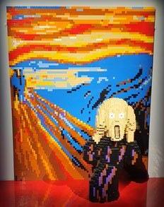
To date, Da Vinci’s Mona Lisa has been defaced with a moustache and a goatee, Edward Munch’s The Scream has featured characters from the SpongeBob Square Pants franchise, and Van Gogh’s self-portrait inspired Bert from Sesame Street so much, he even took a painting class himself and gave it his best shot. I was not disappointed; I’d have that framed in my house! If you are ready for a few giggles or ready to give me your best eye-roll, let’s take a look at some of the most parodied artworks of all time.
Kicking off with the main lady herself, the beloved Mona Lisa has been possibly the biggest target for spoofed artworks. Possibly because it’s one of the most recognisable paintings to have ever existed! Her character and her facial expression are shrouded by centuries of mystery, and perhaps the simple composition of the piece makes it easier to alter. Titled Mona Moi, muppet diva Miss Piggy couldn’t resist getting in on the action and is seen holding the same pose and giving that neutral expression from Miss Piggy’s Treasury of Art Masterpieces from the ‘Kermitage Collection’ by Michael K. Frith.
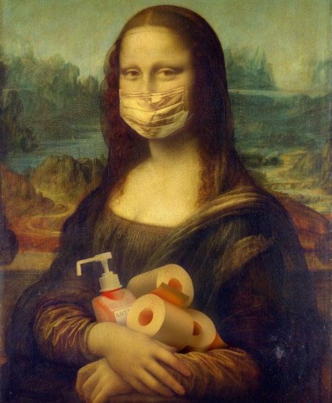
Homer Simpson has had his very own daughter Lisa appear as her in multiple episodes and other promotional images. Finally, who could forget the coronavirus era, where Canada based photo artist Genevieve Blais took to Instagram and made an account called Plague History which saw her recreate famous artworks and characters rocking a face mask in the age of the pandemic. In an interview she stated: ‘we could all use a smile in lieu of recent events, so I decided to update art history for 2020’.
Vincent Van Gogh’s Starry Night is a beautiful and whimsical piece with both an incredibly heart-breaking and extraordinary background. During a time when his mental health was deteriorating, he found solace and inspiration from the view of his window in the Saint-Paul–de-Mausole asylum in Saint-Remy, southern France. It has since moved and evolved beyond its time. With its swirling skies and magical touch, it’s no surprise that it has been another popular option to reinvent. But, that paints a different question, is it wrong to spoof a painting when it came from a bittersweet struggle? Or do we accept the fun-loving and engaging artwork to keep Van Gogh’s legacy alive and with us, in hopes of keeping him relevant for a new generation of aspiring creatives?
Karen Letchtenberg, as an example has altered the piece ever so slightly by respecting the same brushstroke techniques and colour palette, except, we are graced with a Starry Night at Hogwarts School of Witchcraft and Wizardry. I bet she’s a Hufflepuff! KAMonkey has also added more to the original version from a pop culture lens by fusing the iconic sky with the Tardis from Doctor Who. These examples demonstrate how
Grant Wood’s American Gothic is another highly referenced painting that has sparked creativity. Fun fact, the two characters portraying the farmer and his daughter, were posed by Grant’s daughter and his dentist. A bit of an odd family dynamic there, but perhaps that is a reason to poke a little fun at these plain-looking country folk. Was he celebrating them, or satirising them? What was he really trying to say about life in the post-war Depression of the 1930s? A question that has no answers from the artist himself, but a great starting point for artists and their parodies.
Out Magazine updated the original image by replacing the duo with two men who are assumed to reflect the queer community. With the headline stating ‘Love American Style’ in the centre of the cover, this could have been more than just a parody, but instead, a powerful juxtaposition which highlights the contrast between cultural norms and values, and the struggles faced by the LGBTQ+ community.
Political statements aside, the farmer and his daughter have been replaced by cats and minions from the Despicable Me films, and others have seen the gardening fork that’s held in the original image, be replaced with light-sabres, musical instruments, kitchen utensils and all other sorts of apparatus! The Donald Trump ones are also quite wonderful!
In the end, art endures and parody lives on. Why? Because we all like to poke fun and we all have a little sass in our souls. Art parody is not focused on ridicule, but more involvement. These reinventions give them a second life, it can spark how profoundly art can connect across time, culture and identity. So, the next time you see The Last Supper with Ronald MacDonald as the host for a table filled with burgers and fries, or The Creation of Adam featuring Deadpool and Wolverine nearly touching fingers, embrace the sacred becoming the silly. Parody is where the party’s at!
By Anthony Loddo
“Art parody is not focused on ridicule, but more involvement. These reinventions give them a second life, it can spark how profoundly art can connect across time, culture and identity.”
We often think of art as something self-contained. A painting in a frame, a sculpture on a stand, a short film projected on screen and turned off when it’s over. But, the truth is more dynamic: the experience of viewing carries just as much importance as the artwork itself.
The entirety of our encounters with art, from entering the exhibition space to the inevitable ambush of the gift shop, impact how we understand it. Increasingly, museums and curators are attuned to the fact that exhibitions are much more than containers for travelling objects. They build context, becoming active players in shaping public perception of art.
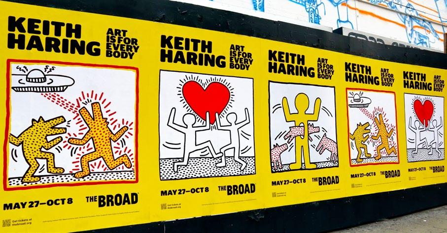
Some exhibitions make this clear in exhilarating ways. Take Keith Haring’s: Art is forEverybody, which ran at The Broad in Los Angeles in 2023. His bold, vibrant, and public-
minded artistic output always had a pulsing energy, and the Broad’s show leaned into it. Neon-coloured walls at the entrance set the stage for the show’s clamorous personality. Inside, chunky black cartoon lines covered entire murals, archival videos played in siderooms, and spaces flowed organically rather than in strict chronological order. Some walls featured windows graffitied with Haring illustrations, allowing glimpses into adjacent galleries. Even the architecture evoked the transparency, collectivity, and imagination so central to Haring’s work, and doubled the message that Haring’s art belongs to everyone, everywhere.
A similar vitality shaped Brasil, Brasil, an exhibition at the Royal Academy of Arts in London earlier this year. Celebrating Brazilian art and culture, the show’s masterful use of space created an atmosphere as lively as the works themselves. The rainbow of colours in the modernist paintings extended onto the exhibition walls, painted in warm yellows, pastel pinks, and sage greens. Some works were displayed on backlit panels, making the canvases glow. On the wall texts, giant black serif letters demanded attention and counterbalanced the smaller scale of the surrounding paintings. The viewer’s eye became a zoom camera, broadening the
brightly painted benches in the centres of the rooms continued the visual language of the works. It was a show that embodied the idea of an ‘immersive’ museum experience without the typical technological flair.
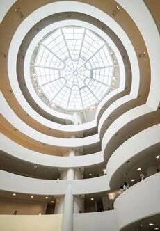
Architecture plays a central role in shaping how we move through art. Nowhere is this more evident than at New York’s Guggenheim Museum. Designed by Frank Lloyd Wright, the building’s famous spiral ramp invites continuous movement. Visitors ascend or descend the curve at their own pace. As they move, they see works not in isolation but in dialogue with one another across the rotunda. In that space, bodies constantly pass one another. Some pausing, others moving fluidly. The buzz of human movement echoes through the tower, lending an ever-changing soundtrack to the art on display. It’s a visual flow unlike any other museum. Wright’s voice pierces through the concrete walls, insisting to us that viewing is never static.
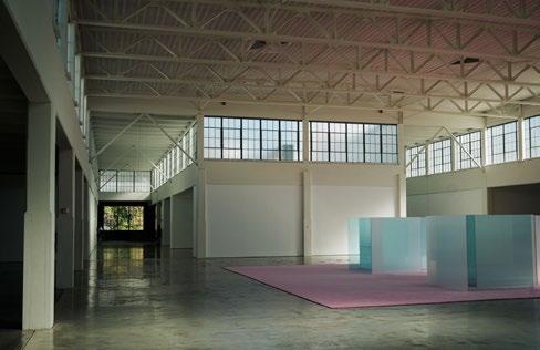
Further up north at Dia:Beacon, a converted factory in upstate New York, the experience is entirely different. The museum’s vast industrial spaces are perfectly suited to large-scale contemporary works. Richard Serra’s monumental steel sculptures, for example, inhabit the building like coiled giants. Walking alongside them through a space that echoes their materiality transforms viewing from a latent to an active encounter. Larger than life art like Serra’s is imposing and monolithic. It activates senses beyond sight as it forces you to feel its
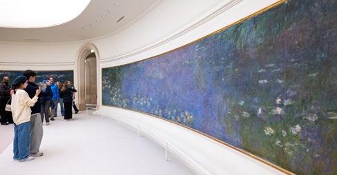
weight, its curves, its textures, and listen to its stillness. Across the ocean at the Musée de l’Orangerie in Paris, Monet’s Water Lilies hug the concave walls, illuminated by skylights filtering in natural rays that shift throughout the day. The viewer is subsumed in the watery depths of the Impressionist scenes. In this instance, architecture is designed to fit the art, not the other way around.
When works of art are moved into new architectural spaces, they can reveal fresh meanings. When the Frick collection temporarily moved from its Gilded Age mansion on Fifth Avenue into the brutalist Whitney building on Madison (it has since reopened in its original location), the works entered a whole new dialogue. Opulent Rococo canvases and Old Master paintings clashed with the stark, streamlined interior. Biblical scenes were displayed next to trap-
ezoidal windows. It challenged assumptions about the ‘timelessness’ of art: an El Greco looked surprisingly contemporary in this unexpected setting.
Our sensitivity to experience is especially poignant when we remember that exhibitions are ephemeral. When they’re gone, they’re gone. The momentary constellation of space, viewer, and art disintegrates. In the end, no matter how we walk through an exhibition, we engage in a physical, emotional, and psychological experience. That’s why the act of seeing matters so deeply. Whether we dizzy ourselves in the Guggenheim spiral, have sensory overload in a loud Haring show, feel dwarfed by a Serra sculpture, or lose ourselves in Monet’s Water Lilies, our experiences with art are far from passive.
By Sophia Jactel
The decolonisation of art institutions has often been interpreted as an act of decontextualisation. Tristram Hunt, the director of the V&A, claimed that alongside colonial violence, empire also presented an exchange between cultures and a story of cosmopolitanism – he expressed concern that the history of empire is buried within the V&A’s collections.
However, in his scepticism, he underscores the very point of decolonisation: to include the multitude of narratives that arose during empire in descriptions of pieces and introductions to exhibitions, to give voice to all perspectives. Decolonisation should simply constitute freeing an institution from the cultural effects of colonisation, but also acknowledge colonial pasts in a way that will provide a critical understanding of its implications to the institution’s visitors. Decolonisation is rooted in a dual focus: of acceding the past and righting the future. By accepting responsibility for past wrongs, being aware of complicity in ongoing structures and its contemporary duties to facilitate contact with cultural heritage, institutions have the power to become spaces of transitional justice – where the voices of victims of colonisation are perceived as important and integral to the presentation of art and artefacts.
Carsten Stahn proposes the revision of semantics in the decolonising mission of art institutions. He notes that museum terminology often relies on linguistic concepts that rely on colonial experiences. For example, Native American objects from Africa or Latin America remain labelled as ‘tribal’ artefacts and reproduce developmental myths and cultural inequalities. In this vein, The Belgian Ethical Principles specifically state that labelling practices should be tackled with ‘deepened provenance’ and ‘self-reflexive approaches to the histories of colonialism and racism’. Provenance is deemed essential in the
decolonisation of labels – context is placed at the centre, rather than being taken out of the picture. Historically, the funding and maintenance of art collections have been closely tied to colonial endeavours. Thus, despite growing calls for reform, it must be questioned whether art institutions are truly committed to meaningful decolonisation, even if it means departing from their normative operation.
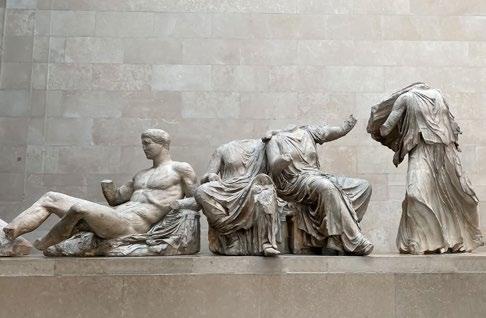
The British Museum is a notable instance where, despite acknowledging their entanglement with colonialism, there has been hesitancy to repatriate illustrious artefacts, like the Elgin Marbles. While John Keats’s poem On Seeing the Elgin Marbles
expresses a profound connection between the artefact and his ‘spirit (being) too weak – mortality/Weighs heavily on me like unwilling sleep’ as a commentary on human finitude, the Elgin Marbles now challenge the morality of art collectors in ‘morality (‘s) ’ ethical sense. There have been some positive developments on this front: in 2018 a reported commissioned by the French President Emmanuel Macron recommended the permanent return of looted African art, an effort echoes by the Dutch government in 2022. This led to the return of twenty-six artefacts to Benin. This is, however, but a fraction of the thousands of objects taken from Africa, and more certainly needs to be done.

The interrogation of perspectives and narratives is key in the decolonisation of art institutions, and art curation. For centuries, Western art institutions have shaped frameworks about global art and museums have typically displayed nonWestern art through an ethnographic lens, in a way that presents them as ‘primitive’. For example, the Musée du Quai Branly in Paris, which houses thousands of African and Indigenous artefacts, was originally designed to exhibit non-Western objects as part of France’s colonial legacy, rather than as an independent, artistic tradition in themselves. In 2020, the museum revised this and introduced new exhibitions, curated by African artists to reframe African and Indigenous pieces as fine art, as opposed to relics of colonised cultures.
In decolonisation scholarship, there exists a concern with ‘speaking for others’, where discourses on indigenous populations exclude local voices. In 2018, the Brooklyn Museum was faced with a similar issue when it faced backlash for hiring two white curators to oversee its African art collection. Consequently, institutions like the Tate Modern and MoMA are now hiring more curators from African, Indigenous and Asian backgrounds, to show their seriousness about decolonisation and allowing collections to be shaped by real cultural histories.
Decolonising art institutions requires deliberately engaging with efforts to transform their structural operation. Temporary exhibitions, diversity initiatives and surface-level acknowledgements of colonial histories, without an inclusion of
indigenous voices, have become superficial, tick-box engagement with decolonisation. Art institutions must move beyond tokenism: while it is promising that many institutions have adopted decolonial language in the operation of exhibitions and the collection of artefacts, words without action continue to ring hollow. Institutions must interact with the deeper colonial structures that underpin collections – they must critically examine their own foundations and commit to long-term partnerships with artists and communities whose cultures they display. Decolonisation brings back the contextual backgrounds of showcased cultures and communities – it widens the scope for museums to engage with diverse perspectives and narratives.
By Sophie Macdonald
Heralded for his controversial art installations and defying the boundaries of what art is, Czech artist David Černý meets with the Art & Culture Magazine to answer my burning questions! Exploring the notion of how far one can go in utilising art as a tool for social and political commentary, Černý’s work is emblematic of the daring, the shock factor and sparking conversation.
Having even been arrested for a short time after painting a Soviet tank pink, his creative genius has often been viewed as ‘acts of disobedience’. Having won numerous awards for his show-stopping public art installations, we are delighted to explore the context behind David’s work and delve into his projects.
Q: David, thank you so much for meeting with me to discuss your work, it’s such a privilege to have you on board! So, to start off with, for those who aren’t familiar with your incredible work, can you please tell us a little bit about yourself and your journey as an artist?
A: If anybody asks me who I am or what I’m doing I usually say that I’m a pilot. I was born in the Czech Republic during the communist regime and the Russian Invasion. My parents didn’t run away. I ended up doing Graphic Design, and I recall doing many etches. I switched from doing large paintings to smaller work in my studio. In 1971 and 1972 exhibitions were cancelled by the communist regime. But, it was during the first four years that I was following them to the openings. I actually quit drawing and told myself I’d never be an artist. This was from four to fifteen years of age. I then went to High School and during my fourth year, decided to do something other than making amplifiers and computers. I then made
underground movies with my friends at the age of seventeen or eighteen. In 1996 Gorbachev unleashed the communist regime, people escaped via the Prague embassy, and during this time I was accepted into university.
Q: Many of your works challenge authority and social norms. What drives you to create such provocative pieces?
A: So, what is considered provocative, for me is not. I was somehow taking care of my roots as I did care about where I lived and what was surrounding me. It was a reaction to my surroundings you could say.
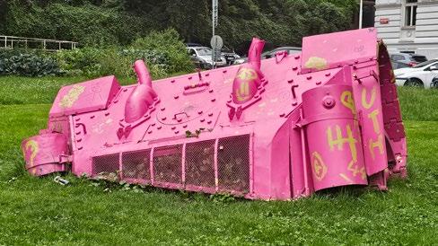
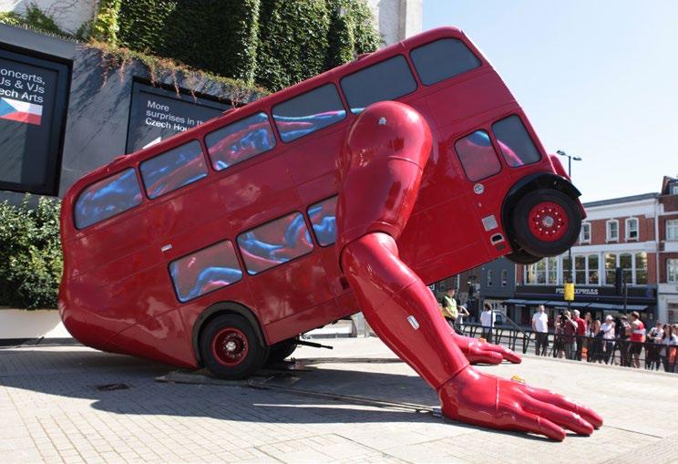
Q: Which artists or movements have influenced your style and approach”?
A: Many and nobody. In different periods we see different artists, styles and thoughts. I wouldn’t say any particular style has influenced my work, but the collection of artists, thought patterns and movements will always be present.
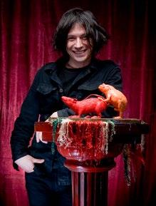
Q: Many of your pieces have sparked debate around the world, such as Entropa (2009). Your artwork titled Pink Tank (1991) was also a bold statement against Soviet influence. What message were you trying to convey with this piece, and did you anticipate the strong reactions it received?
A: I did anticipate that there would be some reactions, but it ended up being a huge scandal. I couldn’t go out into the street for one whole week. I was hiding. It was a coincidence that the weapons and armoury from the Russian troops were still in the country. So, during that time, government finally forced them to leave. The troops were still occupying the country in 1991, after the communist regime. It was a real satisfaction when I saw them leaving and this coincided with the piece. This coincidence and reaction blew it up.
Q: Do you think art should always be political, or do you sometimes create just for aesthetic reasons”?
A: I don’t know what art is. That’s the problem. In different times and in different environments art means something else. I believe in both. The ideology which connects with a movement. For example, a Rothko painting focuses on aesthetics but reflects strong ideas, and Francis Bacon’s works are also probably influenced by not necessarily politics, but humanity, and therefore political in nature. Whether it be about the cruelty of the world, or something happening at the time, I do believe that the aesthetic will carry a meaning or ideology.
more....
“I don’t know what art is. That’s the problem. In different times and in different environments art means something else. I believe in both.“
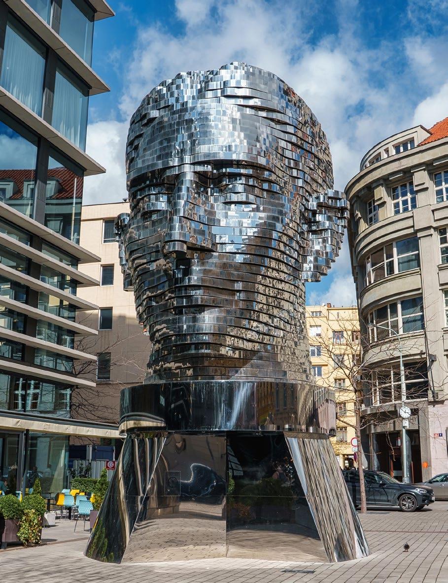
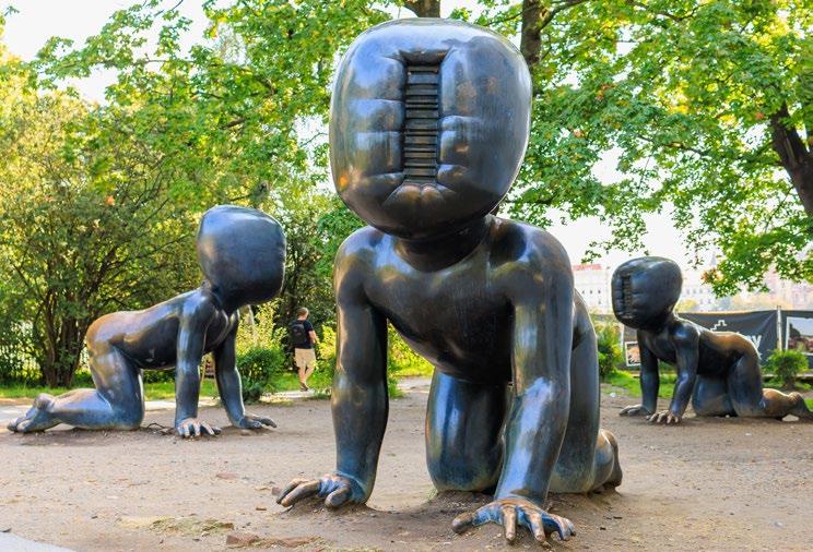
Q: I particularly love your piece Babies(1995). Can you tell us a bit about how this artwork came to be, and what inspired the context attached to it?
A: So the first one was born when I was living in New York and I was asked to do a piece for the ICA in Chicago. I then moved them to Prague and attached them to the Prague TV Tower. They have a barcode in place of their face which showcases physical deformation. I drew inspiration from a movie about an escaper from a concentration camp in North Korea who made his way to South Korea. He explains his experience growing up in a dictatorship and when living in the south he encounters a bizarre situation where he walks through a supermarket full of goods and feels lost. This idea of fighting for ownership is an odd concept as nobody had to own anything. Money had no value. Bolsheviks weren’t killing people in the town where I grew up. Even though one would be imprisoned, or even when I was caught and beaten by the police, it wasn’t the time where they killed. You’d be kicked out of school and end up in military service, but it was more like a hunting game. The only disadvantage
was that I was unable to learn English fully, but my experience is irreplaceable.
Q: Another one of your works that I love is the Head of Franz Kafka (2014). This kinetic sculpture (like many of your others) involves unconventional materials and techniques. What was your creative process like for this particular piece?
A: When I was asked to do something for this major spot in the centre of Prague, I looked at what Prague is. It was a multilanguage city before the war, and was built by Czech brick-layers and German architects with Jewish money. This triangular city and three communities living there lead to Kafka. A Jewish writer, writing in German, with a Czech name, living in Prague. He represents the essence of the city. Kafka was actually published as a German author. The sculpture is in Národní (National Street) which represents these three groups. He also worked as an insurance company clerk, and fifty metres from the piece you have the remains of the old Jewish cemetery. The next door building is the City Hall of Prague. Kafka is a comic writer in a way, he was very
ironic and the City Hall represents what he hated the most; bureaucracy. The location is ironically pivotal!
Q: What upcoming projects are you working on, and can you share any details with us?
A: So I have a few minor projects on the horizon at the moment, I opened the Musoleum David Černý, and last year I unveiled four huge installations and other permanent installations. The Butterfly Effect was created for the façade of the Máj department store in Prague. They change colour, move their wings and their bodies are reminiscent of Spitfire fighter planes as they vibrantly look down onto the bustling street.
By Tamara Bell
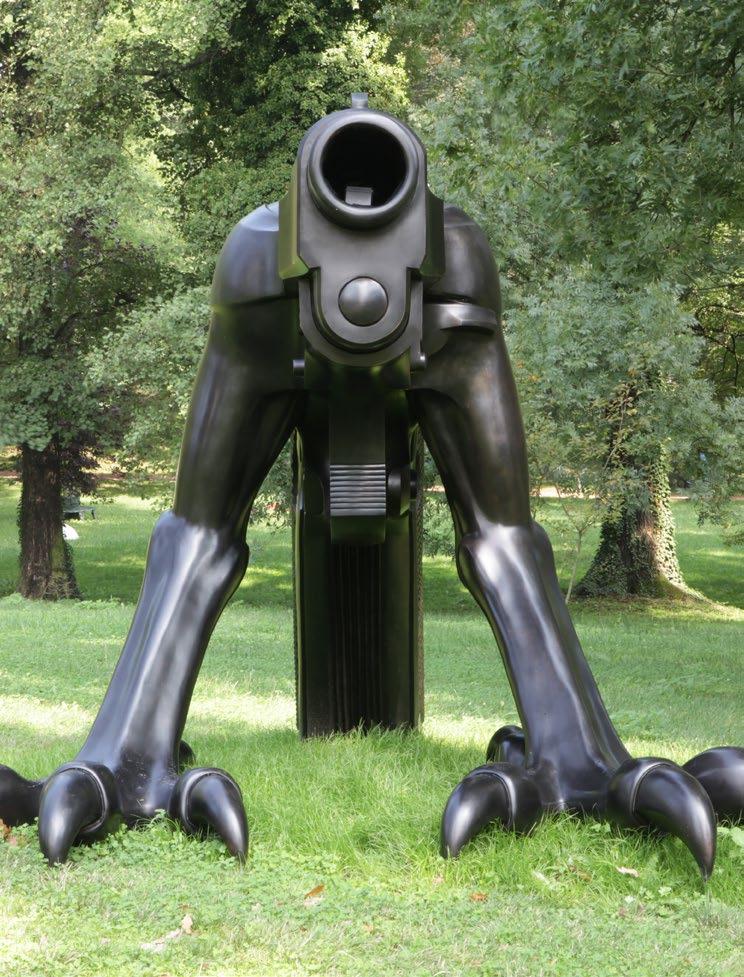
Picture a country house, a lush green garden, gilded frames, and ornamental furniture adorned with burnished fruit bowls. This is the visual shorthand through which period dramas convey stories of desire, excess, and privilege. These flecks of luxury can be traced back to a 17th century movement known as English Baroque.
Unlike its more extravagant Continental cousin, the English Baroque embraced drama with restraint. Shaped by political shifts, Protestant ideals, and a taste for architectural clarity, it provided the perfect backdrop to stage some of the most charged and dramatic period pieces in English cinema.
Think of clipped hedges and a steady procession of windows across a red-brick façade, this domestic monumentality conveyed drama without resorting to theatrical excess. Inspired by the political mood of Restoration England, these exteriors channel symmetry and order, directing a visual rhythm ideal for the cinematic frame. Strong contrasts between light and shadow cut through character’s motives, crafting an emotional setting on which to experience these stories. Carved wood panelling and classical motifs craft this playful light as both austere and elegant, subtly framing the period piece. Coupled with a theatrical spatial design made up of grand staircases and double-height entrance halls, the movement and ceremony of English Baroque are the perfect match for cinematic blocking. The weight of palettes of deep reds and olive greens proved ideal for films steeped in passionate tension.
In The Draughtsman’s Contract (1982), Peter Greenaway drew directly from this tradition. The film unfolds on a Wiltshire estate in the late 17th century, a world surveyed and then drawn. A geometry of hedgerows and formal gardens shape the story and its staging.
These uncanny English Baroque visions are mirrored in the draughtsman’s own compositions, with clipped avenues and gridded plans echoed in the framing of characters. Interiors are deliberately made uncomfortable in their constrictive grandeur, as the logic of English Baroque is compressed into cinema.
But Greenaway is only one filmmaker among many to succumb to the allure of the English Baroque and his controlled prevision also informs Stanley Kubrick’s Barry Lyndon (1975). Kubrick, like Greenaway, draws from the same pool of natural light and long, slow zooms which focus on interiors stripped of sentiment. Soft candlelit compositions echo the stillness of a Kneller portrait, which gathers in a candle’s flicker rather than in movement or momentum.
Even more stylised films like The Favourite (2018) by Yorgos Lanthimos carry this imprint. Though The Favourite’s tone might have been more cutting and satirical, the English Baroque sets the principled stage upon which this story unravels. Queen Anne’s palace is divided by sequences of doorways and repetitive corridors, with the garden becoming a display of competitive control. These elements are echoed in the stiff costumed silhouettes which themselves create figures who might have been better rendered in paint rather than flesh.
The diverse appeal of the English Baroque to filmmakers is premised on this clarity
of form. Palettes of oak, red, and green lend gravity to the screen and decorate the rooms in which these stories are performed. Gardens become intricate maps of thought and creativity, staging competition between characters amongst perfectly trimmed hedges. Depending on where the light falls, however, the English Baroque can offer equal parts of wealth and decay, and repression or excess. It also best frames characters in their solitary spaces, sitting at long dining tables or walking alone through an orchard. These scenes all become part of a network of charged emotional moments beheld in this architecture.
For all its rigour, the English Baroque leaves room for interpretation. Directors adapt its architectural constraints to shape scenes of emotional warmth, despite its ability to constrict. Bodies which are distant from one another suddenly become closer, luring the viewer into its tension before slowly letting our gaze go. The influence of English Baroque on period films extends beyond just set design into a set of principles which visualise the director’s intentions. It crafts a visual grammar which directors use to heighten period dramas in their mood, narrative tension, and historical affect. What was once a somewhat short-lived architectural style in the decades after the Civil War is now one of the most enduring visual codes in British cinema.
By Vuk Winrow
Award winning gin, reborn from winemaking tradition
FOUNDED BY ALEX & EMMA WATSON


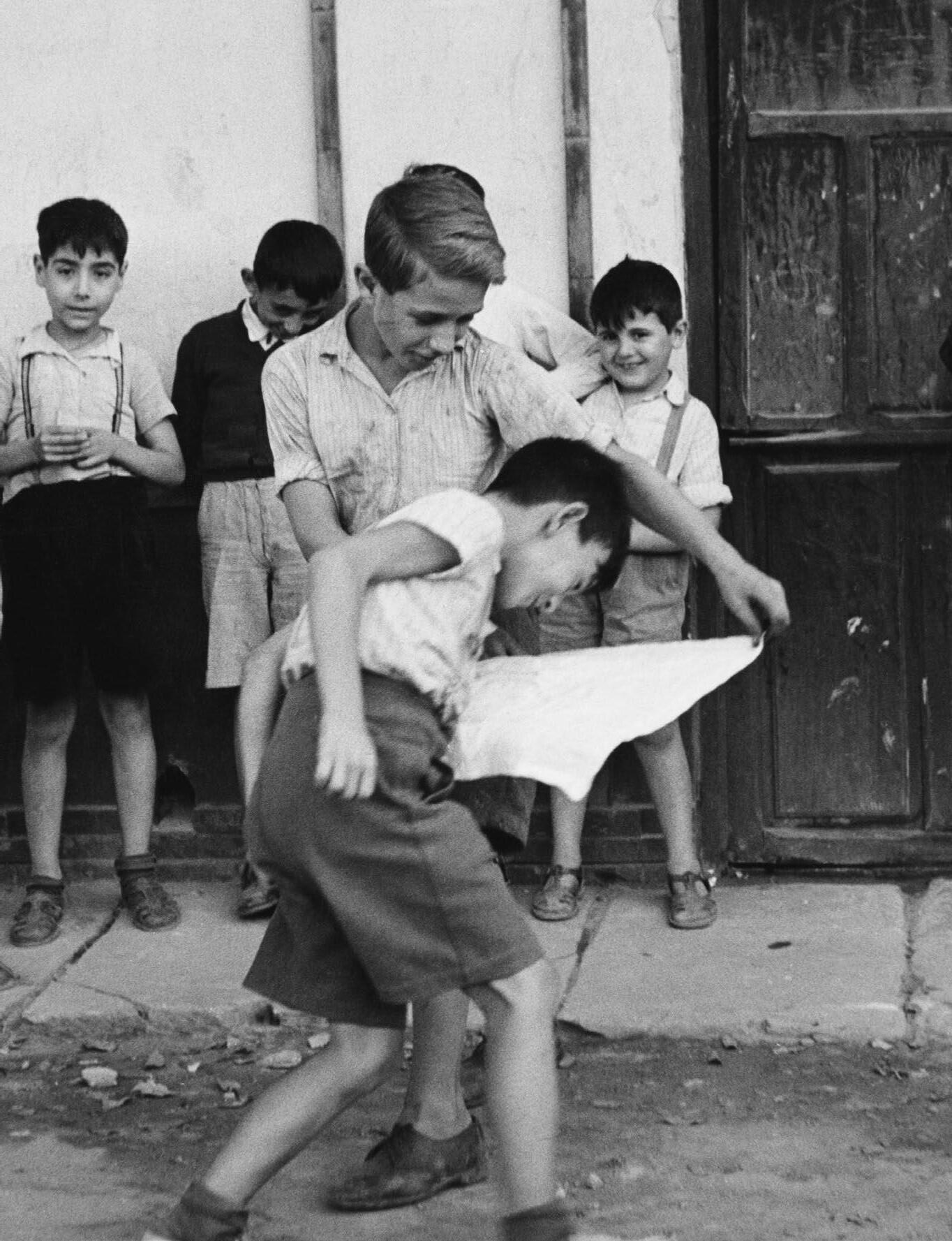
“The streets of the poor, quarters of the great cities are, above all, a theatre and a battle-ground. There unaware and unnoticed, every human being is a poet, a masker, a warrior, a dancer: and in his innocent artistry, he projects, against the turmoil of the street, an image of human existence.” Helen Levitt
The quote above was taken from the opening scene of the 1948 film In the Street by Helen Levitt. Many of us have probably never heard of Helen Levitt’s work. Up until recently, I have started to discover more and more about her street photography, how she aims to capture the soul of the people in New York and the subjects which she chooses to focus on. The quote above perfectly exemplifies the truth behind her attitude towards street photography better than I could ever describe. Levitt is a photographer of the people, capturing the souls of the working class, the differences in communities and the playfulness and innocence of children playing in the streets of New York. The Black and White film is a must watch for those interested in witnessing a time capsule of human existence during the 40’s. It is beautifully innocent in its representation of people and does not at any point force an interaction or conversation between cameraman and subject. Some of the most interesting scenes are those depicting the small nuances of conversations between friends or neighbours, a side eye by someone across the street, a gentleman petting his cat and so forth. Levitt’s record of us during this time is truly astonishing, as stated above, the film does not push for any false involvement
but rather allows each subject to exist within the environment. It’s astonishing to me that one of the first elements of critique from a street photographer is just how successful a film is in discerning the American working life of the 1930s & 40s.
Levitt’s career as a street photographer initially began under the wing of another artist, whose primary focus during the 1930s was commercial photography. Her eventual transition and boom into street photography really came to fruition after visiting the Julien Levy Gallery in New York. The street photography scene as well as the Museum of Modern Art’s expansion of the photography department, meant that Levitt was inevitably spending more time there and building relationships with other photographers of the same or similar genre. Over time, Levitt has produced some extraordinary images, capturing the communities of bustling New York. Some of my favourites from Levitt’s career as a street photographer include New York (Four Children) (1939) and N.Y. (Children with Laundry Matt) (1972). Both images showcase the beauty of innocence and playfulness amongst kids, the connections between them, and the objects which they choose to play with, which all exude soul
and character. Levitt’s work often reminds me of the works of Vivian Maier. While Maier, in my opinion, had a much more technical approach to street photography, rendering images which had both great storytelling and composition, Levitt’s approach seems to be a little more candid and much like the photographing of children in New York, innocent and sweet.
Unlike other photographers of her time choosing to highlight political legislations, and aiming to push the lower income communities out, Levitt’s work is a stark contrast, giving us an escape and sense of happiness during the turmoil of that decade. As mentioned above, the streets of the poor and quarters of the great cities are both a theatre and a battleground. Levitt tells the story of the theatre of the streets with joy and respect.
By Francesco Scalici
Scan here to see some of Helen Levitt’s photography
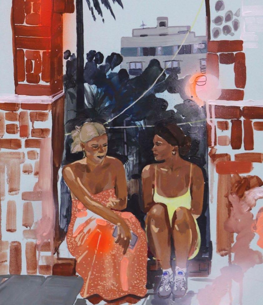
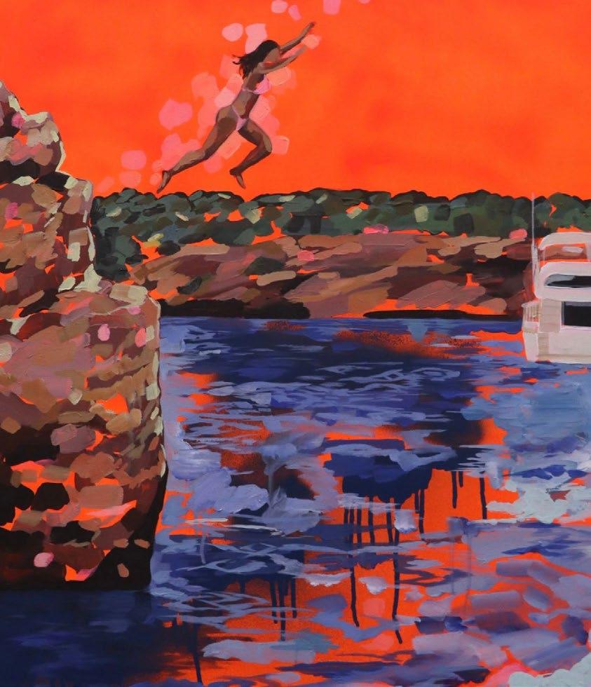

Artists often lend their voices to contemporary debates. The rise of generative artificial intelligence (AI) has become particularly relevant to the art world, and sparked considerable contestation over its role in processes of human creation. A recent update to the popular AI platform ChatGPT sparked a barrage of Studio Ghibli-inspired images imitating the iconic style of the studio’s founder, Hayao Miyazaki.
Hayao’s reaction to being shown early forms of AI-generated visual imagery in 2017 provoked a scathing response: ‘whoever creates this stuff has no idea what pain is whatsoever. I am utterly disgusted…I strongly feel that this is an insult to life itself’.
There is little doubt that a multi-talented animator, filmmaker and visual storyteller like Miyazaki would react equally viscerally to bastardisations of his own style, painstakingly honed and cultivated over a lifetime. Born in Tokyo during the Second World War to a middle-class family, his interest in the burgeoning world of anime was sparked by The White Snake Enchantress (1958), the first colour animated feature-length film released in Japan. After graduating, he began his foray into animation at Toei Doga in 1963, where he worked on pioneering films like Gulliver’s Travels Beyond the Moon (1965), which was released in the United States the following year. Miyazaki’s art has long been grounded in a Japanese aesthetic, but interaction with Western styles proved fruitful. Indeed, he has previously cited the French surrealist feature Le Roi et l’Oiseau (1952) as an inspiration. It’s not surprising to see why. The whimsical art style, with fantastical and anthropomorphic elements, follows two youths navigating an oppressive and authoritarian world in a retro-futuristic setting: themes that have become a hallmark of the Japanese auteur.
Miyazaki’s creative instincts were given fuller expression following a move to Tokyo Movie Shinsha, where he directed his first feature film, TheCastleofCagliostro (1979), based on the Lupin III manga by Kazuhito Katō. As another step in his artistic evolution, this entry (though somewhat beholden to a source material and style) is replete with imagery and style that have also become characteristic of Miyazaki’s works. The happy-go-lucky thief (Lupin) inhabits a world brimming with colour, suspense and mystery.
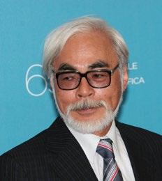
A frantic car chase across a backdrop inspired by the Alps precedes a showdown on an intricately mechanised clock tower hiding a secret treasure. The antics of the leading trio Lupin, Daisuke, and Clarisse are framed against a story of familial tension and rivalry, the travails of young adulthood, and honour among thieves. As a testament to Miyazaki’s growing significance in this space, John Lasseter, co-founder of Pixar, named Cagliostro as a major influence on his aspirations to become an animator.
The founding of Studio Ghibli in 1985 heralded Miyazaki’s elevation to a global audience, with arguably all the films produced since the studio’s inception occupying a place in the pantheon of animation. MyNeighbourTotoro (1988), Princess Mononoke (1997), Spirited Away (2001), and Howl’sMovingCastle (2004) have each captured the imaginations of at least two generations of children, although the accessibility of Miyazaki’s narrative and visual style means that adults are equally likely to find entertainment and meaning in them. When Hollywood-adjacent Western animation studios began moving to digital animation en masse, Studio Ghibli has remained committed to hand-drawn
methods. The scale of imaginative prowess across these films is frankly astonishing, even as they draw extensively from Japanese folklore and Shinto cosmology. One of the most iconic images associated with Studio Ghibli is the scene in Totoro during which Mei, Satsuki, and Totoro stand side-byside waiting for the Catbus. Half-shaded by the streetlamp in a gloomy, forested side road swamped by rain, the scene evokes a singular sense of nostalgia and ‘cosiness’. The verdant, lush Japanese countryside depicted in the film underlies this, eschewing bleaker neo-futurist visions encapsulated in films like Akira (1988) in favour of pastoral, naturalistic aesthetics.
Spirited Away arguably represents the apotheosis of Miyazaki’s global spread. Winning the Academy Award for Best Animated Feature, it is widely regarded as one of the greatest animated feature films of all time. It’s not hard to understand why. It is a tender, intricately detailed, thematically complex rendering of a fairy tale that follows a young girl forced to work at a bathhouse after her parents are turned into pigs. The opening sequence contains obvious critiques of consumer culture, using a deserted theme park to represent the alienating and ultimately superficial allure of consumerism. The blurring of the spirit world and ‘real’ world acts as a sincere exploration of spiritualism and the coming-of-age process.
Therein lies the value of art: its ability to reflect and evoke universal human experiences and emotions. The creative process is intrinsically linked to why people find art relatable or impactful. Computers might be able to mimic what has already been wrought by human minds, but the legacy of masters of their medium like Miyazaki will compel and endure far beyond the facile world of ones and zeroes.
By Francis Devincenzi
The relationship between appearance and character is long established, at least in art. Since the Medieval Period, artists have equated external beauty with internal grace. Influenced by theologians such as St Augustine and Thomas Aquinas, artists of the Medieval period frequently interpreted physical appearance as a reflection of moral character — associating virtue with beauty, and deformity with moral corruption.
It is no wonder Medieval manuscripts depicted angels as light, white, beautiful creatures and devils as their visual – and, thus, moral–antithesis. But when it comes to the portrayal of moral degeneration, there is no enmity painter as notorious as Hieronymus Bosch.
An Early Netherlandish painter from Hertogenbosch, Hieronymus Bosch remains remembered for his twenty (ish) visions of heaven, hell, and the moral world, each more inexplicable than the other. The grotesqueness of his figures and the innate pessimism of his works emerge as the two defining factors of his oeuvre. Through satirical, didactic, and often cataclysmic scenes, it faces viewers with the aftermath of human sin. This is most obvious in Bosch’s trademark triptych, The Garden of Earthly Delights (c. 1490-1510), which inspired spin-offs from Alexander McQueen’s runway collection to Guillermo del Toro’s monsters. It is also the case in his renditions of The Haywain Triptych (1516) and The Last Judgement (1504-1508). But, Bosch’s

”You cannot watch StarWars, or see the creatures from Tatooine, and not wonder if George Lucas was borrowing from – or, at the very least, familiar with – the work of Hieronymus Bosch.”
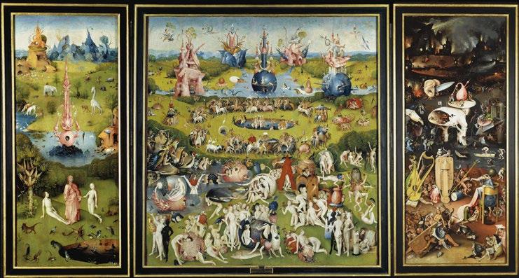
contribution to one of the greatest cultural icons of our time – the Star Wars franchise –remains unnoticed.
You cannot watch Star Wars, or see the creatures from Tatooine, and not wonder if George Lucas was borrowing from – or, at the very least, familiar with – the work of Hieronymus Bosch. Because, he was. In an interview from 1977, Lucas recalled some of his greatest inspirations: Joseph Campbell’s The Hero with a Thousand Faces; the Samurai, on whom the Jedi were modelled; and Mongolian noblewomen, whose ceremonial dress shaped Padmé Amidala’s style. But, Hieronymus Bosch, too, should have made it into the list. His nightmarish, phantasmagoric creatures echo across Lucas’s galaxy. As uncanny as it may seem, placing Bosch’s surreal visions alongside the creatures of Tatooine reveals striking visual and thematic parallels — ones too specific to ignore.
Take a look at Watto, for example. In The Phantom Menace, he emerges as one of the most morally corrupt characters–albeit not on a scale as galactic as the Darth Sith’s. Watto’s insectoid appearance not only reflects his hideous, repellent nature in the Boschian tradition but also signals a survival-driven, amoral pragmatism. Inherently, it showcases how physical deformity was historically viewed as a
sign of crafty self-interest. His corruption is earthly, petty, and palpable; it is all too human. This makes him perfectly suited for a Boschian interpretation; like the sinful souls in Bosch’s hells, whose corruption is signalled through physical grotesqueness, Watto stands hunched, debilitated, and repulsive. This is true both physically and psychologically. Fittingly enough, he’s also sentenced to the kind of harsh, punishing climate that they, too, experience — like Bosch’s hells or, to a milder degree, his sinful visions of earth, Tatooine has a harsh, jarring climate. It is a desert wasteland where depravity, evil, and hedonic pleasure rule supreme; where
sin is put on a pedestal and goodness, like Anakin’s, is often unnoticed. But, instead of resisting that, Watto gives in to sin; he instigates it, becoming the embodiment of one of Bosch’s main preoccupations: avarice. Yet, as would have been the case in any Boschian satire, especially TheShipofFools (c. 1490-1510), Watto falls prey to his own greed and materialism. That’s the whole irony. In making a deal with Qui-Gon Jinn — in which he ensures a profit either way — he loses his ‘most precious’ slave, Anakin Skywalker. That’s the punishment.

Hieronymus Bosch
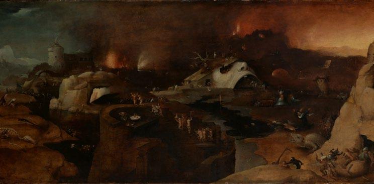
The ties between Tatooine’s grotesque creatures and Bosch’s monsters is further exaggerated in the podrace scene. Driven by greed and spectacle, two themes that Bosch looked down upon, it becomes the perfect vision of earthly, hedonistic indulgence. It is, in a sense, a cosmic retelling of The Garden of Earthly Delights, where figures busy themselves with satiating desire and succumbing to sin instead of practicing restraint, self-discipline, service, and compassion. It is no wonder the one who exhibits these characteristics — Anakin — becomes the sole soul that flies away into the heavens, at least temporarily.

But, no one’s corruption eclipses Darth Maul’s. As Darth Sidious’ young apprentice, he personifies two sins: wrath and pride. (It is fitting, you might note, that Count Dooku, his master’s second apprentice, later observes: ‘twice the pride, double the fall’). In any case, Darth Maul’s appearance references both Medieval and Boschian demons. With his red and black skin, horned head, and skeletal, sinewy, yet human frame, he echoes the visual language of medieval manuscript devils—traditionally portrayed with flaming skin, animalistic limbs, and grotesquely exaggerated features. Furthermore, like a Boschian demon, he is ideologically both the executioner and eventual victim of divine retribution. Having been trained in the ways of force but succumbing to the dark side, he enacts the classic pattern of the fallen angel: once part of a luminary order, now an apprentice of chaos. If we were to place him in a Boschian vision, he would easily stand in Hell (c.1505), surrounded by other wrathful agents of destruction. The classical Boschian satire? He himself falls into a reactor shaft — its gaping, cylindrical, red-and-black form eerily echoing the medieval hell mouth, the symbolic door into damnation. Like all of Bosch’s sinners, he is, thus, doomed by the very evil he serves.
Although we may not know the extent of Bosch’s influence, at least not until Lucas himself comments on it, drawing associations between Boschian iconography and that of Star Wars sheds light into the underlying, metaphysical narrative of one of the most popular franchises of our time. Even more importantly, it becomes a reminder of the perseverance of archetypes — and iconographies — of good and evil across time and media. As it turns out, these visions of beautiful and ugly, alongside their implications of good and evil, are so deeply ingrained in our psyche that we don’t need an art historical explanation. We understand their meanings intuitively. We’re naturally repulsed by the rotten and drawn to the divine. And we feel this long before we rationalise it. Because, as Campbell wrote and Lucas understood, these images represent primordial archetypes of good and evil that stand nestled deep within the human psyche.
By Maya Stoilova

Buckle up. Luxury travel just got personal.
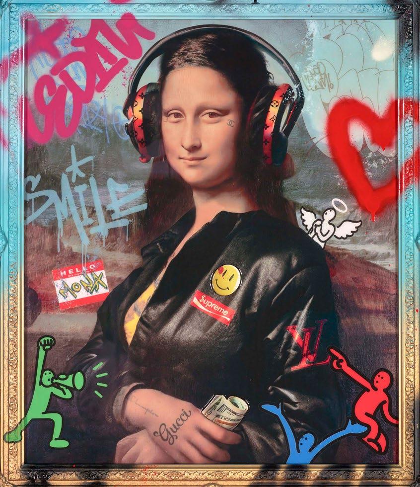
Just this March, Christie’s hosted its first-ever AI auction: Augmented Intelligence. It exceeded estimates, outpacing its $600,000 projection and generating $728,784. But the real gain wasn’t financial; it was the new collectors the sale drew in. With half of the bidders being millennials or Gen Z, and 37% first-time buyers, Christie’s finally passed its own test. It achieved what it often asks of its graduate scheme applicants: finding a way to engage the next generation of collectors.
However, that too came at a cost. Over 6,500 individuals, many of whom are artists, signed an open letter, urging Christie’s to cancel the event. ‘These AI models and the companies behind them’, they wrote, ‘exploit human artists, using their work without permission or payment to build commercial AI products that compete with them’. They are, therefore, financially and ideologically exploitative.
The letter culminated with a plea: ‘Your support of these models, and the people who use them, rewards and further incentivises AI companies’ mass theft of human artists’ work. We ask that, if you have any respect for human artists, you cancel the auction’. But, the action proceeded as planned. Members of the auction house defended its legitimacy, framing technology, and, naturally, AI as a medium for artistic innovation and enhancement. As one of them told The Art Newspaper, ‘the artists represented in this sale all have strong, existing multidisciplinary art practices, some recognised in leading museum collections. The works in this auction are using artificial intelligence to enhance their bodies of work’. After all, artists have been pushing against conventional boundaries for years, and AI is yet another way to do so.
At this moment, the semantics of the sale are besides the point. What matters are the questions it bids. As AI artworks sell for
tens of thousands, should the artists whose work trained the models get a cut? Who owns the rights to AI-generated art, and how do we define ownership when the creator is a machine? Does AI undermine the market by flooding it with instant, infinite content? Or does it expand the market by lowering barriers and beckoning young collectors? Does AI threaten artists, or are they just unwilling to adapt? Can something that is AI-generated even be considered art? The list goes on.
In contesting these, albeit indirectly, Christie’s and the signees initiated the debate that will continue to shape art, authorship, and ownership in the digital age. Both sides have fair arguments.
Yes, AI cultivates creativity. But isn’t art supposed to be a reflection of the human experience, lived, felt, and suffered, not the product of a soulless algorithm?
Yes, AI fosters an artistic revolution. It pushes against boundaries, questions convention, and introduces new techniques and media. But, unlike previous revolutions, it does so at the expense of the artists it neither credits nor compensates.
Yes, AI allows for almost immediate creation, expediting the artistic process and allowing for greater output. But it denigrates the
importance of effort. At the same time, it questions the value of mastery, artistry, authorship, technique, and the human hand. Yes, young collectors seem to be ‘into it’. But, popularity and artistic value are not the same, and commercial success has hardly been seen as the true measure of ‘good’ art. In fact, many of the greatest painters we know today only became ‘masters’ posthumously.
And, yes, AI art has secured its place at prestigious art institutions. But, does institutional acceptance prove its artistic value, or is it simply a reflection of the market’s underlying capitalist structure?
No side is right, and no side is wrong. Both are true. How we proceed from here, it seems to me, is a matter of taste, belief, and preference. Like every seismic shift in the history of art, the introduction of artificiallygenerated images angers, disturbs, and polarises; just as it appeals, questions, and innovates. It challenges tradition whilst drawing on it, and it employs new methods and media to reference the old. It pushes against boundaries whilst still thriving within the frame. In doing so, it follows the footsteps of any other artistic revolution. So, the real question is not whether it belongs; but whether you believe it does.
By Maya Stoilova
“Your support of these models, and the people who use them, rewards and further incentivises AI companies’ mass theft of human artists’ work. We ask that, if you have any respect for human artists, you cancel the auction.“
Shown left an example of an AI created version of AmericanGothic
The Art & Culture Magazine is proud to welcome Sophie Tea for our September edition! Known for her vibrant, unapologetic style and her pioneering approach to art in the digital age, Sophie is renowned for breaking away from traditional gallery systems, as she gained fame by selling her work directly through social media and building a loyal global following. Her art, often centred around themes of female empowerment, body positivity, and individuality, is as bold and expressive as the movement she’s helped create.
Q: For those who aren’t familiar with your work, can you tell us a little bit about yourself and how you first started out in the art world?
A: So, I’m an artist and most well-known for painting women. I started ten years ago after studying business, but always wanted to be a painter when I was little. I had a job at a consultancy firm and travelled to India where I saw a graffiti wall at a hostel. I was running out of money and asked the manager there if I could paint on it in return for a free stay. This made me realise how much I wanted to do this with my life. I was then very new to the art world and placed a picture of the multi-coloured cow mural I had made in India on socials. It was incremental growth since then as an independent artist without gallery representation.
Q: How do you handle creative blocks, is this something you’ve experienced before?
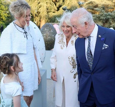
A: I had a lady stop by with her son once to my gallery on Carnaby Street. I’m always fascinated by how young boys react to my artwork, and I’ve had groups of them come
Q: What’s something a fan or collector has said about your work that has surprised you?
A: I experience creative blocks all the time and love ‘Bad Art Sundays’. I’m very protective of keeping the love for what I’m doing. When your hobby becomes how you earn money things can become confusing and you can lose the love of it. On Sundays I’m making work to experiment and for nothing else. Some of it is magic and the rest is for me to get my creative energy out. It’s about creating a ritual. I have access to all the materials in the world and still don’t know what to make, this happens all the time. Allocating the time to be in the studio is so important. Being uninspired is part of being an artist.
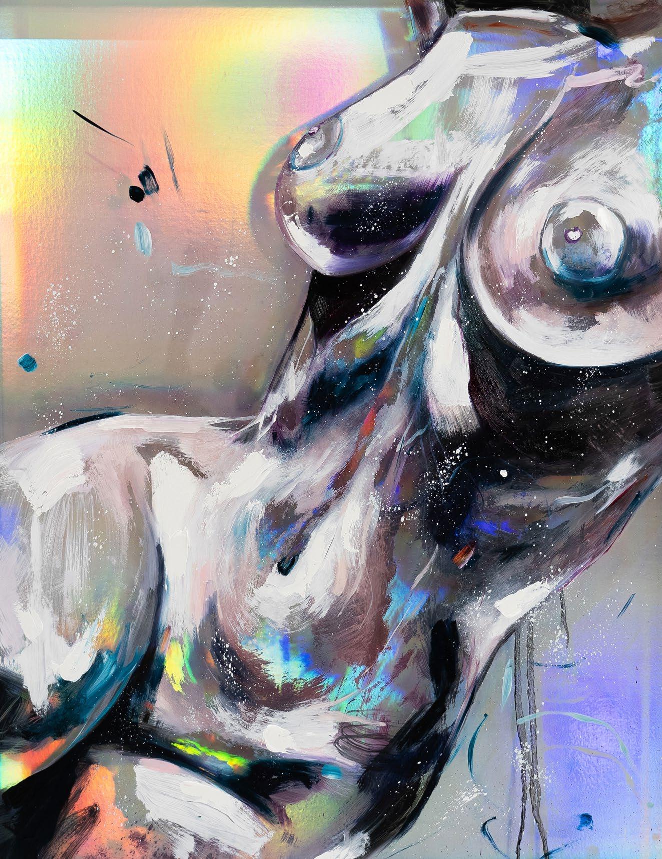
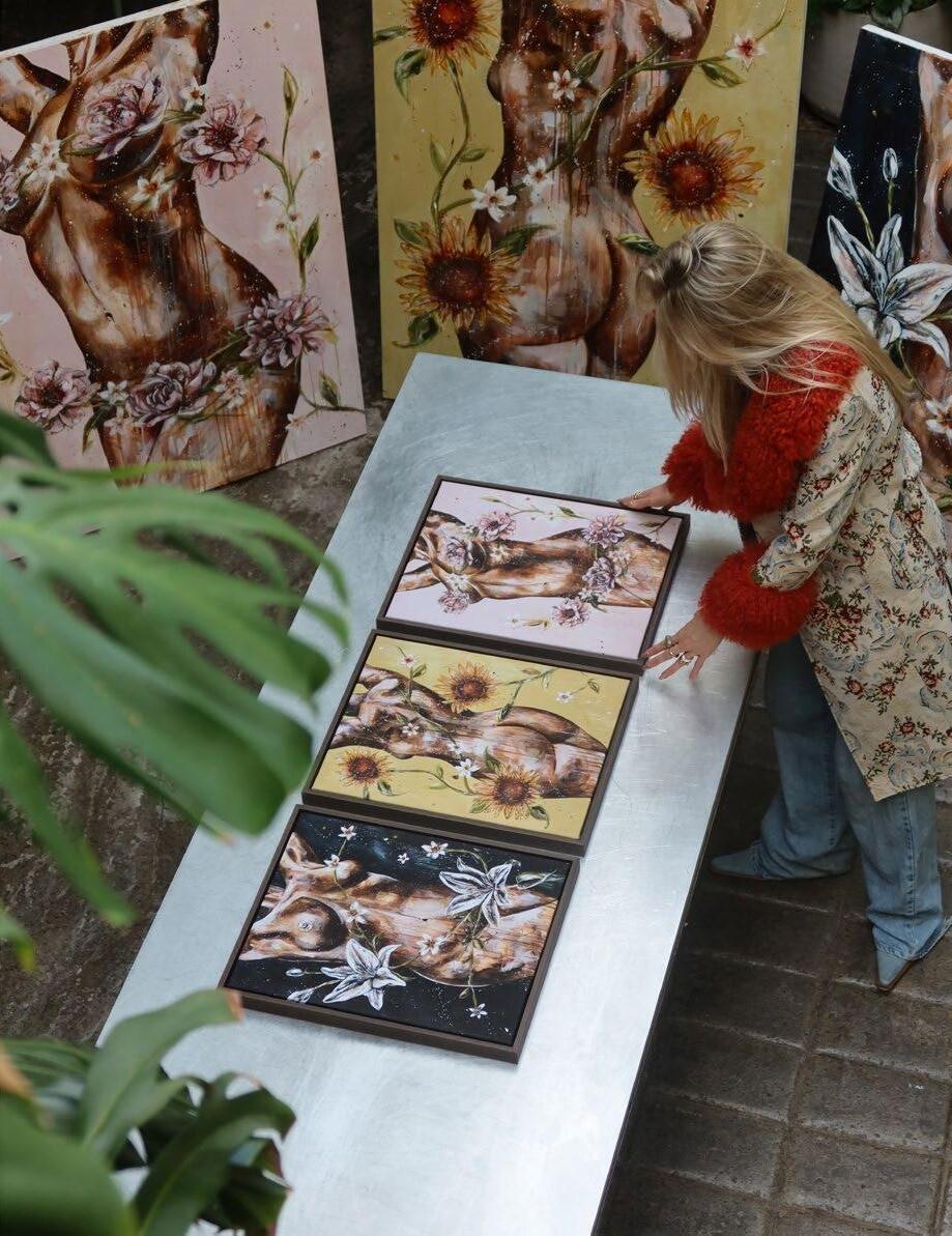
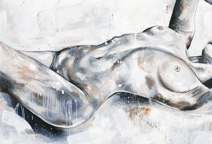
in and laugh at my work. On this occasion the mum said that she wanted to ‘desexualise the female form for her son’. This surprised me because it’s never been for men actually. My work is about female empowerment and for the female gaze. I thought it was an interesting perspective to see a mother buy something to educate her son about the power of the female form in a non-sexual way. It’s funny how the female form is such taboo, but when you put it out there in the world it can solve the relationship that people have with themselves.
Q: What do you believe the next generation of artists will need to unlearn about how the art world works?
A: I think artists have the power right now, more than any other time in history. We have access to our clients directly. I’ve never navigated the art world. I’ve made this little universe for myself where I have the internet, and the art world never accepted me or served me. I enjoyed creating and making and didn’t need to move in those circles. I was one of the mentors for the King’s 35 Under 35 foundation, and I feel that these young artists need to learn that we have the power
now. You can formulate your own path to success without representation. I’d say we’re probably one of the top five most successful commercial artists in the UK and I know nothing about the art world. The power of an artist is to think about things differently. Lean into what makes you unique, and if that doesn’t fit into the art world then no worries! There’s other ways of going about it – I mean, I just got an interview with you guys, the tastemakers in art and culture!
Q: Your work often focuses on the female body — what does that subject mean to you personally?
A: I never had the best relationship with my body growing up. I started painting animals, then abstracts and it was all through a commercial lens which, as a business owner, I always had. About five years into being an artist I started painting nudes. I was at a stage in my career where I could take a risk and do something that could maybe make an impact. I remember when I was little I used to think ‘there’s no films that feature women with a flat chest’ or ‘magazines with bodies that look like mine’. If I would’ve seen a woman that looked like me in the media
it would’ve made such a difference. This cathartic process was the motivating factor for me. Overnight I had over one-thousand images of women being sent over with their individual stories.
Q: The glitter boobs have become almost symbolic of your movement — what do they represent for you personally and artistically?
A: That’s so funny that you’ve seen the glitter boob stuff! Looking back, it was a moment for me to reclaim that negative relationship I had with my body. As a business owner, it was getting likes and follows. It was a way of me using my body to push my art career (something for me to reflect on, as there are problems with that too). My friend was also a business owner and always tagged me in everything which I’ll never forget. It’s about women supporting women. She now owns REFY beauty and is the most successful person I know. Separate from body image, it was about support and uplifting your friends together.
“I think artists have the power right now, more than any other time in history. We have access to our clients directly.” more....
Q: Can you tell us a bit about the challenges and risks that you’ve experienced in this industry?
A: My biggest challenge is when I scaled back my operation. When I moved to Sydney we absolutely blew up, I’ve never seen demand like it and you think you’re invincible. I had a massive warehouse, a team of sixteen people, galleries, and yet in a way, I lost my love of art and it became a business. It was prolific. It felt like a factory. After Covid our demand dropped and I still had all this overhead. I realised I had to scale things back, including the gallery in London which no longer served me at that given time. The biggest challenge I had is now the thing I’m most proud of. It’s moving back to London, getting to the heart of what I was building, and back to the love of it. I’m now doing less work but better work. Being an artist and being in business are two things that almost contradict each other. Making artwork to ensure everyone gets paid is challenging. I questioned whether I was happy with this mass-production. Now I’m in a much better position. With the archive sale we made millions in just a few days. It gave me time to reassess everything and take a pause, and rather than taking and selling, it was about giving. An example of this is ‘Charity Shop Friday’.
Q: You’ve leveraged Instagram and TikTok in powerful ways — how do you see social media shaping the art world?
A: The biggest thing is your close relationship with customers. I’ve heard that with galleries there’s gatekeeping of access to clients, restrictions on what and how much you paint and so on. Social media demoncratises that access to the art world and to your clients. It’s all I’ve ever known and will do, but where I never used to be acknowledged by the art world, I’m now invited to events by galleries and auction houses. The King’s event with

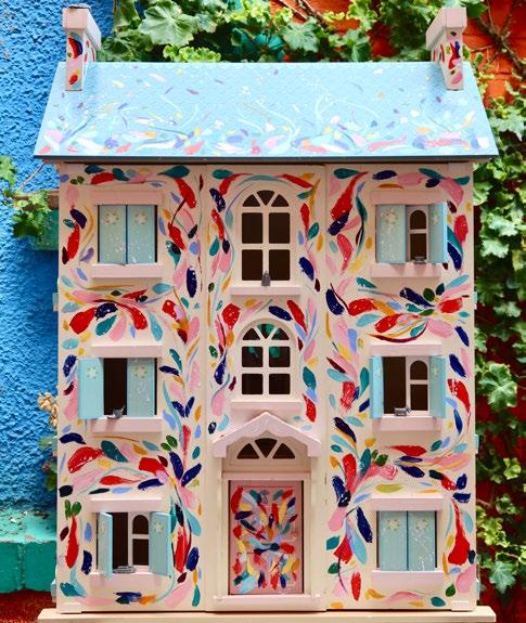
the Elephant Family charity wanted to auction off an egg. The person with the most money wins it, and I personally, want to leave behind the legacy of accessibility in the art world. You don’t need to be good at art to whack the paints out and gain happiness from creativity. Our ethos is the democratisation and accessibility of the art world. I represent this when I walk into these rooms. With the egg, I requested to put mine up for donation, and it made more money than all of the auctioned ones. When lots of people donate and get involved the impact is huge. This is a metaphor for what I’m trying to build in the art world. I want to redefine the elitism. Art in its most pure form is for everyone.
Q: How do you manage to separate your personal identity from your brand identity, or have they always been merged as one?
A: They’ve always merged. Me being my chaotic authentic self online performs well. Trying to be someone that you’re not online is exhausting. I don’t need to post the
polished content, and it works well. I have a great relationship with social media, and when you turn up authentically, people for the most part, are nice. Your art is what you are.
Q: Can you tell us a bit about any future projects you have on the horizon, and whether you’re looking to expand your brand globally?
A: I have a show at the Royal Albert Hall coming up at the end of the year. I’ve got a US move up my sleeve and would love to go to LA, and this September we have a show in New York.
By Phoebe Noble & Tamara Bell
Scan here to find out more about Sophie Tea
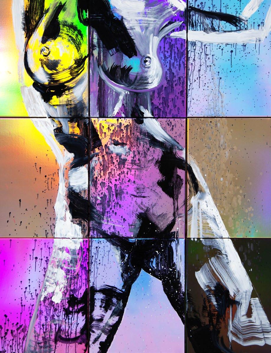
MULTI-STACKED NUDES
The sixteenth and seventeenth centuries were turbulent years for Europe, driven by religious wars and desires for continental domination. One nation that enjoyed a remarkable renaissance both politically and artistically in this early modern crucible was the Netherlands.
Subjugated to the hostile, Catholic Spanish crown for decades, the declaration of the Calvinist-Protestant Dutch Republic in 1588 prefigured the meteoric rise of the ‘Republiek’, which began to expand its influence globally through its seaborne trade routes and mercantile prowess. The period from 1588 to roughly 1672 has subsequently become popularly known as the Dutch Golden Age, a period in which Dutch culture, artists, explorers, colonists and traders were among the most pre-eminent in Europe.
The middle class that expanded during this period began to identify more consciously with a Dutch nation, inaugurating a fascination with quotidian depictions of Dutch life. Art began to become incrementally more accessible, expanding from the purview of the Church to private patrons keen to develop and exhibit their own collections. The ordinary became worthy subject matter, as Dutch society flourished and began to reap the rewards of overseas expansion.
Johannes Vermeer encapsulates the contemporary zeitgeist. His specialisation in depictions of interior domesticity was common for Dutch artists of the period, who often made a living focusing on one subject matter. The Milkmaid (c. 1658) is emblematic of this approach. In a simple pastoral scene, a milkmaid is depicted pouring milk into a container. A low light suffuses the painting, giving the woman and her surroundings a weight that lend the setting an air of mundanity. The maid herself is focused on her task, glancing downwards, lending it a reflective, almost voyeuristic quality:
the viewer is catching her in a thought unknowable to them. Many of Vermeer’s surviving paintings depict women in similar scenes of daily life.
Women in the Golden Age were not merely subjects, however. Judith Leyster was a
prominent Dutch painter of the era, an eighth child born to a clothmaker. One of the first paintings attributed to her, when she was 20, is TheJollyToper (1629) which depicts a popular comic character (Peeckelhaeringh) from seventeenth-century theatre. The jovial central figure leans backwards, ‘in media
res’, laughing as the show comes to an end. The influence of Caravaggio is evident, for whom half-length representations of raucous revellers set against a neutral background were a regular feature. This influence is similarly observable in her 1629 works Merry Trio and The Last Drop, which also depict scenes of cavalier carousing. Her selfportrait, completed around 1630, was wrongly attributed to Frans Hals (her teacher), and was only properly attributed in 1949. Indeed, most of her oeuvre was misattributed to Hals or her husband, the painter Jan Miense Molenaer. Her rediscovery in the twentieth century is a valuable recognition of the contribution of women as agents in the Dutch arts.
It would be remiss not to acknowledge the enduring influence of Rembrandt van Rijn, widely considered as one of the greatest visual artists in the Western world. Unlike many of his contemporaries, he produced a hugely diverse range of works. As a participant in contemporary Dutch life, he honed his craft in Leiden, sketching street life in the form of beggars and performers, women and children. His 1642 painting The Night Watch represents such a street scene, depicting a company of civic guards mustering. Commissioned for the Amsterdam
Arquebusiers guild hall, it is a masterpiece of energy, deploying light to shift focus and draws attention: the gesticulating captains, the urchin girl, the looming drummer, the confusion of banners and pikes. Twenty
years later, his 1662 work Syndics of the Drapers’ Guild demonstrates a continuing preoccupation with Dutch culture (alongside his myriad of historical, Biblical works). It depicts five men of the Amsterdam cloth guild inspecting cloth, staring forward with a cool self-assuredness at the importance of their role for the mercantile republic.
As with so many other disciplines, art is not immune to revisionism, particularly as it is inherently an interdisciplinary medium that draws from, and must be placed within, historical context. The term ‘Dutch Golden Age’ has courted its fair share of controversy, particularly as awareness has grown of the role played by slavery and colonialism in facilitating the material conditions for such prosperity. The Rijksmuseum in Amsterdam ceased using the term in 2019, in recognition of the ‘negative aspects’ of the period. This rebalancing provokes necessary debates over the reproductive relationship between art and depictions of the nation: what Johan Huizinga called an illusionary ‘aurea aetas, that mythological land of plenty’ that obscures as much as it reveals. Painting, sculpture, and architecture convey implicit meaning, often projecting images of the past that can represent both the realities of the everyday and the imagined grandeur of days gone by. Golden ages are often only labelled as such retrospectively.
By Francis Devincenzi
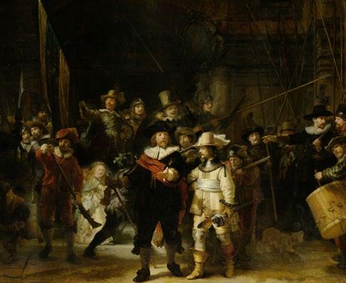
As a cultural movement that sought a radical renewal of thought, the Age of Enlightenment emerged from the late 17th century in Europe to the early 19th century. Supporting one’s freedom and use of reason against conditioning, superstition and prejudice, pioneering thinkers of the time saw the world as a place of oppression, in which false values were to be eradicated and replaced with the rational; an intellectual weapon.
The bourgeoisie ushered in this new approach to art, which was later to inform the building blocks of the French Revolution. In the famous words of the philosopher and art critic Denis Diderot, ‘to make virtue attractive and vice hateful: this is the purpose of any honest individual who takes into his hand a pen, a brush, or a chisel’. Playing a key role in the then modern world, art took stock of moral and civic values, prioritising use and function, in place of ornate and frivolous decoration. Theorists believed that art served as an important vehicle for transmitting values to socially educate the art-consuming public which was expanding into the middle classes. This era of knowledge and scientific discovery flourished among Europeans and Americans, thus changing the ways in which they viewed the world. European colonialism and the transatlantic slave trade were foundational during the Age of Enlightenment, and informed our understanding of the history of human cultural achievement from a predominantly European perspective.
A dialogue on the nature of divinity, reasoning and knowledge acquired through perception (the five senses) informed visual culture although mired in controversy. Famous literary works such as Diderot’s Encyclopédie (Diderot pictured) threatened governing
social classes, giving rise to secularism, freedom of thought, religious tolerance and the value of science and industry. Striving to give the people knowledge, the Encyclopédie gained widespread popularity much to the government’s displeasure, and was formally suppressed in 1759. Paving the way for political revolutions in undermining religious dogma and the authority of the monarchy, artists showcased this newfound awareness in their work.
An Experiment on a Bird in the Air Pump (1768) by Joseph Wright of Derby housed at the National Gallery in London was one of the most famous images to depict the scientific advancements of the Enlightenment. This candlelight scene by the accomplished portrait artist depicts a natural philosopher performing Robert Boyle’s air pump experiment amongst a group of onlookers. This Caravaggesque masterpiece is peppered with a variety of different reactions and expressions to include grief, disbelief, dismay and scientific curiosity which overcome concerns for the bird.
Boyle performed a number of wicked and cruel experiments on different animals, describing the reaction of a lark to be the following:
‘The bird for a while appear’d lively enough; but upon a greater exsuction of the air, she began manifestly to droop and appear sick, and very soon after was taken with as violent and irregular convulsions, as are wont to be observ’d in poultry, when their heads are wrung off: for the bird threw her self over and over two or three times, and dyed with her
breast upward, her head downwards, and her neck awry’.
Described as being ‘too shocking to every spectator who has the least degree of humanity’ by the astronomer James Ferguson, such themes were frequently explored by artists and caused a dichotomy between the marvels of the technological age becoming as awe-inspiring as traditional images of religious events.
Indeed, the Age of Enlightenment in art was a transformative period that bridged the gap between reason and creativity. This intellectual and forward-thinking movement emphasised clarity, order, and exploration. Artists of this era challenged traditional norms, embracing new techniques and ideas that laid the foundation for modern artistic movements that were soon to follow on and flourish in artistic circles. Their works not only reflected the philosophical ideals of the time but also shaped the cultural landscape for generations to come, ultimately allowing for humanity’s free will to flourish, and for mankind to question the limitations placed upon us by a morally corrupt society.
By Tamara Bell
“Enlightenment is man’s emergence from his self-imposed minority (so) dare to be wise! Have the courage to use your own understanding! This is the motto of the Enlightenment.”
Immanuel Kant, 1784


The Transcendental Club was an influential group, comprising of 19th-century writers, philosophers, and thinkers who sought to eclipse the limits of reason and materialism in favour of the spiritual and intuitive dimensions of human experience. Set up in 1936, the group’s most notable founders include Ralph Waldo Emerson and Henry David Thoreau; Margaret Fuller joined the following year, and in 1840 the group began to publish a journal, TheDial.
The Transcendentalists were not only united by a collective rejection of orthodoxy, the rationalism of the Enlightenment and industrialisation; they were also united by a desire to provide an American literature. While meaningful comparisons can be drawn between the Transcendentalists and the European tradition of Romanticism in literature, the Transcendentalists were post-independence thinkers, endeavouring to carve out their own, individual, paths. They wanted to, as Emerson claims, ‘have a poetry and philosophy of insight and not of tradition, and a religion by revelation to us, and not the history of theirs?’. The doctrine of the group would not only lay the groundwork for American literature but modern American philosophy: Thoreau’s principles of self-reliance in his well-known treatise, Walden are progenitors to American debates of interventionism or isolationism, and Emerson’s call on Americans to orate and muse upon the vast landscape of their country would mirror expansionist notions of Manifest Destiny. Transcendentalism shaped the American imagination, it refigured the language used to describe nature, subsequent literary portrayals of broad American borders, and, namely, how the landscape was presented in art.
Thomas Cole’s The Oxbow (1836), for example, divides a sweeping view of the Connecticut River Valley into two contrasting halves: the left side remains a dark, untamed
“Have a poetry and philosophy of insight and not of tradition, and a religion by revelation to us, and not the history of theirs?“
Ralph Waldo Emerson
wilderness with stormy skies whereas the right side depicts a bright, cultivated farmland. This juxtaposition invites viewers to consider the tension between nature and civilisation: the raw, unaltered natural world versus human intervention and settlement. The most interesting feature of this painting, however, lies in the fact that the river, running in-between both sides, forms a type of question mark. This reflects the Transcendental ideal of the open-landscape, of America as a question to be answered. It presents the wilderness as it does America’s literature at the time: as undiscovered and untrodden, waiting to be cultivated. Cole’s exclusion of the existence and cultures of Native American settlements is intentional here: Cole was deeply concerned about the environmental and spiritual costs of industrialisation and westward settlement. The neatly organised farmland reflects the
ideals of Manifest Destiny, the belief that it was divinely predetermined that Americans should expand across the continent and bring order to the wilderness.
Cole presents a multi-layered perspective on the American west. As well as expressing concern, Cole communicates the fleetingness of human efforts in the face of nature’s power. Cole’s inclusion of, what is widely believed to be, a small figure of himself painting amidst the wilderness provides another interpretation of the question central to his painting. This self-portrait reinforces his role as an observer and advocates for preserving nature’s beauty while acknowledging the inevitability of change. Moreover, Cole’s presentation of the grandeur of nature aligns with the Transcendentalist idea of the natural world as a source of divine truth, as sublime. In Walden, the sublimity of nature is presented as morally purifying, he claims ‘we need the tonic of wilderness […] We need to witness our own limits transgressed, and some life pasturing freely where we never wander’. Thoreau, like Cole, advocates for the exploration of nature to better the self, as opposed to the way in which pioneer’s attempted to place borders on the landscape. As such, Cole creates a visual dialogue about the transformation of American expansion and the ethical responsibilities that arise.
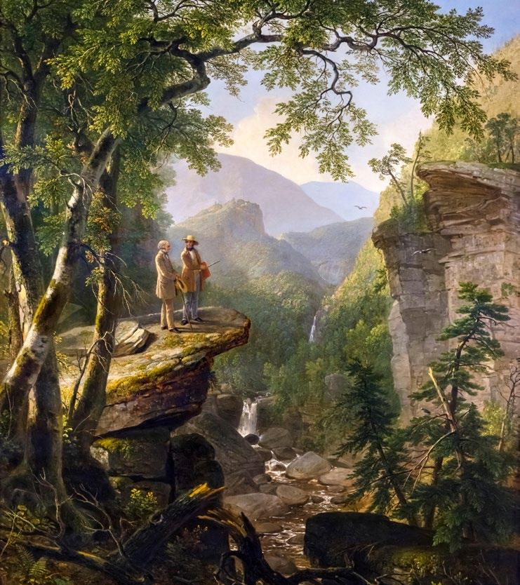
Asher B. Durand’s Kindred Spirits (1849) also celebrates the spiritual philosophies of Transcendentalism. The work places the poet, William Cullen Bryant, and the painter, Thomas Cole standing atop a rocky outcrop in the Catskill Mountains. The pair are surrounded by towering trees, a cascading waterfall and an impressive view of the valley below. The title itself refers to the shared reverence for nature and artistic expression between both artists, making it an explicit
reference to the transformative power of Transcendentalism on contemporary presentations of the American landscape. The soaring cliffs, flowing water and infinite skies of the painting capture the sense of awe that the landscape inspires: it emphasises the sublimity that was central to Transcendental thought. Durand painted Kindred Spirits after Cole’s death in 1848: it was written in memoriam and became an elegy for the American wilderness. In this way,
these paintings appear as dedicated poems to nature: their entwined Transcendental thought weaves together art and literature, the landscape and the imagination. They remain a powerful reminder of the enduring influence of the natural world in shaping human thought and experience.
By Sophie Macdonald
The enduring influence of the sea remains axiomatic in art. Seascapes have been used to reflect an array of emotions: feelings of existential solitude, the call of the unknown, and the passage of time have all been metaphorically buried within depictions of the sea. It has captivated the minds of artists for centuries — from the tempestuous waves of J.M.W. Turner to the serenity of Monet’s Water Lilies, water has long served as both muse and metaphor for artists.
For the Romantics, the sea was emblematic for sublimity. Whether the awe-inspiring terror of a storm or the quiet melancholy of an endless horizon, the Romantics treated the afflatus of the sea as a divine source. J.M.W Turner’s infamous, moody seascapes portray the sea as sublimely overwhelming. TheSlave Ship (1840), one of the most famous Romantic seascapes, presents a violent storm, swelling a ship carrying enslaved people. The first impression the piece evokes is that of a red sunset protruding over a stormy sea, however, on closer inspection, one can see a sinking ship and, in the right corner, a swarm of drowning slaves. Its swirling, passionate waves emphasise the chaotic power of nature as entwined with horror: it presents the sea as palimpsestic, holding within it the histories of human cruelty.
Casper David Friedrich’s The Monk by the Sea (1808-10) similarly presents a somewhat mercurial seascape, where its dark blue sea filters into the sky. When one looks closely, a single figure, who has turned away from the viewer, can be seen standing on a low dune. The viewer is presented as the same landscape as the monk, which is often interpreted as a profound reflection on the mystery of nature. The emptiness of the horizon, which is barely discernible in the distance, emphasises that which is unreachable — the sea is not only a physical element but a means to grapple with the questions asked by humans.
The Impressionists and Post-Impressionists also sought to capture the fleeting movement of light in the dynamic, transient nature of the sea. Famously, water was at the forefront of Claude Monet’s psyche: TheWater Lilies (1840-1926) symbolise his full retreat into nature and use water to communicate a sense of serenity. Monet was dedicated to depicting the ephemeral nature of the sea. His Impression, Sunrise (1872) portrays the sea as a reflective surface, as a canvas to experiment with the interplay of light and the atmosphere. His painting suggests that the sea acts in harmony with other natural elements, namely with the sun. Its light shines over the hazy sea and acts as a guide for those sailing along the coast. Monet renders the water itself into soft blues and greens, and allows his viewer to sense the water, rather than providing an accurate portrayal of the sea.
For the Impressionists, water was a feeling — they used colour to convey the breathtaking experience of seeing a vast seascape. Vincent van Gogh’s Seascape near Saintes-
AFTERNOON
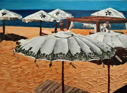
Maries (1888), for example, uses thick impasto brushstrokes to capture the movement of the sea in a Mediterranean fishing village and uses it as a backdrop for his own emotional experience. Rather than a calm image, the sea is turbulent and becomes a mirror for van Gogh’s own psychological troubles. Interestingly, the emotional intensity of van Gogh’s seascapes marked a shift in depictions of the sea and began to make room for its Modernist interpretations.
Edvard Munch’s The Storm (1893) took on this revision, and instead presents a haunting depiction of the sea, with ghostly figures situated on the shore. The sea becomes a metaphor for inner conflict and highlights the unpredictable forces of nature as reflective of the artist’s mental state. As a recurring motif in Munch’s work, the sea symbolises an overwhelming fear and anxiety, amplified by the raging storm. The Storm also has a restraining quality, it becomes a barrier that separates the figures from an escape and suggests that, for Munch, the sea also confines his personal conflicts and makes him feel powerless against its might.
Moreover, Georgia O’Keeffe’s Wave, Night (1928) portrays a stylised, breaking wave, in a way that is reminiscent of the impressions left by the sea on Virginia Woolf. O’Keeffe imbues the sea with a sense of introspective mystery and seeks to capture its symbolic resonance. Comparably, Woolf sees the sea as ‘dissolving her’, it ‘drums into [her] ears’ and the rolling waves ‘shoulder [her] under’.
Both O’Keeffe and Woolf make the sea enigmatic, as a force with the power to consume, and to which they surrender themselves.
Contemporary and abstract seascapes, on the other hand, saw a hyperreal turn. Gerhard Richter’s Seascape (1969) presents a notable example: his piece blurs the line between photography and painting. Unlike Turner’s turbulent storms or Friedrich’s melancholic solitude, Richter’s seascape is unnervingly serene and places the viewer in a state of quiet mediation as opposed to sublime terror. By doing so, Richter presents the sea, an ever-changing entity, as paradoxically frozen in time. His piece becomes a mediation on the instability of reality, emphasising the boundless nature of the sea as reflective of unpredictability.
One of our artists at Art Space, Jack Hernandez follows in this tradition with his striking, oil seascapes. Similarly to Richter’s serenity, Hernandez’s Afternoon (2023) places his viewer in a peaceful beach, peppered with sunbeds to encourage contemplative relaxation. His other composition, Beyond the Water (2024) allows the viewer to imagine, what he terms as the ‘peace of [his] mind’ through the kind of seascape that Friedrich’s monk was set to behold. Placed among the history of artistic seascapes, one can suggest that Hernandez’s works also become pieces of his mind – fragments of his imagination.
By Sophie Macdonald
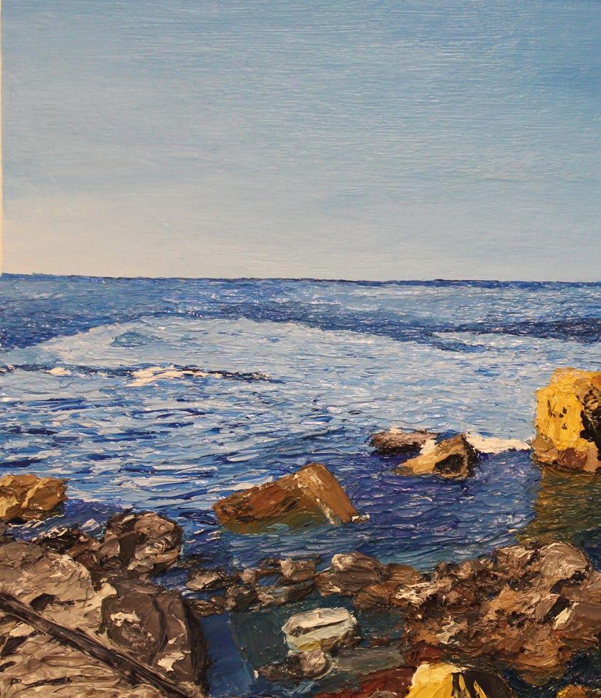
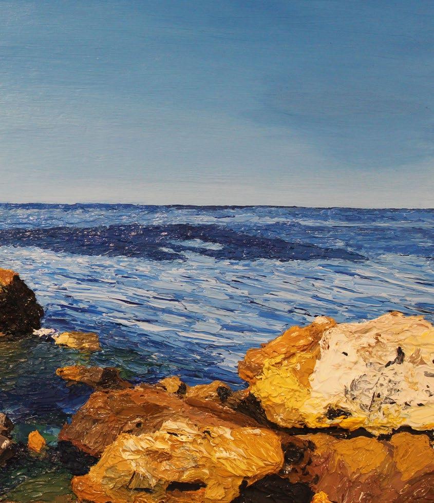
Modernism has been traced through a period of irrevocable and unimaginable change: from the late nineteenth century to the mid-twentieth century, Modernism, as a movement, reflected the historical moment in which it existed art was wrapped in a multitude of historical processes, from the progression of industrialisation to the horrors of fascism.
It sprung from a complete rejection of artistic history — it disavowed traditional forms in favour of abstraction and was hunted upon a desire to capture the true essence of shifting societies and identities. Modernist art provided a space for rebellion and reaction: it upended reality and suggested that realism was no longer sufficient to portray a war-torn, urbanising world. Modernism encompasses a vast array of, often contradictory, sub-movements like PostImpressionism, Fauvism, Cubism and Futurism. However, despite their differences, each is bound by the repudiation of what came before.
Modernist art endeavoured to provide a new way of seeing and did so by experimenting with light as a means to capture the emotional intensity of moments. The PostImpressionists, for example, were not simply concerned with capturing the Naturalistic, fleeting effects of light, but the symbolism of what it reflected. Perhaps the most famous example of this is van Gogh’s TheStarryNight (1889), which uses swirling brushstrokes and striking contrasts of yellow and blue to create a dream-like night sky, imbued with light from the stars and moon. Fauvism also sought to liberate colour from reality. Maurice
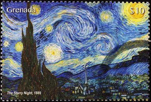
de Vlaminck’s The River Seine at Chatou (1906), for example, depicts the Parisian River with deep blues and fiery oranges, charging the scene with internal light and suggesting that the Seine holds within it the emotional projections of those that dream upon it. Cubists, like Picasso, also moved away from traditional depictions of light and shadow, instead using fragmentation and contrast to create a sense of complexity. Picasso’s Portrait of Ambroise Vollard (1910) shatters the persona into geometric forms, dispersing light unevenly across the canvas. This broken, disintegrated form of light scatters reflections in facets and creates a sense of unease and dynamism in the presentation of identity.
Futurism, on the other hand, used light to express feelings of chaos and exertions of power. During the 1930s, Italian Futurism became closely aligned with fascism, supporting Mussolini’s vision of a technologically advanced, militarised Italy. Futurism’s blinding contrasts and radiating beams, such as those in Tullio Crali’s Nose Dive on the City (1939) communicates a sense of speed and presents aerial warfare as a Futurist ideal. Futurism was one of the most extreme examples of Modernism’s impulse to break with traditional conventions. It openly attacked the past and rejected Renaissance ideals; Marinetti’s Manifesto of Futurism (1909) called for the destruction of museums, libraries, and history itself. The broadness of Modernism as a movement
meant its rejection of tradition ended itself to co-option by various political groups. While Futurism sought to reflect authoritarianism, other Modernist movements, like Cubism, emphasised emotional and psychological journeys, instead using their departure from traditional forms to critique the rise of extremism and the existence of war. While it is troubling to think that Modernism’s rejection of authority could give way to fascist depictions, Futurism became just one example of how Modernism, as a movement, mirrored the political world in which it existed.
The cultural effects of Modernist art also seeped into the world of literature and created a concomitant movement in the literary world. One of the best examples of this interaction is an emotional one, through the friendship between Gertrude Stein and Pablo Picasso. Stein is remembered as a progenitor of literary Modernism, and a central figure in the Parisian art world. While her experimental work was pronounced intelligible by her contemporary critics, it has since been recognised as indelibly Modern — as a source of inspiration for Modernist writers and artists alike. Her Paris salon at 27 rue de Fleurus became a meeting place for the ‘new moderns’, including Matisse, Gris, and, of course, Picasso. Her
theories also attracted the admiration of notable ‘Lost Generation’ writers, famously F. Scott Fitzgerald, Ernest Hemingway and Sherwood Anderson. They, she claimed, were working with her on a literary quest to produce an ‘exact description of inner and outer reality’. Stein’s theories closely related art and literature: what artists like Picasso were doing for the visual arts, she was attempting in her writing – she helped to shape a conscious break with the past.
In the early years of his career, Picasso painted a Portrait of Stein (1905-1906), one that, as she wrote in 1938, was ‘I, and it is the only reproduction of me which is always I, for me’. His portrait, which employed light in its Modernist sense, marked a transition from his Rose Period into his early experiments with Cubism, one which Stein helped to foster. Stein and Picasso influenced each other. In fact, she believed that Picasso’s artistic style was the only one able to fully capture her identity. To repay him, she wrote If I Told Him, A Completed PortraitofPicasso (1923) about him in return. Stein’s poem is incredibly Cubist in style: she uses abstracted, fragmented sentences that combine to form a whole image. Stein’s repetitive poem is indebted to Picasso: she wanted to achieve in literature what he did in art — he who did not simply see one feature of a person, but ‘whom one really is’. Both
Stein and Picasso underscored the true essence of the movement, as a constant search for new forms and a readiness to dispose of all that had gone before. Modernism was a movement that encouraged revolutionary artistic output, its disregard for tradition persuaded artists to imagine new ways of reflecting tumultuous periods of political change.
By Sophie Macdonald

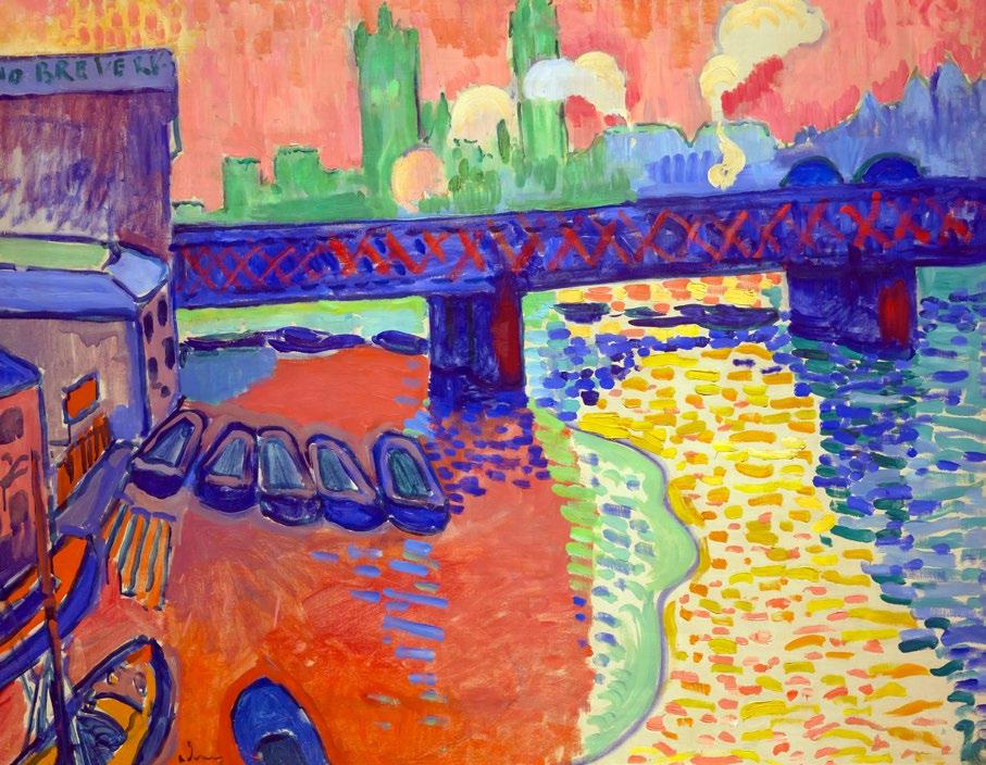
“How do you see these trees? They are yellow. So, put in yellow; this shadow, rather blue, paint it with pure ultramarine; these red leaves? Put in vermilion.” Gaugin
Fauvism emerged as a short-lived French movement at the beginning of the 20th century, lasting from 1905-1908. It embraced the style of Les Fauves, known as the ‘wild beasts’, who emphasised striking colour over realism. While Fauvism retained the representational nature of Impressionism, the subjects of their works were depicted in a rather Modernist style, which indulged in a deliberate simplification and abstraction.
This fleeting movement left a significant mark on our conceptualisations of Modernism and captivated the attentions of notable artists like Henri Matisse and André Derainit radicalised the way Modernists saw emotional expression through colour.
The movement’s name was coined by Louis Vauxcelles, who remarked, after seeing a Quattrocento-style sculpture displayed in the same room as Matisse, that it was like beholding ‘Donatello among wild beasts’. The story of Fauvism is full of serendipitous happenings – its beginnings were spurred by a delayed train journey, where Derain and Vlaminck had to walk the remaining distance in 1900. Derain and Matisse also spent a summer together in Collioure, where they painted numerous works that would feature in the Autumn Salon of 1905. Fauvist paintings are also, to an extent, characterised by chance. Fauvists reflect, what they feel, is the true essence of light in their paintings: in 1888, Gauguin outlined the way he conceived of his art: ‘How do you see these trees? They are yellow. So, put in yellow; this shadow, rather blue, paint it with pure ultramarine; these red leaves? Put in vermilion.’
Colour was chosen by contrasts. Fauvism disregarded the actual colours of a landscape. Instead it transformed the way artists perceived light – rather than shading, or using perspective to create depth, Fauvists relied on strong, differing hues to demonstrate a new way of seeing the world. Instead of using natural skin tones, for example, Matisse’s Woman with a Hat (1905) portrayed his wife, Amélie, in a riot of bold, unblended colours. Matisse applied electrifying greens, blues and reds. Matisse’s The Green Stripe (1905) is also one of the most infamous examples of Fauvist portraiture – this time, he presents his wife with a bright green line running down the centre of her face. This unexpected choice was meant to be divisive; he was experimenting with how colours could define form and accentuate emotional impact – Matisse
shocked audiences who were accustomed to the more delicate tones of Impressionism. Derain’s Charing Cross Bridge series (19061907) exemplifies this approach. Derain’s series presents as a bold contrast to Monet’s Charing Cross Bridge, which mystically portrays the bridge as buried beneath London’s smog. Derain instead paints the bridge and river in commanding shades of orange, pink and blues. The result saw a dream-like, almost surreal, depiction of the city, which felt more like an emotional response on a canvas than a realistic reflection of the scene. Maurice de Vlaminck took this use of colour and redefined it –he layered colours like a poet layering emotions into verse: intensely and without hesitation. In works like The River Seine at Chatou (1906), he used bright reds and yellows for water, deep blues and purples for trees, and swirling brushstrokes to convey movement. De Vlamnick’s piece is almost hallucinatory: his striking colours and circular perspective makes it as though one is seeing his painting through a looking-glass, tinted with multi-coloured lenses.
Interestingly, some of the Fauvists were also among the first of the avant-garde artists to study African and Oceanic art, as well as other forms of non-Western artistic expression. Matisse’s Blue Nude (Souvenir of Biskra) (1907) reflects its influence with a simplified figure. The painting presents a reclining nude woman, with her body contorted in a way that feels both fluid and sculptural. The influence of African sculpture is evident here in the exaggerated proportions and angular features of the woman’s body and reflects Matisse’s fascination with bold and minimalist forms. The carved-nature of the woman’s body also speaks to the Fauvist preoccupation with contrast – the harsh lines that separate the woman’s limbs mirrors Matisse’s The Green Stripe. Derain and de Vlaminck also collected African sculptures and integrated their bold forms into their paintings.
This fascination with non-Western art, as well as Fauvism’s desire to use contrasting colours to capture the essence of scenes, would pave the way for the Cubist style – particularly the work of Pablo Picasso, who was friends with the Fauvists and shared their eagerness to break free from traditional artistic conventions. The Fauvists subordinated everything to the interplay of colour. They also forged the path for abstraction, an artistic style that defined Modernism. Matisse continued to experiment with colour throughout his career. His later works, such as the Cut-Outs series (1940s), retained the Fauvist use of unrestrained colour while using cut-out shapes of brightly coloured paper as his medium. Traces of Fauvism can also be found in contemporary artworks: the works of Marc Chagall and David Hockney, for instance, share Matisse’s strong, stylistic use of bold colours to convey emotional intensity. Fauvism continues to present itself as a ‘wild beast’, one whose use of colours cannot be tamed by singular artistic movements.
By Sophie Macdonald
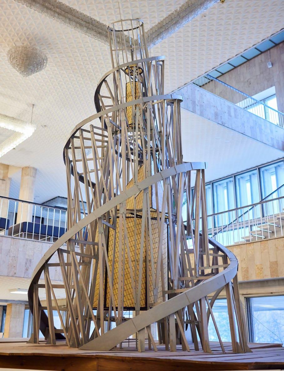
In Vladimir Tatlin’s eponymous Tower (1919), he presents a design at the pinnacle of the Constructivist movement. Radically tilted and precariously balanced, the structurally courageous concept is a machine-like vision of architecture, driven by the industrial ambition of the Russian avant-garde.
Tatlin was one of three key players who founded the Constructivist art and design movement in the early twentieth century. The two others–art theorist and designer Aleksei Gan, and artist and graphic designer Alexander Rodchenko–produced their own pivotal works which were not only iconographically significant but also fuelled the switch from art for art’s sake to art for practicality’s sake. The term Constructivism was thus derived from the notion of literally constructing something: in essence, art was not necessarily to be made, it was to be built.
In post-revolutionary Russia, Constructivism became a tool of governance in the newly emerging Communist landscape. The Bolshevik Revolution, and the subsequent establishment of the Soviet Union in 1922, turned Russia on its axis, establishing new leaders and the New Economic Policy driving market-oriented reforms. The mindset was to harness art as a tool for transformation over ornamentation. Art was subsequently used in enterprise and designed to be received by mass audiences. Constructivist aesthetics spilled over into graphic design, appearing in posters with bold type and starkly geometric compositions designed for legibility, not imagination. Rodchenko’s 1924 Books(Please!)InAllBranchesofKnowledge features a black and white image of a woman calling out, with her hand next to her cheek, and text emerging from her mouth in the shape of a megaphone. The bandana on her head screams ‘revolutionary’, like an Eastern European Rosie the Riveter, and the puzzle of red and black shapes filling the poster are like a communist cage around both her identity and her exclamation. Constructivist material culture as seen in these posters was directive, efficient, and reproducible. Form always followed function: the ‘imagery’
of the object, as it were, took a backseat to its utility. In most cases of Constructivist art, that utility was propaganda.
Amongst artistic production of the time, the Tower was peak propaganda and had an important intended function. It was to be built in the port city of St. Petersburg as the headquarters for the Comintern, a world organisation of communist parties aiming to be unified under Marxist-Leninist ideologies. The Comintern would be the pulsing, breathing organ of revolutionary struggle. It needed a home base with sturdy walls and spatial authority. But that home was never built. Instead, the Tower designs became a revolutionary symbol, an x-ray glimpse into the machinist minds of communist leaders, an edifice of hardness and modernity made of steel, iron, and glass, cutting sharply into its surrounding space. It was a warped response to the Eiffel Tower, resisting vertical symmetry while still reaching upwards in a double helix of Communist DNA. The surviving sketches evoke motion, transparency, and a utilitarianism that makes the building feel functional and purposeful despite its audacious anatomy. Tatlin was adhering to the Constructivist belief in ‘material truth’: he demonstrated materials in use and towards an end goal, challenging the elusive abstraction previously steering the avant-garde. And, of course, the French parallels continued in the billowing flag drawn in at the top of the tower, a replica of the one in the hands of Delacroix’s Lady LibertyLeadingthePeople
In contrast to other modern movements, Constructivism wasn’t introspective. It didn’t aim to be reflective about its own identity, or its weaknesses, or its contradictions, or even the nuances of what ‘progress’ in art really
meant. It was outwardly social, structural, and instructive. There was something to be said for the practicality of creating things. Changes in art went beyond aesthetics alone, and entailed new mediums, techniques, and skills to emphasise process over product. Instead of taking a brush to a canvas, the artist took a compass to a drafting sheet. The Impressionist obsession with capturing ephemeral nature ‘en plein-air’ was replaced with practical ideas, washes of solid colour imprisoned in angular compositions defined by communist rhetoric. The artist was no longer a dreamer, wistfully thinking and translating, but was now an artist-engineer, putting pen to paper and building something unambiguous in its interpretation. The modernist drive to abolish traditional representation was a point of leverage for the Constructivists, who, if nothing else, authored a guide to a radical future.
The Tower, then, wasn’t just a monument. It was its own manifesto. An emblem of dynamism and imminent change, it proposed a new way to live, to work, to organise society. Now it stands on paper, as an abandoned icon of communist potential. By the mid to late 1920s, Constructivism was in decline due to an increased hostility on the part of the Bolshevik regime towards avant-garde art. However, its legacy was continued as it was brought out to the West by artists like Naum Gabo and Antoine Pevsner. Along with the Dutch De Stijl movement, Constructivism was a key component in the formation of the Bauhaus. Still, Tatlin’s design endures. Its ghost hovers in art historical consciousness as an emblem of defiant optimism and a symbol of what Soviet art was rushing toward before the tides turned.
By Sophia Jactel
A name perhaps unfamiliar to the Western ear, Ljuba Popović’s dream-etched brushstrokes are the heart of the Serbian surrealist movement. They layer and swirl with the pulse of a movement unfolding in real time. Born in Tuzla (now part of modern-day Bosnia and Herzegovina) in 1934, Popović studied painting in Belgrade before moving to Paris in the 1960s.
Although filled with ideas and images, Popović did not seek to imitate the artistic throngs of the French capital. His imagination extended beyond this, to a mythical homeland of Orthodox icons, village rituals, and childhood visions shaped by esoteric folklore and a deep devotion to his native soil. What sets Popović apart from his European peers is the deep pull of myth and ritual running through his work. Popović’s work harkened back to something older and less tangible, drawing on church mosaics, mythic creatures, and the symbols of his own inner world. With each image, he painted with a kind of urgency which refused the rigid intellectual and cosmopolitan boundaries set by ‘true’ surrealists.
At first glance, Serbian surrealist images often reveal bodies, but they slowly unravel to become surfaces of light and flesh. These figures twist and transform, clinging to the edges of the canvas and then slowly drifting out of view, fragmented and dreamlike. These kinds of images were central to the Mediala group, founded by Popović in Belgrade, 1960. Like the contorted figures in Popović’s work, the Mediala group remained at the edge of Belgrade and Paris, never fully settling in one place.
To shape their shared approach, the Mediala group drew together five guiding ideas, uniting emotions like fear and longing whose meanings might not appear similar on the surface. The fusion of opposites was
integral to the Mediala group’s beliefs where classical painting techniques were united with futuristic outlooks inspired by science fiction. Beauty and horror aligned to reflect the complexity of human life as the group saw it. This lead to a return to storytelling in painting, guided by a belief in art’s spiritual weight and its power to endure.
In Popović’s work, bodies stretch like the elongated rising structures of postwar Yugoslavia with their veins threading through their appearance. His bodies united the domestic and the grand-standing structures of his home, as he painted their eyes to gaze through layers of skin or smoke. His paintings resist fixed meaning, shifting across time and place with images that hover just beyond recognition. Nowhere is this better seen than in his depiction of female forms, rather than being reduced to decoration, they injected energy and purpose into his work. In other words, they were central to the rituals of Serbian surrealism in carrying its ideology.
In his native country, his exhibitions drew attention for their bold and unrepeatable style. The Serbian surrealists looked inwards, forging their own path with a quiet defiance that valued intuition over alignment. The Mediala group thrived on this sense of freedom to look inward and to take symbolism seriously in their desire to resist simplification of their images. This
influence spread during the 1970s and 1980s across the region. Artists like Olja Ivanjicki and Vladimir Veličković developed work with similar intensity. Connected not by similar forms, but by a similar depth of ideas and engagement with the potentials of Serbian surrealist ideas. They offer a vision of Serbia shaped by brushstroke and memory, rooted in the people who lived its stories.
As Serbia moved through periods of tension and fracture, surrealist painted expression became a universal language to communicate this collapse. Artists could face the harsh reality of losing their nation as they knew it without retreating into disorientation. Surrealism and its mythical symbols united the body and the spirit to form a new kind of national identity rooted in the visual image. Popović’s influence runs through the fabric of Serbian contemporary art. One even sees Popović’s contorted bodies in Marina Abramovic’s boundary-pushing performance art. But unlike Abramovic whose body is the artwork, the work of Serbian surrealists remains on walls across Europe. These images speak in symbols, tracing stories too dense or personal for language, and ask viewers to direct their attention to what can only be expressed by paint and entangled bodies.
To stand in front of a Serbian surrealist painting is to feel this same pull into a world of the past that is still incredibly rooted in the
“His paintings resist fixed meaning, shifting across time and place with images that hover just beyond recognition.”
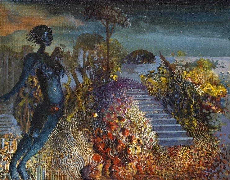
present. Its intensity is the same as looking upon more contemporary interpretations of Serbian identity, as conveyed by artists like Abramovic. But this intensity rather than overwhelming the viewer, settles the viewer into this mythic story, with every figure and every shadowed curve holding something unsaid. Popović painted the world as he felt it, and it is the importance of feeling which moves through the colours and swirls of his work which unfold in front of the viewer, beckoning them in.
By Vuk Winrow
Kinetic art is an art form that incorporates movement as a fundamental aspect of its expression. Like a phoenix rising from the ashes, kinetic art emerged after the first world war as a radical reimagining of the static traditions that had previously dominated centuries of artistic expression.
Its challenge, then, was not only to encompass the societal changes prevalent in a post-war society, but also to subvert conventional artistic forms through its incorporation of dynamic components: mechanically driven elements, such as gears, motors, and propellers, or naturally powered movement, including wind, water, and viewer interaction. Thus, Kinetic art became a genre of art that transcended the boundaries between sculpture, physics and the observer. It allows us to explore the possibilities of movement, time, space, and to reflect on the emergence of technology in the modern world. Today, it stands at
another threshold — as artificial intelligence infiltrates the art world and, consequently, our future — Is kinetic art moving in the right direction?
Naum Gabo
Russian sculptor and kinetic art’s founding figure, Naum Gabo (1890-1977) introduced motion as an integral component in his art. Gabo incorporated principles from engineering and architecture, using his sculptures to demonstrate new concepts of science and technology. His most influential work, The Standing Wave (1920), featured a simple steel rod vibrating rapidly via a
concealed motor to create the illusion of a three-dimensional form. Gabo’s Standing Wave represented a profound shift: that sculpture was not simply a static shape, but an event unfolding in time. Now he stands at the forefront of the whole artistic tradition, having set this twentieth-century artistic movement in motion.
Alexander Calder
American sculptor Alexander Calder (18981976) propelled kinetic art into the public imagination with his invention of the Mobile in the 1930s. Calder was the first to use wire to create three-dimensional line ‘drawings’

of inanimate objects and people, introducing line into sculpture as an artistic element to provide animating qualities to figures. His seminal work, Lobster Trap and Fishtail (1939), which is still on display at the Museum of Modern Art (MoMA), merged engineering and artistry as it suspended sculpture into the air; pivoting central frames of skeletal support wires with metal discs and fins attached at their ends, composing a Y-shaped mobile of different levels, with each constituent swirling and swaying in relation to each other. Calder’s playful and unpredictable sculptures invited viewers to experience art not as an object, but as a dynamic phenomenon.
Jean Tinguely
Swiss artist Jean Tinguely (1925-1991) pushed kinetic art into an entirely new direction: one of chaos and self-destruction. Tinguely began his career by creating assemblages composed of found objects, such as armchairs, scrap metal, and other items that may have been considered junk, to create sculptural contraptions that satirised industrialisation and directly confronted society’s increasing demand for automation, consumption, and speed. Best known for his Homage to New York (1960), Tinguely forged a 27-foot-high assemblage of bicycle wheels, motors, a piano, an enamelled bathtub, and other emblems of industrial modernism, which was built to self-destruct before an audience at the MoMA in just thirty minutes. For Tinguely, kinetic art was not just about motion, it was about the failure, unpredictability, and impermanence of machines and society’s rapid industrialisation; his art sought to liberate viewers from static compositions and evoke an interactive relationship between the spectator and the object.
Rebecca Horn
German artist Rebecca Horn (1944-2024) sought to expand the metaphorical and emotional range of kinetic art in the 1970s and beyond. Horn’s sculptures and installations involve delicate, dreamlike movements that explore the boundaries between the female body, machine, and environment. Replacing bodily parts with mechanical components, her work speaks to the spiritual and thematic logic that art is autonomous and has a life of its own. One of her most iconic works, The Feathered Prison Fan (1978), features mechanised feathers, shaped like a nautilus shell, that gently open and close like breathing wings over a woman’s body, merging mechanical motion with the vulnerability of organic life, much like Botticelli’s Venus Alongside the aforementioned kinetic artists,
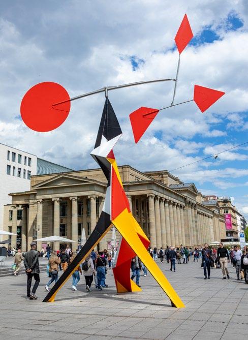
Horn’s work stands apart for its haunting intimacy; her machines do not just move, but also express longing and transformation. In many ways, Horn’s contributions to the genre have created a bridge between kinetic art’s mechanical roots and the psychological, emotional senses.
Throughout the late twentieth-century, kinetic art expanded beyond motors as artists began to integrate light, sound, and later digital technologies. Works became increasingly interactive, with many of them often requiring viewer participation as part of the art itself. Thus, the line between the artist, artwork, and audience was blurred, echoing kinetic art’s core principle: that art is a living, moving experience.
Whether it is art which imitates life, or merely life which imitates art, these prominent artists’ works are emblems which reflect the multitude of societal changes evident in their times. Today, the arrival of artificial intelligence presents kinetic art with new possibilities and challenges. Could we begin to see sculptures that could evolve and interpret data to create artist-audience-art interactions without direct human control? Will AI-driven kinetic art lose the human touch that artists like Tinguely and Horn embedded into their work? As kinetic art leaps into this new venture, the dynamic and innovative spirit of the artistic movement should remain central to its core to ensure it does not take a step in the wrong direction.
By Evelyn Heis
Emerging from 1960s America, Minimalist art is typified as an extreme form of abstraction comprising of geometric shapes, and the dissemination of an anti-elitist creative culture. Closely linked to Conceptual art, Minimalism was a movement that began to shy away from gestural expression in favour of order, harmony and simplicity.
This aesthetically purified form of beauty rendered objects as artworks for no other reason than to showcase them for what they were and reduce them to their raw beginnings. Whether it be a geometric cube placed on the gallery floor or a black-washed canvas devoid of intricate detail, Minimalism glorified essential structures, factory production techniques and stark, conspicuous blatancy.
Stripped to its essentials, the post-war era very much informed the Minimalist movement spanning the entirety of the creative fields. From music and literature to the visual arts, the movement’s objectives were to redact all conventional characterisations of art in order to remove mediation between artist and artwork when viewed by the gallery-goer.
Informed by repetition and gradual variation, subjective and gestural components were purposefully eliminated, thus provoking much chatter and controversy in Abstract Expressionist artistic circles.
Some of the most renowned pioneers of Minimalism include artists like Carl Andre, Robert Morris, Sol LeWitt, Dan Flavin and Donald Judd to name a few. Venturing into the realms of Minimalist art produced by such artistic icons, below lies further information on some of the most prominent pieces that shaped the cultural climate…
GreensCrossingGreens(ToPiet MondrianWhoLackedGreen)
Dan Flavin (1966)
Minimalist artists considered the viewer’s experience towards the gallery surroundings in their work. This relationship to the environment which informed their oeuvre, was brought to light in Flavin’s Greens Crossing Greens. Here the artist created an installation which prohibited movement around the gallery by creating barriers of green, fluorescent lights. He also paid homage to the famous artist Piet Mondrian and the Neo-Plasticist Movement through the title of the artwork. The fluorescent beams resemble a ladder of sorts, and the black geometric lines of Mondrian’s primarycoloured canvases.
Dan Flavin (1966-69)
As an admirer of the Constructivist artist Vladimir Tatlin, Dan Flavin gained much inspiration from his portfolio to create his Monument for V. Tatlin artwork. This smallscale artwork was created as an ironic tribute to a piece of Tatlin’s intended to be taller than the Eiffel Tower itself. Constructed from identical and unconventional materials consisting of prefabricated fluorescent tubing, Flavin arranged these elements in a strict vertical pattern to depict a sterile futuristic piece adhering to the components of the Minimalist movement.
Carl Andre (1969)
Rendered through the repetition of steel and zinc plates, Andre formulated an interactive chessboard pattern in the Minimalist style for viewers at the Tate to walk on. Considered to be an ‘environment’ or installation, Andre subverted the traditional relationship between viewer and sculpture in this silent invitation to question the rules and regulations that typically shape one’s interaction with art. Entering the realms of political commentary, Andre also explored the social ‘games’ implemented by society in his austere work.
In his essay titled Specific Objects (1965), Donald Judd wrote that ‘it isn’t necessary for a work to have a lot of things to look at, to compare, to analyse one by one, to contemplate. The thing as a whole, its quality as a whole, is what is interesting… shape, image, colour and surface are single and not partial and scattered. There aren’t any neutral or moderate areas or parts, any connections or transitional areas’. The artist Donald Judd was renowned for creating a series of monochrome metal boxes, prefabricated to have a perfect metal finish devoid of individual peculiarities and stacked on gallery walls. These units were often labelled as ‘specific objects’ or ‘untitled objects’ in order to create separation from paintings and sculptures. Notorious for creating his own visual language that conformed to pareddown Minimalist ideology, Judd’s work is emblematic of Robert Morris’ claim where ‘simplicity of space, does not necessarily equate with simplicity of experience’. Giving rise to repetition of form, Judd’s boxes enables complex encounters for viewers encouraging a rich visitor experience in its contemplation of context.
By Tamara Bell
“What you see is what you see.”
Frank Stella
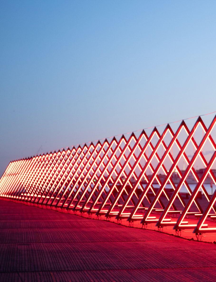
“
The main actor in the total installation, the main centre toward which everything is addressed, for which everything is intended, is the viewer.”
Ilya Kabakov
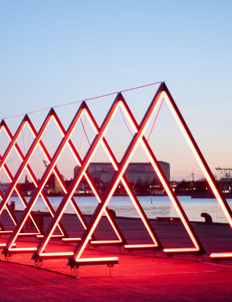
Installation art is often described as an ‘environment’, comprising of an entire room, or specific area, created to be engaged with by its audience. Moving beyond the frame, an installation can be categorised as a work of art with fluid boundaries. Whether indoor or outdoor, large or small in scale, an installation typically incorporates a wide variety of mediums as well as commonplace objects to create a unified experience. With the primary focus being the viewer’s experience and engagement with this ‘environment’, an installation carries conceptual connotations in its purpose for existence.
With artists such as Allan Kaprow pioneering this form of art in the 1950s, the artist explained that with his first ever installation piece he ‘simply filled the whole gallery up… When you opened the door you found yourself in the midst of an entire environment… The materials were varied: sheets of plastic, crumpled up cellophane, tangles of Scotch tape, sections of slashed and daubed enamel and pieces of coloured cloth… five tape machines spread around the space played electronic sounds which [he] had composed’.
Indeed, Installation and Conceptual art went hand in hand as from the 1990s. With the ‘crash’ of the art market in the late 1980s, this gave rise to a reawakening of interest in the concept behind the artwork. Art began to focus on the idea rather than the object, which was solely conducive to exacerbating a theme, story or thought-provoking message. Diving into the world of Installation art, some of the most notorious examples of conceptually-driven pieces are explored in this article…
Edward Kienholz (1964-65)
Illuminating the poignancy of time, Kienholz presents an unsettling installation with The Wait. Showcasing a limited gallery space with a household setting, what appears to allude to a seated elderly woman anticipating her eventual fate, is depicted as the main focal point of this ‘environment’. Accompanied by mementos symbolising the different stages of her life, the figure consisting of cow bones holds on to a taxidermy cat placed beneath a portrait of her presumed belated husband. While she awaits her imminent death, the chirping of a live parakeet in a nearby cage fills the space, and enhances the melancholy of the scene, juxtaposing life, colour and song with its bleak undertones.
Richard Wilson (1991)
The first time I saw this piece was in 2015 at the Saatchi Gallery in London, Chelsea. Being the last year 20:50 was on view for the public, Wilson’s artwork was one of the most surreal, unexpected and incredibly immersive experiences to engage with. Comprising of a room filled with what initially appeared to be an empty space with highly polished flooring reflecting the gallery architecture that surrounded it, we were asked by gallery staff to pretend we were gently blowing a daffodil’s petals to be dissipated by the wind. Much to our surprise, the expansive space that clinically absorbed its surroundings with its mirror-like effect began to ripple and was entirely flooded in thick recycled engine oil. Amplifying the disorienting and mesmerising experience of the space, 20:50 was a fusion of Op Art and Surrealism, creating an otherworldly environment to captivate and surprise the gallery-goer.
TheWorldinTwelveRooms Meschac Gaba (1997-2002)
Having created this particular installation over a period of five years, the Beninese artist Meschac Gaba worked on this colossal installation comprising of twelve rooms to include a library, music room, salon and humanist space, thus challenging traditional notions of what a museum/gallery should be. Not only does the artist place Africa at the heart of universal creation, but he also creates a universe of his own beyond the remits of globalisation.
Davide D’Elia (2013)
In a challenge against the vital force of nature, the Italian artist Davide D’Elia created a whimsical and surreal pastelhued Tiffany blue installation for the viewer to walk through. Immersing the viewer in the inexorable flow of time, D’Elia filled the space with nineteen blank canvases and a second-hand chair obtained from a street market. Covered midway with antifouling paint, D’Elia created an engulfing abyss that blocked the flow of time and any natural process to follow such as the growth of algae or mould. The resisting objects above the Tiffany blue colour were contrasted with their counterparts below the antifouling line traced by the artist in an exploration of time and decay akin to marine vessels.
By Tamara Bell
“The Italian artist Davide D’Elia created a whimsical and surreal pastel-hued Tiffany blue installation for the viewer to walk through.”


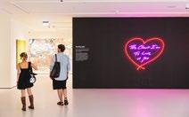
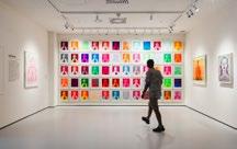

New to London, Moco Museum presents an incredible collection of large-scale original modern & contemporary artworks by some of the art world’s most celebrated creators.
Spread across three floors, this new flagship location by Marble Arch at the top of Hyde Park presents the perfect exhibition space for visitors to truly immerse, learn and experience the transformative power of art.
See works by Banksy, Basquiat, Warhol, Haring, Koons, Kusama, Hirst & many more.
Plan your visit today!
Pleased to welcome Liu Bolin to the Art & Culture Magazine, the renowned Chinese artist is greatly recognised for his skyrocketing media furore surrounding his Invisible Man series. Highly skilled in camouflaging himself into complex backgrounds by using body paint, the artist explores themes of identity, invisibility, and the relationship between the individual and society.
Through his unique blend of performance art, painting, and photography, Liu challenges societal norms and invites reflection on personal and cultural visibility. His innovative approach has earned him international recognition, making him a leading figure in contemporary art.
Q: Hello Liu! Thank you so much for joining me for this interview! I’ve been so excited to chat with you about your highly unique work and groundbreaking influence on the art world. To start off, can you please tell us a bit about yourself and your journey as an artist?
A: Of course! It all started when I was a student in middle school showing artistic talent. Subsequently, I gained admission to Shandong University of Arts, and during this period I became acquainted with various Western art movements and masterpieces created by renowned artists. The school library housed collections featuring works from masters such as Michelangelo, Leonardo da Vinci, Picasso, Van Gogh, Matisse, and so on. The allure of this art captivated me deeply and it was during this time that I solidified my aspiration to become an artist.
After graduating from university, my first position was as an instructor for foundational courses in the art department of a college. I began to explore art independently and later enrolled in the graduate program of the sculpture department at the Central Academy of Fine Arts. I recognised that art should not only inherit the evolution of artistic styles throughout history but also address the challenges posed by contemporary realities. As a result of these insights, I began actively conveying my sentiments about society through my work.
Q: What inspired you to create your Invisible Man series, and how did it evolve over time?
A: In 2001, the World Trade Center in New York was attacked by airplanes, marking the first significant entry of the term ‘terrorism’ into global consciousness. This
event profoundly shocked me and prompted deep reflections on life and death within the context of our world. With China’s successful bid for the 2008 Beijing Olympic Games, the country gradually emerged as a focal point on the global stage, leading to increased international interest in Chinese contemporary art. This burgeoning enthusiasm reignited my aspiration to become an artist, prompting my return to the Suojiacun International Art Camp in Beijing in 2005, bringing together over 140 artists from China and abroad.
However, like leaves caught in a winter breeze, the art district remained precarious; discussions regarding its potential demolition persisted since its inception. Ultimately, the government forcibly removed the Art Camp on November 16th in 2005, amidst global attention. Consequently, I initiated my first act of invisible protest on November 17th, the following day. This began my active engagement in invisibility as a form of dissent.
The artist’s disappearance on his initiative is used to question the whole event, and this work is used to appeal to society to pay attention to the living state of the artist. As time went by, my vision continued to expand, and my works have also undergone some
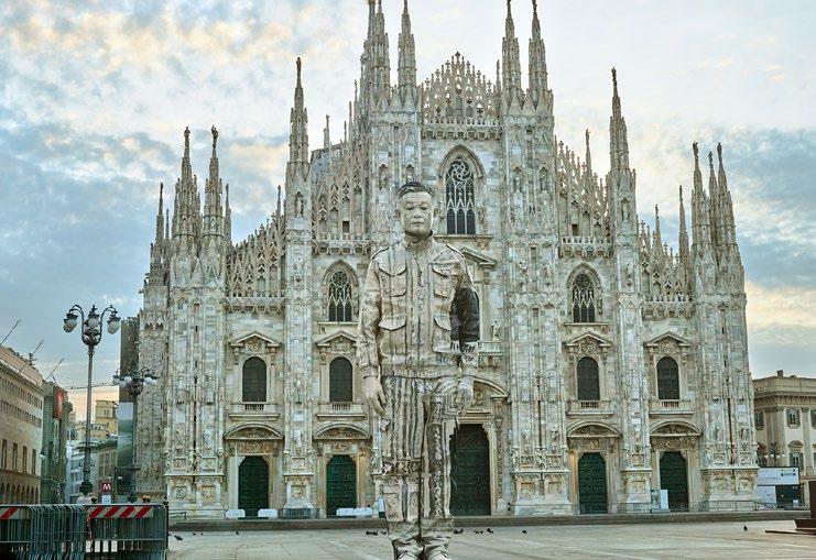
changes: first, I started to shoot works in different countries in 2009; in 2013, I invited more people to participate in my works, and this series is called Target; in 2015, I started to invite real hackers to download pictures from the European government website, hide myself in them, and then put them back on the website, this series is called Hacker Series. These new works have evolved slowly as my thinking about the world expands. The invisible method I insist on, and my questioning and thinking about society have not changed.
Q: How long does it take for you to complete one of your camouflage works? Could you walk us through the process and how you go about choosing a location/background for your camouflage pieces?
A: It takes time to create. If the background is simple, it takes 3 or 4 hours. If the background is complex, such as a supermarket, it takes at least 3 days due to colours and details.
As a result, if one does not pay close attention, my presence may go unnoticed.
When selecting the background, I typically opt for common scenes that frequently manifest throughout the evolution of society. This choice is informed by exploring cultures
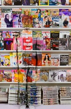
and the challenges encountered in human civilisation.
I consider my positioning and orientation in relation to the camera and then consider focal points for drawing attention, and strategies for accurately reflecting that obstructed colour onto my body more efficiently. I then assume the role of a model and stand in position.
Q: Are there any specific themes or messages you try to convey with these settings which you hope people will take away from your art when viewing it?
A: I have done Hiding in the City work worldwide for the past 20 years. I hide myself in different cultural backgrounds that reflect a series of unique contradictions in politics, culture, economy, social life, etc. I use my work to remind people to think about these problems and solve them head-on.
Q: What challenges do you face when blending yourself into such complex backgrounds? Are there moments when the
camouflage doesn’t quite work the way you envisioned it?
A: The biggest challenge has been recording the whole body participating in the work. Initially, I used the method of shooting video and time-lapse photography to record, but after trying, I finally decided to use stopmotion photography.
Q: How do you see the relationship between art and activism, particularly with your art often being interpreted as a commentary on societal and political issues?
A: As an artist, one must not only inherit the burdens of human history and the evolution of civilisation but also confront contemporary challenges. On the one hand, it entails embracing a convergence of artistic styles; on the other, it requires addressing real-world issues. My works are more like a mirror, reflecting on ourselves.
Q: What role does photography play in your work, and how do you approach working with photographers to capture your pieces?
A: I take photos myself and also ask my friends and photographers to take photos for me because in my work, I cannot be both the photographer and the photographed subject, so I need a photographer to help me, but I do set up the light, angle, position, aperture, and speed before the shutter is pressed.
Q: If you could collaborate on an artwork with any artist (past or present), who would it be and why?
A: If I had the opportunity to collaborate with an artist (past or present) it would be Michael Jackson. I liked his divine power on the stage.
Q: What are some of the most memorable projects you’ve worked on?
A: In June 2018, I completed a photo shoot in Pyongyang, North Korea. I am the first artist to do body art on the streets of Pyongyang and the only one so far, as this poses challenges due to the issues with cameras in Korea. Just when I was covered in colour and about to finish the shoot, a man in military uniform came over from a distance. My security guard picked up his leather bag and left while my assistant and I stayed there, not knowing what would happen next. Fortunately, the soldier was passing by and only glanced at us. Looking back now, I still feel a little shaken. For artists, it is always a
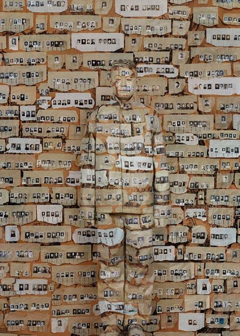
self-test: testing whether we really believe in art, and if we believe in it, we must go all out.
Q: Are there any particular projects or ideas that you are currently working on or that you’re excited to explore in the future?
A: The epidemic caused me to think about the earth, humankind’s fate and also changed my creative methods. During this period, I created some virtual paintings, oil paintings, and sculptures through 3D printing and scanning. In my opinion, artistic creation should be related to the times we live in and explore our current world. I hope that with
these new works people can think more about themselves, our technological prowess and the cognitive limitations we face as a population.
By Tamara Bell
The following article will discuss several works of art from Da Vinci, the significance of sketches such as the famed VitruvianManas well as his collective works of art which have influenced generations artistically, mathematically and philosophically.
Leonardo Da Vinci is a name synonymous with every contemporary artist today, his name is so interlinked with popular culture that much like the phrase ‘It’s a Picasso’, the name Da Vinci is a name that will be recognised in almost every part of the globe. It would be virtually impossible for me to discuss every detail of this man’s life as an artist and polymath, let alone critique the Mona Lisa (arguably the most famous painting in the world). Instead, I would like to discuss a little more about his sketches, the various anatomical studies which have become important points of contention surrounding the early Renaissance period, and the understanding of the human body past the religious, to a more biological and scientific approach.
Much like Darwin’s emphasis on searching for biological and scientific truths, Da Vinci’s life (outside of painting the Italian nobility) focused heavily on scientific research and anatomical study. While we can assume this is all an aid to getting a better understanding of the human condition and mastering technique, we would be naive in doing so. It is evident that Da Vinci had a passion for developing skill in a variety of practices and how these practices culminated together. Da Vinci is in fact regarded as not only a master painter but first and foremost a polymath, an individual whose knowledge and practice spans a variety of subjects, philosophically pondering the material in which he has just investigated and in Da Vinci’s case, taking a scientific approach to an artistic practice.
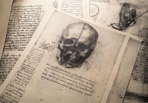
As the Renaissance period marked the transition from a more medieval way of thinking during the Middle Ages to a boom in all things architectural, philosophical, artistic and scientific, Da Vinci’s works of art focused
heavily on an understanding and observation of subject matter. His anatomical studies are by far some of the most detailed, as Da Vinci himself states:
“To obtain a true and perfect knowledge… I have dissected more than ten human bodies… As one single body would not last so long, since it was necessary to proceed with several bodies by degrees.“
Observation is clearly key for Da Vinci as good observation is good science. His understanding of the minute details of the human body and various animal anatomies have allowed him to create a pool of comparisons between species. How our bones work, how we move and function, the differences in how our bodies react under stress or tension, all to further his knowledge and understanding of our being. One amazing quote regarding this, emphasises the level of detail to which he aims to grasp with regards to human anatomy. He stated, ‘remember that to be certain of the point of origin of any muscle, you must pull the sinew from which the muscle springs in such a way as to see that muscle move’. This statement is a fantastic example of exercising the smallest of details. Furthermore, it is reminiscent of another practice commonly used during early sketches of dinosaurs or extinct animals. ‘Shrink wrapping’ is the term given in palaeontology and early paleo-theory to describe the portrayal of the skin and muscles of animals without the adorning of any feathers or unnecessary textures on the skin. The purpose of shrink wrapping is to assume or deduce a set of data on how a species functioned biologically. Early sketches of dinosaurs, chimps and other species of animals have a somewhat similar aesthetic to Da Vinci’s sketches of the human condition.
The Vitruvian Man is a great example of this. One of the most important sketches within Da Vinci’s repertoire, The Vitruvian Man depicts a nude individual whose arms and legs are stretched in two positions, centred
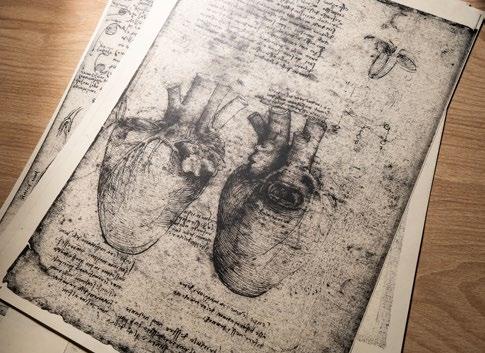
within a square and circle and adorned with text on both the upper and bottom parts of the paper. As explored in Issue 5 of the Art & Culture Magazine, The Vitruvian Man is Da Vinci’s representation of ideal body proportions, although some have theorised that his sketch is more akin to a representation of the ‘perfect male’, a sketch which details divine proportions and perfect symmetry. The lesser-known fact about the sketch is that it’s based on the writings of Vitruvius, a Roman architect and engineer who lived circa 70BC and whose manuscripts are considered the first volumes of architectural importance for the early
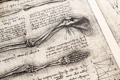
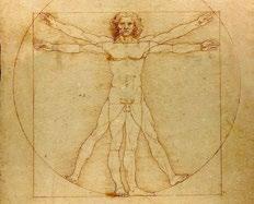
Renaissance period. We can see that Da Vinci’s sketch of The Vitruvian Man is as much a nod to architectural precision as is the human condition. In fact, Da Vinci was not even the first to interpret the words which lead to the Vitruvian sketch. Francesco Di Giorgio’s 1470 sketch focuses on an early interpretation of the writings from the Roman architect.
Da Vinci’s importance as an artist and polymath cannot be understated. Although he never obtained any scientific qualifications or attended university to study the sciences, his works have provided us with the value of observation and documentation. Da Vinci will always be remembered as the man who painted the Mona Lisa, yet his body of work, consisting of the various sketches and paintings of the human anatomy are arguably more important when looking at the scope of his artistic life.
By Francesco Scalici
When one thinks of Italy’s artistic heritage, names like Bernini immediately come to mind, a master whose towering achievements, such as St. Peter’s Basilica still leave an indelible mark on Rome’s landscape. The grandeur of the Baroque and the echoes of the Renaissance are familiar stories. But beyond these dazzling façades and celebrated masters lies a quieter narrative: the story of women artists who shaped Italy’s artistic landscape, often working in the shadows of their male contemporaries. Their names may be less well known, but their impact is no less vital.
Our journey begins in Rome, the pulsating heart of seventeenth-century art and architecture. Among the era’s monumental achievements, a remarkable figure emerges: Plautilla Bricci (1616–1705). In a world where architecture was an overwhelmingly male domain, Bricci carved out a rare space for herself. Plautilla Bricci (1616–1705) is a rare woman architect. Though her buildings no longer survive, her detailed drawings reveal a bold and visionary mind. At a time when most women were confined to painting or craft, Bricci crossed into architecture designing and even supervising construction.
Born into an artistic family, she trained under her father, Giovanni Bricci, a painter, poet, and polymath, who also introduced her to Rome’s cultural circles. Her mother, Chiara Recupiti, had ties to the Neapolitan court. Like Artemisia Gentileschi, whose father paved her path, Plautilla benefited from both training and crucial early connections.
Her earliest known work, a Madonna and Child (c. 1630s), is in Santa Maria in Monte Santo. Through her father’s connections and friendship with the influential Elpidio Benedetti, Plautilla secured two of her most significant commissions: Benedetti’s Villa outside the city walls and the Chapel of San Luigi in San Luigi dei Francesi. The Villa Benedetti, an ambitious project she led
between 1663 and 1668, was largely destroyed during the French siege of Rome in 1849.
Her final known commission in 1675 was a processional banner for the Oratory of St. John the Baptist in Poggio Mirteto, depicting the birth and beheading of the saint. Though her buildings are lost, Plautilla Bricci’s legacy endures in drawings, documents, and the quiet strength of a woman who forged a career as an architect in a male-dominated sphere.
Travelling north from Rome into Tuscany and Emilia, we encounter Sofonisba Anguissola (c.1532–1625), one of the most remarkable women artists of the Renaissance. Born into a noble family in Cremona, Anguissola was an artistic prodigy. Her father, Amilcare, a humanist with forward thinking views, ensured she received an education and artistic training, extraordinary for a woman at the time.
Her talent was recognised by Michelangelo, Vasari, and later Van Dyck. Anguissola became known for her emotionally subtle, psychologically rich portraits that stood apart from the more stylised conventions of the era. Rather than idealising her sitters, she sought to capture their inner lives with grace and restraint. She spent several years at the Spanish court of Philip II, initially as a
lady-in-waiting to Queen Elizabeth of Valois, whom she also taught to paint. After the queen’s death, she remained at court and continued her work, eventually receiving a royal pension.
Although she painted a few religious works, most of her surviving pieces are portraits, including at least sixteen self-portraits spanning her life. She executed more selfportraits than any other artist between Dürer and Rembrandt. One of my personal favourites is The Chess Game, a lively scene of her younger sisters playing chess, watched by an elderly maid. Vasari praised its realism and spirit, saying it lacked nothing ‘save speech’. The painting’s warmth and naturalism showcase everything that made Anguissola unique: her ability to bring stillness to life.
Despite the restrictions placed on women in her time, Anguissola carved out a long and successful career and earned lasting recognition for her work. As we encountered the melting point of Bologna, a vibrant intersection of intellectual, artistic, and spiritual traditions. Elisabetta Sirani (1638–1665) emerged as a luminous exemplar of the city’s cultural dynamism and founder of Europe’s first school for women artists. Sirani, in a career spanning little more than a decade, produced an astonishing body of
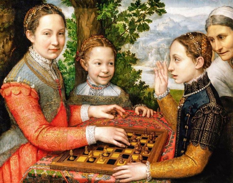
work: approximately 200 canvases (130 of which survive), 15 prints, and countless drawings and wash sketches.
Averaging nearly twenty paintings per year, she was celebrated not only for her prolific output but also, for her extraordinary speed of execution, repeatedly completing portrait busts in a single sitting.
From the refined courts of Tuscany, we moved on to Milan, where Fede Galizia (c.1578–c.1630) made her mark. Galizia was a remarkable artist. Trained by her father, she gained early praise for her portraits, altarpieces, and especially her still-life’s, everyday objects painted with incredible precision. However, Galizia’s oeuvre extends beyond still-life painting, as she also tackles dramatic and religious scenes. Her
work Judith with the Head of Holofernes exemplifies her ability to engage with complex narrative themes, demonstrating a sophisticated command of narrative intensity and emotional expression.
She likely died during the plague around 1630. This whistlestop tour touches on just a few remarkable women, there are many more whose stories remain to be told. Their legacies remind us that Italy’s artistic heritage is not solely built on its celebrated masters but also on women who worked with quiet determination, often forgotten by art history canon. Today, these female artists are being rediscovered, not in isolation, but as part of vibrant, interconnected communities of artists working across Italy.
By Kitty Perring
“These female artists are being rediscovered, not in isolation, but as part of vibrant, interconnected communities of artists working across Italy.”
One of the most ambiguous and alluring images known to many is the Girl with a Pearl Earring, painted by the Dutch Golden Age artist Johannes Vermeer in 1665. Replicated by many artists throughout the ages, and heavily embedded within contemporary pop culture, this soft portrait with a glazed stare arouses an unmatchable sense of calm intimacy, as we hold the gaze of this female protagonist.
The Girl with a Pearl Earring is a simple, yet highly personal and memorable portrait of a young woman whose identity remains in speculation. Set against what used to be a backdrop of deep enamel-like green, Vermeer depicts a youthful girl illuminated in view and bathed in a soft, glowing and highly flattering light. Her rounded facial
contours are rendered in idealised perfection as her Turkish-style turban falls down to her upper back in soft pastel tones of blue and yellow. Set in conjunction with its complementary counterpart, Vermeer’s choice of indigo and ultramarine to frame the young girl’s face, draws one’s attention to her supple vermillion lips and pale complexion.
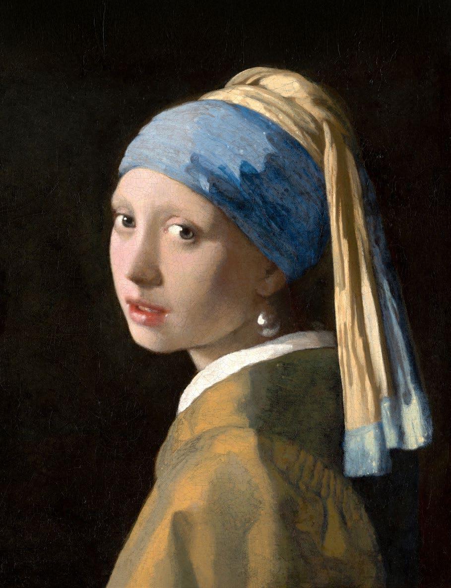
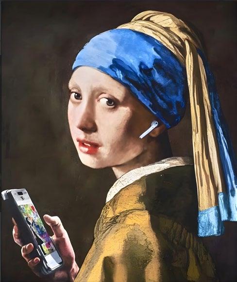
“Making its mark in a world filled with images and culture, contemporary artists such as Banksy and Mr Brainwash have reproduced the painting substituting the pearl earring with other items such as earphones surrounded by vibrant splashes of paint in a street art aesthetic.“
The girl’s eyes glisten with life as she stares wonderingly in-situ at the painter, or nowadays, her millions of admirers around the world. Her exaggeratedly large pearl earring which glistens towards the right-hand side of her neck is a focal point in the composition. Much speculation has surrounded this peculiar detail, as critics have claimed that the pearl is nothing but an optical illusion due to having ‘no contour and also no hook to hang it from the girl’s ear’ (Mark Brown). A critic once explained that the title of the painting derived ‘not just from the detail of the earring, but because the figure glows with an inner radiance against the dark background’ (Madlyn Kahr).
Recognised as ‘the painter of light’, Johannes Vermeer enjoyed the domestic genre and depicting everyday scenes of milkmaids pursuing tranquil occupations or merchantmen in their comfortable homes. Splendour and simplicity were pivotal in Vermeer’s chosen subject matter, often accompanied by a Caravaggesque quality in the contrast between light and dark. The intrinsic luminosity in his oil paintings was only magnified by his skilled use of realistic
colour tones to infer a photographic quality with nothing but a camera obscura and a paintbrush in hand. Vermeer was able to capture the smallest of details, even the slightest of contours to depict the fabrics and textures of everyday objects with remarkable precision. Bringing his subjects to life and skilfully depicting objects as if stepping into our three-dimensional world, Vermeer was championed for placing his subjects in the real world and in real life situations.
Vermeer’s methodology and acute sense of colour combinations was exacerbated by the scarcity of pigments at the time. His ability to mix colours and maximise his range of pigments with the few tools available, further gave the artist much credibility and praise for his highly esteemed artworks. Indeed, his enigmatic GirlwithaPearlEarring is certainly championed for a plethora of reasons far beyond the artist’s abilities and unparalleled skill.
Proudly hanging in the collection of Mauritshuis in The Hague since 1902, TheGirl with a Pearl Earring has been the object of much admiration, and the subject of various
literary and cinematic projects. From Yann Lovelock and W.S. Di Piero’s poetic works exploring Vermeer’s girl from a romantic lens of self-identity in the modern world, to Tracy Chevalier’s fictionalised historical novel which later became a 2003 film starring Scarlett Johansson and Colin Firth. Making its mark in a world filled with images and culture, contemporary artists such as Banksy and Mr Brainwash have reproduced the painting substituting the pearl earring with other items such as earphones surrounded by vibrant splashes of paint in a street art aesthetic.
Fusing together the classical works of our masters with a playful and subversive approach to art, these renowned artists render the traditional in a celebration of irreverence. Incorporating bright colour tones, bold graphics and comedic effect through the use of graffiti, stencil work, textures, spray paints and collage, this iconic image from the past is brought back into our present day and honoured for its lasting impact and influence on the contemporary art world.
By Tamara Bell
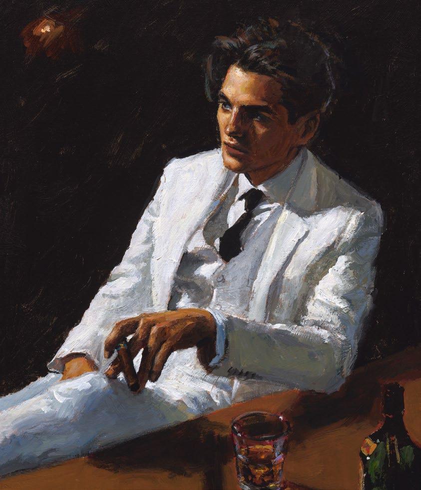
Canaletto produced distinctive masterpieces of Venice which vividly captured the city’s unique atmosphere and lighting conditions like no other artist.
Giovanni Antonio Canal was born in Venice to theatrical backdrop artist Bernardo Canal in 1697 and elected to use the professional name ‘Canaletto’ to separate his identity from his father when Venice faced a rapid decline in its former brilliance. In 1719 the father and son team went to Rome to design stage scenery for operas composed by Alessandro Scarlatti. Following his return to Venice after one year Canaletto achieved rapid fame by painting lifelike cityscapes that displayed precise architectural details with shimmering water and expansive blue skies.
Despite Venice descending into grime and losing its historical grandeur, Canaletto remained committed to creating beautiful artistic depictions that transcended the city’s real conditions. Through his art, Canaletto delicately reshaped the cityscape with buildings that experienced minor dimensional changes or positional adjustments to achieve a sophisticated visual outcome. Canaletto earns continued praise because of his unique representation of light and water. His artwork demonstrated radiant skies while utilising luminous colours. Canaletto refined and mastered the view painting (‘veduta’) genre previously popularised by Luca Carlevarijs.
The year 1726 brought Canaletto a significant partnership when he encountered Owen McSwiney who was residing in Italy and who changed his professional path. Through his association with Owen McSwiney, Canaletto received his first English client, Charles Lennox, 2nd Duke of Richmond after McSwiney commissioned two paintings and prompted Canaletto to produce small landscape paintings of Venice for tourists. Canaletto met Joseph Smith an English art collector who worked as a merchant in Venice before he became British Consul through his business associate McSwiney. Canaletto made paintings for Smith’s Grand Canal home which functioned as promotional pieces to draw in new patrons.
As Canaletto’s primary representative, Smith connected English Grand Tourists with the artist who depicted the legendary ‘serenissima’ through paintings that these tourists acquired as memories of Venice. Canaletto’s paintings allowed viewers to be transported to Venice’s canals and atmosphere through their visual archive rather than acting simply as works of art.
Smith’s most important work consisted of twelve Grand Canal paintings completed over the course of approximately ten years. The series of paintings shows almost the entire length of the Grand Canal. Canaletto’s paintings show topographical accuracy but gained their composition through artistic manipulations which included expanded perspectives and merged viewpoints along with architectural alterations that brought buildings closer to viewers. The artist probably used a device such as a camera obscura to accurately capture building placements according to common methods of his time.
The Grand Canal series includes two important paintings namely A Regatta on the Grand Canal and The Basin of San Marco on Ascension Day. These paintings illustrate two major yearly celebrations in Venice including the gondola races of the Venetian Carnival and Ascension Day’s Wedding of the Sea ceremony. Through his work, Canaletto depicted the vibrant ceremonial and theatrical nature of 18th-century Venice which established its reputation as a magnificent spectacle.
Smith displayed Canaletto’s paintings in gold-panel frames before George III acquired his collection in 1762 and made unfortunate changes by adding rococo decorations.
The Queen’s Gallery in London hosted the Canaletto and the Art of Venice exhibition with over 200 paintings and prints in 2017. While it maintains a display of over 50 Canaletto works throughout different periods, the UK museum collections contain 139 Canaletto paintings which are dispersed across the Wallace Collection, the National Gallery and the Dulwich Picture Gallery.
The artist Canaletto experienced both higher commercial success and lasting fame in Britain than in Venice and this success led to a ten-year residency in England where he created London landscapes such as Westminster Bridge and painted properties for his English patrons including magnificent houses and castles.
Canaletto’s painting Venice, the Grand Canal, Looking Northeast from Palazzo Balbi to the Rialto Bridge fetched an unmatched £18.6 million ($35.8 million) at Sotheby’s New York in 2005 which marked the highest value of his work even though his popularity declined during his later years.
Joseph Smith established Canaletto’s everlasting legacy which remains evident in the Royal Collection and through the continual admiration of those who see his work as timeless.
By Jo Ward
His lyrical accuracy of anatomy has transcended naturalism during the course of history. George Stubbs, the notorious English painter was and is still considered to be, the artist whose horses are crafted with the utmost precision and perfection to date. Having been excluded from the Royal Academy for being classified as a sporting painter, his studies in the field of anatomy served him wisely, as his legacy in the art of equestrianism remains unparalleled.
Born in Liverpool in 1724, Stubbs was the son of a leatherworker. Moving to both York and Lincolnshire, he gained experience in painting portraits, and most famously, sporting and racing events hosted by the Jockey Club. The artist conducted significant research, most famously, his publication titled TheAnatomyof the Horse after studying the subject during his time in the north of England.
While George Stubbs was surrounded by some highly skilled artists of the 18th century, namely, Reynolds and Gainsborough, his talent was only acquired through sheer determination and practice as a self-taught independent artist. Enjoying royal patronage throughout his life, and specialising in animal paintings which depicted lions, dogs and horses, Stubbs became renowned as a ‘Romantic’ painter during his lifetime, particularly, for his artworks which covered the popular theme of the lion attacking the horse and its underlying symbolic references.
Settling in London in 1758, Stubbs created his most famous equestrian painting titled Whistlejacket in 1762, now hanging at the London National Gallery. Commissioned by
“The impactful oil painting depicts nothing more but the horse itself executed with the utmost anatomical perfection yet to be challenged.“
the Marquess of Rockingham, the canvas depicts her racehorse at life-size scale on its hindlegs. The impactful oil painting depicts nothing more but the horse itself executed with the utmost anatomical perfection yet to be challenged. Described by The Independent as ‘a paradigm of the flawless beauty of an Arabian thoroughbred’, Stubbs has left the entirety of the canvas vacant, except for a small number of shadows beneath the horse to infer depth of field. This stark and methodical execution focuses the viewers’ attention on the horse, whereby one is engaged to trace every detail and curve of the animal’s body
and pay close attention to its accuracy of musculature and physiology.
Indeed, the heroic scale and lack of background of Whistlejacket create an unparalleled example of equine art. With a single horse commanding a monumental canvas, Whistlejacket rises to a levade with his head turned towards the viewer in a ‘romantic study of solitude and liberty’ in his natural state. Paying close attention to detail and inferring the horse’s equine physiology to include veins, detail of form, blemishes and flexing muscles, contemporaries speculated whether the painting was left unfinished due to its bold and sole depiction of the horse itself devoid of any other detail or subject matter.
Whistlejacket, the chestnut stallion with his flaxen-coloured mane and tail, remains a legacy as the pioneering example of equestrian themed painting, and the painter’s skill, talent and majesty that commands the room and continues to turn heads of awestruck visitors from around the world.
By Tamara
Bell
Home to the Musée d’Orsay in Paris, Olympia lies in her boudoir, in direct discourse with visitors from all around the world. Described as ‘the brothel scene that birthed Modern art’ by the New York Times, Manet’s Olympia has stirred much debate and aroused shock and controversy since its conception in 1863.
In line with Realism, a mid to late 19th century movement which claimed the artist should represent the world as seen, and not through rose-tinted lenses, Olympia pioneered the breakdown of artistic and social conventions. Édouard Manet was one of the movement’s strongest advocates. During a time of great disparity between social classes, Realists were keen to free art from strict regulations, often resulting in a highly provocative image.
As stated in Gustave Courbet’s manifesto La Réalisme, ‘art should be an objective record of the world. It should be guided by the artist’s vision at the expense of hallowed notions about appropriate and inappropriate subject matter’. Concerned with liberating the artist from bourgeois taste, Realism also rejected painterly techniques associated with Fine Art, thus making its painting style as raw and real as the subject depicted.
Arousing much scandal upon its unveiling at the Paris Salon in 1865, Manet’s Olympia completely took viewers and critics by surprise. Accustomed to nudity in mythological paintings often adhering to a Classical context, Manet presented a ‘real’ woman in the nude. Devoid of historical underpinnings, Olympia was a real-life prostitute who embodied the Parisian Street rather than the Classical past.
Evoking shock with her confrontational gaze, Manet purposefully depicted specific details in his painting to confirm Olympia’s role as a
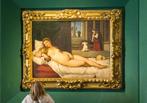
courtesan. Certain accessories such as the orchid in her hair, jewellery, oriental shawl, cat, slipper and black ribbon around her neck all symbolise her wealth and voluptuous nature. Her stark pale skin contrasts greatly with that of her servant’s, only to intentionally raise issues of social class in a patriarchal Parisian society.
While Olympia covers her modesty much like previous versions of similar images such as Titian’s Venus of Urbino (1534), she
blatantly ignores the bouquet of flowers being presented to her by her servant, which can be assumed to be a gift from a client. Indeed, while Titian also peppered his scene with symbolic references, such as a dog to represent fidelity, Manet purposefully chose to substitute this for a black cat; a creature associated with nocturnal promiscuity.
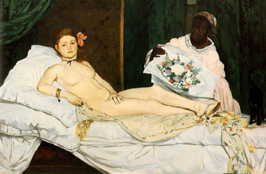
“Art should be an objective record of the world. It should be guided by the artist’s vision at the
expense of hallowed notions about appropriate and inappropriate subject matter.
“
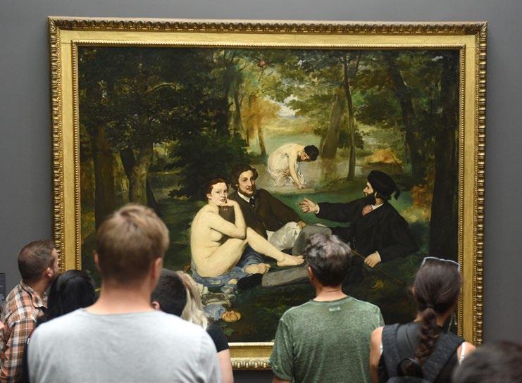
The broad, quick brushstrokes which deviate from canonical conventions of the time further enhance Olympia as a real woman whose nudity is starkly brought to the fore by harsh lighting. While critics labelled Olympia as ‘vulgar’ and ‘immoral’, the French novelist Émile Zola respected Manet’s principles stating that ‘when our artists give us Venuses, they correct nature, they lie. Édouard Manet asked himself why lie, why not tell the truth; he introduced us to Olympia, this filleof our time, whom you meet on the sidewalks’.
Created during a time where Parisian society was rife with misogyny and sexism, Olympia defied the notion of a female subject being created purely for the male gaze. While earlier images of the female nude were carefully crafted to meet the beauty standards implemented by a patriarchal society, embellishing voluptuous curves, soft supple skin, long hair and idealised features were typical of this genre in art. Meanwhile, Manet decided to forego all preconceived ideas
surrounding the objectification of women, and presented a slender, pale, real-life woman emblematic of the insidious realities that lurked beneath elitist social circles.
Ultimately, Olympia is a symbol for injustice and raises important social concerns that were often overlooked. Whether it be the injustice of gender roles, race or slavery which had been abolished fifteen years prior to the paintings inception, Manet’s radical rejection of traditional academic routine shed light on such matters. In the words of art critic Lorraine O’Grady, ‘while the confrontational gaze of Olympia is often referenced as the pinnacle of defiance towards patriarchy’, Manet’s bold and spirited adherence to Realism brought other historical factors to the fore. As stated by the author Catherine West, ‘by claiming an oppositional gaze we can identify, criticise, resist, and transform, these and other oppressive images of [all] women’.
By Tamara Bell
“By claiming an oppositional gaze we can identify, criticise, resist, and transform, these and other oppressive images of [all] women.“
Lorraine
O’Grady
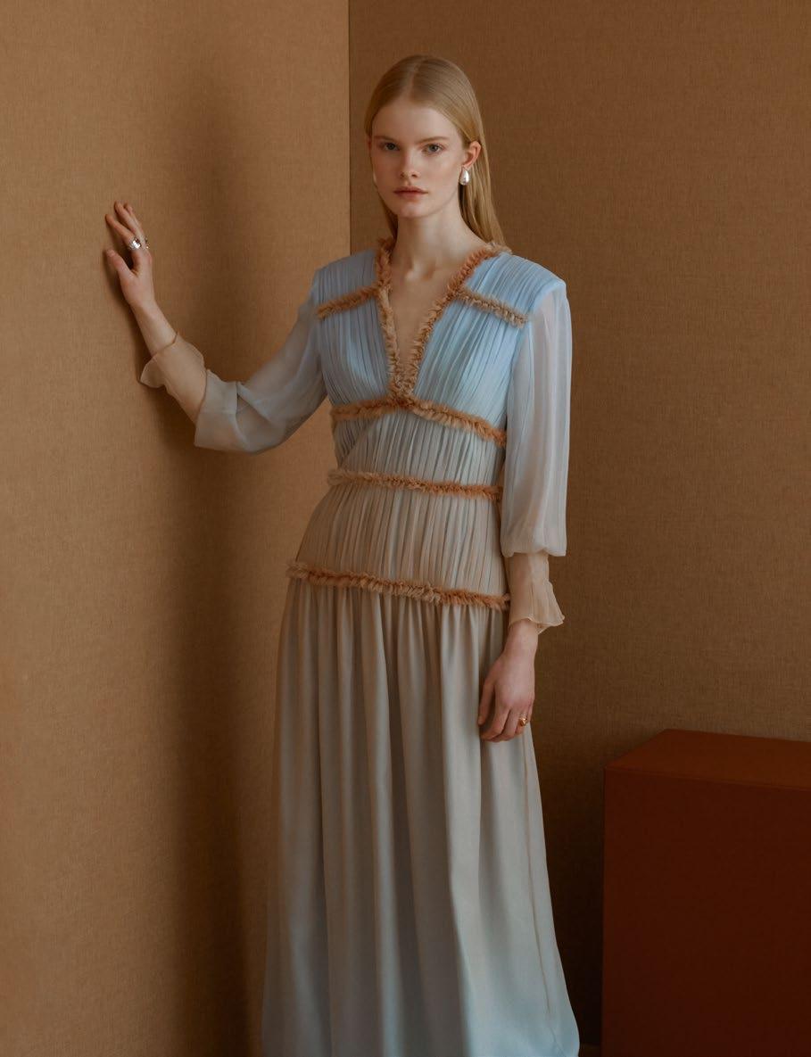
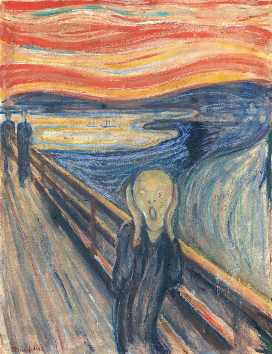
Several thematic concerns come to mind when thinking of the artist Edvard Munch. Ideas regarding the sublime, the grotesque, nightmares, morality and inner turmoil driven by an existentialist crisis are all fundamental concepts epitomised by TheScream.
Created by the famous Norwegian artist in 1893, Munch explored the notions of inner and outer turmoil deeply woven into the fabric of art history. His horror served not just to shock or disturb, but to provoke thought and contemplation surrounding morality, fear and identity. By probing into the psychological depths of individual trauma, Munch’s The Scream delves into a world in which societal anxieties come to light, and established ideals are heavily critiqued.
Deeply rooted in Western aesthetic discourse, Munch successfully blends awe with terror when viewed through the lens of the sublime. The artist creates a tension between fear and fascination where the viewer tries to reconcile forces and embrace the monstrous, thereby challenging preconceived notions of beauty and the ideal. This attempt to provoke, unsettle and fascinate becomes a haunting intertwine that blurs the boundary between reality and the surreal.
Social spirals into madness have been explored by many renowned artists throughout the ages, such as Francisco Goya’s Los Caprichos (1797-98) or Francis Bacon’s oeuvre. Standing as a vivid expression of pure existential dread, Munch’s hallucinogenic swirls of panicked dysphoria surrounding the ghostly figure in TheScream create an unsettling fascination which is palpable to the viewer. Drawing its visitors in, with blood-red clouds and a Surrealist landscape, the artist directly and simply achieves his blatant mission; to create an image that symbolises the anxiety of the human condition.
Not only does Munch achieve this with his choice of palette, shapes and forms, but also, in the sinister context that lies beneath the image. Nestled along a fjord path overlooking Oslo, the figure in Munch’s painting is said to be a patient that escaped from a nearby asylum; an institution that served as an early precursor of the modern psychiatric hospital.
The treatment of patients was highly focused on containment and restraint, often accompanied by brutal measures of so-called ‘treatment’. In his diary entry dated the 22nd of January 1892, Munch wrote the following:
“One evening I was walking along a path, the city was on one side and the fjord below. I felt tired and ill. I stopped and looked out over the fjord – the sun was setting, and the clouds turning blood red. I sensed a scream passing through nature; it seemed to me that I heard the scream. I painted this picture, painted the clouds as actual blood. The colour shrieked. This became TheScream”.
Indeed, the imagery of The Scream has often been linked to the effects that an individual suffering from depersonalisation disorder experiences, that which lies in a jarring distortion of one’s surroundings and the self.
“My fear of life is necessary to me… Without anxiety I am a ship without a rudder. My art is grounded in reflections… My sufferings are part of myself and my art.”
Edvard Munch

Described as ‘representing the universal anxiety of modern humanity’ by Arne Eggum, The Scream has continually been parodied and reproduced in many artistic fields. From the Ghostface mask originally created by Kevin Williamson in the film industry, to Andy Warhol’s desacralised silk-screen massproduced prints. From the 2013 stamps selected by the Norwegian postal service, to the Whatsapp emoji (U+1F631) that many of us use to express shock or bewilderment.

From the Scream franchise
Munch’s enduring legacy is far beyond a painting on a wall. Munch shed light on the purest and innermost fears of humanity. Exploring the human condition often disregarded as a taboo subject to shy away from, Munch forces the viewer to confront their reasons for existence. In an attempt to grapple with the unsettling notions of ‘why are we here?’ and ‘what is this life that we’re experiencing?’, the artist’s seemingly bold statement also serves to foment a universal collective. Ultimately, while we walk through life in our own individual vessels and have the capacity to question our human experience, we are able to do this together, and seek asylum in each other.
By Tamara Bell
“Munch shed light on the purest and innermost fears of humanity. Exploring the human condition often disregarded as a taboo subject to shy away from.“
Celebrated for his use of bold colour and pioneering the Fauvist movement in the early 1900s, Henri Matisse continues to leave a lasting impression on artists and contemporary art today. The French artist was a member of les Fauves, a group of modern artists who emphasised painterly qualities and stark vibrant colours over more representational features retained by the Impressionists. While the movement was short-lived, the wild brush work, thick impasto and strident colours which characterised the artwork from this era, became immensely avant garde.
Matisse, who initially studied Law before dedicating his life to his art, aroused much criticism for the work he exhibited at the Salon d’Automne. Not only did his love for the practice disappoint his father, but the Fauvist style was ill-received by critics such as Camille Mauclair who stated that it was as if ‘a pot of paint had been flung in the face of the public’. While the exhibition garnered much criticism, the one painting which stood out from the rest was Matisse’s Woman with a Hat (1905). The painting was at the heart of this controversy. While some viewed the work as marking a stylistic shift from the Divisionist technique to a more expressive and loose aesthetic, others criticised the painting for its overly saturated and unnatural colour combinations together with its ‘unfinished’ attention to detail.
The half-length portrait of Matisse’s wife Amélie, caused a scandal among artistic circles. Condemned for its supposedly ‘infantile’ qualities, Woman with a Hat was criticised for its ‘bright palette and loose, seemingly haphazard application’ (John Klein). The audience at the Salon d’Automne dismissed the work for its ‘mad’ compositional elements where unnatural swirling strokes of thick paint made up the figure’s face. Matisse used vibrant colours in place of monochromatic shadows and contrasts. This is evident in Amélie’s green facial features and ambiguous background. Her imaginary hat also marked a complete departure from Realism
and inferring accuracy of subject matter in painting, thus ‘questioning the foundations of Impressionism from which he had emerged’ (John Elderfield).
While Matisse successfully sold his Woman with a Hat for 500 francs, thus serving as a boost in morale, his painting titled Le Bonheur de Vivre (The Joy of Life) completed between 1905 and 1906 further exacerbated existing public protest and outrage. Exhibited for the first time at the Salon des Indépendants in 1906, this particular piece was designated as the pillar of early Modernism alongside Pablo Picasso’s LesDemoisellesd’Avignon (1907).
Playing on classical notions of nude male and female figures, Matisse depicted frolicking men and women in a landscape drenched with vibrant colours. Creating parallels with the works of renowned French Rococo artists such as Jean-Antoine Watteau, one can observe the playful, witty, tongue-in-cheek Fauvist adaptation of a similar subject matter in Matisse’s painting. While Watteau’s The Embarkation for Cythera (1717) symbolises the temporary nature of human happiness cast in a traditional mythological guise, Matisse’s Le Bonheur de Vivre mirrors this pastoral fantasy albeit drenched in large amounts of cadmium sulfide-based yellow.
Concerned for his lack of stylistic consistency with LeBonheurdeVivre, the French Pointillist
painter Paul Signac wrote ‘Matisse, whose attempts I have liked up to now, seems to me to have gone to the dogs. Upon a canvas of two-and-a-half meters, he has surrounded some strange characters with a line as thick as your thumb. Then he has covered the whole thing with flat, well-defined tints, which — however pure — seem disgusting’.
Despite the ongoing controversies and disputes surrounding Matisse’s work, his Le Bonheur de Vivre was finally accepted as a modern masterpiece by the 1920s. His ability to convey emotion through simplified forms and bold usage of colour solidified his legacy as one of the 20th century’s most influential and widely acclaimed artists.
Having reshaped the landscape of modern art, Matisse’s approach to colour, form and expression continues to impact the art world today and challenge creative disciplines. Having continually pushed the boundaries of artistic technique, his unique visual language continues to thrive and resonate with admirers worldwide.
By Tamara Bell
“There is nothing more difficult for a truly creative painter than to paint a rose, because before he can do so, he has first to forget all the roses that were ever painted.“
Henri Matisse

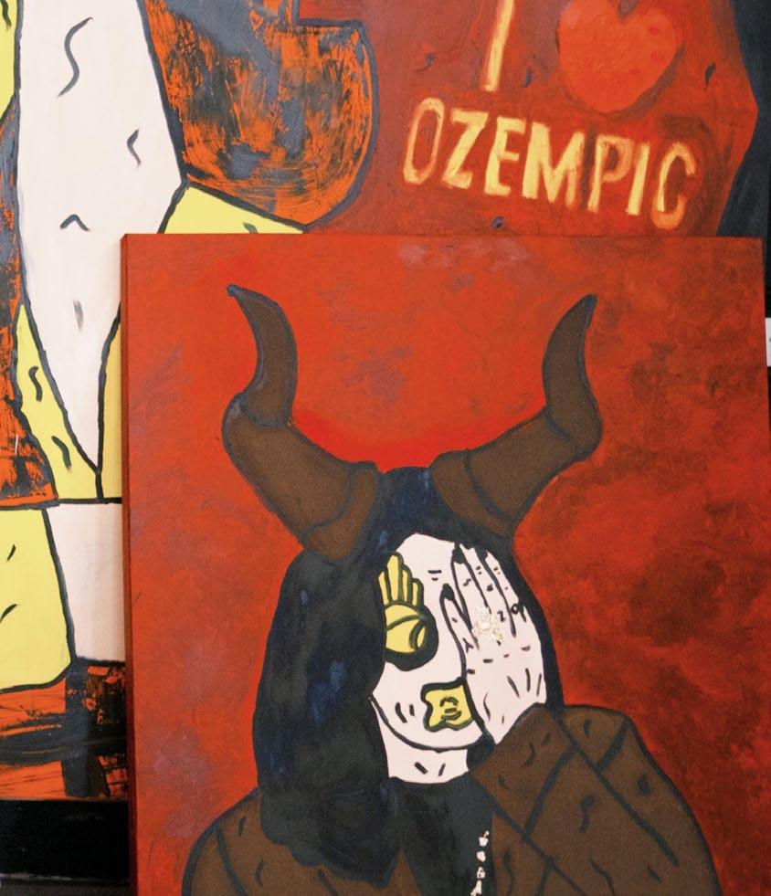
The intersection of high fashion and avant-garde art found its most provocative expression in the collaborative work between Italian fashion designer Elsa Schiaparelli and Spanish surrealist Salvador Dalí during the 1930s. Their partnership challenged conventional boundaries between art and commerce, creating designs that functioned simultaneously as wearable garments and critical commentaries on commodity culture, gender representation, and the politics of the female body.
For the Surrealists, the human body served as both experimental laboratory and conduit for ideological transmission. This fascination aligned perfectly with Schiaparelli’s revolutionary approach to fashion design, which prioritised the corporeal experience over mere aesthetic considerations. ‘The body must never be forgotten’, Schiaparelli insisted, believing that ‘the more the body is respected, the better the dress acquires vitality’.
This philosophy materialised most dramatically in her infamous Skeleton Dress, where skeletal motifs transformed the garment into what critic Jennifer SweeneyRisko described as a ‘second skin’. The dress’s extreme constriction heightened awareness of the wearer’s physical form while simultaneously critiquing the fashion industry’s temporal fragility and the mechanisms of commodity fetishism that reduced women’s bodies to consumable objects.
Similarly, the Tears Dress exemplified Schiaparelli’s exploration of bodily vulnerability. The juxtaposition of violent imagery against elegant fabric highlighted the precarious position of women’s bodies within both commodity culture and the broader social context of the 1930s, when women faced unprecedented economic and political uncertainty.
THE TEARS DRESS
Elsa Schiaparelli Collection
The most celebrated product of the Schiaparelli-Dalí collaboration emerged in 1937-38 with the creation of the Shoe Hat, a black wool construction featuring a vertical pointed heel adorned in pink velvet balanced against a pointed toe that curved dramatically over the wearer’s face. Schiaparelli proudly declared this design an ‘innovation’, and it perfectly embodied Surrealist principles of the uncanny and irrational while maintaining the movement’s characteristic wit and humour.
The hat’s radical design operated on multiple levels of meaning. Fashion theorists Caroline Evans and Minna Thornton argue that the piece references the repressed unconscious through displacement, with the phallic heel making visible the intersection of sexual and commercial desires that underpinned both Surrealist aesthetics and consumer culture. By transforming a women’s accessory into something simultaneously familiar and alien, Schiaparelli disrupted conventional commercial flows while satirising the fashion industry’s commodification of female desire.
“The body must never be forgotten, the more the body is respected, the better the dress acquires vitality.“
Elsa Schiaparelli
This strategy of fragmentation and displacement allowed Schiaparelli to address the problematic ways Surrealist imagery typically isolated and fetishised female body parts for commercial consumption. Rather than perpetuating this objectification, her designs enabled women to participate actively in Surrealist discourse rather than merely serving as its objects.
The broader Surrealist movement’s relationship with the female body was deeply problematic, as demonstrated most clearly in the 1938 Exposition Internationale du Surréalisme. The exhibition’s Rue surréaliste featured sixteen mannequins, each decorated by different artists in explicitly fetishistic styles within a setting deliberately evocative of a red-light district. André Masson’s contribution — featuring a wicker cage, velvet gag, and pansy over the mouth — epitomised the submissive erotic object of the male Surrealist gaze.
This installation revealed the central contradiction within Surrealist fashion: while the movement recognised women’s visibility in fashion culture, it consistently reduced them to objects rather than acknowledging their potential as cultural voices. The mechanisms of fashion promotion ensured that these manipulated and fetishised representations of the female body became widespread cultural currency.
Schiaparelli’s work provided a crucial alternative to this objectification. Her designs emphasised the body’s representational potential rather than its availability for consumption, challenging essentialist gender norms while offering more nuanced and liberated perspectives on feminine embodiment.
The genius of the Schiaparelli-Dalí collaboration lay in its ability to infiltrate and transform commercial fashion while
maintaining critical distance from its mechanisms. By reimagining the body within her creations, Schiaparelli simultaneously critiqued commodity culture’s manipulation of physical form and the fetishised representations of femininity prevalent in Surrealist art.
Her work demonstrated how Surrealism’s radical rejection of conventional beauty standards and its exploration of the body as both object of fascination and site of unconscious expression could be successfully transposed into commercial fashion. This created a subversive critique of mainstream ideals that operated from within the very system it challenged.
The Schiaparelli-Dalí partnership proved that countercultural ideals — particularly those challenging traditional notions of gender and bodily representation — could infiltrate and transform the commercial fashion industry. Their collaboration offered new perspectives on the body’s role in both art and culture, creating space for women to engage with avant-garde aesthetics as active participants rather than passive objects.
Their work established a precedent for fashion as legitimate artistic and critical practice, demonstrating that clothing could function as a vehicle for complex ideological statements while remaining commercially viable. In doing so, they expanded the possibilities for fashion to serve as a site of cultural resistance and transformation.
The enduring influence of their collaboration continues to resonate in contemporary fashion, where designers regularly blur boundaries between art and commerce, challenging conventional representations of gender, sexuality, and the body. Schiaparelli and Dalí’s revolutionary partnership proved that fashion could be simultaneously beautiful, wearable, and deeply subversive — a lesson that remains as relevant today as it was nearly a century ago.
By Jessica James
By Tamara Bell Editor-in-Chief
Richard Hamilton, the so-called ‘Daddy’ of Pop Art most certainly deserves to have a light shone on his iconic work and enduring influence throughout art-historical movements.
Having been one of the first pioneers of incorporating collage, plastic and magazine cuttings into his work, Hamilton certainly embodies the zeitgeist of the 1960s. Characterised by bold colours, massproduction techniques and reflections on pop culture, Hamilton was renowned for taking fragments and themes from popular sources to craft a running commentary on the contemporary world and the commodification of consumer culture.
Heralded as the artist who turned massmedia into masterpieces, Hamilton’s rise to fame followed the notorious This is Tomorrow exhibition at the Whitechapel Gallery in 1956. In collaboration with the Independent Group, the exhibition’s theme revolved around the ‘modern’ way of living, transforming the gallery space into a vibrant interactive collection of installations. The iconic show was described by Lawrence Alloway as ‘a lesson in spectatorship which cuts across the learned responses of conventional perception’. Bringing to light the ideas of multidisciplinary creatives to include architects, designers, artists and theorists, the amalgamation of technical approaches saw new methodologies come to the surface in this collective curatorial enterprise.
With his most famous work that comes to mind upon hearing his name being Just what is it that makes today’s homes so different,
so appealing? (1956), the collage was created for the catalogue of the exhibition. Now a part of the collection in the Kunsthalle Tübingen in Germany, this was deemed the first ever work of the Pop Art movement to achieve iconic status.
Consisting of images taken from American magazines, Hamilton’s template was derived from a modern living room showcased in the Ladies’ Home Journal. Including the famous body builder Irvin ‘Zabo’ Koszewski and an unidentified nude female figure as the main focal points in the collage, Hamilton peppered other mundane everyday objects throughout the scene. These include a staircase, a television set, advertisement pictures, a rug, a chair, a then recent newspaper, a tape recorder and an outdoor view from a window.
Arousing problems of copyright and authorship, the work received much criticism, as Hamilton was accused of simply cutting out and mechanically pasting the collage material.
Arousing problems of copyright and authorship, the work received much criticism, as Hamilton was accused of simply cutting out and mechanically pasting the collage material. Having been widely reproduced over a period of fifty years, Hamilton’s Just what is it that makes today’s homes so different, so appealing? has become one of the most revered symbols of mass-consumerism, the social climate of the time and a tongue-incheek parody of 1960s politics.
Another notorious installation piece of Hamilton’s was his contribution titled Fun House, produced for the This is Tomorrow
exhibition. Having visitors squeeze through a narrow corridor embellished with hundreds of pinup images from popular culture to include advertisements, film posters and spinning colour discs accompanied by Elvis Presley music blaring from a jukebox, the artist’s walkin installation was intentionally interactive and intuitive. Regarding Fun House, Hamilton stated ‘with the things I exhibited in the fun house, I tried to reflect the young people’s attitude to life. Music, science fiction movies, objects. I was pretty much alone in the exhibition with that. Everyone else was looking back rather than into the future. But it was my contribution that caused a sensation’. Hamilton’s post-Dadaist text-photo collages deviated from propagandist roots and gave rise to analytical commentary on popular culture. Looking to iconic figures such as Marcel Duchamp and James Joyce, Hamilton sought to ‘bring together completely different techniques and qualities into one picture. Each image was to be its own system, an accumulation of ideas’. This ultimately distinguished the artist from other Pop artists of the time, with each and every motif being extracted in the most peculiar and diverse way.
In the artist’s own words, he defined Pop Art as something ‘popular, transient, expendable, low-cost, mass-produced, young, witty, sexy, gimmicky, glamorous, and Big Business’. By creating collages from advertisements derived from newspapers and magazines, Hamilton stressed the everyday common place values society was implementing. Giving rise to issues surrounding gender roles, consumerist culture, brainwashing, lack of necessity and the sheepish mentality of the masses involucrated in this social experiment, were issues to be read between the lines when evaluating the symbolic connotations referenced in the artist’s work.
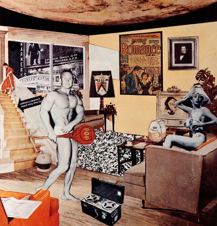
“Hamilton stressed the everyday common place values society was implementing. Giving rise to issues surrounding gender roles, consumerist culture, brainwashing, lack of necessity and the sheepish mentality of the masses involucrated in this social experiment, were issues to be read between the lines when evaluating the symbolic connotations referenced in the artist’s work.”

“I know how I live my life. I have a little magnet brain that attracts the kind of things that obsess me.”
Sophie Calle
From exploring the depths of human vulnerability, identity and intimacy, to blurring the boundaries with her unhinged invasions of privacy, the French artist Sophie Calle opened up a new dimension altogether when it comes to the creation of art.
It all began in February of 1981. Sophie Calle was employed to clean the rooms at a hotel in Venice, Italy. Armed with various suspicious instruments deemed unnecessary to complete her daily tasks, Calle was on a separate mission of her own in the name of art. Among these items included a camera and tape recorder, often hidden in her mop bucket. Calle spent the next three weeks untamed. In the absence of hotel guests, the artist rummaged through their belongings, photographed the items on their night tables, waste bins, wardrobes and even transcribed unsent postcards. When this wasn’t enough, Calle welcomed the invitation to explore the contents inside their suitcases should a key have been left in sight.
The culmination of Calle’s intrusive act was her art project titled The Hotel. The work originally took the form of a large diptych, and later, a book. Calle presented a diary organised by room number with her photographic documentation unveiling the personal items and habits of each and every hotel guest whose rooms she had the pleasure of invading. In an attempt to explore the dichotomy between the private and the public, presence and absence, Calle’s highly questionable work forms the pinnacle of conceptual art in a shockingly controversial way. Her bold acts of exposure continued to prevail throughout her professional life, even culminating in the act of stalking an individual through the streets of Venice.
Calle’s notable work titled Suite Vénitienne, became a highly methodical and tantalising task whereby the artist’s investigative approach not only documented the whereabouts of her subject known as Henry B, but provides a candid projection of Calle’s own psyche and addictive behaviours. Being drawn to elusivity ultimately caused Calle to be confronted by Henry B as she trailed him throughout the winding streets of the city.
Calle met her subject at a party and moved to Venice to follow him as he decided to relocate. She phoned hundreds of hotels, visited the police station and even interrogated his suspected neighbours to find out his exact address. Once located, Calle photographed this raincoated figure from behind, intensifying the thriller-esque narrative against the striking backdrop of Venetian cobblestone roads and architectural marvels. Enlisting Venetian friends and a delivery boy to aid her stalking tactics, Henry B eventually had words with the artist when he realised she strayed too close.
Armed with a camera and a blonde wig, Calle’s emotionally diluted intentions aroused feelings of obsession and lust. Giving way to an increased awareness of psychological overtones to include danger, secrecy and eroticism, the artist even rented out a room that Henri B had spent the night in with another woman.
Arousing the debate of what is considered art, how far one can go to create something unique, and where to draw the line between what is deemed an unhealthy pattern of behaviour, are all thematic concerns revolving around Calle’s body of work. Notorious for taking liberties and teetering into the realms of highly inappropriate acts of violation is none other than Calle herself. Questioned by many, and controversially admired by those who love a good story in the name of art, Calle has opened up many conversations surrounding human vulnerability, identity and intimacy. Her detective-like tendencies accompanied by her many disguises and assuming different characters in an added act of role-play, only foments the unsettling nature of Calle’s work and artistic pursuits.
Unequivocally, in the famous words of Calle herself, ‘I travelled for seven years, and when I came back home I was completely lost. I didn’t know what to do with my life, so I decided to let people decide for me. For months I followed strangers on the street. I photographed them without their knowledge, took note of their movements, and finally lost sight of them. At the end of January 1980, I chose a man and followed him to Venice. That’s how I started. That’s all”’
By Tamara Bell
In the landscape of contemporary art, few artists have interrogated the construction of female identity as persistently and provocatively as Cindy Sherman. Her groundbreaking work challenges fundamental assumptions about how women are seen, represented, and ultimately rendered visible or invisible within cultural discourse. Through her lens, Sherman exposes the complex dynamics of what feminist theorist Laura Mulvey termed the ‘male gaze’ while simultaneously confronting society’s systematic erasure of aging women from visual culture.
Mulvey ’s influential concept of the male gaze characterised the female body as connoting ‘to-be-looked-at-ness’, positioning women primarily as objects of visual desire and pleasure rather than autonomous subjects. This framework reveals a fundamental paradox in female representation: women are simultaneously hyper visible as objects of desire and invisible as complex individuals with agency and depth.
However, as feminist scholar Michelle Meagher astutely observed, this hypervisibility is far from universal. The cultural gaze that objectifies young women systematically excludes aging women, creating what Kathleen Woodward described as the ‘youthful structure of the look’. This dynamic renders older women doubly marginalised — no longer valuable as objects of desire yet still denied recognition as subjects worthy of serious artistic attention.
Coral Broughton’s research supports this analysis, demonstrating how societal beauty standards create a ‘double standard of aging’ that renders mature women effectively
invisible in both popular culture and fine art. As Woodward noted, ‘in academic and artistic circles, the body has been the focus of attention for many years, but the older female body has been significant only in terms of its absence’.
Sherman’s breakthrough series, the Untitled Film Stills (1977-1980), emerged as a revolutionary response to these representational limitations. These highly constructed images created familiar tropes of mid-century white femininity through carefully orchestrated poses, costumes, and settings that appeared to capture candid moments from non-existent films.
The series was immediately celebrated for its sophisticated exploration of identity, appropriation, and gender construction, aligning perfectly with emerging postmodern and feminist trends in the art world. By positioning herself as both photographer and subject, Sherman collapsed traditional
boundaries between creator and muse, artist and model, challenging the fundamental power dynamics inherent in visual representation.
Each image in the series functions as a meditation on performativity — the way femininity is constructed through repeated acts rather than expressing some essential feminine nature. Sherman’s various personas inhabit recognisable feminine archetypes: the vulnerable ingénue, the sophisticated urbanite, the mysterious femme fatale, the suburban housewife. Yet her precise control over every element of composition reveals these identities as elaborate performances rather than authentic expressions of self.
What makes Sherman’s work particularly significant is her ability to create what might be termed a ‘female gaze ’— a way of seeing that resists both the objectifying hypervisibility imposed on young women and the cultural

invisibility that erases older women from representation. Her photographs acknowledge the constructed nature of feminine identity while refusing to reduce women to simple objects of desire.
This approach becomes even more radical when considered alongside her later work, which increasingly featured aging bodies and challenged conventional beauty standards. By maintaining artistic control over her own representation across decades, Sherman demonstrated how women could reclaim agency over their visual identity throughout the life cycle.
Sherman’s practice reveals the inherently political nature of self-representation. In a cultural context where women’s bodies are consistently defined by external forces — whether through commercial advertising, pornography, or fine art traditions dominated by male perspectives — the act of a woman controlling her own image becomes transgressive.
Her work exposes the mechanisms through which feminine identity is constructed and maintained, revealing gender as performance rather than essence. This insight has profound implications for understanding how power operates through visual culture and how marginalised groups might resist dominant representational frameworks.
In our current digital age, where social media platforms have democratised image-making while simultaneously intensifying surveillance of women’s bodies, Sherman’s insights feel
more relevant than ever. Her exploration of identity construction through photography prefigured contemporary concerns about authenticity, performance, and self-presentation in digital spaces.
Moreover, her commitment to representing the full spectrum of female experience — including the aging process that mainstream culture prefers to ignore — offers a crucial model for artists seeking to challenge ageist beauty standards and expand definitions of who deserves visual representation.
Sherman’s revolutionary contribution lies not merely in her technical innovations or aesthetic achievements, but in her fundamental reimagining of who controls the narrative of female identity. By seizing the means of representation and refusing to limit herself to culturally sanctioned forms of femininity, she opened new possibilities for how women might see themselves and be seen by others.
Her work demonstrates that the question of visibility is always political — that who gets seen, how they are seen, and who controls the act of seeing are crucial determinants of social power. Through her sustained interrogation of these dynamics, Sherman has created a body of work that continues to challenge viewers to question their assumptions about identity, authenticity, and the politics of representation. In doing so, she has established a framework for understanding how art can serve as a site of resistance against oppressive representational systems, offering new models for how marginalised voices might claim agency over their own visual narratives.
By Jessica James
“In academic and artistic circles, the body has been the focus of attention for many years, but the older female body has been significant only in terms of its absence.“
Kathleen Woodward


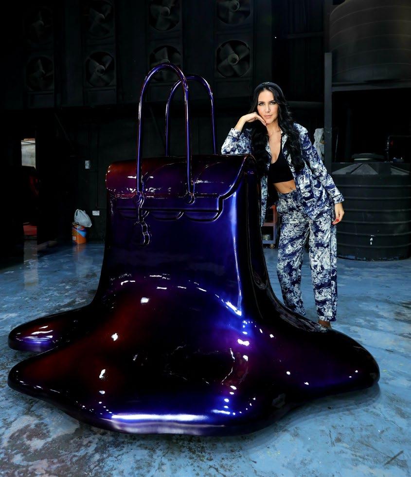

It’s not just about creating beautiful things anymore; it’s about crafting a legacy that aligns with my values that everyone can enjoy.

THREE DANCING FIGURES BY KEITH HARING
KEITH HARING IS A RATHER SPECIAL TALENT, AN ARTIST WHO’S WORK MANY OF US KNOW OF AND HAVE RECOGNISED SOMEWHERE AT SOME POINT IN LIFE.
Writing about Keith Haring makes me reminisce of a particular instance in which I saw his work, not in a museum or a pop-up exhibition, not in a gallery amongst other artworks or even a private piece in some collector’s home. Shockingly, the memory which sticks out the most is when I came across his work printed on a H&M t-shirt while shopping for some socks. The moment was so ingrained in my head, that I remember leaving the store feeling somewhat angry and disappointed! It was later that evening I realised why I felt disappointed about facing something that is supposed to commemorate his work. Surely, a H&M collaboration with Keith Haring’s work is something to be celebrated, especially because this is no small company. Any and all eyes on his work will not only continue to illuminate the causes that Haring spent his life fighting for but also bring new attention to current social issues.
What I have just discussed is the bedrock of this article and the reason for my change of attitude towards seeing his work printed on a t-shirt of one of the biggest fashion chains in the world. My argument might seem unjust, especially after stating all the positives about artist exposure and creative collaborations. However, I somewhat felt that his legacy had been diluted in this instance. The one big issue I had was that most people who would choose to purchase one of these tees, would do so not because of Haring’s political antiapartheid messages or support for those going through life with AIDS but because it simply looked cool. I found that in that moment, a simple t-shirt with a Keith Haring print on it represented nothing that his legacy stood for. My experience of this moment lead me to believe that this t-shirt meant less about bringing awareness to social issues, but more about how an art piece can be changed to suit the needs of the bigger picture. In a previous article of mine, I discussed the importance and value of seeing works of art live, in the flesh. An experience that is truly rewarding and equally experienced in an enriching environment. Haring’s work is something that should be celebrated and witnessed in person, the playful approach to art is of course marketable in the eyes of big companies and can easily create a bridge of visual language. But, his work is often mistaken as nothing more than just visual, we seem to neglect the importance of the message.
“HIS WORK IS OFTEN MISTAKEN AS NOTHING MORE THAN JUST VISUAL, WE SEEM TO NEGLECT THE IMPORTANCE OF THE MESSAGE.”

A FANTASTIC EXAMPLE OF HARING’S WORK AND ONE THAT SHARES THE STORY AND IMPORTANCE OF HIS ADVOCATING FOR AIDS IS THE 1989 MURAL TITLED TODOS JUNTOS PODEMOS PARAR EL SIDA.
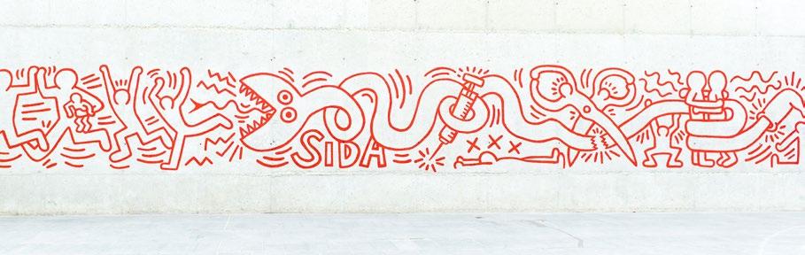
Located on a wall next to the Museum of Contemporary Art in Barcelona this piece (now replicated due to vandalism) represents the best of street art and social commentary. Haring’s unique and unapologetic style appeals to a mass audience, but the message is clear, and the characters portrayed evoke Haring’s use of small sexual cues. A great example of an outdoor art piece, and one that reflects Haring’s own personal struggle.
The Keith Haring foundation was established in 1989, a year prior to the death of Haring himself. In the latter stages of his life Haring dealt with AIDS and unfortunately passed away in 1990. The legacy that Keith Haring left behind was more than just a legacy of an artist, his foundation is a pillar for nonprofit organisations, artist led projects and programmes seeking to highlight and teach the youth about HIV and AIDS, the stigma behind this and how to overcome personal trauma through art. In my opinion the foundation stands as an example of how art can truly make a change and become community focused. Unlike my original opinions about the H&M t-shirt experience, understanding this foundation and potentially getting involved is the best way to contribute and share knowledge about Haring’s work and his effect on social problems.
Haring’s celebration of life and love of human interaction is echoed most in his mural Tuttomondo, located on the rear wall of the Sant’Antonio Abate Church in Pisa, Italy. This mural is another great example of Haring’s expression for unity, most interestingly is the fact that it is painted on the rear of a church wall. Haring’s early involvement with religious groups growing up in the US might have had an influence here. We can see that the mural is an amalgamation of Haring’s respect for his religious beliefs as well as his own acceptance of who he is. We could state that Haring in this instance is challenging the traditional ideology of man and woman, yet his mural suggests a love and respect to all individuals from all walks of life. This is the legacy of Keith Haring, the legacy of a man who simply aimed to tell his story and to help others along the way.
By Francesco Scalici
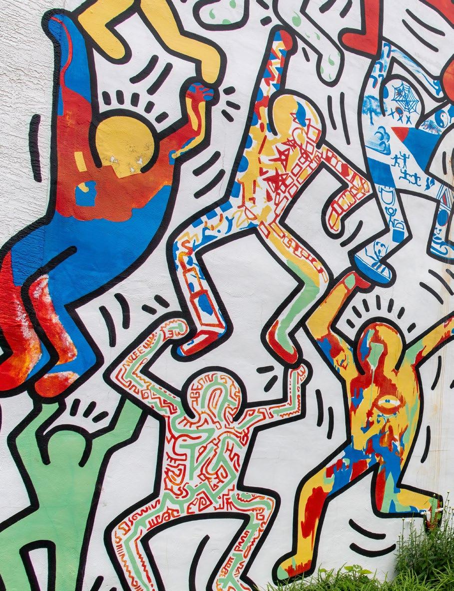
When you think of curves that leave a lasting impression, or a woman who made them a global phenomenon, we jump straight to Beyoncé right? The ruler of sass and performance? Well, we are taking a detour into the world of architecture, where it used to be defined and dominated by rigid structures, boxy shapes and straight lines. Then, enters queen Zaha Hadid and her designs, which shook up the scene with fluid formations, sweeping and organic forms that completely rejected geometric shapes and embraced a more futuristic aesthetic.
Think of her buildings as a ‘mic drop’ moment. They demand attention, and shout innovation, almost encouraging you to cheer, shout and reward them with a standing ovation. Beyoncé may drop singles, but Zaha can make jaws drop!
On October 31st, 1950, Baghdad, Iraq, a star was born into an upper-class Iraqi family. Her father was a wealthy industrialist, and her mother was an artist. After receiving a bachelor’s degree in mathematics from the American University in Beirut Lebanon, she secured a spot at the Architectural Association School in London. She strutted into the ‘boys club’ of architecture like it was her very own runway. What makes her so remarkable is that she didn’t just enter this male-dominated field, she completely rewrote it, daring to challenge every stereotype and created a narrative that didn’t previously exist before. Why? Because no one else dared to do it! And, I must say, she did this with unapologetic flair.
Forbes Magazine even named her among 100 of the most powerful women in the world. Hadid’s first work emerged from the Russian Avant-Garde movement, where she took inspiration from Kazimir Malevich and Vladimir Tatlin. She adopted their work and used painting as a design tool over the conventions of architectural drawings which she found to be limiting and frankly, quite boring. She
revisited their work with designs of geometric abstract art and implemented them into buildings. Picture a dystopian fantasy graphic novel, and sprinkle on a bit of Alien-chic and ultra-modern brilliance! These were some of the ideas she introduced to the architectural world in the early 1980s.
Characterised by fragmentation, movement and abstraction, her ideas were published in
many magazines, but her work was deemed as unbuildable by professionals. Well, to that, she gave a very polite architectural middle finger to the masses and accepted the challenges ahead! It wasn’t just the scepticism, rejection and contending with the gender-biases around architecture that challenged her. Her tenacity and fierce nature could cope with those insignificances. If anything, it was the financial costs, structural and engineering
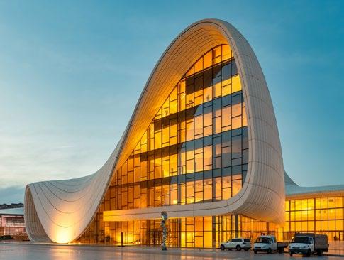

concerns and technological limitations that were her major barriers. The complexity of her groundbreaking designs made them appear financially impossible. She found it difficult to find engineers and commissioners who would invest in her ideas, as this alien method of curving walls, and gravity-defying surfaces were very difficult to engineer and build.
On top of that, technology and specific modelling software programmes were not as advanced as they were during the early stages of her career. She had to invent new tools to make her ideas come to life and ultimately find a team that was willing to think outside the box and take a risk to explore these new unconventional approaches to find solutions. Once she had created her own architectural Firm in the 1980s, she became known as a paper architect whose designs could never be built into the real world. It wasn’t until 1993 that her first completed project was really brought to life. Located in Weil-am-Rhein, Germany The Vitra Fire Station stands proud and strong in its brick-and-mortar structure boasting razor-sharp geometric shapes and a stream of movement and multi-viewpoint perspectives. This launch really made her portfolio explode across the globe and she gained international attention.
She was later commissioned for several projects including the Bergisel Ski Jump, in Innsbruck Austria which won an international competition and became a landmark for the city. At a length of 90m and a height of 50m, aesthetically, it’s minimalistic but with a Sci-fi edge. Striking and unusual, it hosts a restaurant at the top with a panoramic view of the town and
peaks of the mountain tops. It’s a combination of a tower, slope and a bridge all at once.
In 1998 her career began to skyrocket. The first American museum to be designed by a female

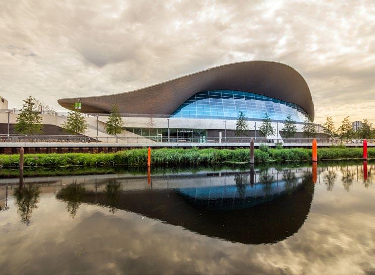
architect, was the Centre of Contemporary Art in Cincinnati, Ohio. Hadid brought to life a new and innovative concept that pushed aside the ‘norm’ for a typical display unit by giving each gallery unique shapes, sizes and spacing.
After its completion in 2004, this really cemented her legacy as an A-list celebrity in the world of architecture. Since then, she has been able to translate her distinctive style and vision to life without the need to compromise. The Maxxi Museum in Italy, for example, features continuous and flowing walls where galleries and spaces intersect, and sweeping walls with interconnections to bridges creates an exciting, unpredictable and whimsical experience for visitors.
If that hasn’t convinced you, then maybe a look at the London Aquatic Centre will change your mind! Specifically built for the Olympic Games in 2012, it is best known for its undulating roof that mimics the fluidity of water. Its curvature looks like a giant wave about to crash over you, which creates this sense of motion, unease and energy as it spans across the area.
During her lifetime, she managed to envision and complete over 50 built projects around the world, and since her passing in 2016, her Firm continues to operate with many more projects currently in development. Let’s raise a perfectly curved champagne flute-glass to the perfect Queen of curves herself! She bent the rules and the world - without her, the world would be far less fabulous!
By Anthony Loddo
“Let’s raise a perfectly curved champagne flute-glass to the perfect Queen of curves herself! She bent the rules and the world - without her, the world would be far less fabulous!“

The complexity of her groundbreaking designs made them appear financially impossible.
Imagine the lovechild of Andy Warhol and Walt Disney and there you have Takashi Murakami, the 63-year-old art rockstar! Murakami is a renowned contemporary artist from Japan who has become widely famous for his unique mixture of commercial aesthetics with pop culture, and where vibrant colours are often met with darker meanings.
Stumbling into the world of Takashi Murakami is like waking up in the neon-lit streets of Shibuya, gazing at the smiling flowers and other mischievous characters he’s brought to life. These iconic figures have become symbols of his style and have helped him flourish in his career.
Murakami is the founder of the ‘Superflat’ movement, which is heavily influenced by manga and anime. It usually follows a twodimensional style which challenges fine art and commercial art and often incorporates elements and statements about Japan’s consumerist culture. Mr. DOB for example, is one of his characters who has evolved across his body of work. Created in 1993 and serving as Takashi’s alter ego - a wide-eyed, sharp-toothed figure bears a few similarities between Mickey Mouse and Frankenstein. Don’t believe me? Give that icon a google, he can be adorably cute or morph into something straight out of your nightmares! A true monster of capitalism. His name has even been cleverly sourced out, as Mr. DOB derives from the Japanese slang ‘Dojobite’ which means ‘why’. And, honestly, what could be more fitting? He’s more than just a character, he’s a symbol, a secret message that gazes into your eyes and asks, ‘why are we like this?’
His various smiling flowers also carry a darker narrative behind their innocent appearance. Whilst flowers have always been significant in Japanese culture for their purity, grace and beauty, these rainbow-coloured little critters stand as a motif for life and death. However, in a 2005 interview for the New York Times, Murakami revealed that the smiling flowers were all representative of repressed emotions and trauma shared by Japanese residents after the Hiroshima - Nagasaki bombings back in 1945. If you look closely enough,
some of the flowers are holding back tears in their eyes, which makes them all the more beautiful and equally, all the more sinister. But, why smiles? Why this forced happiness? Why is this being sold by consumer brands? Could there be a deeper message about manufactured joy? Is this what we’ve become? Painted on smiles in our perfect little life. Are we the flowers now? Now, beyond the ‘happy’ or ‘not so happy’ flowers, and the devil child that is Mr. DOB, Takashi’s work isn’t always so eerie. In fact, Murakami has collaborated
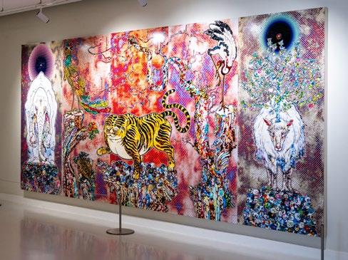
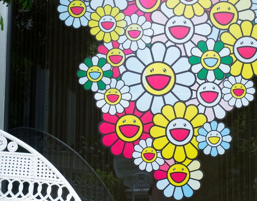
t-shirts featuring our favourite flower friends. Was it charitable? Yes. Was it limited? Yes. Did it sell out in seconds? Of course!
Each collaboration has really shown off his unmatched versatility as an artist, proving he can bring his universe to just about anyone and anything, and we all seem to fall in love and fully immerse ourselves in it. Takashi Murakami has essentially been one of the most influential contemporary artists of this generation. With his unique patterns, dynamic aesthetic and bold characters, he has completely redefined the boundaries of art creating a visual language that resonates across the world. His legacy continues to grow with his art management company called Kakaikiki headquartered in Tokyo, with offices in New York, where he mentors new artists and expands his ideas into new creative fields and is still recognised as a major force in the art world. Love his work or hate it, in Murakami’s world, one thing is for certain, nothing is flat, it’s Superflat!
By Anthony
Loddo “In a 2005 interview for the New York Times, Murakami revealed that the smiling flowers were all representative of repressed emotions and trauma shared by Japanese residents after the Hiroshima - Nagasaki bombings back in 1945.“
Zanele Muholi is a South-African visual activist, who uses their global acclaim to increase the visibility of the LGBTQI+ community. Muholi’s photography is deeply entwined with South Africa’s post-apartheid, socio-political landscape. Their art is not simply about representation, but resistance and voice. Muholi’s work serves as an archive for narratives that have been systematically erased and has become a renowned form of protest. By centring LGBTQI+ identities, their artistic lens serves as both a mirror and a weapon, exemplifying dignity whilst confronting oppression.
South Africa became the first African country to legalise same-sex marriage in 2006 and has constitutional protections against discrimination based on sexual orientation. However, beneath this legal framework lies a more complex and often brutal reality. Hate crimes, ‘corrective’ rape, and deep-rooted homophobia continue to plague Black queer and transgender individuals, particularly in rural areas. This is the tension in which Muholi’s work exists. Their photography documents queer lives, not as abstract symbols of struggle, but as real people, full of love, resilience and strength. Muholi’s intimate portraits of Black LGBTQI+ South Africans creates a powerful counternarrative to mainstream media, which often reduces communities to statistics.
Their ongoing series Faces and Phases (2006 - present) is an example of this. The project consists of striking black-and-white photographic portraits of lesbian, transgender, intersex and gender-nonconforming individuals from South Africa and beyond. Each subject is photographed with dignity and agency, directly confronting the camera, and, by extension, the viewer. Their Brave Beauties series also portrays transgender women and non-binary individuals as glamorous and confident, in poses that challenge the narrative of queer victimhood and instead embraces queerness as powerful and beautiful.
In Somnyama Ngonyama (2018), Muholi turned the camera on themselves and includes themselves in their narrative. Muholi challenges the colonial and racist traditions that have historically objectified Black bodies: by exaggerating the darkness of their skin through dramatic lighting, these portraits reference histories of oppression while also celebrating senses of joy and survival. Muholi is embedded within the community they photograph. Their work is intensely personal; they are not just an observer, but an active participant in the lives they depict and represent. Muholi disrupts the filtering of African and queer identities through a Eurocentric gaze and instead allows people to tell their own stories. Muholi stands as an incredibly important figure in the art world, and their work has served profound functions in some of the most prestigious institutions in the world.
Muholi’s visual activism was first launched through their solo exhibition, entitled Visual Sexuality: Only Half the Picture, at the Johannesburg Art Gallery in 2004. The exhibition featured photographs of rape survivors, and victims of hate crimes. Muholi made sure to anonymise their subjects, and only gave viewers access to an above-theknee shot, or a hip shot in a way that also hid the person’s gender. Unlike later exhibitions, the identity of their subjects are not on display. This reflects the sensitivity of exhibiting in
Johannesburg, where, although homosexuality is legally protected, the fear of hate crimes remains stark.
In Faces and Phases, however, Muholi platforms over three-hundred portraits of lesbians, shot in front of blank or patterned backgrounds. This project began in 2006, when Muholi photographed activist Busi Sigasa, a survivor of corrective rape who contracted HIV from the attack. It remains one of the most significant bodies of their work, and comments on the collective memory of communities that have been historically marginalised and ostracised. Individual portraits are often captured in direct, frontal poses that confront the viewer with their gaze. Muholi also subverts traditional portraiture, typically reserved for political leaders, to depict her subjects and allows Black and/or queer people to define themselves on their own terms. Each portrait becomes a collaboration – they are presented in conversation with each other, and the social context in which they were created. Faces and Places has been exhibited internationally, including at the Tate Modern and the Venice Biennale. Among other influential artworks, it stands as a radical declaration: ‘We are here. We have always been here. And we will not disappear’.
By Sophie Macdonald
We are here. We have always been here. And we will not disappear.
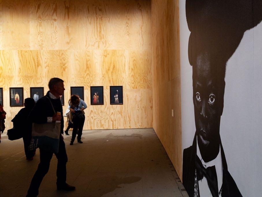
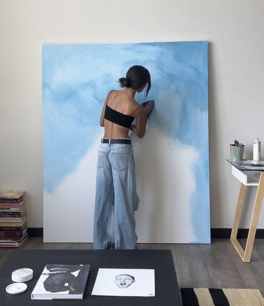
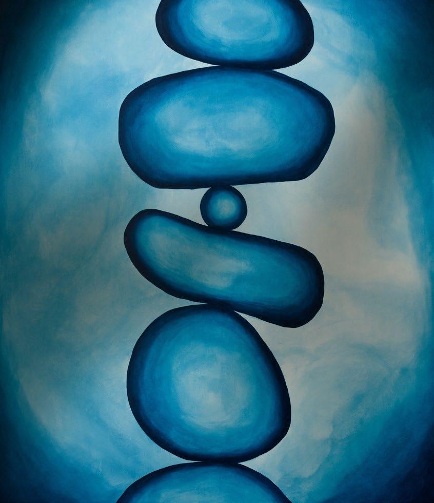
Formerly nestled in a well-lit corner of Soho Square, this past November the Sarah Kravitz Gallery played host to a powerful meditation on motherhood by Croatian artist Dunja Janković. Her practice spans experimental drawings in comics, prints, illustration, yet she remains grounded in her Croatian roots, most notably through founding the SKVER art festival on the island of Lošinj.
In Of Mothers and Others, her work turns inward, exploring the mother as both a personal figure and a symbol of national heritage shaped by the traumas of war. Its exhibition space also serves as a poignant reminder of the importance of independent galleries in fostering powerful cultural connections between communities and identities often under-represented in the art world. Curated by Maximiliane Leuschner, the show brought together twenty works varying from self-portraits, elusive figures, and images of urns rendered on paper in pastel, pencil and crayon. Whilst some of the abstract figures repeat themselves, they do so out of a necessity to push Jankovic’s thematic undercurrent of the intertwinement of loss, self-identity, and motherhood.
Viewed through a diasporic perspective, the rows of urns and abstract self-portraits invite viewers into an exploration of Janković’s Croatian heritage. Whilst this might not have been the curational intention, the themes of the exhibition establish an undeniable link between the pull of place and self. These themes are given weight through Janković’s layered colourful surfaces and repeated lines, crafting an intimate portrait of artist and mother. Much like the two fraught entities of mothers and motherlands, Janković’s forms swell and buckle like vessels under pressure. They sometimes resemble bodies and landscapes, and other times look more like wounds and organs.
“In her MotherUrns series, one is reminded of the loss of both mothers and motherlands in the war which tore former-Yugoslavia apart.“
In her Mother Urns series, one is reminded of the loss of both mothers and motherlands in the war which tore former-Yugoslavia apart. Here, the mother is made present in the urn but only because she is captured in a vessel of death. Set against the stark white walls of the gallery, the drawings draw viewers into colourful, almost therapeutic re-imaginings of what was once considered lost. Through repurposing the mother and the motherland as an urn, Janković creates a space in which these two entities can live in harmony. Her assertive yet tentative mark-making shapes the contours of these forms, Janković unites contradictions which could previously not be drawn together. Colours gather, then recede, mirroring the emotional tension held in the figure of the mother as creator and protector but also mourner and witness. During the conflict in the Balkans, motherhood became incredibly dense with cultural significance.
Janković captures this without idealising it and through allowing the urn to be a place of growth, these symbols are given an architectural weight. They help re-craft identities previously deemed lost, evoking poignant reactions about how to store memories of places we can no longer access.
While Croatian identity shapes the work, it is never reduced to a motif. Janković provides hints in her drawings where the curves in her Self Portraits and Figures series echo coastlines. One imagines the rhythm of the drawing as similar to experiencing bright blue waves crashing upon Istrian shorelines. The sometimes-harsher lines might symbolise the jagged rocky beaches of Croatia, and circular marks become reminiscent of pebbles. They carry the viewer into a pocket of calm, even as the work speaks to destruction and loss. These, however, act as quiet nods to those who might share in Janković’s cultural lineage rather than direct symbols. It is this openness to interpretation in Janković’s work which does not overwhelm viewers with a particular interpretation that
here
establishes a collective memory of the idea of motherhood. Rather than pinning down a definition, Janković allows multiple meanings to thrive, offering regional hints for viewers to pick up and claim as their own.
More personally, these drawings become a testament to not only loss but the survival, strength, resilience and devotion of Balkan mothers, who carry immense responsibility even in times of strain. This is captured in drawings like Dunja Janković’s Self Portrait which might be dense and dark at first glance but as viewers linger, the dense layers separate into subtle shades of light which when composed together give the image emotional weight. This coincides with Janković’s deliberate avoidance of sentimentality. The stark white light of the Sarah Kravitz gallery lays these images bare, creating a space of empathy and reflection where viewers are encouraged to understand and ponder. Janković draws on figures
shaped by both personal and national history, weaving these narratives with delicate or sharp pastel lines.
By slowing down and leaning into Janković’s drawings, the viewer feels a sense of commonality with these images and the experiences Janković evokes. The work evokes communal memory while holding onto the regional specificity that shape the intertwined ideas of mothers and motherlands at the heart of Janković’s work. Whilst these works speak broadly to a Balkan experience, as any artist might draw on their personal identity for inspiration, they connect with broader questions about displacement, resilience, and homelands. Returning to the tightly packed urns which form the central focus of the exhibition, they gather and honour the memories of the women that Janković’s exhibition thematically captures.
By Vuk Winrow
“Whilst these works speak broadly to a Balkan experience, as any artist might draw on their personal identity for inspiration, they connect with broader questions about displacement, resilience, and homelands.“

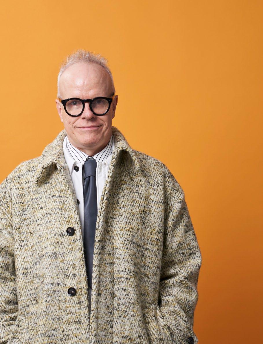
The future is often invented with fragments from the past.
Delighted to welcome Hans Ulrich Obrist, a prominent Swiss Curator, Art Critic, and Art Historian to the Art & Culture Magazine, Hans is also the highly esteemed Artistic Director of the Serpentine in London.
Hans has overseen numerous groundbreaking exhibitions and projects since 2006, and is greatly renowned for his innovative approach to contemporary art. Celebrated for his commitment to expanding the boundaries of art presentation, often engaging with a wide range of disciplines and international artists, it has been such a privilege to chat to Hans about his work and creative endeavours.
Q: Thank you so much for joining me today Hans! To start off with, please tell us a little bit about yourself and the work that you do.
A: So, I’m the Artistic Director of the Serpentine and a Curator. I’ve been working with artists since I was a teenager at 16 or 17 years of age. I think it’s important to connect the visual arts with all the other art forms and even go beyond in order to bridge the gap between the humanities and the sciences. I think I’d consider myself a bridge builder!
Q: Tell us a bit about your professional journey in the art world over the years, and now as the Artistic Director of the Serpentine in London.
A: I began with my exhibition titled The Kitchen Show when I was still a student. I studied Economy and later started to work in Paris. I would organise small exhibitions in museums, I worked with the Biennale and then found myself working internationally. I’ve curated a lot outside of the museum as I want to bring art into society. In 2006 I then joined the Serpentine, and I’ve been very interested in the Pavilion Project where we commission architecture every year. You’re not only exhibiting, but building.
My parents weren’t into art, but art was always coming into our home. I saw billboards with artists like Keith Harring, I came across artists who sold flowers on the streets of Zurich, paintings in the streets and so on. While my parents didn’t take me into museums, I wouldn’t have had this encounter if it weren’t for artists bringing their work into the streets. I believe we need to bring art outside the doors of the museum and to the people. I then started going to museums and became interested in the field of art, and when I came across the work of Giacometti
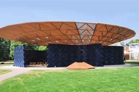
this left an indelible mark on me which instantly captivated me.
Q: I love that your mission is to bring art from inside the museum, outside to the streets. It’s very much aligned with our ethos too: ‘art is for everyone’. What projects are you currently working on, and can you give us an insight as to any upcoming exhibitions that will be taking place at the Serpentine?
A: Absolutely. So, we just opened two exhibitions, one is by Arpita Singh who is a pioneering Indian artist. She works a lot on memory as a thematic concern and is a truly great painter. She’s very well known in India but not in Europe. We also have an exhibition by Giuseppe Penone which is inside and outside of the gallery. He brought his tree sculptures into the park and this ties in beautifully with our annual theme on ecology. Penone really invites us to be in communion with the environment. Then we have the Pavilion, and a special playground of Lego as urbanism by Peter Cook.
But, I must say I’m very excited about what we’re doing at the moment with Peter Doig. We’re working on an exhibition for this Autumn, just in time for Frieze in late September which brings together art and music. Sound appears in his work and at the same time we have sound systems from the earlier 20th century as well. His installations
and paintings complimented by the sound systems and his own record collection along with other invited guests to play their records is such an interesting fusion. It brings forth emotion, much like Gerhard Richter’s acapella-complemented exhibition. Video games are another theme we seek to explore. They are very collaborative and bring together scripts, writing, storytelling, animation, film, sound and we’re very interested in working with this medium.
Q: From having such a multifaceted career in the art world as an Art Curator, Critic, and Art Historian, what role would you say is your favourite and why?
A: I think it’s very holistic and one role complements the other. It’s a very generous profession which involves fundraising, and so many aspects to realise the dreams of architects and artists. I often ask artists about their unrealised projects which they cannot do, and I often think about what we can do to make this artistic dream become a reality. This is my favourite activity. I like

to bring worlds together. We live in an age which is very divided and polarised. I think it’s important that we build bridges between worlds that don’t talk to each other. I’m currently working on a project which brings art and football together alongside Juan Mata. I co-curated an exhibition about this which brings together football as urbanism and art. It’s about bringing together.
Q: One of your projects I absolutely loved was The Interview Project. Can you tell us a bit about this and what inspired you to do this.
A: I’ve always been in conversation with artists and The Interview Project began to share their ideas with the world. So far, we have almost 4000 hours of conversations of which about 2000 hours are film!
Q: Some very iconic figures have featured in your published interviews. From Richard Hamilton (032c) to Tracey Emin (Manifesto & Poetry Marathon 2008-9). What would you say have been some of your most memorable interviews and why?
A: It’s difficult to mention a favourite, as so many of these conversations have been lifechanging. I would say that the
conversations I also published as both an English and French text with Édouard Glissant were very inspiring as a toolbox for me on how to make exhibitions. These are certainly the ones that have had the biggest impact on my practice.
Q: What challenges have you encountered during such a pivotal career in the art world?
A: There is always the challenge of cost in order to produce a reality. It is also exciting, although challenging. Another challenge would be to liberate time. We live in such an accelerated world and very often artists want to work on long-term projects not on ones which are fast events. To liberate time is something I’m trying to do with my exhibitions.
Q: With your published book titled A Brief HistoryofCurating, what lead you to research and write this book?
A: That’s also a very interesting question, thank you for asking that! I realised at a certain moment that there was a lot of interest in this notion of curation. The world found it to be used not only in the art world, but in other disciplines as well. When
I first told my parents I decided to become a Curator they thought this was in the medical profession, almost to ‘cure’ the world. There was very little literature about the history of curation, and I met some pioneers of the field who taught me a lot, so I sought to record this insight from my mentors and share it with the world. It has now been translated into so many languages that it’s been very exciting for me.
Q: Are there any specific time periods or movements within the history of art that you’re particularly interested in?
A: I think the future is often invented with fragments from the past. To invent the future, we need to work with the past as well, and simultaneously, I’m also very interested in the extreme present and what’s happening right now. It’s about working with these different temporalities. There is a particular amnesia about the just past and the more remote past. It’s a transhistorical way of curation. I’m very interested in the Black Mountain College as well, which I’ve always thought we should have for our time. I would’ve loved to be there with Robert Rauschenberg, Josef Albers etc during those times of art, craft and society coming together.
Q: If you could curate the space for any artist, past or present, who would it be and why?
A: It depends on which space!
Thank you for your great questions!
By Tamara Bell
“I often ask artists about their unrealised projects which they cannot do, and I often think about what we can do to make this artistic dream become a reality.“


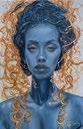


Based in South East London, Dan studied art at college before receiving his (BA) Hons in Design. After graduating he returned to Australia and settled down in Sydney for seven years. In this vibrant city he honed his creative skills and specialised in urban art which has informed his work since. Dan is involved in various charities through the sale of his artwork such as the Peter Jones Foundation, WWF and the British Heart Foundation. Dan also donates artwork to a variety of auctions such as the annual Acton Homeless charity auction and the Amy Winehouse Foundation.
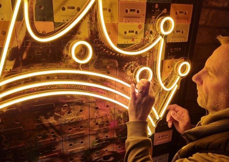
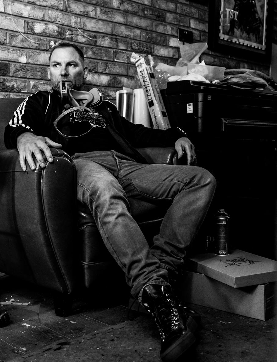
It can be a long and lonely road for an artist to get recognised and I do believe you need a lot of luck.
Q. When did you first realise your skill and passion for art creation?
A. I was always sketching as a kid and it’s what I enjoyed most at school. Following school I went to Art college which I really enjoyed and realised this is what I want to do. I ended up in university and read a jewellery degree which was a bit random but something I really enjoyed, I then spent four years working with precious metals and stones which has had a huge influence on how I approach my art today.
Q. Do you have any other cultural interests aside from painting and/or sculpture?
A. I assisted writing and directing a short film last year which was an amazing experience and something I’d like to continue doing more of most certainly!
Q. How did your work begin to gain such recognition?
A. I have been painting for approximately fifteen years but it’s only really the last five years my artwork has really gained recognition. It can be a long and lonely road for an artist to get recognised and I do believe you need a lot of luck. I managed to secure some celebrity commissions which really helped my profile. You just have to keep at it and stay positive.
Q. What challenges have you experienced in this profession?
A. Starting out as a full-time artist can be tough, you need to believe in yourself and your skills. It takes time to become established so you need to be patient, always be positive and never give up, share your art on your social platforms and enjoy the process. I still don’t see this as a profession, as I love what I do, and I am blessed to earn a living to do it.
Q. What would you like to accomplish with your art/what are your future goals?
question I get asked most). I just learnt the craft and perfected it.
“I did a commission for Sharon Osbourne a few years ago which she thanked me with by placing a video on Instagram… my art career has led me down many crazy paths.“
A. I love to collaborate with other creatives on various projects and always test myself. I assisted in writing and directed a short film last year. I painted my first wall Mural in Camden, I didn’t really know what I was doing but I received amazing feedback. I would like to do more short films, maybe act in them and continue to experiment with new ideas and collaborate with other creatives. My future goal for this year is to exhibit overseas, I have my eye on Art Basel, Miami.
Q. What are your favourite and least favourite mediums to use?
A. My favourite would probably be spray paint as it’s what I use every day and what I have complete control over (no I was not a graffiti artist and I did not paint trains, a
My least favourite is resin another medium I use most days, but it’s very temperamental and you don’t have much control over it. Temperature is a huge factor to it curing correctly, it bubbles so you need to add heat to get it flat. If you get it on your hands it’s a nightmare, it’s also toxic and sometimes I have come into my studio the next day to find a poor fly in the middle of a piece of art set solid in resin.
Q. Have any specific artists influenced your work, if so, which ones?
A. Yes 100%. Every artist has influence. Art has been around since cavemen used chalk on cave walls. In art college I loved a few artists that always stuck with me: Dalí, Joan Miró, MC Escher and Andy Warhol.
When I first started painting during my adulthood I loved Banksy, Dface and Shepard Fairey and how they transformed the art world and opened the gallery doors to urban art. I also collect a lot of art, I don’t have my own art on my walls at home, but it’s very varied from Kenny Random, Ben Eine, Opake, Maxim, Thierry Noir to PichiAvo and many more.
Q. Do you have any memorable/funny anecdotes to share with us from your journey as an artist?
A. I have many! I did a commission for Sharon Osbourne a few years ago which she thanked me with by placing a video on Instagram but what was funny was what her husband Ozzy Osbourne said, he cracked me up with his thank you speech, check it out on my Instagram feed! As for memorable, it would have to be all the folks I have met along the way from other amazing creatives, interesting celebrity commissions and those that I speak to at my exhibitions who I love to chat to and listen to. My art career has led me down many crazy paths. One day I will write a book!
Q. What are your favourite movements within the history of art?
A. The huge wave of urban art that changed the way galleries sold art, they all became accessible to normal people. Galleries used to be intimidating places full of traditional art with gallery owners speaking a language I did not know. Now all galleries are very accessible to all walks of life and are fun, inviting and enjoyable.
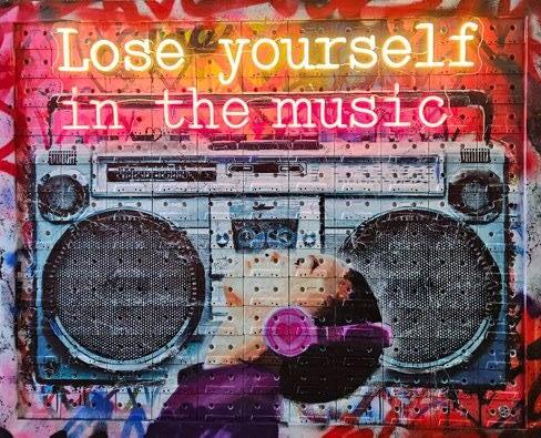
If I have to put my art history hat on and transport back to my college days then I was a huge fan of the Renaissance and still am. I am a huge Michelangelo fan and like to implement that style of work into my artwork today.
Q. What projects are you currently working on/will you be working on next?
A. I have a very busy year with Clarendon Fine Art who I am signed to. I will be exhibiting throughout the UK all year in various Clarendon galleries. I am always getting involved in other projects, and a recent project is Artizm which is a joint show with 20 other creatives. I hope to do more murals and go very big. Its never a dull moment being an artist!
By Tamara Bell
FIND OUT MORE ABOUT DAN PEARCE HERE
“Her art captures the transformative journey for both the artist and the viewer.”
NIKKIJAVID.COM
Nikki Javid specialises in large-scale acrylic canvases, and is particularly known for her innovative series, where rag becomes the primary tool for making expressive artworks. Her art communicates themes of growth and the journey of the inner-self for both herself as the artist creating the piece, and observer of her work. Her abstract art has been exhibited at the Brewery Art Walk Exhibition, and is beginning to circulate more widely in today’s contemporary art world.
Mason Newman is a British contemporary artist and designer renowned for his provocative and irreverent approach to art. Self-taught and unafraid to challenge conventions, Newman delves into themes of celebrity, consumerism, sexuality, and mental health. His work is characterised by a darkly comedic tone, aiming to provoke thought and elicit visceral reactions.

“I collect vinyl, I DJ, I hoard clothes like I’m prepping for an apocalypse.“
Newman’s unconventional materials — ranging from defaced dollar bills to discarded fast-food packaging — reflect his belief that art can be found in the everyday and the overlooked. His audacious style has garnered attention from major brands, high-profile collectors and celebrities such as pop star Billie Eilish.
Q. When did you first realise your skill and passion for art creation?
A. I always knew I had ‘something’ in me, call it creativity, call it undiagnosed Bipolar. But it didn’t really slap me in the face until I was 18, making clothes. That’s when I caught the bug. That’s when ‘making stuff’ became ‘this might be my actual life’. There was no other choice.
Q. Do you have any other cultural interests aside from painting and/or sculpture?
A. Yes, the best threesome: music, fashion, and pretending I can do it all! I collect vinyl, I DJ, I hoard clothes like I’m prepping for an apocalypse. I’ve got over a thousand pieces easy. I saw a video of Nigo with his giant warehouse full of stuff — clothes, art, toys, chaos — and I was like, ‘yep, that’s the dream’. The art world can keep their white cubes. I want a massive shed full of culture.
Q. How did your work begin to gain such recognition?
A. The Ed Hardy collab lit the fuse. Then boom — sales, attention, Forbes’ 30 Under 30, all that shiny stuff! But none of it means I can stop hustling. I still kick down every door ‘cause the art world ain’t opening them for me.
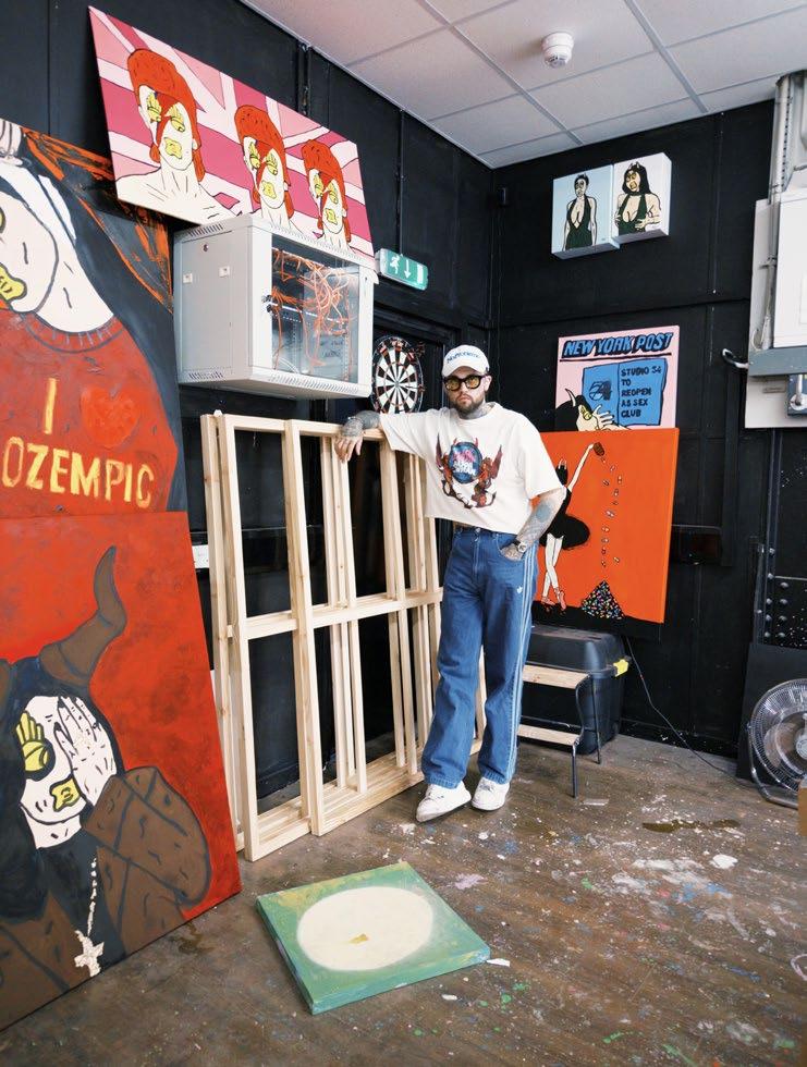
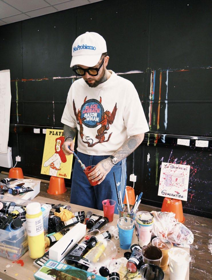
The art world can keep their white cubes. I want a massive shed full of culture.
“I’m big on Prince, Virgil, Lenny Kravitz, Ozzy — artists who didn’t stay in their lane, which is basically my whole vibe!“
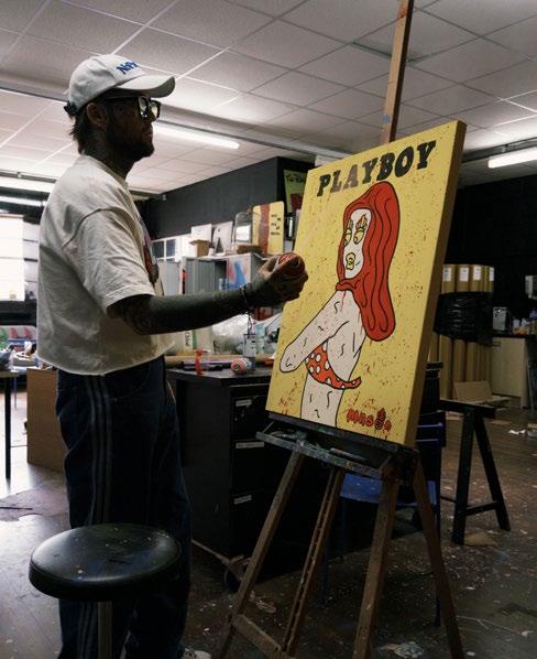
Q. What challenges have you experienced in this profession?
A. Coming from a council estate, I weirdly never had trouble mixing with the rich or the cool. But, the art world? Different beast. I got signed to an agency once — some lady on the intro call looked at me like I was dirt ‘cause I didn’t go to some fancy art school, she said I should ‘go study’. Meanwhile I’m selling more work than half their portfolio and her herself. Weird game!
Q. What are your future goals?
A. I want an MBE, a creative director role at a proper fashion house, a Saatchi solo show. And, a big studio in Birmingham where working-class kids can make mad stuff with actual mentorship — not just art schoolteachers who hate their jobs and wives!
Q. What are your favourite and least favourite mediums to work with?
A. I love oils, but I mostly use acrylics. With spray paint, I don’t love how it looks, but I can’t deny it saves time, and clay? No, absolutely not!
Q. Have any specific artists influenced your body of work?
A. Warhol’s the big one. He understood culture before culture understood itself. I’m also big on Prince, Virgil, Lenny Kravitz, Ozzy — artists who didn’t stay in their lane, which is basically my whole vibe!
Q. If you could collaborate on a project with any artist (past or present) who would it be and why?
A. Right now, Damien Hirst. Let’s make something expensive! I already ticked off my dream one though which is Ozzy and Sabbath. It’s hard to top that!
Q. Are you working on any current projects that you can share with us?
A. I can’t say too much, but there’s loads dropping this year. Black Sabbath x MN, Ozzy’s final show x MN, Toyshop x MN. It’s chaos in the best way!
By Tamara Bell
FIND OUT MORE ABOUT MASON NEWMAN HERE
“A few years ago I felt the need to create my own movement, that I called Neo-emotionalism. A movement where the importance of creating with emotion goes beyond the technique used.”
FABIAN PEREZ
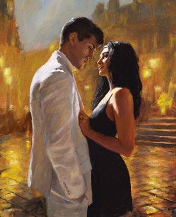
Influenced by his travels to Japan, Argentinian artist Fabian Perez aims to combine figurative & abstract styles. He believes the purpose of art is to perpetuate beauty and therefore gives colour to mood in order to make the viewer feel with complex rhythmic patterns. Likening painting to music, Fabian compares colour, technique and subject matter to music, lyrics and poetry. With a particular affinity towards Argentinian Tango culture, the romanticism and passion of movement with which two bodies move in unison greatly inspires Fabian’s overall oeuvre.
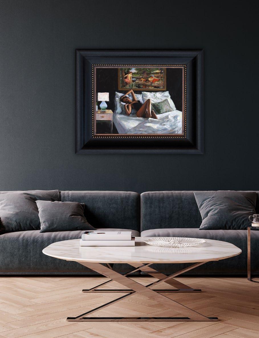
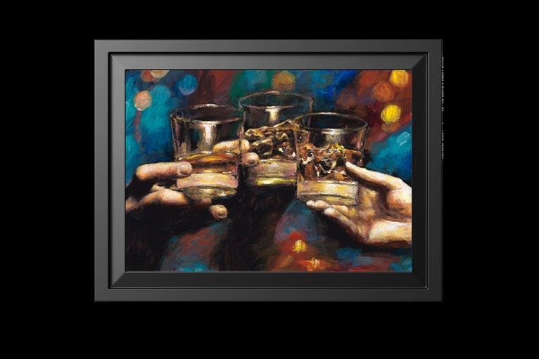
Debbie Wingham is a British multimedia artist and designer renowned for her opulent creations that blend fashion, fine art, and luxury. Dubbed the ‘Queen of the World’s Most Expensive’, she has crafted a series of record-breaking pieces, including the world’s most expensive dress, shoes, cake, and even a Christmas tree adorned with precious gems.

Her creations have attracted a global clientele, including celebrities, royals, and high-net-worth individuals, and have been featured in over 70 television shows and more than 100 magazine covers. Wingham’s work is characterised by its extravagance and media appeal, often incorporating diamonds and other luxury materials to create pieces that are both art and statement.
Q. Can you tell us a little bit about yourself and how you initially began creating some of the world’s most extravagant creations?
A. I never imagined I’d become one of the world’s most expensive artists. Growing up in a council estate in northern England, my roots were humble — so the irony of being globally known for diamonds isn’t lost on me. The Black Diamond Dress, my first World’sMostExpensive creation, was my bid for recognition. I’d already worked with major brands and dressed countless celebrities, but always under someone else’s label. I needed something to change that — so I dreamed up the diamond dress. That dress didn’t just elevate my career — it transformed my life.
Q. When did you first gain an interest in the art world, and decide that this was what you wanted to do professionally?

A. I’ve always been evolving. Creativity is my superpower, whether it’s expressed through wearable art like haute couture and fashion accessories, edible art, or fine art collectibles. I’ve known since I was 11 that my path would be a creative one, but the medium? That changes all the time. At age 11 I sold the first dress I made to a sixth former, I was raised by a tailor mum and dressmaking was definitely my first love!
Even now, with a range of collectible and accessible art, I’m still growing, still experimenting. Art has always been my passion — from the surreal dreamscapes of Dalí (my Drip Collection certainly nods to that) to the delicate strokes of the French Impressionists, and Banksy’s bold statements captivate me.
Q. Can you walk us through the journey of creating one of your most iconic pieces, like the $15 million heels?
A. Most of my creations follow a similar process. Everything starts with the design, inspired by the client’s passions. In this case, the shoes were crafted for a woman who adored two things: afternoon tea around the world and collecting shoes. Naturally, I merged them into one gloriously eccentric piece. It’s a little bonkers — but then, so are my clients (in the best way). That’s why my portfolio is so wildly diverse. Her father shared her favourite things with me — he simply wanted to gift her diamonds in a way that reflected her personality. The result?
A pair of heels that can either be worn or displayed as art. The thought of dancing in them all night makes me a little nervous, but hey — to each their own!
Q. Your creations often merge art, fashion, and culinary design. How do you conceptualise such multidisciplinary projects?
A. Switching between so many different mediums requires serious organisation — but that’s exactly why I love it. There’s no time to get bored when every project keeps you on your toes! At the end of the day, whether I’m working with fondant, silk, resin, or chocolate, my creative process stays the same. Once you understand how a material behaves, it doesn’t matter if it’s meant to be eaten, sculpted, or worn!
Q. You’ve been dubbed the ‘Queen of the World’s Most Expensive’. How do you approach setting new benchmarks in luxury?
A. I’m fiercely selective, only taking on work that truly excites me. While I constantly receive offers from private clients and major brands wanting to collaborate on diamond projects, I’ve become increasingly discerning. This shift comes as I’m developing an entirely new commercial proposition. Sustainability in luxury has always been important to me, and this next chapter fully embraces sustainability, locally sourced
“It’s not just art; it’s a rebellion in luxury form.“

and affordability. It’s not just about creating beautiful things anymore; it’s about crafting a legacy that aligns with my values that everyone can enjoy.
Q. What challenges have you faced in maintaining your brand’s identity across diverse mediums and markets?
A. That’s a good question, but truthfully I’ve always marched to my own beat. I don’t get too caught up in outside opinions or industry noise. When you’re one of the few creators who’s found success across so many different fields, you earn the freedom to follow your instincts. At this point, I’ve built the credibility to trust my own compass.
Q. After years in Dubai, you’ve returned to Spain and launched Additions. What inspired this transition, and how does it reflect your personal growth?
A. Dubai will always be one of my great muses – a place where the impossible becomes reality. The city holds a special place in my creative journey. But, Spain speaks to my soul differently. Here, I’m surrounded by nature, the landscape itself stirs something deep and artistic within me. While Dubai’s electric energy sparks its own kind of inspiration, I’ve found that true creativity flows best in tranquillity. That, along with being closer to my family in England, makes Spain the perfect home for this chapter of my life.
Q. Do you have any memorable/funny anecdotes to share with us from your journey as an artist?
A. I’ve got enough horror stories to fill a memoir! Take it from me, crafting massive edible installations and small children is a disastrous combo. Picture sugar sculptures meeting tiny tornadoes and you’ll get the idea!
Q. What projects are you currently working on/will you be working on next?
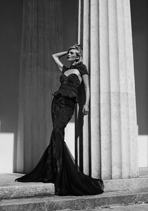
A. A new World’s Most Expensive creation is coming very soon. And, my Drip Collection is expanding with fresh designs, including more accessible pieces —some even crafted from sustainable materials. Think high-top sneakers and a bold new timepiece design — all reimagined with that iconic melting effect. At its core, the Drip Collection plays with modern status symbols, warping and redefining them. It’s not just art; it’s a rebellion in luxury form. It’s a sarcastic take on commercialism.
By Tamara Bell
FIND OUT MORE ABOUT DEBBIE WINGHAM HERE
“Once you understand how a material behaves, it doesn’t matter if it’s meant to be eaten, sculpted, or worn!“
“Paul showed an interest in painting from an early age; while others wanted to be doctors or pilots, he clearly remembers telling a teacher that he wanted to be an artist.”
PAULKENTON.COM

Paul Kenton is a contemporary British artist renowned for his vibrant cityscape paintings that capture the dynamic energy of urban life. Kenton’s distinctive style blends impressionistic techniques with bold colours and expressive lines, often layering acrylics and oils on metal surfaces to create depth and movement. His works frequently depict iconic cities like London, New York, Paris, and Dubai, aiming to convey the unique mood and atmosphere of each location.

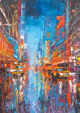
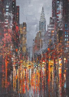
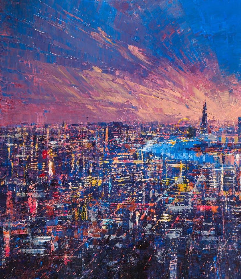
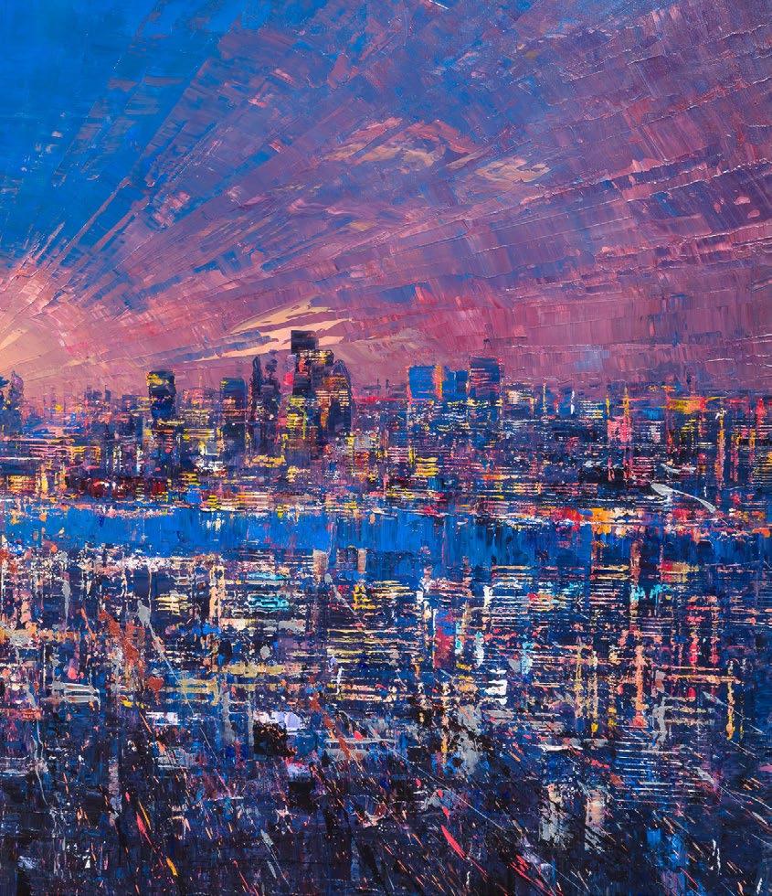

Mr. Brainwash, the artistic persona of Thierry Guetta, is a French-born, Los Angelesbased street artist whose meteoric rise to fame has both captivated and confounded the contemporary art world. Blending elements of pop culture, graffiti, and raw street energy, his work is an explosion of colour, irony, and optimism.

Mr. Brainwash challenges conventional definitions of art and authenticity and is renowned for transforming the familiar into the fantastical by turning cultural icons into bold statements of joy, rebellion, and artistic freedom. Being a symbol of the unpredictable power of modern creativity, he joins us at the Art & Culture Magazine in this candid and exclusive interview.
Q. When did you first realise your skill and passion for art creation?
A. I never ‘planned’ to become an artist — it just exploded out of me like a can of paint hitting the wall. One day, I picked up a camera and started documenting street art, and the next, I realised I wasn’t just watching history, I wanted to be part of it. I didn’t discover art. Art discovered me. That’s when passion met purpose.
Q. Do you have any other cultural interests aside from painting and/or sculpture?
A. Absolutely. I’m obsessed with everything that moves the human spirit — music, film, architecture, dance, even fashion. Life is art.
A child’s laughter, a shared meal, an old vinyl record — all of it is culture, all of it is beautiful. I believe art doesn’t live in a museum — it lives in every heartbeat.
Q. How did your work begin to gain such recognition, and what message do you seek to convey with your art?
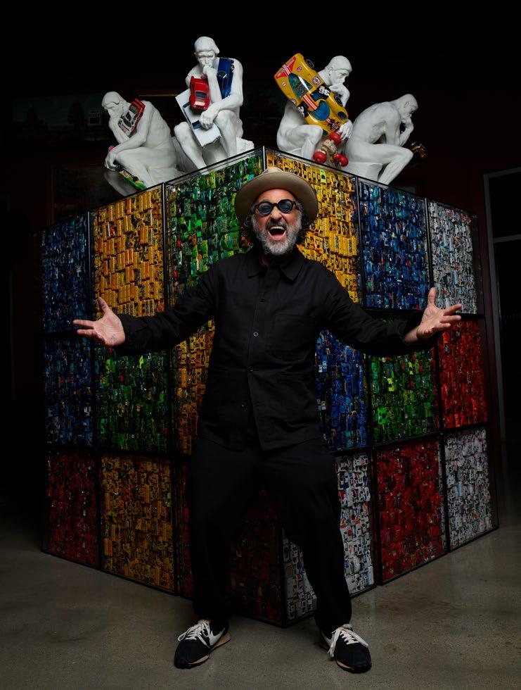
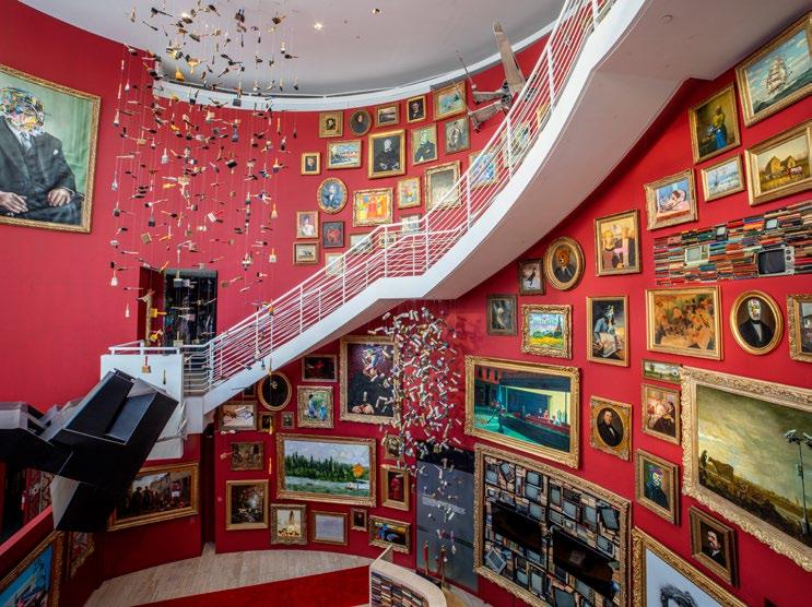
A. Recognition came because I wasn’t trying to impress — I was trying to express. My art says: ‘Life is Beautiful’. It says: ‘Love is the Answer’. People connected to that. In a world full of chaos, they saw hope splashed in colour. And I think when you speak from the heart, the world listens.
“In a world full of chaos, (people) saw hope splashed in colour. And I think when you speak from the heart, the world listens.“
Q. What challenges have you experienced in this profession?
A. The biggest challenge? Being misunderstood. People love to put you in boxes, but I was never meant to fit in one — I was born to break them. There’s also the pressure of expectation… but I don’t let that stop me. I remind myself every day to stay wild, stay messy, stay true.
Q. What would you like to accomplish with your art in the coming years and what are your future goals?
A. I want to build more spaces where people feel — like my museum in Beverly Hills, or
giant installations around the world. I want to turn cities into playgrounds of positivity. I want to remind every person, from every walk of life, that they matter.
Q. What are your favourite and least favourite mediums to use?
A. I love everything. Spray paint, sculpture, broken records, neon, canvas, walls, cars — I’ll even paint a toaster if it speaks to me! I don’t really have a favourite. The only medium I don’t like is silence. Art should make noise, even if it whispers.
Q. Have any specific artists influenced your work, if so, which ones?
A. Yes, so many. Warhol taught me that pop is powerful. Basquiat reminded me to be raw. Keith Haring gave me movement. And Banksy — he challenged me to look at the world differently. But honestly, I’m inspired by everyone who creates with courage. From Picasso to a kid with a crayon.
Q. What are your favourite movements within the history of art?
A. I believe every movement is important like the one that’s happening right now — this moment, where art is no longer locked behind velvet ropes. It’s on buildings, buses, and in your heart.
Q. What projects are you currently working on or will you be working on next?
A. I can’t talk about them yet, but I’m working on new collaborations and a few surprises I can’t wait to reveal. Imagine a place where joy meets chaos, and inspiration falls from the ceiling. Stay tuned…
By Tamara Bell
FIND OUT MORE ABOUT MR BRAINWASH HERE

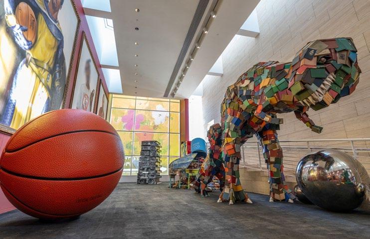
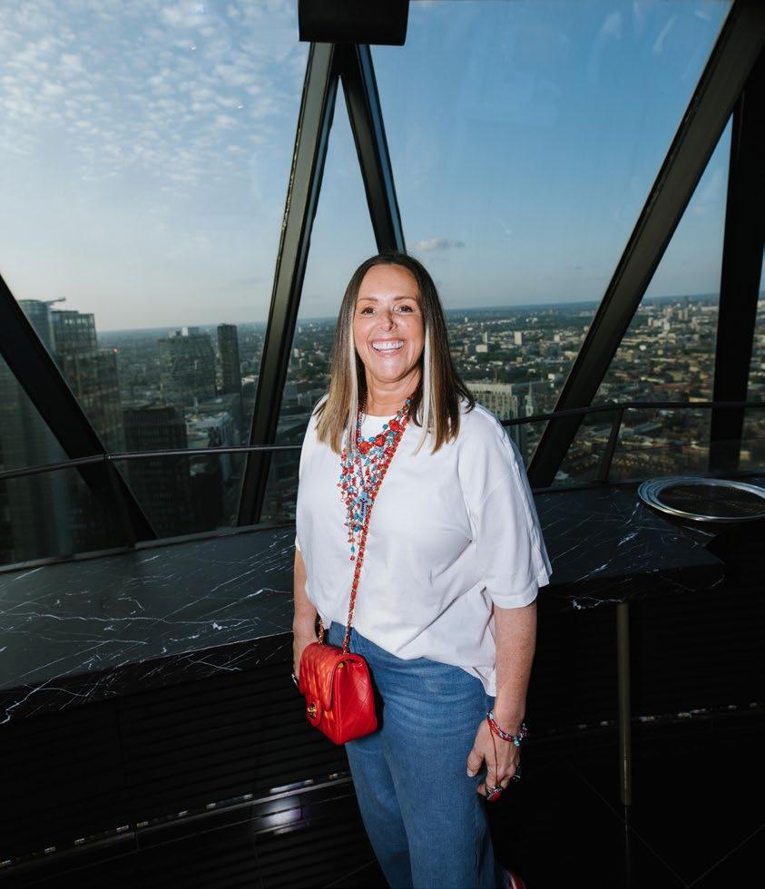
Zara Muse embodies warmth, positivity, and resilience.

“Zara Muse embodies warmth, positivity, and resilience. She radiates joy and empowerment, not only through her artwork but also in her interactions with others.”

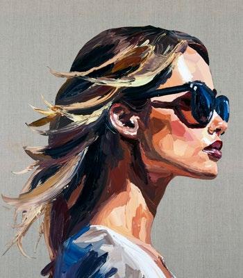
Zara Muse is a British contemporary artist celebrated for her richly textured, emotionally resonant paintings. She began creating art as a form of therapy, developing a distinctive technique using palette knives and spatulas to produce vibrant, three-dimensional works that explore themes of nature, femininity, and human connection. Muse’s art is characterised by its celebration of female strength and emotional depth, often inspired by influential women in her life. Her pieces have been featured in prestigious exhibitions and have attracted a diverse clientele, including celebrities and international collectors.

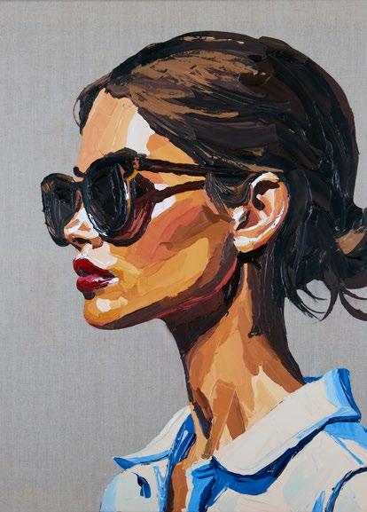
Don’t miss out on our Q&A with feature artist Simon Kenny in our next issue of Art & Culture Magazine.
Find out about his work so far and his exciting new work ready for his next run of solo exhibitions.
Vulnerability isn’t a weakness; it’s the thing that connects us all.

The shape of beauty.
Ferrari invite you to discover the Ferrari Roma Spider. A timelessly elegant high-performance car, encapsulating a contemporary take on the chic, pleasure-seeking Italian lifestyle of the 1950s and 60s.
Contact your Official Ferrari Dealer to discover more.
Fuel economy and CO2 results for the Ferrari Roma Spider in mpg (l/100km) combined: 14.7 (19.2) – 29.7 (9.5). CO2 emissions: 437 –217 g/km. Figures shown are for comparability purposes; only compare fuel consumption and CO2 figures with other cars tested to the same technical procedures. These figures may not reflect real life driving results, which will depend upon a number of factors including the accessories fitted (post-registration), variations in weather, driving styles and vehicle load.