Style Guide
Graphic policy for all internal and external communications


Last Updated: September 22, 2022


EDI Style Guide 1 Table of Contents General Consistent Visual Branding Requires Consistent Usage 2 Why Are the Guidelines Important? 2 About EDI 2 Logo Usage Logo Usage 3 Logo Clearance 4 Logo Minimum Size 4 Correct and Incorrect Logo Usage 5 Correct Logo Usage Examples 5 Incorrect Logo Usage Examples 5-6 Design / Formatting General Formatting Notes 7 Color Palette 7 Typefaces / Fonts 8 Primary Font: Trade Gothic 8 General Typography Notes 8 Acceptable Font Substitution 9 Graphic Elements 10 Texture / Pattern 10 Photography / Images 11 Icons 12 E-blasts 12 PowerPoint 12
Consistent Visual Branding Requires Consistent Usage
To achieve consistent visual branding throughout all corporate communications and promotional materials, as well as across multiple media, we have established a corporate identity standard to aid you as you create these new materials.
This manual provides guidelines for proper branding and includes design and color systems. When using the EDI corporate identity for any internal or external forms of communication, either for print or electronic media, follow the guidelines as specified in this document.
Why Are the Guidelines Important?
Brand guidelines assist the internal EDI team and outside vendors in maintaining the integrity of the established design system and the overall brand.
These guidelines illustrate established design rules and are instrumental in maintaining brand consistency across all materials through which the EDI prospective and current clients, employees, industry partners, media and other stakeholders experience the brand.
About EDI
Founded in 1999, EDI is a full-service consulting and technology firm that specializes in Maintenance, Asset and Facility Life Cycles, and the business processes and software that support them. Through the development of integrated workplace management software (IWMS), EDI provides industryspecific solutions designed to:
+ Reduce implementation time
+ Provide intuitive tools to enhance performance
+ Decrease the cost of software deployment
+ Increase ROI via cost savings and time smart IWMS solutions
+ Enhance company-wide efficiency
+ Minimize the potential for errors
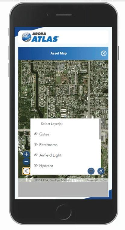
In addition, EDI is co-developer of Arora ATLAS®, an enterprise level suite of mobile products designed to simplify and enhance asset management through the seamless convergence of asset data and location services.
Helping organizations implement mobile, RCM, Root Cause Analysis, and risk-based maintenance strategies, EDI has emerged as a leader in the implementation of Maximo® in a variety of industries including Utilities, Water/ Wastewater, Transportation, Life Sciences, to name a few.
EDI continuously demonstrates the ability to deliver projects on-time and underbudget while significantly improving the performance of Maintenance, IT and Operations at all organizations EDI assists.
EDI Style Guide 2
Logo Usage
Color logo for use on white or light colored backgrounds
This logo is available in the following formats:
+ JPG - file name: EDI Logo - An Arora Company COLOR.jpg
+ PNG - file name: EDI Logo - An Arora Company - COLOR.png
+ EPS (vector file) - file name: EDI Logo - An Arora Company.eps
White logos for use on dark background or dark photos
This logo is available in the following formats:
+ PNG - file name: EDI Logo - An Arora Company - WHITE.png
+ EPS (vector file) - file name: EDI Logo - An Arora Company - WHITE.eps
Black logo for engraving or embroidery
This logo is available in the following formats:
+ EPS (vector file) - file name: EDI Logo - An Arora Company - B&W.eps
EDI Style Guide 3
Logo Clearance
When using the EDI logo in conjunction with other elements such as other logos, text and graphics, keep these other elements a minimum distance from the logo equivalent to 1/4 of the height of the letters edi measured from the ascender to the baseline of the letter d and the letter i. Additionally, logos should be kept at a minimum of 3/8” from the edge of a page, screen, etc.
1/4 height from ascender to base of the d and i
Full height from ascender to base of the d and i
Logo Minimum Size
Consider the readability of the tagline when determining the logo size. Although it is understood that factors may exist that prevent adherence to this standard, the desired minimum size for the EDI logo is .55” wide for print or digital applications. If the logo is used in the footer of a publication such as a proposal, the minimum size is .325” wide, but the “An ARORA Company” Tagline should be removed from the logo and appear to the right of it at a height of .1” measured from the ascender to the descender of the type height as shown below.
EDI Style Guide 4
.55” wide EDI® logo minimum width .1” tall .325” wide Document Name | | X EDI®
logo minimum width with tagline appearing at its minimum height to the right of the logo in a footer
Correct and Incorrect Logo Usage
Proper logo usage is important. Always consider the background when deciding which logo to use. Factors such as background color and contrast impact readability. Use the following examples as a guide for correct and incorrect logo usage.
Correct logo usage examples
The color logos work best against a white background.
The white logos work best against darker photos.
The color logos also work well against lightly colored backgrounds like tints.
Incorrect logo usage examples
The white logos work best against darker colored backgrounds.
The color logos do not work well against dark backgrounds–they do not read well.

The color logos do not work well against dark photos–they do not read well.
The color logos do not work well against background colors similar to the logo colors.
Even light background photos can make the logo hard to read. Do not use the logo against a chaotic image.

EDI Style Guide 5
General Formatting Notes
When EDI was established, the company name was Electronic Data, Inc. (EDI). Now EDI is officially Electronic Data, LLC but still goes by EDI.
Color Palette
Color Systems
There are four commonly used color systems and each system is used for a specific output process. In print, whenever possible, use the Pantone Matching System (PMS). The colors can also be reproduced through the four color process (CMYK).
Pantone Matching System (PMS) colors should be used for print items that do not include photography as it provides the most accurate and consistent color reproduction. Consider this option whenever is possible (e.g., you can run PMS colors as a 5th/6th color for full-color printing).
CMYK is the system used for full-color printing. The four colors that are used in CMYK printing (cyan, magenta, yellow and black) can be overlapped in different ways to create a reasonable representation of the visual spectrum.
RGB color is used for digital materials (e.g., Word docs, PPT, video) where a monitor will be the main viewing device.
HEX colors are used for web applications; HEX colors are easily recognized by the “#” sign preceding a 6-digit number, which could be all letters, all numbers or a combination of the two.
CMYK C100 M85 Y5 K25
RGB R0 G34 B105
HEX # 012169
CMYK C38 M14 Y2 K1
RGB R225 G125 B0
HEX #D67D32
CMYK C23 M16 Y13 K46
RGB R136 G139 B141
HEX #888B8D
EDI Style Guide 7
Pantone 280
(Commonly referred to as EDI Dark Blue)
Pantone 2954
(Commonly referred to as EDI Medium Blue)
Pantone 651
(Commonly referred to as EDI Light Blue)
Typefaces / Fonts
Primary Font: Trade Gothic
In order to achieve a cohesive style in all marketing materials, it is critical to use typefaces consistently. The primary typeface/font is Trade Gothic with the following font variations: Light, Light Oblique, Regular, Oblique, Bold No. 2, and Bold No. 2 Oblique. Never distort, condense, stretch, or alter the typeface in any way.
Trade Gothic is shown in the following order: Light, Light Oblique, Regular, Oblique, Bold No. 2, and Bold No. 2 Oblique
abcdefghijklmnopqrstuvwxyz
ABCDEFGHIJKLMNOPQRSTUVWXYZ 0123456789(.,!?&%$)
abcdefghijklmnopqrstuvwxyz
ABCDEFGHIJKLMNOPQRSTUVWXYZ 0123456789(.,!?&%$)
abcdefghijklmnopqrstuvwxyz
ABCDEFGHIJKLMNOPQRSTUVWXYZ 0123456789(.,!?&%$)
abcdefghijklmnopqrstuvwxyz
ABCDEFGHIJKLMNOPQRSTUVWXYZ 0123456789(.,!?&%$)
abcdefghijklmnopqrstuvwxyz
ABCDEFGHIJKLMNOPQRSTUVWXYZ 0123456789(.,!?&%$)
abcdefghijklmnopqrstuvwxyz
ABCDEFGHIJKLMNOPQRSTUVWXYZ 0123456789(.,!?&%$)
General Typography Notes
Unless it creates a readability issue, text should appear as gray rather than solid black. Bullets should either be blue squares (■) or blue plus signs (+) as shown below. Be consistent and use one style or the other styles rather than both:
■ This is an example of square bullets
+ This is an example of a plus sign bullet
EDI Style Guide 8
Acceptable Font Substitution
In situations where it is not possible to use Trade Gothic, such as PPT or Word documents, Arial can be used with the following variations: Arial Regular, Arial Italic, Arial Bold, Arial Bold Italic. If necessary, in rare instances Arial Narrow, Arial Narrow Italic, Arial Narrow Bold, and Arial Narrow Bold Italic may be used.
Arial is shown in the following order: Regular, Italic, Bold, Bold Italic, Narrow, Narrow Italic, Narrow Bold, Narrow Bold Italic:
abcdefghijklmnopqrstuvwxyz
ABCDEFGHIJKLMNOPQRSTUVWXYZ 0123456789(.,!?&%$)
abcdefghijklmnopqrstuvwxyz
ABCDEFGHIJKLMNOPQRSTUVWXYZ 0123456789(.,!?&%$)
abcdefghijklmnopqrstuvwxyz
ABCDEFGHIJKLMNOPQRSTUVWXYZ 0123456789(.,!?&%$)
abcdefghijklmnopqrstuvwxyz
ABCDEFGHIJKLMNOPQRSTUVWXYZ 0123456789(.,!?&%$)
abcdefghijklmnopqrstuvwxyz
ABCDEFGHIJKLMNOPQRSTUVWXYZ 0123456789(.,!?&%$)
abcdefghijklmnopqrstuvwxyz
ABCDEFGHIJKLMNOPQRSTUVWXYZ 0123456789(.,!?&%$)
abcdefghijklmnopqrstuvwxyz
ABCDEFGHIJKLMNOPQRSTUVWXYZ 0123456789(.,!?&%$)
abcdefghijklmnopqrstuvwxyz
ABCDEFGHIJKLMNOPQRSTUVWXYZ 0123456789(.,!?&%$)
EDI Style Guide 9
Graphic Elements
Texture / Pattern
A key element of the EDI® brand is the Grid Pattern Background designed to reflect the six boxes in the EDI logo. The Grid Pattern is shown below overlaid on EDI dark blue, medium blue, and light blue. This texture / pattern can be used over solid colored backgrounds (A-C), gradient colored backgrounds (D), or over photo backgrounds (E). When using the texture with type, make sure that the type is in the foreground and readable.
The Grid Pattern can be used for print or digital communications and is currently incorporated into proposals, event booths, eBlasts, and PowerPoint presentations.

EDI Style Guide 10
(A) “EDI Grid texture PMS 280-70_9.25x11.25.eps” over EDI Dark Blue
(D)
(E) “EDI Grid texture White 9.25x11.25.eps” at 50% Transparency with gradient fade over image
(B) “EDI Grid texture White 9.25x11.25.eps” at 50% Transparency over EDI Light Blue
(C) “EDI Grid texture PMS 2954-70_9.25x11.25.eps” over EDI Medium Blue
Photography / Images
EDI should be represented well through the use of high-quality photos. If applicable, product screen captures may be used provided they are high resolution. Subjects should be relevant to content and intended audience. Our marketing team can work with you to provide appropriate images as needed. Contact marketing@aroraengineers.com with photo requests. Below is a small sampling of the type of images that we currently have available, but specific images can be created and provided as needed.


EDI Style Guide 11
Icons
The use of icons in EDI promotional materials is encouraged. The look and feel of icons should remain consistent and not be mixed within one piece. For example, the style, color scheme, and line weights should be consistent. EDI has a series of icons that continues to grow. Contact marketing@aroraengineers.com with icon requests. Below is a small sampling of the type of icons that are currently have available, but specific icons can be created and provided as needed.

E-blasts
A Mailchimp template named “EDI Template” in the saved templates folder of the Arora Mailchimp account should be used for e-blasts.
PowerPoint
PowerPoint templates and standard presentations are available for staff on SharePoint. Externally, send a request to marketing@aroraengineers.com
EDI Style Guide 12