Style Guide
Graphic guidelines for internal and external communications
Last Updated: October 24, 2022

Arora ATLAS® Style Guide 1
Arora ATLAS® Style Guide 1 Table of Contents General Consistent Visual Branding Requires Consistent Usage 2 Why Are the Guidelines Important? 2 About Arora ATLAS® 2 Logo Usage Logo Usage 3 Color Logos for Use on White or Light Colored Backgrounds 3 Color Logos for Use on Dark Background or Dark Photos 4 Grayscale Logos for Black and White or One Color Printing 5 Word Marks 7 Color Word Marks for Use on White or Light Colored Backgrounds 7 Logo Clearance 8 Logo Minimum Size 9 Correct and Incorrect Logo Usage 10 Correct Logo Usage Examples 10 Incorrect Logo Usage Examples 10 Design / Formatting General Trademark and Formatting notes 12 Color Palette 12 Typefaces / Fonts 13 Primary Font: Trade Gothic 13 Acceptable Font Substitution 14 Graphic Elements 15 Texture / Pattern 15 Photography / Images 16 Icons 17 E-blasts 17 PowerPoint 18 Video 18
Consistent Visual Branding Requires Consistent Usage
To achieve consistent visual branding throughout all corporate communications and promotional materials, as well as across multiple media, we have established a corporate identity standard to aid you as you create these new materials.
This standards manual provides guidelines for proper branding and includes design and color systems. When using the Arora ATLAS ® corporate identity for any internal or external forms of communication, either for print or electronic media, follow the guidelines as specified in this document.
Why Are the Guidelines Important?
Brand guidelines assist the internal Arora ATLAS® team and outside vendors in maintaining the integrity of the established design system and the overall brand.
These guidelines illustrate established design rules and are instrumental in maintaining brand consistency across all materials through which the Arora ATLAS® prospective and current clients, employees, industry partners, media and other stakeholders experience the brand.
About Arora ATLAS®
Arora ATLAS® is an enterprise level suite of mobile products consisting of six modules, Arora ATLAS® Fix, Arora ATLAS® Inspect, Arora ATLAS® Supply, Arora ATLAS® Request, Arora ATLAS® Insights, and Arora ATLAS® Connect. ATLAS is designed to simplify and enhance asset management through the seamless convergence of asset data and location services.
The six on-the-go mobile tools perform the following functions:
+ ATLAS Fix activates maintenance operations by connecting work management and location services.
+ ATLAS Inspect enhances inspections by enabling location services.
+ ATLAS Supply enables real-time inventory management through mobility and location services.
+ ATLAS Request simplifies the work request process through real-time location services and advanced intelligence.
+ ATLAS Insights combines assets, location services, and sensory data to enable better decisions through more complete information.
+ ATLAS Connect enables real-time facilities management by enabling enterprise systems to share information to break down technology silos and provide more informed decision making.
Arora ATLAS® Style Guide 2
Grayscale logos for black and white or one color printing
(Continued)
Arora ATLAS® Connect - GRY logo – This is for use in instances where marketing the ATLAS Connect Module as a stand-alone product. Only use this version if grayscale or one color printing is a requirement.
Arora ATLAS® Fix - GRY logo – This is for use in instances where marketing the ATLAS Fix Module as a stand-alone product. Only use this version if grayscale or one color printing is a requirement.
Arora ATLAS® Insights - GRY logo – This is for use in instances where marketing the ATLAS Insights Module as a stand-alone product. Only use this version if grayscale or one color printing is a requirement.
Arora ATLAS® Inspect - GRY logo – This is for use in instances where marketing the ATLAS Inspect Module as a stand-alone product. Only use this version if grayscale or one color printing is a requirement.
Arora ATLAS® Request - GRY logo – This is for use in instances where marketing the ATLAS Request Module as a stand-alone product. Only use this version if grayscale or one color printing is a requirement.
Arora ATLAS® Supply - GRY logo – This is for use in instances where marketing the ATLAS Supply Module as a stand-alone product. Only use this version if grayscale or one color printing is a requirement.
Arora ATLAS® Style Guide 6
Word Marks
Word Marks were created for each of the ATLAS Modules. Their intended use is for instances where the overall Arora ATLAS® product is promoted, and encompasses all 6 modules. Do not use these alone–they should appear only when the ATLAS logo with the tagline appears somewhere in the document, web page, or video. Here is an example of how they can be used as a grouping at the end of a video or back page of a document:
Color Word Marks for use on white or light colored backgrounds
Each of the following Word Marks are currently available in the following formats:
+ JPG + PNG
+ EPS (vector file) Should another format, such as grayscale, or whiten be required, contact marketing@aroraengineers.com with your request.
Arora ATLAS® Connect Word Mark
Arora ATLAS® Fix Word Mark
Arora ATLAS® Insights Word Mark
Arora ATLAS® Inspect Word Mark
Arora ATLAS® Request Word Mark
Arora ATLAS® Supply Word Mark
Arora ATLAS® Style Guide 7
Logo Clearance
When using the Arora ATLAS® logo in conjunction with other elements such as other logos, text and graphics, keep these other elements a minimum distance from the logo equivalent to the height of the capital letters of the word ARORA. Additionally, logos should be kept at a minimum of 3/8” from the edge of a page, screen, etc.
When using Arora ATLAS® Connect, Arora ATLAS® Fix, Arora ATLAS® Insights, Arora ATLAS® Inspect, Arora ATLAS® Request, or Arora ATLAS® Supply logos in conjunction with other elements such as other logos, text and graphics, keep these other elements a minimum distance from the logo equivalent to the 75% of the height of the capital letters of the word ATLAS. In instances where the product short name (i.e. Fix, Inspect, and Supply) is shorter than the word ATLAS, the registered trademark symbol should not be included in the 75% clearance equation. Logos should also be kept at a minimum of 3/8” from the edge of a page, screen, etc.
Arora ATLAS® Style Guide 8
75% 75% 75% 25% 25% 25%
Logo Minimum Size
Although it is understood that factors may exist that prevent adherence to this standard, the desired minimum size for each logo is as follows for print or digital applications:
Arora ATLAS® Style Guide 9 .125” tall .125” tall .125” tall .125” tall .125” tall .125” tall 75% 75% 75% 25% 25% 25%
Arora ATLAS® logo with without tagline
Arora ATLAS® logo with tagline
Arora ATLAS® Connect logo
Arora ATLAS® Fix logo
Arora ATLAS® Request logo
Arora ATLAS® Insights logo
Arora ATLAS® Insights logo
1”
1”
Arora ATLAS® Inspect logo
wide
wide
Correct and Incorrect Logo Usage
Proper logo usage is important. Always consider the background when deciding which logo to use. Factors such as background color and contrast impact readability. The following examples are applicable to all versions of the Arora ATLAS® logos and Wordmarks.
Correct logo usage examples
Incorrect logo usage examples

Arora ATLAS® Style Guide 10
The blue and gray logos work best against a white background.
The blue and gray logos do not work well against dark backgrounds–they do not read well.
The blue and gray logos do not work well against background colors similar to the logo colors.
The blue and gray logos also work well against lightly colored backgrounds like tints.
The white logos work best against darker photos.
The blue and gray logos do not work well against dark photos–they do not read well.
The blue and gray logos do not work well against background colors similar to the logo colors.
The white logos work best against darker colored backgrounds.
ARORA ATLAS
Integration and Mobile Platform
Do not typeset the wordmark in other fonts.
Do not recolor logo
Do not rotate the logo.
Do not rearrange or resize logo elements. Do not add any elements to logo.
Do not skew the logo.
Do not fade / lighten colors.
Do not add a dropshadow to the logo. Do not use the symbol without the wordmark. The ONLY instance where it is acceptable without the wordmark is when it is used as a favicon.
Arora ATLAS® Style Guide 11
General Trademark and Formatting notes
Per our trademark, “ATLAS” should not be used alone unless somewhere in the document or image is it preceded by Arora, clearly defining it as “Arora ATLAS®.” Subsequent references within the same document or image may shorten the reference to ATLAS alone.
When the full product name, Arora ATLAS®, is used ATLAS should be in all CAPS followed by a superscript registered trademark symbol, and Arora with Capital “A” should precede it. If using the shortened name ATLAS is used, it should be all caps.
Similarly, when referencing any of the Arora ATLAS® modules, ATLAS should be in all CAPS and followed by a superscript registered trademark symbol, and Arora with Capital “A” should precede it, when written in text, followed by the module name with the first letter capitalized (i.e. Arora ATLAS® Connect, Arora ATLAS® Fix, Arora ATLAS® Insights, Arora ATLAS® Inspect, Arora ATLAS® Request, and/or Arora ATLAS® Supply).
Subsequent references within the same document or image may shorten the reference to ATLAS Connect, ATLAS Fix, ATLAS Insights, ATLAS Inspect, ATLAS Request and/or ATLAS Supply. In these instances ATLAS should be in all CAPS followed by the module name with the first letter capitalized. No registered trademark should be used with these shortened references, and a module should never be referred to in writing without ATLAS preceding it (i.e. Connect, Fix, Insights, Inspect, Request, Supply).
Color Palette
Due to the nature of the product(s), the Arora ATLAS® logos have been designed first and foremost for digital reproduction, and do not currently exist in Pantone (PMS) format. Should the need for PMS versions arise, contact the marketing department. The logo color breakdowns are as follows:
CMYK C86 M52 Y4 K0
RGB R35 G114 B179
HEX #2372b3
CMYK C66 M59 Y60 K45
RGB R68 G68 B67
HEX #444443
CMYK C10 M34 Y100 K0
RGB R229 G170 B35
HEX #e5aa23
Arora ATLAS® Style Guide 12
Arora ATLAS® Blue
Arora ATLAS® Gold
Arora ATLAS® Gray
Typefaces / Fonts
Primary Font: Trade Gothic
In order to achieve a cohesive style in all marketing materials, it is critical to use typefaces consistently. The primary typeface/font is Trade Gothic with the following font variations: Light, Light Oblique, Regular, Oblique, Bold No. 2, and Bold No. 2 Oblique. Never distort, condense, stretch, or alter the typeface in any way.
Trade Gothic is shown in the following order: Light, Light Oblique, Regular, Oblique, Bold No. 2, and Bold No. 2 Oblique
abcdefghijklmnopqrstuvwxyz
ABCDEFGHIJKLMNOPQRSTUVWXYZ 0123456789(.,!?&%$)
abcdefghijklmnopqrstuvwxyz
ABCDEFGHIJKLMNOPQRSTUVWXYZ 0123456789(.,!?&%$)
abcdefghijklmnopqrstuvwxyz
ABCDEFGHIJKLMNOPQRSTUVWXYZ 0123456789(.,!?&%$)
abcdefghijklmnopqrstuvwxyz
ABCDEFGHIJKLMNOPQRSTUVWXYZ 0123456789(.,!?&%$)
abcdefghijklmnopqrstuvwxyz
ABCDEFGHIJKLMNOPQRSTUVWXYZ 0123456789(.,!?&%$)
abcdefghijklmnopqrstuvwxyz
ABCDEFGHIJKLMNOPQRSTUVWXYZ 0123456789(.,!?&%$)
Arora ATLAS® Style Guide 13
Acceptable Font Substitution
In situations where it is not possible to use Trade Gothic, such as PPT or Word documents, Arial can be used with the following variations: Arial Regular, Arial Italic, Arial Bold, Arial Bold Italic. If necessary, in rare instances Arial Narrow, Arial Narrow Italic, Arial Narrow Bold, and Arial Narrow Bold Italic may be used.
Arial is shown in the following order: Regular, Italic, Bold, Bold Italic, Narrow, Narrow Italic, Narrow Bold, Narrow Bold Italic:
abcdefghijklmnopqrstuvwxyz
ABCDEFGHIJKLMNOPQRSTUVWXYZ 0123456789(.,!?&%$)
abcdefghijklmnopqrstuvwxyz
ABCDEFGHIJKLMNOPQRSTUVWXYZ 0123456789(.,!?&%$)
abcdefghijklmnopqrstuvwxyz
ABCDEFGHIJKLMNOPQRSTUVWXYZ 0123456789(.,!?&%$)
abcdefghijklmnopqrstuvwxyz
ABCDEFGHIJKLMNOPQRSTUVWXYZ 0123456789(.,!?&%$)
abcdefghijklmnopqrstuvwxyz
ABCDEFGHIJKLMNOPQRSTUVWXYZ 0123456789(.,!?&%$)
abcdefghijklmnopqrstuvwxyz
ABCDEFGHIJKLMNOPQRSTUVWXYZ 0123456789(.,!?&%$)
abcdefghijklmnopqrstuvwxyz
ABCDEFGHIJKLMNOPQRSTUVWXYZ 0123456789(.,!?&%$)
abcdefghijklmnopqrstuvwxyz
ABCDEFGHIJKLMNOPQRSTUVWXYZ 0123456789(.,!?&%$)
Arora ATLAS® Style Guide 14
Graphic Elements
Texture / Pattern
A key element of the Arora ATLAS® brand is the Halftone Dots Background shown below overlaid on ATLAS blue, gold, and gray at 15% opacity. This texture / pattern can be used over solid colored backgrounds (A-C), gradient colored backgrounds (D), or over photo backgrounds (E). When using the texture with type, make sure that the type is in the foreground and readable (F).


Arora ATLAS® Style Guide 15
(A)
(D)
(E)
(F)
(B)
(C)
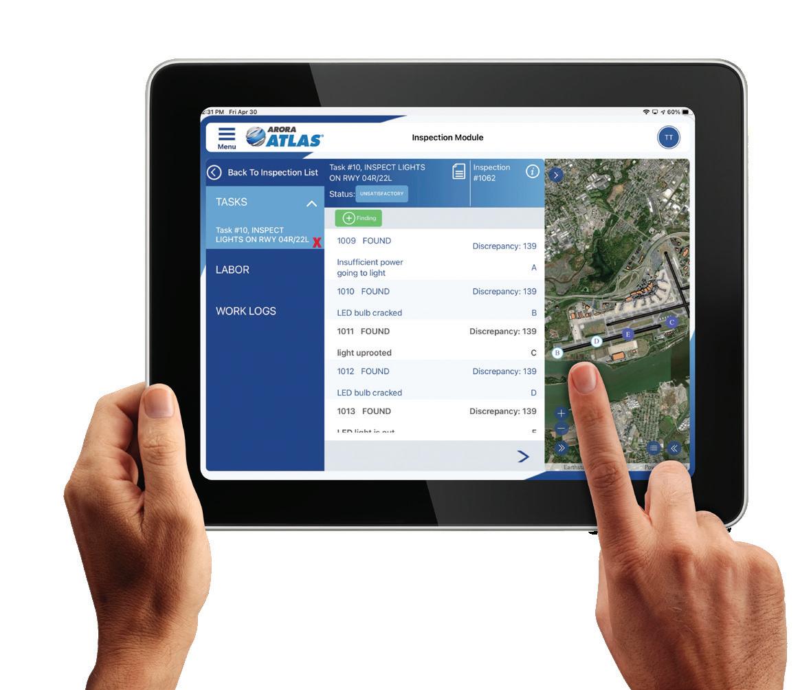
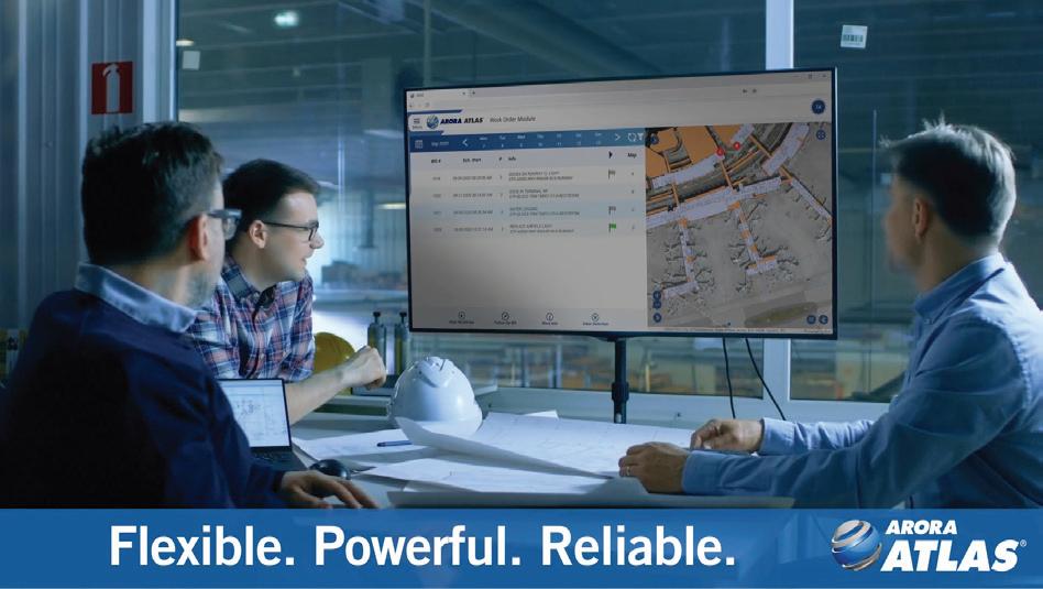
Photography / Images
ATLAS should be well represented through the use of high-quality photos combined with high resolution product screen captures. Subjects should be relevant to content and intended audience. Our marketing team can work with you to provide appropriate images as needed. Contact marketing@ aroraengineers.com with photo requests. Below is a small sampling of the type of images that we currently have available, but specific images can be created and provided images as needed.


Arora ATLAS® Style Guide 16
Icons
Because it can be challenging to find imagery relevant to content at times, the use of icons in ATLAS promotional materials is encouraged. The look and feel of icons can vary based upon the examples (A) thin line icons, and (B) solid fill icons shown below, however, the look and feel should remain consistent and not be mixed within one piece. For example, use either style A or B rather than style A and B together. The preferred color scheme for icons is an ATLAS blue background (CMYK C86 M52 Y4 K0; RGB R35 G114 B179; HEX #2372b3) with the icon in white.


E-blasts
A Mailchimp template named “ATLAS Template” in the saved templates folder of the Arora Mailchimp account should be used for e-blasts.


Arora ATLAS® Style Guide 17
(A) Thin line icons
(B) Solid fill icons
ATLAS Template for e-blasts
PowerPoint
PowerPoint templates and standard presentations are available for staff on Sharepoint. Externally, send a request to marketing@aroraengineers.com.


Video
Videos should uphold brand standards and utilize the same color scheme, fonts, and look and feel. The opening scene is typically a spinning logo reveal. The texture / pattern over a solid colored background (ATLAS blue, gray, or gold) may be used for section breaks. Titles should be easy to read and can run across the bottom or side of the screen depending on what works best with the accompanying clip. All videos should end with the Arora ATLAS® logo along with the Wordmarks for the module(s) and a call to action. Click here for examples of videos.

Arora ATLAS® Style Guide 18
Logo reveal for ATLAS Request
Section break
Title on bottom of screen
Title on side of screen
End screen
Sample end screen
