53 minute read
Kind of Architecture Paul Preissner


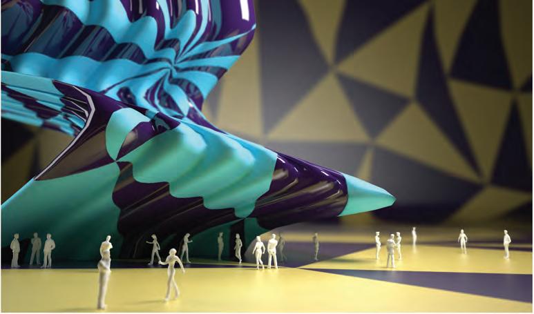
Clumsy Forms, UIC Graduate Research Studio, 2011-2012
Kind of Architecture
Advertisement
Paul Preissner
Resistencia Generativa, por Pablo Remes Lenicov
La acción de proyectar lleva implícita la carga de la memoria y el tiempo. Como acto informado desde los planos virtual y actual, proyectar arquitectura es conducir información a través de un proceso temporal que se orienta hacia el futuro y define una condición material en su desenvolverse. Proyectar es elegir y descartar, vinculando acciones en una secuencia capaz de conferir organización a la materia. En la actualidad, la notoria autonomía que han adquirido las distintas fases del proyecto arquitectónico posibilita su resignificación y genera oportunidades para un uso analítico de la memoria, escapando intencionalmente de un hacer generativo de la misma. Se hace posible proyectar sin referencias aparentes, ni afirmaciones heroicas, conduciendo al grado cero de nuestras capacidades de hacer y promoviendo una agenda de trabajo sin alineamientos: en contra de nadie, a favor de nada. Se trataría de un proyectar que persigue el humor, la liviandad, y hasta cierta indiferencia, sin por ello perder su profundidad, su espesor cultural, o la capacidad de incidir decisivamente sobre el contexto.
Paul Preissner busca crear estas condiciones en su práctica: creciente indiferencia frente al canon digital, atemporalidad, ignorancia conscientemente buscada de lo existente. Argumenta que así puede mantenerse en un lugar inestable desde donde actuar sin ambiciones desmedidas, abriendo caminos que caracteriza como modestos e incisivos. Su proyecto busca evadir obstáculos y rozamientos heredados de la primera generación de arquitectos digitales de cuyo mandato inicialmente se hizo cargo, para reelaborar procedimientos que admiten un estado de experimentación continua. Su trabajo se libera de las imposiciones del medio tecnológico para crear un discurso formal propio que será explorando con una agresiva libertad.
La investigación de Preissner no aspira a actuar bajo la ley de la semejanza como valor, sino a transitar un camino que lo lleve hacia una arquitectura no reconocible como tal. Promueve un distanciamiento de su formación eisenmaniana, remitiendo paradójicamente a aquella máquina de resistencia infinita que ideara su maestro. Persigue una arquitectura que rompa continuamente con sus disponibilidades como proyectista, buscando olvidar su propio hacer y transformando el comienzo de un proyecto siempre en un desafío nuevo. Es así que lo digital recupera su relevancia en la elaboración del proyecto, ya que es posible hacer sin actualizar el pasado que reside en la memoria, libre de las ataduras de la mano como productora de formas.
Paul Preissner vincula, asimismo, el hacer proyectual con la enseñanza del proyecto, generando una sinergia entre ambos campos, como un unicum que avanza consolidándose temporalmente como una verdad, discutible y luego olvidable. Esta agenda de trabajo conjunta se manifiesta a través del estudio formal de la geometría y la textura, y de su relación con el contexto inmediato. Pero lo más interesante quizás sea lo que está latente, aquello que no posee una expresión visual directa: su inserción cultural dentro del campo arquitectónico, su original mirada sobre lo urbano, y, sobre todo, el humor como herramienta y condición del trabajo.
Kind of Architecture
Paul Preissner
00:04:45 Ethos Good evening, and thanks for having me. I have formatted the lecture in three parts. In the first part I’m going to talk briefly about the early history of my ofce and the kind of work we were interested in during that phase. I am doing this as a necessary background to a recent and significant change in my interests. Then, there are some jokes in the middle, and finally, some new work. During the initial phase of my ofce I was interested in software as a way to develop new forms in architecture. Predictably, I was interested in all those things that architects who like software and technology are into, whether they are movie special effects, grotesque animated shapes and objects, or swoops and curves. Part of that came from my own education at Columbia University, at a time, the end of the 90s, when software was being intellectualized within academia much more aggressively than in practice. As a student, I had been working in things that were new at the time, and our research interests were very similar to our disciplinary interests as a profession. I think that ethos continues on today. Therefore, the work I do with students at the University can be considered the abstract design interests that then the ofce tries to resolve architecturally.

Jeongok Museum of Prehistory, 2006
In 2006 we worked on a competition for a Museum of Prehistory, in Gyeonggi-do, South Korea. We took second prize and it enabled us, both financially and interest-wise, to start the practice in full. All of the shapes that now are well known, the voluptuous volumes, the curves, the tethering between landscape geometry, object geometry, and material geometry were developed with a sense of mobility. Then, quite literally, the curves from one project would be reused to start the geometries for future investigations. Curves from the landscape of this project went into the early diagrams for a park in South Korea. The volumes for a library in Czech Republic went into observation towers for Seoul. One project would blend into the next, because all of them were invested in techniques like animation, deformation, and curved geometry. We also did this facade project for a 72-story ofce building in Beijing. We had no responsibility for the interior, just for the development of a precast modular system that could produce a unique façade. Because of the way that pre-cast panels work, if you have, say, two million panels, you do not have only one mold for all of them, and you end up probably with one mold for every forty panels. So being that we had about a thousand different molds, that gave us the ability to create at least a thousand unique shapes and to produce a project that looked organic and somewhat irregular.
00:10:15 Worrisome Familiarity Our second interest while doing these projects was the use of software as a way to simulate their presentations, to produce renderings. While at first we wanted to produce photorealistic responses, it later became part of an interest into its artistry side, where the images started looking more abstract, or fuzzier. At around this time we also worked on a museum project for Poland where the issue was to produce surface divisions and apertures, which took the shape of spots that can illuminate in the evening. Every project was part of a family, and at this point, around 2009 and 2010, I started to be worried, because it all seemed too familiar and no longer represented an ideological challenge. At this time, it seemed also that nobody was contesting or refusing the notion that complicated geometry and softwaredriven techniques were viable for architecture. Everyone thought that it was ok, but to us, those ideas, all of a sudden, started to seem uninteresting. I was always the kind of kid that, if my parents agreed to something, then I no longer wanted to do it. In any case, all these shapes started to seem too smooth, too inarguable, somewhat soft. The techniques were worked out, the deployments were worked out, and the only thing that mattered was whether you had access to exorbitant budgets to realize them, something that I did not have, and probably would not get for a while.
00:12:15 Graphic and Geometric So I needed to find another way to produce interest in the work. I started to play with simple but very big graphic patterns, scaled to the degree that they would not fit entirely on the buildings. They were meant to be read not as individual material canvases, but as oversized graphic representations that would start to work as forms of architecture themselves, still maintaining a

Busan Opera House, 2011
relationship between the site and the project in a kind of cohesive interaction, but then also introducing the notion of mistakes or ill-fits, using different sizes of stripes, having them offset. Within the panel divisions of the glass interior for the Opera, the idea was to have three different scales of triangulation that then offset each other. In other words, it was not about indexing the geometry, but about introducing something that actually works without regard to it, almost as if there were two projects, the graphic project and the geometric project, and both were ignorant of each other, simply coexisting within the same space. 00:15:00 Kind of I began to dramatically rethink my architectural interests in parallel to this, and thus to re-launch the ideological ambitions of the ofce. Starting with patterns and shapes, and then migrating those through some of the work that I did with students at the University of Illinois in Chicago, led to our later projects. This finally brings me to the ofcial title for this lecture: “Excellent ordinary architectures, clumsy forms, or minor objects, and totally being ok with being only kind of ok, but somewhat goofed or weird, kind of.”
00:13:44 The Realm of Pets, Toys, and Out-of-Scale Objects At the same time, this started to make me interested less in the specific shape of the project and more in what the interaction between these goofy, syrupy geometries, and the very understandable, legible, graphic patterns they started producing. And this implied a reduction in the perceptible scale of the work, so that the production would start looking more like little toys, or objects, as opposed to architectural projects. It had always been my interest to have architecture not look like architecture. And I do not mean this in some minimalist way, where you are just hiding details, but in a way in which it does not quite even feel like it belongs to the realm of architecture. These objects are more in the realm of pets or toys, but in a much bigger scale. You obviously could not pick these objects up, they are quite heavy. This is the case of the project we did for the main building of the Central Library in Helsinki, Finland. 00:15:30 Seriousness and Narcissism I started to figure out what was boring me about contemporary architecture. Not just about my own, but about that of my colleagues too. In the last few years, I started to find most new architecture, while interesting for a number of pragmatic reasons, still dull, predictable, and maybe obnoxious for artistic and cultural reasons. Perhaps, the problem is that it is too venomously serious, in the sense that there is no such thing as an avant-garde without there being such a dead seriousness to its pursuit. A seriousness that is not just of relative importance, but also evidence that the projects themselves do not even have a self-awareness of their own out-of-place-ness. Part of that, I think, is an expansion of global financial ability, manufacturing capabilities, design abilities, which have eliminated the issue of shape as an architectural problem, because, apparently, we can figure them all out. As a consequence,
the differences between projects appeared to be so small and so uninteresting, that the discipline began to feel far too narcissistic.
00:17:00 Humor I became interested in how one could produce humor within architecture, because that seemed the one emotional aspect of work that did not quite have a place. And so I looked not only at finding interest in architecture, but also in movies, in TV, in stand-up comedy, in painting, and in comic books. More or less every other artistic pursuit seems to have developed a very sophisticated sense of humor, whereas architecture has only the most basal sense of humor: when somebody tries to produce a joke with an architectural project, it inevitably is a version of an architectural typology turned upside down. You have seen this sketch billions of times, and everybody thinks it is very provocative as an idea, but I have a collection of over five hundred images of upsidedown house structures around the world. There is one that is particularly funny because they chose the wrong kind of house to turn upside-down: you cannot even tell it is upside-down, because the house has a flat roof. Perhaps you would be able to tell if the plants would grow upside down, but actually you can see that it is upsidedown when you notice that the balconies are turned around. Anyway, whoever their bad architect was, he or she was even worse. Such exercise seems to me both immediately noble and entirely forgettable, and it also seems somewhat typical of iconographic or exuberant projects of architecture in general, in the sense that it has a very immediate reaction and affect to them. But the joke wears off rather quickly, and probably the same thing is true of some expressive and expensive architectural projects, which are very immediately provocative, and then that feeling wears off quite quickly too, and you are left with an empty shell of a project that no longer has any ability to culturally captivate. With upside-down houses as a way to pursue a joke, the problem is that you have to put stairs to get to the door, which is right there at the top.
00:20:20 Self-reflection There is a big problem with architecture not having been able to develop a sense of humor about its own work. And since architecture is not only a built product but also, by definition, an idea about architecture, as it is self-reflexive by nature, it should actually have a much more developed humorous palette. You all probably know Garfield. It is a very not-funny comic strip by Jim Davis, which was in the newspapers when I grew up with as a kid, and it is about

Museum of Polish History, 2009
this cat. He is a jerk, he does not really like the dog, he does not like Mondays, but he always talks back. He is very cynical and sarcastic. And there are two artists who have done appropriations of that. The first one is Dan Walsh, who has gone through and removed Garfield from the comics. There are always these initial reactions that make sense in the world of comics as long as there is a cartoon cat to talk to. But now he is just saying it to empty space, and it makes him look crazy. But the more provocative one to me is a really simple one when Garfield is replaced with a real cat. They are called Realfield Comics, but I have never been able to find the original inventor of that meme. Here the cat does what cats do. He just looks at you, but does not give you any emotional feedback.
00:22:40 Funny The internet is really great at giving us things that are funny. And what I mean by funny is not necessarily a joke that you can understand, that has a lead-in, a particular punch line, and then it gives you what you are supposed to expect. Rather, I mean these just really strange objects that people either like, or find fascinating, and somehow share, such as people who dress up in panda-bear outfits, or really bad paintings, not in the sense of amateur art, but professional art by really talentless painters. I find it kind of funny to see these amateur mistakes, or immature behaviors, or strange occurrences. There is a whole field of funny things that do not rely on particular jokes, in a semantic understanding, or in an awareness of the field. It does not have to be fun, but even if it is, you do not need to understand the whole history of photography, of kittens, or schoolchildren, or of rich people in order to get it.
00:24:05 Against refinement and fetishization I tried to find how to exploit this deficiency within architecture, how to produce projects that are not merely dancing to the technological agenda, that are not advancing a particular agenda of wealth, that are not a new refinement of modernism, that do not fetishize the past, or the materials of history, but that rather somehow locate themselves outside of these conventional discussions and start producing an architecture that is, say, abnormal, or awkward, or kind of clumsy—things that do not feel immediately wrong, but that are also not spectacular or noteworthy, things that have, at the same time, enough subtle imperfections to keep developing as an image.
00:25:12 Color and Formal Theory What I started doing research-wise, but this is also a personal search, is to look at how certain artists deal with shape, color, form, and geometry in order to produce artistic work, that is neither remarkably advanced nor amateur because of a lack of ability. An example would be a sculptor like Anne Truitt, who produces simple shapes but then applies colors in a way that never indexes change in the material. The line between colors is actually a little bit off the separation of forms in her works. I also like the work of Willy Verginer a lot. There is nothing remarkable about his subjects. There are rabbits, there is a guy, there are some strange or forced positions, but what is interesting to me is the superposition of the color theory on top of the formal sculptural theory, so that the only relationship to each other is the simultaneous occurrence of both. Here there is this green band that reads as though it exists within the states of which these two are part. It does not tell us more about rabbits, or about the individual, or about the relationship between the two. It is actually kind of rude, in the sense that it ignores the ears and includes the fingertips. But the simultaneous interaction of the two artistic theories at the same time produces a formal work that has a depth to it, in the sense that it does not really have an immediate source, nor does it belong in a historical project.
00:28:00 Blatantly Wrong I am interested in works by Wade Guyton that are made of old computer prints with misalignments of paper. I also like patterns and colors by Tamasyn Gambell that are a little bit too out of date, as their technological imperfections start to produce new shapes that feel romantic, surreal, or disturbing, in a sense. I do not know if you are acquainted with the work of Jay Mark Johnson. He is a photographer that uses a rolling shutter, so as the person is moving, you get this moving distortion blurring in a single image. Some of them are very abstract, which I find really funny. On the church in this little town, there is this fresco of Jesus in the XIX century. Over time, the figure deteriorates and looks like a chipped away old painting. Then there is this lady sitting there in the village. She is like 80, deeply religious,


Clumsy Forms, UIC Graduate Research Studio, 2011-2012
loves the little town, goes to church two or three times a day. She asks the priest if she can repair it, because she loves it so much, and he accepts. And so she takes her brushes and everything and she fixes it. And it suddenly looks, to most people, as though it had been ruined. This was a huge story at the time. The New York Times ran a long article on it. People wanted to imprison her for defacing the historic picture of Jesus. But somehow I find the absolutely poor quality of the painterly techniques of the updated version to be much more interesting, enjoyable and kind of funny, because of the blatant mistakes. It is certainly better than the first one, which was just an unremarkable portrait. I mean, it is a fine portrait of Jesus, but it is not as good as this lady’s.
00:30:40 Objects Inappropriate as Architecture All this makes me feel more convinced that a better way to produce architecture is one that does not really support its own facts, but rather subverts its own reality. Architecture is inherently big. Even small architecture is quite large and heavy. Thus, I think the best any project can do is to accept that the larger it gets, the more minuscule it should feel. The techniques to do this are similar to the video mistakes or the photograph copies. But the idea is that the bigger an object becomes, the more it should work to produce a form of smallness about itself, conceptually and then somehow physically. In the design studios I teach, we started to try to identify what clumsy forms are like, forms that are not trying to be beautiful, or cool, or advanced, or romantic, nothing serious, not very large, but medium-size buildings that could formalize mistakes trying to physically embody in an architectural form what we observe from television and other media: objects that seem kind of inappropriate as architecture. Buildings that are out of shape, or have big bellies, as in fatness and softness. These projects resort to artistic practices and techniques that are inherently small, and assume that they scale up to a much larger size, so you get perfect cubes produced by very bad stacks, or slightly crooked or bent pizza-box towers, pillows, etc. This is a collection of all of them. The following year, with a different group of students, we took this a bit further, and instead of thinking of it as a physical exercise to produce a set of cute models we looked through it as an urban scale problem, such that buildings would not be invisible but, at the same time, would not be the center of attention. We produced a set of projects that seemed embarrassed about their own condition. Their desire was to always hide and tuck away behind other buildings, so you could only see parts of them. Like in television, when there is the fat guy that tries to stand behind the tree, escaping from the cops, and they see him because his belly sticks out. Using these humorous techniques and applying them to architectural examples, the idea is that the main architectural project should not really be the center of your attention, but rather secondary or tertiary.
00:34:19 Sorry for a Building There are all these little people here, so you can get a sense of how big these objects are. The idea is that the stupid mistakes, bad color choices, the fact that they do not even coordinate with the platform that they are on, either in pattern or in color, are all formal and visual techniques that produce a minimum architecture, a minuscule architecture, one that starts to feel more object-like, as opposed to experience-like. Sometimes they get close to lining up. They are kind of the same color, and their stripes kind of look the same. But they are all a little offset, or one is more reflective than the other, so they embody a notion of partiality, incompleteness, or sloppiness, which is exploited as an ambitious agenda. We are trying to find ways that we can produce large-scale formal objects that are able to makes us feel sorry for them. Nobody ever feels sorry for a building. You might feel sorry for the owner of the building. But it is very different to look at things, like this poorly colored brown object with a big bag, and not feel that it is embarrassed of itself, and well aware of its own imperfections. Perhaps, what is most interesting is the softness between the color bands where striping is now removed, so at a huge scale you have the same kind of effects as a teenager trying to
paint the striping, but then even more the way the brown initially seems like it has to participate in the building itself, but it is the earth that has bumped, and you see the part of the surface that was not well covered.
00:37:37 Fake I started to get deeply interested in architectures that no longer look like buildings, which used to be the prevailing taste, but still look like something recognizable. Whereas the organic, software-driven shapes did not produce something that looked like a teddy bear, these abstractions and geometries looked animal-like, or bubble-like, and had qualities and characteristics that were associated with things that we all know. These start to be tablecloths covering spheres, toilet-paper rolls, ballooning. None of them are live objects, they are inanimate, industrially designed for purchase, and they are all fake, in the sense that they are renderings. So what we try to do is to figure out ways in which the representation of architecture looks like it is a photograph of an actual thing, not a rendering and not a model, but to fake the smallness of it, so it looks the same as if you are photographing it for an advertisement for your kid.
00:39:24 Primitive This evolved from work I did with students. It was made for an exhibition at the University in Chicago called Primitive Forms. The notion of the exhibition was that, similar to Laugier’s hut, architecture has this root sense of self, whether it is four columns and a roof, or whether it is Le Corbusier’s Dom-ino House: the irreducible moment of architecture that produces an atmospheric effect. For me, it was the simultaneous combination of patterning, superfluous or weird shapes, and the adherence to regulations at the same time. So our initial work was very wild, in the sense that on purpose it did not respect boundaries and did not have any edge. There was a combination of primitive geometries, platonic solids, flush edges with weird kinks, in a way that the striping initially seemed as if it was indexing the geometry and producing a topography of it, but was really just kind of crooked, and going on a diagonal that did not match the one on the ground. In some sense, I think this is the description of the idea that architecture is not only a building, but also the idea of a building, and getting to the idea of the building is probably the most important pursuit.
00:41:14 Ill-thought-through This is a project for a competition for a school campus in Greece. It includes a kindergarten, a primary school, a high school, and the administrative and ofce spaces. It uses the lexicon of the previous work, starting with a bunch of platonic shapes that then develop into different curves, roof heights, and start interacting with soft colors, like pale pinks and yellows, which then intersect with the circulatory moments of the building, so that the staircases produce big grey nose-like outgrowths on the exterior surfaces. All these are done to seem very ill-thought-through, like shapes that do not optimize what is going on in the inside, and do not fit properly, somehow similar to when Talking Heads wore those massive suits in the 1980’s, suits for somebody that was four times their size. The idea is that you get these pleasures that are kind of comic, or humorous, but are not a joke. You get them from prosthetic noses, or bad color patterns. And they start to produce new forms of public space. In the school there are four buildings formalizing the courtyard for all the students, and their reduction in size is done through the secondary platforms that each building has. This generates a holistic plaza for the entirety of the school, but also allows for smaller gatherings from individual years. It generates a much more casual or informal gathering place, instead of an uptight one. We carried this through to see how it was tectonically developed, with a structure that has an irregular spacing and triangulations that are not based on any optimization principle, but based on the projection of particular formal effects, such as heaviness. We used columns of different sizes, to make up for both the inefciencies of the structure but also to produce certain effects. Some of them seem too thin for their role, some too heavy, and there is a lack of continuity of the members that allows the structure to be an artistic object. The combination of the way in which the slab is hollowed out, with this golf-ball effect, is made of a circular geometry, instead of a tessellated geometry, so even the patterning of the structure is dealt with in the same way as the color patterns.

Clumsy Forms, UIC Graduate Research Studio, 2011-2012

Belgrod Historic Center Plan, 2014
00:45:06 Mass and Pattern We continued with even simpler forms while working on a competition project for a Day Care Center for Mentally Disabled Adults in Israel. The Center opens at 8am and closes at 6pm, and there are no permanent residents. Adults that are not entirely able to care for themselves come here to receive therapy. The idea is that the campus should not institutionalize the program, so that it does not feel like a hospital or a school. The day care center serves seventy-four adults. The campus is broken down into twelve different pods that service about eight adults each day. We propose for each pod to take an autonomous form that we then allow to casually scatter throughout the site to produce individual orientations, individual and semi-private courtyards, and circulation through the complex. Colors are used not to provide any kind of indexing of the shapes, but to unify the whole thing. These are some details and plans that have a very normative interior arrangement. Some had to be square rooms for the care facilities. However, there are also very unique informal courtyards that both unite the volumes and provide separation between them. The interiors are developed to be a bit friendlier. The whole project is intended to be very low budget. It is entirely done with cast in place concrete. The towers on each of the volumes are raised to bring more illumination with fewer windows. Thus the interiors can still be very private for the users, while having the benefit of illumination and allowing for a degree of discrete identity. They do not seem to relate to any particular geometry, but work more as a secondary pattern, a kind of paint that is applied on the massing. 00:48:10 Sloppy and Unsafe Trying to continue with this idea, in a project for a Sculpture Park in Queens, which has permanent works by people like Isamu Noguchi, we decided to use wooden members to produce something that feels like it is organized and sorted the same way you would deal with small blocks, children blocks, or boxes with books, but then scaled up so massively that they feel enormously heavy: quite literally heavy objects that feel improperly positioned for the significance of their stature. Some of them are objects stacked on top each other, other times they are apart from each other and do not follow any particular pattern. The significance of the size is important, in the sense that the organization is so cluttered and messy that it seems very unadvisable to do things in this manner, sloppy, and a bit unsafe.
00:49:51 Friendly, Casual, Neighborly Part of what all this leads up to is the ambition to have architecture subvert its own stature and size so that it seems minor, unimportant, even uninteresting or antiambitious. Not an architecture without ambition, but one whose ambition is to not be the center of attention. This is done through these medium-sized interventions that develop a level of interest that is neither big nor negligible. We tried it out in a competition for a Housing Scheme for a Small Town in Russia. Most of the pictures of the site they sent us were very beautiful, but it is actually mostly kind of ugly. The client wanted a rich diversity of buildings: singular, modernist housing projects that looked like very thoughtfully designed objects. We took their different density prescriptions and came up with the amount of housing that we needed, and then, instead of appropriately deploying it across the site, we tried to give every building a percentage of unobstructed perimeters. To do that, we wrote a software tool that ran a set of irregular associations on the site, so they could touch but then produce space with the other buildings. It produced a disorganized, messy, thoughtless, plan organization that then generated the particular differences required by the program. The center has more ofce space, the exterior has more retail, and housing is above. This allowed us to produce one type of housing density, but also a variation of density across the site. The resulting site plan is suburban in nature. This, in turn, produces a circulation and a usage plan that is much more friendly, and maybe casual, neighborly, and informal for the residents. The idea is that it is a zoning project, so we had no care about the architecture of any individual building. It was about the notion that, by interacting with each other, the buildings would produce a particular feel for the site. This project would be built in five to six phases, probably with one contractor, but the nature of site plan would be the same, regardless of the qualities of the individual projects.
00:54:00 Gates to Go Around The last two projects came up this summer. One is a tiny little Installation for a Street Fest in Chicago, in a neighborhood called Wicker Park. About three million people come over three days to enjoy food, music, and street art. We were asked to produce two ceremonial gates that would generate a performing arts space in between. So, since different parts of the streets have different atmospheres, they needed to be gates to mark a passage into something else. The street is 60 feet wide, and the sidewalks are 15 feet wide, so we had 90 feet of space. With a very small budget to do it, the thinking was that we would never build a gate that worked as such, because it would be easier to go around it than to go through it. Instead, we proposed a jokey gate, which started with these clumsy towers, a sort of abstract frame that then gets colored somewhat inappropriately. You can always see through it. People would go either through it or around it, which is fine. The carpentry connections, because of the way they were replicated improperly, produced a joinery that was more interesting than you might generally have.
00:56:05 Strange Familiarities The last project was done in partnership with Paul Andersen. Paul did a workshop here at Di Tella University, so some of you may know him. The Biennial of the Americas is a festival that Denver has had for a couple of years. It is a cultural and art festival from Latin-South American countries, in which there is a special night called “Music and Animals” for which Paul and I were asked to produce a pavilion with a budget of 12,000 dollars. It had to be built within a single day and taken down the next morning, so we needed to do something that would be very easy to construct. We would not be able to start before 8am, and the whole thing needed to be done by 1pm. We thought we would do a sort of barn, and then figure out how to adapt it to our interest in strange

Two Barns, 2013 (with Indie Architecture) familiarities. The idea would be to take a conventional prefabricated barn typology, like those steel barns in the US where you can store hay or tractors. We would then combine different radiuses of arches to produce a new object that felt bigger or weirder than the initial barn. As the budget became clear we went to just do two of them, and then, for a number of reasons, went down to the same size. In plan, the two barns do not quite sit next to each other: they are offset from each other and at different angles. This produces two covered spaces, but also nine collective spaces on the sides. There are both interior spaces, and then these moments when there is a kind of shared interior, also some others where there is an in-between space. Then, we commissioned an artist that makes plants that you can eat. She was going to have this feast of plants, so as to have a particular purpose for this table that goes through. Another idea was to grow the grass around it in a particular pattern, much higher than everywhere else in the park district. And we did this for like five weeks. They were growing grass everywhere in order to give it the shape we wanted. But then they cut all of it, so it did not quite work out. We finally got all the parts professionally painted on the interior so that it did not look like an agricultural product, but had a kind of automotive finish. The color is called pink salmon. The arches were mounted over nicely finished wood beams, so the building is slightly taller when all is put together. What is interesting is that while recognizing the similarity of these two units, they can never be viewed from the same perspective, and new spaces are produced in between. Besides, the perspectives through individual barns seem to produce the odd illusion of the second barn being shorter or cut off. It always feels like they should be longer. People had fun and ate the plants. They tasted the lettuce, and there was something artistic about it.
01:01:33 Pet-rock Architecture I never know really how to appropriately end lectures. Actually, I do not want to summarize these projects and ambitions into anything that makes them seem too important. So, this is where the work started, what we went through, what the purpose was, and where it is conceptually now: this exploration of modest ambitions, or anti-ambitions, to produce weird suburban-feeling vacancy within a city. I am also, I suppose, trying to find an architecture that feels less like a piece of technology, or something to use, and more like something that you have in the same way as you may have a pet-rock. Architecture and design, in general, for me, are mostly an entertainment field now, more than like a pragmatic discipline. Architecture is like a third body.
01:03:00 Dogs and Buildings I have a small dog, a little Italian greyhound. Klaus is his name. I have always been interested in dogs, but at some
point, about three or four years ago, I started watching a lot of documentaries on dogs, and began to learn about the history of how we relate to them. More or less eighty or eighty five thousand years ago, wolves would eat the leftovers of the food of early groups of humans. As the wolves got more courageous, they would come closer into the human settlements. People would try to repel them, but eventually they would come close enough to be captured. And so they became more docile. Later, they were put to use for agriculture purposes, for hunting and defense purposes, so that humans developed around eighty different breeds of dogs, and each one of these breeds was very precisely developed, and purposed to do something specific, whether it be to hunt bears or to take rabbits out of holes. The head shapes changed, the body shapes adapted, fur patterns changed. In eighty five thousand years, we got eighty types of dogs. Life was tough for everybody back then. Unless you were a king, your life sucked, but you had these dogs. But then, when Victorian England happened, with enough accumulated wealth, with the establishment of the middle classes, and with the appearance of free time, dogs were adopted not to do just useful things, but for entertainment. In this way, dogs became pets, as opposed to just stuff. So, in the last two hundred years, we have developed around twelve hundred different breeds of dogs. There are eight hundred formally recognized types of dogs, and there are another three hundred informal hybrid breeds. What is interesting is that, for eighty five thousand years, we could not figure out more than eighty types, but when dogs no longer had to do anything for us, then we had an enormous need for diversity of types. I think architecture went through this same predicament. Architecture has served a very pragmatic and purposeful function for a long time. It did things, both nice and terrible, and its development was based explicitly on what was supposed to be useful, and on the materials that it had to have. But probably in the last ninety years we have come to realize that function is a very flexible thing in architecture, mostly through the repurposing of explicitly designed previous functions.
01:06:30 Funny Misery In the United States, you have churches being turned into apartments, alleys that are turned into barns, so function no longer means much, because buildings can always be turned into something else. Churches make much better nightclubs today than places of worship. So function is no longer meaningful. I think once we have untethered architecture from a particular purpose, we will have a real explosion and diversity of types. And this has to do with the fact that architecture does not really satisfy a particular purpose, but it is more a form of entertainment. My contribution to this thought is to say that entertainment does not equal spectacle, but perhaps a more abstract belief that architecture has a character, a human sensibility, that understands “funny misery”, that awkwardness that you feel when you are fifteen, and are trying to go on a date and nothing works. I would really like it, at this stage, if there are questions from you, or accusations, I would like to know what you think.

01:12:03 Conversation Audience: It is clear that there is a critical dimension to what you do, and that the humor is part of that. There is something particularly irritating about parametric architecture and related endeavors, in that they are so optimistic about technology, about the social, political systems we live in. They seem to be too-well integrated. Maybe they aspire to be a new kind of classicism, in the sense that they represent the power of the civilization we live in, so I agree that it becomes annoying. PP: It is a new conservatism. Audience: I like very much this critical impulse, but it raises a more substantial question: whether or not architecture can be critical at all, because making architecture requires money and power. It is easy in art to be critical, because you can make it with little money, but in architecture, how can you do that? Maybe one can go to the small scale, to cheaper constructions, or to something closer to art installations? How possible do you think it is to become critical in a certain way? PP: I do not think architecture can be free of its criticality. If it is architecture, then it is ideological and has a position, which means that it is reflective on the current state of affairs. In some way it is always a political project. It is obviously difcult for architecture to be critical of its financers, but I do not know why you would want that. Of course you cannot have a project for a big bank that reacts to or is anarchistic against the financial system, but that is something different. I think architecture can be critical by exposing assumptions in how people interact with the building, or in how buildings interact with their neighbors. There is a photo project that I did with Alex Lehnerer the last time we were in Los Angeles. We made a list of a hundred important projects that we could agree upon as being important buildings, in a range of buildings going from Frank Lloyd Wright to Thom Mayne, where we even included the gallery designed by Marcelo Spina. We were interested in taking pictures of the buildings that were neighbors to these. The juxtaposition that these expressive, clearly laborious projects produce, when one views them in the immediate context of their normal neighbors, shows that these regular projects are important as well. Architecture is a weird moving target. It is not like art, where there is the artist who does something, the audience, who literally stands in front of it, looks at it, and then the interaction between the two. Architecture works differently. There are people who use the building, people who use the building next to it, and that is how they see it, others who see it in the TV, in books, or whatever, people who use the building because they work there, people who clean them for other people, and so on. There are so many different ways in which you can interact with an architectural project, that it is not so easy to identify the constituency of a piece of architecture. I think the illusion of an audience in architecture is a big problem. There is somebody who is paying for it, but it is not necessarily a program for them. And then there is the enormous elasticity of building program itself. I do not know if I am responding, I think I got off the question. But these projects are small and they have a small budget because I am starting a new ofce, and you only get small projects at this stage. They are not being critical in ways that other projects are, but are perhaps critical of the set of expectations that people bring to architecture. Ciro Najle: What I see in the description of the work is its profound acknowledgement of the current state of the art, like it or not. Profound to the point of accepting certain weaknesses that contemporary culture has constructed, of which you yourself assume to be part. It is profound and courageous to do that, and to move away from the heroic impulse. And it is smart as well to have been able to do it in such a short period of time. In that sense, I feel not only sympathetic to it, but I also admire the attitude. At the same time, I wonder how that attitude can be sustained in time without falling into its own argumentations and problems. One of the weaknesses I find in the argument—and I would ask you not to be self-critical about it, but rather to construct something else out of that—is that many of the categories that you use, and I have been writing them down: not to be center of attention, unpretentiousness, clumsiness, not precisely related, disorganized, messy, toylike, anti-everything, not caring about the architecture of a particular building, regardless of individual quality, goofy, jokey, improperly replicated, impolitely sitting, dumber, and so on, a number of qualities that you clearly seem to value, are negative in their basis, they are about ‘not doing something’. And only a few of them are afrmative, but in a consciously weak sense, like the appeal to clumsiness or dumbness. One could say that the discourse could easily fall into a certain form of evasiveness, celebratory at first, but nihilistic at its root, and therefore could soon reach a dead end, or get exhausted in its humor. But then, on the other hand, you mention some afrmative qualities, like human, friendly, casual, or neighborly, so I was wondering what are the afrmative condition of the discourse and the form making ethics, and how, if at all, can they sustain themselves in time, being mostly negative or putting themselves on the weak side of architecture.

Fotografía: Máximo Sánchez Granel, Archivo EAEU
PP: I think how you describe it can be seen as negative, but I do not see it as negative, in the sense of producing an opposite of the positive. I think the work is looking for a set of values outside of the conventional way that architecture is and has always been discussed, which is a form of perfection. Especially because architecture is not just a building but also the idea of a building, such that the history of architecture is about searching for the perfection of an idea manifest in a set of materials that produce a very large object. Every architectural chronicle, when you study the history of architecture in types, and regions and parts of the world, always talks about ways to produce a perfectly beautiful object. And the only times that it does not explicitly do this is when architecture or society find a momentary interest in the exact opposite, like the grotesque. The problem is that this happens still within the same dialogue: if one is interested in beauty, having an interest in the grotesque does not negate an interest in beauty, because it uses the negative as a way to form the opposite. Harry Frankfurt, an American philosopher who is now in his eighties, wrote an essay in the 1980s called On Bullshit. In this essay, he says that there are people who tell the truth, who believe in the moralistic ideal that there is a truth to believe in, and they tell it, and then there are people who tell lies, and they are jerks, but also, by definition, enormously invested in truth, because they are telling the opposite, and then his idea of bullshit is a kind of novelty category, because it does not matter whether it is true or false. There is just a particular agenda that is trying to be advanced and certain rhetorical techniques are used to convince someone of its attractiveness. Therefore, whether what is being said is true or not is of no concern to the person who is talking bullshit. This relates to architecture in that it is either about trying to produce a constructed purity, whether it be structural efciency, visual beauty, or organizational beauty, like the notion of the program-diagram that works seamlessly and optimizes use, and is mostly concerned with the definition of correctness and perfection, or about deviating from it when it explores its opposite, the ugly, the grotesque. But that investigation is not possible without an awareness of beauty, and a deep respect for it. So the interest in skulls and death is really reafrming the interest in life and flesh. Hopefully what this work is leading towards is something outside that conversation. Architecture does not have to be about beautiful or ugly things, it can be atonal. It does not have to follow a musical scale, nor subvert a musical scale. It can be indifferent to it. It can produce patterns and combinations that are not really thought through, that are not based on any particular musical theory. It can be based on the ignorance of those things. The attractiveness for the people that pursue the grotesque is that they somehow feel it is a violent action against beauty. But it ends reafrming the same allegiances. So I guess that what I meant with anti-everything might have been something else, because this is not anarchist work. I guess it was anti-ambition so it’s worth it. It has concerns. It is not just trying to be construction, but it is not something that has ambitions of grandeur. It is finding interest in being something that will never be important. CN: Is that possible? PP: Most of the artists and musicians that are famous are not super famous, and they probably never will be, because their work is too difcult, or it is not clear what their motivations are. They have developed a certain level of appreciation, but not enough to be open to a lot of people. I think within architecture this has to be true too. There are a lot of buildings that nobody cares about, but there is something disturbingly different about them. They do not look normal, and it is tough to even find out who the architects are, because no one hears about them, but I think the buildings are great. So yes, I think it is possible. CN: I understand, but it is a very sophisticated construct to say that when you are an architect, rather than a nonarchitect or a non-Architect. When you are an architect lecturing in a school of architecture, and also teaching in another school of architecture, in the context of a number of avant-garde intellectuals, despite what you said, I am afraid that you cannot avoid participating in culture. In that sense, pretending not to participate is just another sophisticated version of actually doing culture. That is why I ask if true renunciation or indifference is possible. For example, the renderings you showed are extremely sophisticated in how they were constructed, and as a result produce a particular form of expression to communicate clumsiness or disorder. In that sense I am saying that there is sophistication about the lack of care. PP: I think the whole idea of the avant-garde is personalitydriven more than work-driven, and I think it is possible to not participate in that and still produce work that is pretty clear ideologically. Zaha Hadid could be less famous but still be doing what she is doing, and it might have a kind of mystique about it. Sometimes it is not really up to anybody whether an idea becomes appreciated. What is difcult is to produce poor quality consciously. As an architect you know what good architecture is, you know what quality is, at least within a given framework, and it is very tough to then produce architecture that disavows any consciousness about it. So you have to be very well studied, and precise, and work hard at it to produce things that will inform that. It is particularly tough to try to work these things out on a studio project, even with graduate students who have a sophisticated view of culture. Student work is fairly bad, for the most part. And it should be, because it belongs within a learning process. So for students to produce atonal architecture on purpose, when they still cannot produce tonal architecture is very unlikely. If you cannot play guitar then you cannot “not play guitar” as the point of it, because you can only “not play guitar”, plainly. I find it difcult to define or even to really talk about it, because it is not in a direct relationship to a totally correct or totally incorrect condition. Somehow the vocabulary has not quite developed to talk about it. It is afrmative when I talk about it relating it to human qualities
or emotional issues that are certainly pleasant, but at the same time not extremely joyful. In that sense, neighborly is not something great, but it is also not hostile, there is this weird pleasantry about it. There is something fascinating about being neither normal nor spectacular, about being in-between conditions. But I am not sure quite what that is, so I have been working around the idea that architecture, as a formal and material practice, should try to solve it through the means of color, shape, and composition. Because if there is an anonymous architecture, which includes the overused types, the normative houses, the normative ofce buildings, and there is clearly the avant-garde, the spectacular work that is meant to be singular, individual, there has to be something that is neither a superhero nor a regular person, a third type of architecture. My inability to properly articulate it right now is probably due to the fact that the dominant way to look at it works within that scale between anonymity to uniqueness. This has to do with my biography, because I was part of the first generation of kids in the United States that was brought up being told that they were special all the time. Now every kid in America thinks he is unique, which is the funniest thing. In the 1950s it was the opposite, everyone was told they were part of the exact same thing. But, somehow, it always missed a real component: the people that do not fit in. I believe there has to be a way to produce architecture that does not fit in. CN: On the other hand, you were showing all of these images one after another and very quickly: the digital models, the parts, the renderings, and you were describing them sometimes with more attention, sometimes with less. Perhaps one could say that those images are there at the service of consolidating your ideas, rather than at the service of differentiating them. In that sense, I was wondering about your use of the word unique. Are you searching for unique forms of goofiness that might challenge the notion of goofiness in general? Of course, this search might wish to be neither heroic nor antiheroic, and just goofy, but there are the projects that aim at constructing a form of specificity and uniqueness that is irreducible to the condition of goofiness as such, as they are very particular. I am asking because the kind of sophistication by which one model and the next define a quality of goofiness differently, even if you do not have the word to describe it, becomes paradoxically highbrow. Would this be a problem in the context of your argument? PP: Yes, it is a highbrow problem. Just to clarify, it is not an anti-intellectual project, it is a deeply intellectual project, and also a very formal project. But, part of the effort is to remove the sense of importance from the details. One thing that really started getting under my skin about the entire parametric project is that there is a corrupt aesthetic byproduct of parametricism, which became evident, for example, in that it was horrible to be in reviews at other schools where we would have to spend three hours talking about the difference between a curve like that or a curve like this. You spent hours debating these minor differences as if they matter, and I do not think they do. Those curves are just ideas of a line, so whether it is curved one way or the other is somehow irrelevant. And let me just get back to some of these projects we were talking about: the difference between one and the other is, in a very practical sense, that one is red and yellow, and looks like balls under cloth, and the other is purple. One has clear edges to the difference in color and the other has a feathered difference. Another one has weird stacks and looks a bit like it should topple over. There are a lot of differences between them, but they are conceptually identical. The act of breezing through all of them while talking over them is meant to refine their concept. The red and the yellow are only marginally important. If this was brown and green, in terms of the goal that these things were serving it would be the same. And if there were five balls instead of four, I think, it would look the same. There would be physical differences but not ideological differences. Actually, I think that architecture’s audiences, all of them, are subconsciously, and intuitively, much more sophisticated in how they appreciate architecture at an ideological level. Details matter less, in most senses, and it is the generalities of organization that make a difference. CN: How about the scale of these objects? PP: Yes, all of these were thought of as very large objects. They are presented through the coloration, but then the entire formatting of the image becomes important: the fact that these renderings are meant to look like photographs of things that you might put on your bookshelf (my mom collects figurines, so they’re supposed to look like collectibles), but not as a reduction of the real thing. They would be scaled up, so the effect would be to miniaturize the building. This one might be 300 meters tall, but the way that it sits in the city does not actually appear as part of the same context. Details are important, because they enable the ideologies that we produce, but, when I say that details are unimportant, I mean to problematize alternative issues, especially in Chicago, where people tend to fetishize assembly. The AIA has an award for the best detail of the year, which, to me, always looks like the worst detail, with tons of bolts, really expensive, and overdesigned. For me, if a detail does what it is supposed to, then it should subvert its own identity to the collective effort. You should not see anything. Drywall seams are probably the best detail in architecture, because you see the entire wall and not the panels, or the tape, or the plaster. I think detailing is important, but only insofar as you are not aware that something was detailed. Audience: Do you think that color, shape, and composition, which you mentioned a number of times, can be solved or developed by personal feelings, leaving aside technique? PP: Any kind of artistic work tends to be deeply personal and should be close to your own interests. At the same time, I do not think I am unique. Everyone should trust that, if you do something following your own interests, there should be at least one another person on earth that finds it good too. The color selection is personal, but also
arbitrary. The personalization of your color is to make sure that it does not accidentally match, more so than it is to come up with a routine to always make things that do not match. If things are truly arbitrary, then it should happen that sometimes there are things that just match perfectly. The problem is that it looks like you have done something that matches perfectly. So when I pick arbitrary colors, the only personal choice is to make sure that they do not happen to be on the right place on the color scale. I do that rather crudely. In the project for Greece I took a set of Sherwin Williams home interior paint recommendations, from a catalogue they put out in 1982, and the color combinations for the 1974 Ford Mustang. I thought that way I would get two color palettes that do not match. They are two different types of things, a house and a car, and they are ten years apart in style, so there is no way they should match. But then, in the end, the brown of the Mustang seemed to work fine with the other colors, so I had to do some personal choices to change that. With color you have to make sure that you do not accidentally make things look that good. I think they look good, but they look good in a different way. I do not think that the work is about subverting pleasure. It is about trying to find new forms of pleasure, pleasure in forms that are not conventional.

Fotografía: Anna Font, Archivo EAEU
Clumsy Forms, UIC Graduate Research Studio, 2011-2012