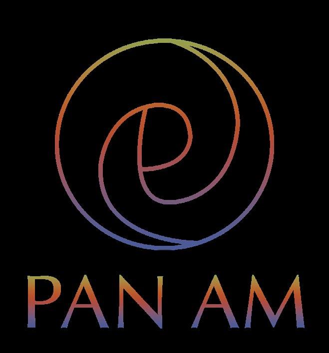
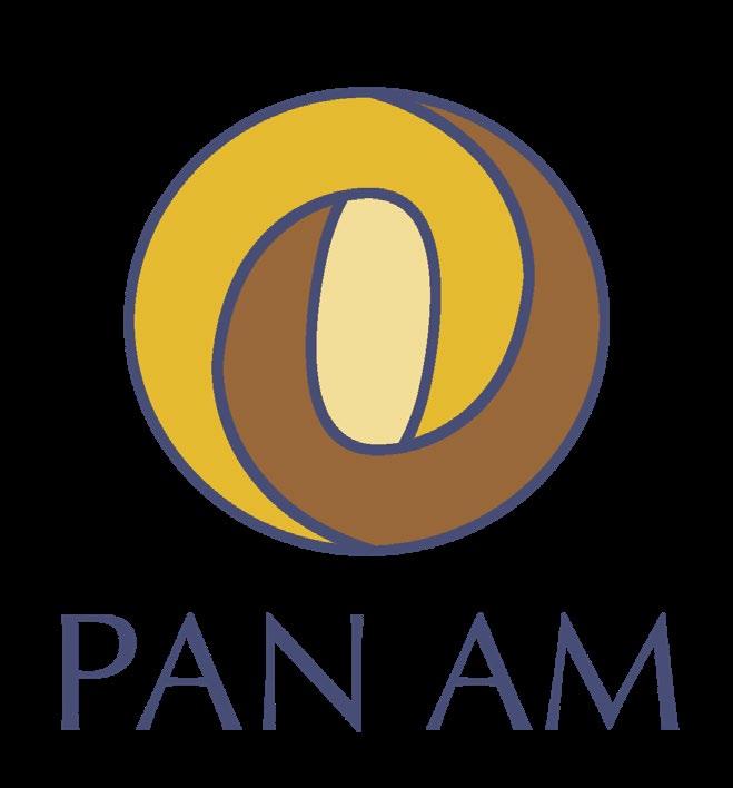
Pan Am

Visual Development Guide

Am
Visual Development Guide
Yu (Verna) He
Pan
Contents Introduction Round One Round Two Mission Statement 00 00 00 00 00 00 Know My Worth Hand Sketches Logo Exploration Digital Roughs 01 02 03
Round Three Look-A-Likes Inspiration 00 00 00 00 00 00 Best Logo Development Tight Sketches Digital Version Similar Logos Other Brand Guidelines 04 05 06
Who We Are
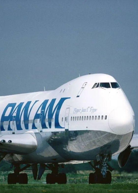
Pan American World Airways, or "Pan Am," was principal international air carrier of the United States for most of its lifetime—first flying mail between Key West, Florida, and Havana, Cuba, in 1927. We want to build relationship to new cultures in the future.
01
Mission statement
The Pan American brand was born from an experiential journey of a new culture; opening people's eyes to the diversity of cultures.
Brand soul
Pan Am will open people's eyes to the richness of world cultures.
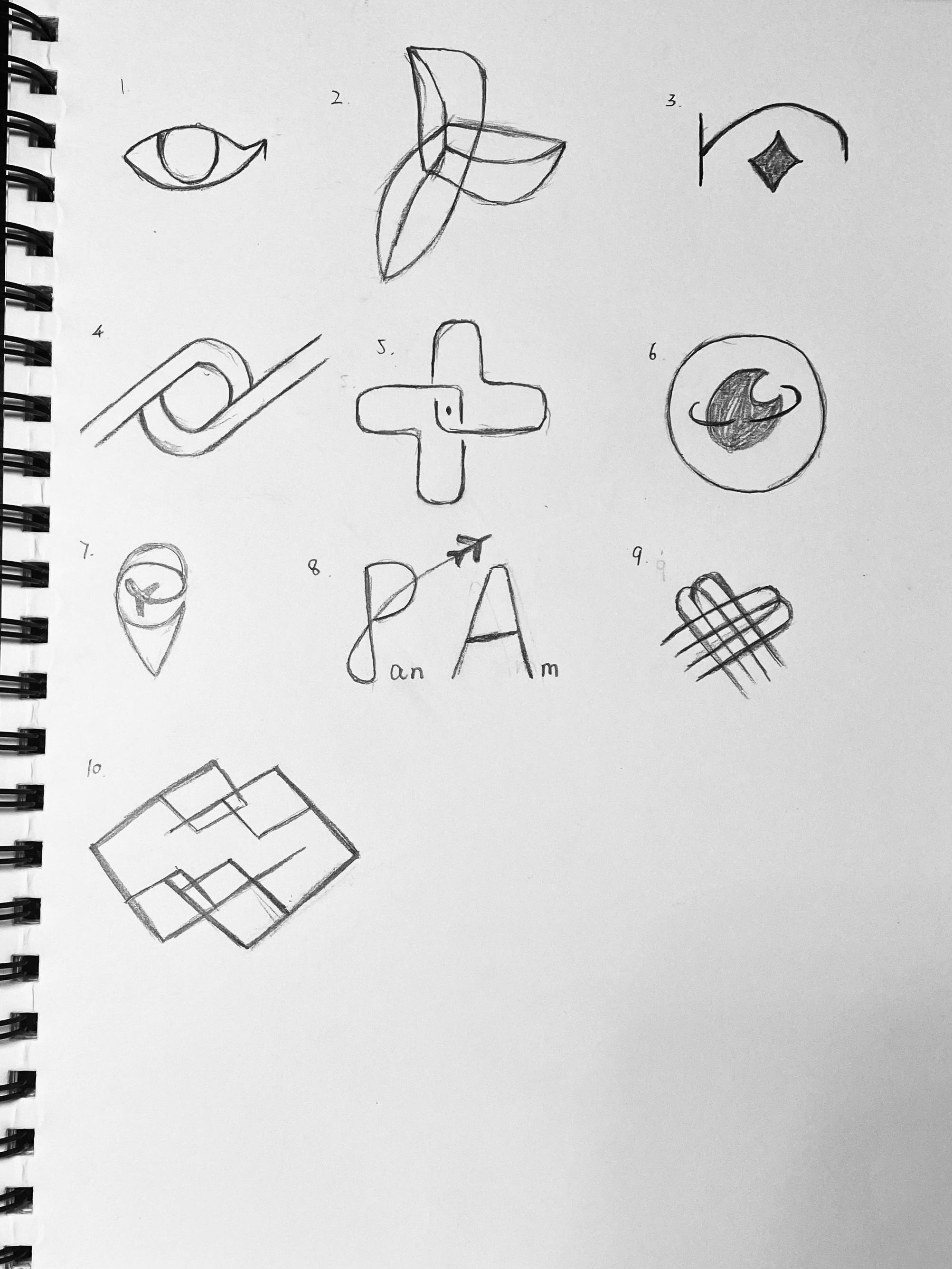
Richness (Cultural Diversity) Connecting (Communication Between People) Global (Open People's Eyes) Round One Sketches 02
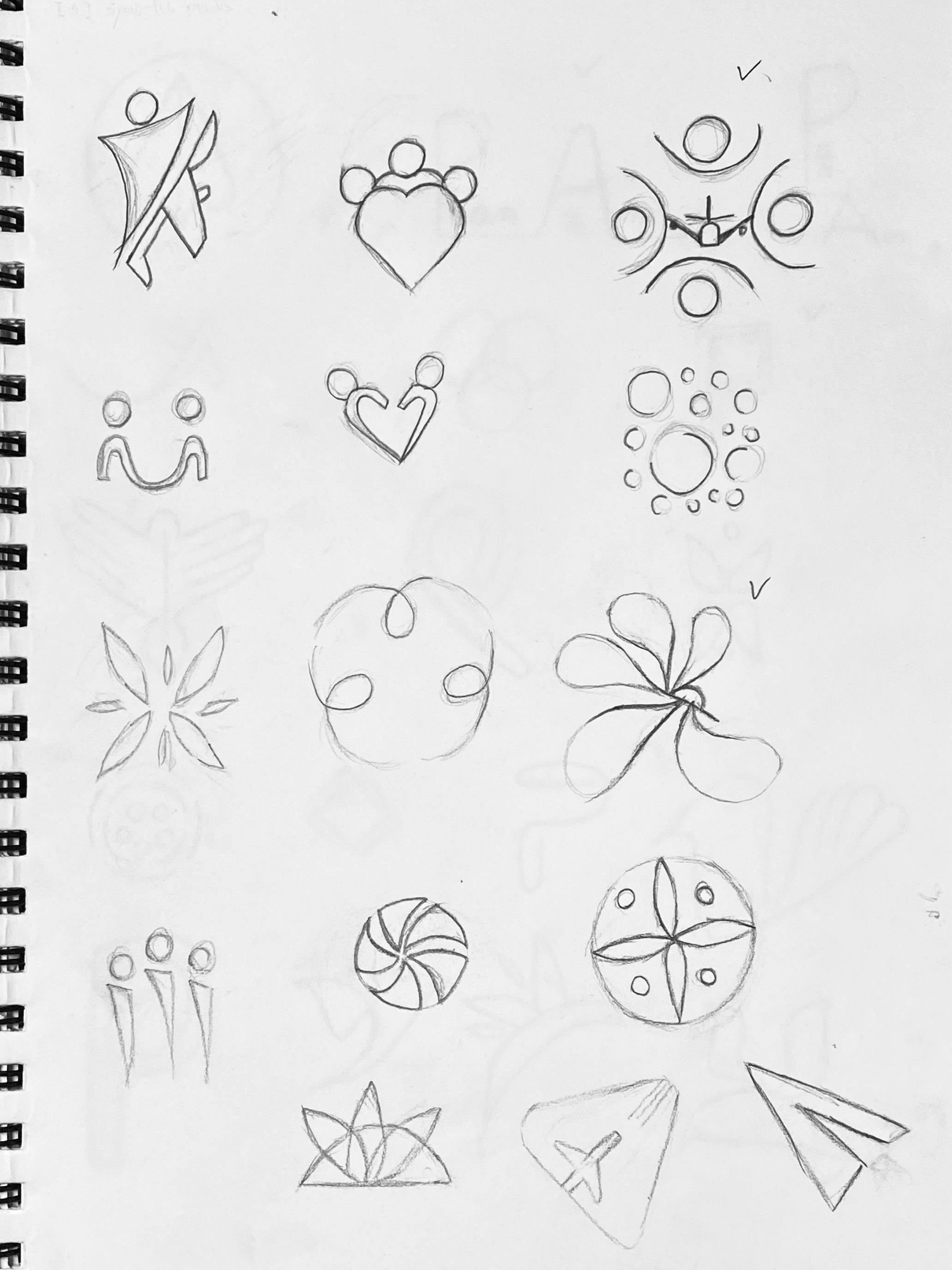
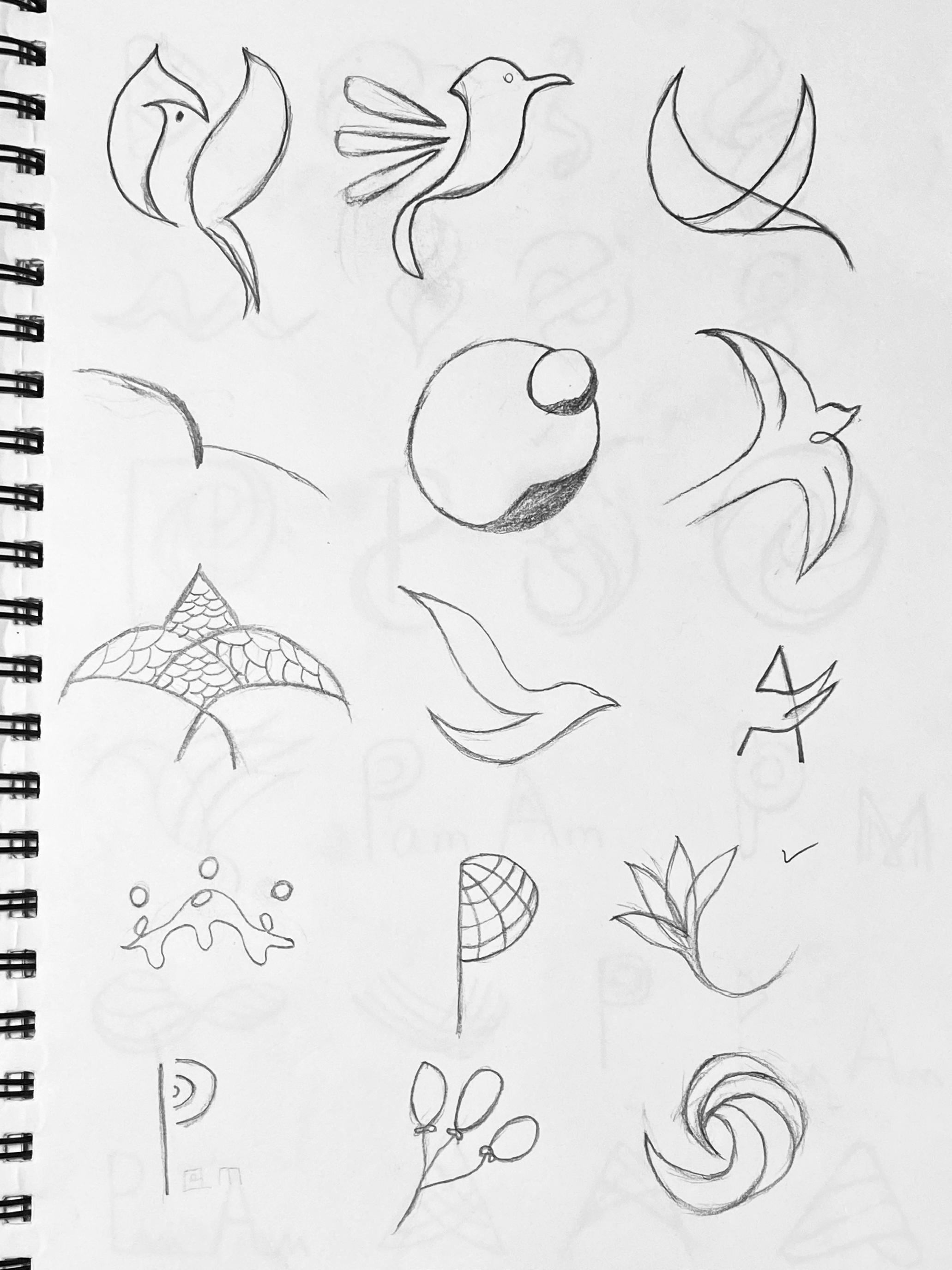
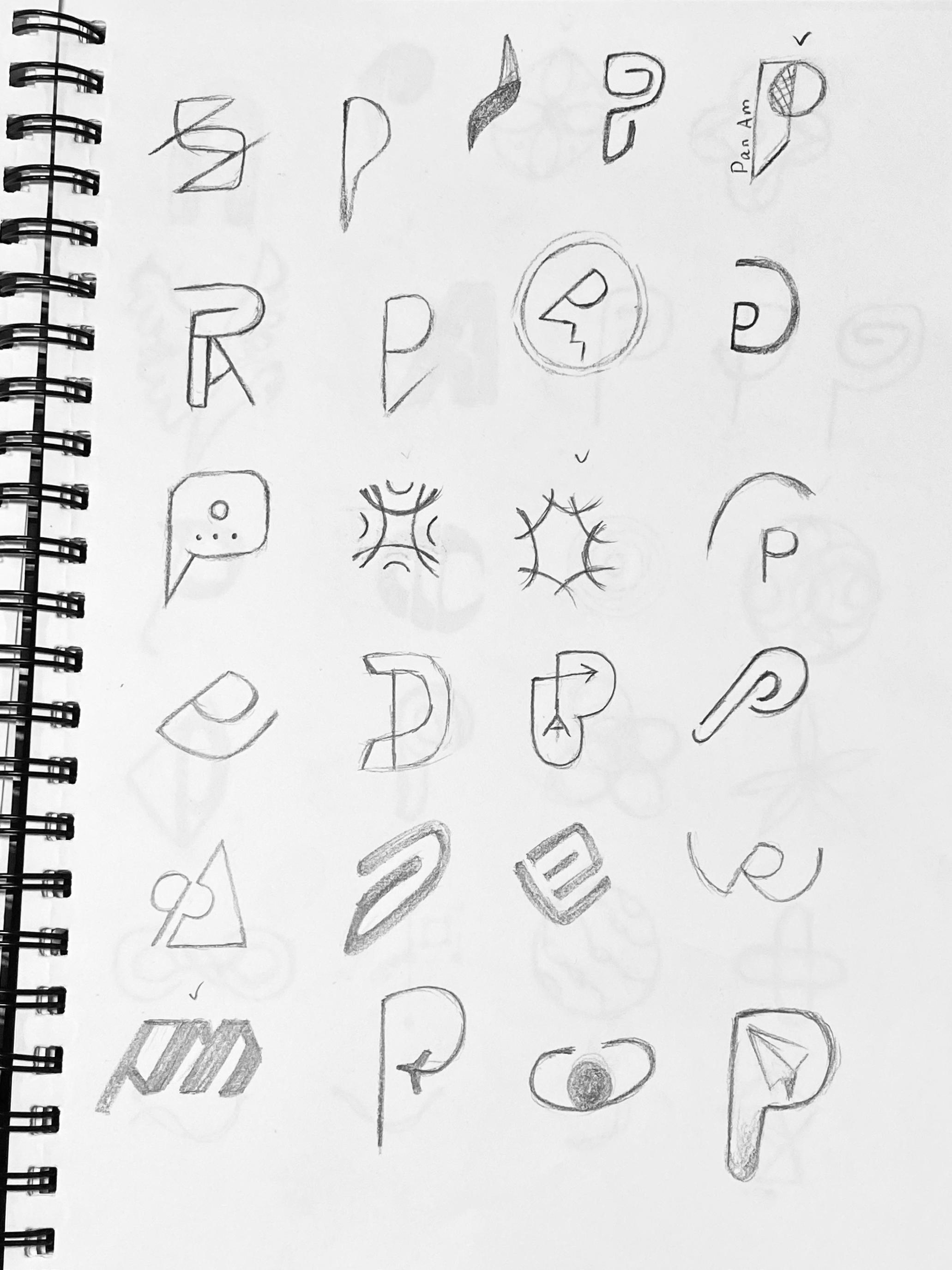
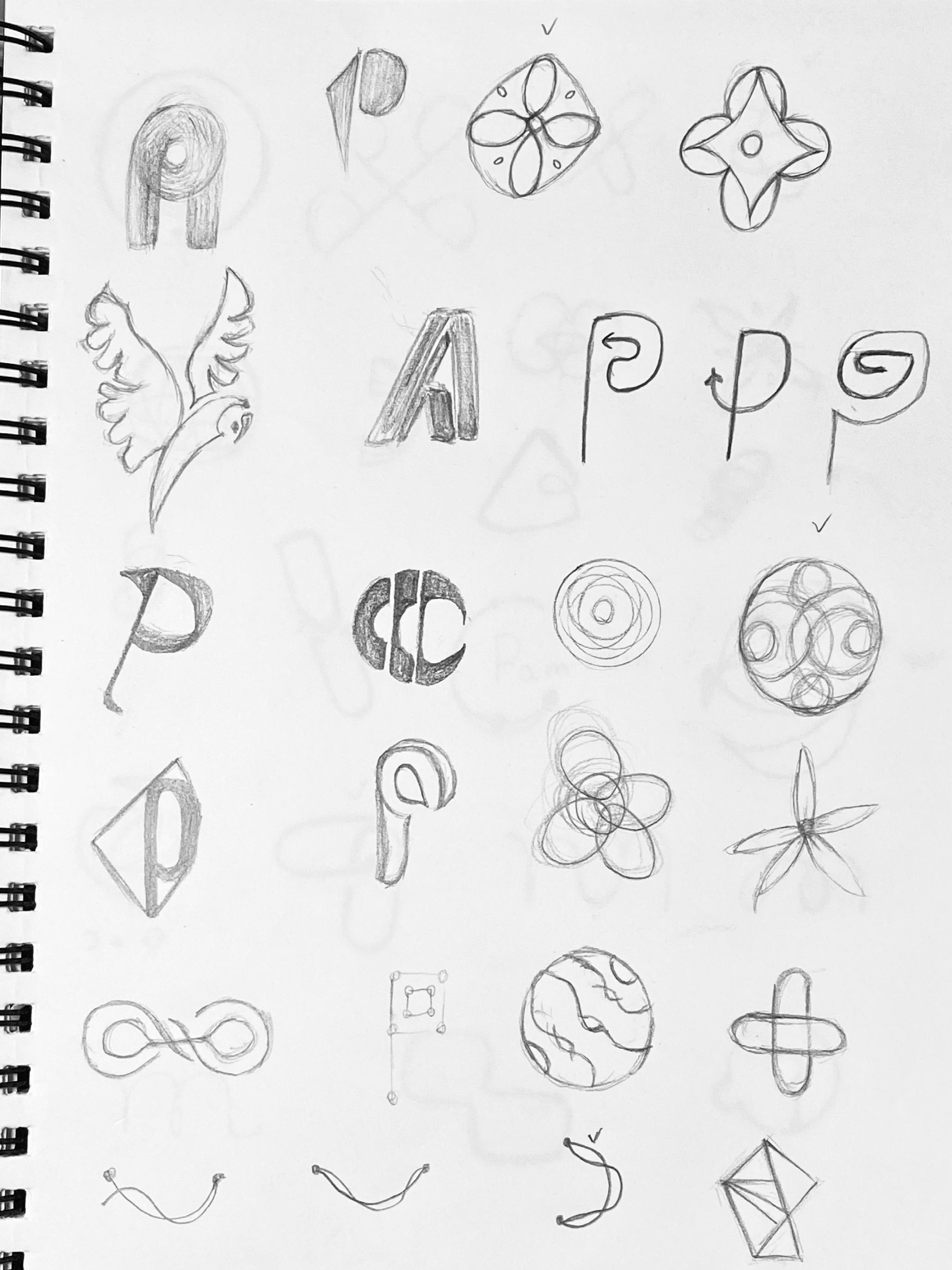
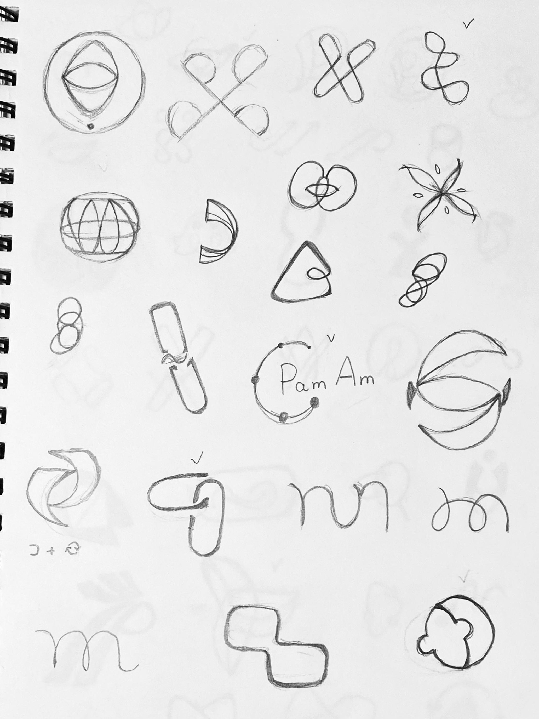
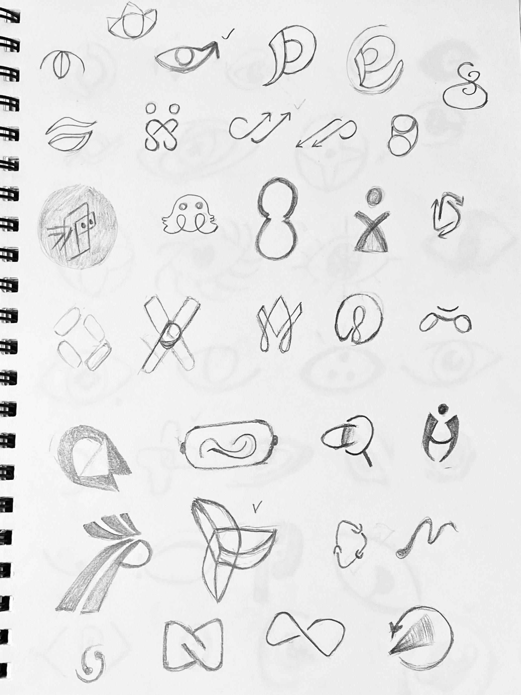
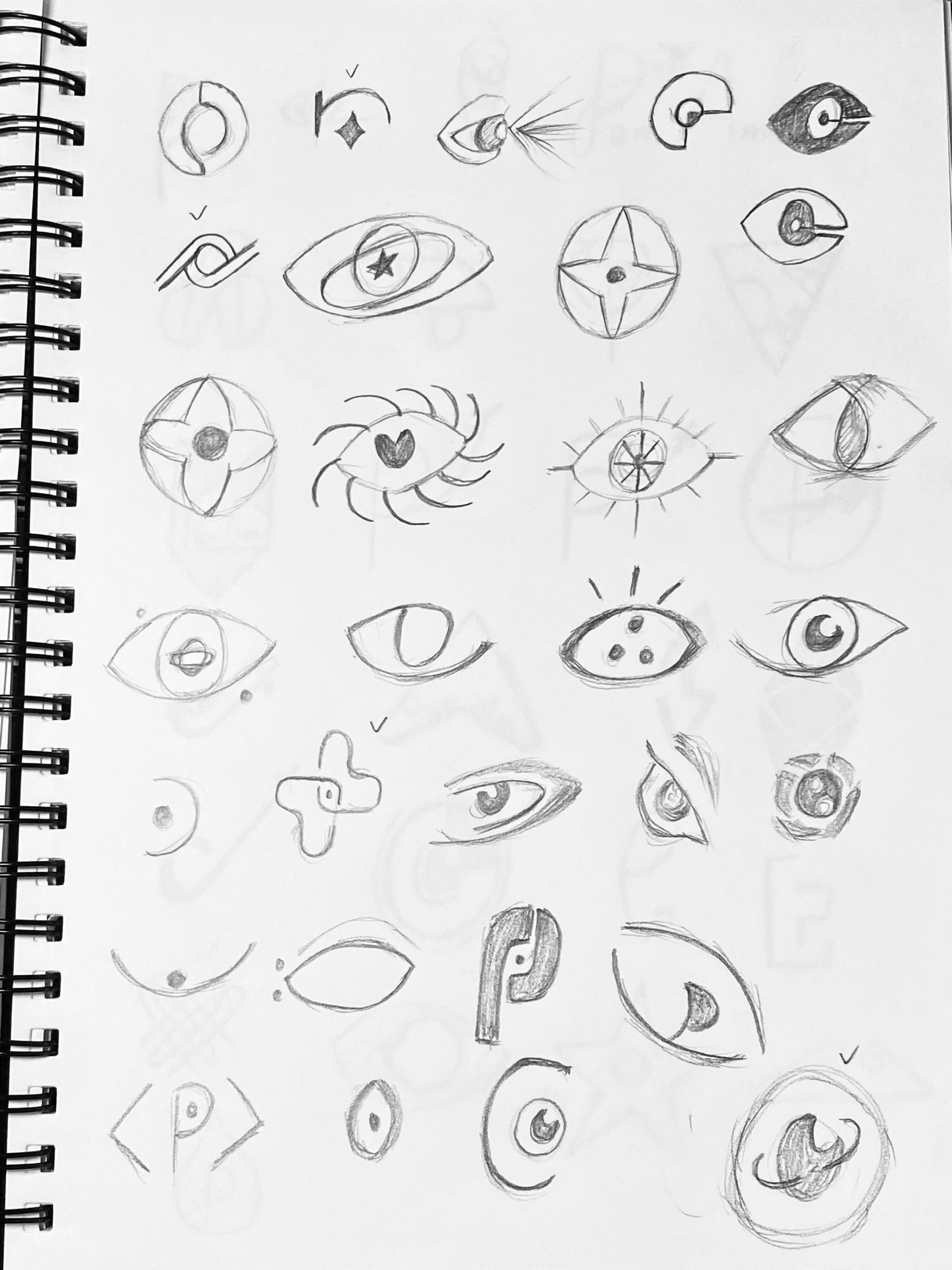
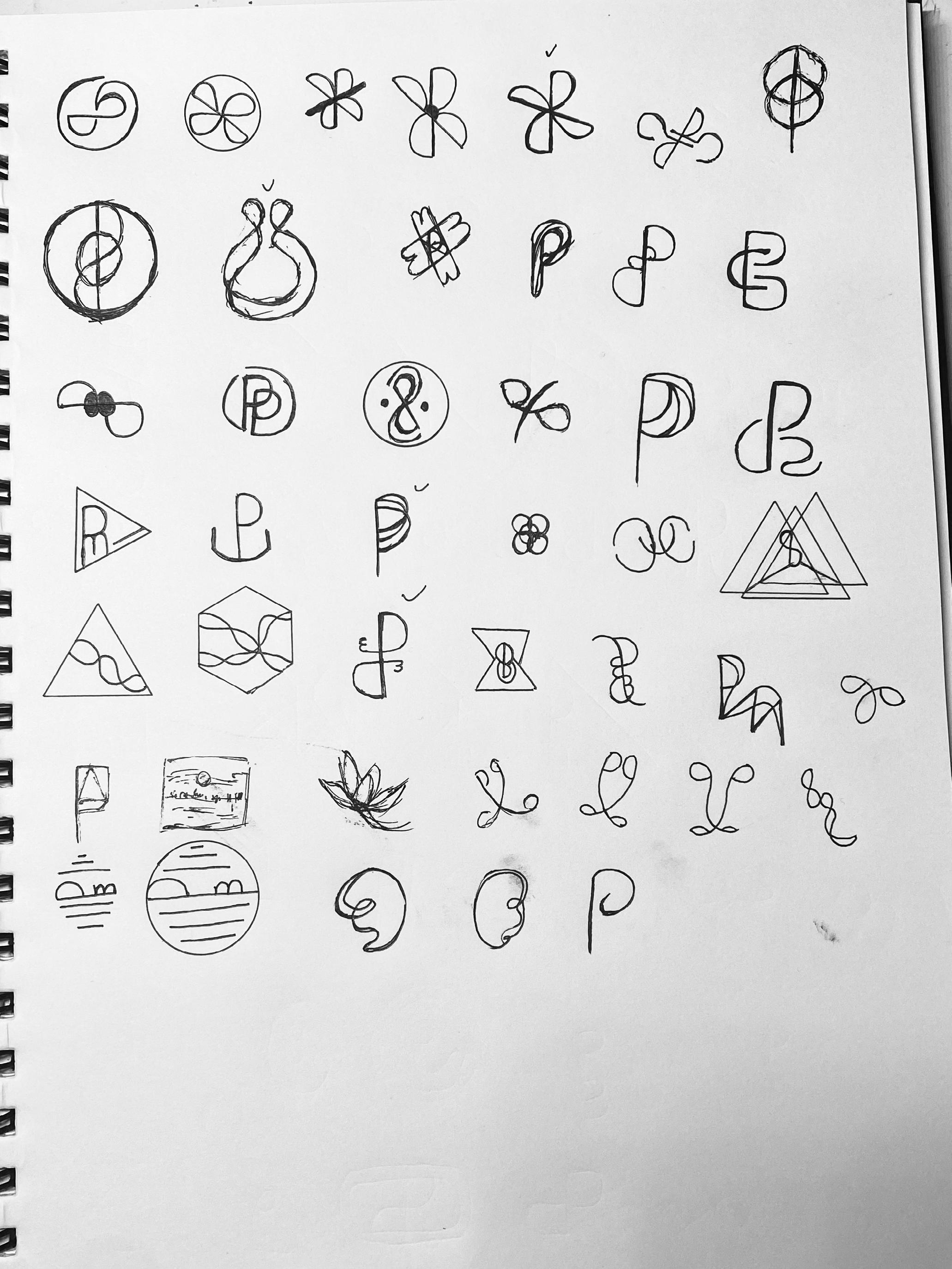
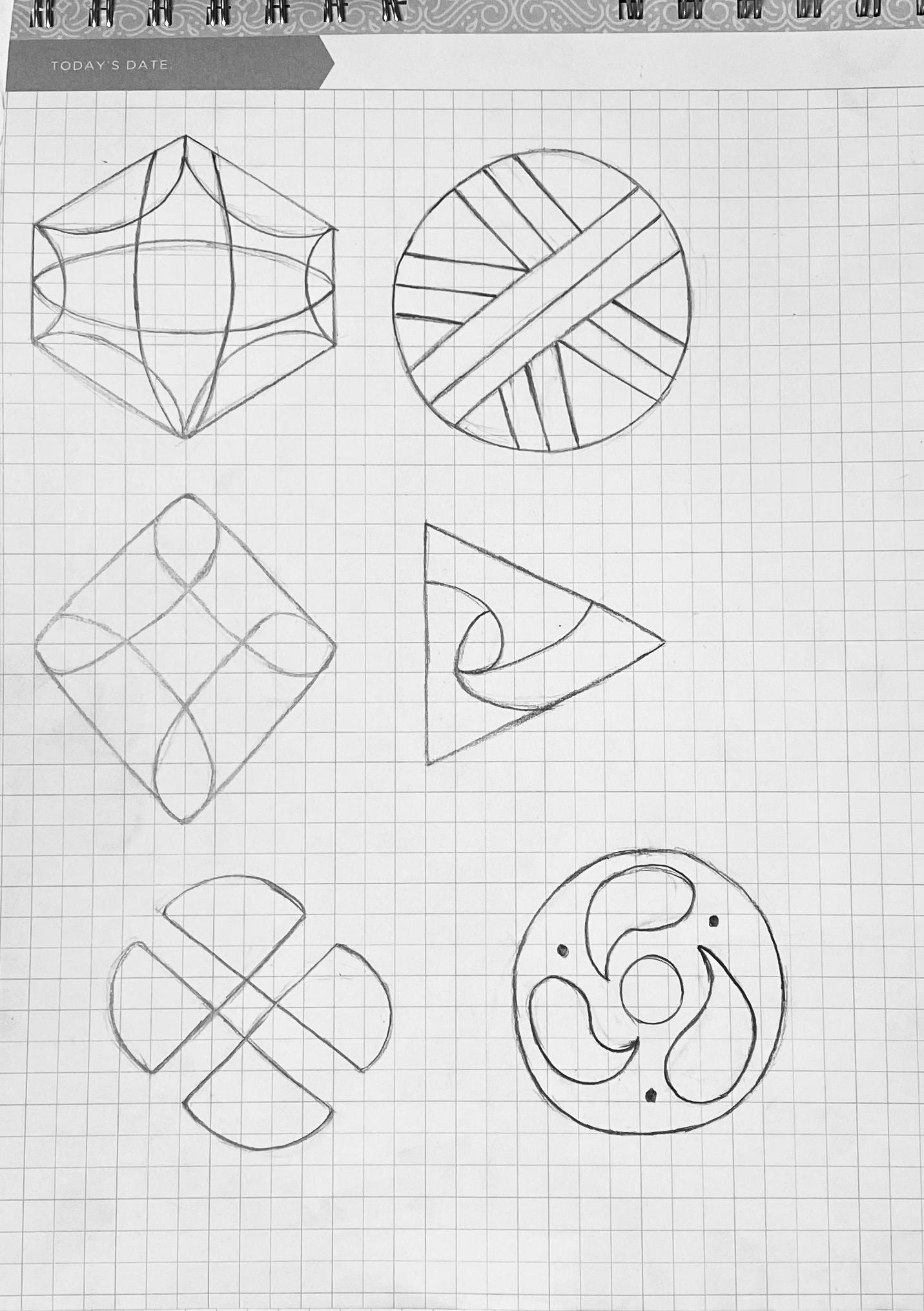
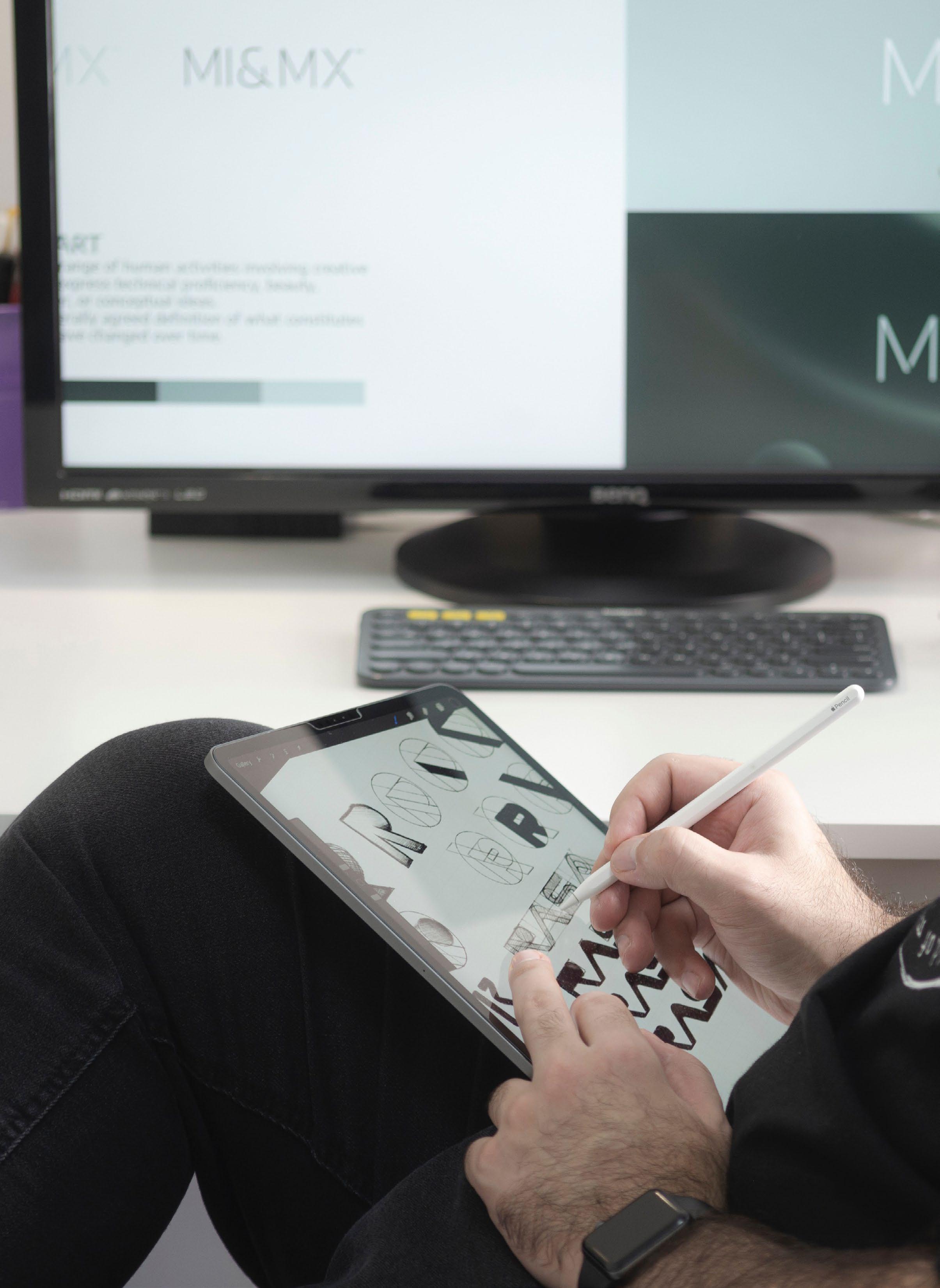
The initial sketches are based on three keywords and brain- storming. The three keywords are Responsibility, Respect and Natural. Each keyword sketches include symbolic, graphic, and wordmark. The Initial exploration helped me try a variety of designs and choose a direction as for future logo design.
Yu (Verna) He / 05232201 / Nature of Identity Brand System 5
6 The Brand Richness
Yu (Verna) He / 05232201 / Nature of Identity Brand System 7 Richness
8 The Brand Richness
Yu (Verna) He / 05232201 / Nature of Identity Brand System 9 Richness
10 The Brand Connecting
Yu (Verna) He / 05232201 / Nature of Identity Brand System 11 Connecting
12 The Brand Connecting
Yu (Verna) He / 05232201 / Nature of Identity Brand System 13 Connecting
14 The Brand Connecting
Yu (Verna) He / 05232201 / Nature of Identity Brand System 15 Global
16 The Brand Global
Yu (Verna) He / 05232201 / Nature of Identity Brand System 17 Global
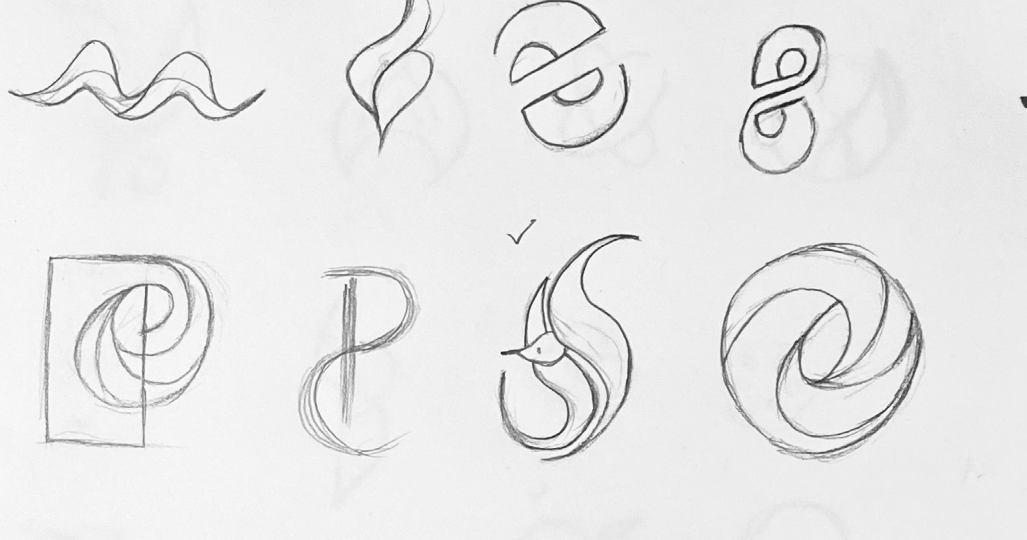
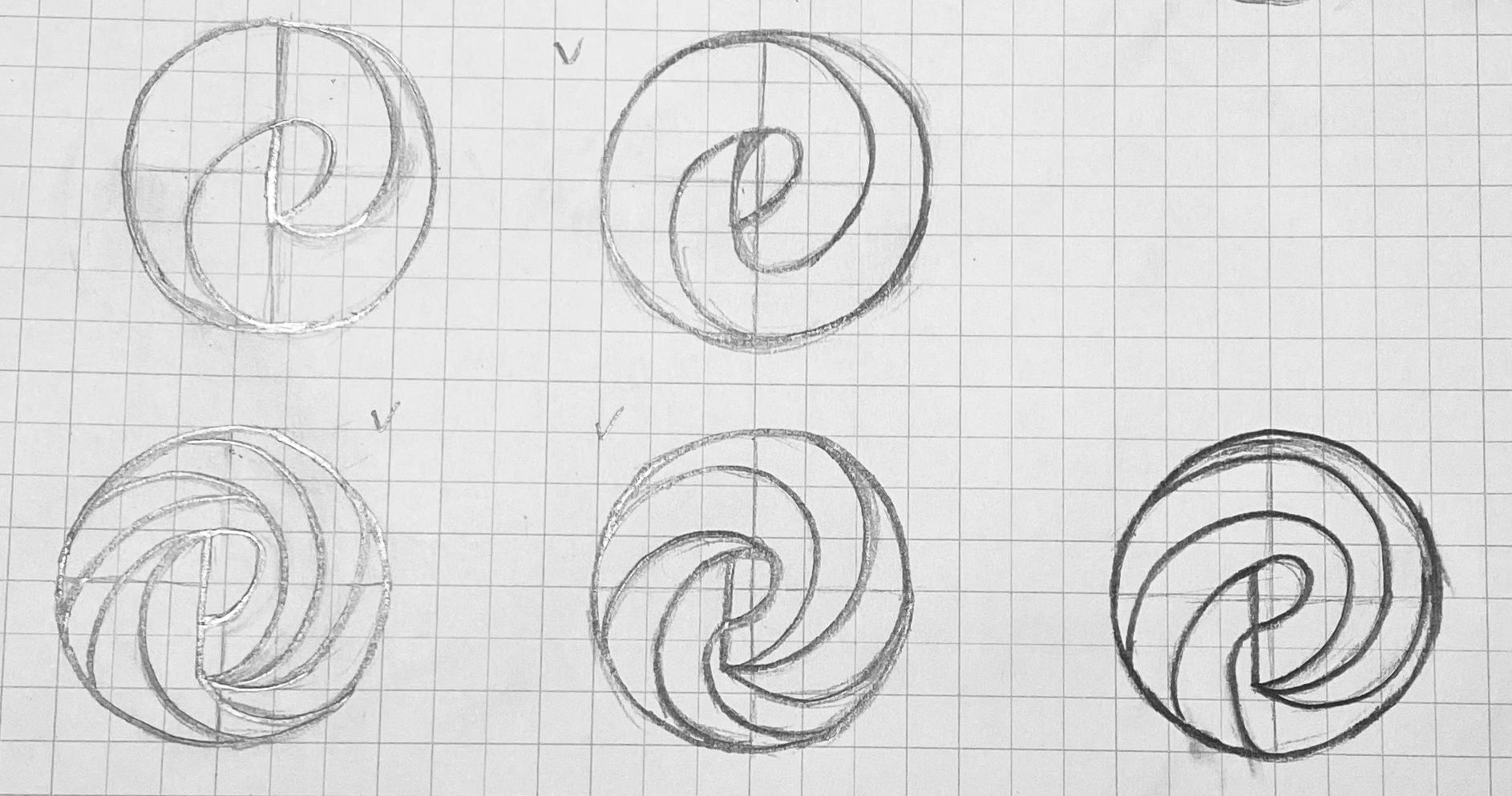
Round One Sketch Refined
Richiness
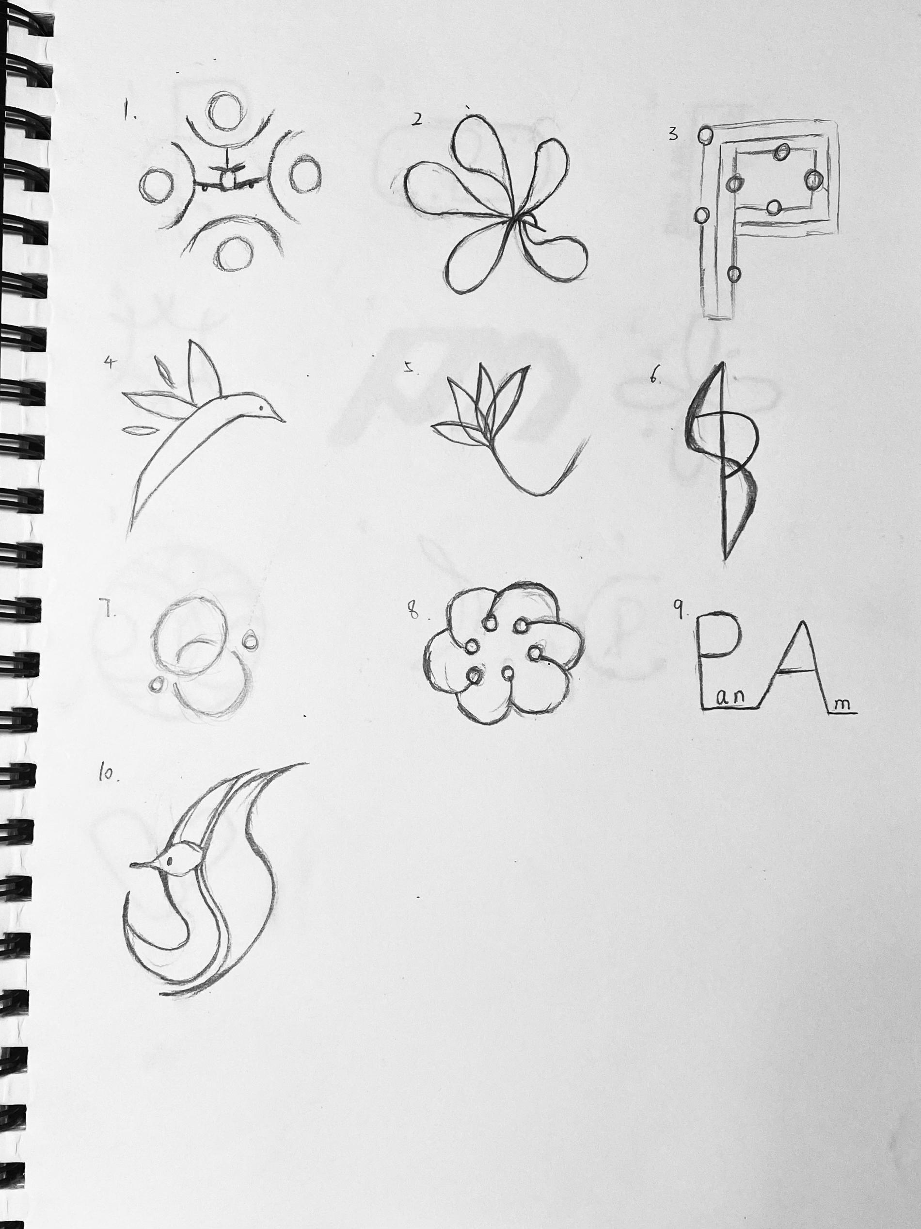
Richness (Cultural Diversity)
The logo played with birds symbol, airplanes, flowers, and a P logotype; some were explored with transparency. All will use 3 to 5 different colors to the character of diverse cultural backgrounds.
18 The Brand
Yu (Verna) He / 05232201 / Nature of Identity Brand System 19
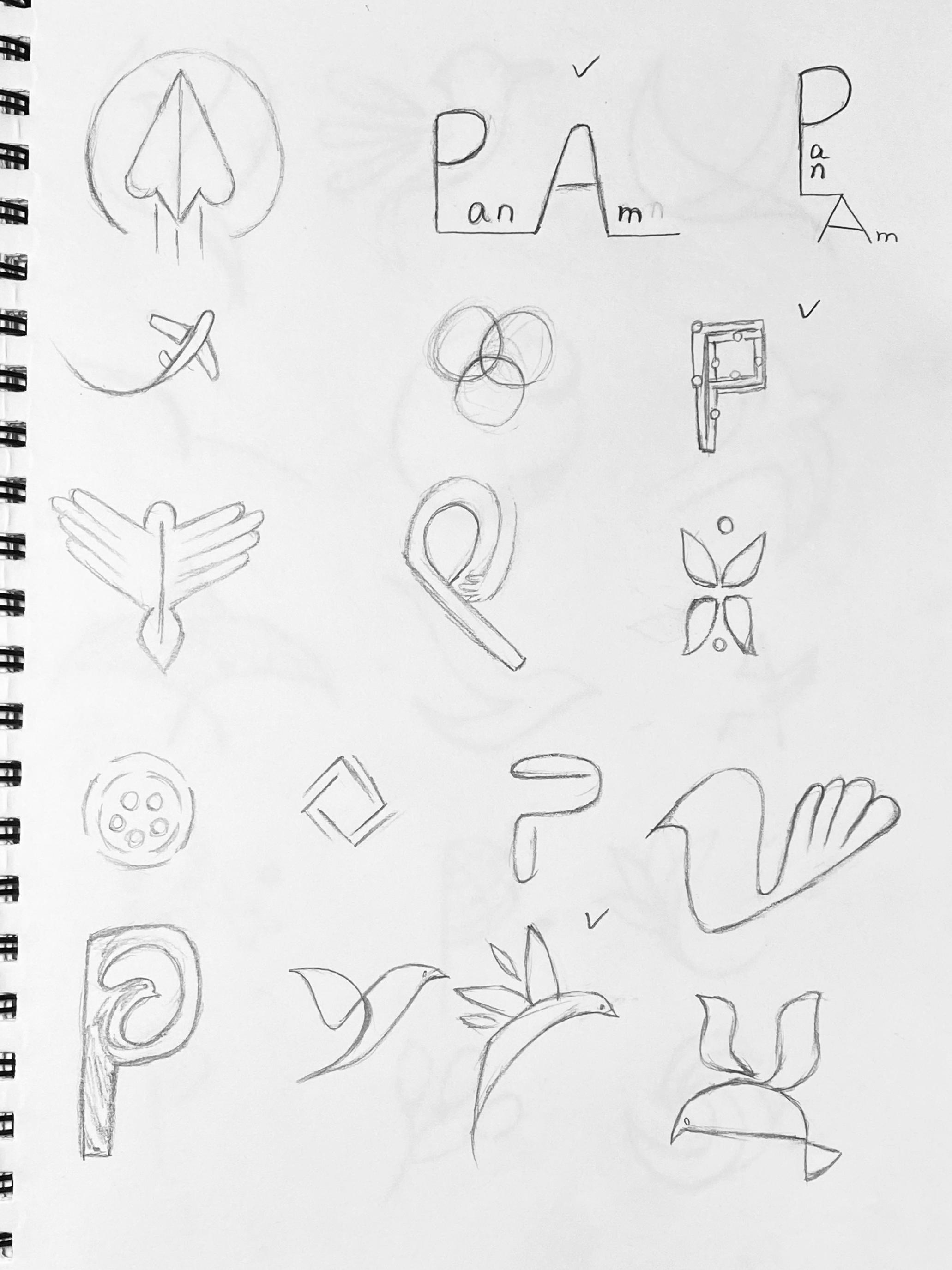
Round One Sketch Refined
Connecting
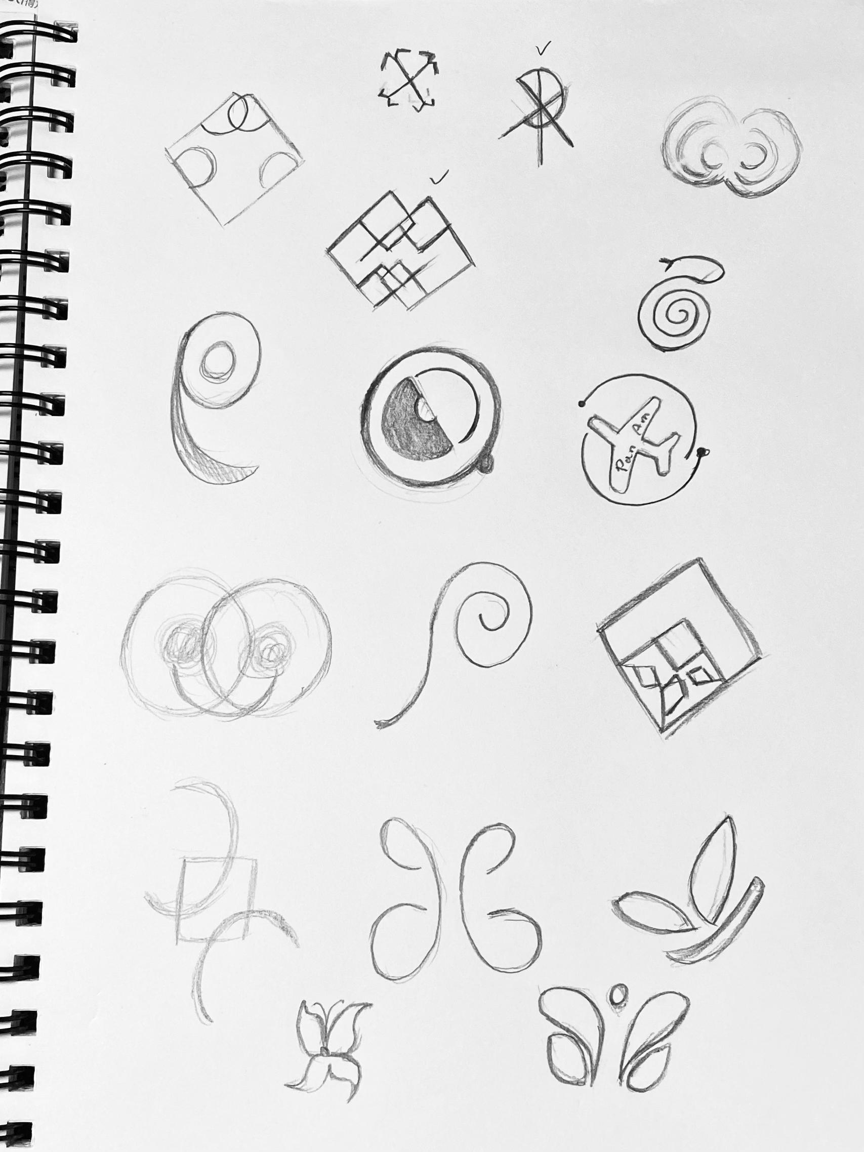
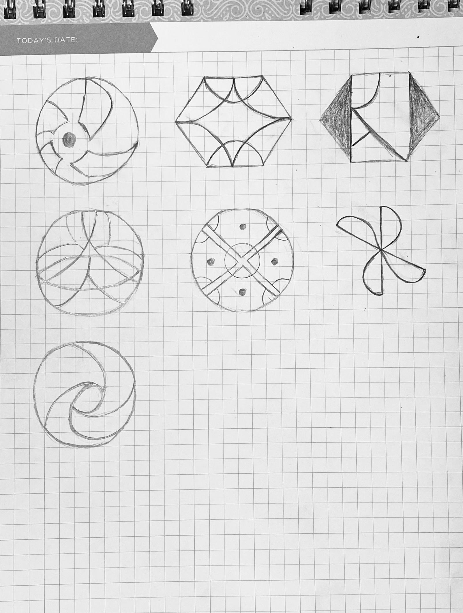
Connecting (Communication Between People)
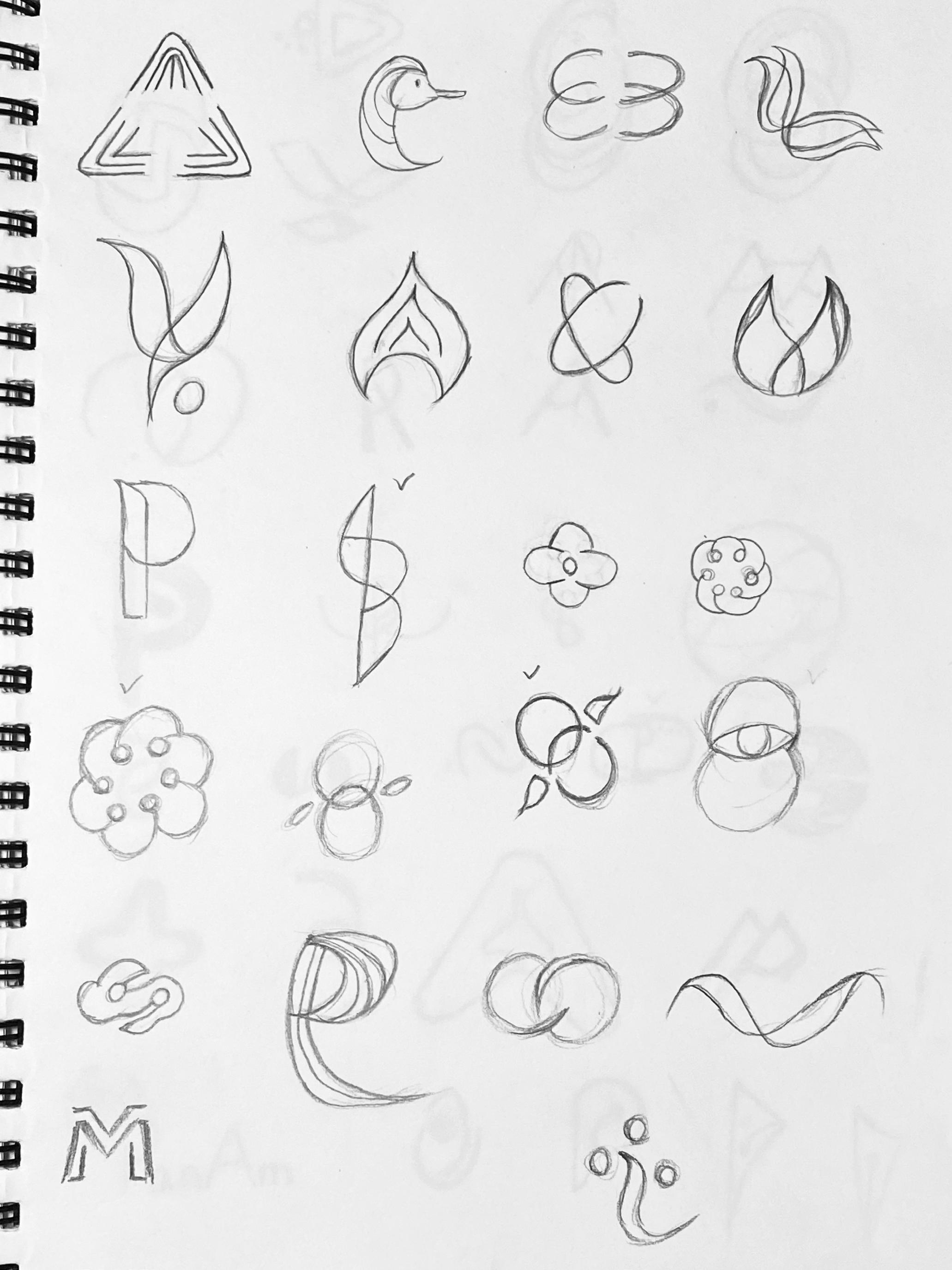
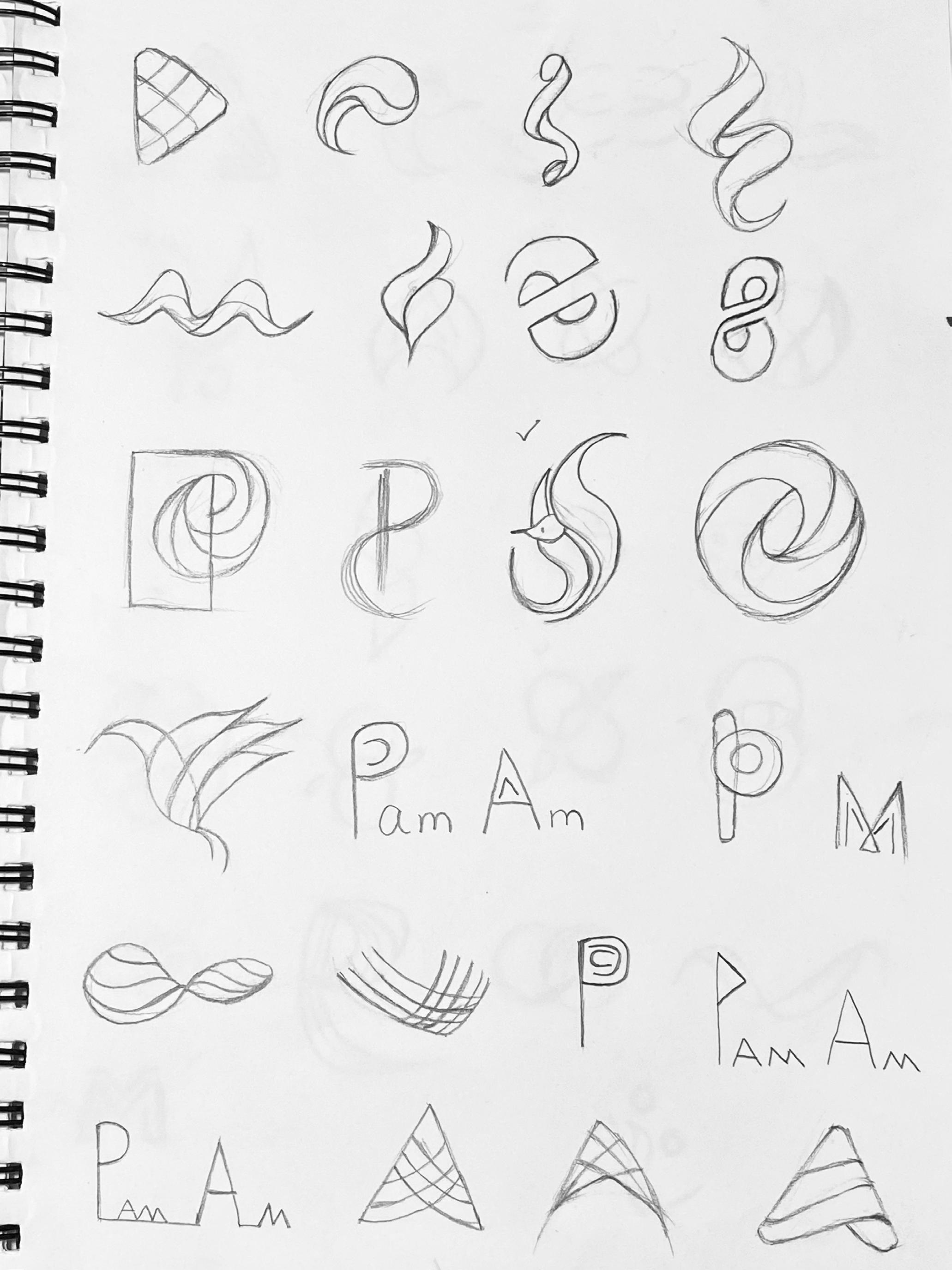
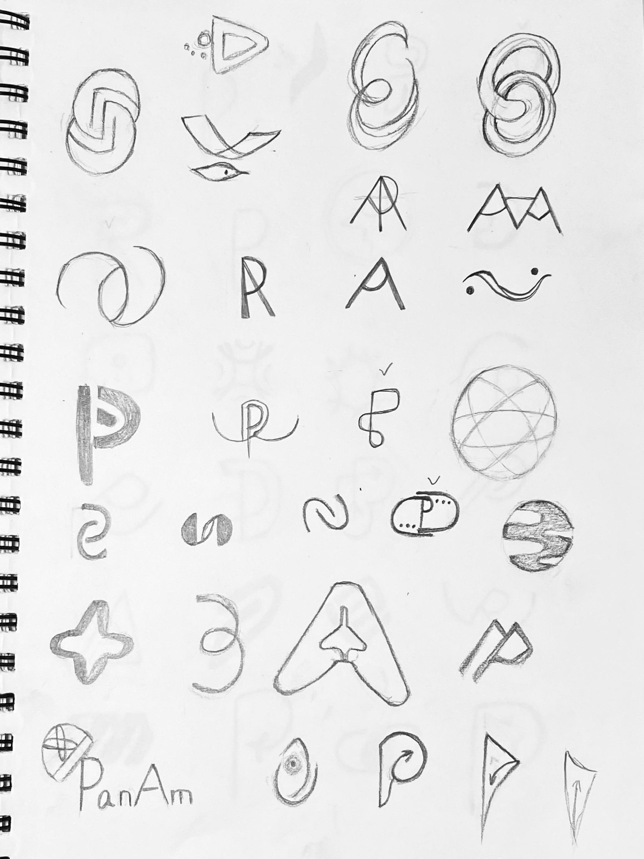
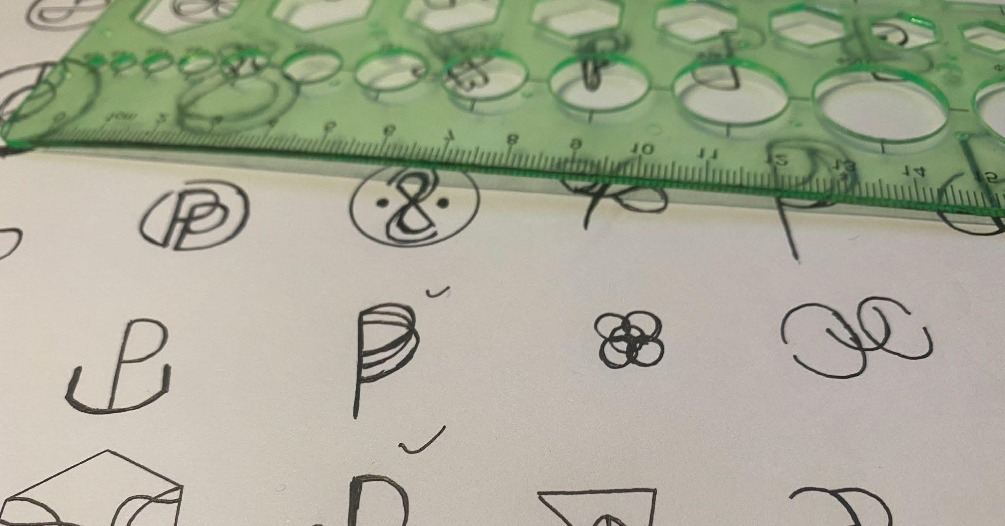
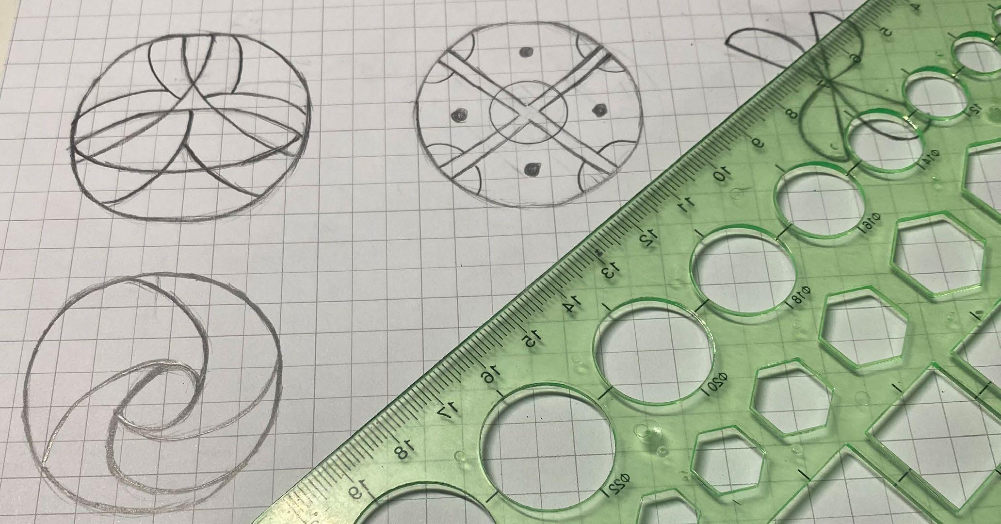
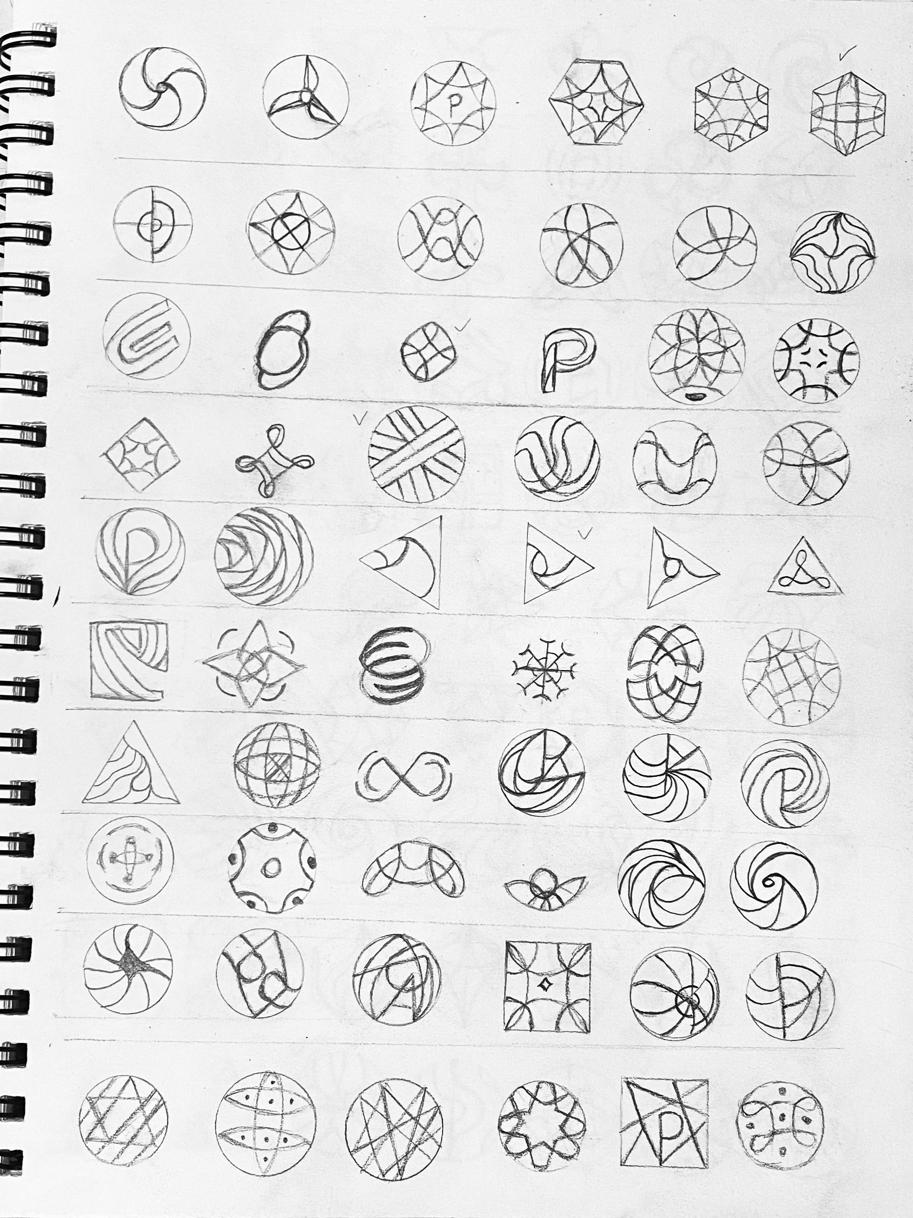
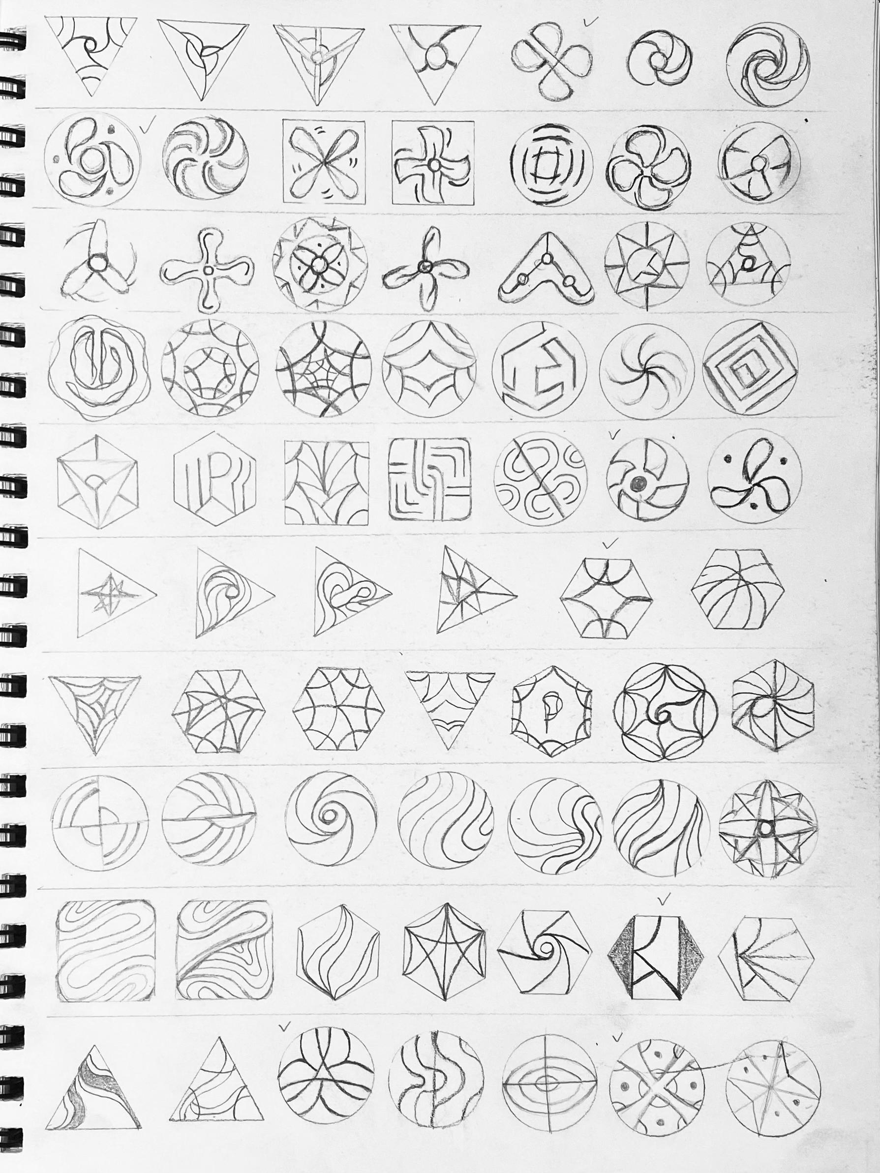
I explored the abstract P logotype, different circles, sharing link icons, and abstract shapes. I wanted to show how to connect people by using different graphic elements.
20 The Brand
Yu (Verna) He / 05232201 / Nature of Identity Brand System 21
Round One Sketch Refined
Global
Global (Open People's Eyes)
For this direction, I used an eye symbol, some abstract graphics, a P shape, a global symbol, and map icons. All connect with the subject and explore the diverse possibilities of the logo.
22 The Brand
Yu (Verna) He / 05232201 / Nature of Identity Brand System 23
Richness (Cultural Diversity) Connecting (Communication Between People) Global (Open People's Eyes) Round Two Sketches 03
After first round of rough sketches, the camp of responsibility seems to have the most potential. I chose some logos for developing refinement and refined them for final direction.
Brand System 25
Round Two Sketch
Connecting
Connecting (Communication Between People)
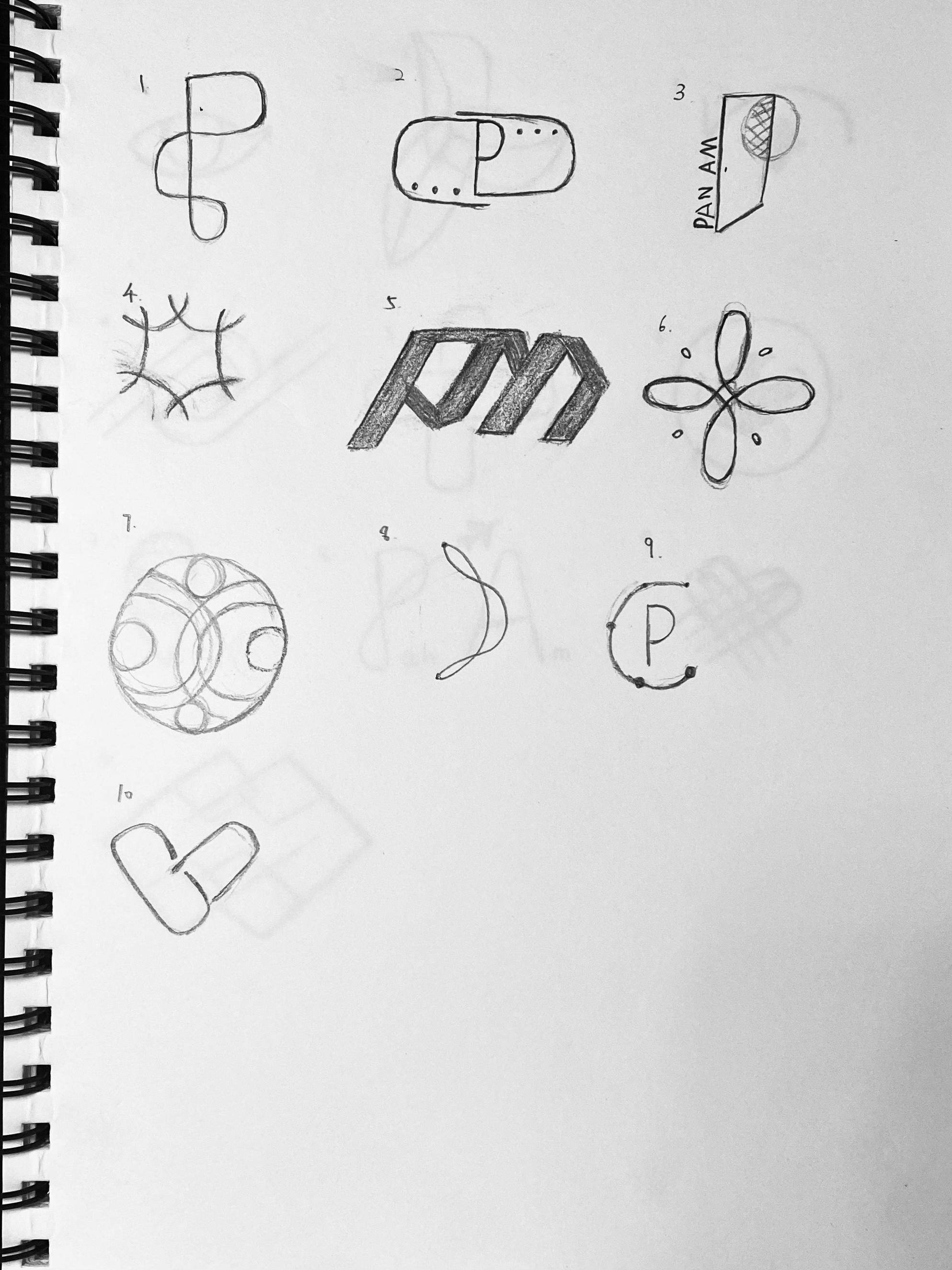
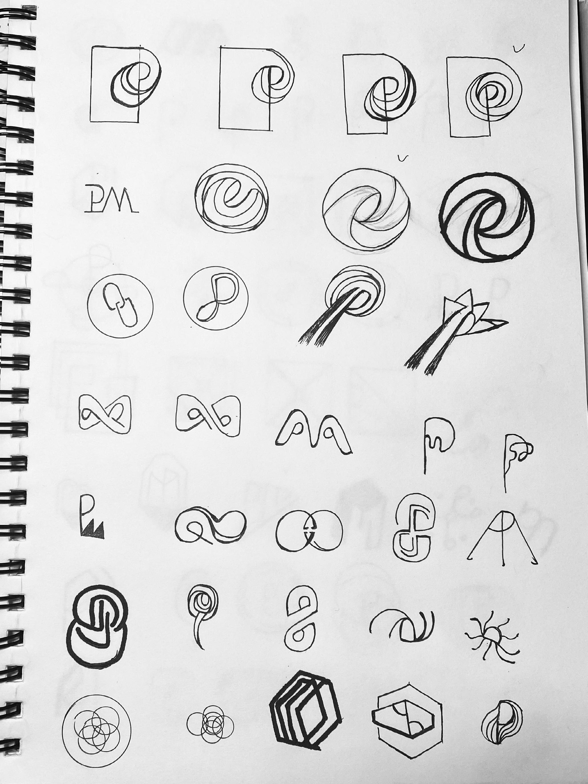
Based on the feedback, I refined more exciting shapes with P and PM; to see what showed more potential or worked better.
26 The Brand
Brand System 27 Connecting
28 The Brand Connecting
Brand System 29 Connecting
Digital Comps
Connecting
Connecting (Communication Between People)
Based on the feedback, I refined more exciting shapes with P and PM; to see what showed more potential or worked better.
30 The Brand
P A N A M
Pan Am Pan Am
Brand System 31
Richness (Cultural Diversity) Connecting (Communication Between People) Global (Open People's Eyes) Round
Sketches 04
Three
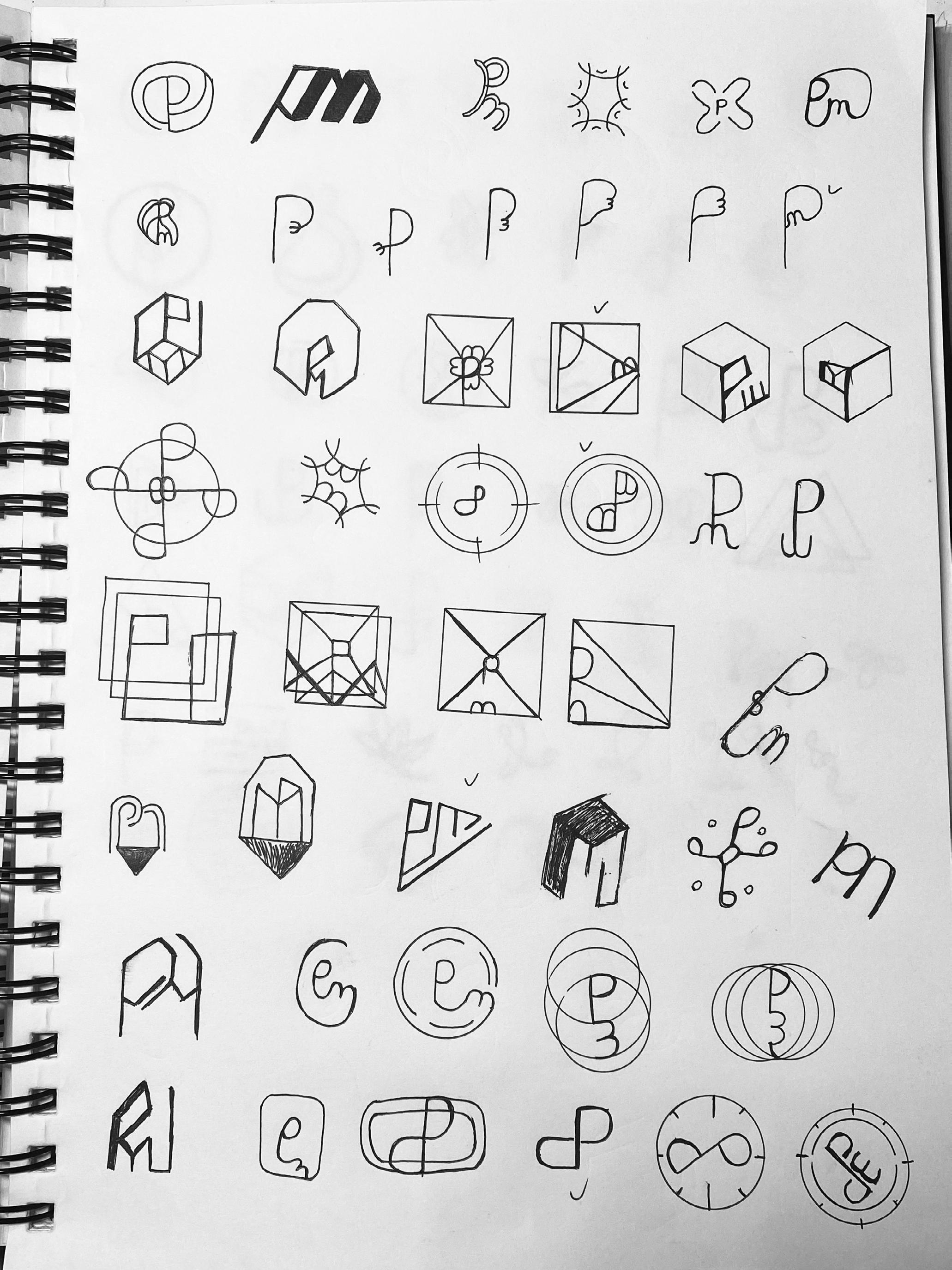
The following sketches expand on the best ideas from the previous round of sketching. These main ideas are refined and developed with several variations to find the version that will act as the best representation for Pan Am.
Brand System 33
34 The Brand Connecting
Brand System 35 Connecting
36 The Brand Connecting
Brand System 37 Connecting
Digital Versions Connecting
38 The Brand
Brand System 39
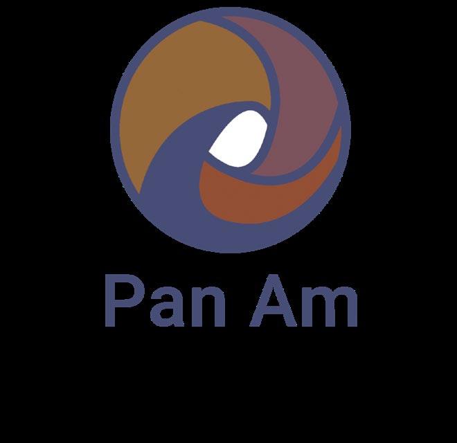
Pan Am
PAN AM Pan Am
40 The Brand
Logo Option 1
Pan Am
Hexagon

PAN AM PAN AM PAN AM PAN AM PAN AM PAN AM PAN AM PAN AM
Brand System 41
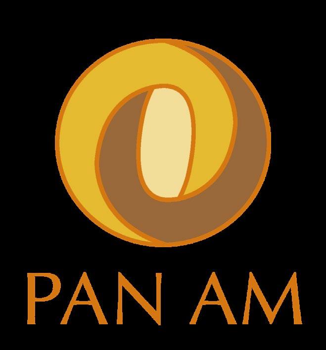
Color Options
Option
Pan Am PAN AM PAN AM PAN AM
42 The Brand
Logo
2
Circle
PAN AM PAN AM PAN AM PAN AM PAN AM PAN AM PAN AM PAN AM Color
Brand System 43
Options
Pan Am PAN AM Pan Am PAN AM
44 The Brand
Logo Option 3
Circle

PAN AM Pan Am Pan Am PAN AM Pan Am Pan Am Pan Am Color Options Brand System 45
Richness (Cultural Diversity) Connecting (Communication Between People) Global (Open People's Eyes) Round
Sketches 05
Three
The 4th round of sketches takes us to even more refinement and larger drawings. Of the best logo refinements from the last stage, two was chosen. The focus this round was to find the best iteration and develop the color.
Brand System 47
Connecting 48 The Brand
Brand System 49
Computer Comps
50 The Brand
PAN AM Round 4
Brand System 51
PAN AM
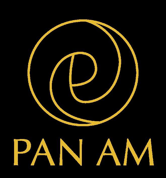

Color
52 The Brand
Round 4

Brand System 53

54 The Brand
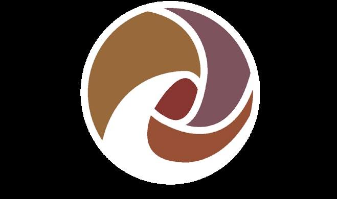
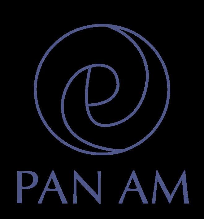
Final Logo Round 4

Brand System 55
Look-A-Likes
To find 20 similar logos for Pan Am; When designing a logo, it is important to see what logos currently exist so that the re-design isn't copying anything.
06
58 The Brand

Brand System 59

60 The Brand
Brand System 61
07
Inspiration
Visual research and leveraging inspiration from good works are essential qualities for designers. When we are faced with a new project area and do not know the rules and structure, it is wise to conduct research and study from existing works and materials.
32 The Brand

Identification and Analysis
New Identity Introduction
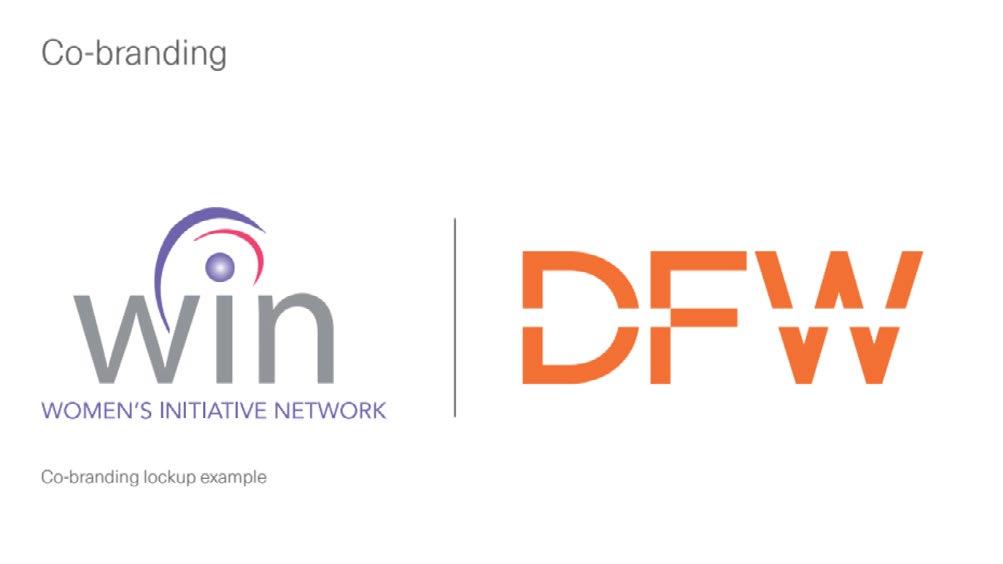
The brand DFW is being very clear and straightforward when introducing their primary and secondary logos by putting the logo at the very front of their brand standards book.
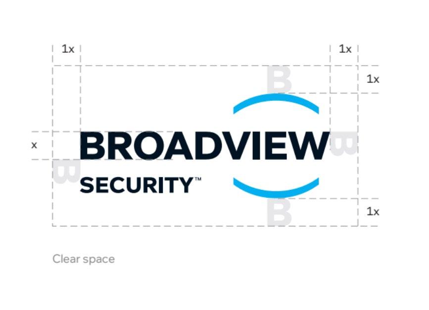
Logo Anatomy
The logo anatomy helps in identify- ing the angle of the forward slash, distance between each character and their sizes.
64 The Brand
Type Specs
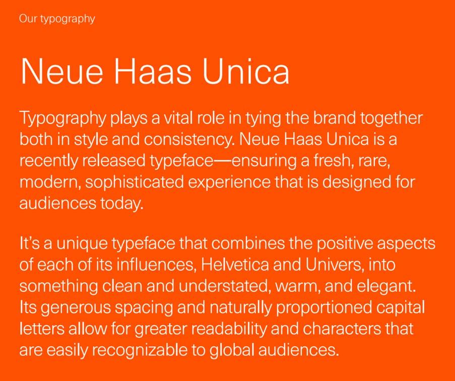
Main colors
Neue Haas Unica shows type specifications for for screen and print use by putting them on a mockup of a laptop which is nice and clean type.
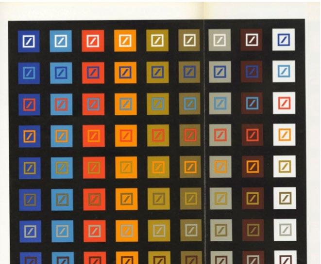
Deutsche Bank has 72 acceptable logo colors, which makes it easier to place them on a breadth of colored backgrounds and assets.
Brand System 65
Logo Don'ts
Alternate Version of Logos
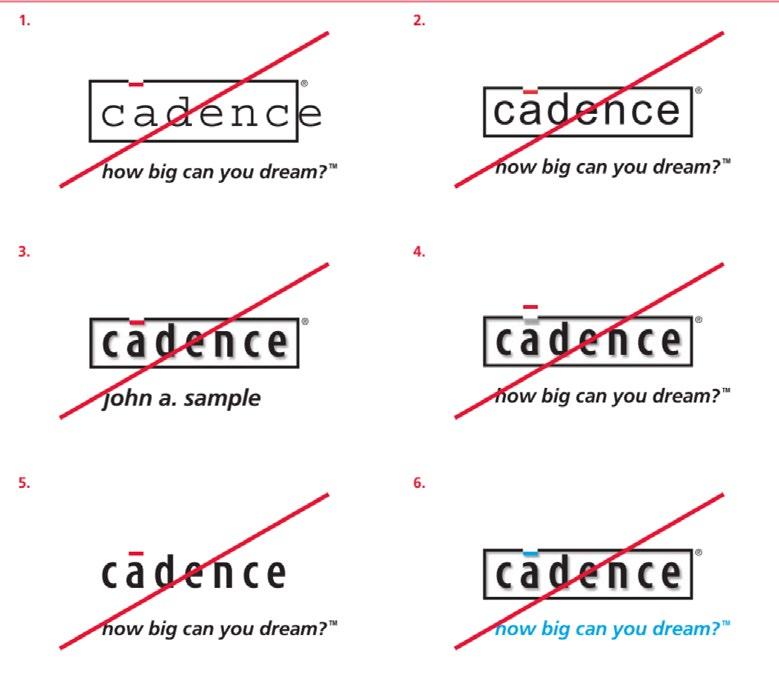
This type and logo direction are not fit to my project; the logo shows bold and heavy feeling.
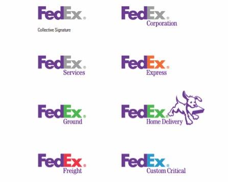
FedEx is a good example that shows different versions of alternative logos. It uses different colors, typefaces, positions and graphics to distinguish different departments. We can see that the tagline is always below the word EX which doesn’t influence the hierarchy of the entire logo.
66 The Brand
Color Combination
Layout
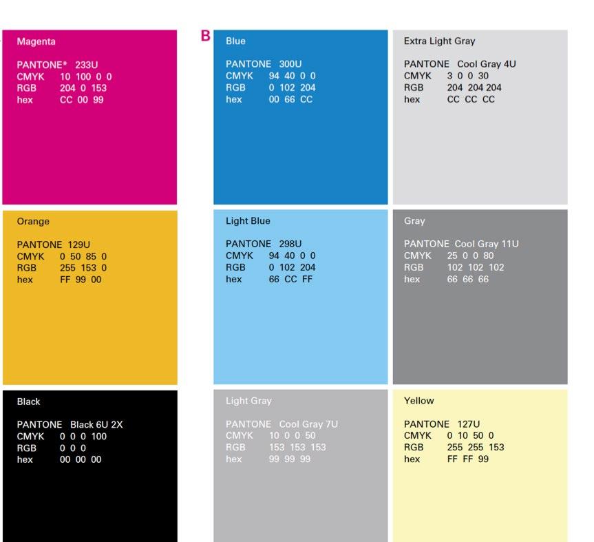
Rightturnretail’s color palette works quite harmoni- ously. It elaborates on printing colors and web colors which gives more understanding for other designers to use. Also, it reminds designers of using Pantone Color Standards to examine colors.
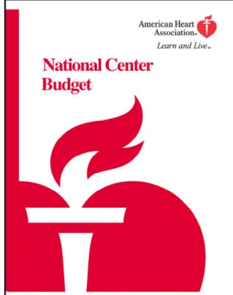
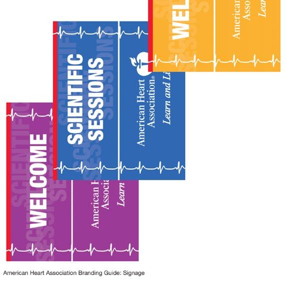
American Heart Association works great layout of type transparency; their color usage is attractive and dynamic.
Brand System 67
Sources
Information
https://en.wikipedia.org/wiki/Pan_Am https://www.deltamuseum.org/exhibits/delta-history/family-tree/pan-am http://www.everythingpanam.com
Potography https://www.pexels.com/zh-cn/ https://unsplash.com
68 The Brand
Brand System 69