PORTFOLIO


2KS GRAPHICS
©2023 2ks Graphics. All rights reserved.
Adobe Certified Graphic Designer in Photoshop, Illustrator, Indesign, Priemere Pro, After Effects, Animate and Dreamweaver. For details and designs, scroll down. Available for your needs.

Installed Kingaszalasna@gmail.com

0868662890


PORTFOLIO
Contact Info:
Co Offaly, IRELAND


CV My Process Book Cover Design Along the mountaintop Comic Cover Design Fuck Princess Rise Logo Pharmacy 15 18 21 Peacock Logo Builders Morfetta Logo Solicitors Brass Dog Logo Security Company 2 3 4 8 12 TABLE OF CONTENT
ABOUT ME: My name is Kinga Szalasna and I’m a certified adobe graphic designer and visual artist working on freelance projects. I successfully communicate with clients to deliver to them the best design possible that suits their needs and solves their design problems. I mainly design high quality, modern and fresh-looking book covers and logos. My other experience includes posters, ads, labels, .
In the near future I’m hoping to expand my horizon and start working on brand identity as part of a larger team.
Photoshop
Illustrator
InDesign
Premiere Pro
After Effects

Dream Weaver
Animate
2KS
2
GRAPHICS
1. PROJECT SCOPE:
Establish what is the project, where it will be used, when is it due, who is the target audience, and how much it will cost.
2. WORD ASSOCIATION
Write down any initial words that pop into mind associated with the project before any researching. After researching, add more words.
3. TARGET AUDIENCE:

If the target audience hadn’t been establish target audience by looking at the company’s or competition’s demographics. Research how best to appeal to the target audience.
7. TYPOGRAPHY: Pick typography based on the mood, target audiences and values.

8. SKETCHES:
Sketch ideas. Depending on the preferences of the company/client, communicate with them on the idea and incorporate their feedback into sketches before moving onto production
9. EXECUTION
Produce the best idea/ideas with or without communication with the company/client, depending on their preferences.
My Process IDEA CONCEPT RESEARCH
11. REVISION: If there is any feedback, revise your design and incorporate it.
3
BOOK COVER DESIGN
ALONG THE MOUNTAIN TOPS
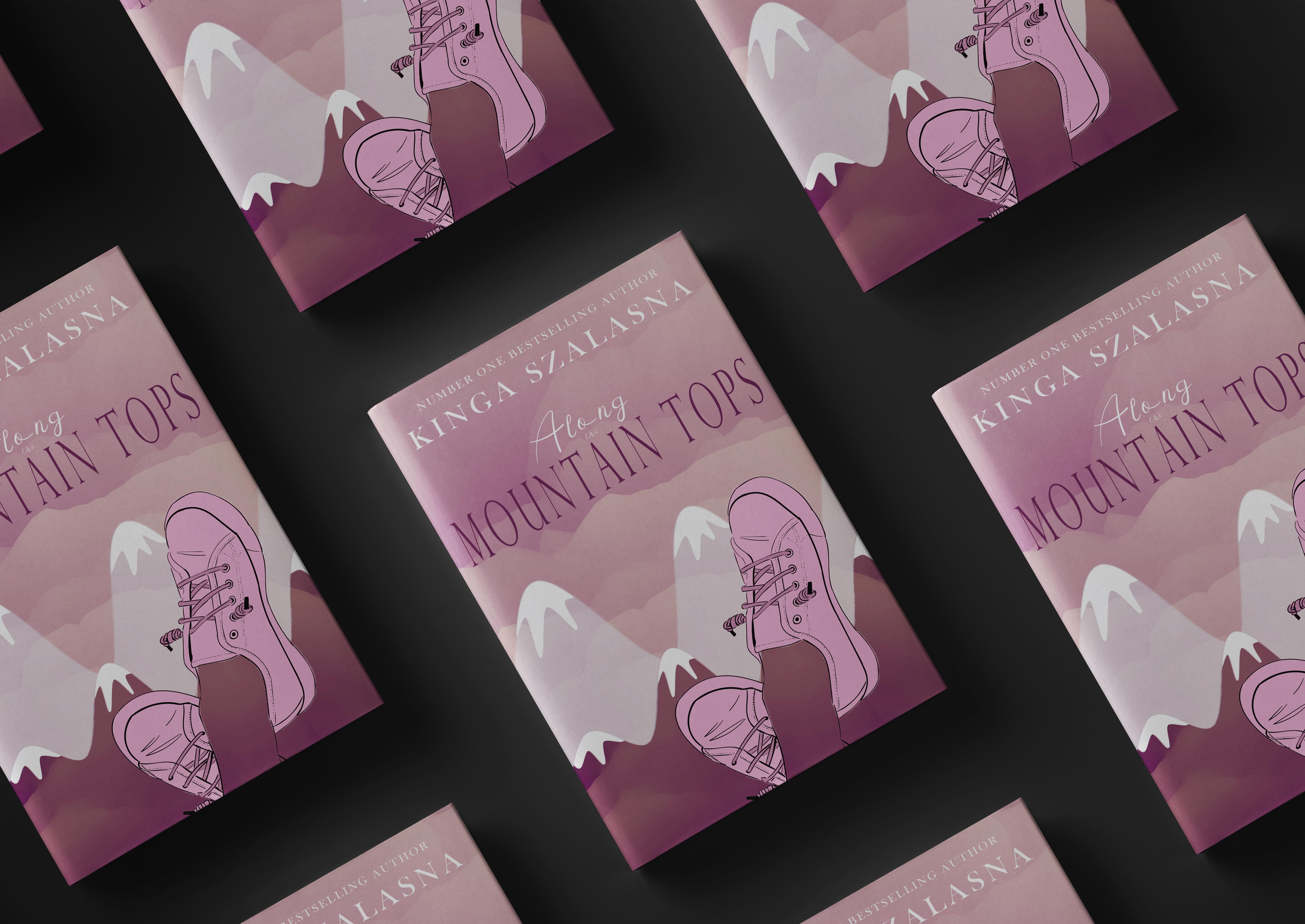
Along the Mountain tops
PROJECT: Design a book cover that expresses the light and fun tones of an adventure book about mysteries, friendship and traveling the mountains. The book is an adventure/woman’s fiction genre aimed at young females between the ages of 16-24.
NAME: Along the Mountain Tops
COLOURS: According to colour psychology, different colours convey different values and evoke different feelings. The various shades of pink used emphasises femininity and calmness while the purple adds a hint of mystery to it.
IMAGERY: On the front cover, the pose of relaxed feet up in the air is used to further convey the light tones of the novel. The feet with the mountains in the background visually show the reader the plot of the story without any spoilers. On the back cover, the two holding hands lets the reader know that the book involves a beautiful story of friendship.
#f2f1f1 #d7b0b4 #f1bdd9 #8f5877
5
TYPOGRAPHY:
Elegant and flowy
Peace Boy font is used on the first half of the title to reflect the beautiful and fun story behind the cover.
The second part of the title uses a stretched out Perpetua Titling MT font. The font is stretched out to make it appear taller like a mountain reaching the sky
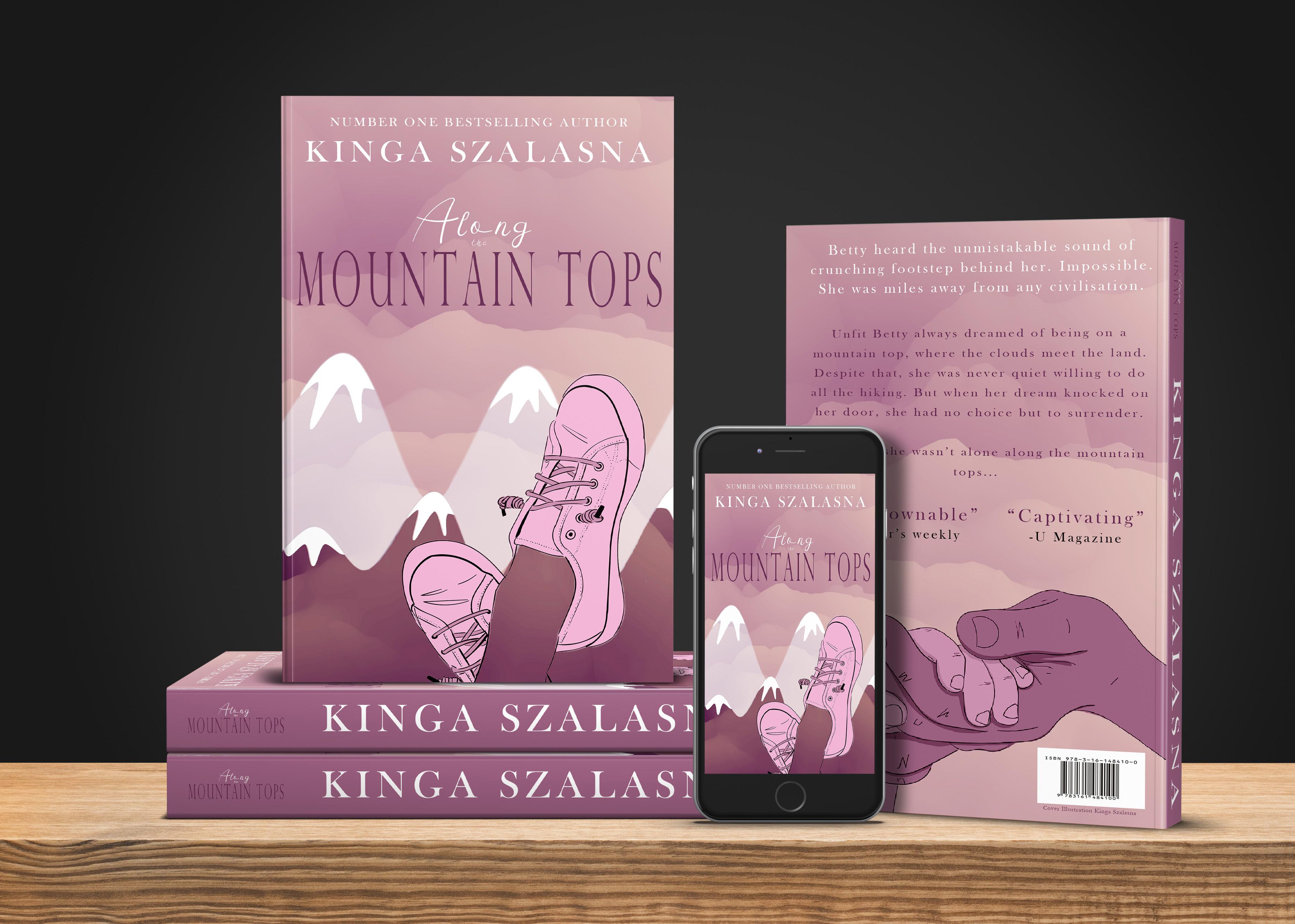
All fonts used are nonserif fonts. Non-serif fonts are viewed as modern and cool.
Baskerville Old Face is the most used font on the inside of books. You can see the font being used on the blurb and name of the author.
6


7
COMIC COVER DESIGN
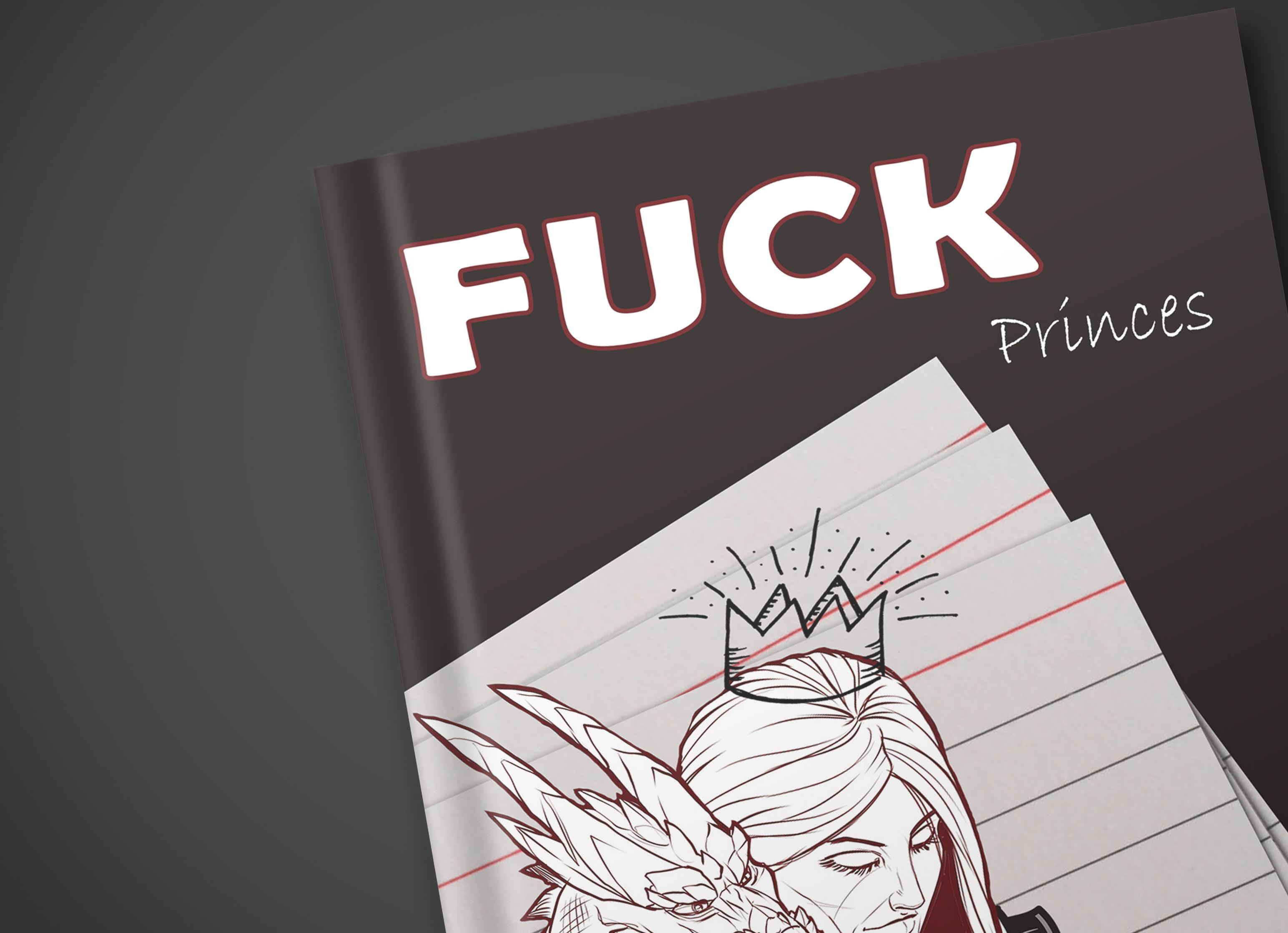
FUCK PRINCES
FUCK Princes
PROJECT: Design a comic cover for a fairytale with a twist, Fuck Princes. The cover should draw attention of young adults and visually signal to them what the book is about.
COLOURS: The grey of the armour on Prince Blah Blah is a darker shade than the armour on Princess Bananana to indicate that he is the ‘villain’ of the story. However, the blue on his armour evoke the feelings of loyalty, trust and confidence to reflect that he has the ‘prince charming’ personality of every fairytale prince.
In contrast, the heroin, Princess Bananana, has red in her armour to show her passionate and aggressive nature.

The black of the background was chosen to compliment the other colours and to stand out among the other comics.
TYPOGRAPHY: A thick, bold and slightly quirky Berlin Sans FB Demi Bold font is used for fuck and a thinner but equally fun Bradley Hand ITC font for Princes. Baskerville Old Face is the main font used on the cover as it is the most common font used on books. It is familiar and very legible.

9
From another prospective they are protecting each other’s backs.
On the front cover, Princess Bananana is wearing armour, ready to ‘save’ herself and her companion, dragon. Dragon
From one perspective, Princess Bananana and Prince Blah Blah are facing each other off with swords.
IMAGERY: 10
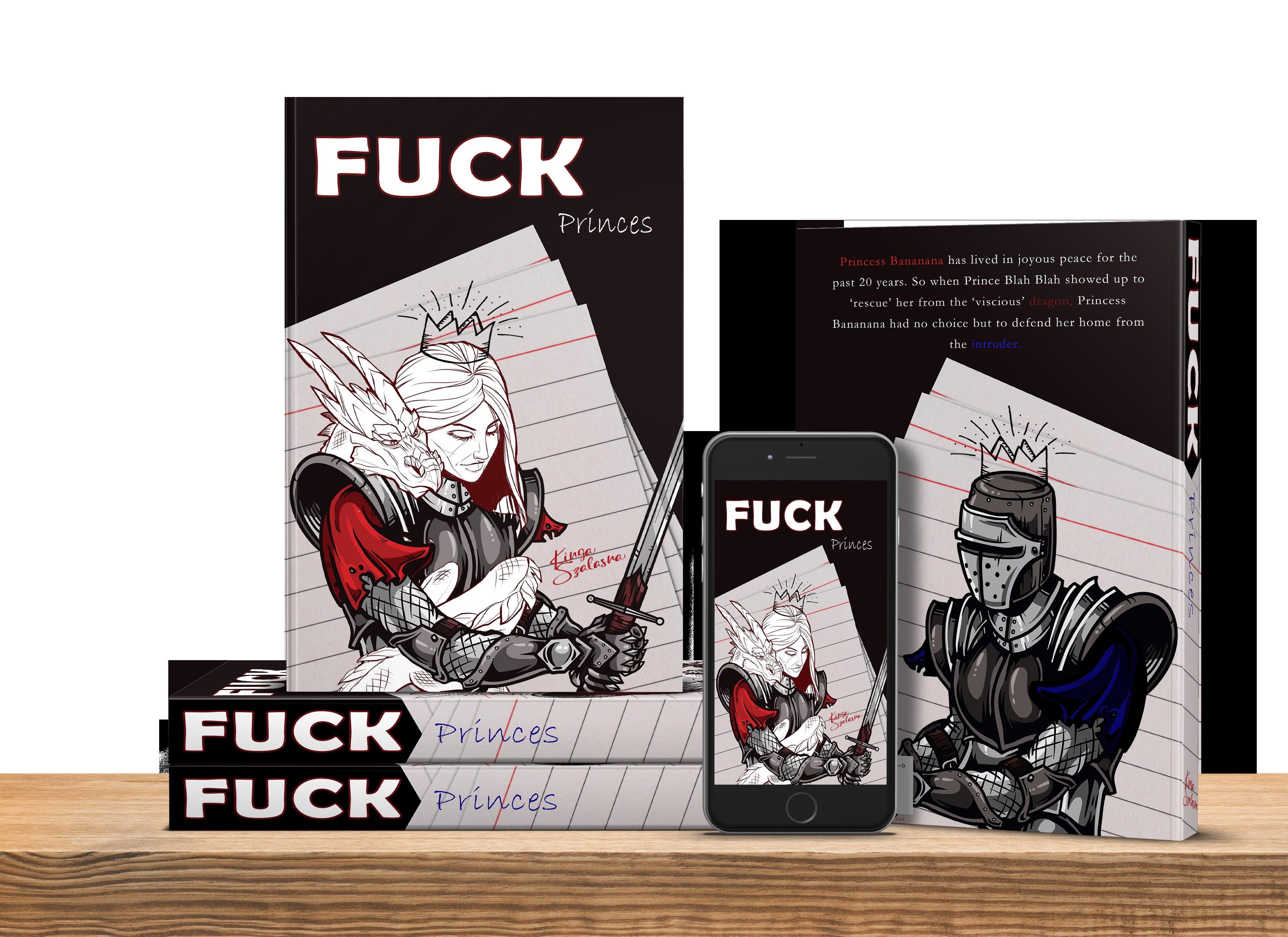

 Prince Blah Blah in dark armour on the back cover.


#f070809 #a42025 #581316 #1c1e3d 11


The Power to Heal
a local pharmacy, Rise. The logo will be used on signs, windows, packaging and medical products. The company values health, trust and loyalty.
font was altered. The the letter R and tracking was increased. The letters are no longer joined and they are carefully placed to form an exponential line. The font is thick and slightly curvy, creating an

, with small embellishment is used. Both fonts used are non-serif making them fun and modern.
The colour green is associated with health and good decisions. Blue colour evokes the feelings of trust, loyalty and reliability. The two colours combined form a perfect palette for a pharmaceutical company who values health, trust and loyalty.
Rise is ascending along the inside of a hollow rising heart, which is associated with good health. On the top, where the two halves of the heart meet, they form a very subtle cross. The i in Rise is a hidden smile that once seen cannot be unseen. The logo is simple yet effective.
13


 # 5EBB47
14
# 3B2F90

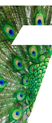
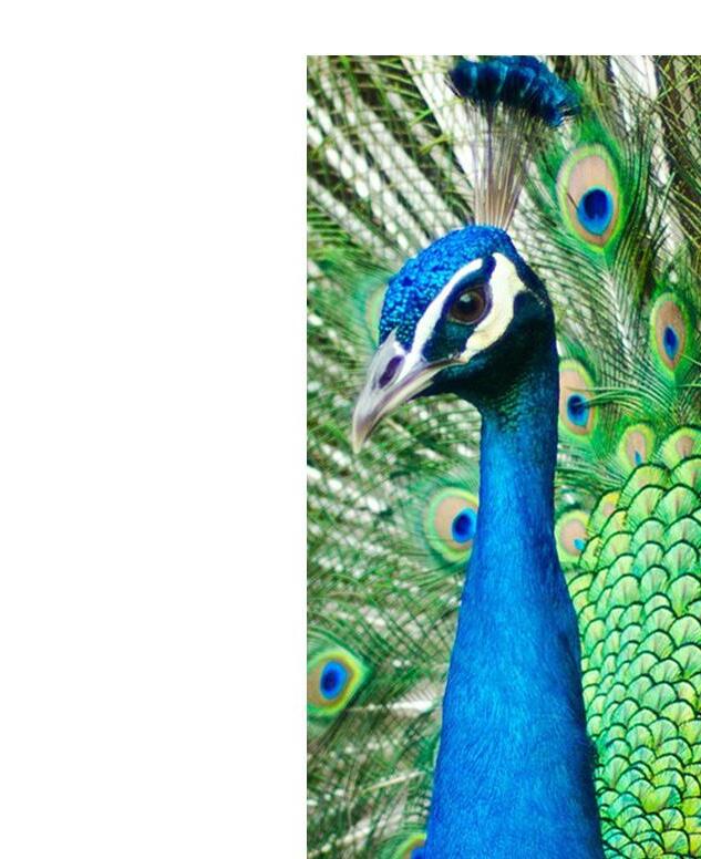
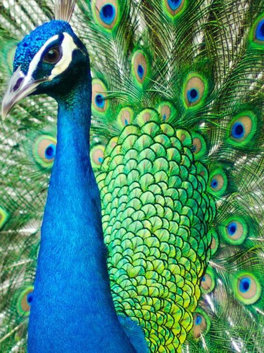
PROJECT: Design a logo for a start up home building business, Peacock.


TAGLINE: From the ground up.
TYPOGRAPHY: The two non-serif fonts used are modern and fresh. The thick magento bold font for Peacock conveys unmoving, solidity and strength, while the much lighter and font mirrors their diligent

White evokes the feelings of freshness, calmness and comfort. It is simple and yet intriguing.
A pentagon shape representing a house with a peacock cut-out combines the name of the company with the business of house building. Visually the logo is

Peacock Peacock 16


17


PROJECT: Design a logo for a solicitor, Morfetta. The logo should be simple, elegant and easily recognisable.
TAGLINE: In it to win it.
TYPOGRAPHY: Simple, legible and clear Belll MT font is used for the name of the company. The serif font is traditional and elegant while the custom made M adds a modern feel to it. The M was altered to make it look like scales of justice. Solicitors job is to tip the scale in favour of the client. A similar, but a non-serif and modern Constantia font is seen on the tagline. The tagline compliments the main font.
Colour psychology shed light on what kind of emotions colours evoke. Black is simple, elegant and it evokes

EXECUTION: The logo is a simple typeface with a line underlining Morfetta that extends from the M. It is sophisticated, serious and perfectly suitable for a solicitor.

19
TYPOGRAPHY


Bell MT:
Aa Bb Cc Dd Ee Ff Gg
Hh Ii Jj Kk Ll Mm Nn Oo
Pp Qq Rr Ss Tt Uu Vv
Ww Xx Yy Zz
Constantia:


Aa Bb Cc Dd Ee Ff Gg
Hh Ii Jj Kk Ll Mm Nn Oo Pp Qq Rr Ss Tt Uu Vv Ww Xx Yy Zz
20

BRASS DOG
PROJECT: Create a modern logo for a security company, Brass Dog. The design should reassure the client about the high quality of the safety products.
TAGLINE: Always Alert

TYPOGRAPHY: Brass Dog uses a bold loud font to convey the protective and aggressive nature of a dog on guard. The thick font gives the illusion of heaviness and unbudging to convey security and safety. The dynamic font of the tagline creates a visually pleasant contrast and movement. The font is very modern and easily recognisable.
COLOURS: The bold and aggressive red draws our attention and makes the logo look important. The black emphasises a luxurious and high quality nature of their products.
EXECUTION: The silhouette of a natural guard dog, Doberman dog was used to spell out the word dog. The dog is in a guarding position and has the word brass perfectly slotted along its back.

#ffffff #e22925 #070809 22


93: Aa Bb Cc Dd Ee Ff Gg Hh Ii Jj Kk Ll Mm Nn Oo Pp Qq Rr Ss Tt Uu Vv Ww Xx Yy Zz
Aa Bb Cc Dd Ee Ff Gg Hh Ii Jj Kk Ll Mm Nn Oo Pp Qq Rr Ss Tt Uu Vv Ww Xx Yy Zz
23
BAUHAUS
Courgette:
TYPOGRAPHY


24
BRASS DOG BRASS DOG


HERE FOR YOU AVAILABLE 2KS GRAPHICS ©2023 2ks Graphics. All rights reserved. Adobe Certified Graphic Designer with experience in book covers, logos, posters, labels, social media posts and film editing. Available for your needs. Contact me to hire me, for qoutes, collaborations and more examples of my other work. Found what you need? Yes No Contact me. I can show you examples of my other work. I can quote you. Shoot me an email or a quick call Installed CONTACT INFO: Kingaszalasna@gmail.com Co Offaly, IRELAND 0868662890 Hire Me
