PJAMIE GRIFFIN
Table of Contents Contents Table of Contents 2 About Me 3 The Design begins. 5 Seasonal Mood-boards 6 Book Cover Design 8 Perfume Poster 10 Minimal Design Poster 12 Nine logos 14 JIF Almond Butter 16 EDJO 18 Griffin Design 20

Hello, I’m Jamie, a visual designer/video editor.
After six years as a video editor and videographer using Premiere Pro, I decided to take the time to learn the other adobe creative design apps, aiming to become an adobe certified professional in the process and improve my skill set.
Below you will find some of the work I have produced along the way, as well as a description of the briefs and my design process.
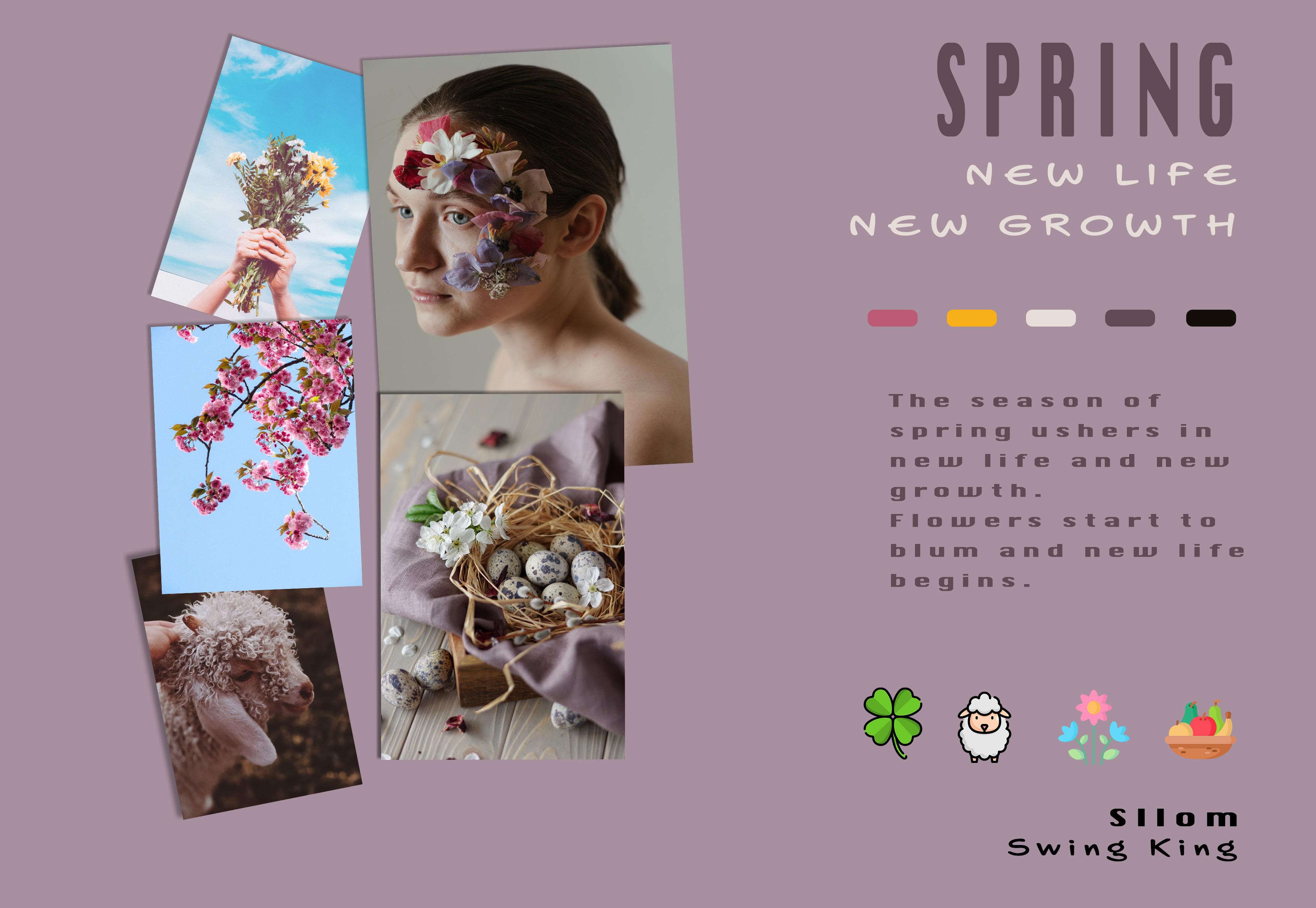
As the title suggests, this project is to create a mood board for each of the four seasons.


The first step was to brainstorm my thoughts on each season, e.g. how a particular season made me feel, what the weather would be like or what events happen in any season.
is depicted with the image of a woman that I feel fits the look of a season.
My theme is life and death through crops and flowers, I also wanted to focus on the beauty of each season which


The brief for this project was to create a book cover for a book called dreams using the colour scheme from one of the previous moodboards.

For this project, I chose my winter moodboard.
To explain the cover, the opaque heads facing in opposite directions inside the energy orb represent the good and the bad dreams we have and the analogy that our energy creates what we see in our dreams. The font is to represent the waves of energy also.
On the next page are a few variations on the theme. I decided to challenge myself to make a horror version of the book cover and a children’s one. The reason is that they are not areas I would usually work in so it would be a good challenge.

This project aim was to choose a perfume brand and make a new poster ad for the selected perfume. As you can see, I chose Dior Sauvage, a fragrance I own, therefore it would be a good fit.


The poster on the left was the first one that I made, the background photo was chosen because of the contrast between the sky, the sand and the scene of the sunset.
The black and white poster was created to show the versatility of the original poster in an ad campaign. Only leaving the perfume bottle in full colour.

For this project, I was tasked with remaking or redesigning an old movie poster using minimal colours.
After going through a few different movies that I wanted to redesign/recreate I settled for ‘Casablanca’, A classic and a favourite of mine.

My aim was to use one main font colour that stood out and then the rest to be, black, white and grey.
The colour I went for is a burned orange and it was used for the movie title and for the main character’s slogan.

“I settled for ‘Casablanca’, A classic and a favourite of mine”
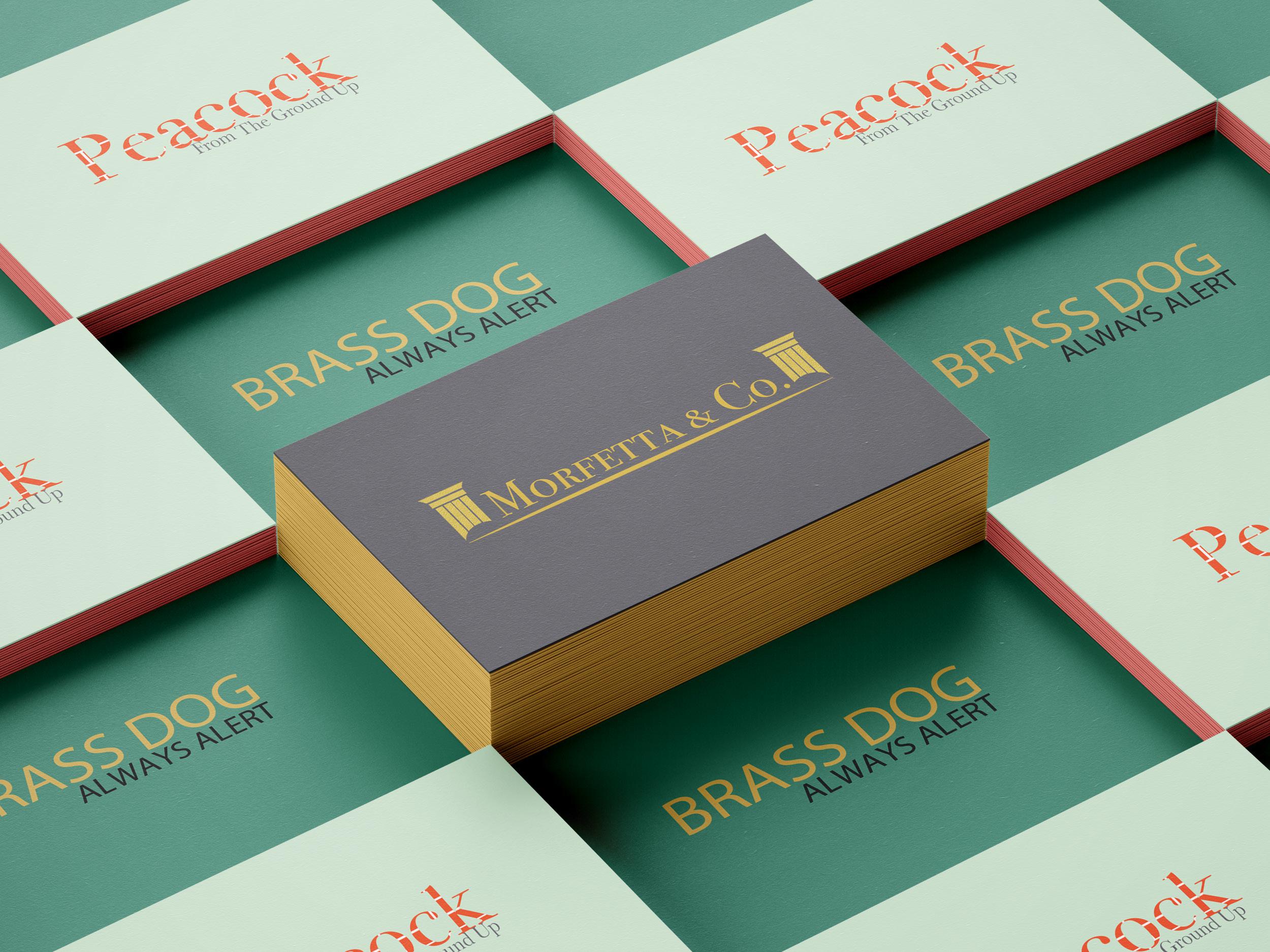
The Nine Logo project was to develop logos for nine different companies logos; in the project brief, there was a short description of each company.
This project required more research than most other projects simply because of the amount of logos I needed to design.


I found that modern company logo design is going through a debranding phase, and most prominent companies have flattened their logo designs, so much so that the current logos are mainly black text. This trend did influence my designs to a degree.


The first logo I designed was the Peacock builders logo.

I wanted the logo to say builder or construction company at a glance and came up with the sketch to the right.
The idea is that the company name is made or looks like it’s made of red brick and to use the negative space at the bottom of the K to marry up with the U in up to create a trowel shape. Hence, the company’s slogan, “From the ground up“, is so close to the primary name.
JIF is an American peanut butter company. The brief for this project is to create a JIF almond butter variety to add to their line-up.

While researching the company, I found their current lineup of peanut butter labels to be very overthe-top colour-wise, so I decided to create a more up-market look for their “New” variety.
As you can see in the mock-up, I went for is mainly gold with a black gradient for the label and a gold lid.


EDJO is a fictional health food store/supermarket I was tasked with making the logo for. This logo needed to be friendly, clean and recognisable as well as corporate.
I researched other health food stores and major supermarkets before designing this logo, I noticed a theme that they mostly use serif fonts and strong colours. my aim was to replicate this while giving EDJO its own individual identity.


“they mostly use serif fonts and strong colours”

This a fictional company that I have created as my own graphic design company.


I have created a logo which is three colours Red, Green & Blue, as well as the company name either beneath or to the right of the logo. I created an iterif design for the logo so it can be used in any design situation.


