02
03
04
05 5
06
07
VISI
08
W W . G O TO K Y O . O
R G / E N / T O U N C OV E R T O K Y O’ S D A Z Z LI NG CULTUR E
09
Don’t be creative just for creative sake, strive for strategy. -Mike Roach
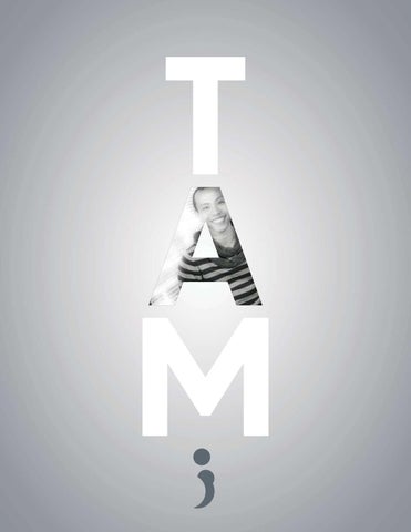
I am a storyteller. I find inspirations in simplicity and yet, impactful solutions. No matter which mediums I use, my stories are unfolded by relevant words and effective visual elements. Create by Tam Hoang delivers the message to enhance the consumers’ experience, not for the competition. - Tam Hoang
Multimedia Development
Int egrat ed Social Media
My Creative Ideology Reinvent Yourself
10
Reinvent Yourself
By Tam Hoang
SYMBOL PROCESS
Our symbol, a semicolon is often used in writing when the author wants to stop, but instead, keeps going.
y
PRIMARY LOGO y
Cyan
y
Logotype
indicates clear space . The blue area must be kept free of other elements.
Magenta indicates type and element alignment and boundaries.
Reinvent Yourself
By Tam Hoang
X
is the space from baseline to the capheight
Y
is the minimum required clear space is
x
( indicated in the symbol process)
Tagline
Logomark
LOGO VARIATIONS
Reinvent Yourself BRANDED COLORS
Pantone Black 7 C
Reinvent Yourself PATTERNS
Pantone 431 C
Pantone 806 C
FONTS Arial Narrow
A B C D E F G H I J K L M N O P Q R S T U V W X Y Z a b c d e f g h i j k l m n o p q r s t u v w x y z
11
12
13
14
15
16
17
18
19