Brand Guide

As champions of both functionality and aesthetics, the importance of maintaining brand consistency both internally and how we present the Firm to the outside world is paramount. These standards ensure that we maintain the integrity of the SFS brand, message, and culture.
It is important to maintain a consistent voice and messaging throughout all of our marketing.
SFS's mission statement is a concise sentence written to sum up the essence of how we do business and is used on our website and other important marketing pieces. Be sure to use the most up-to-date versions in any marketing materials.
People are at the core of our design solutions, and our people are the core of SFS.
SFS has a team-first culture that values individual spirit and believes each member of our team brings a unique and meaningful perspective that enriches our studio. We encourage authenticity and honesty among our team members because we believe individual strengths and goals contribute to productive teams, excellent projects, and lead to a stronger bond with our clients. We celebrate curiosity, diverse interests, and we encourage everyone to flourish in the subjects they are drawn to.
All of our staff members are engaged in a common effort to deliver responsive, functional, and beautiful architecture to our clients. We connect and discover, communicate and collaborate, and exchange ideas with challenges to make them better. We work together; we laugh together; we learn together. Through our shared passion for design and our shared respect for each other’s expertise and contributions, we achieve outcomes to benefit our clients and enrich our communities.
Certain icons and messaging are an important part of our project approach and should be consistently used in proposals and other marketing materials.
SFS generally follows the Associated Press Stylebook for guidance on grammar and spelling. Some common examples are listed to the left. Refer to the AP Stylebook online or consult Marketing with writing questions.

UNDERSTAND OUR CLIENT’S WHY

EXPLORE POSSIBILITIES
COMMUNI CATION

COMMUNIC ATION COMMUNIC ATION
LAND WHERE IT MAKES SENSE
ENSURE SOUND EXECUTION
• Always refer to the firm as "SFS Architecture" in written form (this does not apply to the logo), as per AP style capitalization guidelines. Reference page 187 of the following document: deanza.edu/communications/ documents/ap_styleguide.pdf
• Lowercase letters can be used as a stylistic preference on certain marketing pieces with approval. Examples: Logo, Business Cards, Brand Guide.
• Lowercase directional indicators except when they refer to specific geographic regions or popularized names for those regions.
• Spell out numbers one through nine. For 10 and up, use Arabic numerals.
• Do not use a comma before the conjunction in a simple series: John, Paul, George and Ringo; red, white and blue.
• Use only one space after the end of a sentence.
• Use hyphens to link all the words in a compound adjective.
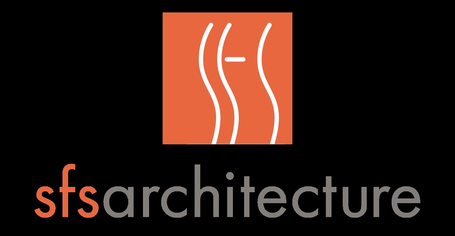
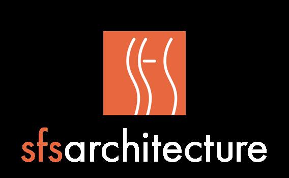
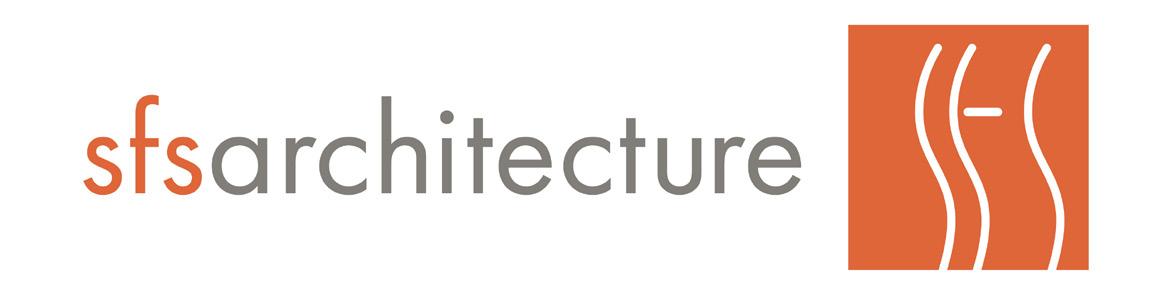
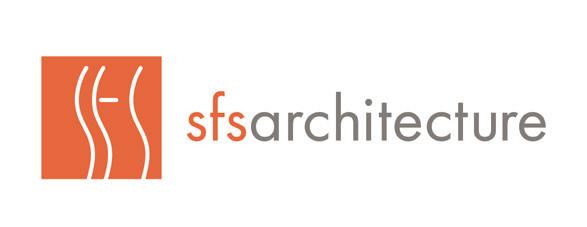
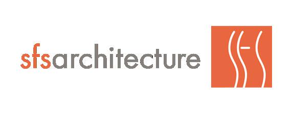
The SFS logo consists of powerful curved elements evoking the culture of our design services. Carefully chosen for its modern and yet refined style, it has been further enhanced by updating the typeface to use Futura in 2022. The orange and gray versions of the logo should be used across primary brand applications. All of our logos can be downloaded from our Sharepoint site.

There are approved versions of the logo that should only be used in certain instances.
Use the black and gray logo for items such as grid paper where the expense of full color is not ideal. (Page 8, A)
Use the white and gray or orange and gray logo over photo backgrounds. (Page 8, B & C)


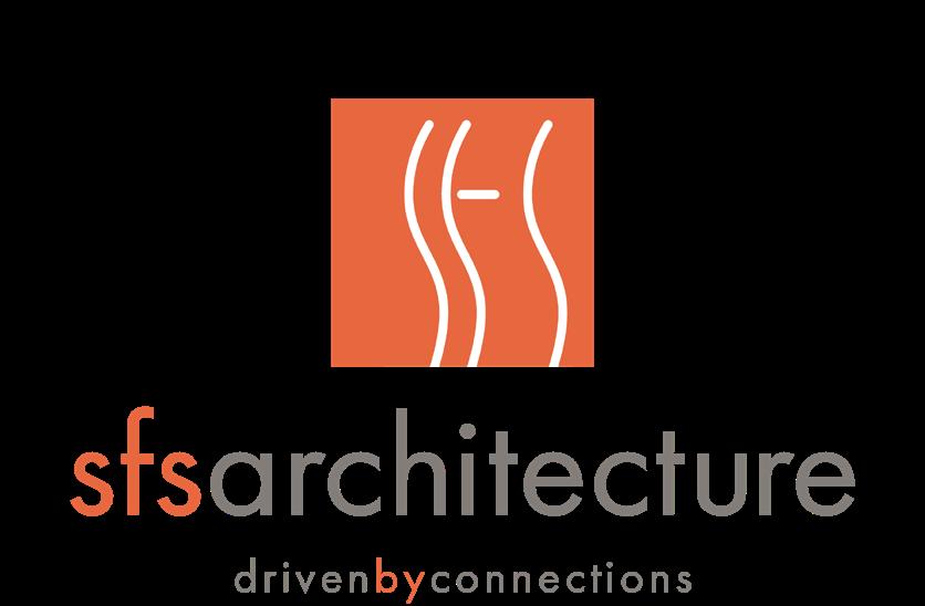
A) When communicated in its original form and in the proper context, the tagline can enhance perceptions of SFS. Use it when telling a story about our design philosophy, or for an audience who may not be familiar with us.
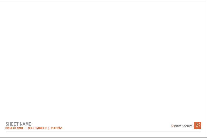
B) Occasionally, instances may occur that call for the use of a version of the logo wherein the "icon" (the orange square) is aligned on the right. An example of this application is right-facing pages, such as in the titleblocks.

The orange and white logo can be used over photos with lighter backgrounds.
The white and gray logo should be used on very dark backgrounds or photos, where the contrast allows the logo to stand out vividly.
Ask the Marketing Department if you have questions about logo application.


Clear space is equal to half the width of the orange icon in the logo. Always ensure that space exists between the logo and other elements on the page.
The logo should never be smaller than the orange icon at the height of 0.375” or less.

To maintain integrity of the brand, don’t compromise the overall look of the logo by changing it to an unapproved color, skewing, rotating, or distorting the logo.
Do not add text decorations to the logo such as drop shadows, outlines, boxes, or rearrange elements of the logo that aren’t referenced in this guide.
Do not change the logo colors
Do not squish/squeeze or distort the logo
Do not use a drop shadow on the logo
Do not rotate the logo
Do not put the logo on hard to read colors

Do not put the logo on a busy background
Do not use gradients of any kind on the logo
Do not use outlines on the logo
Our main typeface is Futura. Its variety of weights makes it versatile for various marketing materials.
Adobe Fonts recently added the condensed version of Futura. It is acceptable to use in some applications.
Do not use the "light" version of either typeface as they are not legible.
Arial is the preferred font for Microsoft applications such as Outlook, PowerPoint, and Word.
The following color palette has been selected to create a unified look across all SFS documents. The two primary colors are the orange and warm gray of the logo.
Shades and tints of both colors may be used in certain instances. Additionally, we use black for certain subheadings, body copy, and in other applications. Refer to the Marketing team with questions about our colors.
PANTONE 166 U
CMYK 6 73 83 0
RGB 231 104 62
HEX e5673e
PANTONE WARM GRAY 10 U
CMYK 50 45 47 10
RGB 131 125 121
HEX 827c78
Official business cards, envelopes, and letterhead have been created by the Marketing Department.
Do not alter the design of any of these items. All of these items can be reordered through the administrative assistant. If you need a custom solution, please contact Marketing.
Site signage at the standard size of 8' x 4' and physical placement on the construction site are imperative to maintaining good visibility and consistency for the SFS brand across all media.
Keep in mind that construction signs are typically seen at a distance for short periods of time and therefore should be kept visually simple.
We design spaces that enrich people, organizations and communities.
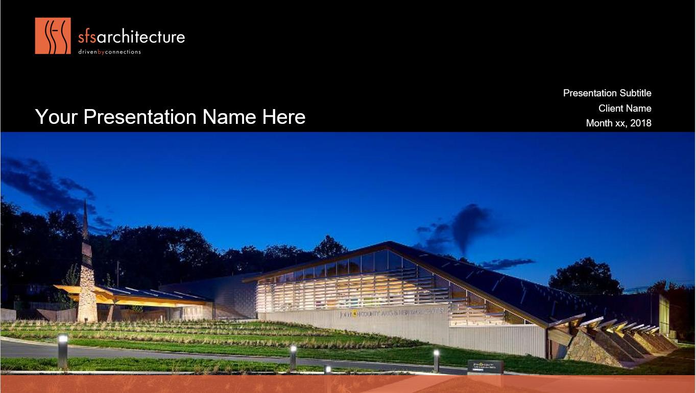
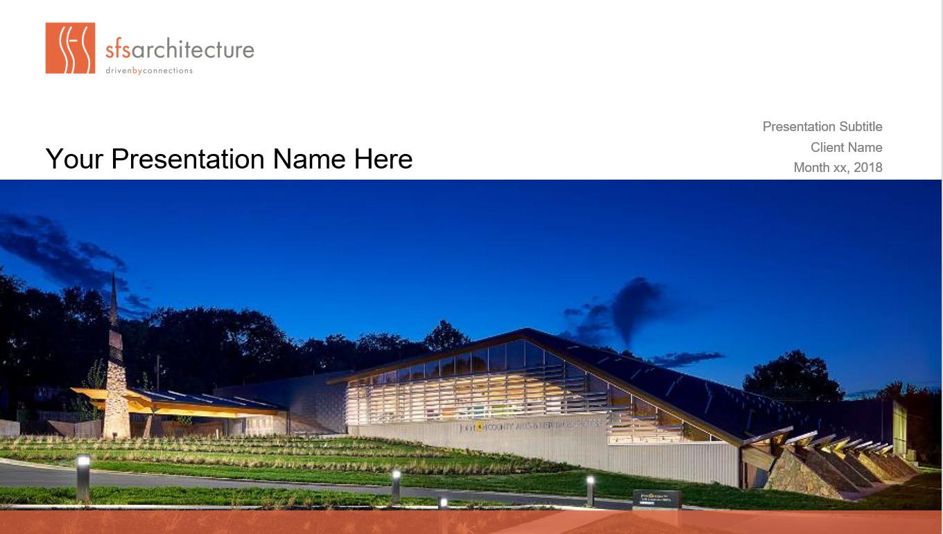
There are four PowerPoint templates available to download via Sharepoint. Do not use a template that is not SFS-branded.
All PowerPoints include the SFS brand colors and use the Arial font.
There are a variety of layouts available in the templates which can be modified into slide masters. The colors/logos can also be modified for specific clients.
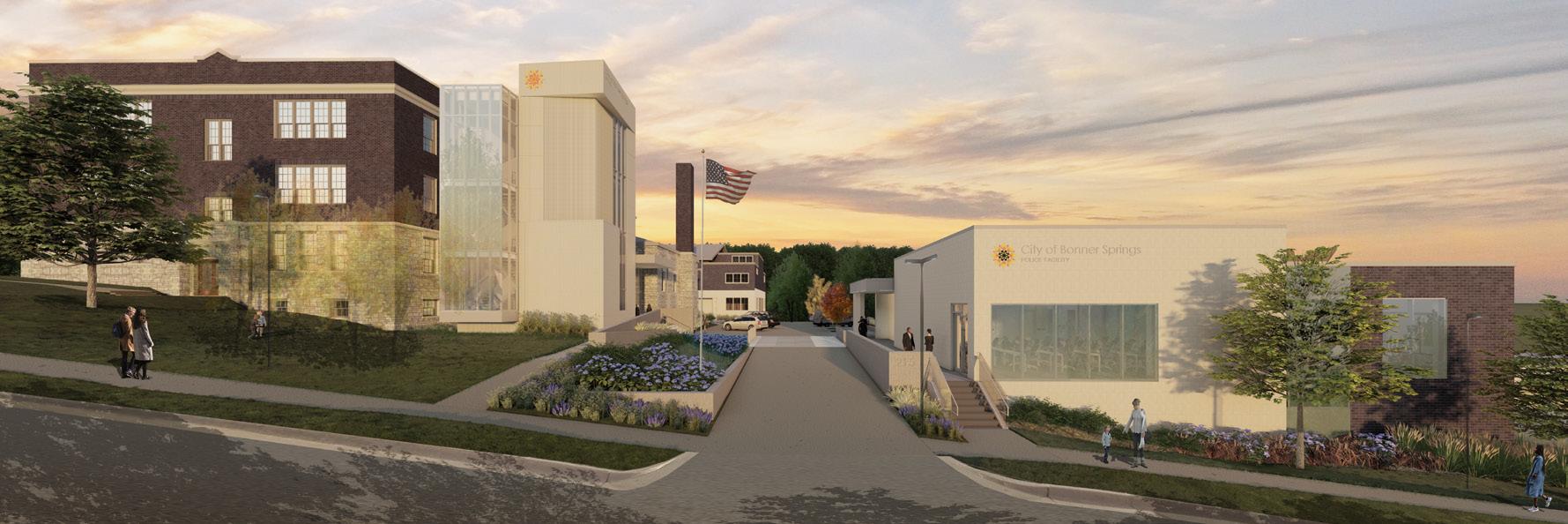
Presentation titleblocks have been created for use in formalizing and sharing design phase and other graphic information that does not require a construction document titleblock.
Presentation titleblocks are available in Indesign and Revit formats in various sizes on our Sharepoint site.
Project Name
Presentation titleblocks have been created for use in formalizing and sharing design phase and other graphic information that does not require a construction document titleblock.
Presentation titleblocks are available in Indesign and Revit formats in various sizes on our Sharepoint site.
Presentation titleblocks have been created for use in formalizing and sharing design phase and other graphic information that does not require a construction document titleblock.
Presentation titleblocks are available in Indesign and Revit formats in various sizes on our Sharepoint site.