Brandbook and visual strategy
This project is a case study excersise of limited extension and no physical implementation.
Associate professor: Homero Ruíz
Create by: Sandra Cruz - Lentes Chuecos
Привет!
Privet I Hello!
This is not just another document. I present to you the brandbook of the Raduga coffee project (Pадуга обжарка кофе), this will be a step-by-step guide that will give you advice about how to use the Raduga brand.

Here you will find our personality, our character, but most importantly, our DNA. This is the essence of who we are and what we want to convey to all of our coffee lovers.
We also explain our brand concept, meaning, and different usages. Keep this brandbook with you at all times, because this will help you to apply the brand in every of its presentations, but more importantly, to convey the real experience of the coffee ritual.
Index The coffee experience The basics Mission & vision Brand values Look & feel Initial analysis Ecosistem SWOT Visual Strategy Market insertion KANO model 07 09 13 19 21 23 25 28 31 35 39
41 42 44 45 50 51 52 53 55 57 Logotype Concept Versions Grid construction Safe space Minimun sizes Incorrect uses Colors Tipography Mockups

The coffee experience

The basics
Raduga coffee
Pадужный Kофе
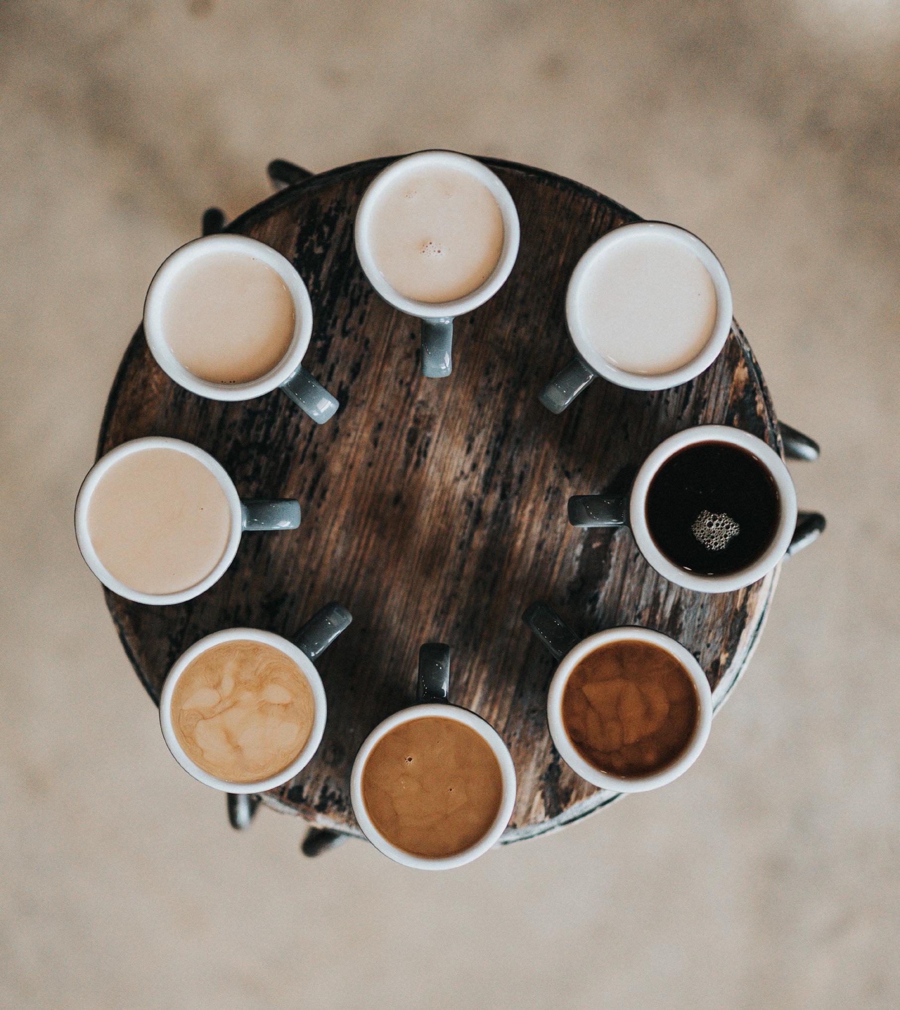
The specialty coffee industry has seen new trends in recent years, but it’s still easy to get into.
Even though we now have more options and processes for enjoying grains, there isn’t enough education about it, staying in gated communities that charge high prices.
Raduga Coffee Project is an open coffee roasting house specializing in the treatment of premium grains.
We embrace the use of technology and traditional elements to preserve and share artisan methods that elevate the coffee ritual in our daily lives.

Through our roastery, testing rooms, barista school, and community, we supply small and large businesses, provide continuous maintenance to the equipment and share information on the specialty coffee shop segment.
Every step of the process will be handled by us. We will select only the finest and most unique grains from around the world in order to ensure that you receive the highest quality coffee.

Our goal is to guide you through the entire coffee experience.

Mission
& vision
Our Mission
A community that embraces and appreciates traditional and novel ways of making coffee.
Promote education, training and consumption of the specialty artisan coffee segment with flexible wholesale prices and high quality products.


Completely satisfy all the needs of both new and old customers. This includes everything from coffee grains to operating a large franchise of coffee shops. Our Vision

Brand Values
Quality Coffe ritual Tradition Loyalty Guidance Relatable Community
Look & feel
Artisanal but not old Authentic but not to loud RELAtable but not to deep Human but not to personal Bold but not to strong ritual but not holistic friendly but not childish best quality but not to expensive
Initial analysis

Ecosistem
On this map we can see the specialty coffee brand sector around the world with local brands (in the middle circle) and a number of the most prestigious international coffee rosters (external circle), and in the middle the past brand of Raduga Coffee. Using this exercise, we were able to find visual opportunities that we could exploit for our new brand and make it stand out in a wide range ecosistem.
Although we are a local brand, we aspire to be a world-wide reference in the coffee industry, which means our visual aesthetics have to be of the highest quality.
Heat map of brand visual ecosistem more atractive

less atractive

Obserbations
Yellow and black predominate.
There is no clear style. It is loaded from rustic to minimalist.
Colors outside the usual spectrum draw attention. Black and white logos do not attract attention.
Red, blue and yellow logos stand out. The most charged or friendly attracts more attention. Using small text in bold sizes makes the brand stand out more.
SWOT
Strengths Oportunities Treads Weakness Good reputation Place and location 6 years of work Recognition in the market Good interior design Memorable elements Competition Access to alternatives online Better looking brands The current war situation Hostile social and political situation Large market with new and old costumers To many brand aplications The appearance is outdated The transmedia products doesn’t seem cohesive All the information is in russian Don’t follow the current trends Has a vague comunication system Create a memorable brand Create a bold and authentic brand Take advantage of the current trends Unify all the brand aspects Diversify the market Transmite the quality of the business Use new social media strategies

Visual strategy
Taking advantage of the opportunity areas and upcoming trends in the specialty coffee industry, our strategy is rebranding .
This will bring a more authentic, friendly, bold and minimalist look to Raduga Coffee. Thus our visual look and feel will match our artisanal, high quality and relatable values positioning us better in the market.

Our main goals
Unify and renew all the brand’s touchpoints to give customers a better, more integrated experience.
Keep old customers and attract new ones with a bold but not too radical look.
Connecting with the coffee ritual will be the core of the brand language, with a culturally relevant and updated approach to engage consumers.

Market insertion
Our market insertion strategy consist of 4 principal areas:
Things we know, that you should too
In Raduga Coffee we have a lot of passion and knowledge about the coffee specialty world, and we’re hoping to spread this knowledge, but our social media today seems to only contain random information.

It’s our goal to publish all of this information, facts, and passion for coffee in a manner that is high-quality and friendly, just like our products.
The strategy is to make reels and posts that blend real photos with digital design in a ratio of 75% to 25%. This will boost our social me dia engagement, so we can share information and passion in a more effective way.
Intimate and instagrammable spaces
Our roster and tasting salon are special and we want everyone to experience it. We’ll capture photos and make reels of the experience and human connections that happen at this place as a central part of the strategy.

In the same way, we’ll adapt parts of the space to make it more interactive and encourage customers to share us on social media.
Embrasse talking and conversations
In order to attract more people to our barista school and tasting salon, we’ll promote their events and make communication around them more friendly. This will ensure that future customers don’t feel like outsiders, but instead become members of an intimate community.
Personalized and suscription coffee
We want our customers to know how much we value them and that they deserve nothing but the best. We will upload and implement tools to make our products, menu and experience more personalized.
By providing personalized boxes filled with everything you need to master your skills or to enter the coffee world, we will connect our subscription model to our information strategy. This kit will be complemented by all the free resources on our social media and web site. This content will be periodically updated so people can come back and create a sense of belonging, upgrading their relationship with the coffee ritual and becoming part of our community.

model Implementation investment Low Absent Fully implemented High Customer deligth Atractive packaging Coffee subscription boxes Personalized options High quality methods Coffee testing sesions Fluent social media Instagrammable spaces Unify brand
KANO
Logotype
+ +
Construction Logotype
The brand’s main concept is to elevate the coffee experience. We wanted to create a brand that communicates the humanity and community around the coffee world. We wanted a brand that captured the conversations and human interactions that we have around coffee. Our mornings would not be complete without a cup of coffee and when we drink a cup of roster coffee we taste the essence of every grain.
Thus, to share this experience with more people, this brand must reflect high quality but in an affordable manner; the high quality of this brand is because it is made properly in a traditional manner.
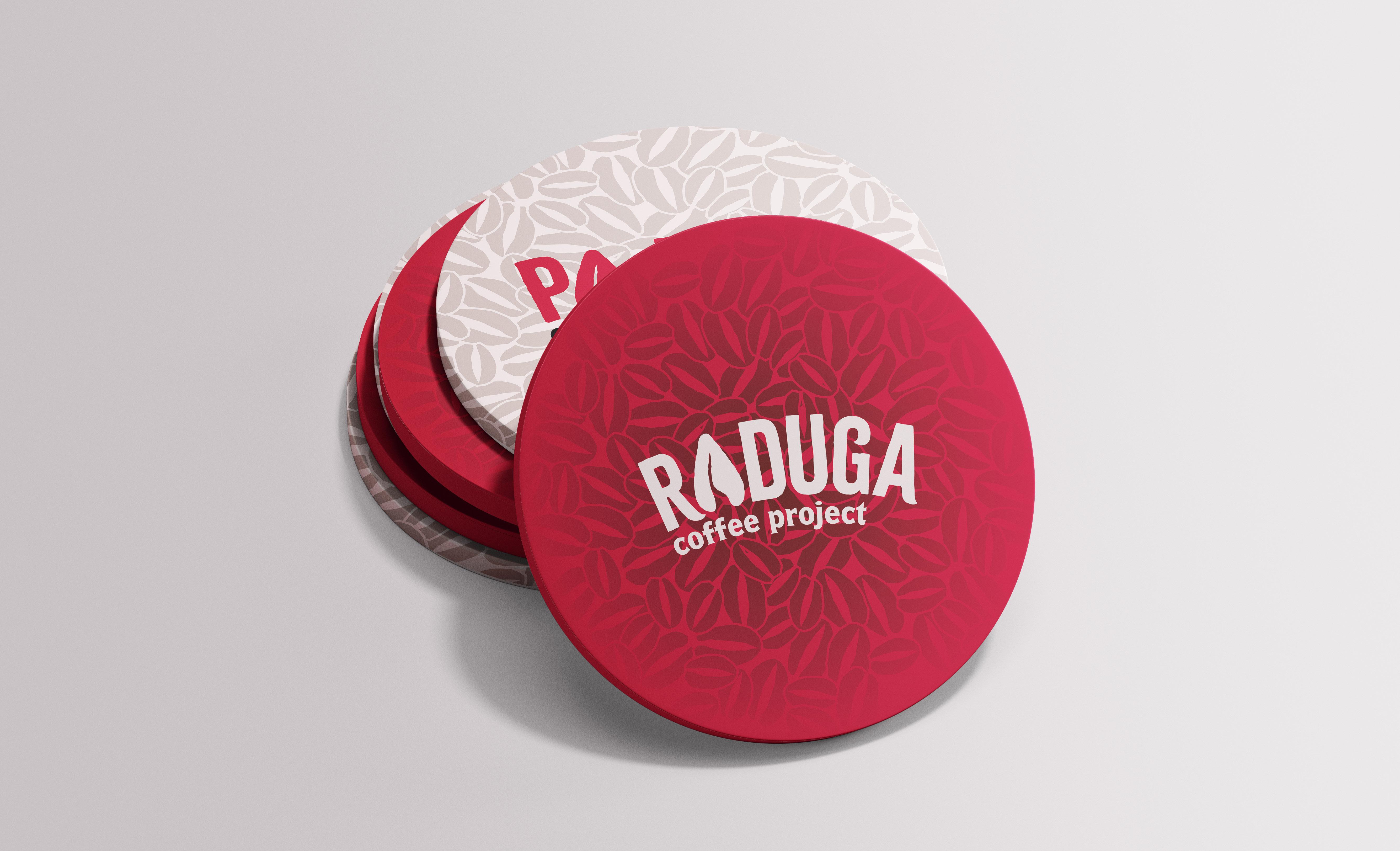
LOGOTYPE
The result is a logotype with an arch shape that is a reflection of the traditional coffee brands with circular based logotypes and that also is related to the name (Raduga coffee - Rainbow coffee).
We used Citrus Gothic Solid which is a typeface with a rustic, cozy feel that fits the artisinal character of the brand. The name is set in capital letters to make it more bold and the subheading “coffee project” is set in Espiritu regular, a typeface with a more traditional, serif-like feel. Under this heading, we also refer to the idea that we are a full community, not just a roster.
Russian
LOGOTYPE
For the Russian version of the logotype, we created a mix of Citrus Gothic Solid and Pretendard. This typeface incorporates both the Russian and English alphabets, and similarly for the subheading, we adapted Espiritu Regular with a few variations.
Each version is also modified with a handmade look to give it a more rough and artisinal vibe. Also the construction of both logotypes is the same, as well as their minimum spaces, safe spaces and application restrictions.
Construction GRID
SPACE Safe
This safe space is presented as the minimum air distance that must be kept around this logotype version.
To ensure its optimal readability in any of its uses, avoiding possible interference from some other element.
This safe space must always be respected in any application of the brand.
Construction of the safe space Resulting safe spaceMinimum print reproduction size
Digital minimum reproduction size
For printing, this version of the logotype must never be reduced below 9 mm in height.
For digital use, this version of the logotype must never be reduced below 25 px in height.
Minimun sizes for
reproduction
These minimum reproduction sizes must always be respected in any application of this brand version to ensure optimal readability. Also, it can only be used as shown or in negative and positive versions.
Incorrect Uses
1 Do not use the logotype directly on images that may be difficult to read. For use as a distinctive element in an image or video, it should be white.


2 Never include text or elements behind, on, or between the logotype; at all times, you must respect your safety space.
3 Not deform the logotype in any way that affects its color, shape, scale, opacity, or rotation.
4 Don’t use any gradients or unauthorized effects.
5 The typography of the logotype may not be changed at any time.
6 Don’t change the color of the logotype or any of its items.
7 Don’t change the shape of the logotype at any under any circumstances.
8 Don’t use shadows or any unauthorized effects.

9 Don’t use any container shapes.
10 Don’t use outlines.
11 Under no circumstances use the previous logotype.
1
2
3
4 7 10
5 8 11
6 9
Colors

COLORS
colors that
be used
packaging
diverse products. Crimson red RGB 218 9 52 HEX #da0934 CYMK 0 95 72 0 Coffee brown RGB 85 12 0 HEX #4a1403 CYMK 36 100 94 57 Rosted black RGB 6 2 1 HEX # 060201 CYMK 90 79 62 97 Cultured RGB 254 244 244 HEX #f4f4f4 CYMK 0 7 3 0
Crimson red is the main color because its uses are uncommon on the market, which allows it to stand out. Also we created a variation of black and white to be more playful and connect better with our authenticity concept. The brown tone is used to preserve the essence of Roster Coffee, with an exact tone extracted from Roster Beans. We also include an extension for secondary
could
in
or
Typography
Typography
Gothic Rough and Espiritu Regular are the main typography choices because of their artisanal and bold
They will be used for main titles and decorative graphics depending
the context.
body type, we use Pretendard. This typeface is sans serif to maintain the modern aspect of the brand and
also available in both English and Russian . In addition it also has a variety of weights that could be use
applications. Aa Citrus gothic Rough Espiritu regular Pretendard regular ABcdefghijklmnopqrstuvwxyz 1234567890 ¡!”#$%&/()=¿? ABCDEFGHIJKLMNOPQRSTUVWXYZ abcdefghijklmnopqrstuvwxyz 1234567890 ¡!”#$%&/()=¿? ABCDEFGHIJKLMNOPQRSTUVWXYZ abcdefghijklmnopqrstuvwxyz 1234567890 ¡!”#$%&/()=¿? AA Aa Aa
Citrus
looks.
on
As a
is
in many
Mockups