
HELLO WELCOME TO OUR WORLD.
This is your world too; a connection to all things about our brand, with all the tools and assets you need, the reasons why we do what we do, and all the stuff that makes us, us.
POLYGIENE BOILER PLATE
ABOUT US
Polygiene is a global leader in performance technologies for textiles, delivering advanced solutions that keep garments and products fresher for longer. Founded in 2006, Polygiene has redefined freshness and textile performance through innovative treatments.
Through key technologies such as StayFresh, StayCool and OdorCrunch2.0, Polygiene helps brands enhance product performance, comfort, and durability. Working closely with partners across a wide range of industries, Polygiene creates tailored solutions designed to add lasting value.
Trusted by leading global brands, Polygiene continues to set new standards in freshness and smart technology, helping products stay fresh, wear better, and last longer.
GROUP
BRAND ARCHITECTURE
CATEGORIES
PRODUCT FUNCTIONS
MASTER BRAND

OUR BRAND
MANTRA ORIGIN PURPOSE
MISSION PERSONALITY
AMBITION
TONE OF VOICE MESSAGING PILLARS OUR VOICE
VISUAL GUIDELINES
LOGOTYPES
COLORS
TYPEFACE
ICONS
DESIGN EXAMPLES
COPYWRITING GUIDELINES APPENDIX
OUR BRAND
OUR MANTRA
FOR MINDFUL LIVING
Mindful living starts with small choices. Choosing to care for the things we have. Choosing to make them last longer. Choosing what’s better for ourselves and for the world we share.
When we take these small steps together, every day becomes a little smarter, a little fresher and a little more sustainable. It’s about choosing with care, keeping what matters and adding value through the way we live.
That’s what mindful living is about.
FOR US, MINDFUL LIVING IS WHEN:

We add value to people’s lives.
We take on the responsibility.
We contribute to sustainability. We care.
We live the Polygiene way.
OUR ORIGIN
WHAT DEFINES US?
A drive to improve everyday life by extending product life and enabling smarter, more sustainable use of the things we rely on.

OUR PURPOSE
WHY ARE WE HERE?
To become an enabler and inspiration for shaping a smarter, fresher and more mindful way of living.

OUR MISSION
HOW DO WE DO IT?
By empowering people to feel good about themselves and confident in the choices they make – for their lives and for the world around them.

OUR PERSONALITY
WHAT DRIVES US?
With a strong ethos we spring from a long Scandinavian tradition to innovate and adding value by smart technologies and services.

OUR AMBITION
WHAT DO WE STRIVE FOR?
To add value to what people already rely on — helping them to longer-lasting products, less waste and a fresher, smarter everyday.

OUR VOICE
We know our technologies and services make a real difference to everyday life – in lots of ways. That’s why we speak with confidence, but never with ego. We’re energetic and enthusiastic and we include people through conversations that feel human, engaging and informed.
TONE OF VOICE
When it’s time for facts and figures, we’re serious. But we never take ourselves too seriously. Because at the heart of it all, we’re here to connect – to inspire, to inform and to make things feel a little easier, a little fresher, a little smarter. And when the moment allows, we let our sense of fun and curiosity come through. Sometimes even a touch of cheekiness.
It’s all part of who we are. About the mindset we bring to everything we do, about being part of something bigger. That’s why, in everything we say and do…
We’re in.
WE’RE IN.
01 A mindset of engagement and positive change.
WE’RE IN: ONE MESSAGE. TWO MEANINGS.
02
WHEN WE’RE IN , WE’RE ALL IN.
Built into products, working from within to make them last longer and stay fresher.
WHEN WE’RE IN , THEY PERFORM BETTER.
MESSAGING PILLARS
“For Mindful Living” is our overarching brand idea. To support that idea we use a clear structure to keep our communication consistent across everything we do. We’re in is our core message and the promise that unites all of Polygiene® - both internally and externally. Under this umbrella, each business area has its own focused message that reflects the specific function.
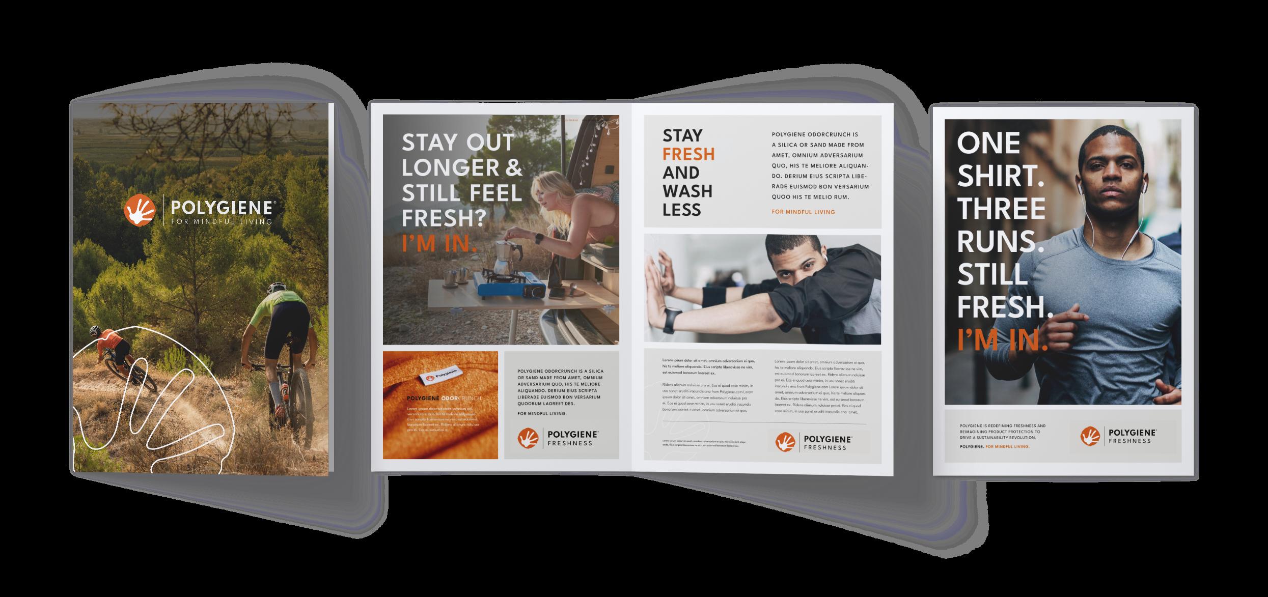
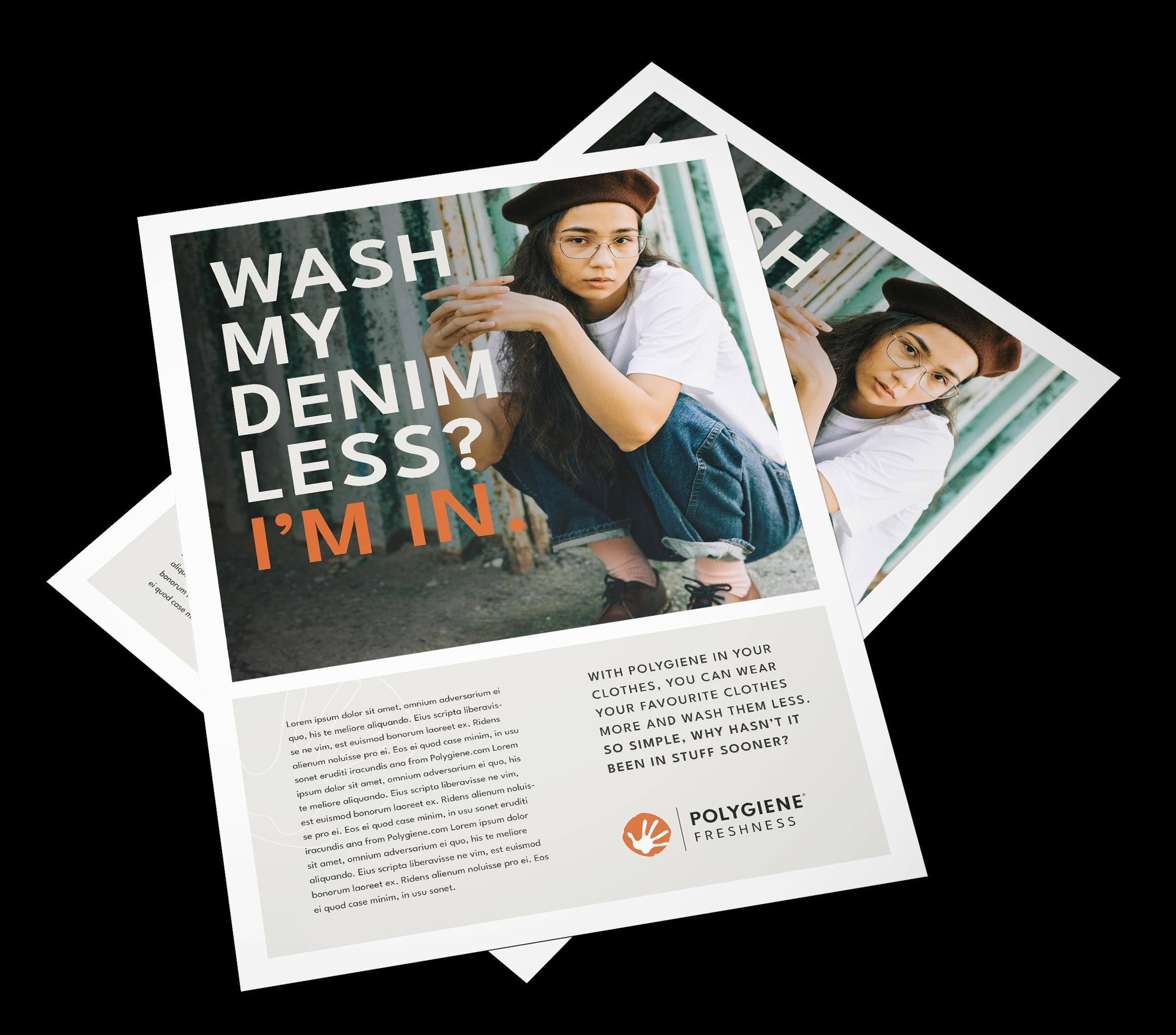
Freshness uses Wear More. Wash Less.* and Adding value to express the everyday benefits of our technologies.
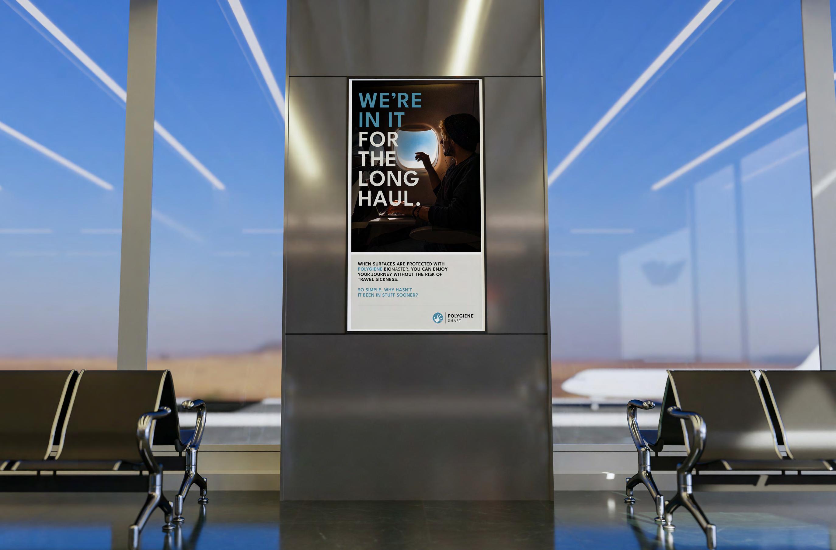
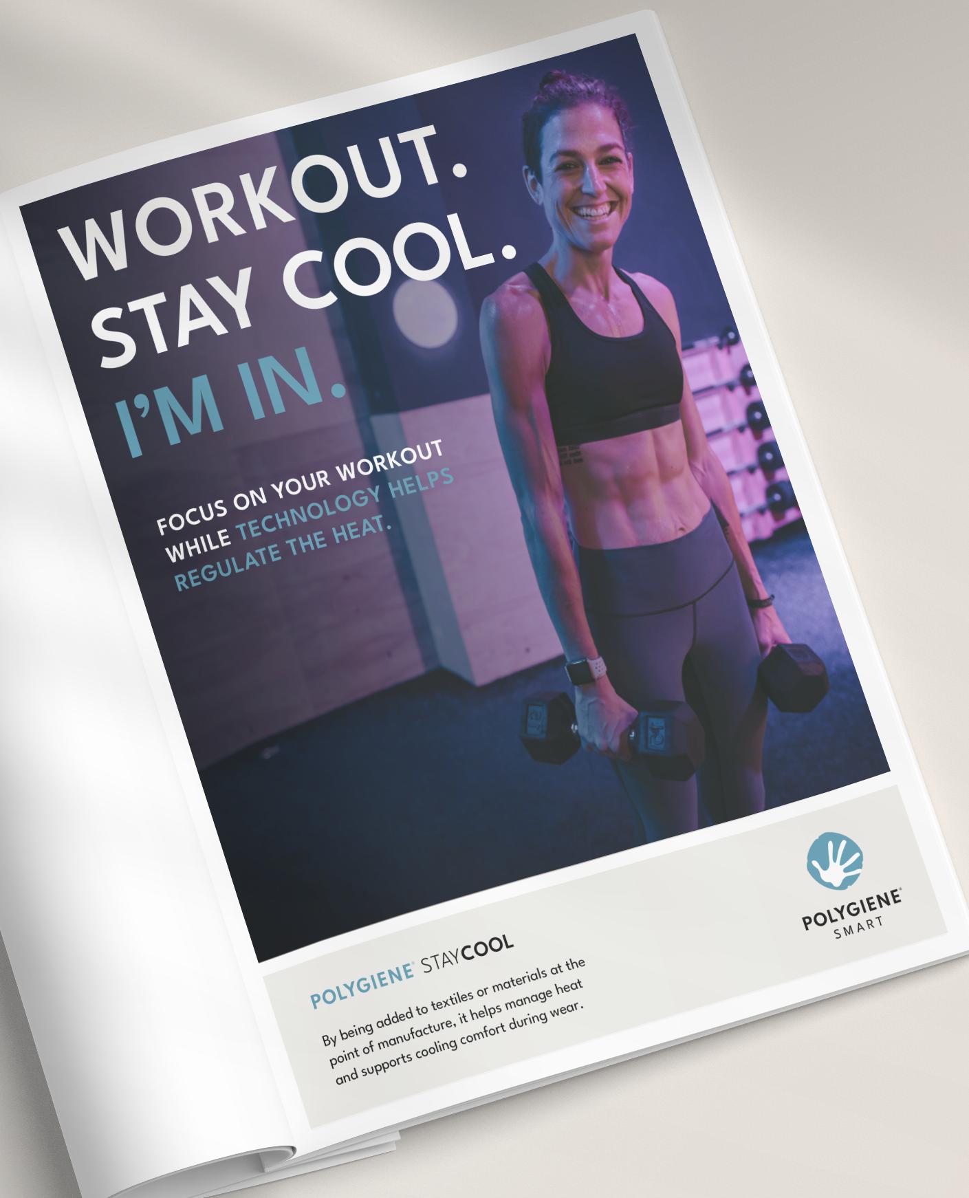
Smart uses Adding value to highlight how our built-in solutions improve performance, longevity and function.
Together, this structure ensures that every message feels connected, distinctive and true to what Polygiene stands for.
*Always use initial capital letter when ”Wear More. Wash Less.” is communicated
VISUAL GUIDELINES
LOGOTYPE ARCHITECTURE
GROUP CATEGORIES

PRODUCT FUNCTIONS
MASTER BRAND
LOGOTYPE GENERAL
The Polygiene® General logotype always comes with our ”For Mindful Living”mantra. It’s used when communicating the company as a whole, not specific business areas. It’s the primary logo for fairs, ads and materials where Freshness and Smart solutions appear together.
Use the horizontal version as default; the vertical version is optional for narrow or centered layouts.
HORIZONTAL VERTICAL
LOGOTYPE FRESHNESS
Use the Polygiene® Freshness logotype whenever Freshness products and solutions are communicated on their own — in ads, folders, leaflets, datasheets, hangtags and at fairs.
The horizontal version is preferred; the vertical version is used for narrow or centered formats.
HORIZONTAL
LOGOTYPE SMART
Use the Polygiene® Smart logotype whenever Smart products and solutions are communicated on their own — in ads, folders, leaflets, datasheets, hangtags and at fairs.
The horizontal version is preferred; the vertical version is used for narrow or centered formats.
HORIZONTAL
LOGOTYPE PRODUCTS
When specific technologies are being communicated, use the designated product logotype.
All Polygiene® technologies has 4 different types of logos. The horizontal logo is the preferred one.
Polygiene primarily communicates through our functions Freshness and Smart. The technology logos are secondary.
LOGOTYPE MINIMUM SPACE
All Polygiene® logotypes need clear space around them to ensure visibility. For horizontal logotypes, use the height and width of the “O” in Polygiene as minimum free space on all sides.
For vertical logotypes, use 2× the height and width of the “O.” More space can be used when the layout allows.
HORIZONTAL
VERTICAL
korta ner LOGOTYPE PLACEMENT
Place all horizontal Polygiene® logotypes in the bottom right corner as default, using the width of the hand symbol as minimum margin. It may also be placed bottom left or top, following the same spacing. The vertical logotypes is used mainly for centered layouts or in narrow formats.
Both horizontal and vertical logotypes may be used vertically on tall, narrow objects when needed.
LOGOTYPE COLORS
WHITE OR LIGHT BACKGROUNDS – POSITIVE LOGOTYPES
On white or light backgrounds (-40% black) you shall always use the positive logotype. Please note that the hand ALWAYS shall be white regardless of the color/tone of the background. The ONLY exception is when a one-color print is used or when the background color is too close to the color of the Polygiene hand symbol, and therefore a one-color print is used instead.
LOGOTYPE COLORS
BLACK OR DARK BACKGROUNDS – NEGATIVE LOGOTYPES
On black or dark backgrounds (+40% black) you shall always use the negative logotype. Please note that the hand ALWAYS shall be white regardless of the color/tone of the background. The ONLY exception is when a one-color print is used or when the background color is too close to the color of the Polygiene hand symbol, and therefore a one-color print is used instead.

BLACK BACKGROUNDS
DARK COLORED BACKGROUNDS
DARK GREY BACKGROUNDS (+40% BLACK)
DARK PHOTO BACKGROUNDS
LOGOTYPE COLORS
BLACK AND WHITE LOGOTYPES
Sometimes the logotype can not be used with the orange or blue color. Either because it is only a 1-color print/transfer or the color of the background is to close to the logotype color. Then we use the Black or White logotype. Black logotypes on lighter backgrounds (-40% black). White logotypes on darker backgrounds (+40% black).
Note the exception – the hand is not white when black or white logotypes are used. In these cases the hand in the circle will always be shown in the background color.
DARK BACKGROUNDS (+40% BLACK) LIGHT BACKGROUNDS (-40% BLACK)
LOGOTYPE MIS-USE
DO NOT USE OTHER COLORS FOR THE IDENT
DO NOT ALTER THE SIZING OF THE IDENT OR TYPE HIERARCHY
DO NOT DISTORT OUR LOGO AND SCALE PROPORTIONALLY
DO NOT SEPARATE THE THE IDENT FROM LOGOTYPE
Our suite of logos are our key representative on both a business and consumer facing level, which is why it is important to keep the logos true to their original creation. These demonstrations are all examples of incorrect logo use.
ONLY USE BLACK/WHITE FOR ONE COLOR LOGO USAGE
DO NOT ROTATE OUR LOGO IN ANY WAY
DO NOT USE EFFECTS WITH OUR LOGOTYPES
DON’T USE LIGHT LOGOTYPES ON LIGHTER BACKGROUNDS
COLORS
Orange is our core Polygiene® color and represents both the brand as a whole and the Freshness business area. Blue is the main color for the Smart business area.
Both colors are mainly used in logotypes and product wordmarks, and sparingly as accent colors. When used as backgrounds, always pair them with the white logotype.
A warm light grey is our unified background color for all categories and communication.
We also use standard black and white.
TYPEFACE
League Spartan is our primary typeface and an important part of our global visual identity. It’s modern, clean and rooted in a Nordic design tradition. We mainly use Semibold, Regular and Light, but all weights may be used when appropriate.
LEAGUE SPARTAN
EXTRA BOLD BOLD
SEMI BOLD MEDIUM
REGULAR LIGHT
EXTRA LIGHT THIN
LEAGUE SPARTAN SEMI BOLD
ABCDEFGHIJKLMNOPRSTUVXYZÅÄÖ
abcdefghijklmnoprstuvxyzåäö 1234567890!”#€%&/()=?`*,.-;:_
LEAGUE SPARTAN REGULAR
ABCDEFGHIJKLMNOPRSTUVXYZÅÄÖ abcdefghijklmnoprstuvxyzåäö 1234567890!”#€%&/()=?`*,.-;:_
LEAGUE SPARTAN LIGHT
ABCDEFGHIJKLMNOPRSTUVXYZÅÄÖ abcdefghijklmnoprstuvxyzåäö 1234567890!”#€%&/()=?`*,.-;:_
?
TYPEFACE USAGE
HEADLINES
SEMIBOLD
UPPERCASE
+30 BLOCKING
ALL HEADLINES IN SEMIBOLD CAPS
SUBHEAD SEMIBOLD
SUBHEAD LIGHT
INTRODUCTION SEMIBOLD UPPERCASE
INTRODUCTION SEMIBOLD LOWERCASE
BODYCOPY REGULAR UPPERCASE
SUBHEAD UPPERCASE/ Subhead lowercase
SUBHEAD UPPERCASE/ Subhead lowercase
LOREM IPSUM DOLOR SIT AMET, OMNIUM ADVERSARIUM EI QUO, HIS TE MELIORE ALIQUANDO. EIUS SCRIPTA LIBERAVISSE NE VIM, EST EUISMOD BONORUM LAOREET EX. RIDENS ALIENUM NOLUISSE PRO EI. EOS EI QUOD CASE MINIM.
Lorem ipsum dolor sit amet, omnium adversarium ei quo, his te meliore aliquando. Eius scripta liberavisse ne vim, est euismod bonorum laoreet ex. Ridens alienum noluisse pro ei. Eos ei quod case minim
LOREM IPSUM
Lorem ipsum dolor sit amet, omnium adversarium ei quo, his te meliore aliquando. Eius scripta liberavisse ne vim, est euismod bonorum laoreet ex. Ridens alienum noluisse pro ei. Eos ei quod case minim, in usu sonet eruditi iracundia, sea at accusamus principes delicatissimi. An has sumo putant persius. Ridens alienum noluisse pro ei. Eos ei quod case minim, in usu sonet eruditi iracundia.
BODYCOPY LIGHT LOWERCASE
ACCENTS
CAPTIONS
REGULAR OR LIGHT LOWERCASE
Lorem ipsum
Lorem ipsum dolor sit amet, omnium adversarium ei quo, his te meliore aliquando. Eius scripta liberavisse ne vim, est euismod bonorum laoreet ex. Ridens alienum noluisse pro ei. Eos ei quod case minim, in usu sonet eruditi iracundia, sea at accusamus principes delicatissimi. An has sumo putant persius. Lorem ipsum dolor sit amet, omnium adversarium ei quo, his te meliore aliquando. Eius scripta liberavisse ne vim, est euismod bonorum laoreet ex.
LOREM IPSUM LOREM IPSUM
Lorem ipsum dolor sit amet, omnium adversarium ei quo, his te meliore aliquando. Eius scripta liberavisse ne vim, est euismod bonorum laoreet ex.
Lorem ipsum dolor sit amet, omnium adversarium ei quo, his te meliore aliquando. Eius scripta liberavisse ne vim, est euismod bonorum laoreet ex.
HAND ICON
The Polygiene® hand icon comes in two versions – outlined and filled –and are decorative elements used to support our visual identity.
Both is primarily used large and bleeding to the right hand side, creating a interesting, graphic presence. The icon should always be in white, but transparency can be used to create a more subtle visual effect.
Neither version replaces the logotype or is used as a sign-off. They are visual accents, meant to strengthen our brand expression.
INFOGRAPHIC ICONS
Our infographic icons are always placed inside a coloured circle –Orange for Freshness and Blue for Smart. They can also be used in negative white on coloured backgrounds or photos. A shared artwork bank contains all approved icons for both business areas. Always use these official versions to ensure consistency.
FRESHNESS ORANGE ICONS
HORIZONTAL DESIGN GRID





VERTICAL DESIGN GRID








DIGITAL DESIGN GRID
korta ner
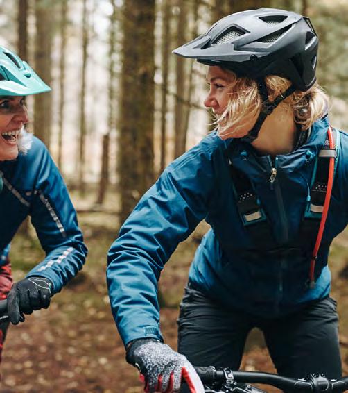
This is a general principle design grid for all digital formats. We work with a modular design.
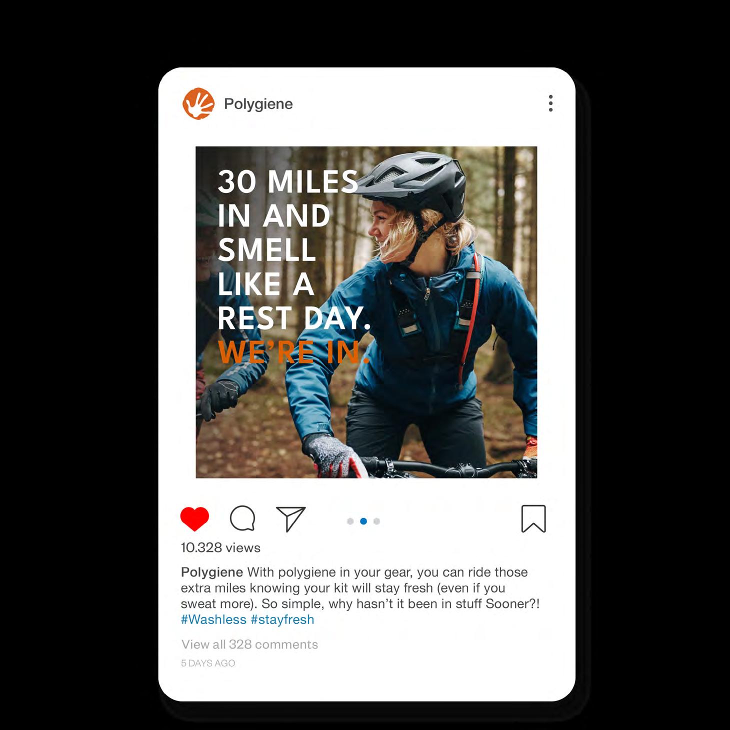
For vertical formats the page is divided in 2 columns with no surrounding white frame (to maximize size). If the design needs a Polygiene® warm grey backgound use a dividing white frame in between modules. For a square use 4 modules, for higher format use 6-8 modules depending on format/design. Horisontal formats such as web banners follow the same rules but horizontally. When the format is very narrow such as this horisontal web banner, use one module on the height (width for narrow vertical banners). Always use a big legible Semibold Headline and avoid small texts

VERTICAL DIGITAL DESIGN GRID
HORIZONTAL DIGITAL DESIGN GRID
APPENDIX
COPYWRITING GUIDELINES
THE USE OF ® IN HEADLINES, COPY & ADS
The name Polygiene is a registered trademark, and we use ”Polygiene®” only once per layout – the first time it appears in informative text.
We never use ® in headlines, slogans, taglines or standalone statements, as these are treated as design elements rather than body copy. In layouts with mixed or flexible text blocks (such as ads), apply this rule:
Use ® at the first occurrence of Polygiene in the text that informs, not in the text that sells.
If several short text blocks appear, place ® in the block that functions most like body copy – the part that explains, describes or provides information. After this first use, simply write Polygiene without the ®.
This approach keeps our communication clean, consistent and legally correct across all formats.
POLYGIENE GROUP BOILER PLATE
Polygiene® Group is our parent company and this text describes its purpose, partners, presence, etc. This text is standardized so that it can be used as is. It should always remain the same. You can use it at the end of a press release, on a brochure, in a presentation, etc.
ABOUT US
Polygiene® Group is a global leader in ingredient technologies designed to enhance freshness and performance across products and materials. Through its Polygiene and Addmaster companies, the Group partners with over 500 leading brands worldwide to deliver advanced solutions that add lasting value.
With technologies such as StayFresh, StayCool, OdorCrunch2.0, Scentmaster, Biomaster, and Verimaster, Polygiene Group combines innovation with industry expertise to strengthen product performance and differentiation. Headquartered in Sweden, Polygiene Group is listed on the Nasdaq First North Growth Market in Stockholm.
More information: polygienegroup.com
Certified adviser: Svensk Kapitalmarknadsgranskning AB

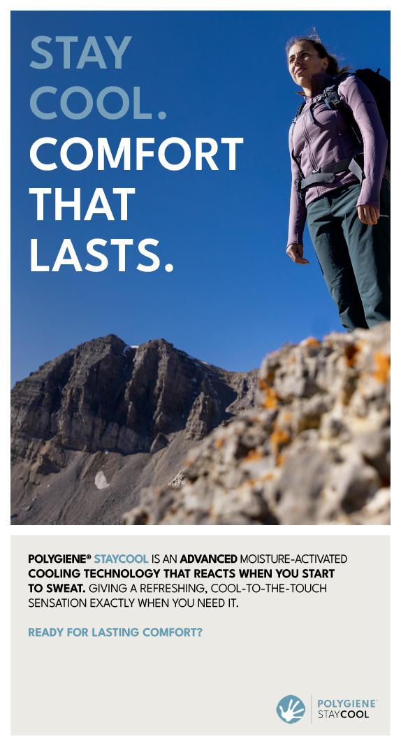
UNDER PRESSURE, I STAY COOL. I’M IN.


SEASON

