POLYGIENE GRAPHIC GUIDELINES
OUR VISUAL IDENTITY


OUR VISUAL IDENTITY
Polygiene®
Mindful Living」を含む ロゴデザインです。こちらのロゴデータは年次報告書や四半期報告書などの財務・法務関連文書、 Polygiene®の母体となる会社のロゴタイプを必要とされる場合にのみご使用ください。
こちらのロゴはホールディングカンパニーの名称であり、商業的な場面で使用されるロゴではありません。
The Polygiene® Group logotype with our overriding theme ”For Mindful Living” shall only be used as a mother company logotype. For example in financial and legal documents such as yearly reports and quarterly reports etc. It is the name of the holding company and is not a logotype to be used in commercial situations.
POLYGIENE GRAPHIC GUIDELINES – LOGOTYPES「For Mindful Living」がタグラインとして記載されているGeneral ロゴは、
特定の事業分野ではなくPolygieneを企業としてご紹介いただくシーンでご使用ください。
例えば、フレッシュネスとプロテクションの製品や、加工技術が同時に展示されるフェア、
広告、その他のマーケティング資料を指します。
主に横書きタイプのロゴをご使用いただくことをお願いいたしますが、
一部の資料では中央に縦書きのロゴを使用することも可能です。
The Polygiene® General logotype with our overriding theme ”For Mindful Living” shall be used whenever the company Polygiene shall be communicated and not the specific business areas Freshness and Product Protection. For example in fairs, ads and other marketing material where both Freshness and Product Protection products and solutions are together. The logotype shall mainly be used in horizontal mode, but in some material a centered vertical logo might be used.
ご使用いただくシーン:ポリジンを企業としてご紹介いただく(フレッシュネスとプロテクションのカテゴリ両方を含む)
HORIZONTAL VERTICAL/CENTERED POLYGIENE GRAPHIC GUIDELINES – LOGOTYPESPolygiene StayFresh™ / Polygiene OdorCrunch™/ Polygiene ScentMaster™
VERTICAL/CENTERED Polygiene Freshness™(ポリジン・フレッシュネス)のロゴタイプは、 Freshness(フレッシュネス)カテゴリ内の加工技術を搭載した製品および、
加工技術を単独で伝える場合に使用するものとします。
例えば、広告、リーフレット、下げ札などのマーケティング資料。
また、ファッション、スポーツ、アウトドアなどの展示会等でのメッセージにもご使用ください。
ロゴタイプは主に横書きでご使用いただくことを推奨しますが、
The Polygiene Freshness™ logotype shall be used whenever the Polygiene Freshness products and solutions are communicated on its own. For example marketing material such a ads, folders, leaflets, datasheets, hangtags etc. Also for messaging in textile-, fashion-, sports- and outdoors fairs for clothing and garments. , The logotype shall mainly be used in horizontal mode, but in some material a centered vertical logo might be used, for example in narrow and centered materail such as backside of hangtags and similar applications.
場合によっては縦書きのロゴを中央に寄せてご使用ください。
ご使用いただくシーン:フレッシュネスカテゴリの機能を搭載した商品を紹介する
POLYGIENE GRAPHIC GUIDELINES – LOGOTYPES HORIZONTALPolygiene ViralOff™ / Polygiene BioMaster™ / Polygiene VeriMaster™
Polygiene Product Protection™(ポリジン・プロダクト・プロテクション)のロゴタイプは、 Protection(プロテクション)カテゴリ内の加工技術を搭載した製品および、加工技術を 単独で伝える場合に使用するものとします。例えば、広告、リーフレット、下げ札などの マーケティング資料。また、展示会やフェアのブースレイアウトの一部でご紹介いただく際にも ご使用ください。ロゴタイプは主に横書きでご使用いただくことを推奨しますが、 場合によっては縦書きのロゴを中央に寄せてご使用ください。
The Polygiene Product Protection™ logotype shall be used whenever the Polygiene protection products and solutions are communicated on its own. For example marketing material such a ads, folders, leaflets, datasheets, hangtags, product branding etc. Also for messaging at trade fairs for the different product protection categories. The logotype shall mainly be used in horizontal mode, but in some material a centered vertical logo might be used, for example in narrow and centered materials such as narrow stickers, backside of hangtags and similar applications.
ご使用いただくシーン:プロテクションカテゴリの機能を搭載した商品を紹介する
POLYGIENE GRAPHIC GUIDELINES – LOGOTYPES HORIZONTAL VERTICAL/CENTEREDPolygieneの加工技術を搭載いただいた製品につきましては、手のロゴマークなしでの 訴求はお控えいただいております。基本的にカテゴリ分けをしたPolygiene Freshness (ポリジン・フレッシュネス)またはPolygiene Product Protection(ポリジン・プロダクト・プロテクション)の
どちらかのロゴをご使用いただくことをお願いしておりますが、機能名で細かく区別をする必要がある場合に限り、
Polygiene Product Wordmarksをご使用ください。
ワードマークには、弊社名と機能名が含まれており、当社独自のフォントで表記しております。
このマークは見出しとして、あるいは単独のロゴマークとして使用することができますが、
The Polygiene products shall never be used without a Polygiene logotype. They are always used under respective business area: Polygiene Freshness or Polygiene Product Protection. However there are certain times when we need to differentiate the products with Polygiene Product Wordmarks. The Wordmark includes the company name and the product name and is always written in a unique way with our font in a group. It can be used as a headline or as a stand alone logotype but always in the context with a Polygiene Freshness or Product Protection logotype. An example is the backside of the hangtags.
常にフレッシュネスまたはプロテクションの手のマークを含むロゴデータも併せて表示いただける場合にのみ可能です。
参考例として、弊社の新しい下げ札デザインの裏側をご覧いただけますと幸いです。
POLYGIENE GRAPHIC GUIDELINES – LOGOTYPES POLYGIENE FRESHNESS POLYGIENE PRODUCT PROTECTIONPolygieneのロゴをご使用いただく際はすべて、明快で目立つものでなければなりません。
そのため、ロゴの周囲には、他のテキスト、アイテム、パターンを配置できないスペースを設けてください。 注:これは最適なスペースではなく、デザインによって適したものをご採用ください。
All the Polygiene logotypes shall have clarity and stand out. Therefor we have a consistent minimum area of free space around the logotypes where no other text, items or patterns can be placed. Note: This is not the optimal space, that will always depend on the specific product or design.
For horizontal logotypes: Always use free space according to the height and width of the letter ”O” in Polygiene around the logotype.
For vertical/centered logotypes always use the 2x height and width of the letter ”O”. Often design looks better with even more free space, but this is the minimum.
常に "O "の文字の高さと幅の2倍を使用する。
多くの場合、さらに余白があった方がデザインは良く見えますが、Oの高さと幅2倍のスペースは最低限です。
【横長ロゴの場合】
ロゴタイプの周囲には、Polygieneの "O "の文字の高さと幅に応じたフリースペースを常に使用する。
【縦書き/中央揃えのロゴの場合】
スペースについて
A4やA5サイズのパンフレットやリーフレットなどの印刷物の右下に、 手のマークの幅が端に来るように配置されるものとする。
代替案として、左下隅または印刷物の上部に配置することもできが、
同じ最小/最適距離を使用しなければならない。
【縦書きロゴ】
主に中央のロゴタイプや小さな四角いラベルなどにご使用ください。
また、バナー、看板、ステッカー、下げ札など、縦長のものにご使用いただくことも可能です。
ロゴは常に販促物の「下部」に配置をお願いいたします。
Our Polygiene horizontal logotypes shall in first hand be placed in bottom right corner on printed materials, such as A4, A5 brochures and leaflets, with the width of the hand circle to the edges. As a alternative it can be placed in bottom left corner or on top of printed material but the same minimal/optimal distance shall be used. The vertical logotype is mainly used for centered logotypes and when placed in small square labels etc. The vertical logotype can off course also be used left or right aligned as well as the horizontal logotypes can be used vertically (always with the symbol placed at the ”bottom”) on certain narrow vertical objects such as banners, signs, stickers and hangtags for example.
白または明るい背景(-40% BLACK)の場合には、常にフォントが黒色のロゴを使用してください。
背景の色やトーンに関係なく、手の平の部分は白でベタ塗りであることをご注意ください。

ただし、一色印刷の場合(13ページ参照)、または背景色がPolygieneの手のマークと
近すぎる場合に限り一色印刷で代用する場合は例外とする。
On white or light backgrounds (-40% black) you shall always use the positive logotype. Please note that the hand ALWAYS shall be white regardless of the color/tone of the background. The ONLY exception is when a one-color print is used (see page 13) or when the background color is too close to the color of the Polygiene hand symbol, and therefore a one-color print is used instead.
WHITE BACKGROUNDS POLYGIENE GREY BACKGROUNDS LIGHT COLORED BACKGROUNDS LIGHT PHOTO BACKGROUNDS
BLACK)の場合には、常にフォントが白色のロゴを使用してください。
背景の色やトーンに関係なく、手の平の部分は白でベタ塗りであることをご注意ください。
ただし、一色印刷の場合(13ページ参照)、または背景色がPolygieneの手のマークと 近すぎる場合に限り一色印刷で代用する場合は例外とする。
On black or dark backgrounds (+40% black) you shall always use the negative logotype. Please note that the hand ALWAYS shall be white regardless of the color/tone of the background. The ONLY exception is when a one-color print is used (see page 13) or when the background color is too close to the color of the Polygiene hand symbol, and therefore a one-color print is used instead.
BLACK BACKGROUNDS DARK COLORED BACKGROUNDS DARK GREY BACKGROUNDS (+40% BLACK) DARK PHOTO BACKGROUNDS背景の色がロゴタイプの色に近くオレンジやブルーの手のマークが目立ちにくい場合に限り、
BlackまたはWhiteのロゴをご使用ください。明るい背景には黒のロゴタイプ(黒の割合が-40%)。
濃い色の背景には白のロゴタイプを使用ください(黒の割合が40%)。
例外として、黒または白のロゴタイプを使用した場合、手の平部分は白ではありません。
Sometimes the logotype can not be used with the orange or blue color. Either because it is only a 1-color print/transfer or the color of the background is to close to the logotype color. Then we use the Black or White logotype. Black logotypes on lighter backgrounds (-40% black). White logotypes on darker backgrounds (+40% black).
この場合、丸の中にある手はくり抜いた状態で、常に背景色を透過して表示されています。
Note the exception – the hand is not white when black or white logotypes are used. In these cases the hand in the circle will always be shown in the background color.
今後もコーポレートのカラーとFreshness(フレッシュネス)のビジネスエリアのロゴには オレンジを継続して使用いたします。新しい「オレンジ」は、以前より自然で濃い色になりました。
また、Protection(プロテクション)カテゴリでは、新たにブルーを追加いたしました。
ロゴ以外にも、見出しの言葉を強調したり、その他のグラフィック要素としてもぜひご活用ください。
背景色としてお使いいただく場合は、ロゴのデータはワンカラー(白)のものをお使いください。
The main Polygiene color has always been orange, and is used for our General and our Freshness business area logotypes. Our new orange is a bit more natural and darker. Now we also introduce a new blue colour for our Product Protection business area. The colors are mainly used in the logotypes and the product wordmarks, but can also be used to highlight words in headlines or as other graphic elements - but shall be used with care. It is a accent colour. Sometimes it can be used as a background color, always with the white logotype in this case. Shades in % of the logotype colors can also be used. As a general Polygiene background for all or categories and communications we use a warm light grey color that unifies both product categories. We always use standard white and black.
ご存知の通り、Polygieneのメインカラーはこれまでずっと「オレンジ」でした。
すべてのカテゴリーの、Polygieneの制作物の背景色として、暖かみのあるライトグレーを使用しています。
こちらも併せてご参照ください。
ABCDEFGHIJKLMNOPRSTUVXYZÅÄÖ abcdefghijklmnoprstuvxyzåäö
1234567890!”#€%&/()=?`*,.-;:_
Polygieneの標準書体はLeague Spartanを使用しています。 こちらのフォントはGoogle Fontsから無料でダウンロードいただける書体です。
この書体は、私たちのグローバルなビジュアル・アイデンティティの重要な要素となっています。
モダンでありながら時代を超越したこのフォントは、私たちポリジンらしいクリーンかつ、 北欧らしいエッセンスをさらに高めてくれます。
The standard Polygiene Typeface is League Spartan and it is a free downloadable typeface from Google Fonts. This is an important ingredient of our global visual identity. The modern still timeless typeface enhances our clean and nordic traditions. We mainly use these three cuts: Semibold, Regular and Light. But all cuts in the font can be used depending on design, text, needs etc.
私たちは主にこの3つのカットを使用しています。セミボールド、レギュラー、ライトの3種類です。
しかし、デザイン、テキスト、ニーズなどに応じて、すべてのカットを使用することができます。
ABCDEFGHIJKLMNOPRSTUVXYZÅÄÖ abcdefghijklmnoprstuvxyzåäö
1234567890!”#€%&/()=?`*,.-;:_
ABCDEFGHIJKLMNOPRSTUVXYZÅÄÖ abcdefghijklmnoprstuvxyzåäö
1234567890!”#€%&/()=?`*,.-;:_
POLYGIENE TYPEFACE – LEAGUE SPARTANPOLYGIENE GRAPHIC GUIDELINES TYPEFACE
SUBHEAD UPPERCASE/ Subhead lowercase
SUBHEAD UPPERCASE/ Subhead lowercase
LOREM IPSUM DOLOR SIT AMET, OMNIUM ADVERSARIUM EI QUO, HIS TE MELIORE ALIQUANDO. EIUS SCRIPTA LIBERAVISSE NE VIM, EST EUISMOD BONORUM LAOREET EX. RIDENS ALIENUM NOLUISSE PRO EI. EOS EI QUOD CASE MINIM.
Lorem ipsum dolor sit amet, omnium adversarium ei quo, his te meliore aliquando. Eius scripta liberavisse ne vim, est euismod bonorum laoreet ex. Ridens alienum noluisse pro ei. Eos ei quod case minim
LOREM IPSUM
Spartan Semibold
大文字で、読みやすさとスペースのために+30の間隔を空けています。 単語を強調するために、アクセントカラーを使用することもおすすめです。
Headlines: League Spartan Semibold. Uppercase letters and spaced +30 for better legibility/space. Minimum spacing of rows is same as typesize: 62/62 pt and maximum ca +10%: 62/70 pt. Accent colour can highlight a word.
Subheads: Semibold/light, maximum 50% size of headlines. Uppercase always a bit smaller and spaced +40. Lowercase no extra spacing.
Spartan Semibold または Light 文字サイズは最大で見出しのフォントサイズの半分まで。
Introduction paragraph: In Semibold, if lowercase same size as body copy, if uppercase always spaced +40 and a bit smaller. Body copy: In Regular or Light depending on print, screen, paper, size etc. Shall always be written in standard lowercase letters. Minimum spacing of rows is ”auto” mode. Small accent texts: Uppercase and spaced +140. Captions: Same as as body copy but ca 75% of it’s size.
Lorem ipsum dolor sit amet, omnium adversarium ei quo, his te meliore aliquando. Eius scripta liberavisse ne vim, est euismod bonorum laoreet ex. Ridens alienum noluisse pro ei. Eos ei quod case minim, in usu sonet eruditi iracundia, sea at accusamus principes delicatissimi. An has sumo putant persius. Ridens alienum noluisse pro ei. Eos ei quod case minim, in usu sonet eruditi iracundia.
Lorem ipsum
Lorem ipsum dolor sit amet, omnium adversarium ei quo, his te meliore aliquando. Eius scripta liberavisse ne vim, est euismod bonorum laoreet ex. Ridens alienum noluisse pro ei. Eos ei quod case minim, in usu sonet eruditi iracundia, sea at accusamus principes delicatissimi. An has sumo putant persius. Lorem ipsum dolor sit amet, omnium adversarium ei quo, his te meliore aliquando. Eius scripta liberavisse ne vim, est euismod bonorum laoreet ex.
Lorem ipsum dolor sit amet, omnium adversarium ei quo, his te meliore aliquando. Eius scripta liberavisse ne vim, est euismod bonorum laoreet ex.
Lorem ipsum dolor sit amet, omnium adversarium ei quo, his te meliore aliquando. Eius scripta liberavisse ne vim, est euismod bonorum laoreet ex.
【小見出し】フォント:League
こちらのアウトライン化された手のアイコンは、注意して使用いただく必要があります。
背景色はPolygieneのグレー(P15参照)でアイコンは透明度100%の白で、できれば大きく、
右側に寄せてご使用ください。Polygieneの他の色と併せてご使用いただくことも可能ですが、
その場合はアイコンの色味は透明度30%の白に変更いただき同系色の効果を出すようにしてください。
ただし、こちらのアイコンはロゴの代替として使用することはできません。
The outlined hand icon shall be used with care. It is mainly a decorative element that plays with the classic Polygiene hand icon. It shall always be used in 100% white on the Polygiene grey background color and preferably big and bleeding to the right hand side. It can also be used on other Polygiene colours but then always in 30% transparent white to achieve a discrete tone-in-tone effect. It can for example be used as a pattern, or decorative element in specific graphic products. However, it should never replace the real logotype as signoff etc.
POLYGIENE GRAPHIC GUIDELINES – ICONS 30% TRANSPARENT WHITE ICON BIG BLEEDING WHITE HAND ICONPolygiene Products Protection(ポリジン・プロダクト・プロテクション)のブルーの2色で ご用意がございます。また、色付きの背景や写真などには白でくり抜いたバージョンを 使用いただくことも可能です。
The pictogram icons are always placed in a colored circle – in Freshness Orange or Product Protection Blue. The icons can also be used negative white on colored backgrounds, photos etc. There is an ”artwork bank” with a number of of pictograms to choose from for both business areas.
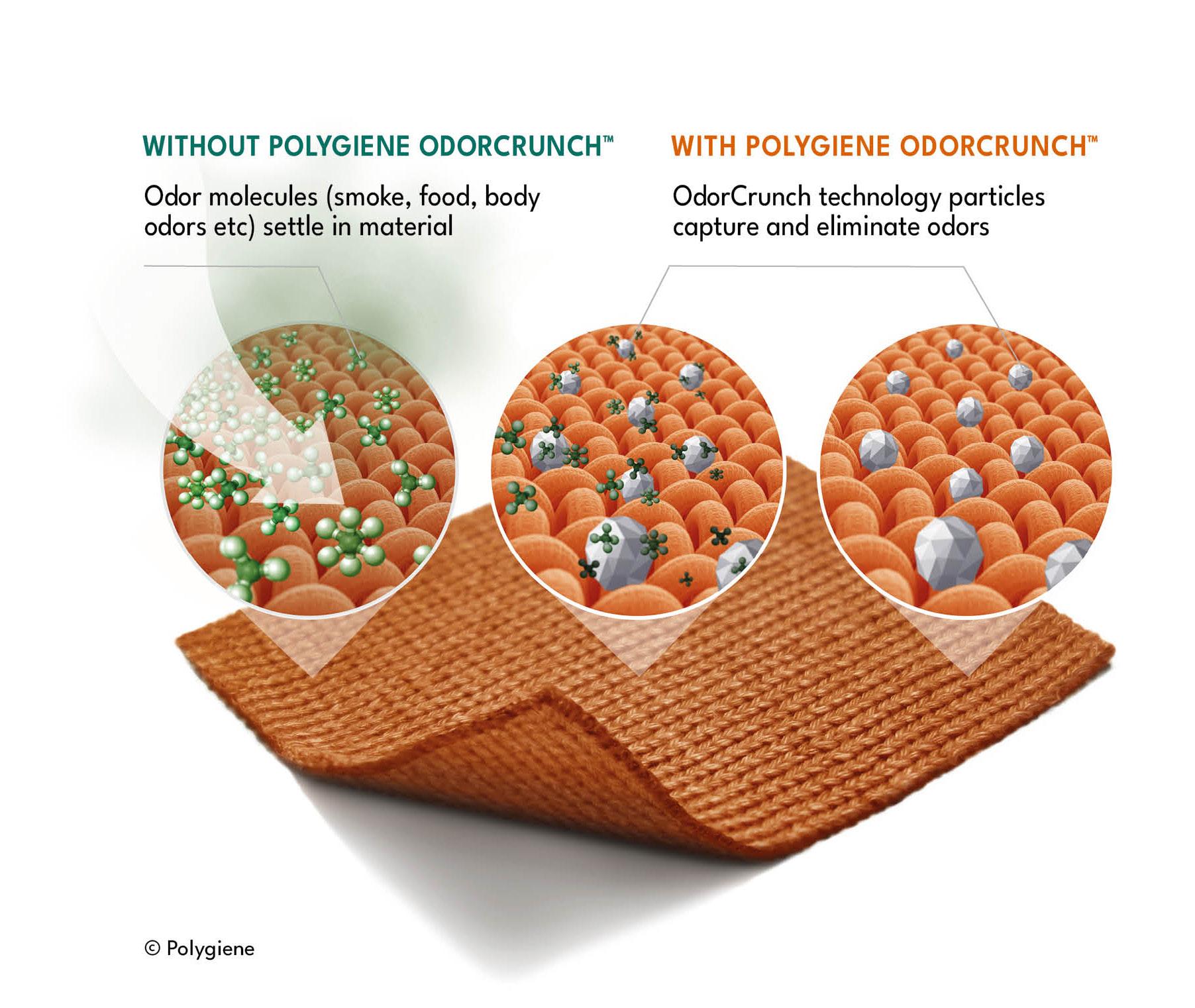
3Dイラストレーション(ポリジン・フレッシュネス)
POLYGIENE FRESHNESS 3D TECHNICAL ILLUSTRATIONS
これらのイラストはPolygiene Freshness(ポリジン・フレッシュネス)カテゴリの技術・製品の
仕組みを技術的に説明するものです。パンフレットやカタログ等で、加工技術について ご説明いただく際に限り、ご使用いただけます。
また、この3Dイラストレーションをお使いになる際は、常に白、Polygieneウォームグレーまたは ライトグレーの色を背景に設定してください。。グレーの背景に配置する場合は、
These illustrations are technical descriptions on how the technology/product works. These can be used in technical documents, leaflets and brochures when describing the technology. Never to be used in end-user commercial communications such as advertising etc. These illustrations shall always be placed on a white, Polygiene warm grey or light grey background. When placed on a grey background use transparency/multiply.
透明度や多重度をご使用ください。
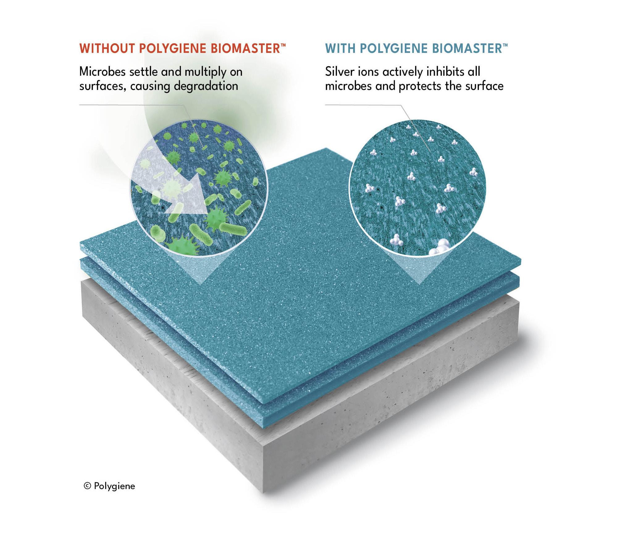
3Dイラストレーション(ポリジン・プロダクト・プロテクション)
POLYGIENE BIOMASTER 3D TECHNICAL ILLUSTRATION
これらのイラストはPolygiene BioMaster(ポリジン・バイオマスター)加工についての
仕組みを技術的に説明するものです。パンフレットやカタログ等で、加工技術について ご説明いただく際に限り、ご使用いただけます。
また、この3Dイラストレーションをお使いになる際は、常に白、Polygieneウォームグレーまたは ライトグレーの色を背景に設定してください。。グレーの背景に配置する場合は、
This illustration is a technical descriptions on how the Polygiene Product Protection/BioMaster product works. It can be used in technical documents, leaflets and brochures when describing the technology. Never to be used in end-user commercial communications such as advertising etc. The illustration shall always be placed on a white, Polygiene warm grey or light grey background. When placed on a grey background use transparency/multiply.
透明度や多重度をご使用ください。
 POLYGIENE GRAPHIC GUIDELINES – ICONS
POLYGIENE BIOMASTER 3D ILLUSTRATION
POLYGIENE GRAPHIC GUIDELINES – ICONS
POLYGIENE BIOMASTER 3D ILLUSTRATION
Polygiene Group describes the mother company and is used in press releases, financial and legal documents, such as yearly and quarterly reports etc. It is the name of the holding company and is not a name or a logotype to be used in commercial situations.
Polygiene Group(ポリジングループ)は母体となる会社を示すもので、プレスリリース、
年次・四半期報告書などの財務・法務関連文書で使用ください。これはホールディング会社の名称であり、 商業的な場面で使用される名称やロゴタイプではありません。英語で記載いただく場合には Polygiene Groupと小文字で表記し、各単語の頭に大文字を使用してください。
It is written in lowercaps with an uppercase letter in the beginning of each word: Polygiene Group.
また、現在商標登録中のため記載される際に最初に記載される場合は社名の後に™マークを付けてください。
As we are in the process of registering the name and want to show ownership, we put out TM after the name the first time we use it on a page:
Polygieneという社名は、Polygiene Freshness(ポリジン・フレッシュネス)と Polygiene Product Protection(ポリジン・プロダクト・プロテクション)という
特定の事業分野ではなく、Polygieneという会社を示すときに使用するものとします。
The name Polygiene shall be used whenever the company Polygiene is being communicated, and not the specifik business areas Polygiene Freshness and Polygiene Product Protection. For example, at fairs, in ads and other marketing material where both Freshness and Product Protection products and solutions are communicated together.
例えば、展示会、広告、その他のマーケティング資料で、FreshnessとProduct Protectionの 両方の製品とソリューションを一緒に伝える場合などです。
The name is registered and therefore we write ® after the name Polygiene:
この名称は登録されているため、Polygieneの名称の後に®と表記しています。
The Polygiene Group and Polygiene has an overriding theme that is »For Mindful Living« this is the umbrella of all we do, it is used together with the mother company Polygiene Group logo and the general Polygiene logo.
Polygiene GroupとPolygieneは、「For Mindful Living」というテーマを掲げており、 これは私たちが行うすべての活動の包括であり、母体となるPolygiene Groupのロゴと Polygieneのロゴと共にタグラインとして使用しています。このフレーズの所有権を示すため、 ページで初めて使用するときは、フレーズの後に™マークを付けてください。
As we want to show ownership of the phrase, we put out TM after the phrase the first time we use it on a page. Only use the correct ™ symbol that is available within the font, never use the character T plus M:
フォント内で使用可能な正しいTMシンボルのみを使用し、アルファベットのT+Mの文字で 打ち込むことはお控えください。
Polygiene Group For Mindful Living™
Polygiene For Mindful Living™
加工技術の名称については小文字で表記し、各単語の頭に大文字を使用しています。
Polygiene Product Protection(ポリジン・プロダクト・プロテクション)の2つの事業分野を持ち、 将来的にはさらに多くの事業分野を追加することも計画しております。
Today Polygiene has two business areas, Polygiene Freshness and Polygiene Product Protection, and in the future more business areas can be added.
【例】
Polygiene have a number of products that is part of the two business areas. They are written in lowercaps with an uppercase letter in the beginning of each word and syllable of the product name:
Polygiene(半角スペース)StayFresh
They are written in lowercaps with an uppercase letter in the beginning of each word. This is the way we write them:
これらの事業は小文字で表記され、各単語の先頭には大文字が使われています。
カテゴリの表記については下記をご参照ください。
Polygiene Freshness™
Polygiene Freshness™(ポリジン フレッシュネス)
Polygiene Product Protection™
Polygiene Product Protection™(ポリジン・プロダクト・プロテクション)
※一番初めに記載いただく場合のみ英語(カタカナ)の表記をフルで記載してください。
Polygiene StayFresh
Polygiene OdorCrunch
Polygiene ScentMaster
Polygiene BioMaster
Polygiene VeriMaster
Polygiene ViralOff
™マークの使用は所有権を示すものであり、カテゴリ名を印刷物等で初めて表示記載したときにのみ使用。 フォント内で使用可能な正しいTMシンボルのみを使用し、T+Mの文字は決して使用しないでください。
The use of the TM-mark, show ownership and is only used the first time the business areas is presented on a page. Only use the correct ™ symbol that is available within the font, never use the character T plus M:
The Polygiene Group and Polygiene has an overriding theme that is »For Mindful Living« this is the umbrella of all we do, it is used together with the mother company Polygiene Group logo and the general Polygiene logo.
GroupのロゴとPolygieneのロゴとともに、 私たちの活動すべてを包括しています。このフレーズの所有権を示すため、
As we want to show ownership of the phrase, we put out TM after the phrase the first time we use it on a page:
ページで初めて使用するときは、フレーズの後にTMを付けています。
Polygiene Group For Mindful Living™
Polygiene For Mindful Living™
フォント内で使用可能な正しいTMシンボルのみを使用し、T+Mの文字は決して使用しないでください。
™マークの使用は、製品の所有権を示すものであります。
各印刷物等のページで製品がページ上で最初に紹介される場合にのみご使用ください。
The use of the TM-mark, show ownership and is only used the first time the products are presented on a page:
Polygiene StayFresh™
Polygiene OdorCrunch™
Polygiene ScentMaster™
Polygiene BioMaster™
Polygiene VeriMaster™
Polygiene ViralOff™
It is tempting to skip Polygiene in front of a product name, but this is the way to show that Polygiene is linked to the product names. Therefore, use Polygiene in front of the product names as much as possible.
現在Polygiene社は、Polygiene Freshness(ポリジン・フレッシュネス)と
Polygiene GroupとPolygieneは、「For Mindful Living(思いやりのある生活のために)」という テーマを掲げ、母体であるPolygiene
REGISTERED®, TRADEMARK™ AND COPYRIGHT © .
先に述べた製品名は公的に登録されることはありませんが、販促物等に初めて記載する際には、 所有権を示すために必ず™マークを付ける必要があります。Polygiene For Mindful Living™や
Product names
機能名
見出しに記載されず、本文で初めて記載される場合:
The first time it is written in body copy, but not in a headline:
• Polygiene StayFresh™
• Polygiene OdorCrunch™
• Polygiene ScentMaster™
Polygiene Wear More Wash Less™ も同様になります。
The product names mentioned earlier will not be registered publicly but they should always be marked with TM, to show ownership, the first time they are written in body copy. The same thing applies for Polygiene For Mindful Living™ and Polygiene Wear More Wash Less™.
In headlines
見出し部分
Polygiene Group and product names: No ®, ™ or © No full stops (.)
Polygiene Group(ポリジングループ)、Polygiene(ポリジン)、 各機能名を記載する際には、®マーク、™マーク、©マーク、 「。(句読点)」を使わないでください。
• Polygiene BioMaster™
• Polygiene VeriMaster™
• Polygiene ViralOff™
本文に1度記載済み、または見出しに記載された場合:
The second time it is written in body copy and in headlines it is without TM.
• Polygiene StayFresh etc.
(™マークが取れます)
In body copy
本文
・ Polygiene® - 見出しに記載されず、本文で初めて記載される場合
・ Polygiene - 本文に1度記載済み、または見出しに記載された場合
• Polygiene® – the first time it is written in body copy, but not in a headline
• Polygiene – the second time it is written in body copy and in headlines
Business areas
カテゴリ表記
見出しには記載されていない、かつ本文に初めて記載される場合:
・ Polygiene Freshness™(ポリジン・フレッシュネス)
• Polygiene Freshness™ and Polygiene Product Protection™ – the first time it is written in body copy, but not in a headline
・ Polygiene Product Protection™(ポリジン・プロダクト・プロテクション)
見出しに記載済み、もしくは本文で2回目以降に記載される場合:
• Polygiene Freshness and Polygiene Product Protection – the second time it is written in body copy and in headlines
・ Polygiene Freshness もしくは ポリジン・フレッシュネス
・ Polygiene Product Protection もしくは ポリジン・プロダクト・プロテクション
To be able to claim ownership of For Mindful Living, it has to be preceded by Polygiene, and followed by a TM the first time it is written
For Mindful Livingの所有権を主張するためには、最初にPolygieneを記載し 最初に記載する場合には™マークが必須となります。
• Polygiene For Mindful Living™ – first time it is written, but not in a headline
• Polygiene For Mindful Living – second time it is written and in headlines
本文に1度記載済み、または見出しに記載された場合 見出しに記載されず、本文で初めて記載される場合
Polygiene Wear More Wash Less
Wear More, Wash Lessの所有権を主張するためには、最初にPolygieneを記載し 最初に記載する場合には™マークが必須となります。
To be able to claim ownership of Wear More Wash Less, it has to be preceded by Polygiene, and followed by a TM the first time it is written
見出しに記載されず、本文で初めて記載される場合
• Polygiene Wear More Wash Less™– first time it is written, but not in a headline
• Polygiene Wear More Wash Less – second time it is written and in headlines
本文に1度記載済み、または見出しに記載された場合
POLYGIENE GRAPHIC GUIDELINES TEXTIllustrations, graphic elements – © (copyright)
Copyright gives Polygiene the exclusive rights as the creator/owner of certain artwork, films, websites, illustrations etc
著作権はPolygieneの所有する特定のアートワーク、フィルム、ウェブサイト、イラストなどの 制作者/所有者としての独占的な権利を与えています。
著作権について 会社概要
• Illustrations: (how it works etc) – Place © Polygiene under illustration where there is space
3Dイラストを使用される場合には、下に©Polygieneと記載必須
下げ札、プレゼンテーション、文書に記載する場合には、Polygiene Wear More Wash Less©と 最後に©をフレーズの最後に配置してください。
• Artwork (does not apply in body copy): Polygiene Wear More Wash Less© (on hangtags, in presentations and documents) – The © is placed in the end of the phrase
Here are a few examples of text that we always use. The more we use the same pieces of text, the stronger and more consistent we make our messages. Please therefore use these as is.
Vision
»We want to change products – from fast consumables to durables«
Mission
/Input needed/
The elevator pitch
This is a short description of what Polygiene is:
/Input needed/
This is the »About us« text that describes who we are, our purpose, who we work with, our presence, etc. This text is standardized so that it can be used as is. It should always remain the same. You can use it at the end of a press release, on a brochure, in a presentation, etc:
ポリジンとはどういった企業なのか、私たちの目的などを説明する会社概要のテキストです。 このテキストは、そのまま使えるように標準化しておりますので、ぜひプレスリリースの末尾、 パンフレット、プレゼン資料などにご活用ください。
Polygiene Group™(ポリジングループ)は、抗菌テクノロジーとニオイのコントロール 技術のグローバルリーダーです。私たちは表面の硬いハードサーフェイスやテキスタイルに 加工を施すことで製品を保護し、より衛生的に保つとともに、加工された製品を使用する 消費者の皆様が自信を持ってフレッシュで快適にお過ごしていただく環境をご提供しています。 当社は、フレッシュネスとプロテクションの分野で選ばれる成分ブランドとして、
Polygiene Group™ is the global leader in antimicrobial technologies and odor control solutions. We treat hard surfaces and textiles to ensure that your products are better protected and remain more hygienic, and you remain confidently fresh and odor-free.
As the ingredient brand of choice, we work with over 500 global premium brands within our business areas of Product Protection and Freshness. We provide a wide range of technologies that increase the value of our customers products and enable consumers to live a more mindful life. We offer solutions and treatments for products with technologies such as: BioMaster, VeriMaster, ScentMaster, MasterPiece, BioStatic and OdorCrunch. Polygiene Group is listed on the Nasdaq First North Growth Market in Stockholm, Sweden. For more information: www.polygiene.com
世界で500以上のグローバルプレミアムブランドと契約を締結しています。 パートナーブランドの製品価値を高め、消費者がより心豊かな生活を送ることができるよう、 さまざまな技術を提供しています。私たちは、BioMaster、VeriMaster、ScentMaster、 MasterPiece、BioStatic、OdorCrunch…このような加工技術で製品のソリューションや 加工技術を提供しております。Polygiene Groupは、スウェーデンのストックホルムにある Nasdaq First North Growth Marketに上場しています。
詳細については、https://japan.polygiene.com/ をご覧ください。
POLYGIENE GRAPHIC GUIDELINES TEXT