4 minute read
Dymaxion Map

1943 PAPER 9½ IN × 1 FT 3¼ IN (24 CM × 39 CM) BUCKMINSTER FULLER INSTITUTE, NEW YORK, USA
BUCKMINSTER FULLER
Advertisement
With the outbreak of World War II in 1939, it became apparent that mapmaking could be used in the service of political, religious, and racial divisions. In 1943, the visionary American inventor and designer Buckminster Fuller decided to acknowledge the problems of projecting the spherical Earth onto a flat surface by designing a map that offered a connected global world, and that stressed unity rather than difference.
His Dymaxion Map, named after his distinctive design ethic (see box below), used an icosahedron to create a terrestrial globe, which could be unfolded into a flat world map that looked like a piece of origami. Despite its unusual shape, it was more accurate in proportion than previous rectangular maps, which showed serious distortion, especially at the poles. Fuller’s method proved that no map projection could accurately depict the whole globe. It also showed interconnected landmasses without political borders, reflecting his progressive belief in the need for global cooperation and sustainability. Fuller rejected cartographic orientations of “up” or “down,” and instead created a radically democratic map that was more interested in how temperatures affected human development.
BUCKMINSTER FULLER
1895–1983
Richard Buckminster Fuller was one of 20th-century America’s great intellectual mavericks—an inventor, writer, architect, and designer.
Expelled from Harvard University, Fuller served in the US Navy during World War I. He worked on techniques for producing affordable, lightweight housing, the first of several innovative projects that came under his trademark term “dymaxion,” a compound of three of his favorite concepts: dynamic, maximum, and tension. It described a series of increasingly ambitious projects that Fuller invented from the late 1920s, including a three-wheeled car, houses, and geodesic domes—stable, lightweight, spherical structures that influenced a generation of urban planners. Fuller’s unconventional ideas were based on his prescient belief in global sustainability and an environmental awareness of the fragility of what he called “Spaceship Earth. SCALE
A deck plan of the six and one half sextillion tons Spaceship Earth
BUCKMINSTER FULLER

Visual tour
6
4 3
2 5
1
1
KEY
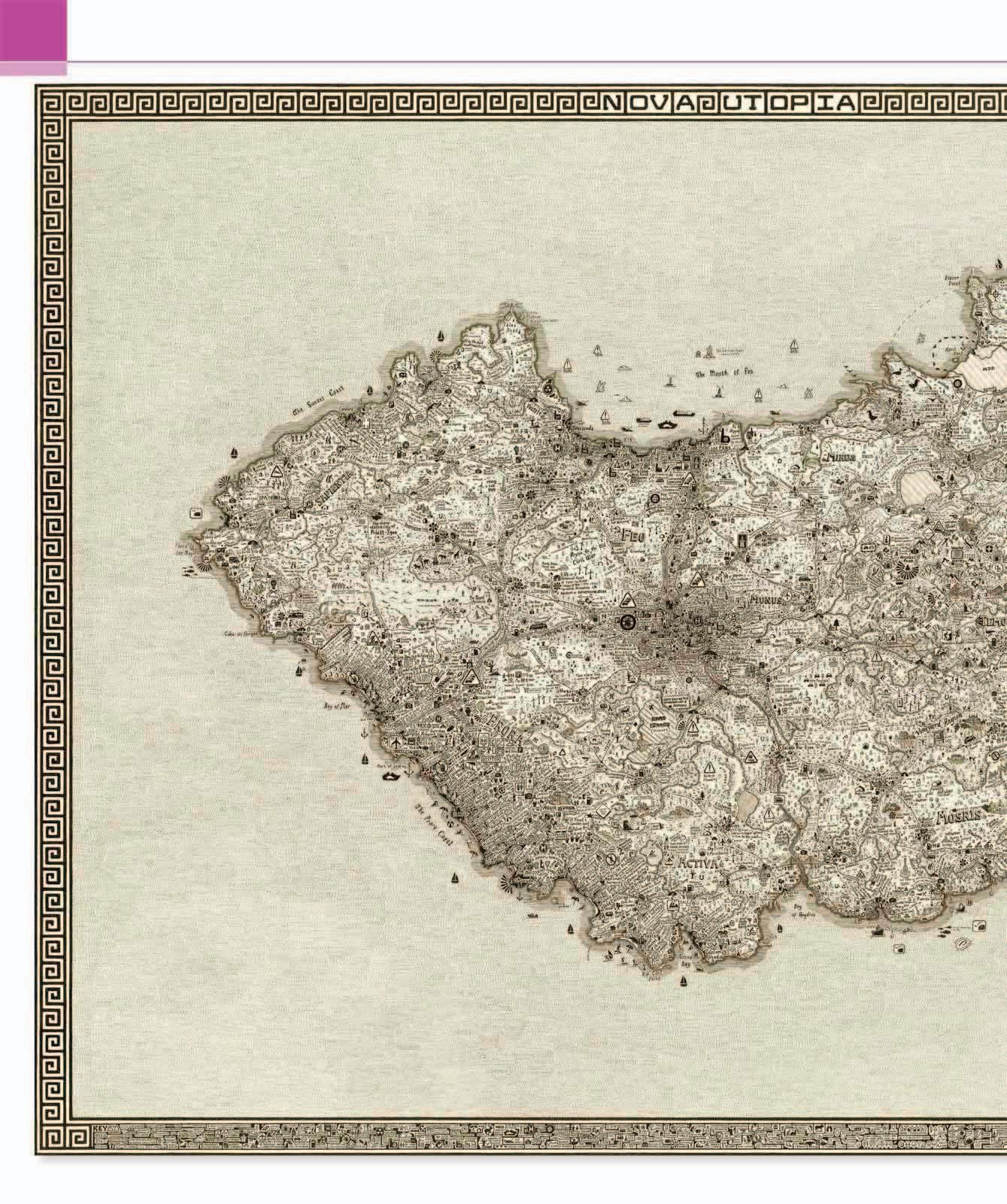
4 ANTARCTICA COMES IN FROM THE COLD Most world maps marginalize Antarctica, or in Mercator’s case, distort it (see pp.110–13). Even polar projections invariably placed the North Pole as their center. Although Fuller’s method situated Antarctica in relative isolation, it offers a rare view of the continent’s size and shape. Current debates around global warming make this image seem eerily prophetic.
2

1 FROM ONE POLE TO ANOTHER One of Fuller’s great beliefs was that “ up,” “down,” “north,” and “south” were all cultural constructs, and as a result his map does not have a “right way up.” Although the North Pole sits approximately in the middle, it has no wider significance other than to show a spiral-shaped region of territorial interconnectivity. 4 MARGINAL EUROPE Fuller decenters Europe. Its political geography is no longer seen as pivotal, with many of its place names even written upside down. Instead, Fuller reintroduces an age-old interest in temperature zones, with Europe lying within a temperate region. This revision of Greek klimata (see p.43) would have been recognizable to Aristotle, Ptolemy, and even al-Idrīsī. 3
3 DOWN UNDER? Having rejected orientation in terms of “up” and “down,” Fuller’s map changes assumptions made by the language of geography, including descriptions of Australia as “down under.” Even the term “Antipodes” stems from Plato’s explanation of “above” and “below,” describing one place diametrically opposite, or “below,” another. On Fuller’s map, Australia is just another continent, cut free from age-old assumptions about its place in the world.
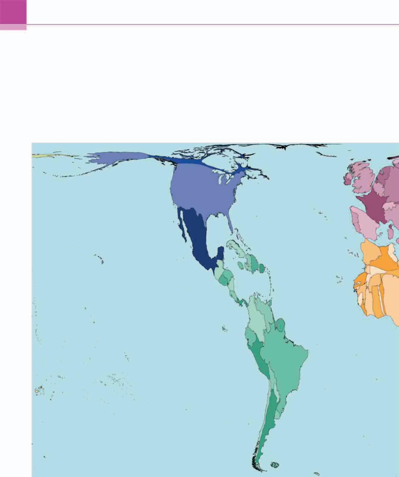
2 SOUTH AMERICA Having been the subject of so much imperial and colonial mapmaking since the late 15th century, South America is shown here as part of a ribbon connecting North America to Asia and then Africa in one continuous belt running left to right, rather than its usual orientation running north to south. Its distance from other continents, especially Africa, appears considerably distorted, but Fuller retains its shape and proportion.
4 REDDEST AFRICA Compared with traditional maps, Africa looks “upside down,” but Fuller’s startling projection makes us realize that this is quite arbitrary. Its red hue is based on high temperature zones, although Fuller’s interest was more in how social patterns of migration and economic activity were defined by the coldness of a region, as opposed to its heat.
4
IN CONTEXT
Throughout history, most world maps projected the spherical globe onto straightforward shapes such as rectangles or ovals, which resulted in some form of distortion. Fuller took the radically different approach of using an icosahedron with twenty triangular faces, because it was the closest shape to a sphere, and therefore limited distortion when the Earth’s surface was projected upon it. The shapes and sizes of landmasses were preserved, but at the expense of producing an “interrupted” shape when the earthly icosahedron was flattened out into a discontinuous map.
5

1 Fuller’s map is shown here placed on to a three-dimensional icosahedron.