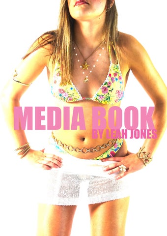
MEDIA BOOK
BY LEAH JONES
INTRODUCTON 6-7
OVERVIEW OF CONCEPT 8-9
THEME AND MESSAGE 10-11
WHY I CHOSE THIS IDEA 12-13
COLOUR PALETTE
FASHION INSPO
IMAGE AND SETTINGS 32-33
WHAT WORKED WELL? 34-35
WHAT WOULD I CHANGE? 36-37
COLOUR PALETTE
WHY DID THEY INSPIRE ME? 62-63 BEACH ROLE 64-65
KEY DATES AND NAMES 66-67
FILLER PAGE 74-75
WHAT IVE LEARNT 76-77
LIST OF CREDITS
This diary is a journey through every detail and inspiration that shaped my Final Major Project. From the earliest concepts to the final creative decisions, each stage has been carefully documented. Inspirations, ranging from colour palettes and textures to influential figures, photographers, and artistic movements, have all played a vital role in the development of this work. This short visual diary presents a curated insight into that process, offering a glimpse into the thoughts, research, and creative exploration behind the final outcome.

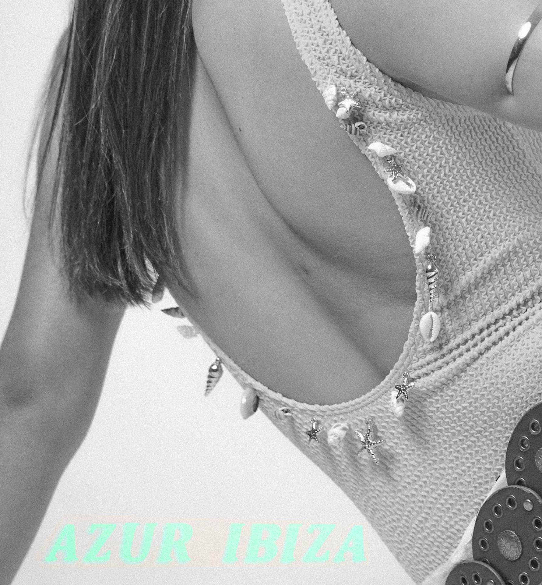
Every detail is important, even if it is just the colour of a bead.
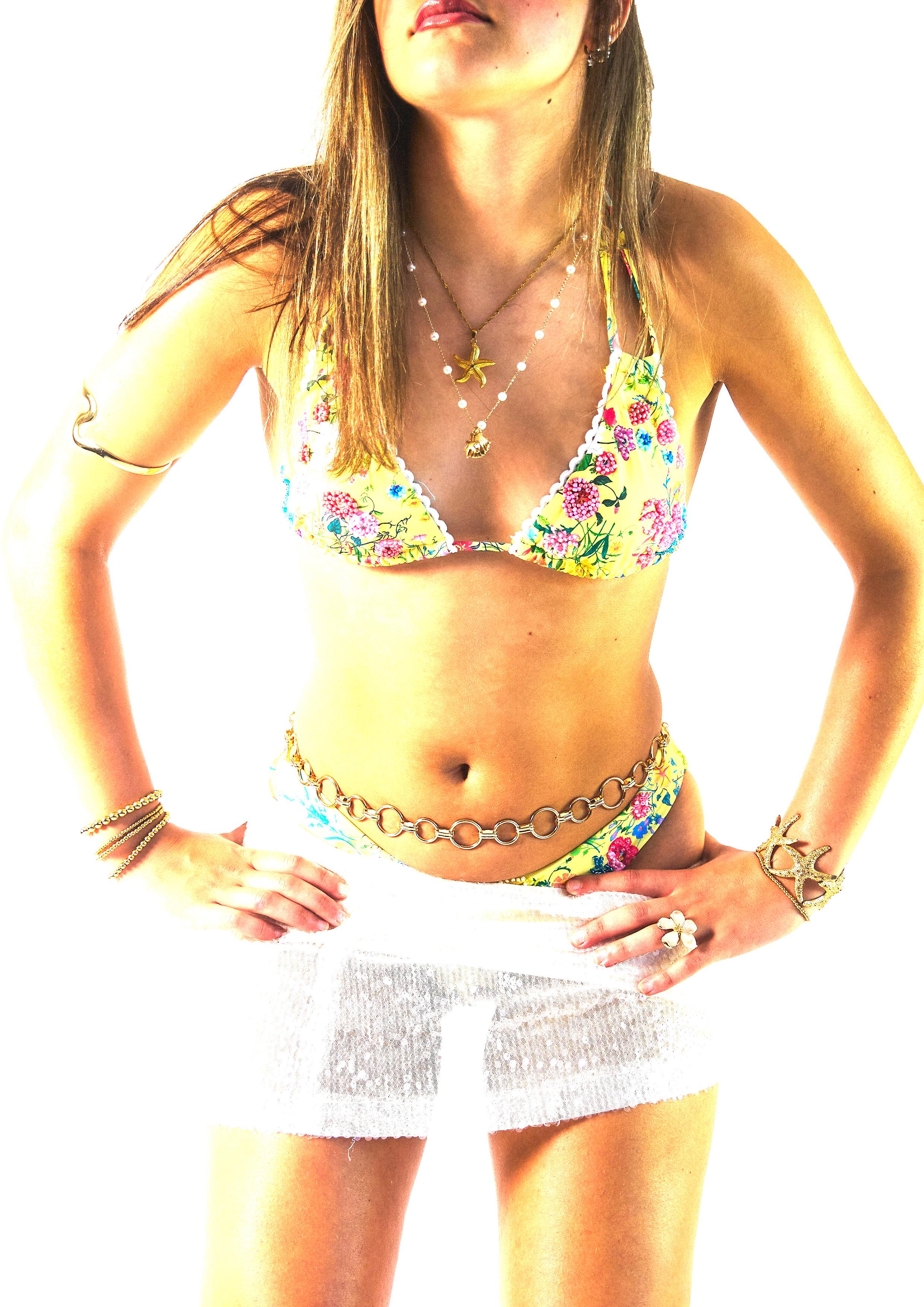
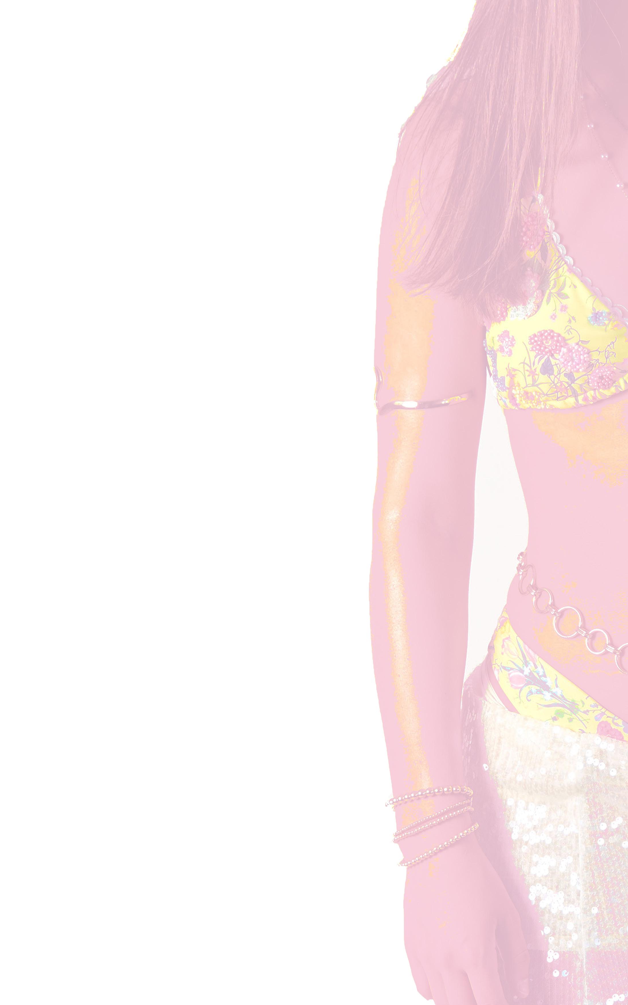
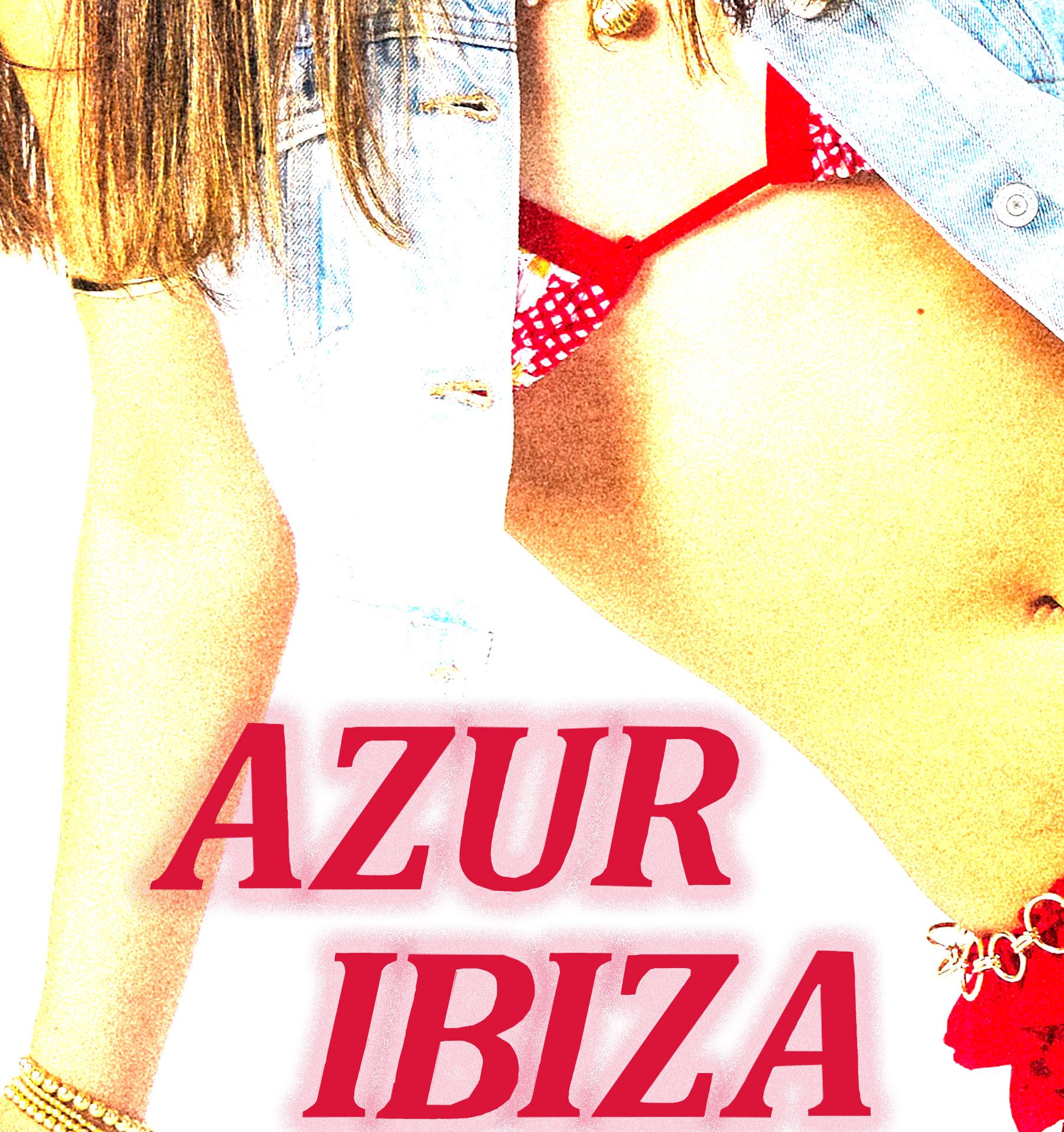
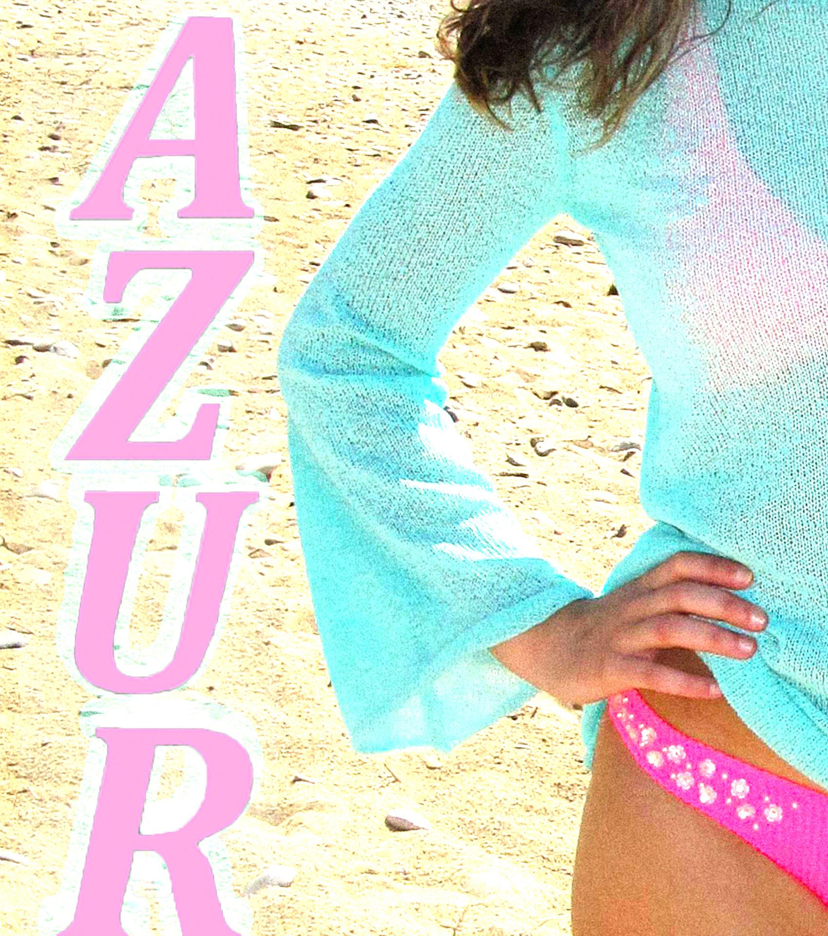
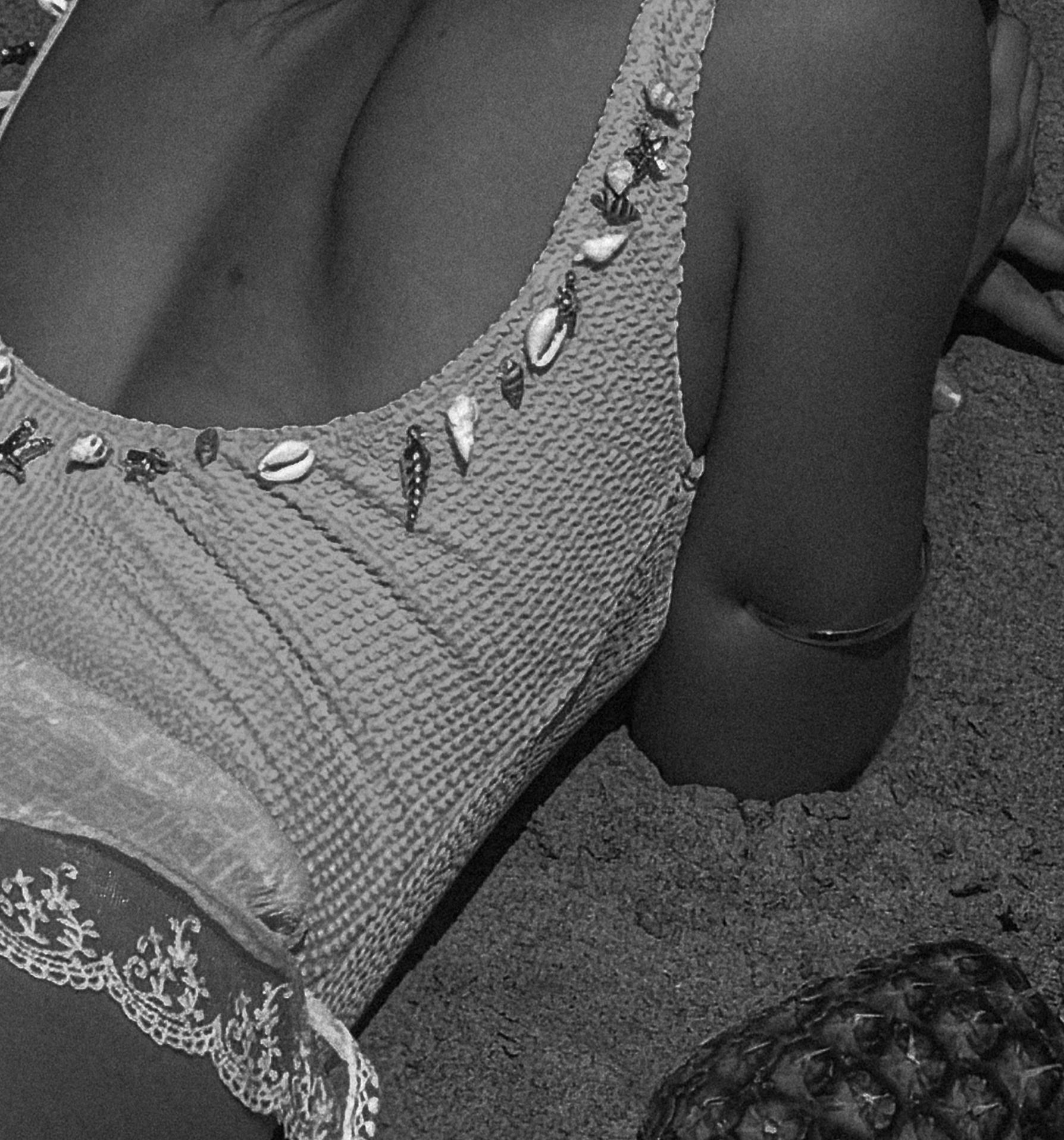
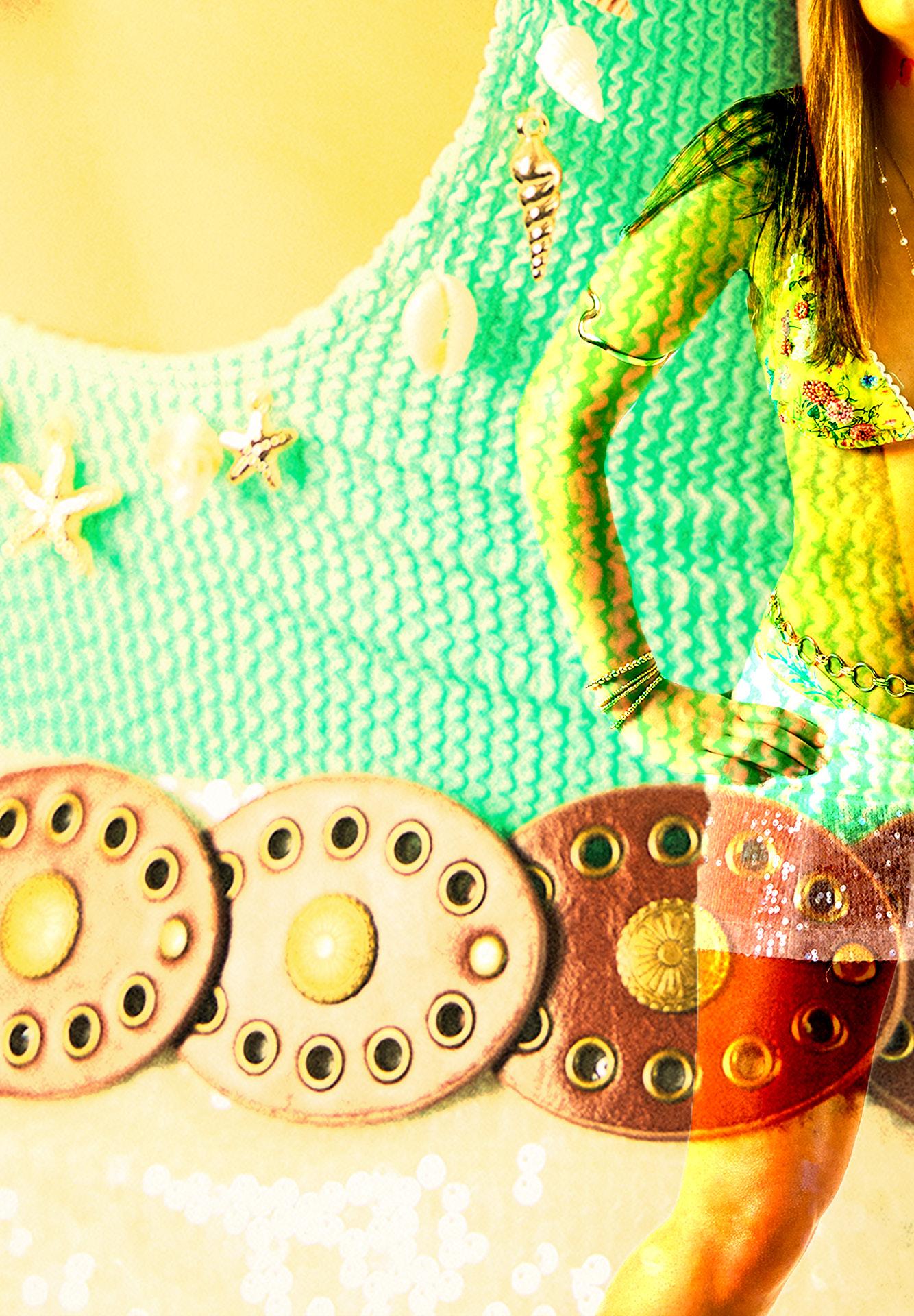
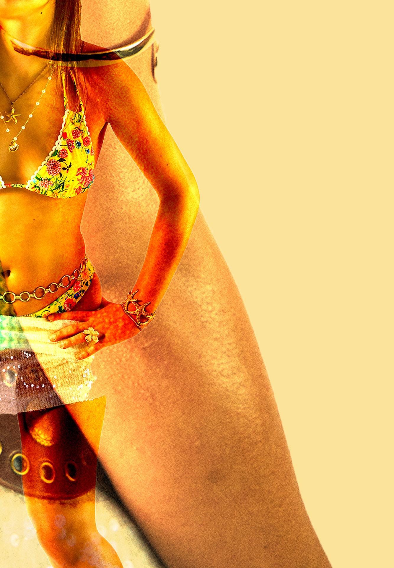
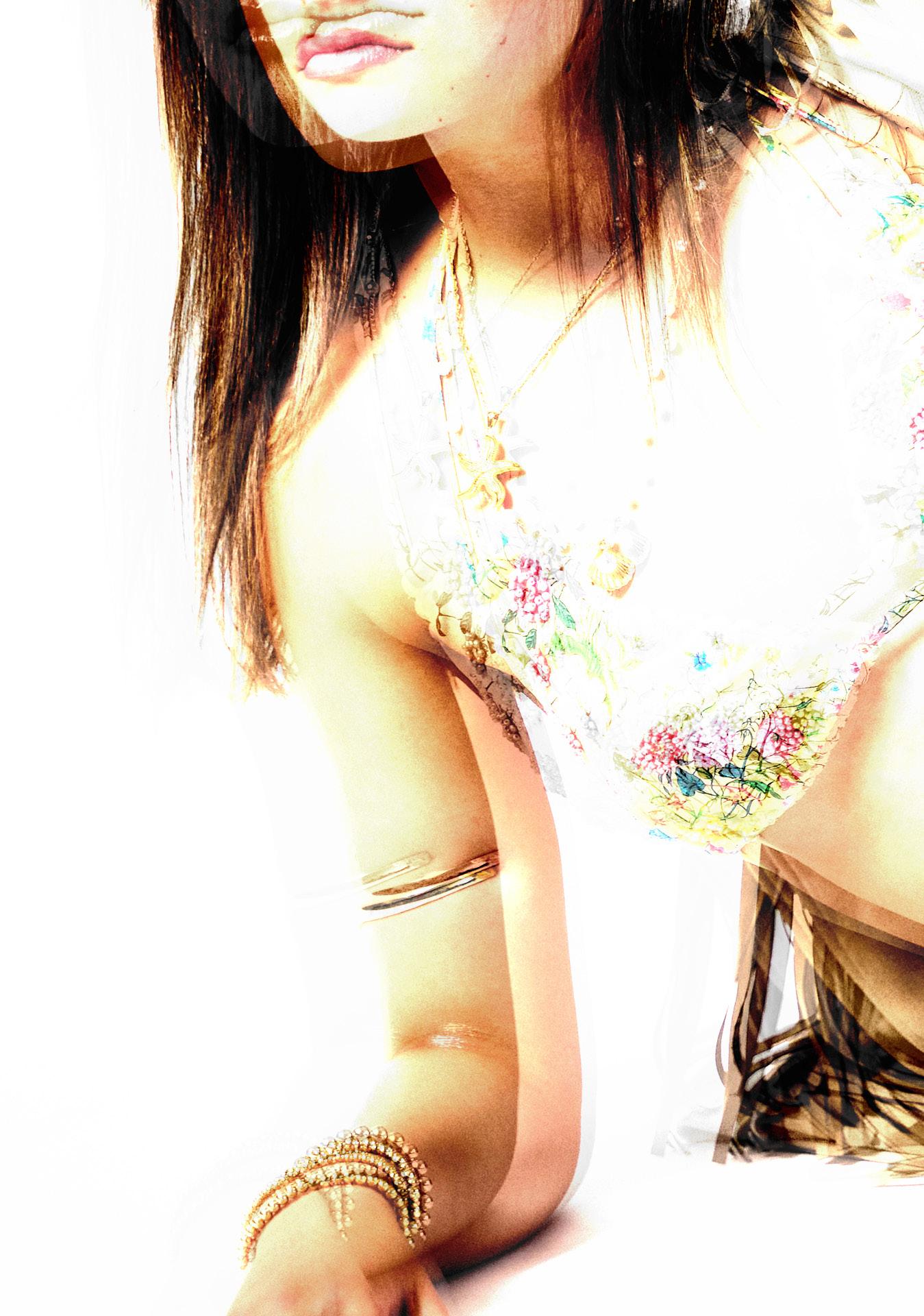
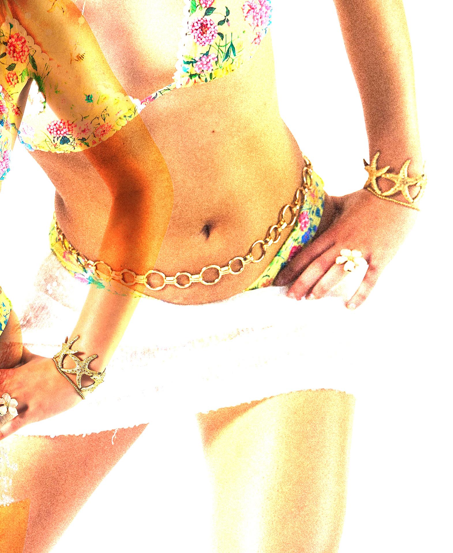
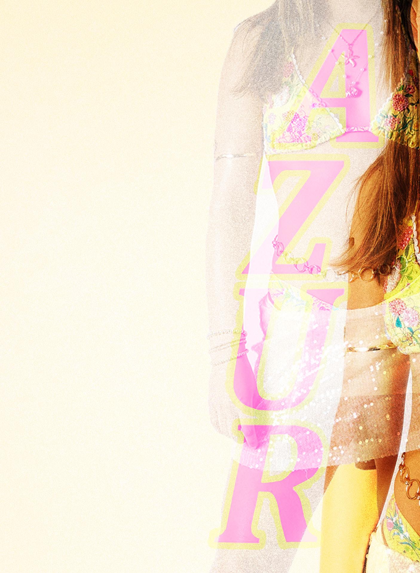
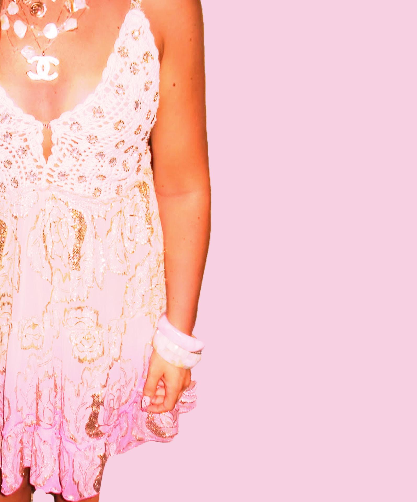
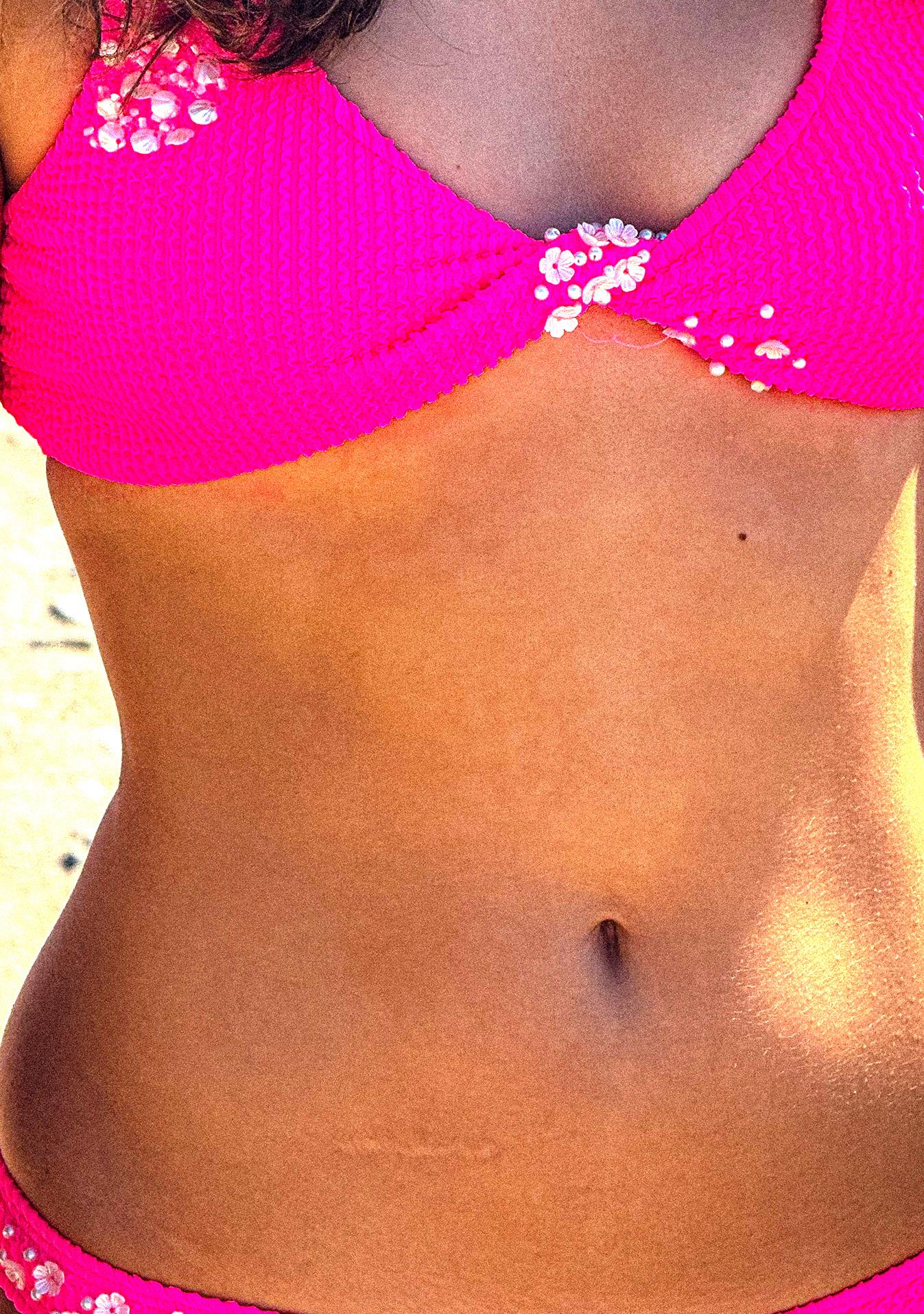
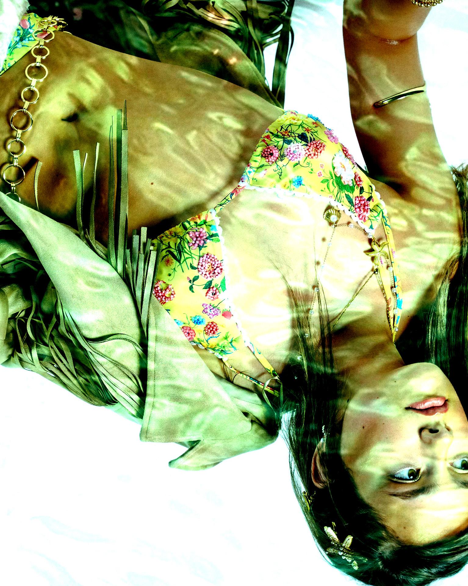
My rebrand concept focuses on transforming the bikini brand Azur Ibiza into one that resonates more strongly with a Gen Z audience. The aim was to inject a sense of fun, vibrancy, and personality into one that resonates more strongly with a Gen Z audience. The aim was to inject a sense of fun, vibrancy, and personality into the brand, aligning it more closely with the spirit and lifestyle of Ibiza, the island from which the brand originates. Through in-depth research into both Ibiza’s unique culture and emerging trends in slow, timeless fashion, I discovered that incorporating elements like beading and embroidery would be a perfect fit. Adding a touch of both sides of the island with the glitz and the glam of the beading as well as the wholesome, craftsmanship side of Ibiza.
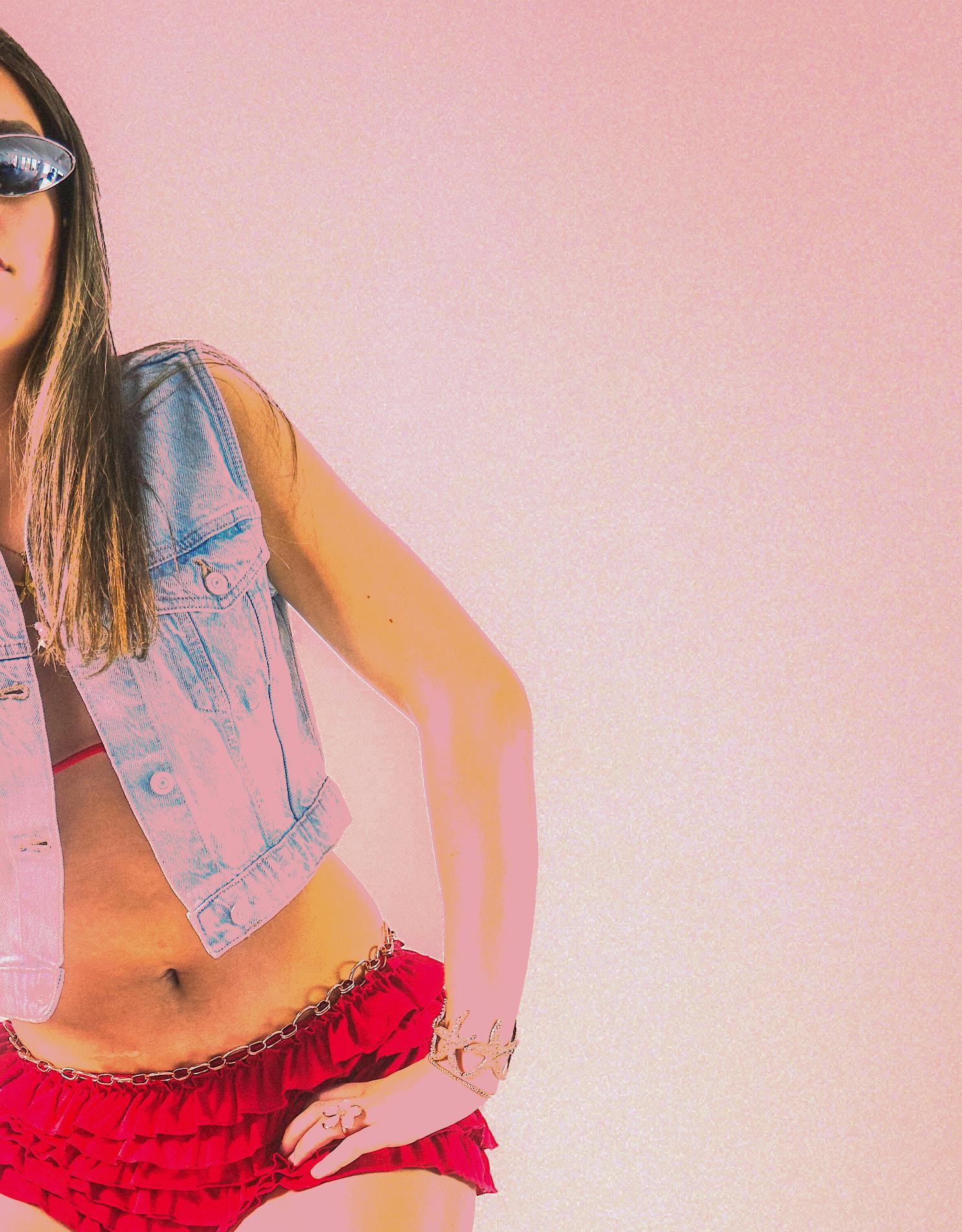
The theme of my rebrand for Azur Ibiza is rooted in bold ’90s nostalgia, reimagined through a modern, authentic lens. I wanted to channel the carefree energy, individuality, and vibrant style of the decade, drawing inspiration from iconic pop culture, beach glamour, and fashion editorials of the time. This rebrand explores the versatility of swimwear, showing how it can move effortlessly from sunny beach days to electric nightlife, while still staying true to the raw, natural beauty that defines Azur Ibiza. I focused on real textures, minimal editing, and expressive styling to reflect the brand’s values of inclusivity, transparency, and empowerment. Every detail, from the creative direction to the makeup and photography was carefully considered and personally executed, making this campaign not only a celebration of ’90s style but also a true reflection of my creative vision and identity.
My vision is to bring back bikinis that are not only cute, fun, and stylish but also carry a deeper meaning. I want to create swimwear that makes people feel confident and joyful, while also telling a story or representing something meaningful, whether it’s empowerment, body positivity, cultural heritage, or environmental awareness. These bikinis aren’t just about looking good; they’re about expressing individuality and values in a playful, vibrant way. It’s about blending fashion with purpose, so every piece feels personal and inspiring, encouraging wearers to embrace their unique style and stories.
I chose this idea because it introduces an authentic sense of craftsmanship into the brand, which aligns perfectly with Azur Ibiza’s identity as a slow, sustainable fashion label. By incorporating handcrafted elements like beading and embroidery, the brand gains a new layer of uniqueness and storytelling that sets it apart from other so-called “sustainable” fashion brands, many of which lack a distinctive personality beyond their eco-friendly claims. This approach not only reinforces Azur Ibiza’s commitment to sustainability but also elevates its aesthetic and emotional appeal, giving it a richer identity that celebrates both conscious fashion and artistic detail.
THE IDEA...WHY?
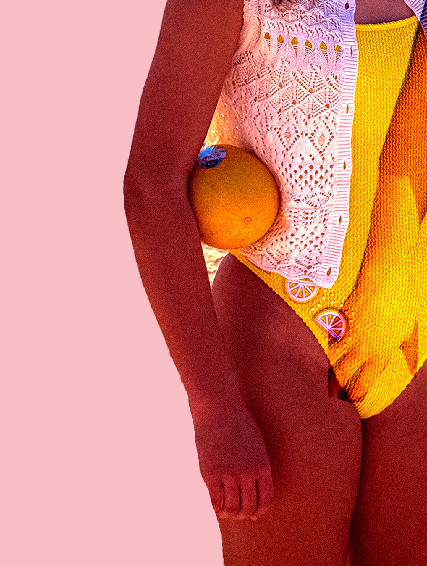
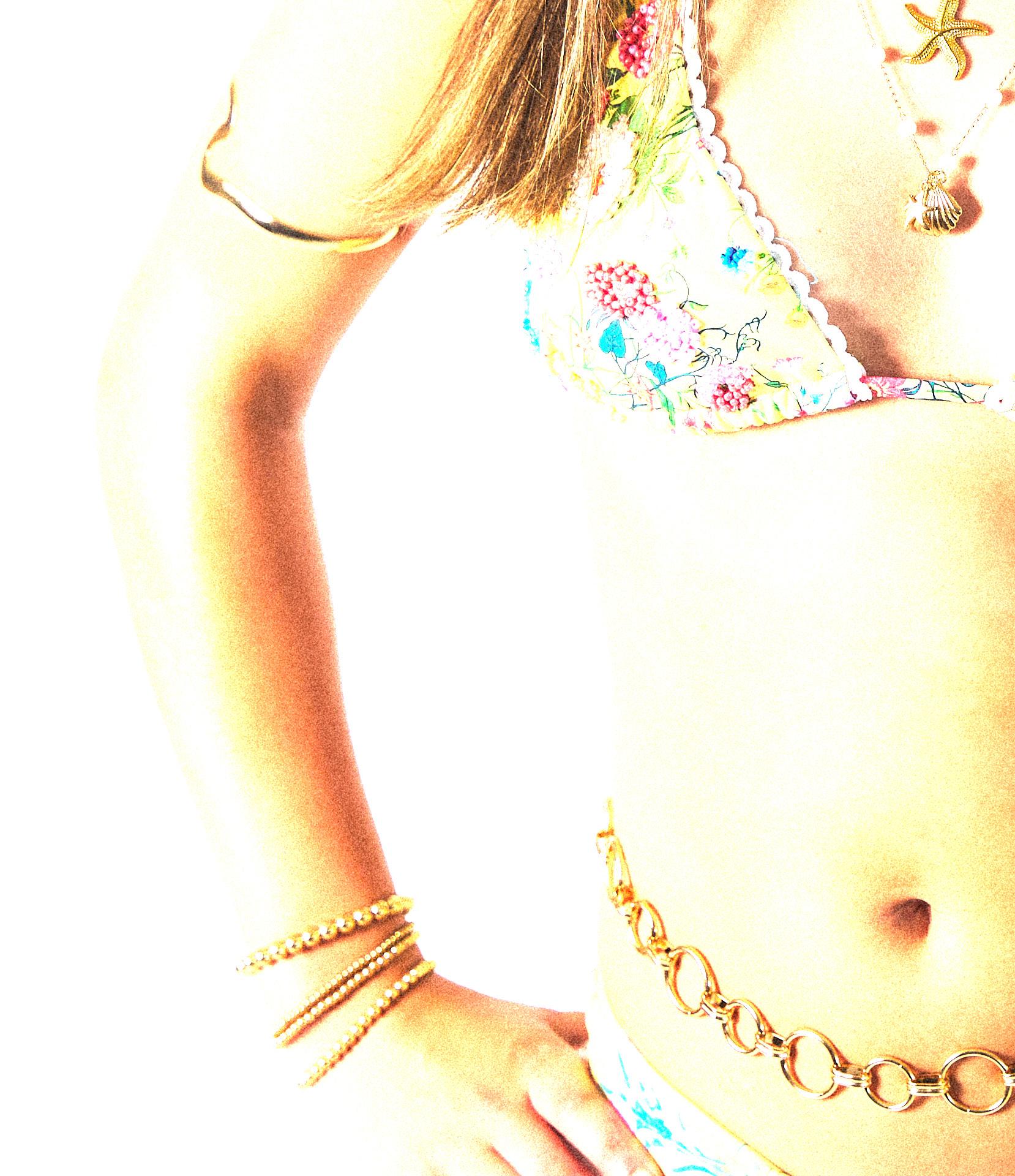
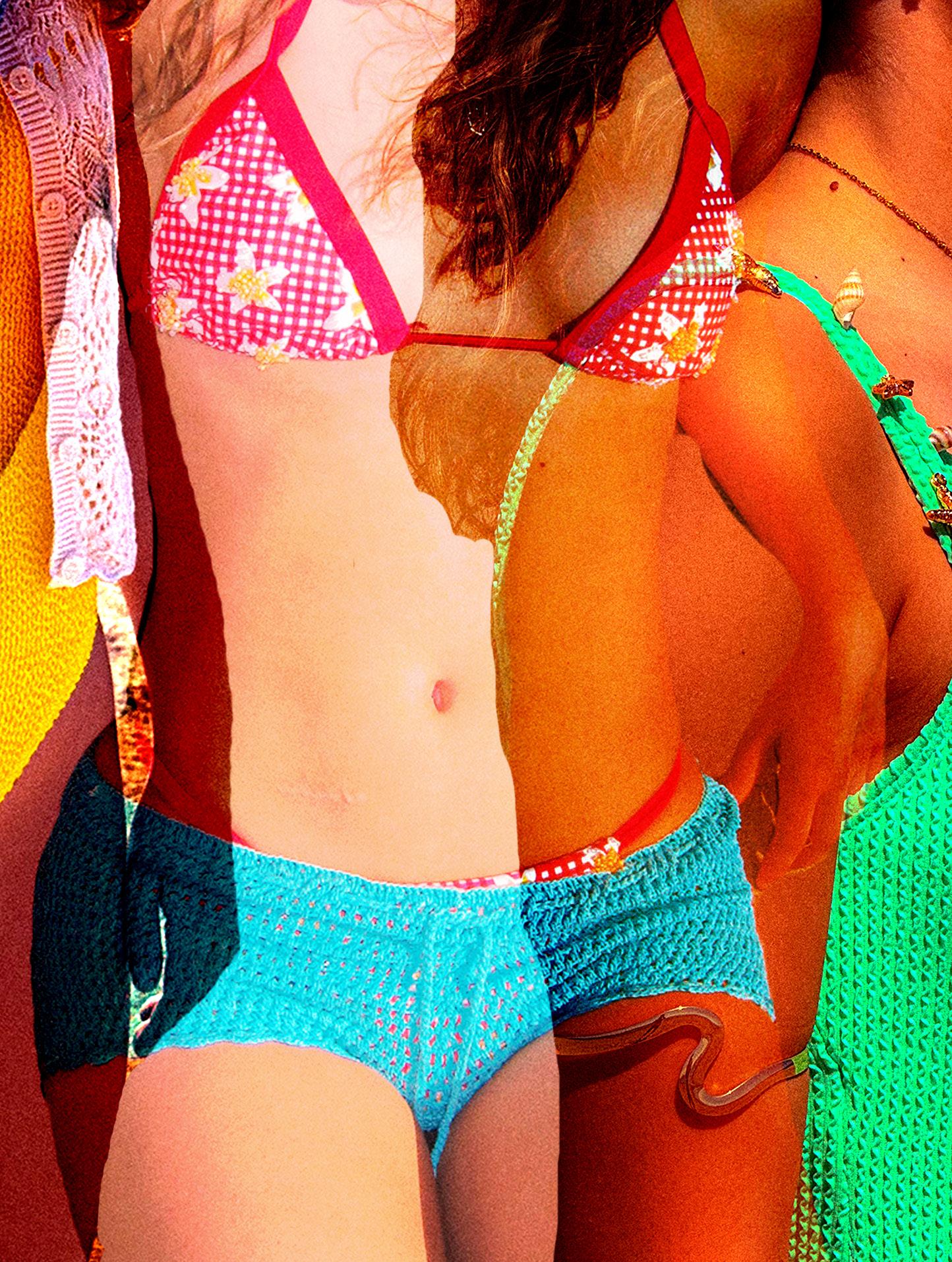
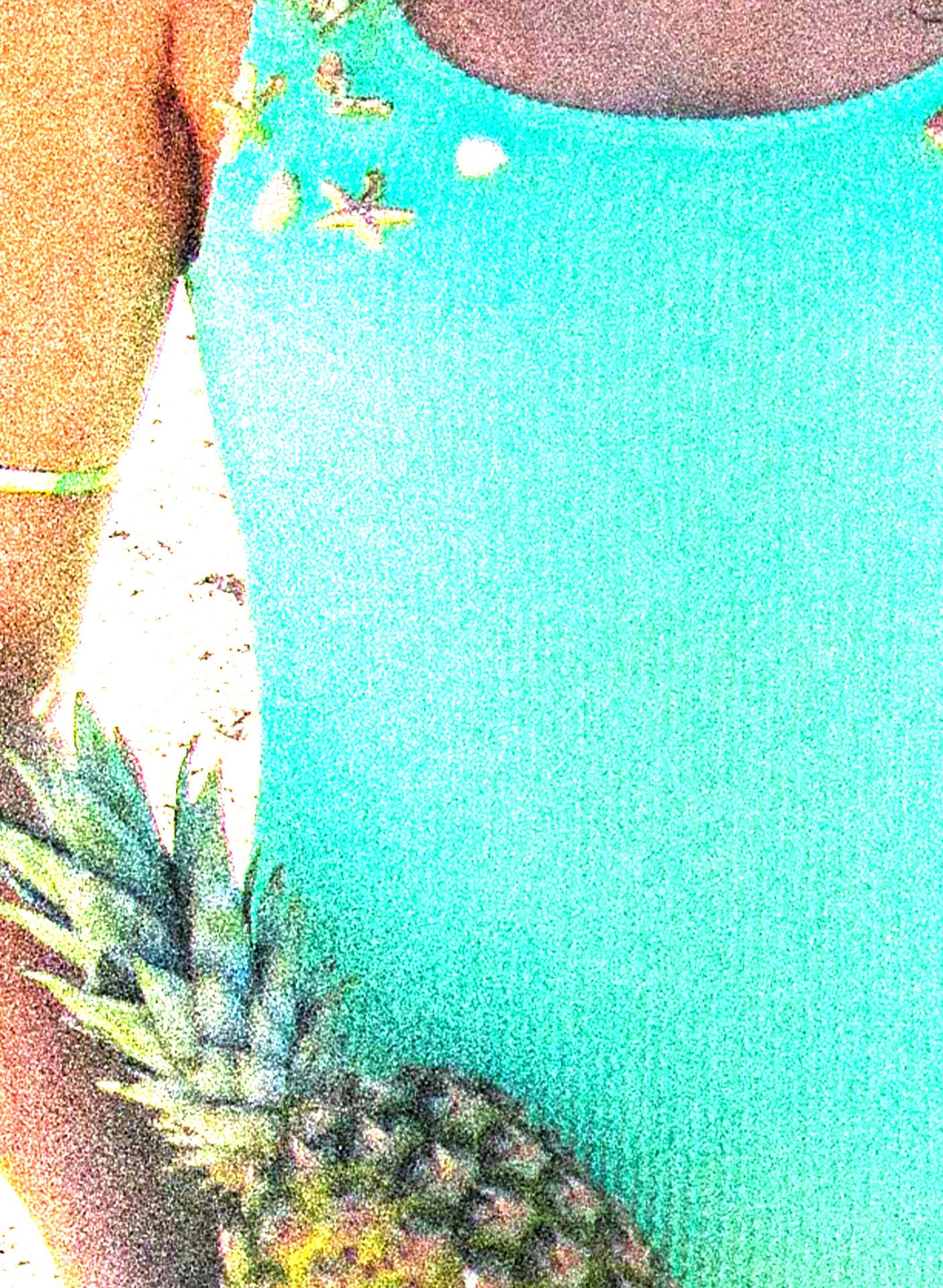
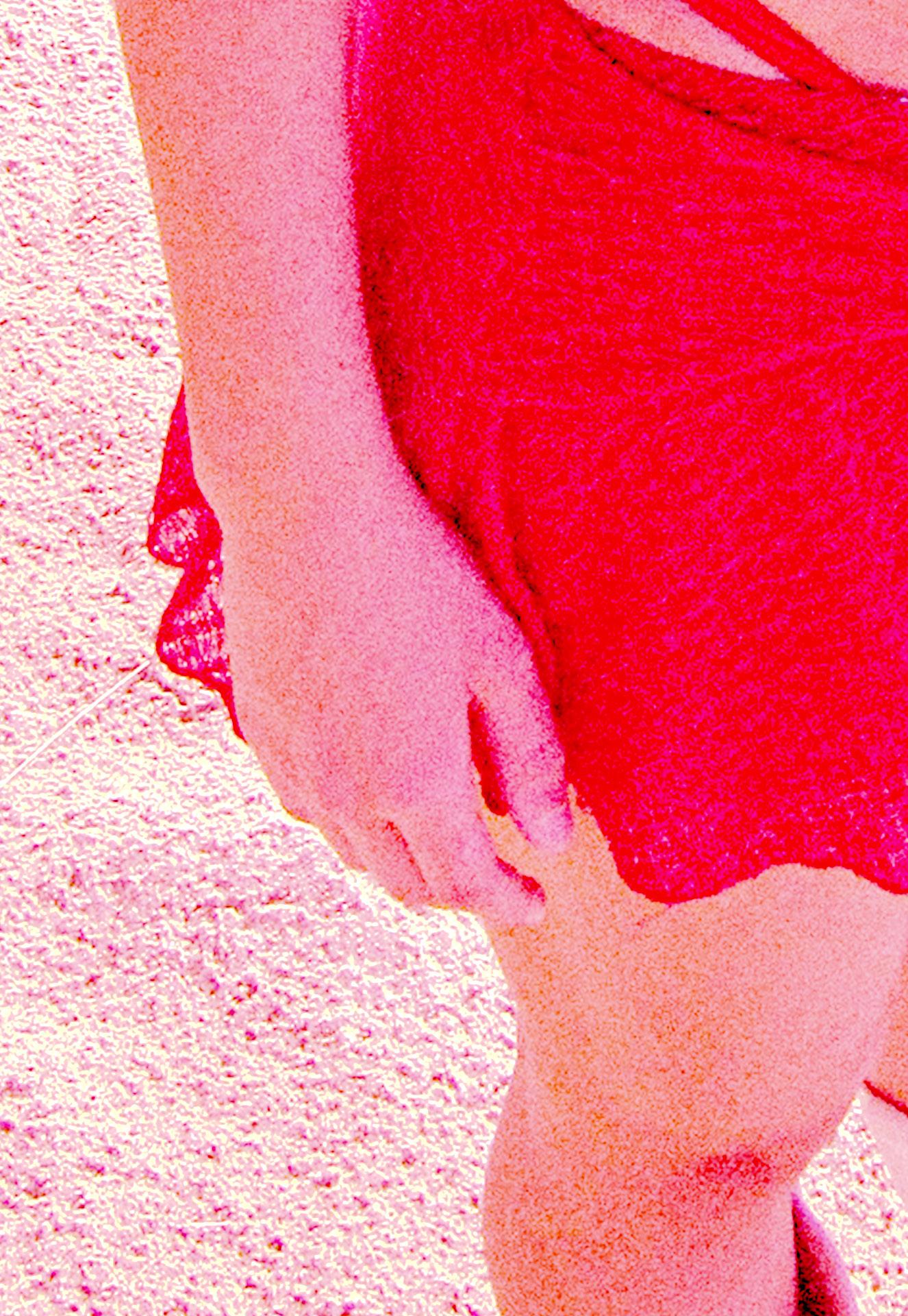
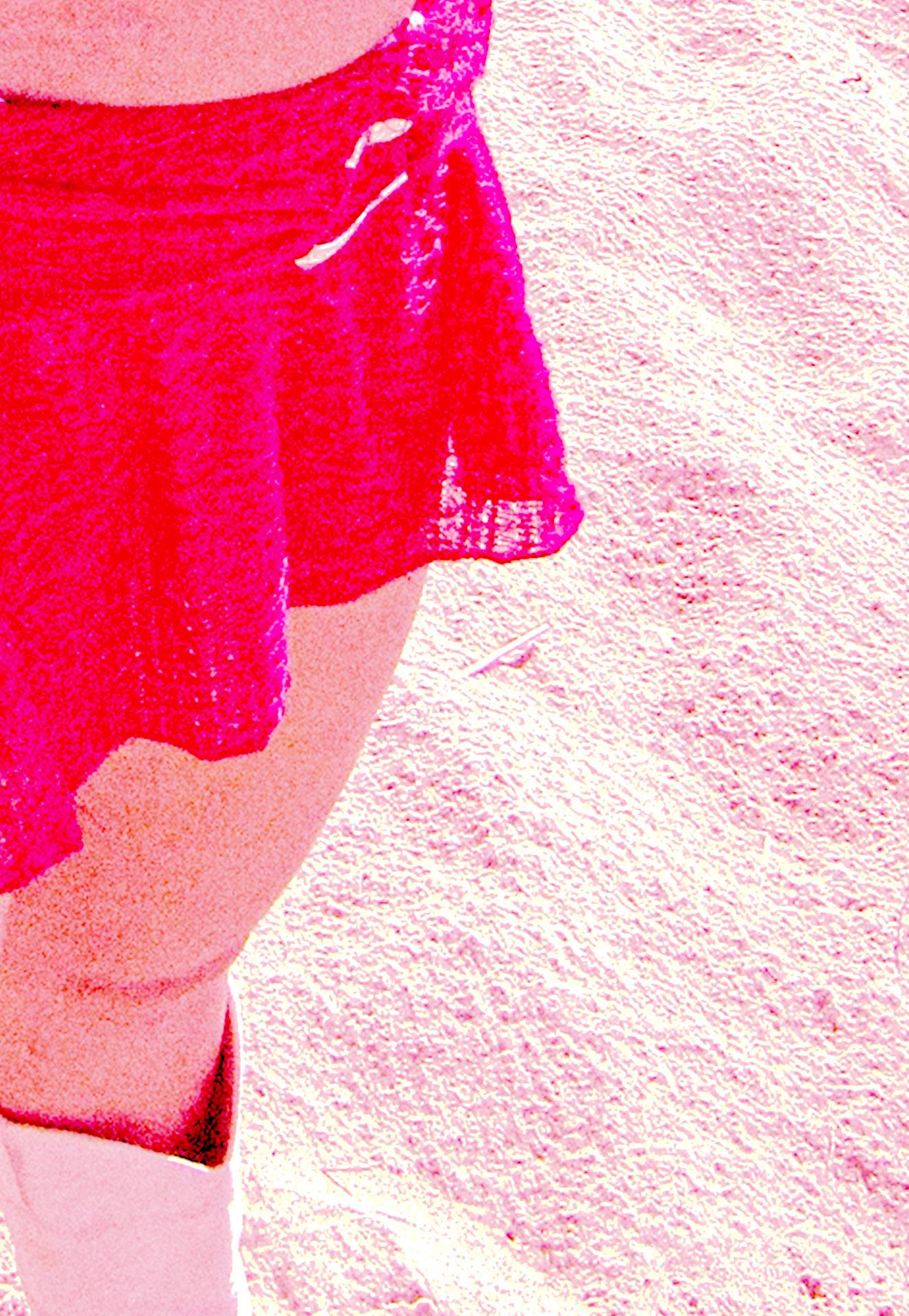
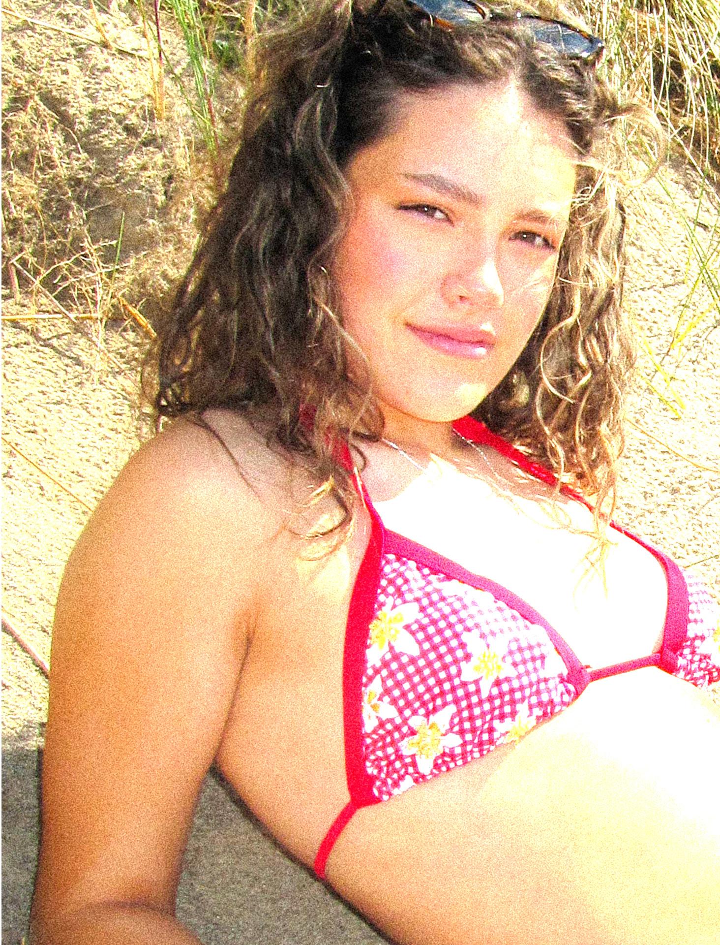
As Azur Ibiza is already a vibrant and colourful brand, it was important to retain that core identity throughout the rebranding process. The brand’s bold and energetic aesthetic is a key part of what makes it stand out, so my updated colour palette remained largely true to the original. Bright, eye-catching colours such as yellow, green, red, and pink were essential to keep the lively spirit of the brand alive. When it came to incorporating beading and embroidery, I ensured that the colours chosen for these elements complemented the swimwear designs. To maintain visual harmony and cohesion across the collection, I focused on basic but impactful shades like pink, yellow, and blue, colours that not only reflect the playful vibe of the brand but also blend seamlessly with the existing palette. This careful selection helped strengthen the overall identity of the rebrand while keeping it fresh and exciting.
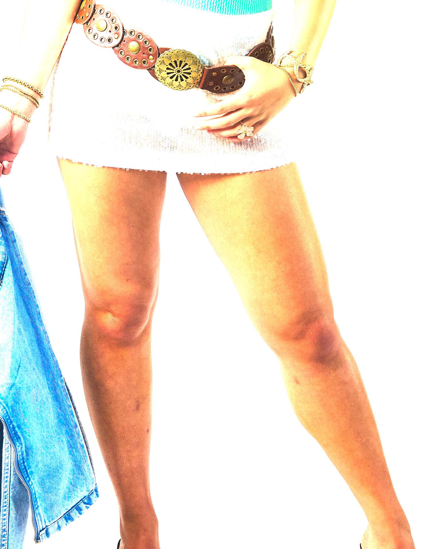
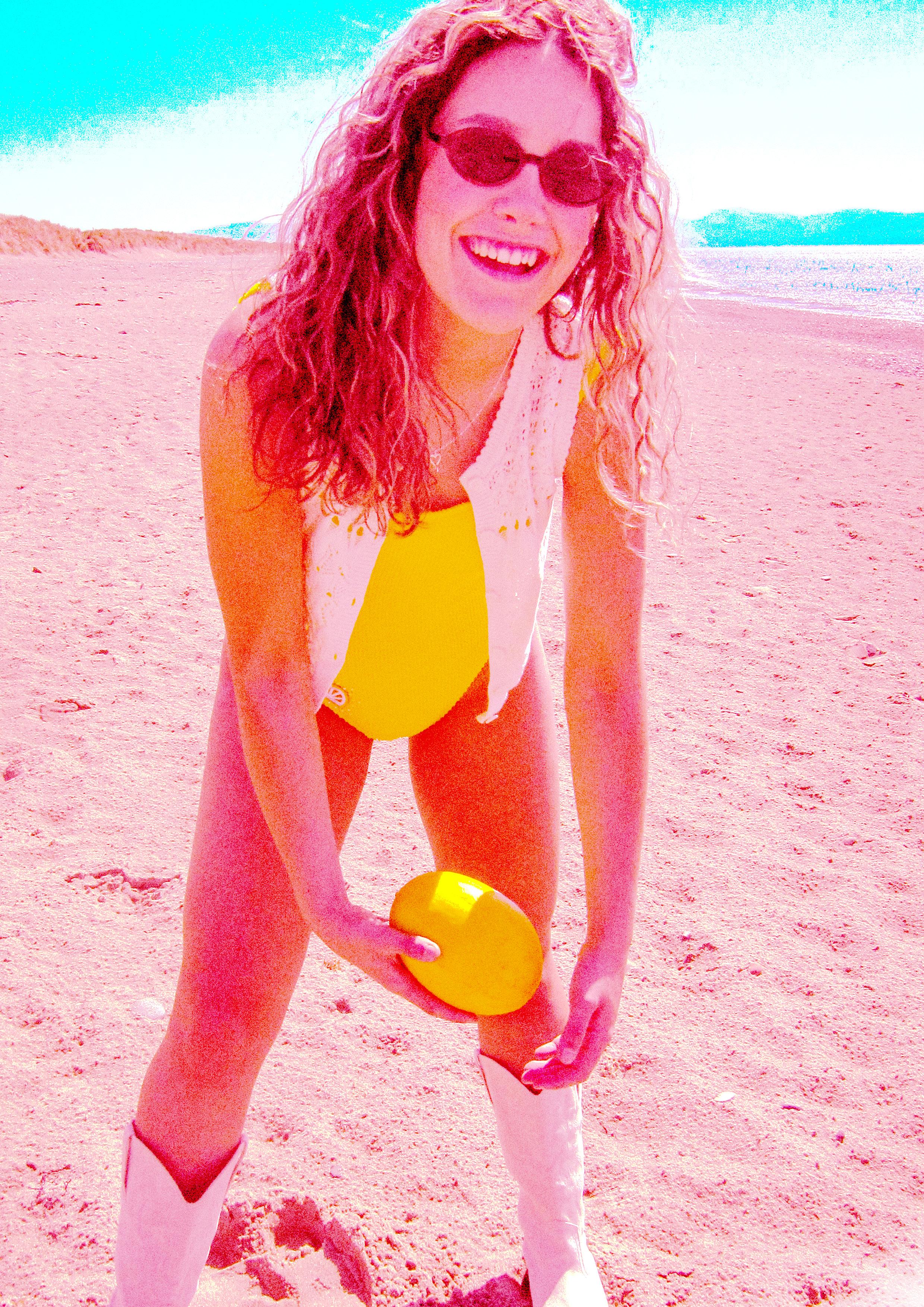
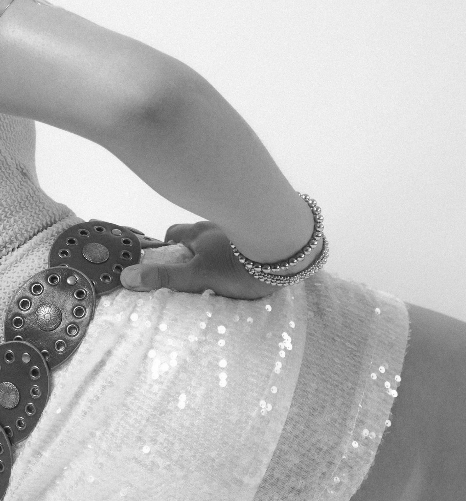
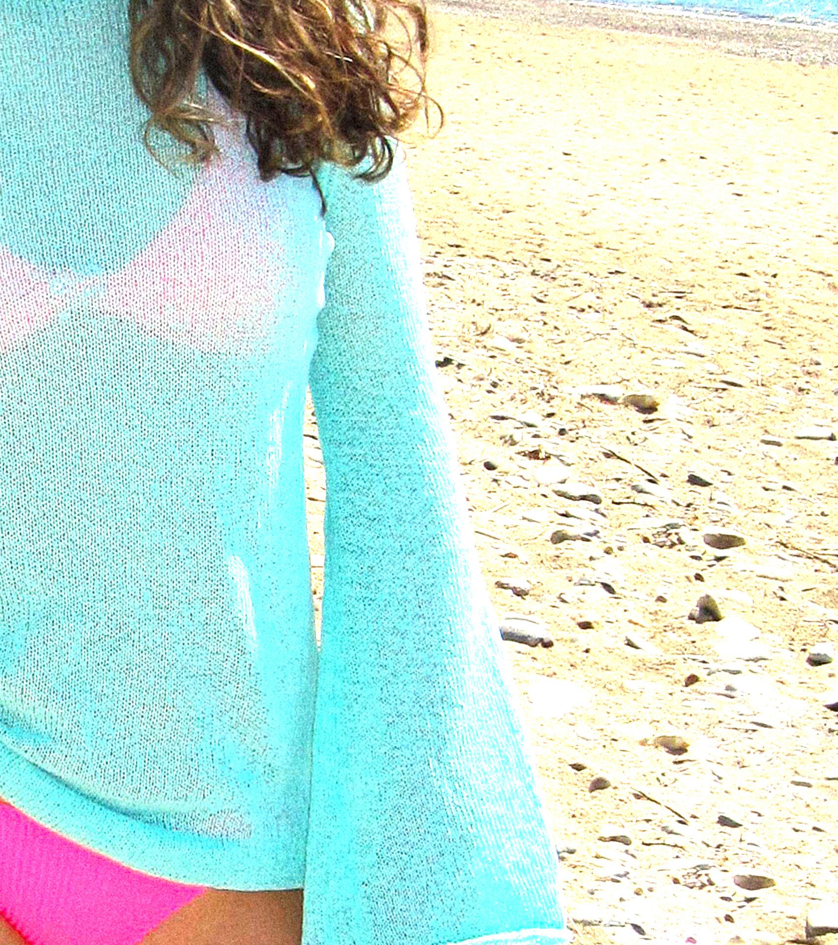
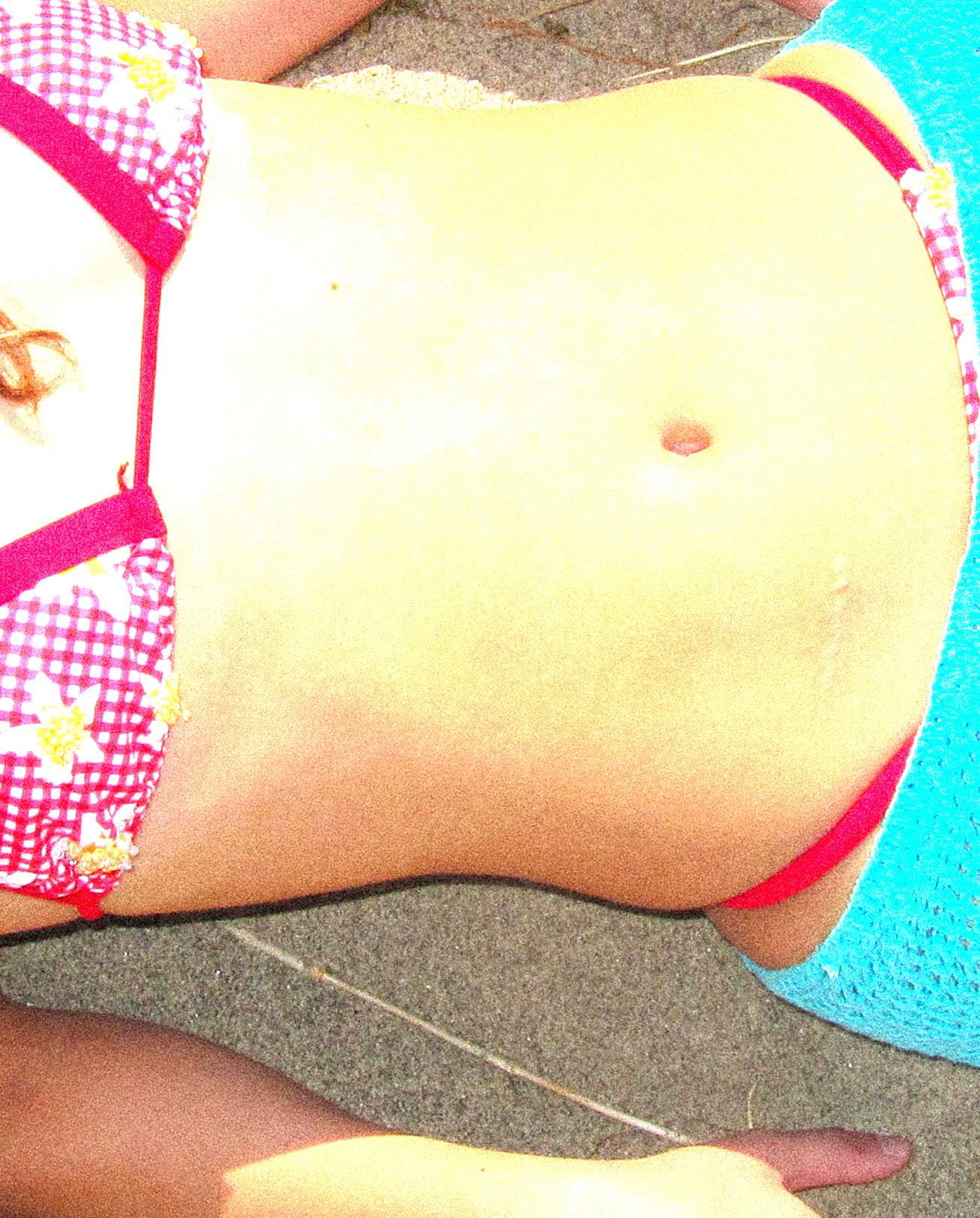
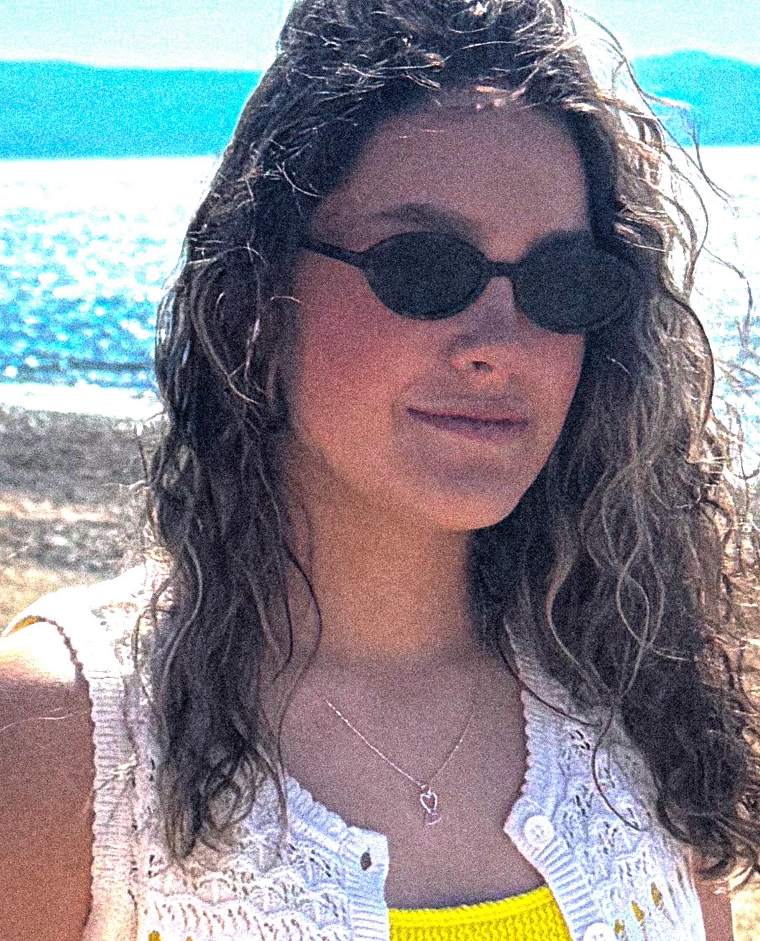
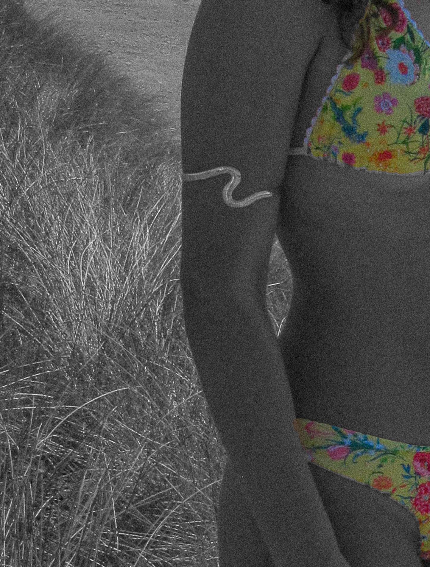
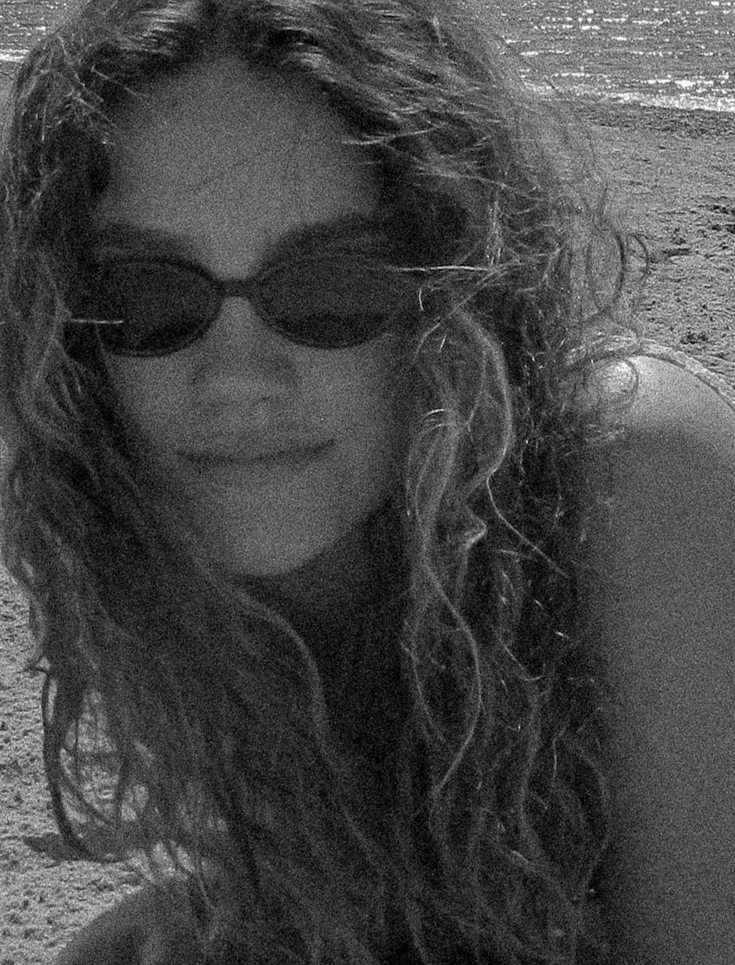
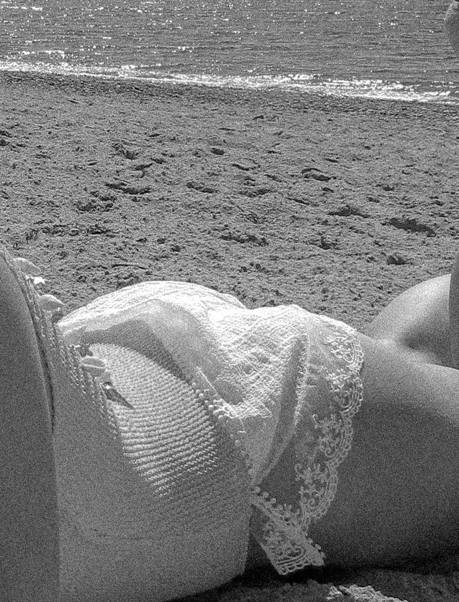
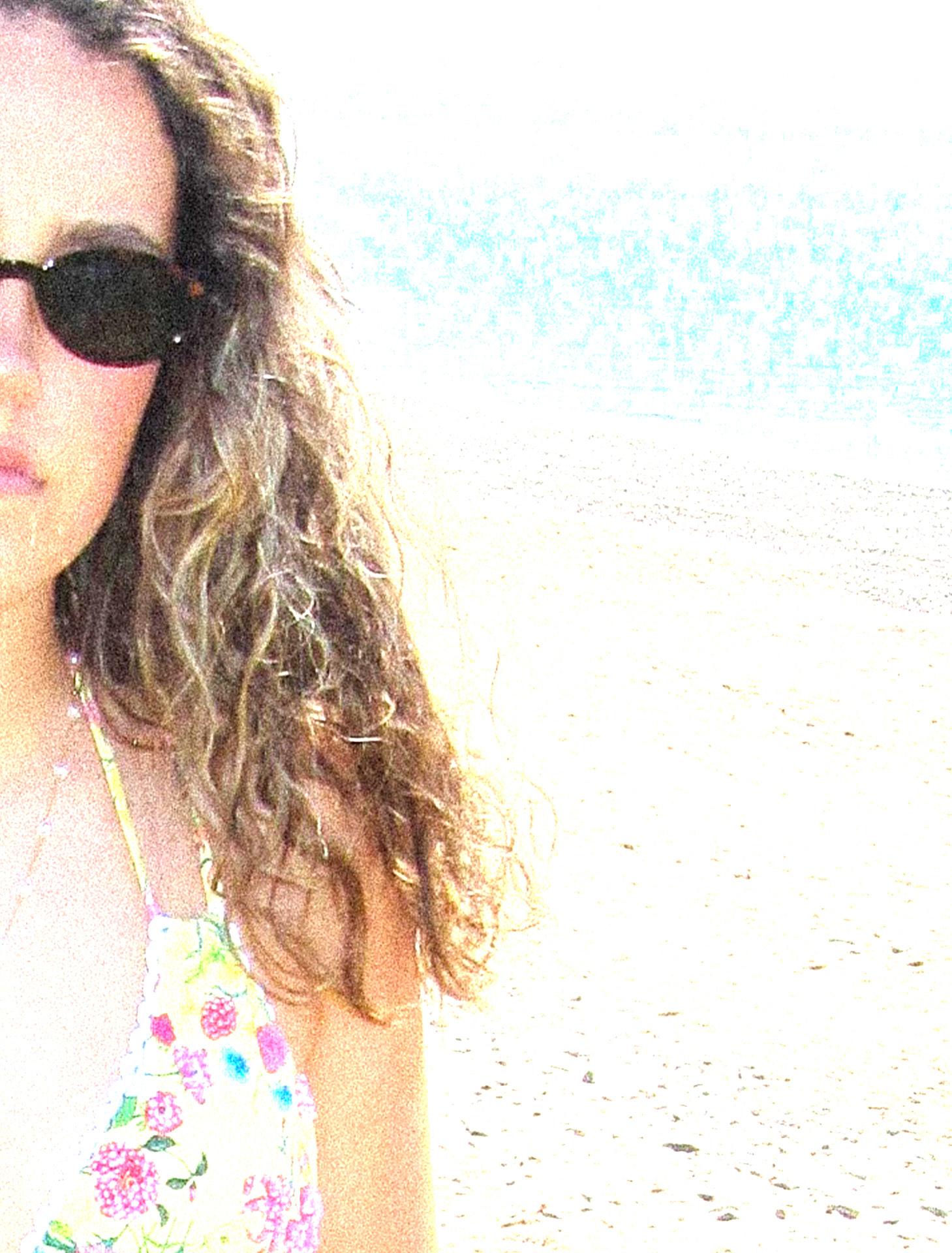
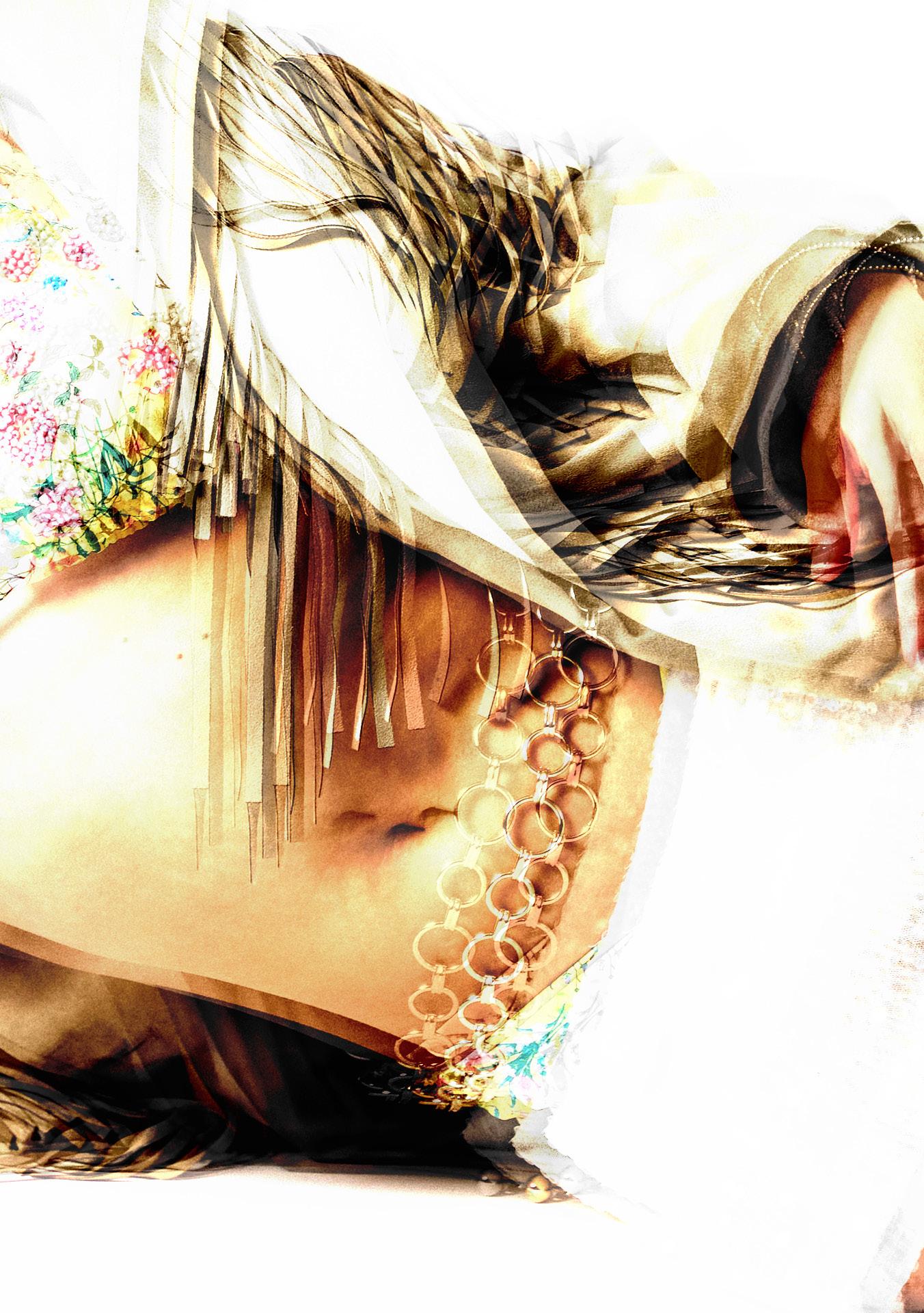
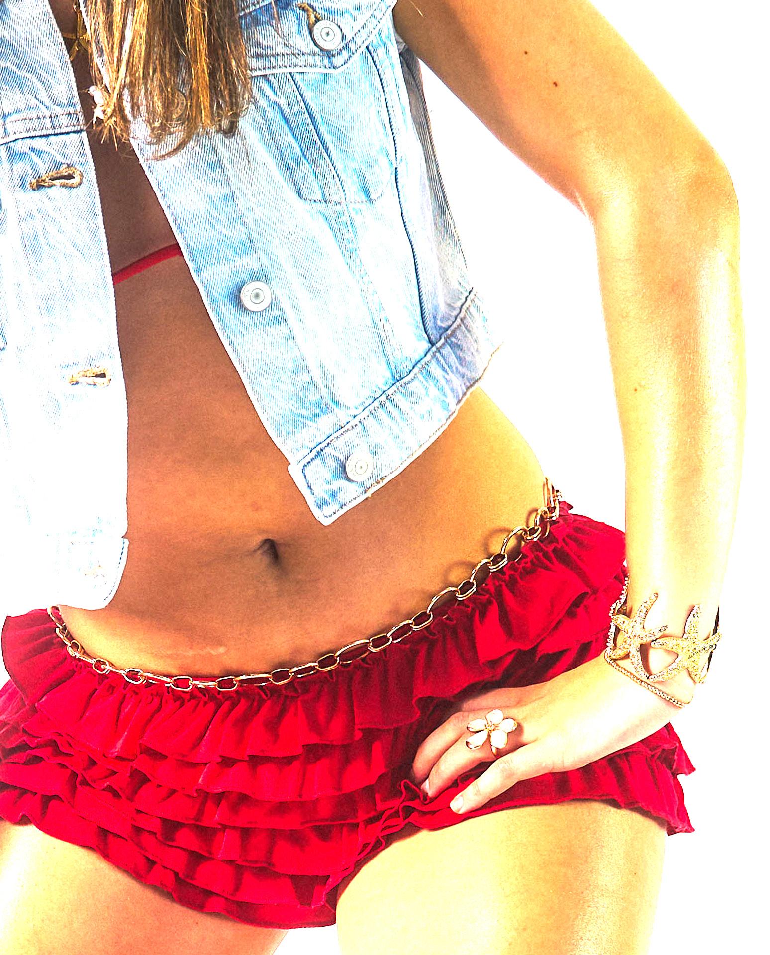
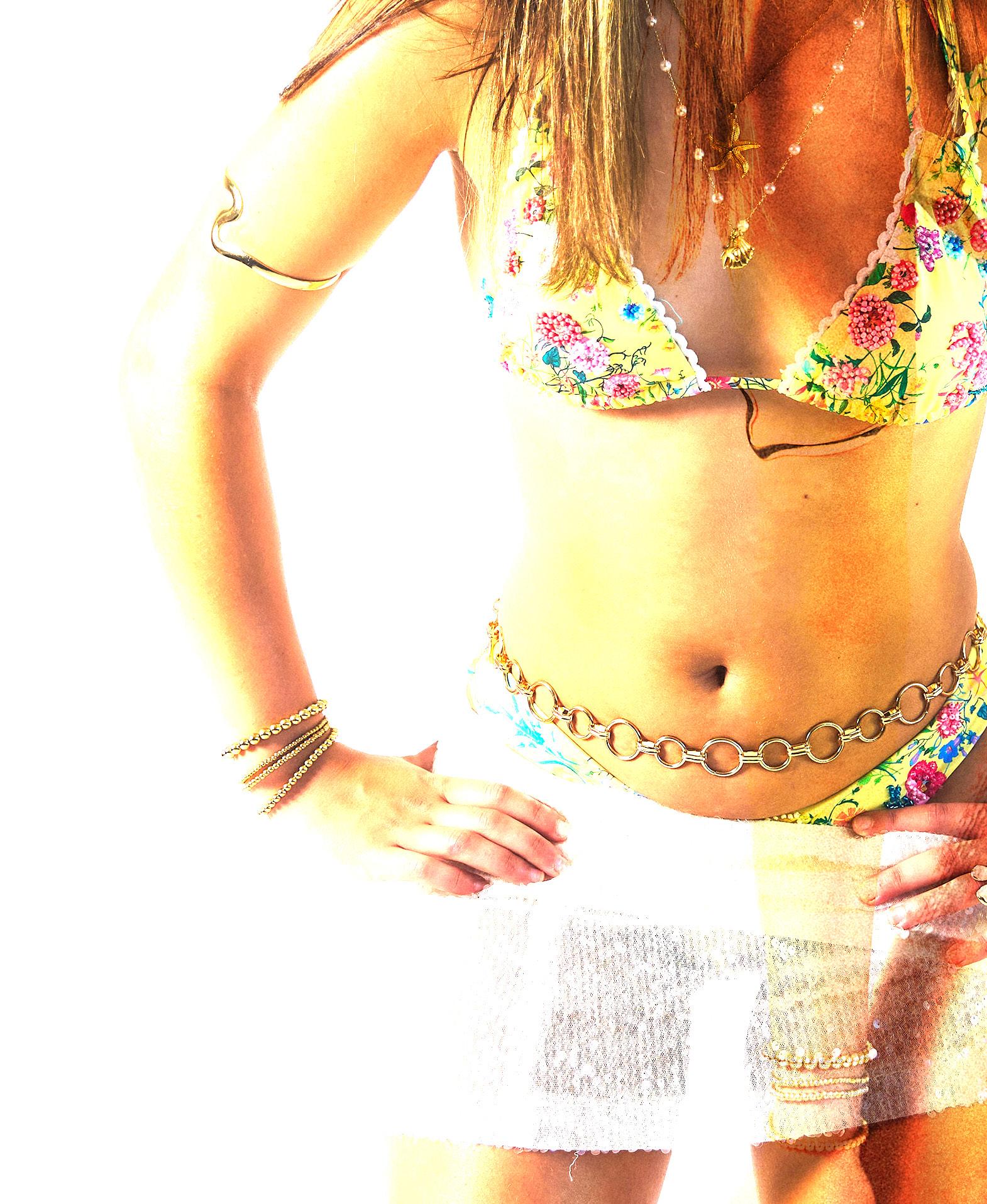
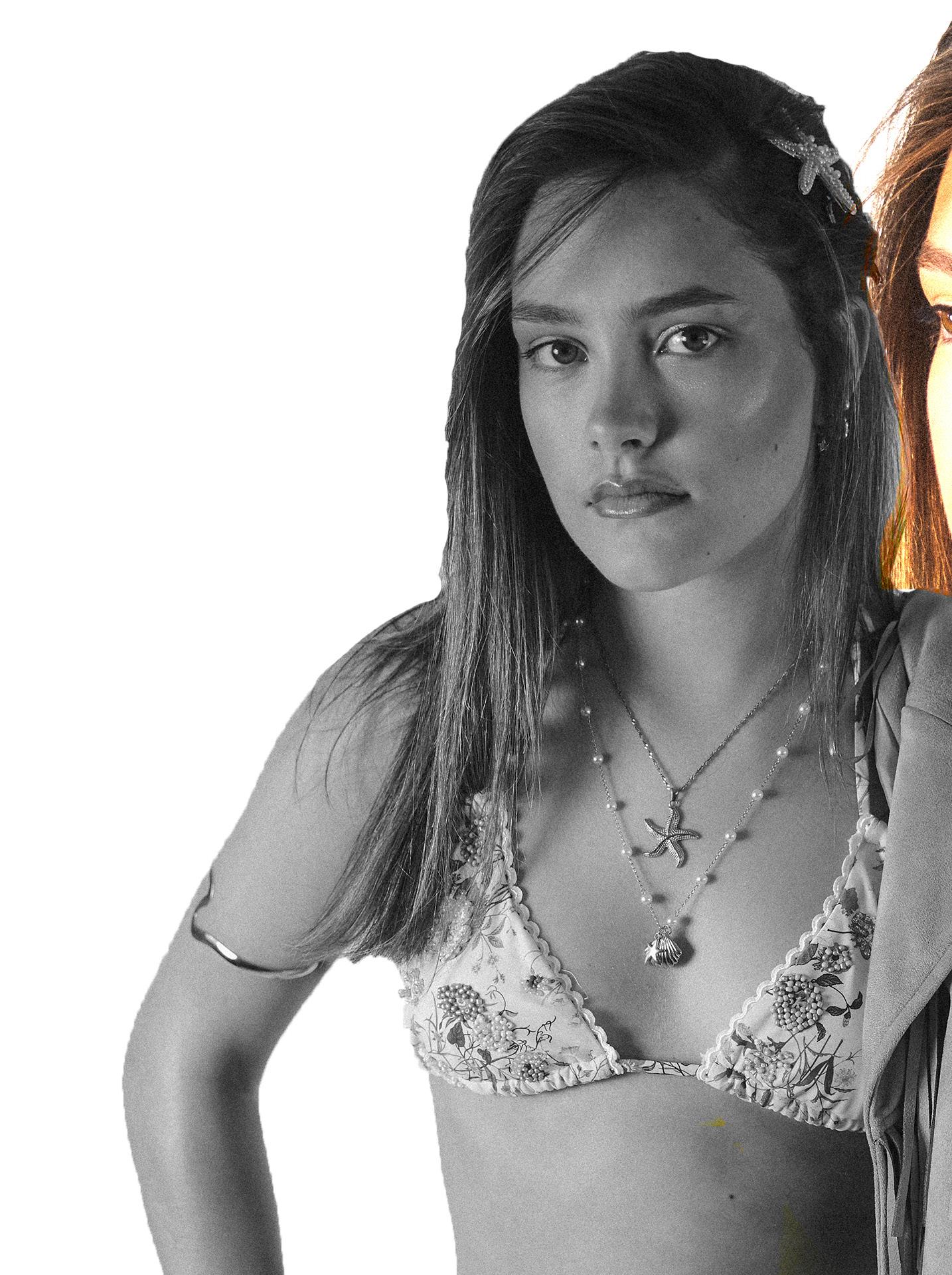
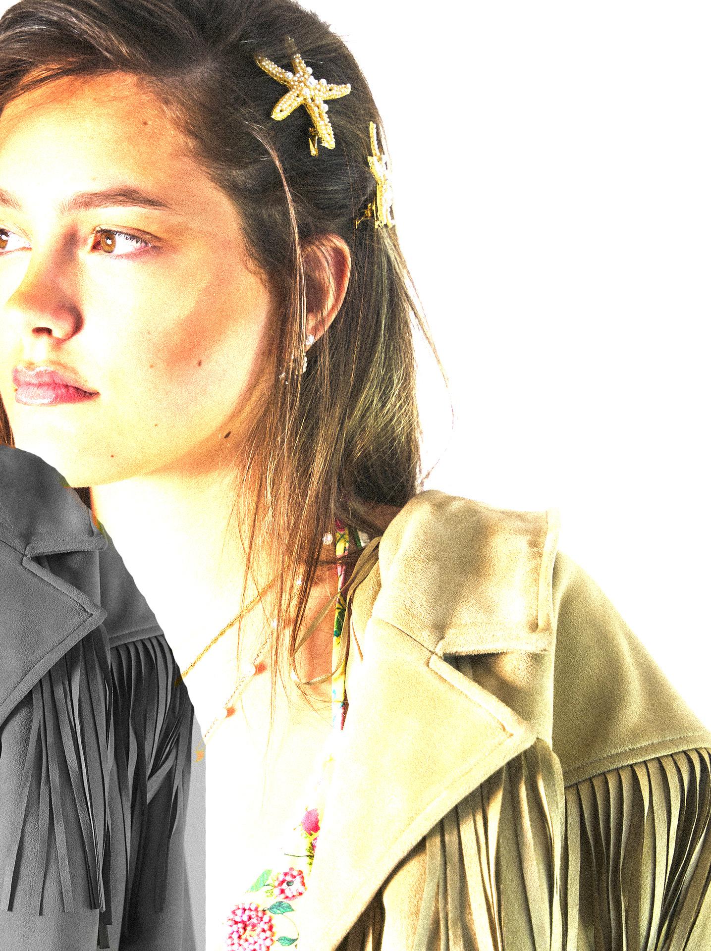
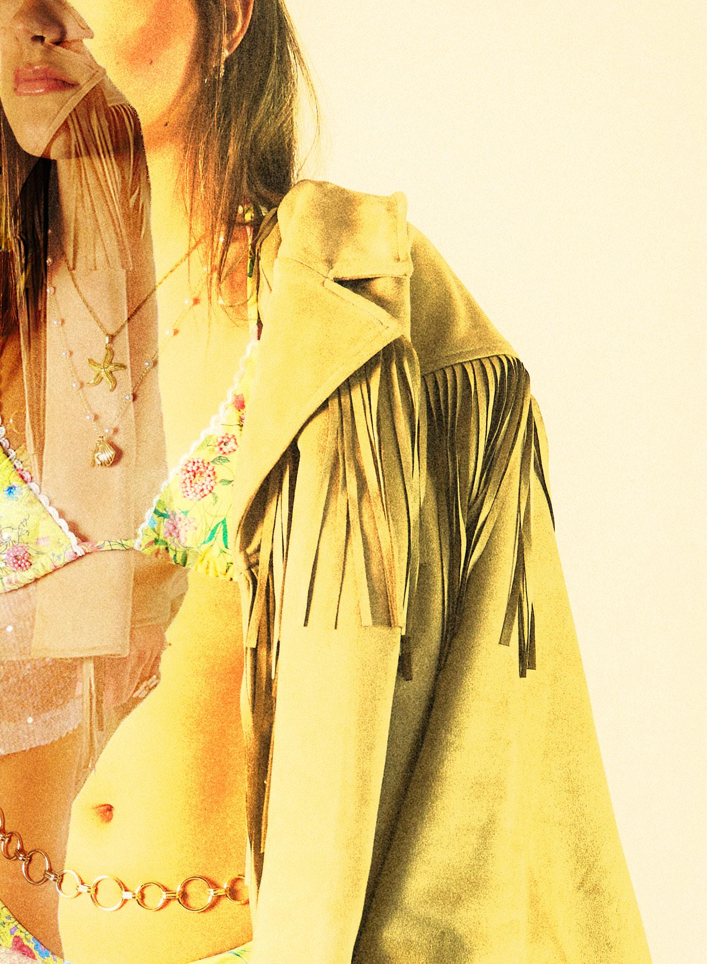
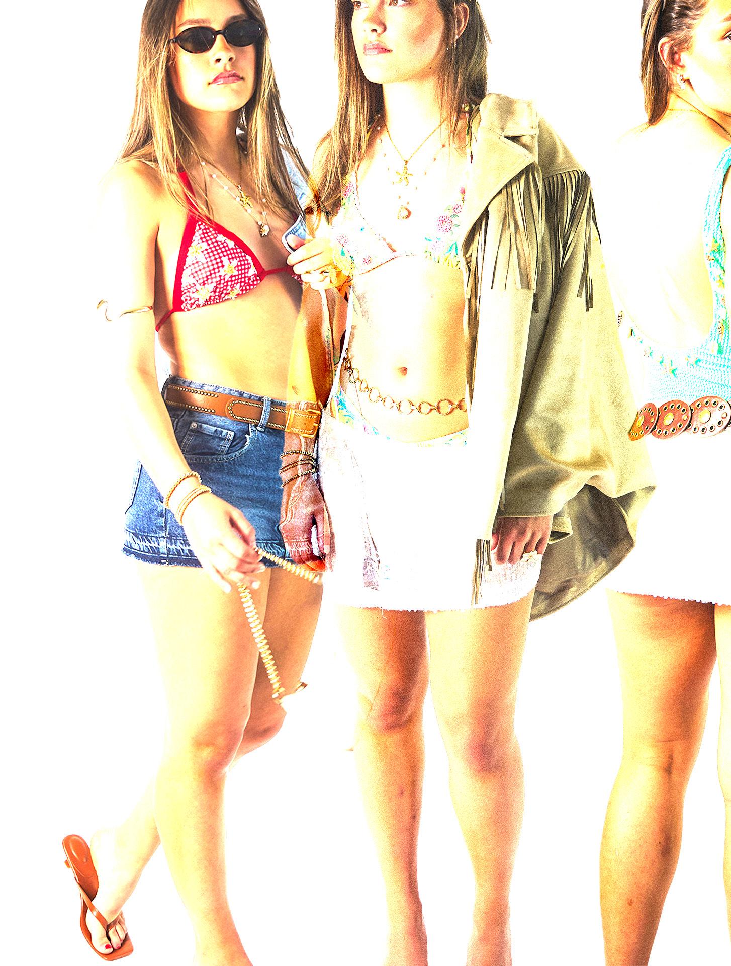
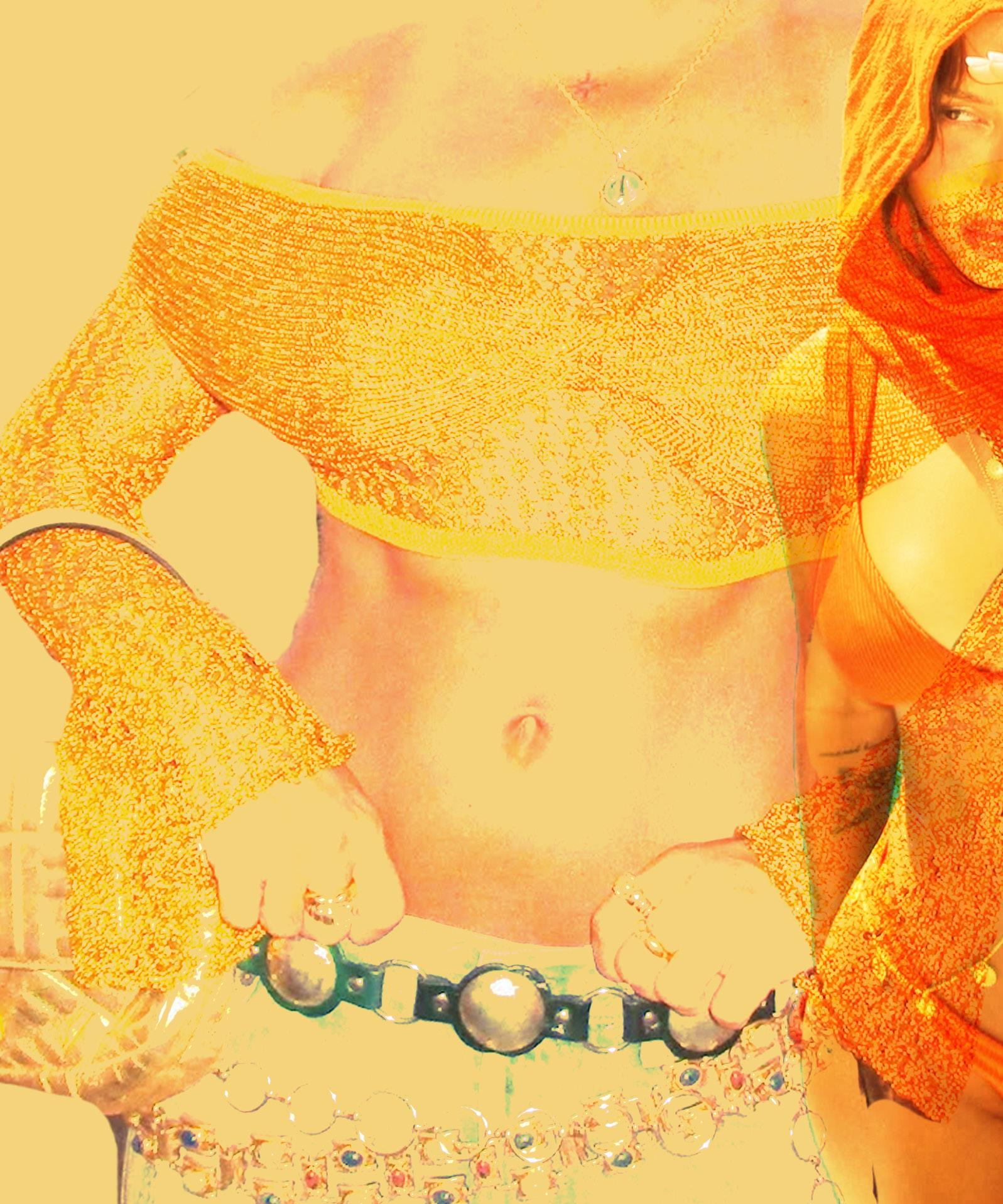
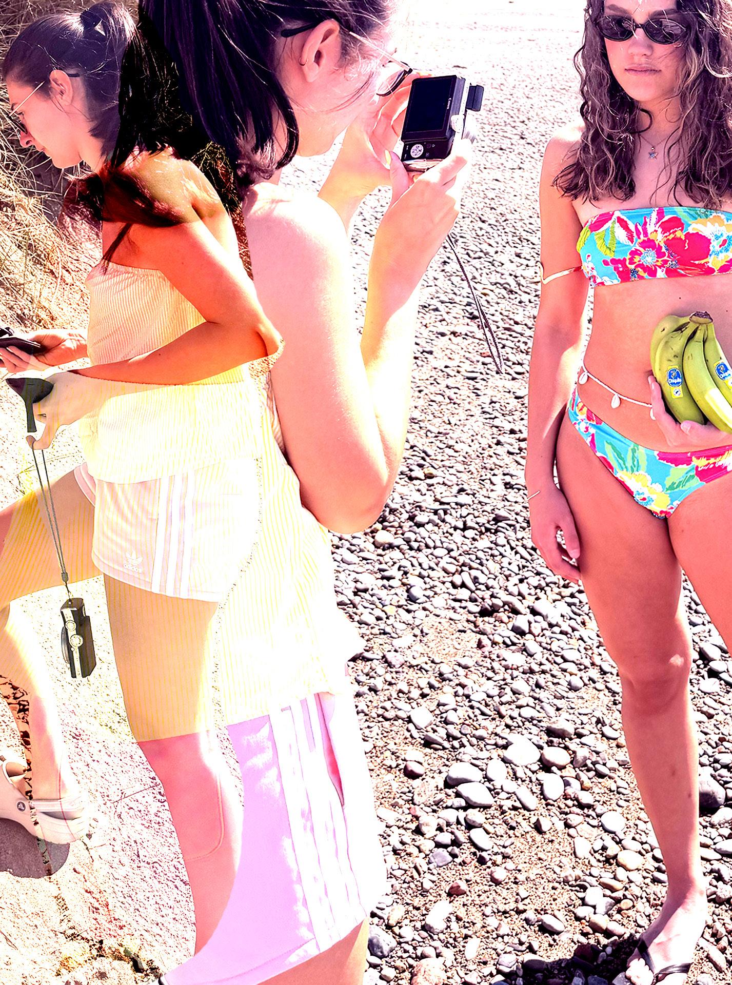
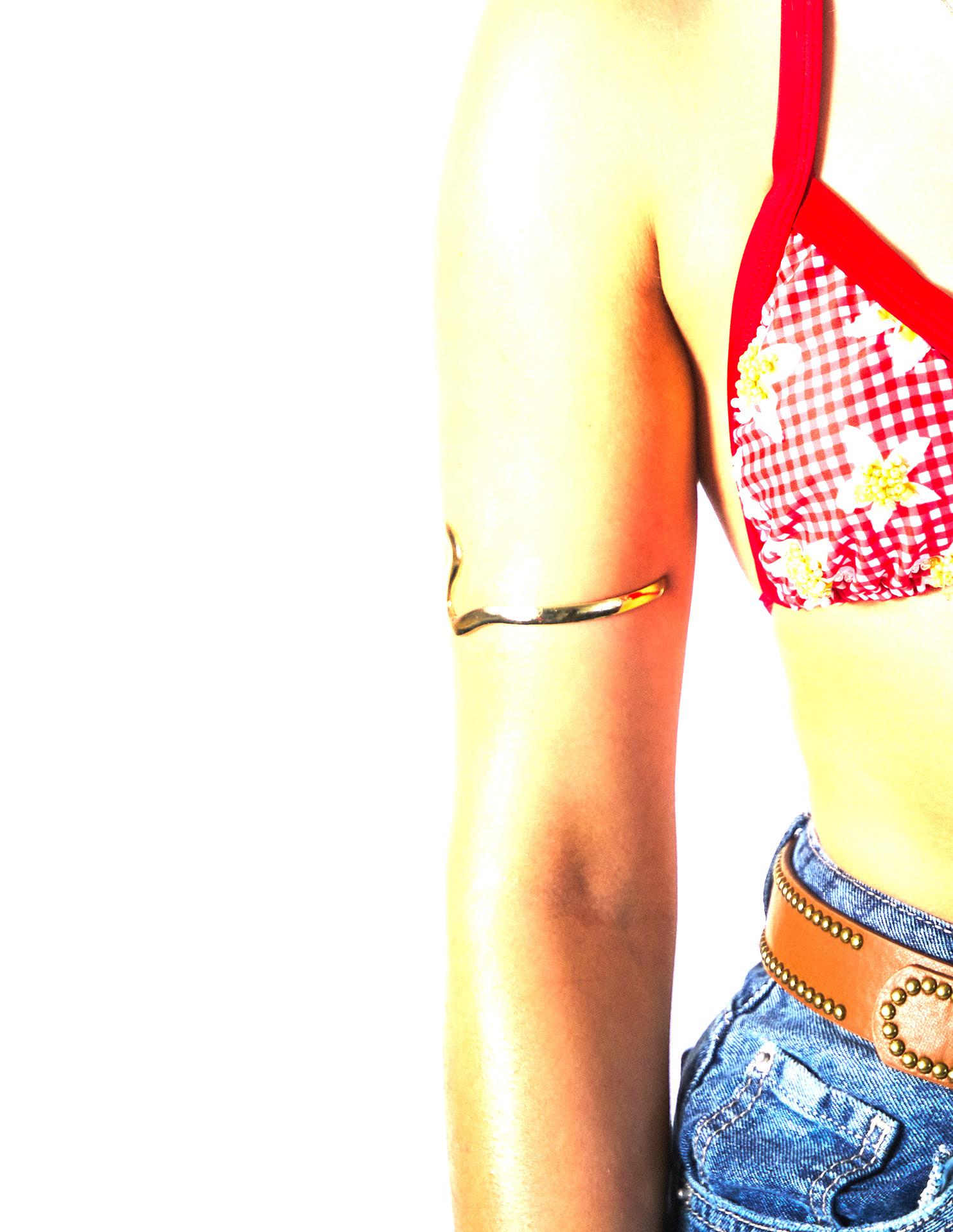
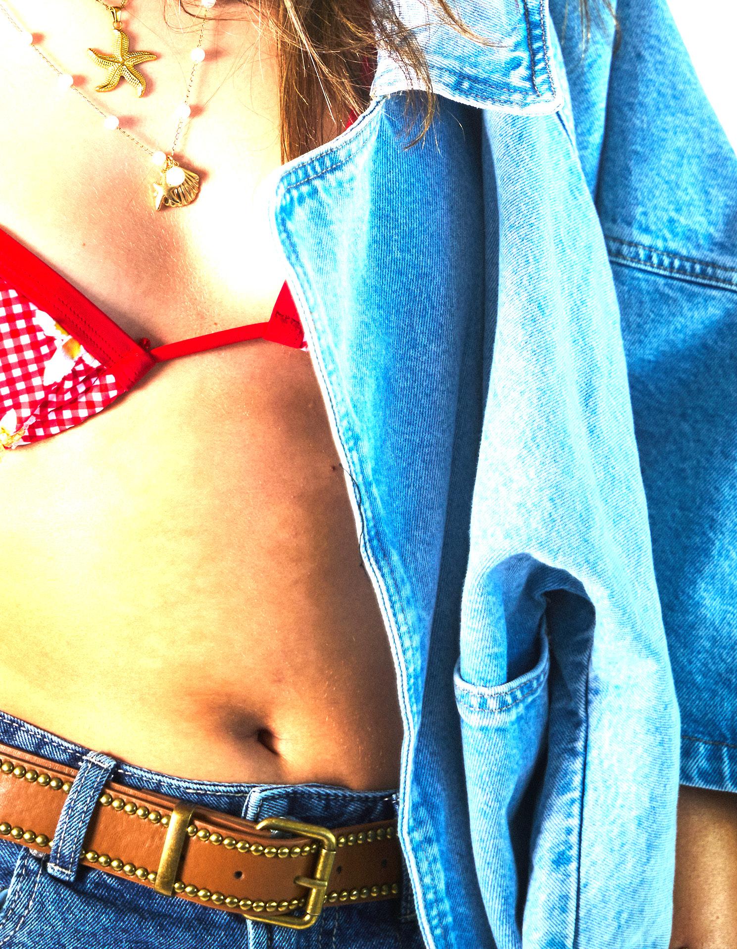
For my location shoot, I aimed to keep the poses feeling very natural and relaxed, while also drawing inspiration from the 90s beach aesthetic to give the images a nostalgic yet timeless feel. It was important to strike a balance between capturing the overall mood and ensuring the bikinis remained the focal point of the visuals. This required thoughtful planning and composition to make sure the swimwear was showcased in the best possible way. I incorporated a mix of close-up shots to highlight the finer details, such as the beading, embroidery, and textures, as well as dynamic, candid-style action shots of my model engaging in typical beach activities like sunbathing, walking along the shore, and lounging by the water. These natural moments helped reinforce the effortless, carefree vibe of the brand, while still maintaining a clear focus on the product.
Natural. Fun. 90’s. Beachy.
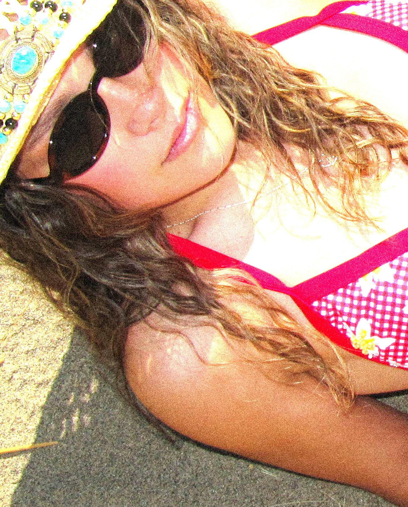
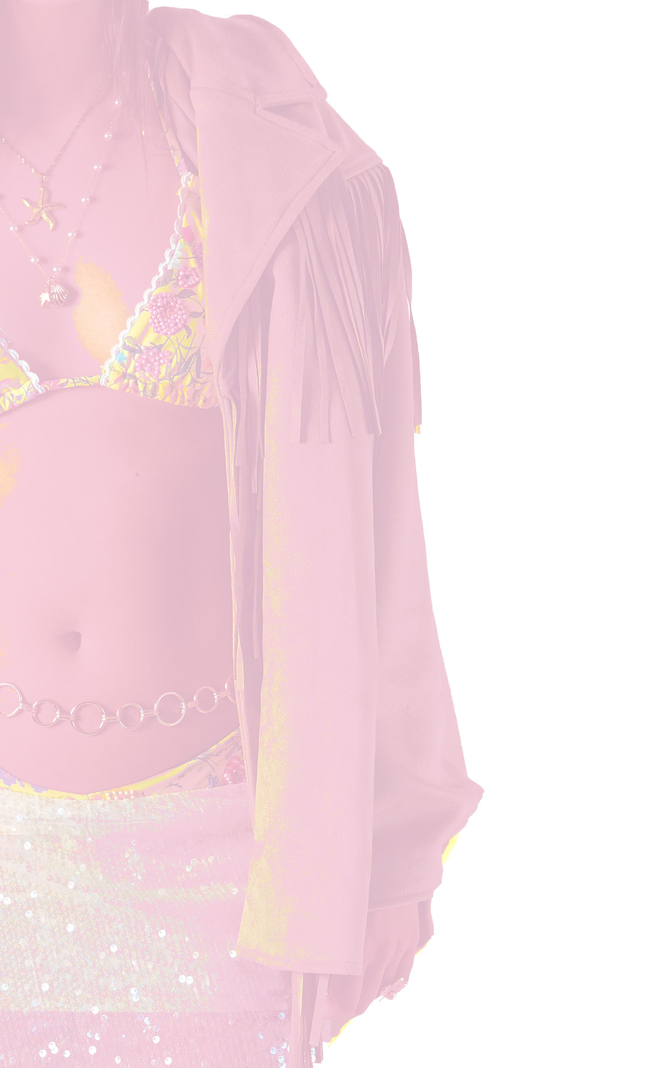
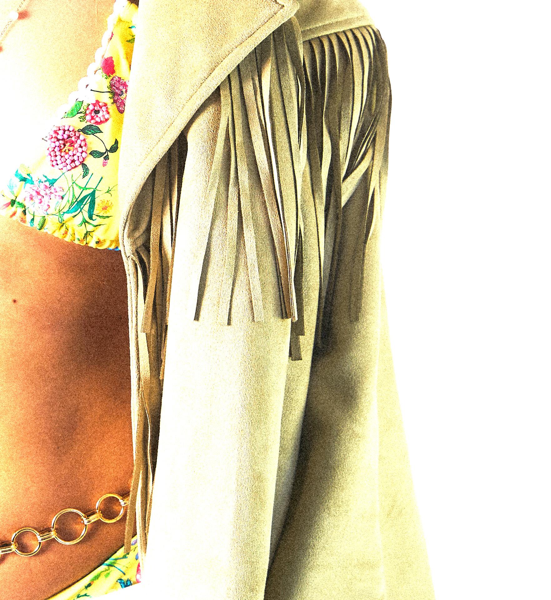
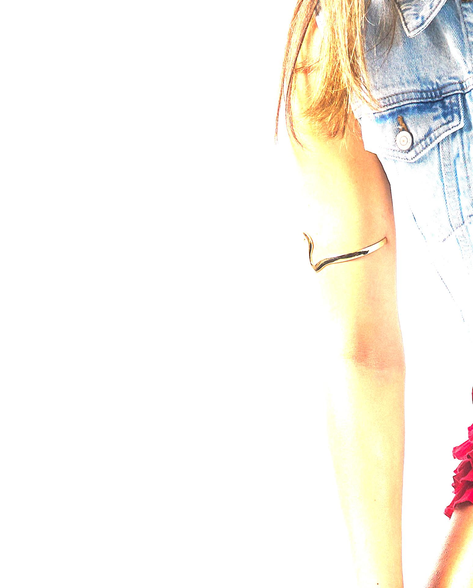
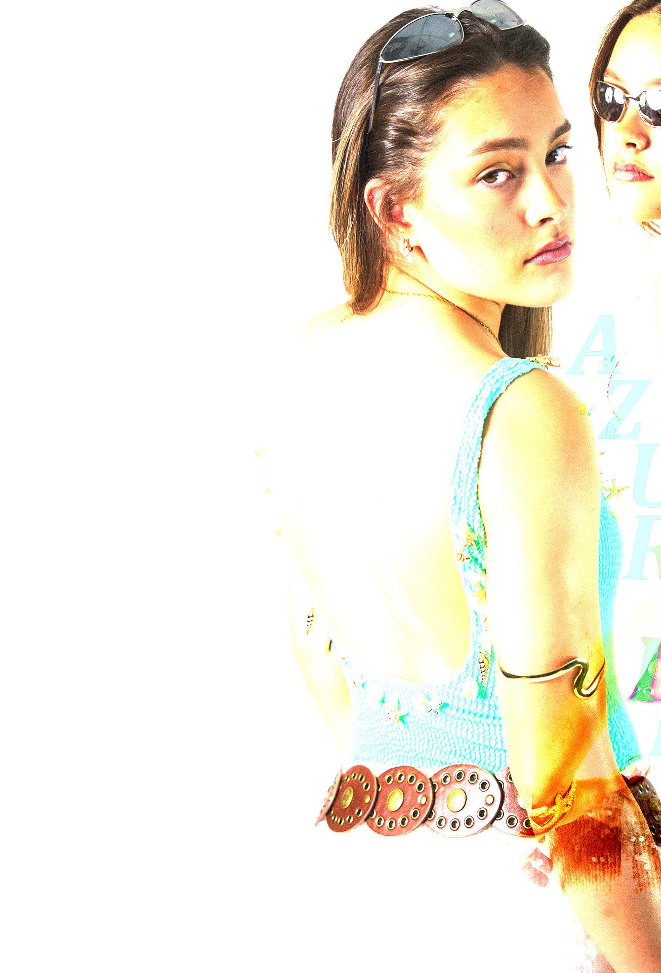
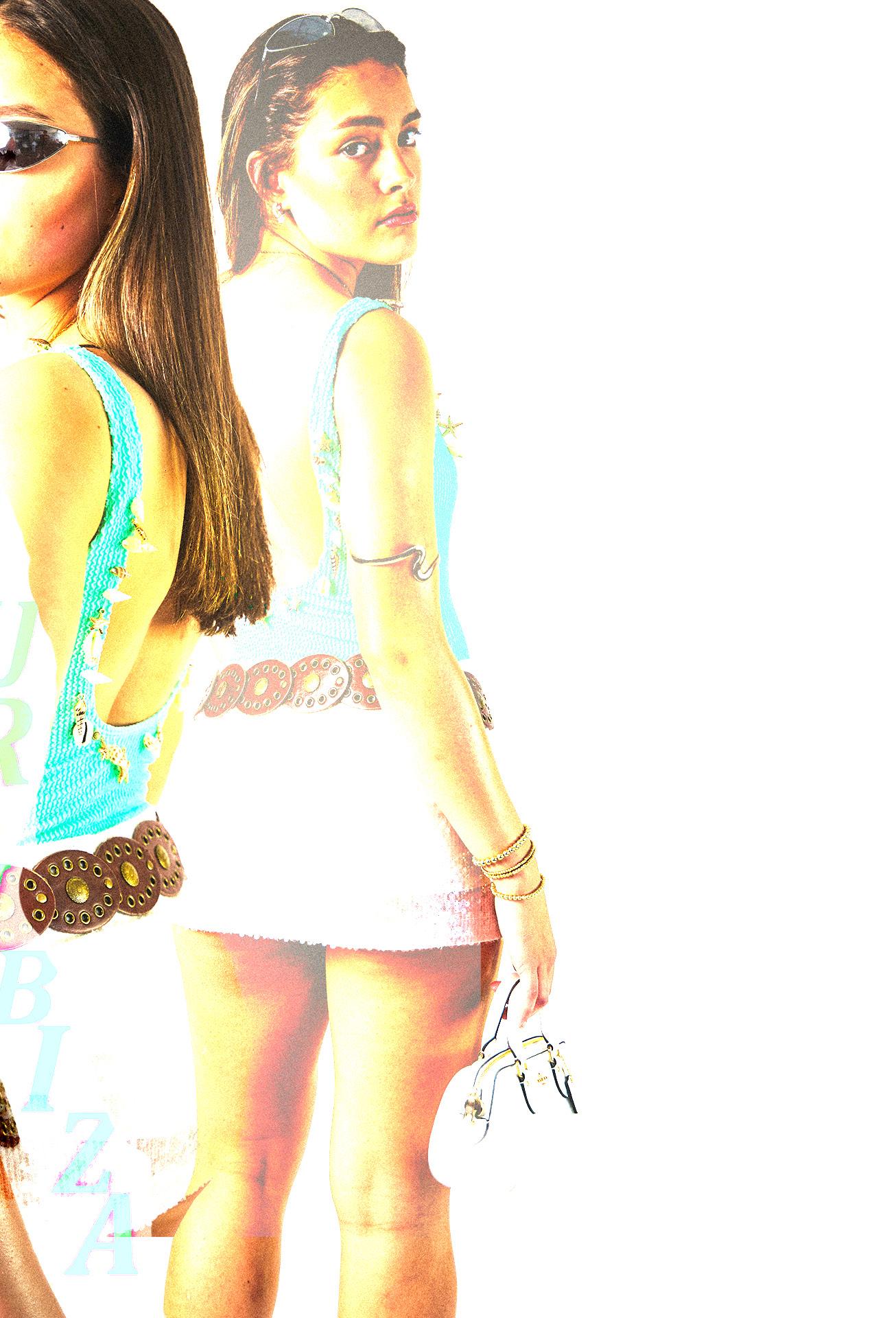
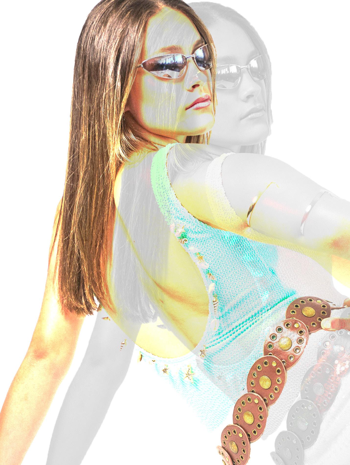
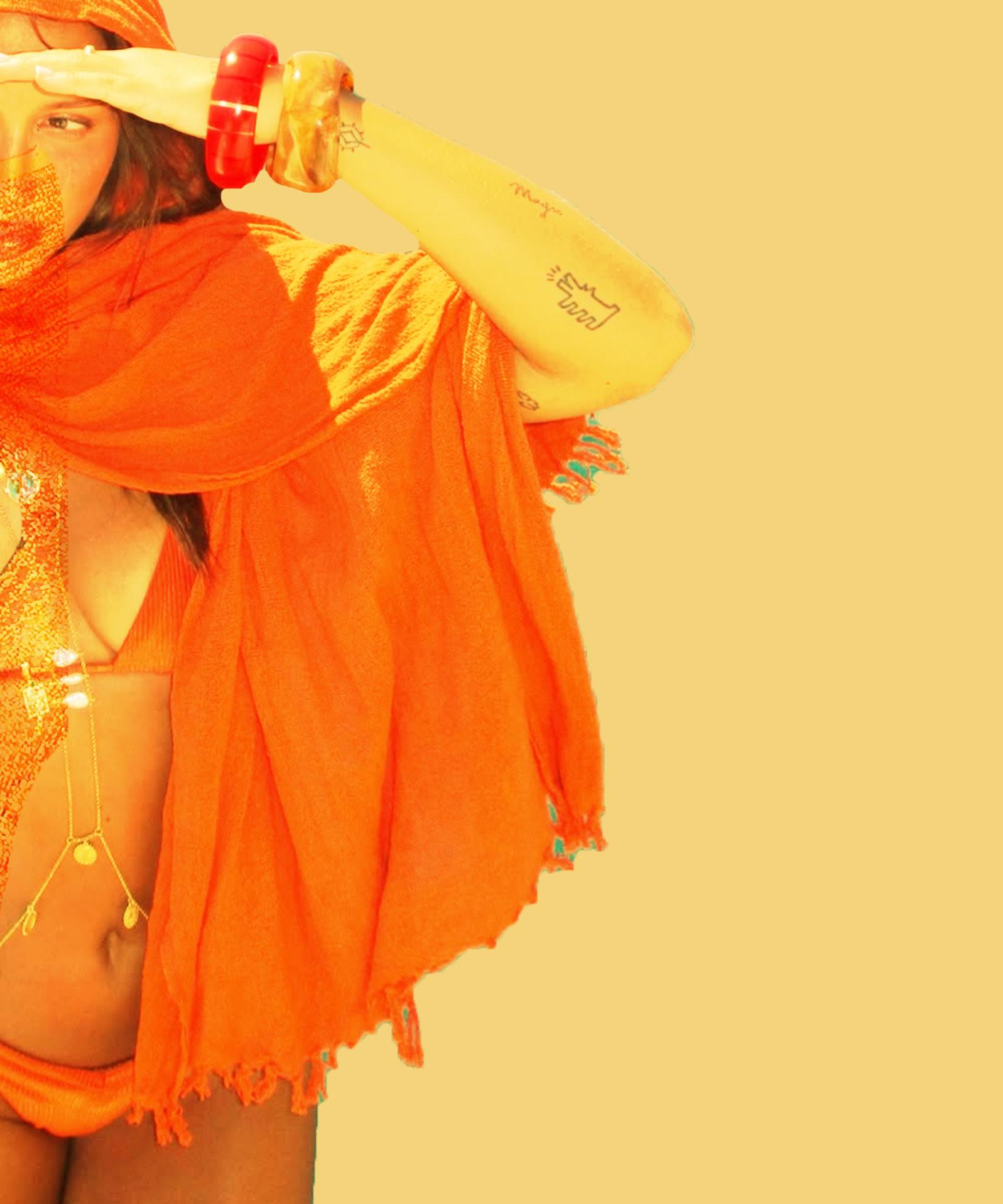
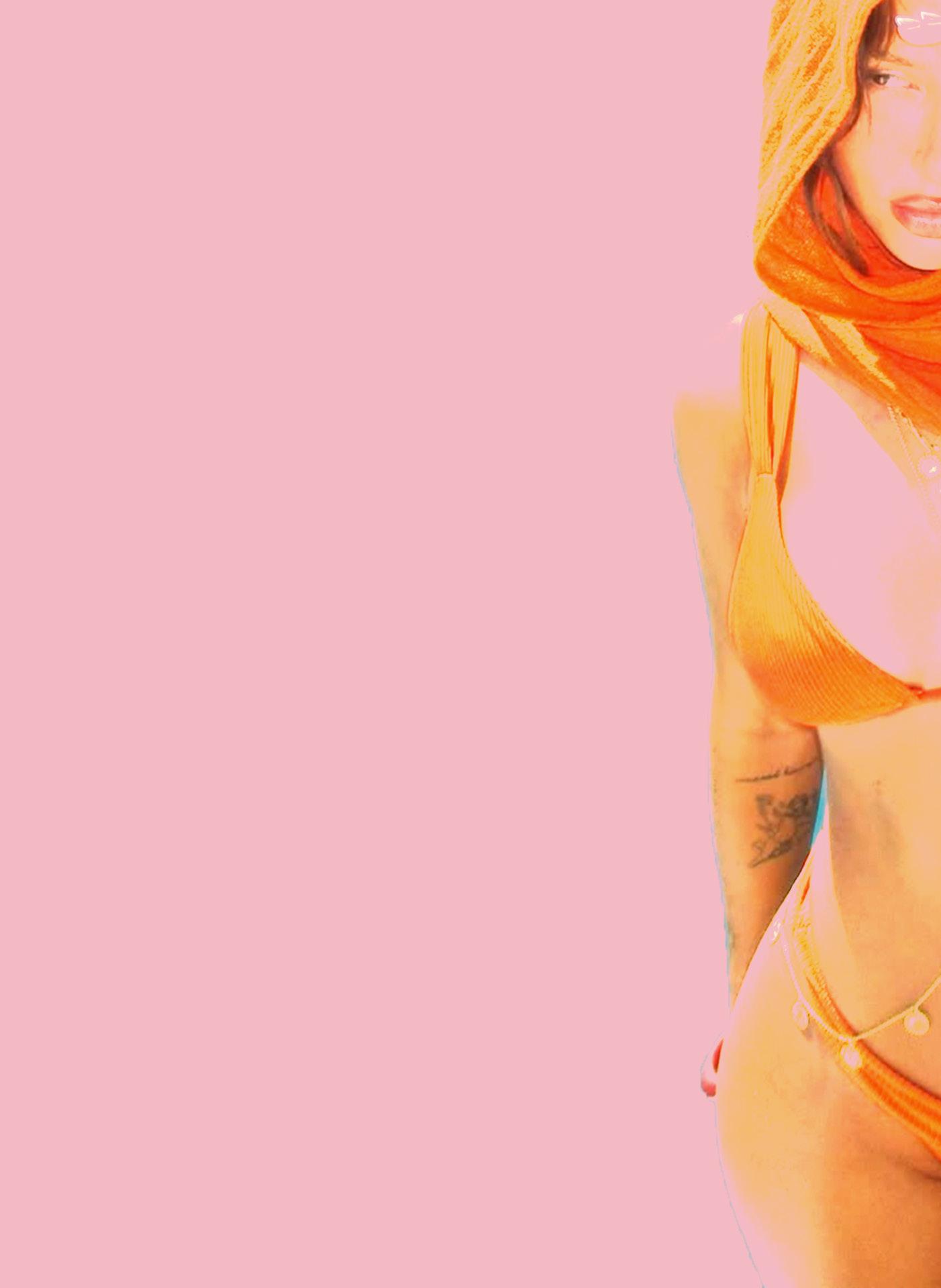
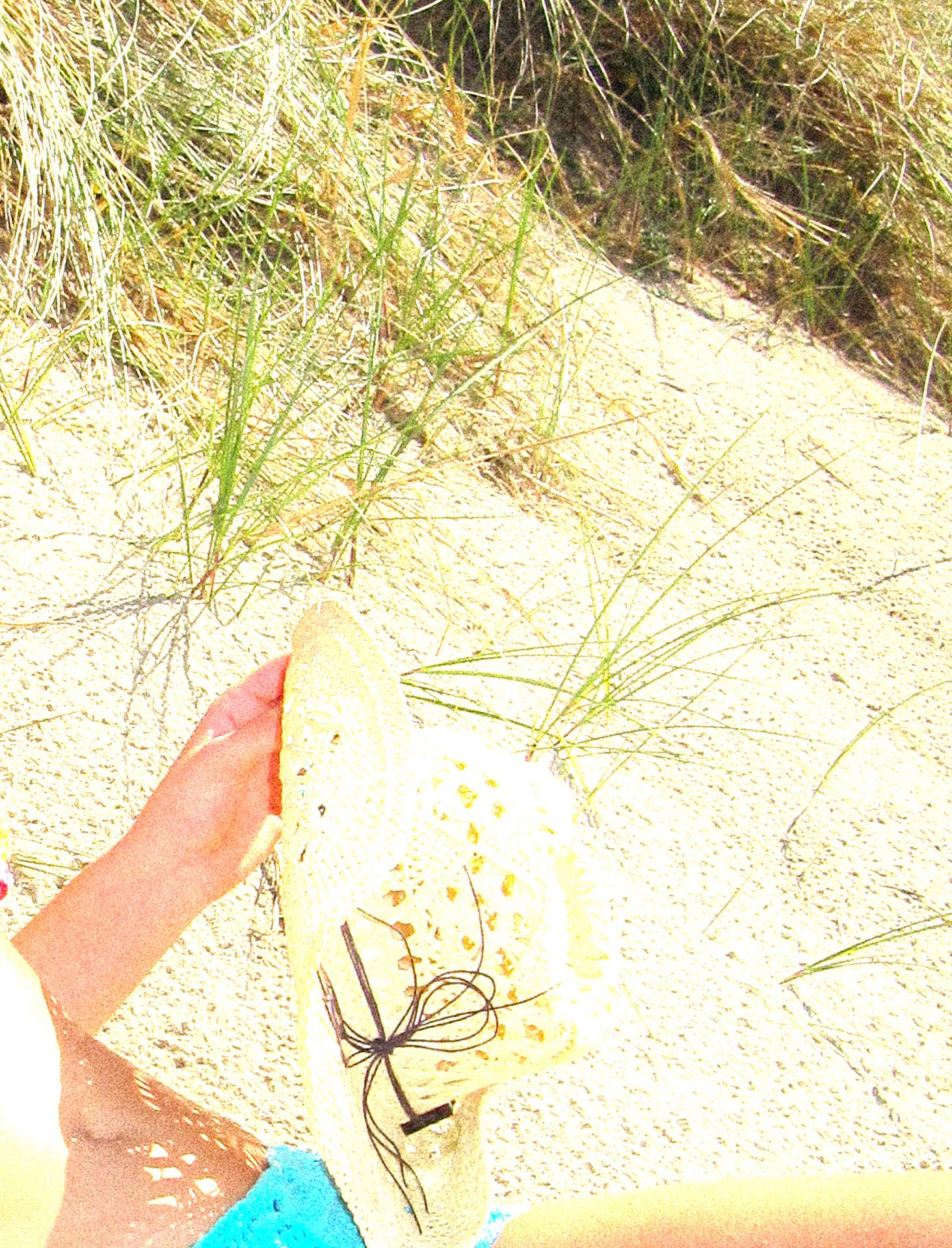
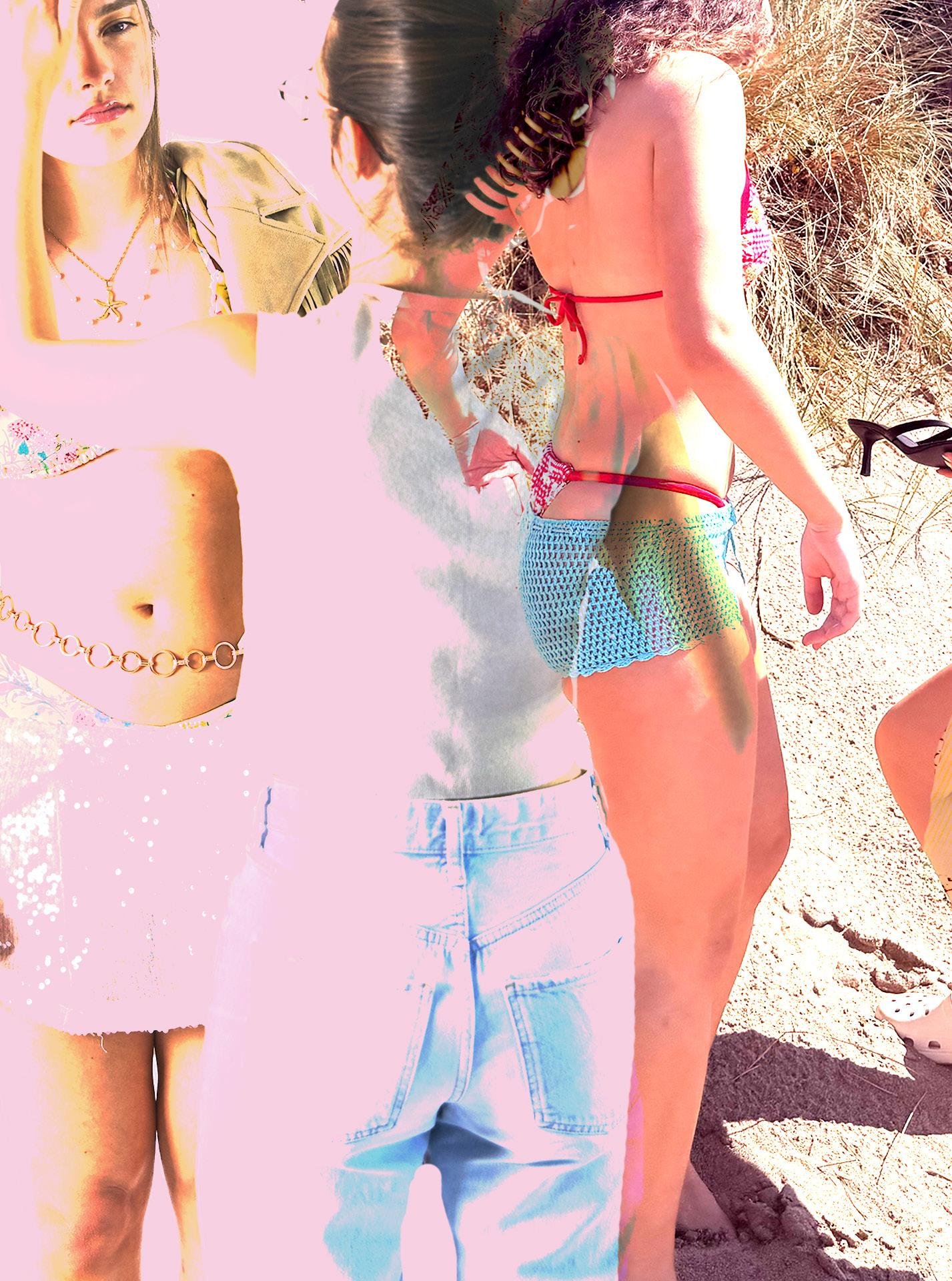
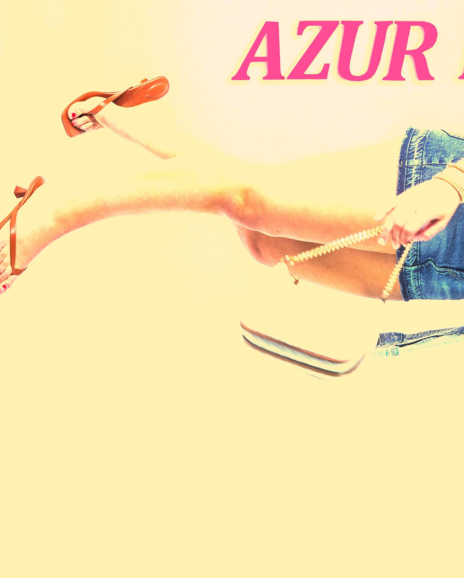
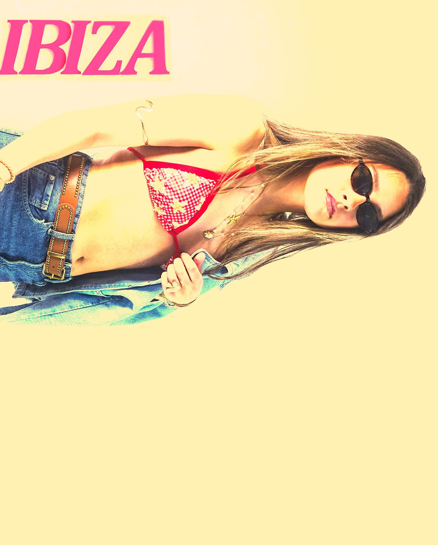
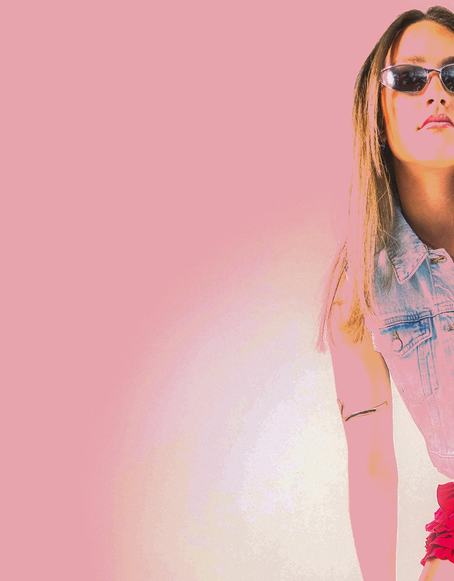
For the styling, I wanted to keep things casual to suit the beach setting, but also bring in clear influences from 90s fashion. Since the shoot was inspired by Ibiza, it was important to include elements that reflect the island’s signature style. I used pieces like cowboy boots and a cowboy hat, which are fun, statement items often seen in Ibiza beachwear and festival fashion. To channel the 90s aesthetic, I incorporated low-waisted crochet shorts, mini skirts, and small round sunglasses, which added a nostalgic yet trendy feel. Overall, the styling helped create a balance between effortless beachwear, Ibiza-inspired flair, and 90s throwback style, aligning perfectly with the brand’s new direction.
90’s. Ibiza. Beach. Party. Spanish. Fun.
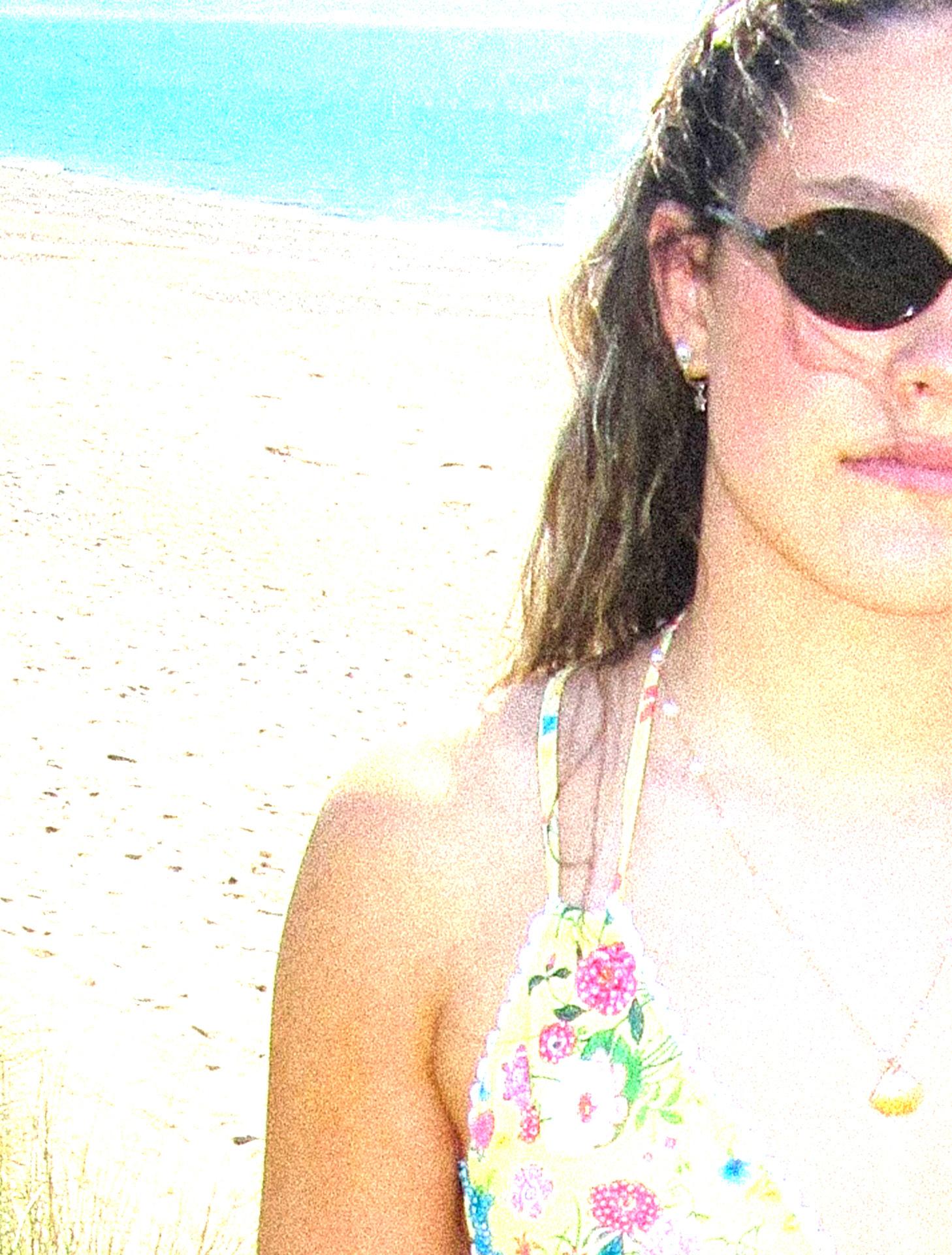
For lighting, I chose to use natural sunlight throughout the shoot. weather on the day was perfect, bright, clear, and sunny, so the lighting tifully in my favour. I wanted the images to reflect the warm, sun-soaked of Ibiza, and I definitely achieved that, as the strong natural light gave authentic, radiant feel. The sunlight helped enhance the colours of styling, creating a vibrant, summery look that matched the overall Because the lighting was so effective, minimal post-production editing allowing the raw beauty of the natural light to shine through in
shoot. Fortunately, the lighting worked beausun-soaked atmosphere gave the photos an the swimwear and overall vibe of the shoot. editing was needed, in the final images.
LOCATION
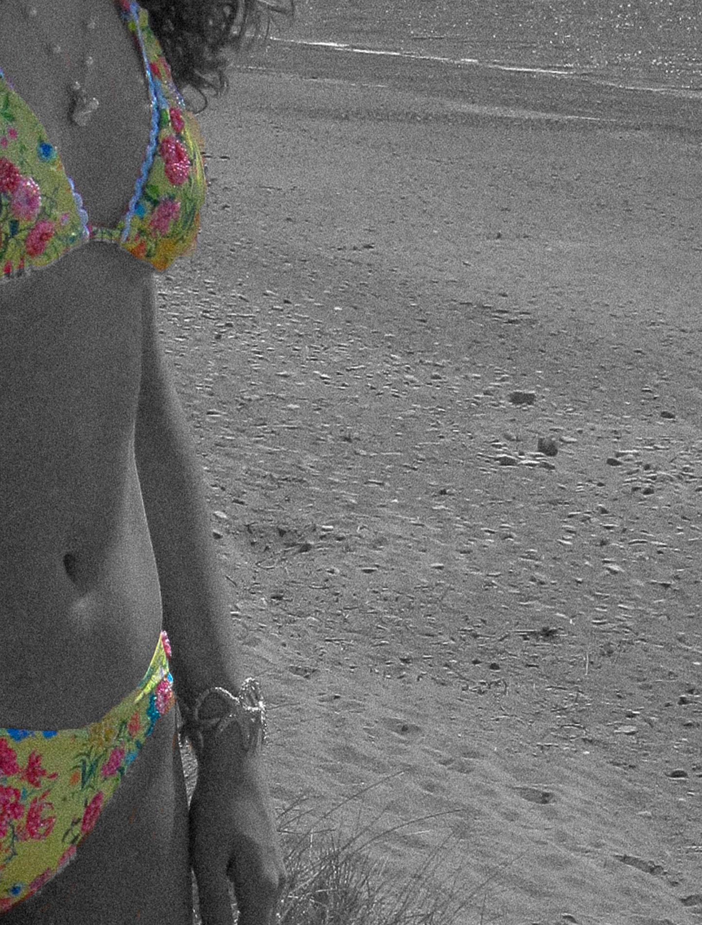
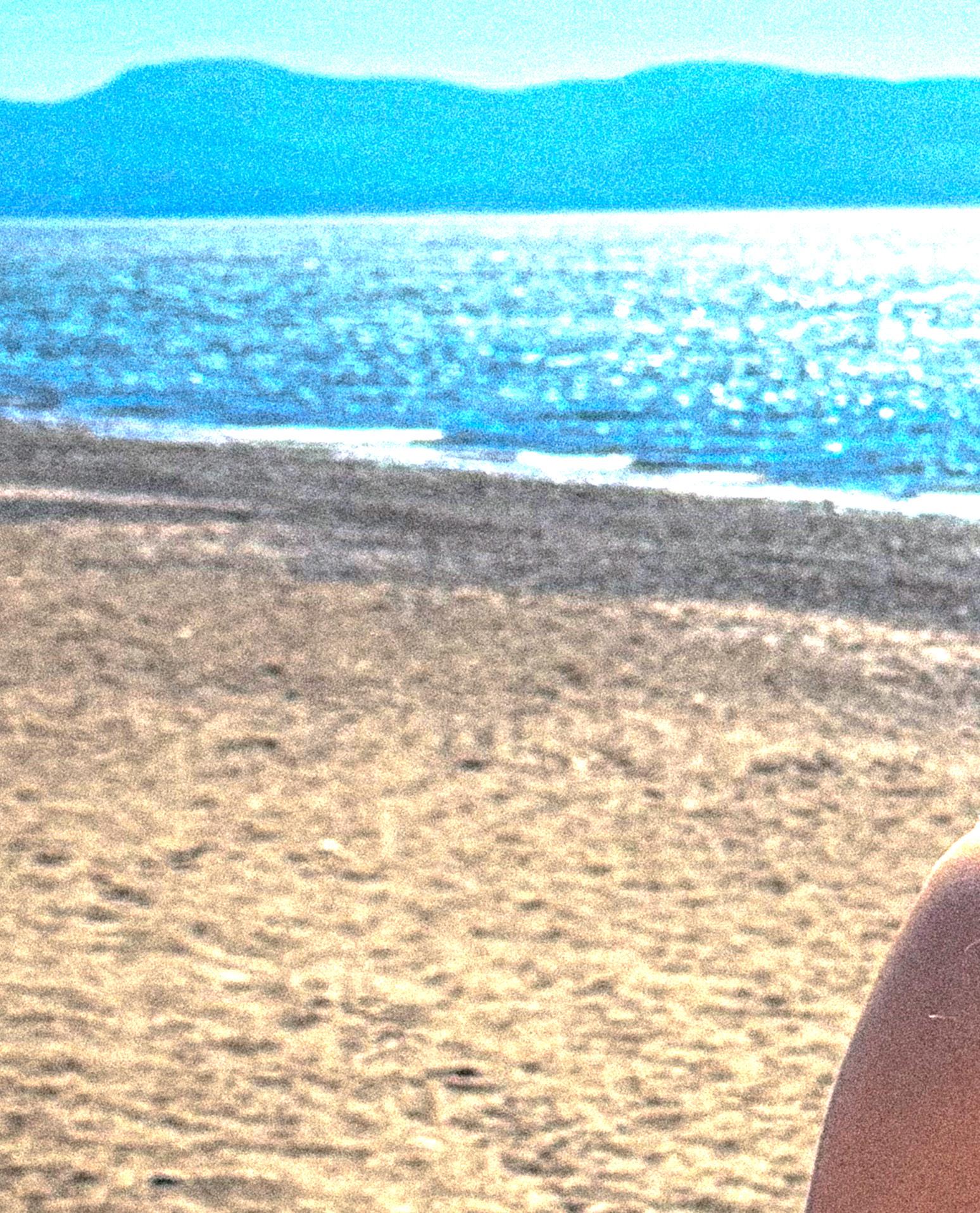
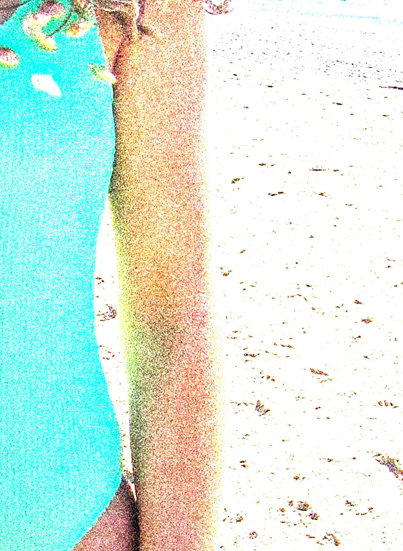
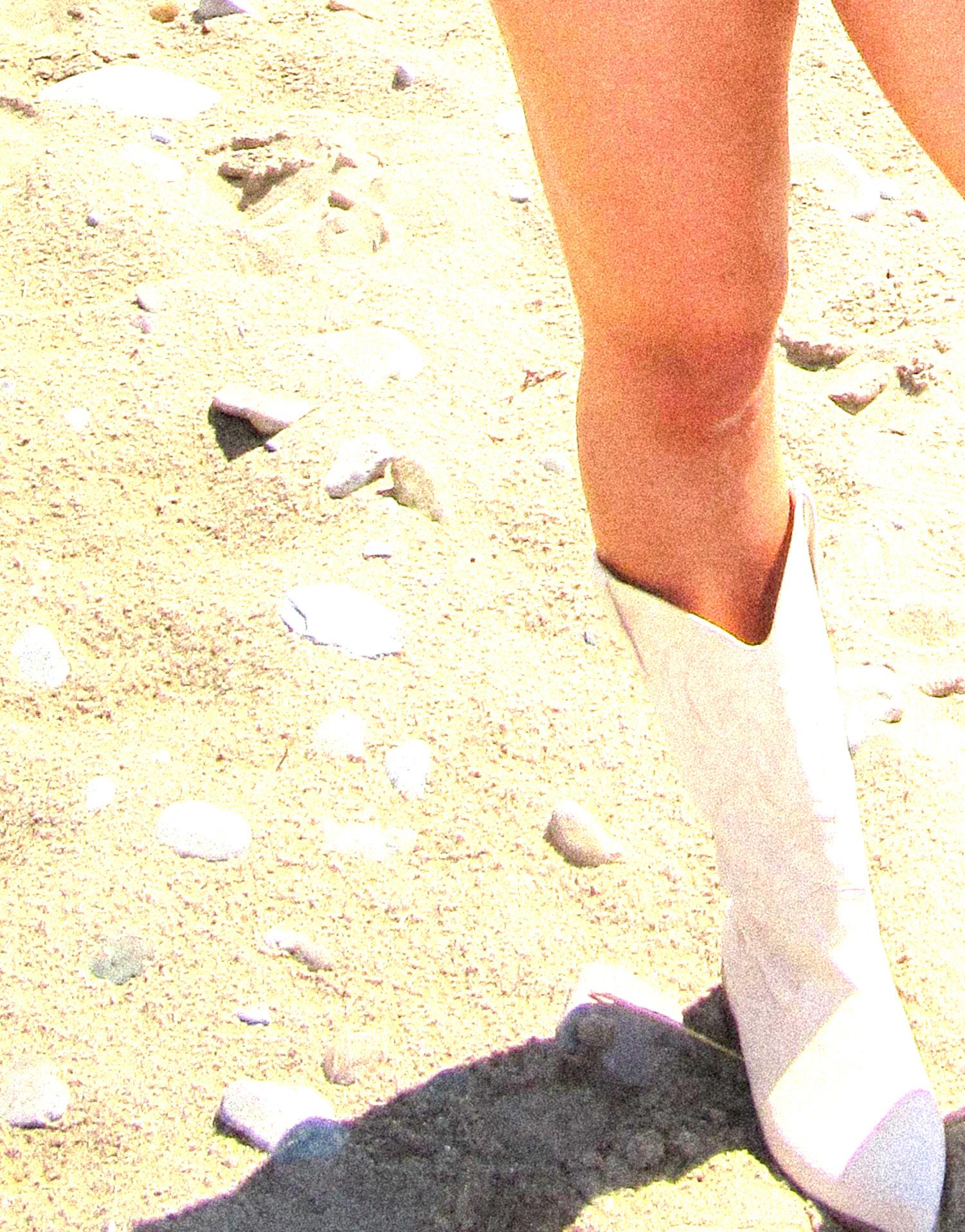
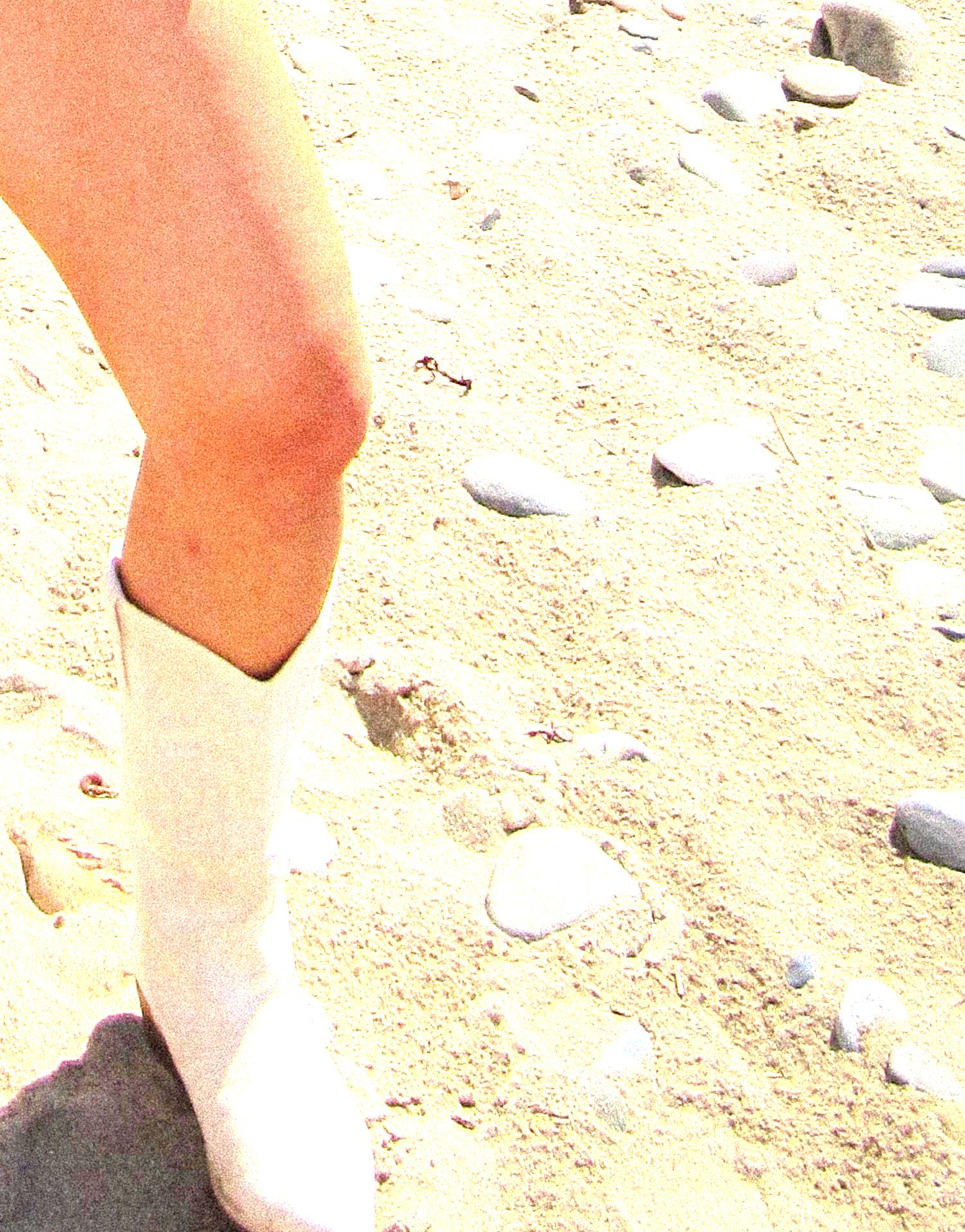
Although my location shoot wasn’t in Ibiza…Pwllheli worked just as well and you’ll be able to see this clearly in my final images. In fact, I’d argue that the Welsh landscapes in the background added even more depth and character to the shoot. The natural textures and scenery gave the visuals a unique edge and helped them stand out. The backdrop brought in a rich sense of texture and personality, making the imagery feel more grounded and authentic. I was lucky to have a variety of environments to work with, sandy beaches, rocky areas, sea views, and even sand dunes, which added visual interest and variety to the shoot. This allowed me to create a more dynamic set of images while still capturing the essence and energy of Ibiza.
Beachy. Sandy. Ibiza. Sun. Sea. Sand. Chill.
PHOTOGRAPHY
For photography, I primarily used my Canon SX200 IS, a camera manufactured in 2009. While it sometimes produces a slight pixelation, this actually added a unique, textured quality to the images that I really liked, alongside delivering the high-quality detail I was aiming for. The camera’s flash was particularly effective in capturing every intricate detail of the swimwear, and the original images straight from the camera looked exactly how I envisioned them. In addition to the Canon, I also used my iPhone camera to capture behind-the-scenes shots. I’m quite pleased with the look and feel of these candid images, so I plan to include them in my image look book to give a fuller perspective of the shoot and creative process.
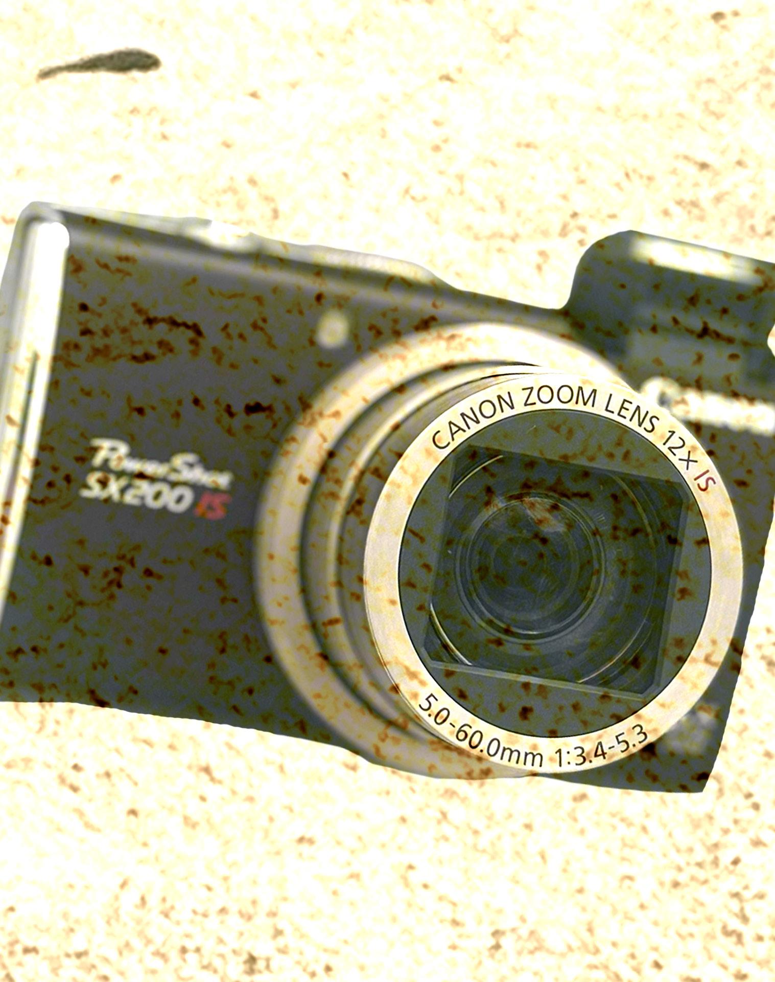
Vintage. Grain. High contrast. Quality.
HAIR
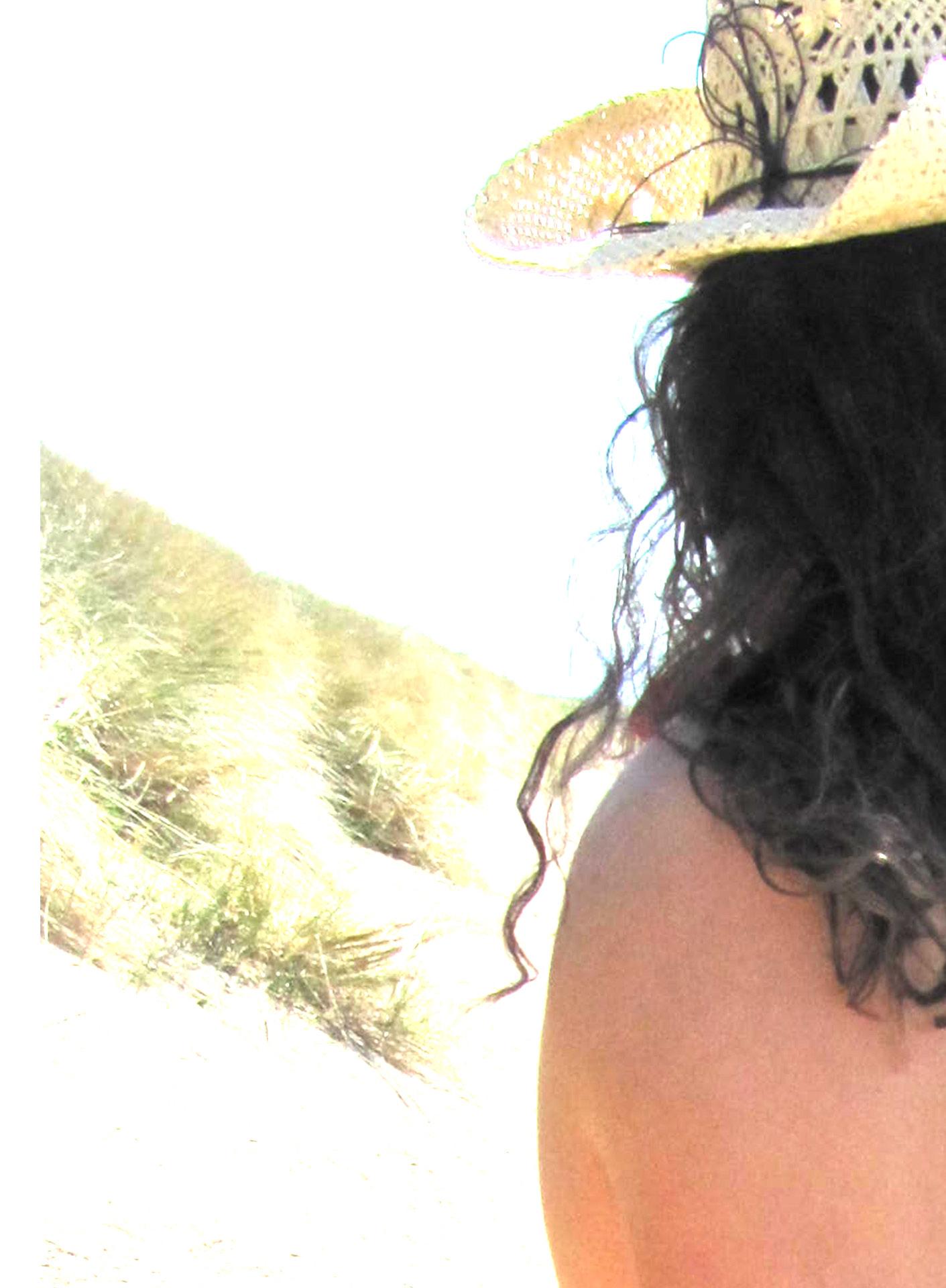
Beachy. Curly. Spanish. Windy. Cute.
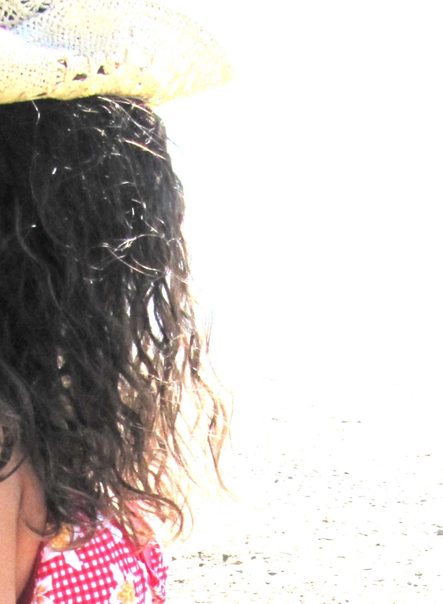
For hair, since this was a beach shoot, I wanted my model to embrace her natural curly hair to keep the look authentic and effortless. Her curls complemented the overall vibe perfectly, adding movement and texture that worked beautifully with the outdoor setting. Additionally, incorporating her natural curls helped me subtly reflect the Spanish heritage behind the brand, as Ibiza’s culture often celebrates natural beauty and individuality. This choice strengthened the connection between the model, the location, and the brand’s identity, creating a cohesive and genuine visual story.
Beach. Natural. Bronzed. Cute.
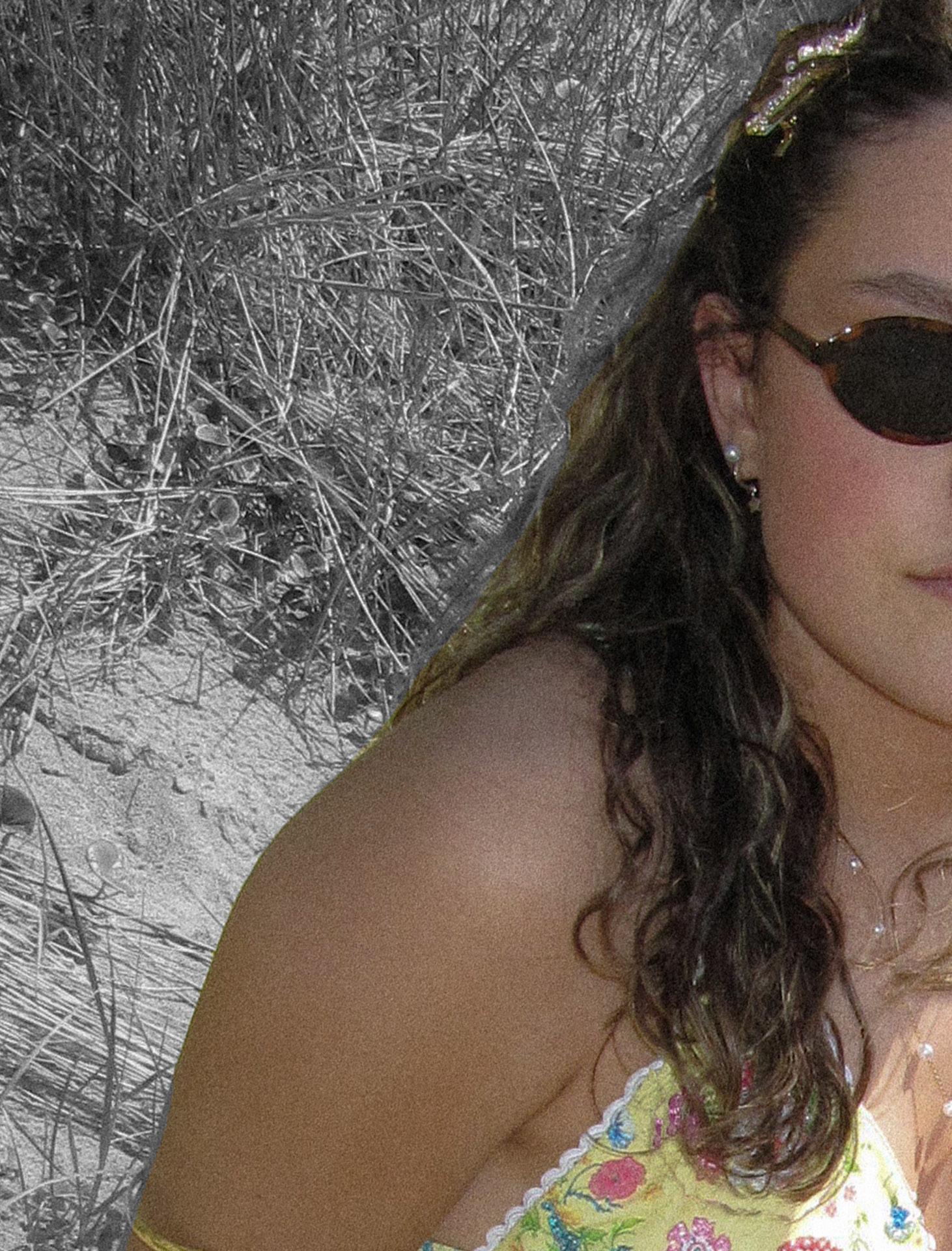
MAKEUP
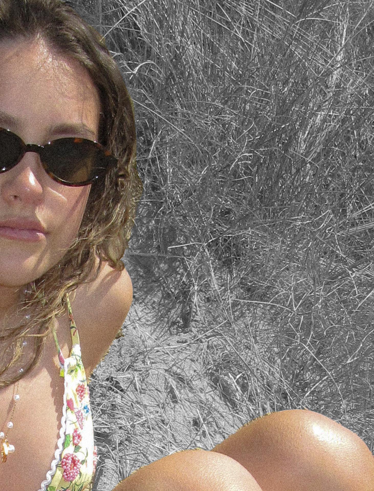
For makeup, I wanted to keep the look chill and beachy to match the relaxed vibe of the location shoot. Since the overall aesthetic was effortless and natural, I aimed for a fresh, glowing complexion with bronzed skin, a subtle blush, and a soft pink lip. This makeup look enhanced the model’s natural beauty without overpowering the images. With the focus clearly on the swimwear and styling, keeping the makeup minimal was essential to maintain balance and ensure that the outfits remained the centrepiece of the shoot. The result was a cohesive, sun-kissed look that perfectly complemented the beach setting and the brand’s laid-back, fun energy..
Beachy, fun, colourful, vintage, digital camera, fun, cute, details, bikini, beads, embellishments, sand, sea, rocks, wind, ibiza, 90’s
For my images and settings, I aimed for a higher contrast to give off that classic ‘90s look, bold and punchy with that nostalgic edge. I didn’t need to add grain, as the digital camera I used naturally gave the photos a soft, film-like texture that worked perfectly with the aesthetic. I experimented with lighting in each shot, embracing how the natural light changed throughout the shoot to give every image its own unique vibe. I edited my images in Lightroom to refine the tones and contrast, then brought them into Photoshop to add text and graphics. For the final touches, I focused on creating a playful ‘90s campaign feel by using big, colourful text, and I experimented with drop shadows and glows to make the logos pop and capture that fun, retro energy.
What worked really well in my shoot was how the styling, location, and natural lighting all came together to create a strong visual story. The contrast between the sequins and crochet against the soft, sunlit beach setting gave the images a vibrant, eye-catching look. Each shot had its own unique lighting, which added variety and personality without needing heavy artificial setups.
In post-production, the flow between Lightroom and Photoshop allowed me to fine-tune the look while staying true to my ‘90s-inspired vision. Lightroom helped bring out the bold contrast and tones I wanted, while Photoshop gave me the creative freedom to play with typography and layout. The playful, campaign-style text, with colourful fonts, glows, and drop shadows, really elevated the final images and tied everything back to that nostalgic, 90’s feel I was aiming for.
If I were to change anything during the whole process, it would probably be planning a bit more around the natural lighting. While I loved the variety it gave each shot, having more control or pre-planning the timing could’ve helped keep a more consistent look across the whole shoot. I also would’ve liked to experiment with a few more poses or compositions to push the styling even further and make the most of the beach location. I would’ve also loved to shoot during golden hour, just before sunset, because that soft, warm lighting would have added an extra dreamy and nostalgic feel that fits perfectly with the ‘90s-inspired concept. Unfortunately, due to the model’s commitments, we weren’t able to schedule the shoot for that time.
Party. Summer. Sequin. Bright. Fun. 90’s
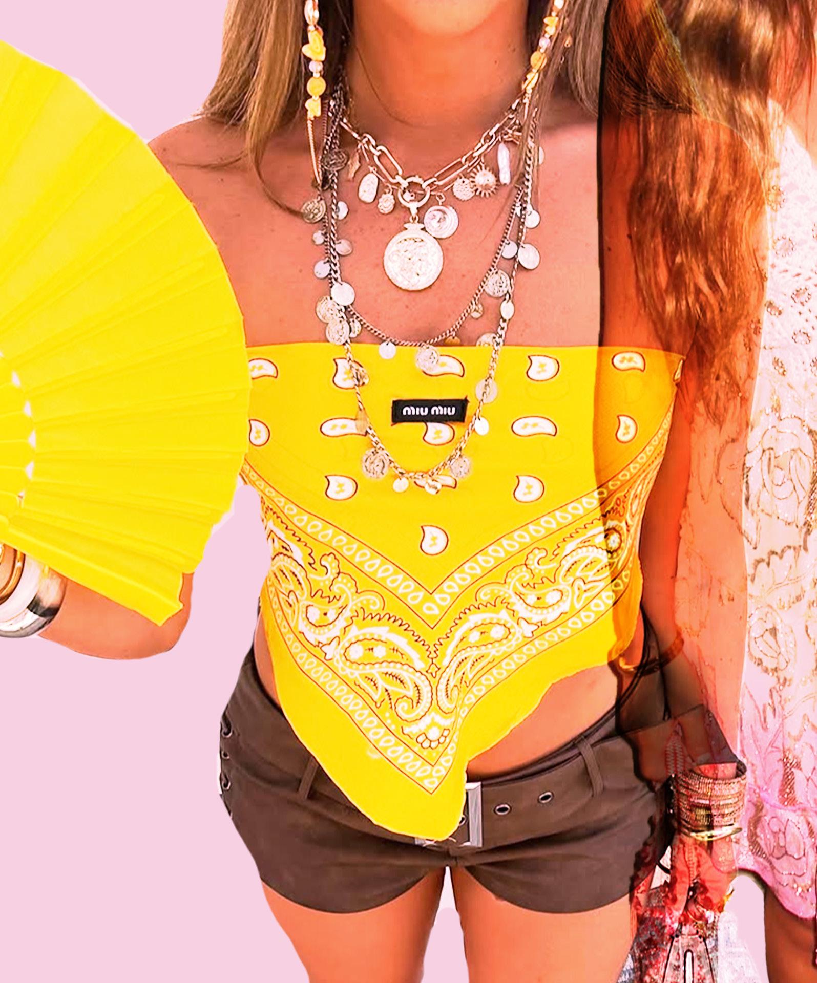
The colour palette for my studio shoot is very similar to that of my location shoot, as I used the same swimwear pieces throughout both sessions. However, the styling pieces were quite different to reflect the distinct settings. For the studio shoot, I incorporated a lot of sequins and denim, creating a bold and playful ‘club’ vibe that showcased how the bikinis could be styled for nightlife and party scenes. The colours remained vibrant and energetic, with a focus on yellows, greens, reds, alongside staple shades like white and blues to add contrast and elevate the overall styling. This combination helped bridge the beachy, relaxed feel of the location shoot with a more dynamic, evening-ready look for the studio session.
For my studio shoot, I really wanted to make the most of having a professional photographer on board, so I decided to fully embrace the 90s aesthetic and worked closely with Andrew to capture the best angles. Drawing inspiration from iconic 90s and early 2000s designers like Dior and Galliano, we focused on bold, dramatic poses that emphasised attitude and confidence. We experimented with low angles, strong body language, and striking silhouettes to ensure the swimwear took centre stage and commanded full attention. This approach helped elevate the images, giving them a high-fashion edge while staying true to the playful, nostalgic spirit of the shoot.
STYLING
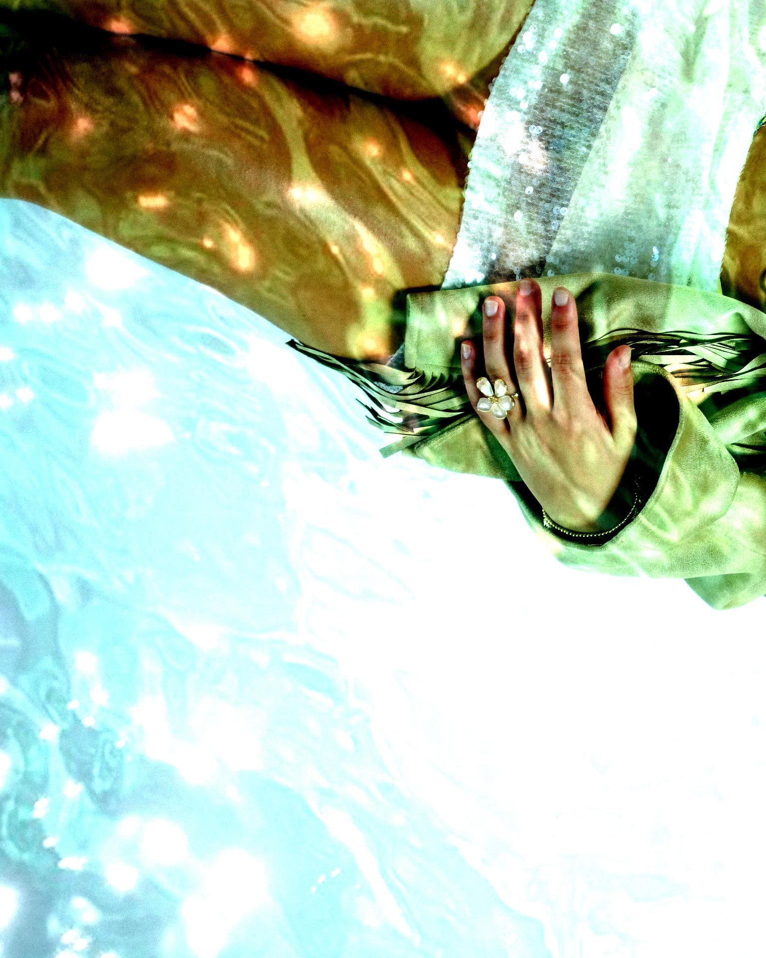
For styling, since this was a ‘club’ studio shoot showcasing how to wear the bikinis while clubbing in Ibiza, I aimed for pieces that were both subtle yet bold to complement the swimwear. I incorporated double denim and sequins into the looks, both trends that were hugely popular in the 90s and perfectly aligned with the vibe I wanted to capture. While the bikinis remained the centrepiece of each outfit, I carefully selected these styling pieces to elevate the overall look without overshadowing them. The balance between statement textures and the swimwear helped create a cohesive, fashionable narrative that feels authentic to Ibiza’s nightlife and the era’s style.
90’s. Club. Bold. Ibiza. Party. Sequin. Denim.
LIGHTING
High contrast. Low lights. Bold. Clubby.
Because I had Andrew as my photographer, I was able to share specific inspiration images with him to guide the creative direction, particularly focusing on the vintage Dior and Galliano aesthetics I wanted to emulate. Andrew suggested using high contrast and low lighting to capture that dramatic, moody feel typical of those iconic fashion campaigns. His lighting adjustments were spoton and perfectly suited the vision for the shoot. As a result, very minimal post-production was needed to finetune the images, which saved me a lot of time and effort. The combination of Andrew’s expertise and the carefully planned lighting setup meant the final photos turned out truly stunning, with a polished yet authentic vintage vibe.
Because Andrew used his professional camera, my images are extremely high quality, very clear, and rich in detail. The camera captured even the smallest elements perfectly, including the intricate beadwork on the bikinis, which really brought out the craftsmanship behind the designs. I’m very happy with how these images turned out, the detailed shots add depth and texture, making the photos stand out. Moreover, the styling and quality of the images perfectly capture and relate to the vibrant, glamorous energy of the Ibiza club scene, which was exactly the atmosphere I wanted to convey.
High quality. Details. Professional. Club.
Club. Party. 90’s. Straight. Highlights.
HAIR
Because my location shoot had a beachy and natural vibe, I wanted to create a clear contrast for the studio shoot by elevating my model’s hair to better reflect the club scene and 90s aesthetic. I decided to style her hair straight, which, combined with her blonde highlights, added a sleek and polished look that instantly brought a more glamorous, nightlife-ready feel to the images. Straight hair was also a hugely popular trend in the 90s club scene, so this styling choice helped reinforce the overall concept and era inspiration. This transformation not only enhanced the visual impact of the shoot but also perfectly complemented the bold, edgy styling and lighting used in the studio.
Club. Glitter. 90’s. Ibiza. Night. Party.
MAKEUP
For makeup, I wanted to keep the look subtle so that it wouldn’t outshine the bikinis, which are the main focus of the shoot. I opted for a natural makeup base similar to what I used in the location shoot, but with a few key additions to elevate the look for the Ibiza club scene. I added a silver shimmer on the eyes and highlighted her high cheekbones with the same metallic shine, creating a luminous, almost ethereal glow. This silver shine was very popular in the 90s and perfectly complemented the club-inspired styling, adding a touch of glamour and edge without overwhelming the overall aesthetic. The result was a fresh yet bold makeup look that enhanced the mood and energy of the shoot while keeping the swimwear front and centre.
Sequin, party, club, glitter, fun, ibiza, beads, bikini, embellishments, studio, professional, 90’s, high contrast, vintage, details
For my bikini shoot, I styled everything with Ibiza fashion in mind, capturing that carefree party energy and vibrant spirit the island is famous for. Think lots of sequins, crochet details, and an effortlessly cool beach-toclub vibe that feels both relaxed and glamorous. I also drew heavy inspiration from the 90s and early 2000s fashion, incorporating nostalgic elements like low-rise cuts, denim, sequins, and fun, playful accessories to bring that retro feel to life. The styling is all about blending glamour with laid-back, sun-soaked energy, creating looks that are as ready for a sunset beach party as they are for a night out in Ibiza’s iconic clubs. This mix perfectly reflects the vibrant, youthful, and dynamic identity of the brand.
FASHION INSPO
ELLIE FRANCES
I find @ellliefrances incredibly inspiring for my bikini brand because of how effortlessly she combines fashion with authenticity. Her content feels real, yet still curated and stylish, which is exactly the kind of energy I want my pieces to reflect. She has a way of making everyday moments look beautiful, which makes her the perfect kind of person to wear and represent something detailed and personal, like beaded and embroidered swimwear.
What really stands out to me is her soft, feminine, but confident vibe. She styles her looks in a way that feels elevated but never overdone, which is ideal for showcasing statement bikinis with intricate textures. I can imagine her wearing one of my pieces on vacation or at a beach club and making it look effortlessly cool.
Her audience clearly trusts her taste and looks to her for style inspiration, which makes her an amazing example of someone who could naturally connect with my brand’s message. She also creates beautiful, high-quality content that captures the mood and detail that goes into my designs.
Overall, she’s the kind of woman I envision wearing my bikinis, stylish, confident, and grounded in her own aesthetic.
Bold, Glamorous, Ibiza-inspired, Party girl energy, Sequin queen, Y2K vibes, Beach to club, Statement looks
Rebellious, Edgy, Youth culture, Bold statements, Trend-driven, High-energy, Individuality, Attitude, Cool kid vibes
I see @badkidhq as a huge inspiration for my bikini brand because her style is bold, expressive, and full of personality, exactly what I want my pieces to represent. She has this amazing way of mixing textures, prints, and accessories that really complements the kind of detail I focus on with beading and embroidery.
What I love most is how she owns her look with confidence. Whether she’s dressing for a festival or just posting a casual outfit, there’s always a standout element. That mindset aligns perfectly with my brand. I want my bikinis to feel like wearable statements, not just swimwear.
She also has a really engaged audience that appreciates creativity and uniqueness, which is the same energy I’m building around my designs. Her photos often have that summer vibe and beach-ready aesthetic that makes her content a perfect fit for showcasing swimwear in a fun, bold way.
Overall, she’s more than just stylish, she’s fearless, and that’s the kind of energy I want my brand to channel too.
VISIBLE INSPIRATIONS
My inspirations from @ ellliefrances and @badkidhq are clearly visible throughout my shoots. From @ellliefrances, I drew inspiration from her use of bold, vibrant colours and playful yet polished styling, which influenced the fun and dynamic energy in my images. Her ability to blend contemporary fashion with a nostalgic feel really helped shape the overall mood I wanted to achieve.
From @badkidhq, I was inspired by their creative use of vintage aesthetics and grainy textures, which I incorporated into my post-production by adding grain and playing with lighting contrast to give my photos that authentic 90’s vibe. Their bold graphics and retro typography also inspired the logos I used, tying together the visual language across both my studio and location shoots.
Together, these influences helped me create a cohesive, nostalgic look that balances modern style with vintage flair.
Because their overall style is based on boldness and individuality, they dress for themselves and not to fit anyone else’s expectations. This sense of confidence and uniqueness is exactly what I wanted to capture and reflect in my rebrand. Azur Ibiza is a brand that stands out because it embraces originality and self-expression. Their style perfectly aligns with the pieces I’ve created for this rebrand, and the styling choices, such as incorporating sequins and vintage-inspired items, help emphasise that distinct, fearless attitude. By blending these elements, the rebrand celebrates the brand’s core identity while pushing it forward in a fresh, vibrant way.
The beach location plays a huge role in bringing my bikini shoot concept to life. It’s more than just a backdrop, it sets the tone and energy for the entire vibe. The natural sunlight, sand, and ocean create that dreamy, carefree atmosphere that perfectly complements the Ibiza-inspired styling. It captures the essence of freedom, movement, and playfulness, while also grounding the sequins, crochet, and party looks in a setting that feels authentic and alive. The beach makes the shoot feel like a real moment, not just a styled concept.
13/05/25 - 21/05/25 - Ruby Ellis
Because my studio shoot was with a professional photographer, the lighting setup was carefully discussed between us beforehand. I showed him inspiration images from vintage 90’s fashion photoshoots, and he adjusted the lighting and contrast to be quite low, creating that classic moody effect. This approach meant that in post-production, I mainly focused on making slight adjustments and experimenting subtly with the lighting. I also added grain to the images to enhance the vintage feel, helping to match the aesthetic of my location shots.
Additionally, I wanted the studio images to have similar logos to those in my location photos. Using bold, fun, and playful 90’s style typography really helped tie everything together, giving the whole project a cohesive and nostalgic look.
WHAT WORKED WELL?
Several aspects worked really well during the studio shoot. First, the collaboration with the professional photographer was a key success. Because we had a clear conversation about the lighting beforehand, based on the vintage 90’s inspiration I shared, the photographer was able to set the lighting and contrast perfectly low right from the start. This made the shoot much smoother and allowed us to capture the exact mood we were aiming for.
Another positive was how the lighting setup complemented the styling and overall concept, enhancing the vintage feel without needing heavy edits later. The subtle lighting meant I could focus on fine-tuning in post-production, such as adding grain to create that authentic vintage texture, which worked beautifully.
Throughout this trimester, I’ve gained valuable insights into both the creative and practical sides of producing a fashion shoot. I’ve learned the importance of clear communication and collaboration, especially when working with professionals like photographers, to ensure the vision is accurately captured. Planning ahead, particularly with styling and logistics, proved crucial, issues like parcel delays taught me to be more proactive and allow extra time for deliveries and preparation.
Creatively, I developed a deeper understanding of how lighting, contrast, and post-production techniques like adding grain can dramatically influence the mood and authenticity of the images. I also learned how cohesive branding elements, such as consistent logos and typography, help unify different parts of a project.
Beyond the technical skills, this process has been an important journey of self-discovery. I’ve learned a lot about what I truly enjoy and where my creative interests lie, which has helped clarify my future career directions. Overall, this experience has strengthened my ability to adapt when challenges arise, refine my visual storytelling, and balance inspiration with practical execution to achieve a polished final result.
Creative Director: Leah Jones
Model: Ruby Ellis
Behind The Scenes: Olivia Phillips
Location Shoot Photographer: Leah Jones
Photographer Studio Shoot: Andrew Grant
Editor: Leah Jones