STUDIO CONCEPT 36-37 WHY 90’S 38-39 BEADING 40-41 FRUIT 42-43
DESIGN FEEDBACK 44-45
LOCATION SHOOT 46-47
CAMPAIGN SHOOT 48-49
SHOOT COCNEPT 50-51
STUDIO SHOOT 52-53
POST PRODUCTION 54-59
SNEAK PEAKS 60-61
POST PRODUCTION 62-67
SNEAK PEAKS 68-69
WHATS NEXT
My journey to the Final Major Project has been one of growth and self-discovery. I began with a brand that felt safe but didn’t fully express my creativity. Realising I was holding back, I took time to explore and ask deeper questions.
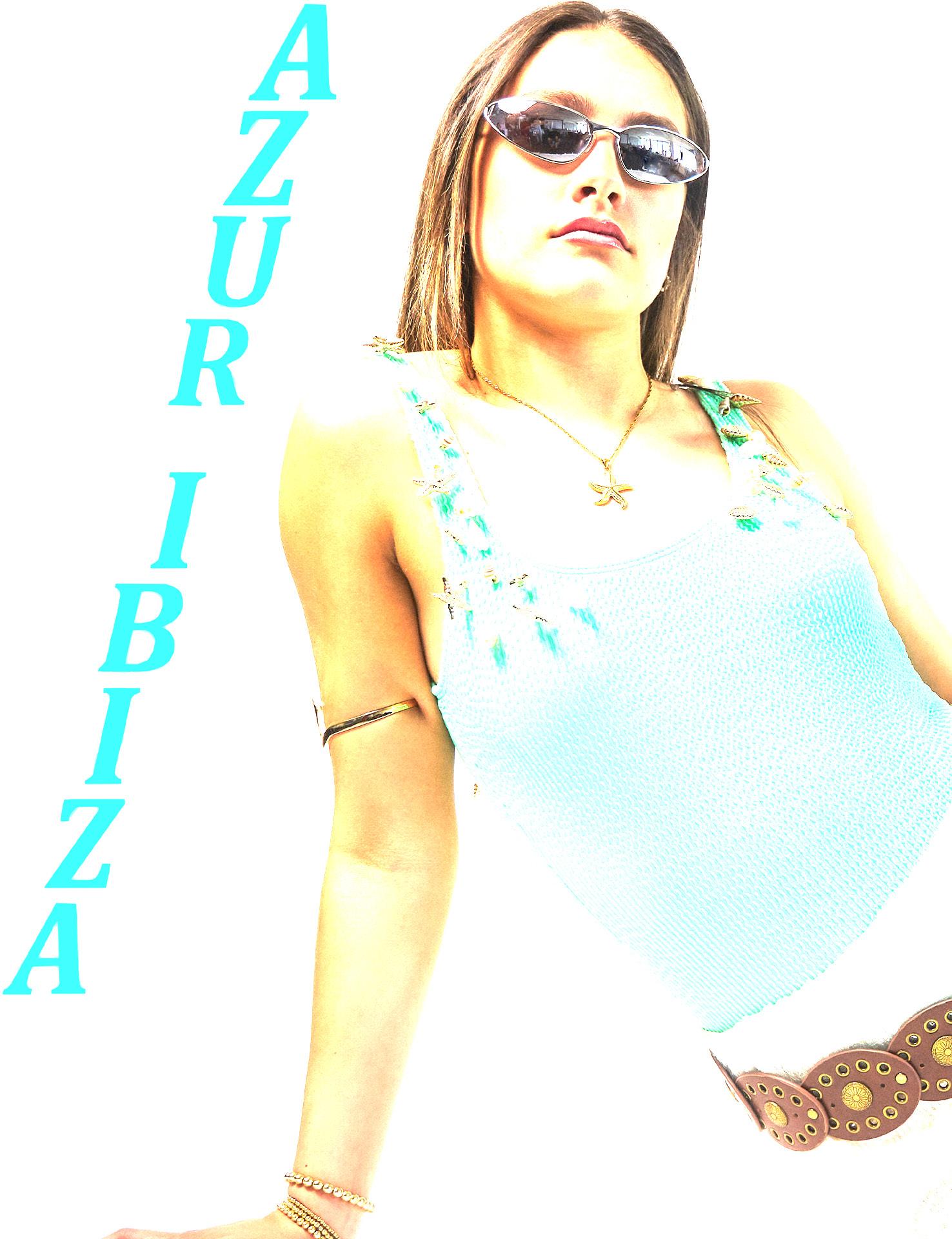
I found my true passion: travel. From outfit planning to destination research, holidays inspire me. This insight sparked the Azur Ibiza rebrand, a brand capturing the vibrant, nostalgic, and effortless spirit of a dream getaway.
This project is more than a rebrand; it reflects who I am and how I’ve grown.
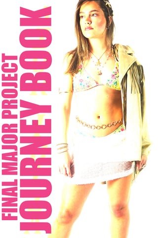
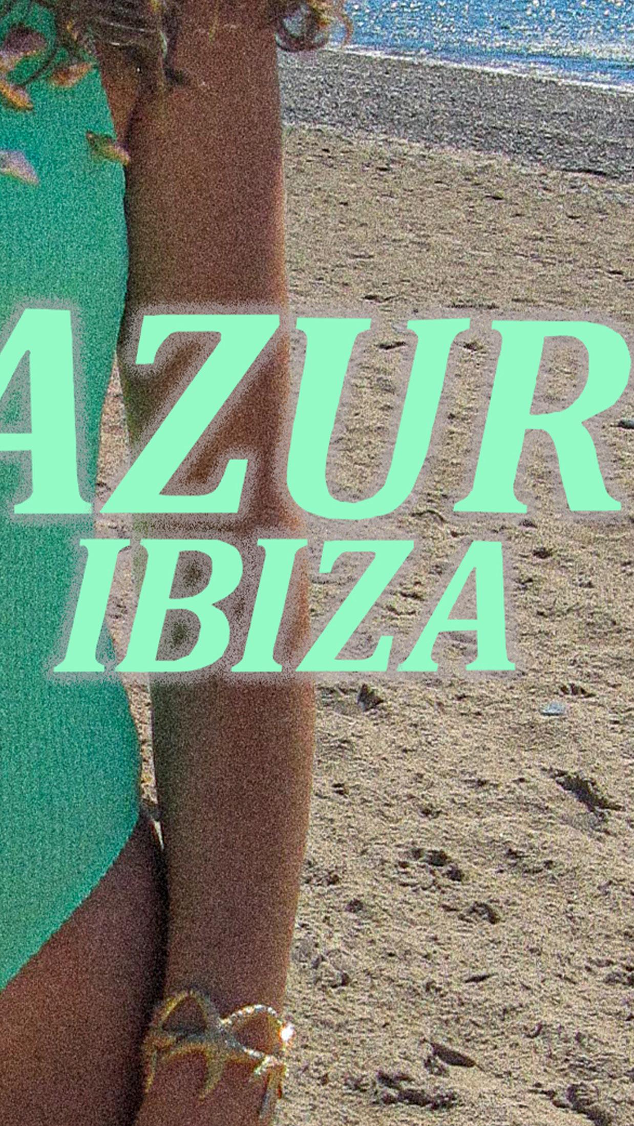
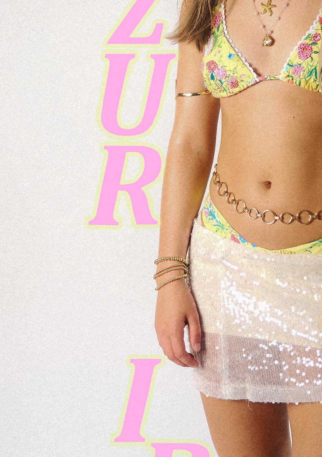
Welcome to my Final Major Project: the Azur Ibiza Rebrand.
INTRODUCTION
INTRODUCTION TO MY FMP
THE BRIEF
This Final Major Project explores the full-scale strategic and creative rebranding of Azur Ibiza, a swimwear label that originally gained recognition for its minimalist aesthetic and association with Ibiza nightlife. While once rooted in seasonal trends and driven by visual simplicity, the brand lacked the emotional depth and authenticity increasingly valued by contemporary fashion consumers. The aim of this project is to reposition Azur Ibiza as a culturally relevant lifestyle brand defined by emotional resonance, timeless design, and purpose-driven storytelling. The rebrand draws from the visual language of 1990s fashion photography, combining nostalgic aesthetics with modern values such as sustainability, individuality, and honesty.
The project will reposition Azur Ibiza not by redefining its ethos, but by enhancing its emotional and cultural relevance. It aims to build on the brand’s existing values of craftsmanship and intention, while weaving in narrative, nostalgia, and raw visual storytelling to form a more expressive and layered brand universe. Through this evolution, Azur Ibiza will become not just a maker of garments but a communicator of feeling, identity, and memory.
At the heart of the project is the exploration of how slow fashion can become emotionally engaging, not simply sustainable in production but meaningful in experience. By combining theoretical research with strategic and creative development, the brand will embrace visual and verbal storytelling that speaks honestly and personally to Gen Z and Millennial consumers. These are individuals who increasingly seek not perfection, but connection, not trends, but truth. Azur Ibiza will offer garments that feel collectible, purposeful, and timeless, resisting the disposable nature of fast fashion and cultivating enduring relevance.
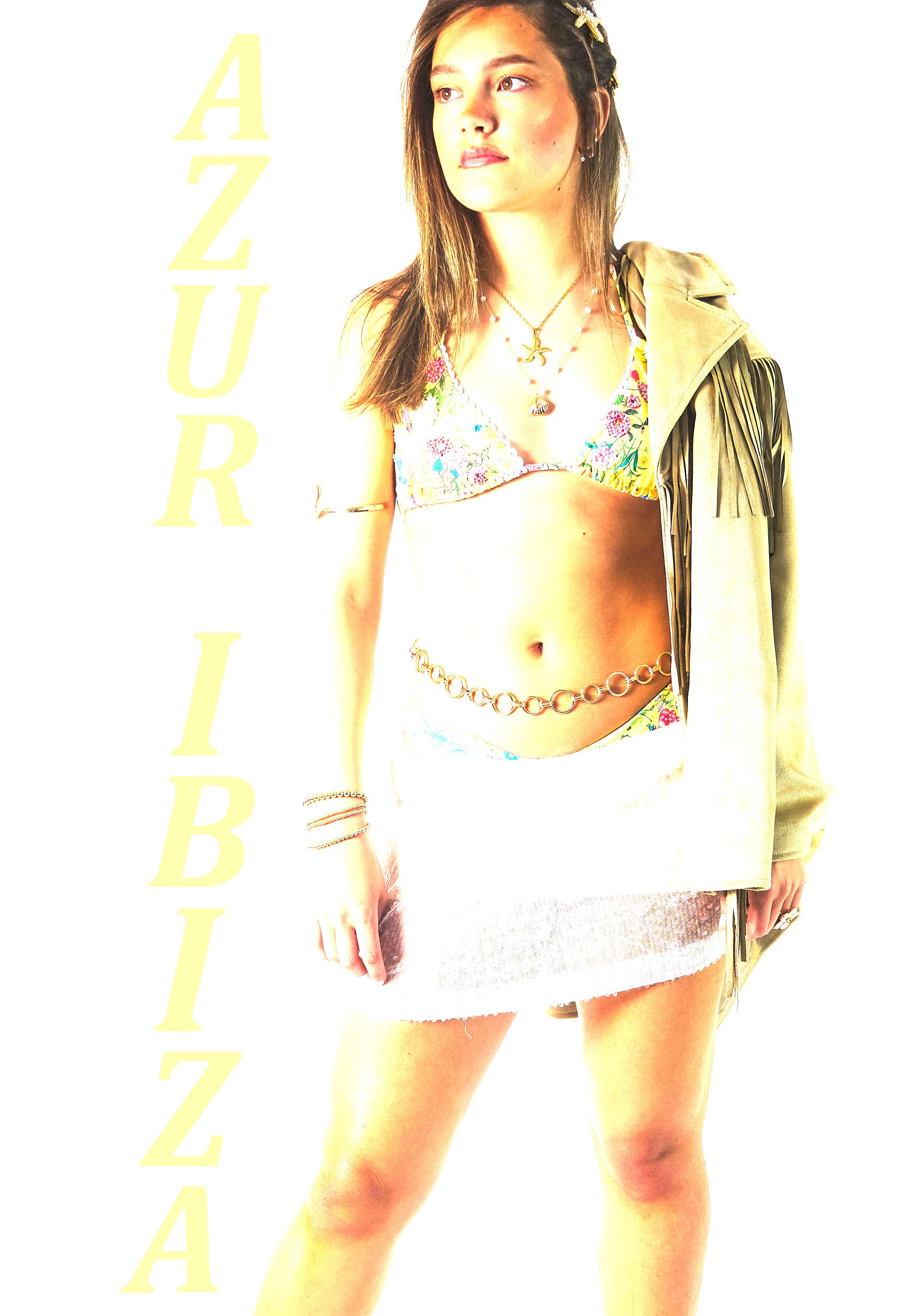
Visually, the project draws from the evocative, unpolished aesthetics of 1990s fashion photography. The final campaign will feature a raw, editorial photoshoot using only natural light and minimal post-production. There will be no retouching or artifice, just light, shadow, texture, and skin. Styling will feature Azur Ibiza’s swimwear elevated through handcrafted embellishments such as sequins and embroidery, paired with vintage accessories to create looks that feel tactile, intimate, and storied. Models will be selected for their individuality and presence, moving away from conventional ideals to celebrate realness and character.
The research framework will explore themes such as nostalgia in contemporary fashion, emotional branding, and the evolving role of imperfection in visual communication. The deliverables of the project will include a brand book that outlines the new visual identity, storytelling approach, tone of voice, and rollout strategy across digital and physical platforms. Additionally, a fully styled editorial look book will be produced, showcasing the new visual direction through photography and creative direction. This will be accompanied by a conceptual narrative that ties the imagery to the broader themes of the rebrand. A creative visual brief will also be included, charting the development of the project and highlighting key turning points and insights gained throughout the process. Finally, a reflective evaluation will consider both the successes and challenges of the project, demonstrating critical engagement with the brief and an understanding of the broader cultural context.
The project will unfold over a ten-week period. The initial weeks will focus on concept refinement and research, including interviews, visual analysis, and theoretical grounding. Midway through the timeline, the focus will shift to creative development, including styling trials and photography tests. The final weeks will concentrate on execution, including the final shoot, curation of visuals, layout of the brand book, the creation of a short film, and preparation of the evaluation and supporting documents. Regular check-ins with my programme leader will ensure the project remains strategically aligned and creatively rigorous.
This Azur Ibiza rebrand is more than a creative exercise...it’s a reflection on the future of fashion branding. It addresses key cultural issues like sustainability, identity, emotional connection, and the rejection of fast fashion’s superficiality. By embracing imperfection, nostalgia, and thoughtful design, Azur Ibiza will become a brand that lives slowly, speaks honestly, and connects deeply. This project showcases the ability to blend theory and creativity into a cohesive, culturally relevant brand strategy for a new generation.
LEARNING OUTCOMES
To meet the learning outcomes of this project, I have approached the rebrand of Azur Ibiza with a critical and reflective mindset, grounding every decision in the core principles of fashion brand management. I began by analysing the existing identity and values of the brand, recognising its strong foundation in slow fashion. Rather than reinventing Azur Ibiza, I wanted to evolve it, deepening its emotional connection with a new generation of consumers while staying true to its essence. I critically evaluated the brand’s current positioning and identified opportunities to shift its communication and marketing from trend-driven minimalism to a more expressive, story-led identity. Throughout this process, I focused on creating marketing and promotional outcomes that are not only visually compelling but also emotionally resonant and strategically grounded in branding theory.
In developing my marketing strategy, I undertook research into the role of digital media and new technologies in shaping how fashion brands connect with audiences today. I explored how platforms like TikTok and Instagram, are used not just for promotion, but for building ongoing conversations and communities. I didn’t want to replicate what’s already out there; instead, I critically considered which platforms and content styles align with Azur Ibiza’s values of honesty, slowness, and personal connection. I drew inspiration from brands that embrace raw visuals and minimal retouching to create authenticity and used this to inform my own promotional approach. This research shaped how I designed the campaign rollout, ensuring that it felt native to the platforms and emotionally meaningful to the audience.
Throughout the project, I consciously differentiated between the strategic vision for the rebrand, the creative tactics I used to bring that vision to life, and the final execution of the campaign. I started with a clear strategy, to reposition Azur Ibiza as a culturally relevant, emotionally resonant lifestyle brand. From there, I developed specific tactics such as 90s-inspired photography using natural light, a season less capsule concept grounded in storytelling, and a warm, reflective tone of voice. These tactics fed into a launch plan that considers not only visual coherence but timing, platform-specific content delivery, and long-term brand engagement. I’ve aimed to ensure that every creative output serves a clear purpose within the wider campaign strategy.
Finally, this project has required me to use entrepreneurial thinking and truly understand my audience. I conducted primary research with Gen Z and Millennial consumers to better understand how they connect with fashion brands emotionally, what they value in terms of sustainability, and how they experience authenticity online. Their insights guided everything from model selection to styling choices, ensuring that the campaign reflects real people and real stories. I approached this not just as a branding exercise, but as an opportunity to create something culturally and ethically meaningful, something that responds to broader shifts in identity, representation, and consumption. I’ve tried to think beyond a single campaign and instead build a future-facing, emotionally intelligent brand model that audiences can connect with long-term.
Overall, I have used these learning outcomes as a framework to shape the entire direction and execution of my project. They have helped me move beyond aesthetics to develop a concept that is critically informed, audience-focused, strategically thought-out, and creatively expressive. Throughout this journey book, the learning outcomes will be visual in my work and can be pinpointed throughout my entire journey.
Azur Ibiza blends slow fashion with sun-soaked nostalgia, drawing deep inspiration from the Balearic coast and the raw, emotive energy of ’90s fashion photography. What began as minimalist swimwear has evolved into a collection of soulful, hand-finished pieces that embody the spirit of freedom, self-expression, and intentional living. Each garment is a quiet celebration of individuality and imperfection, crafted to evoke an emotional connection that lingers long after summer fades.
Rooted in sustainability and conscious design, Azur Ibiza champions timeless style over fleeting trends, offering thoughtfully made collections that honour both the planet and personal authenticity. It’s a community, a movement, a reflection of those who find beauty in the imperfect and meaning in the moment. More than a brand, it’s a feeling...a lasting piece of summer, worn with memory, made to endure.
ABOUT AZUR
ABOUT THE REBRAND
Azur Ibiza began with simple, appealing swimwear, elegant in its minimalism, yet missing the bold, free-spirited essence that defines the island it calls home. The rebrand marks a deeper, more authentic connection to Ibiza’s vibrant culture, infusing the collections with sequins, embellishments, and artisanal, handcrafted details that channel the island’s eclectic energy and magnetic contrasts.
Now, Azur Ibiza fully captures the spirit of Ibiza, its glamour and rawness, freedom and intimacy, serenity and wildness. Each piece is designed not just to be worn, but to tell a story, to hold a moment, transforming swimwear into wearable memories that resonate long after the sun sets. It no longer just hints at Ibiza; it lives and breathes it, celebrating its beauty, rhythm, and soulful complexity in every stitch.
REBRAND INSPO
When I first discovered Azur Ibiza, its minimalist aesthetic was undeniably appealing, clean lines, muted tones, and a sense of quiet elegance. However, it felt somewhat disconnected from the island’s vibrant, eclectic soul. While the brand targeted millennial women with a serene, wellness-oriented image, it overlooked a vital part of Ibiza’s identity: its bold club culture, expressive fashion, and unapologetic sense of individuality.
Despite its visual appeal, Azur Ibiza struggled to generate strong emotional engagement, particularly on social media, where the storytelling lacked the dynamic energy the island is known for. There was a clear opportunity to bridge this gap and breathe new life into the brand.
My rebrand repositioned Azur Ibiza as a slow fashion label that not only embraces sustainability but also celebrates the handcrafted, expressive, and daring. Through sequins, textured fabrics, nostalgic nods to ’90s fashion, and bold silhouettes, the brand now reflects Ibiza’s contrasts, its serenity and chaos, its natural beauty and magnetic nightlife. Azur Ibiza now offers more than just clothing; it offers a sense of freedom, individuality, and a deeper emotional connection to the island’s ever-evolving spirit.
To guide the Azur Ibiza rebrand, I ran an Instagram questionnaire targeting the core demographic. Of 38 respondents, 92.1% were aged 14–25, confirming strong Gen Z and younger millennial engagement.
When asked about Azur Ibiza pre-rebrand, responses like “Basic,” “Simple,” and “Cute” showed a positive but unremarkable identity. Many felt the name didn’t capture Ibiza’s vibrant energy, confirming the brand lacked depth and cultural connection.
Regarding product preferences, 63% preferred bikinis with embellishments, saying they “stand out,” feel “more unique,” and are ideal for events or holidays, though some favored a “less is more” style. This revealed a desire for elevated yet wearable designs.
The rebrand balances vibrancy and simplicity by adding subtle embellishments, beading, embroidery, textured fabrics, while keeping core silhouettes simple and flattering. Each piece is bold yet refined, fashion-forward without overwhelming.
This research provided key insights to help the new Azur Ibiza better reflect the island’s spirit and the tastes of Gen Z and millennials.
MARKET RESEARCH
THE COLLECTION
At the start of this collection, my goal was to create sustainable, stylish swimwear, despite working with a tight budget. I turned to Shein, not as an endorsement, but as a practical source for accessible textures and bold prints that aligned with Azur Ibiza’s emerging aesthetic. It was a resourceful decision that allowed me to experiment creatively without compromising the brand’s evolving vision.
Rather than relying on detailed mock-ups or rigid design plans, I approached each piece intuitively, embellishing by hand with beads, charms, and accessories to bring a unique personality to every swimsuit. This organic, handson method not only allowed for freedom in the creative process, but also embodied the essence of the rebrand: a celebration of individuality, imperfection, and emotional storytelling. Each garment became more than a product…it became a statement, a feeling, a one-ofa-kind expression of the island’s soulful energy.
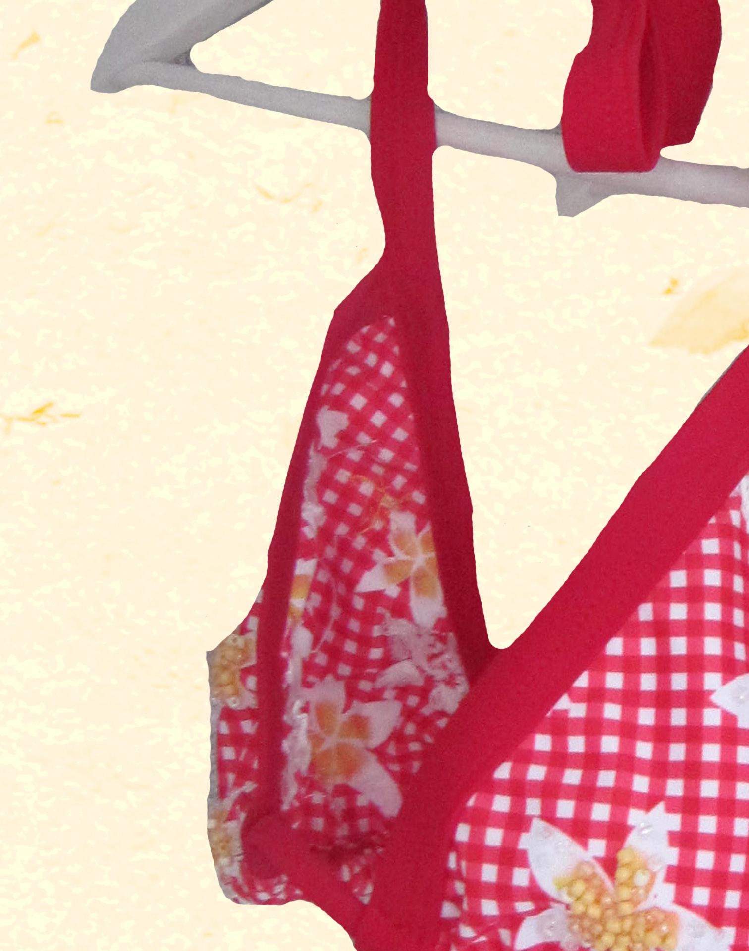
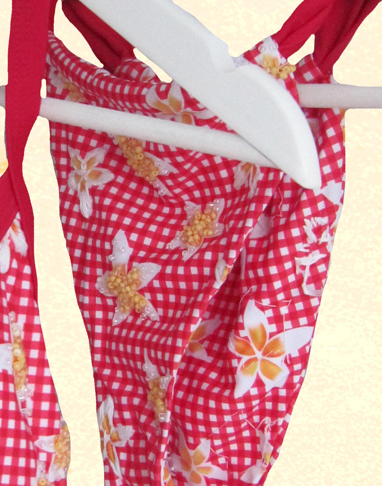
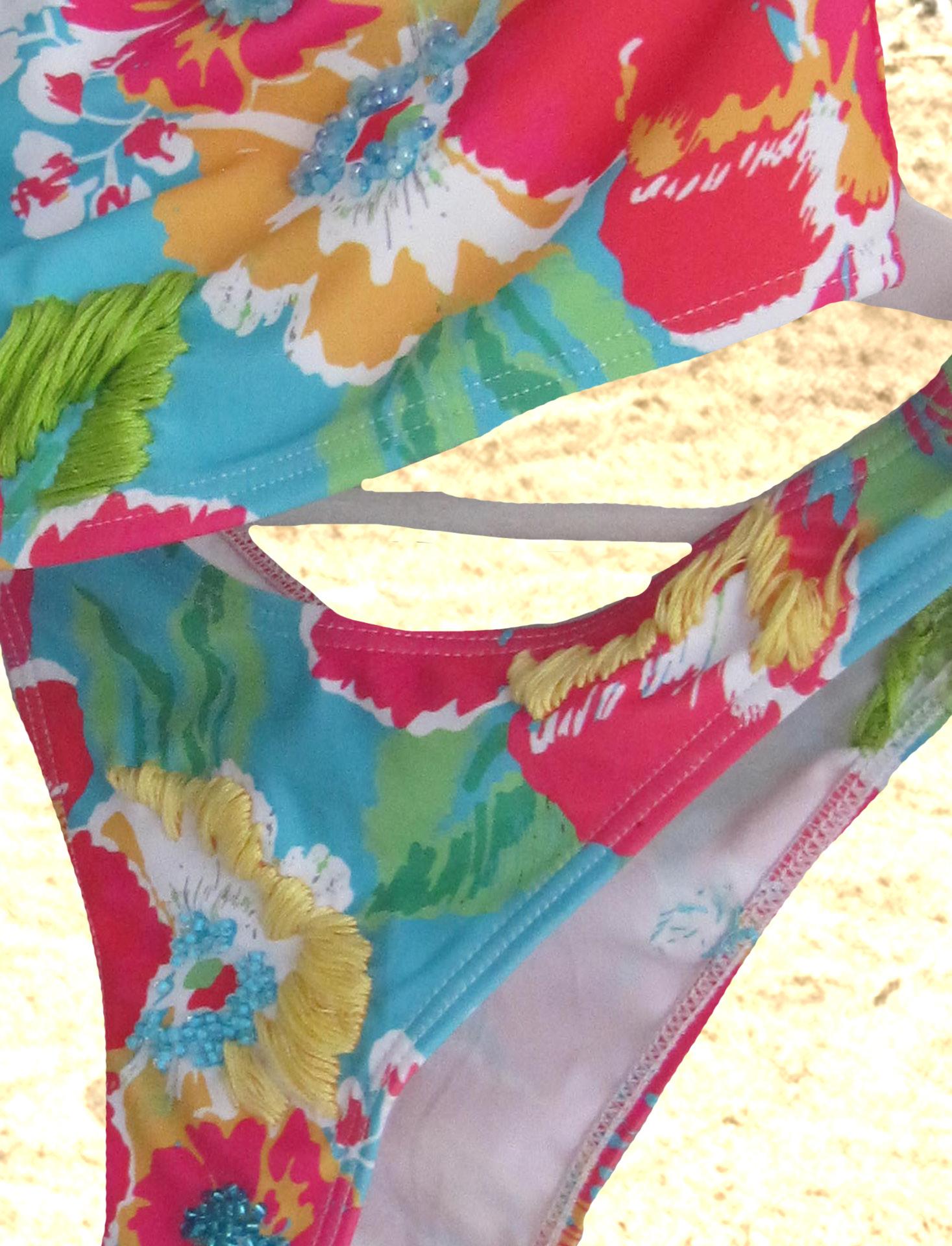
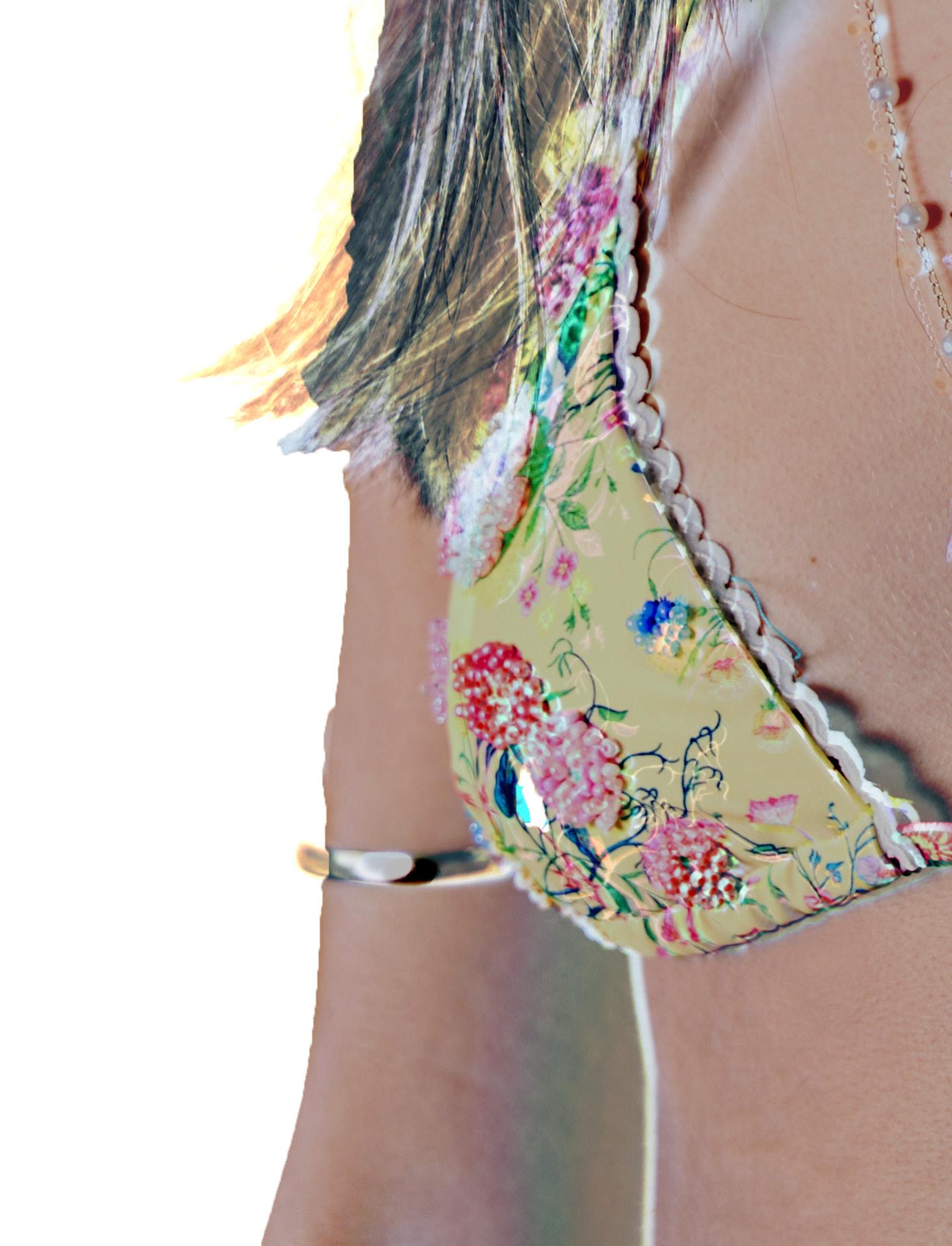
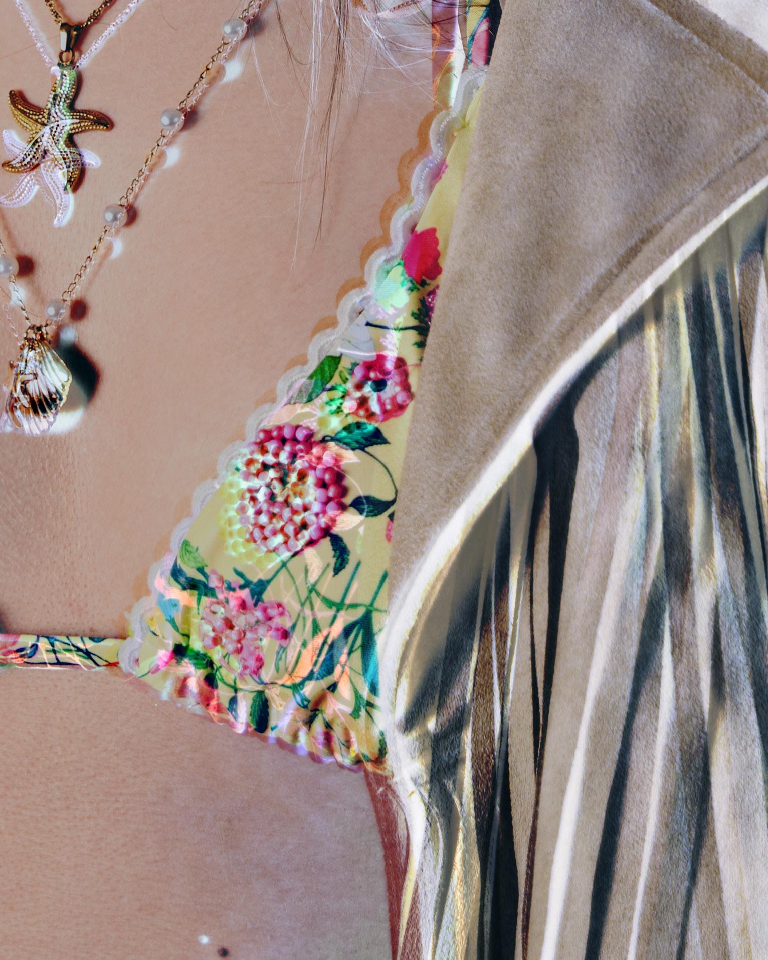
BEAD-ME-GINGHAM
Bead-Me-Ging -
ham is a standout in the collection...bold, playful, and full of character. It introduces patterned swimwear to Azur Ibiza, adding a fresh, edgy twist with its floral gingham print and new personality for the rebrand.
What truly sets it apart is the embellishment: over 10 hours of hand-beading with sunny yellow, glossy white, and crystal-clear beads carefully placed to highlight the bikini’s lines and floral details. The varying yellows add dimension and a summery glow that sparkles like morning dew on wildflowers.
This bikini feels fresh, fun, and entirely unique, embodying the rebrand’s creativity, individuality, and expressive new direction. BeadMe-Gingham doesn’t just fit the collection... it elevates it.
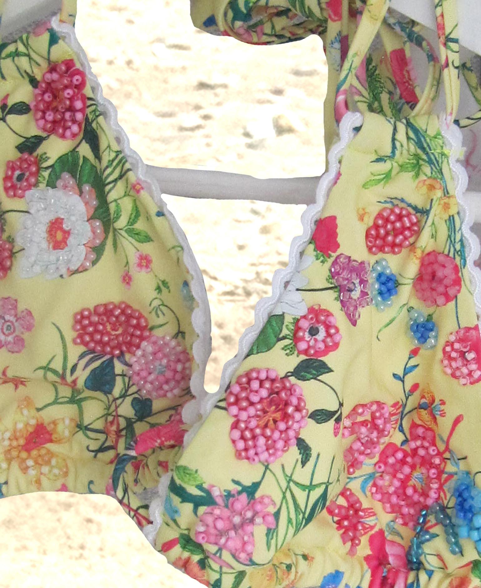
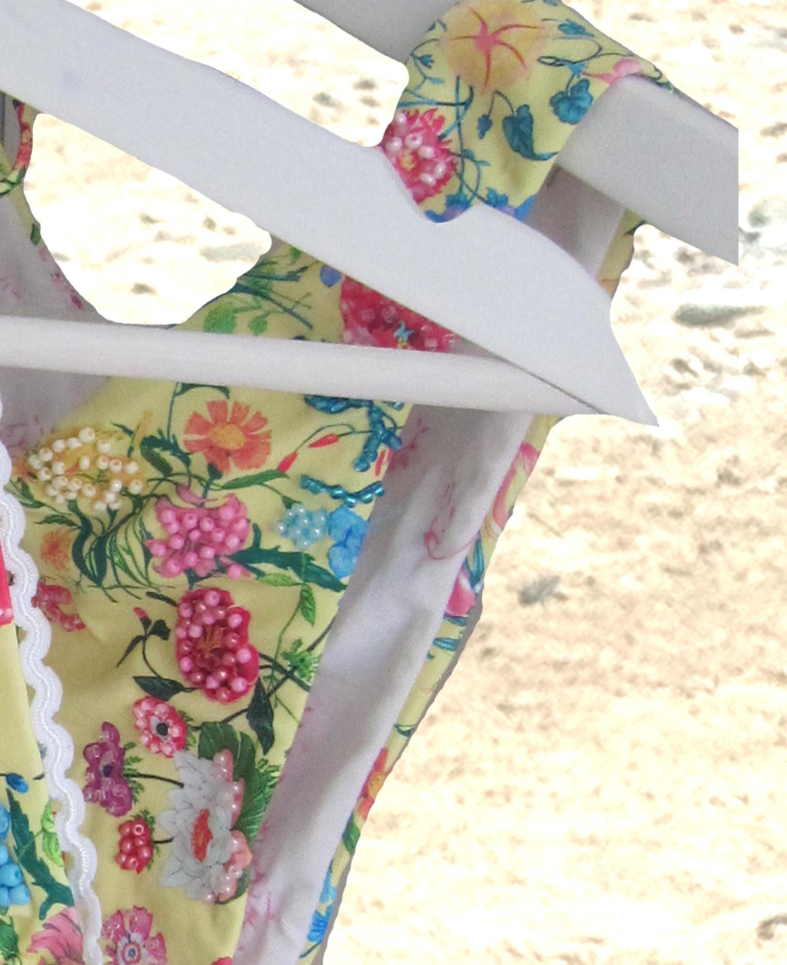
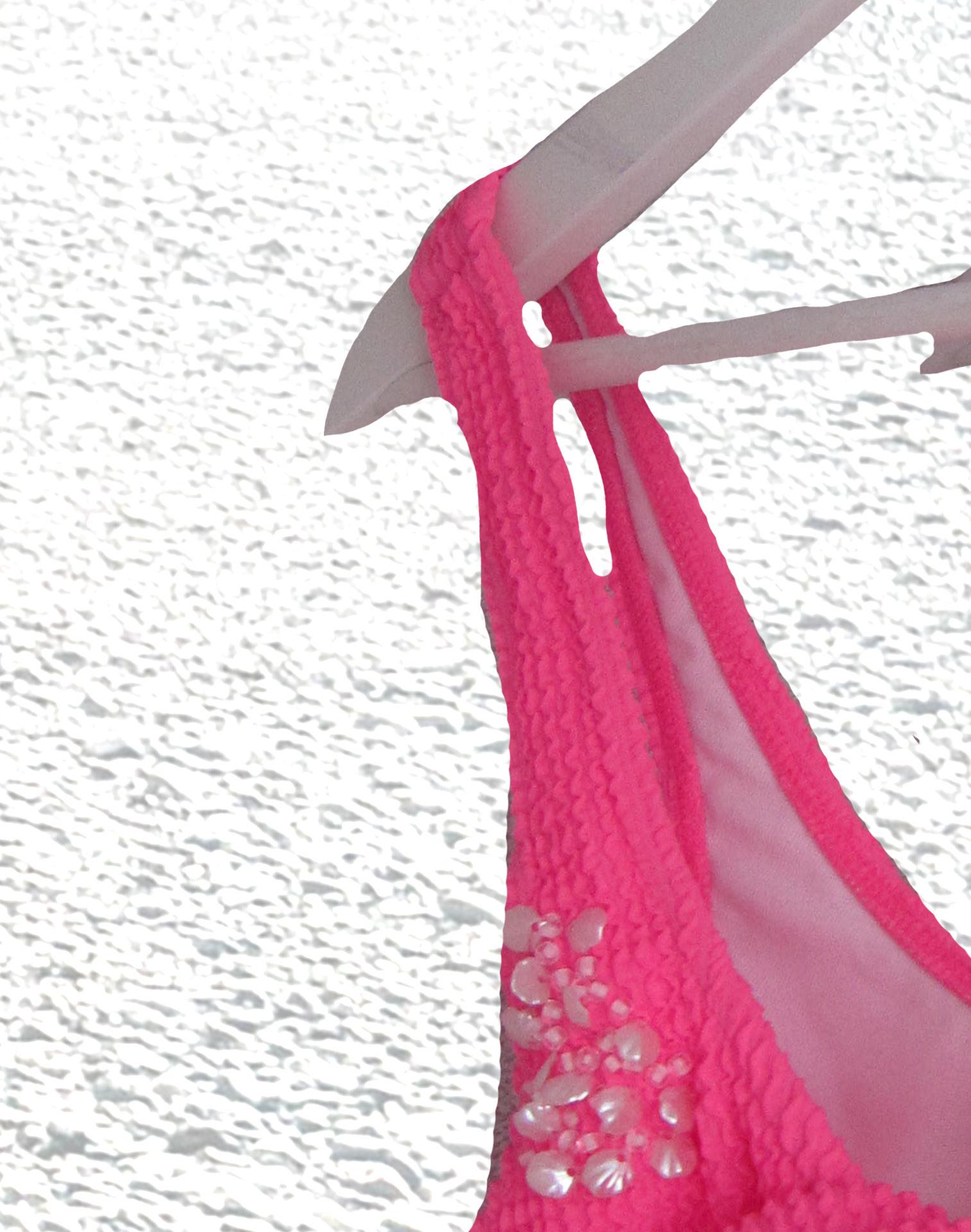
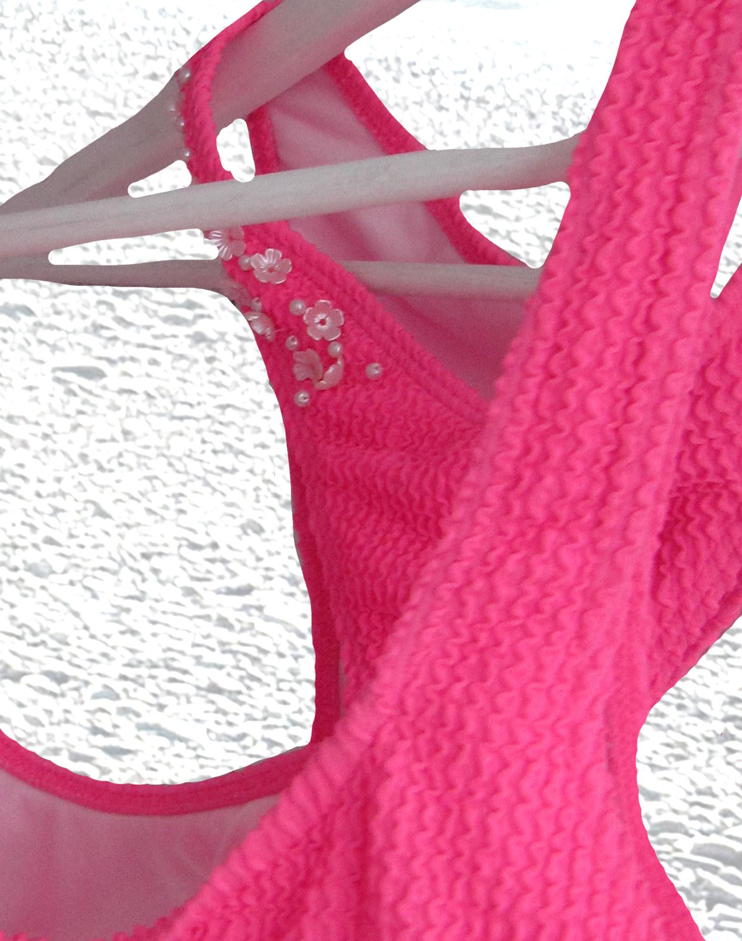
Blooming Beads is the crown jewel of the collection...the most intricate piece and a true labour of love. Set on a soft yellow floral base, it features micro-beading delicately hand-stitched over 12 hours, creating a textured, expressive, one-of-a-kind finish.
The beads in soft pink, purple, blue, and yellow shimmer like a sun-kissed wildflower garden, catching light from every angle. The detailed craftsmanship gives the piece a sense of intimacy and care, almost like wearable poetry.
More than just a bikini, Blooming Beads is a statement, celebrating slow, mindful fashion and individuality. It embodies the rebrand’s mission to bring purity, creativity, and uniqueness to Azur Ibiza.
This piece doesn’t just stand out; it tells a story of dedication and artistry in full bloom.
BLOOMING BEADS
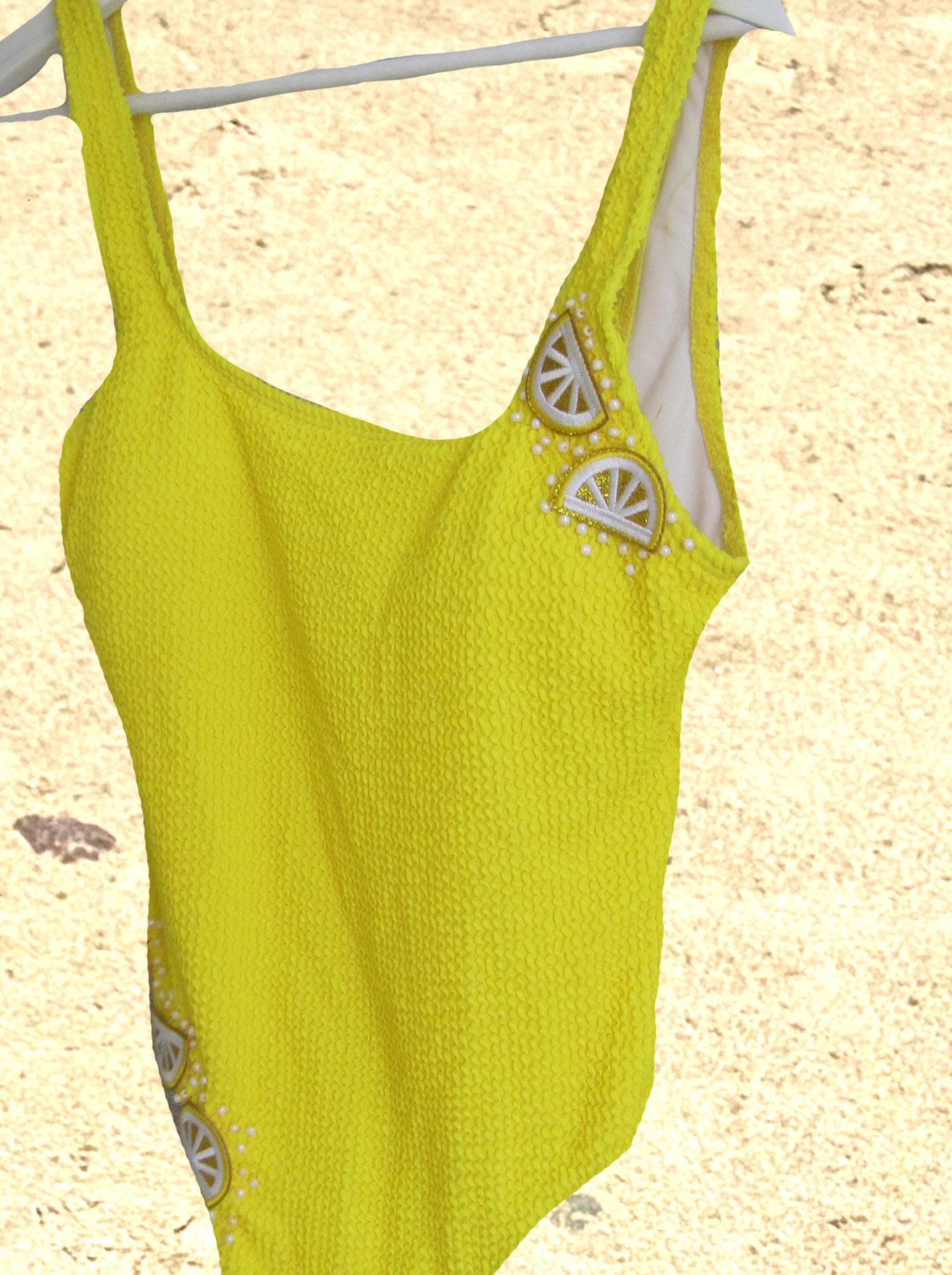
BEAD-A-LEMON
Bead-a-Lemon is the vibrant, sunshine-soaked highlight of the textured swimwear line, adding personality and handcrafted charm to Azur Ibiza’s sleek style. Made in bold yellow with honeycomb-textured fabric, this onepiece radiates warmth and playfulness.
The standout feature is the hand-beaded lemon slice motifs, three on the right hip and bodice, taking 3 hours to embellish. Tiny pearl-like beads mimic the juicy shimmer of citrus, giving the suit a subtle, dewy sparkle.
These details lift the simple silhouette into a fresh, characterful piece, an artistic nod to handcrafted beachy kitsch. Whether paired with a crochet vest or worn alone, Bead-aLemon makes a fun, unique statement.
It’s a joyful tribute to slow craftsmanship and individuality, adding creative flair to Azur Ibiza.
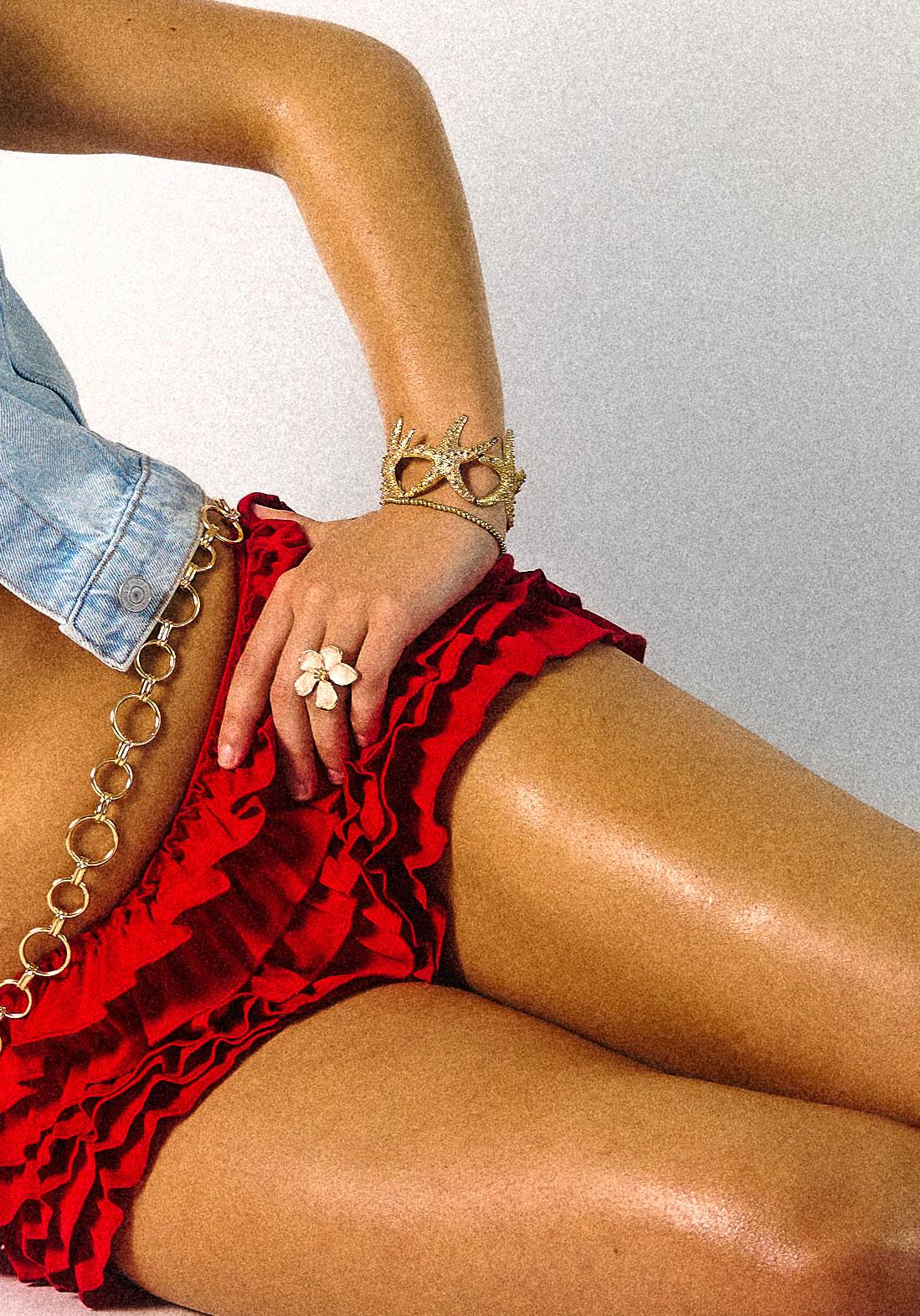
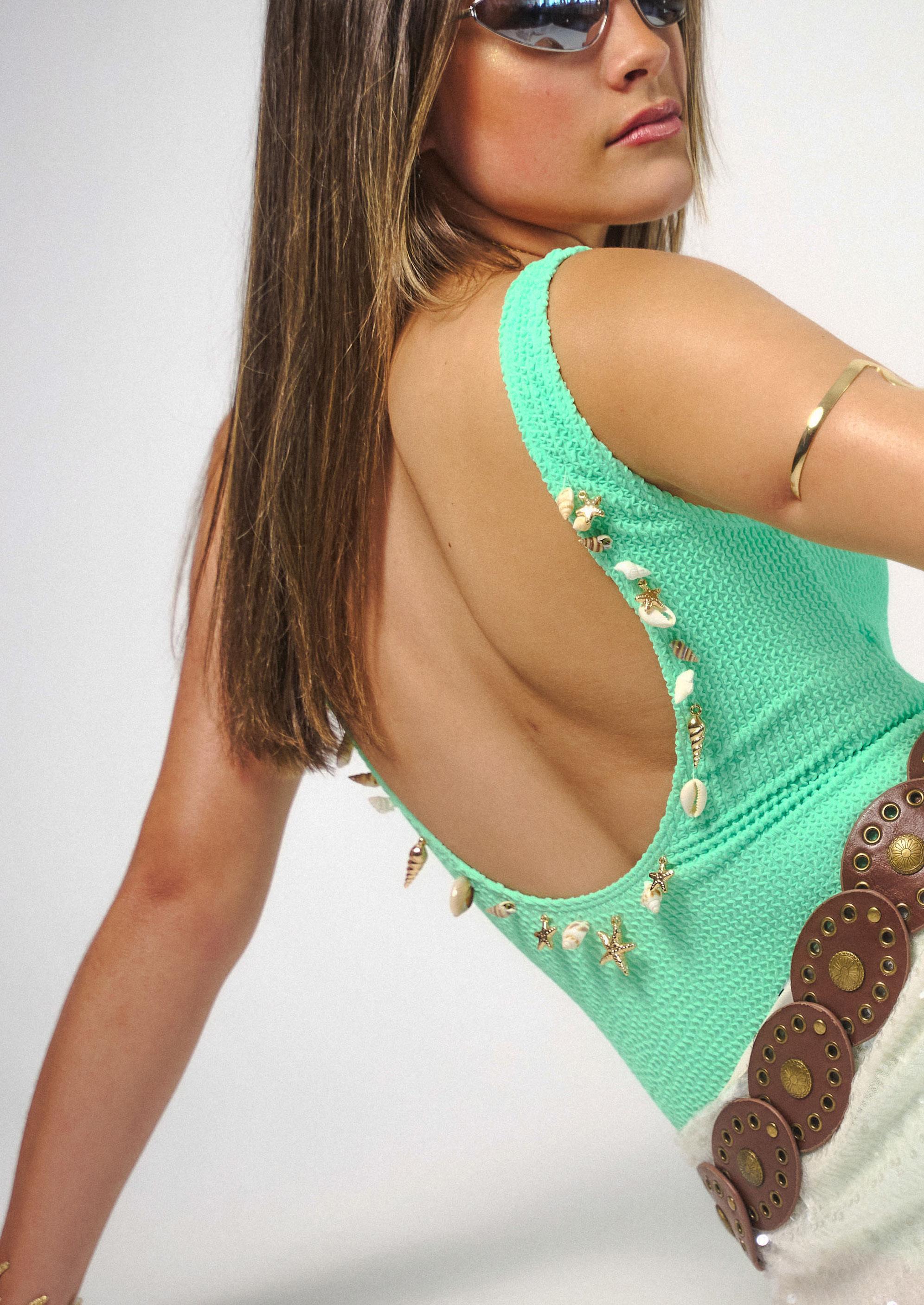
SHELL’D OUT
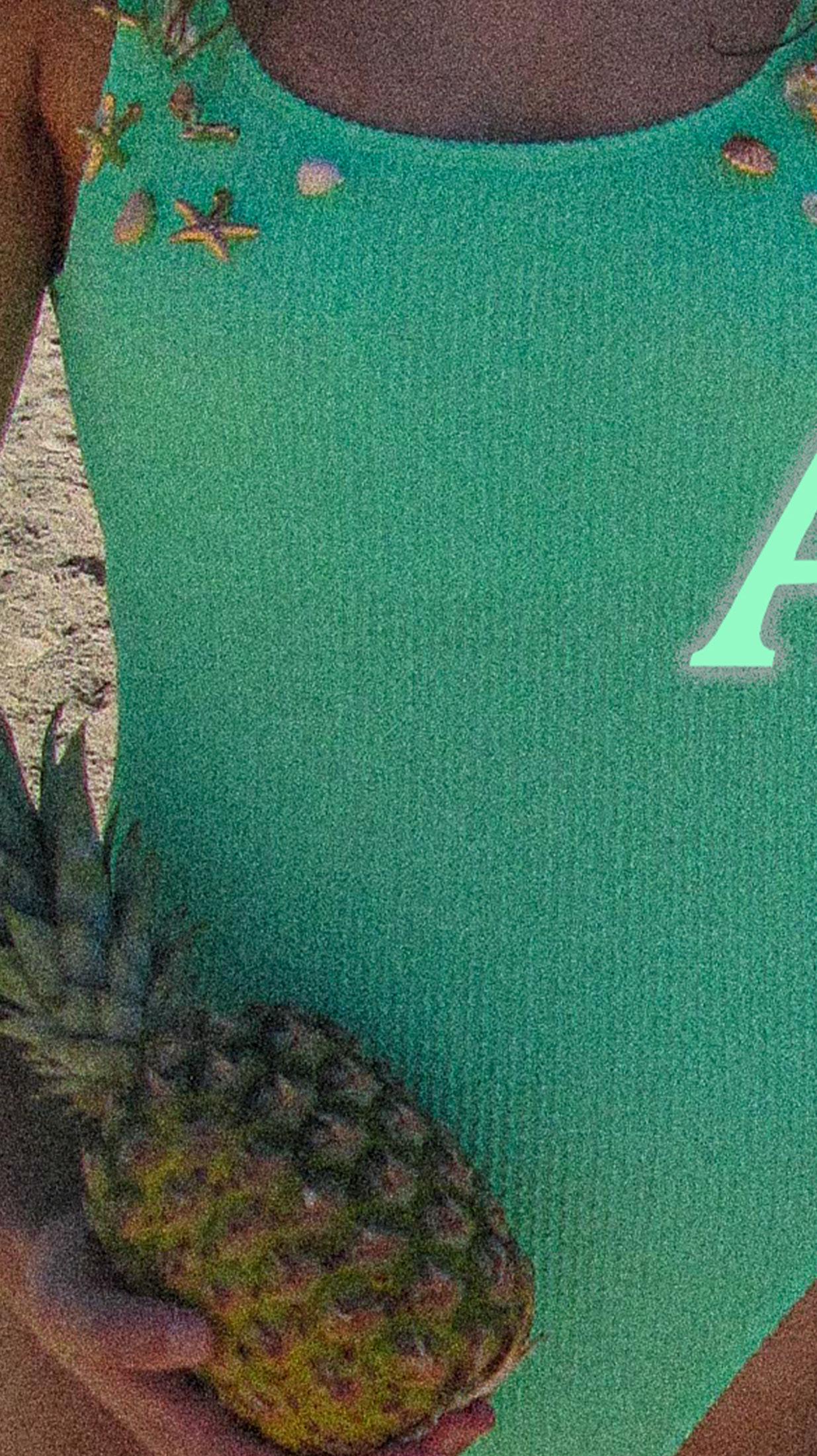
The “Shell’d Out” swimsuit is more than swimwear...it redefines coastal elegance. Made from soft mint green waffle-textured fabric, it offers structure, stretch, and a sculptural look.
Its standout feature is the hand-embellished neckline and straps, adorned with polished seashells and gold-plated marine charms like starfish and coral. This organic, asymmetrical design took over three hours to create, evoking treasures scattered by the sea.
Inspired by Azur Ibiza’s bohemian-glam vibe, the suit blends effortless style with tactile, personal details. It’s a statement piece for dreamers and wanderers, nostalgic, sophisticated, and meant to be worn, remembered, and admired.
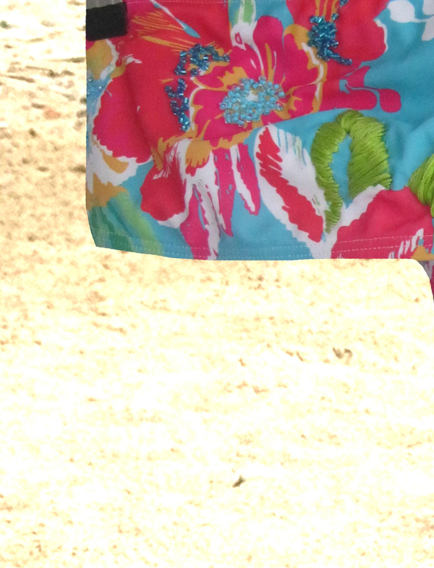
TROPICAL THREAD
Tropical Thread was the first design I created for the Azur Ibiza rebrand and holds deep personal meaning. With less embellishment than later pieces, it marked my early experiments in adding dimension to swimwear. It took 14 hours as I developed my embroidery skills.
This bandeau bikini features a bold tropical print, vibrant red, green, and yellow flowers on a turquoise base, enhanced by delicate hand-applied blue beading and subtle embroidery. These details add texture and light without overpowering the print.
Tropical Thread captures the playful, colourful spirit at the heart of the rebrand and feels like its true starting point.
CALA ROSA
A love letter to Ibiza’s hidden coves and sunset blooms, the Cala Rosa bikini is where soft romance meets bold individuality. Crafted from vibrant, textured fabric that catches the sunlight just right, this piece celebrates the island’s contrasts, wild and delicate, free and intentional.
This swimsuit is hand-finished over the course of three hours, adorned with carefully sewn acrylic flower petals and pearl beadings, creating a tactile, oneof-a-kind detail that reflects the soul of slow fashion. No two pieces are identical, every stitch is a tribute to the spirit of self-expression and imperfection.
Cala Rosa is more than a bikini. It’s a memory in the making. A wearable fragment of Ibiza’s magic.
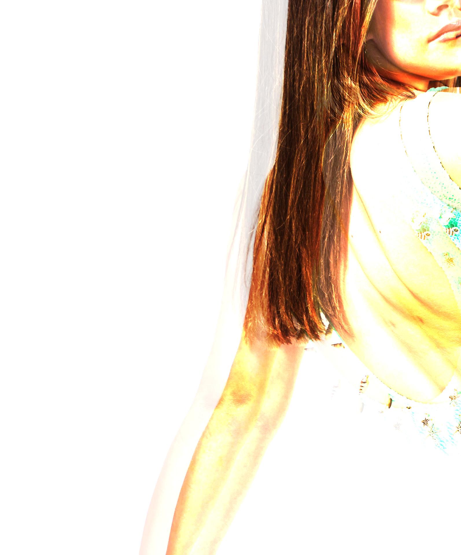
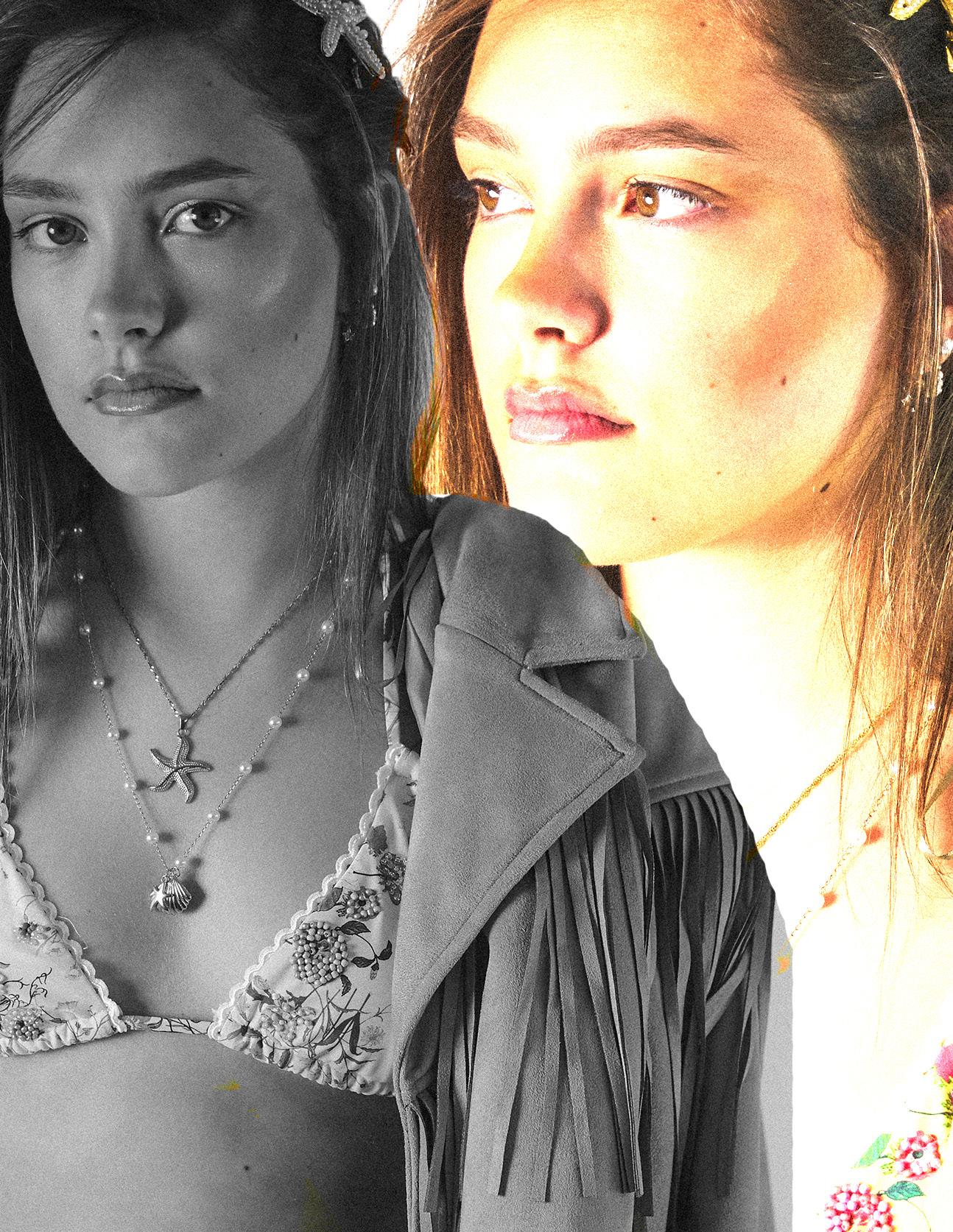
For my brand’s rebrand, I drew inspiration from the bold, experimental aesthetic of the 1990s, a visual language that deeply resonates with my target Gen Z and millennial audience, who are increasingly drawn to raw, nostalgic, and expressive imagery. To authentically capture this spirit, I chose to shoot on an early 2000s Canon digital camera, known for its natural grain, soft focus, and rich saturation. This gave the visuals a candid, unfiltered edge, intentionally minimising post-production to preserve a sense of spontaneity and realism.
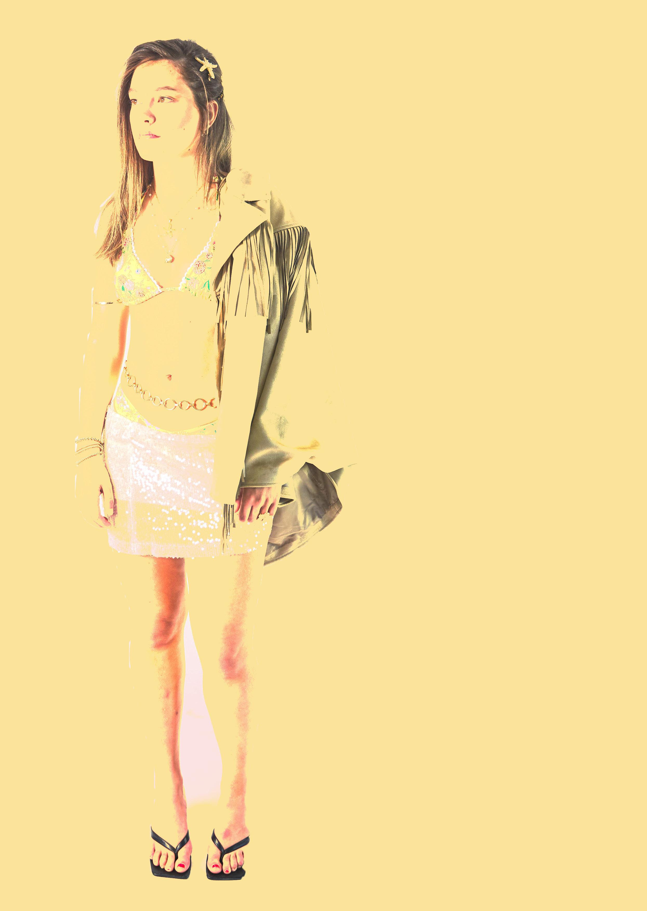
The styling leaned into iconic ’90s fashion: maximalist accessories, hot pants, kitten heels, and the classic headscarf-and-sunglasses combination, all reimagined through the lens of Azur Ibiza.
I layered these nostalgic elements with distinctly Ibizan touches like embroidered crochet, sheer textures, and even cowboy boots, a playful nod to the island’s wild, eclectic energy.
Despite the unpredictability of the UK beach setting and the risk of overcast skies, the shoot delivered the perfect juxtaposition: moody backdrops infused with carefree styling, creating a beautifully offbeat blend of retro and escapist. The result is a visual narrative that feels both familiar and fresh, evoking 90s nostalgia while aligning seamlessly with Azur Ibiza’s bold, handcrafted, and emotionally resonant new direction.
LOCATION CONCEPT
STUDIO CONCEPT
CONCEPT
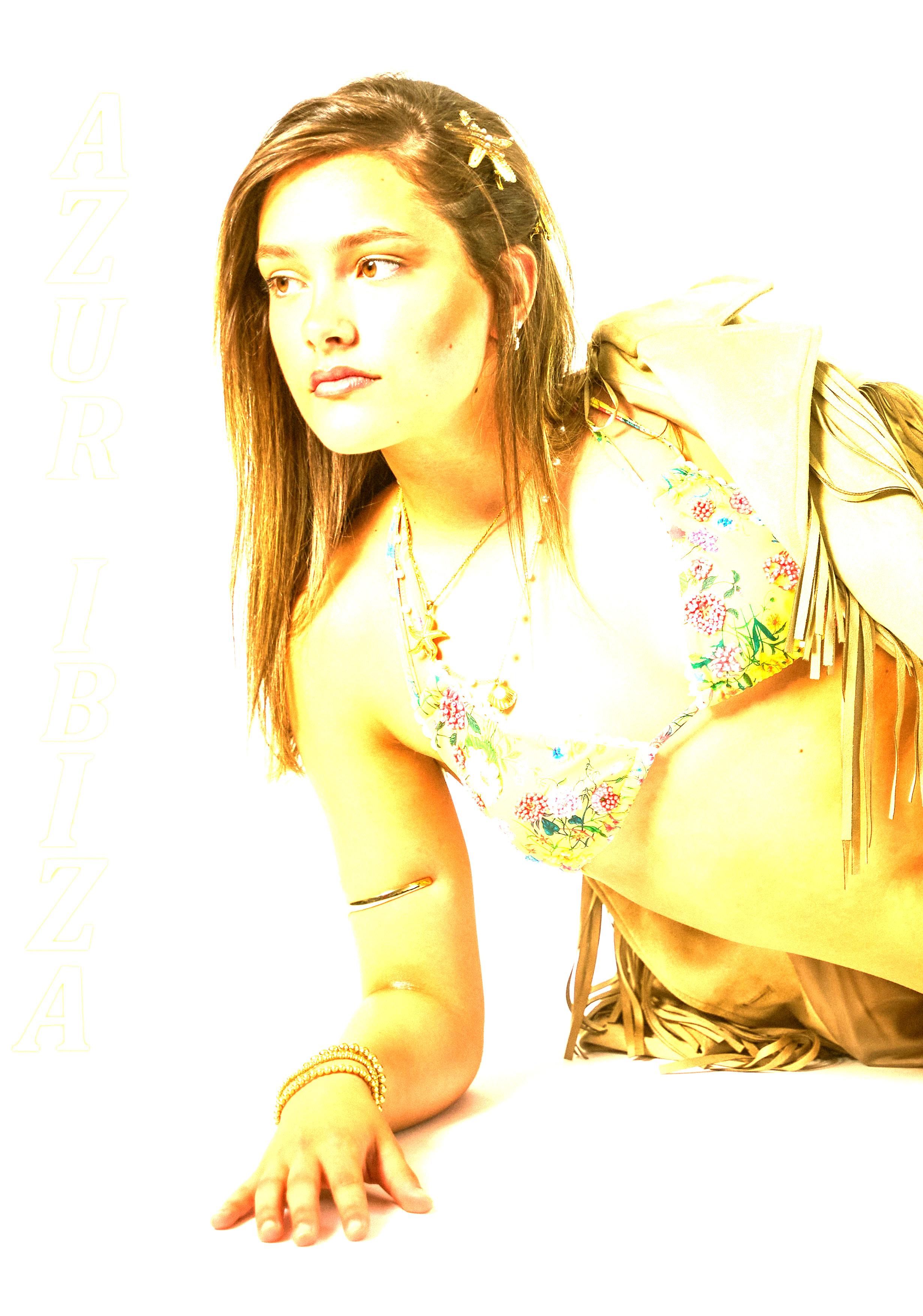
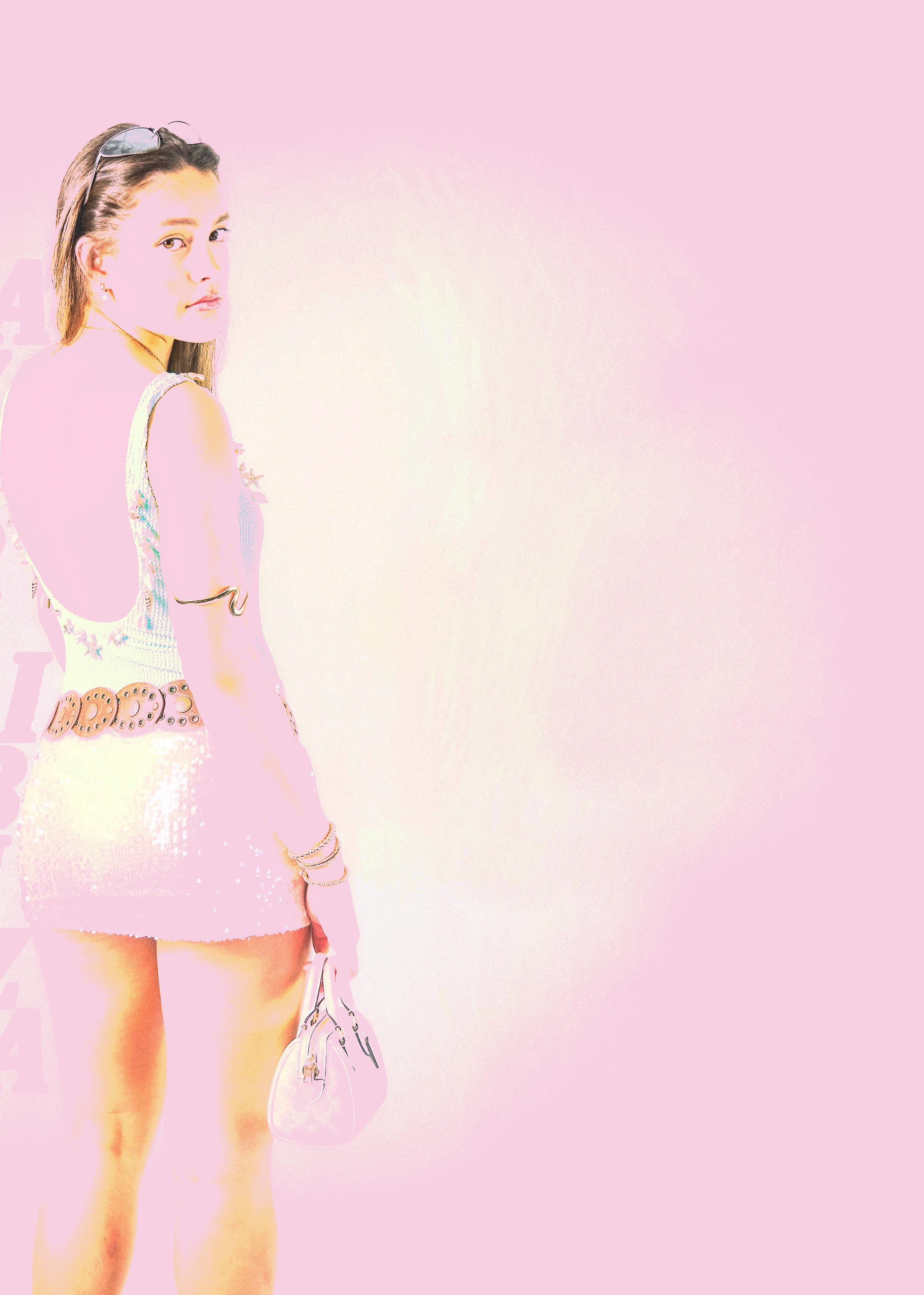
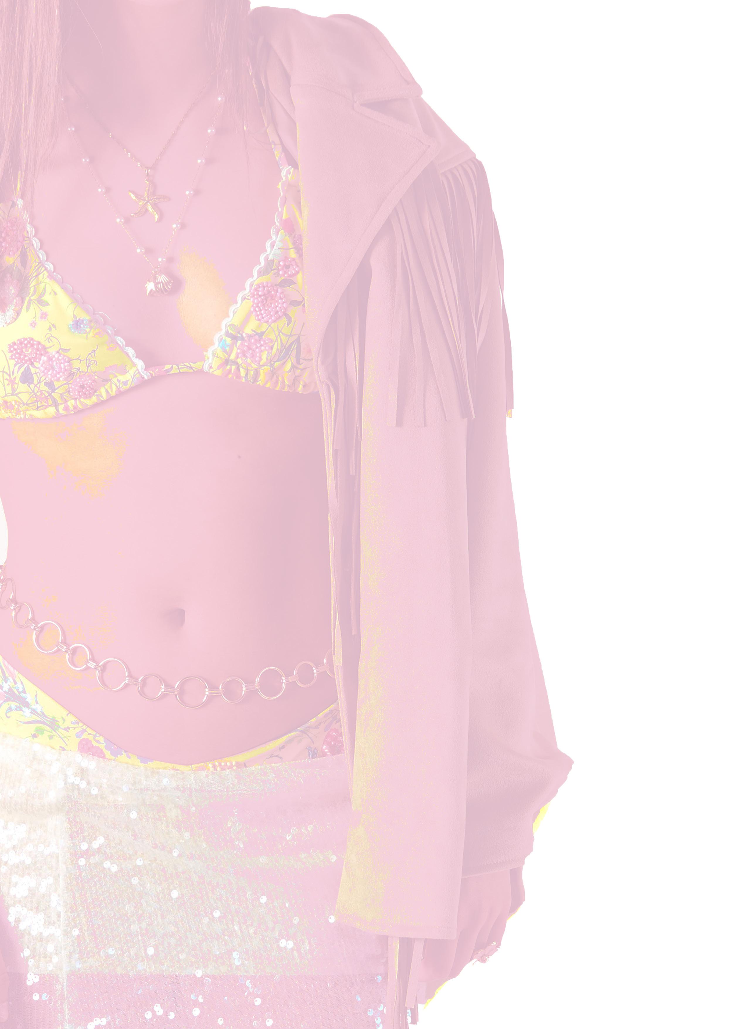
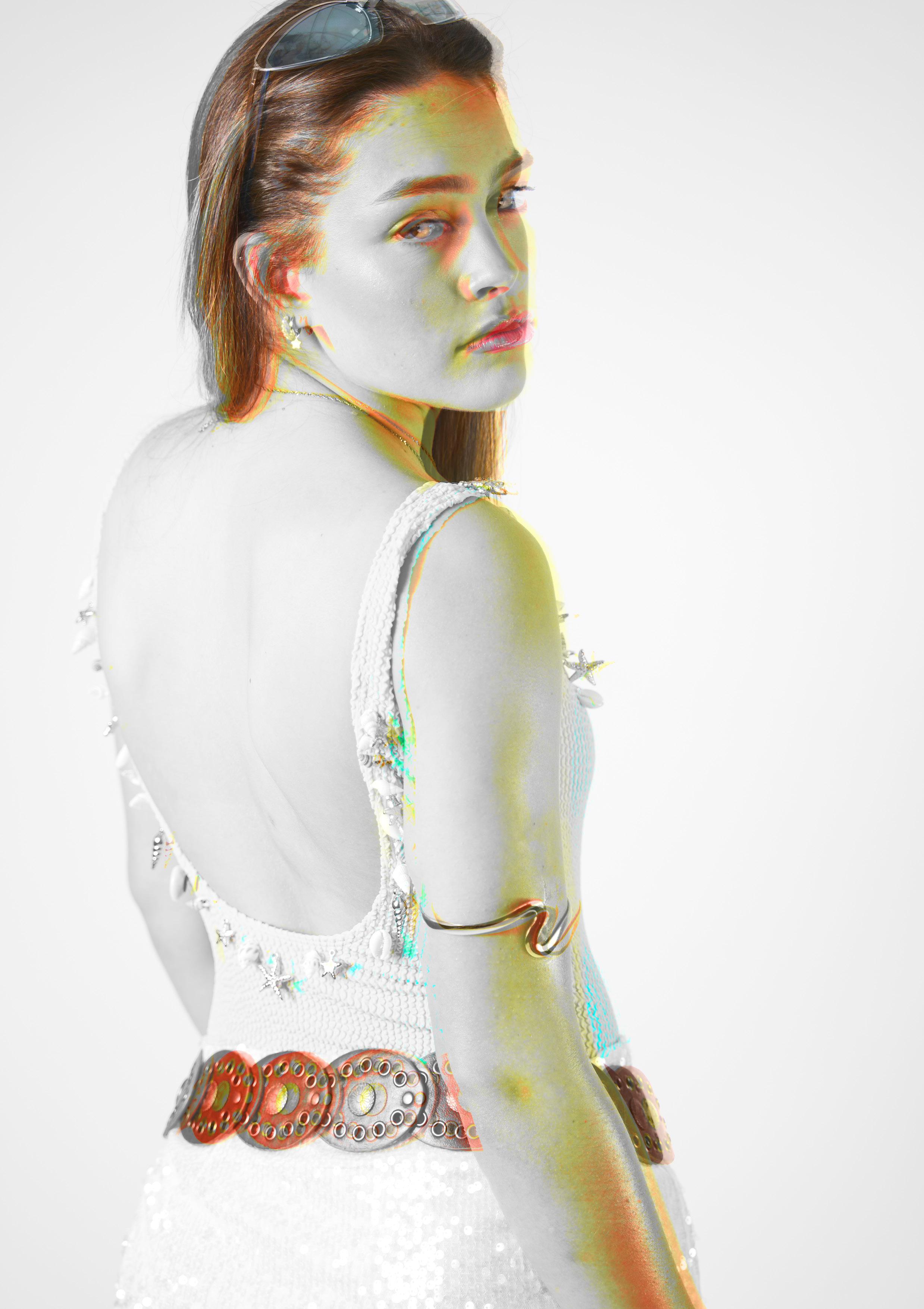
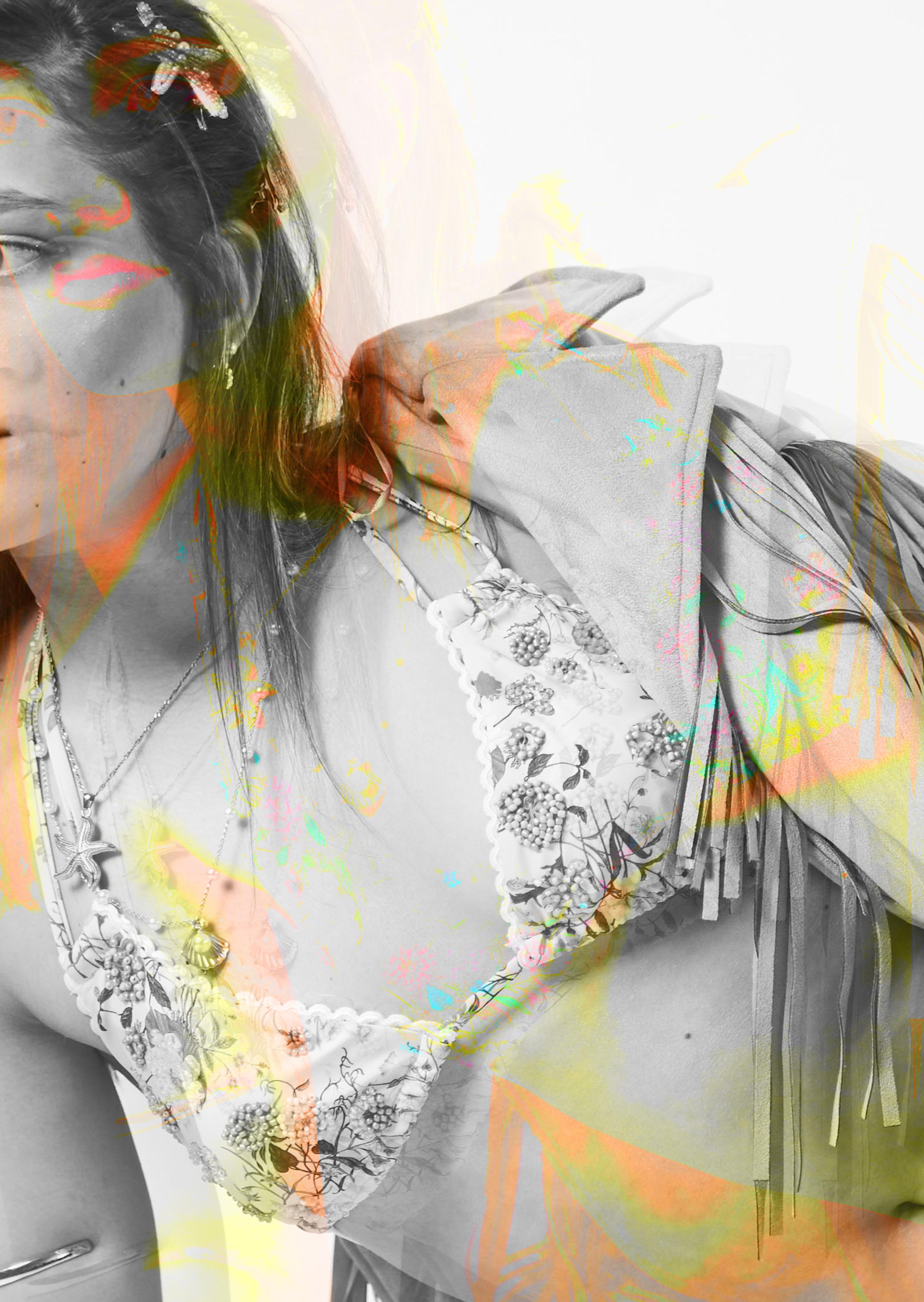
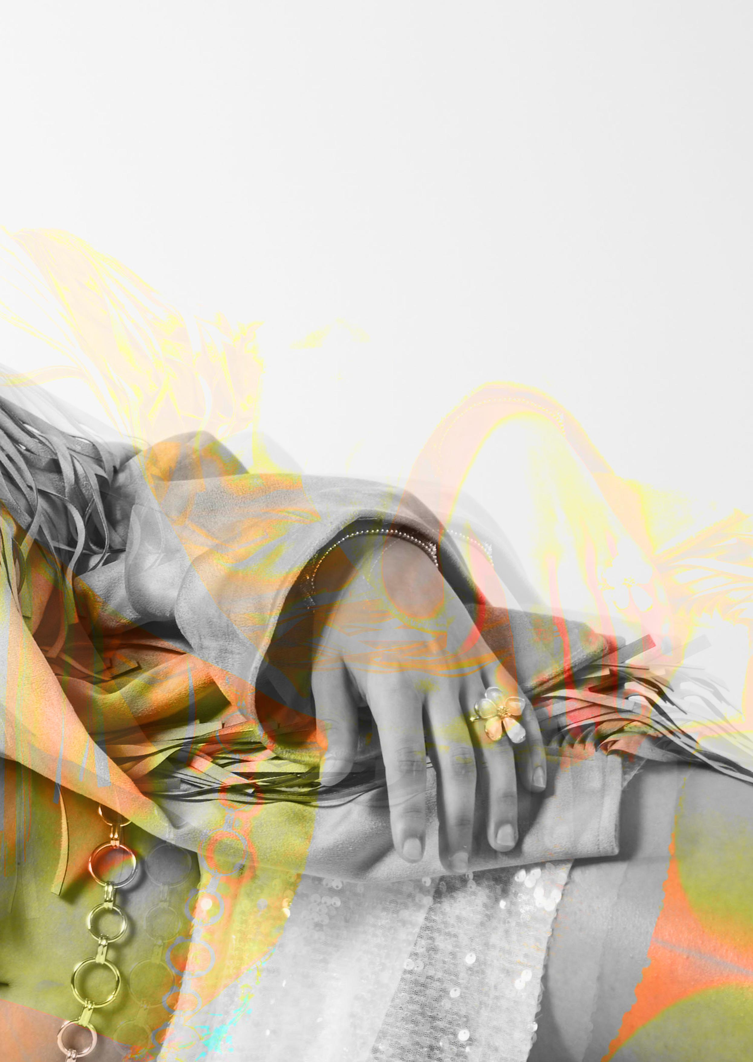
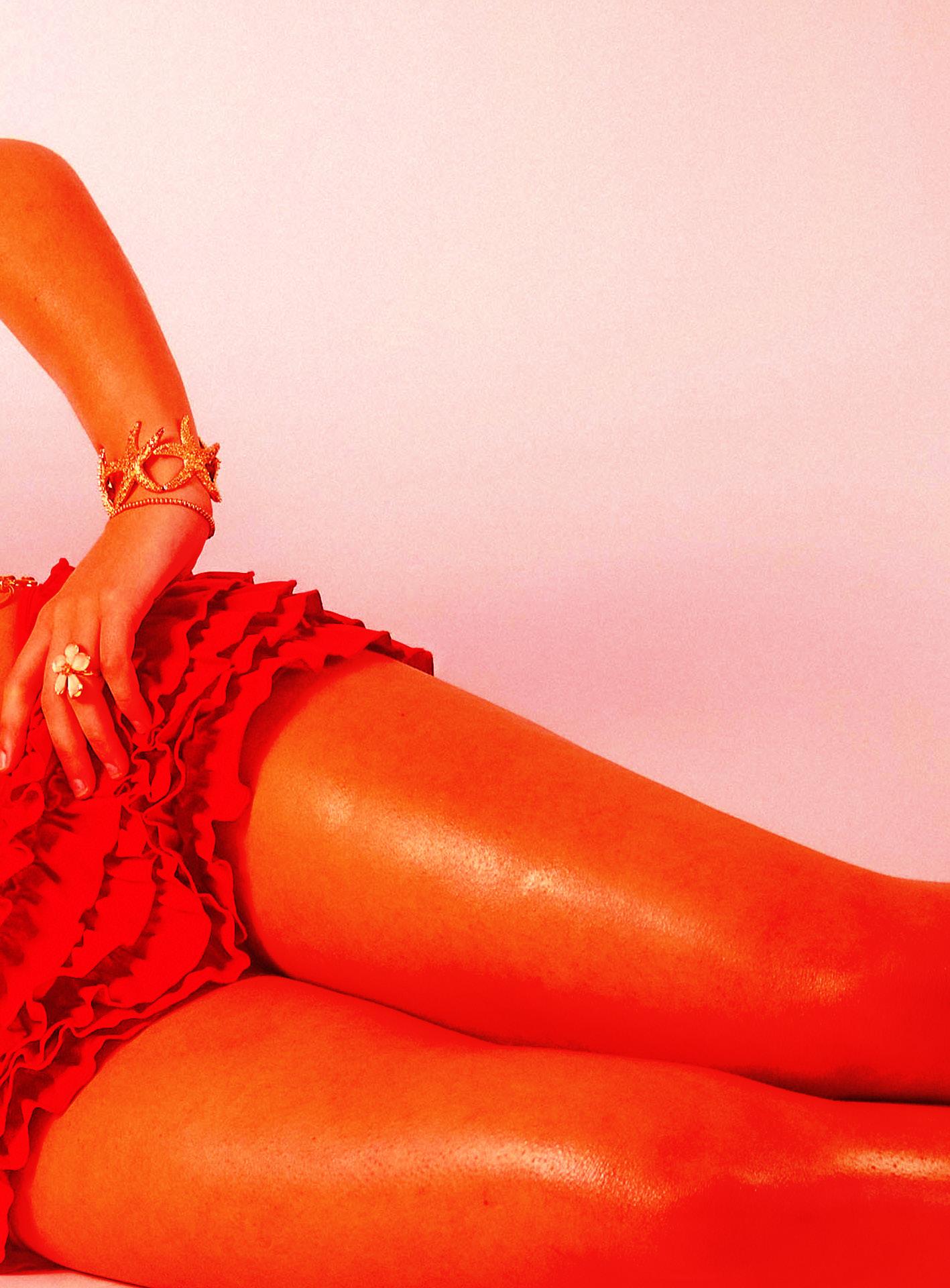
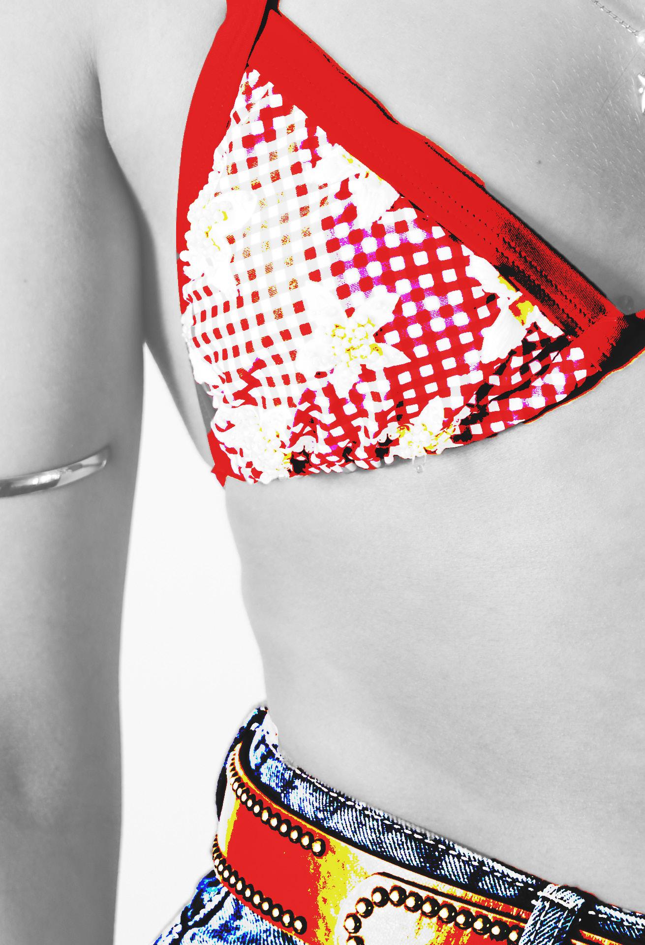
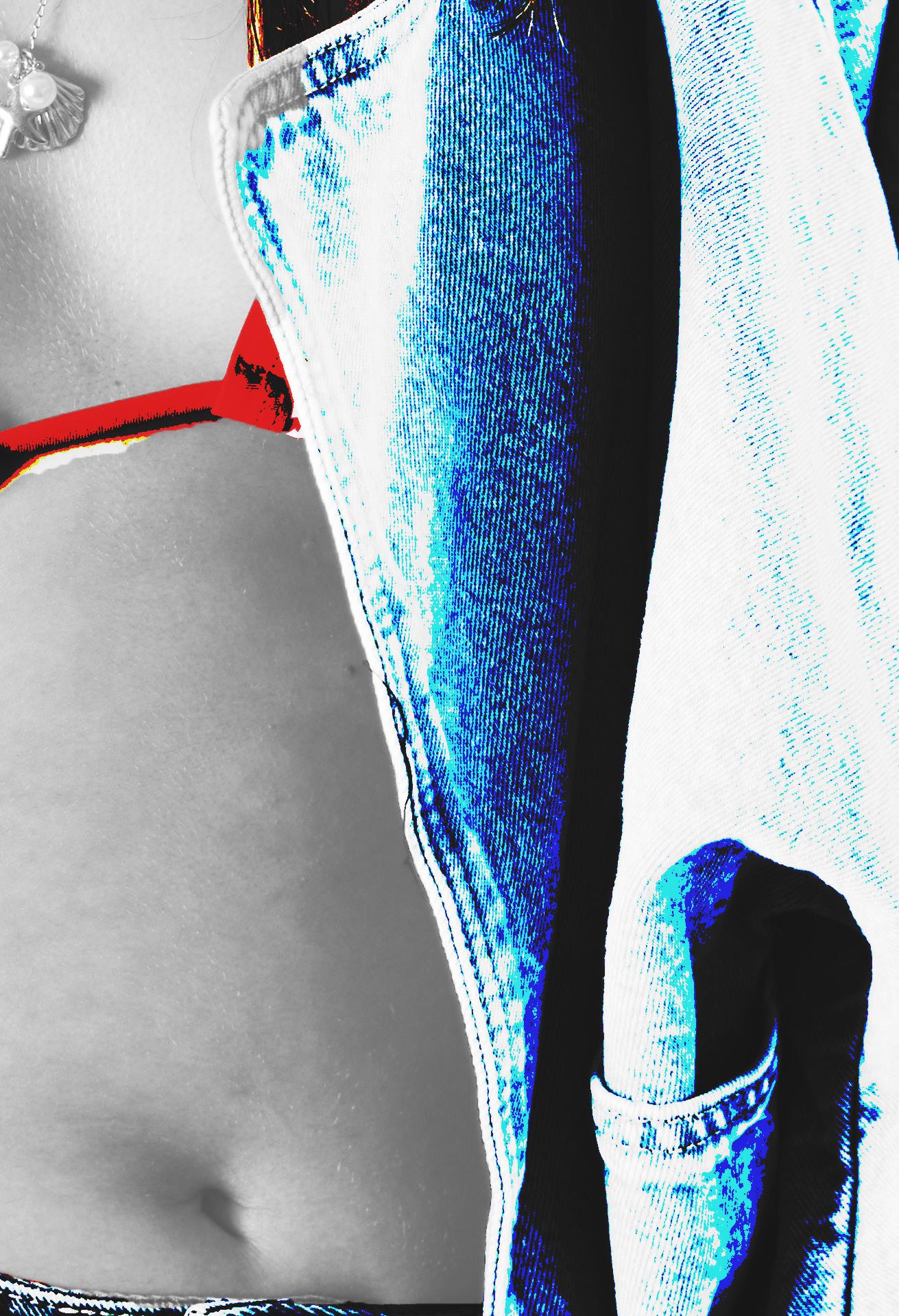
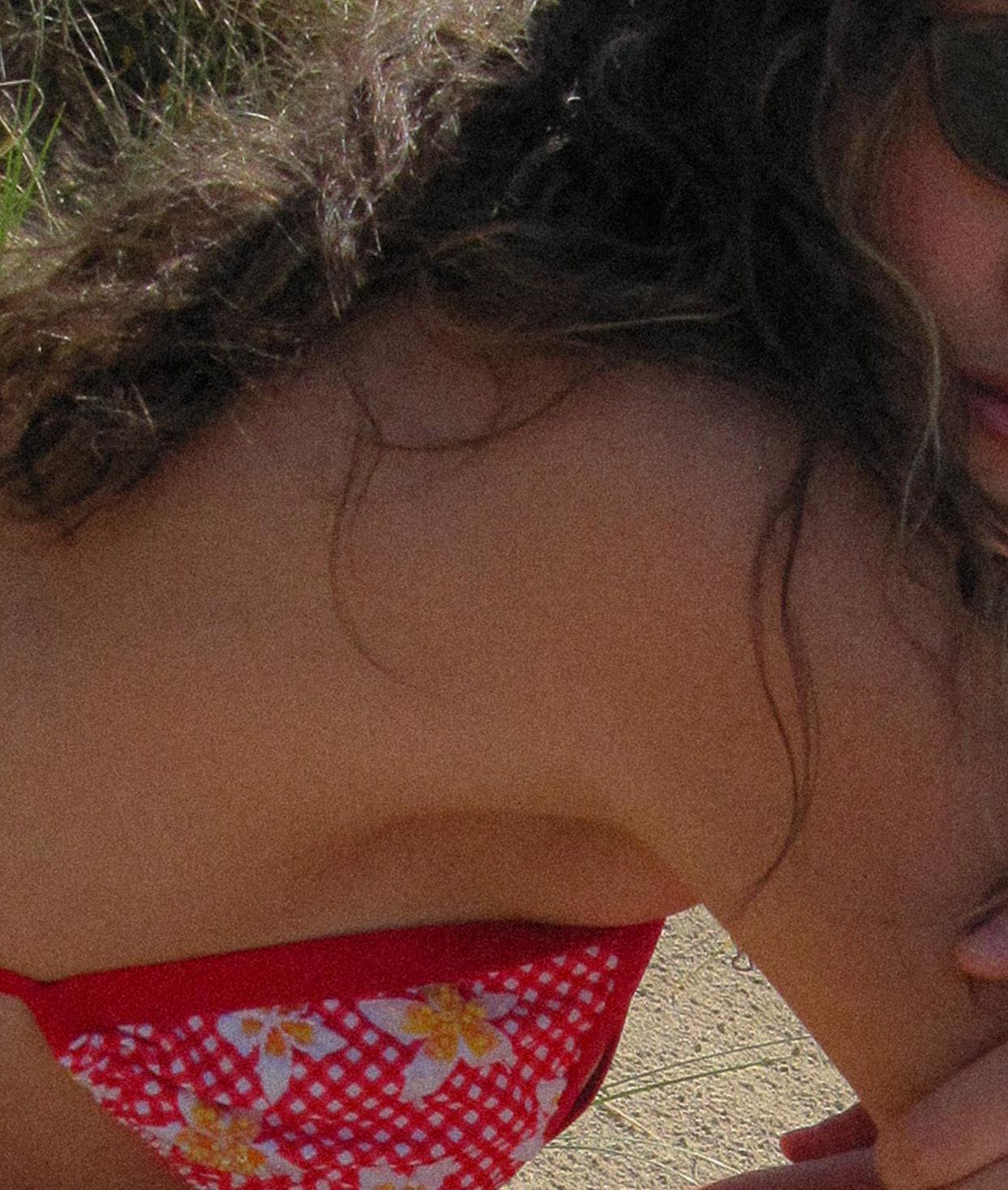
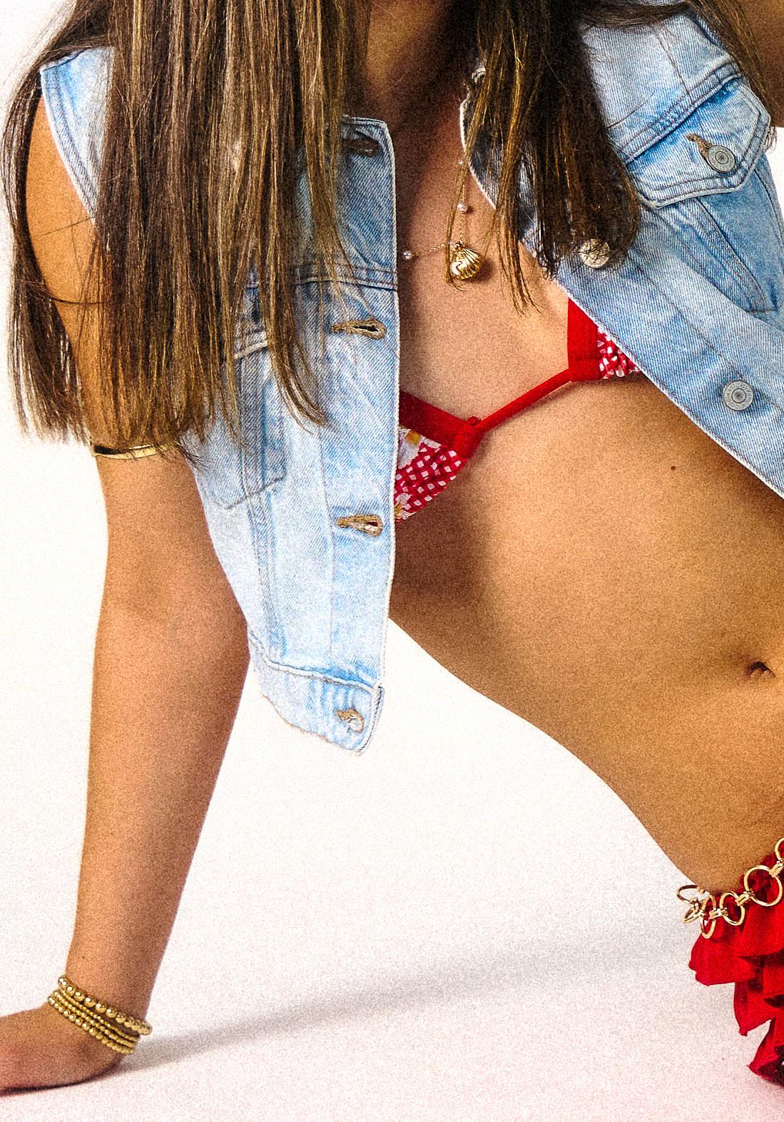
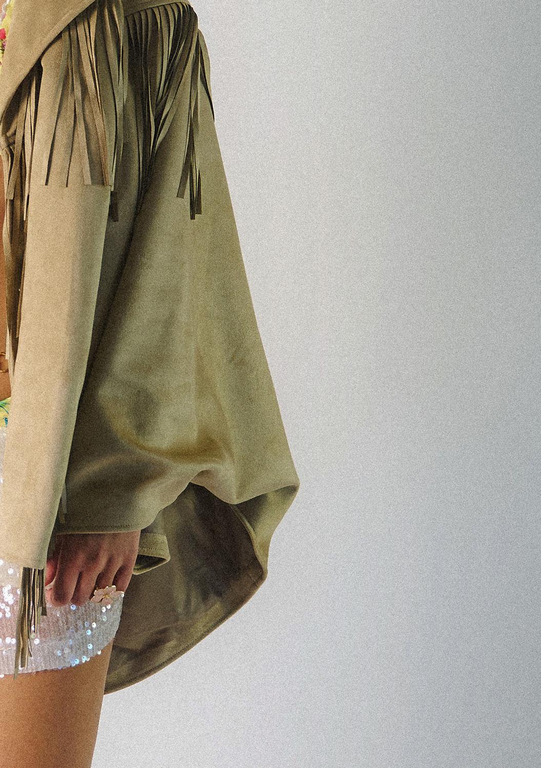
The studio shoot captured the bold, electrifying essence of 90s nightlife, serving as the perfect counterpoint to the sun-soaked ease of the location shoot. Together, they told a complete story, one that reflects how Azur Ibiza pieces transition effortlessly from beach to club, from golden hour to midnight. This contrast added richness to the collection, showcasing its versatility and emotional range. In the studio, styling leaned into a fearless 90s club aesthetic: bikinis layered with sequinned pieces, vintage belts, double denim, and pointed kitten heels. The looks paid homage to an era known for its playful rebellion and eclectic style, while subtly updating it for a modern audience.
The accessories weren’t just decorative, they were attitude, echoing the energy of underground dance floors and backroom glam. Controlled studio lighting was used to recreate the harsh, flash-heavy feel of disposable camera party photos, deliberately raw, direct, and intimate. With minimal editing, the images retained their authenticity and immediacy, allowing the garments and styling to speak for themselves.
This shoot didn’t just showcase swimwear, it brought it into an after-dark narrative, celebrating the rebellious spirit of 90s nightlife and adding an unexpected layer of depth to Azur Ibiza’s Ibiza-inspired identity. It was a visual reminder that this brand isn’t just about summer, it’s about self-expression, transformation, and living freely in every moment.
The ’90s weren’t just a decade, they were a mood, a cultural moment that still resonates deeply today. Azur Ibiza channels that carefree, bold energy, creating an emotional connection with both Millennials and Gen Z.
For Millennials, the ’90s represent lived memories, making it an ideal foundation for a swimwear brand rooted in nostalgia and self-expression. For Gen Z, the era is rediscovered through TikTok, thrifting, and vintage aesthetics, keeping the style relevant and fresh.
Azur Ibiza fits naturally into this revival with classic ’90s silhouettes, high-cut bottoms, triangle tops, ribbed textures, and floral prints. These aren’t just trends; they’re symbols of confidence, freedom, and individuality. The brand celebrates body positivity and expressive style, turning swimwear into a statement of self-love and sun-soaked identity.
With the ’90s influence thriving across indie and luxury fashion, Azur Ibiza stands out by combining timeless style with handcrafted detail and sustainable values. It’s more than swimwear, it’s a lifestyle that connects two generations through shared nostalgia and modern purpose. Not just a trend, but a lasting, cultural story.
For my ’90s photoshoot, beaded and embroidered bikinis perfectly capture the era’s bold, expressive style. The ’90s celebrated standing out with texture, embellishment, and personal touches, think DIY rhinestones, patches, and hand-sewn details that made every look truly unique. These bikinis carry that spirit effortlessly, each piece telling its own story through intricate craftsmanship and eye-catching accents. The handcrafted details catch the light just like iconic ’90s pop and R&B fashion, where swimwear was never just functional but a full-on statement, styled confidently with heels, oversized hoops, and pure attitude. They blend nostalgic glamour with fresh festival-boho vibes and high-gloss supermodel polish, creating a perfect mix of carefree energy and iconic cool that’s tailor-made for this campaign. This fusion of personal expression and polished style celebrates the fearless creativity of the decade, making every shot a vibrant homage to ’90s culture with a modern twist.
BEADING
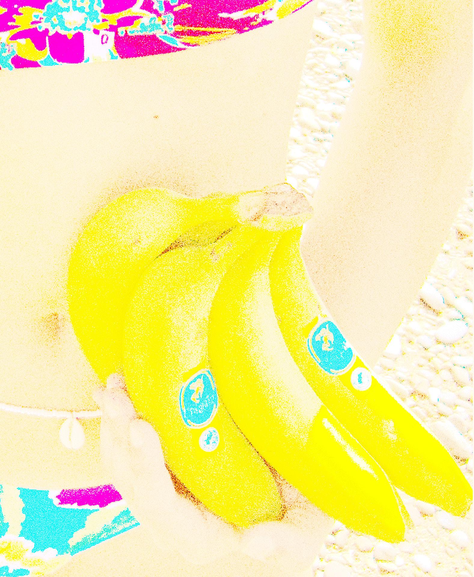
FRUIT
For my ’90s-inspired bikini campaign, tropical fruit isn’t just a prop, it’s a vibrant symbol of the era’s bold colours, playful style, and carefree spirit. The ’90s loved bright, high-contrast swimwear with prints and neon tones inspired by fruits like pineapple yellow and lime green.
Fruit also adds kitschy charm, echoing the decade’s fun, light-hearted designs and beach culture seen in shows like Baywatch and Versace’s tropical motifs. It brings movement and life to the shoot, making it feel spontaneous and fresh.
Additionally, tropical fruit nods to the ’90s wellness boom, symbolising vitality and a lifestyle of feeling as good as you look. Overall, it captures the vibrant, playful, and aspirational essence of ’90s swimwear with a modern twist.
DESIGN FEEDBACK
Bead-A-Lemon received largely positive feedback from 15 respondents. The design was described as “cute,” “chic,” and “current,” with many praising its relevance to present-day fashion trends. The standout feature was the colour, which multiple participants described as “gorgeous,” “bright and vibrant,” and “pretty.” While some appreciated its minimalistic aesthetic, a few noted that it may appear slightly plain in comparison to more detailed designs. Overall, the design was well received for its simplicity and bold colour, with only minor suggestions for enhancement.
Shell’d Out was one of the most highly praised designs, with 100% of respondents expressing admiration. The shell and starfish embellishments were repeatedly mentioned as elevating the piece and giving it a luxurious, high-end look. Descriptors such as “stunning,” “unreal,” and “perfect for the beach” were frequently used, indicating strong emotional resonance with the audience. Only one concern was raised regarding the potential for hair to get caught in the decorative details, a small usability issue that can be addressed in future iterations.
Feedback on Shell’d Out’s back design was also overwhelmingly positive, with 13 out of 15 respondents highlighting the back as a unique and eye-catching feature. Many appreciated the attention to detail on the reverse side, noting that it differentiated the brand from others on the market. However, two respondents did raise concerns about comfort when lying down, due to the shell embellishments. While minor, this suggests an area for functional refinement in future collections.
Bead Me Gingham was celebrated for its stunning and feminine aesthetic. Respondents praised its 3D detailing, ease of styling, and overall visual appeal. The piece was viewed as both simple and effective, managing to stand out without needing overly complex patterns.
Blooming Bead received strong approval for its floral print and complementary beadwork. The design was described as summery, trendy, and visually striking. Feedback highlighted the harmony between the pattern and the colour way, suggesting that the overall composition of the piece resonated well with the audience.
Cala Rosa was favoured for its eye-catching design and more modest coverage, appealing to those looking for a stylish yet comfortable fit. Respondents appreciated its cute embellishments and the fact that the piece felt like a full outfit rather than just swimwear. A few noted that the design offered slightly less support compared to others, but this was balanced by the piece’s simplicity and wearability.
Tropical Thread received more mixed feedback. While described as cute and eye-catching, some respondents felt it needed more embroidery to create a stronger impact. Although not everyone’s favourite, the design was still recognised for delivering a vibrant, holiday-ready vibe.
When asked to choose their favourite pieces, Blooming Bead emerged as a top contender, valued for its versatility and well-balanced colour palette. Shell’d Out continued to impress with its detailed embellishments, while Cala Rosa was also noted for its colour and design elements. Bead Me Gingham and Bead-A-Lemon also received individual mentions, confirming that each design resonated with different consumer preferences. Several respondents stated that they loved all the designs, showing the broad appeal and cohesive quality of the overall collection.
Respondents offered constructive feedback on how the collection could evolve. Suggestions included experimenting with chunkier or more varied beads, incorporating a wider range of tropical colours such as warm oranges and corals, and making shell embellishments more washable or practical for everyday use. Additionally, there was interest in expanding the range with different bottom styles, more adventurous and bold designs, and the inclusion of one-piece swimsuits. Some participants also recommended the addition of complementary items like cover-ups and beach bags to complete the brand’s lifestyle offering.
Based on this valuable feedback, several development opportunities have emerged. Future collections could benefit from incorporating cover-ups, accessories, and more warm-toned colour ways to match evolving trends. There is also strong interest in creating destination-themed collections, which could tap into aspirational travel and beachwear aesthetics. Planning another drop ahead of the full launch could build momentum and further test market preferences. Finally, continuing to innovate with one-piece designs, styling versatility, and standout detailing will be key in maintaining consumer excitement and loyalty.
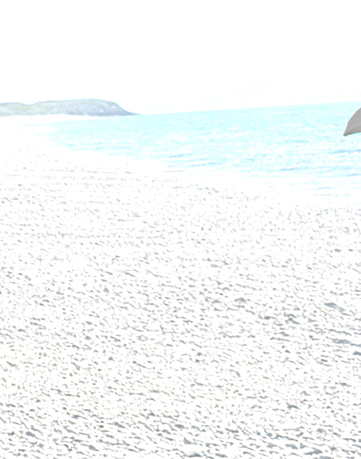
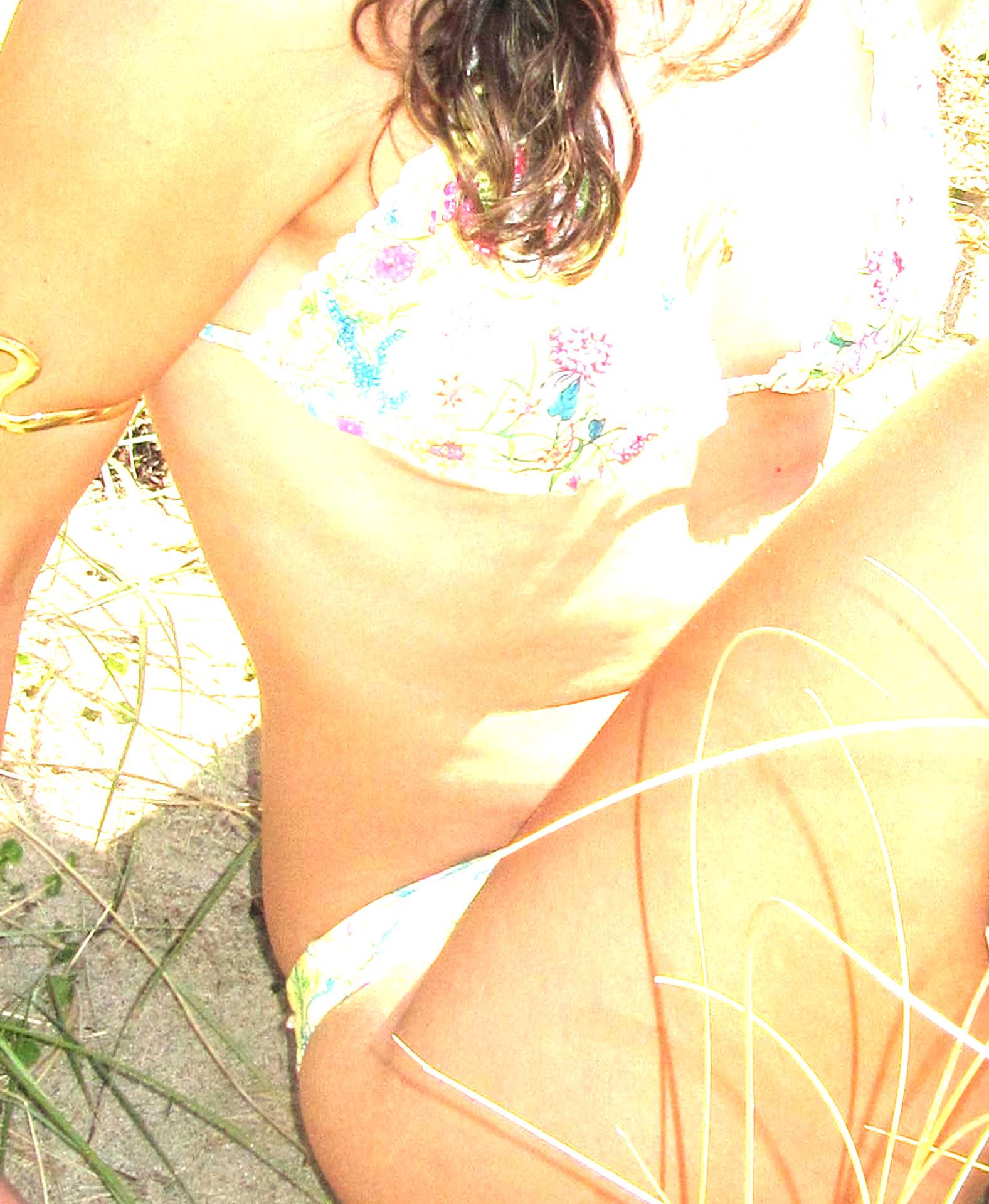
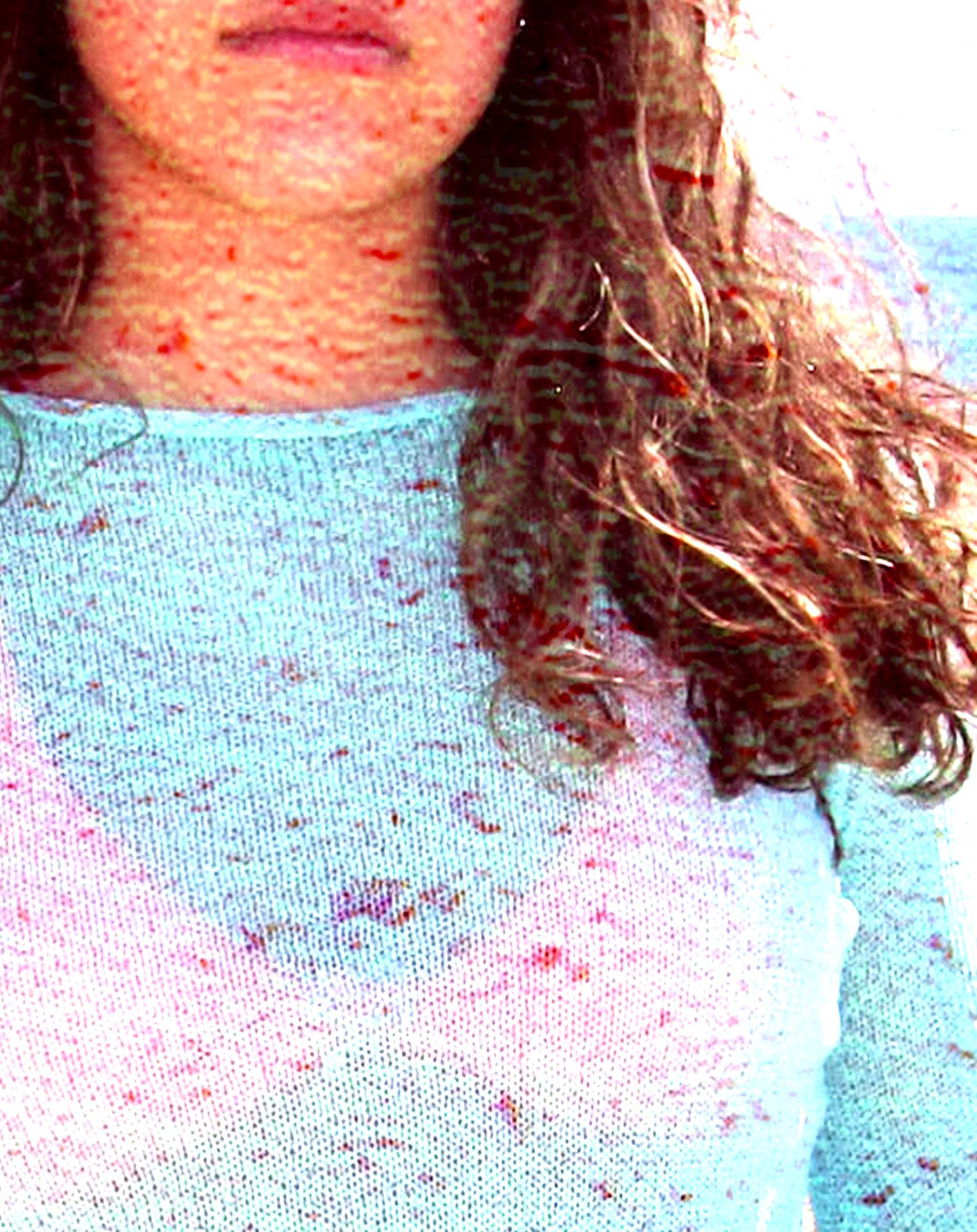
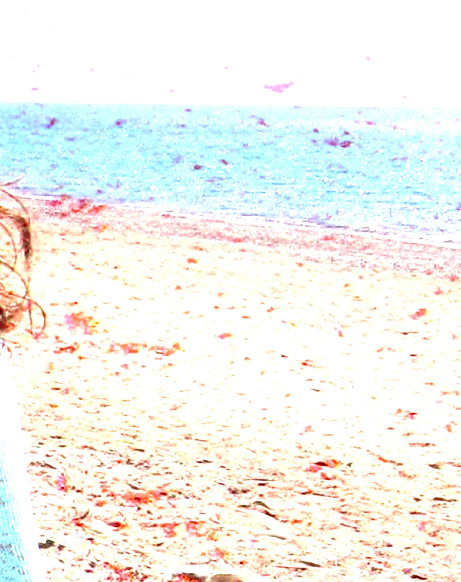
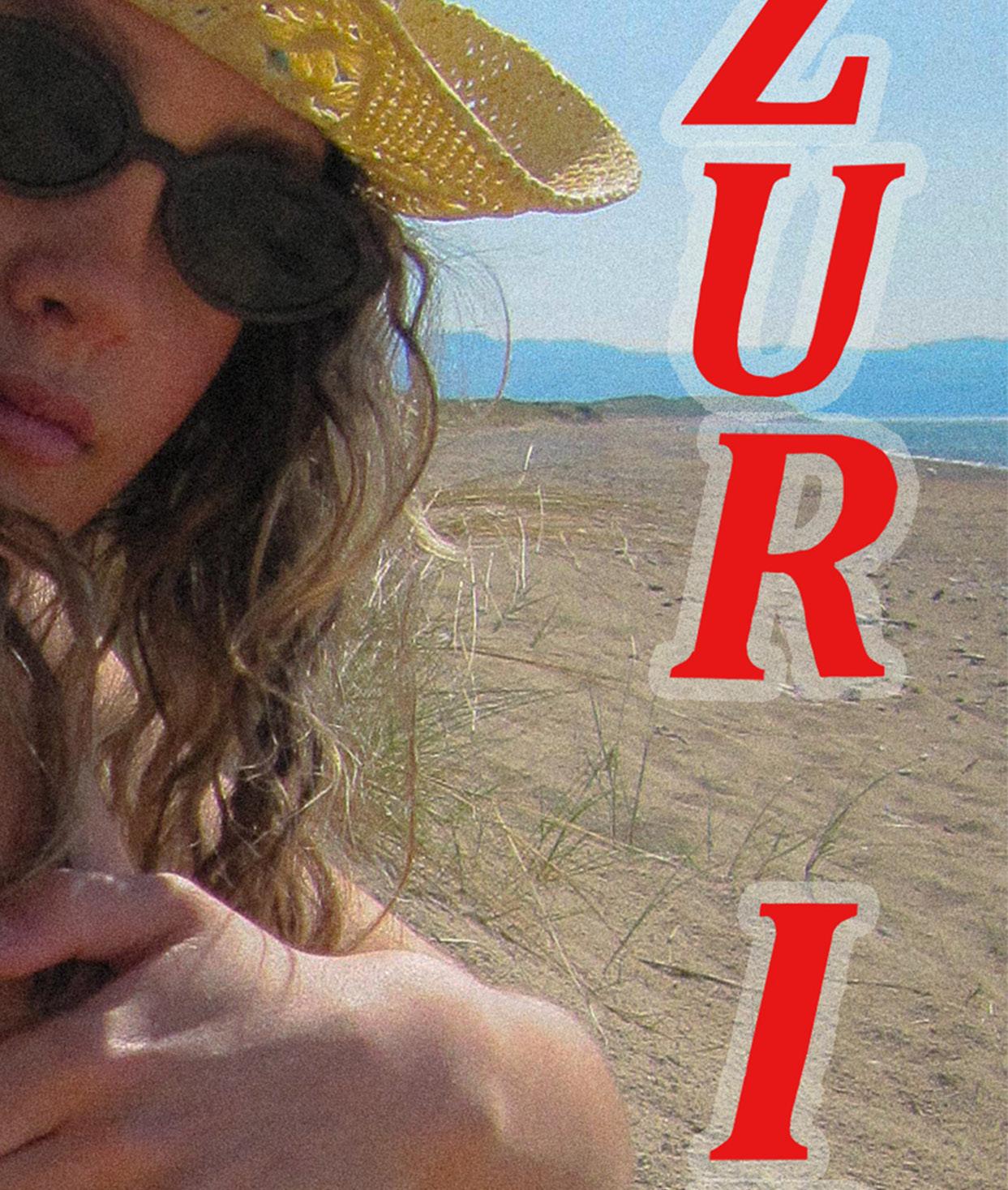
The sun-soaked beach, with its golden sand, swaying sea grass, and clear, endless horizons, perfectly captures the spirit of a ’90s shoot. It instantly evokes classic ’90s beach culture, think Baywatch’s sun-drenched drama, wild MTV spring breaks, and those iconic vintage swimwear ads that defined a generation. Natural light plays a starring role here, highlighting the vibrant colours of the scene, the deep blue sky, sparkling turquoise water, and warm, glowing sand create a striking contrast against my bright yellow floral bikini. This contrast delivers that bold, oversaturated look so typical of ’90s editorials, making every frame pop with energy and nostalgia. The setting itself offers a form of nostalgic escapism, channeling the carefree vibes of tropical getaways and endless summers filled with sun and fun. Adding to this, playful styling choices, like pairing floral bikinis with unexpected elements such as cowboy boots, bring an ironic, fun edge that was a hallmark of ’90s fashion rebellion. Altogether, the beach anchors the campaign in an authentic, nostalgic, yet fresh environment, providing the perfect backdrop for a strong ’90s throwback that’s equal parts homage and contemporary cool.
LOCATION SHOOT
The location shoot went perfectly, with great weather, a rare Welsh treat and a gentle breeze that added a refreshing, natural energy to the day. Staying at my lodge the night before helped keep the atmosphere relaxed and the schedule running smoothly, allowing for a stress-free start. All logistics, including model release forms and Gwynedd Council permissions, were handled well in advance, which meant there were no last-minute issues to disrupt the flow. The beach itself offered a stunning variety of settings, from soft sandy stretches to more rugged stony areas, complete with dunes and tall sea grasses, that felt surprisingly Ibiza-like despite being nestled in the heart of Wales. The photos captured the ’90s vibe exactly as planned, with the styling coming together beautifully even after some earlier weather challenges threatened to complicate things. Overall, the shoot not only met but exceeded my expectations, delivering vibrant, authentic imagery that perfectly embodies the spirit and aesthetic of the campaign.
CAMPAIGN SHOOT
SHOOT CONCEPT
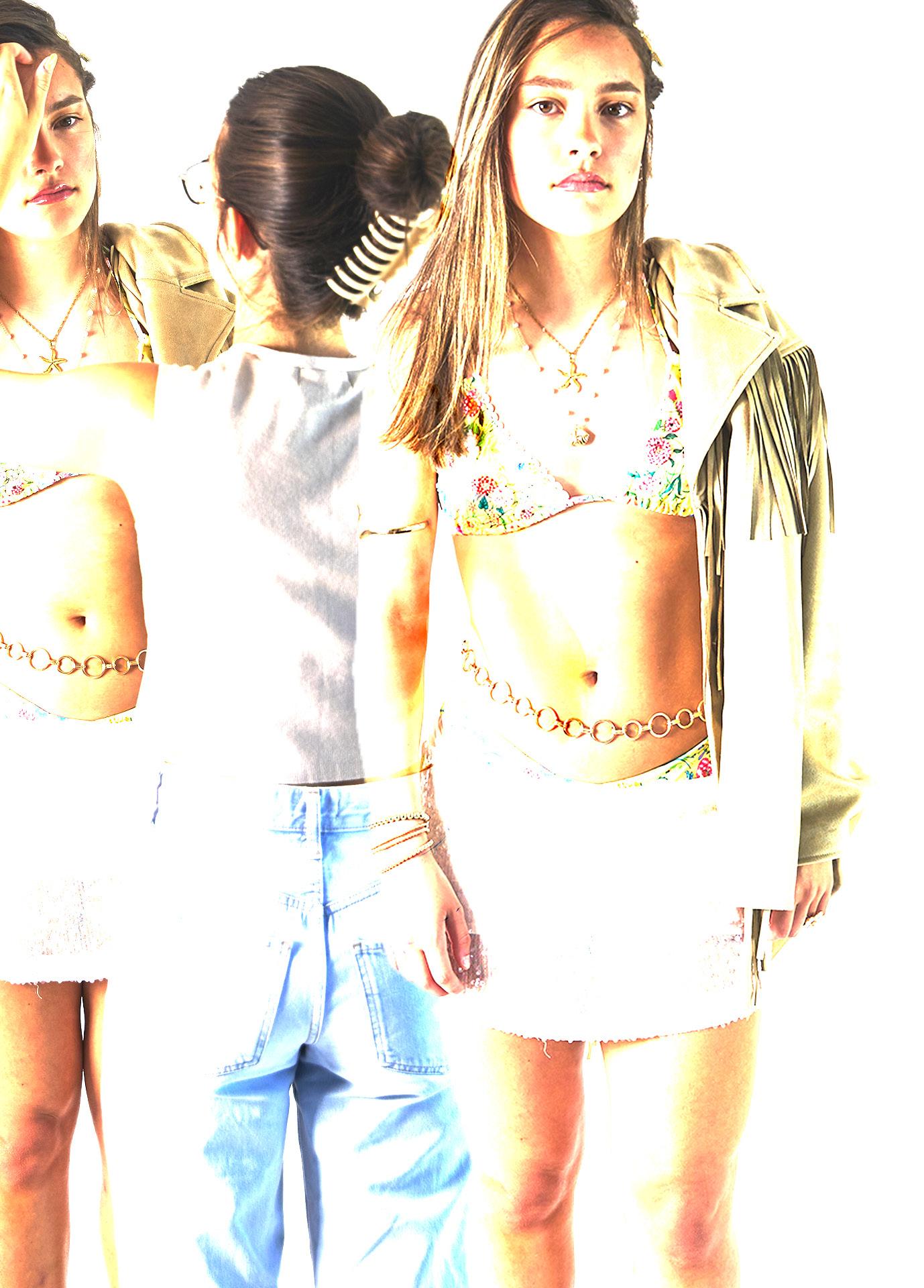
For the studio shoot, I evolved the ’90s Ibiza vibe from the daytime beach theme into a fullon nightlife glamour experience. The bikinis remained the centrepiece, styled as bold, party-ready looks designed for clubs, beach bars, and late-night scenes, keeping them front and centre as unmistakable statement pieces. Embracing a playful, rebellious ’90s party aesthetic, the shoot incorporated glittery makeup, tinted sunglasses, and tousled, carefree hair to channel that unmistakable era’s attitude. Dramatic lighting and vibrant coloured gels intensified the mood, creating dynamic visuals that pulsed with energy and excitement. This shoot beautifully showcased the bikinis’ versatility, proving they effortlessly transition from sun-soaked beach days to all-night dance floors, embodying the full spectrum of ’90s style, from casual cool to electric nightlife glam. It captured the essence of a decade defined by fearless self-expression and unfiltered fun, perfectly complementing the campaign’s nostalgic yet fresh vision.
My studio shoot went perfectly, bringing my vision to life exactly as planned. The styling captured the bold, nostalgic ’90s party vibe while keeping the bikinis front and centre, ing sure they were the undeniable focus of every shot. I took charge of the makeup self, achieving the glittery, bronzed glam look that complemented the outfits flawlessly and enhanced the overall mood. Timing was smooth and efficient, allowing for three fit changes with plenty of attention to detail to make sure every look was flawless. tographer Andrew really understood the vision, bringing his own creative flair inspired by my vintage Dior and Galliano mood board, which added an extra layer of authenticity and sophistication. Every pose, every angle perfectly captured the mood, energy, and lious spirit I wanted to convey. I’m incredibly proud of how polished, powerful, and sive the shoot turned out, true to my brand and exactly what I hoped for, if not even ter. This shoot solidified the campaign’s aesthetic and set the tone for everything to
styling centre, makmakeup myflawlessly three outflawless. Phoinspired authenticity rebelcoheeven betcome.
STUDIO SHOOT
Since I shot my campaign on a Canon digital camera, minimal editing was needed, the natural look matched my vision perfectly and captured the authentic feel I was aiming for. After receiving valuable feedback from my mentor, I enhanced the contrast and saturation, and added a subtle grain effect in Lightroom to amplify the bold, vintage ’90s vibe without overdoing it. I intentionally avoided any airbrushing or skin retouching to keep the images raw and authentic, staying true to Azur Ibiza’s core values of inclusivity, transparency, and celebrating natural beauty. This approach ensured that every photo felt fresh and relatable, highlighting real textures and individuality rather than an overly polished aesthetic. I’m genuinely proud of the final results, they strike the perfect balance between nostalgic glamour and modern authenticity, embodying the brand’s ethos with minimal post-production and maximum impact.
POST PRODUCTION
POST PRODUCTION
For my studio shoot, I collaborated with a professional photographer, Andrew, who brought not only high-quality gear but also a keen understanding of bold ’90s fashion photography. I provided a detailed mood board and brief to clearly communicate the creative direction and aesthetic I wanted to achieve. Together, we focused on using high-contrast lighting with minimal shadows to capture that rich, dramatic ’90s look straight in-camera, which helped minimise the need for heavy post-production. After the shoot, mentors recommended subtly boosting contrast, saturation, and adding grain in Lightroom to further enhance the vintage vibe without compromising the authenticity of the images. The final polished photos authentically reflect the era’s iconic style while staying deeply true to my brand’s core values of rawness, inclusivity, and natural beauty, there was no airbrushing or skin smoothing involved. I’m incredibly proud that these images perfectly capture both my original vision and the identity of my brand, delivering powerful visuals that resonate with the spirit of the ’90s while feeling fresh and relevant today..
WHATS NEXT?
Working on my Final Major Project has been an incredibly fulfilling and eye-opening experience. From the beginning, I knew I wanted to create something that felt personal, purposeful, and genuinely exciting and I found that in the world of swimwear. Throughout the project, I discovered a niche in the market that I connected with creatively and commercially, which led me to design with a clear identity and vision in mind.
One of the most rewarding parts of the process was conducting market research and engaging directly with potential customers. I created two feedback forms as part of my research, and the response was overwhelmingly positive. It was encouraging to see real interest in the ideas I was developing, and the feedback gave me a deeper understanding of what my target audience is looking for. This support has played a huge role in motivating me to take things further beyond the scope of the project.
As a result, I’ve made the exciting decision to start developing my own swimwear brand, Beady Bikini. Although I’m still in the early stages, I’ve recently begun soft-launching the brand on Instagram to begin growing a presence and community. I’m using this time to refine my branding, build anticipation, and gather more insight from my audience. While I’m not ready for a full launch just yet, my aim is to continue developing and building a following over the coming months, with a full brand launch planned for Easter 2026.
This project has not only helped me grow as a designer but has also given me a new level of confidence in my ability to take an idea from concept to reality. I’m excited to keep learning, developing, and building something meaningful and I can’t wait to see where this journey with Beady Bikini takes me.