Portfolio
Foróige Go Club
System Design Awareness Campaign Brand
Eyes on ADHD
Chopin 210th Anniversary
Poster Design
Macbeth: Killer Queen
Branding
ISTD: Lighthouses of the world
Editorial
Newbie Guide to Employer Health Coverage
Slide Deck / Pamphlet
Artists for Climate
Poster Design
Psycho: Re-Imagined
Poster Design Poster Design
Psycho: Cult poster
1 5 7 9 13 15 17 19 21
contents
ForÓige Go Club digital youth work identity
System Design
Branding
I worked with fellow designers at Language Communications to develop this design system for Foróige (derived from “forbairt na hóige,” which means “development of youth” in Irish Gaelic), one of Ireland’s premier national youth empowerment organizations.
They needed a new brand for the digital youth work arm of their organization, complete with a new name and a distinct look and feel that could all work together under a cohesive visual system. The look and feel had to be inclusive, fun, empowering, and contemporary. It had to appeal to a youthful audience as well as to Foróige program leaders.
The end result combines energetic shapes and colors with a funcitonal versatility that works well in a cohesive system. The line-and-dot model implies movement and creative momentum, playing into the overarching brand name of “Go,.” or “GoClub.” Unique icons and colors for each program can either combine or stand alone, and the system allows for the possibility of additional programs as “Go” expands.
2022 -
1
2


SeriousIy PIayfuI. Boing SemiboId ABCDEFGHIJKLM NOPQRSTUVWXYZ abcdefghijkIm nopqrstuvwxyz 0123456789 &@$%[]?!*. 3

4
Eyes on adhd
2022awareness campaign
Branding website design


For my major project, I decided to focused on a cause of personal relevance. In the summer of 2021, I received a diagnosis for ADHD (Attention Deficit Hyperactivity Disorder). Understanding my ADHD helped me to understand myself in ways that I never could have before, and I have been able to move forward with meaningful self-improvement and with a less scathing inner critic.
My research revealed that many people (like me) do not receive an ADHD diagnosis until much later in life, and many others are never diagnosed. This is especially true for women and those assigned female at birth. Missed ADHD diagnoses can have dire consequences for ADHDers and those close to them. Surveys and intreviews revealed that ADHD is critically misunderstood and underfunded in Ireland, which leaves behind people in need. My project aimed to spread awareness of commonly missed or misunderstood symptoms of ADHD, which will ideally lead to detection, help, and a positive difference.
“Eyes on ADHD” uses simple design iconography to draw attention to the issue at hand. The expressive eyeballs are attention-grabbing, versatile, and relatable. All campaign posters and materials lead to the “Eyes on ADHD” website, which is full of resources aimed at helping individuals with ADHD whay not yet be able to seek treatment.


www eyesonadhd com www.eyesonadhd com www eyesonadhd com www eyesonadhd om Awareness. Detection. Help. Difference.
5


6
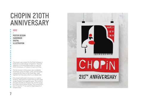
Chopin 210th anniversary

2022poster design handmade digital illustration
This project was created for the Polish Embassy in Dublin for a poster design competition. The brief asked for a commemorative poster to mark the 210th Anniversary of Fryderyk Chopin’s birthday.
The first iteration of this poster was completely handmade using only black, white, and red paper, inspired by the colors of the Polish flag. I later digitized my final piece, which is on display here.
This project particularly showcases my creative thinking. I had great fun experimenting with paper scraps, shapes, and negative space. The cutout of the piano doubles as Chopin’s hair, and the scraps from that cutout outline his face. The cutouts from the “O” and the “P” are used to hilight aspects of Chopin’s face.
1
7

2 8
macbeth: killer queen
2022awareness campaign
Branding website design
The task presented for this brief was to re-brand Shakespeare’s “Macbeth” for a new target audience.
I chose to market to a younger target audience (Gen Z, Millennial) and therefore landed on a drag-fueled musical for the stage, utilizing the iconic music of Queen as a storytelling device. The result was “Killer Queen,” a reference to the murderess Lady Macbeth and, of course, to show-stopping drag queens.


Blue and pink were natural color choices for a gender-defying stage performance. The colors are also bright and engaging, speaking to a younger audience and communicating that the show will be, above all else, quite good fun.
Typography ad logo design communicate that the show is not only fun, but sinisiter. The lettering I created for “Killer” evokes medieval blackletter and a rock-and-roll aesthetic, and the sharp points intentionally reference Lady Macbeth’s murder weapon of choice. In case the hints in the lettering were too subtle, the daggar can also be found in the stem of the high heel shoe.
3
9
Guaranteed to blow your mind


10


Macbeth Meets Mercury Queen June 2021 Bord Gáis Theatre 5 BIRNAM WOOD BLACK PANTONE 419 C RGB 33 35 34 HEX/HTML #212322 CMYK 76 65 66 90 POWER-HUNGRY PINK PANTONE 2038 C RGB 239 96 163 HEX/HTML #EF60A3 CMYK 0 72 1 0 BANQUET BLUE PANTONE 304 C RGB 154 219 232 HEX/HTML #9ADBE8 CMYK 35 0 2 0 Crown Yellow PANTONE 304 C RGB 154 219 232 HEX/HTML #9ADBE8 CMYK 35 0 2 0 11

6 12
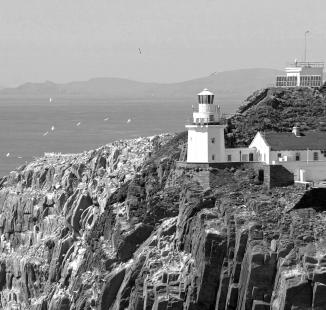
ISTD: Lighthouses of the world
Gerry Butler
We stretched our legs: carrying bags of groceries up to the kitchen at the top; down to the bottom again for the family-sized suitcase; up to the higher bedroom; down to the bottom bedroom
the new lighthouse (they’d be summer visitors, then)... a challenge to race to the top in the quickest time (23 seconds was the most believable)... birders claiming sights of fulmars and choughs... a sighting of the headless
I wondered: how can a headless woman whistle? Then it came to me: imagine blowing across the neck of a bottle. Elementary.
to put up the cot; up to the living room again for a cup of tea. So far, so fit. The wind howled and whined outside. Windows rattled. The clouds closed in. Dusk fell and, dimly through the gloom, we caught the flashing beam of the new lighthouse by the shore below: three times, count to five, three times again. At least, I think that was what it was doing. It was hard to see. mean, I didn’t expect to see all the way to Dublin or anything, or to enjoy cloudless, starry skies. After all, it was a lighthouse they are put where they are generally because the weather is rough enough to wreck ships on the rocks below. With Eddie bathed and put to bed we had supper then put our feet up. That was when, just before bed, Jane made
2022editorial design
typography
copy writing
I would be a third generation light keeper.
Irish Lights had five di erent dimensions: they had the navigational side which would have been lighthouses and light ships, they had the steamers which tended the lighthouses and light ships, and they went around landing oil and stores on the rocks. en they had a depot in Dún Laoghaire where they did all the repairs and buoy work, and painters - they had all that in Dún Laoghaire. en they had a main o ce in Pembroke Street in Dublin, and all the administration was carried out from there.
Created as a response to the International Society of Type Designers (ISTD) prompt, “Lighthouses of the World.”
The book investigates the lore and history surrounding the Bull Rock Lighthouse, which sits atop an island of the same name on the rugged Irish coastline of the Beara Peninsula. Source material ranges from personal email exchanges to transcribed oral histories and archives, with my own commentary running on bright red half-page inserts placed throughout.

The color red represents the accent brightred railing of the lighthouse and injects a pop of bright, youthful color, whcih was crucial for communicating with my younger target audience. The typeface, GT Sectra, nicely toes the line between modern artful type and old humanistic script, which also serves to bridge the generational gap between the material and the target audience. The jagged and angular edges are also beautifully macabre in the right settings, while also reminiscent of the rugged coastline of Beara and the crags of the Bull Rock itself.
e side we were involved in was on the coast, in the lighthouses, and on the light ships. My father was a sailor out of Wexford, as was his father before him, as was his father before him again — that would have been back in the sailing period. And my father’ father went on the light ships — he was a captain aboard the light ships, moving to and from di erent ships. Our father then joined the light ships, because he was in the Merchant Navy. He transferred then from the light ships over to lighthouses. His brother, Amby, had
woman’s ghost. Eh? There followed dozens of spooky entries: party of six all swearing to have seen the ghost climbing the stairs; Siobhan, aged six, disappointed at not seeing the ghost; Ellen, nine, sleeping in with her mum so that the ‘white woman’ doesn’t get her; the headless woman topless (nice body); the headless woman whistling at the window... Jane and I looked at each other. Eddie started to wail. Guess whose turn it was to check on him?
The Bull Rock
We went to bed... and lay awake listening to the place creak. The windows continued to rattle (until a neatly- placed Observer business card was folded into four and inserted in the frame on the windward side). Unable to put off a trip to the lavatory any longer, generously took a detour to stick another card in Eddie’s window, then raced back up to bed. I
...next thing I knew I was lying there, my eyes staring feverishly at a veiled figure looming by the foot of my bed.
I padded down, peering round corners sheepishly, tucked him in and sprang back up sharpish. I returned in time to be informed that, according to one past visitor’s granny and a Wicklow legend, the ghost was 150 years old and lost her head to a suitor armed with a scythe who
ISTD 2021-22
“Lighthouses of the World”
21
also been at sea — he was a light keeper at the time. My father remained in the lighthouses [in the lighthouse service], and he married my mother. My mother is a daughter of a lighthouse keeper as well, her brother Dick, Lord have mercy on him, he’s dead now, was also a light keeper for a short enough period. But that was how the Irish Lights worked. It was a traditional kind of a job — it’s not right to call it a job, it was more a way of life than a job, it was handed down, because light keepers’ sons were listening to, and used to this, all of their lives; it’s what we knew, and we sort of stayed with what we knew. It was a decision [to join the Irish Lights], suppose, in one sense, but I had never considered anything else. e oldest boy, Laurence, he did consider other things, he went into the Customs. at time, you got an education, you got a job, and that was that. It’s so di erent now. What I did [was], had my sights fixed on the Irish Lights from when was a young teenager, nothting else came into my mind other than that, and that’s duly what I did. And will say, that if could do it all again,
every single bit of it I would do; I loved every second that spent in it; I loved it when I got into it because of the remoteness of everything -- your closeness to nature, and also the time that it a orded. I found, a er was made redundant in the finish, it’s the one thing I miss hugely, was all the free time. It was then I understood that in a job you actually trade your time for what money you can get.
When you joined the Irish Lights, you first did an examination. It wasn’t a dicult exam now, it was handy enough. And then you had to do a medical, and swimming test. Swimming was also a part of it, because the likelihood of falling into the sea was very real, and without any safe

equipment you needed to be able to swim!
So that was all part of it. e reason for all of this was mostly to make sure that you were suitable for the job, because it would cost a good bit in training, and if fellows were not going to stay in it, it was costly replacing them with other lads all of thte time. My own twin brother, he stuck with it for five years, he did not like the isolation. Some poeple were just not cut out for that life, it required a special kind of a person, somebody who was good with their own company, and you know, they would have a creative enough mind, and were into reading, and could slow the pace down a bit.
7
Dublin Institute of Design Graphic Design, Year 3 Term 1: Professional Design Practice Student: Kelsey Overbey Instructor: Fiona Duffy 55 56
e former light keeper reflects on his life in the Irish Lights, which he o cially joined in 1969.
“I loved it when I got into it because of the remoteness of everything”
“Jane, Jane, I saw her!”
22
by gales... moonlit walks to
I must have dozed off because the next thing I knew was lying there, my eyes staring feverishly at a veiled figure looming by the foot of the bed. ‘Jane, Jane, saw her,’ I cried. Not daring to look, she pinned herself to me, saying (doubtless hoping): ‘It’s just a nightmare. You’re imagining it.’ We didn’t get much sleep after that. GT Sectra Book A B C D E F G H I J K L M N O P Q R S T U V W Y X Z a b c d e f g h i j k l m n o p q r s t u v w x y z ( ) ? & ! 1 2 3 4 5 6 7 8 9 0 . , : ; - “ ” A B C D E F G H I J K L M N O P Q R S T U V W Y X Z a b c d e f g h i j k l m n o p q r s t u v w x y z ( ) ? & ! 1 2 3 4 5 6 7 8 9 0 . , : ; - “ ” GT Sectra Book Italic
13


8 14
Newbie guide to employer medical coverage

The Newbie Guide to Employer Medical Coverage was my largest project during my time as the graphic design intern at Alliant Employee Benefits over the summer of 2021.

The challenge was to explain the complexities of the American healthcare system and the concept of employer medical coverage to newcomers to the workforce. The main target audience was therefore mainly younger people.
Healthcare in the US is inherently complex, so it was a unique challenge to not only keep the slides as concise and clear as possible, but also to make it visually appealing for a younger audience. I combined dynamic shapes, imagery, and layouts to successfully communicate the crucial points to the target.
9 2021corporate
slide design typesetting photo
design
editing
15


10 16
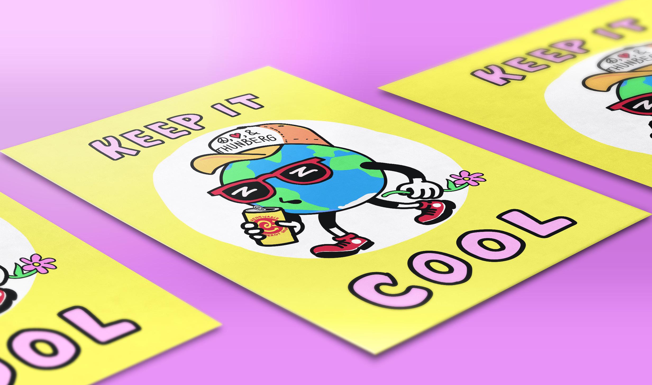
artists for Climate
2021
-
poster design
digital illustration
passion project
I found this project over the summer of 2021 while looking for opportunities for design competitions. TedX put on the “Artists for Climate” open call, asking artists to create posters on climate change with a positive message. I am passionate about using graphic design to create a better world, so this project really spoke to me and my design ambitions.
My submission was inspired by the “Keep Calm, Carry On” posters and messaging from WWII England. I believe that if climate change is to be addressed and successfully challenged, humanity will need to keep a level head in order to stay motivated and achieve our goal of keeping global temperatures down as much as we can. Fear mongering about climate change makes us immobile and helpless. We have to keep our cool if we want to create lasting sustainability and change.

11
17

12 18
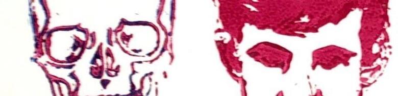
Psycho re-imagined


2020 -
poster design
typography
illustration
handmade/digital
The brief was to re-create a movie poster for “Psycho” that would appeal to a specific target audience of our own choosing, which for me was a younger, more modern target audience. The bright colors were chosen with this in mind, and the yellow lettering is also meant to evoke danger and anxiety.

We were asked to create a handmade poster and convert it to a digital poster, creating our own photoshop brushes and textures to help communicate the feel of the handmade original. I used linocut stamps, lino ink, and yellow paper lettering cutouts to create my original, and used lino rolled ink to create my own photoshop texture brushes to translate the look to a digital rendition.
I specifically drew inspiration from Wim Crowell’s “Hiroshima” poster when I created the long, tight title lettering. I added rounded knife points to the lettering to reference the infamous murder weapon. The subhead cutout lettering was inspired by the iconic Saul Bass.
The layered lino prints convey an uneasy and shaky tone, and allude to the layered character relationships as well as Norman Bates’ mother and his fixation on dressing like her. Slathered-on pink lino ink adds to the raw and disturbing feel of the poster.
13
19


14 20
Psycho cult poster

typography

illustration
handmade/digital
The brief was similar for this poster as for the previous one, but instead of marketing to a broad audience, we were meant to create a cult poster that catered to diehard fans.
I chose to focus on the scene where Norman pushes Marion’s care into the bog. The license plate provides a piece of trivia that cult followers of Psycho would appreciate. Additionally, the typography was inspired by Saul Bass paper cutout lettering, which Psycho and Hitchcock fans alike will recognize and enjoy.
Once again, I leaned on mainly primary colors for this piece, and heavily relied on the dread and anxiety-making properties of bright yellow, which gives the bog an extra eerie glow. After trying out a few different options, the car was colored to match the cameo by Janet Leigh and the “Psycho” car in 1998’s “Halloween,” which film buffs would appreciate. The tail lights were also intentionally colored a bright and evil-eyed red.


15
2020poster design
21


16 22
Thank you