1 minute read
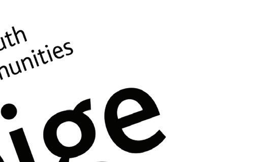
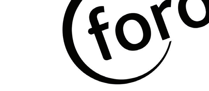
ForÓige Go Club digital youth work identity


System Design
Branding
Advertisement
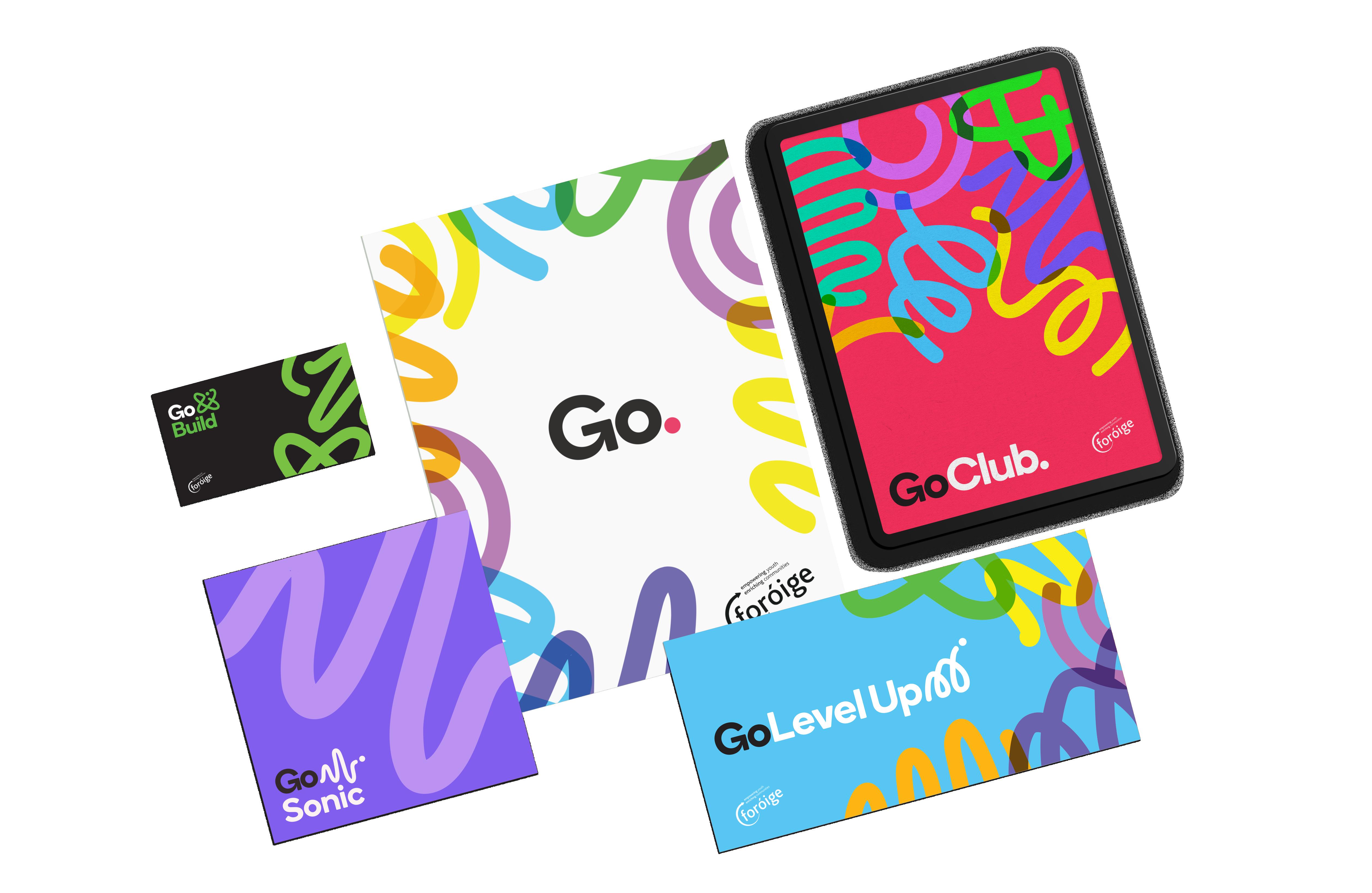
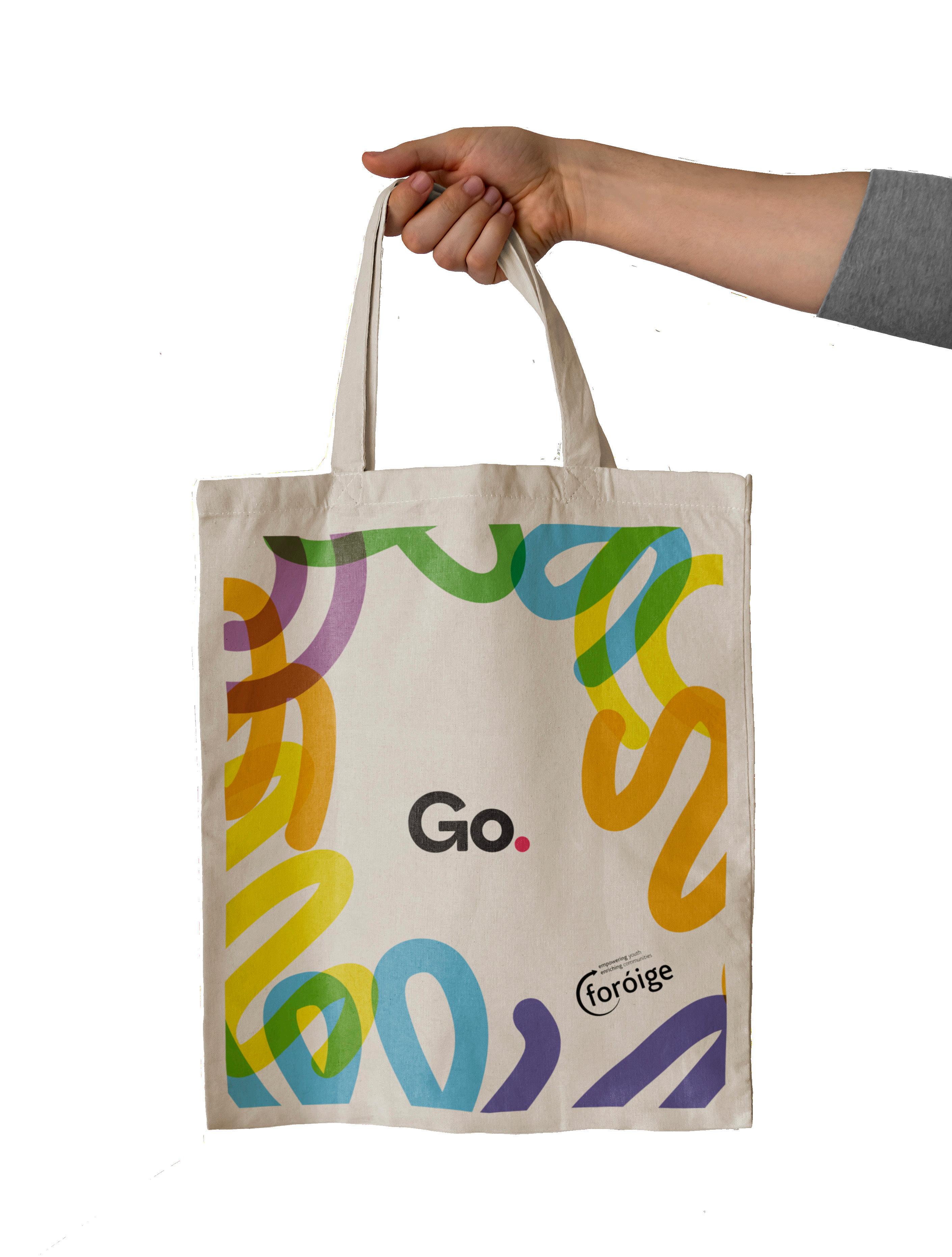
I worked with fellow designers at Language Communications to develop this design system for Foróige (derived from “forbairt na hóige,” which means “development of youth” in Irish Gaelic), one of Ireland’s premier national youth empowerment organizations.
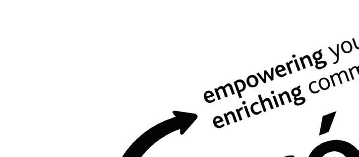
They needed a new brand for the digital youth work arm of their organization, complete with a new name and a distinct look and feel that could all work together under a cohesive visual system. The look and feel had to be inclusive, fun, empowering, and contemporary. It had to appeal to a youthful audience as well as to Foróige program leaders.
The end result combines energetic shapes and colors with a funcitonal versatility that works well in a cohesive system. The line-and-dot model implies movement and creative momentum, playing into the overarching brand name of “Go,.” or “GoClub.” Unique icons and colors for each program can either combine or stand alone, and the system allows for the possibility of additional programs as “Go” expands.