1 minute read
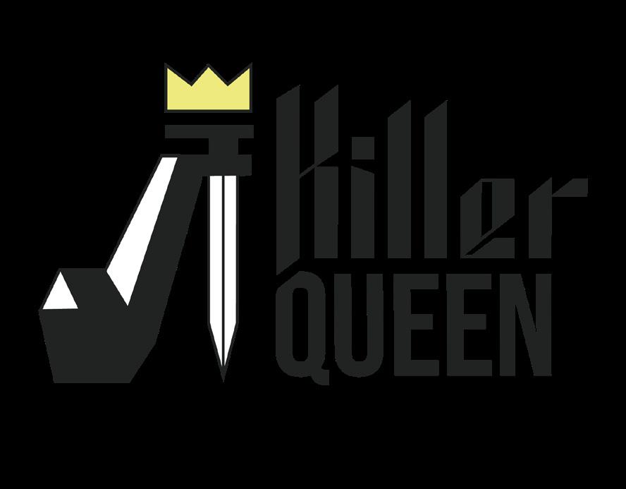
macbeth: killer queen


2022awareness Campaign
Branding website design
Advertisement
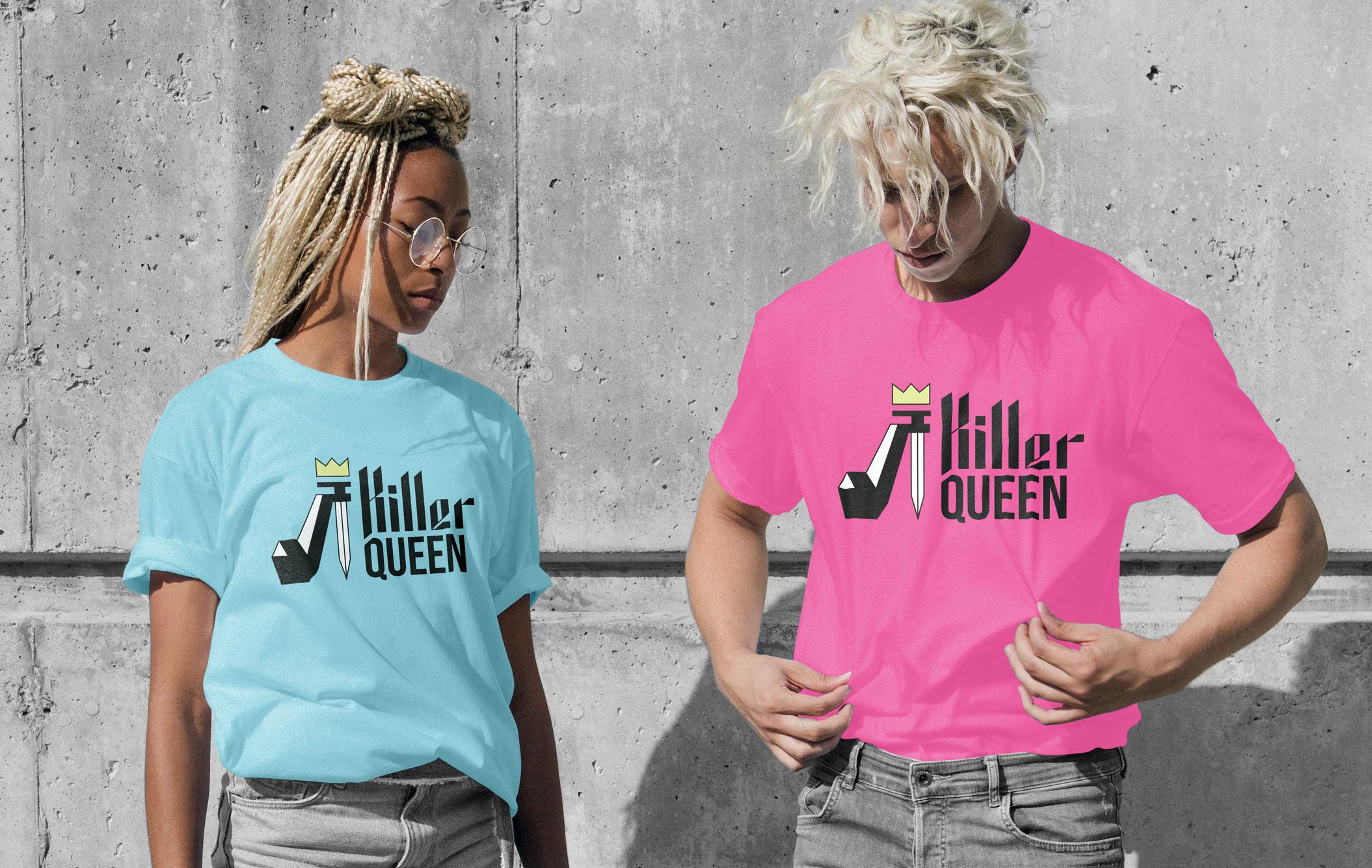
The task presented for this brief was to re-brand Shakespeare’s “Macbeth” for a new target audience.
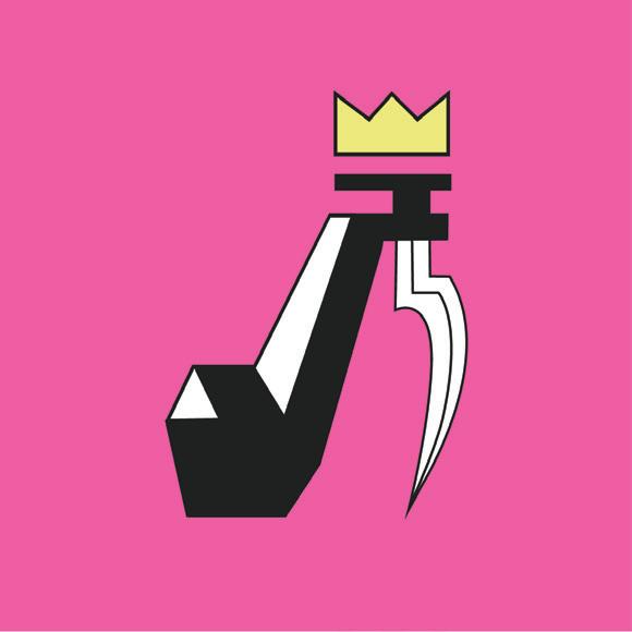
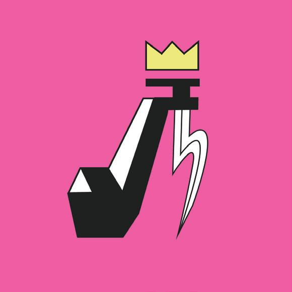
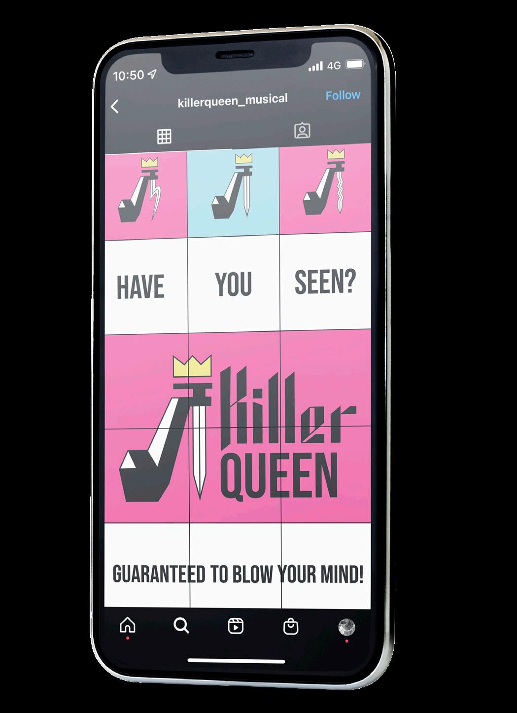
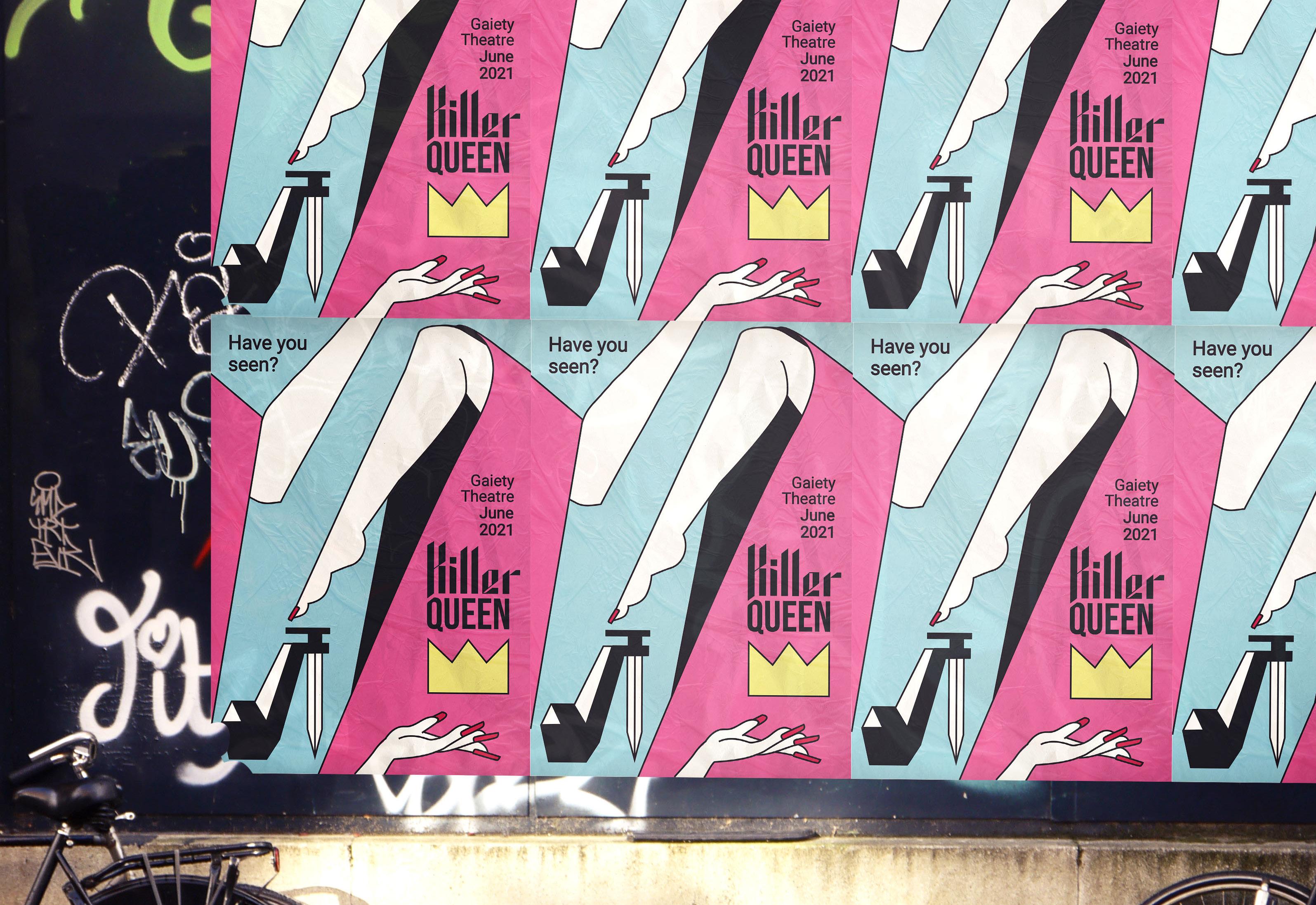
I chose to market to a younger target audience (Gen Z, Millennial) and therefore landed on a drag-fueled musical for the stage, utilizing the iconic music of Queen as a storytelling device. The result was “Killer Queen,” a reference to the murderess Lady Macbeth and, of course, to show-stopping drag queens.
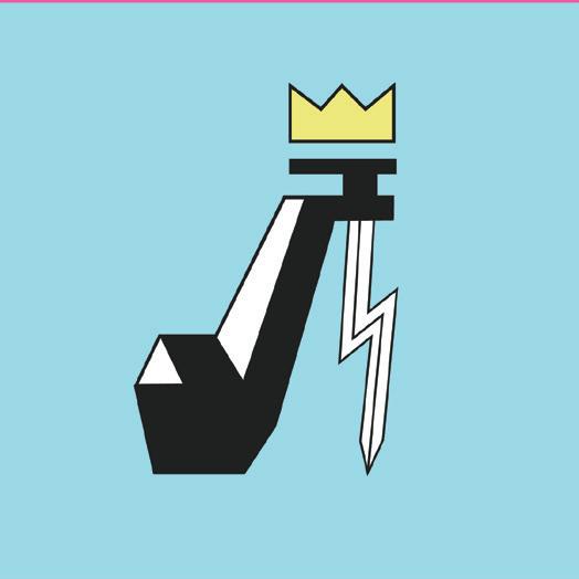
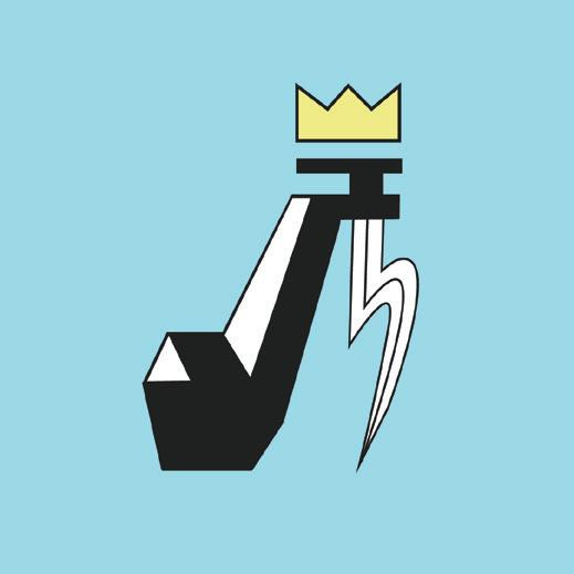
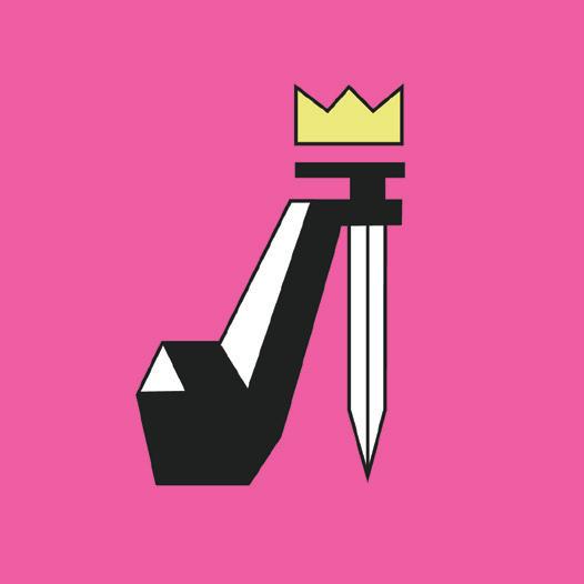
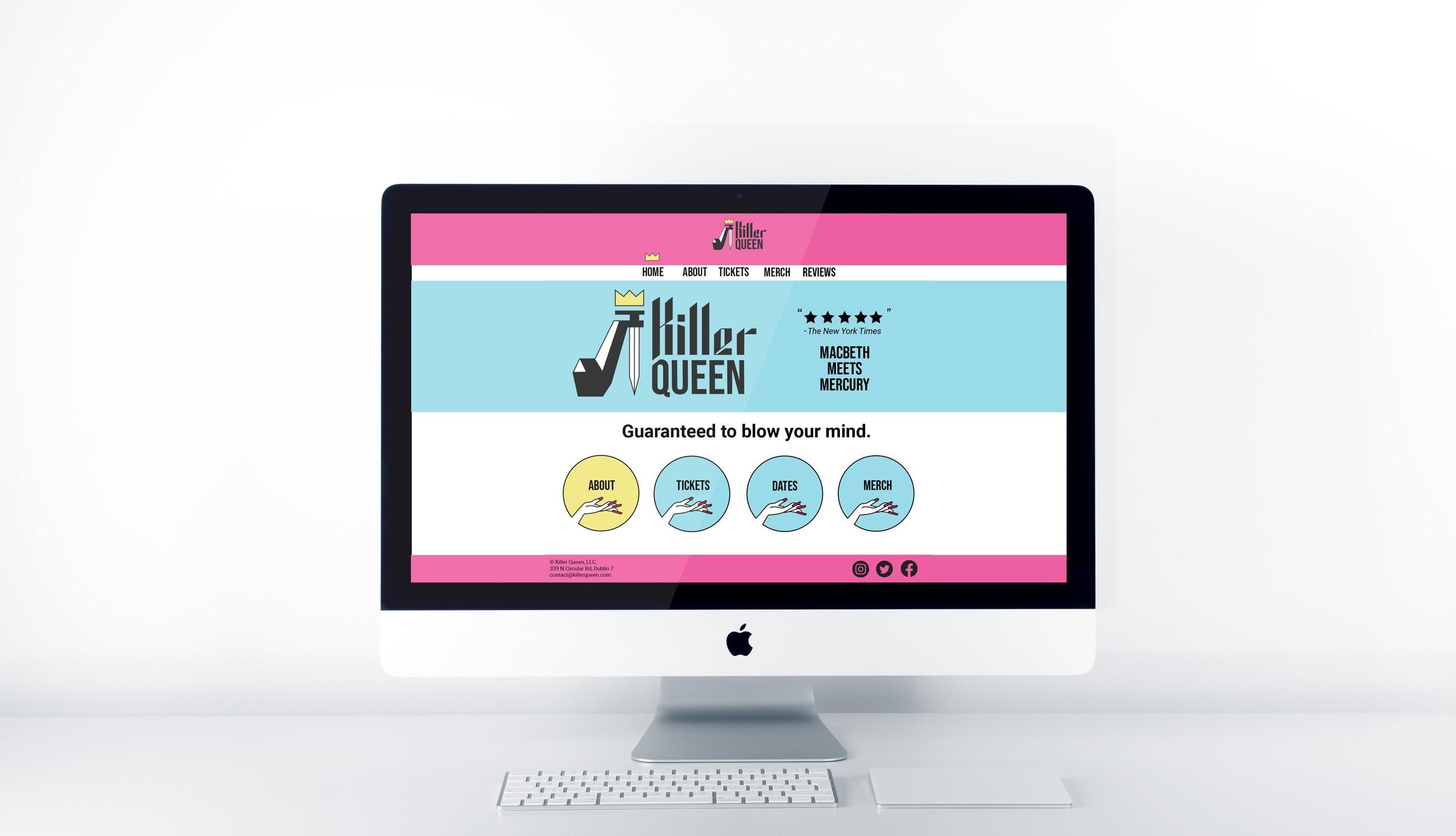
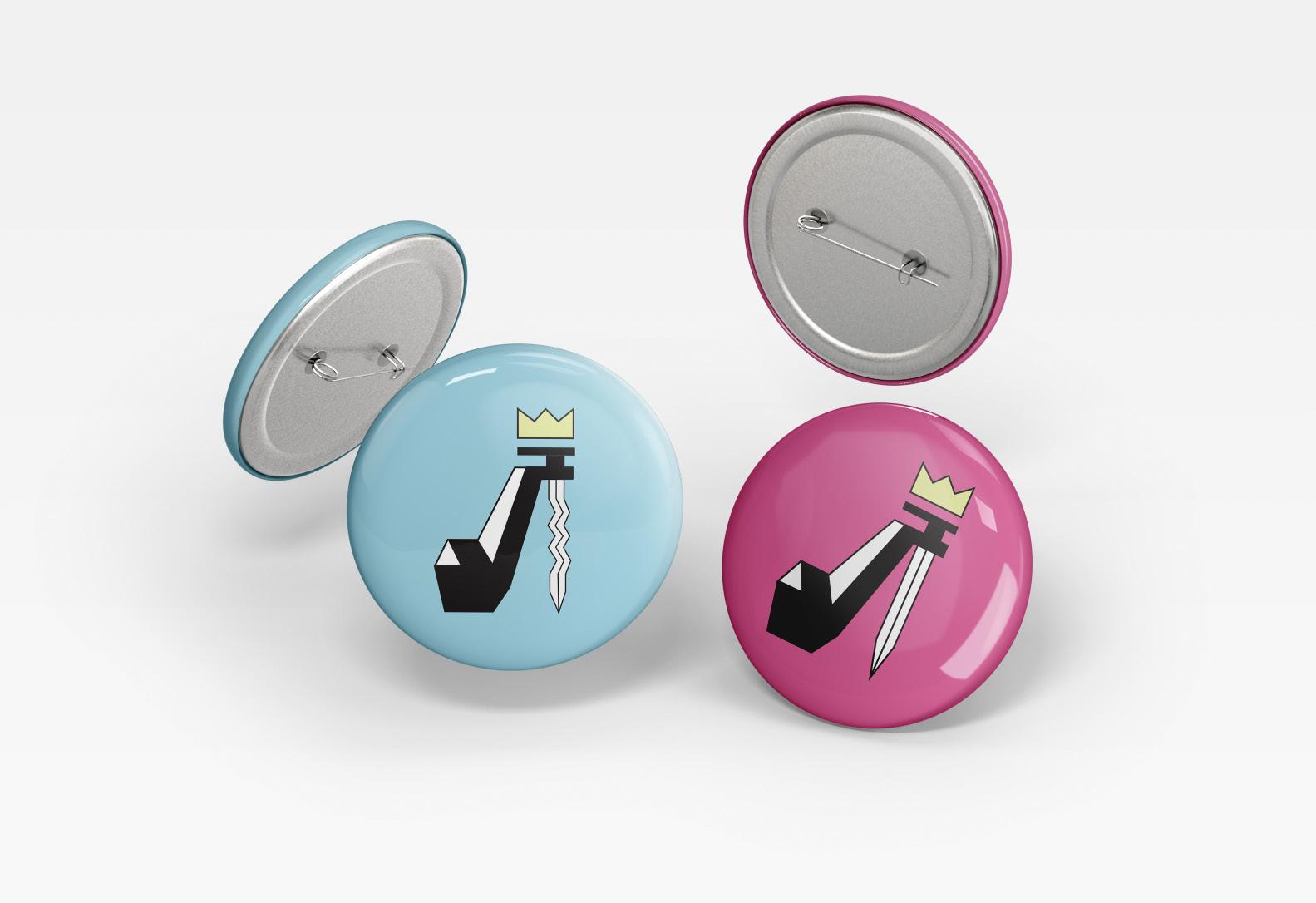
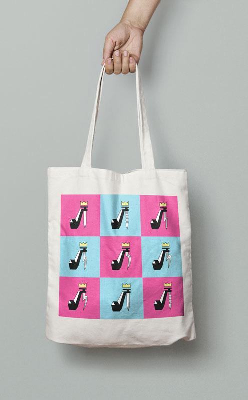
Blue and pink were natural color choices for a gender-defying stage performance. The colors are also bright and engaging, speaking to a younger audience and communicating that the show will be, above all else, quite good fun.
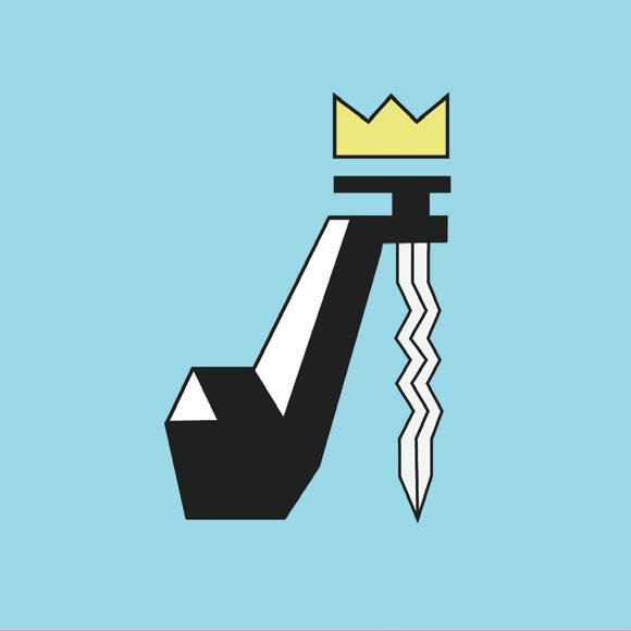
Typography ad logo design communicate that the show is not only fun, but sinisiter. The lettering I created for “Killer” evokes medieval blackletter and a rock-and-roll aesthetic, and the sharp points intentionally reference Lady Macbeth’s murder weapon of choice. In case the hints in the lettering were too subtle, the daggar can also be found in the stem of the high heel shoe.