1 minute read
Psycho re-imagined


2020 - poster design typography illustration handmade/digital
Advertisement
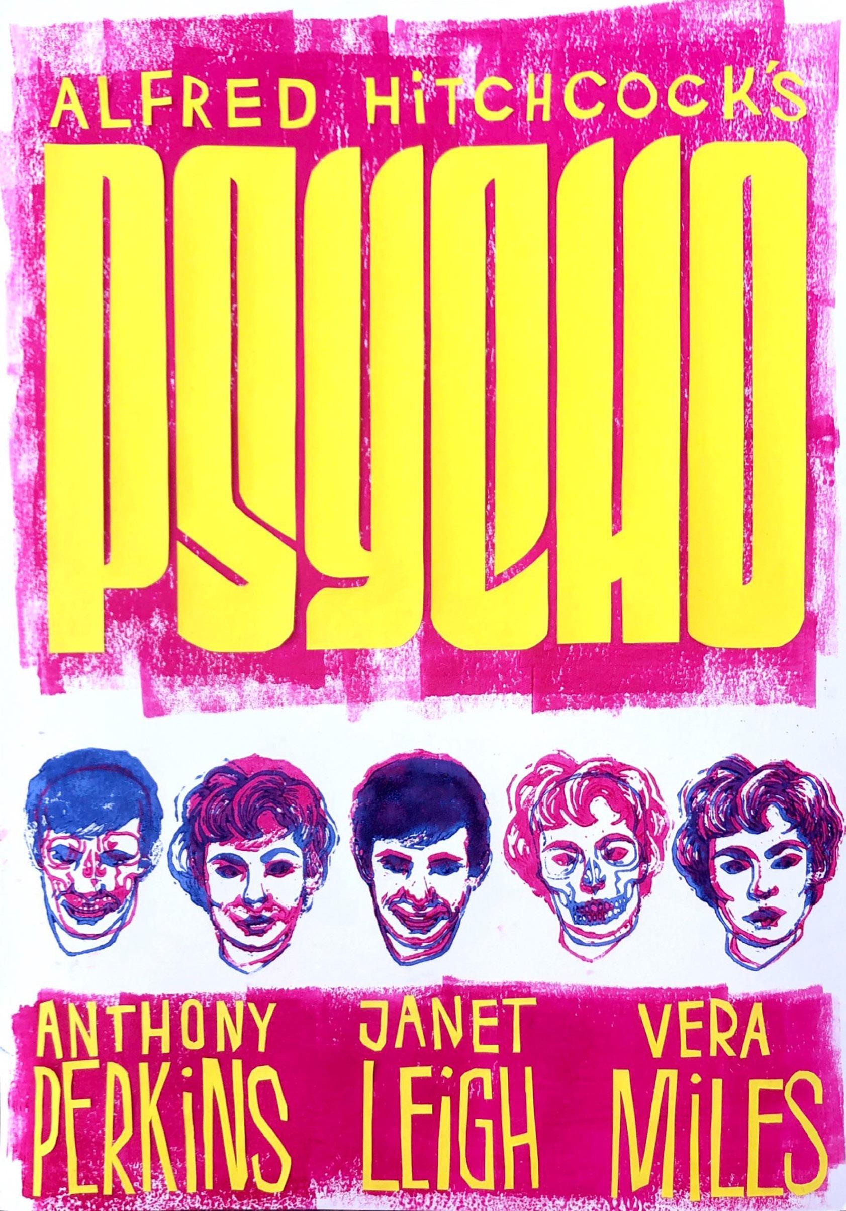
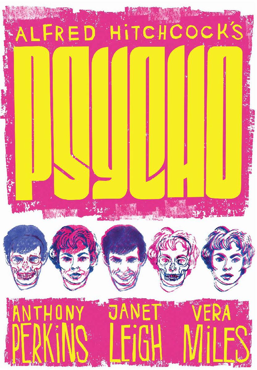
The brief was to re-create a movie poster for “Psycho” that would appeal to a specific target audience of our own choosing, which for me was a younger, more modern target audience. The bright colors were chosen with this in mind, and the yellow lettering is also meant to evoke danger and anxiety.
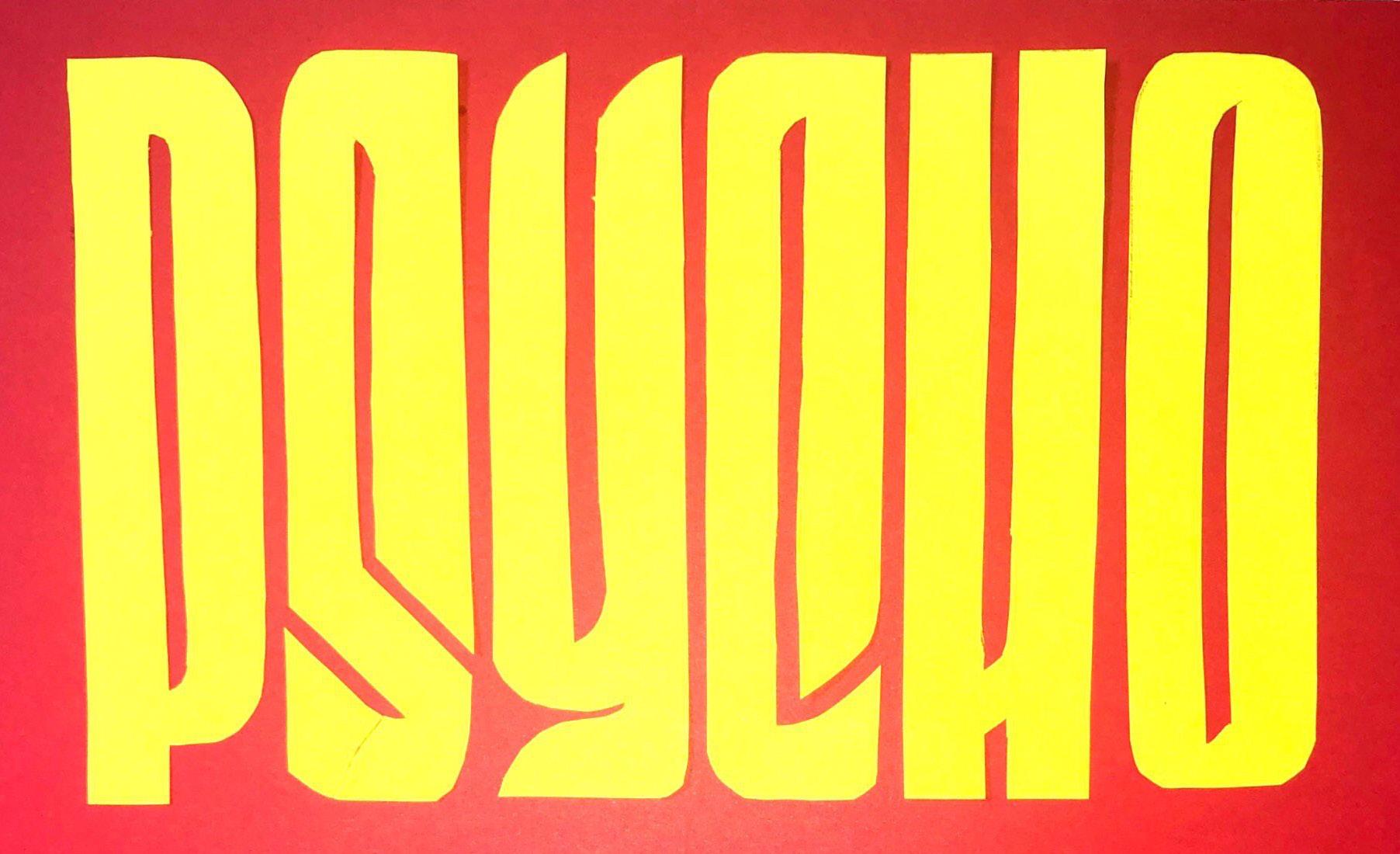
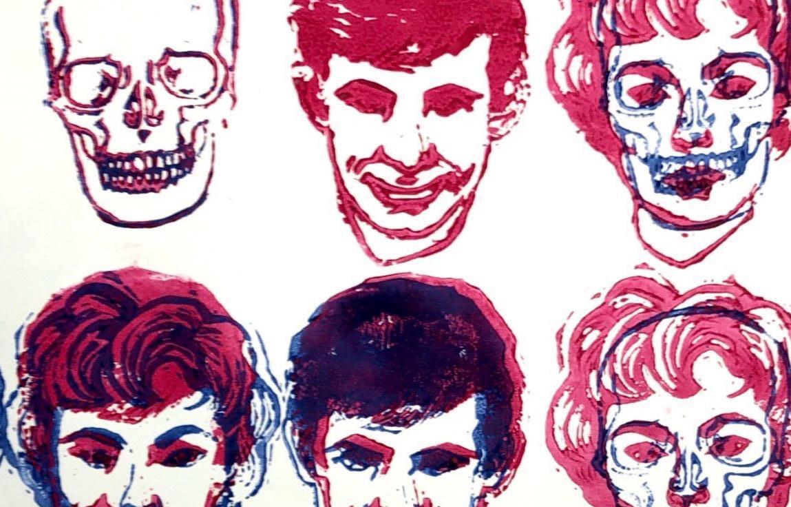
We were asked to create a handmade poster and convert it to a digital poster, creating our own photoshop brushes and textures to help communicate the feel of the handmade original. I used linocut stamps, lino ink, and yellow paper lettering cutouts to create my original, and used lino rolled ink to create my own photoshop texture brushes to translate the look to a digital rendition.
I specifically drew inspiration from Wim Crowell’s “Hiroshima” poster when I created the long, tight title lettering. I added rounded knife points to the lettering to reference the infamous murder weapon. The subhead cutout lettering was inspired by the iconic Saul Bass.
The layered lino prints convey an uneasy and shaky tone, and allude to the layered character relationships as well as Norman Bates’ mother and his fixation on dressing like her. Slathered-on pink lino ink adds to the raw and disturbing feel of the poster.