Jenna’s BEAUTY STUDIO




CONTACT
Joanna Broadhurst
VERSION DATED 01.04.2023
CONTACT
hello@ablazedesign.co.uk


Please read the branding for Jenna’s Beauty Studio and the logo usage, if you have any immediate questions please get in touch. Joanna
Neutral colours complement your primary colours
The main identifying mark for your business is the primary logo. It is what is used in most circumstances, is easily recognisable and the most familiar.
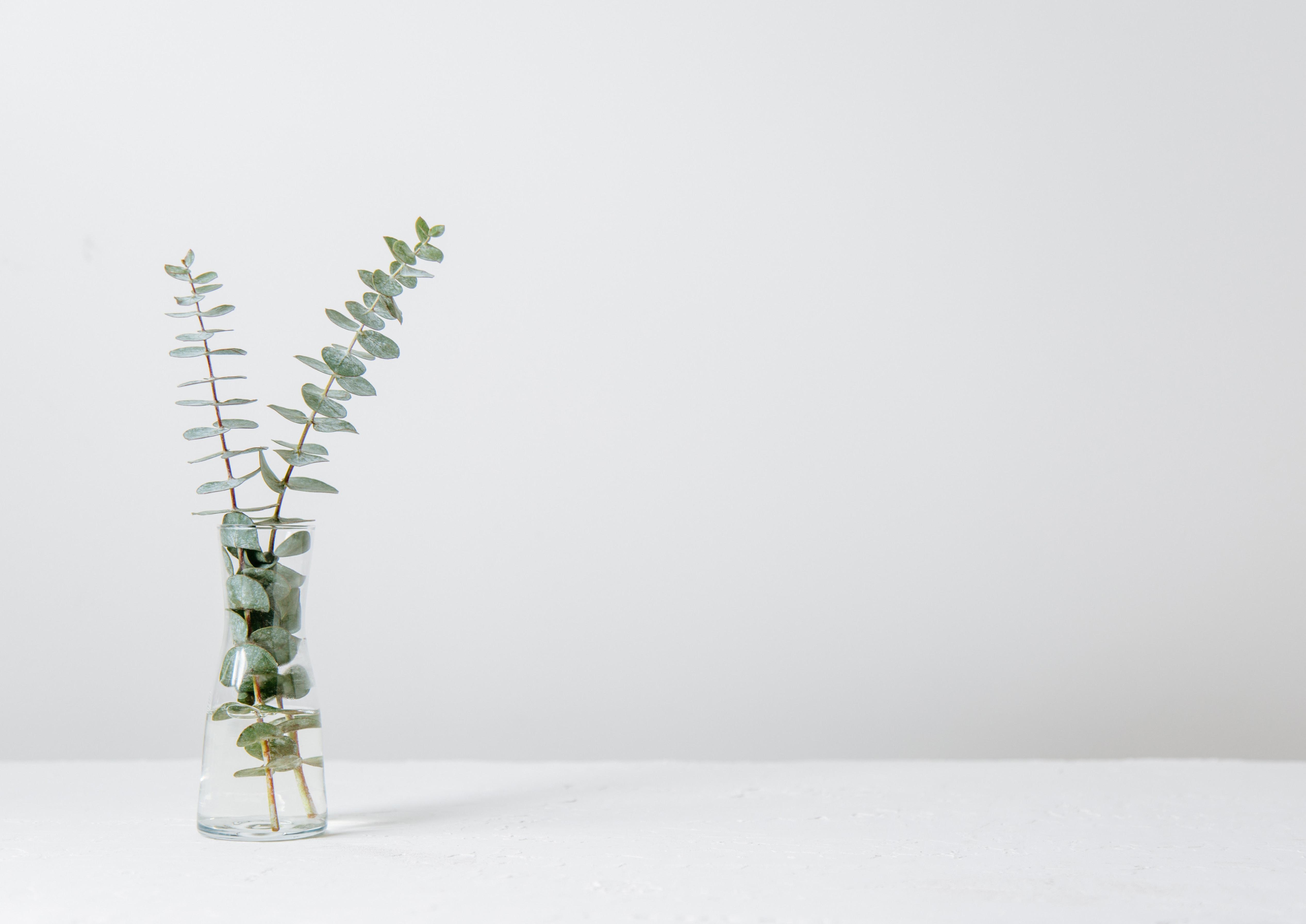
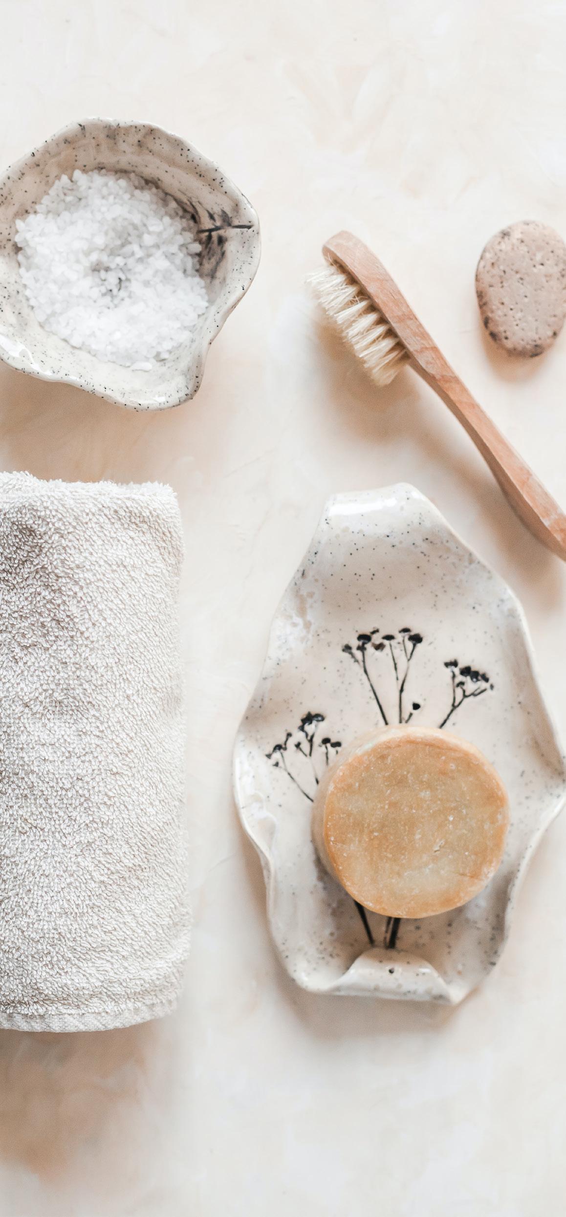
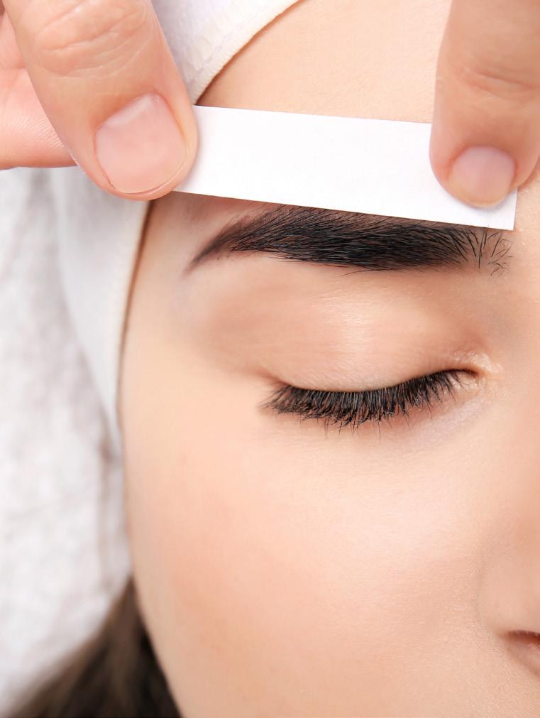
Evenly balanced, delicate, considered, fresh green new you. A wholesome beauty studio.
Jenna’s BEAUTY STUDIO

Sub marks are simpler, compact marks inspired from the primary logo that be used on social media profile images, or with further icons in the footer of your website.
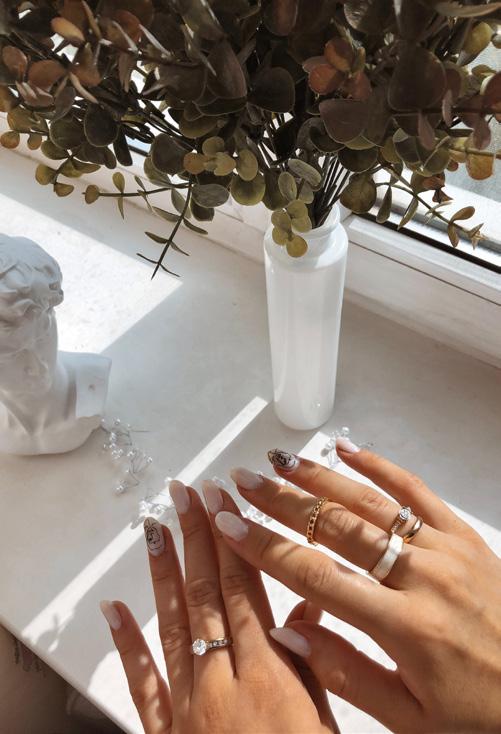
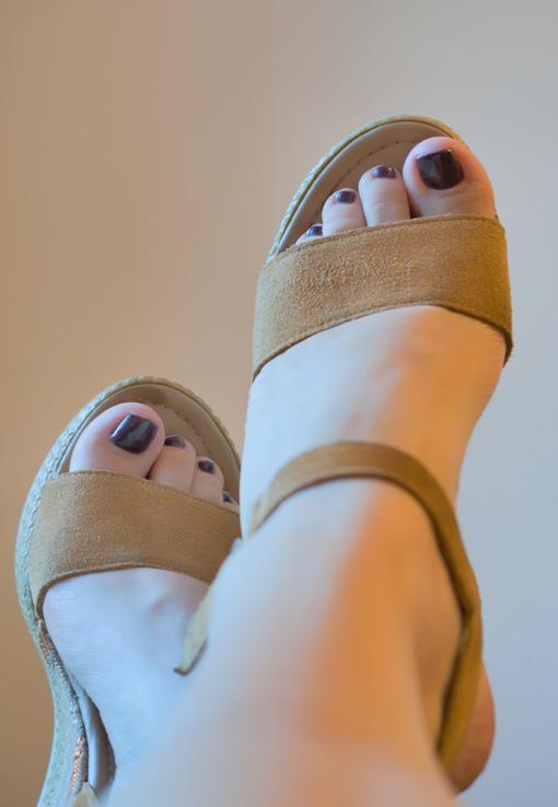
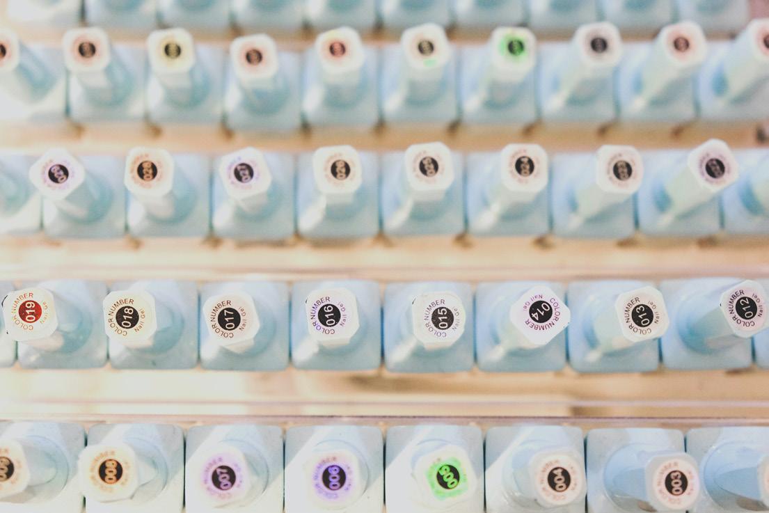
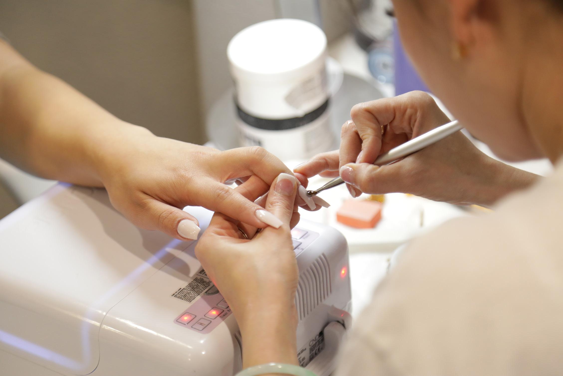

Supporting design elements like icons, illustrations and textures give your brand more flexibility and interest. For example, in website backgrounds, social media templates or marketing materials.
Illustrations

Avatars



Illustrations for socials (as watermarks)



PRIMARY COLOURS
The main colours that define your brand’s tone and style.
NEUTRAL COLOURS

Neutral colours complement your primary colours and add warmth.
Accent Colours
Used sparingly, accent colours at impact and are perfect for buttons, emphasising important text and calls to action.
Are curated selection of typefaces to communicating about your brand messages and ethos
k E ywordS
Beauty, Skin, Nails, Relaxing, Proffessional, Cosy
w E b
For online use Futura PT Book for the H1, H2, H3, H4, H5, H6. Use Made Canvas for pull out text. Paragraph font is Futura PT Book.
PRIMARY FONT - FUTURA PT BOOK
SECONDARY FONT - MADE CANVAS
BODY FONT - FUTURA PT BOOK
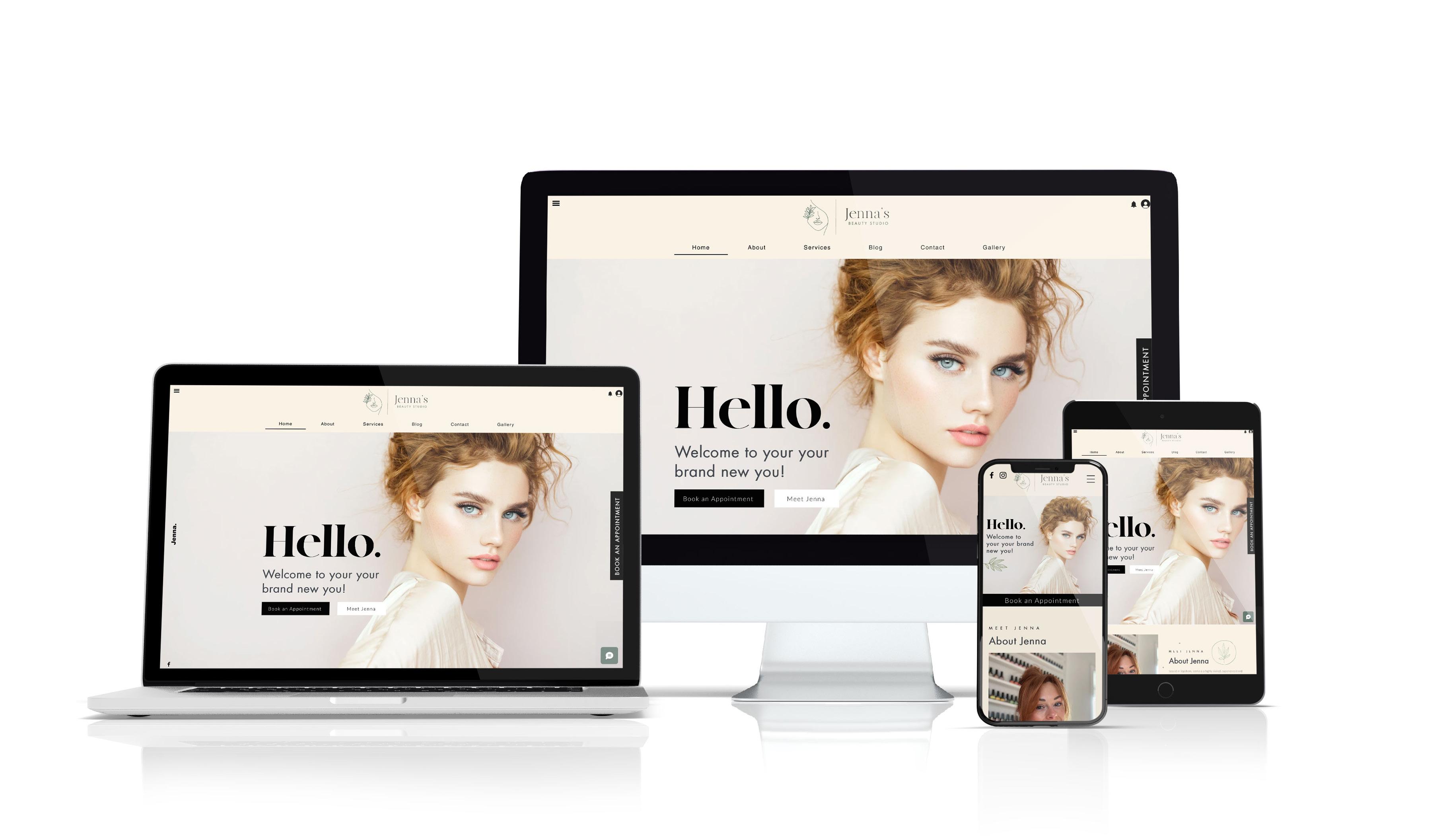
Mock ups of your branding on digital channels, such as your website and social media.
