

CONTENTS
3. P1: POINT OF U
4. STAKEHOLDER ANALYSIS
5. OBJECTIVE/SUBJECTIVE ANALYSIS
6. PRECEDENT ANALYSIS
7. EXPERIMENTATION + MASSING
8. MATERIALITY
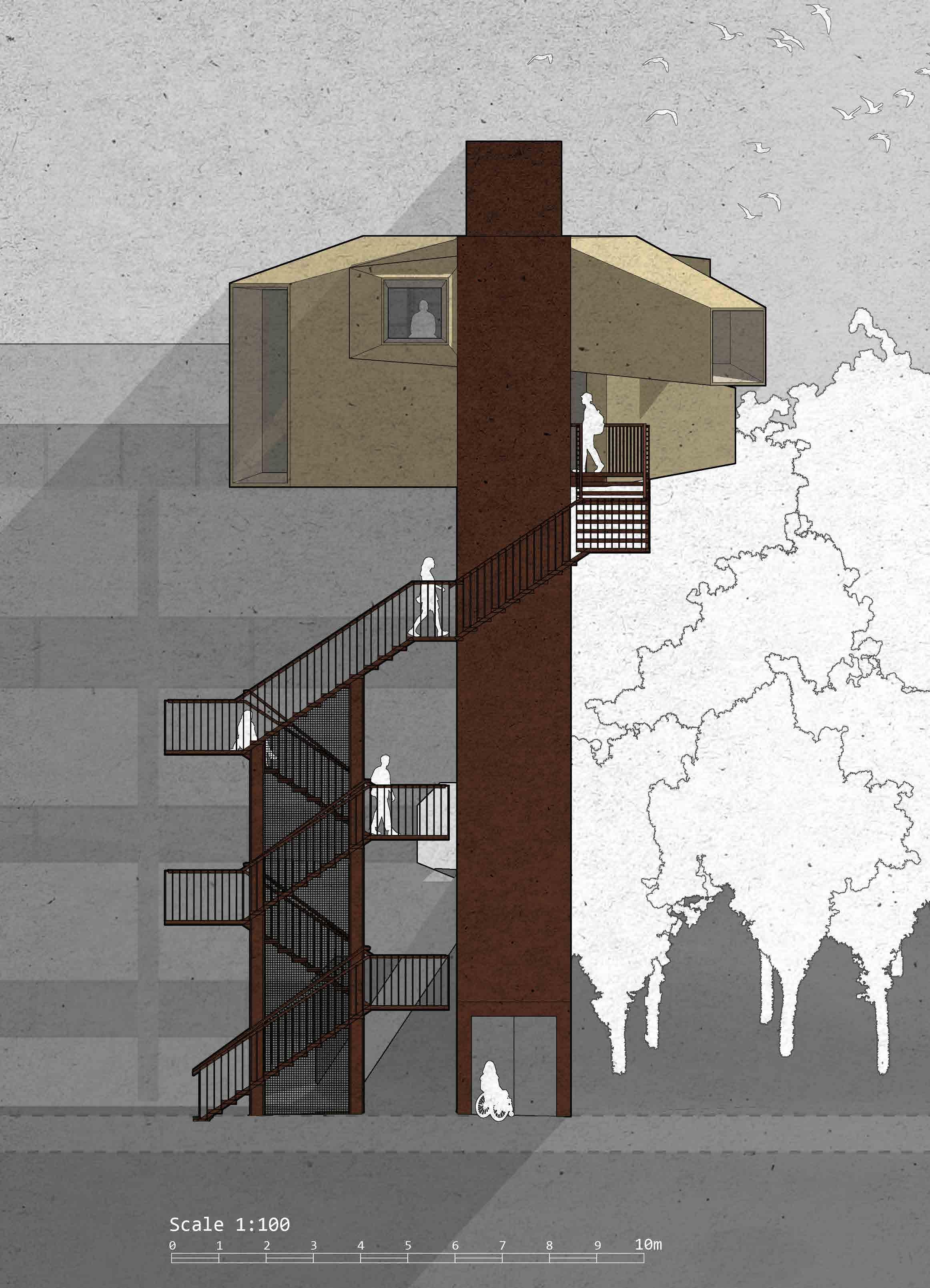
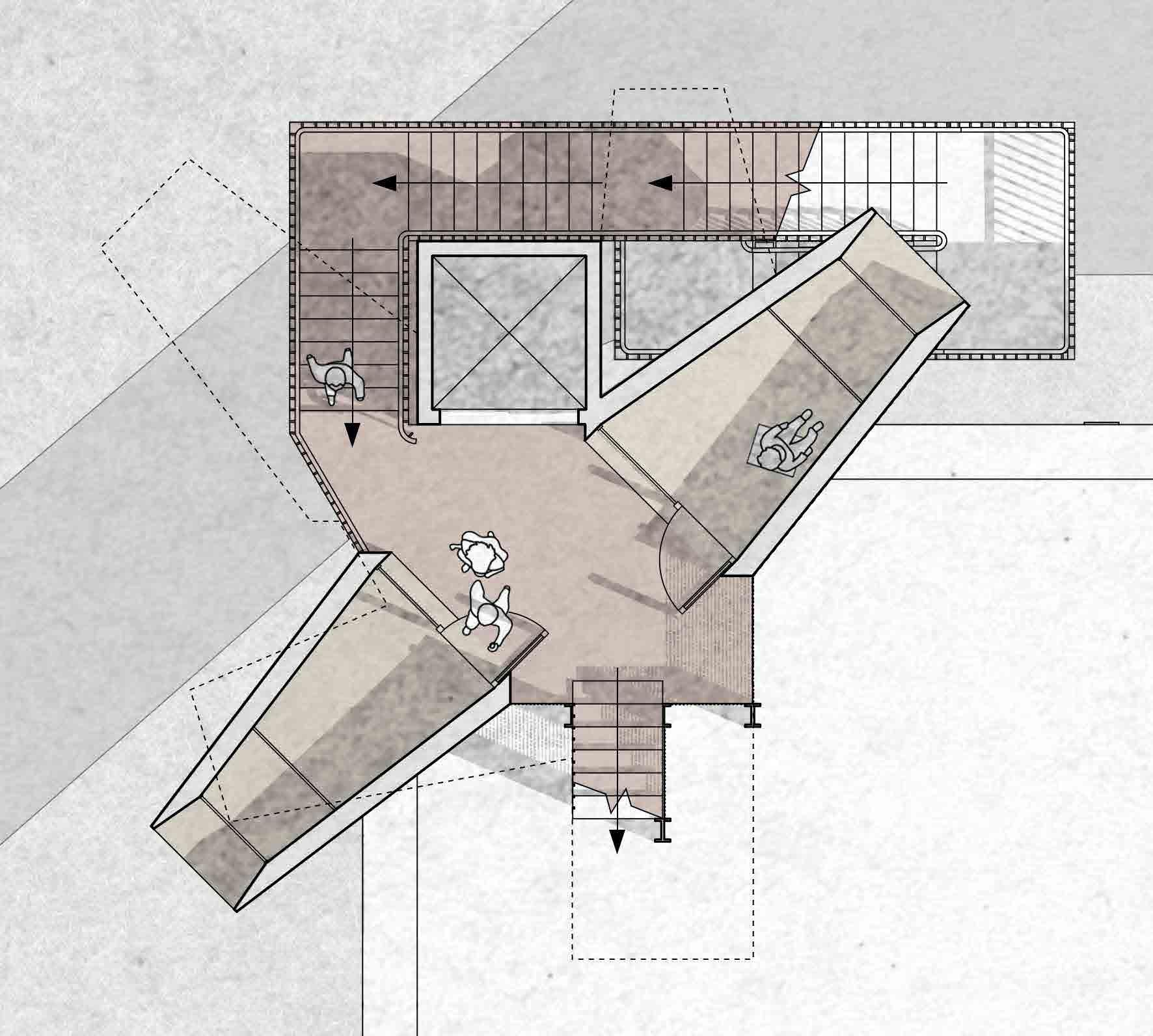
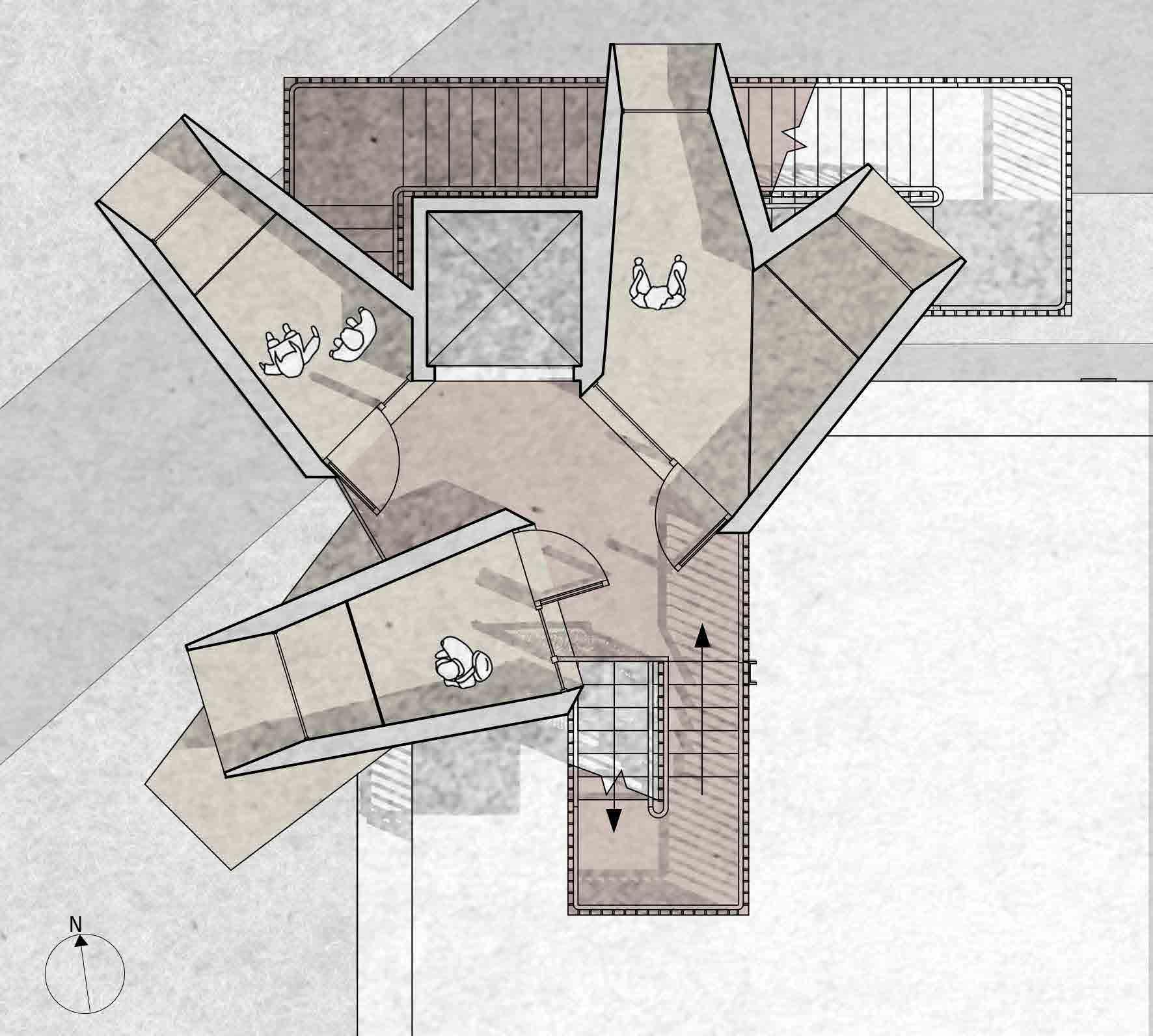
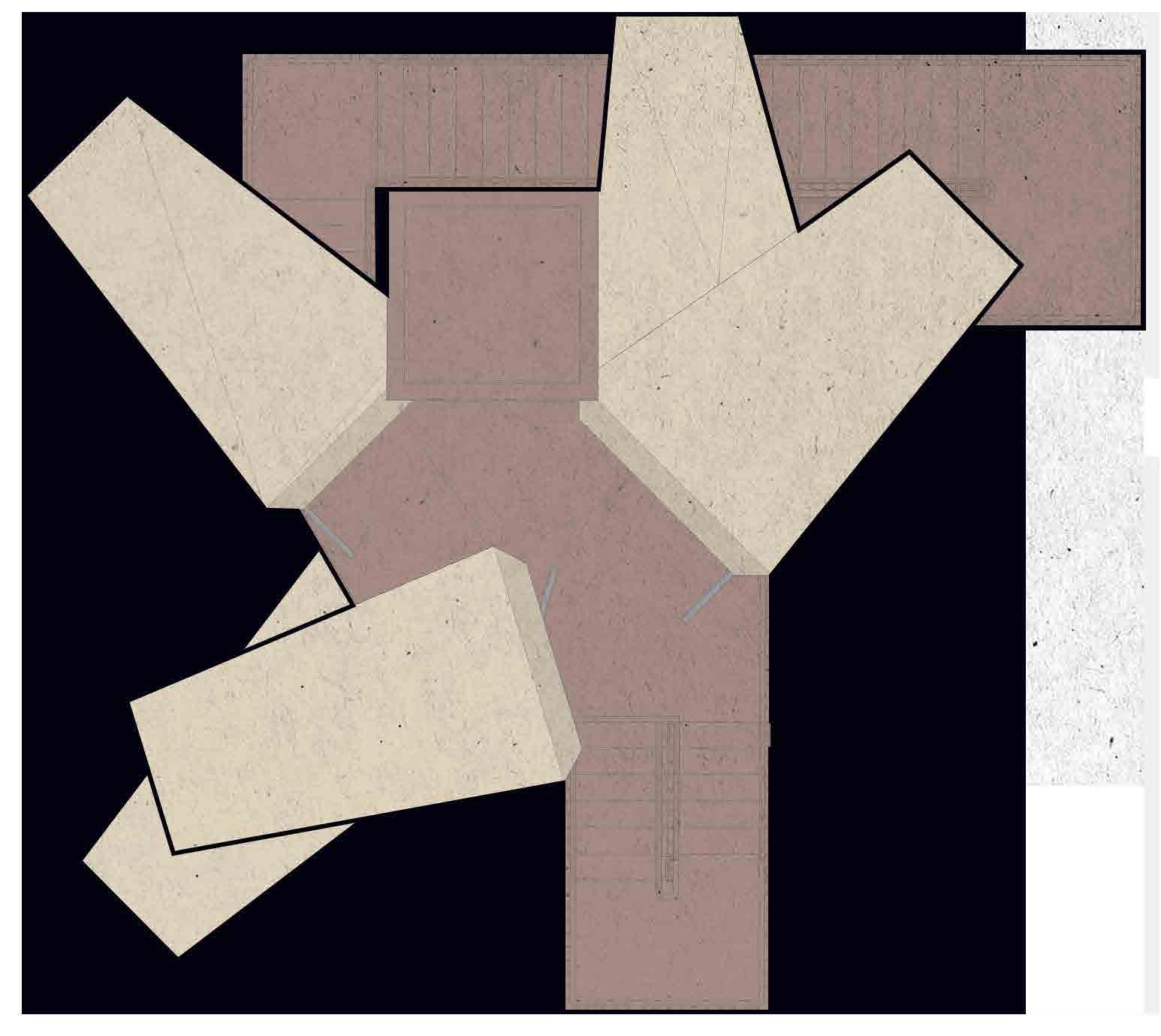
9. PLANS + ELEVATION
10. SECTIONS
11. ACCESS + SITE PLAN + SECTION
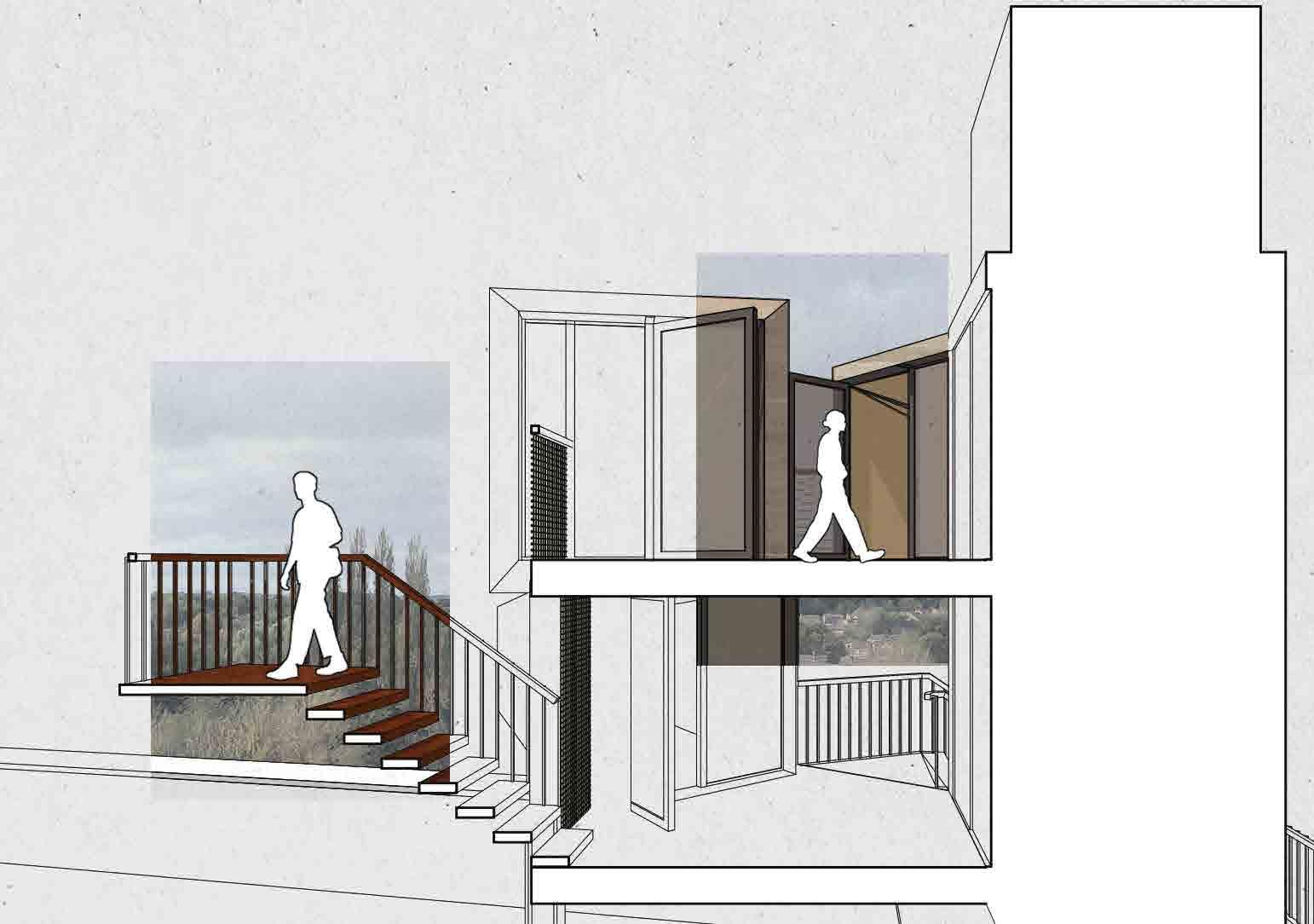
12. STORYBOARD
13. RENDERS
14. P2: LASTING IMPRESSION
15. SITE VISIT
16. SITE ANALYSIS
17. SITE STRATEGY
18. DEEP MAPPING + CONCEPT
19. STAKEHOLDER ANALYSIS
20. PRECEDENT ANALYSIS
23. 5 DESIGN IDEAS
24. MASSING
26. PATHFINDING
27. FORMFINDING
28. INTERFACE WITH LANDSCAPE
30. DAYLIGHTING SOLUTIONS
32. PLANS
34. SECTIONS
36. ELEVATIONS
38. MATERIALITY + SITE PLANS
40. PHYSICAL MODEL + RETROSPECTIVE ITERATION
42. STORYBOARD
43. REFERENCES
POINT OF U
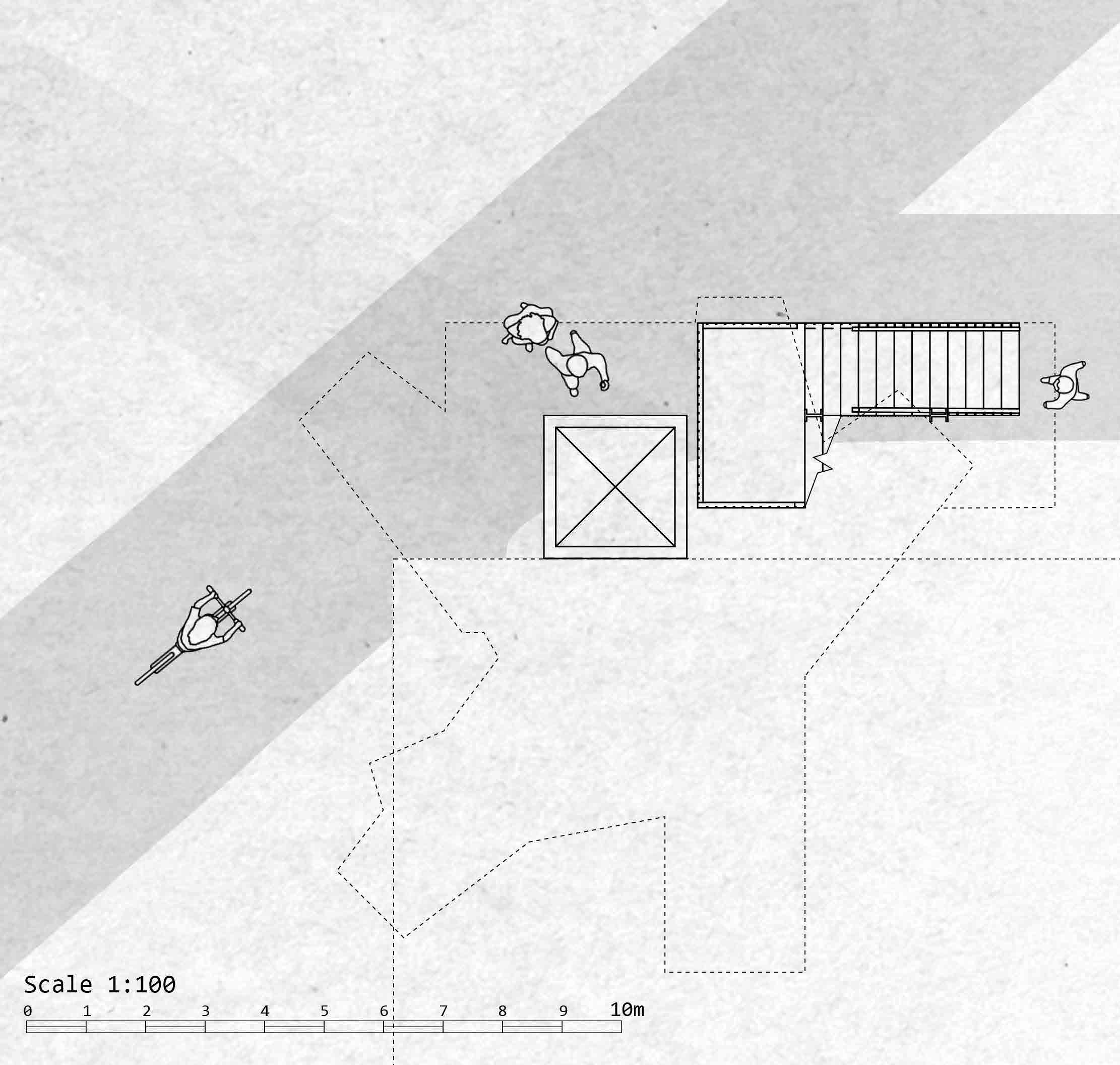
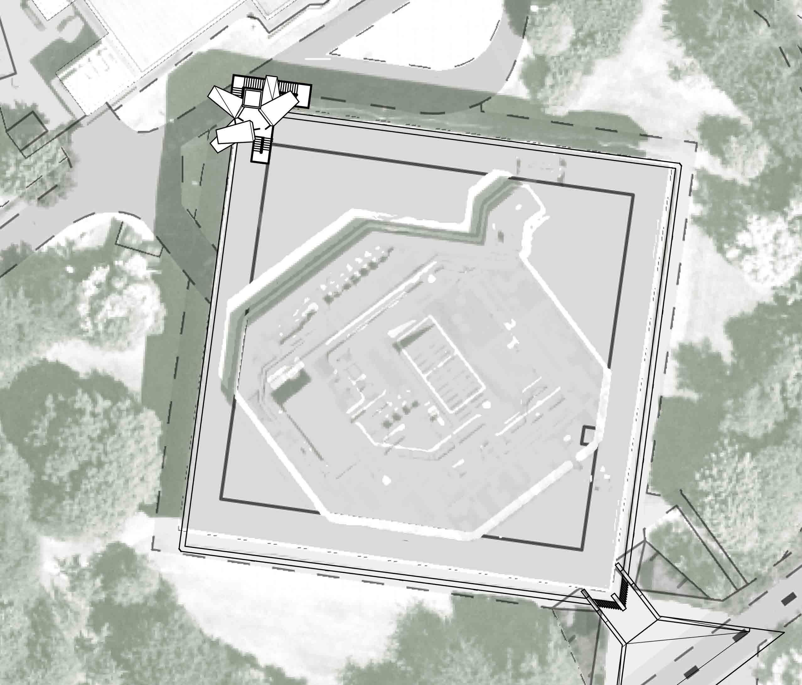
The student community of Loughborough University is already known as one whose interests mainly lie in sports, however, many students don’t feel like this is a fair portrayal of the Loughborough community. The idea behind this project is to represent the equally prevalent creativity that inhabits the campus, providing a space for students of any course to come and create. For most students the library is the heart of the campus, so this is an environment that will be open to all. The task of providing such an environment goes hand in hand with the Urban Sketchers Society manifesto, hence why they will be the primary stakeholders and users of this space. The library’s unique vantage point over much of the campus makes it the ideal site for this structure, and over time, repeated use by the students will create a visual record of the urban landscape of the campus.
STAKEHOLDER ANALYSIS
Staff Members: 13
Student Members: N/A
LU Arts is the main arts programme of loughborough university, providing opportunities for students to get involved in the arts
INDIRECT STAKEHOLDERS
KEY STAKEHOLDERS
Staff Members: 5
Student Members: 15
Urban Sketchers are a global community of people who take part in the practice of on-location drawing. Loughborough University has its own branch of this community as an extra-curricular society, which all students are welcome to

• Ravyn is a student from Chicago who studies criminology.
• She often misses how much the community of her hometown engages with the arts, so she’s struggling to connect with the campus community.
• She needs a space that allows her to connect with other students through their art.
EMMA

RAVYN AVI
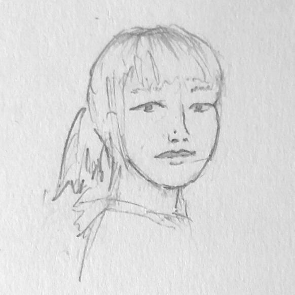
• Emma is a graphic design student and member of the Urban Sketchers Society.
• She and her society face the issue of the rainy weather of Loughborough interfering with their expeditions.
• They need a sheltered space to congregate during bad weather and showcase their work.
• Avi studies sports science and is an AU football captain.
• He has never had much of an opportunity to explore his creative side thanks to expectation from his family to pursue sports.
• He needs a space where he can take time away from sports and creatively express himself, free of judgement.
URBAN SKETCHERS MANIFESTO:
1. We draw on location, indoors or out, capturing what we see from direct observation.
2. Our drawings tell the story of our surroundings, the places we live and where we travel.
3. Our drawings are a record of time and place.
4. We are truthful to the scenes we witness.
5. We use any kind of media and cherish our individual styles.
6. We support each other and draw together.
7. We share our drawings online.
8. We show the world, one drawing at a time.
OBJECTIVE/SUBJECTIVE
DEEP MAPPING THE LIBRARY
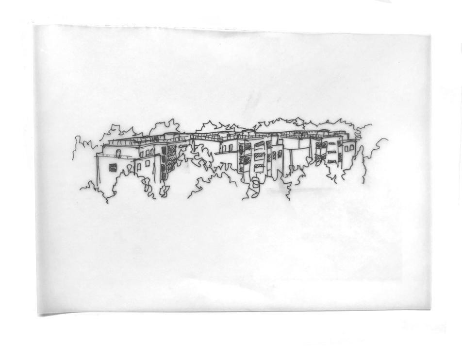
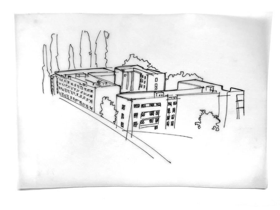
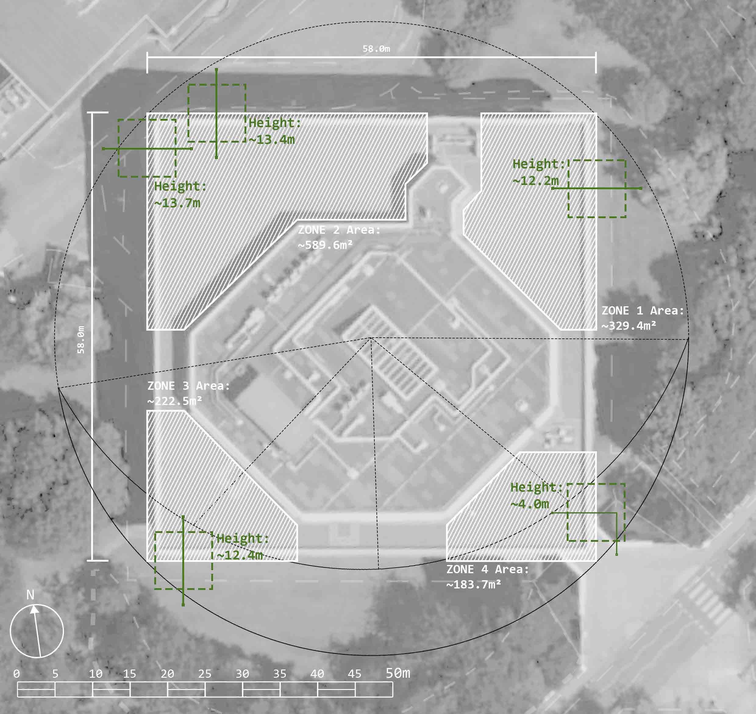
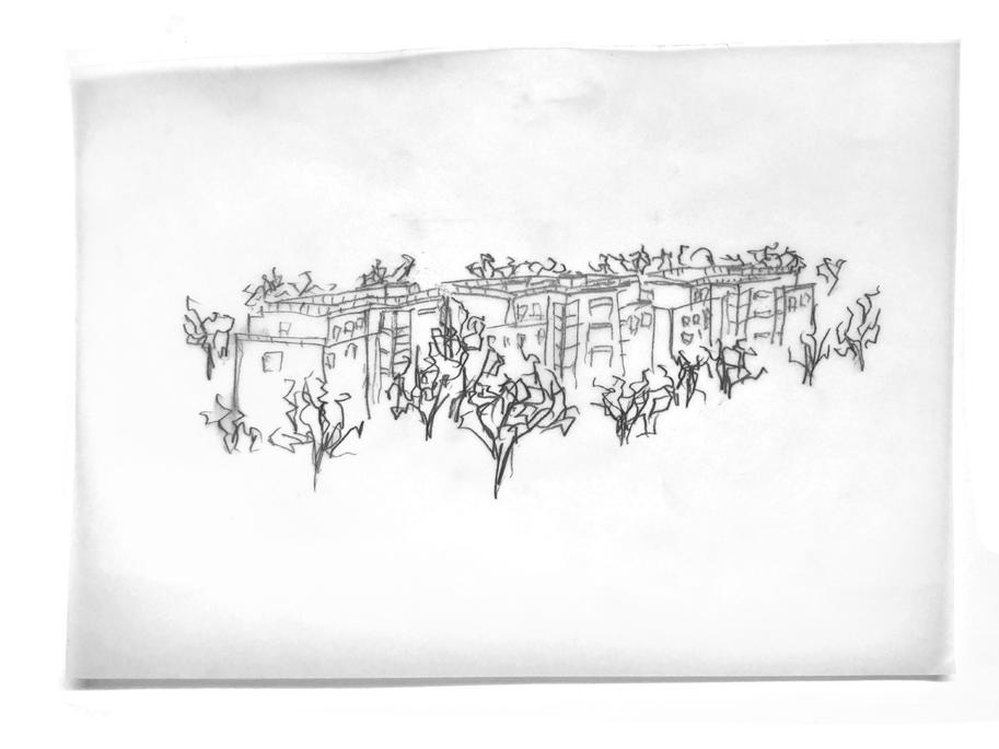
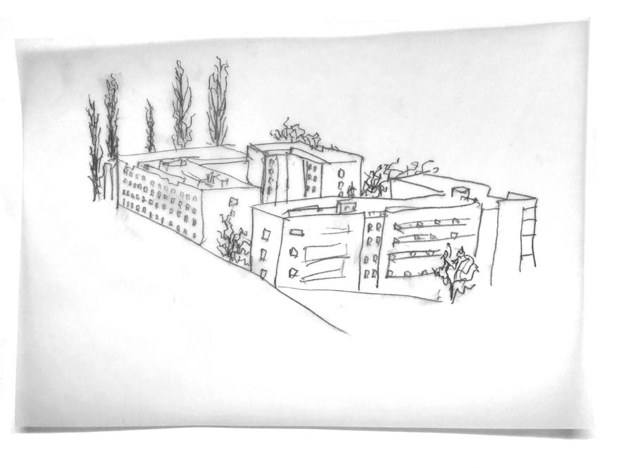
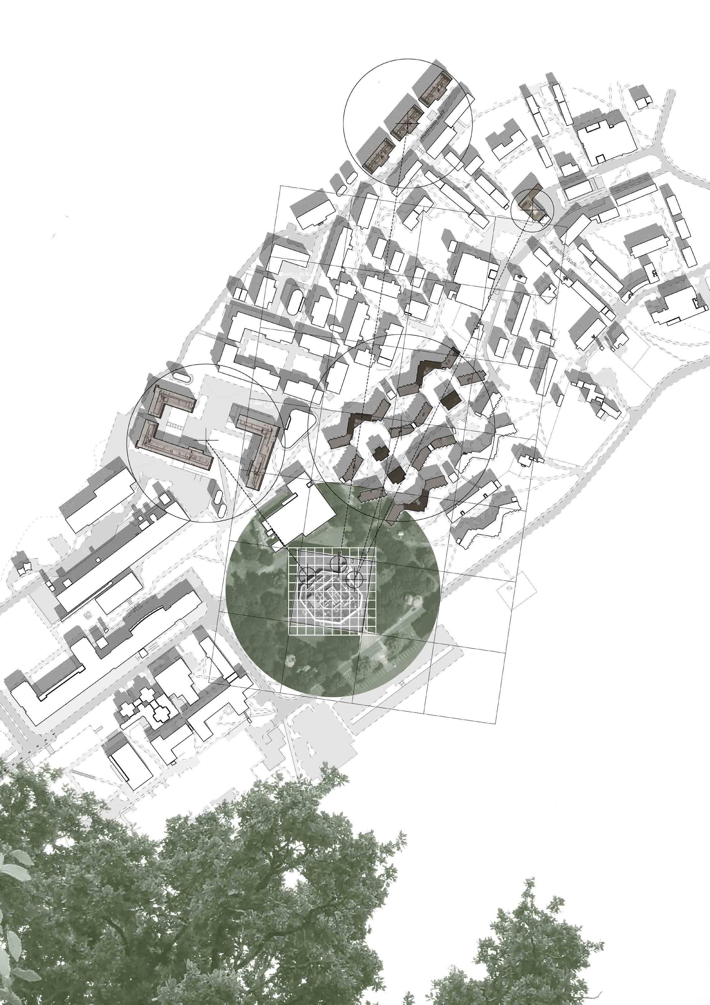
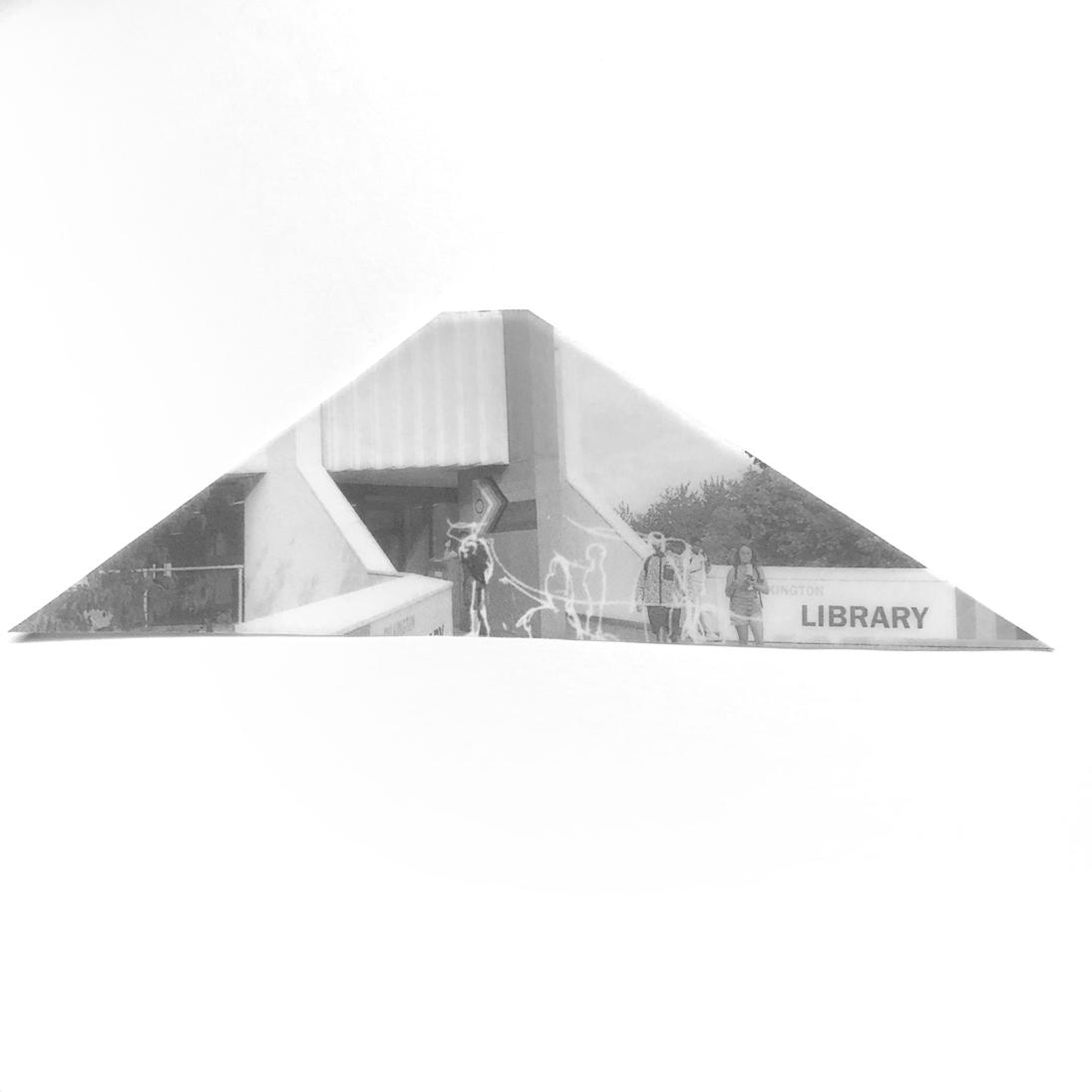
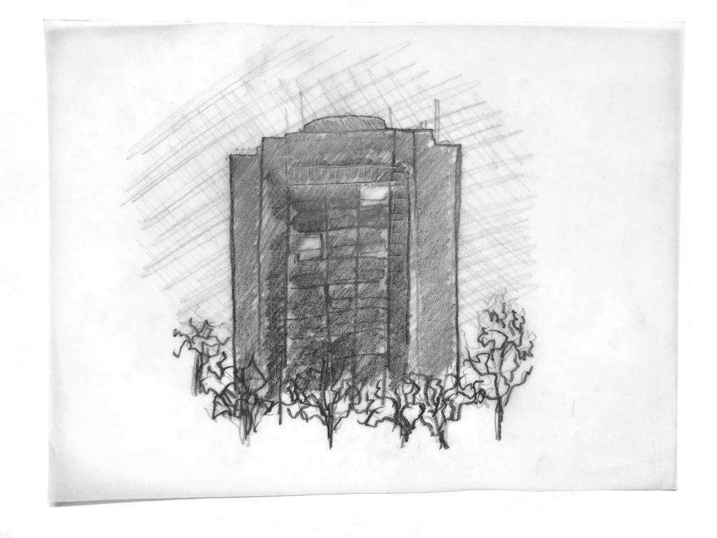
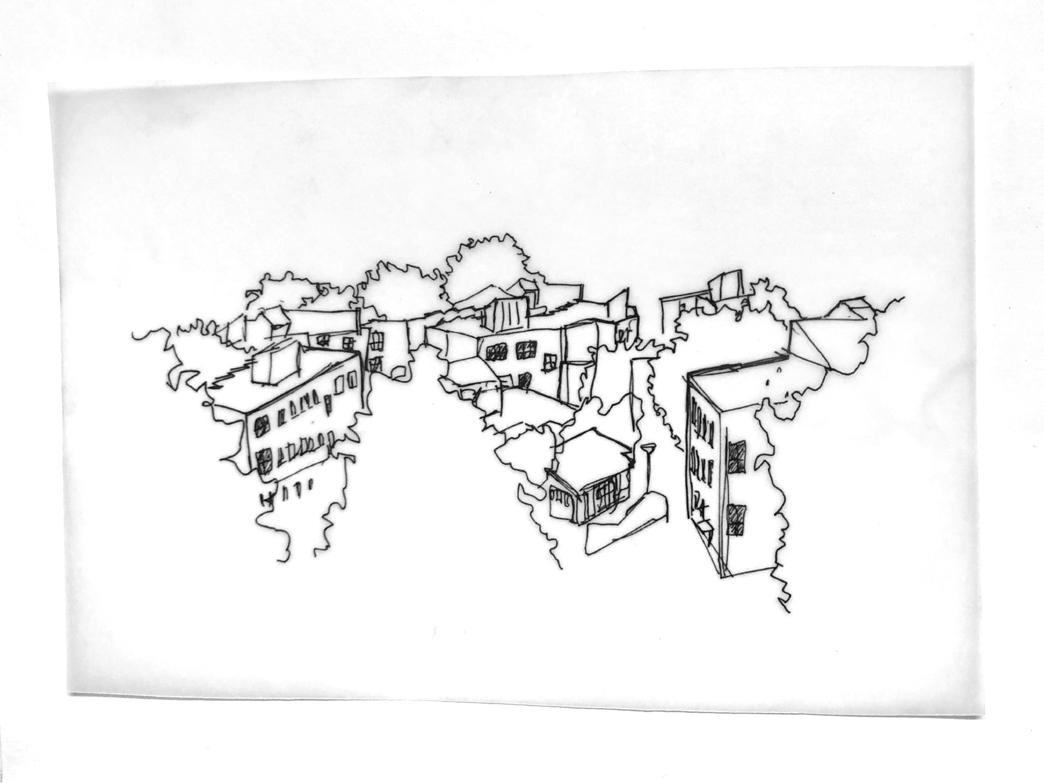
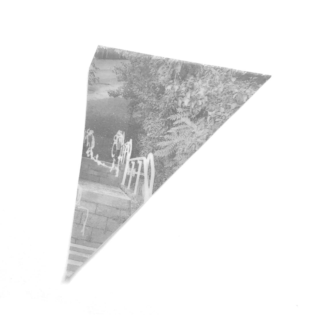
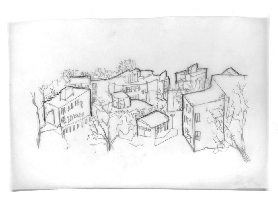
My deep map of the library focuses on the idea of perspective, the unique perspectives that the library provides, as well as the various perspectives students have of the library itself:
1 Buildings visible from the library roof
2 Grid representing distance using the library roof area as reference
3 Urban sketches of campus buildings mapping how they would change through the year
4 Grid representing the maximum for my intervention
5 Views of the building itself from potential access points
6 The library’s immediate surroundings

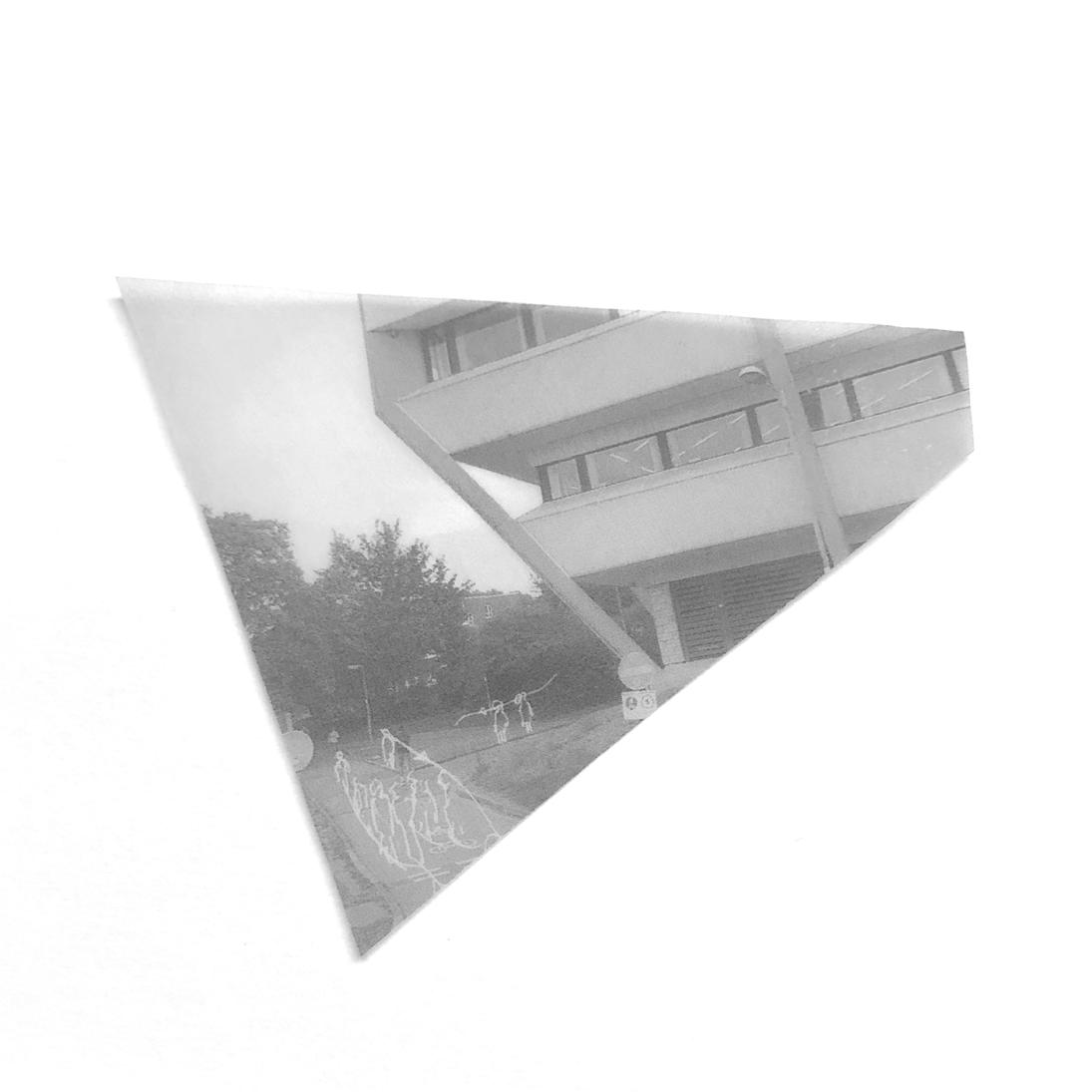
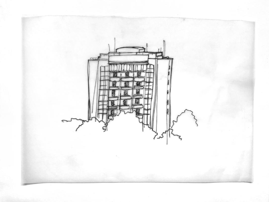
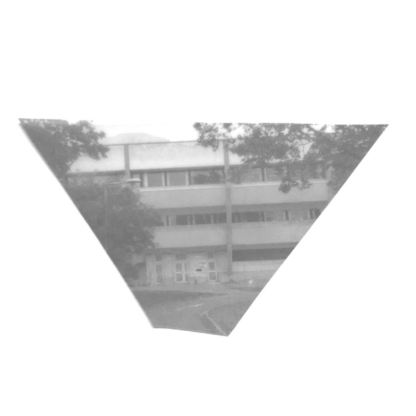


HOW TO CREATE A VANTAGE POINT
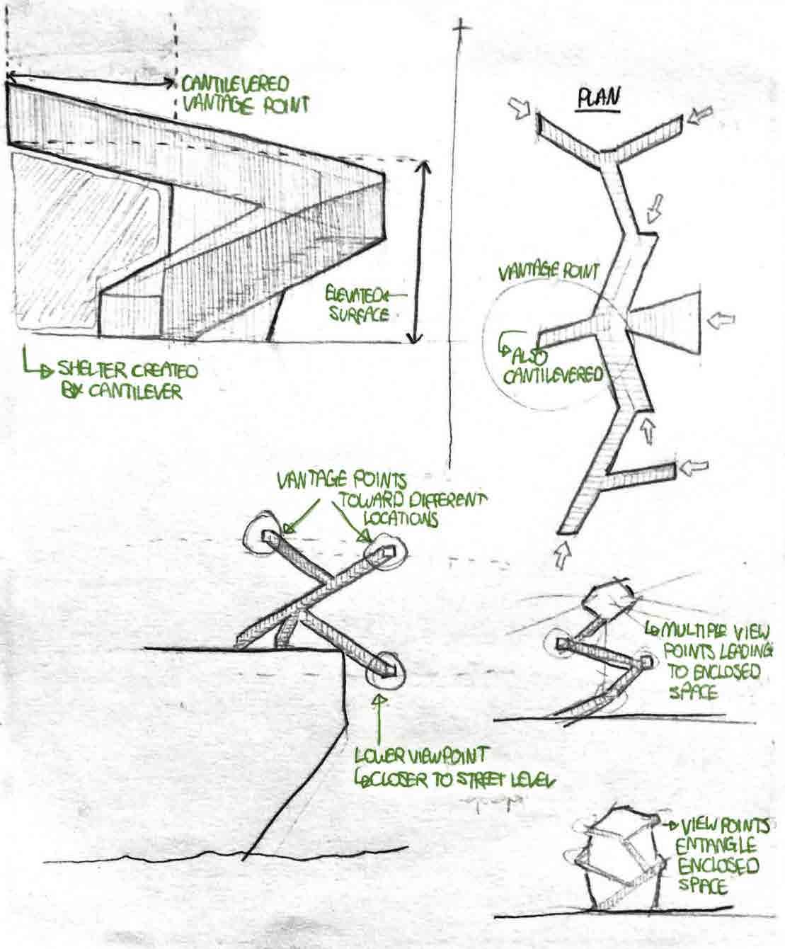
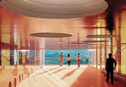
The following precedents are all examples of structures that either create or optimise and existing vantage point.
DESIGN IDEAS
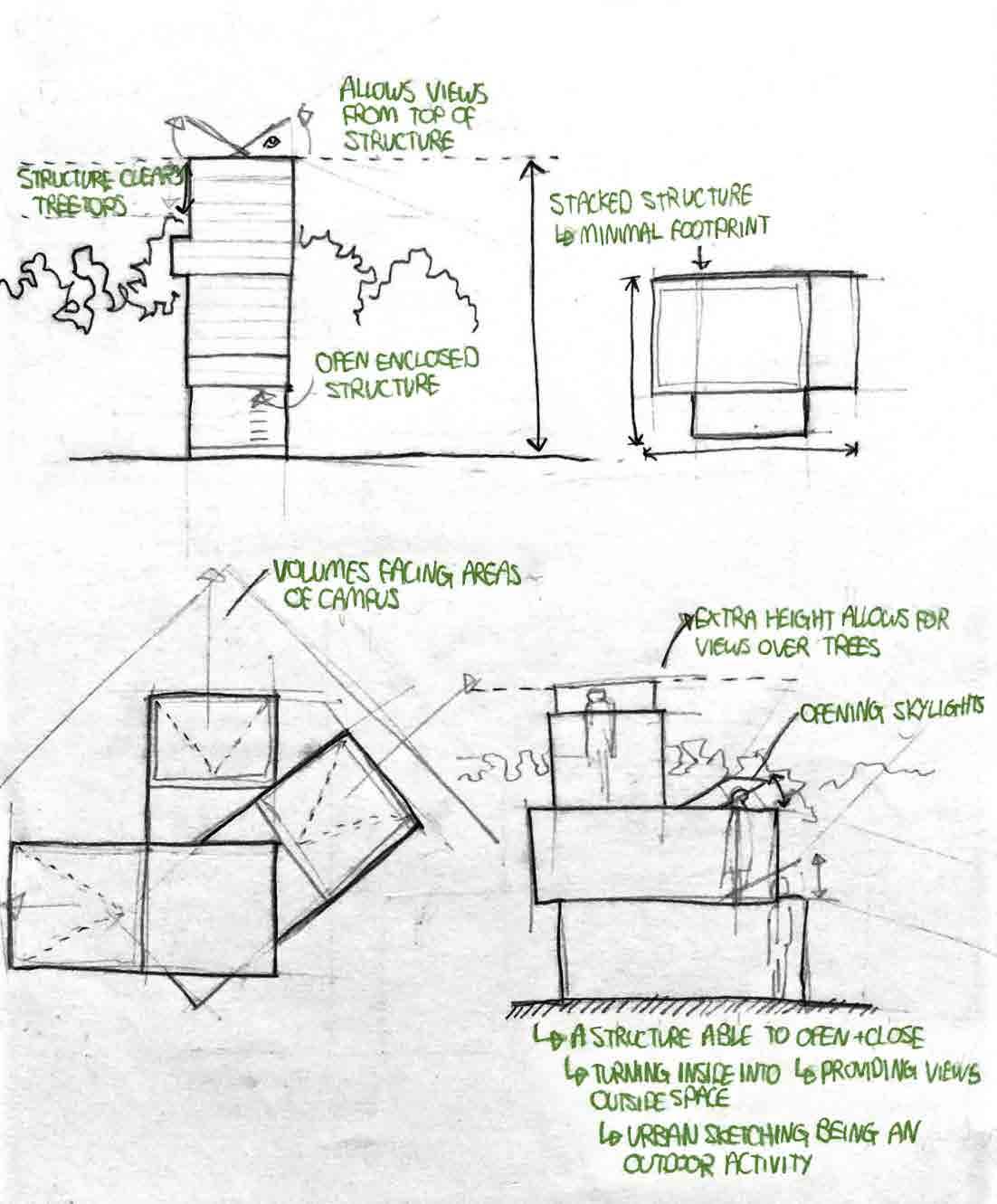
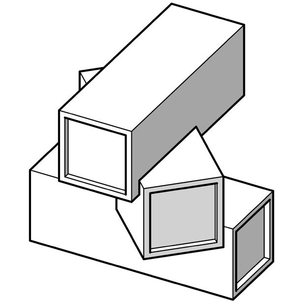
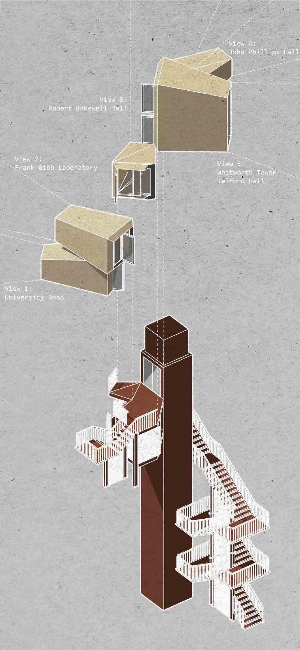
Stacked volumes
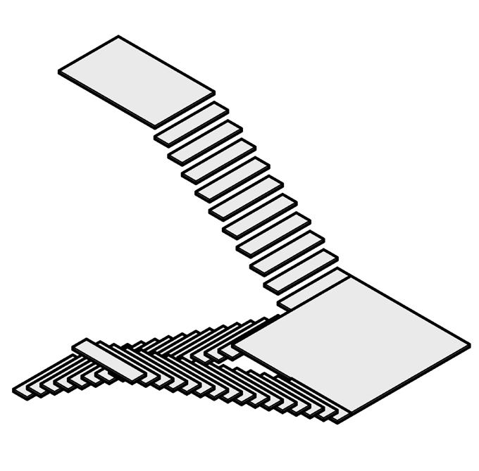
Open circulation
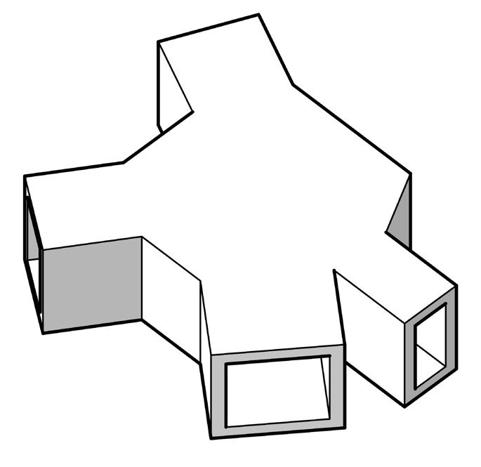
Framing views
EXPERIMENTATION
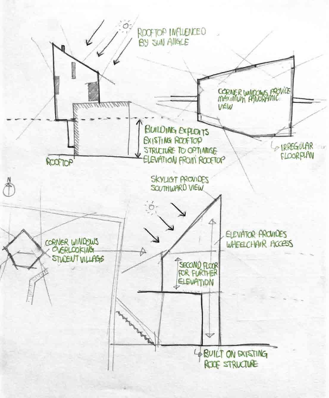
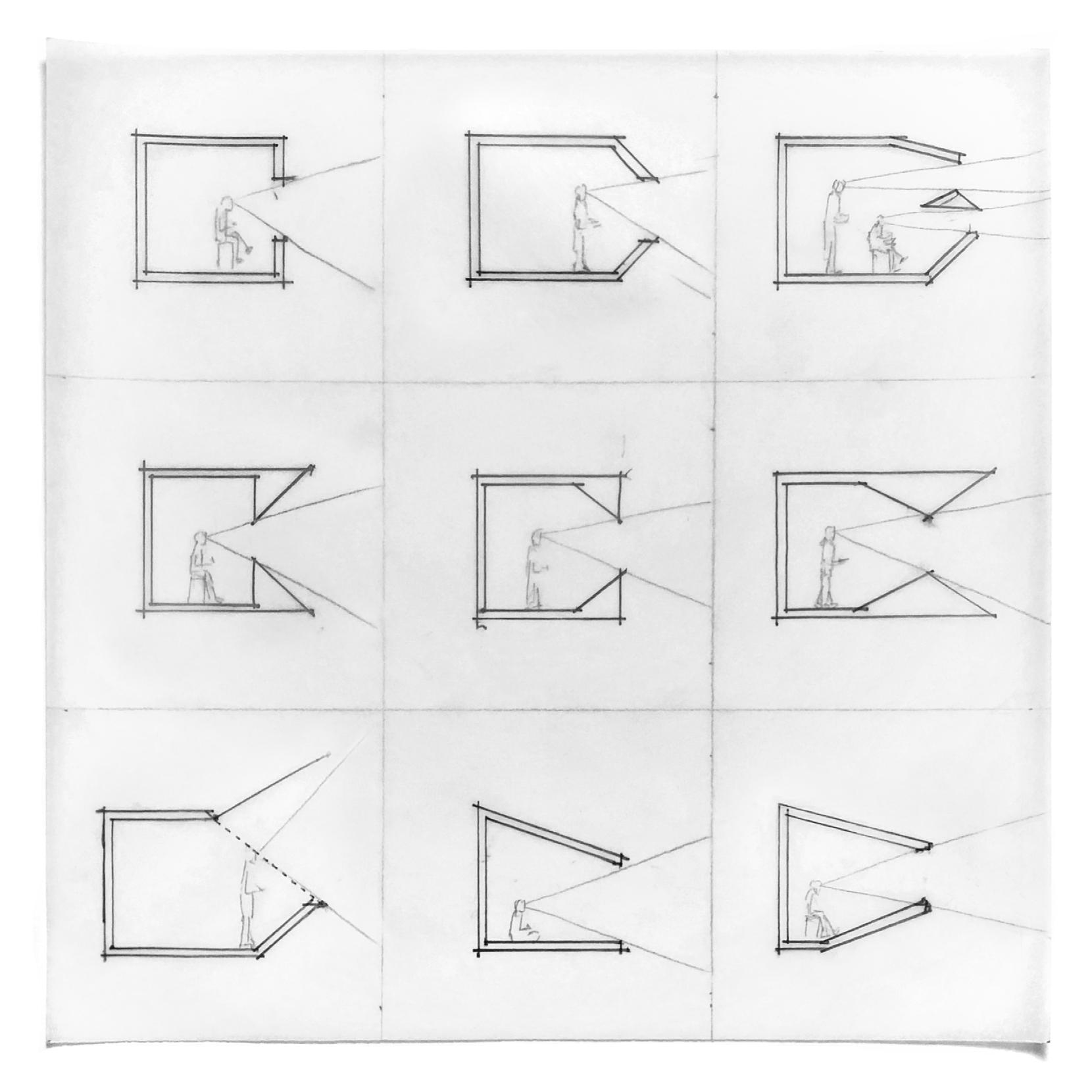
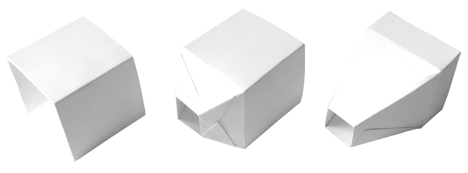
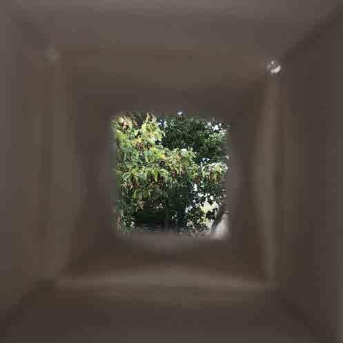
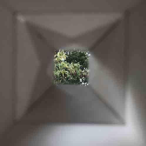
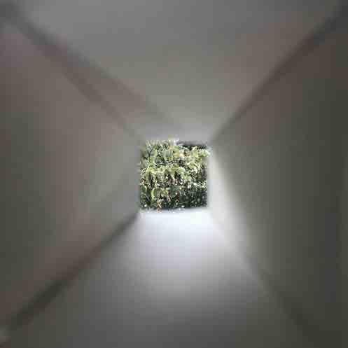
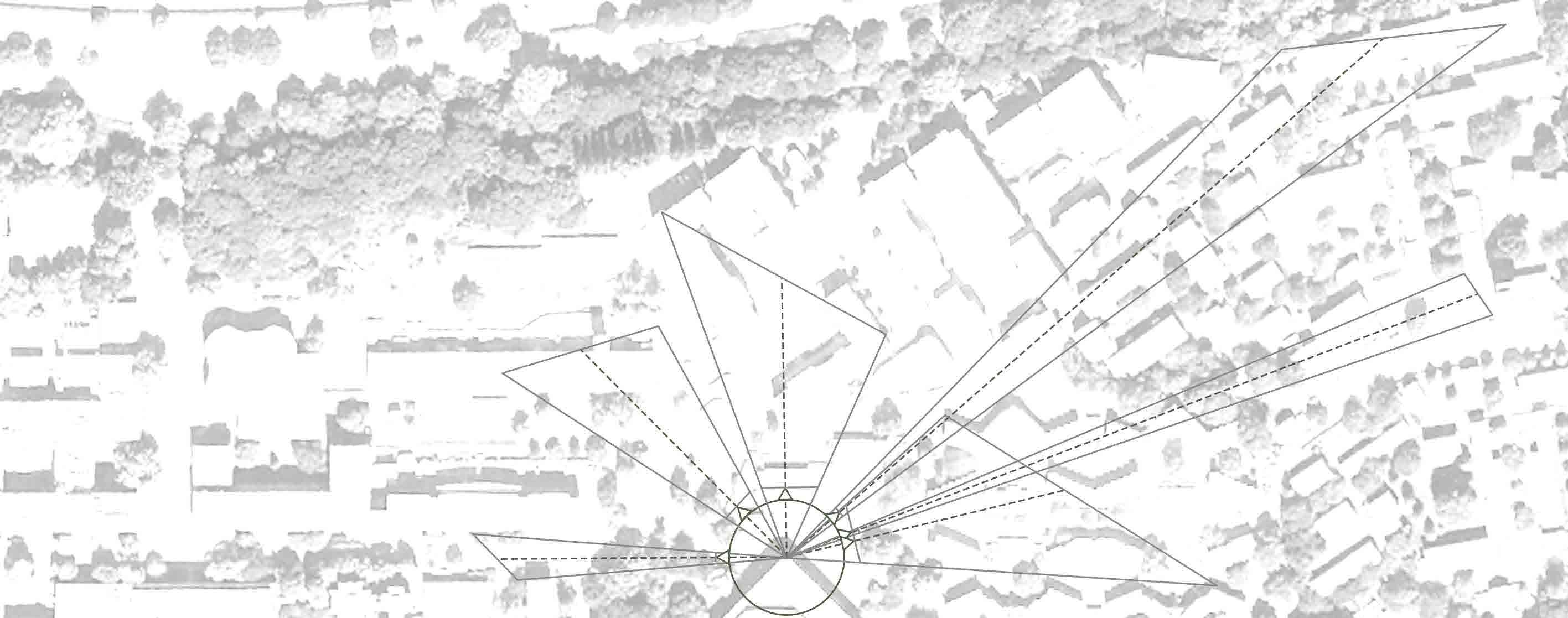
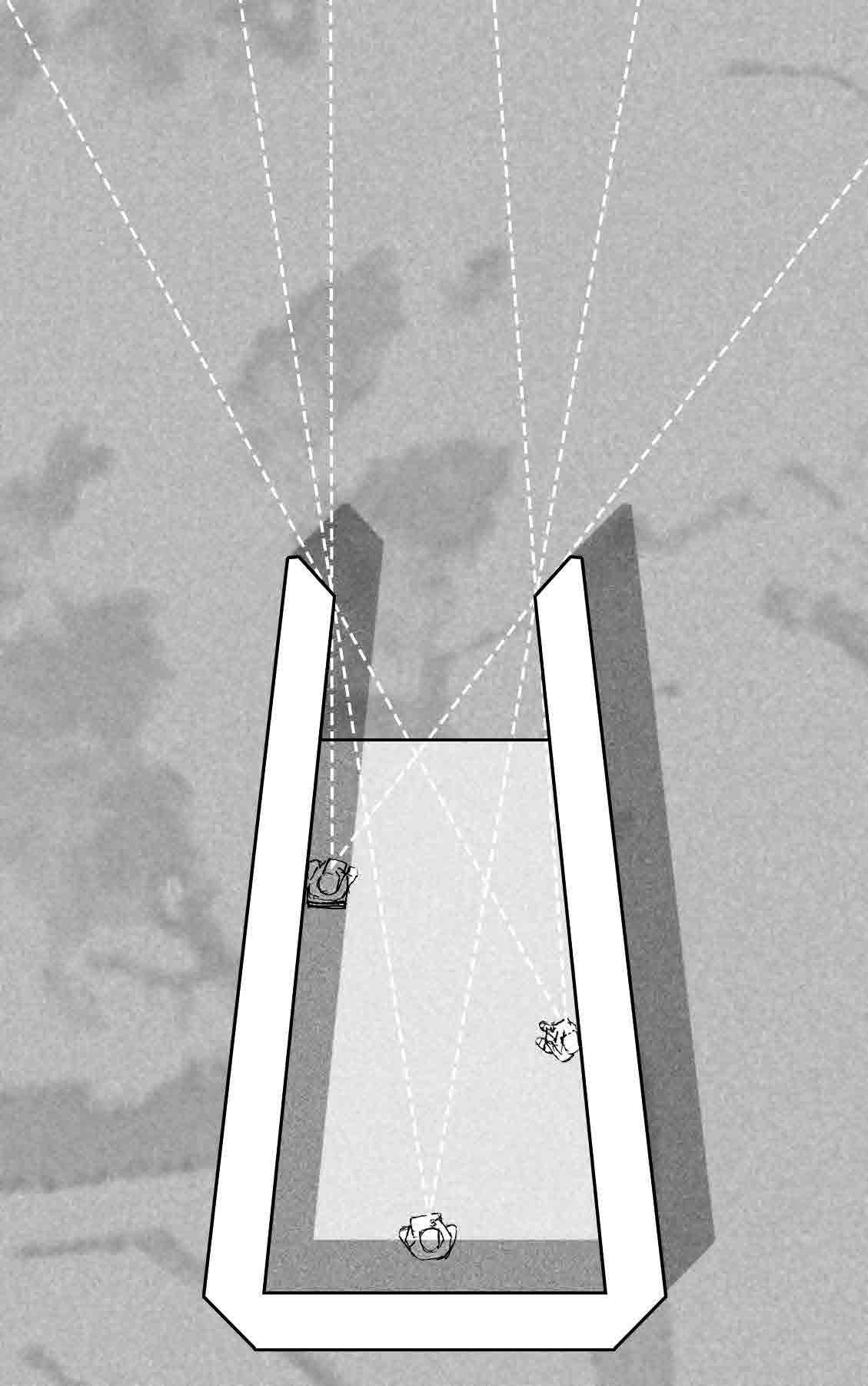
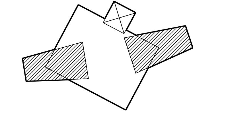
Analysis of the various positions people take while sketching, as well as exploring the ways a structure can allow the artist to frame and focus on a specific view. The final chosen form of the space not only frames the view, but also provides different focal points depending on the users position in the room.
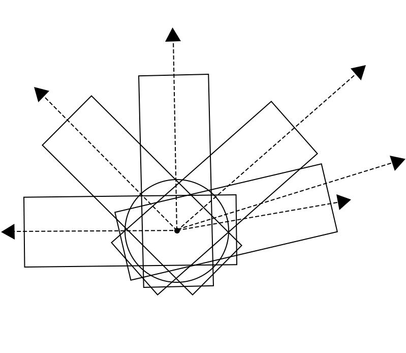
1. Approximation of the necessary angles for each volume
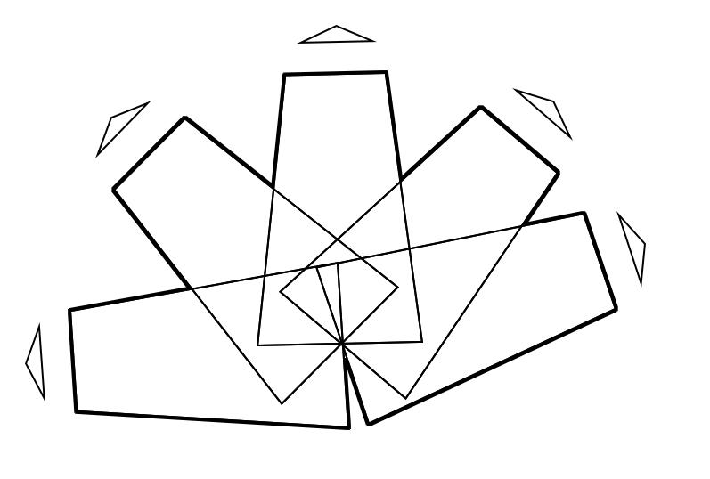
2. Applying the form to the volume
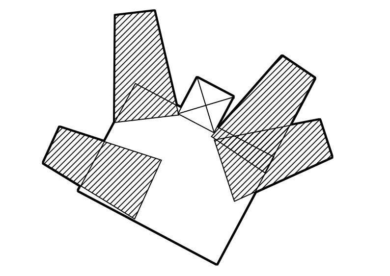
Entrance floor First floor
3. Dividing the volumes betweena lower and upper floor based on the distance between the site and the focus, as well as accounting for access
MATERIALITY

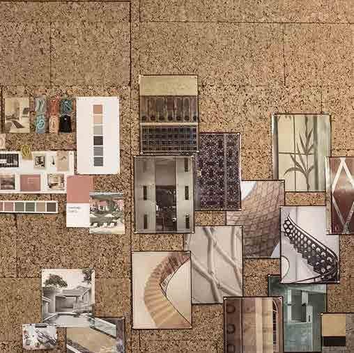
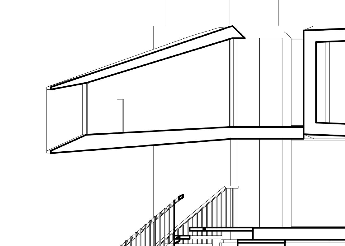
The interior surfaces of the volumes would be clad in cork, allowing the walls to be used to exhibit work created within the structure. The exterior surfaces echo the internal materiality as they are clad in timber.
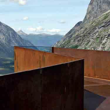
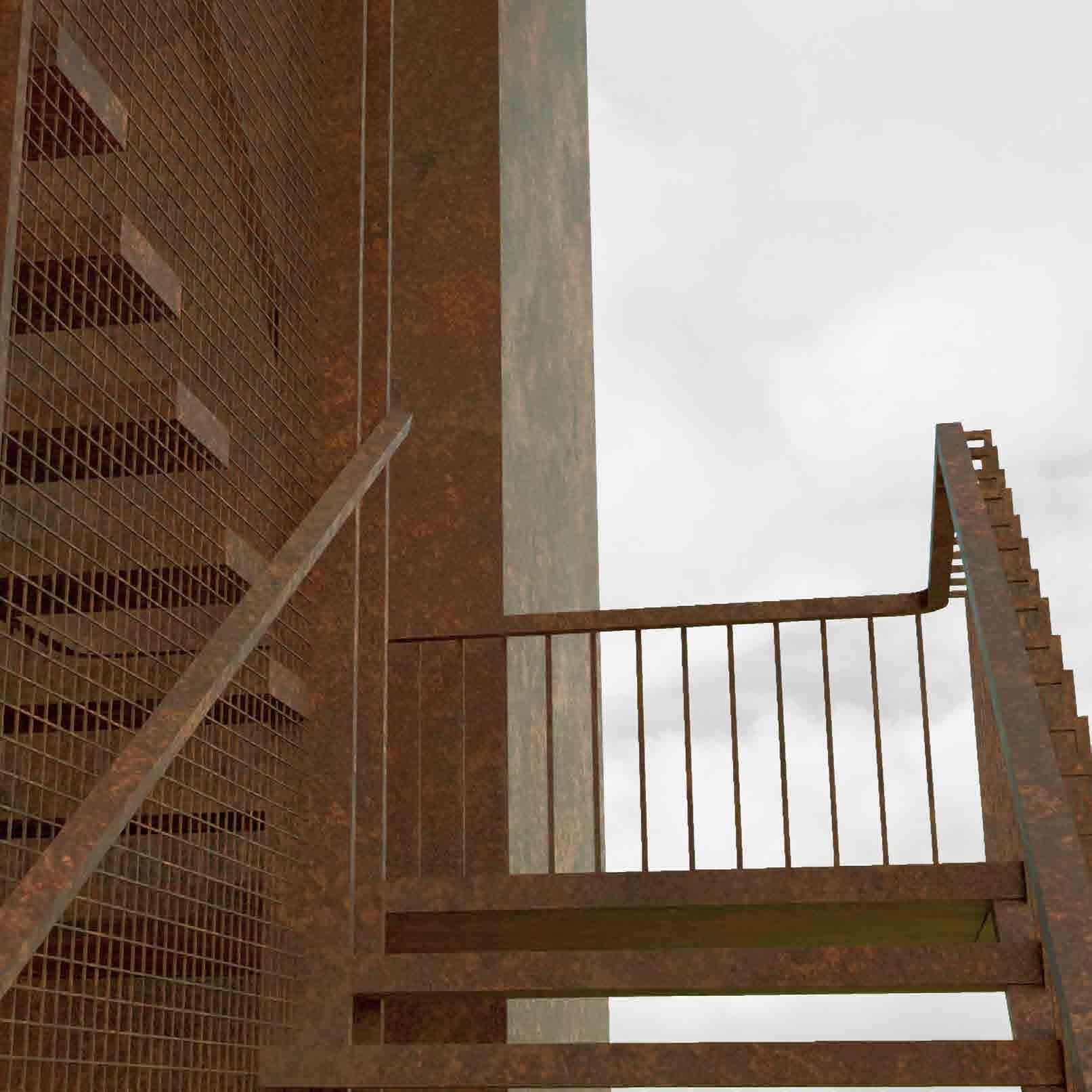
Corten steel visually contrasts the overall materiality of the library itself, which helps to define it as a separate structure from both it and the volumes on top.
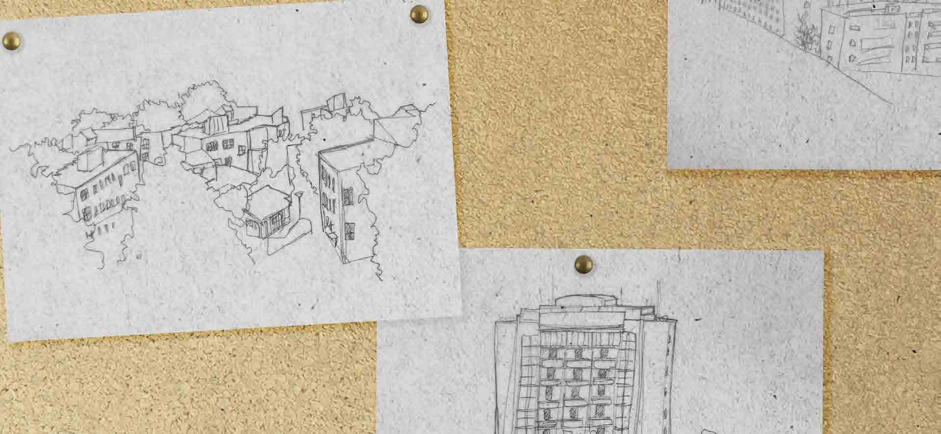
Cork walls as a means of displaying the users work using push pins
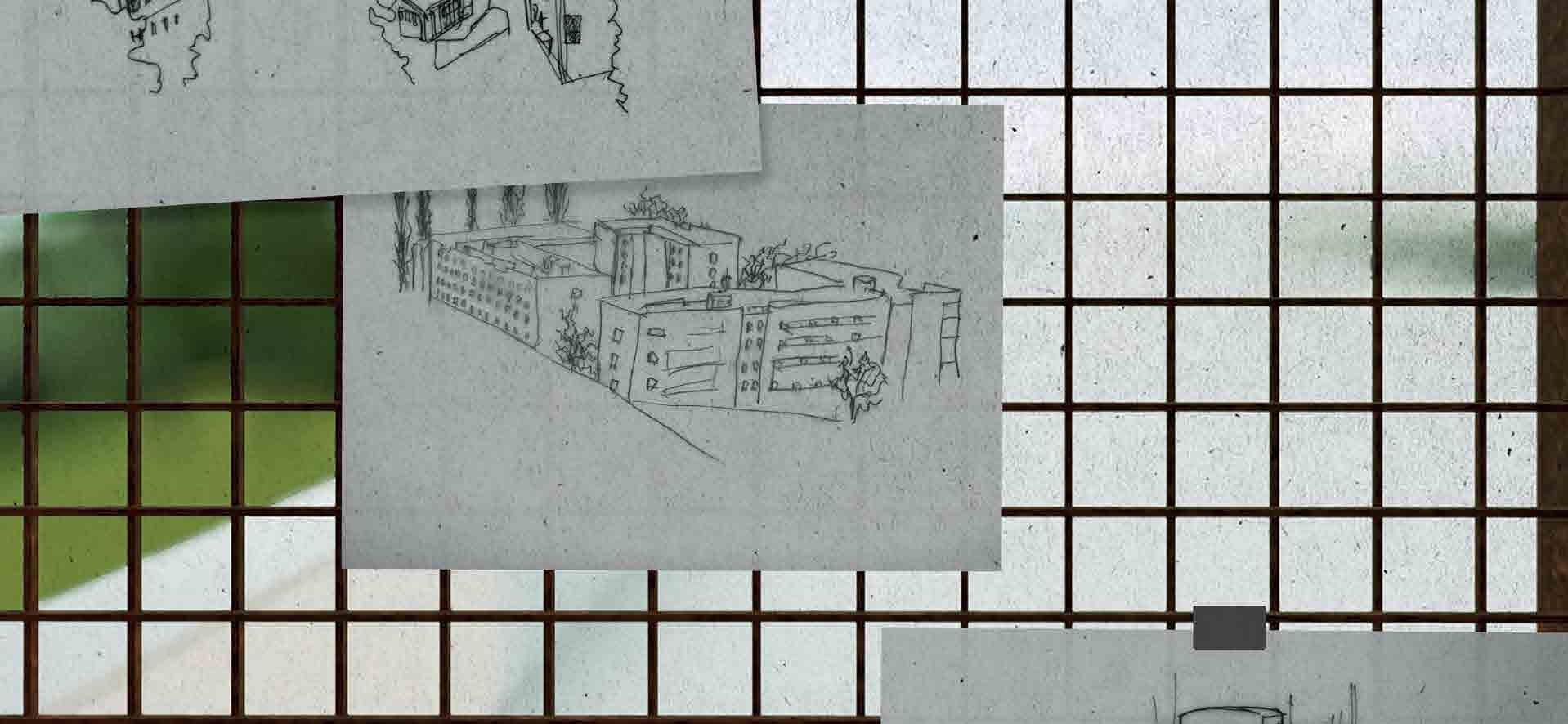
Corten steel mesh being used to exhibit work using clips


TRAVERSING
THE STRUCTURE
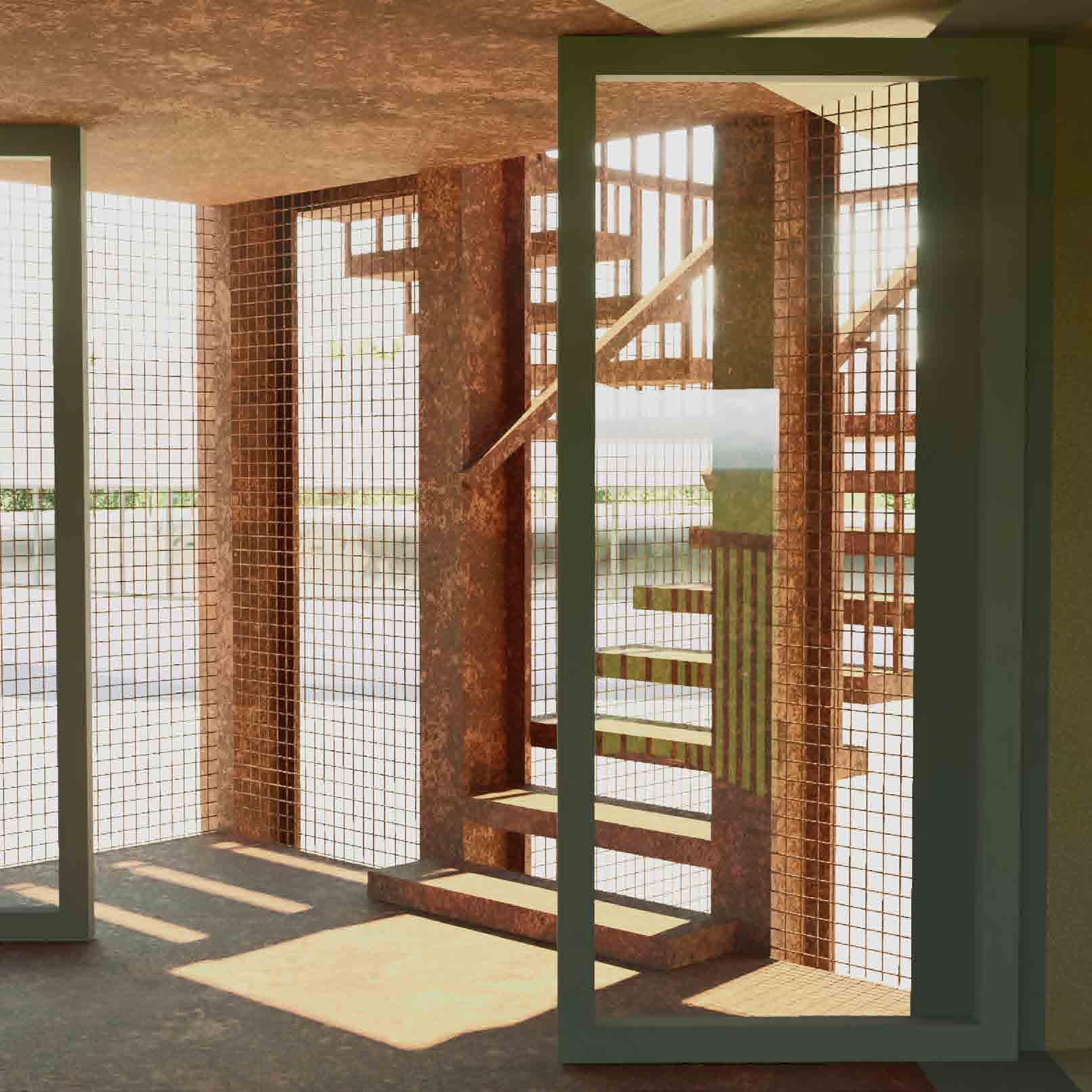
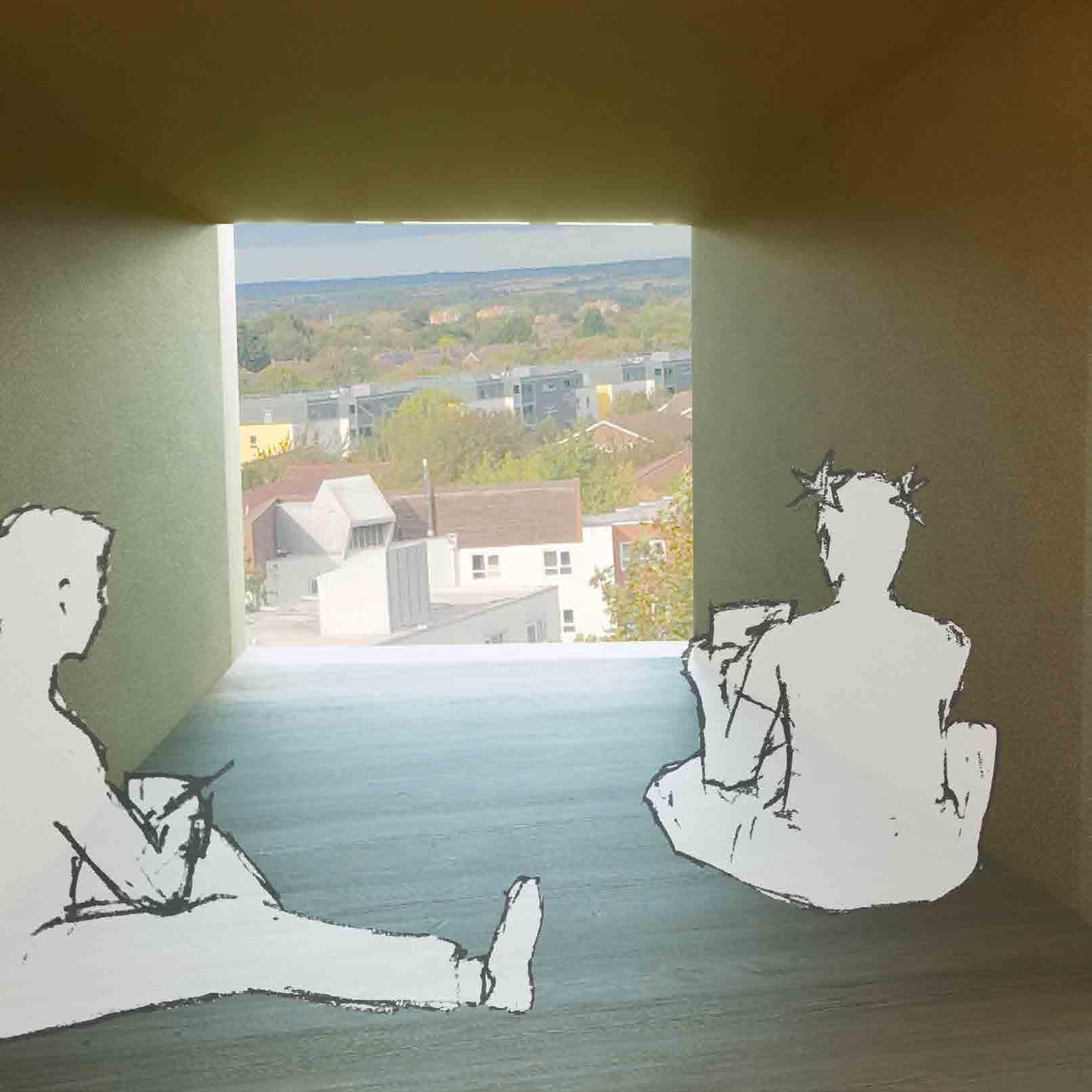
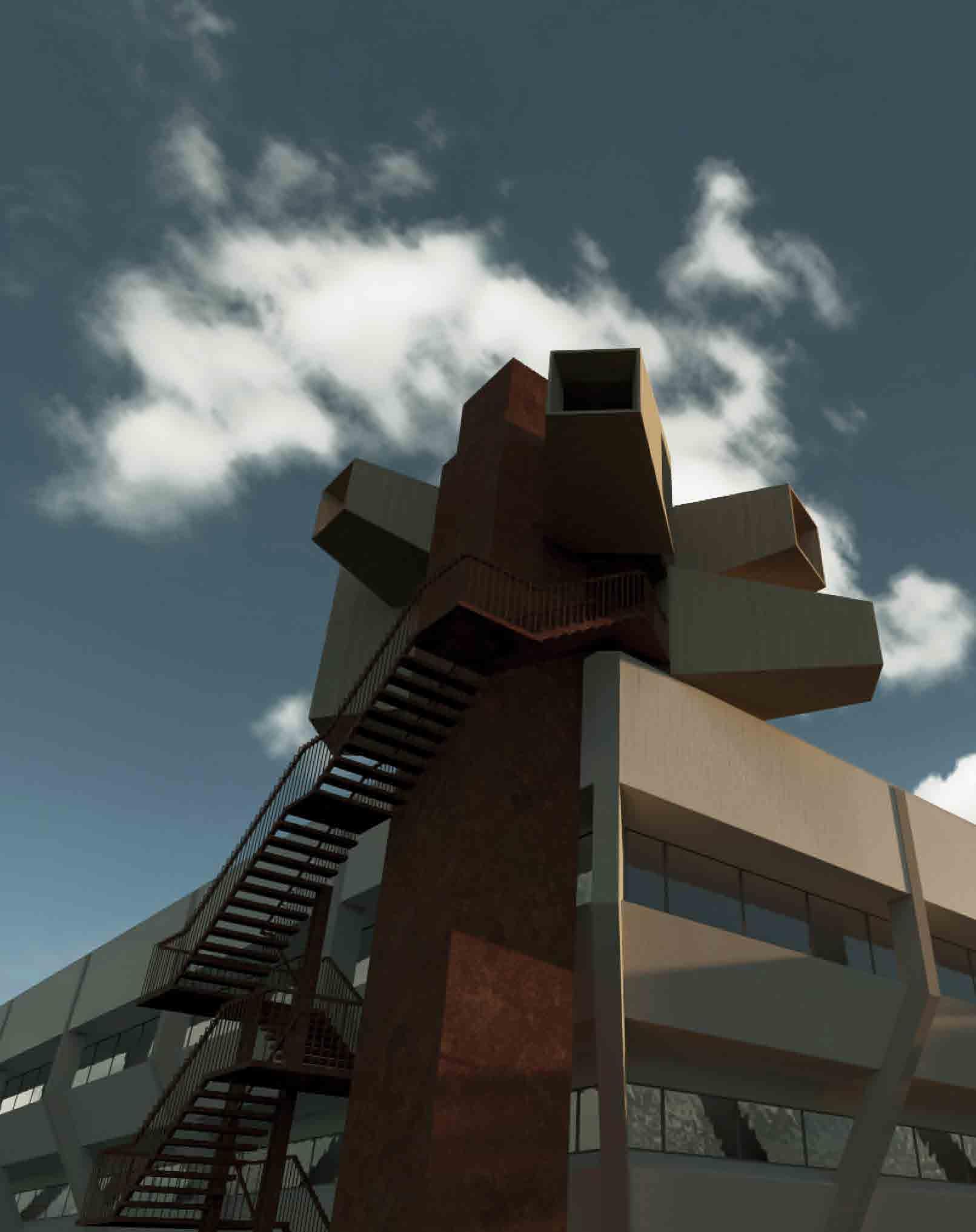
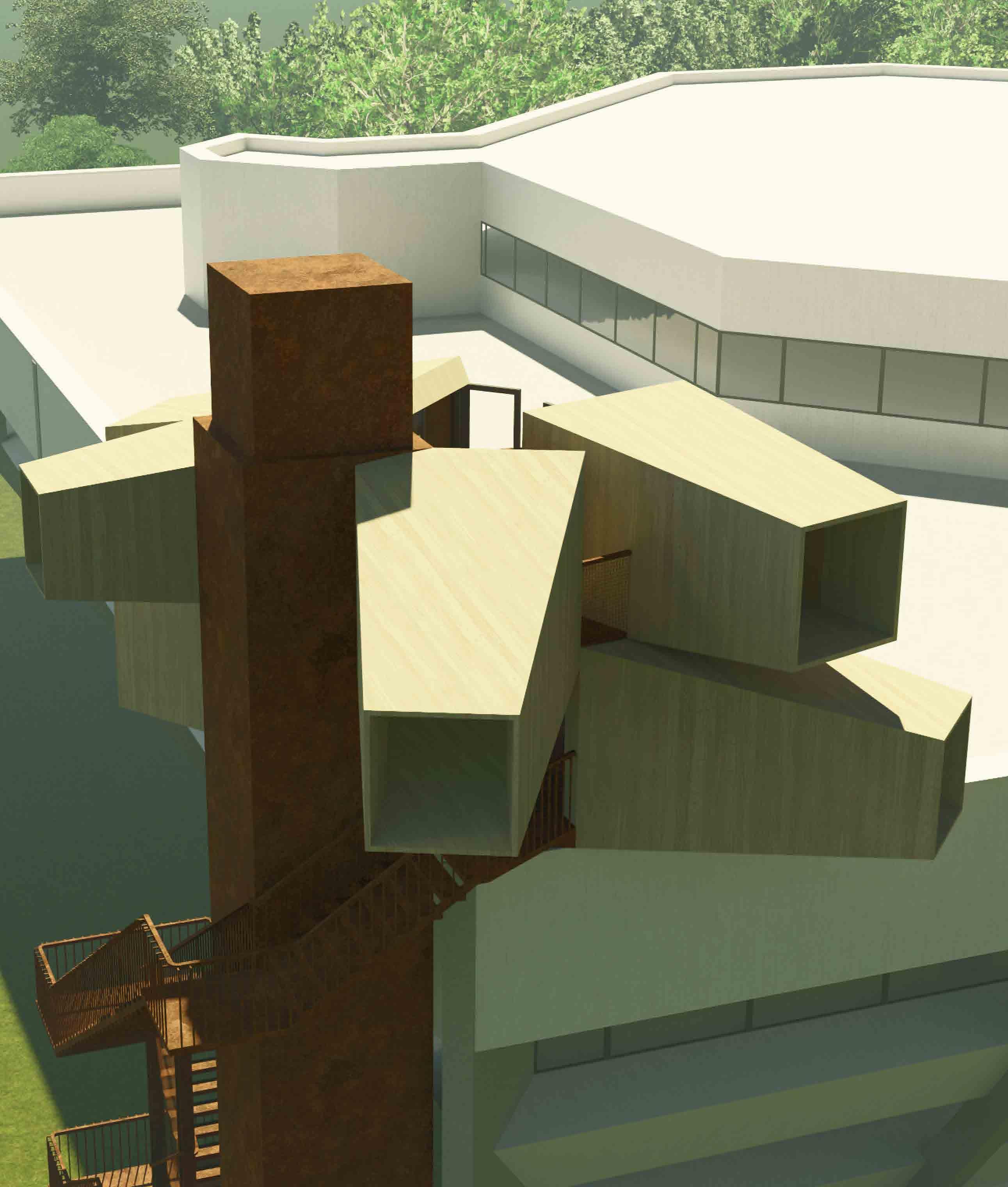 Aerial view [right]
Ground-level view [below]
LASTING IMPRESSION
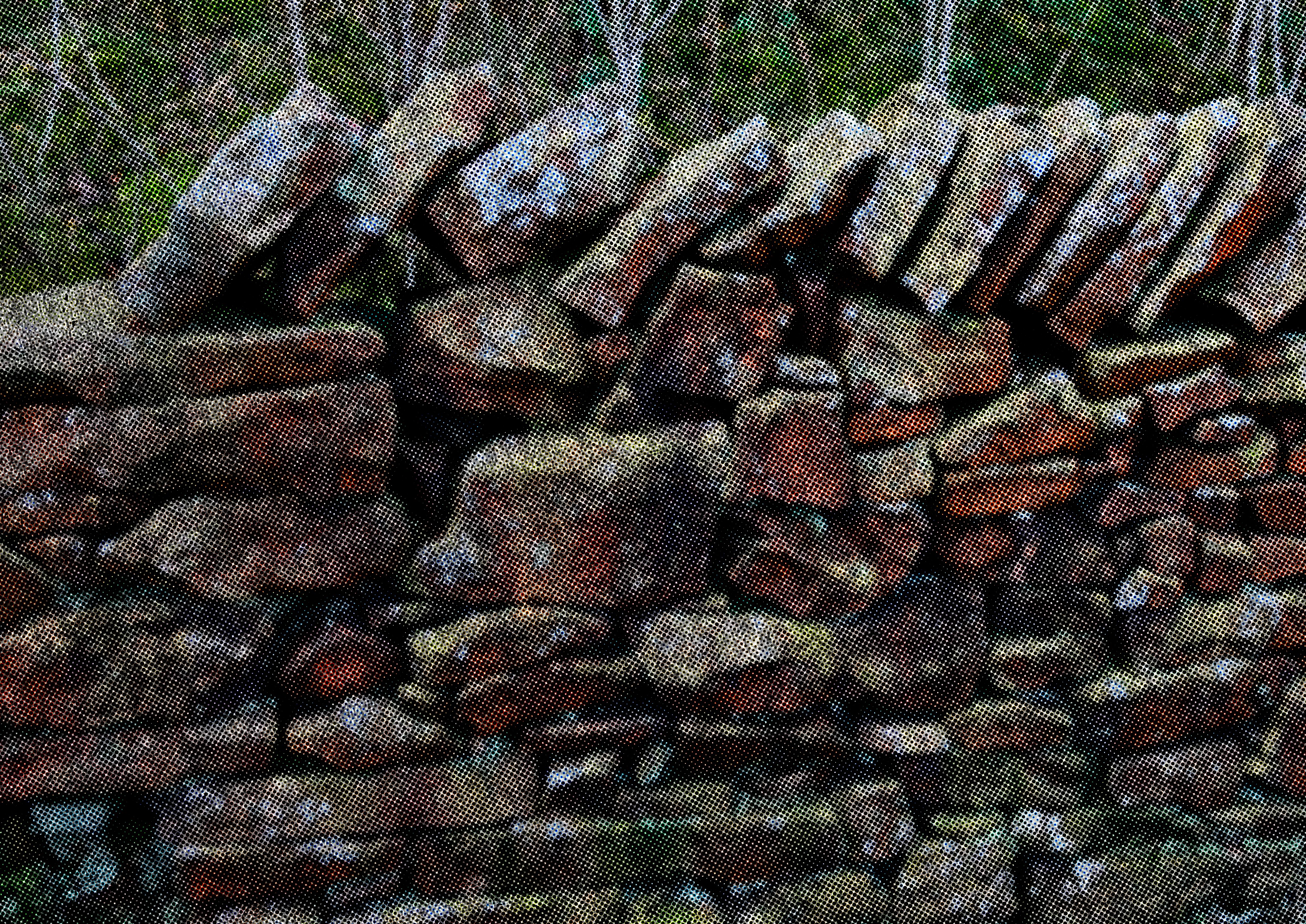
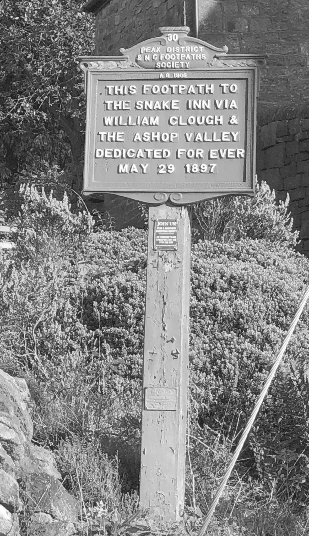
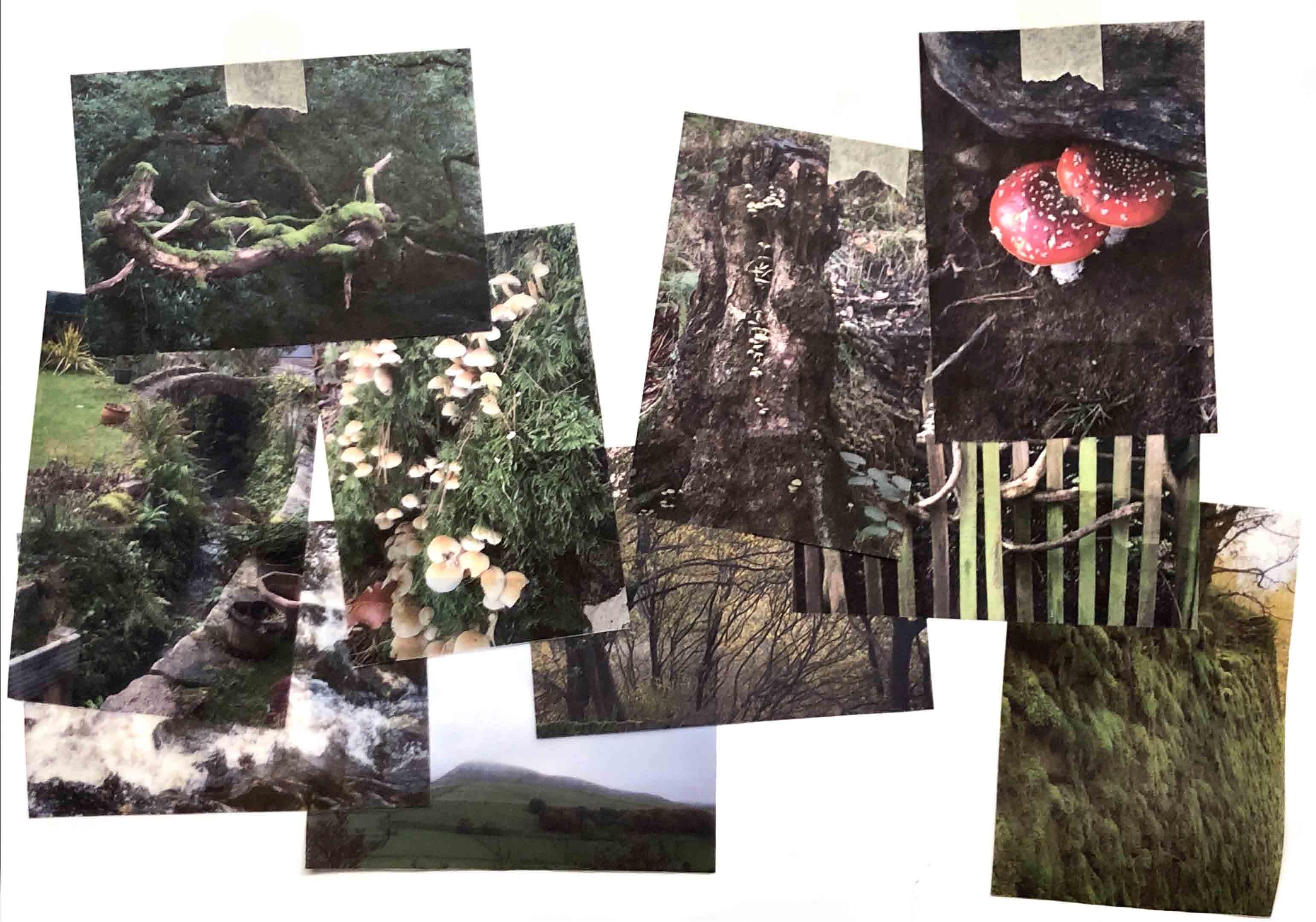
The community of the peak district is one that forges its interpersonal connections through the landscape itself, whether through the walls constructed of dry stone, or the paths that generations of Hayfield residents have imprinted into the ground. These two manmade interventions seem to exist as opposites of each other: to allow and to deny, formed by foot and formed by hand, horizontal and vertical. Yet by sticking to these paths and maintaining these walls, people and the landscape can exist in equilibrium; the convergence of the community is what allows it to thrive.

THE 1932 MASS TRESPASS SITE
90 Years ago, most of Kinder was privately owned by landowners, who would forcibly remove individuals who were trespassing on their stolen property. During this time ramblers would have to ask permission in order to be granted access to the land.
In 1932, residents of the settlements surrounding the Peak District had enough of the lack of public access to common land, and as a result, staged a tresspass. The resulting arrests caught national attention, bringing awareness to the state of land ownership in the UK.
Because of the trespass, The Peak District was sited as the first national park in 1949.


SITE 2 STRATEGY
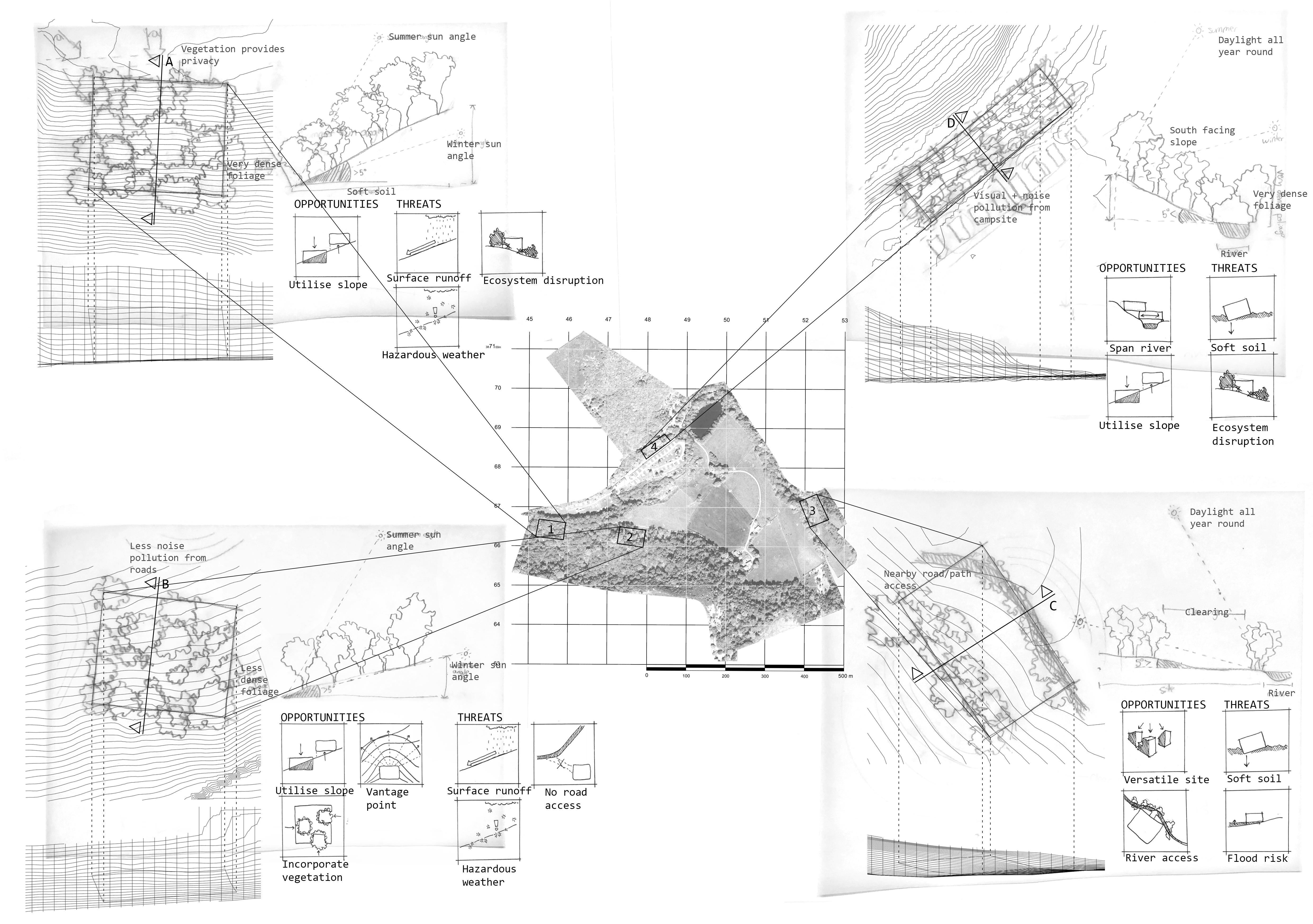
Exploration of the architectural potential of Site 2 using contrasting approaches to building
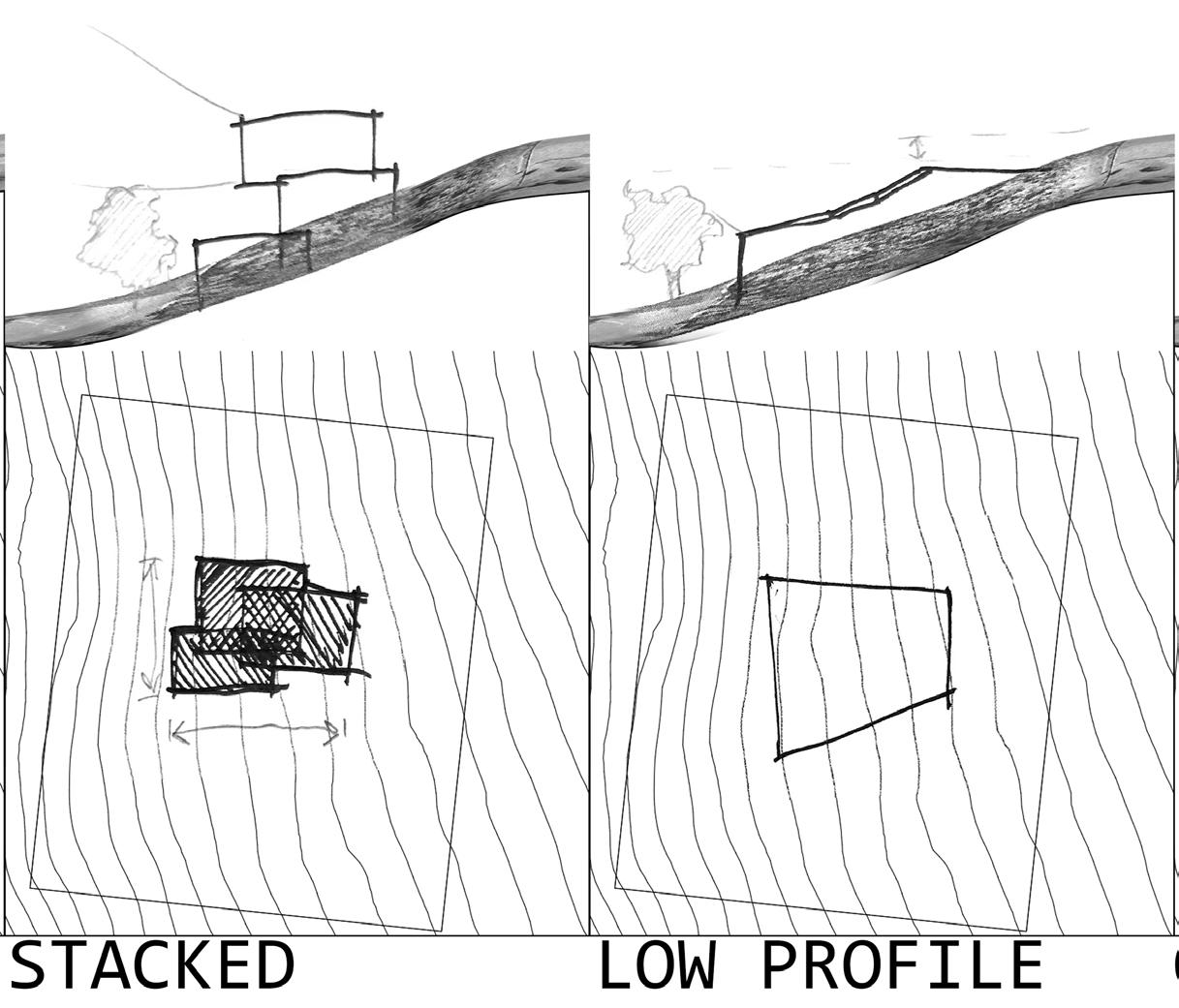
A stacked structure would leave more of the site intact and provide views above the vegetation, however it would stand out against the landscape. A low profile form would blend in more, but have more limited access to views and natural light.
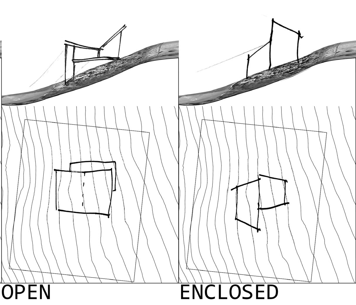
An open structure could allow the limited natural light of this site to permeate through the building, whereas a more enclosed form would encourage visitors to focus on the contents of the visitor centre.
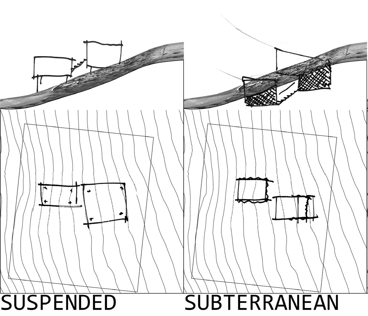
A lighter suspended structure could leave most of the site intact, but make access more difficult. A subterranean structure would massively interfere with the land, however it would completely blend in with its surroundings.
DEEP MAPPING HAYFIELD
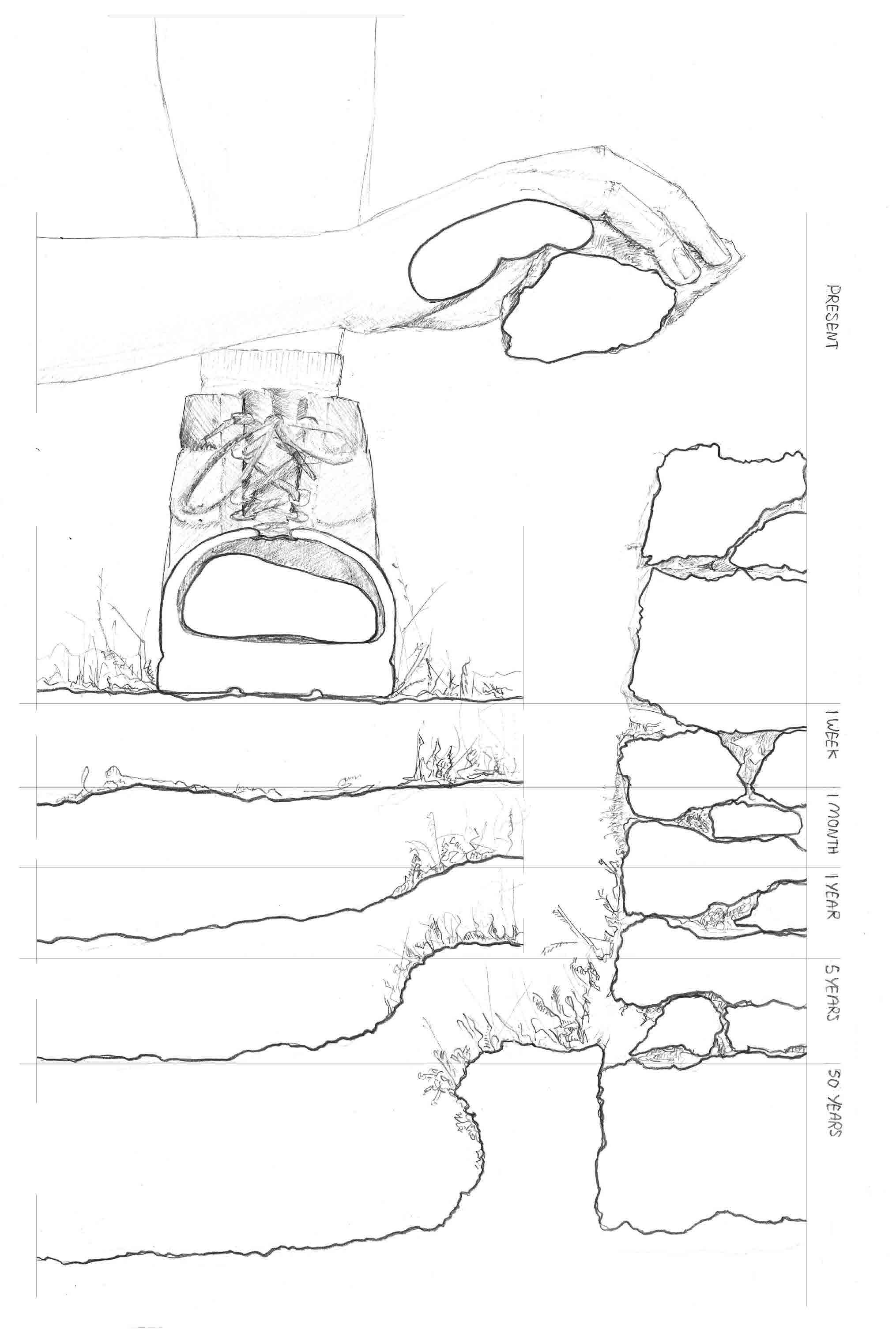
1. A hand is carefully repairing, or maybe dismantling a dry stone wall...
2. This wall which has been there for decades, acts as a habitat for thousands of lifeforms.
3. An irresponsible rambler strays from the path and tramples on the greenery, or maybe they are carving a new path...
4. Years from now, life either side of the path remains intact, and in fact thrives as a result of people following those who came before.
CONCEPT: WALLS
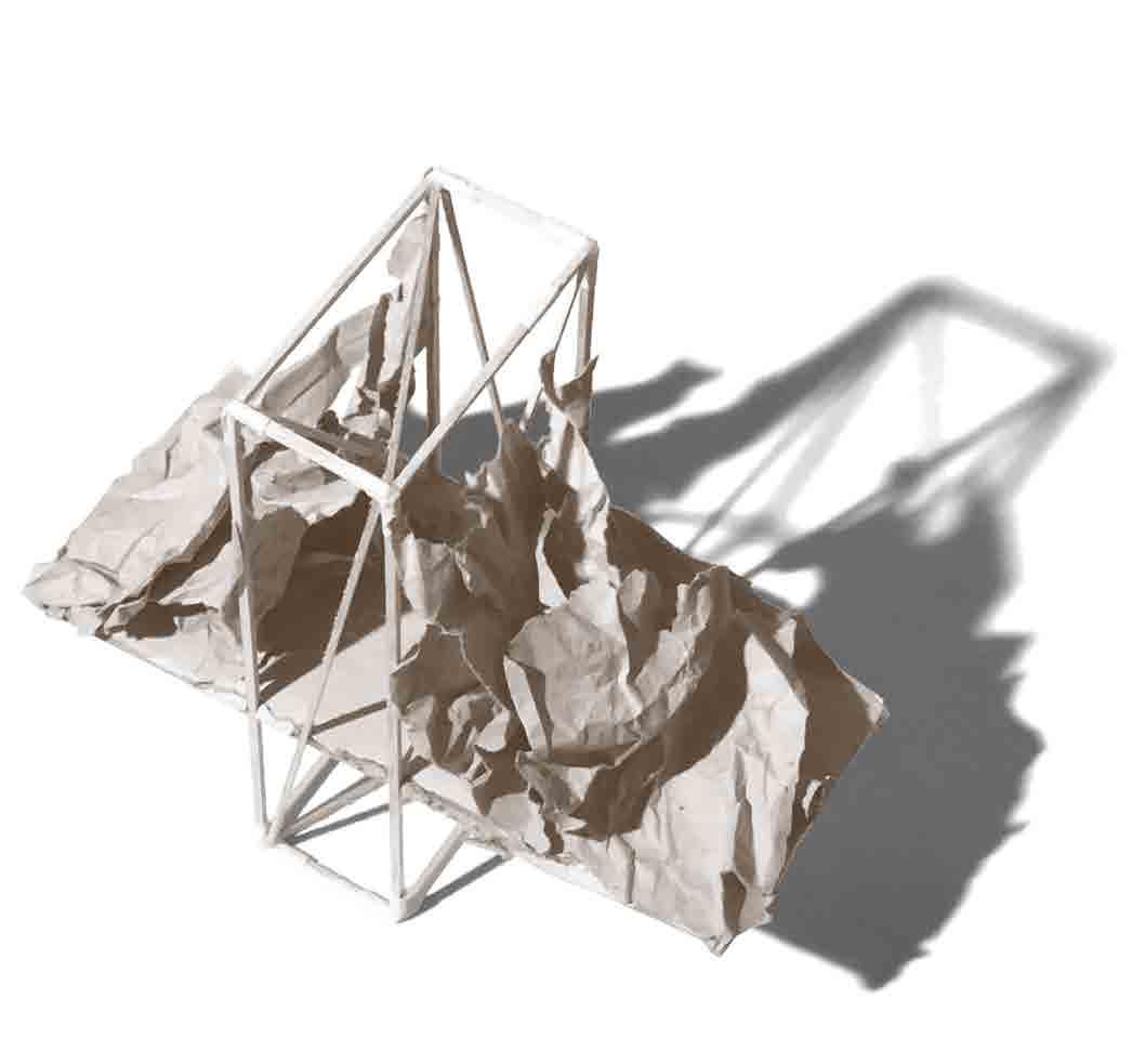
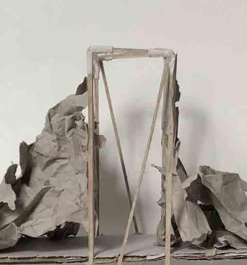
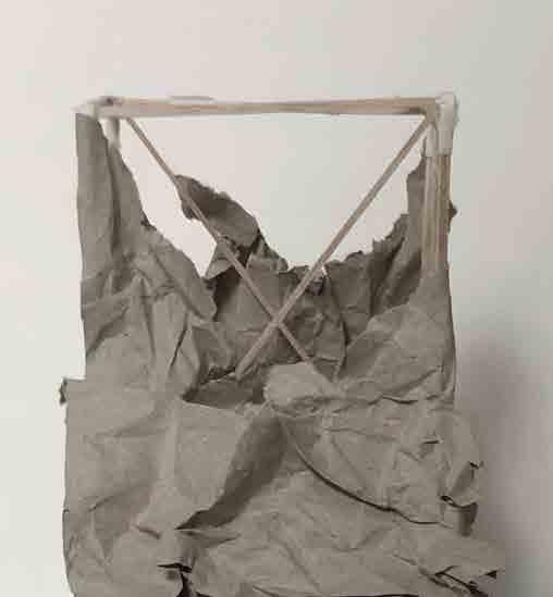
Exploration of the landscape’s response to a human made intervention, representing this idea of mutuality between the people and environment of The Peak district. It depicts a manmade structure encroaching upon the land and in turn being encroached upon by the environment.
CONCEPT: PATHS
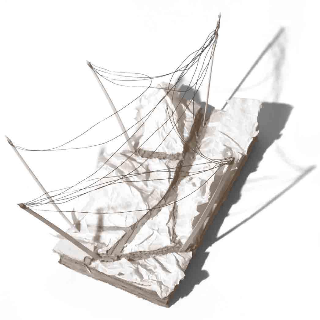
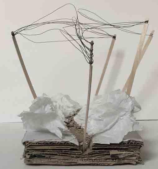
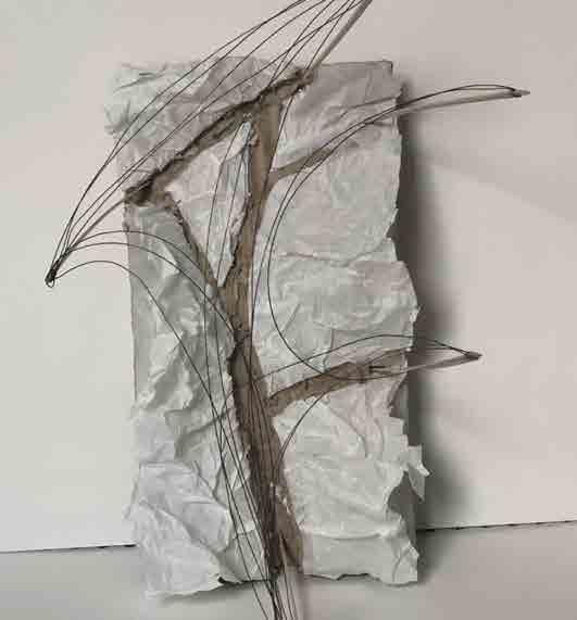
A closer look at the formation of paths within the landscape and how by following in the footsteps of those before you, the landscape can remain intact and even thrive as a result of this communal convergence.
STAKEHOLDER ANALYSIS PROGRAM
HAYFIELD
Residents
Young Hayfield residents
Local council
Local shops
D of E students
Contracts
Transportation authorities
Sponsors
Tourists
Student Communists
Farmers Litter pickers
Trail leaders
PEAK DISTRICT
Wildlife
ACTIVITY:
• LEARNING THE LOCAL CRAFT
• SOCIALISING


ACTIVITY:
• ORGANISING HIKES
• CONFERRING WITH OTHER TRAIL LEADERS


Casual ramblers and hikers Artists
Researchers
Environmental organisations
Historical preservation groups
Dry Stone Walling Association
Cultural Heritage Groups
EXTERNAL
ACTIVITY:
• BUYING EQUIPMENT
• RESTING AFTER A HIKE
• MEETING WITH TRAIL LEADERS



ACTIVITY:
• LEARNING ABOUT UK COMMUNIST HISTORY

• PLANNING FUTURE TRESPASSES

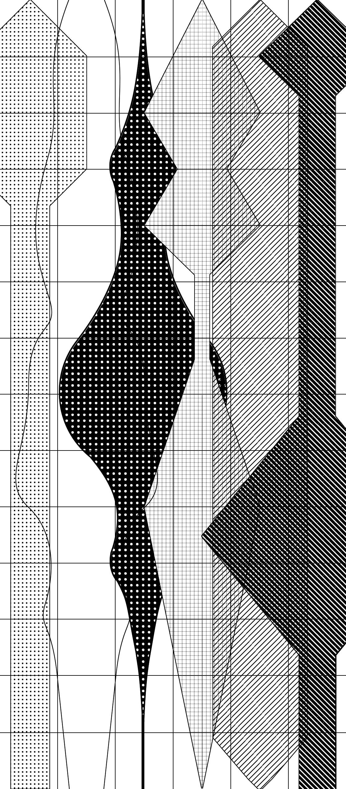
Estimation and mapping out of the usage of the stakeholder’s required spaces throughout the day. This helps to inform the organisation and circulatory implications of the building.
PRECEDENT ANALYSIS
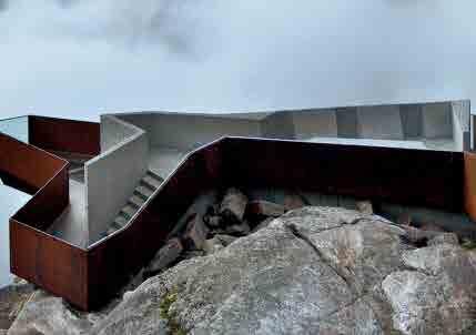
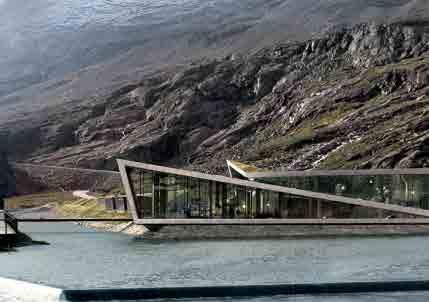
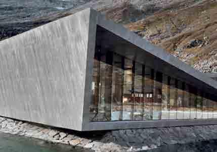
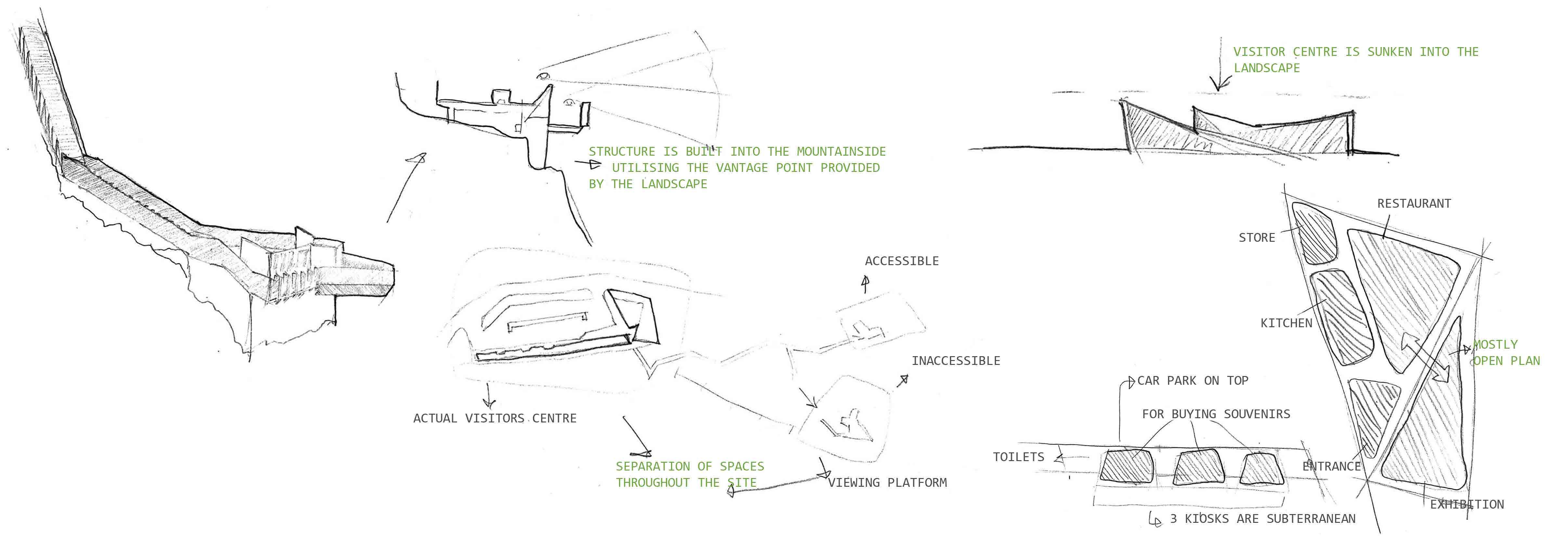
The Trollstigen plateau visitor’s centre is unique in that it consist of two very distantly separated structures connected via a path through the mountains: the visitors centre itself, and an observation deck. I also made note of how the spaces were arranged in this largely open plan structure
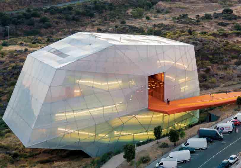
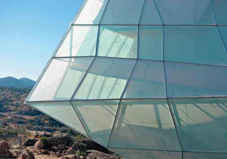
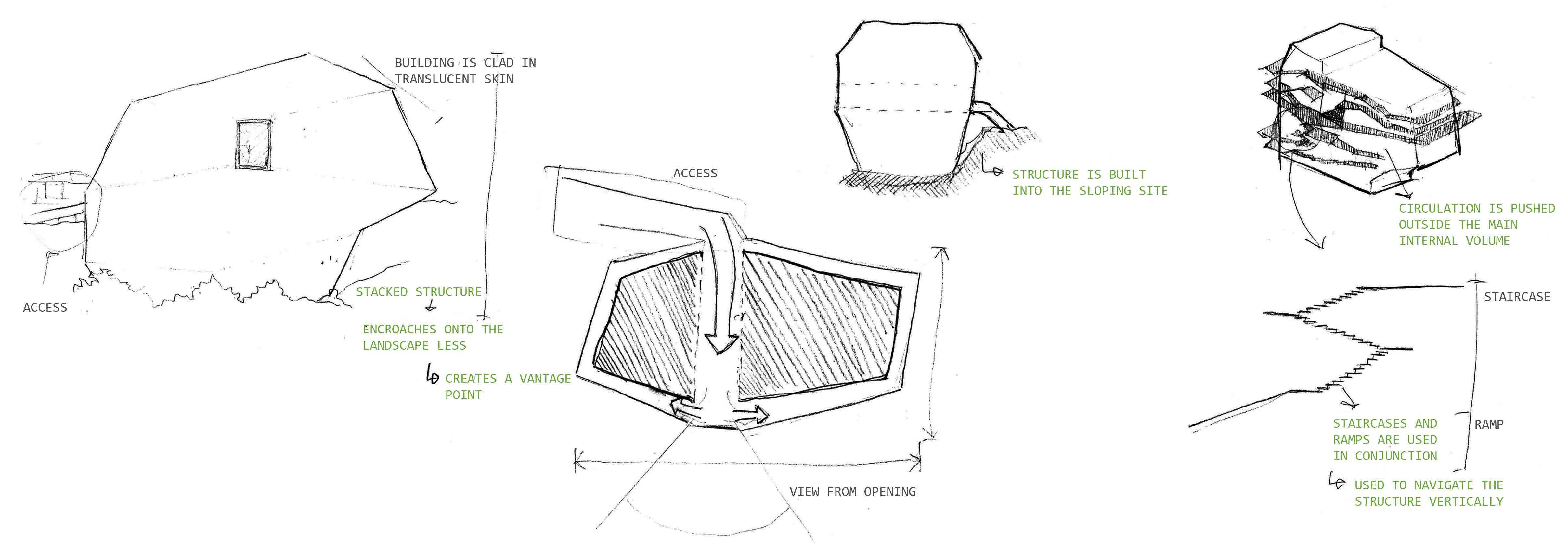
The congress centre in Plasencia won its respective competition due to its unique approach to the buildings relationship with the site, opting to build up in to limit its interference with the landscape. In trying to reduce the physical impression of the building upon the site, the building ends up standing out prominently against the landscape
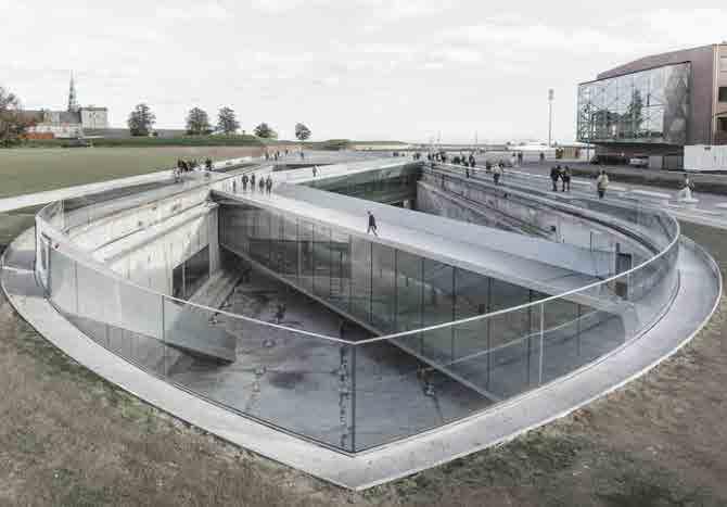
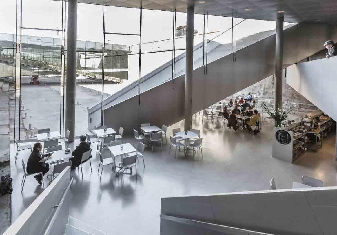
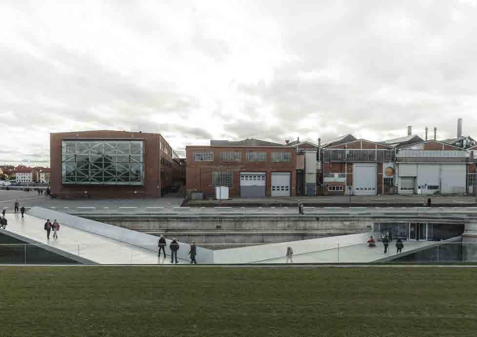
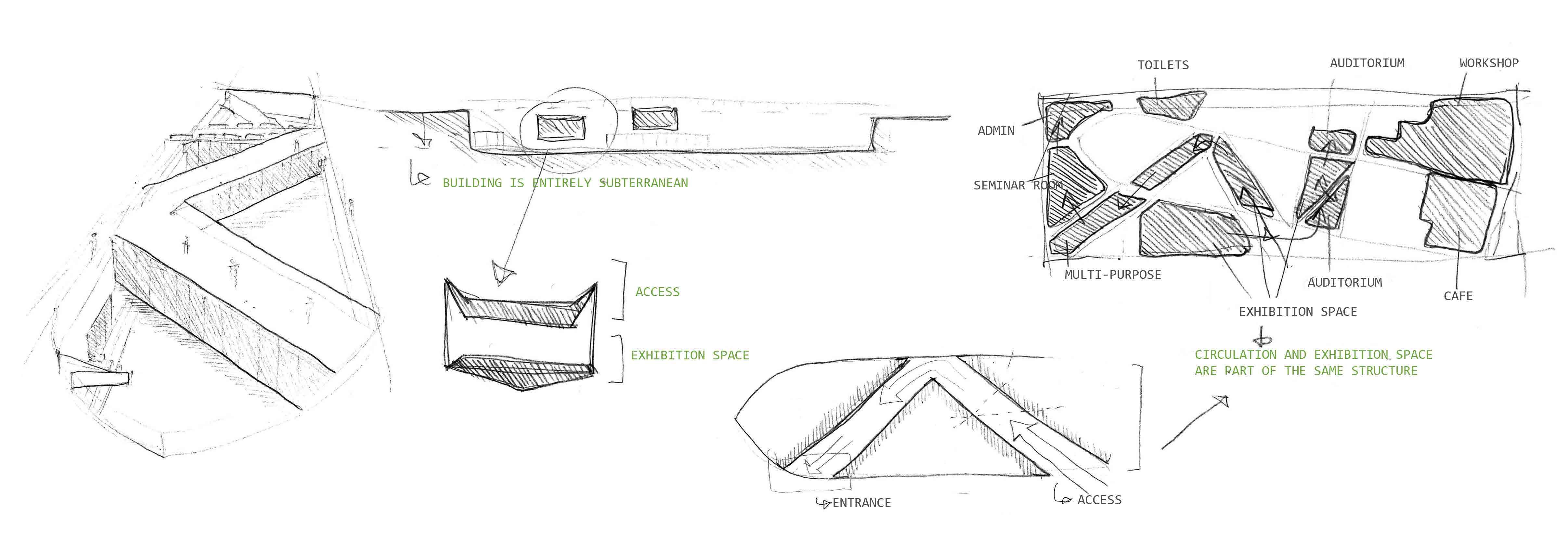
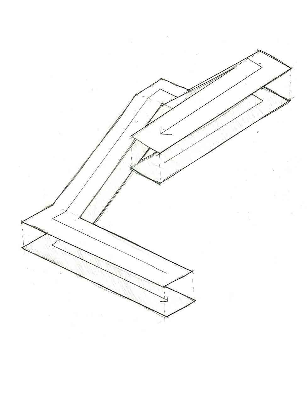
The Danish national Maritime museum had interesting circulatory qualities in that it makes its occupants traverse the same geometries multiple times as they move through the entire structure, with exhibition spaces that double as circulation.
5 DESIGN IDEAS
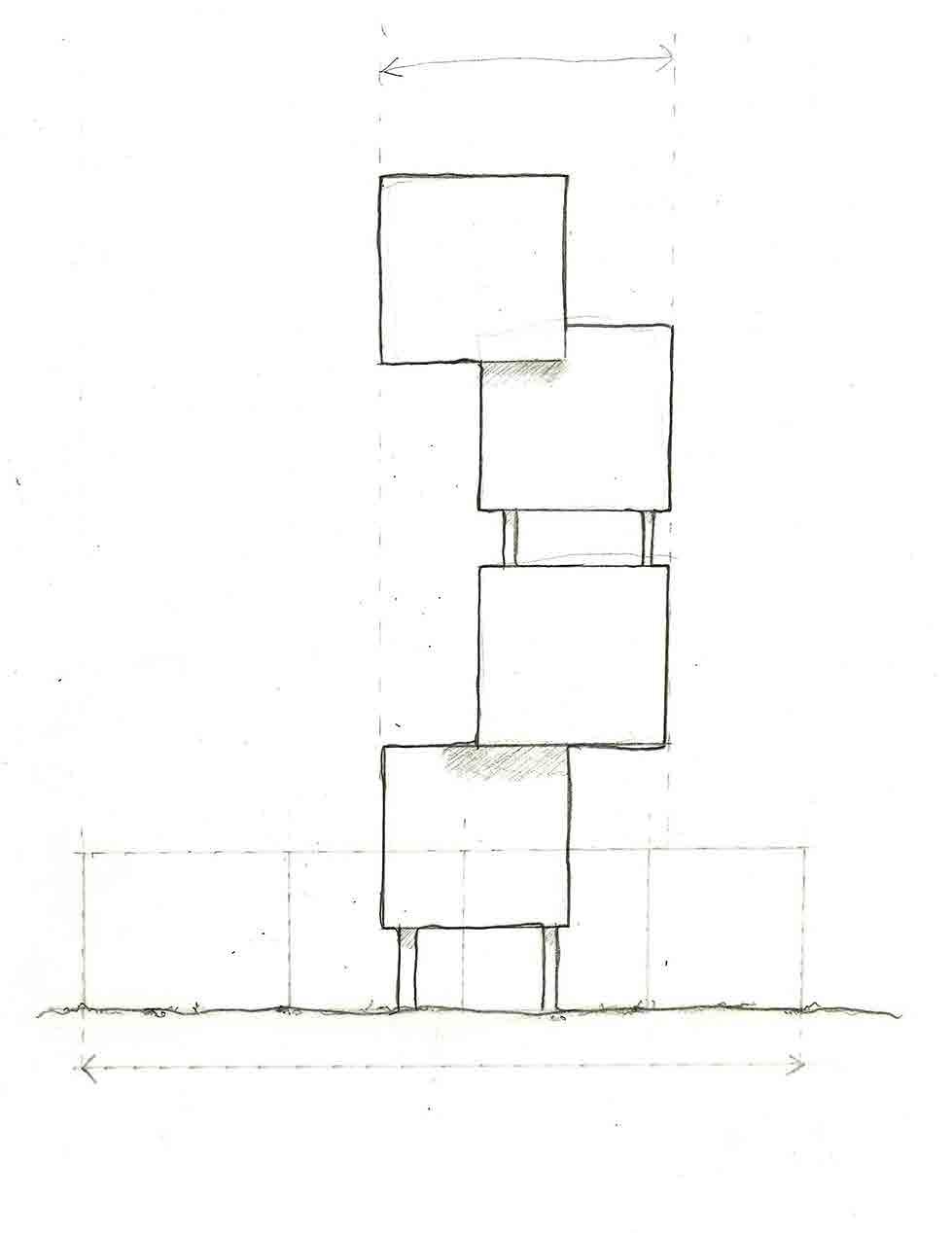
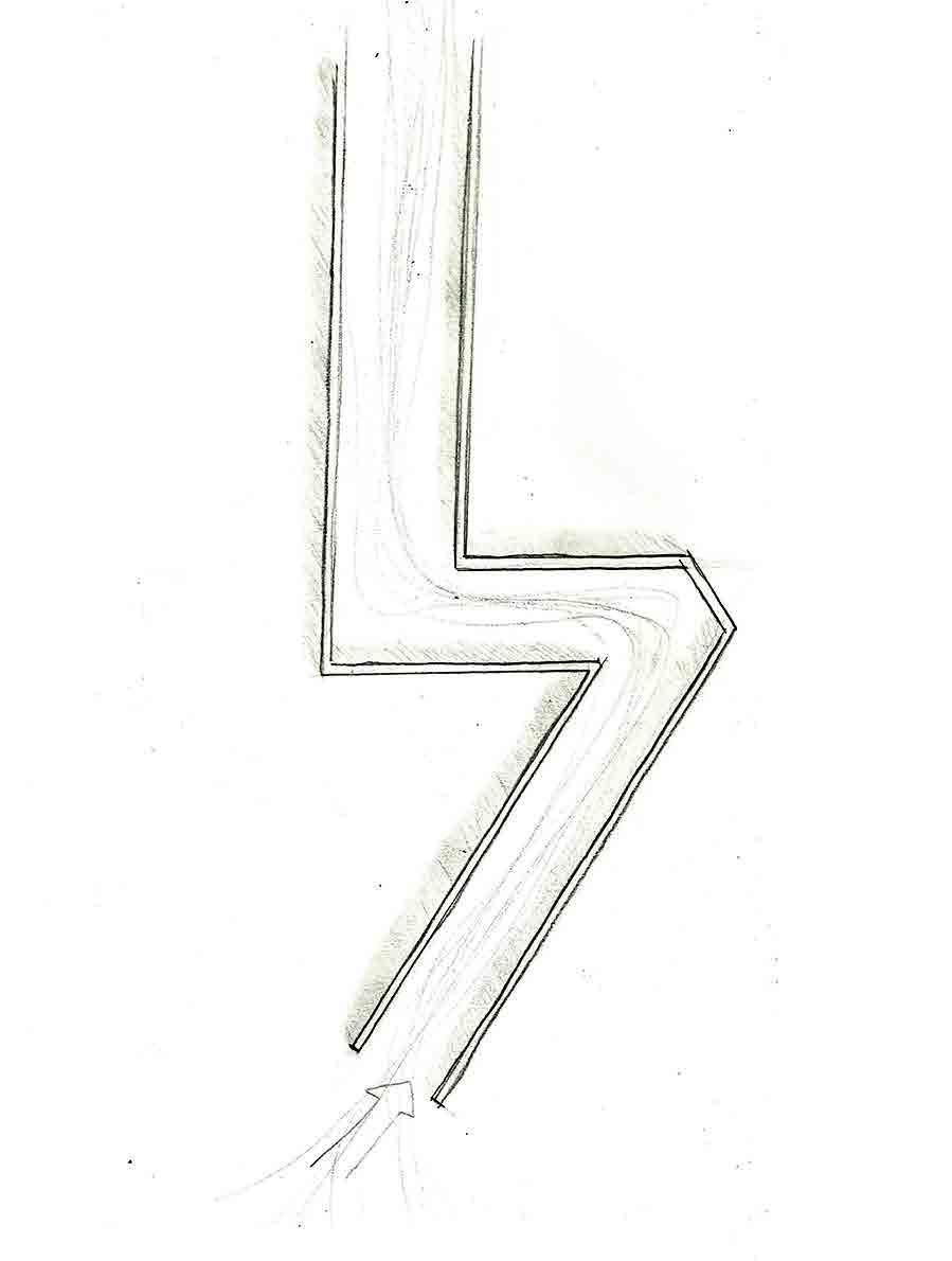
RETRACING STEPS CONVERGENCE MINIMAL IMPRESSION
A structure that encourages its occupants to walk back over the routes they have gone through, making the most of that space
Circulation that makes people converge along a common path and follow in each other’s footsteps
A building that as small a physical impact as possible upon the surrounding environment
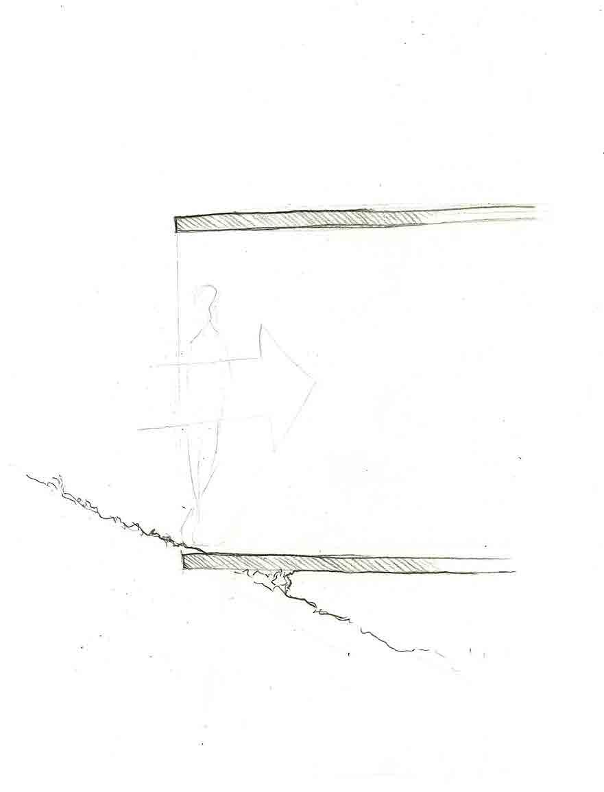
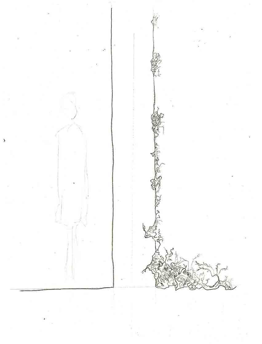
ATTACHMENT TO LANDSCAPE EQUIPOISE WITH ENVIRONMENT
Honoring the integral relationship between the inhabitants of The Peak District and the common land
Upholding the mutual relationship between the human environment and wildlife
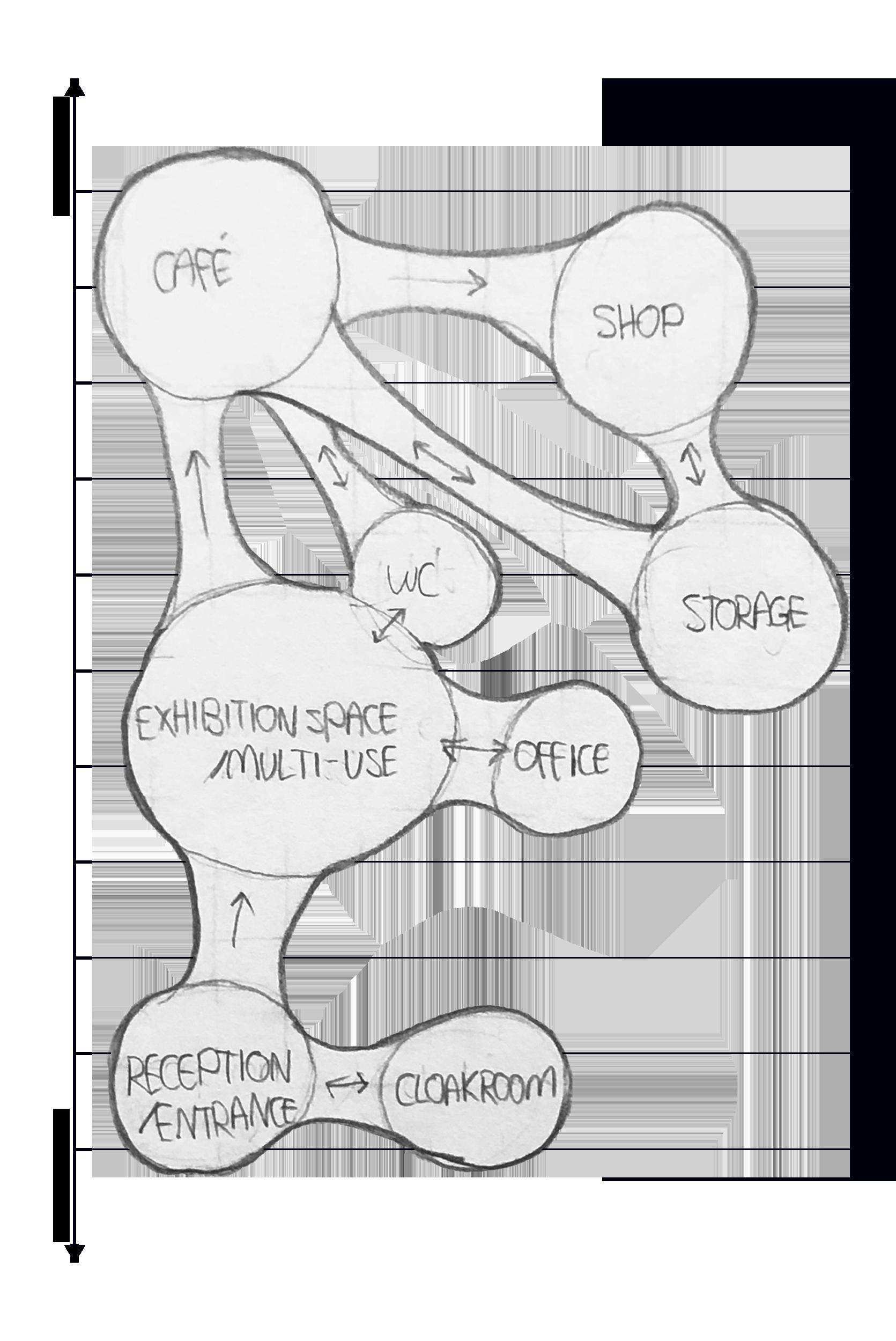
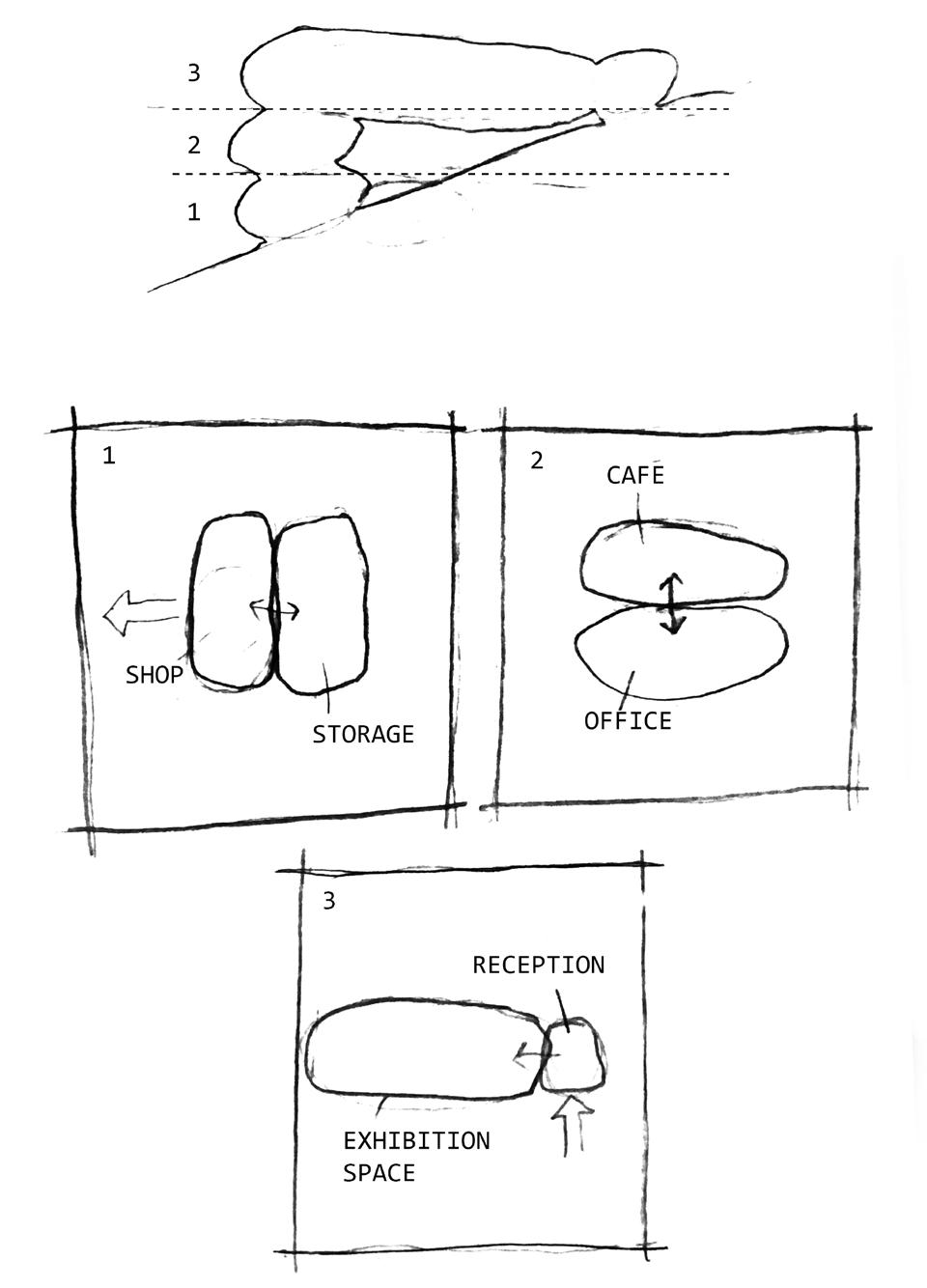
Mapping out of spaces by whether they havea smaller potential footprint (convergent spaces) or have to have a larger footprint (divergent spaces) as well as the necessary circulation between these spaces.
Iteration 1
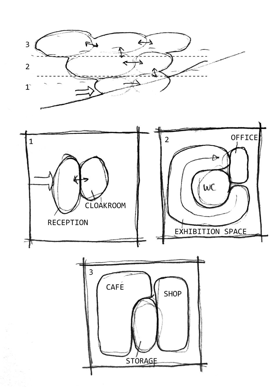
Iteration 2
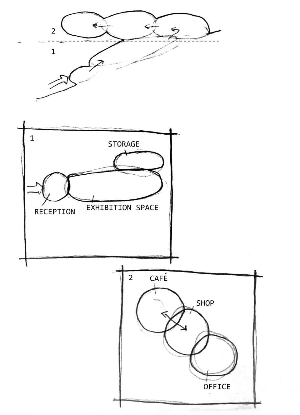
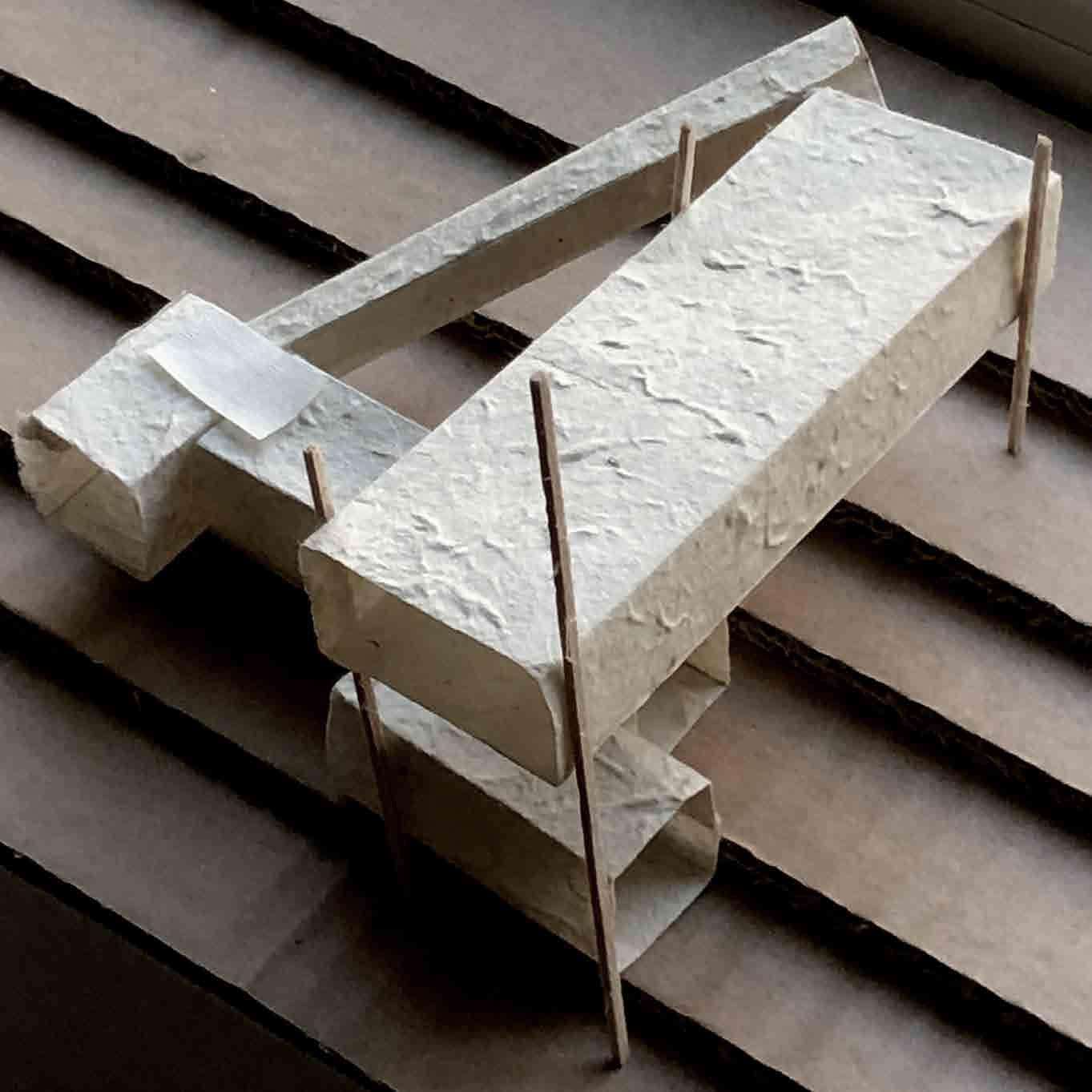
Application of this method of vertically distributing space such that the smaller spaces are on the ground floor.
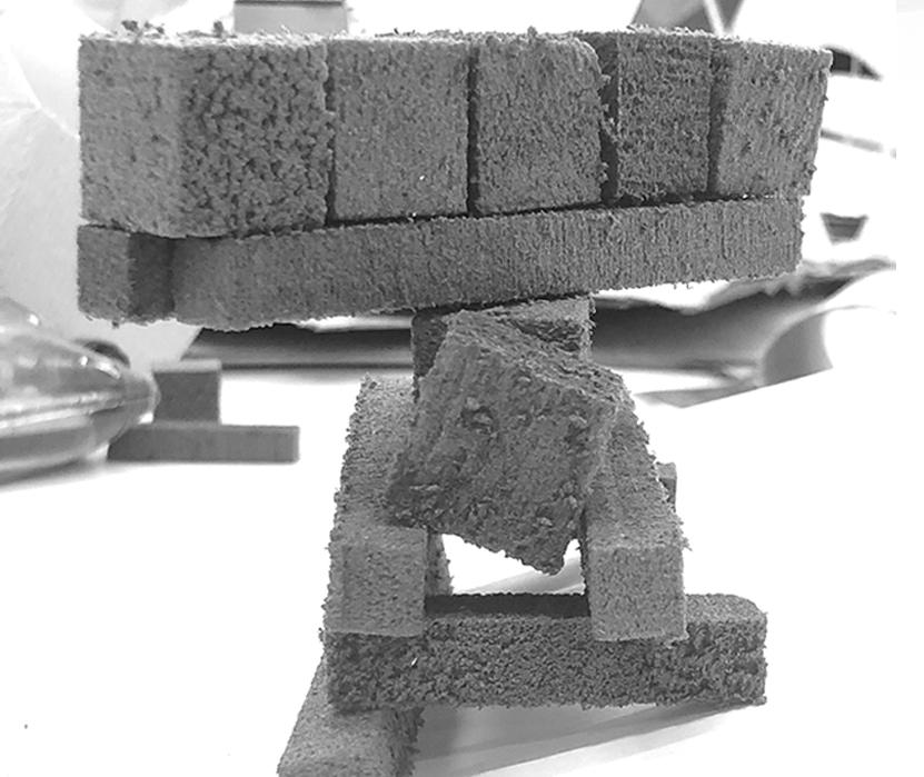
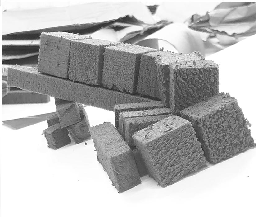
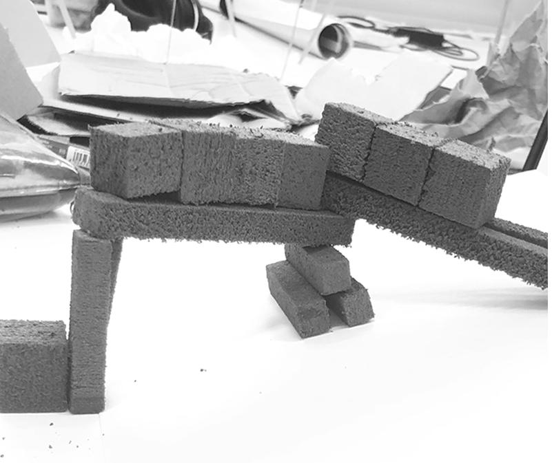
Experimentation of these forms in a tangible space in the form of foam massing model. This exercise helped me understand the tectonics of what would end up a very top-heavy structure.
Iteration 3
ITERATION 1
CAFE/SHOP OFFICE/MEETING ROOM LIFT
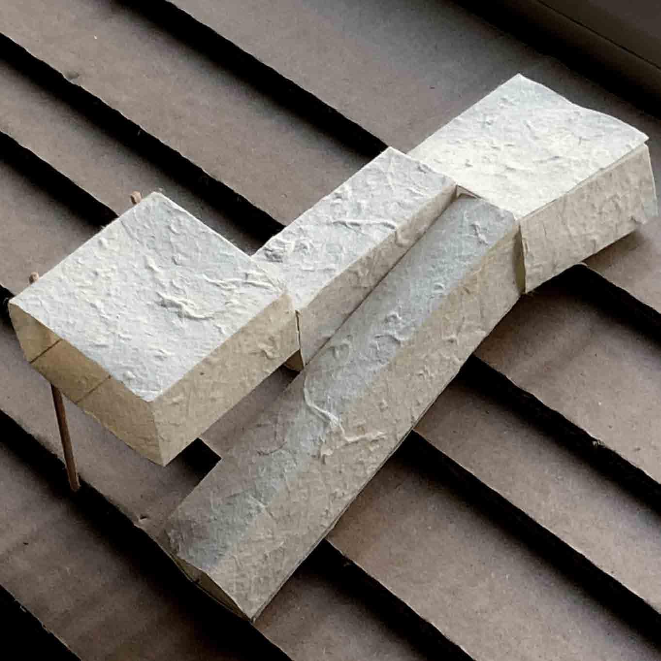
MINIMAL FOOTPRINT
ITERATION 2
LIFT EXHIBITION SPACE
ROOFTOP ACCESS
ENTRANCE
STRUCTURE SUSPENDED ABOVE SLOPE
EXHIBITION SPACE
Further design development and analysis of the second round of iterations.
GROUND FLOOR IS BUILT ALONG GRADIENT
ITERATION 3
CAFE SHOP OFFICE/MEETING ROOM
ENTRANCE
CAFE/SHOP OFFICE/MEETING ROOM
BULK OF THE VOLUME IS SUSPENDED
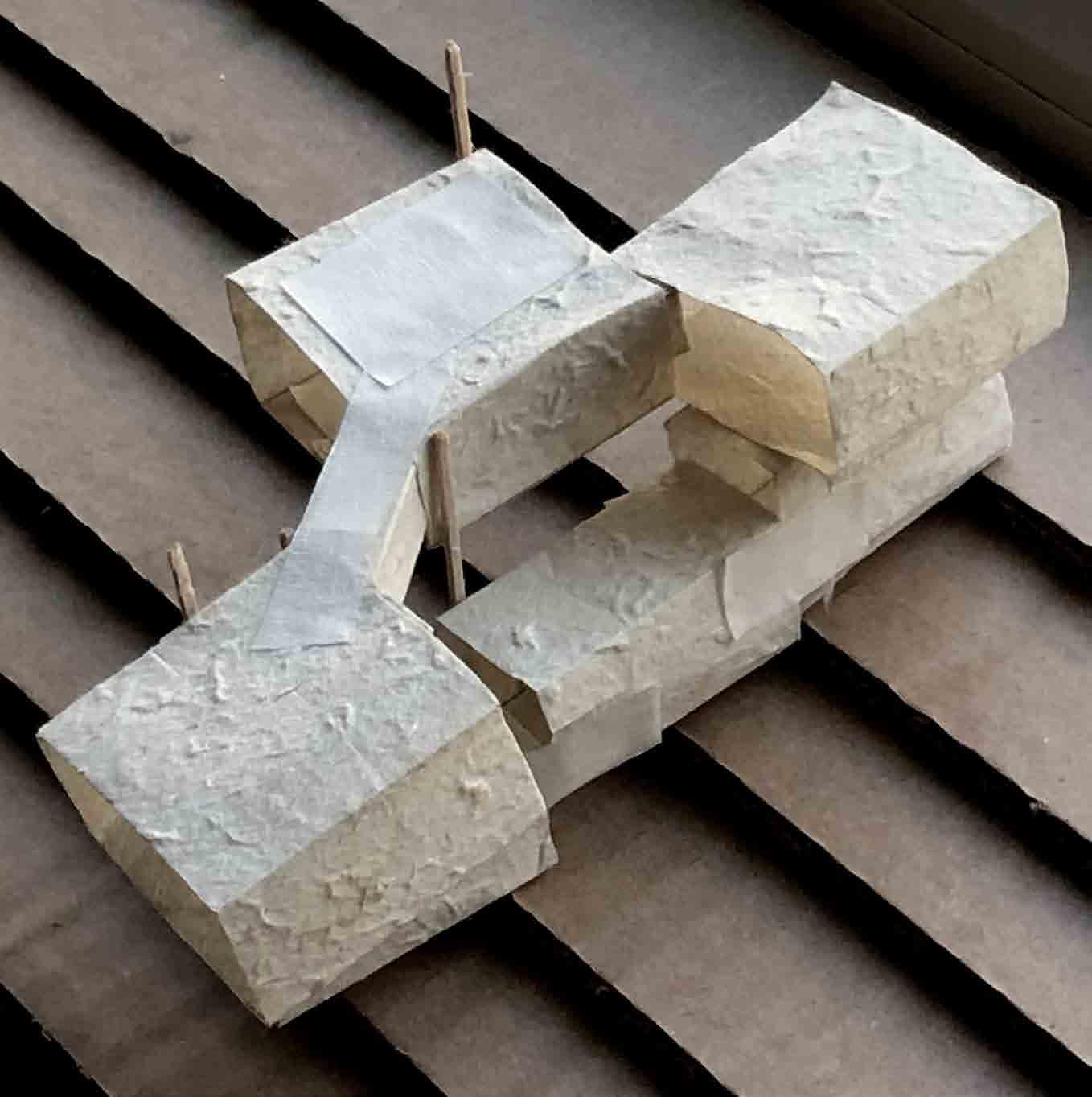
3 LARGER VOLUMES SUSPENDED ABOVE GROUND FLOOR
ENTRANCE LIFT
PATHFINDING
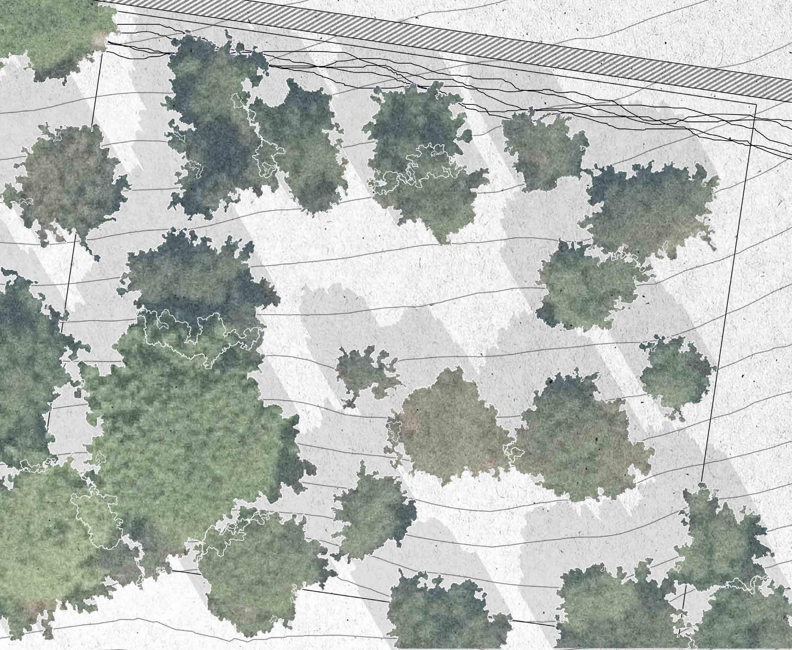
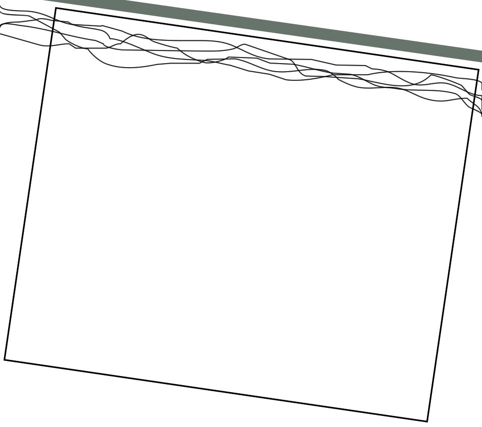
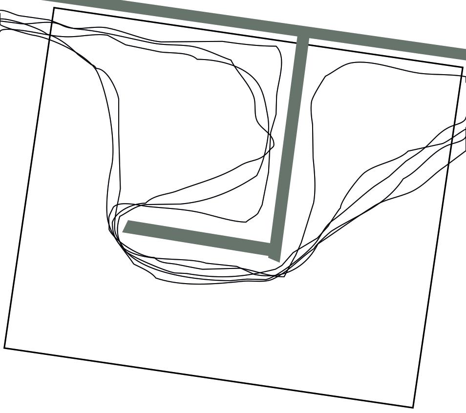
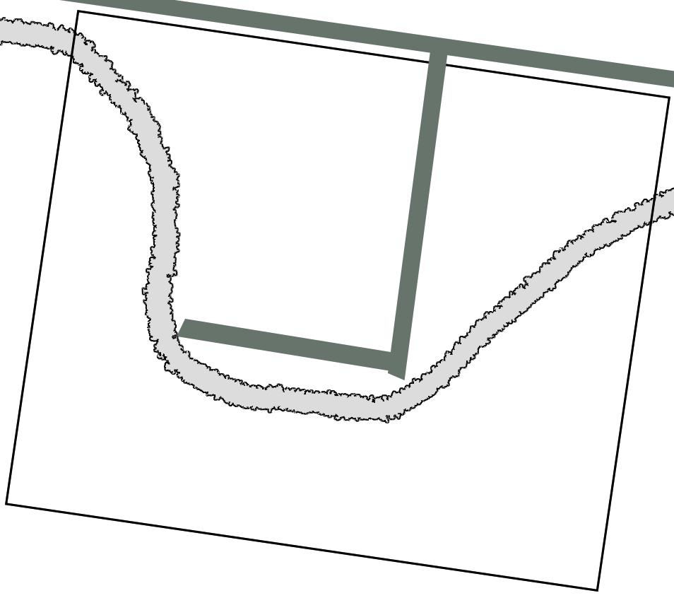
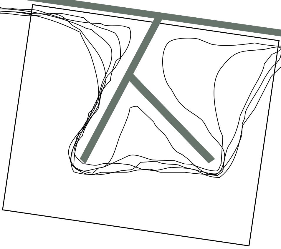
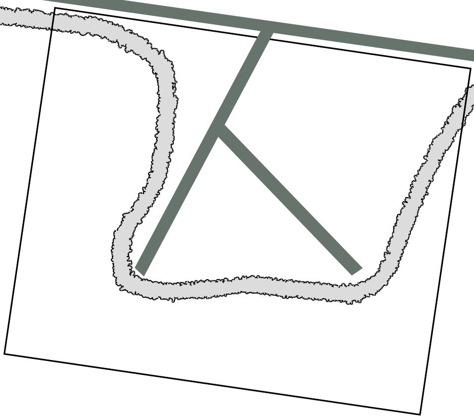
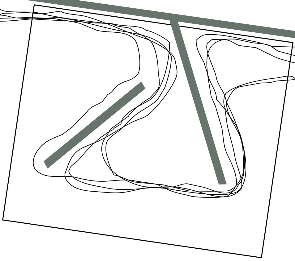
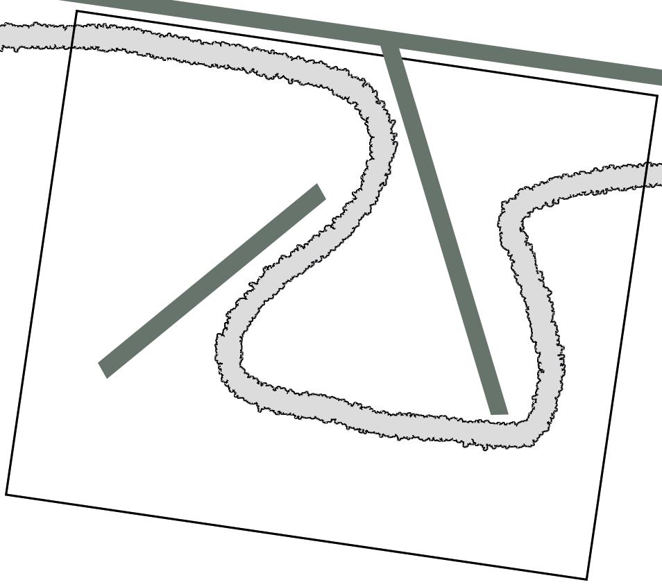
Since the iterations of massing models felt like they straying from the concept, I decided to return to its two main aspects: the path and the wall. Site 2 already has an existing footpath and wall, so my next round of massing were defined by exploration of the relationship between the two, and simulating what would happen if the wall obstructed the path.
FORMFINDING
ITERATION 1
ITERATION 2
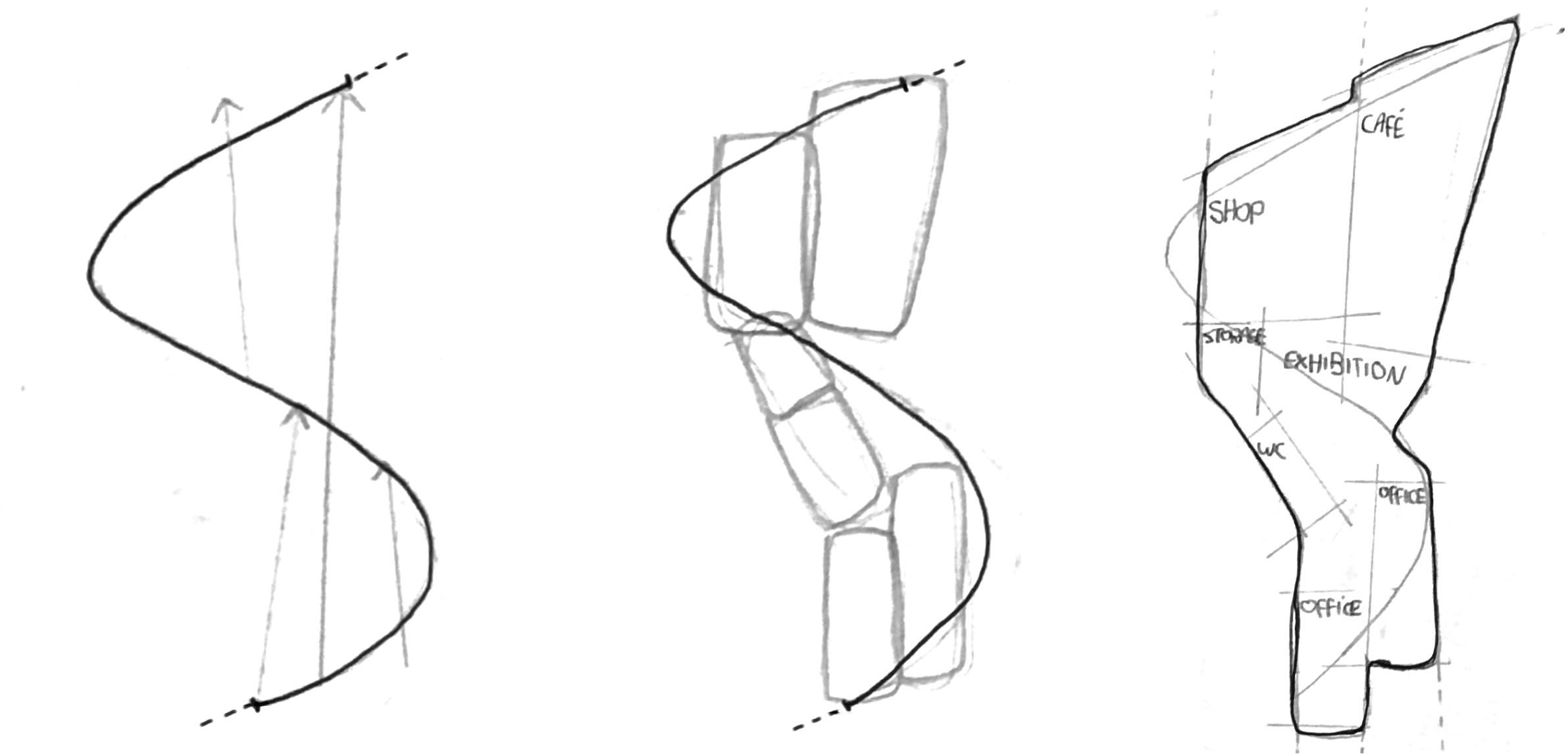
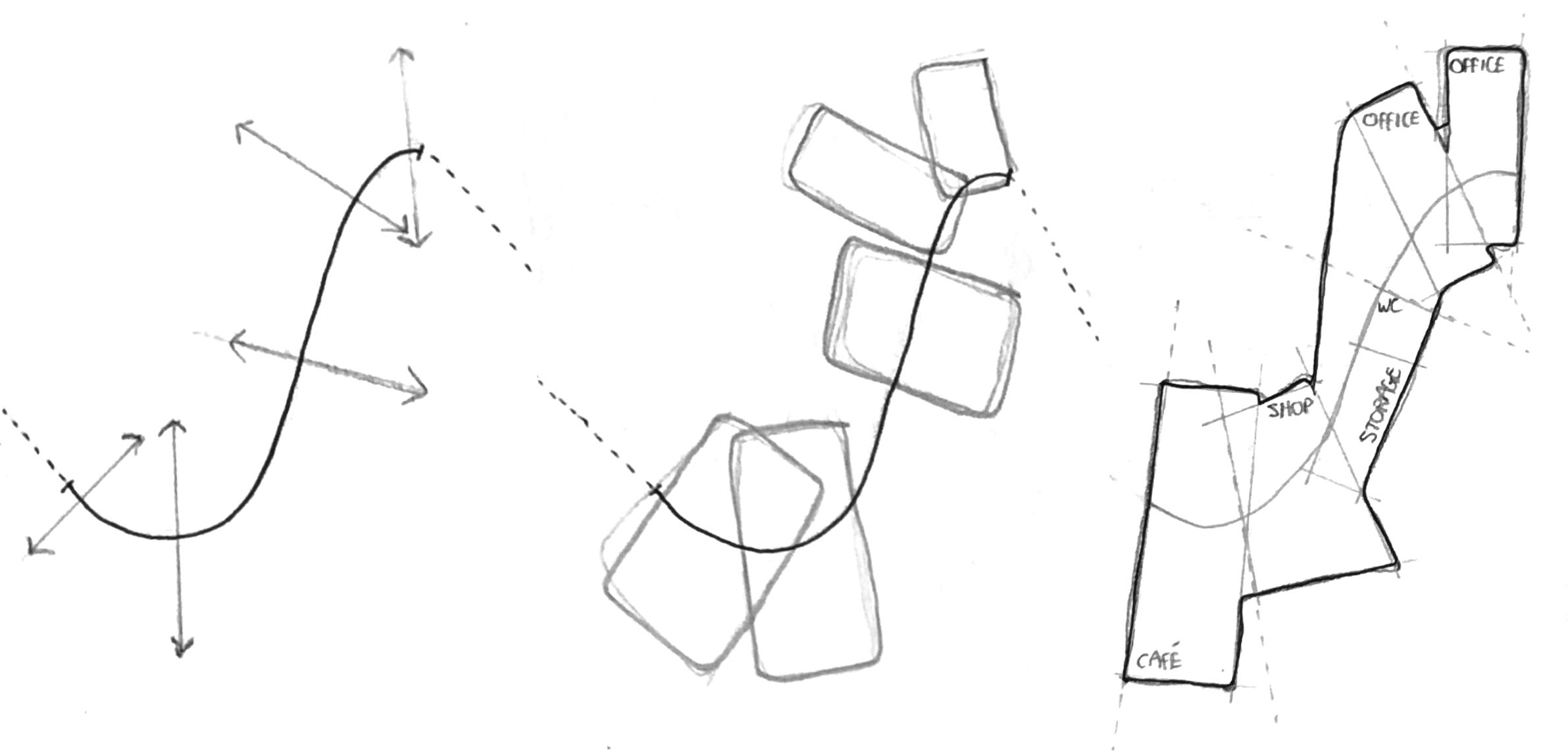
Taking a section of the new path and deliberately diverging from it
Approximating volumes that diverge from the path
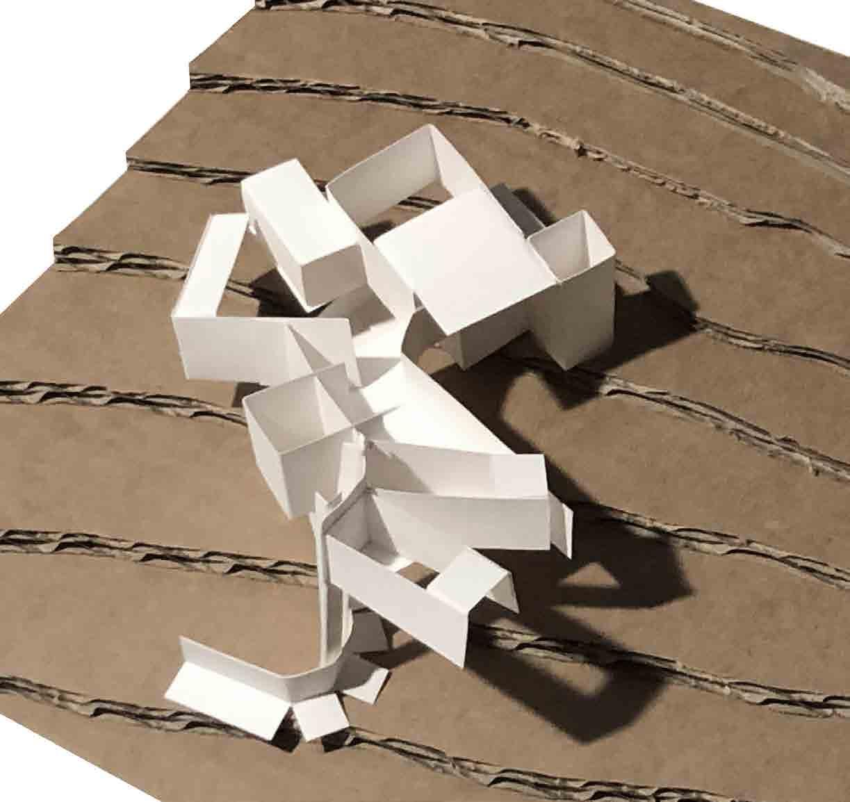
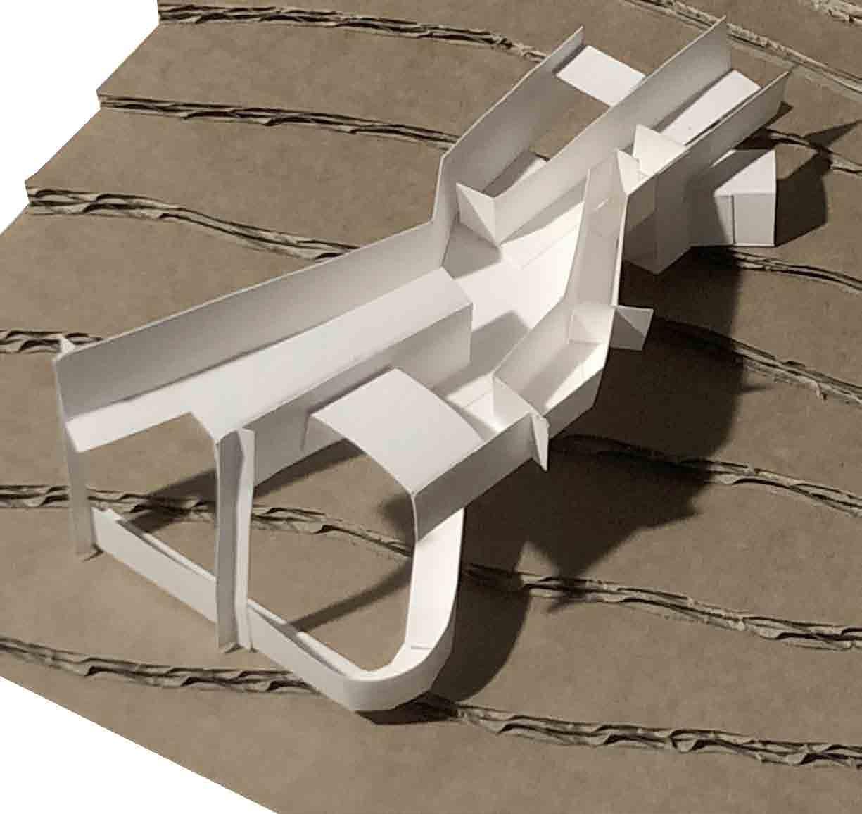
Defining potential functional spaces based on the resulting volumes

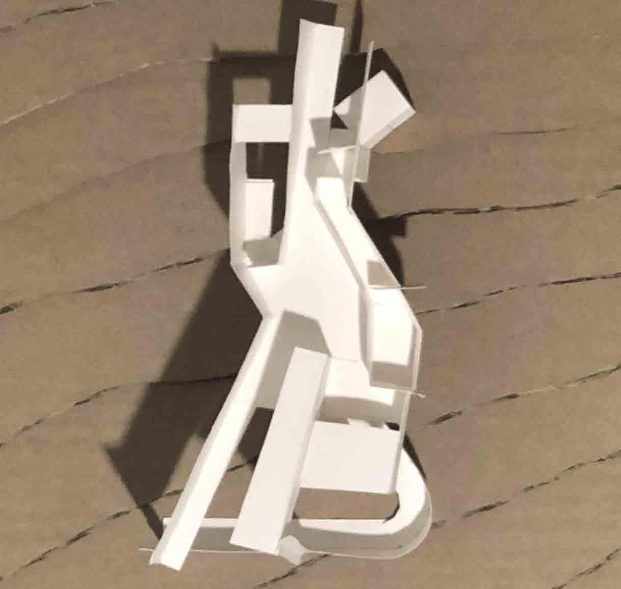
Iteration 2 was the chosen to develop futher as it echoes the path that formed it, while having its own directionality. It also lends itself better to the open plan visitor centre typology.
INTERFACE WITH THE LANDSCAPE
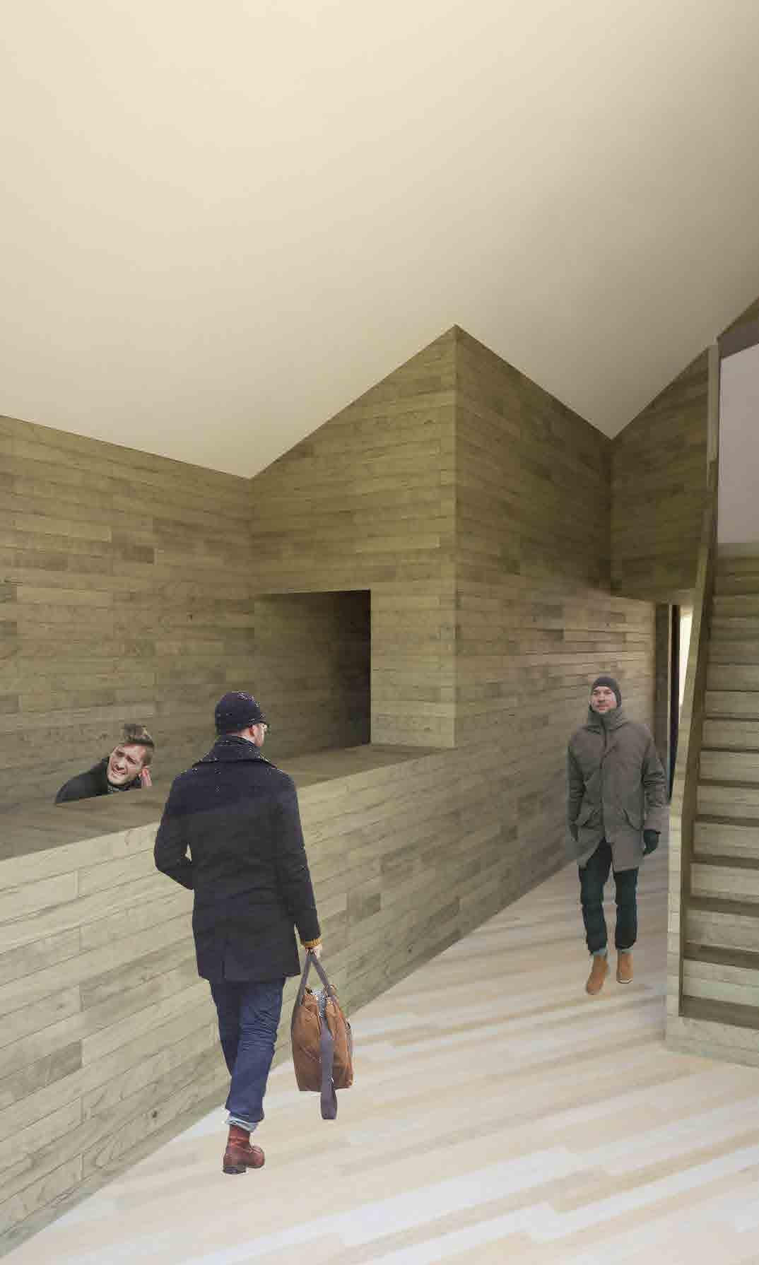
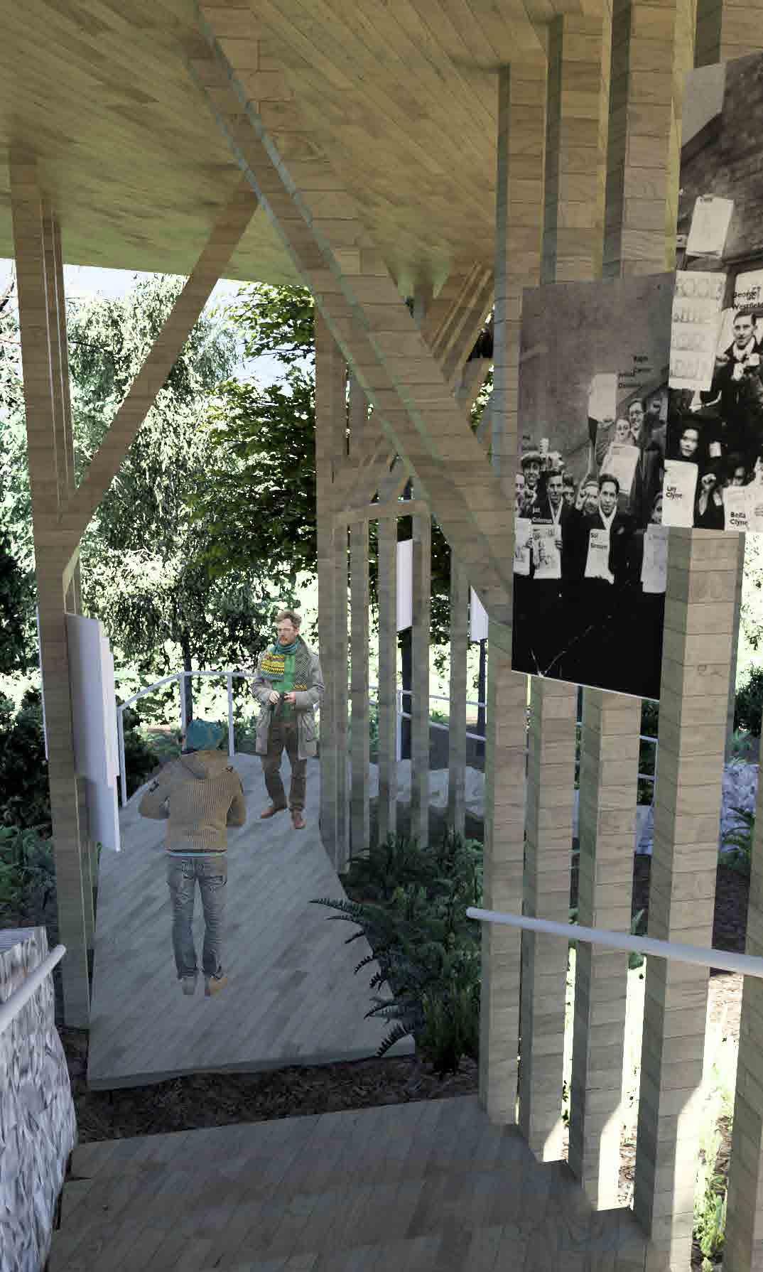
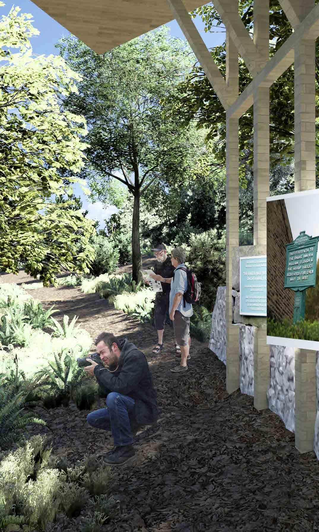
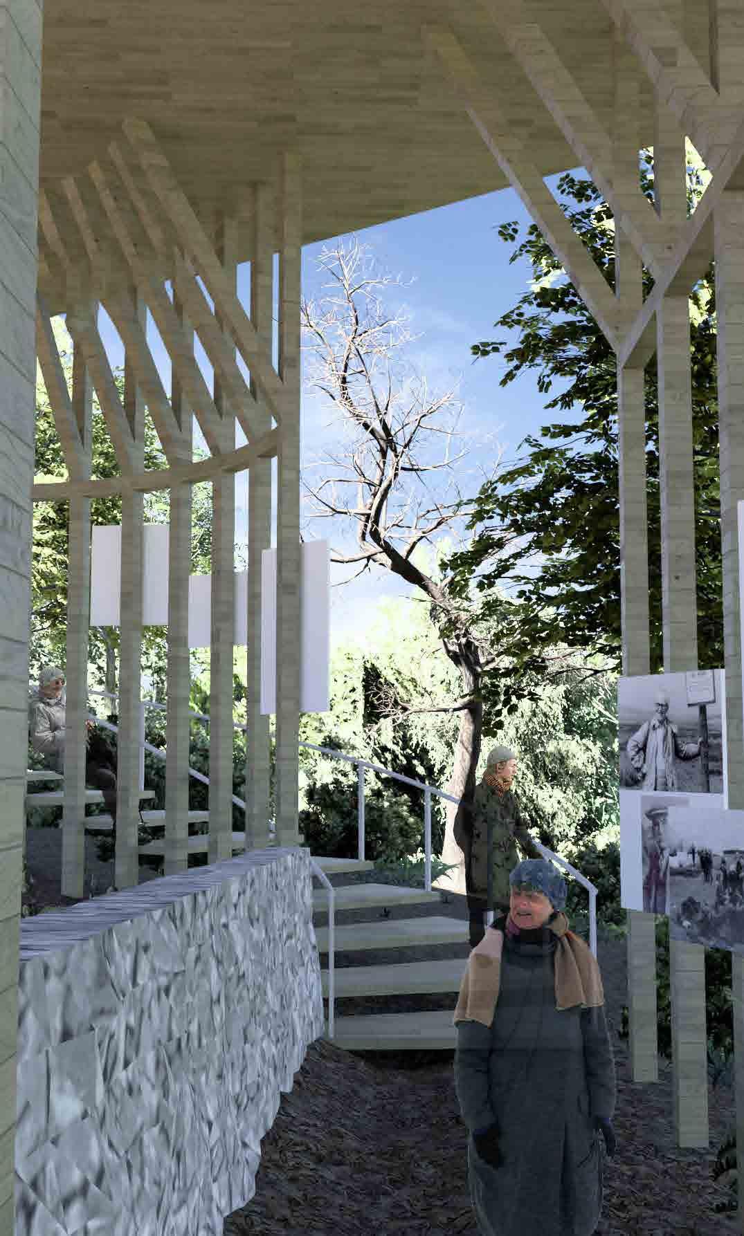
The ground floor exhibition space which follows the form of the path is the part of the building which provides visitors the most contact with the surrounding environment, therefore it holds potential for further exploration of how this space is structured.
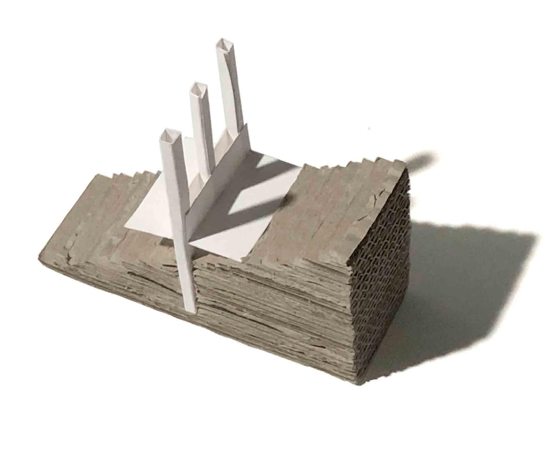
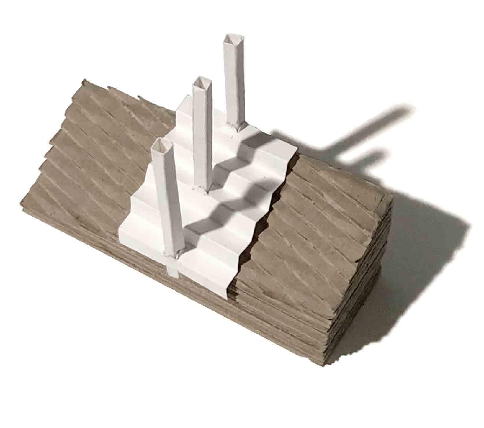
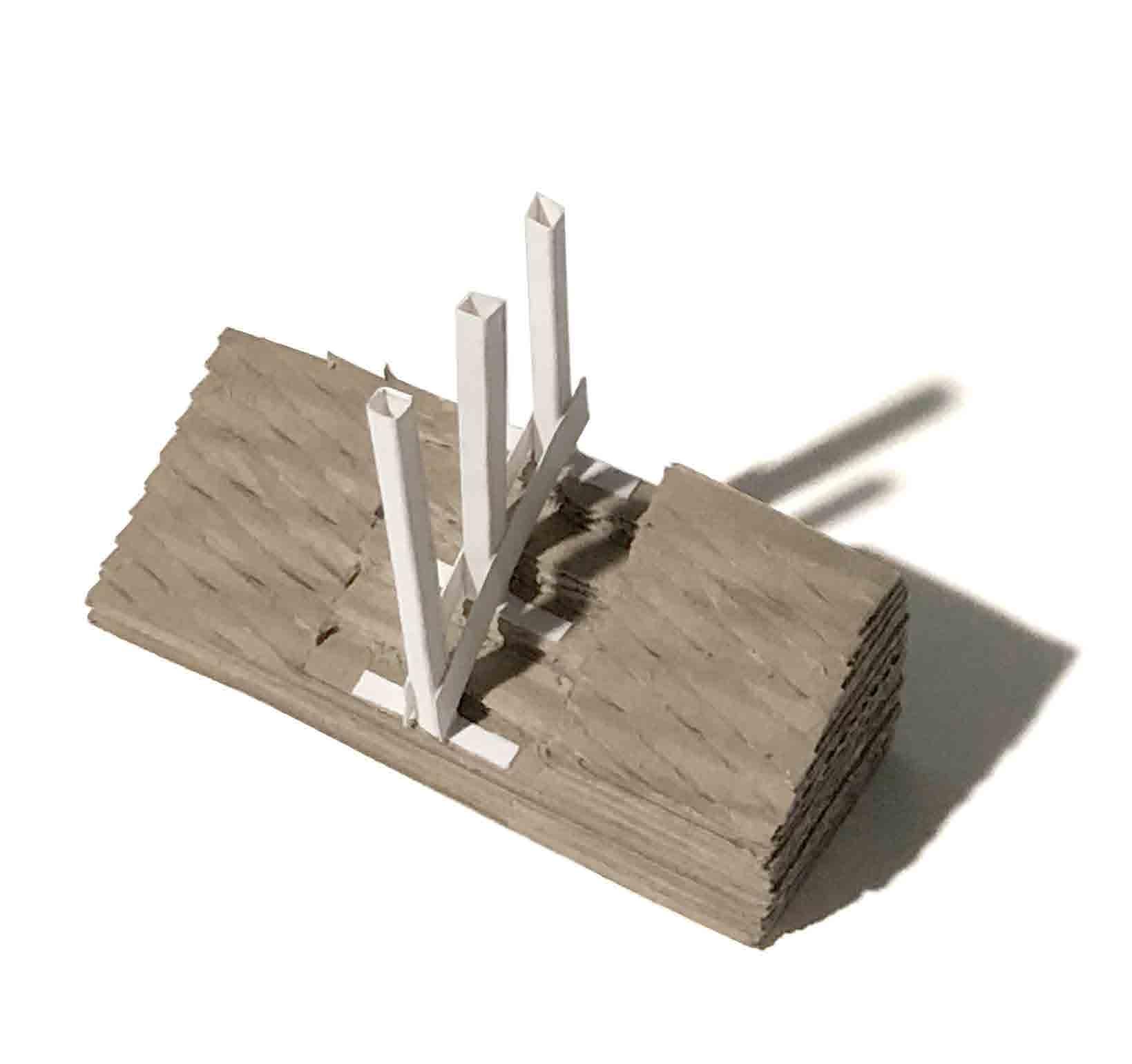

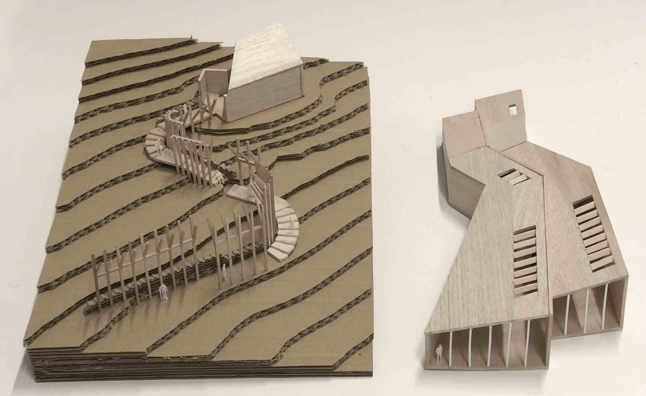
Physical model exploration of how the path would interact with the sloped site, whether it should be suspended above the ground or sunken into the ground. The structural elements that would suspend both the path and the rest of the building end up creating a surface on which the exhibition could be displayed
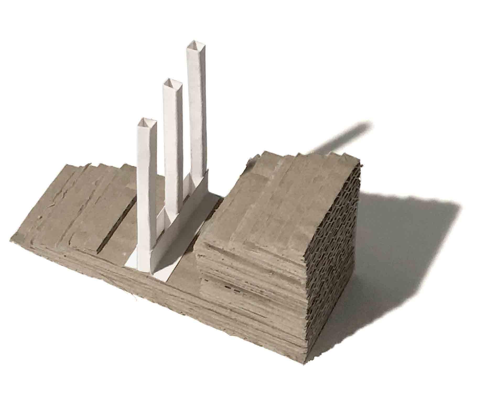
Further exploration of how these approaches would be applied when the path runs down the slope instead of across
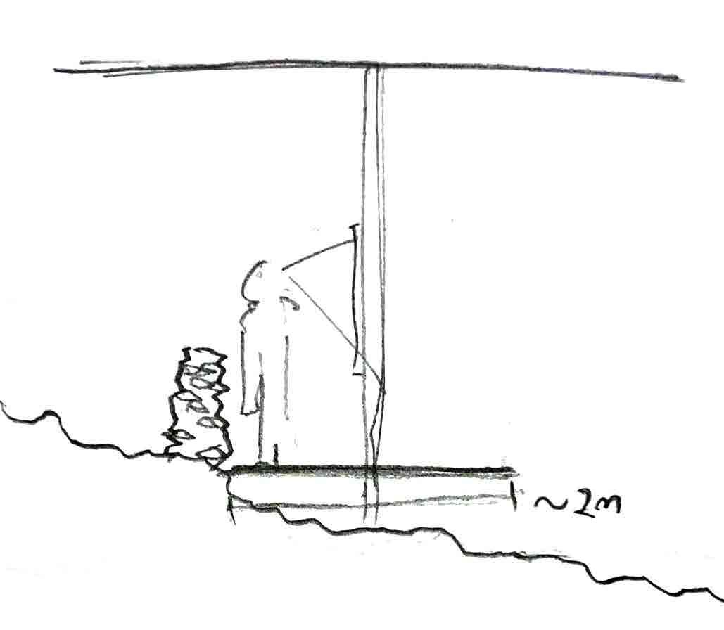
This is the initial idea for how the exhibition space would be organised, however, the path being 2m wide wouldn’t leave enough room for visitors to comfortable experience the exhibition space
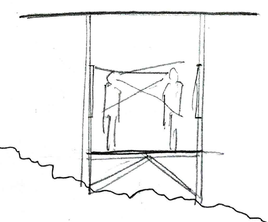
An alternative arrangement is for the exhibit to be either side of the path, however this would likely cause visitors to obstruct each others view
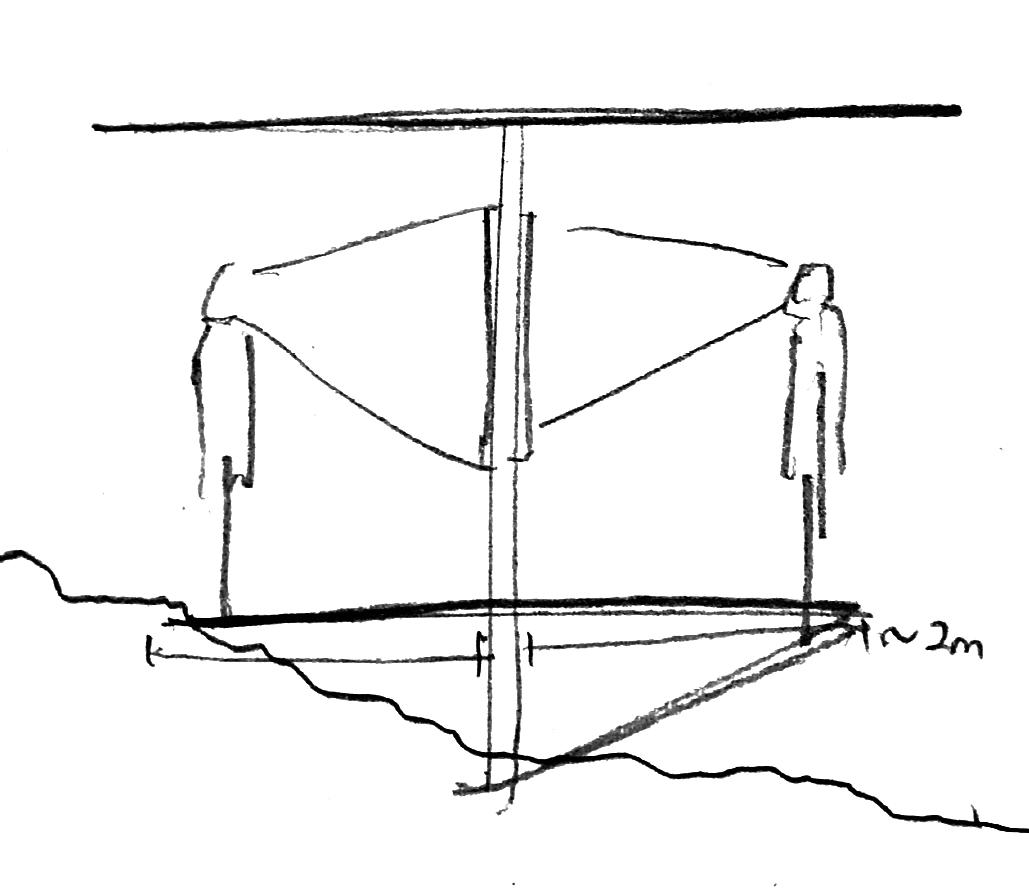
Extending the path such that it is 2m either side of a central exhibit resulted in a path that is too wide and conflicted with the concept of “minimal impression”
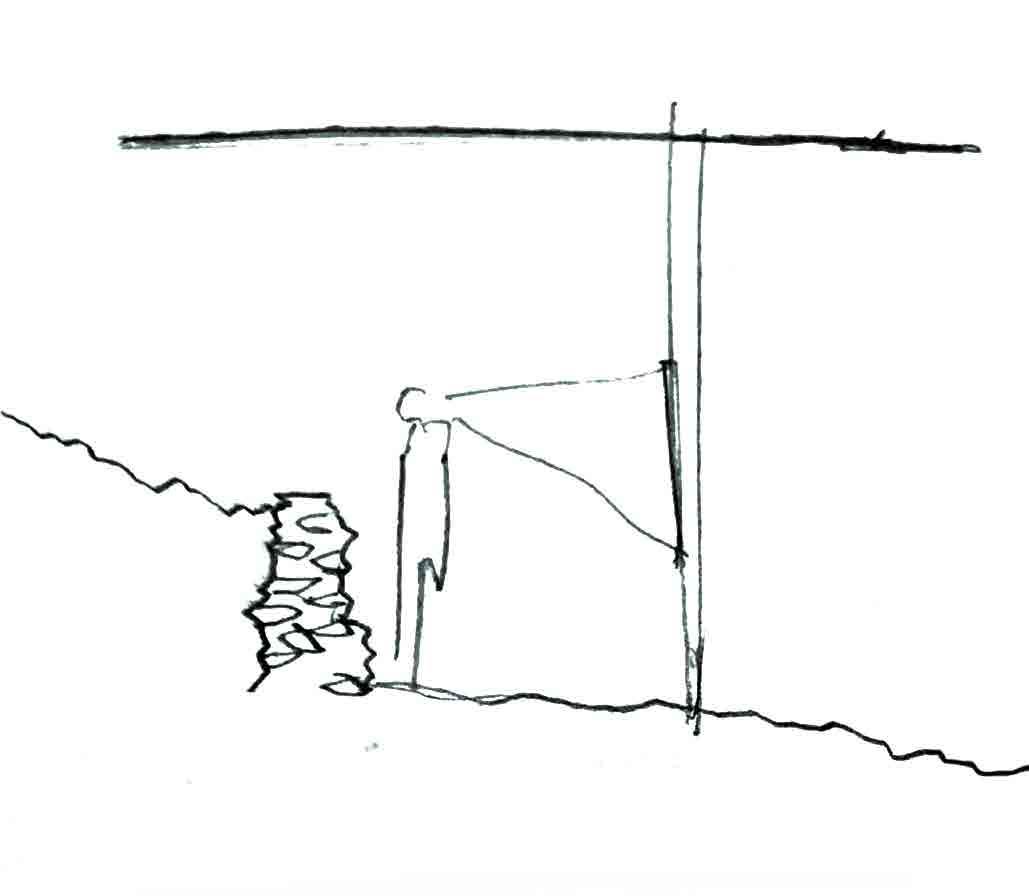
Limiting the view to only one side of the path solved many of these previous issues, however, there is still the problem of the exhibition itself turning what is meant to be a transitional space into a stagnant one

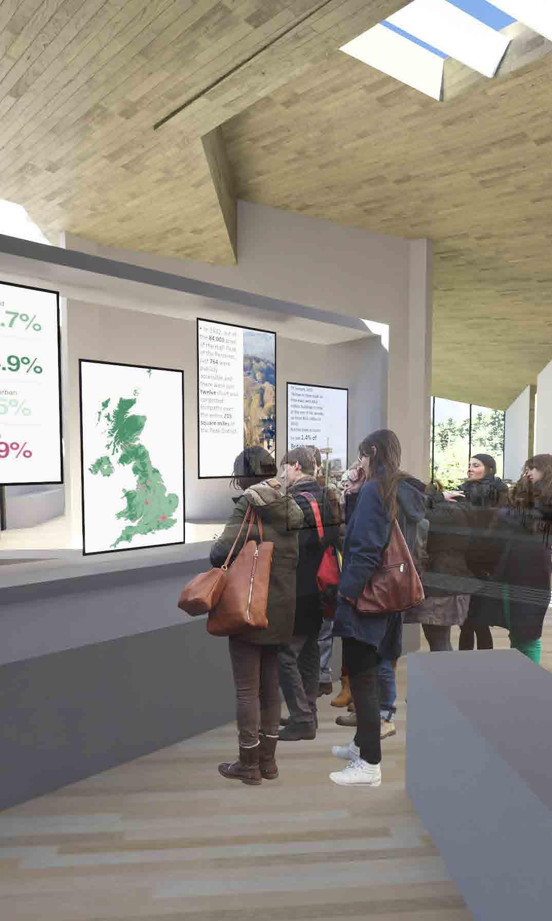
My final solution is to combine the previously explored ideas and have the exhibition be on one side of the path at a time such that it alternated throughout the journey. Additionally, angling the displays that make up the exhibition would encourage a more movement through the exhibition space while providing more of a comfortable viewing distance. The exhibition itself would be largely visual in order to communicate information more efficiently and further encourage movement through the space
DAYLIGHTING SOLUTIONS
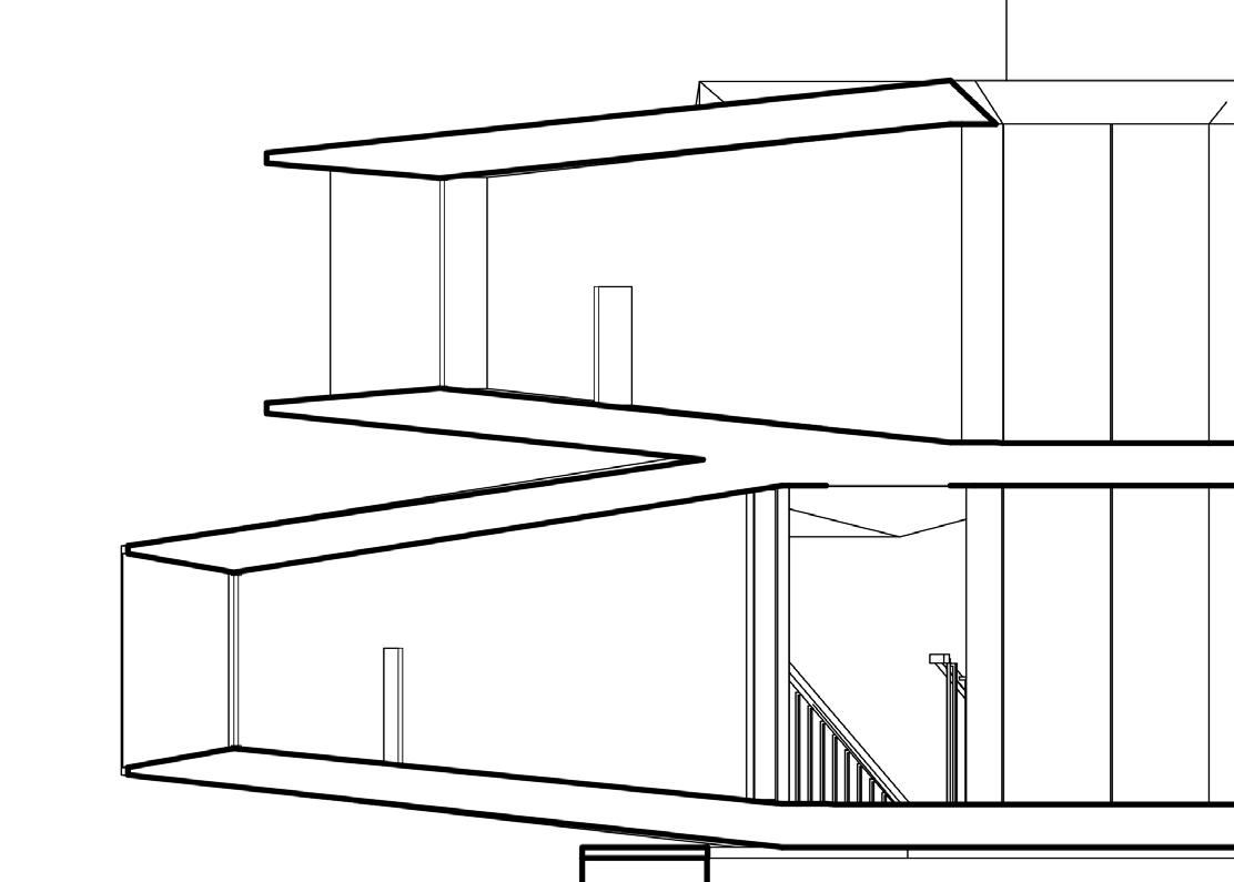
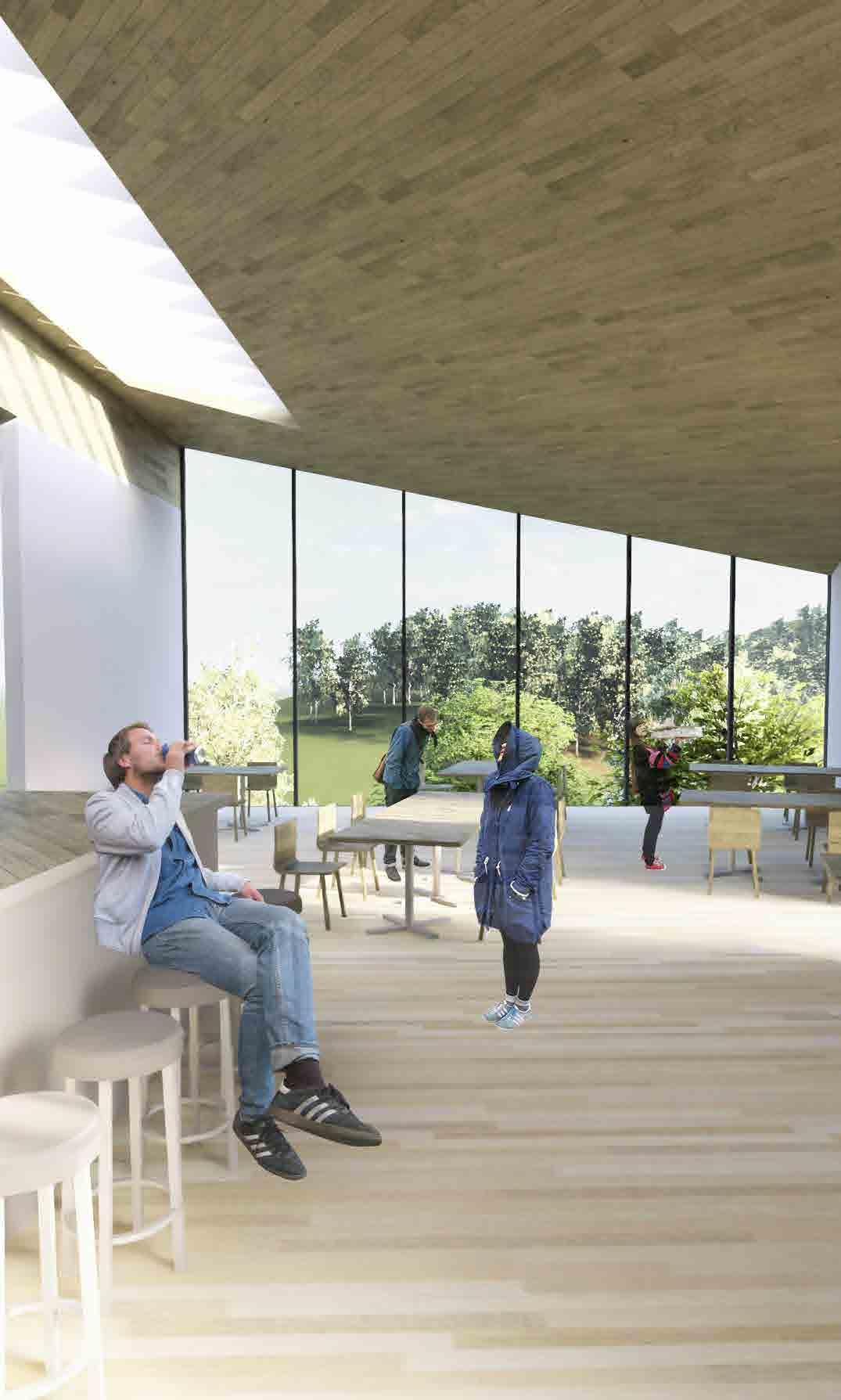
Since Site 2 is on a north-facing slope, there are many issues surrounding optimising daylighting throughout the year. Because of the dense foliage and the orientation of the structure, toplighting is the most effective way to light the space.
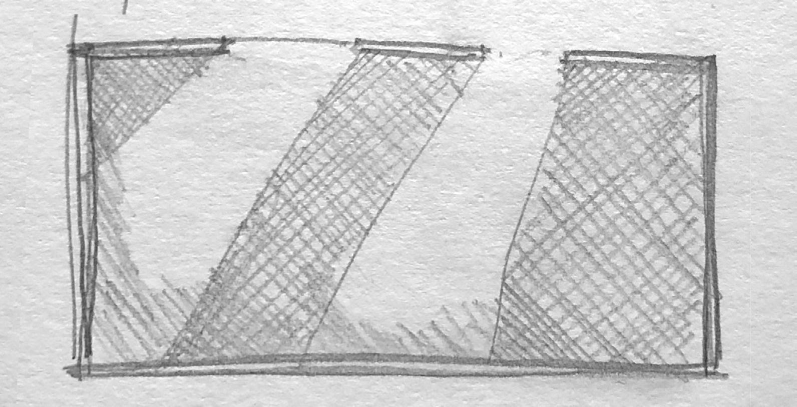
Exploring ways of “catching” the light when at a lower angle
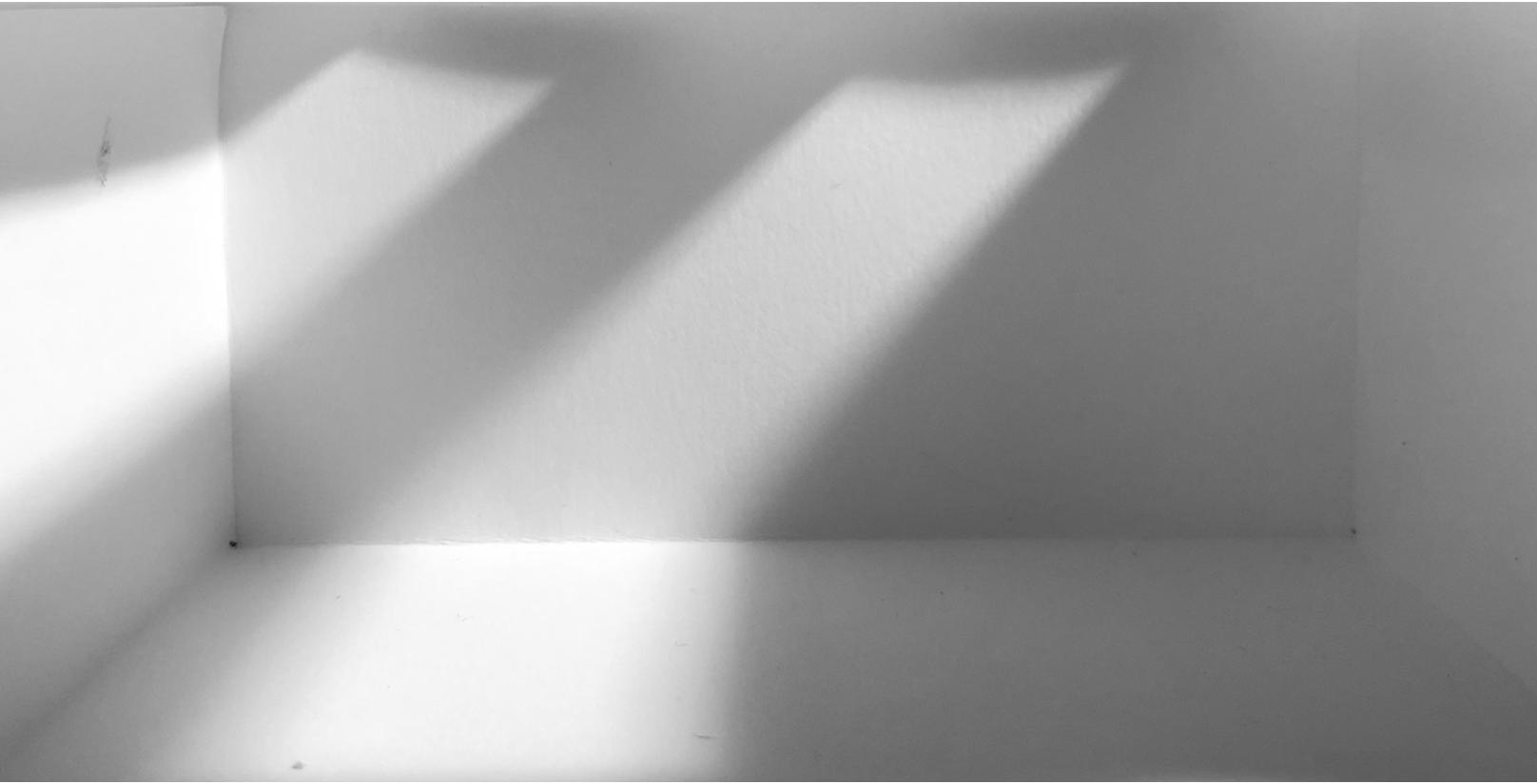
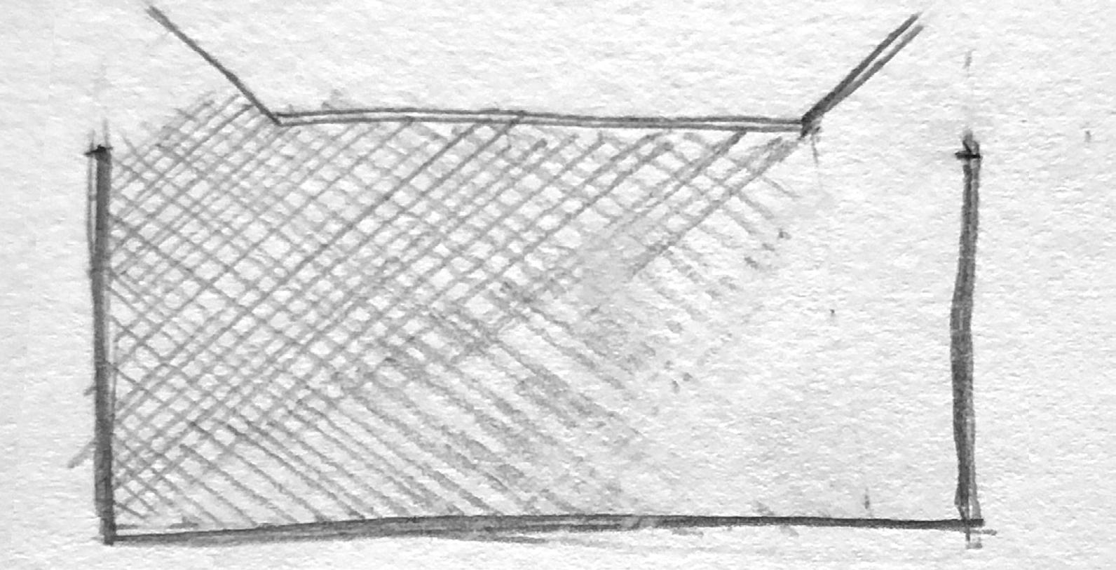
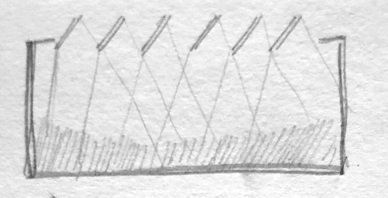
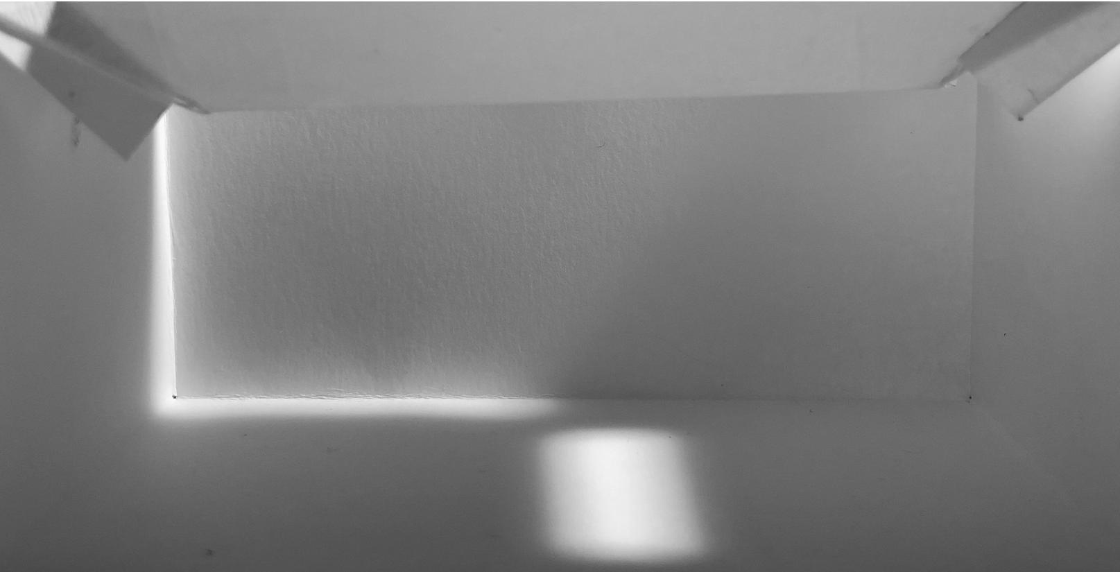
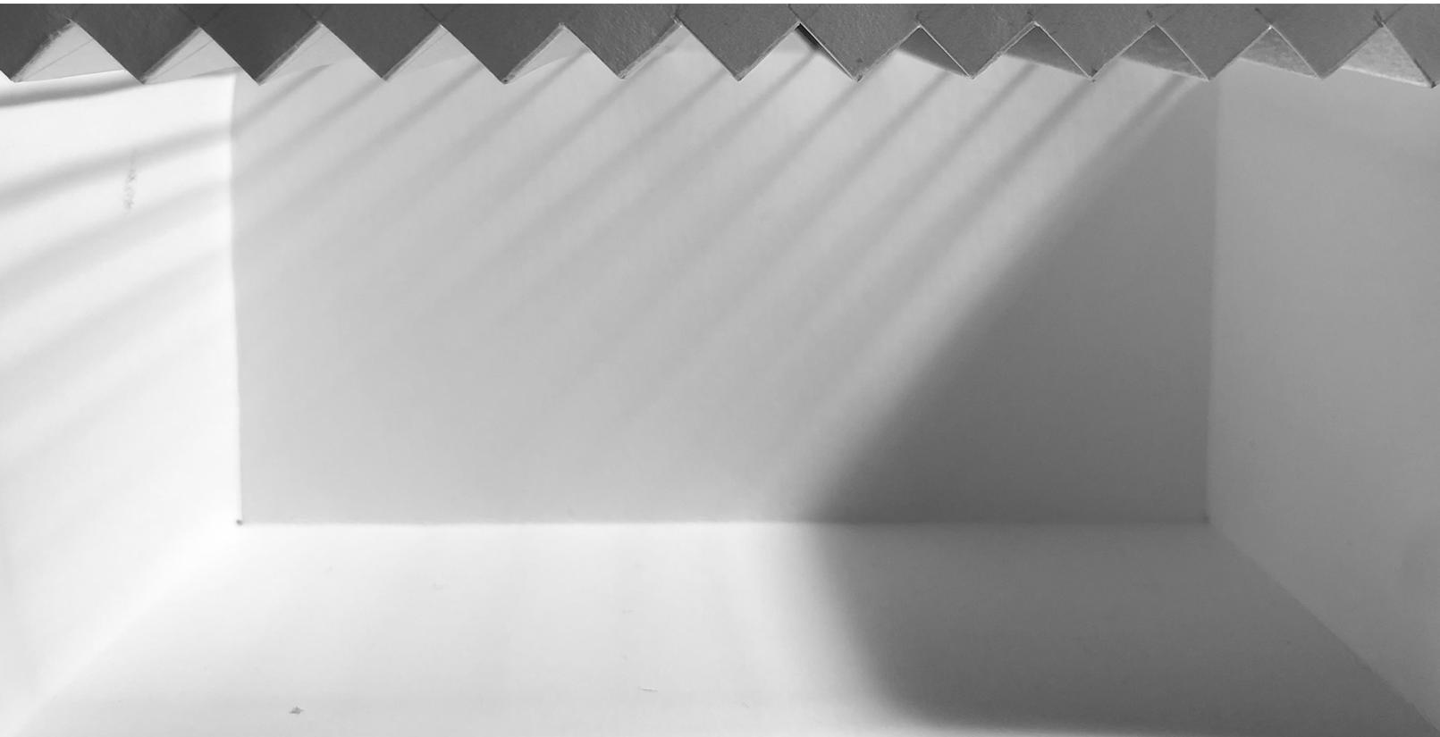
Slatted skylight angled to reflect light down and diffuse int the space proved the most effective toplighting strategy
Closer to the ground, therefore more obstructed by the vegetation and gradient of the slope
Deep plan space with very little opportunity for sidelighting
MATERIALITY
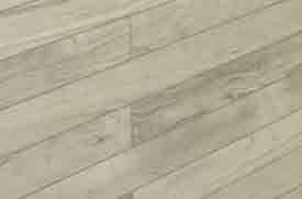
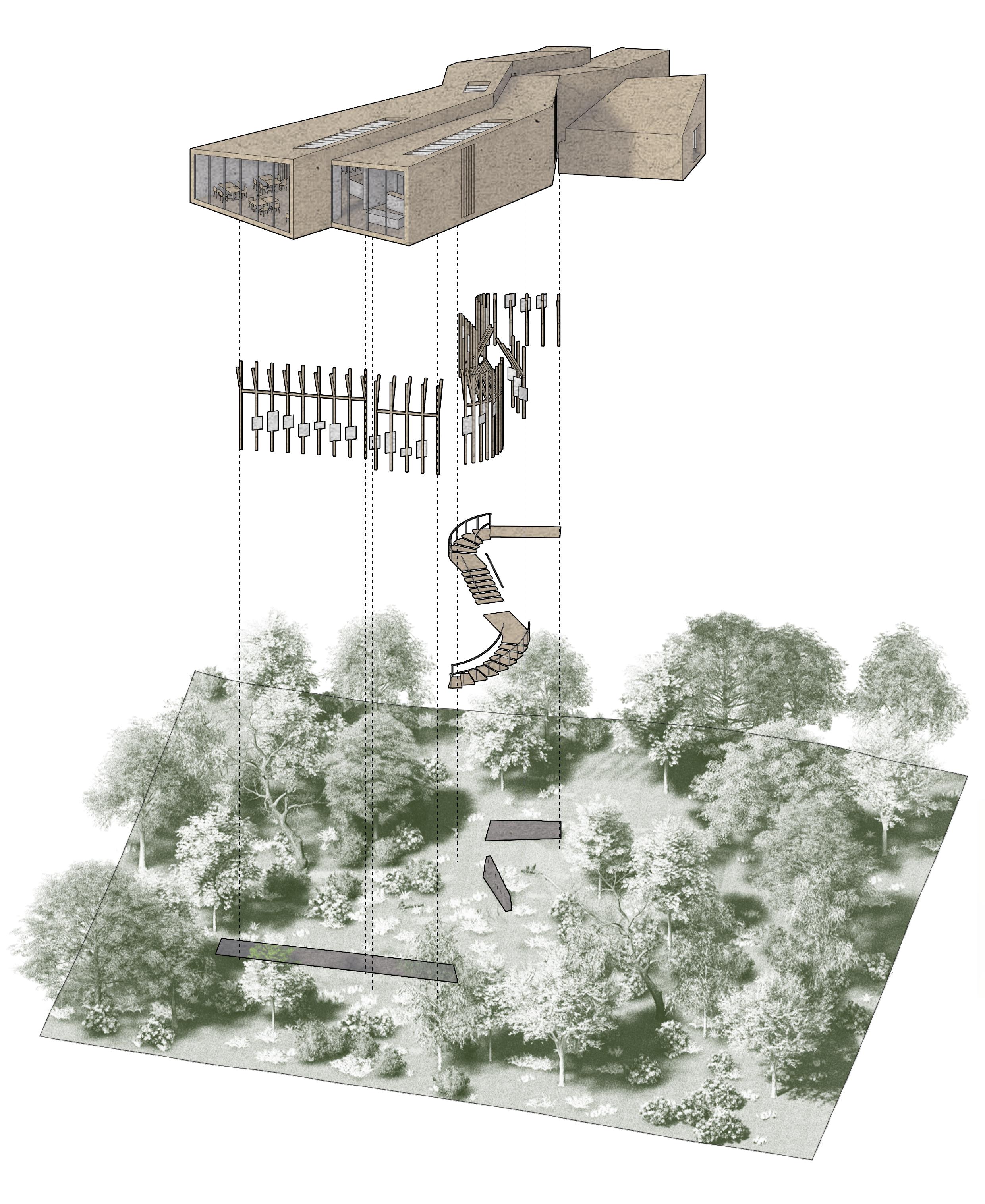
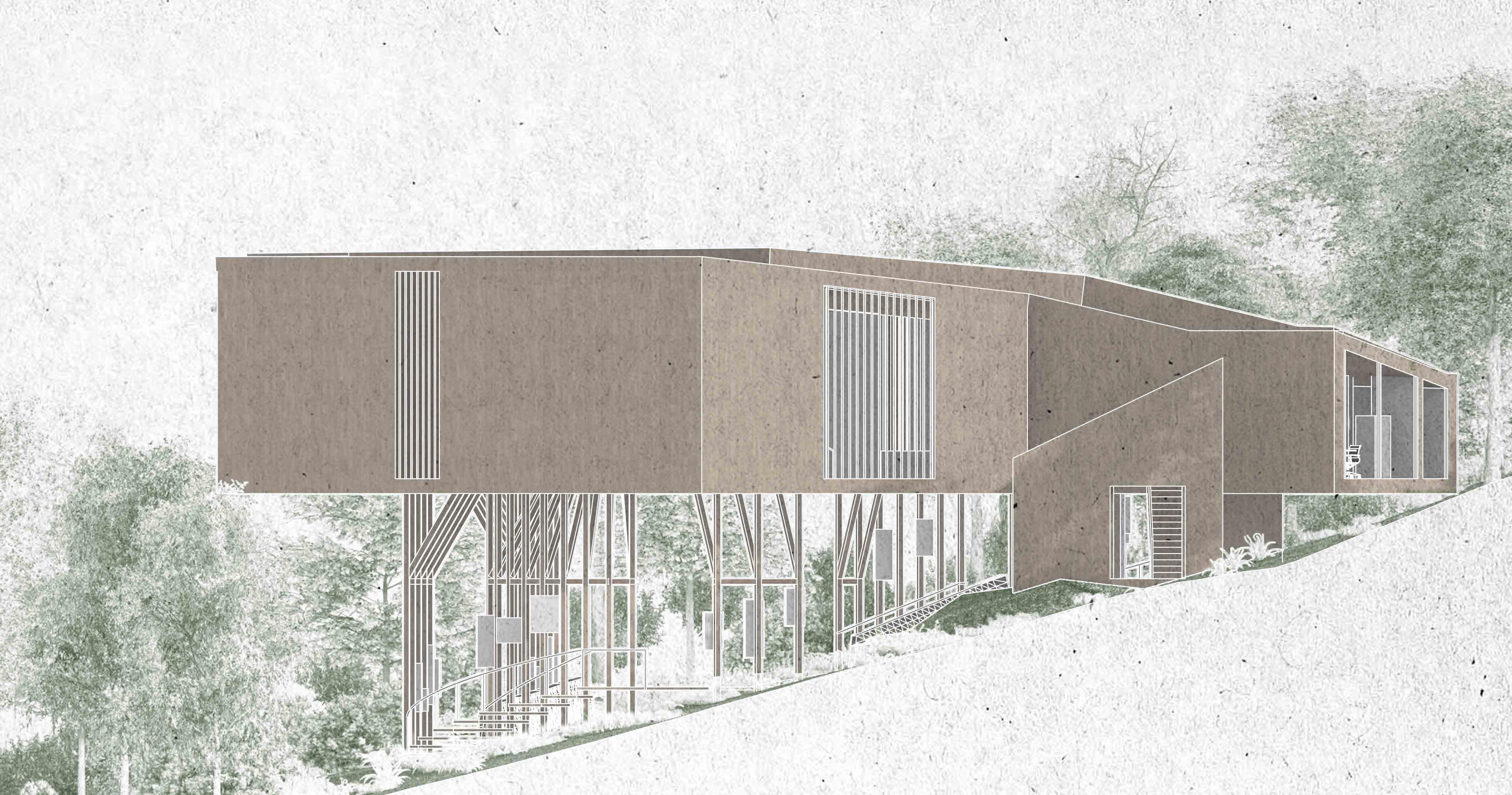
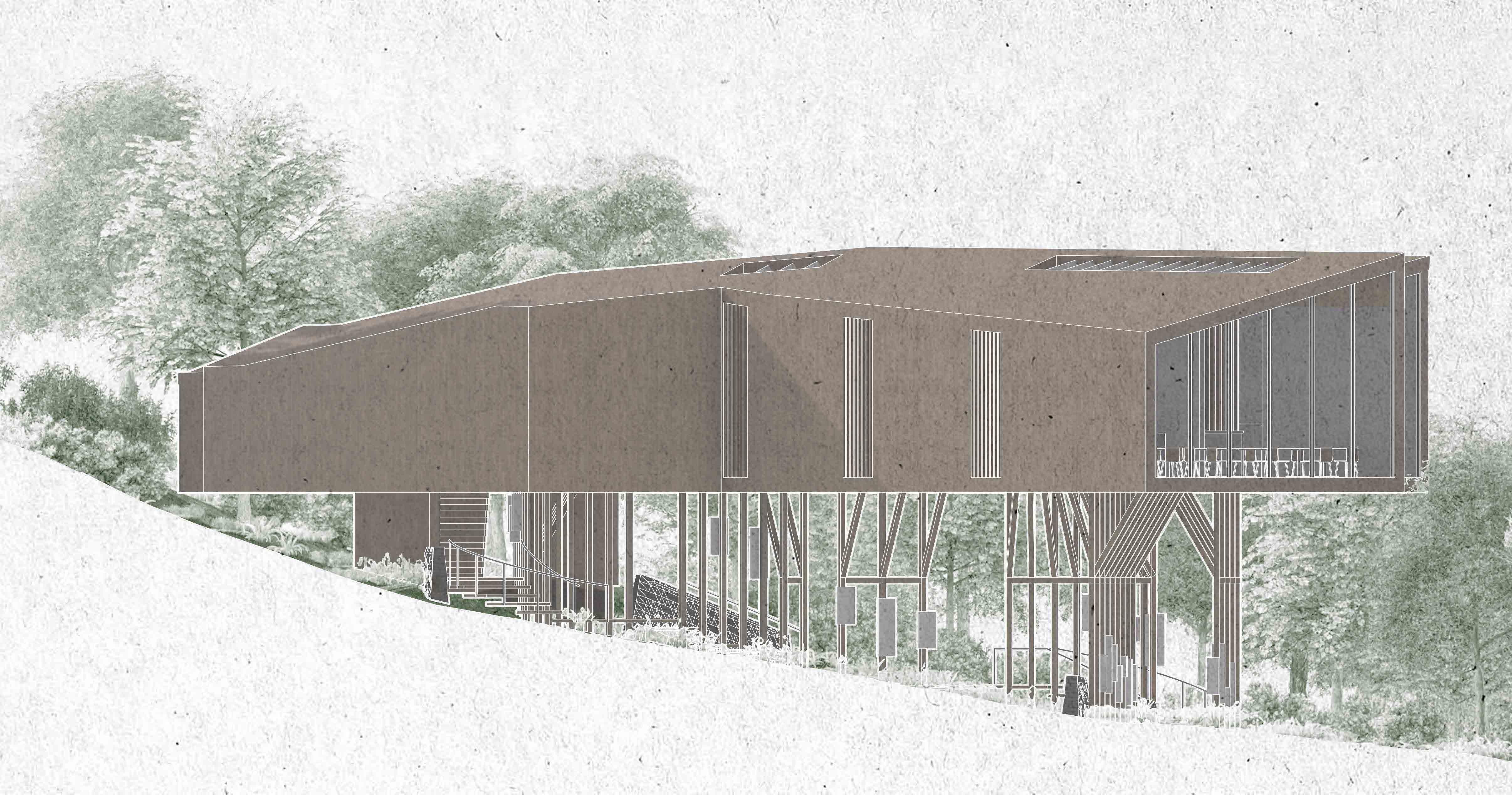
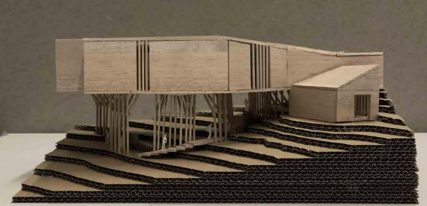
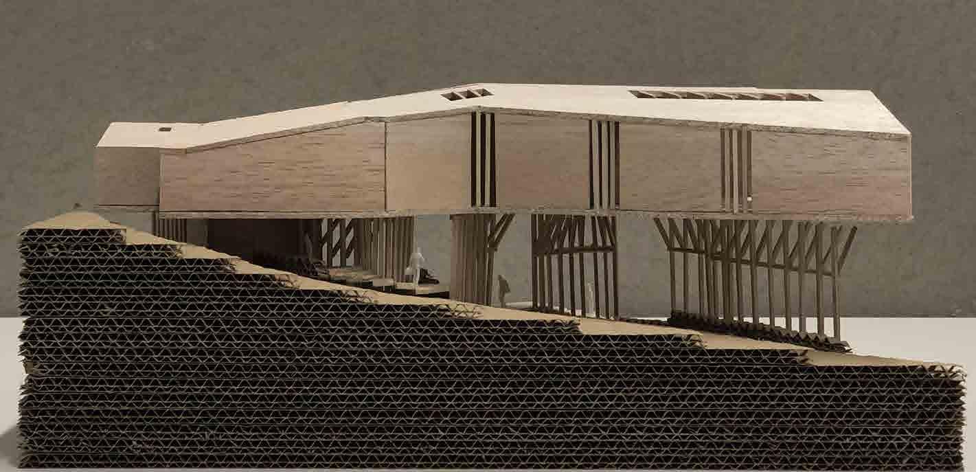
The visitor centre would be largely timber construction since it is lightweight and would therefore would require less interference with the site during construction.
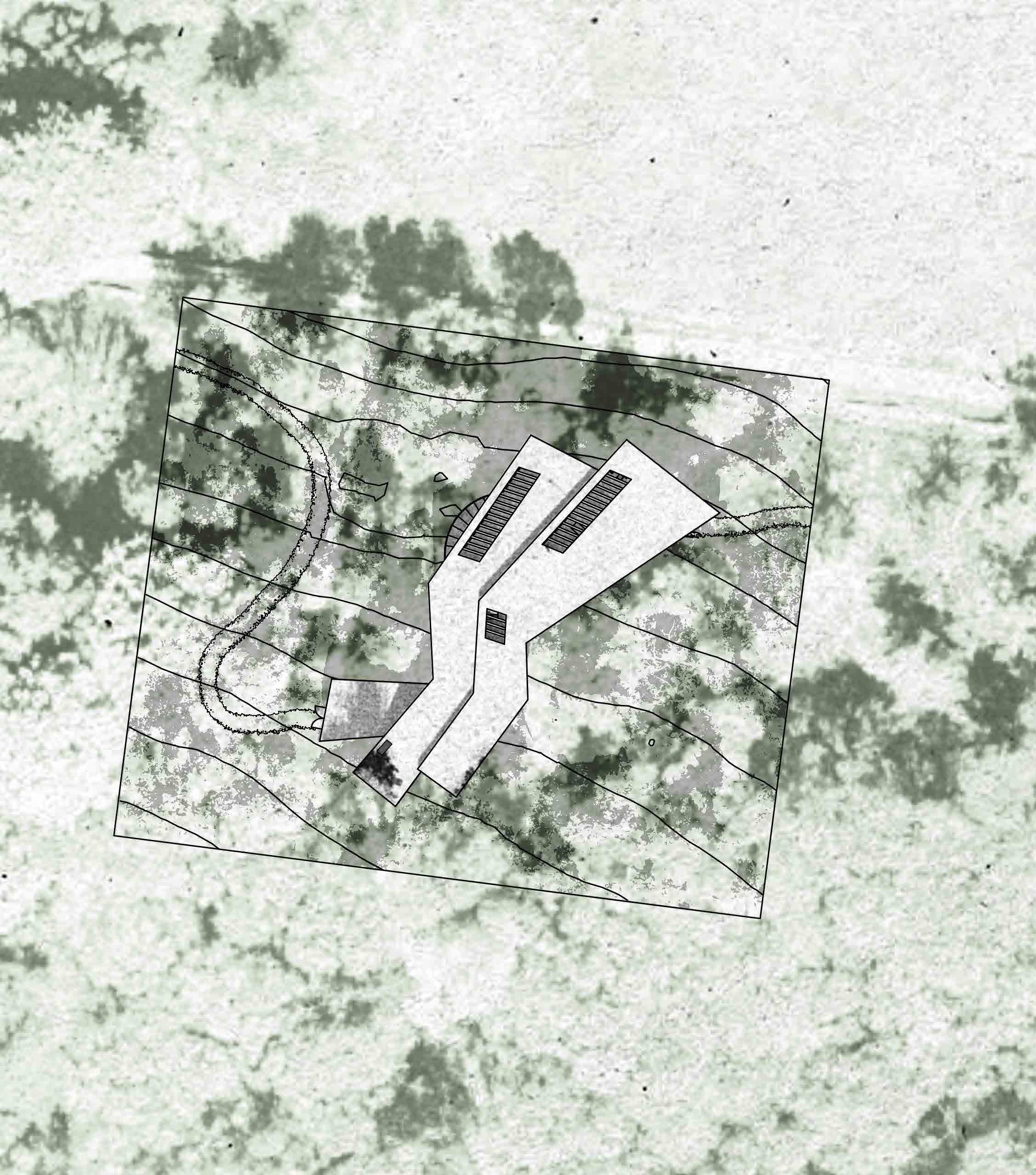
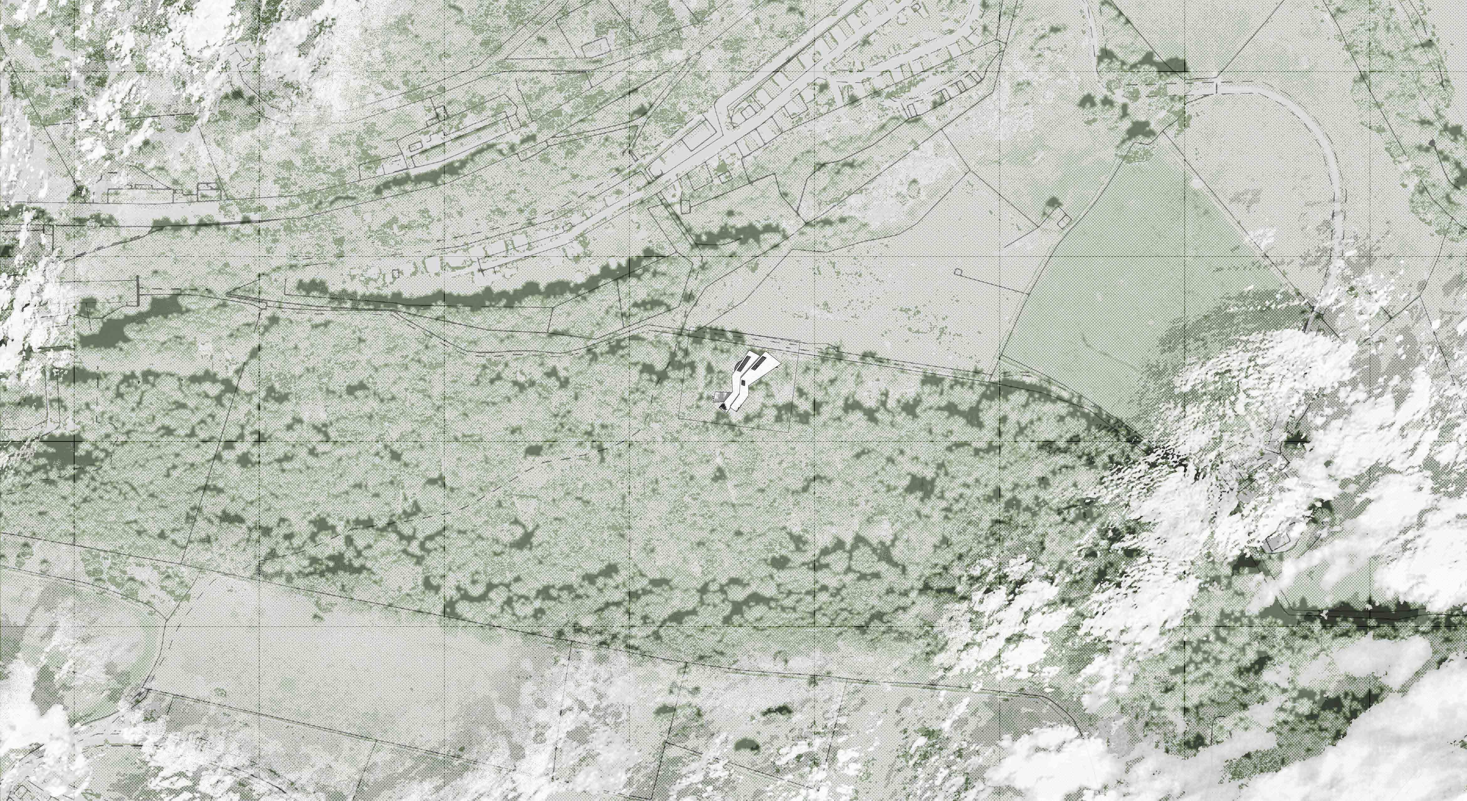

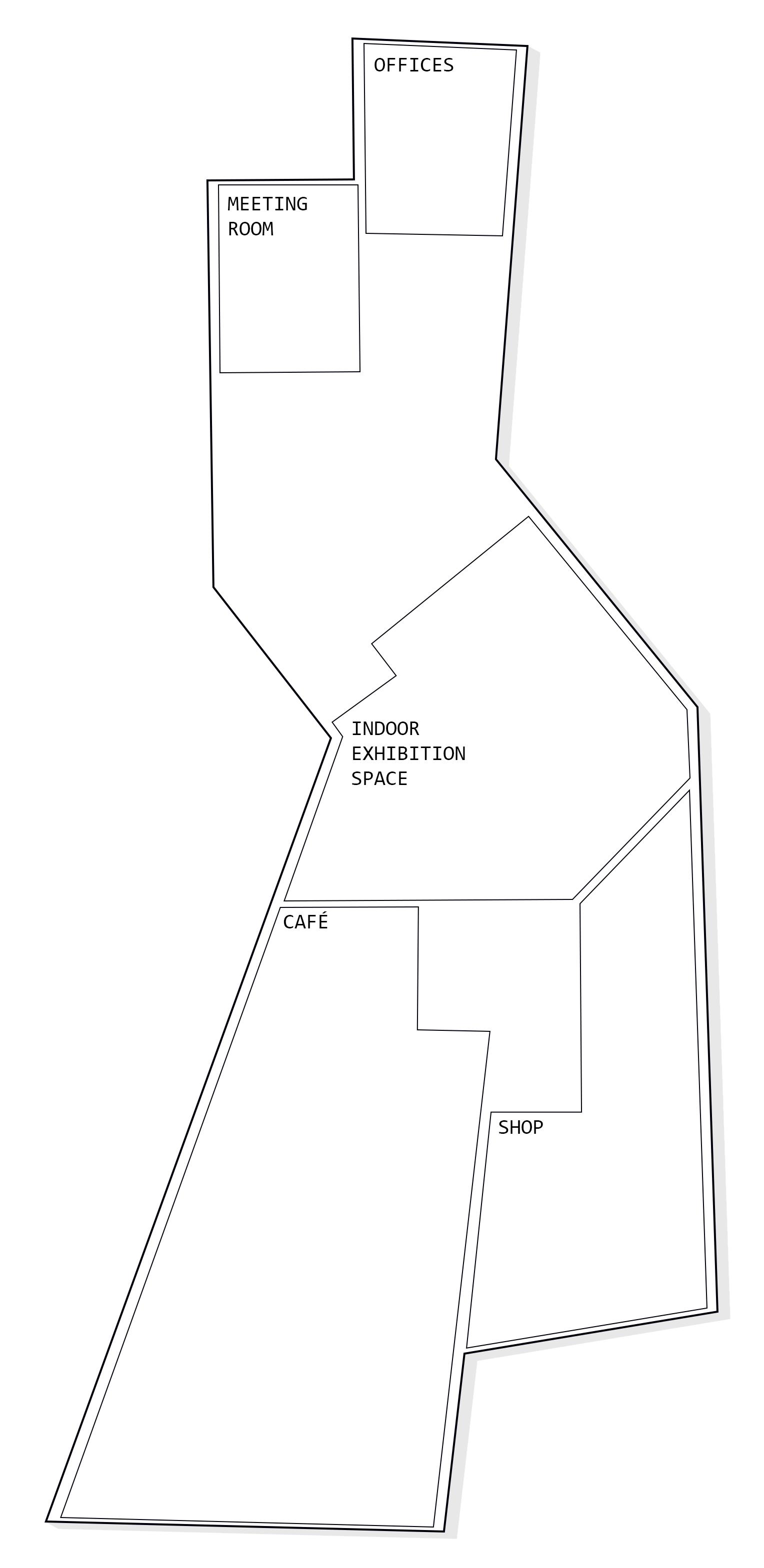
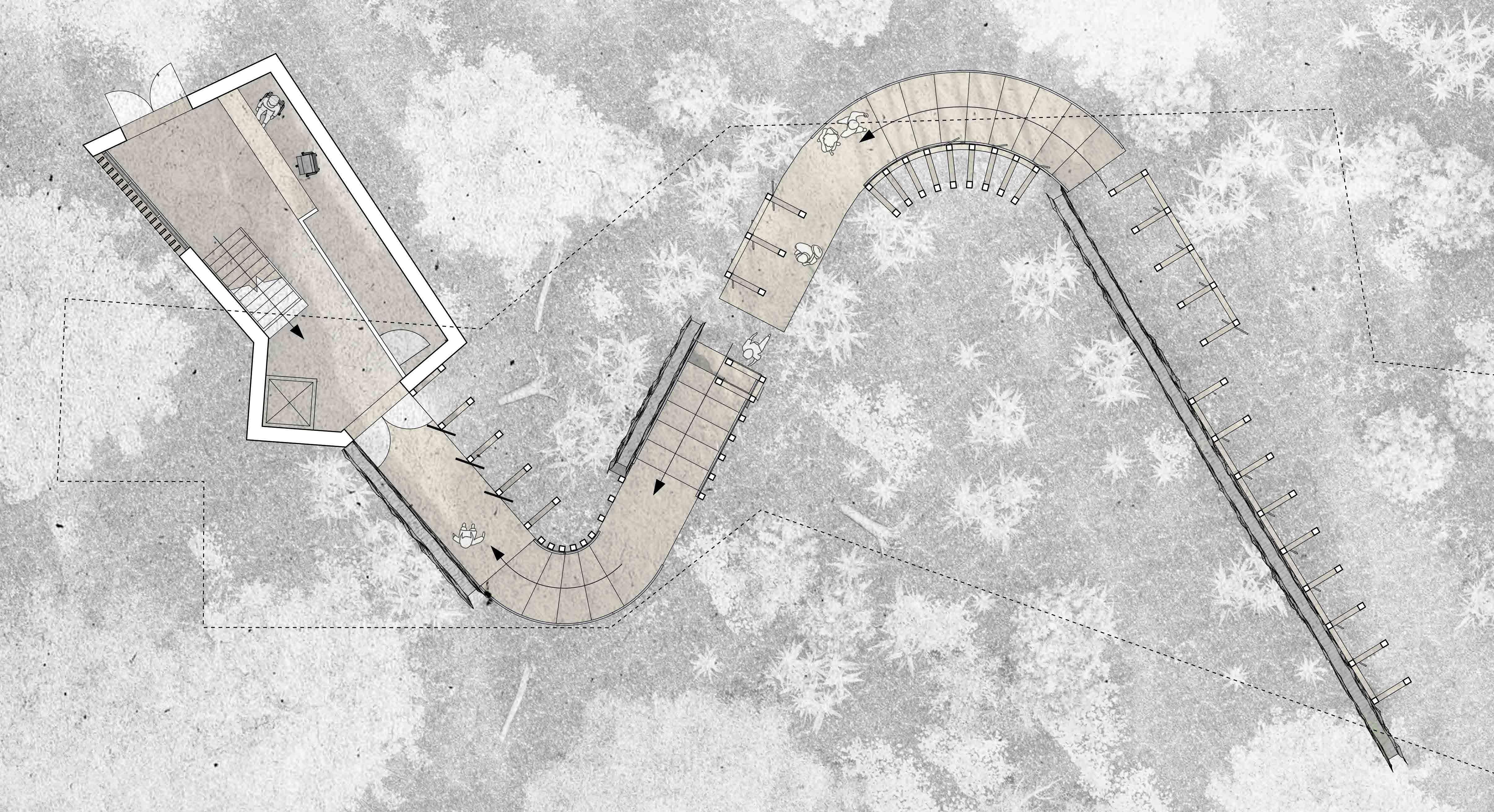
FLOOR PLANS

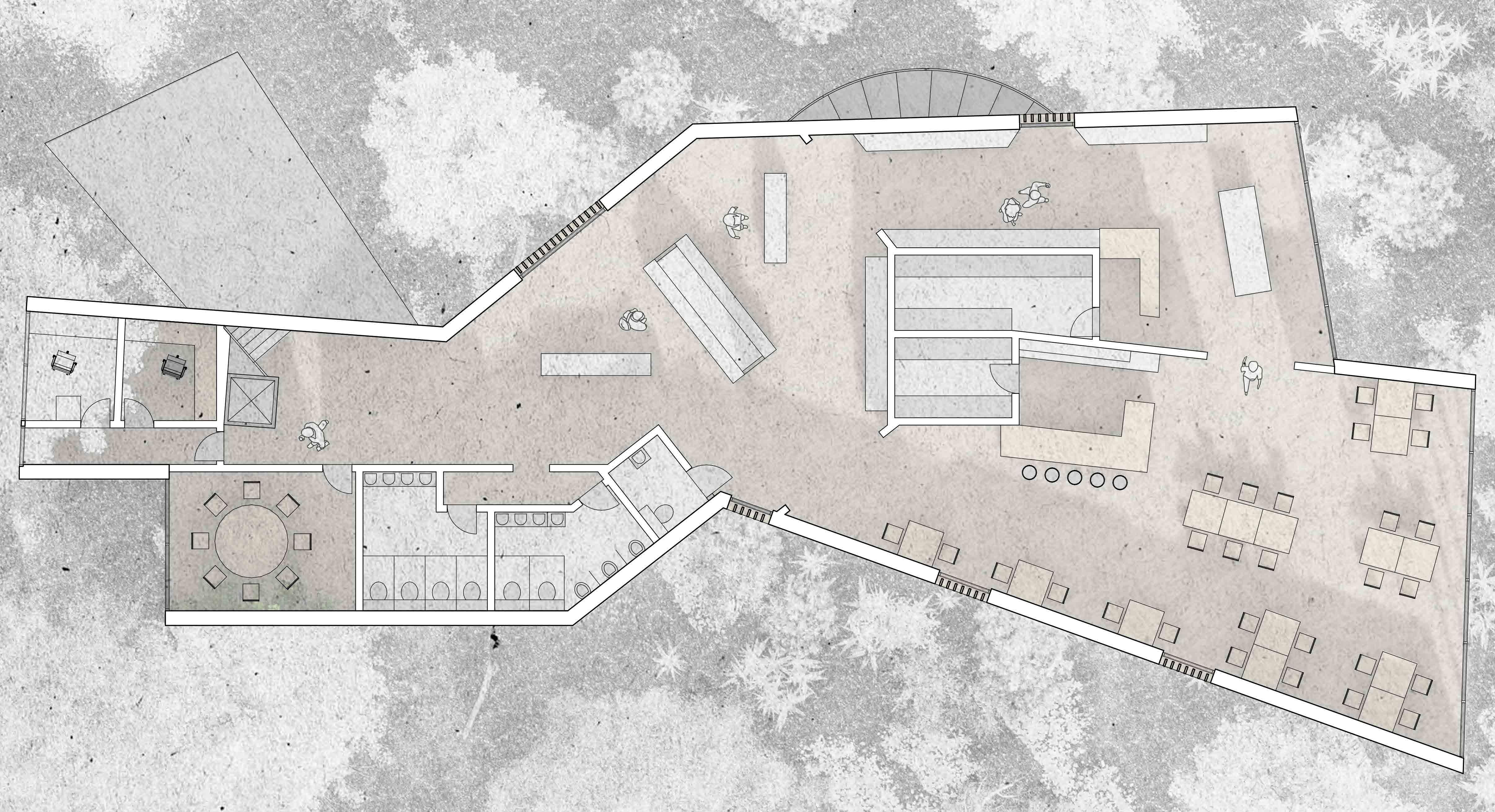
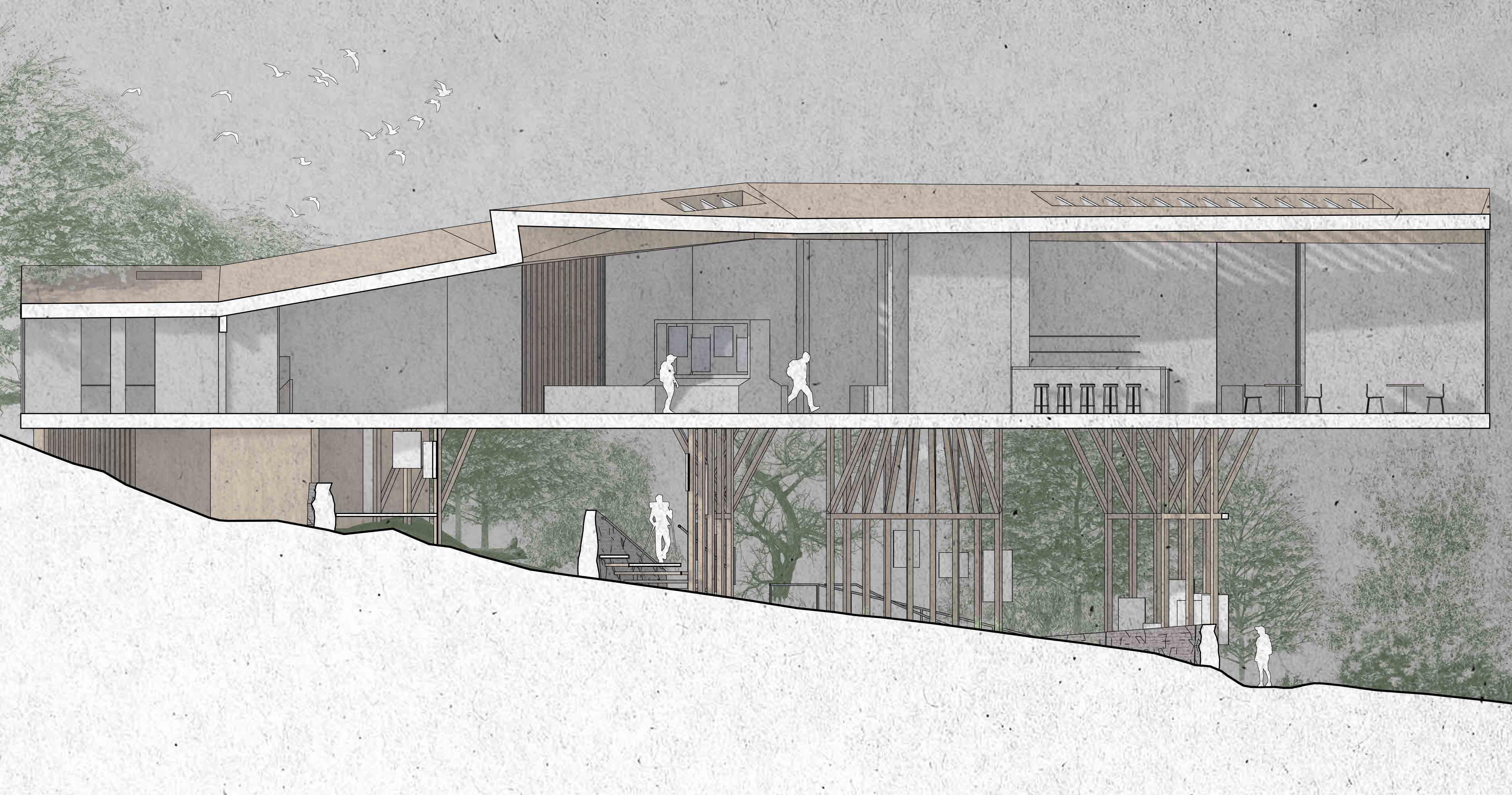
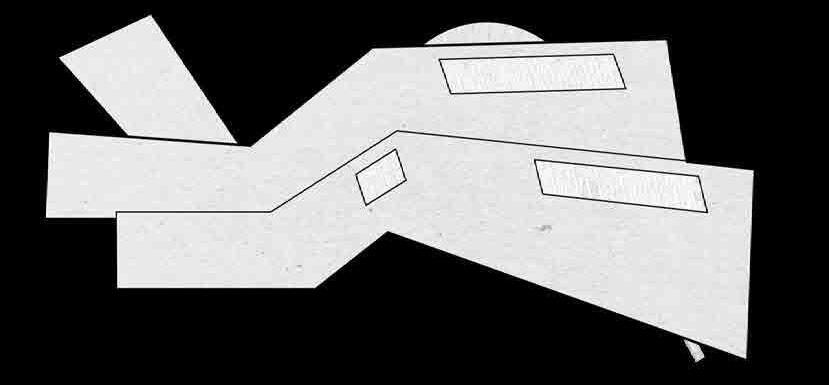

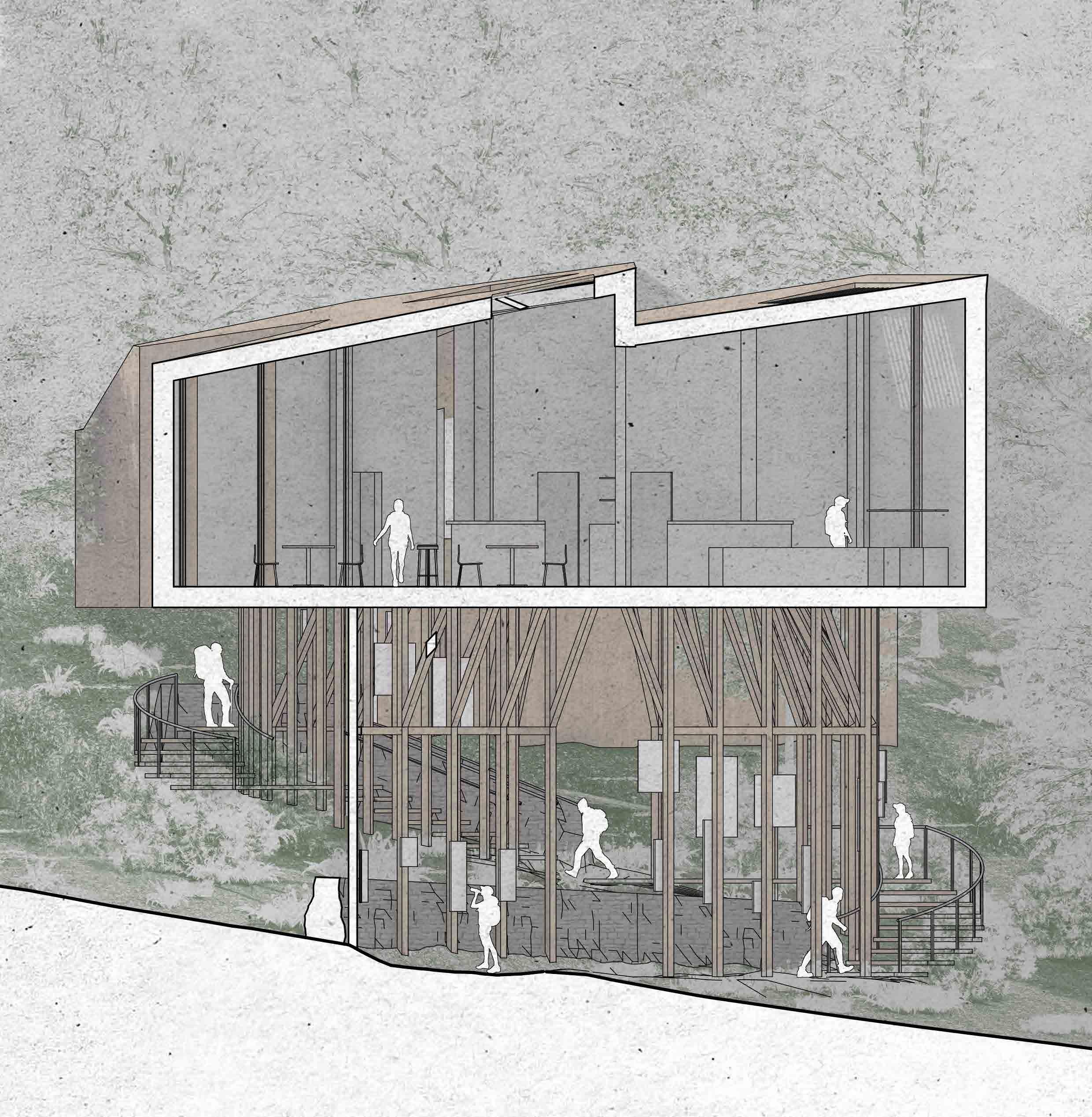



RETROSPECTIVE ITERATION
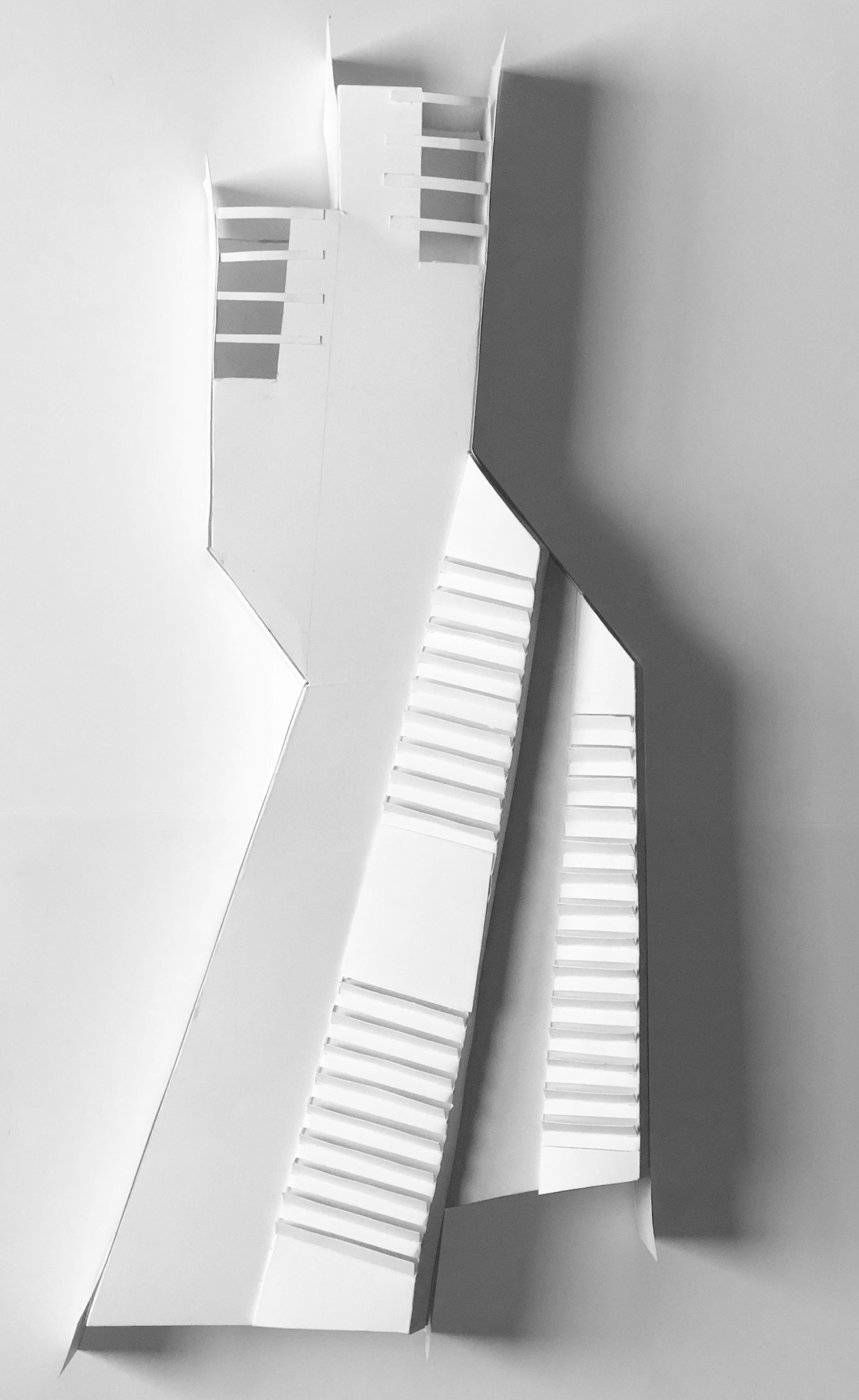
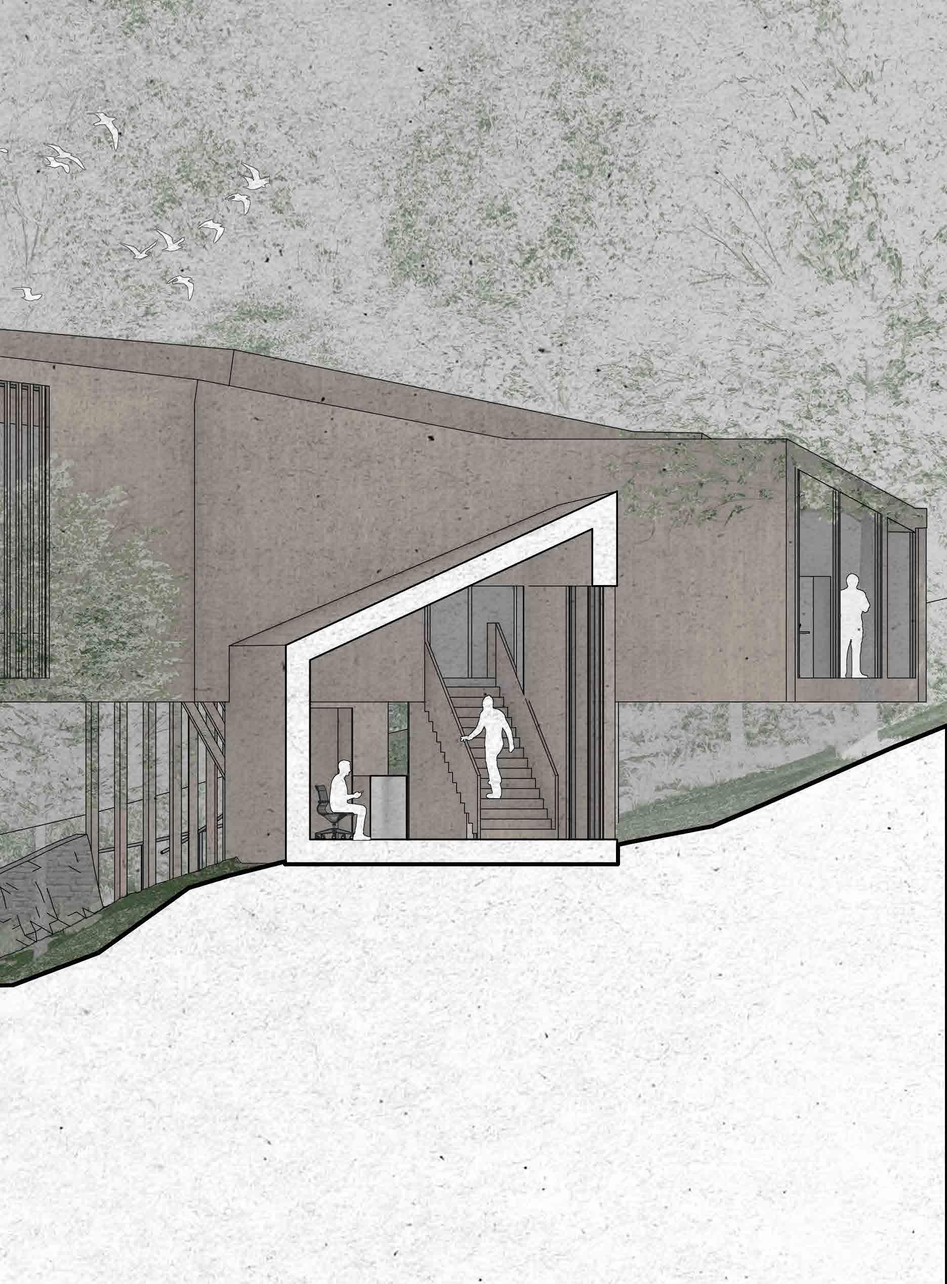
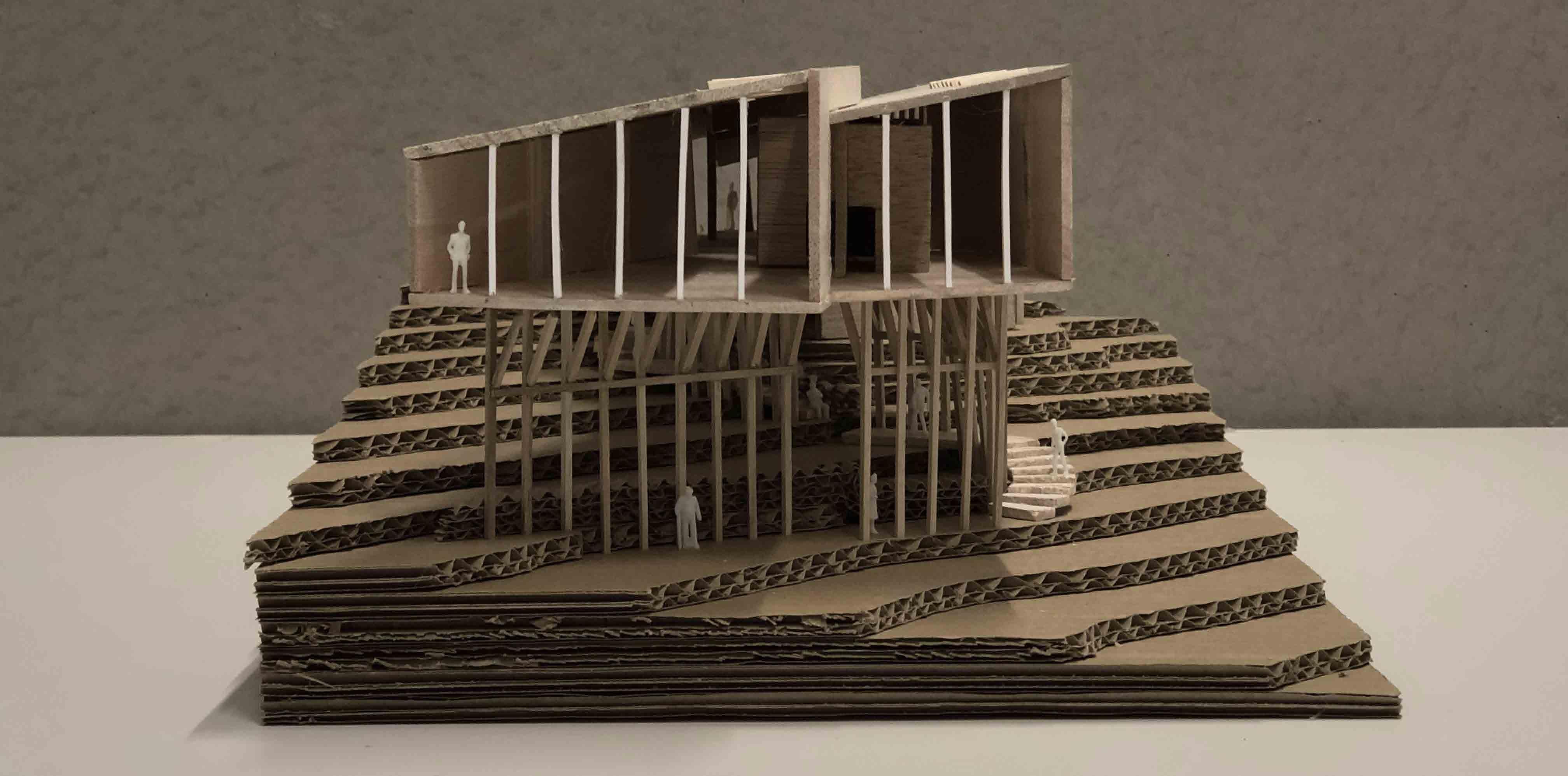
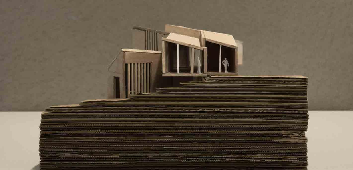
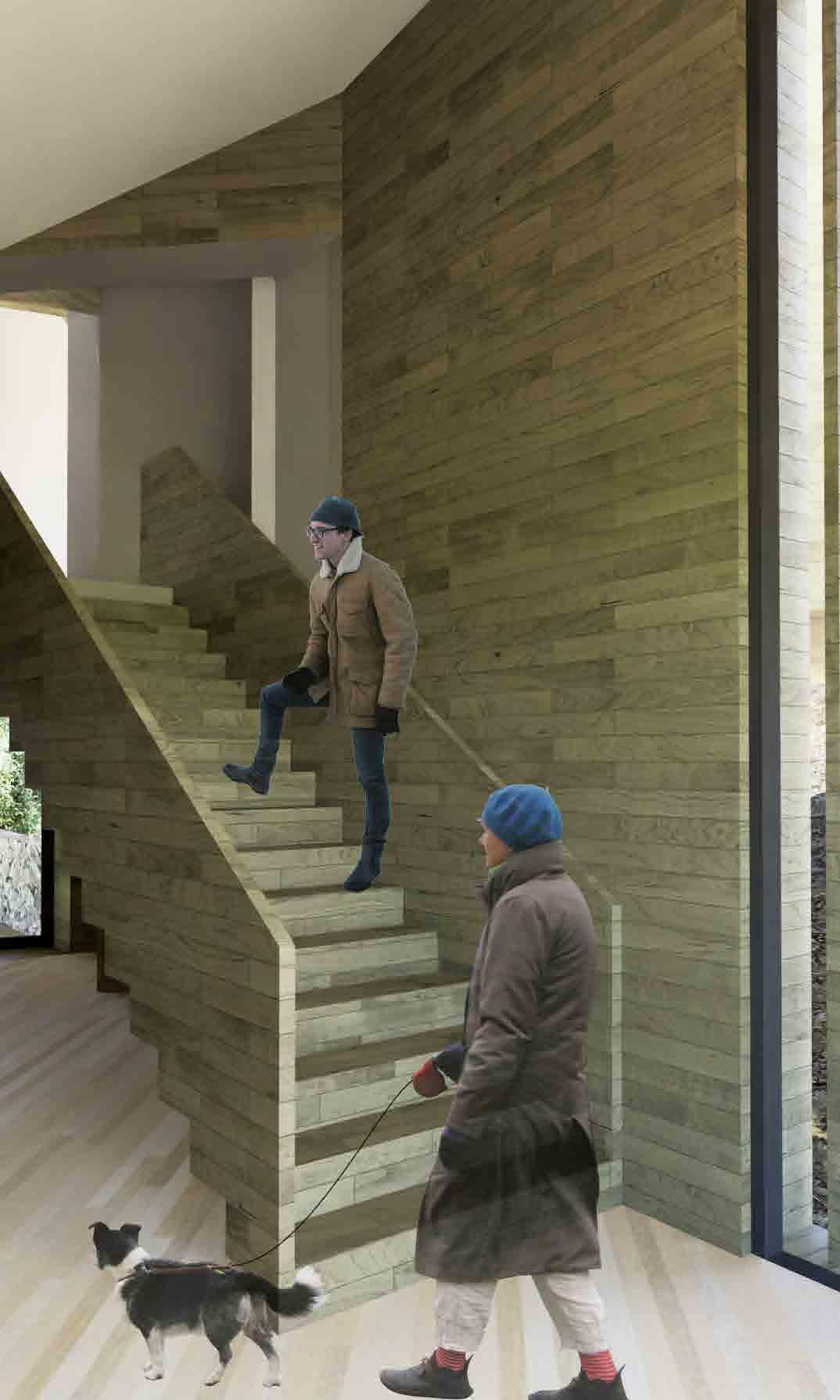
The construction of my physical model shone light on some of the shortcomings and missed opportunities with my design. In trying to reduce the footprint of that volume as much as possible, I unintentionally created a bottleneck within the building; that one relatively narrow staircase needs to provide traffic in both directions. Additionally, because that room is on the north-west side of the building, under dense foliage, and on a northfacing slope, not enough consideration had gone into lighting this space in particular.
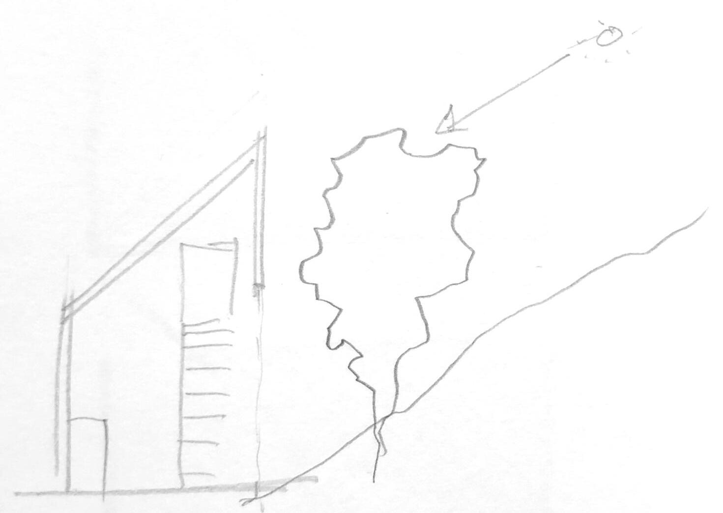
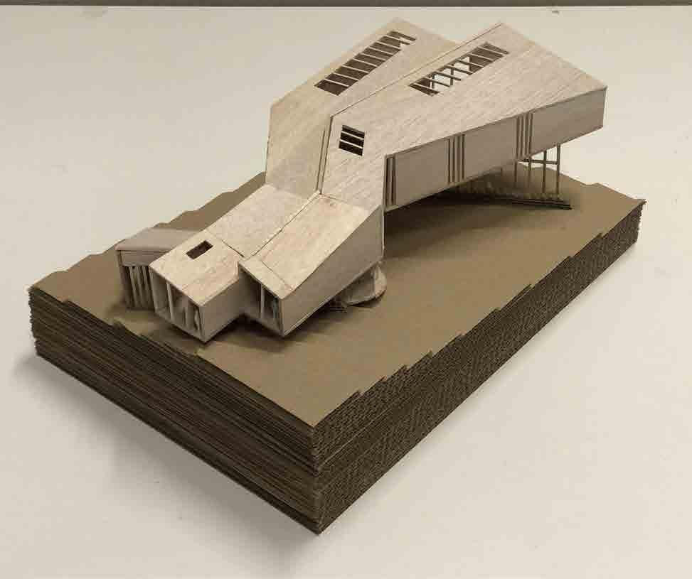
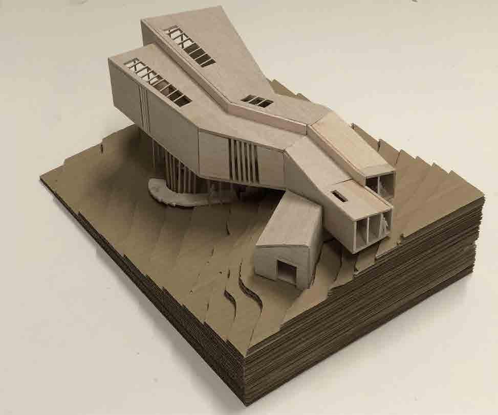
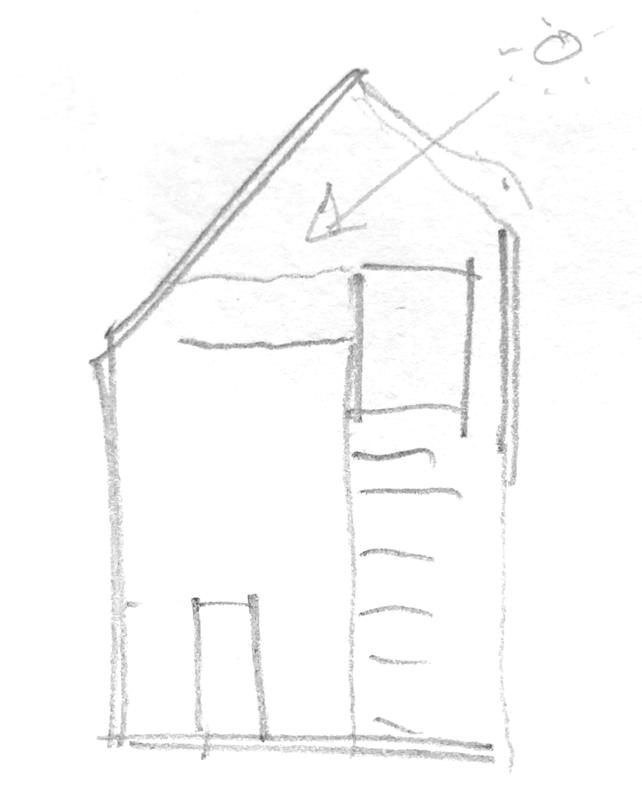
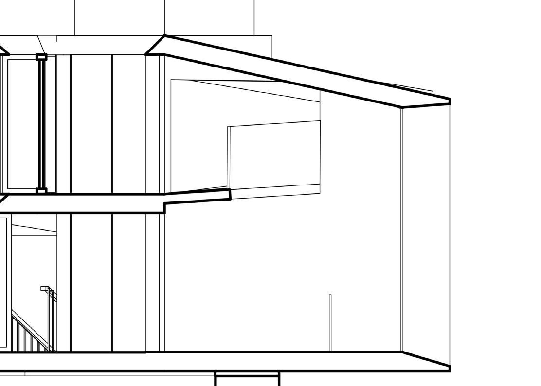
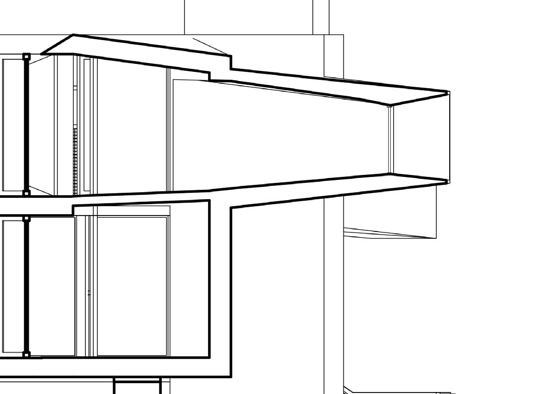
Alternative form allows for more south facing glazing higher up, as well as opening up the boundary between the ground floor and upper floor. However, that style of roof would be inconsistent with the rest of the design
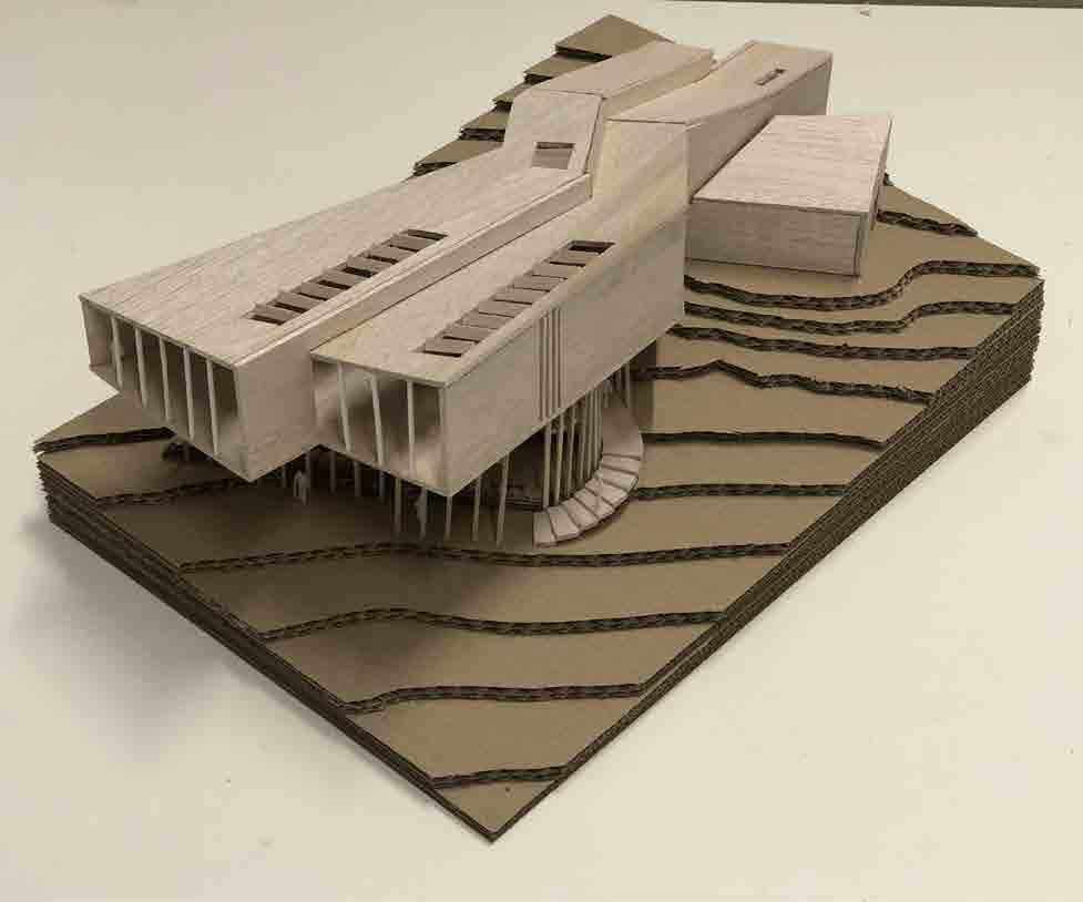
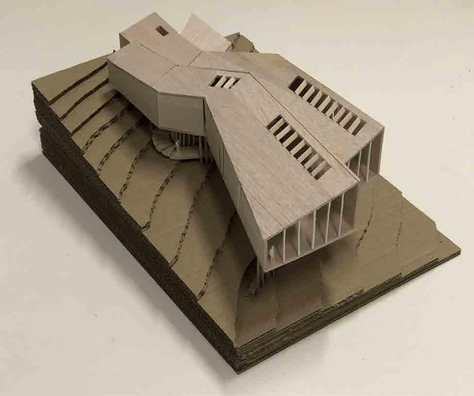
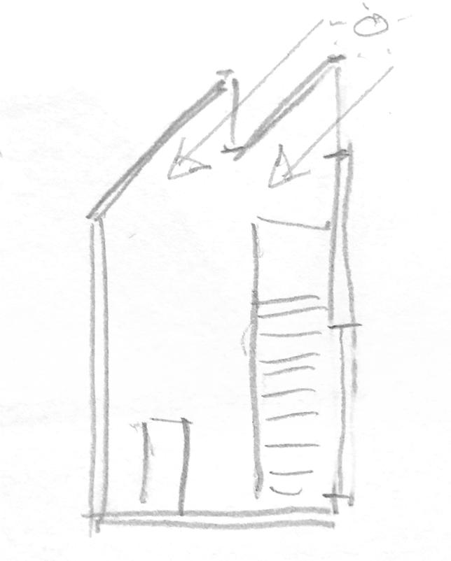
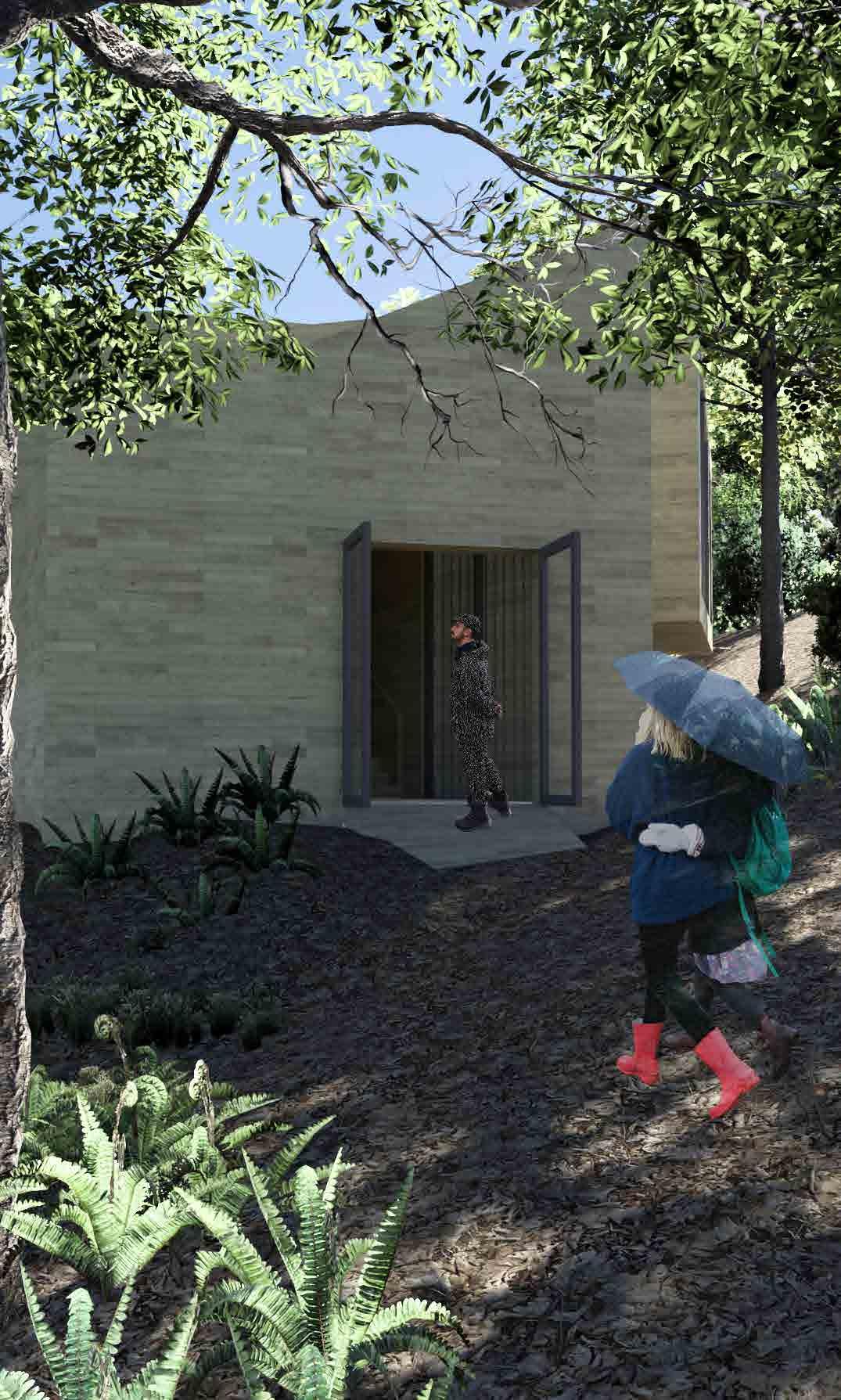
A further iteration that more closely echoes the roof construction of the rest of the visitor centre
REFERENCES
1. https://www.domino.com/content/where-i-work-beni-rugs/
2. https://inspiration.detail.de/visitors39-centre-on-the-trollstigen-plateau-107060.html
3. https://inspiration.detail.de/visitors39-centre-on-the-trollstigen-plateau-107060.html
4. https://inspiration.detail.de/visitors39-centre-on-the-trollstigen-plateau-107060.html
5. https://inspiration.detail.de/visitors39-centre-on-the-trollstigen-plateau-107060.html
6. https://inspiration.detail.de/process-auditorium-and-congress-centre-in-plasencia-114122.html
7. https://inspiration.detail.de/process-auditorium-and-congress-centre-in-plasencia-114122.html
8. https://inspiration.detail.de/process-auditorium-and-congress-centre-in-plasencia-114122.html
9. https://www.archdaily.com/440541/danish-national-maritime-museum-big/526332bde8e44ee8e1000173-danish-national-maritime-museum-big-photo?next_project=no
10. https://www.archdaily.com/440541/danish-national-maritime-museum-big/526332bde8e44ee8e1000173-danish-national-maritime-museum-big-photo?next_project=no
11. https://www.archdaily.com/440541/danish-national-maritime-museum-big/526332bde8e44ee8e1000173-danish-national-maritime-museum-big-photo?next_project=no
