JOIN US ON


JOIN US ON




Lucid PH - Design
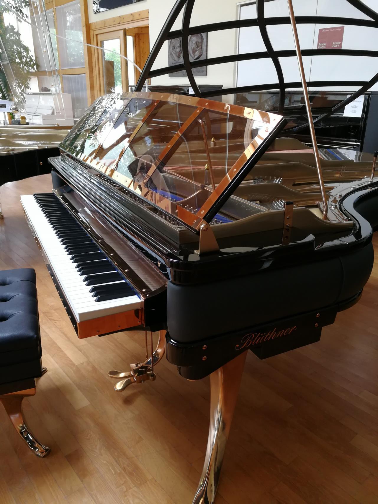
A design still belonging to the future. An imagination of a Danish Icon that brings style and beauty in any surrounding. Blüthner Quality manufacturing as in all of our Lucid Pianos Selection Design.





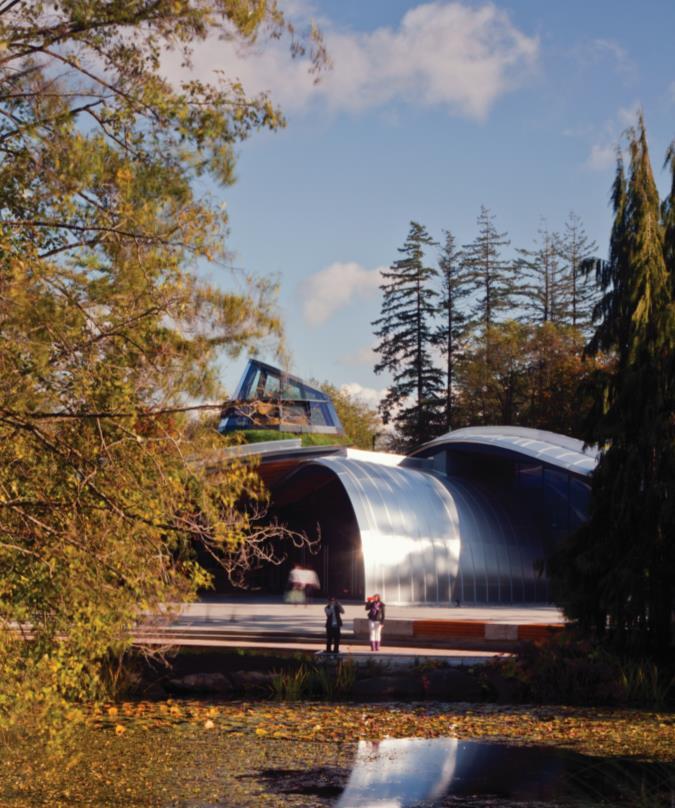
re you ready for this spring? Now the first warmer times have arrived and we all want to renew our spaces with new pieces. So we offer you the selection of new Design Trends but it isn't focused on bright colors; we preferred to opt for more sober and peaceful palette: from pastel pink to mysterious blue to calm shades of beige. A mild transition from winter to spring. Seeing nature reborn we feel more in touch with it, and seizing the opportunity we want to address with you the theme of the protection of Our Planet This time we decided to approach through architecture, by which many studios have decided to contribute to the protection of the environment by applying new construction techniques and using natural materials Named “Most Sustainable Building of the Year” by World Architecture News, the VanDusen Botanical Garden’s Visitor Centre is the perfect example of public expression of sustainability As well as Langtin Yuanzhu Experience Hall in China, a floating building that mixes with the landscape of the nature. And finally we have reserved a series of houses built in the woods where nature is the only neighbor you have. Give it a go! It'll certainly be a unique experience. Enjoy this trip in nature!



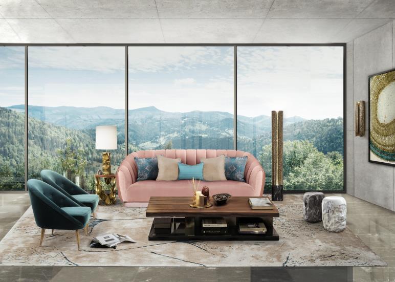


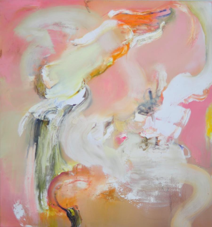
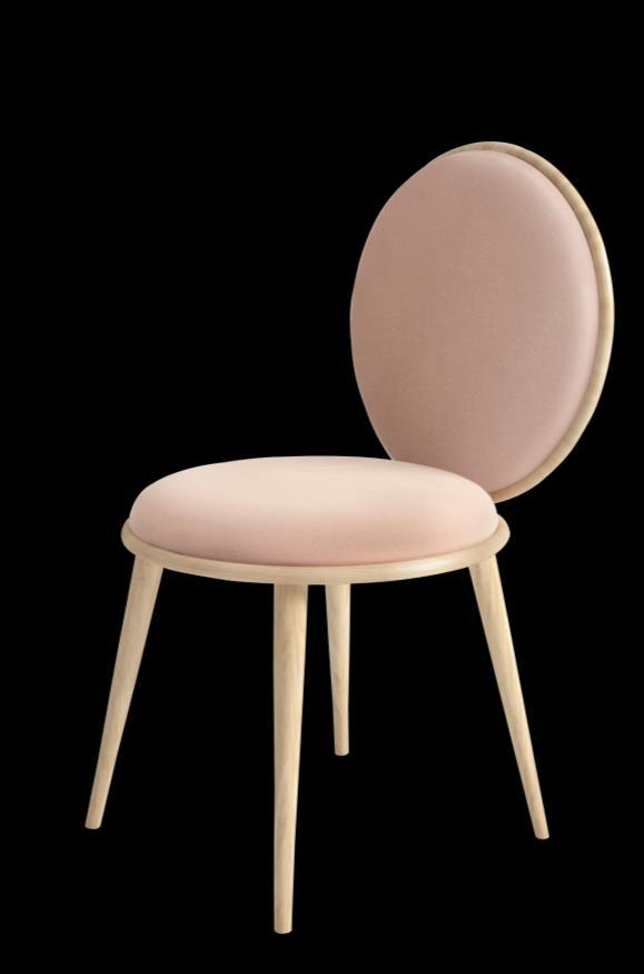

Are you ready to embrace this spring? We propose a rich selection of colors, with pastels making a recurrence, along with intense and warm shades that surely give the warmth to your spaces.
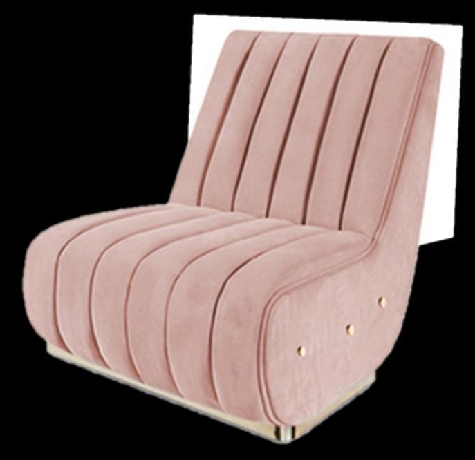

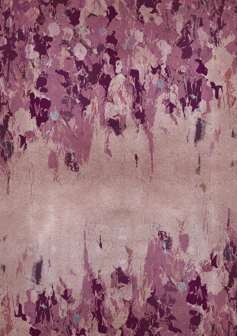
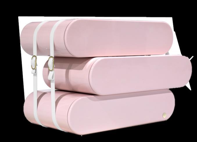
Blush rose
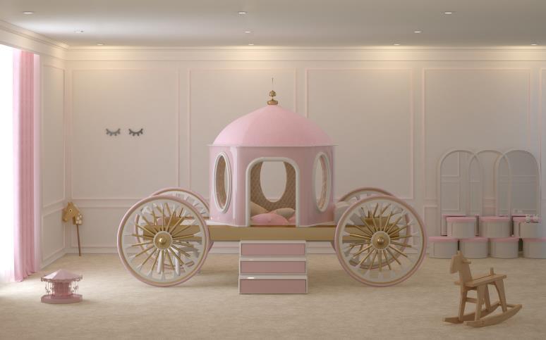
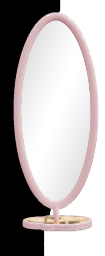
STARTING THE SPRING 2019 TRENDS DELICATE NOTE, THERE IS AN ALMOST TRANSPARENT ROSE THAT IS PERFECT TO PAIR WITH ALL THE OTHER COLORS ON THIS LIST
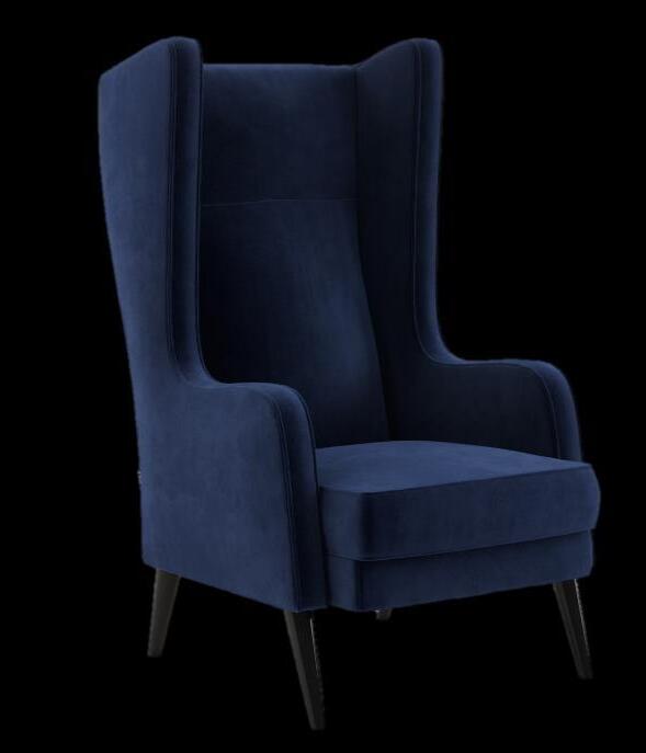
Hudson Armchair by ESSENTIAL HOME
Clerk Armchair by BRABBU
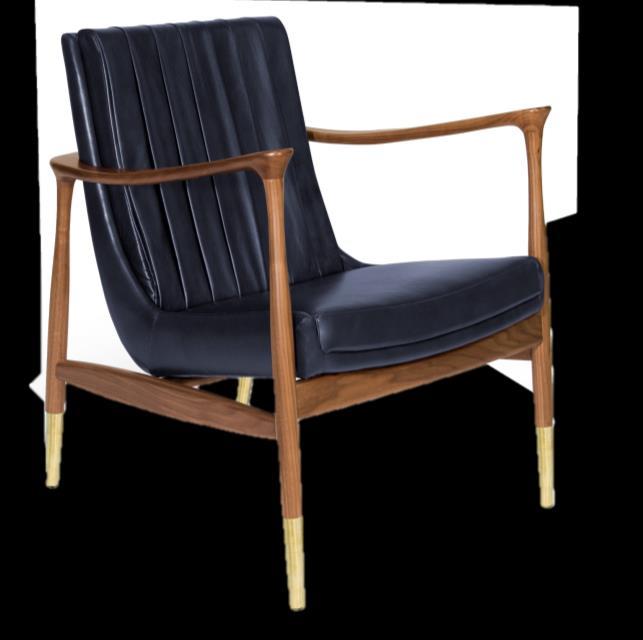

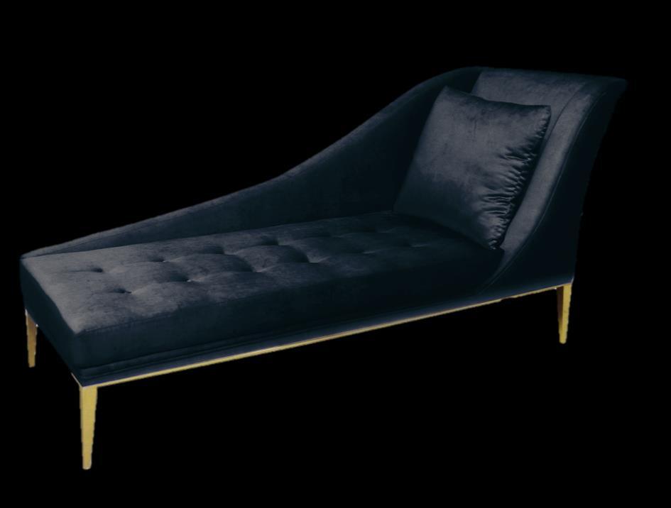
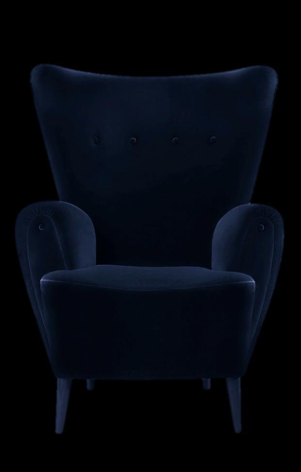
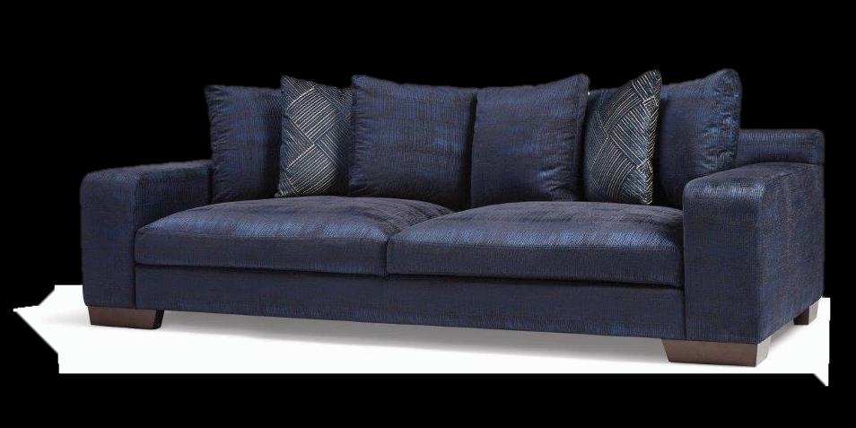
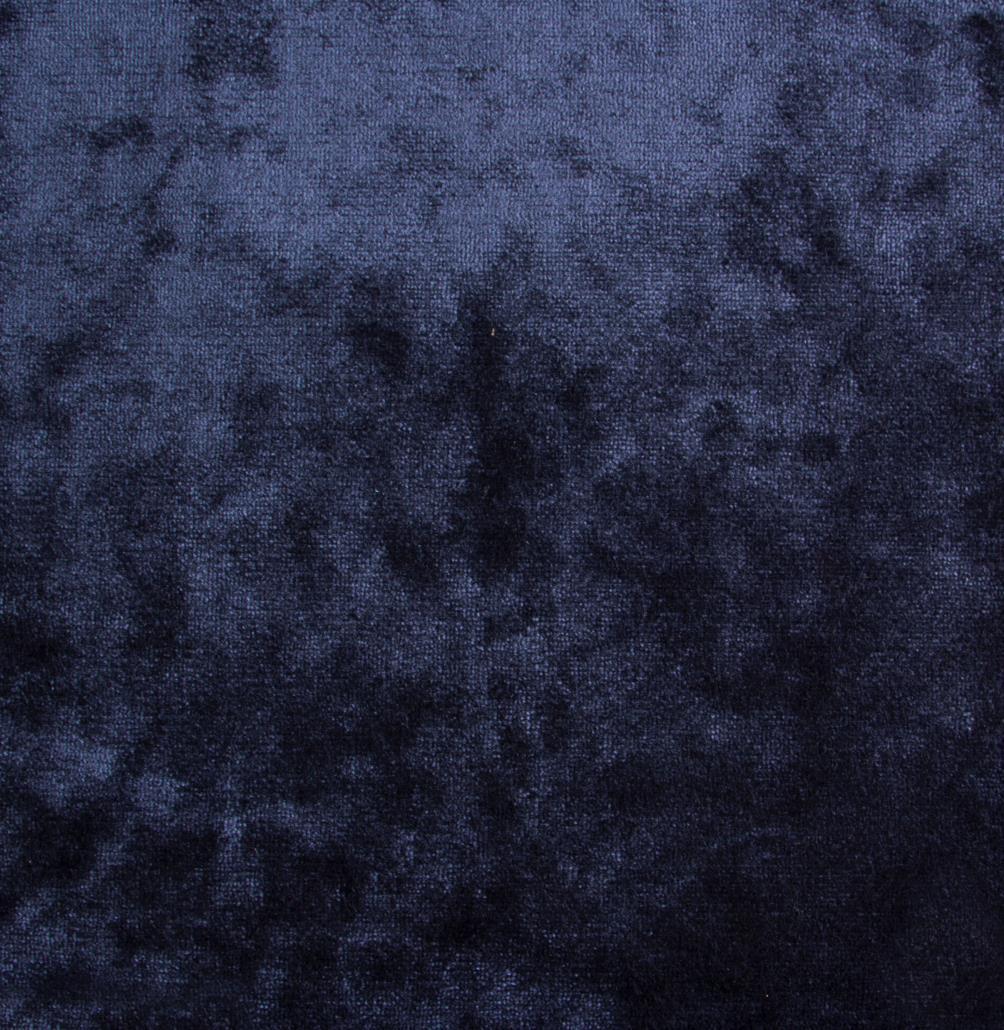
THIS NAVY BLUE GETS AS CLOSE AS POSSIBLE TO BLACK TERRITORY, WITHOUT EVER FULLY GIVING UP ON ITS BLUE NATURE. IT IS A DARK AND MYSTERIOUS SPRING 2019 TREND THAT GOES WELL WITH ALL THE COLORS IN THIS SECTION
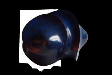
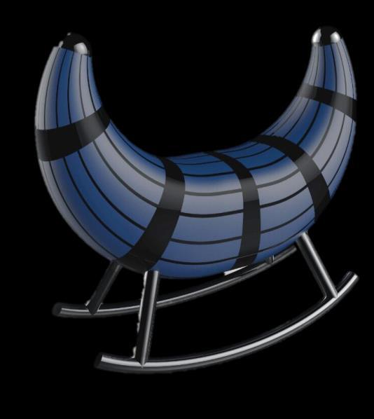
Hélix
Sculpture by JEAN-CHRISTOPHE COURADIN
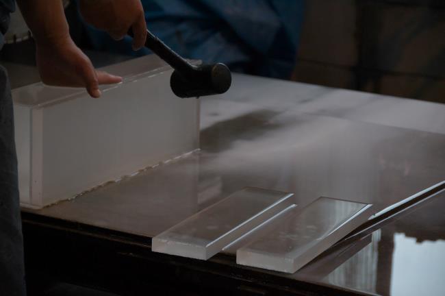

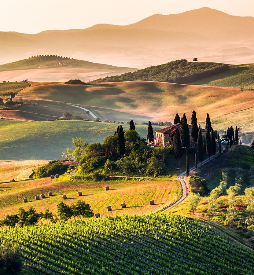
Enjoy the journey in our sustainable world of delicacy from the Italian regions.

Nymph
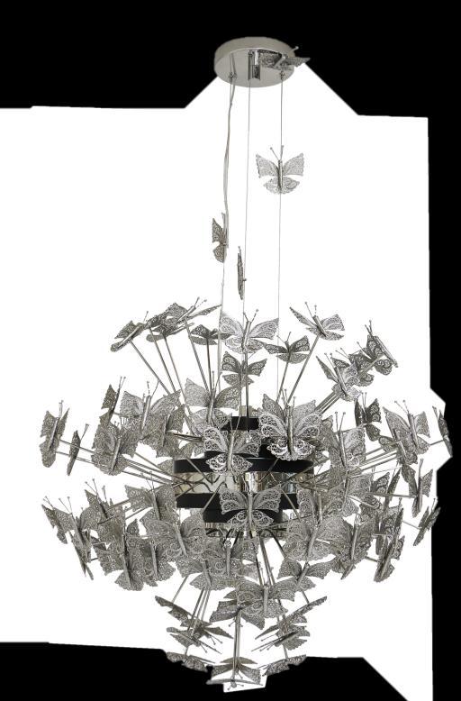
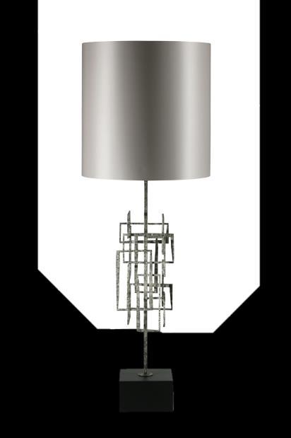
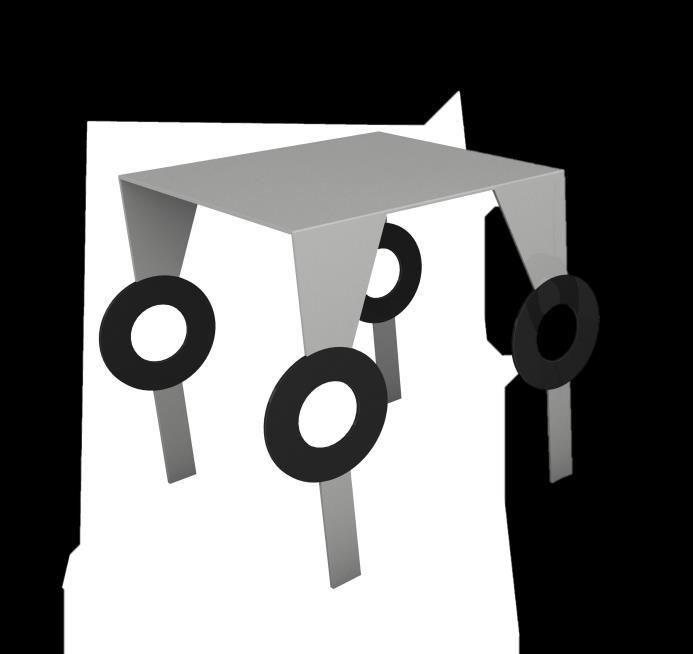
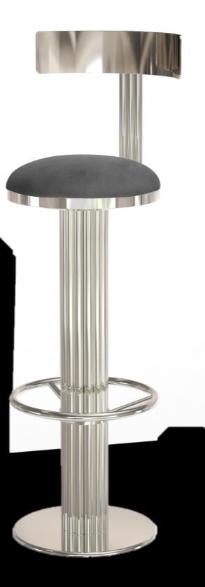
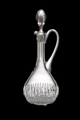
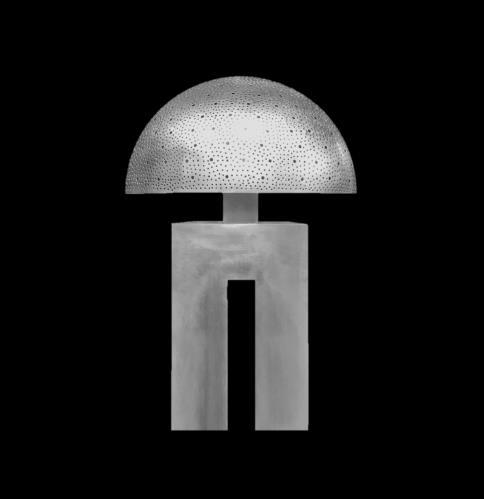
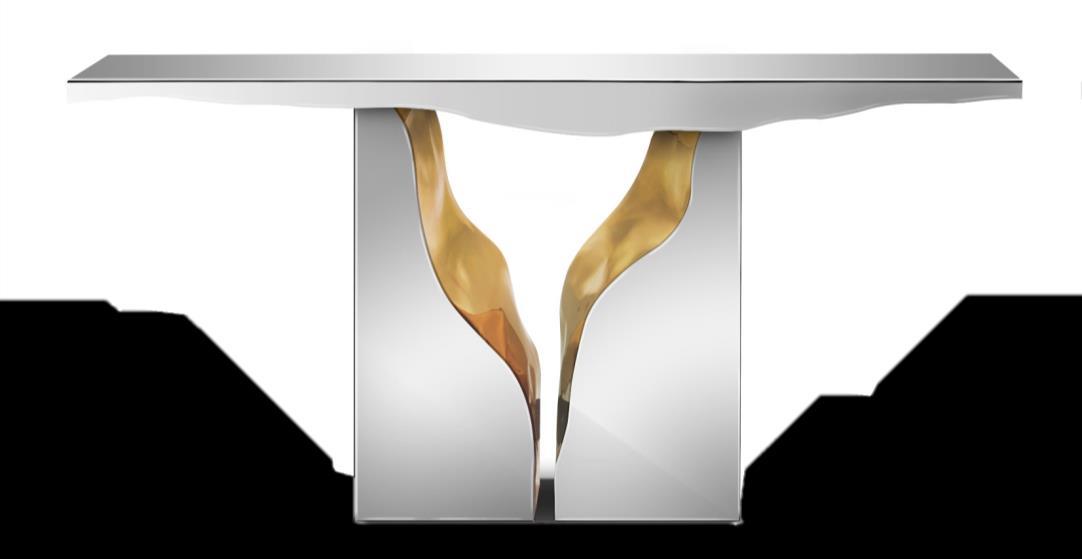
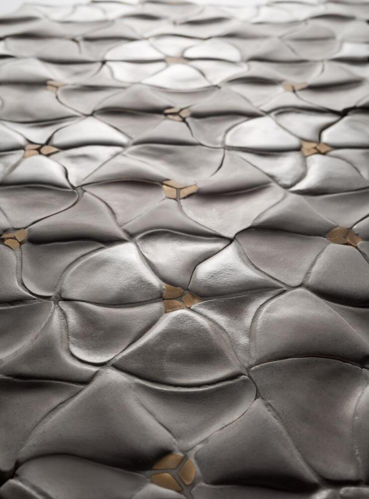
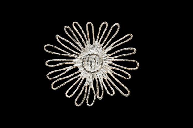
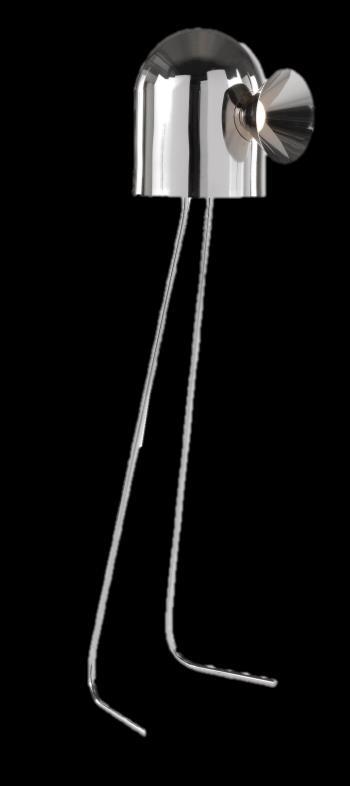
LUXURIOUS AND FIERCE. THE PIECES IN SILVER IS IMMEDIATELY NOTICEABLE, ESPECIALLY IF ACCOMPANIED BY METALLIC FINISHES AND MODERN FORMS FROM A FUTURISTIC INSPIRATION

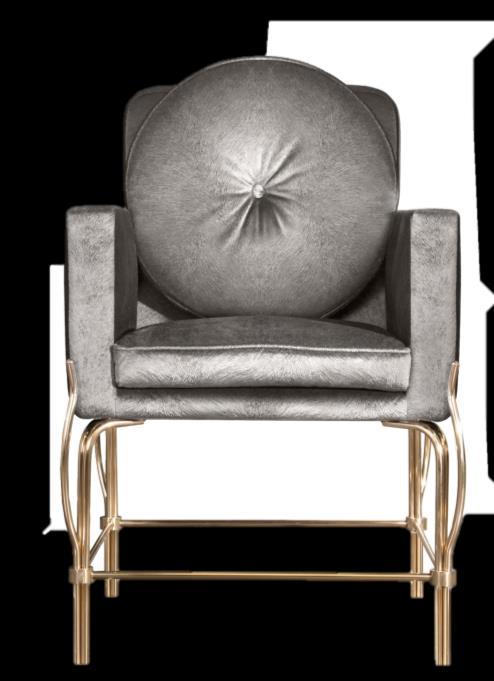
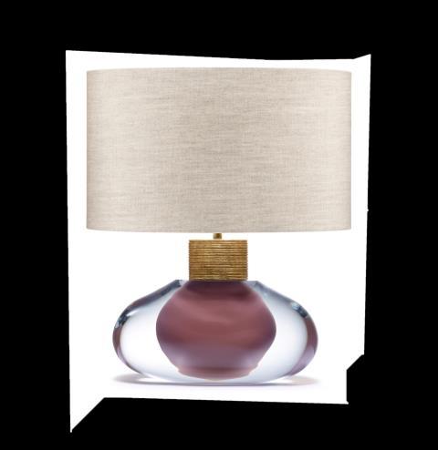
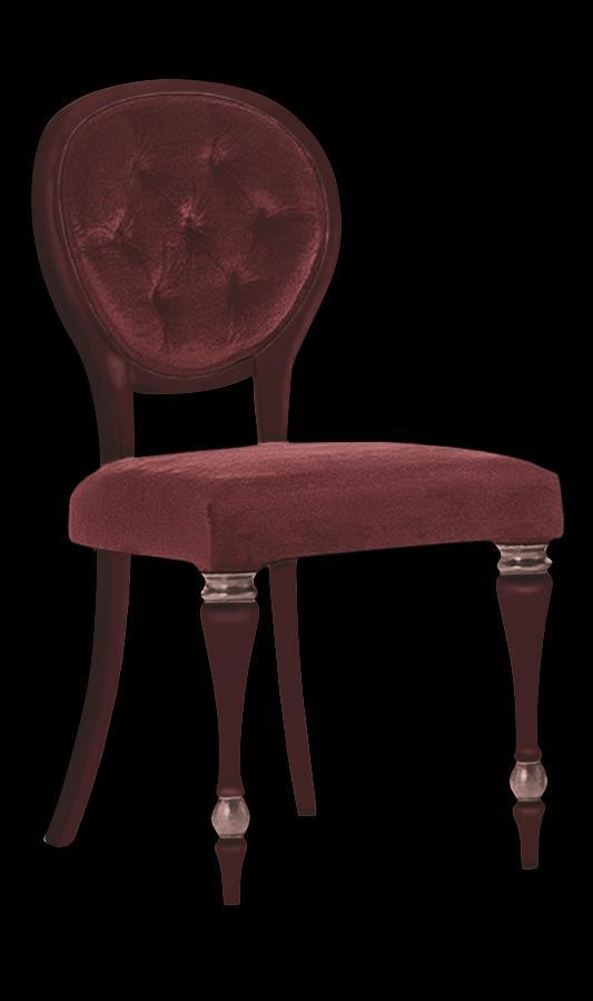
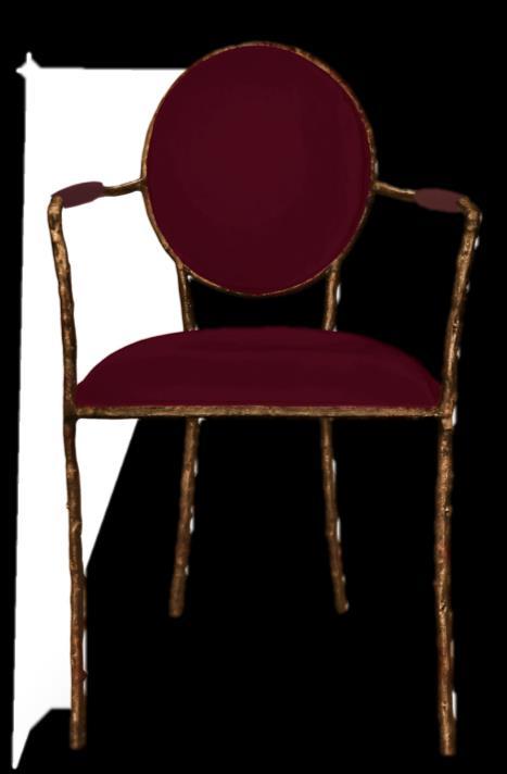
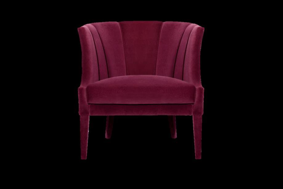

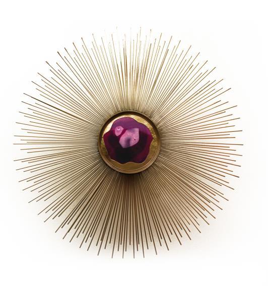
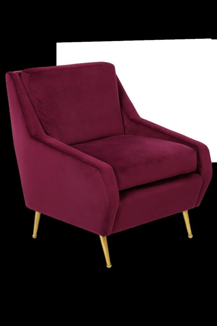
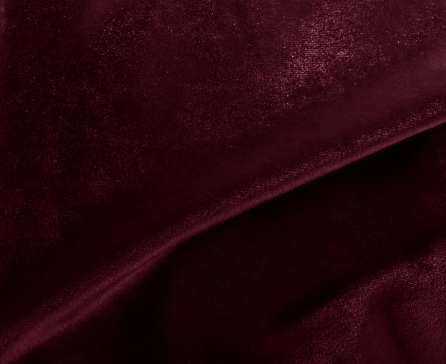
THE DARK SHADES OF AN INTENSE MAGENTA THAT CANNOT BE IGNORED. IT CAN BE MIXED WITH
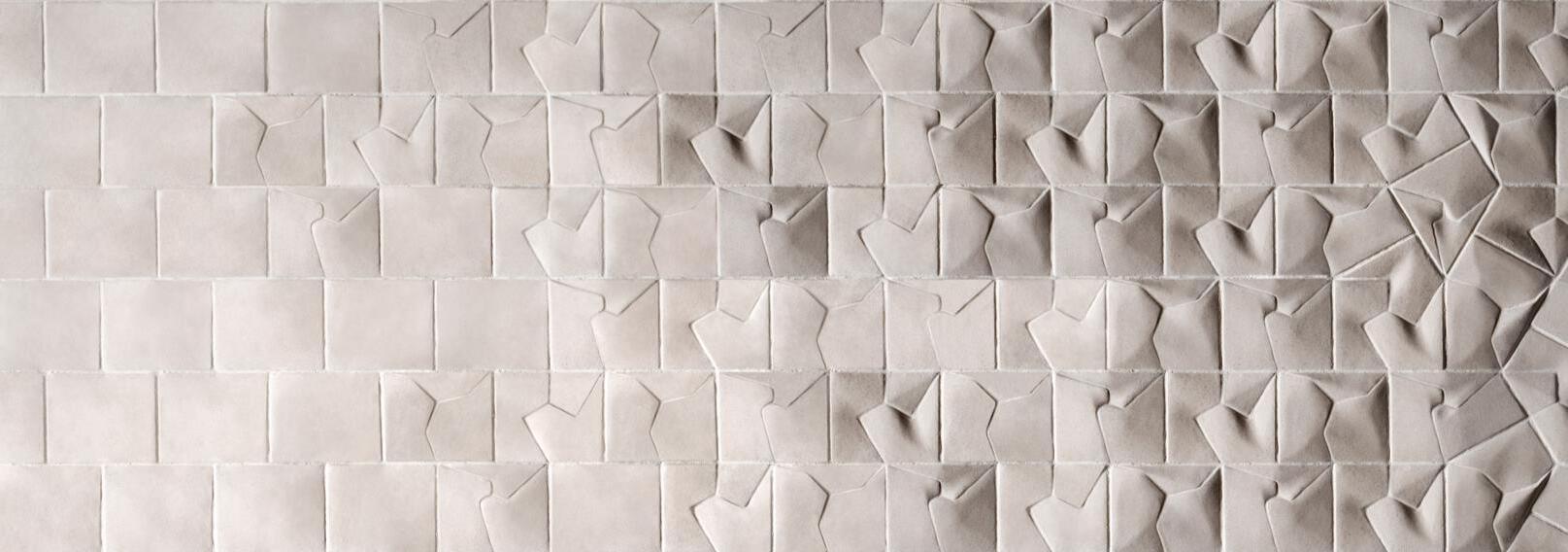
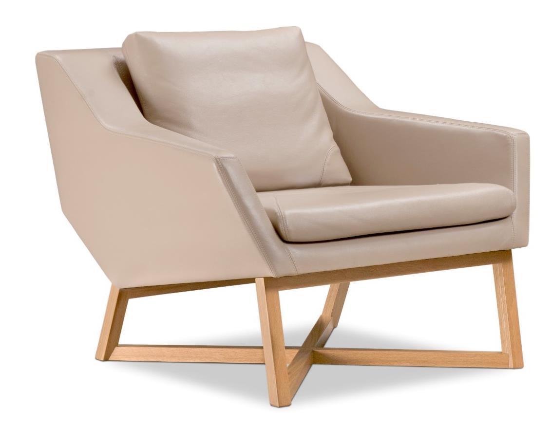
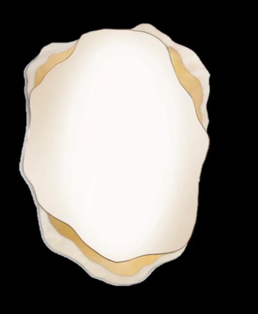
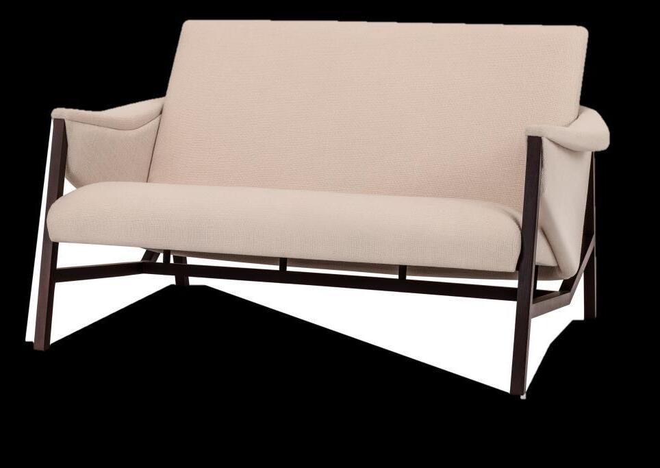
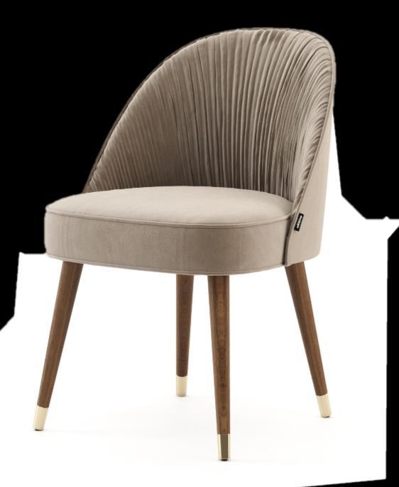
SHADES OF CREAMY TAN AND BEIGE - AN ELEGANT TREND IN YOUR INTERIORS! FROM THE LIGHTEST TO THE DARKEST TO MAKE SURE EVERYONE FINDS THE EXACT SHADE TO FLATTER
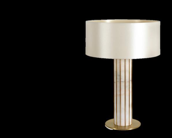
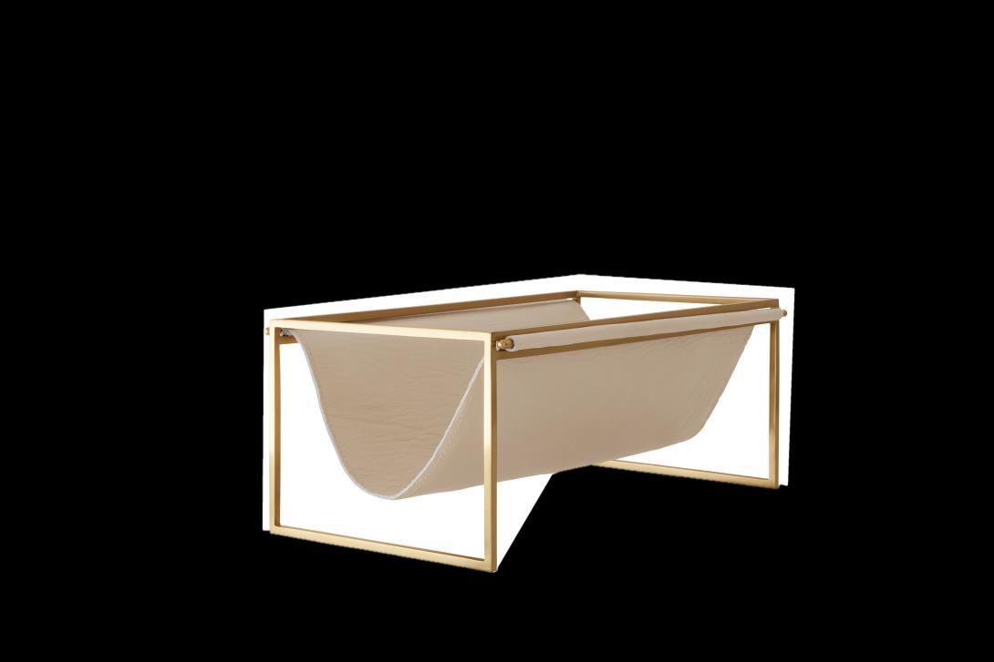
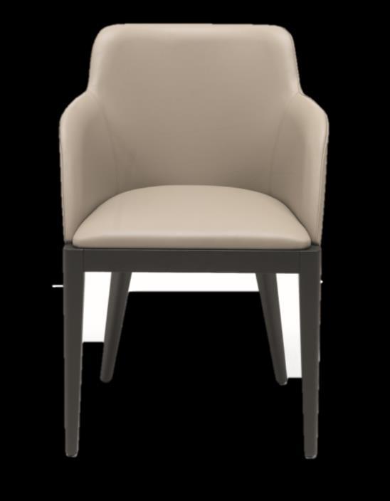
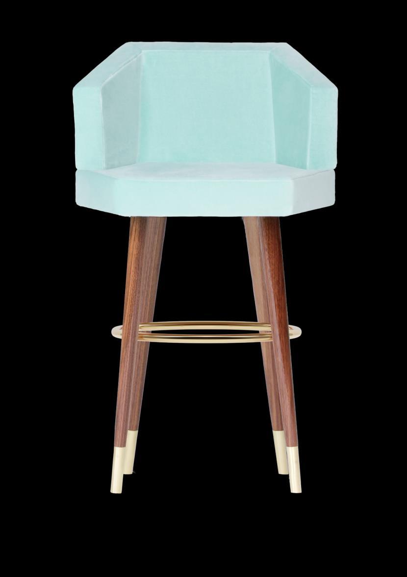
The geometrical form of Honeybee stool by Royal Stranger allied to the royal velvet, the wooden and the metal elements reflect a sense of luxury and at the same time gives a great experience of comfort.
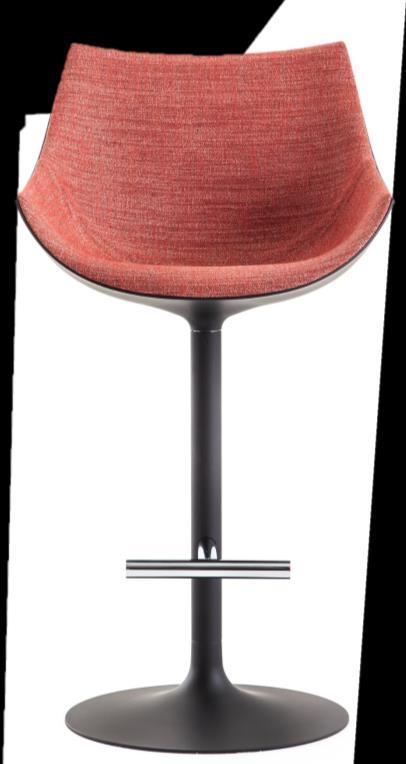
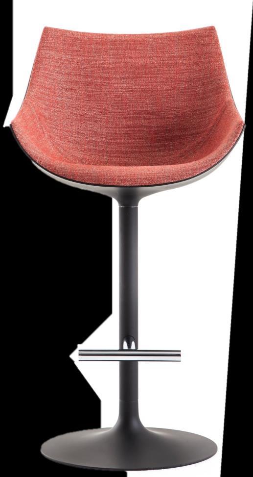
Cassina and internationally renowned creator Philippe Starck introduce Caprice, a continuous evolution for an eclectic collection! It's a 360° swivel bar stool with a stem base perfect for residential or contract use. The padded upholstery in fabric is closely fitted to the chair like a tailored garment, naturally welcoming the body to create a fluid design.
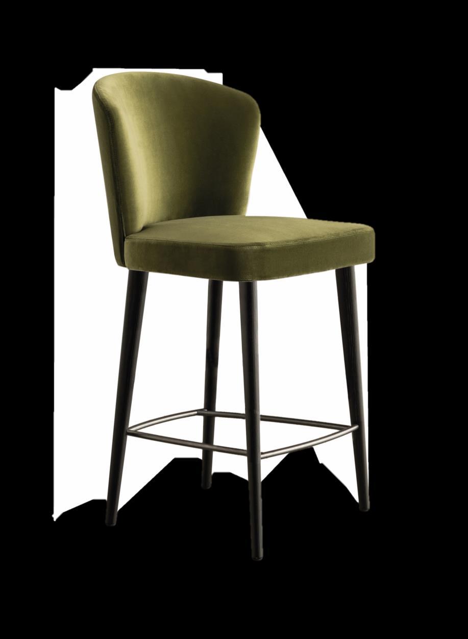

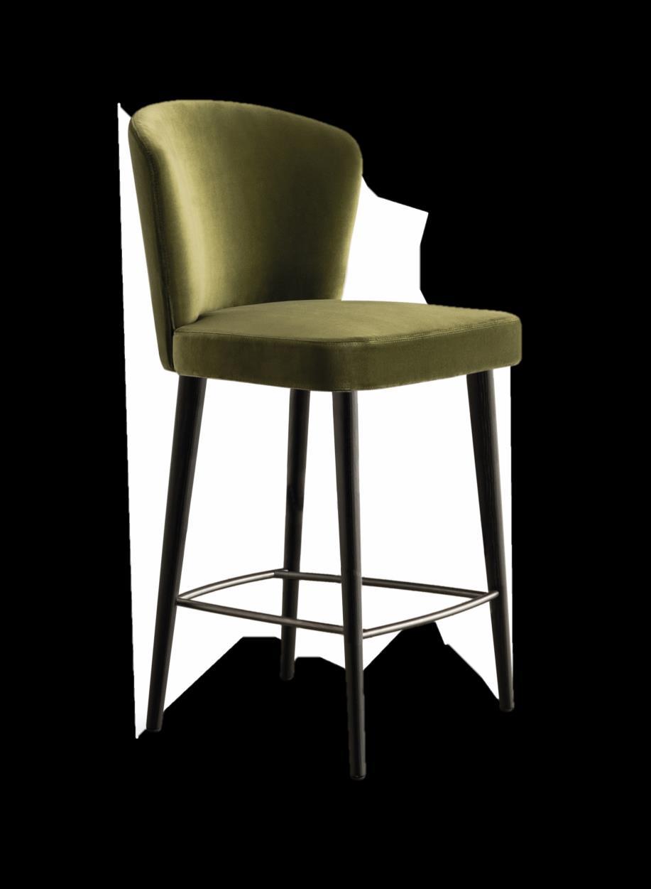
Designed by Rodolfo Dordoni for Minotti, the Aston, with its soft, inviting cushioned seat guarantees you a right comfort. tapered wood legs made of ash give a touch of sobriety accompanied meanwhile the footrests in Pewter color steel represent a detail of finesse. It's a will not go unremarkable in your kitchen!

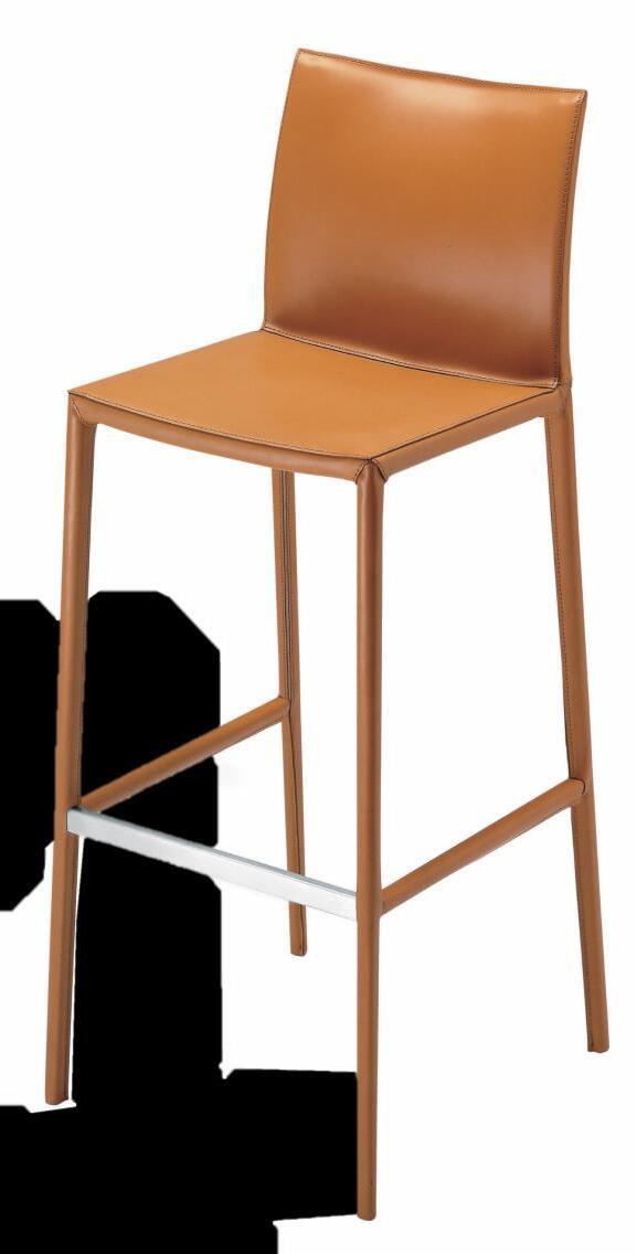
Zanotta presents Leo designed by Roberto Barbieri as a practical and essential piece that satisfies the different situations of use, home and contract. Thanks to its side made of a single piece in cast aluminum, it gives an elegant and precious design.
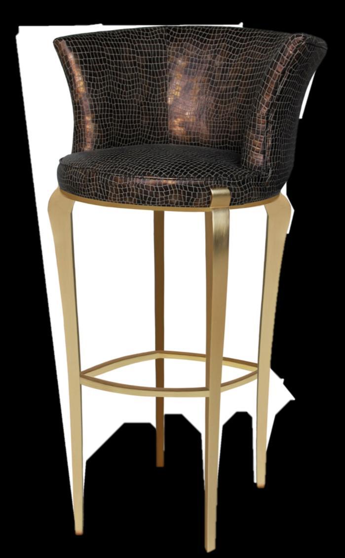
This exquisite bar stool by Koket embraces you with its heavenly curves and luscious accents.
This upholstered delicacy is accented by iridescent lux croc fabric with curvy and sweet feet in gold leaf with high gloss finish.
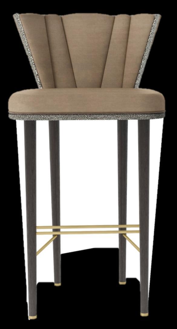
Belfast by Frato is an accurate choice that will scuzzy your spaces. With a dark beige color, this bar stool conquers the attention of anyone who enters in your kitchen giving a touch of character and luxury style.
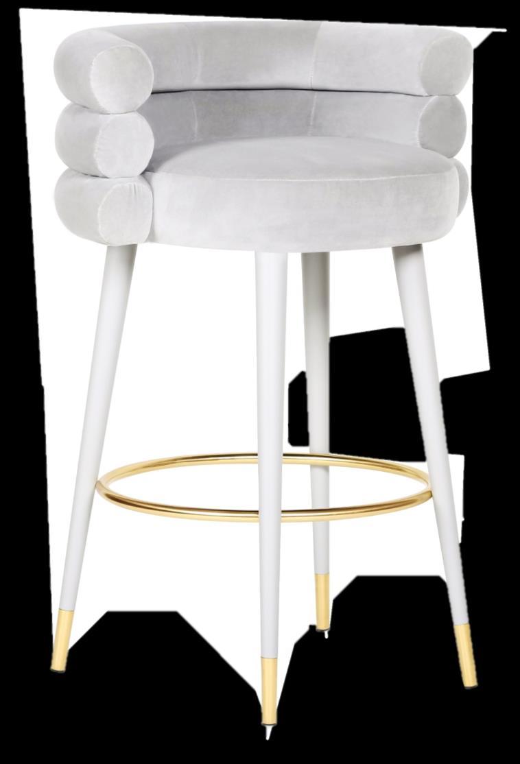
It's the round and sweet shaped bar stool by Royal Stranger with a comfortable upholstery composed by round elements on your back and a complete one on your seat. Thanks to light grey royal velvet upholstery elevated by lacquered finish to the same color, this piece is perfect to give the harmony in your kitchen.
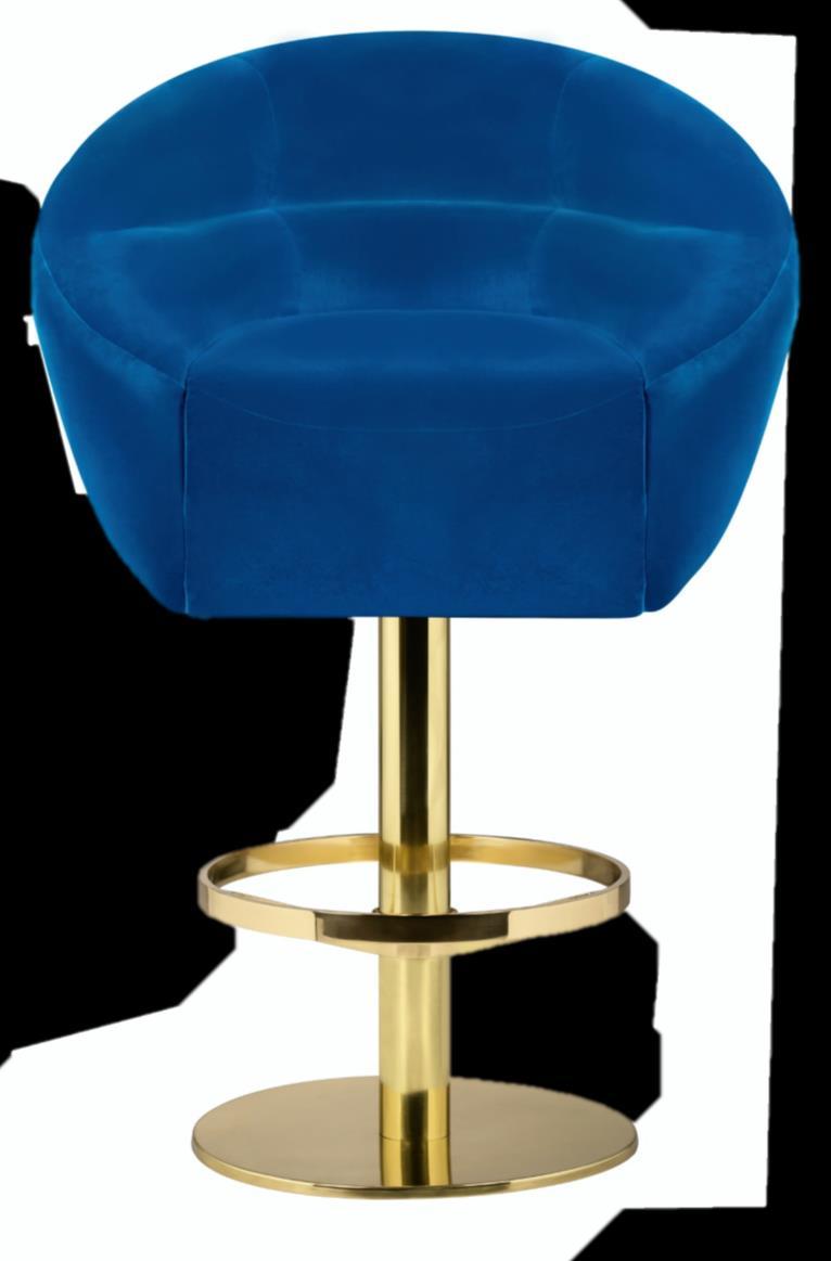

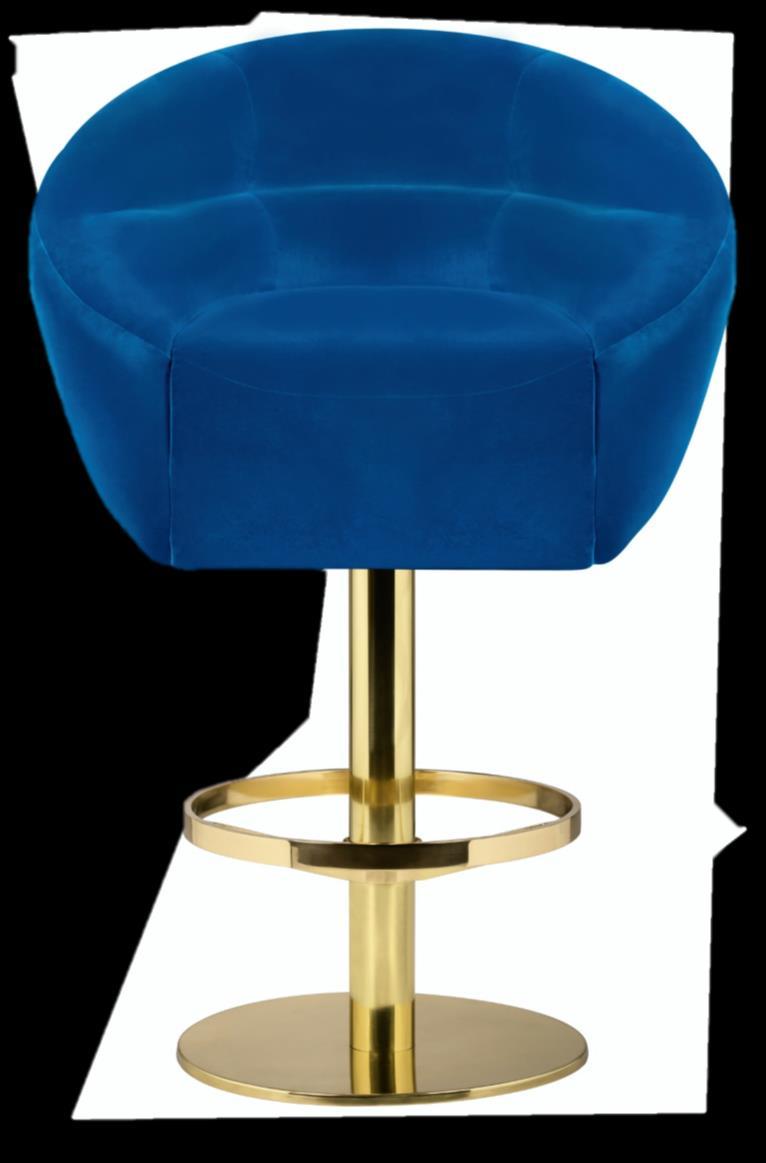
Maa by Brabbu is the language spoken by the MAASAI tribe, a language with a harmonious vowel. This harmony was the inspiration for the Maa bar stool. The combination of its shape with singular colour and the twill delicacy brings the detail that will make every room speak harmoniously.
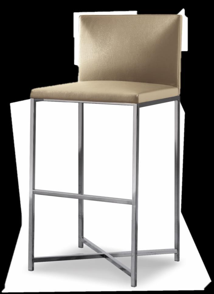
Inspired in the mid-century design but with a contemporary twist, Mansfield by Essential is an accent bar chair with round shape body. Supported polished brass base and a footrest for comfort, Mansfield is upholstered in a sophisticated velvet and a stylish design. A masterpiece for your decor.
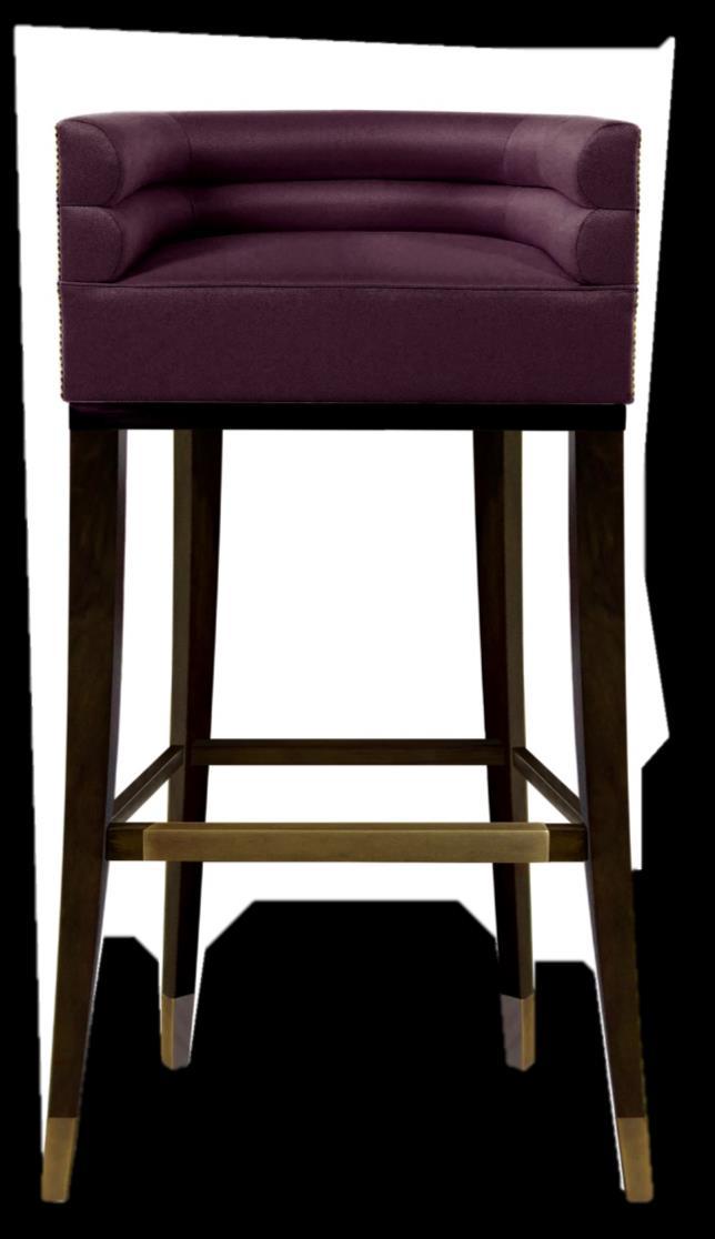

Rodolfo Dordoni created the Flynt bar stool for Minotti mixing craftsmanship and creativity, thus obtaining a unique piece of its kind. Italian design and the sleek lines of this bar stool will surely amaze all those who enter your kitchen.

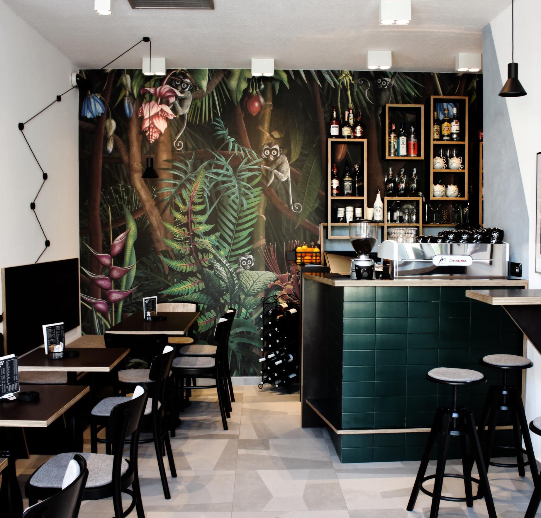
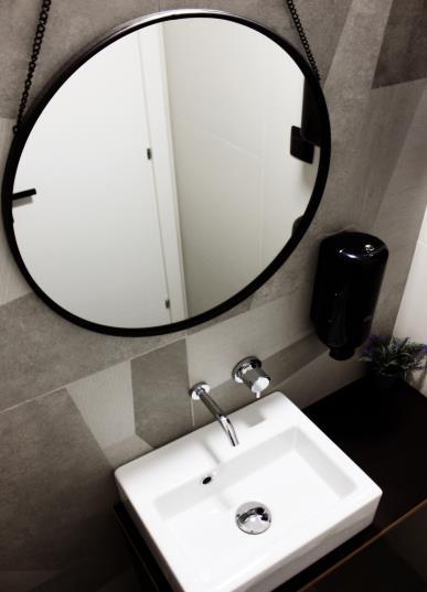
In the centre of Rijeka, Kancelarija Bar – recently opened – it’s very noticeable because of its interiors, original and accurate to the smallest details. A different and polyhedral approach, for a "hybrid" place between cafeteria and office. For the toilets, the unmistakable design of Ritmonio was chosen with the Reverso series in chrome. Reverso finds its perfect place in this unique context of public hospitality, which shares the mission of reserving an original experience for guests: this new "Bar Office" has already become the favourite place for smart workers or anyone who wants to socialize. www.ritmonio.it
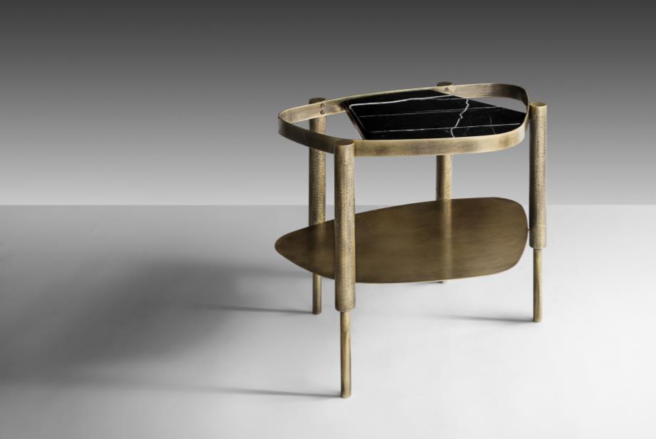
The beauty of the piece lies in its apparent abandonment of any rigorous design rules or clear-cut aesthetic; it is a piece that has emerged organically rather than been born on the computer screen.
The new Tusa armchair designed by Rodolfo Dordoni is the sophisticated piece to enrich your spaces. It’s
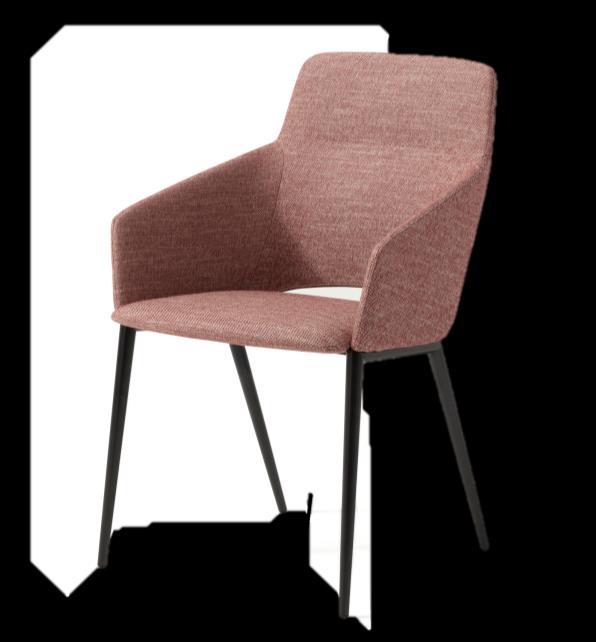
distinguished by a cosy shape and a subtle and rounded outline with well-defined lines. The little padded back and seat provide comfort and support to posture. www.zanotta.it
OKHA launched the Bijou Marble side table - a new take on an earlier prototype released in 2018 which was simply named Bijou. The organic, soft geometry of the table presents the viewer with a completely unique perspective from every angle. There is a sense of the irregular, a random logic, an intuitiveness to the design that speaks of the human hand, nature, not the cold logic of factory or the machine. www.okha.com
“The elements that define this armchair are all in the product name “Tusa”: the emphasis of legs, the tailor-made versions of the backrest high or low, as well as the historic irony of the Zanotta brand.”
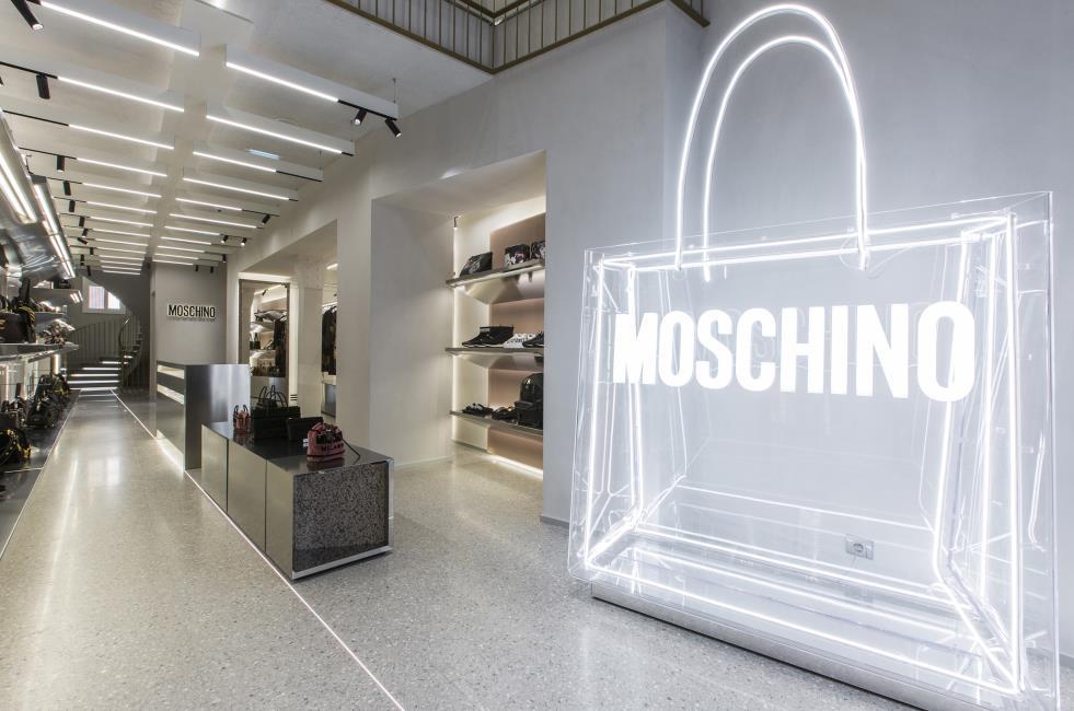
The new Moschino flagship store in the heart of the French capital is in a stately late 18th century Pierre de Paris building. Creative Director Jeremy Scott chose to give it the form of an exhibition route inspired by contemporary art galleries. An exquisite touch has been added to the Fior di Pesco Carnico marble boutique by Margraf, the world’s only quarry of which is owned by the company. www.margraf.it


COMING SOON
Hong Kong: Designed by Suraksha Acharya of Midori Architects, a Chennai based practice, Aero Hive aims to challenge the common belief that contemporary tall buildings cannot be ventilated naturally due to their height and serves as a model of sustainability. Key to these forms of adaptation is the relationship of the building to their environment and the contextual forces that shape the form development and its environmental behavior. Aero Hive is a breathing entity. The breath of this building transpires through vertical diaphragms in the form of green sky atriums that behave as lungs, performing the intake of oxygen and removal of carbon dioxide. This exchange is a way of natural ventilation and is the preferred option when attempting to deliver fresh air to any space due to its low energy requirements. www.midoriarchitects.com
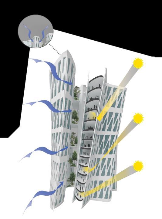
Visualization byVizis, Chennai
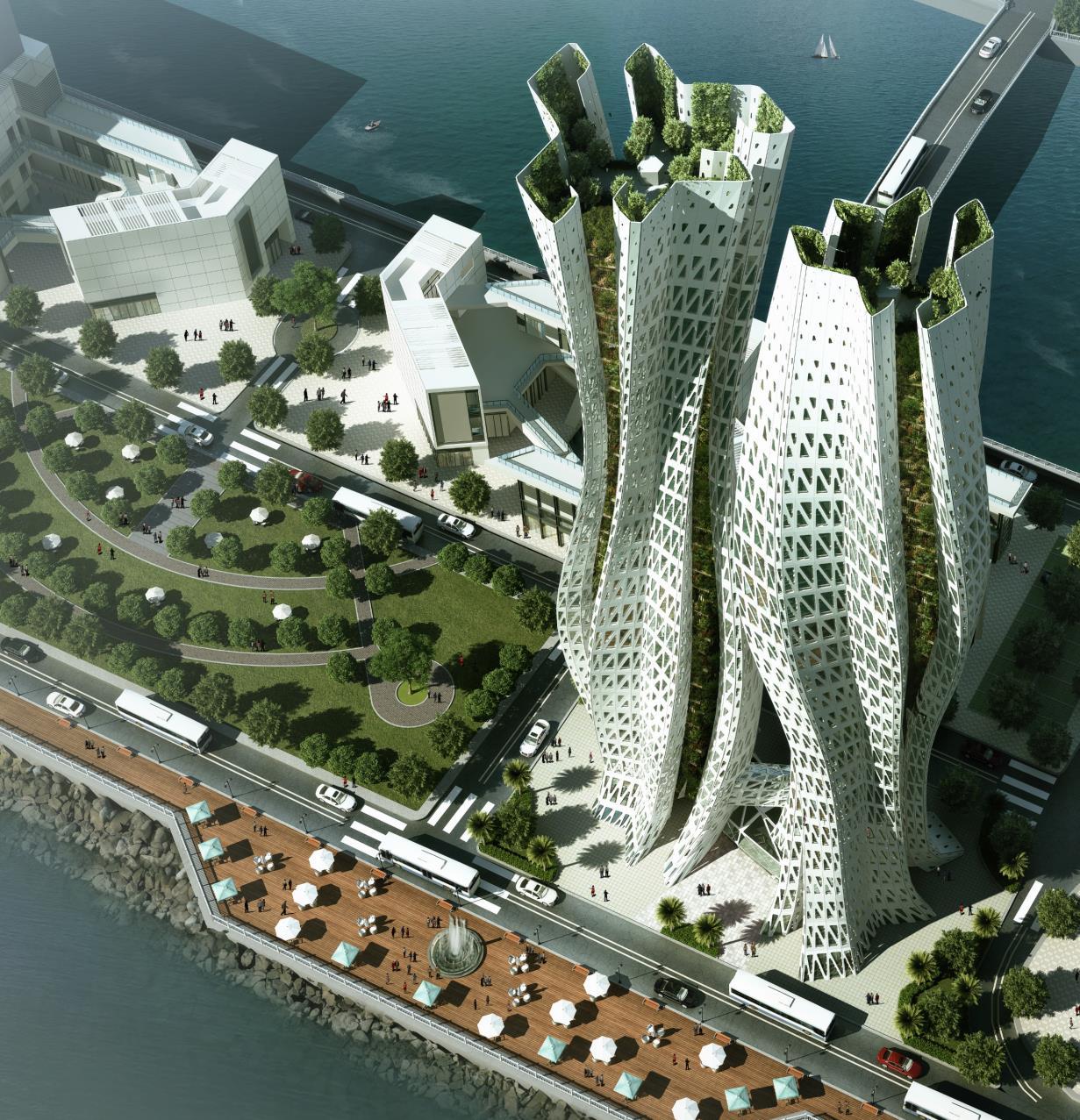
Environmental factors and structural concepts shape the form and skin of this tower. For optimum environmental operating efficiency, the building form should be accordingly shaped, maximizing sun control for different solar angles and insolation intensities. A series of shading & insolation (Wh) studies conducted showed that twisting the tapered hexagonal form 90 degrees clockwise (north west quadrant) and anticlockwise (south east quadrant) yielded self shading benefits. In addition, the towers (Tower A & Tower B) are positioned such that they mutually shade each other at different times of the day and year.
Parametric modelling by Rat[LAB], New Delhi

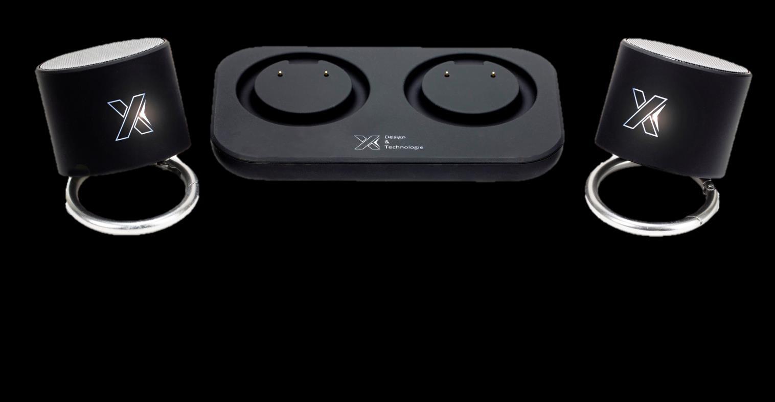
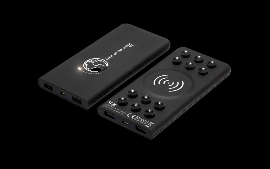


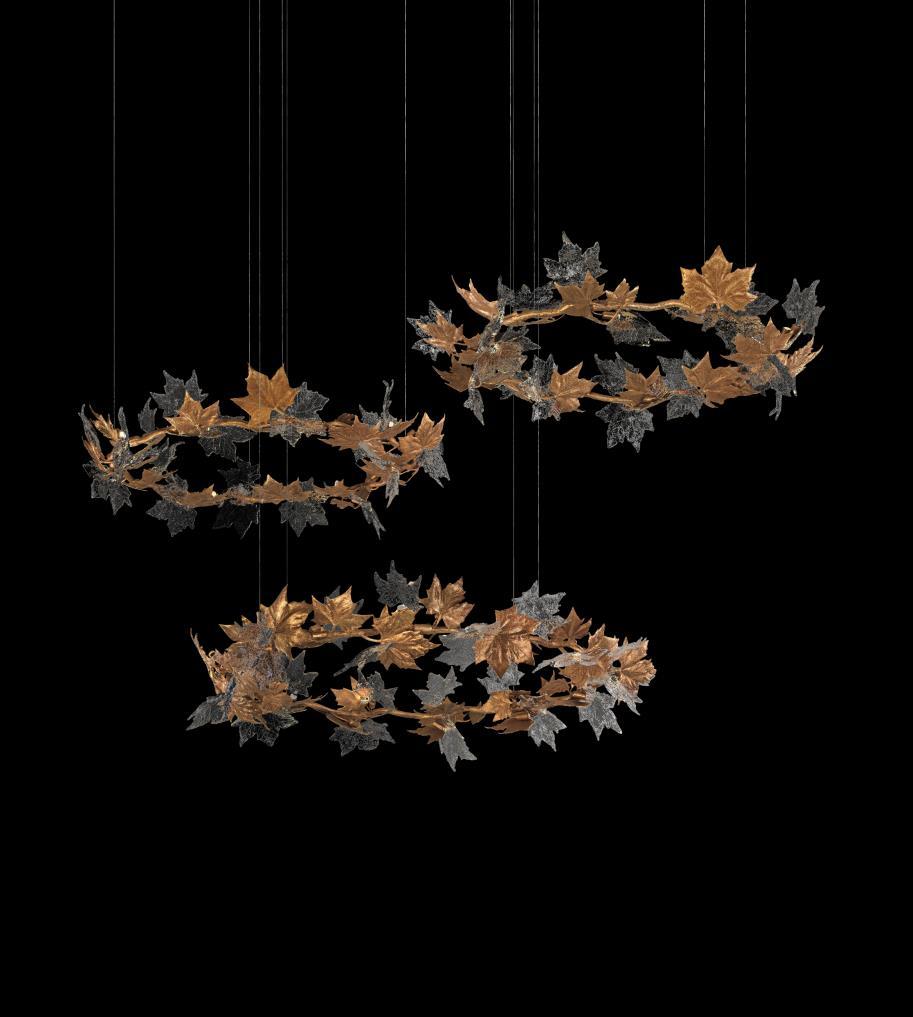
Serip presents its new collection Folio that will be showed at Design Shanghai from 6-9 March. Like a fragment of a whole, the Folio Collection has the intensity of a still moment directly withdrawn from nature. The natural form reflects the arbitrary composition of patterns in a complex set of reflections and contrasts resulting in a sense of an enchanted environment. www.serip.com.pt
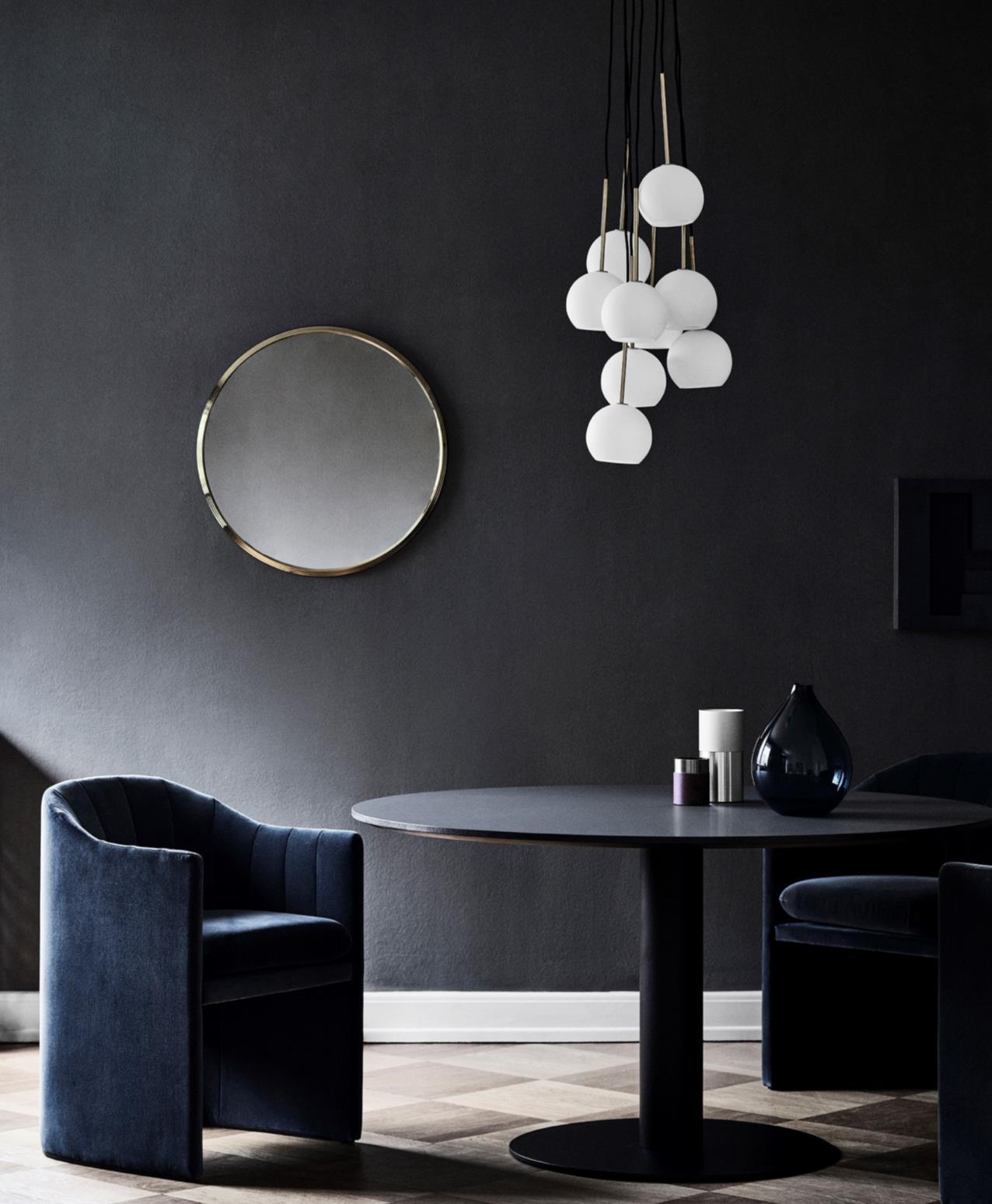
“Our vision was to create something intimate yet still open,..»
Plush to the touch and conducive to conversation, the new Loafer chair SC24 is an elegant piece designed by Space Copenhagen for &Tradition. As its name suggests, the Loafer chair is for unwinding and reclining. Designed so you’ll want to linger longer to enjoy your guests – and every moment in between – the new, fully upholstered dining iteration lets you indulge in any culinary experience in supreme comfort. www.andtradition.com
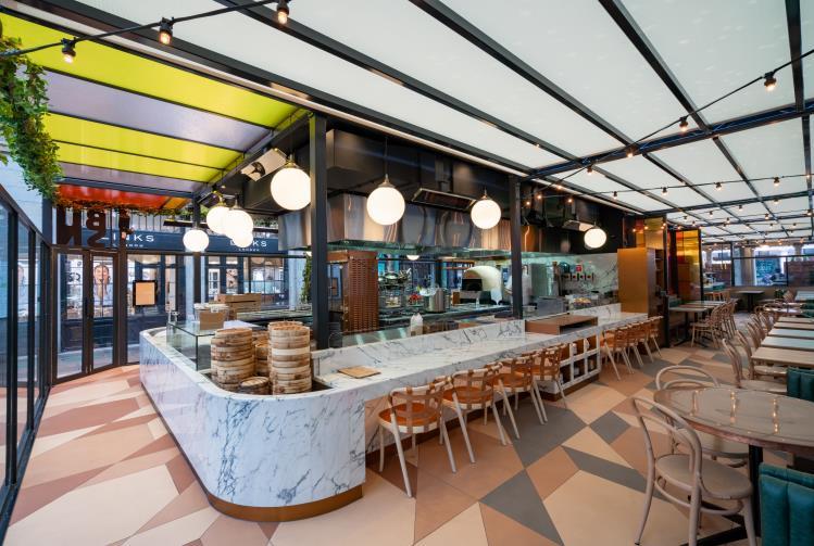
Leading architecture and interior design studio Michaelis Boyd has just completed the design of Buns & Buns, an eclectic restaurant offering a curated selection of innovative and traditional dishes paired with breads and buns from around the world. The restaurant is located in one of London’s most iconic destinations, Covent Garden’s Piazza. www.michaelisboyd.com
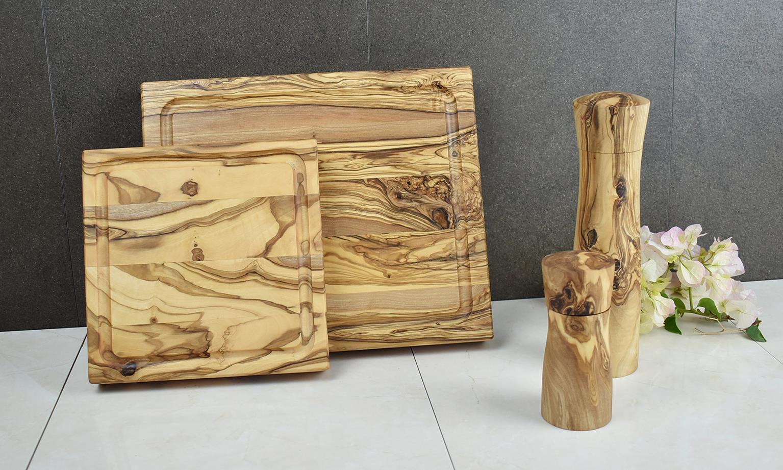

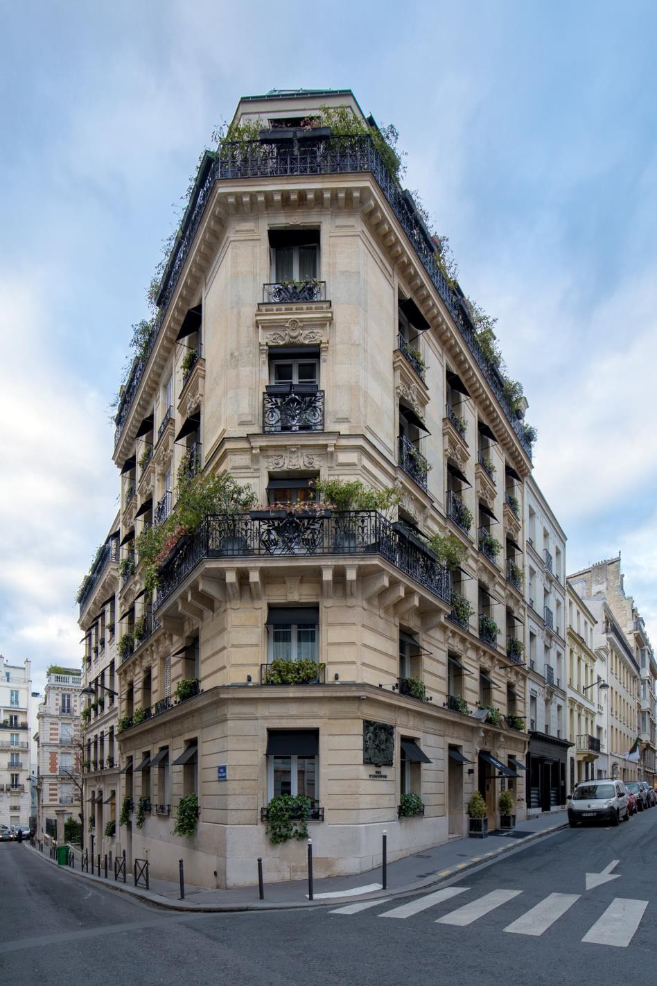
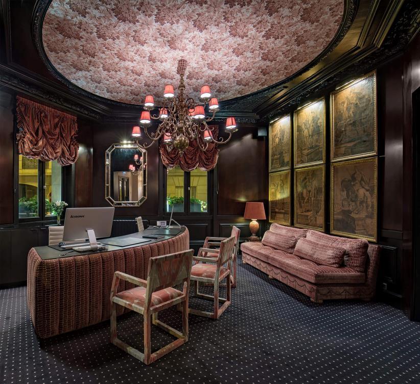
Room Mate Hotels presents Room Mate Alain, its first hotel in Paris; a unique space, with 50 rooms created by the famous interior designer Lorenzo Castillo, who created an elegant environment that focuses on details, in a spectacular building whose facade has been entirely preserved. www.room-matehotels.com
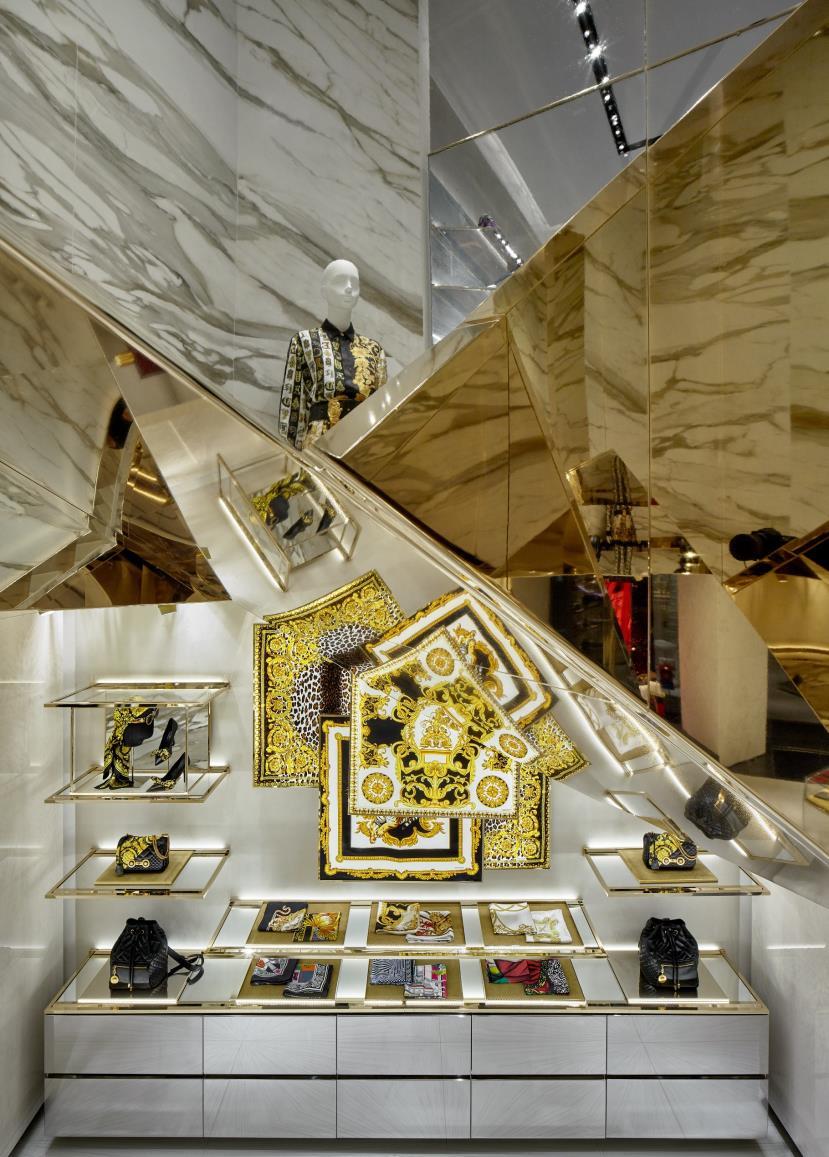
Curiosity, a multidisciplinary based study in Tokyo, presents its new project created by designer Gwenael Nicolas: Versace store in Munich - the second store following Miami Bal Harbour store which unveiled the new retail concept of the Italian fashion brand. Like all the projects, this new opening reflects the architectural style of the designer with attention to the smallest details. Strong visual impact with gold elements and lozenge pattern are also shown in the Munich store following the updated concept in Miami. Limited color palette and selected material accentuate hyper graphical items of the brand. www.curiosity.jp


2

Klara
• stylist | photographer | mum and wife��
• scandinavian interior | minimalist design
@kajastef
Fredi �� �� Dies. Das. Ananas.

3

@federica_miranda
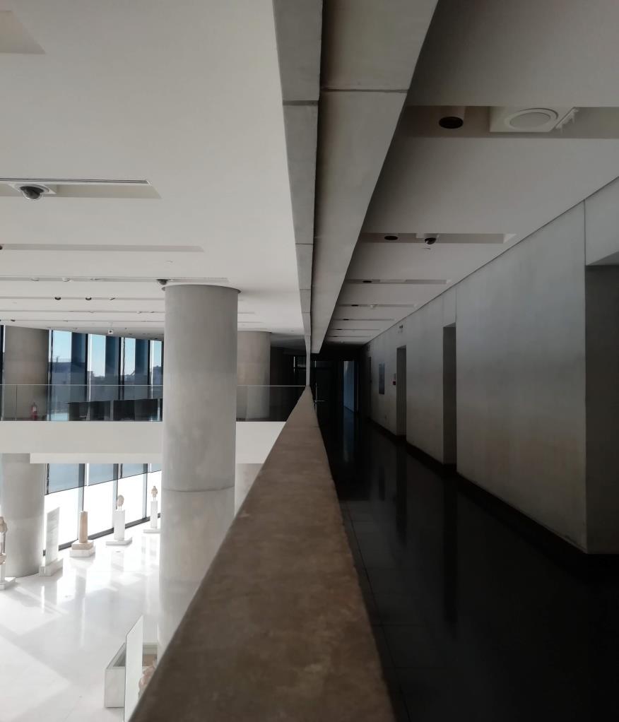
New Acropolis museum, Barnard Tschumi_
Federica Miranda Architect
#federicamirandarchitetto
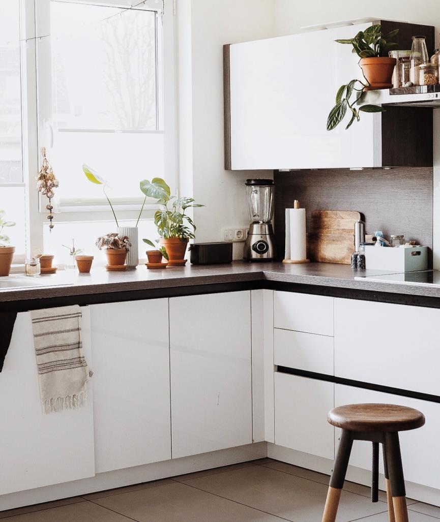
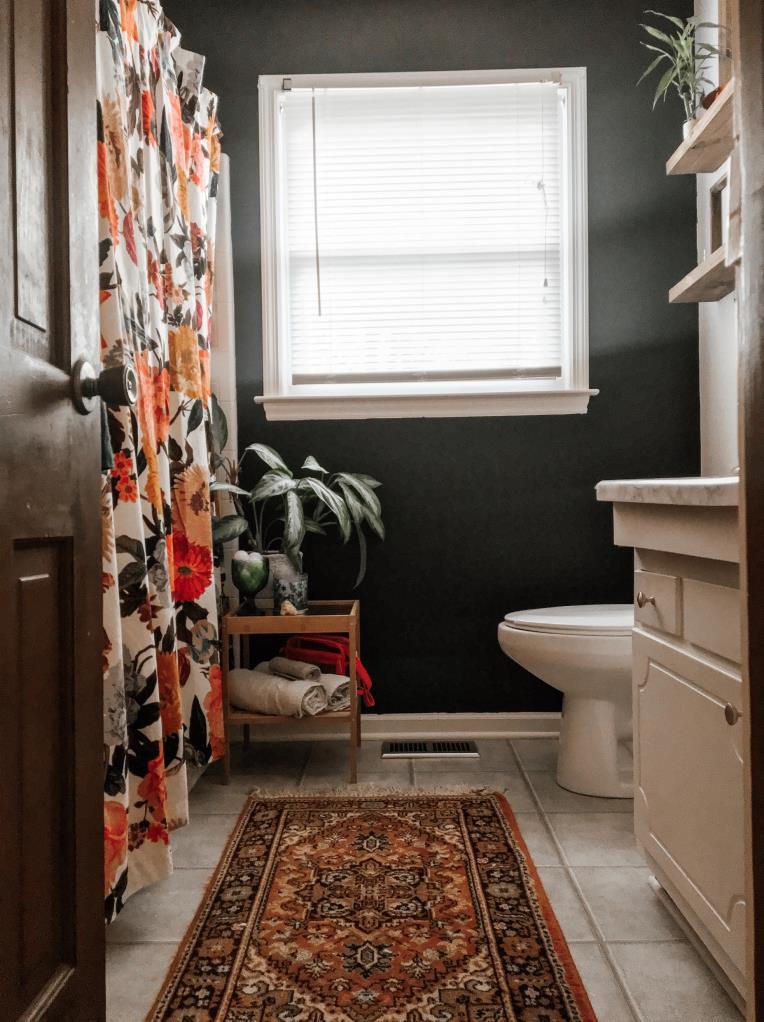

Katzenfreundin. Basteltante. Momentesammlerin. Kaninchenfan. Vintageliebhaberin. Leseratte. Mama. #ourCATurday @what.the.hygge
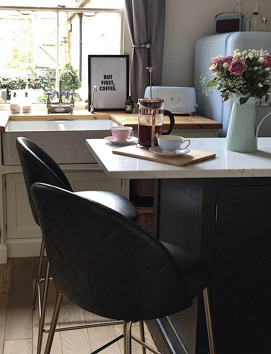

@life_at_number_63

K a t ��
•Interiors blogger, home
lover and illustrator
•Surrey
•House portraits
@arthouseillustrations
•#spotthenewtrend host

#myperiodhomestyle founder, ��Passion for the lighter side of interior decor ��Positivity and encouragement ��DIY & occasional nutty outbursts/coffee ☕️
Tina Stroetmann Manchmal sind es besonders die kleinen Dinge, die Großes bewirken.
Schoene_kleine_ welt
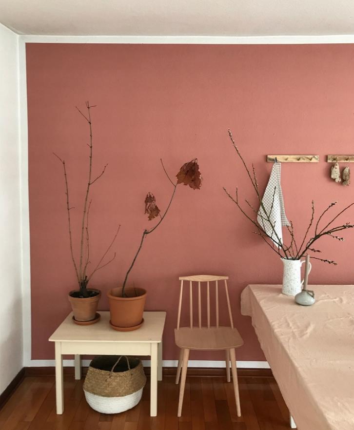
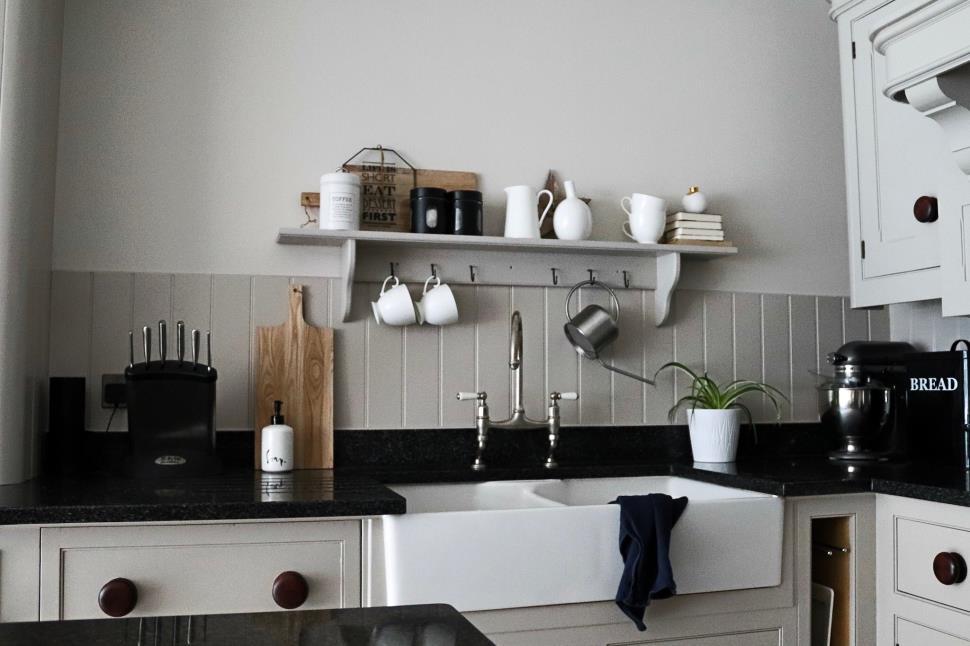
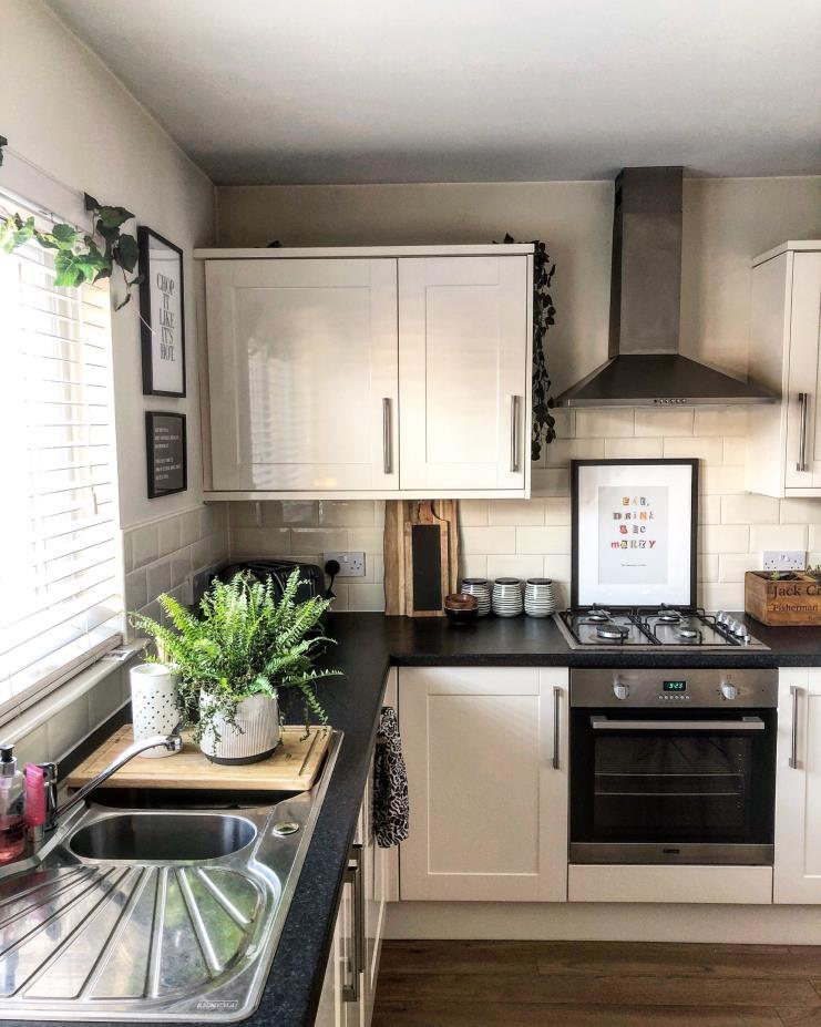


Anna Marie Interiors
Sharing my 1930s house renovation in Surrey UK.✨ DIY projects, design tips, styling and interiors.✨ Family life with ����
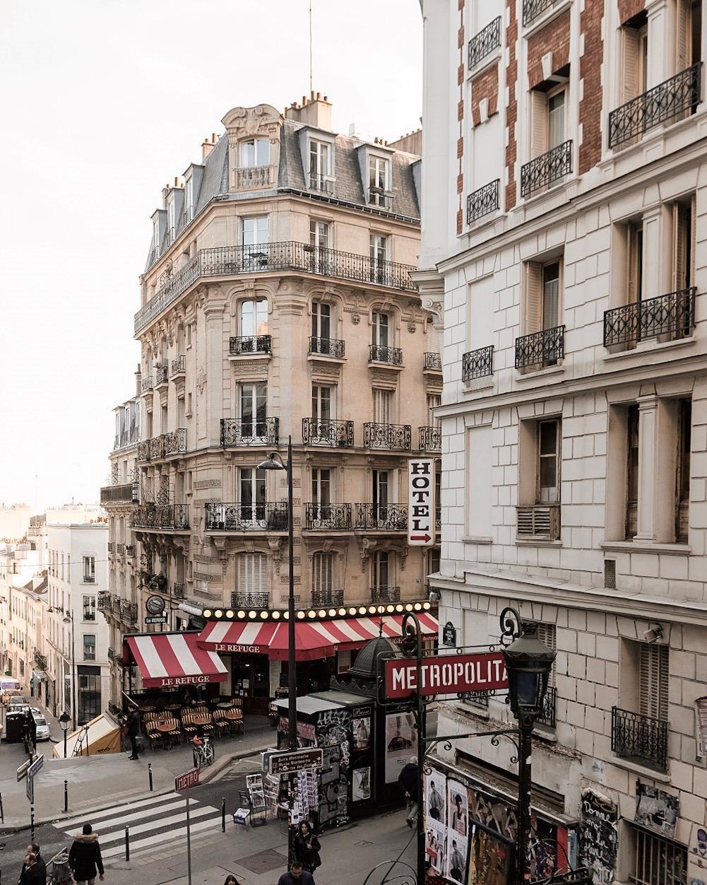
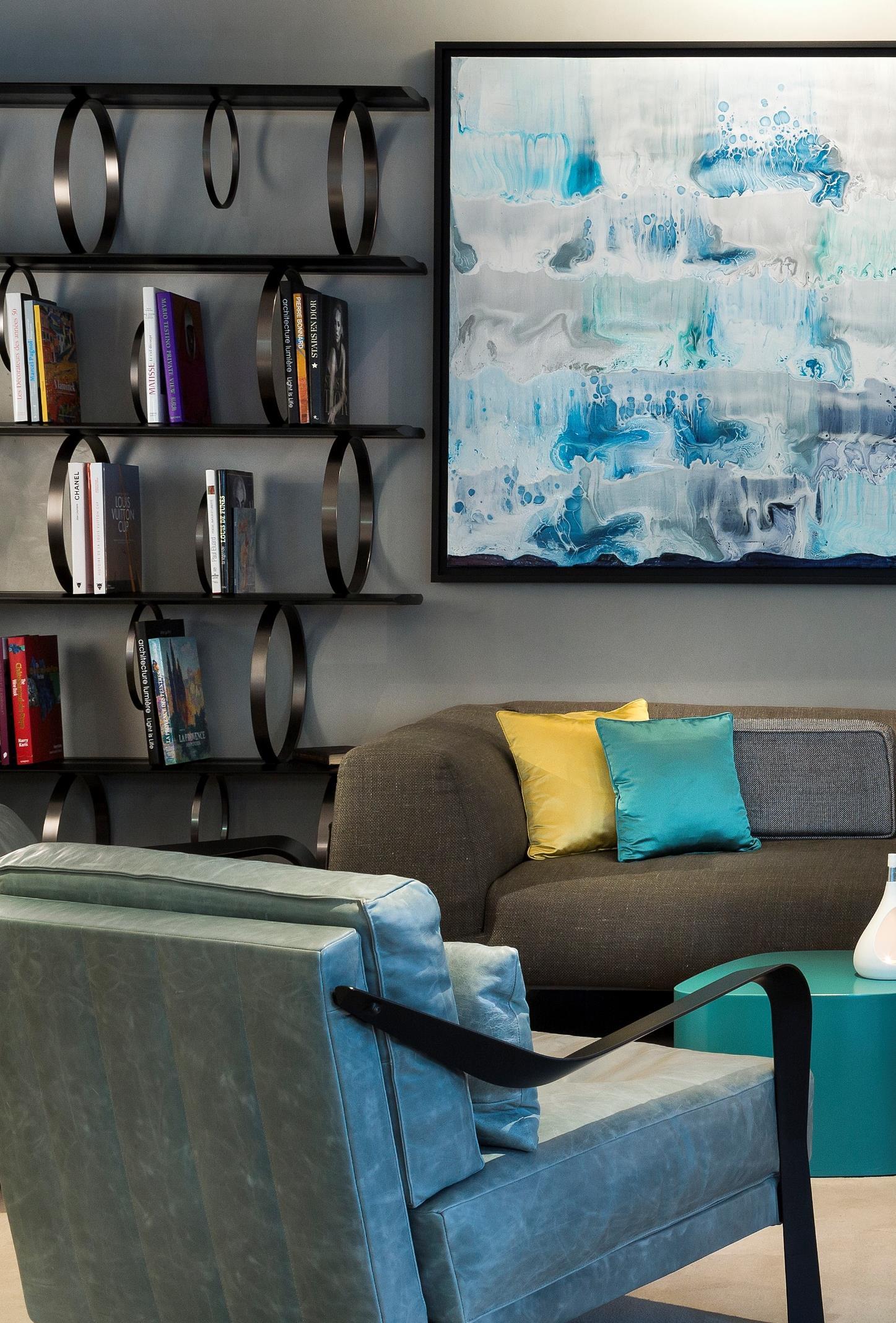
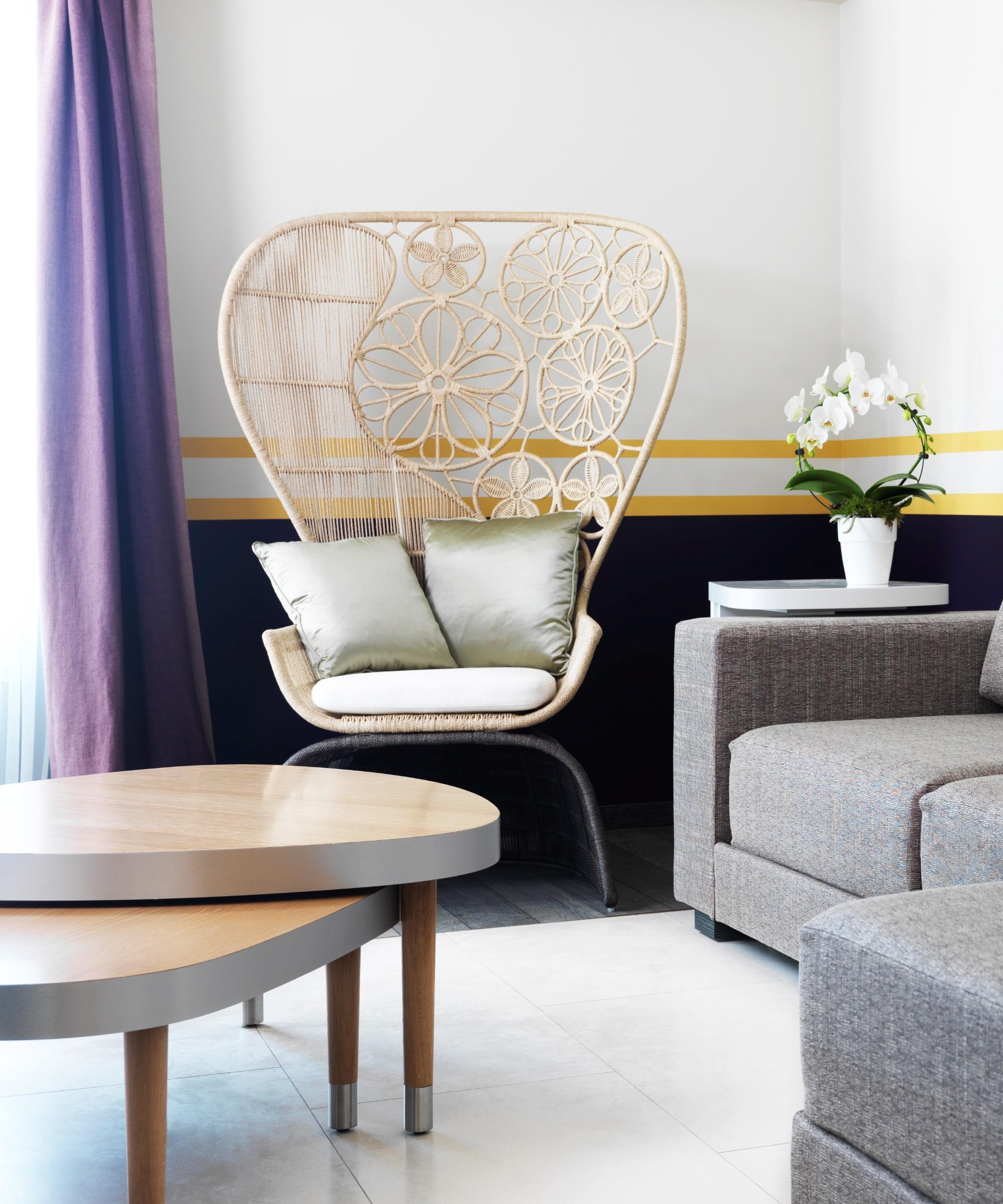
Sybille de Margerie presents the interiors of the Hôtel de Paris in Saint-Tropez. A complex that blends art, architecture and an immense passion for interior design.
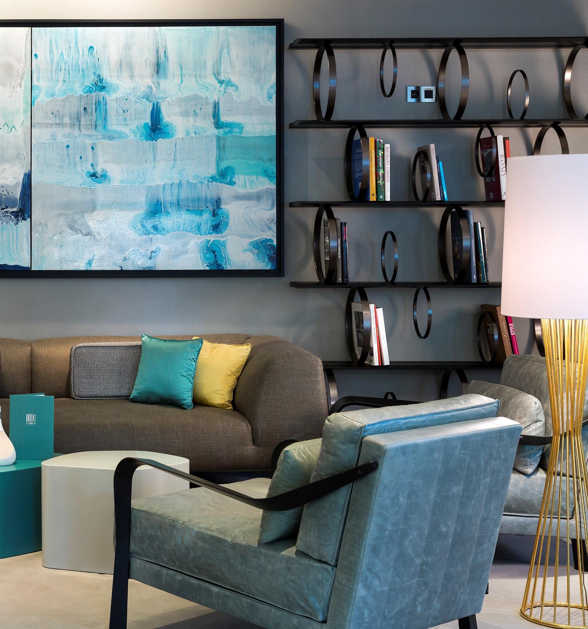
perfectly with furniture.
Hotel de Paris Saint-Tropez has been transformed into a place that embodied
everything that the village represents, culturally, emotionally and artistically by the esteemed French designer, Sybille de Margerie.
The inspiration for this fabulous project has origins from as many as 5 different sources that mix with each other in interior design telling the story of this hotel: Saint-Tropez and women, Saint-Tropez and the arts, SaintTropez and the Mediterranean, Saint-Tropez and the Sixties and Seventies and Saint-Tropez and Paris.
Saint-Tropez and women talks about writers, Colette, Françoise Sagan, about icons like Brigitte Bardot and her villa, La Madrague, about couture and fashion designers like Paul Poiret and Karl Lagerfeld Arts always had a significant influence in this
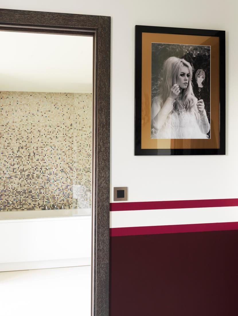
Brigitte Bardot’s pictures –signed by the star herself –are placed throughout the bar, rooms and corridors.
village, indeed numerous painters stayed or lived here like Signac, Matisse, Bonnard, Albert Marquet and Bernard Buffet, and writers, Guy de Maupassant, Boris Vian and Jean-Paul Sartre The French ‘Nouvelle Vague’ (‘New Wave’) film movement choose this site for movie sequences, Roger Vadim’s And God Created Woman and Jean-Luc Godart’s "Pierrot le Fou”.
Saint-Tropez and the Mediterranean because it is a typical village and at the same time it’s a fishing port where the old fishing boats sit side- by-side with the most luxurious pleasure yachts. Saint-Tropez conjures up the light and colours of the Mediterranean, the shadows and the blinding sun, yellow, ochre and red stand out against the blue - hence Sybille de Margerie is inspired by the colors that surround this hotel
The Sixties and Seventies represent the explosion of tourism, pop music, hippies, night- clubs and fashionable beaches, Pop Art... everything that has made of Saint-Tropez a tourist village of fun and luxury lifestyle
Saint-Tropez and Paris: the hotel has been called Hôtel de Paris since its inception and became a trendy holiday destination for Parisians, for the international jet set and the top models.
All these things are bound up in the memories of the place The five themes roll out right through this urban cool hotel.
The vast ground floor sums up the scene: it’s an art-filled, glass-lined showroom of chic, built to attract the hippest hedonists from across the globe.
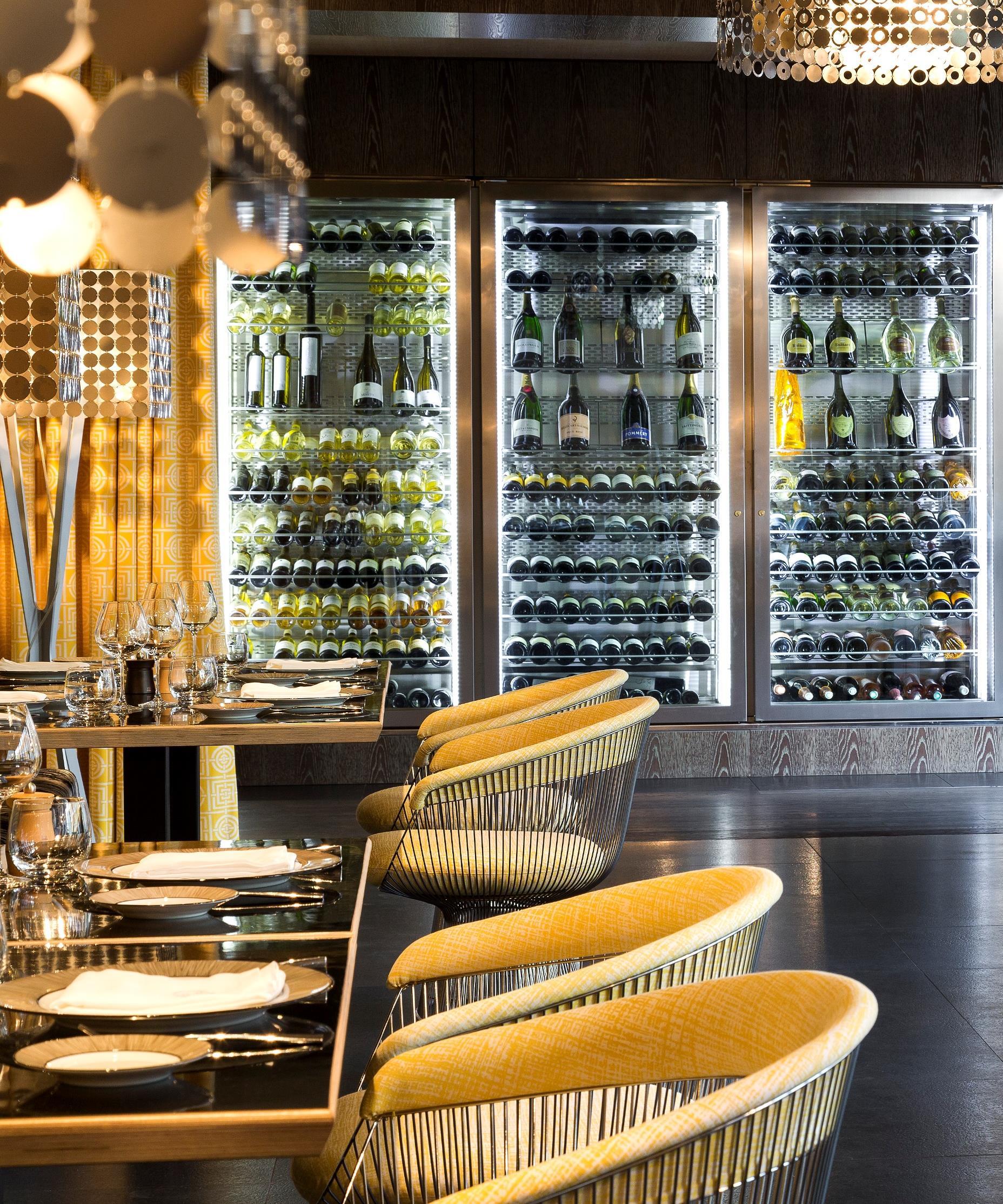
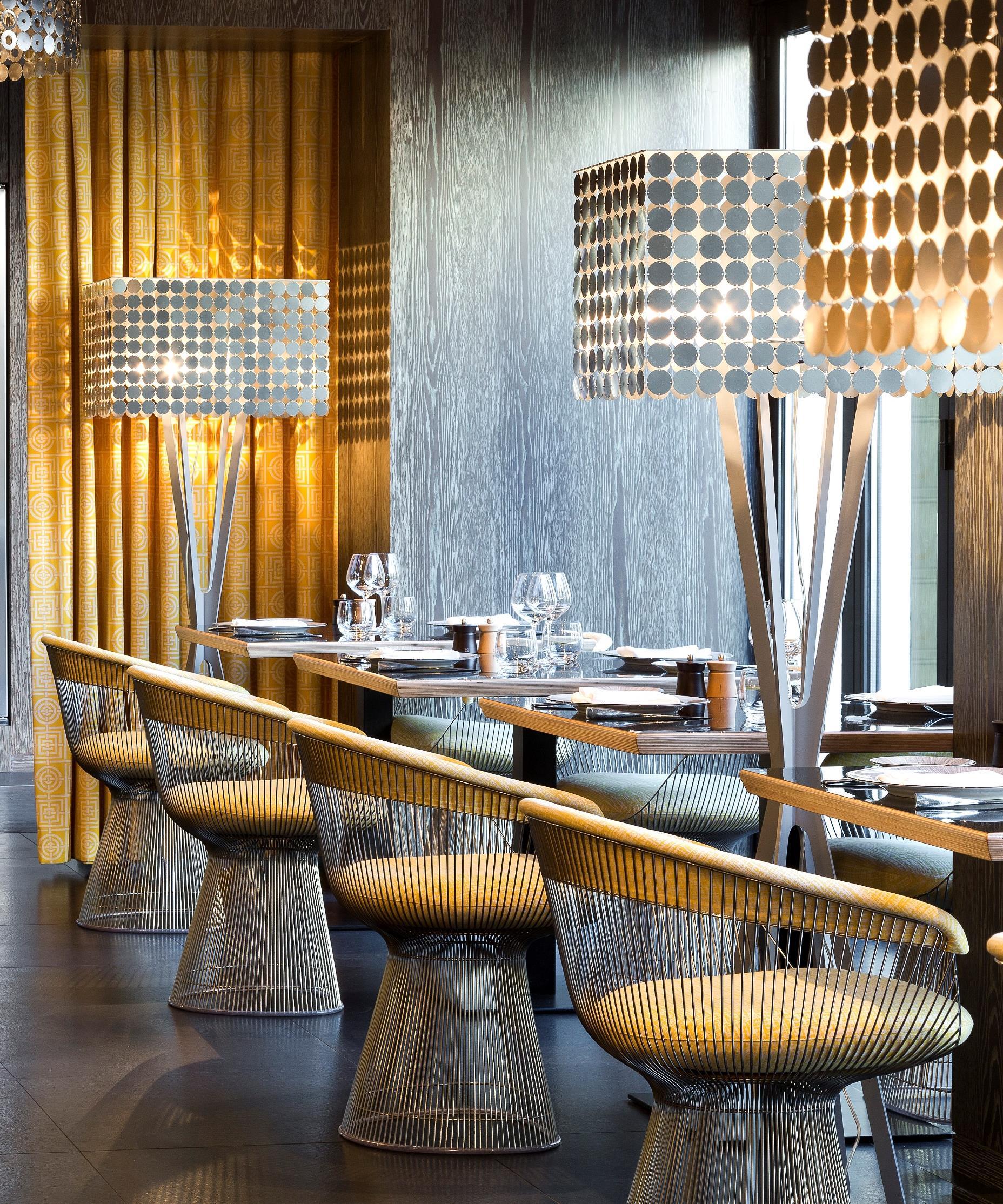
The restaurant of the hotel has been covered in intense yellow accompanied by grey that together make a warm atmosphere. Meantime lampshades give the luxurious touch recalling glittering pop fashion dresses.
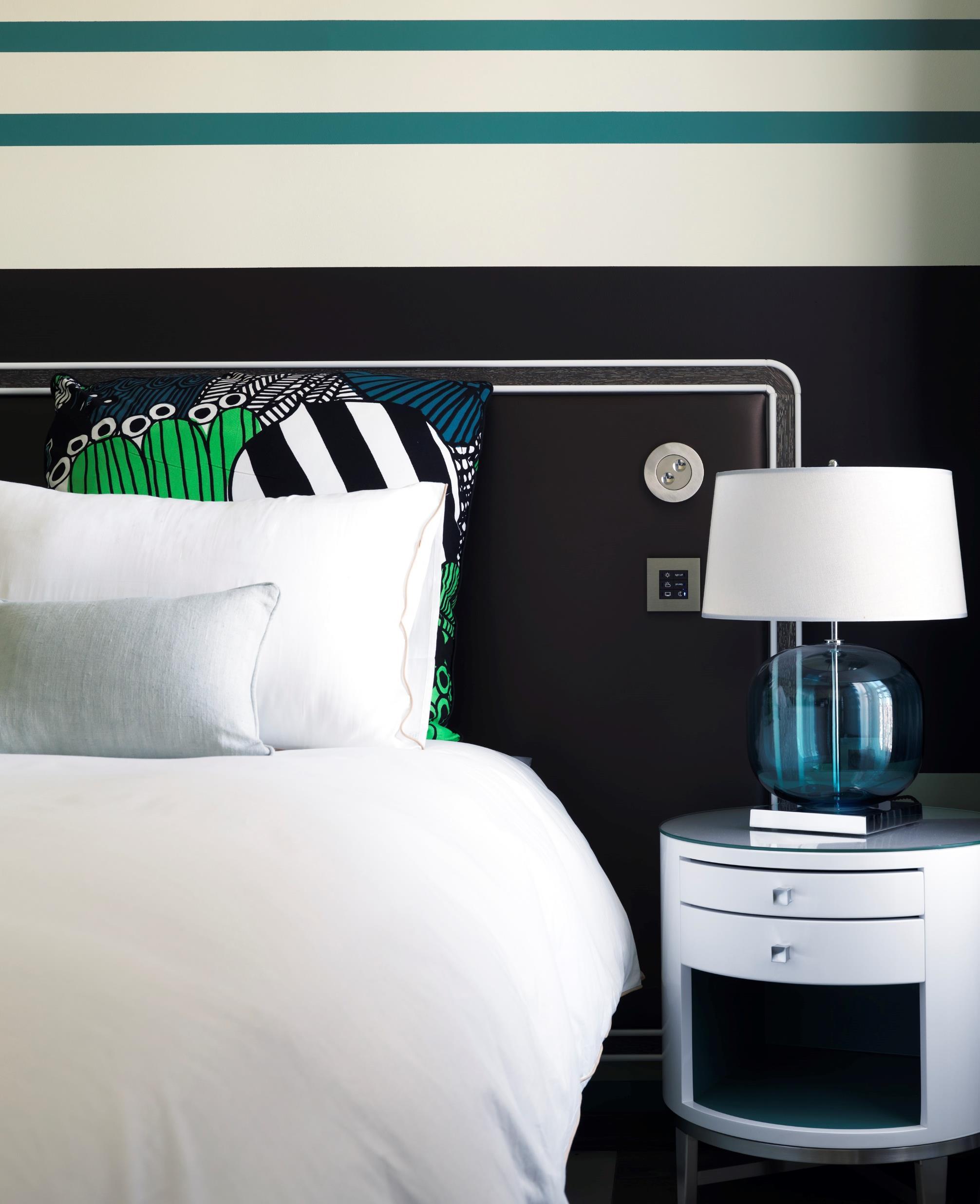
Inspired by the colorful, vibrant decades of the “yéyé" '60s and groovy '70s, guest accommodations pulse with energy, white lacquer furniture marrying with geometrics and bright colors.
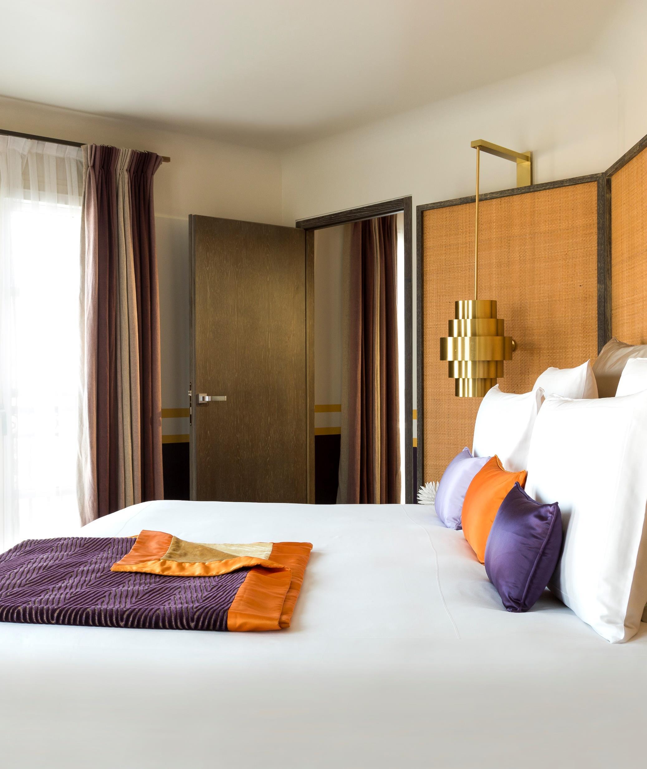
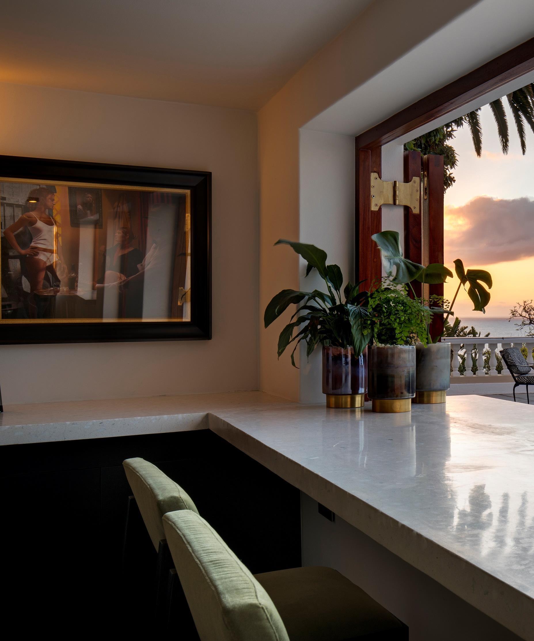
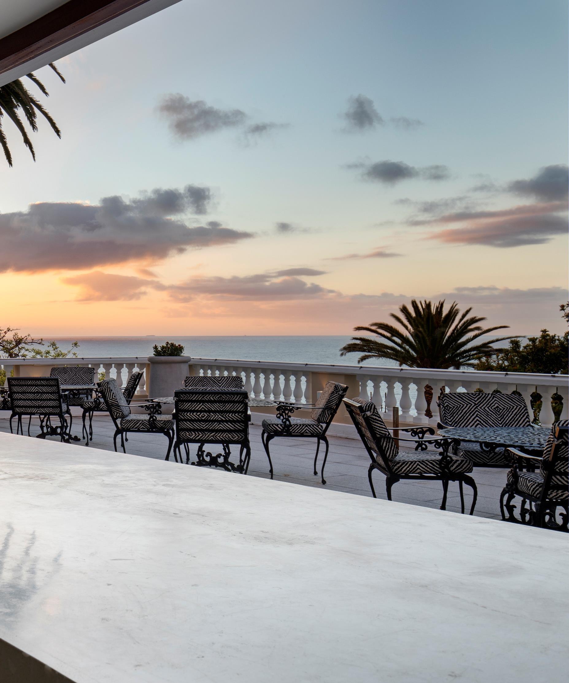
One of the most exclusive hotels in Southern Africa gave OKHA an open brief to redesign its Cellar bar. Lead designer Adam Court combined Japanese reductionist minimalism and post-war Italian Baroque, two seemingly opposing visual styles to execute a complete transformation from gloomy to what he refers to as “Naked Maximalism”.
The Edwardian Villa which boasts many of its original features such as rich wooden panelling, intricately sculpted columns and pressed ceilings to newer features such as expanses of carbon fiber
and articulated glass walls. The setting too has dramatic contrast; the bar overlooks the deep marine blue and turquoise palette of the Cape Atlantic Ocean and is set against the monumental granite boulders of Lion’s Head mountain.
OKHA was chosen for its progressive, innovative and fully inclusive approach to design; being creators of furniture as well as interiors, they custom designed all furniture, fittings and lighting. “The precisely articulated material palette is raw, brutal yet sumptuous” says Court of the long and narrow space which has many intimate nooks and an enormous granite boulder jutting out through its lounge wall. Court completely stripped back the space to its core naked, physical components and reconstructed and sculpted the interior in a ruthless and decisive manner bringing much needed natural light into the previously dark, tavern-like space.
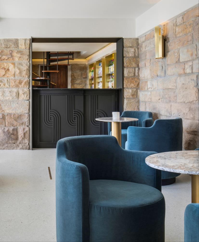
The design is sleek yet emotively resonant and through its effective use of materials is both polished, organic and also delightfully crude Court has applied his lean material palette in an elegant and precise way. This is evident in the very finest details from the subtle brush-strokes of brass inlaid into chalk white Terrazzo floors to the dramatic swathes of solid brass that frame the terrazzo bar creating an almost psychedelic hall of mirrors effect
“It’s a transportive place where one loses sense of time, something we all need” says Court. “The terrazzo floor and bar counter, the exuberant use of solid brass, these things are reminiscent of the halcyon days of the Milanese bar and bistro, I love that theatre and where it takes you”
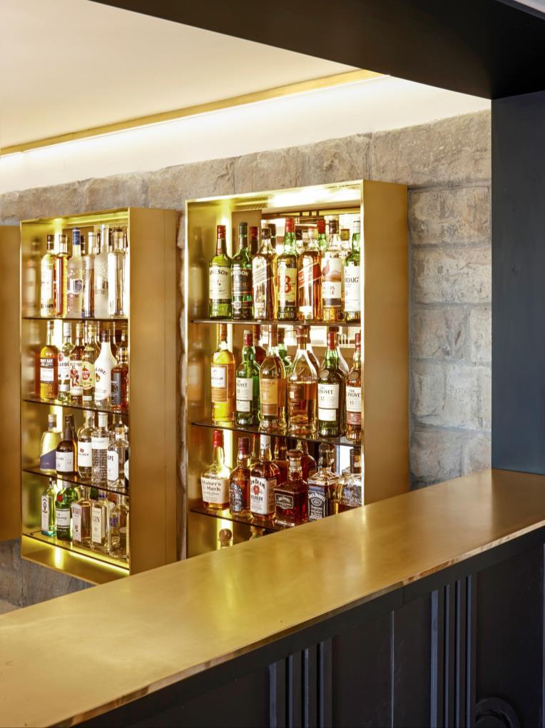

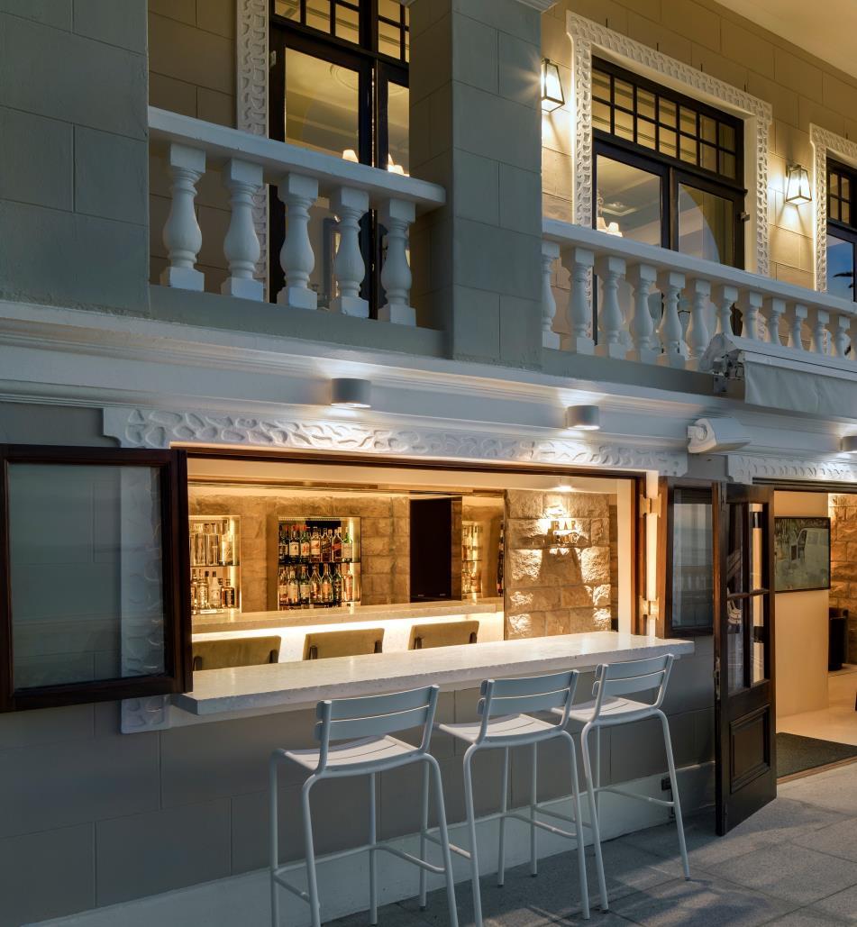
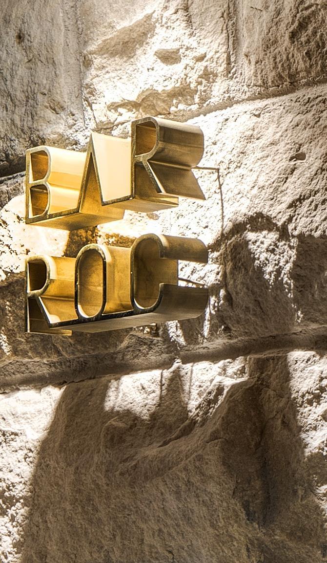
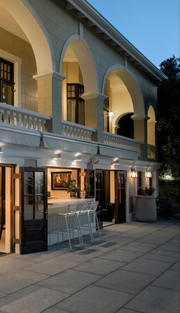
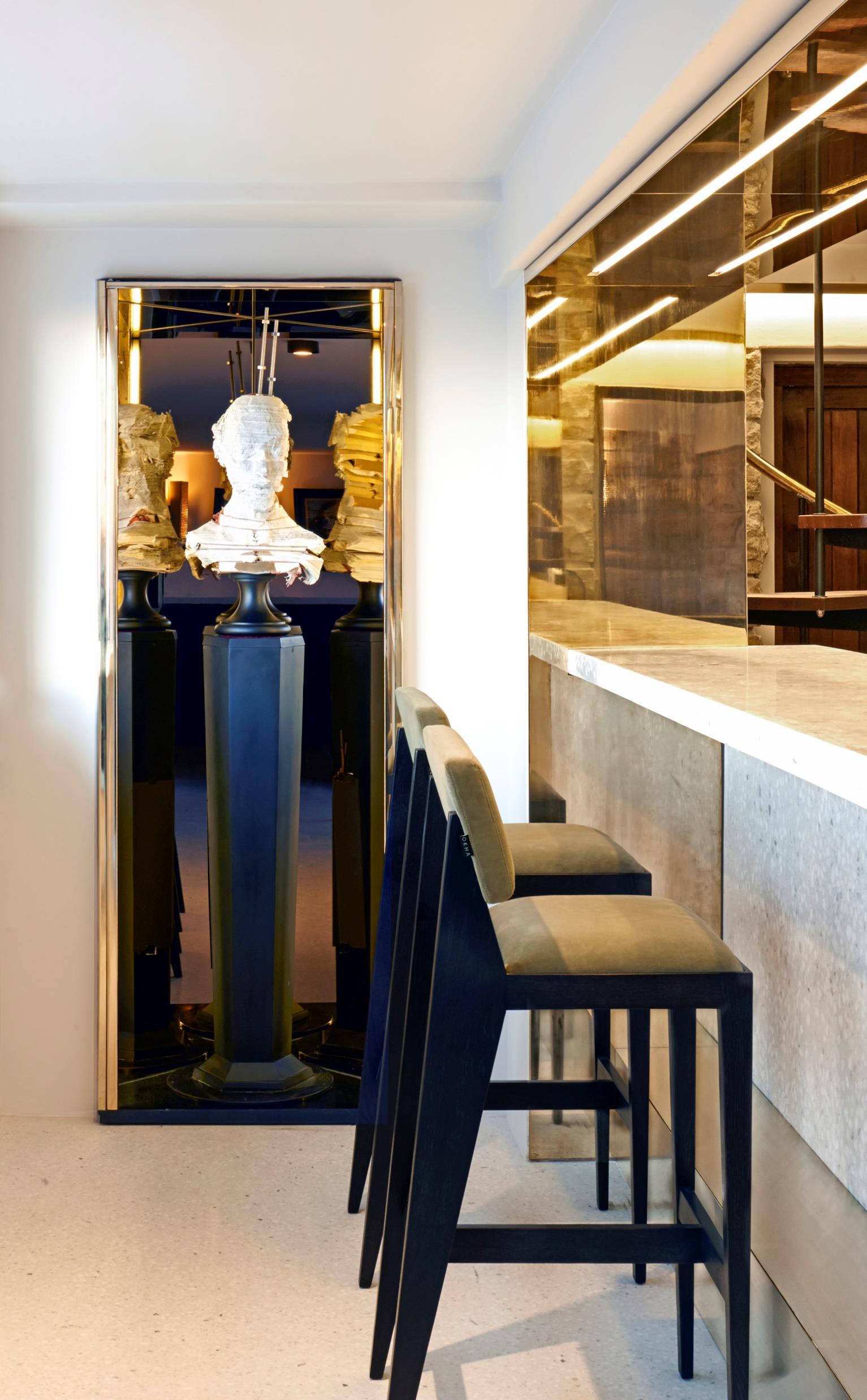
“BAR ROC’s tailored interior has a tangible sense of distilled calm and languid luxury; here time is irrelevant.”
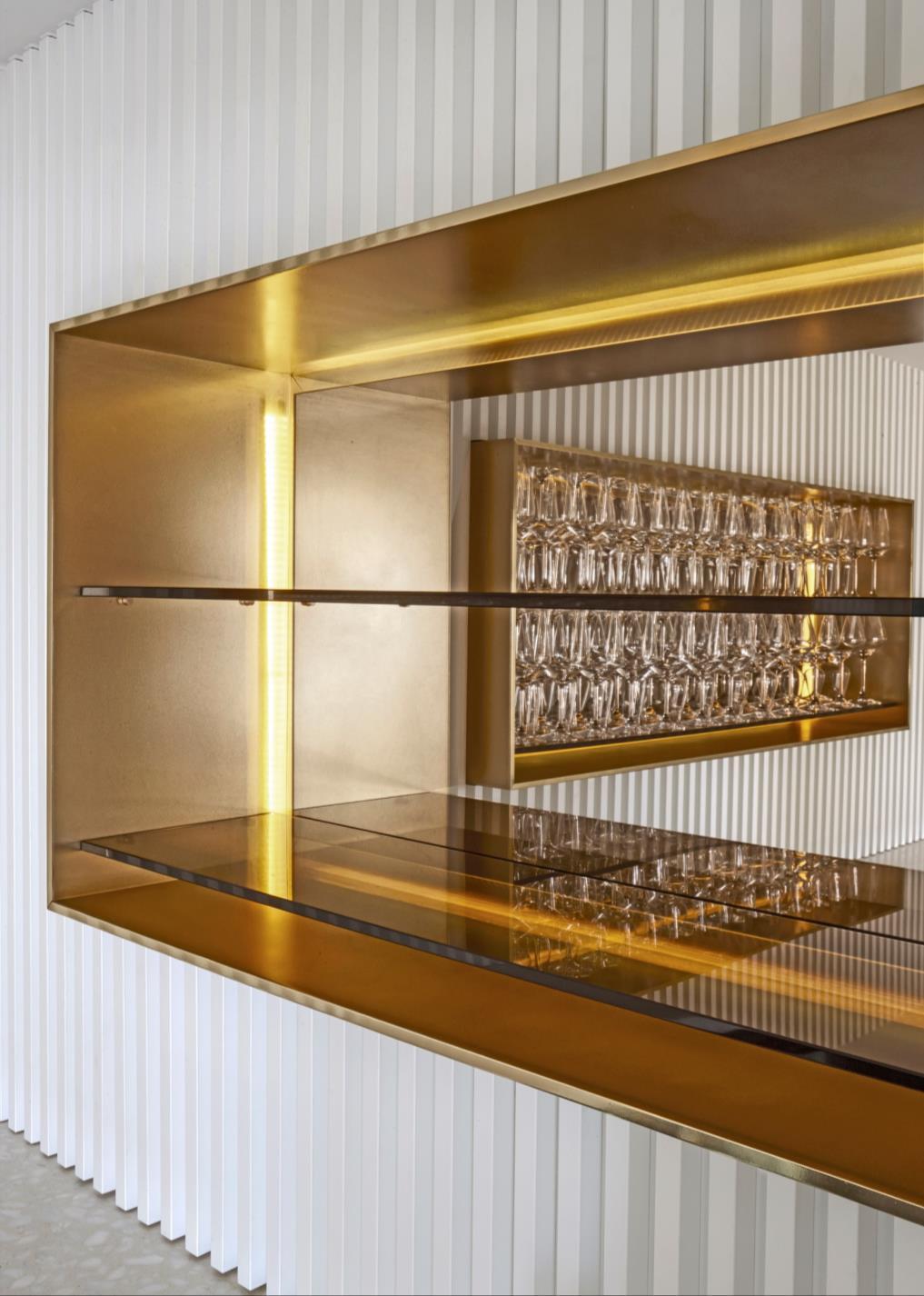
In the tiny wine cellar, a sculpted brass “bunch of grapes” clings to the ceiling, mirror lined and backlit rectilinear brass boxes house “holographic” shelves of wine glasses and the black and white relief walls collide in a Yin Yang symphony.
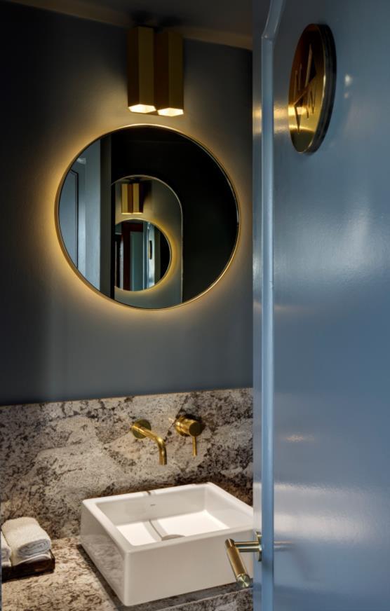
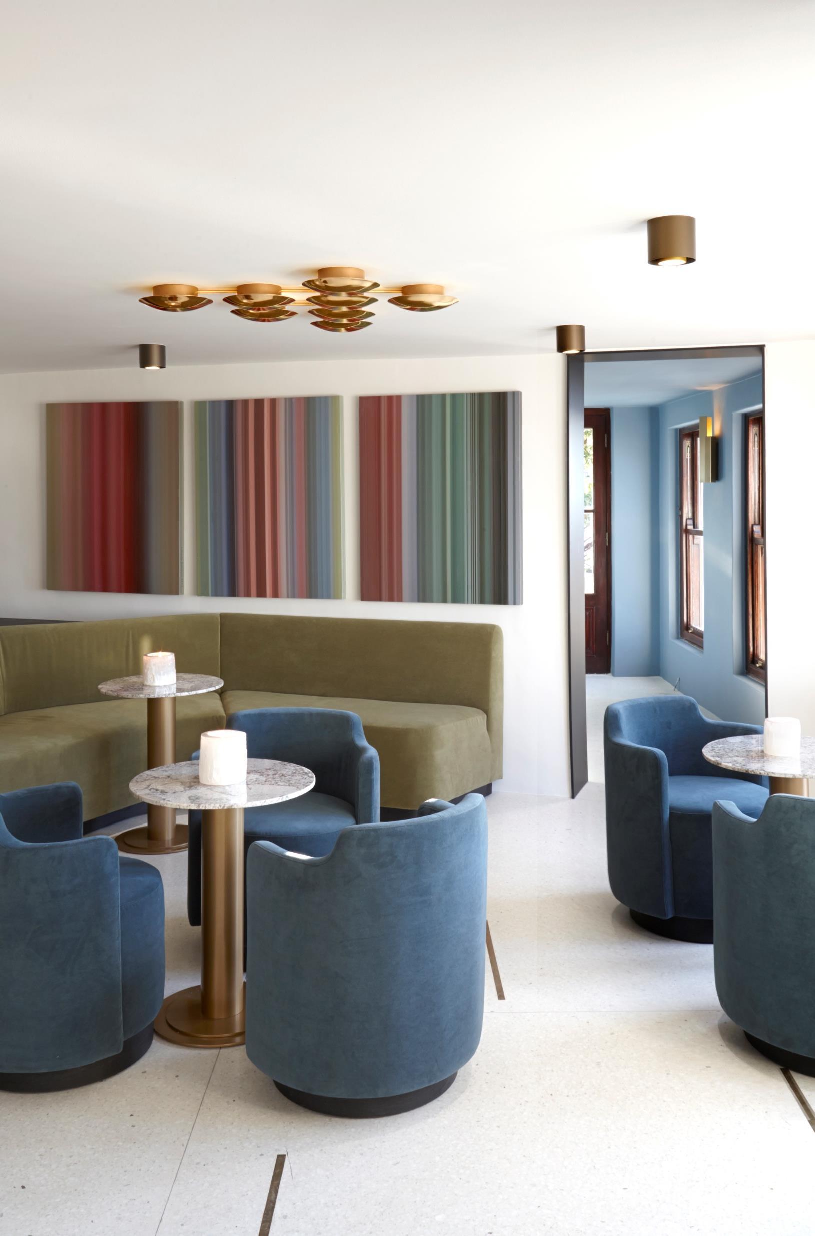
While in the central lounge space, a bespoke fern-green velvet couch wraps around the length of the granite boulder and bespoke Roc Tub seats in cerulean blue velvet encircle marble-topped tables. The marble and cool sea green-blues are carried through to the bathroom’s wash basins, walls and fittings where even the custom designed bathroom signage has a meaningful decal carved into solid brass.
“The range of materials used was kept very narrow as we wanted each material to express itself with clarity.”
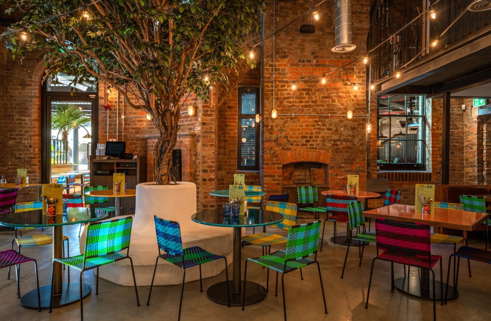
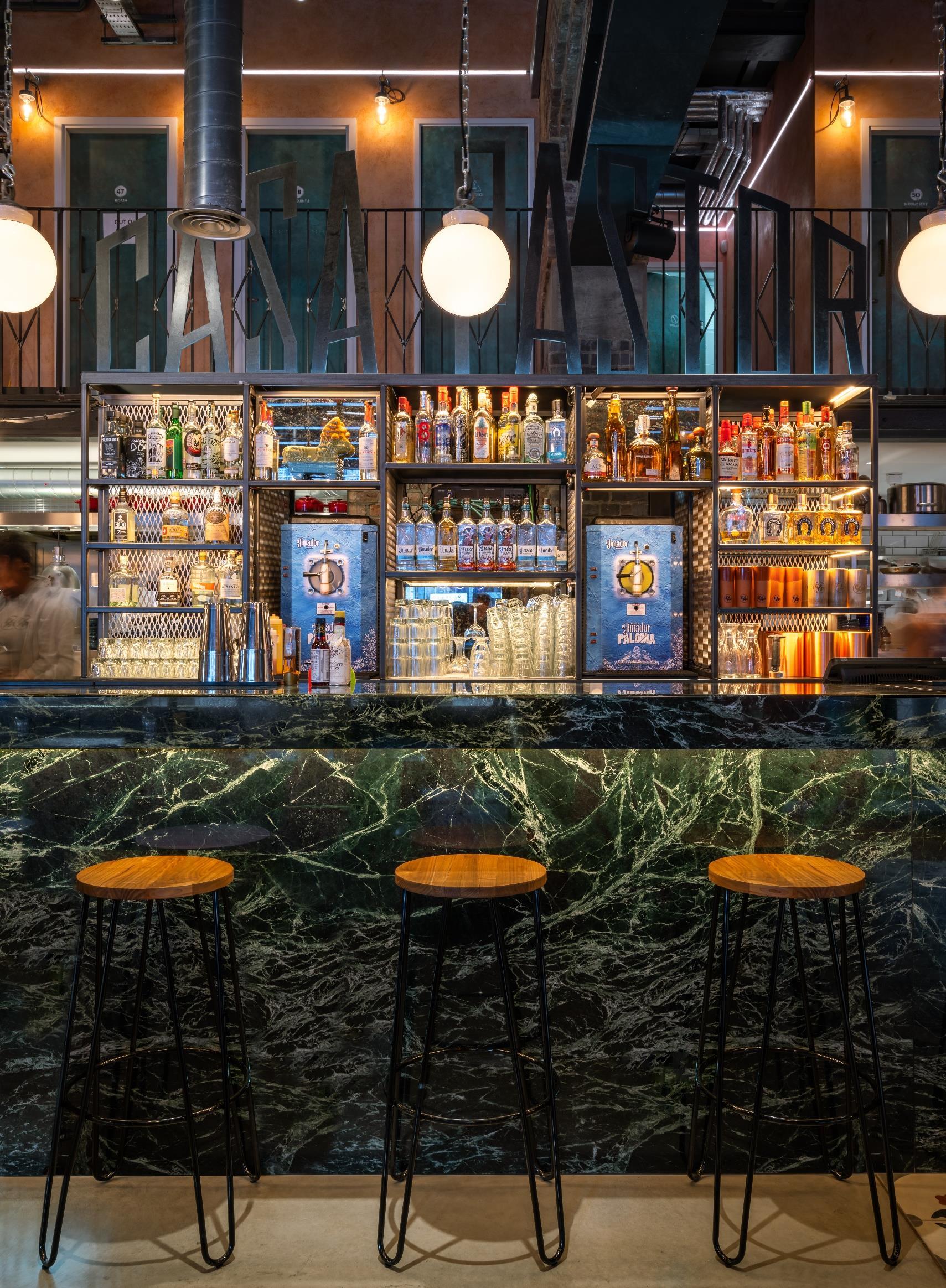
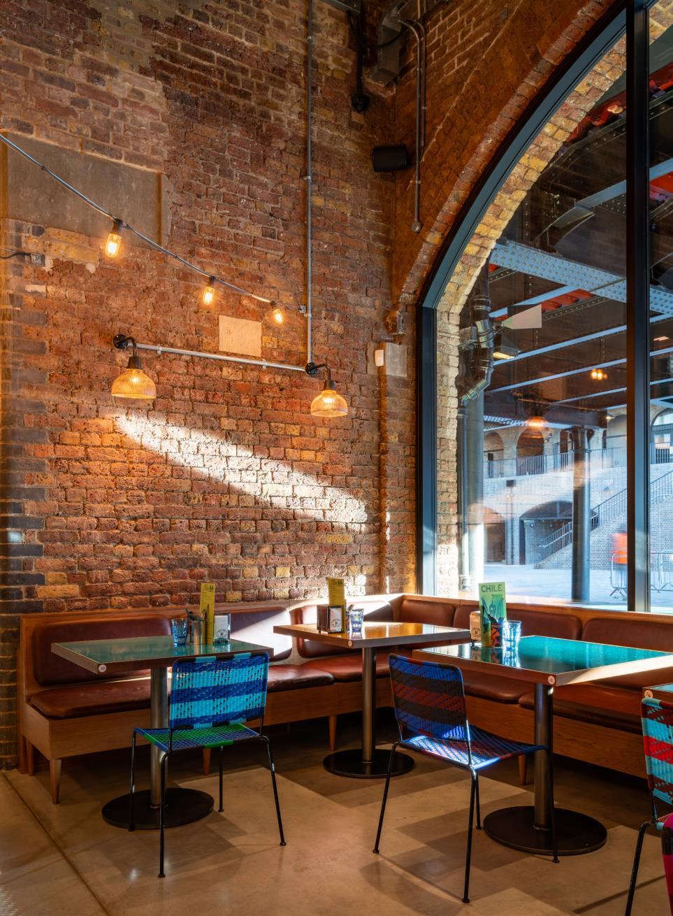
Casa Pastor and Plaza Pastor are situated in Coal Drops Yard, a former Victorian coal store that lies within the historic railway arches of King’s Cross, that is one
of the largest and most exciting redevelopments currently underway in London. This is the second time Michaelis Boyd has worked with Harts Group; their first restaurant project together, El Pastor in London’s Borough Market opened in 2016 and was designed after an inspirational trip to Mexico to allow the design team to fully appreciate Mexican food, culture and architecture.
Michaelis Boyd’s design concept for Casa Pastor and Plaza Pastor pays homage to the vibrancy of Mexico, incorporating powerful architectural and design elements to create truly authentic dining experiences
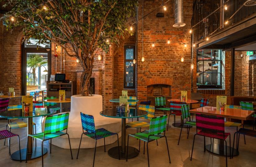
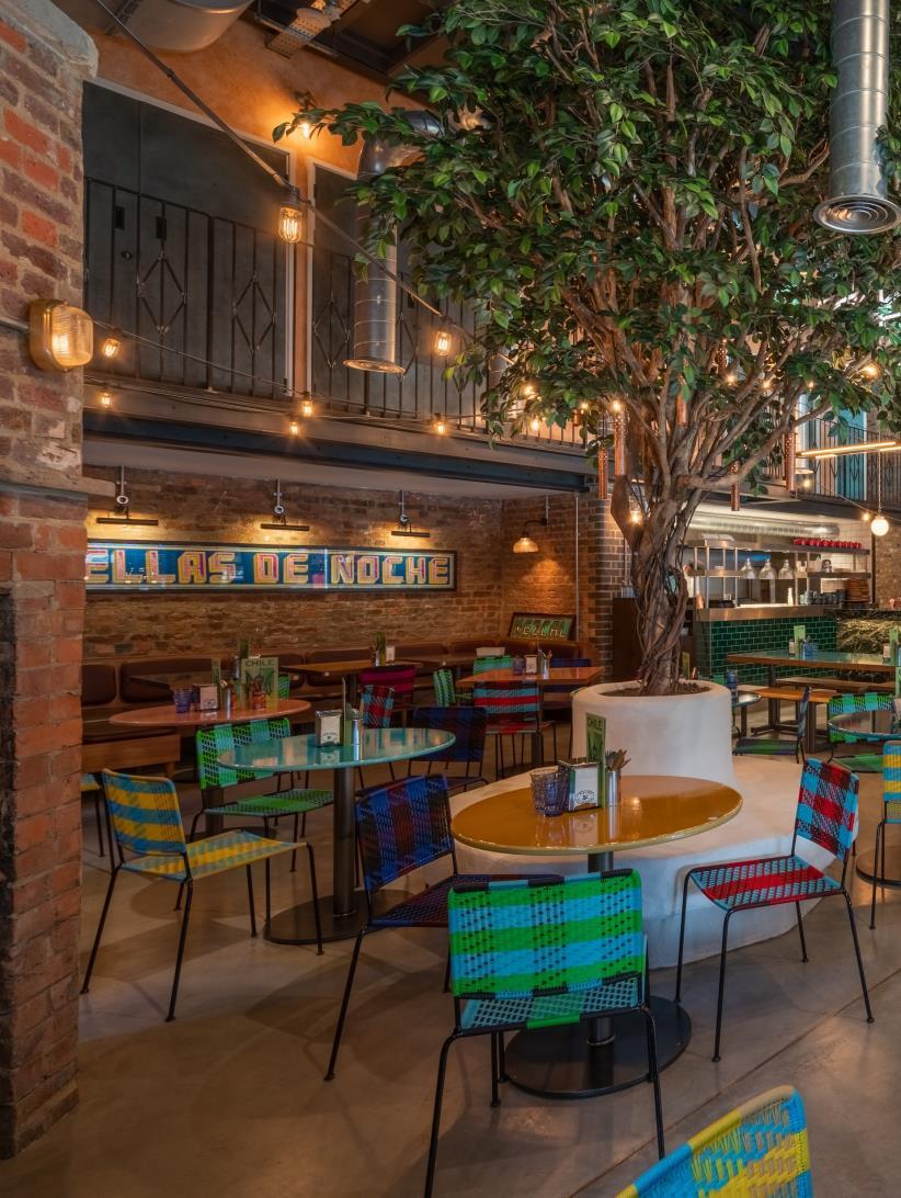
Casa Pastor forms the internal restaurant, while Plaza Pastor occupies an external heated dining terrace that is operated all year round. Casa Pastor, the new big sister restaurant to the original El Pastor in Borough market, is a vibrant 80cover restaurant that takes advantage of the original features of the space, with exposed industrial brick walls and vast arched glazed windows. The restaurant features five-metre high ceilings, eye-catching antique patterned cement tiles, Mexican murals and motifs and customdesigned hanging basket lighting, a nod to Mexican woven basket lights.
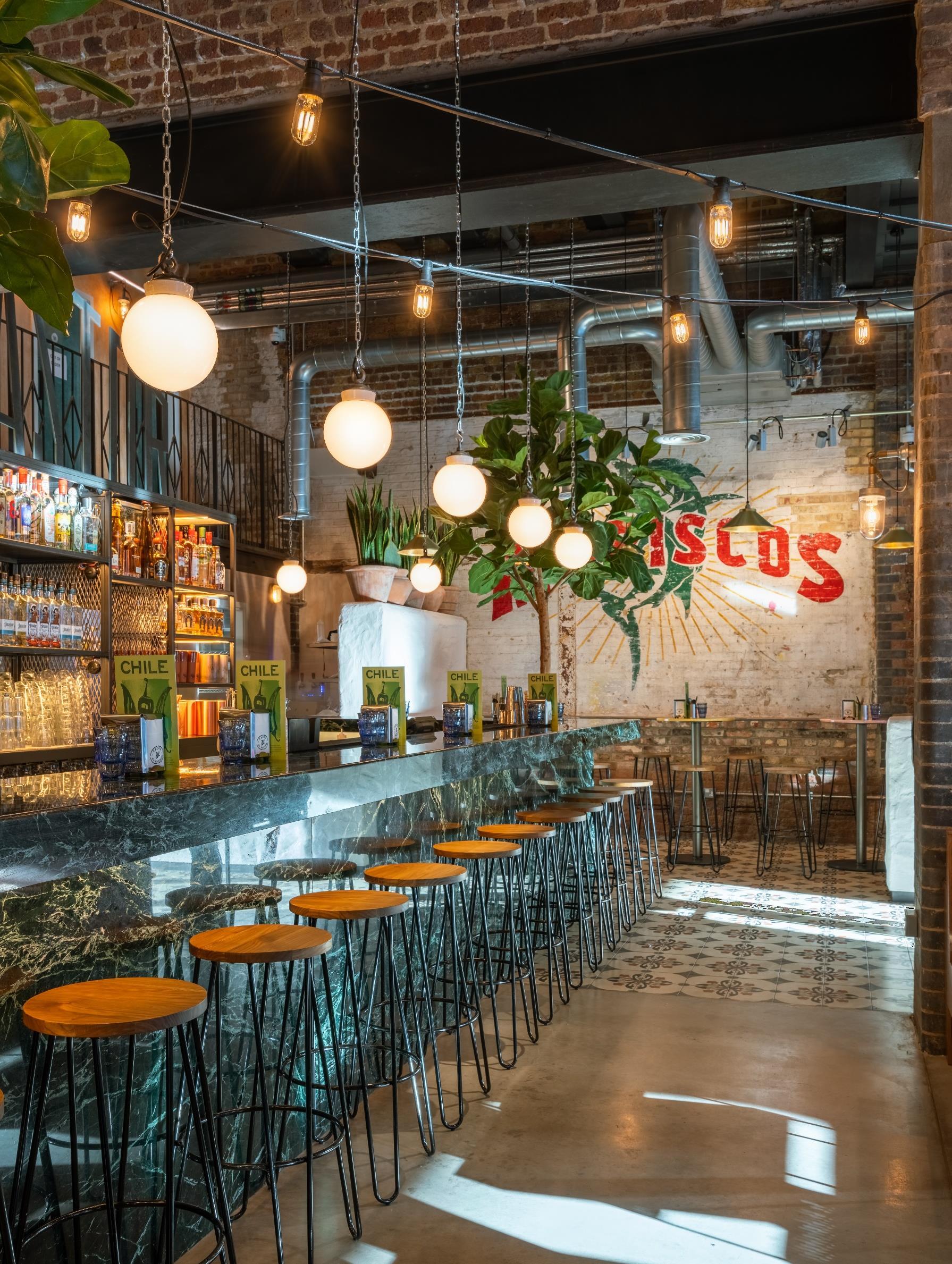
Bar-style counter tables feature brightly glazed Pyrolave table tops reflecting the spirit, energy and colour of Mexico.
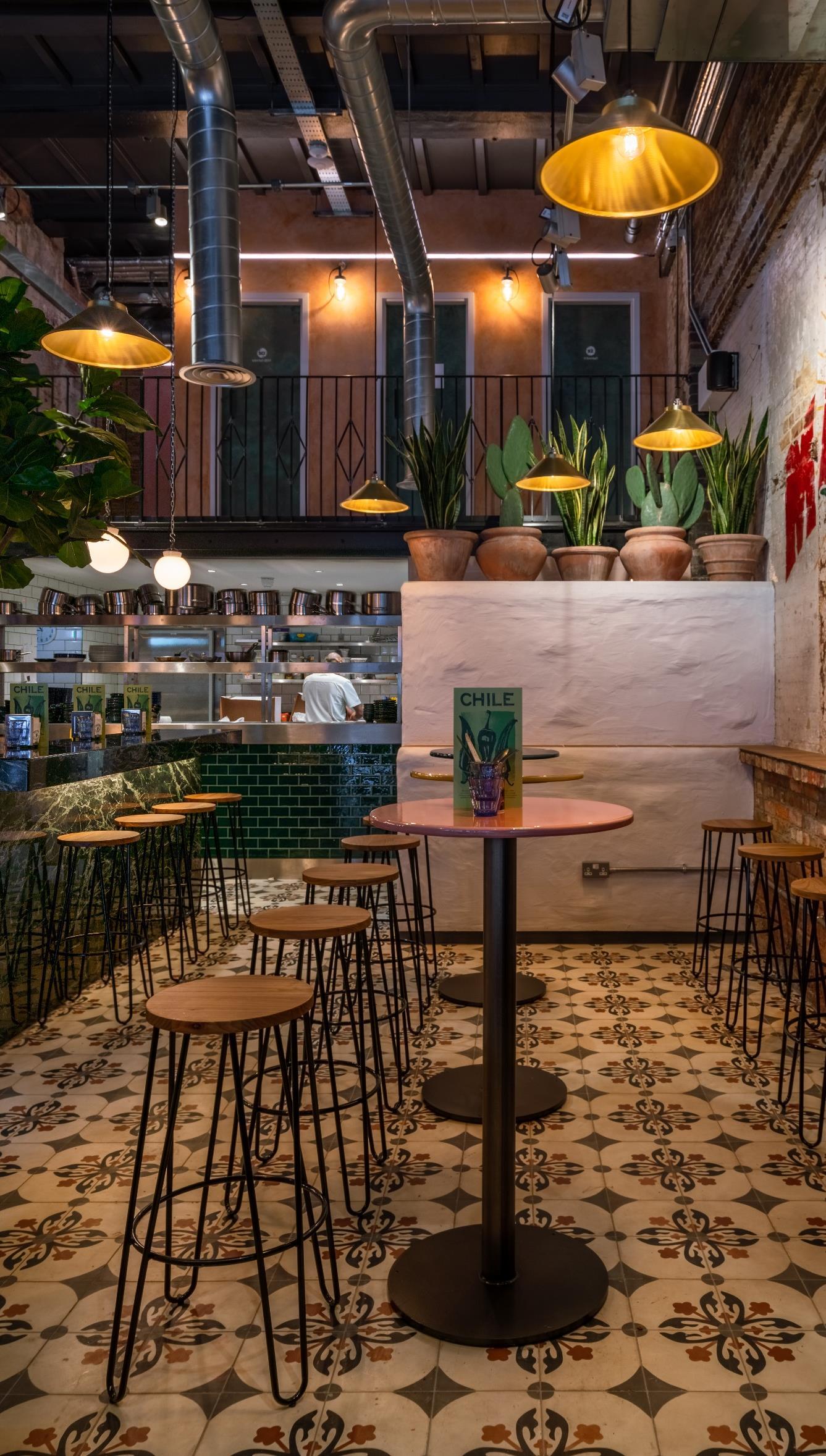
Bespoke encaustic tile perches from Mosaic del Sur are positioned along the entrance perimeter and have been designed to encourage diners to enjoy cocktails in a lively and authentically Mexican environment.
In the centre of the restaurant, the ‘mezcaleria’ bar is clad in dazzling emerald marble with four-metre tall tropical trees positioned either side, while an open kitchen provides a theatrical focal point for the restaurant. Casa Pastor’s central dining area echoes Borough’s El Pastor, with fixed banquette seating featuring black leather cushions hung individually with leather straps and a colourful array of India Mahdavi chairs. Tinted festoon lighting and antique glass wall lights create a relaxed ambience. Casa Pastor’s mezzanine level leads to a copper and zinc clad balcony with pink plaster walls and neon lighting that evokes the vibrancy of Mexican street life, while the metal staircase, balcony balustrades and shelving units take inspiration from typical shopfronts and intricate architectural elements and vernacular design found in Mexico City.
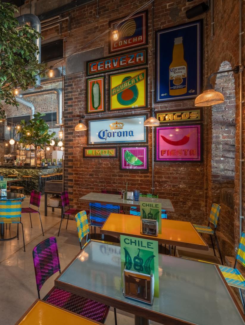
The numbered matte verdigris copper bathroom doors, visible from the mezzanine and as you enter the restaurant, are bespoke designs by Michaelis Boyd that are inspired by retro American and South American motels
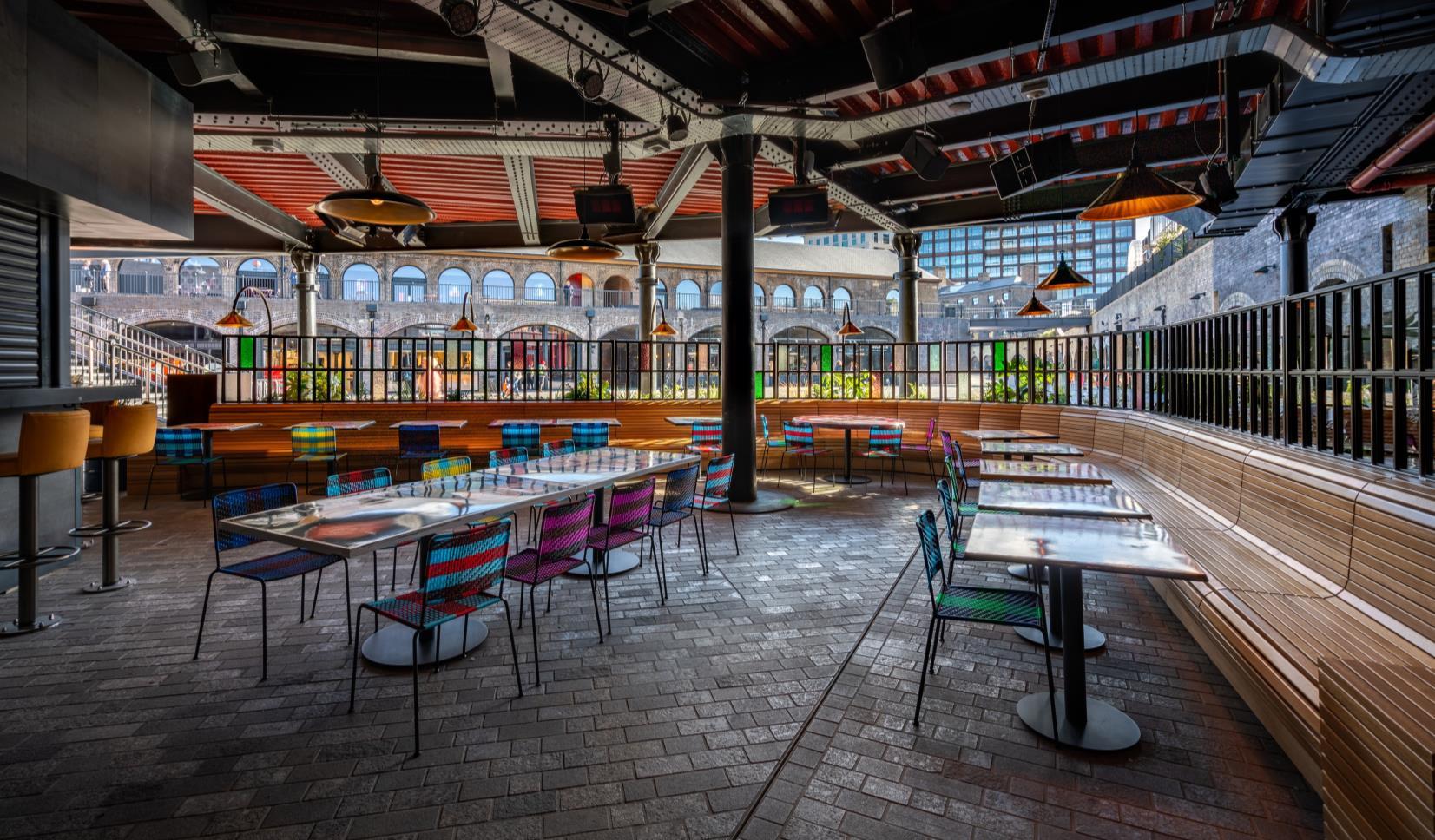
Plaza Pastor is a 100-cover heated outdoor dining terrace adjacent to Casa Pastor, with a centrally located blackened steel cladded bar and open kitchen with cut out backlit branding. The space, which has its own separate menu, is more casual, lively and drinks focused. The restaurant features industrial cast iron beams, slatted oak banquette seating, Michaelis Boyd signature crystal glass screens and lush foliage and greenery. Michaelis Boyd have also designed a small mobile stage area for live music.
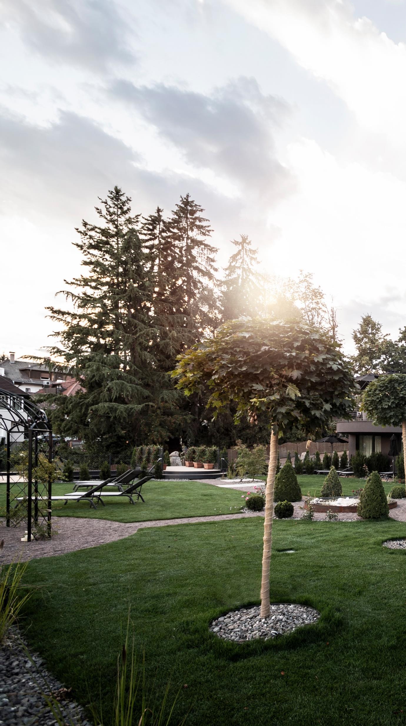
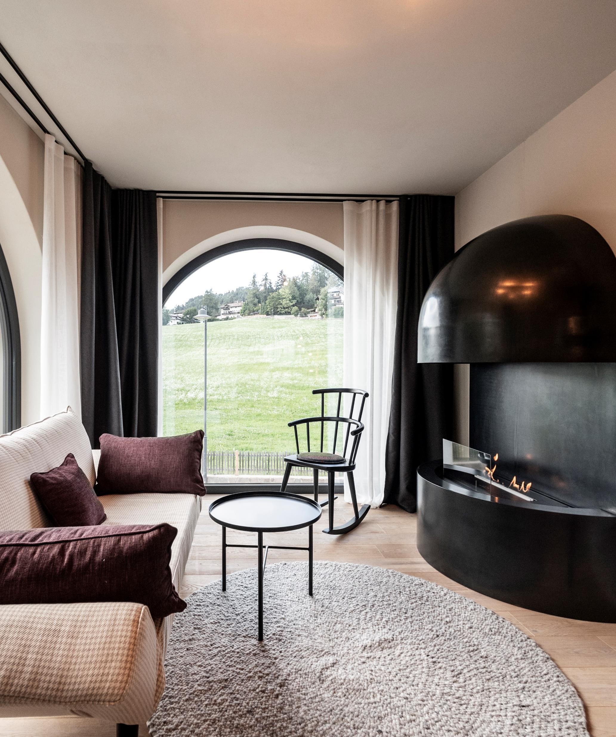
noa* presents Gloriette Guesthouse - the Italian hotel on the Bozner's favourite mountain in which city and country merge together. It builds on the tradition of summer holidays at Ritten and adds another link to the chain.
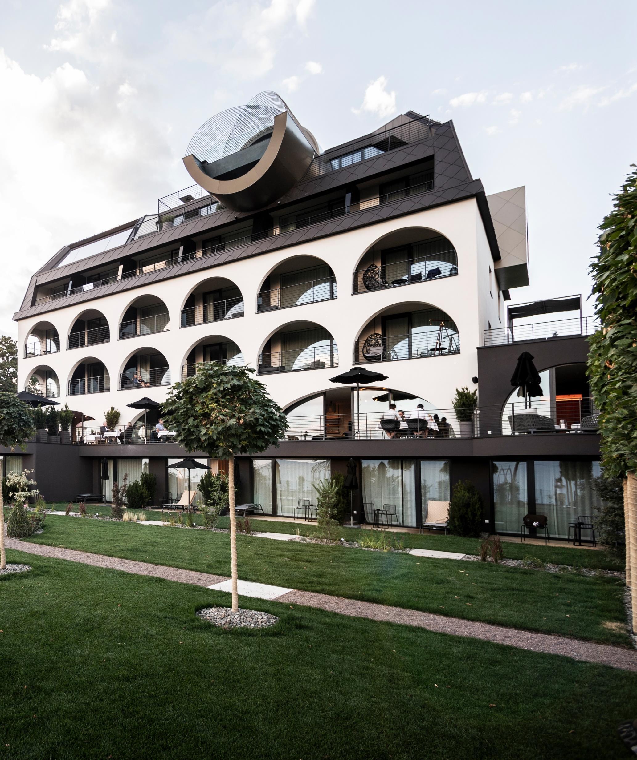
The former small hotel business Bergfink, which was an anchor point in the village structure and nestled amidst the rural-urban structure with all its bourgeois domiciles, built by wealthy Bolzano merchants around the turn of the century, was demolished and a new jewel was created in its place. As the name suggests, it is a gem in the landscape, inspired by the architectural typology in timelessly, elegant Art Nouveau Besides it was essential for noa* to incorporate locally prevalent elements, such as the arches in the façade, or the hipped roof, which looks back to a long tradition in the village of Oberbozen. At the same time, the rhombus is included; a decorative element that appears amongst the many railroad-houses along the Ritten railway, which connects the different summer holiday destinations. The holistic design approach is clearly visible: numerous details form a common thread running through the entire project An interesting aspect is the organization of the hotel that sophisticatedly adapts to the topographic circumstances. The garage thrones the building and its 25 guestrooms, and on which the hotels park extends, from which the seven garden-suites and their private gardens can benefit with delight. Looking over the garden, one can find the public spaces: reception, lobby, the restaurant and it’s extending terrace, which gracefully curve out overlooking the garden with a view that extends to the far horizon.
Withthefeelingofanerain whichthearchitectureofthe cityinasimplifiedformand withoutgivingup completelyonluxuryand comfortontheRitten transposed-generous, classic,simple,butnotsober.
What begins on the ground floor as a flat double arch at the façade, develops through a significant leap in dimensions, into a concise uniaxial arched façade in the floors above. This allows the quality of the outer spaces to become more visible and tangible for the summer retreat. It is especially in this area behind the arcades, where inner and outer space merge – the loggias function as connecting elements, and with the frameless windows the room seams to continue as far as the parapet. The landscape is captured by the reflective black glass elements, which are used as balcony partitions dividing the rooms and which optically multiply the arched view.
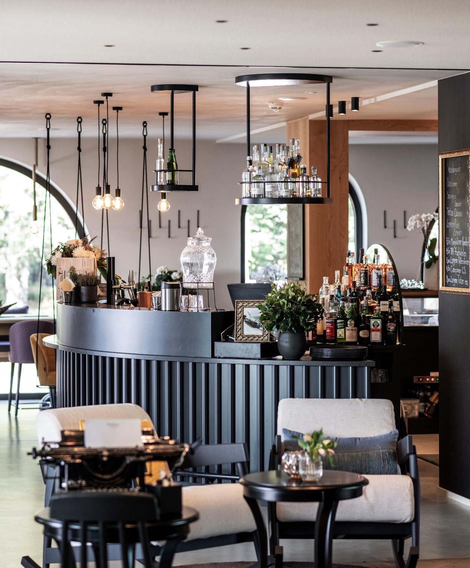
Above the public spaces, the guestrooms are located on three floors – with the suites on the respective edges of the building, clearly recognizable by their cubic bays, that set a confident architectural accent to the building’s façade. Here again, the theme of the arch finds its continuation in the interior, for example as a fireplace in the lounge, where the arch is extruded around its own axis. The furniture is mostly freestanding and loosely positioned, elegant and plain upholstery enhance the ambience. Amidst everything are unique finds from flea markets or little treasures from the previous hotel. Dispersed throughout the building are golden lamp sculptures hanging from the ceilings
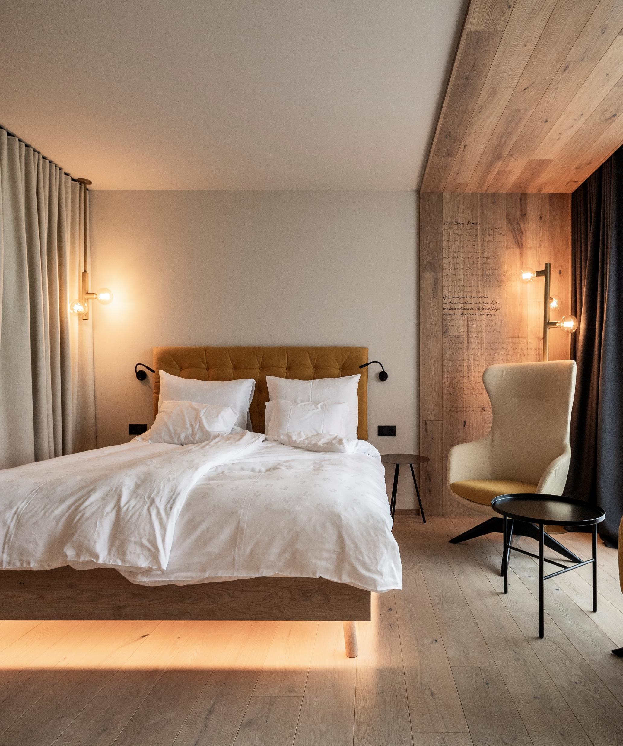
Theappealingandinviting atmosphereisachievedthroughthe useofwood,whichneverappears rusticbutnoble,homogenously plain,withoutbeingcold.
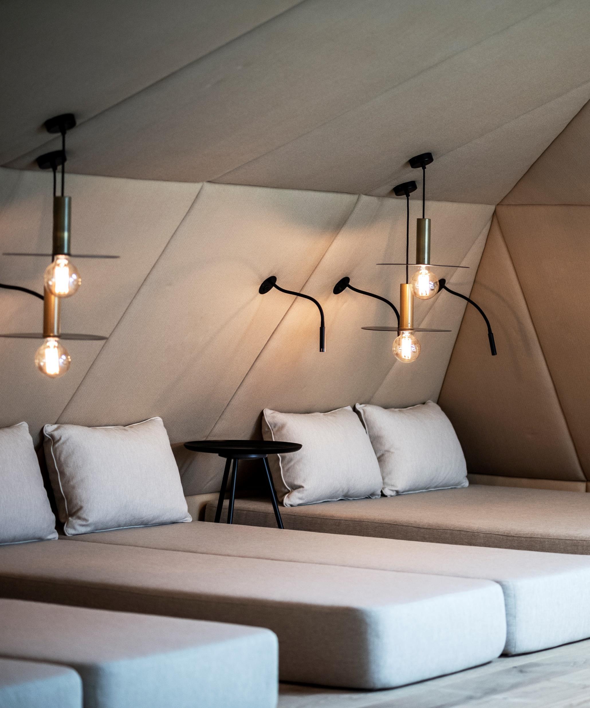
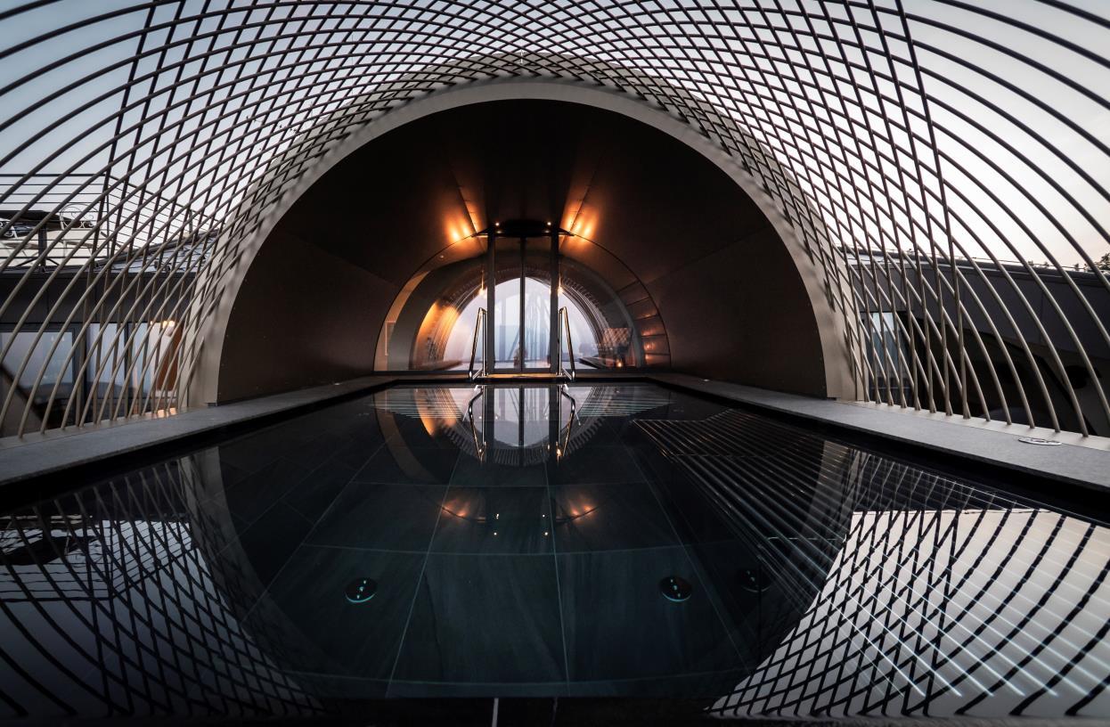
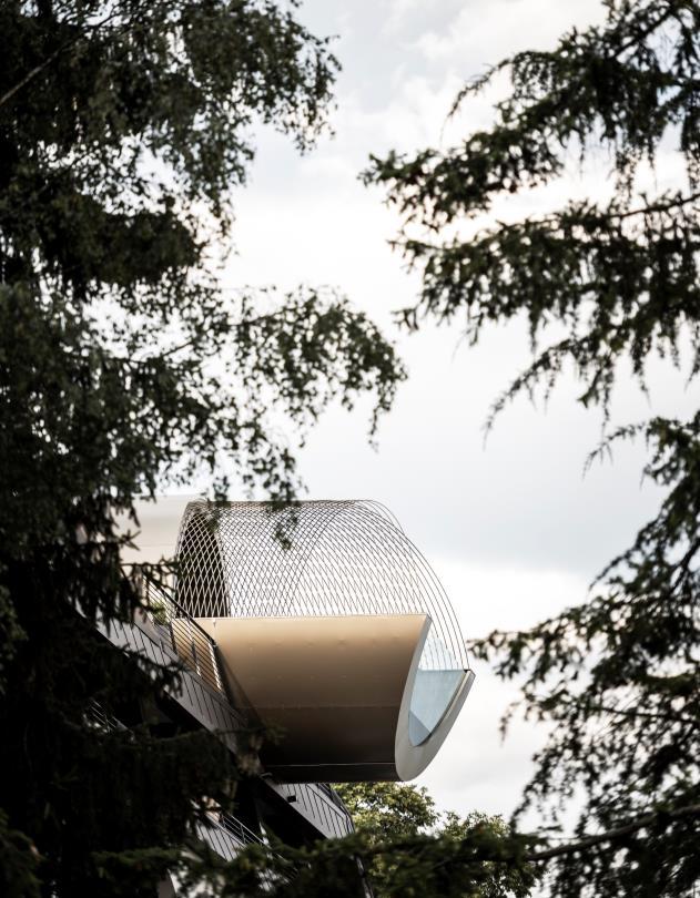
On the very top, clearly detached and with its hipped roof almost appearing as a building on its own, sits the wellness area. Here again, unmistakably, the element of the arch, which, as a bronze-coloured shell breaks through the roof structure and – positioned asymmetrically – sets a confident statement for a particularly lively architectural language
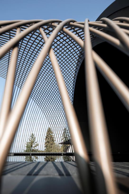
Certainly the biggest highlight, already visible from far off, is the spa area, with its extravagant cantilevered pool In the spa area one finds expansive rest areas retreat zones, as well as some intimate terraces either on top of the bay windows, or cut into the roof, for a rest in the fresh air. A unique eye catcher, is the sweeping cylinder, which on the south side of the building drills its ways into the hipped roof and protrudes on the other side of the facade an upside down arch, serving as the exceptional pool. The shell, in which the pool is enclosed, is covered with the same bronze-coloured aluminum panels as the outside of the cubic bay windows. It forms a caesura to the dark brown hipped roof and allows for a fascinating play of reflections. On the inside, a few stairs lead to
the centre of the cylinder. The automatic sliding door opens and one descends into the water, accompanied by the curved shell, one is lead towards the horizon in the infinity pool.
Nearly six meters deep, the curvature, the transparency and the gentle reflection create some sort of sculpture that reaches into the interior. When entering from the rear end, the pool is covered with a bronze-coloured rounded shell, which increasingly dissolves into a rounded net structure of poles, until one swims out under the open sky: an interplay between metal and water that creates a transition into boundless freedom. It is a process of soft fading out that dissolves this cylindrical shell and thus triggers the feeling of floating while enjoying the distant view. This almost sculptural appearing structure of poles is yet another interpretation of the ever appearing arch and the rhombus – closer observation allows one to see that the curved poles create a rhombus when intersecting. This may well be the summit of a journey that might have been imagined even before entering the building
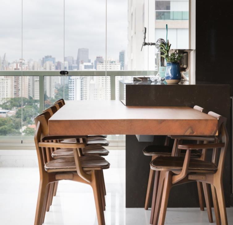
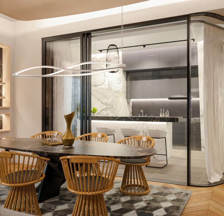
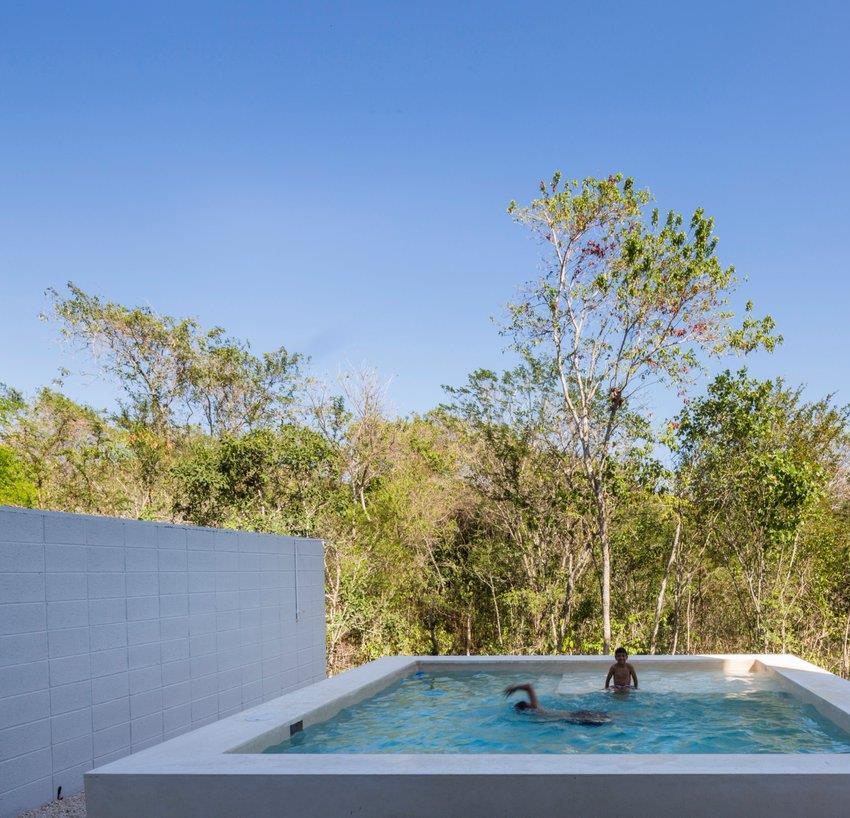


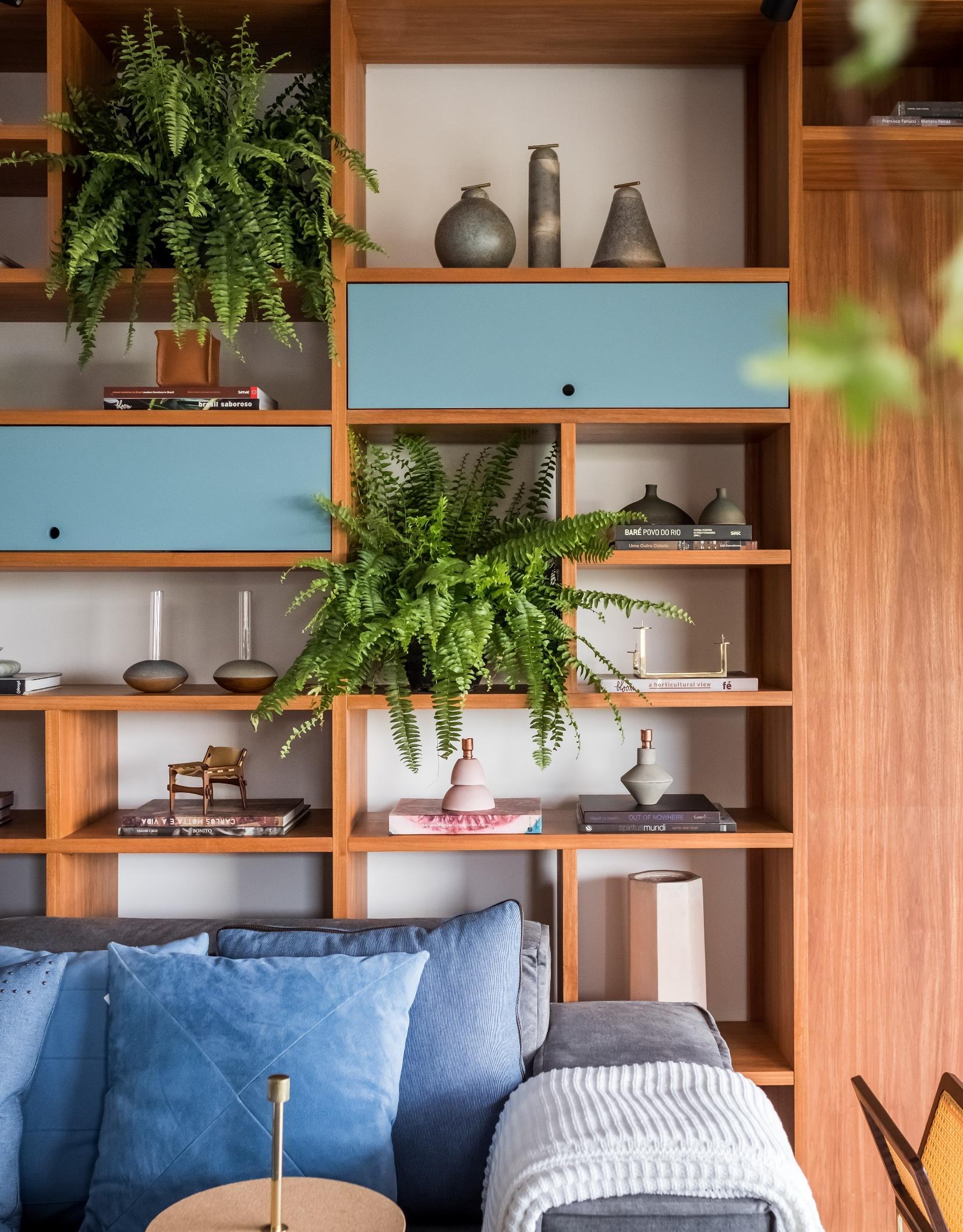
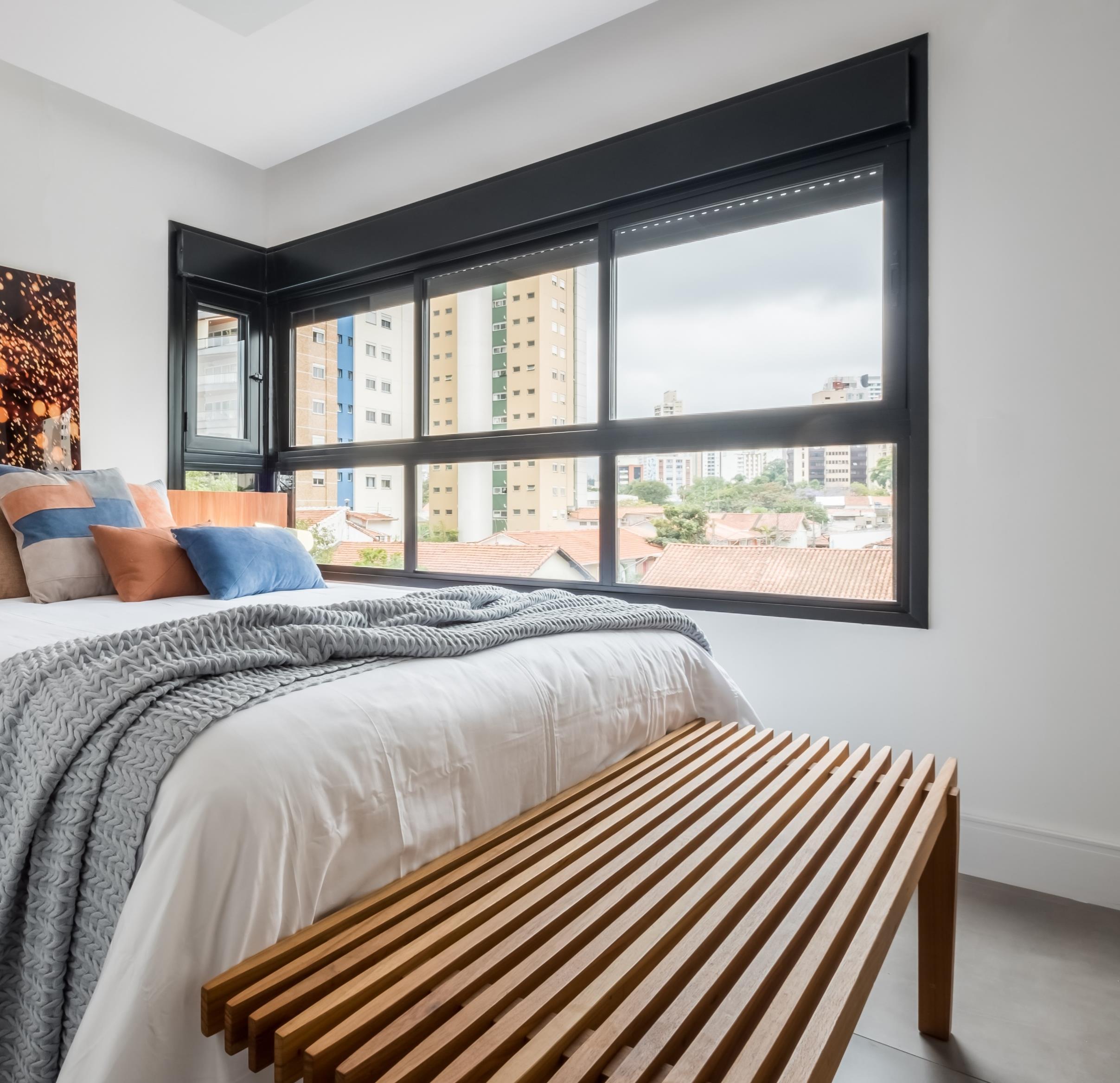
Apartment of a young woman of 30 years, the project signed by Rua 141 + Rafael Zalc tried to print a graceful space, with handmade materials of rustic style and pastel tones for the new inhabitant, making the most of the 70sqm of the property.

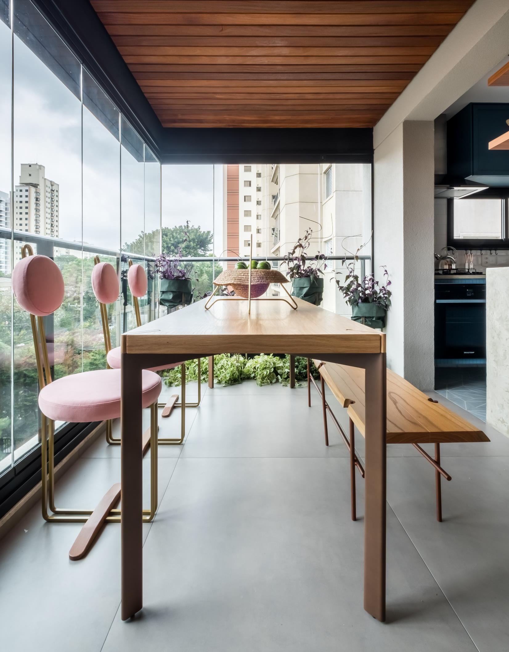
As the resident likes to receive friends, the architects chose to integrate the kitchen area and the terrace with the social area, taking advantage of the colors and textures of each material used in different environments. In addition, they removed the sash that separated the rooms, leveling the external floor with the internal and used the same material of the floor in the external and internal area, to give continuity and
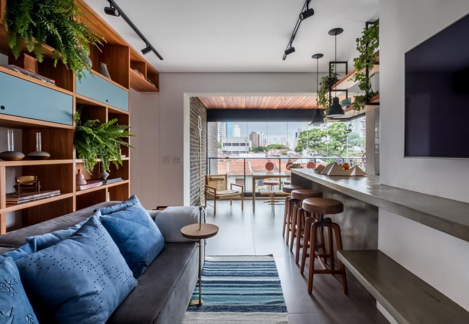
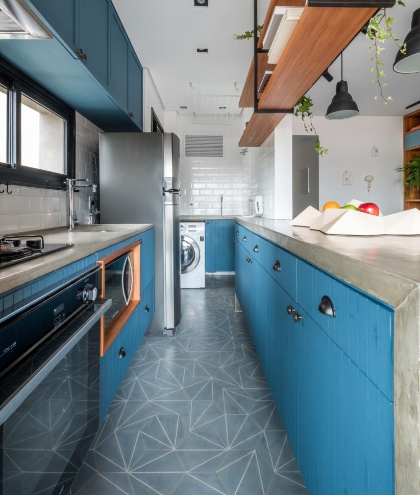
amplitude to that area. Another change occurred in the kitchen and laundry: "As these areas were very reduced, we proposed the integration with the living room to increase the entrance of natural lighting and ventilation This connection between the environments occurs through the apparent concrete bench, which starts in the entrance hall ", explains the architect and partner of Rua 141, Mona Singal
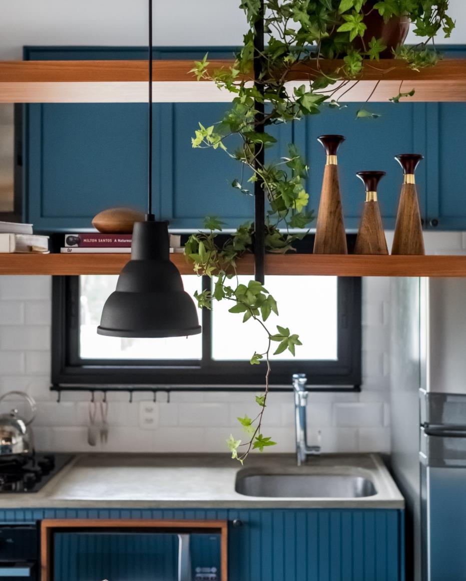
The shelf designed in the living room with the sliding door, which gives access to the intimate area, is the protagonist of this environment, which shelters the vegetation and objects of various Brazilian designers. The result is a space full of life and personality. On the terrace, there was an area for planting on the floor (floor level gardener with the drainage system underneath) and this area was used to plant some species. Rustic and handmade materials, with different colors and textures, were chosen to compose this project One took advantage of the tile, which is an old material, but it was proposed with a contemporary design, with only pastel lines and shades, used on the bathroom floors and in the kitchen. The concrete of the benches, was produced with wood forms in the work, being designed specifically for that apartment.
"The blue tone of the kitchen floor has created a freshness that talks to the corrugated cabinetwork, also blue, and shell handlebars," explains the architect. The design of this joinery was widely used in the 1950s, but in this project it gains a rereading with the vibrant blue tone and composition with the hydraulic tile of contemporary design.
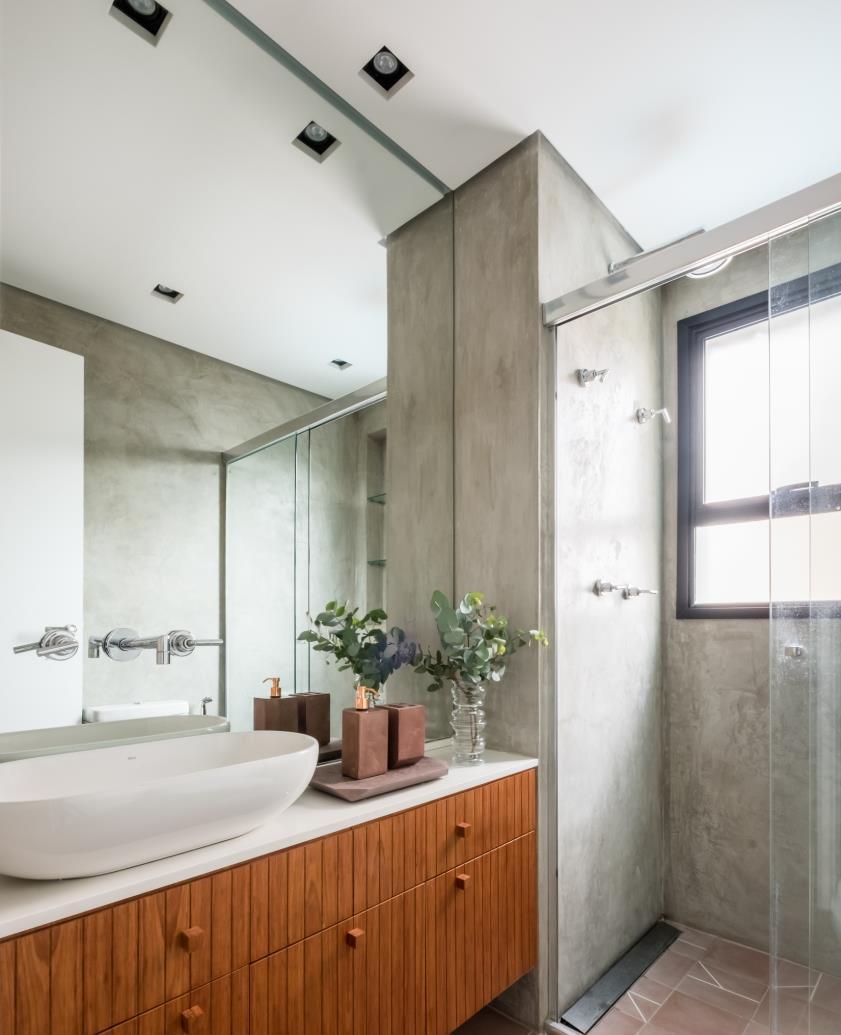
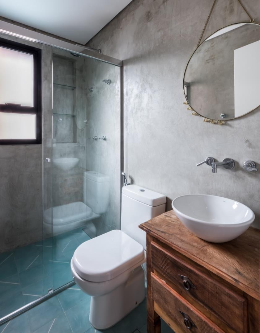
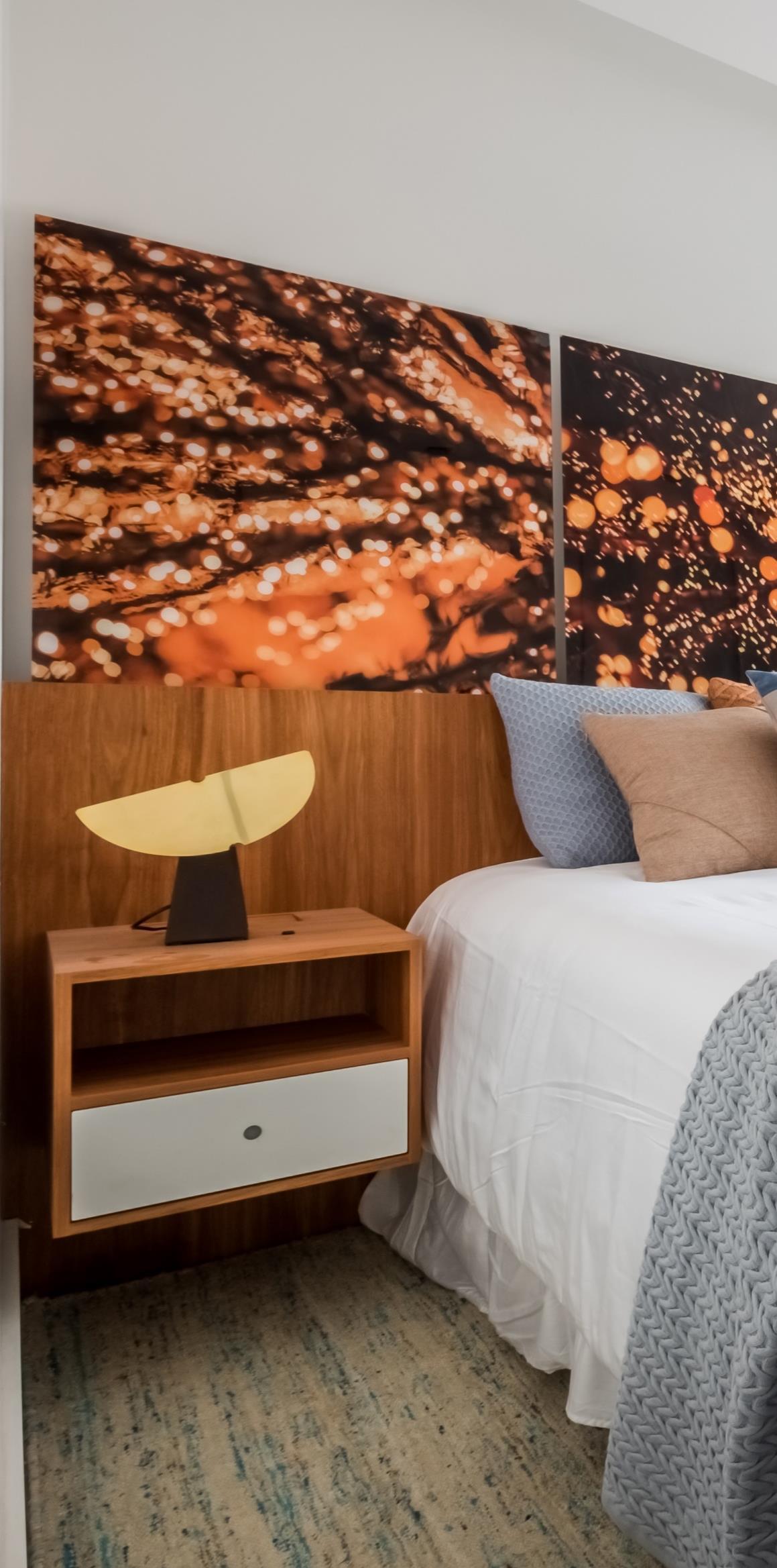
To bring warmth, the architects chose natural wood, present in the woodwork in all environments. The exposed brick wall and the wooden lining, already present in the original apartment, reinforced the rustic language like also the cement burned on the walls of the bathrooms made in
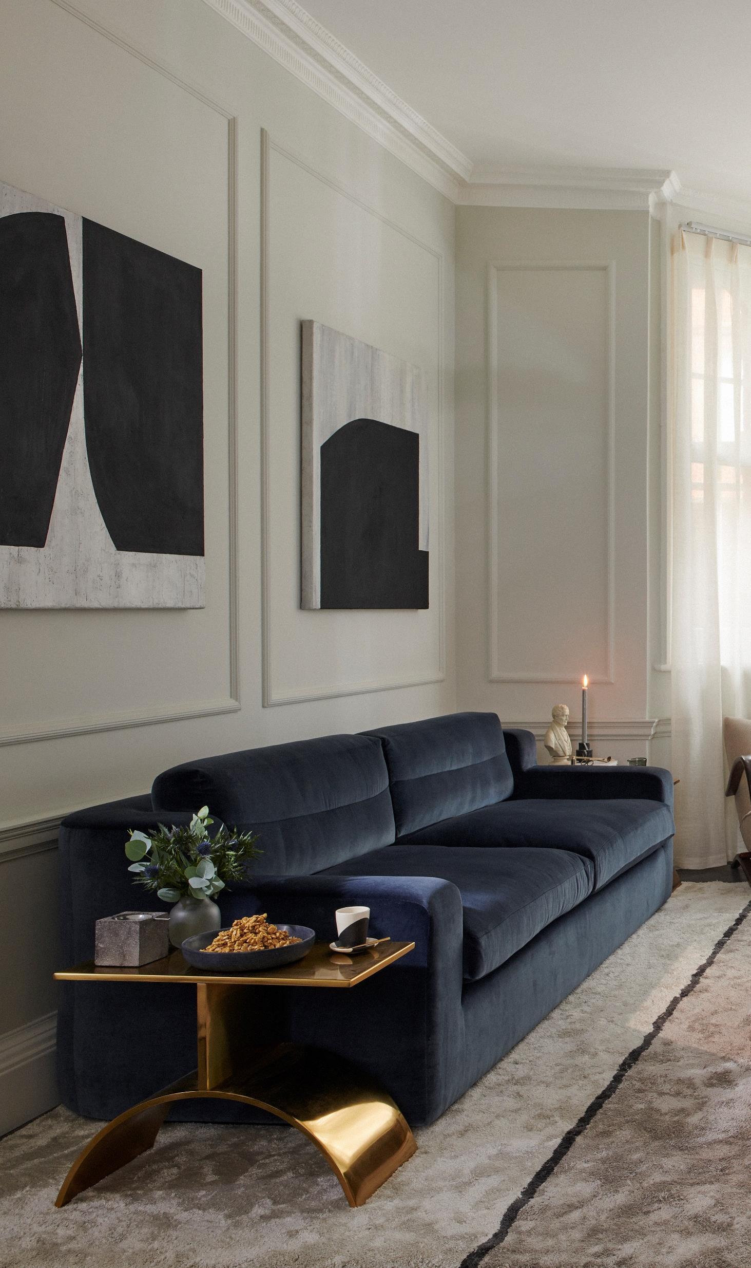
Katie Earl and Emma Rayner co-founders of London-based interior design practice, No.12 have just completed the complete interior design and creative direction of an exquisite 1,250 sq. ft. twobedroom duplex apartment and common areas in Mayfair, London.
Photography by Tina Hillier
No.12 were taken on to create a curated and considered luxury interior design scheme that would stand apart from the homogenous West London luxe look. As a result, No.12 challenged the conventions of the more commonly favored luxury interior design touchpoints by creating an apartment that exudes the high level of luxuriousness the owner would expect in terms of materiality but applied with a more contemporary aesthetic. The design concept combines the property’s prized traditional architectural elements with a modern pared-back, yet bold, design direction to achieve a fresh interior for this superior property.
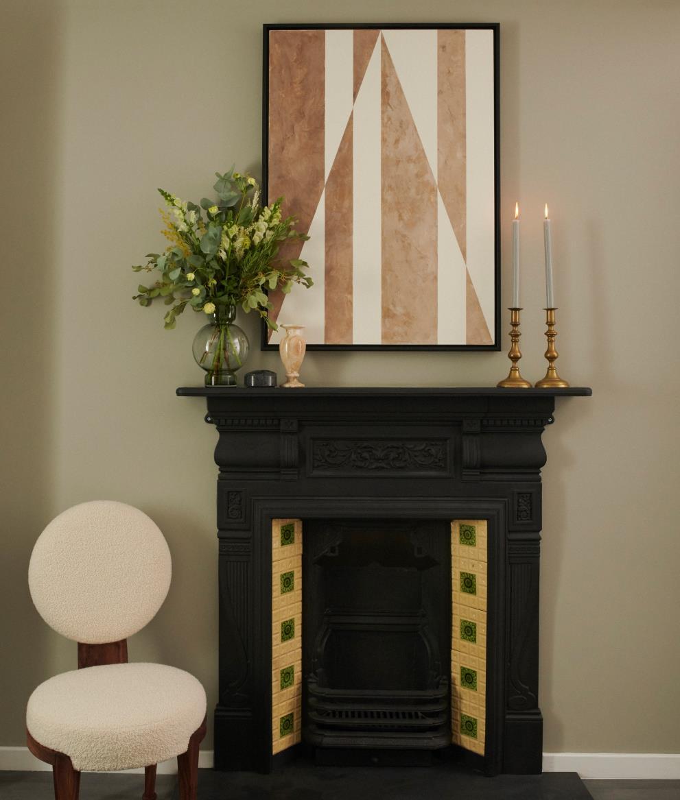
The apartment building provides a mixture of modern and inherited traditional features which No.12 has embraced as a contrasting design element throughout the residence. All the traditional 19th Century detailing, ranges from the fireplaces maintaining all their traditional features down to the delicate rosette molding above the doors No 12 respectfully left these areas as they were found and used them to enhance the overall design. The interior furniture selection follows these design cues and mixes modern pieces with more traditional and contemporary styling. The refined colour palette of the property is mostly neutral with desaturated tones serving as accents throughout each of the spaces, with boldness in form taking precedence over pattern
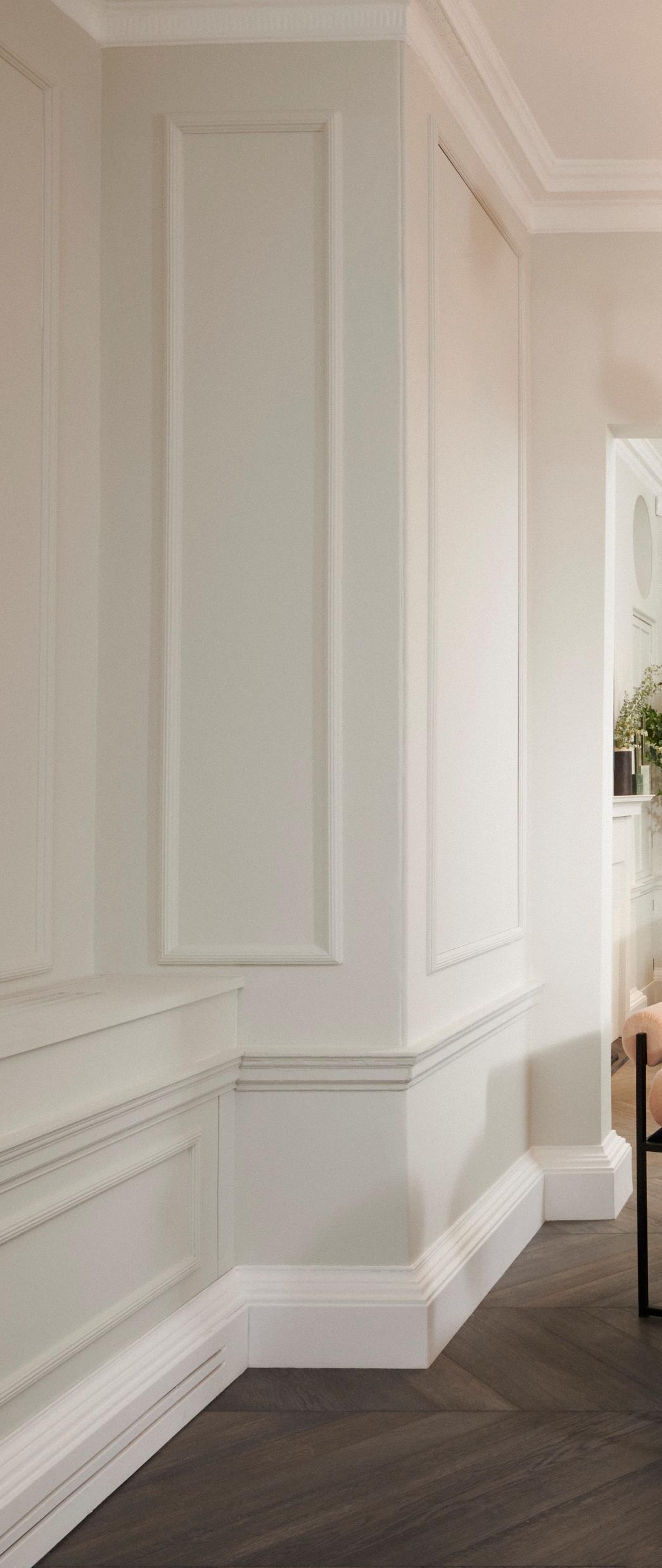
The reception room walls and beading are painted in a cool grey to add a modern twist to the space while highlighting the listed traditional cornicing and architraves in bright white. Rich insertions of colour punctuate the light-coloured space including a bespoke bold desaturated blue velvet sofa at the heart of the room.
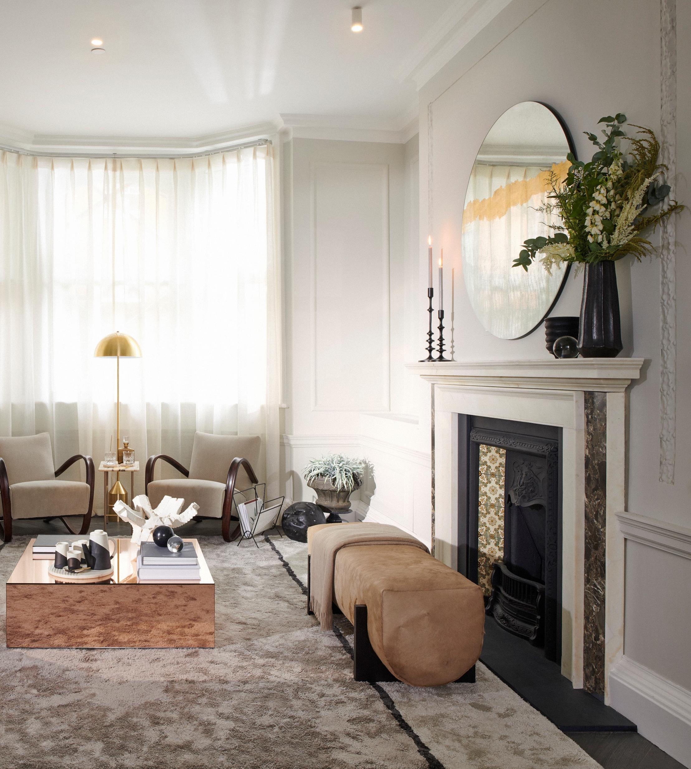
A large deep piled rug fills the imposing expanse of the main living room area to denote a sense of space and make use of every available inch of the room. With this
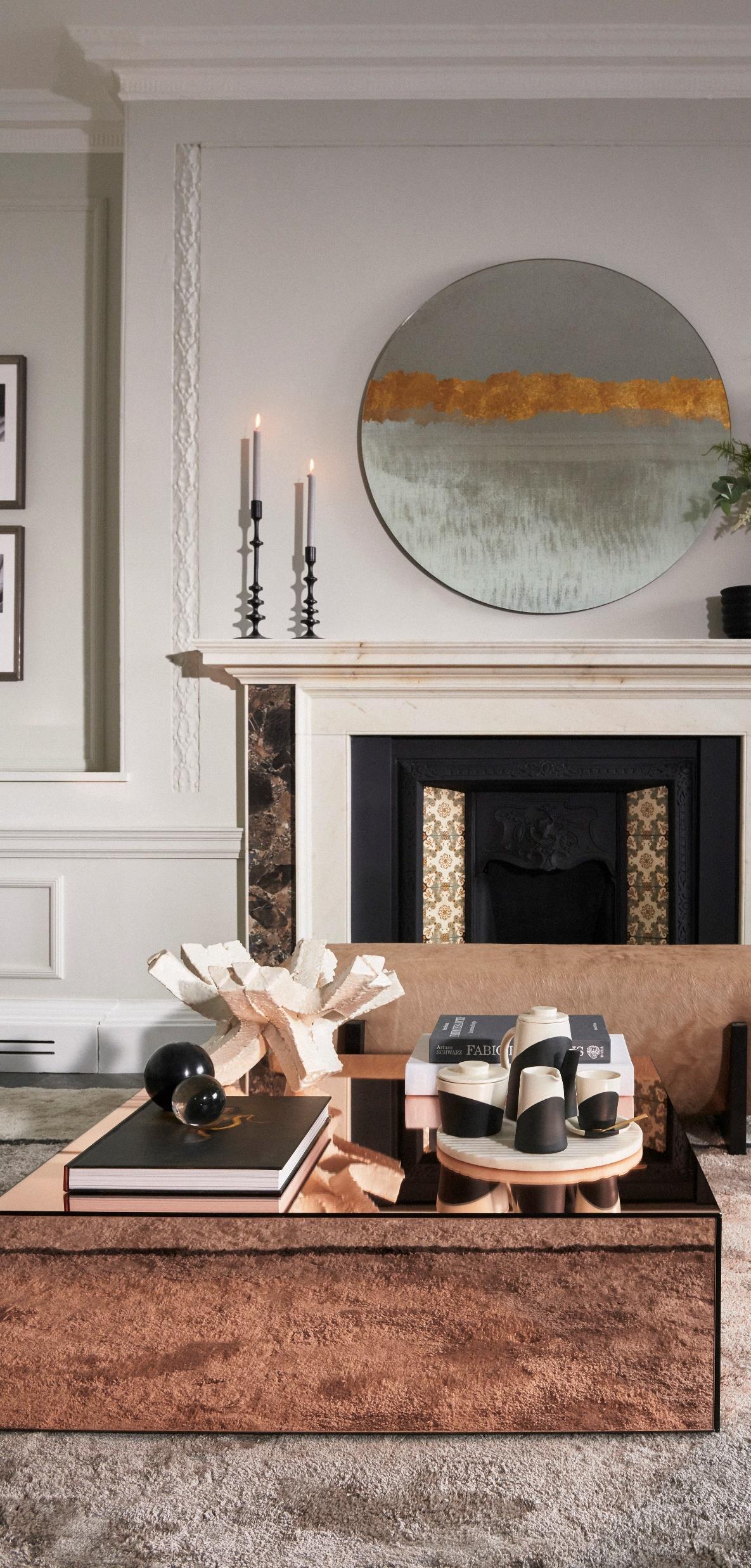
No 12 illustrates how being bold with the scale of furniture can benefit a space. They also show that fewer pieces of furniture on a larger scale can make a space feel grander.

No.12 blends modern brands with vintage pieces to create a fresh interior that feels like a home curated with pieces collected over time. In this residence, bespoke, vintage, antique and modern designs have been harmoniously combined, from the classic reupholstered Halabala armchairs in the reception to the side table with a Novocastrian marble top. Completing the space, No.12 designed a custom bench upholstered in luxurious soft rose coloured hairy hide to sit in front an antique grade-two listed fireplace.

The design is further elevated by a careful selection of bespoke furniture, a key element found in all No.12 projects, which, enables the studio to push the boundaries in creative interior design and offer a truly tailored solution.
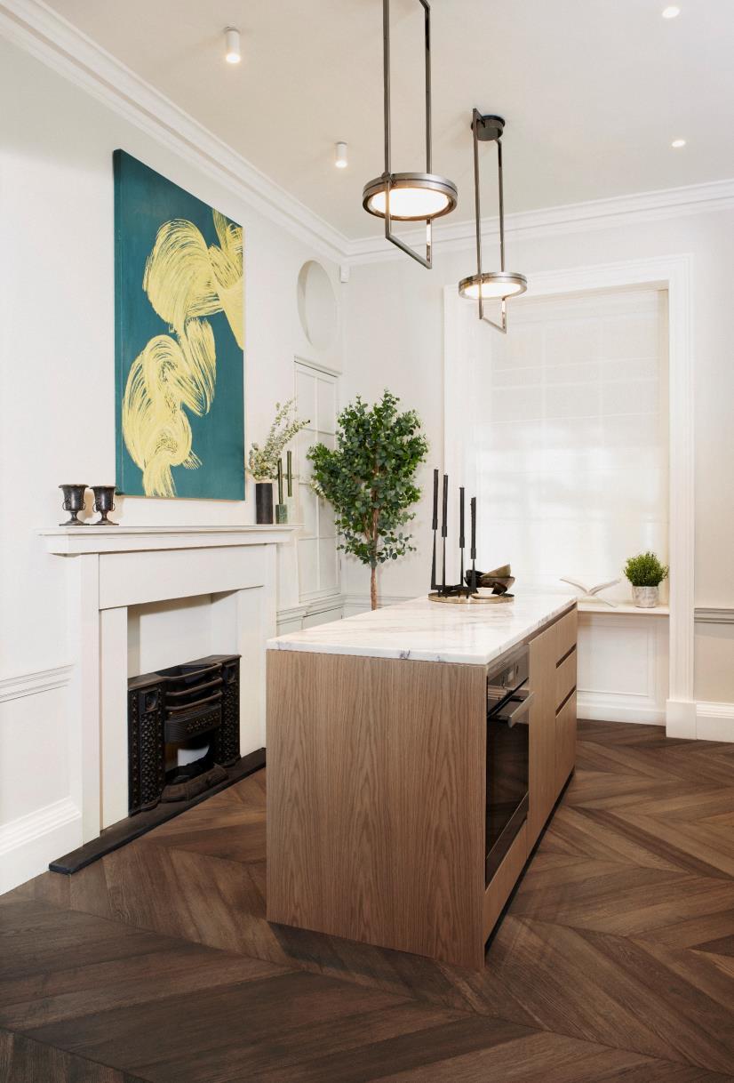
A simplified palette ensures a calm and modern aesthetic throughout the residence bringing about the feeling of a contemporary luxury home. The reception, dining and kitchen spaces are refined, composed and current, with comfortable furniture and accessories perfecting an open plan living environment.
Offering a further design twist, bold veining marble specially selected by No 12 for the kitchen island is a departure from the Calacatta marbles commonly used within luxury developments around the world
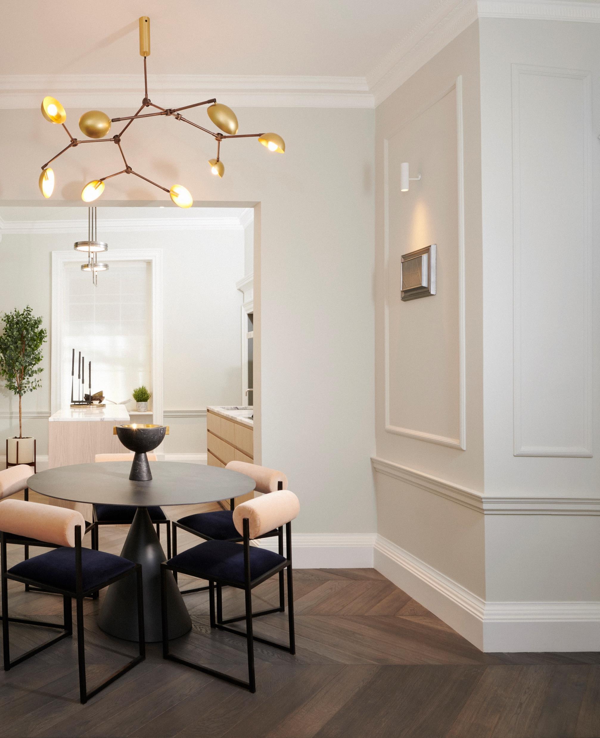
The lighting design for the residence is entirely contemporary, mixing luxury and modern lighting brands to vary the design and style. For the dining room No.12 selected the complementing modern brass chandelier – a new collaboration by 101 Copenhagen and Norr11
The lighting design style is continued by the classic brass multi-lite pendant designed by Louis Weisdorf in 1972, and now produced by Gubi in the master bedroom.
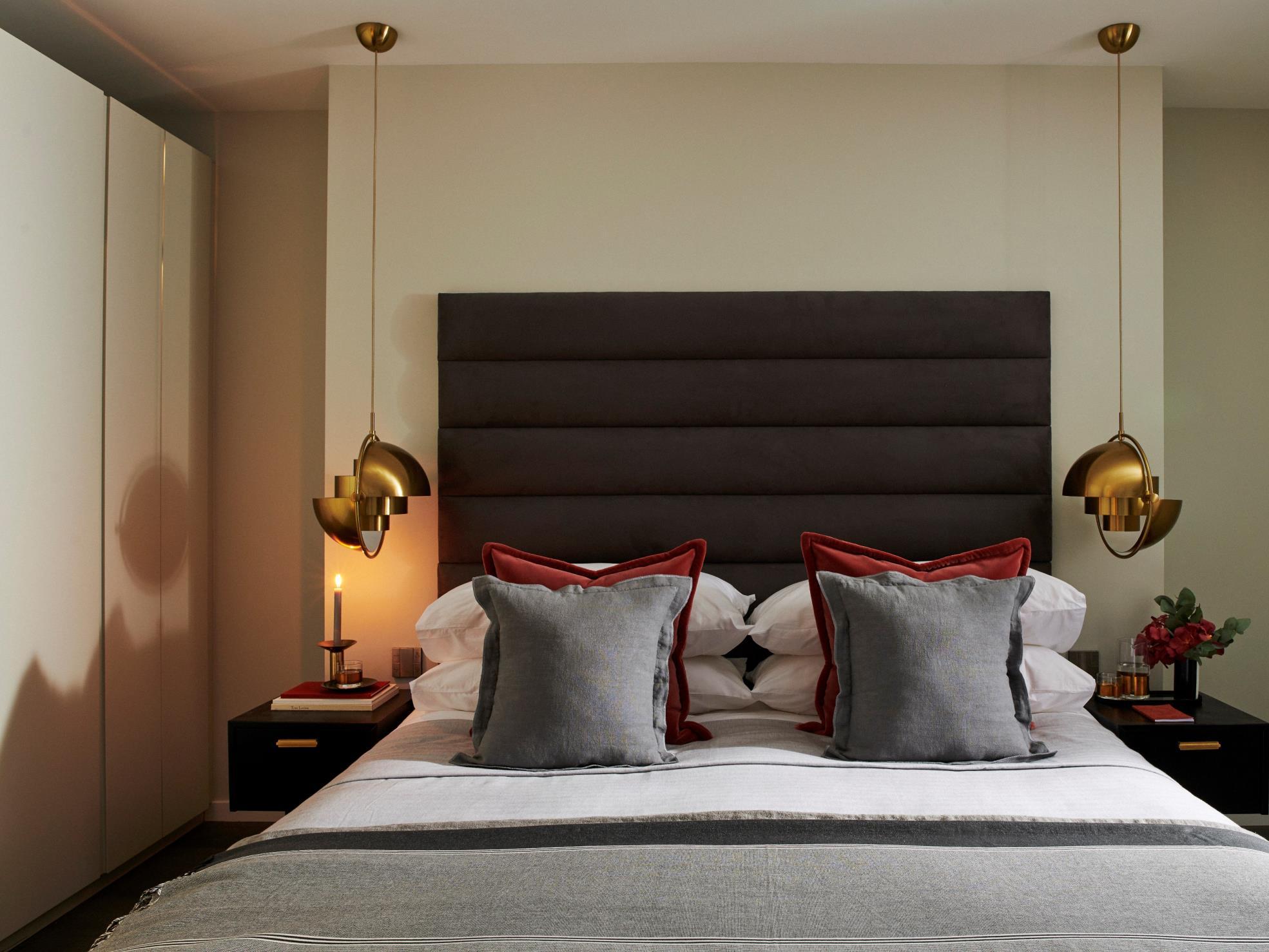
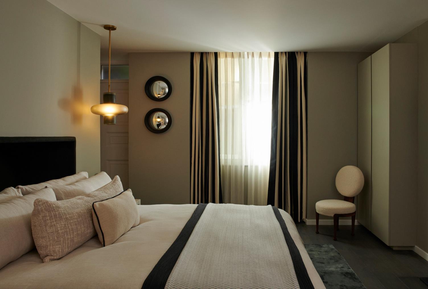
A stairwell leading to the lower ground bedrooms has been painted in a dark grey to add a sense of drama that envelopes the residents as they descend The master bedroom palette features rich tone accents, from the colour pop of rouge velvet cushions to the soft linen curtains with the fine edging detailing that lead out onto a private green
walled patio area. Custom details include a bespoke headboard with a grand wide fluted design upholstered in a cool graphite suede fabric The guestroom bedroom features a playful design with 101 Copenhagen and Norr11 lighting and contrasting tonal bedding with a custom black velvet headboard and striped curtains.

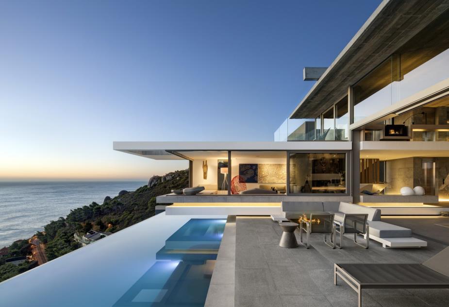
On Cape Town’s mountainside stands a striking angular building by renowned local
architecture firm SAOTA of which the interiors are curated by interior-design leader ARRCC.
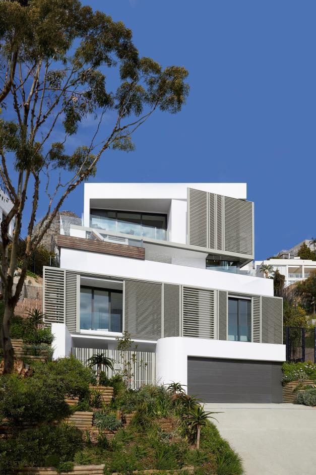

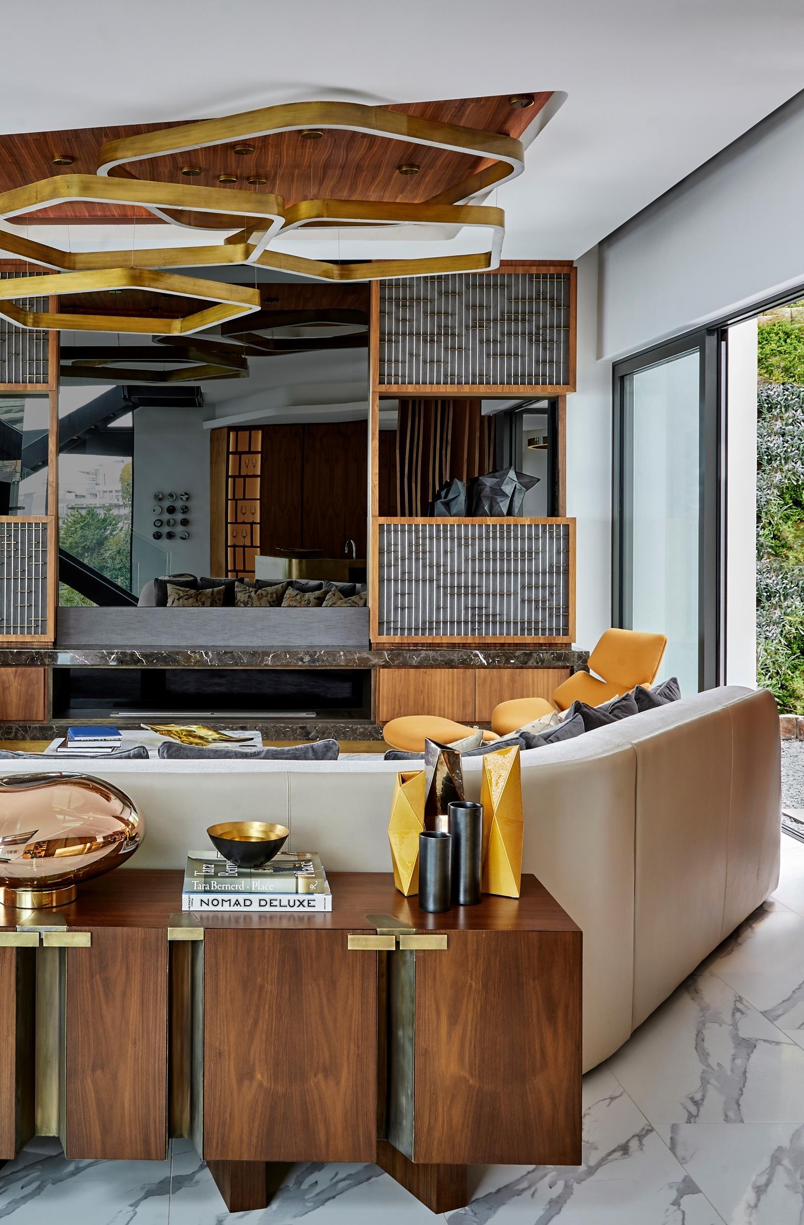
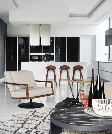
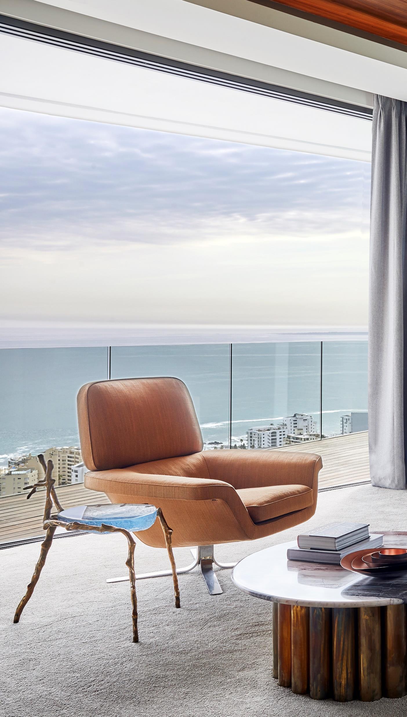
The interiors are a treasure trove of gem-like materials and custom furniture which pull together the client’s brief for ultimate comfort within high-functioning entertainment zones. A profusion of metallic surfaces is juxtaposed with warm wood and splashes of bright colour, invoking a sense of dynamic living. Says ARRCC Designer Nina Sierra Rubia of the entrance hall: “The walnut paneling is a reflection of the warmth in the rest of the home, while the metal fleck ceramic by Chantal Woodman for OKHA, standing on a suspended black swing server,
surround precious marble and wooden surfaces.
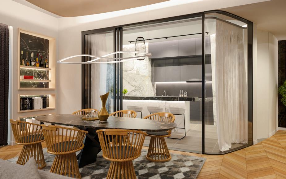
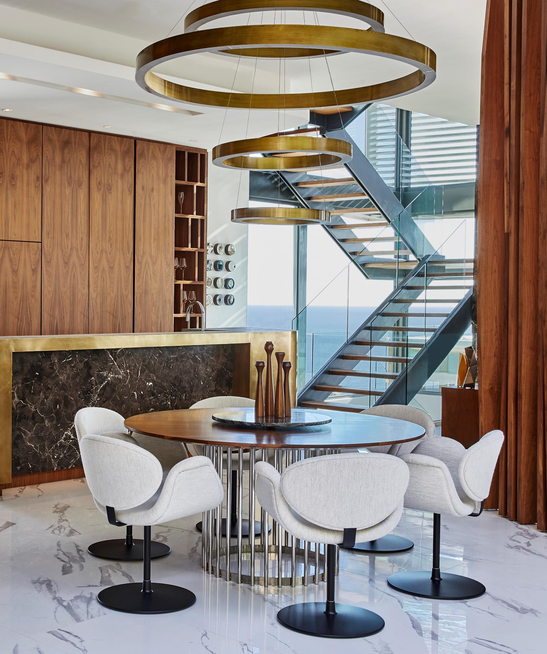
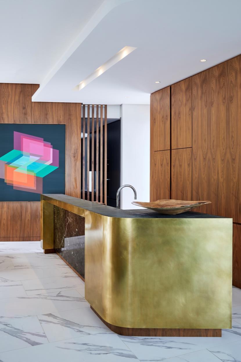
This is evident in the pared-back kitchen, where a dark marble is inserted into a patinated brass countertop with granite work surface Brightened up with an optically abstract painting by Andrzej Urbanski from Everard Read, this area also encompasses the dining suite. The walnut dining table was custom-made with a marble lazy Susan and is surrounded by Arti-forte chairs from Limeline that complement the table’s rounded form. Such circular shapes come to play in the
tells you that there’s fun to be had inside ”
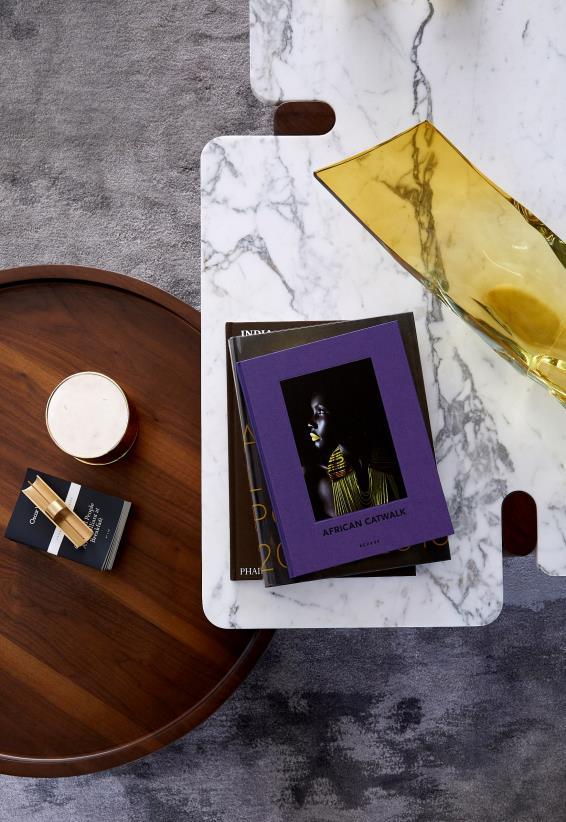
The patterns in the marble-like flooring and custom designed geometric grey woolen rug are complemented by ceramic installation art by Hennie Meyer, each piece inviting closer inspection in its uniqueness.
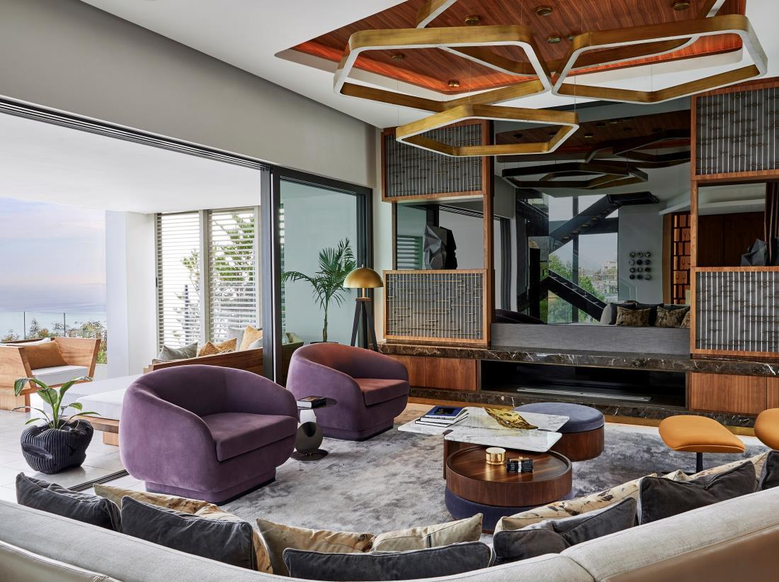
Reached via a double-volume-glass stairwell that introduces mountains cape views, the living area is a riot of calculated contrast, where light-reflective metallics – polished, tarnished or patinated – hover above and
sculptural light, too. Brass rings cast a halo over the table, an atmosphere that is mimicked in the lounge with its polygonshaped light. Separated from the dining area by architecturally slatted walnut screens, the lounge continues the dialogue of fascinating form. Its custom sofa, with angled bend, allows for complete immersion, offering views of the ocean, courtyard and television, which also acts as a mirror, further enhancing the sense of space.
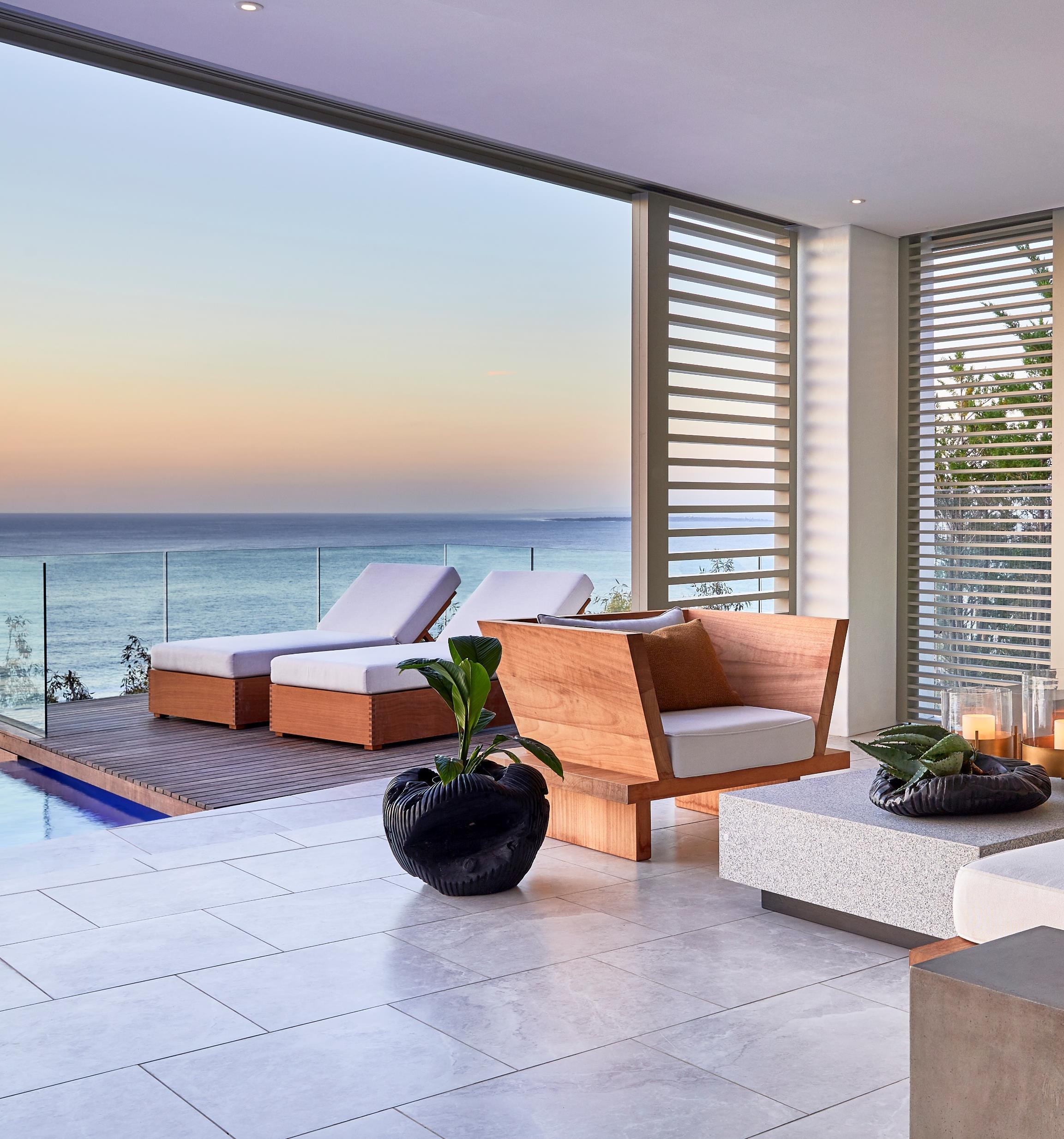
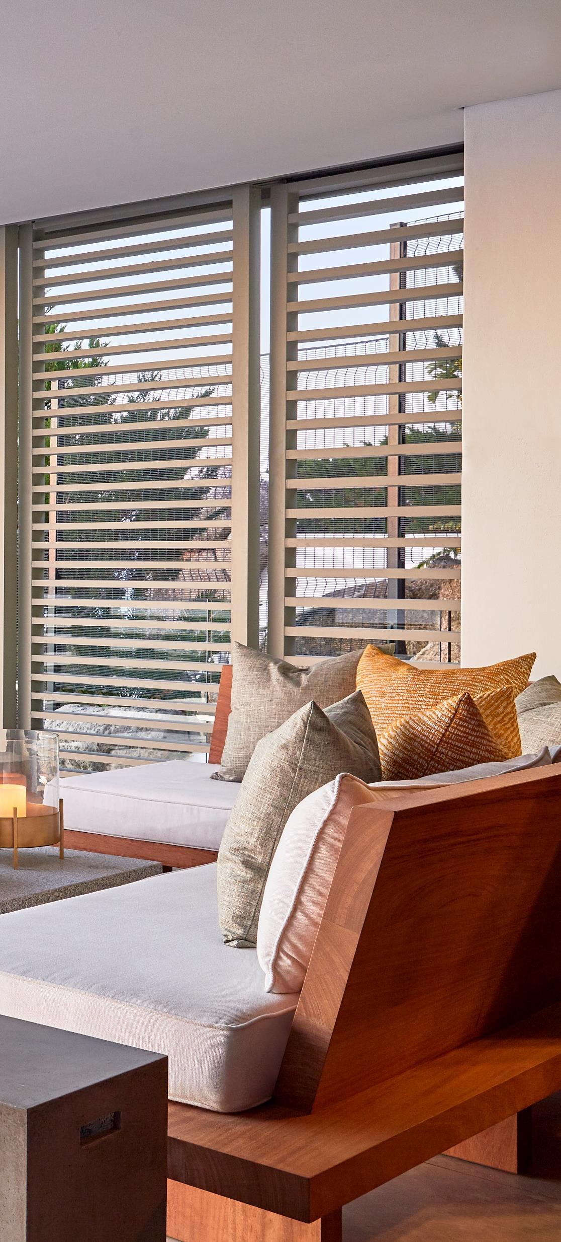
“This entire living-area floor opens up to an enclosed terrace,” Mark explains, ‘which can be closed completely for weather protection ’ Here, Nina and the ARRCC team created two outdoor entertainment areas – one encompassing another lounge with custom furniture in neutral tones, reflecting Cape Town’s beach lifestyle, and the other sporting a cantilevered bio-fuel fireplace for drying off after a swim in the infinity pool
The corridor ends at the kitchen, whose island – a solid block of granite – forms a fulcrum with the principle living areas placed at right angles, parallel with the lagoon. The kitchen looks out over open-plan dining and lounge areas towards a fireplace and picture window framed in a massive concrete hearth wall
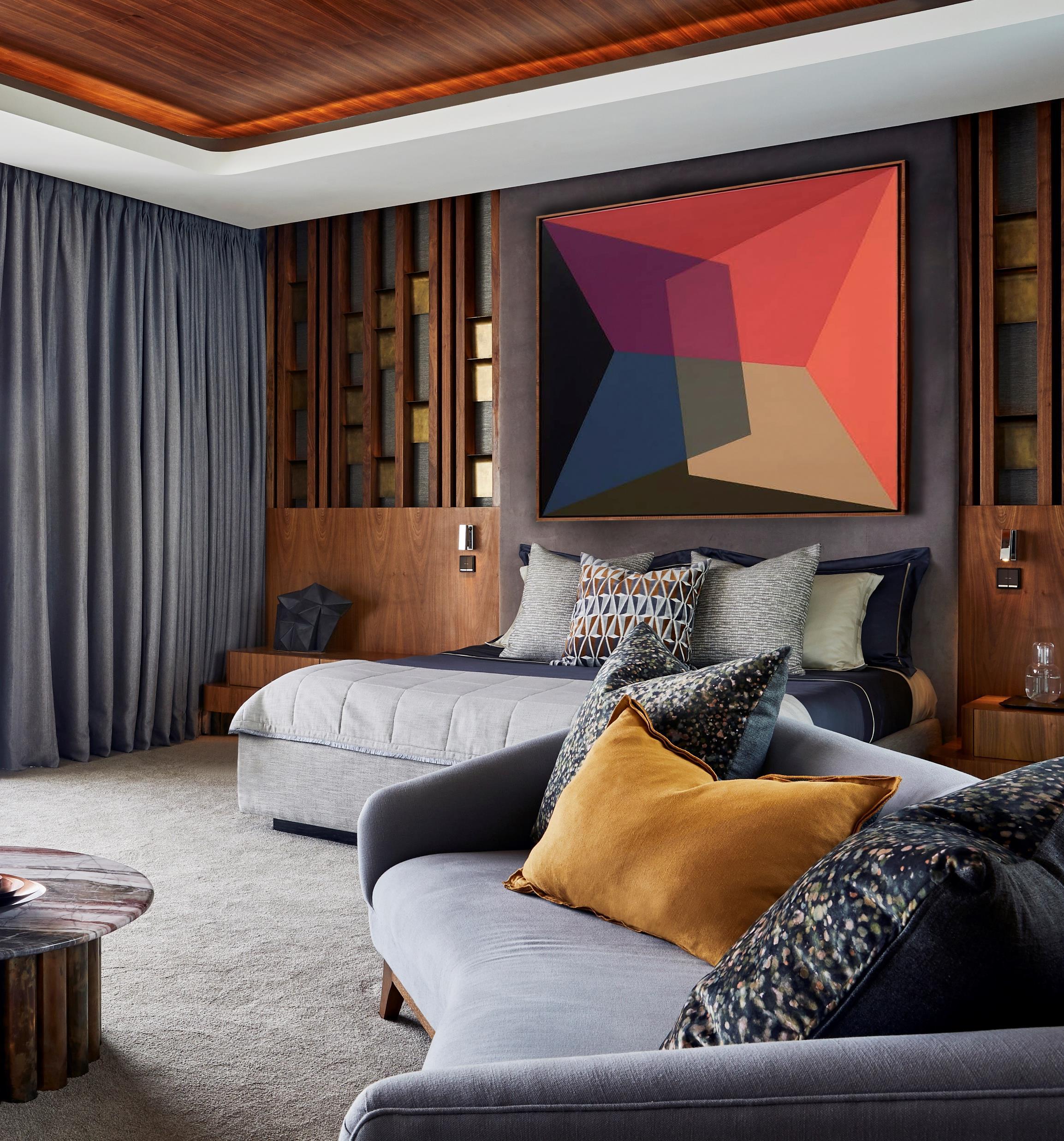
The top-storey master suite continues the home’s affinity for walnut, grey, mustard, and curvaceous forms, bringing these to play in a more masculine way, and then softening the aesthetic with linen effect curtains. Another Andrzej Urbanski, hangs over the bed, adding an interesting geometric language to the space. The wall on either side of this brings warmth through walnut slats with brass fittings that light up.
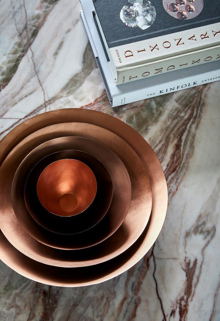
The limited edition Kaggen Side Table, by OKHA in collaboration with Atang Tshkare, and the marble-topped coffee table by Tonic create visual texture in the lounge area, while a painting by Shany van den Berg on the entrance screen welcomes one to this bedroom floor, offering a taste of what’s to be found beyond – a space for full mental and physical immersion.
“It’s a dynamic home,” says Mark. “One where unexpected materials combine to create a space that is as energetic as its owner. ”
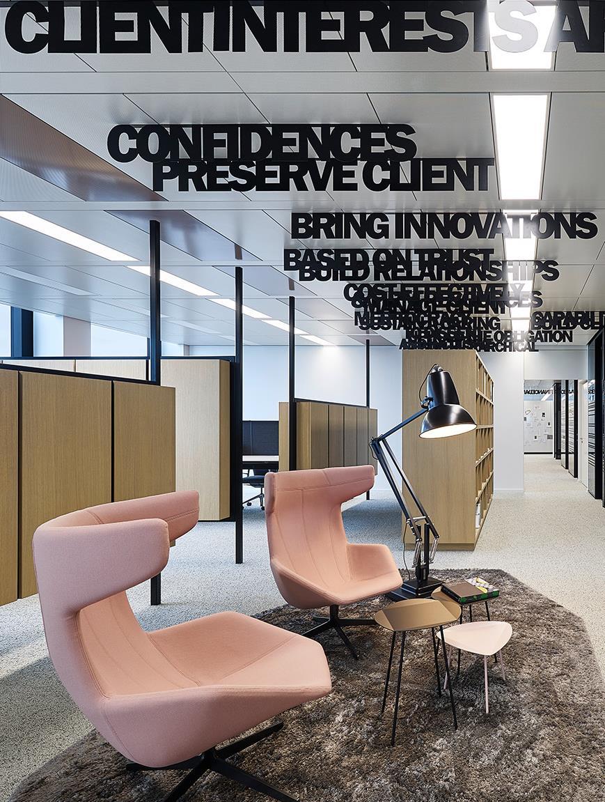
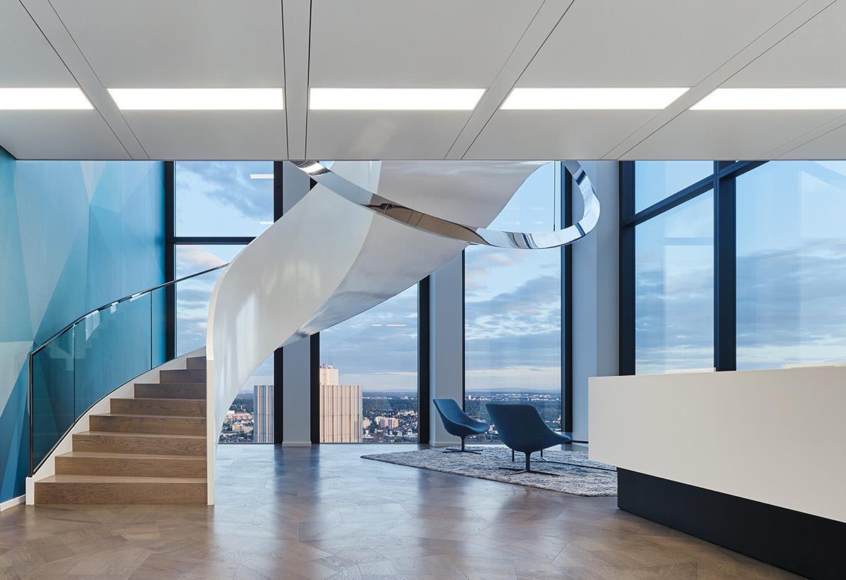
Ippolito Fleitz Group created the interior design of two and a half floors of innovative office space, spread over 4000 square metres in Frankfurt’s “TaunusTurm” building.

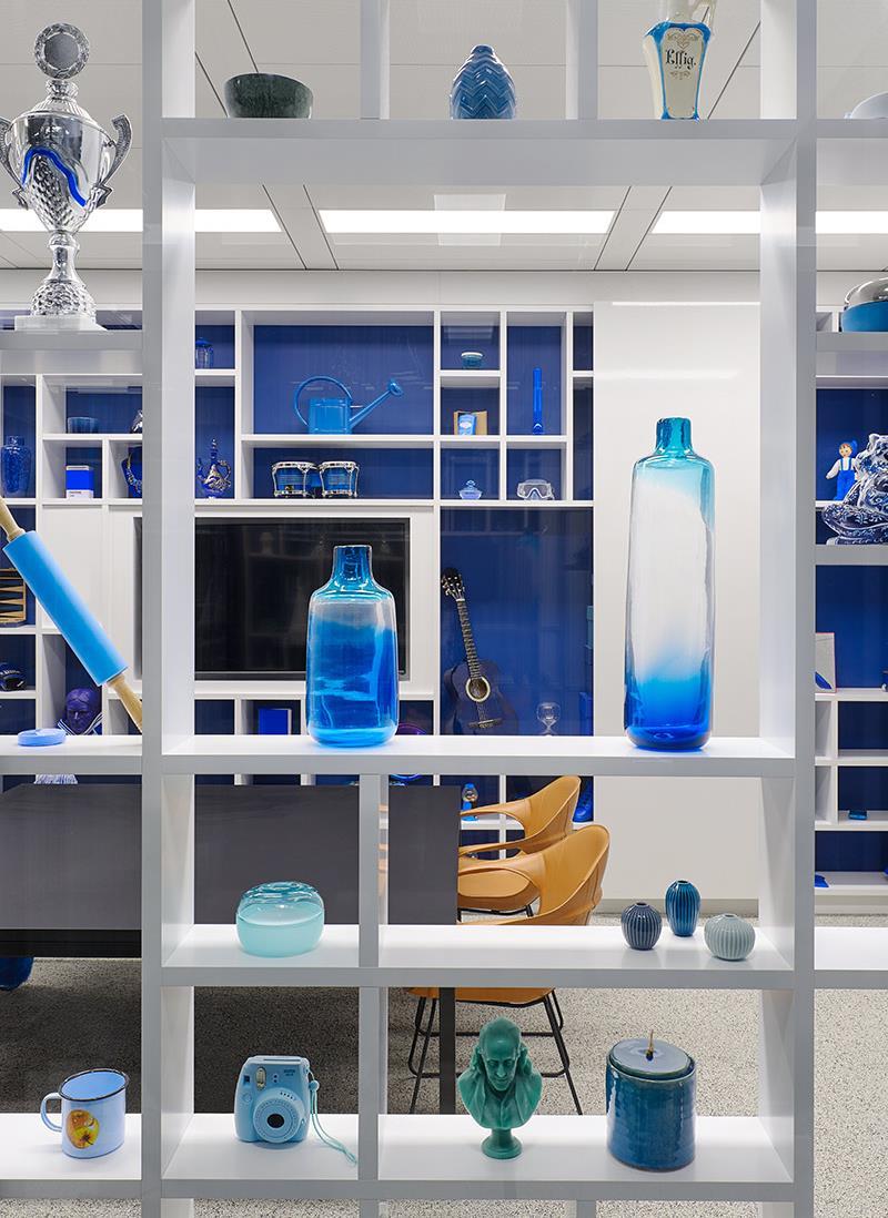
To ensure an adequate level of privacy, proximity and identification, each floor is divided into spatial segments, which in turn are segmented into “Neighborhoods” with a maximum of 25 workplaces. These “Neighborhoods” are connected to “Market Places” - additional communication hubs that create a sense of identity. While the library area with its lush greening presents a place of retreat, punchbags offer an opportunity to dissipate excess energy.
Characteristic nude, teal and blue colour schemes reinforce the localisation of the specific spatial segments. In the office areas, the schemes appear on quietly coloured walls, the partitions’ textile covers and the furnishing. With muted shades and discreet patterns, the selection of materials underlines the suiting-inspired charm of subtle colourfulness. The combination of foils, covers and glass surfaces with graphic applications creates exciting layering effects, while acoustically effective glass partitions, textile-covered panels, thick carpets and heavy curtains provide a high level of soundproofing. Inside the common rooms we intensify the harmonic play of colours with polygonal colour fields in shades of aubergine, blue and brown. Here, vigorous colour schemes and surprising graphic elements emphasise the dynamics and energy of the informal spaces of communication.
Complementing the zoning’s rhythm is a variety of ceiling-installations – colourful raster elements, light-slats and works of art. With his “WELTICHLOTSE” project, linguistic artist Bruno Nagel created word-ceilinginstallations customised for the company’s areas of activity. Merging terms from diverse fields and subjects, he develops unique word structures that challenge readers with structurally flexible modes of reading and thinking Providing food for thought, these peculiar neologisms are spread over all floors and serve as a source of inspiration.
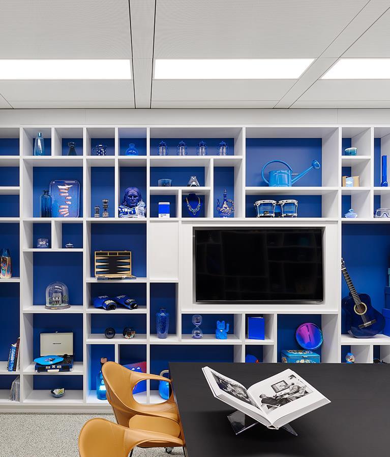
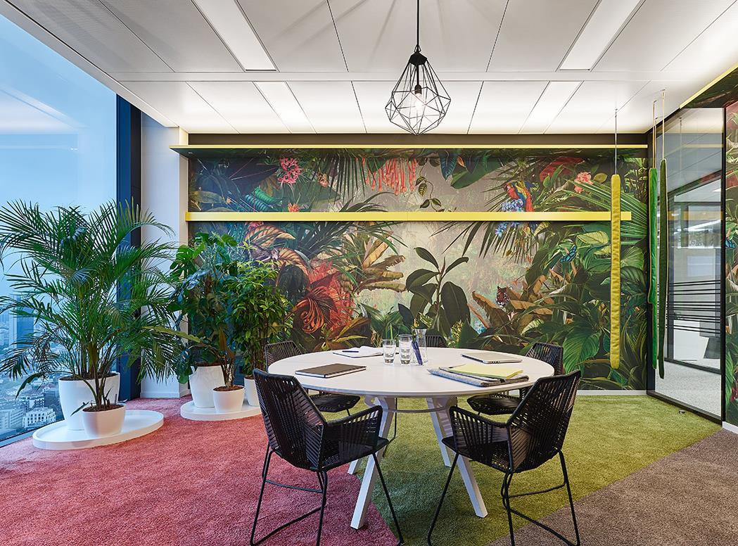
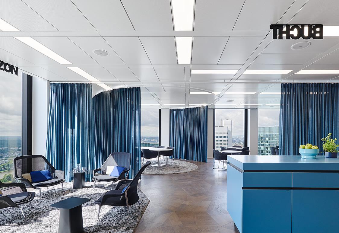
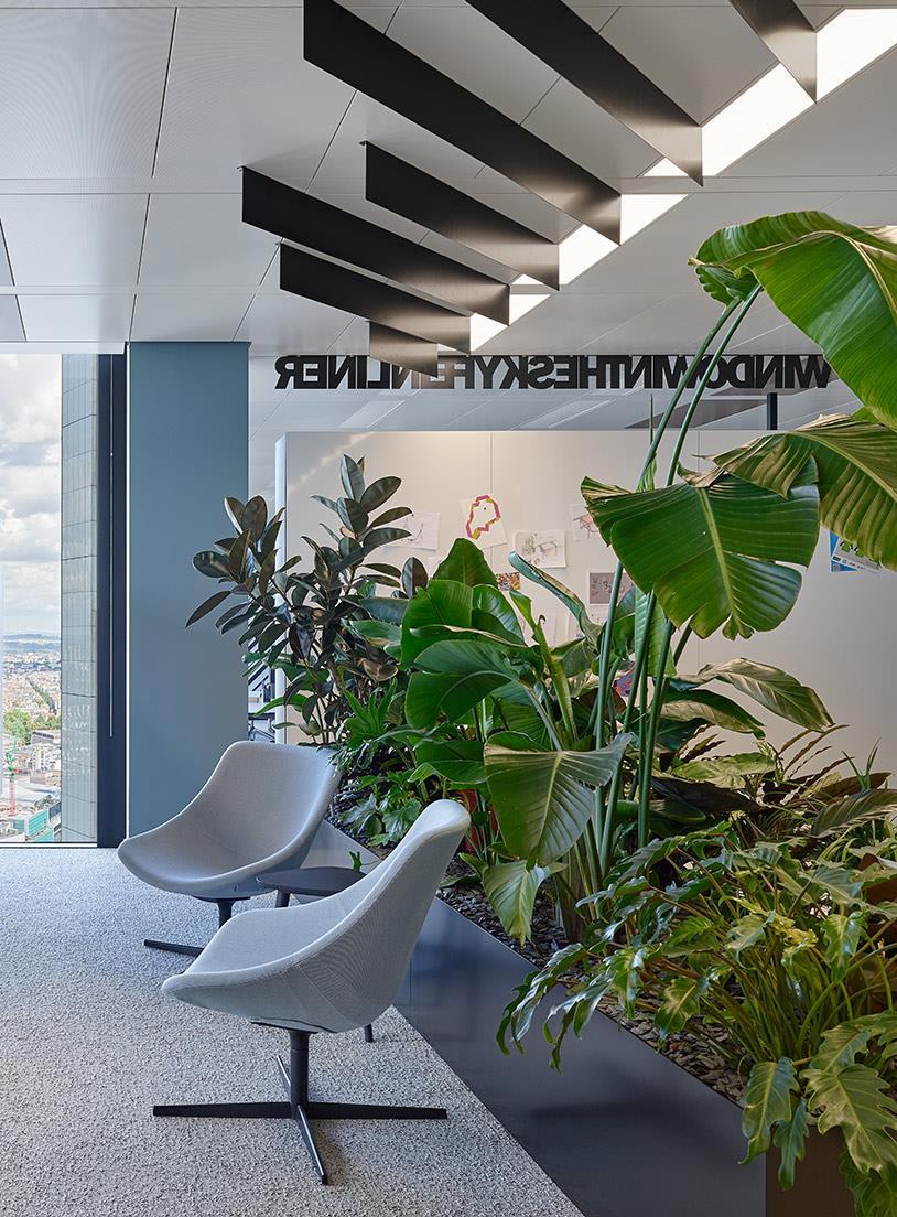
Workspace design not only had to account for highest demands on discretion, but also needed to align a number of divergent workplace typologies. Soundproof spaces of retreat that can be used by groups or individuals offer privacy for confidential conversations, focused work and phone calls. In addition, they provide sufficient temporary workspace for part-time office workers and external employees.
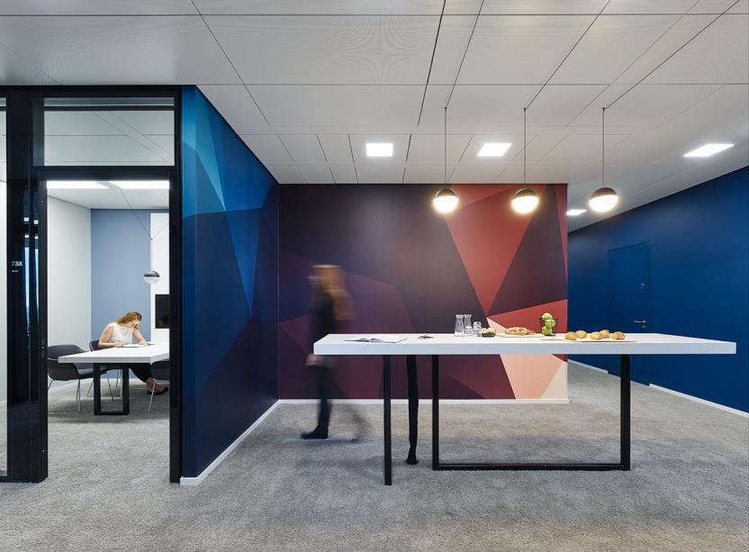
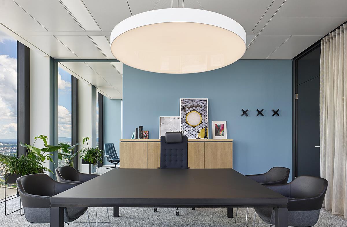
Apart from open space areas for four employees each, the new premises offer a variety of single, double and corner offices as well as personalised lockers that provide individual stowage Height-adjustable desks allow for a flexible work flow, whereas integrated conference tables in the individual offices create the necessary discretion for
intimate conversations. Although consistently designed for desk sharing, the closed offices feature picture boards that can be filled with personal memories by employees – hence giving rise to a pleasant balance between personal offices and public spaces with a sense of identity
The Brazilian interior design Interiores projected the spaces in São Paulo creating a place perfect balance, nature and convenience, sophistication.
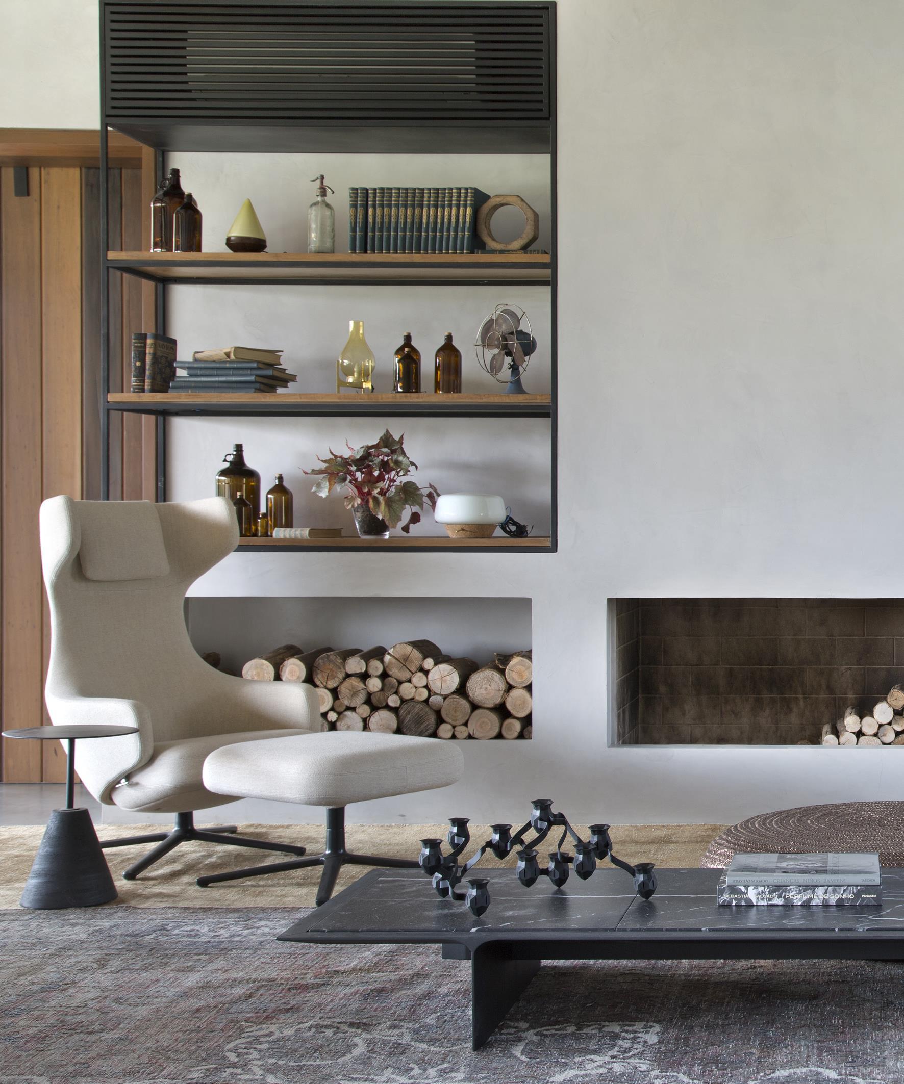
design studio, Melina Romano spaces of double-levels house place that brings together, in nature and comfort, charm convenience, relaxation and sophistication.
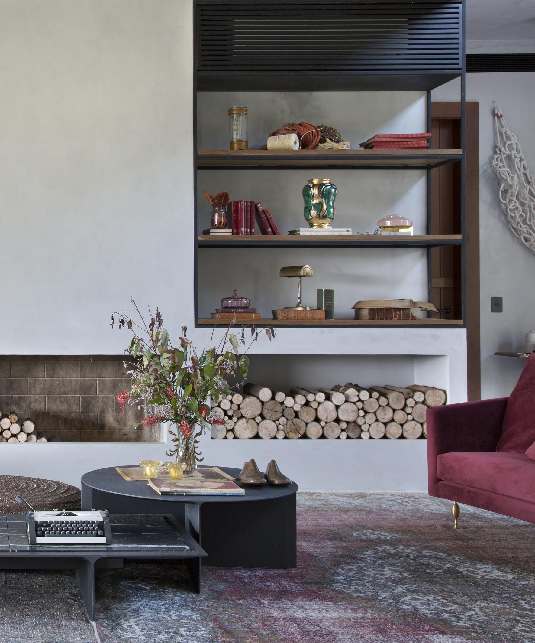
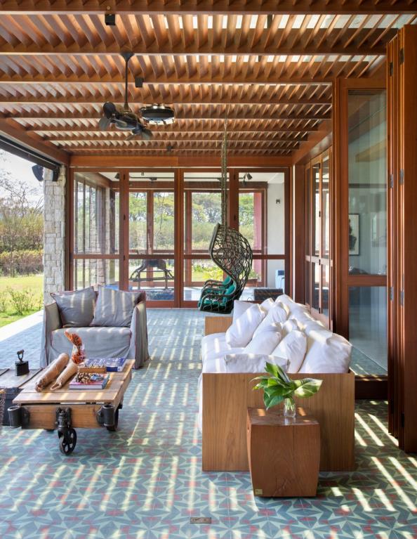
It's a holiday house projected by Simone Meirelles with interiors by Melina Romano for a Brazilian young couple with 2 children, who love to invite family and friends, and also like art, design and travelling. The clients participated during the process, helping to find and choose all digged objects and furniture, as well as sharing with design team personal memories, which they would like to materialize into the space. It was a pleasant process in which the design studio mixed the new with the old, developing a modern atmosphere without putting a bucolic warmth aside customizing all design elements
The challenge to develop a storytelling house, combining vintage and digged elements from the owners, with contemporary elements
The internal house area, connects with the external trough simple and minimal sliding doors, which enable full integration and fluidity for the spaces. The external furniture mixes functionality and iconic designers, like the Paola Lentti chaise. The hydraulic tiles are enhanced by the roof slats, which plays with the natural lightning, awakening different colors while owners have a cup of coffee or a corn cake
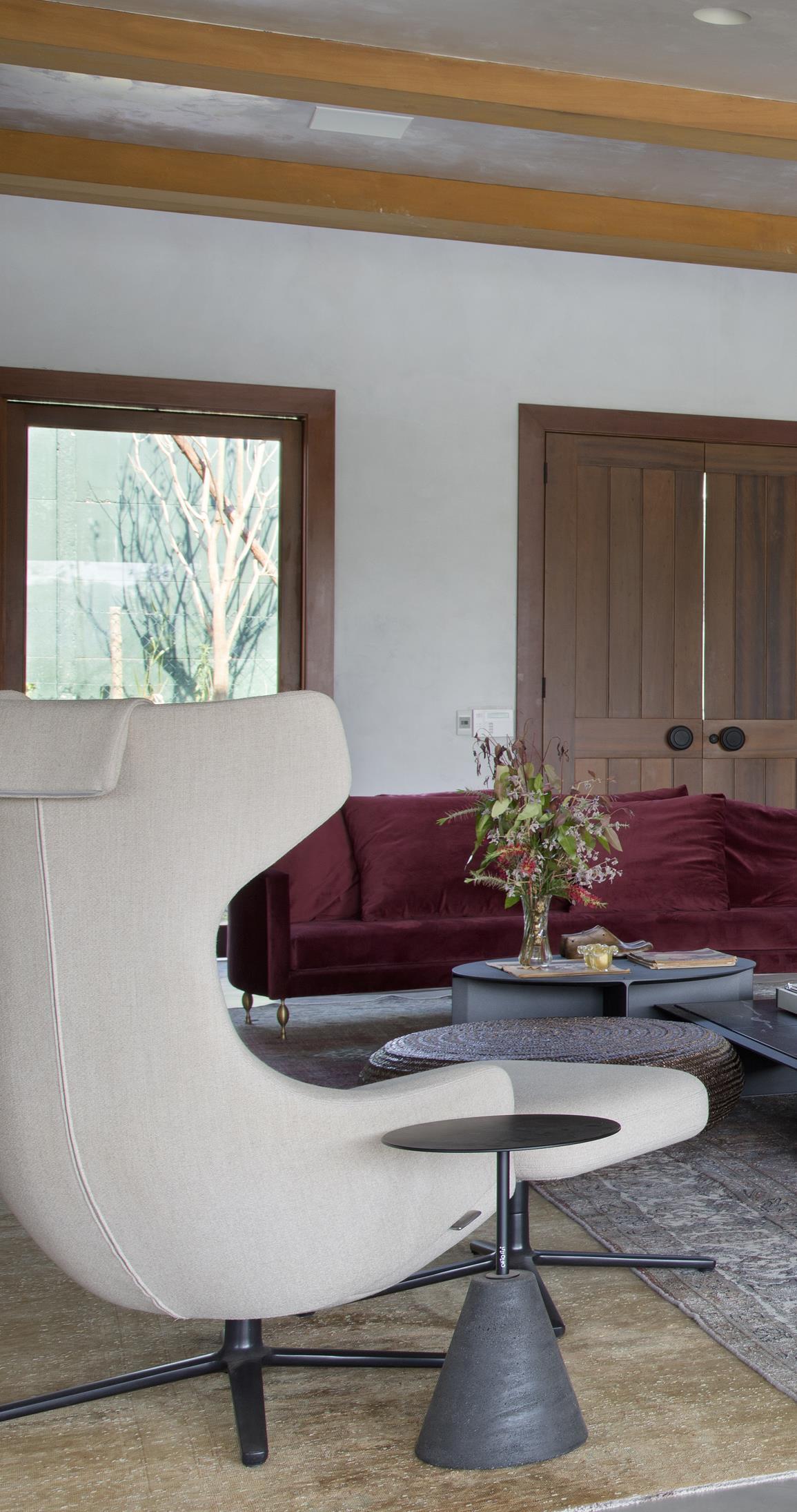
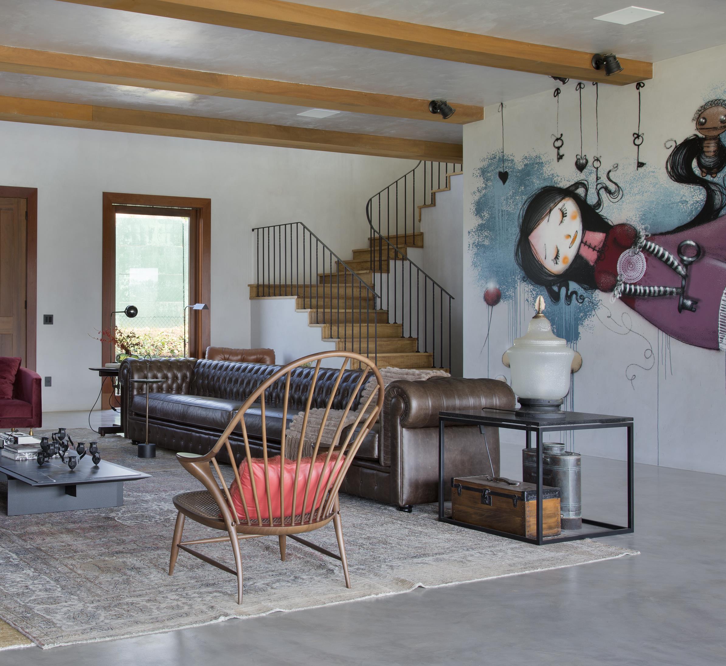
The living room reveals a mix of design, combining great names such as Antonio Citterio, Jader Almeida, Marcel Wanders, Sérgio Rodrigues and Marcus Ferreira, to digged lamps, which deliver comfortable indirect lighting. An important feature is the Vermelho Steam graffiti, inspired by the dolls theater of the XIX century. This graffiti connect trough both sides of the wall, the living and dinning rooms.
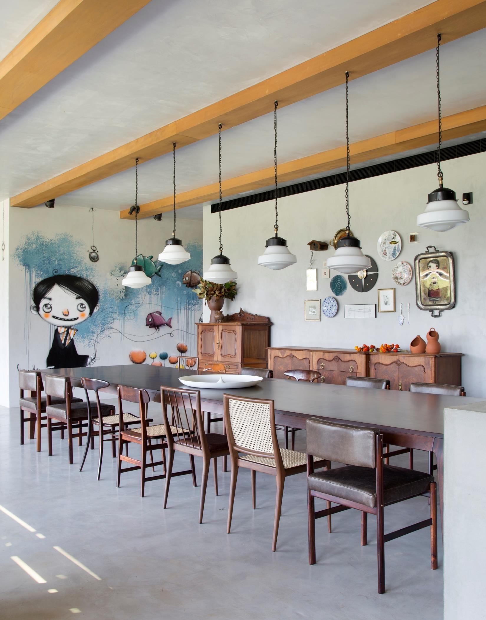
The dinning room walls can be seen as a great treasure, since they combine family accessories and contemporary elements from artists like Calu Fontes. In this room the Decameron Design table and digged chair form Loja Teo and Dpot, provide a great ambiance for Sunday lunches with friends and family
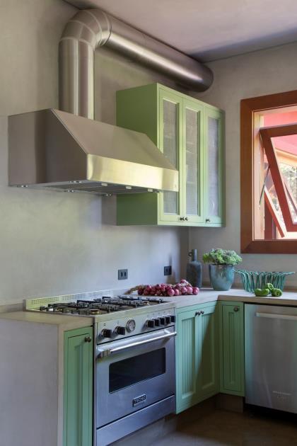
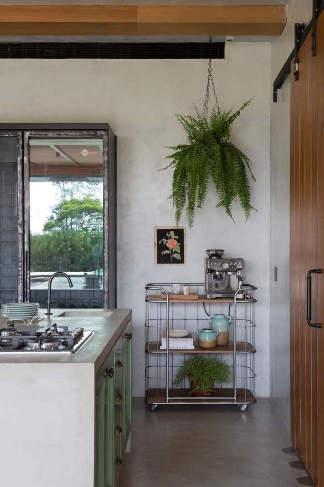
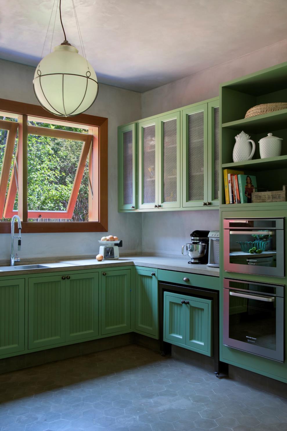
A countryside kitchen is a must in a space like this one and in this project it combines a beautiful green pantone to rustic details, such as the cabinets handles.
On the second pavement is where we find the suites and spa. Each suite was customized with specific furniture and accessories, maintaining the country atmosphere of the rest of the house.
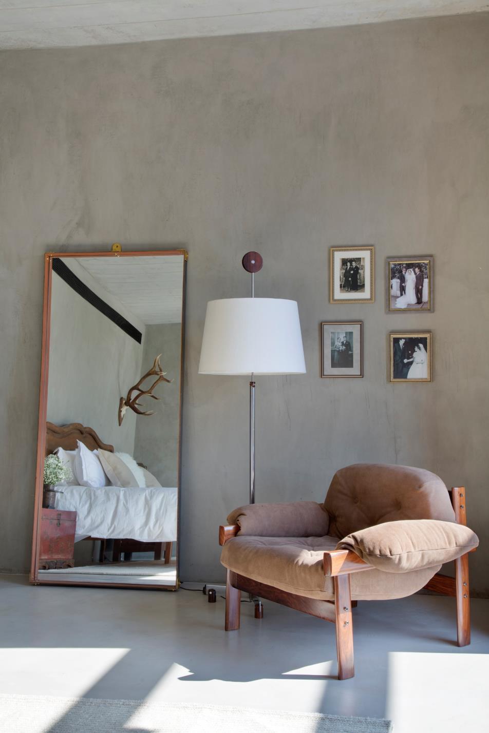
Each bed was custom-made, furniture by Sérgio Rodrigues and spaces with different proposals and functionalities. Another great feature are the bathrooms with custom-made showers, taps and cabinets.
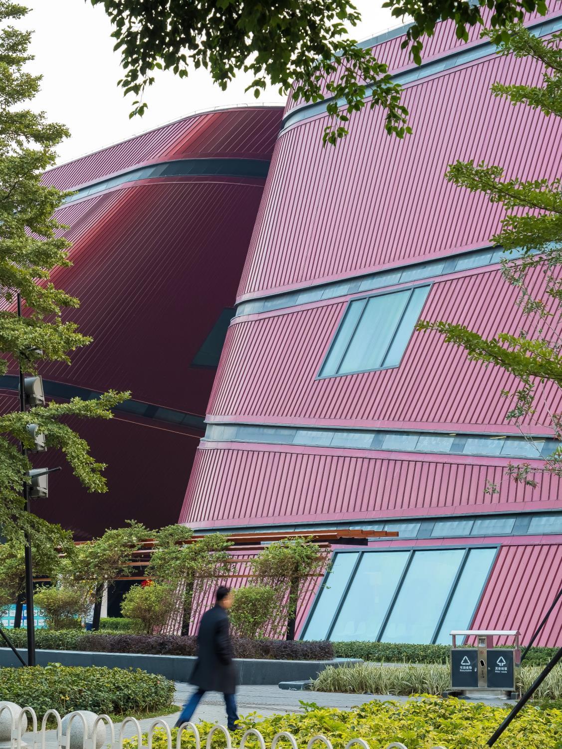
Mecanoo presents the first project completed in China: the Longgang Cultural Centre in Shenzhen. The building contributes a rich and varied cultural programme housed in an iconic urban connector, indeed connects the surrounding areas by subdividing the programme into separate volumes.
Sitting on a long and narrow 3.8 ha site with strict height restrictions, the building connects the surrounding areas by subdividing the programme into separate
volumes. The passages between these buildings, which align with the adjacent roads, provide access from the new business district on the west side of the building to the park on the east The volumes all have curved edges and tilting facades, which frame dynamic views, shelter public squares and naturally guide pedestrian flows. The fluid forms also channel air currents and provide protection against the sun and rain in Shenzhen’s subtropical climate. By
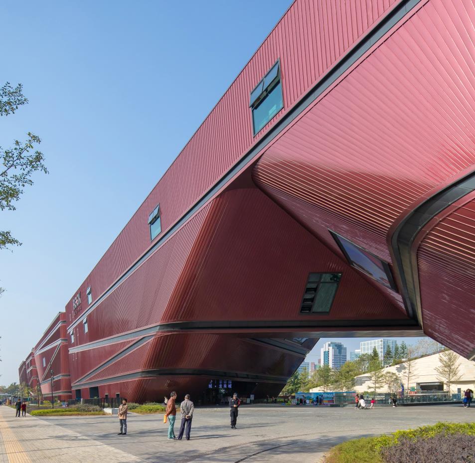
sharing the same formal language, height and material, the volumes form a visually cohesive whole without an apparent front or back facade.
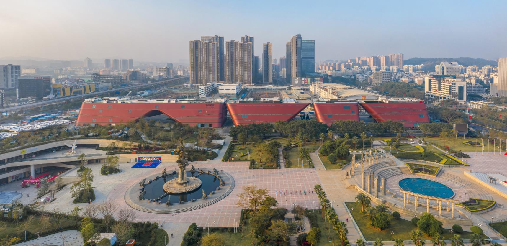
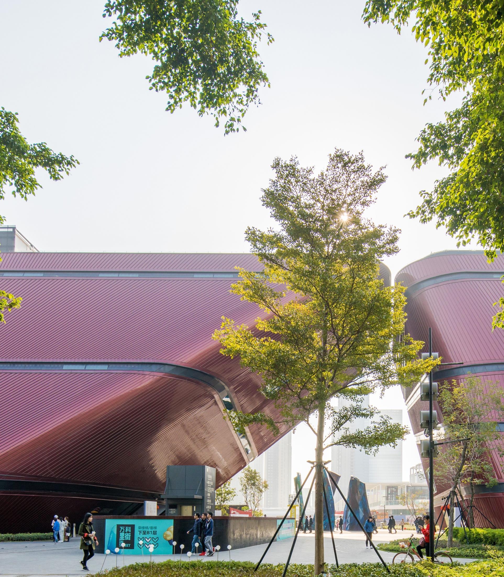
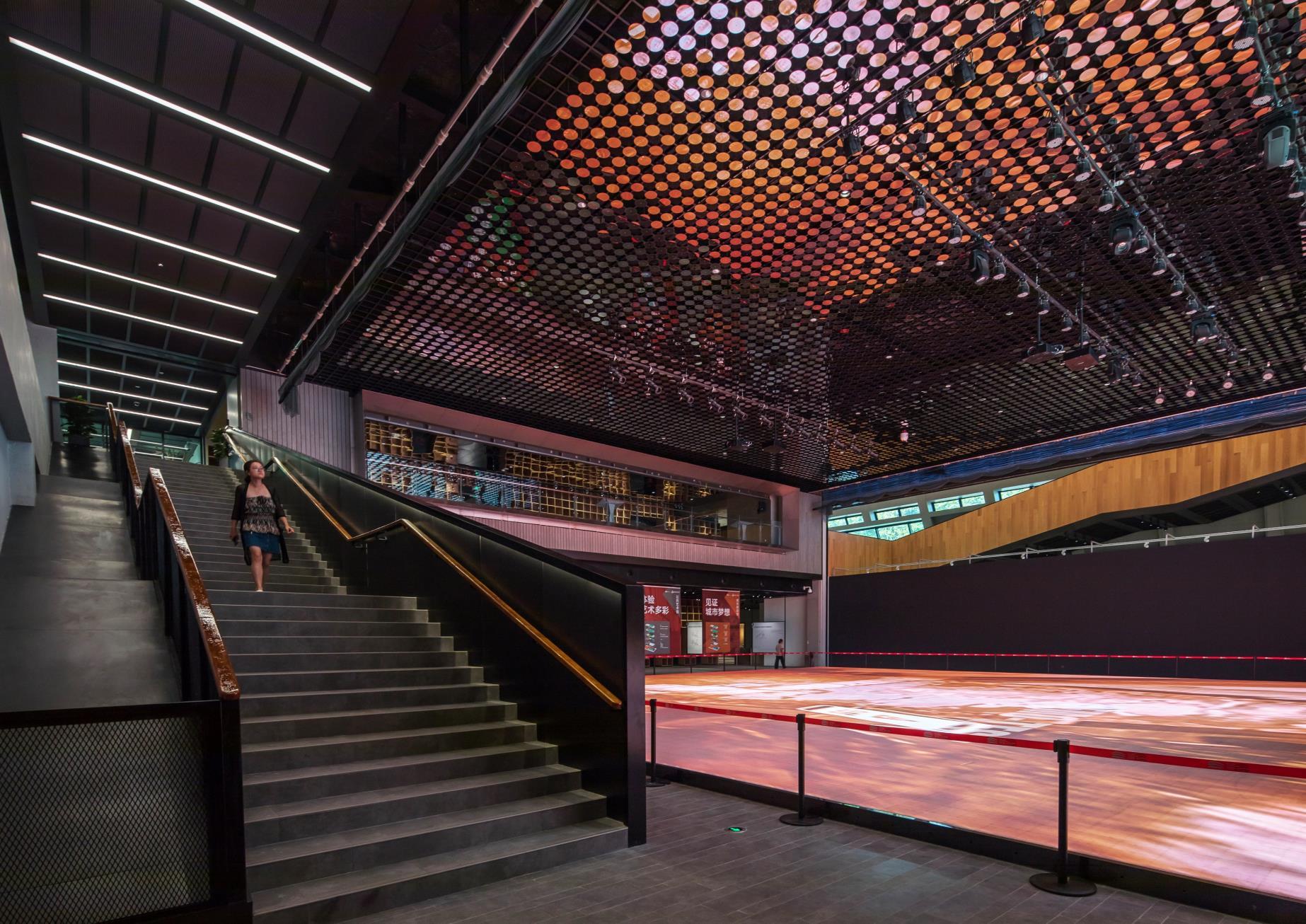
The Longgang Cultural Centre has four main programmatic elements: an art museum, a youth centre, a science centre and a book mall. The science centre focuses on popular science for children and young adults. Next to it, the youth centre offers a place for meeting and extracurricular activities such as music and sports. The art museum combines public arts on the upper floors with an urban planning centre on the ground floor and in the basement. By locating the entrances to the cultural centres at the covered squares, the various cultural programmes can extend outdoors. The largest of the four volumes contains a “book mall” – a mall exclusively for books and book-related events such as booksigning sessions, book launches and exhibitions.
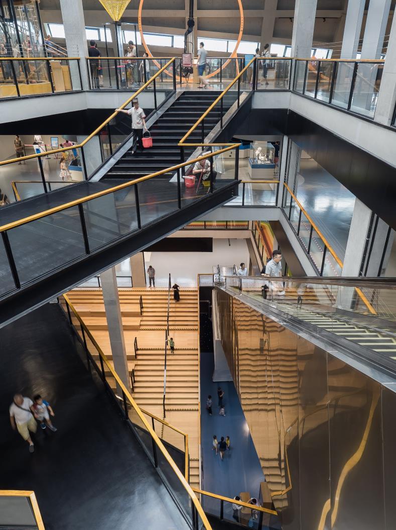
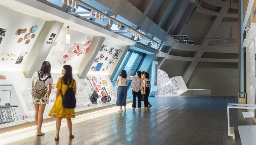
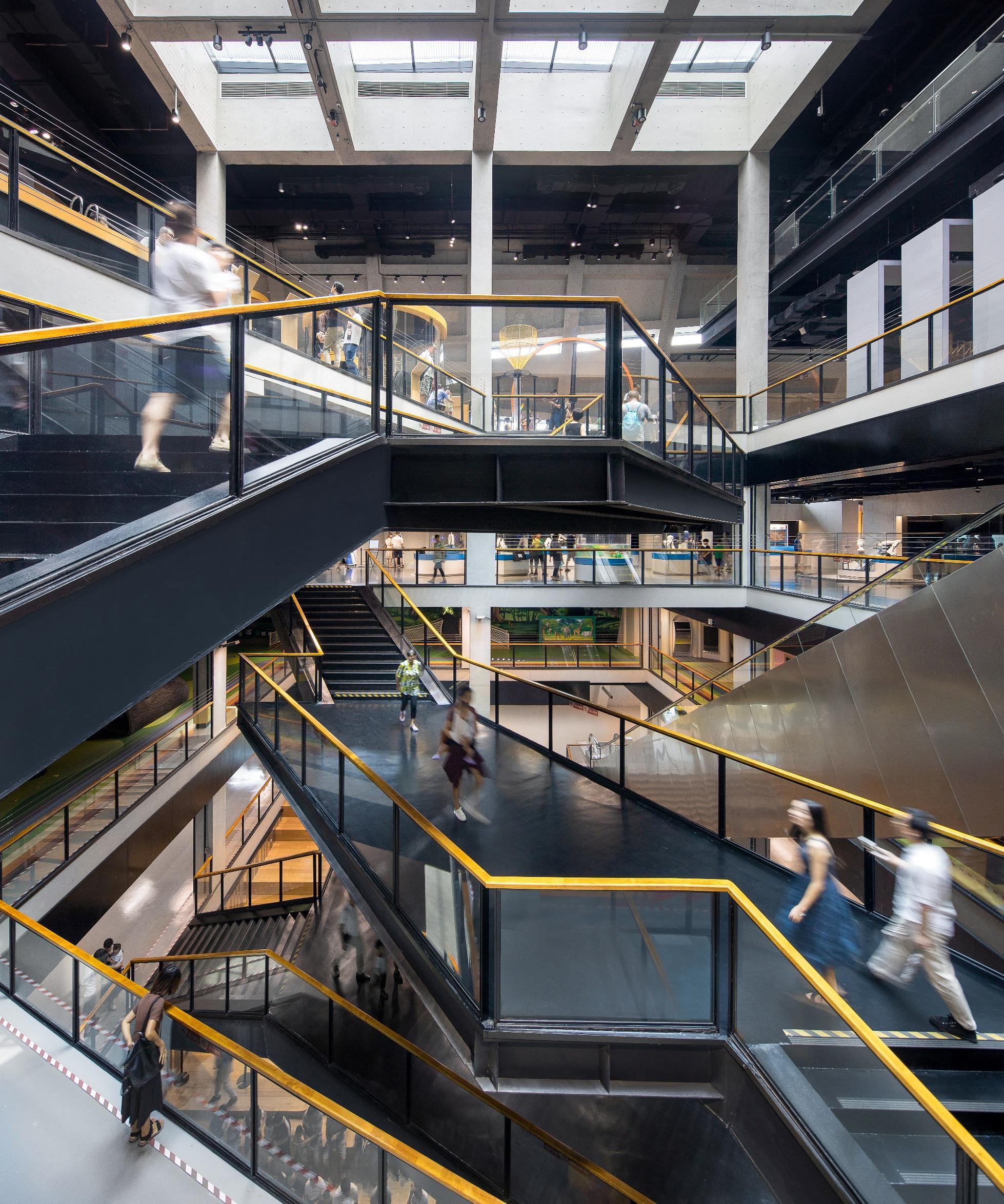
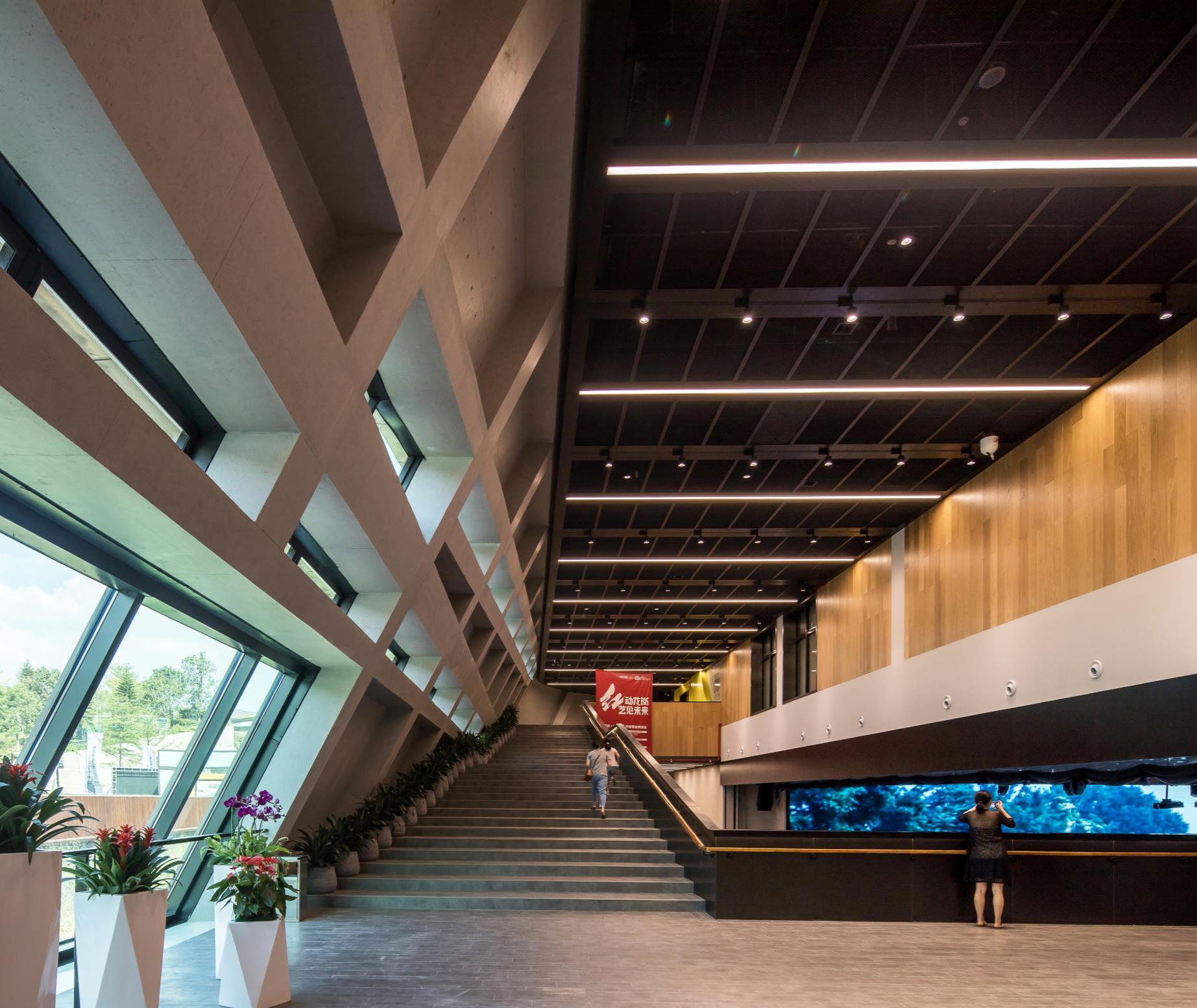
The in-situ concrete structure was carefully designed to become part of the visitors’ experience. The structural facade of each volume integrates beams, columns and massive concrete cores, resulting in a building where everything is revealed. The full-height tilted interior spaces at the edges of the volumes become architectural highlights where the visitor can experience the impressive scale of the construction elements.
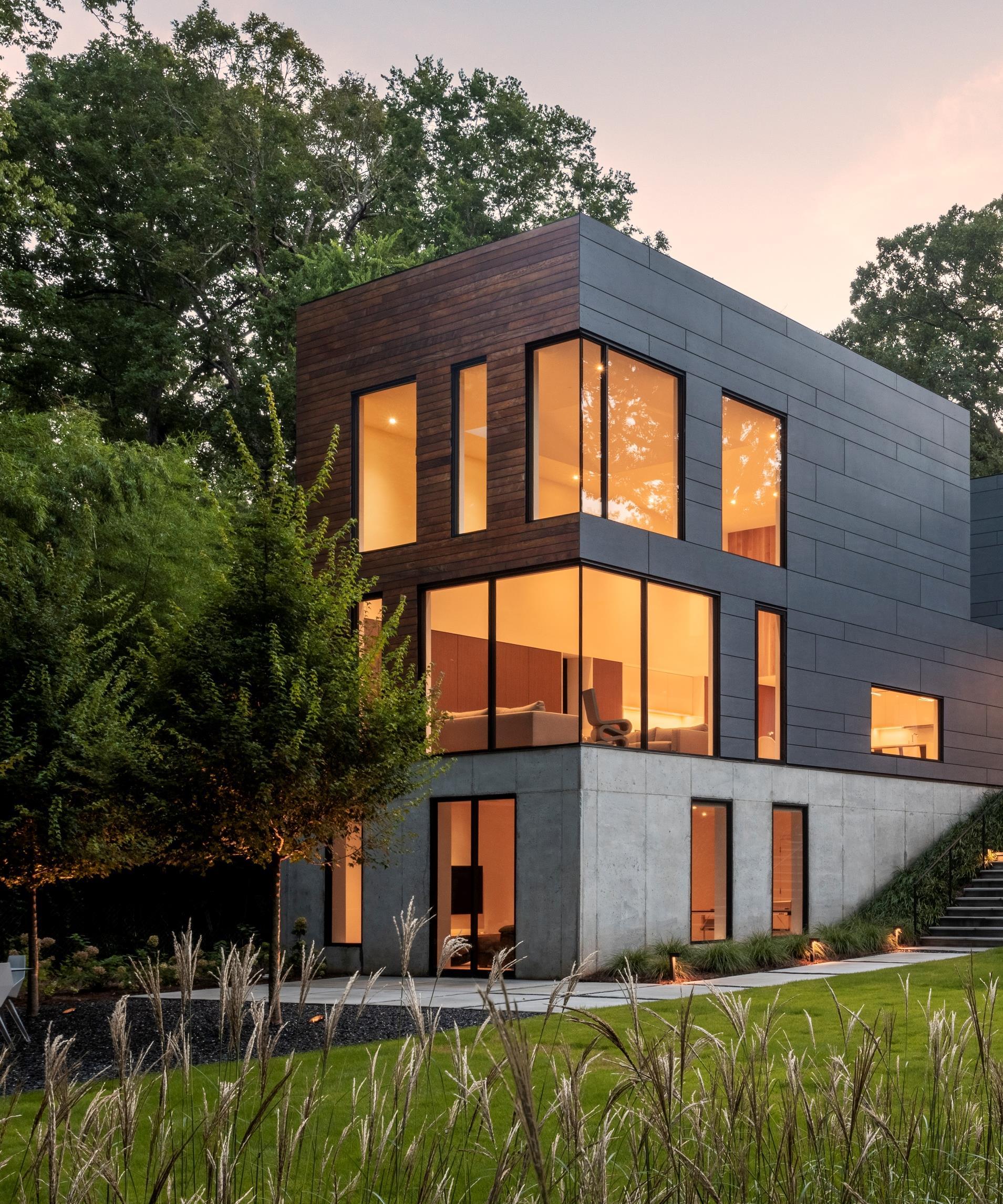
DiG Architects, an American modern residential and commercial architecture design firm, completed its latest project for a busy working couple and their three children in Atlanta, Georgia (USA).
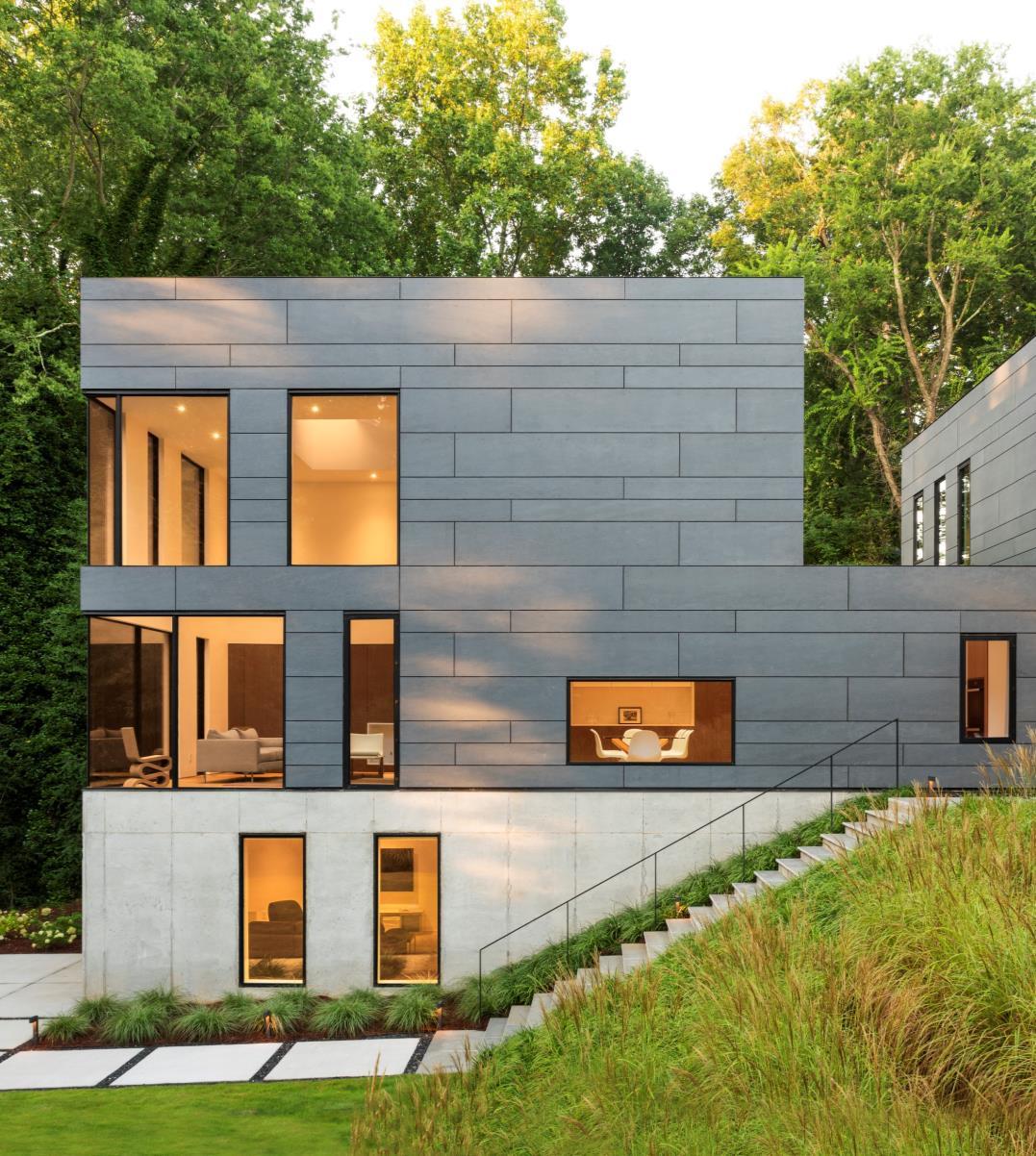
Located near Emory University and the CDC, the house is a quiet, restrained, escape from the excessively noisy digital world that overly stimulates their daily lives and is a reaction to the surrounding banal spec homes each a louder spectacle than the next.
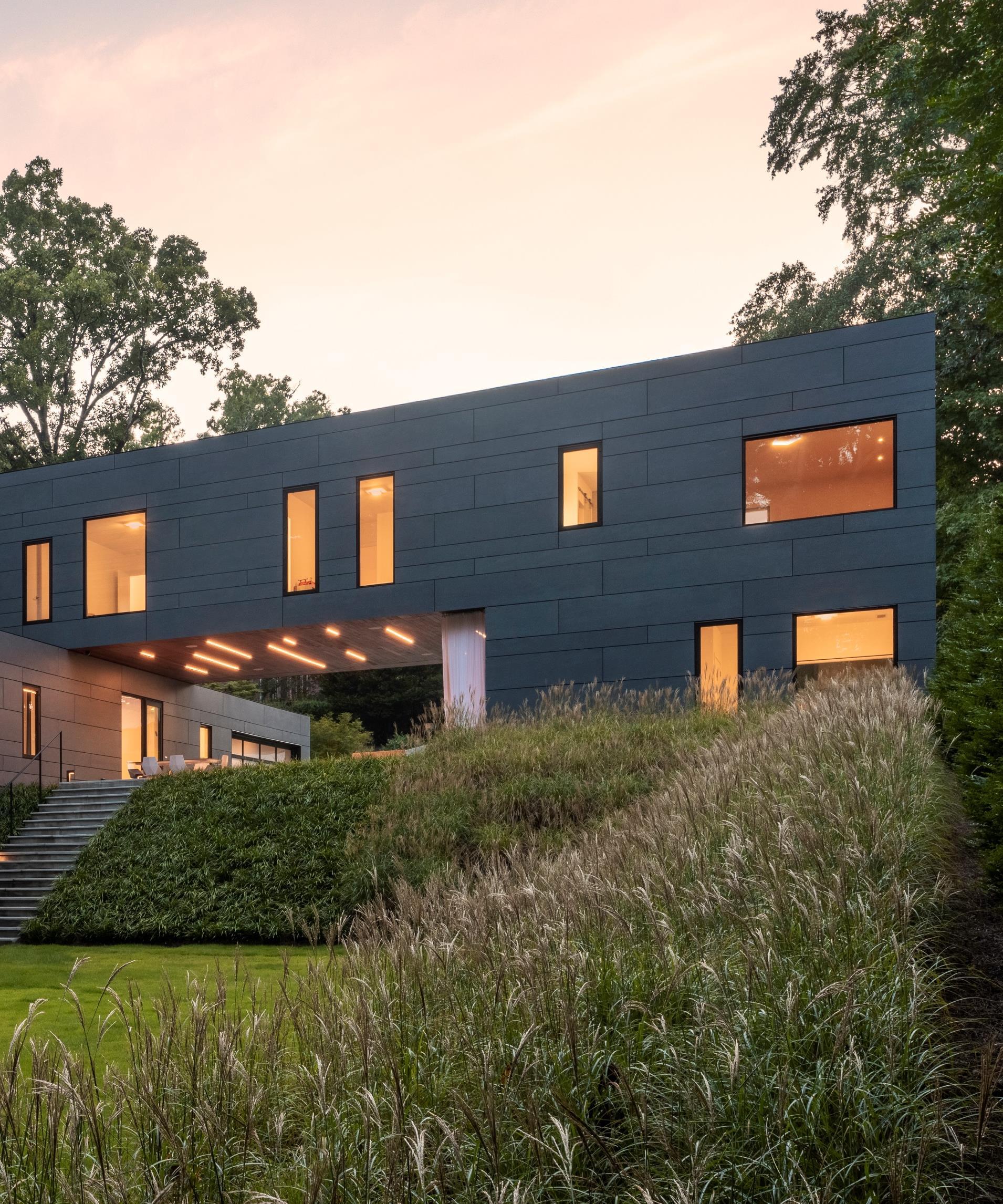
Simple and clean in its form the house started as a twenty-two foot wide extruded box That width was chosen based on the distance a reasonable size wood truss can span. This ensured that no interior support walls were required allowing for an uncomplicated open floor plan. Arranged in an efficient pattern to eliminate waste, the primary exterior cladding of the box is a low maintenance grey cement panel. The panels, attached as an open joint ventilated rainscreen system, help manage moisture intrusion and reduce energy consumption.
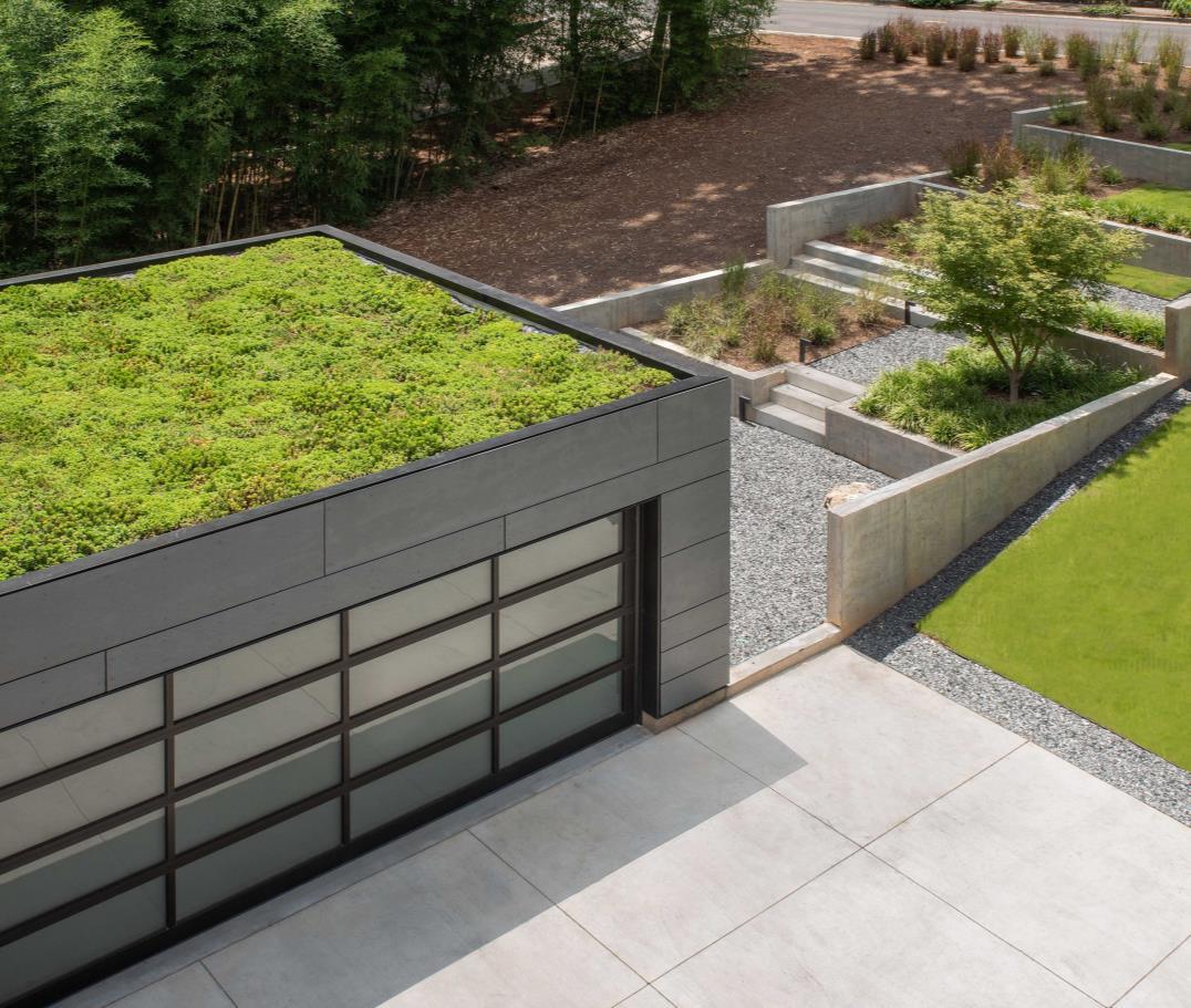
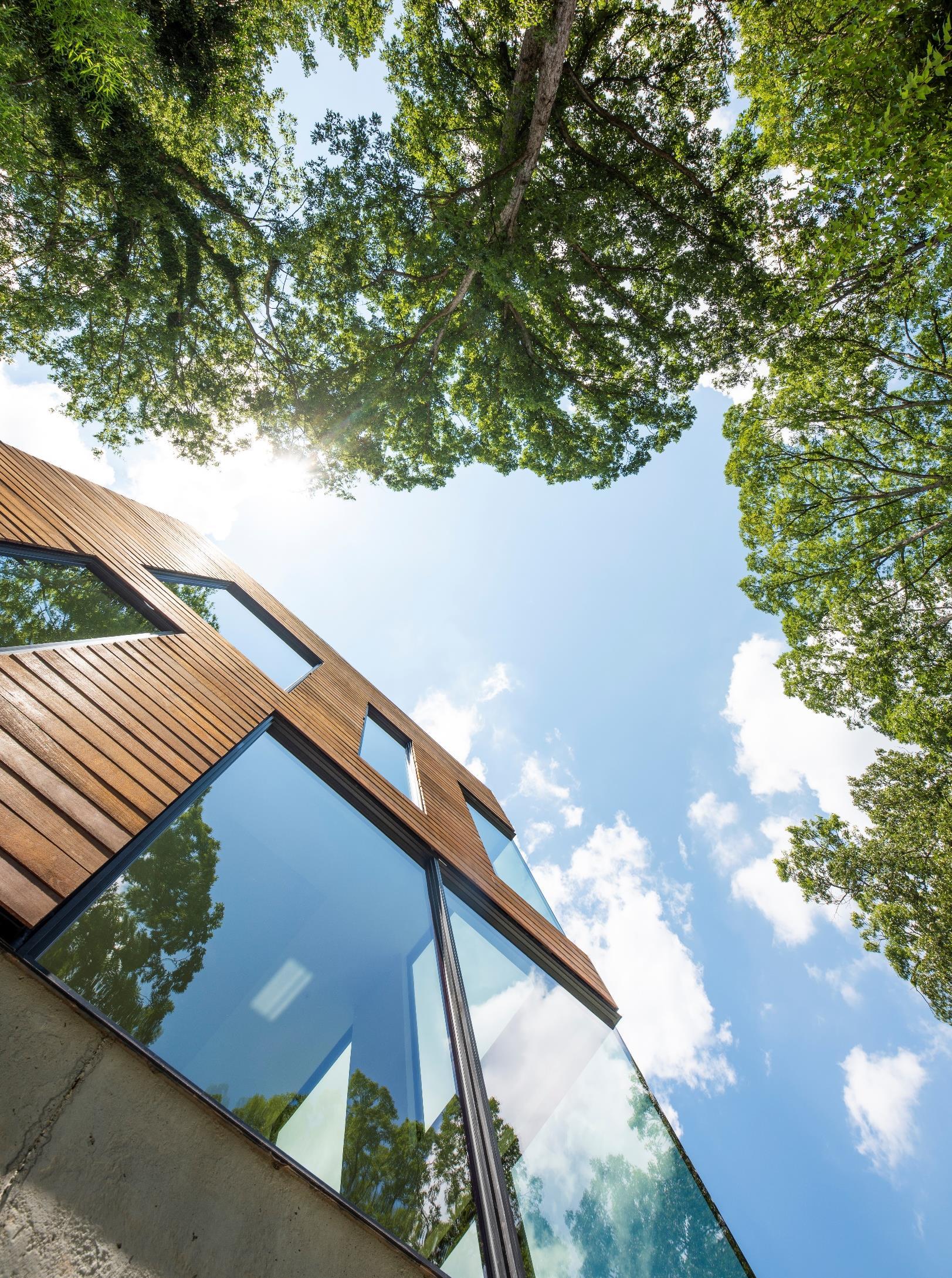
Cut to the desired length based on the space requirements of the family, the box is subsequently split into public and private volumes allowing for a clear delineation between functions. The private portion is rotated ninety degrees around the sky-lit stair hall to maximize views to the serene woods behind the house. A complimentary warm ipe wood, alluding to the softer interiors of the house, clads the cuts. The exposed roofs are covered with vegetation to reduce stormwater runoff, mitigate energy consumption and improve air quality. Comprised of the bedrooms upstairs and the guesthouse on the main level, the private functions bridge across a covered breezeway creating an outdoor room with a view corridor to the woods and access to the main and guest house entrances
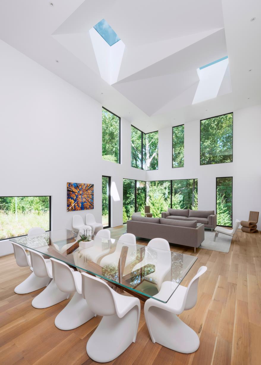
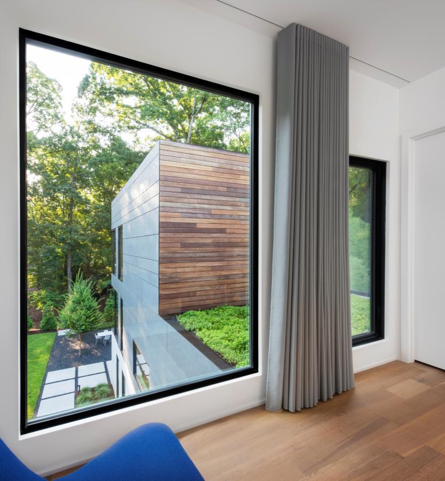
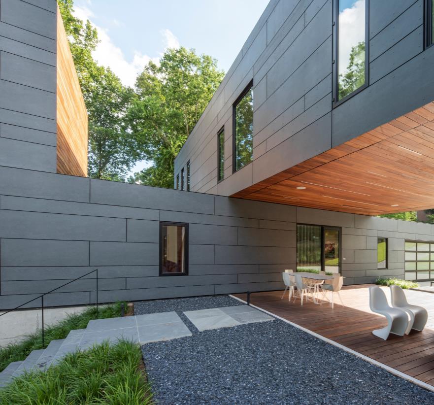
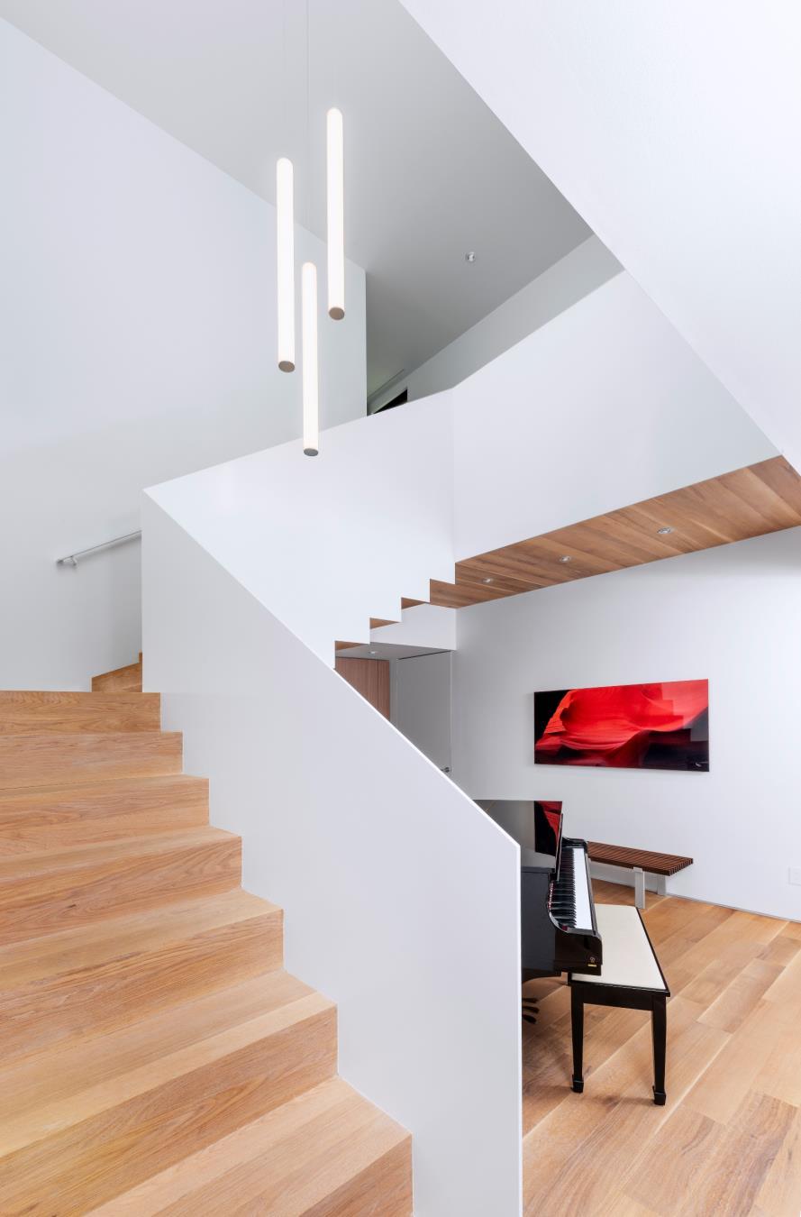
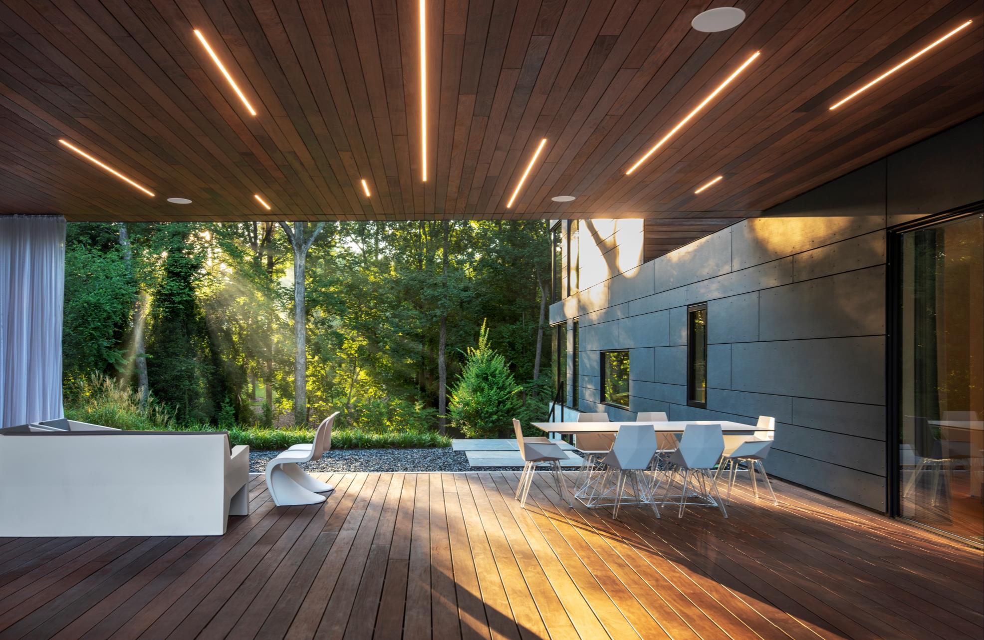
The public functions move through a series of low and tall spaces culminating in a double height sky-lit space. The skylights provide shifting light patterns throughout the day and are operable to create passive cooling during the warm months. The houses six skylights and the low-e insulated glazed windows use sunlight instead of artificial light for illumination to decrease the house’s energy consumption. Lined with cabinets on one side that serve as storage, housing for the entertainment center, fireplace, dining room buffet, refrigerator, and freezer allows the public functions to stay open, clean, and uncluttered. The quiet interiors create a relaxing calm environment that is about the
space itself and the views to the outside
A series of site walls, carefully nestled into the steep lot which slopes forty-two feet down from the front to the back of the property, cascade down the hill from the street to create a terraced entrance garden that becomes the exposed foundation of the house.
Long grasses, appropriate for the climate, reinforce the simple geometric forms of the house with their naturally soothing sway and unify the engineered slopes that mitigate the grade differences of the site. The manicured lower lawn adjacent to the grove of trees give way to the ever changing natural beauty of the woods beyond.
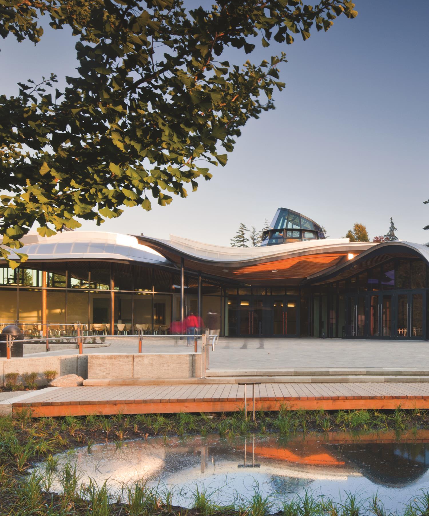
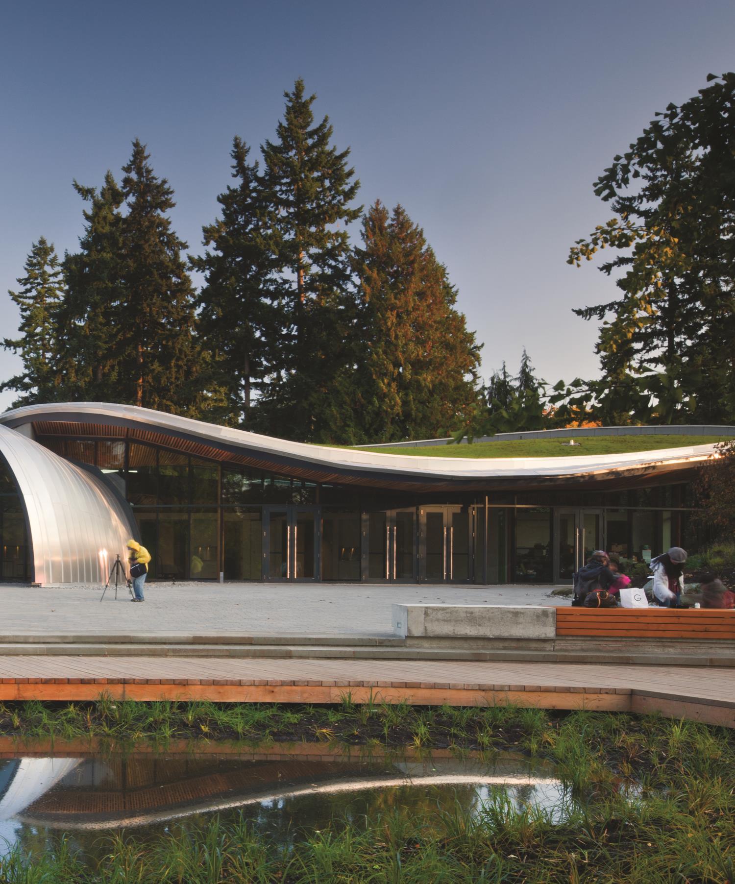
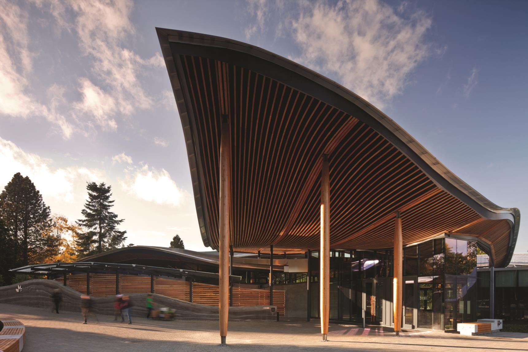
Named “Most Sustainable Building of the Year” by World Architecture News, the VanDusen Botanical Garden’s Visitor Centre realized by Perkins+Will, is a public expression of sustainability in Vancouver.
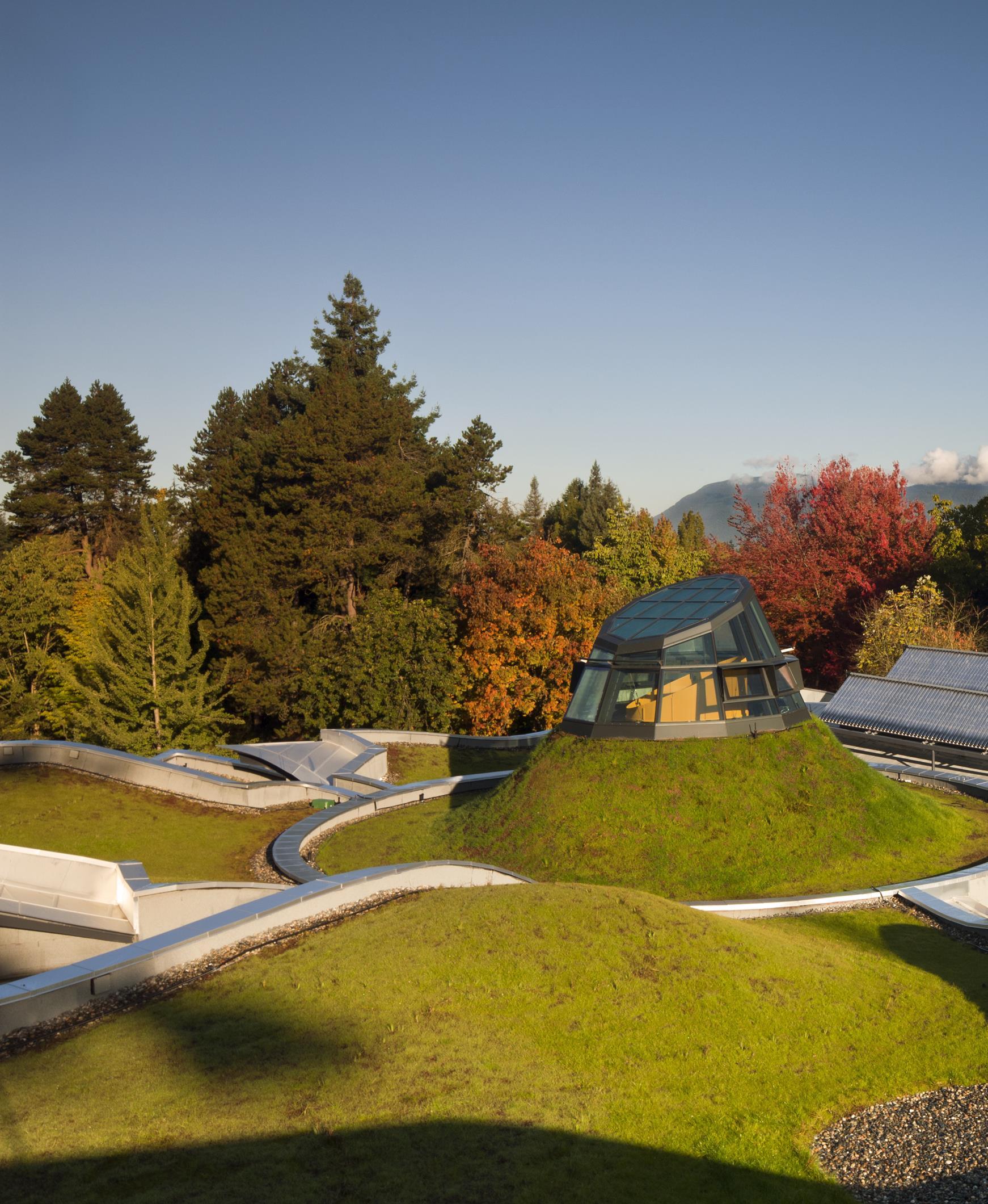
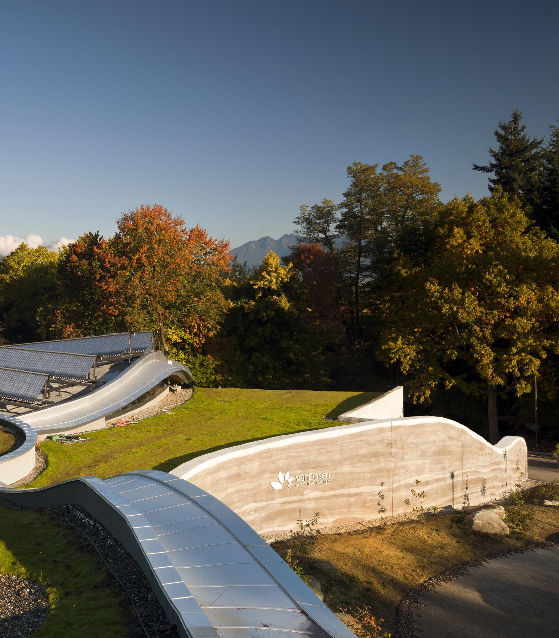
Perkins+Will was commissioned to create a signature, green facility that would increase the VanDusen Botanical Garden’s visitorship and
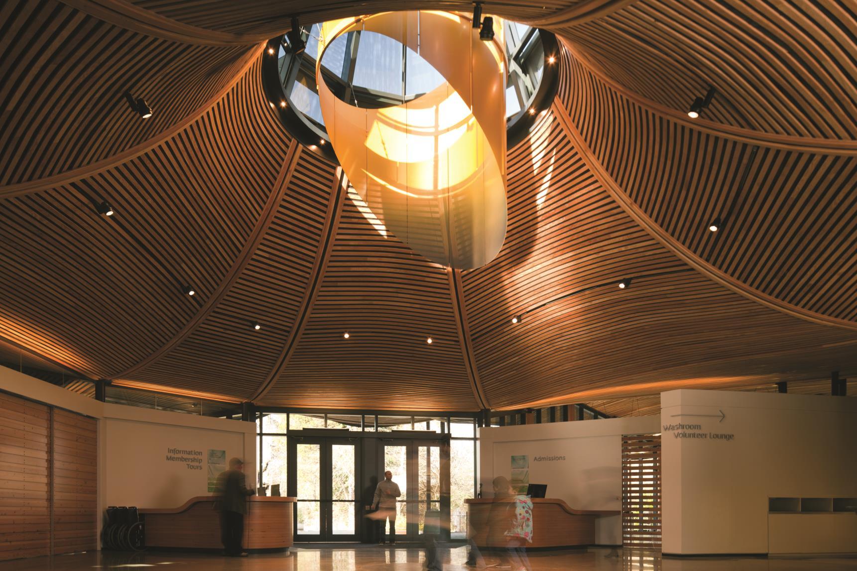
enhance its international stature. Designed to be one with nature, the Visitor Centre creates a harmonious balance between architecture and landscape from both a visual and an ecological perspective. Inspired by the organic forms and natural systems of a native orchid, the project is organized into undulating green roof ‘petals’ that float above rammed earth and concrete walls These petals and stems are connected by a vegetated land ramp that links the roof to the ground plane, encouraging use by local fauna. The building houses a café, an expanded library, volunteer facilities, a garden shop, office space and flexible classroom spaces for meetings, lectures, workshops and private functions. In addition to LEED Platinum certification, the Visitor Centre is Living Building Challenge Petal Certified the most stringent measurement of sustainability in the built environment. The Visitor Centre uses on-site, renewable sources geothermal boreholes, solar photovoltaics, solar hot water tubes to target net-zero energy on an annual basis. Wood is the primary building material, sequestering enough carbon to achieve carbon neutrality. Rainwater is filtered and used for the building’s greywater requirements; 100% of blackwater is treated by an on-site bioreactor and released into a new feature percolation field and garden.
Natural ventilation is assisted by a solar chimney, composed of an operable glazed oculus and an aluminum heatsink, which converts the sun’s rays to convection energy. Summer sun shines on darker surfaces to enhance ventilation further. Located in the centre of the atrium, and exactly at the centre of all the building’s various radiating geometry, the solar chimney highlights the role of sustainability by form and function.

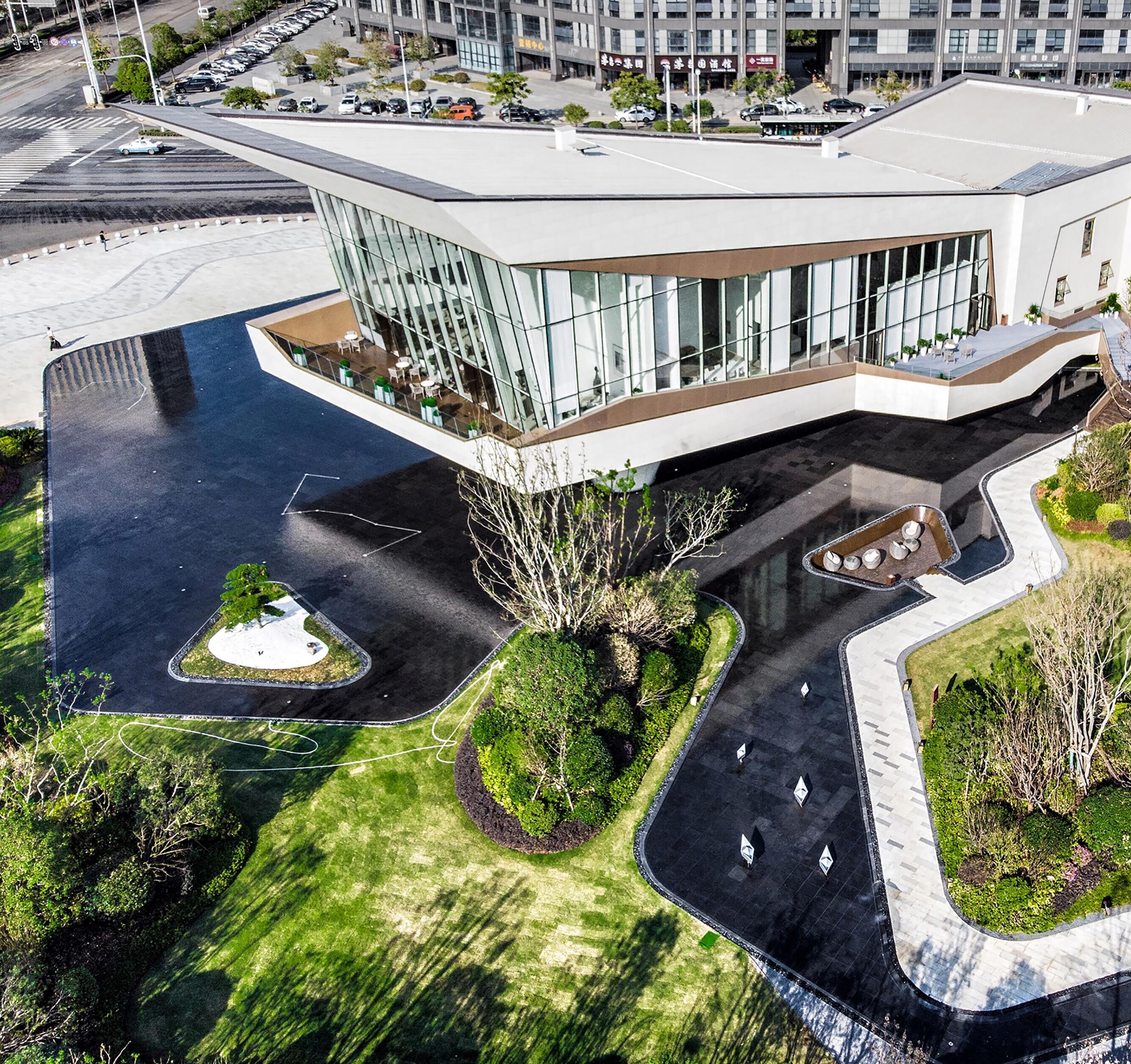
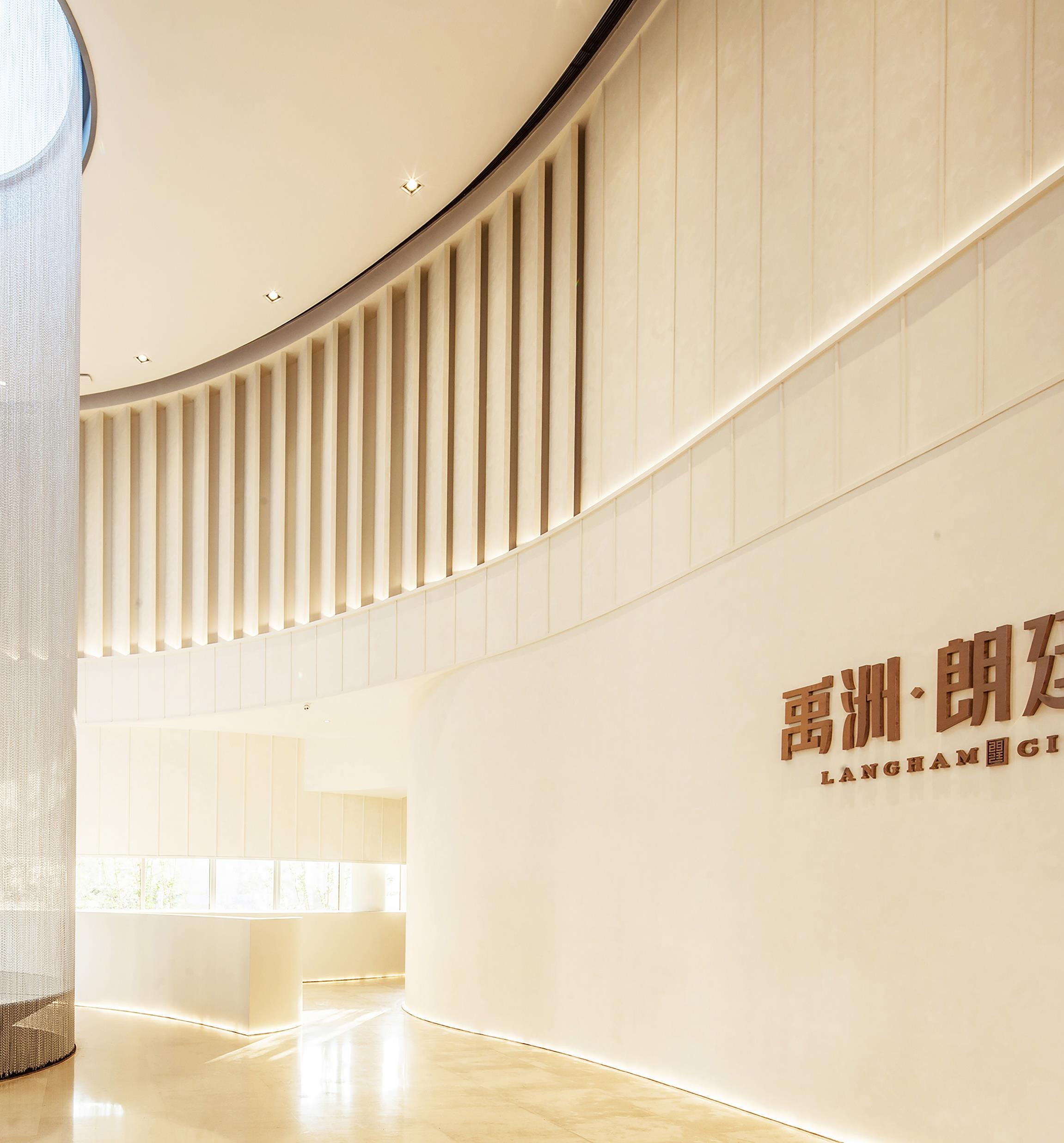
The architecture firm Challenge Design presents Langtin Yuanzhu Experience Hall in Wuhan (China)- a floating building goes against the traditional pattern and creates a rhombus-shaped structure bringing about impressive visual impact.

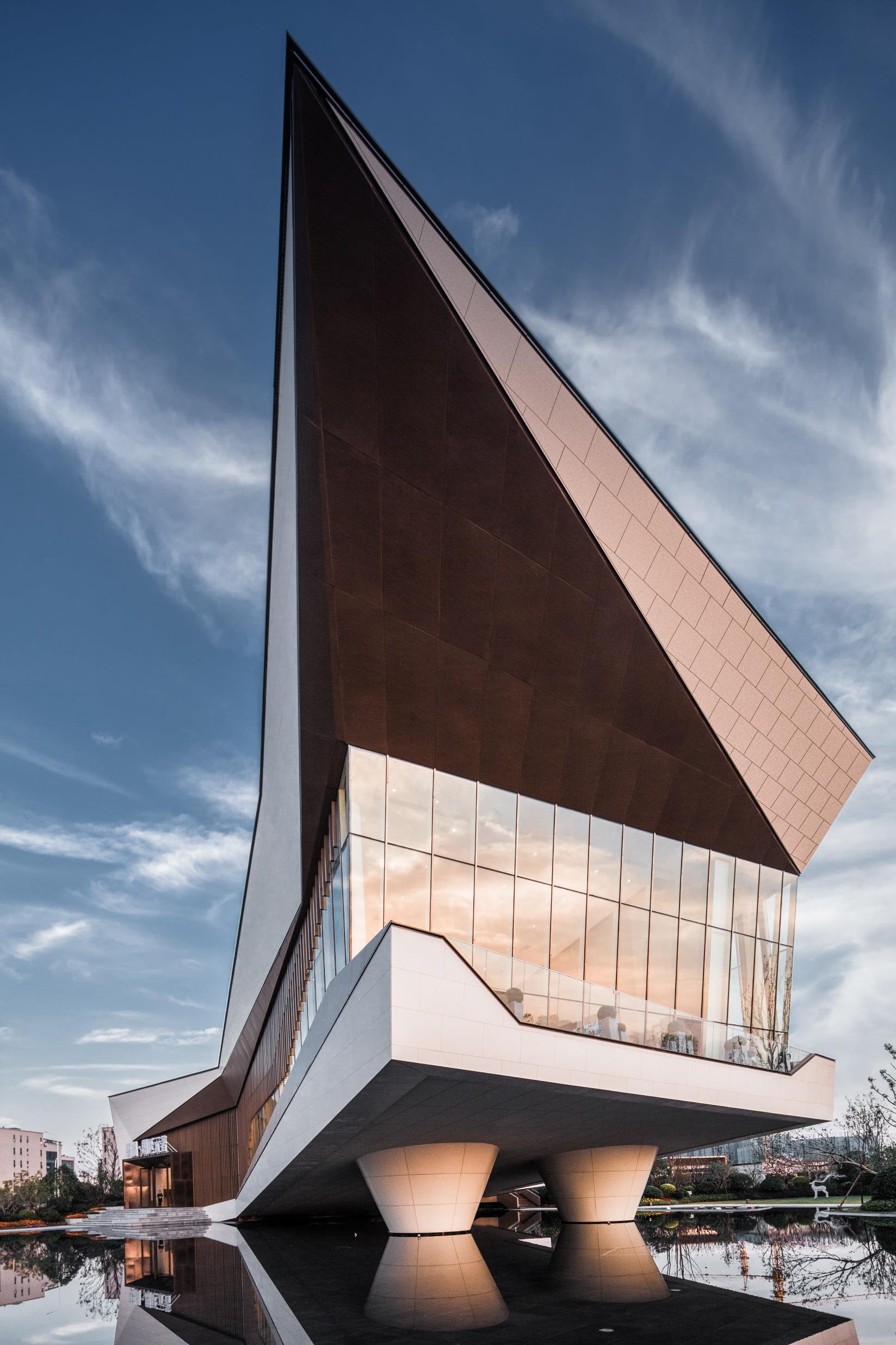
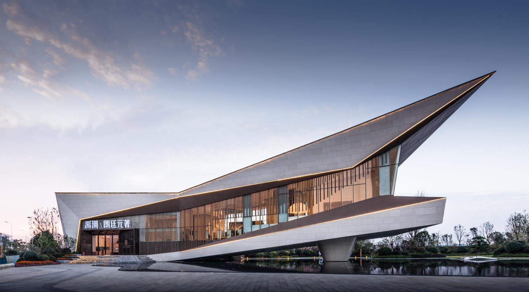
The architecture shall be a space and carrier showing artistic conception instead of an abrupt existence The texture and form of the architecture somewhat show our life experiences.
Based on "harmonious unity of art and function", the architect created a brand new lifestyle experience hall. The fold-line design of the architecture forms an encircling urban space, separating the outside bustle from the inner space. With 270 ° landscape vision, the building enjoys ultimate view, and the building itself also is the urban landmark showing the uniqueness of the whole experience hall.
The sceneries, paths, squares and steps, etc. are scattered along the footway to create ultimate overall visual, auditory experience. The route system full of plot and the curves between people and things or among things in the process of conversion gives spectacular visual delight and shows the original aspiration of the designer.
The building presents a unique texture and light-shadow under the natural light, forming a dialogue relationship between architecture and nature, creating an artificial geometric form and an exhibition form in which nature and human coexist. At the boundary of the building, the minimalist line of light strips are used, which is particularly bright under the stars.
Three layered different materials are used with layers of progressive enhancement, making the building more crystal at night.
The backyard landscape platform not only can guide the flow of people, but also acts like a converter between the indoor and outdoor green space. The fold-line stair that looks like a sculpture can increase the plasticity of the landscape and echo the form of the building
The presence of water blurs the inner and outer boundaries of the building, allowing the building to fully integrate with the environment.
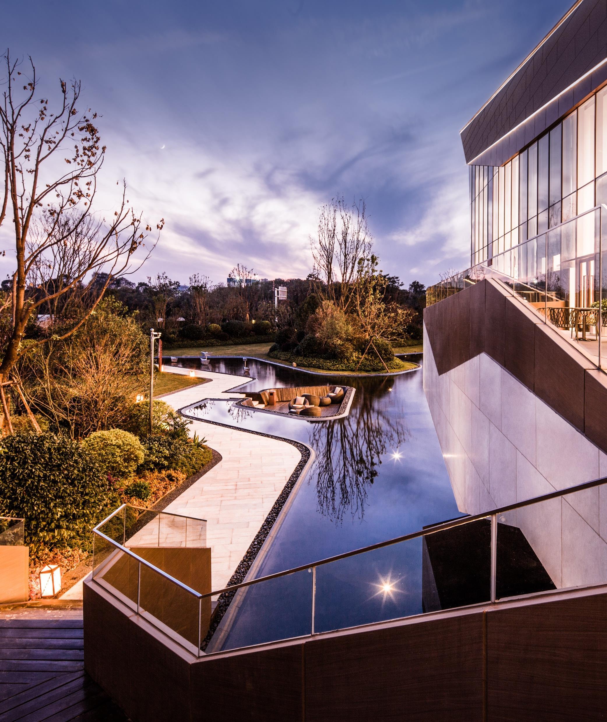
A high-quality architectural space never comes by luck, but from careful design. In the design process, the architect first conceived the concept of a floating space in the water, and then shaped the space according to the functional requirements, and paid special attention to the integrity of the building, the continuity of the space, the organic nature of the environment and the initiative of human being in creating the environment.
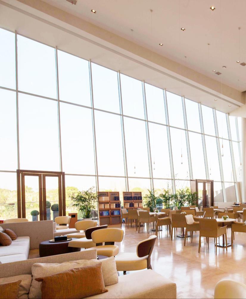
The indoor function of a building is shown in the arrangement of the geometric elements of the external forms to be expressed by the building. This building has a series of experiential function areas such as the Cafe, the children's activity area, the multi-function hall, the book bar, the VR experience room, etc.; all these functions make the space fully utilized and sustainable. The form of functional layout, such as the opening and gathering of different spaces, and the widening and narrowing of vision, can reflect the continuity in space. People in this building can feel the visual delight brought out by the spatial design and immerse themselves in it
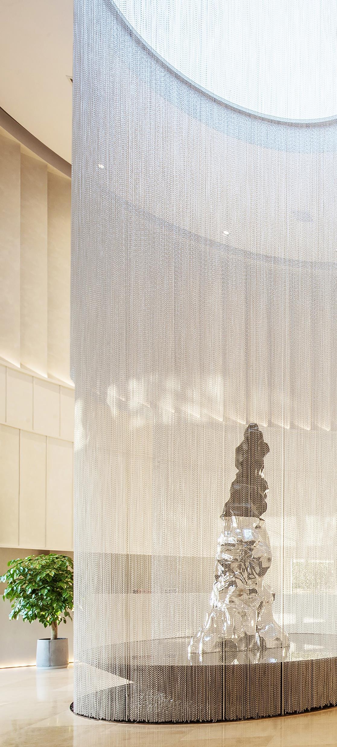
The exquisite sculptures at the lobby offer ubiquitous modern stylishness and elegancy. The matching of materials and the tuning of the lighting colors both contribute to a shiny effect. When people walk up the stairs step by step, natural light spills into the indoor exhibition space through large glass window, making the exterior view unobstructed.
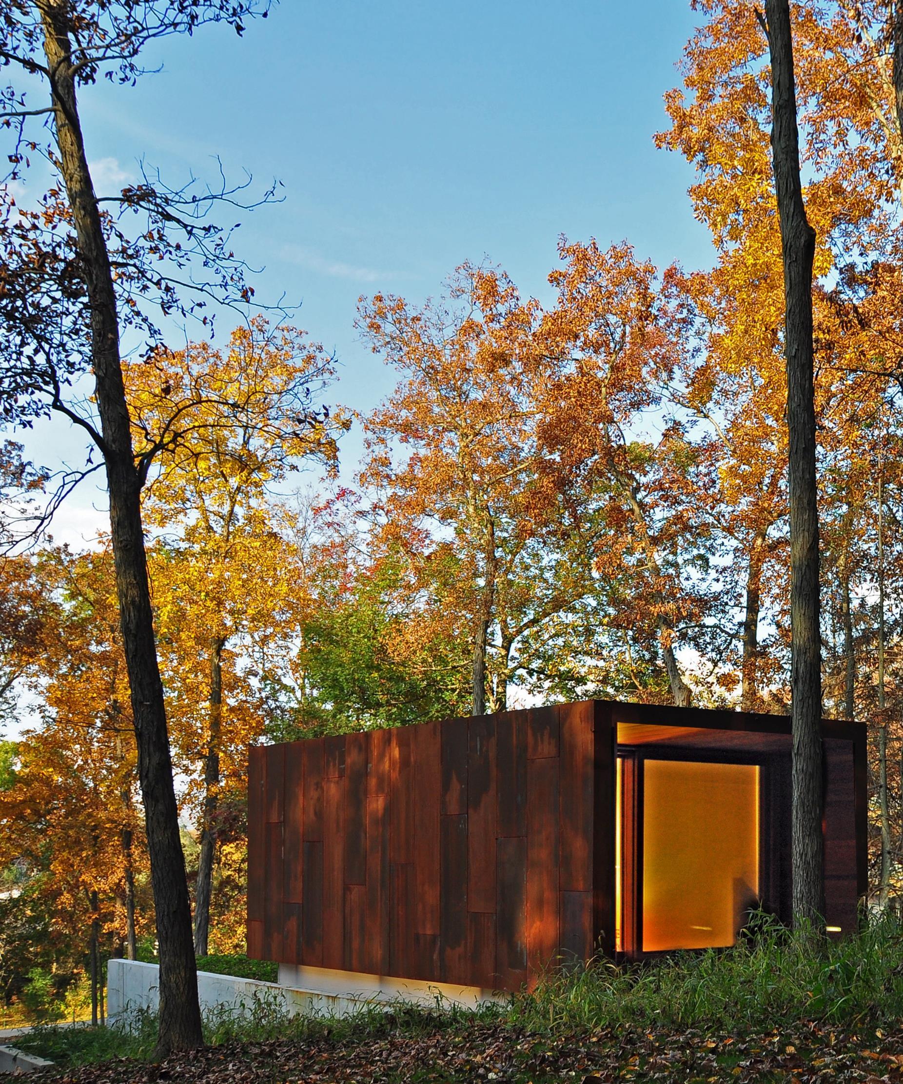
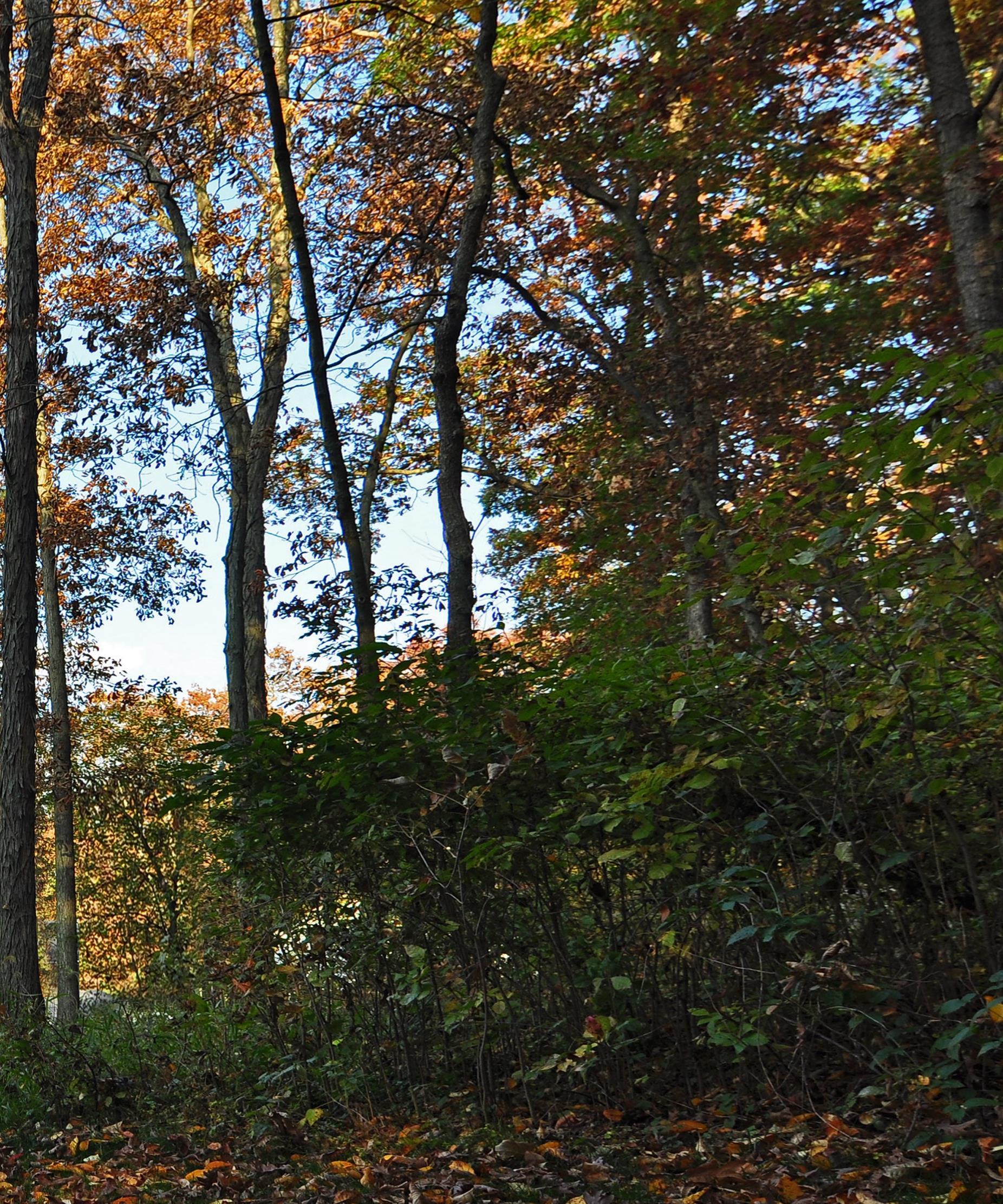
Embrace our new selection of projects of houses built inside the bosques: the choice of this list isn’t by chance, we have intentionally thought to show you and live these projects that are strictly in contact with nature.
Spring Prairie, USA I Johnsen Schmaling Architects
An unassuming structure nestled into Wisconsin’s rural landscape, this intimate retreat serves as a studio for a Country Western musician to write and record his music. With its formal discipline, exacting details, and a carefully restrained material palette, the building, while unapologetically contemporary, continues the tradition of Midwestern pastoral architecture and its proud legacy of aesthetic sobriety, functional lucidity and robust craftsmanship.
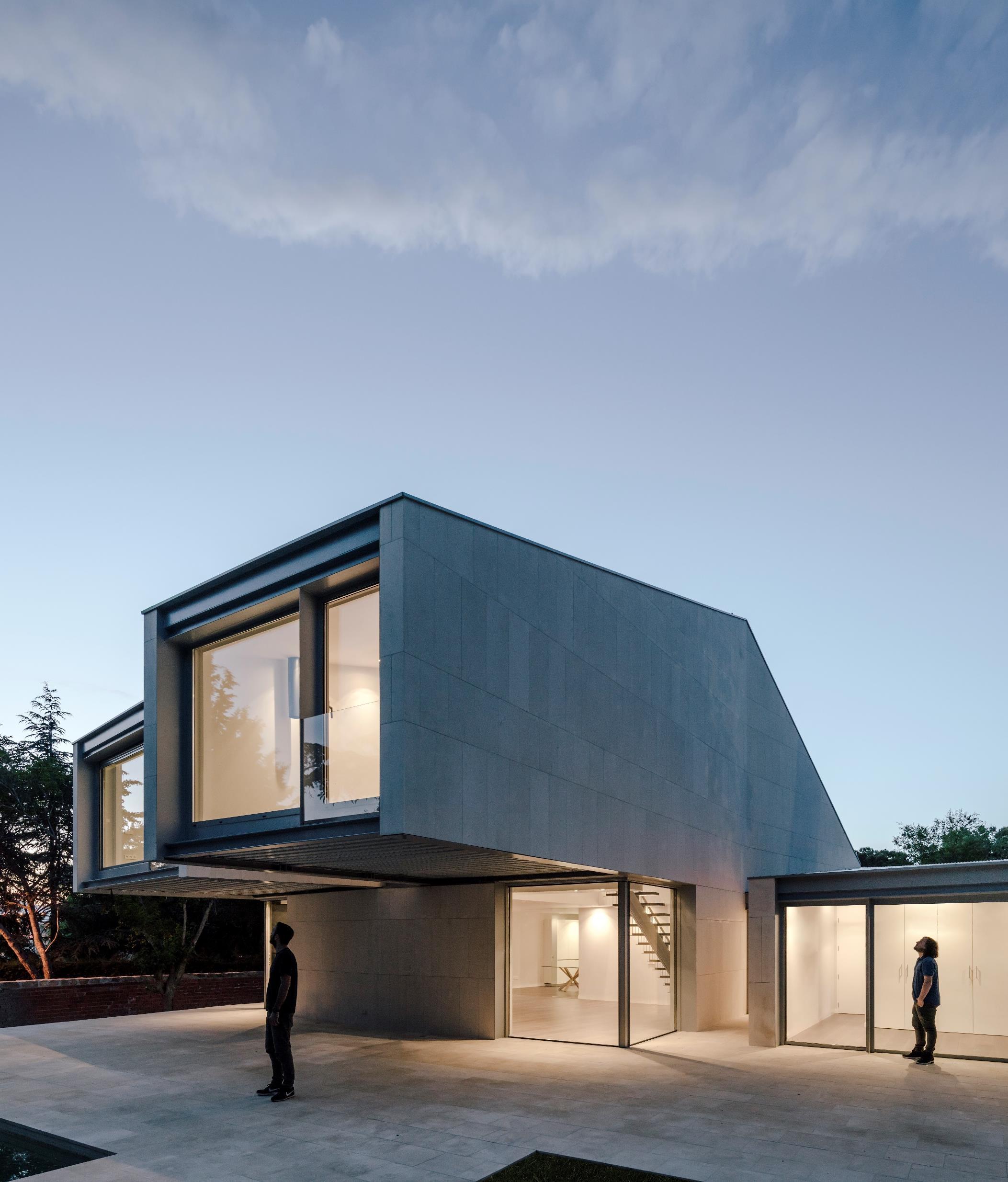
This house is the result of the rupture of the pure volumes regarding a strict sense of orientation. Located at the top of the land, you can see the forest of pines, oaks, and cedars that grow to the south, framing the views. The architects broke and desegregated the residential type volume in a pitched roof oriented always in the N-S direction, generating in this facade large openings and in its perpendicular side blind gaps that facilitate the accommodation of the structural elements As a result, three articulated volumes, two of which fly over the terrain, provide protection and shelter under them. To provide solidity and forcefulness in contrast to the pronounced cantilevers, all the volumes are finished in limestone. It is worth noting the diversity and differences between the N-S and E-O facades. The first are permeable and light, open to the surroundings, while the second are blind, heavy walls, inspired by the profile of the house type, however, with the relationship with what surrounds them.
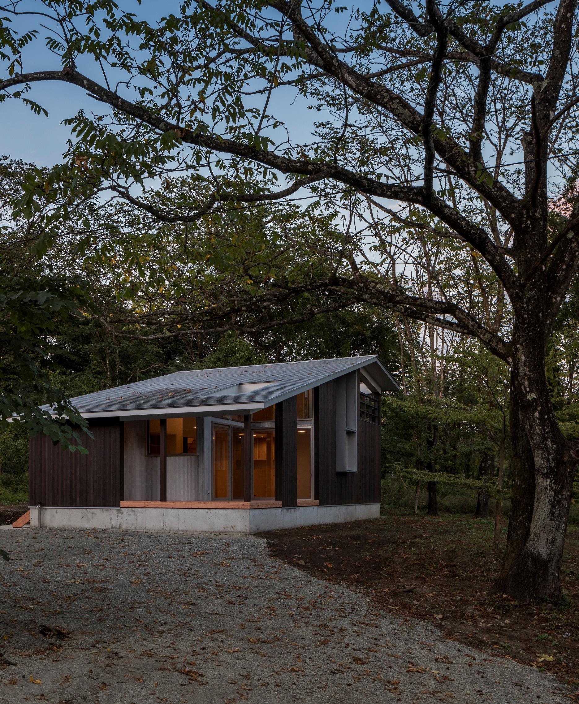
Yamanashi, Japan | Atelier KUKKA Architects
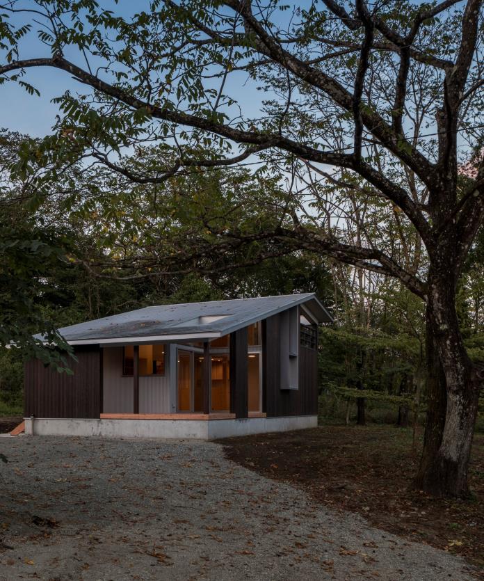
This is a house of a family located at the south foot of high mountains(3200 ft. above sea level) , near Kanto plain. Originally, the site was a forest of Japanese walnuts. The architects designed a great opening of the roof (top light) at the outdoor-living to have a continuity with the tree and the sky. And settle the cedar partial walls with consideration for privacy. One could feel the tree and the sky directly at the outdoor-living, and indirectly at the indoor living. Approaching from a road, over the walnut tree, one could see the gradually ascending gabled roof.
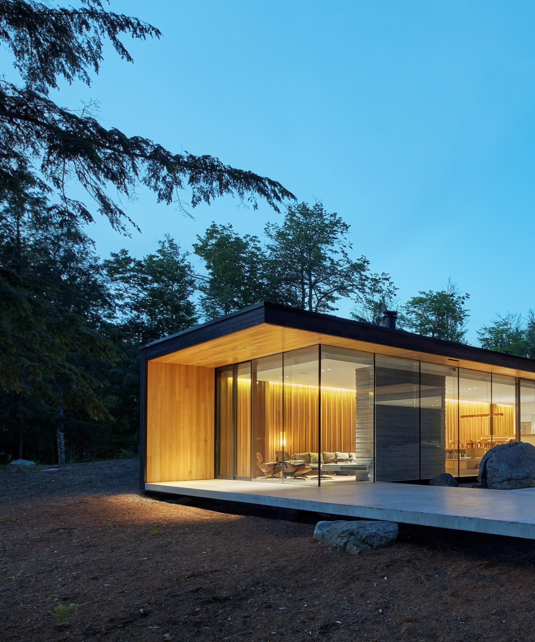
This four-season residence was designed to enhance outdoor living and social gathering. The residence is designed with an interlocking plan to allow for indoor spaces to support a central outdoor living space. The outdoor living area offers an expansive and levitating lake deck and large screened porch that has three sides of retractable insect screen – wide open or bug-free – dependent on season. To extend seasonal use, a sheltered outdoor microclimate is created by taking advantage of passive heating and cooling orientations.
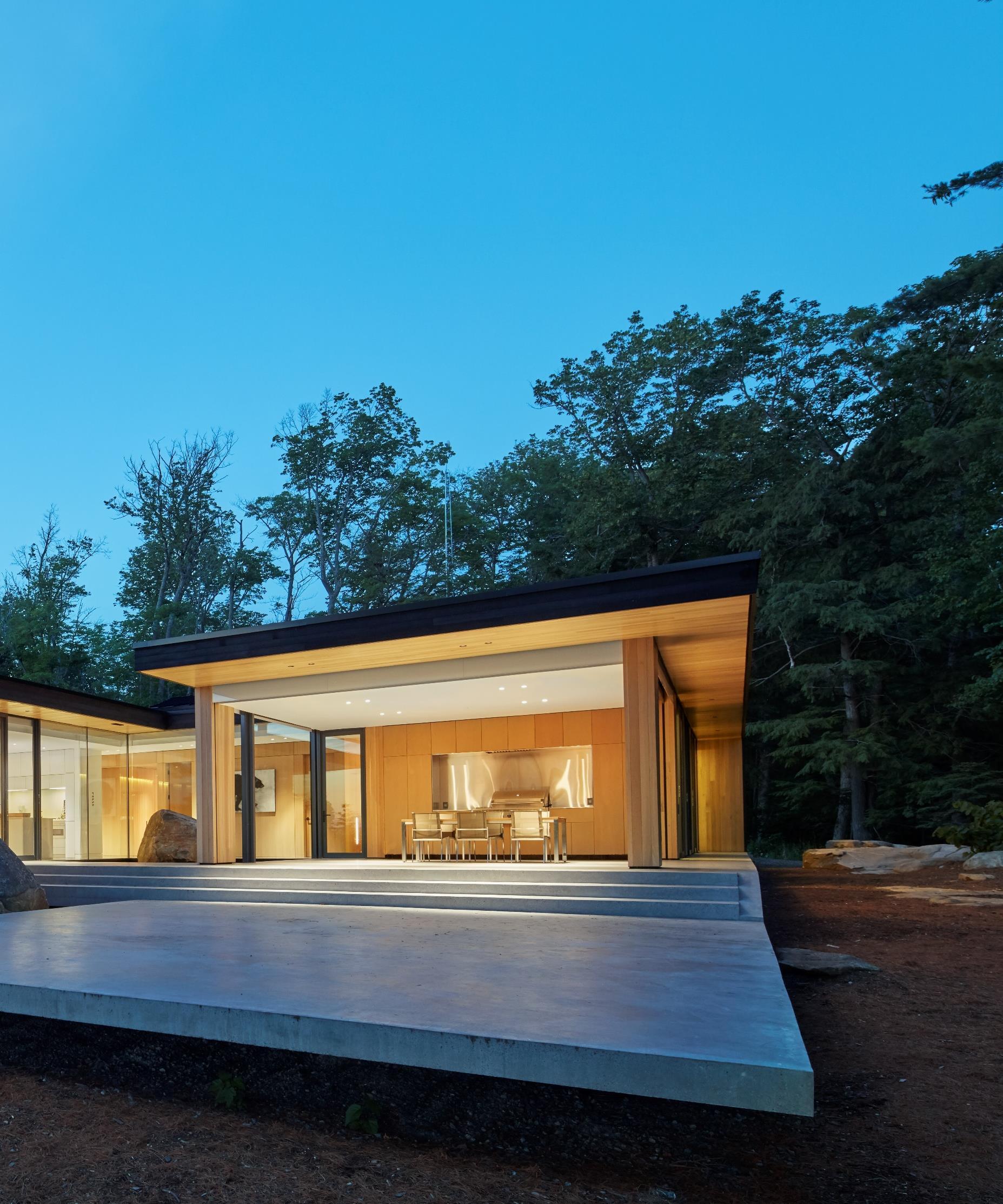
Deep overhangs and large glazed areas on the south and west are modeled to protect from solar build-up in summer and allow for heating gains in winter. Extensive flat roofs recall warmer latitude mid-century precedents and float outward to frame the quintessential Canadian shield horizon. Operable windows on all sides are designed for cross ventilation and passive cooling. Concrete radiant floor heating contributes to energy conservation and creates a heat sinks through the day and night.
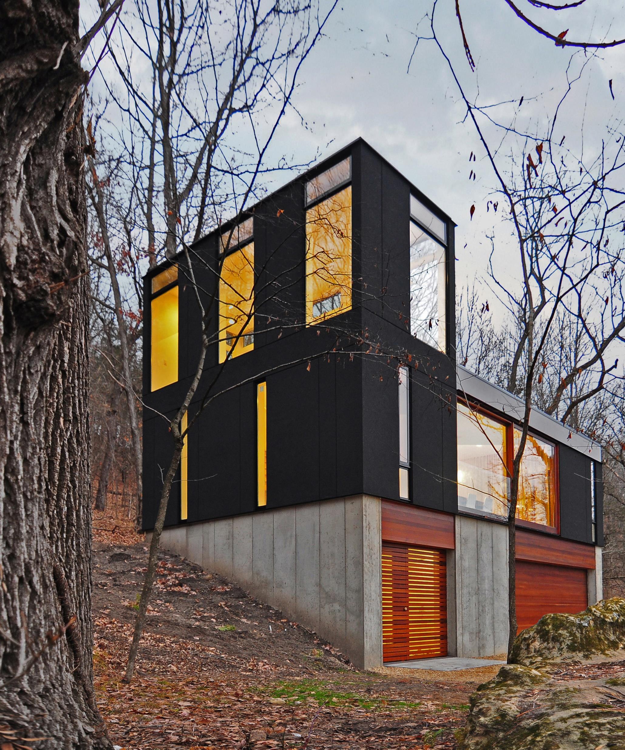
This small cabin for a young family sits at the end of an old logging road, its compact volume hugging the edge of a small clearing in a remote Wisconsin forest. In order to minimize the building’s footprint and take advantage of the sloped site, the horizontally organized components of a traditional cabin compound – typically an open plan longhouse with communal living space, an outhouse, and a freestanding toolshed – were reconfigured and stacked vertically. The bottom level, carved into the hill and accessible from the clearing, houses a small workshop, equipment storage, and a washroom, providing the infrastructural base for the living quarters above. A wood-slatted entry door opens to stairs that lead up to the open living hall centered around a wood-burning stove and bracketed by a simple galley kitchen and a pair of small, open sleeping rooms.

Norway I Architect Espen Surnevik
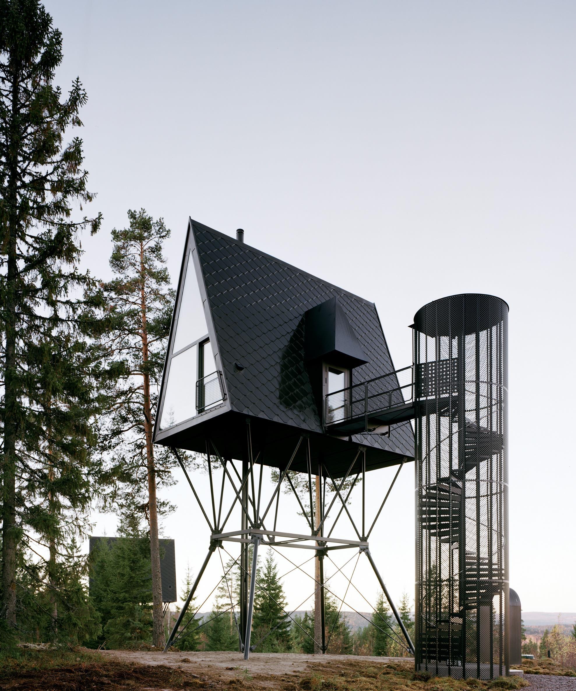
The project is located in the eastern part of Norway, close to the Swedish border, inside the huge forest-area called “Finnskogen” (Finlandian-forests). The main structure is made of steel which are suspended 6m into the bedrock in order to take up all wind loads on the cabins. The cladding is mainly in black oxidized zinc and black steel. This triangular shaped house includes a mezzanine with a bedroom, a complete bathroom with watertoilet and shower and a small kitchen with fireplace. The house is full insulated and has electrical heating in all the wood floors.
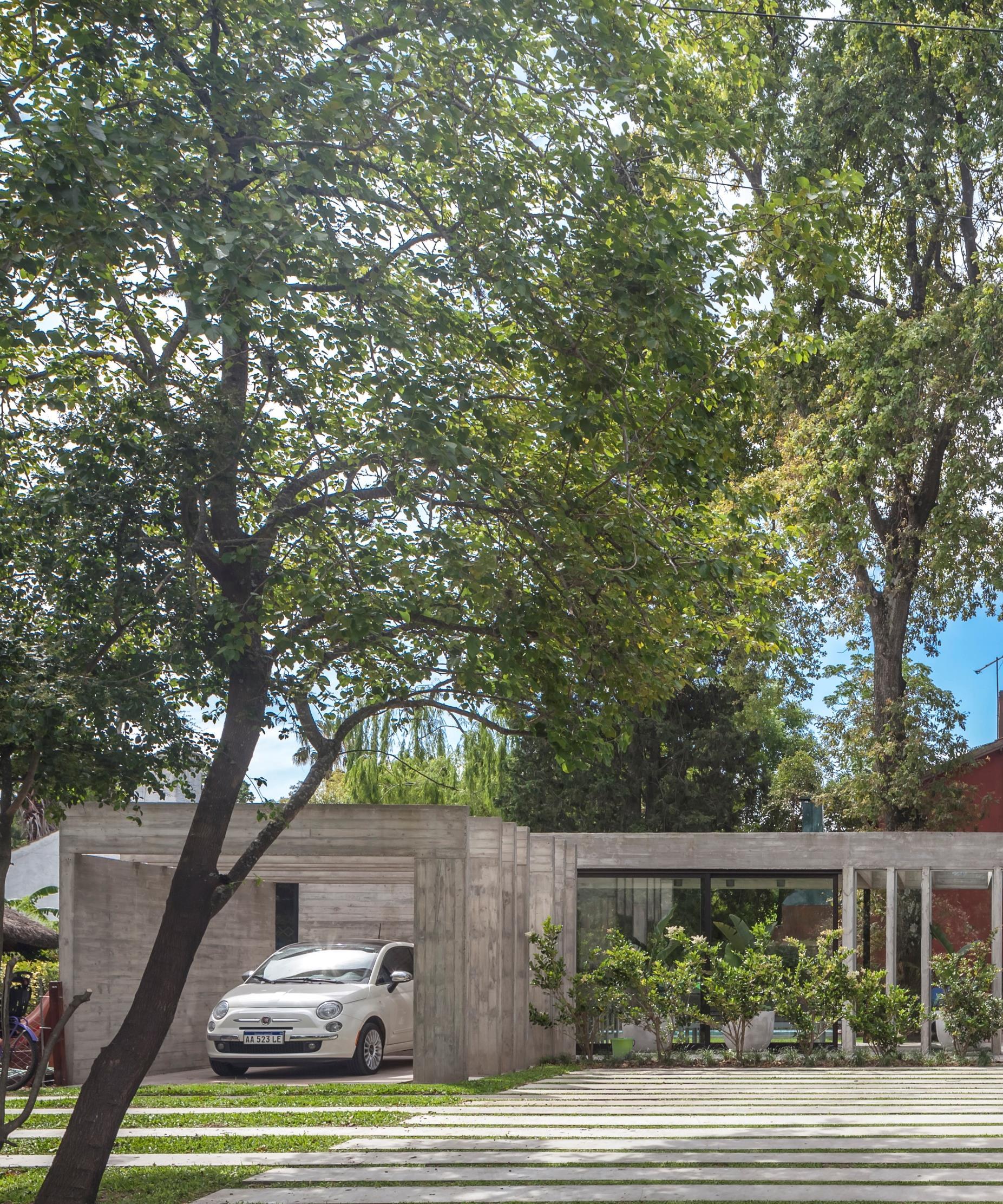
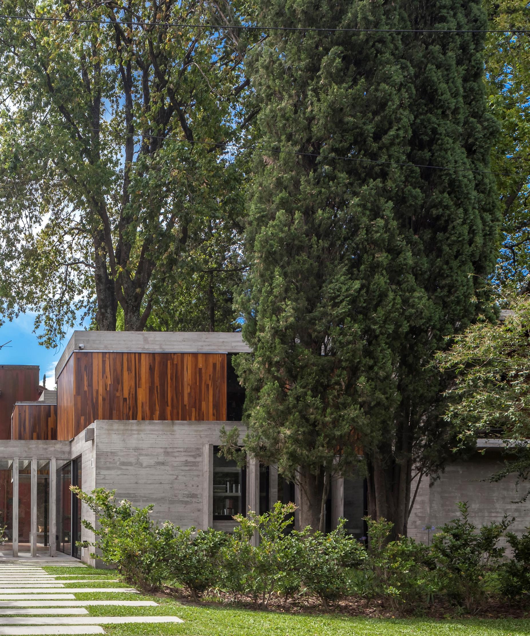
Argentina I Besonias Almeida Arquitectos
It's a corner lot in a closed neighborhood founded in 1968, with an important afforestation, to which the years have added an incalculable value. Different species of trees and shrubs combined give landscape value to the place throughout the year. Interested on the landscape, the architects decided that the project should not only preserve the existing trees in the lot, but that vegetation would be the first and fundamental starting point of the project. So they thought then that the house had to develop accommodating itself in the free holes left by the trees and wrapping them to make them part of the proposed spaces.
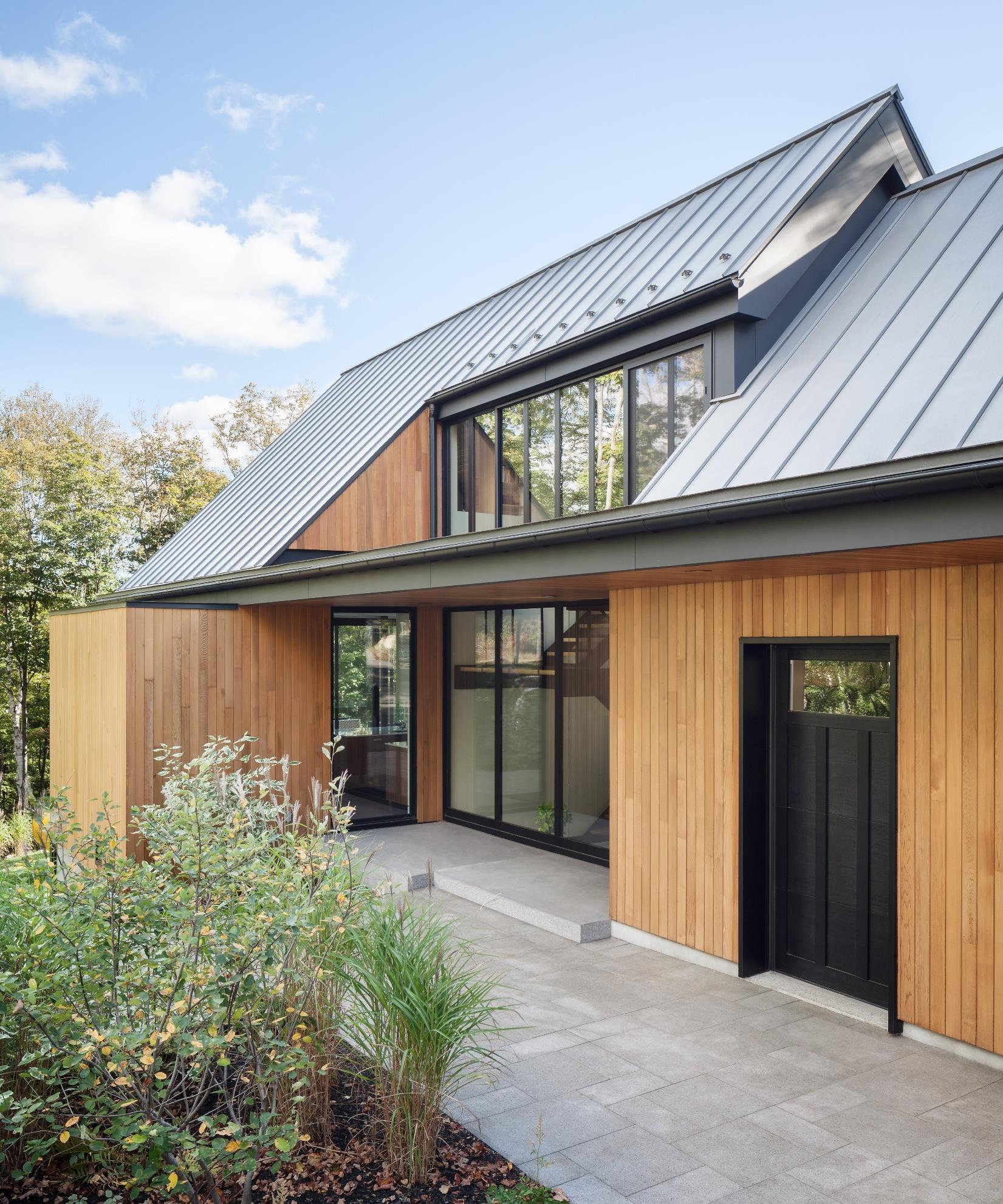
The design of this residence was inspired by the leafy hardwood forest originally found on this mountainside Laurentian site. Inside, its spatial configuration is inverted: bedrooms are closely connected to topography, while living areas on the ground floor take the form of spacious open volumes. These spaces are crowned by a vast wooden canopy that also includes the kitchen at the heart of the residence. Beneath the canopy, branching passages provide both spatial organization and visual openings to the outdoors. As the seasons change, the open spaces are bathed in natural light softened by projecting awnings.

Africa arrcc.com casaliving.eu jewellersnetwork.co.za okha.com southstoredesign.com
America annebschwartz.com besoniasalmeida.com digarchitects.com jaderalmeida.com johnsenschmaling.com melinaromano.com.br mjma.ca perkinswill.com rua141.com thellendfortin.com
Asia atelierkukka.com challenge-design.com curiosity.jp designshanghai.com designtokyo.jp e-stonetech.co.jp futureinteriorsproducts.com gswfair.com indexexhibition.com internationalapparelandtextilefair.com kukan.jp midoriarchitects.com scarletsplendour.com workspace-index.com
Europe altreforme.com
andtradition.com bocadolobo.com brabbu.com bykoket.com cassina.com domkapa.pt douniahome.com espensurnevik.no essentialhome.eu frato.com gandgmagazine.eu giovannibarbieri.com hugueschevalier.com ifgroup.org insidherland.com jcpuniverse.com jetclass.pt laskasas.com lucidpianos.com maisonvalentina.net margraf.it mecanoo.nl michaelisboyd.com minotti.com misuraemme.it muranti.com no12studio.com noa.network piattoeforchetta.com pieter-adam.com portaromana.com ritmonio.it room-matehotels.com royalstranger.com rugsociety.eu sculpture-couradin.com serip.com.pt sybilledemargerie.com zaditaly.com zanotta.it zooco.es

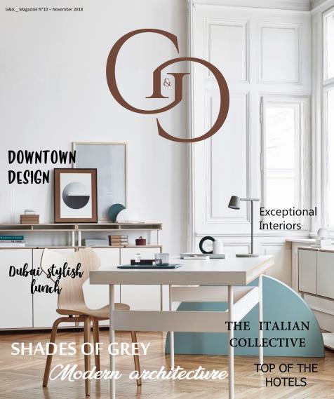
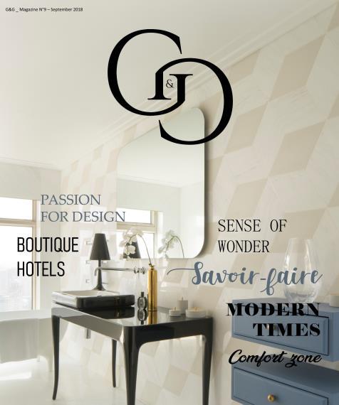

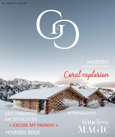

Click to our latest issues now to see even more of trend updates, stylish idees and exciting projects.

