
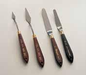
PORTFOLIO books & publications h Britta Bonette britta@bonettedesign.com 805.574.9788
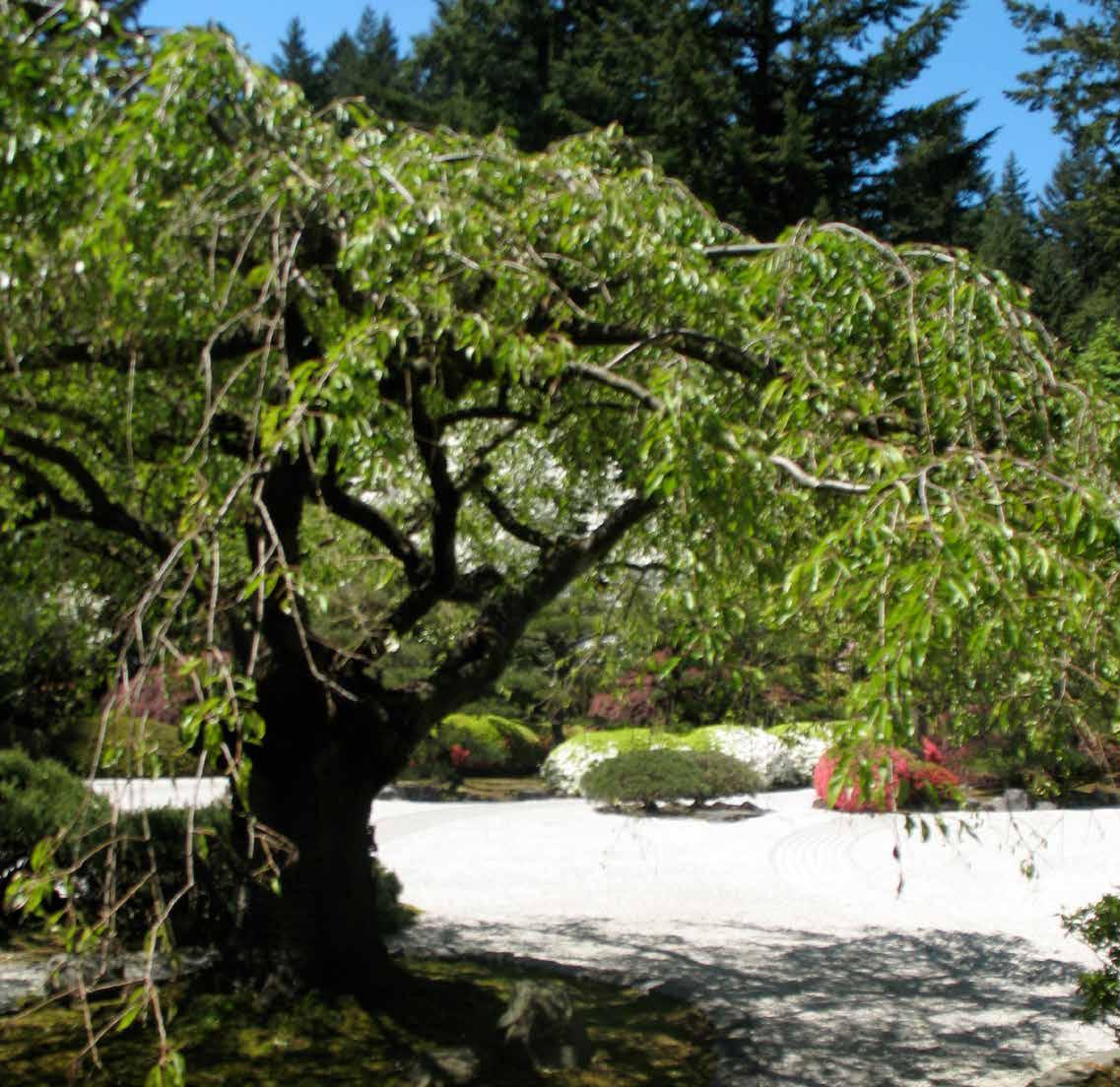
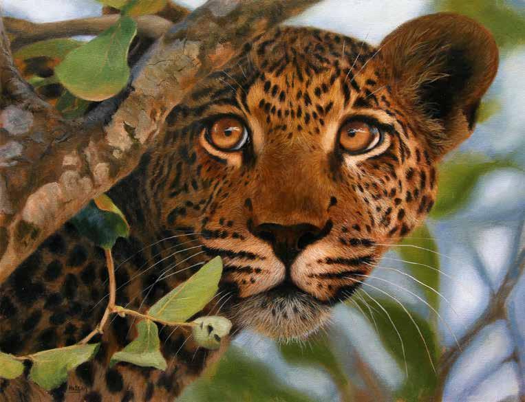
Japanese Garden Japanese Garden
The most authentic Japanese Garden outside of Japan, the Portland Japanese Garden is a haven of tranquil beauty in all four seasons.


Lorem ipsum dolor sit amet, consectetur adipiscing elit. Ut pellentesque hendrerit tortor ut suscipit. Vivamus facilisis, nisi ut sollicitudin faucibus, turpis dui accumsan ex, quis finibus sem mauris nec ipsum. Sed maximus metus, cursus egestas diam. Suspendisse lacinia elementum urna sit amet aliquet. Fusce a turpis vulputate, mattis arcu vel, aliquet lacus. Phasellus tortor ligula, auctor vel enim in, tempus sagittis mauris. Mauris eleifend laoreet sapien nec rutrum. Nunc
vitae ante ultrices, suscipit nisi et, porta mi. Vestibulum id ligula rutrum, gravida mauris nec, venenatis nunc. Aliquam et faucibus eros, quis tincidunt tortor. Donec iaculis malesuada justo sit amet tempor.
Morbi maximus tortor a urna hendrerit accumsan. Duis interdum leo non velit euismod, nec fringilla ligula euismod. Mauris et metus pellentesque, bibendum augue ac, dapibus ante. Nulla a tincidunt leo, quis facilisis ipsum. Aliquam
faucibus lectus in sem euismod, id ullamcorper tellus ultrices. Aliquam erat volutpat. Donec posuere posuere feugiat. Nam blandit sagittis risus eget aliquam. Suspendisse viverra consequat nisi, ac laoreet neque tincidunt ut. Proin cursus purus non justo pretium, porta viverra arcu rutrum. Aenean cursus orci sit amet sodales pulvinar. Nulla sed elit faucibus mauris malesuada elementum. Fusce elementum Lorem ipsum dolor sit amet, consectetur adipiscing elit. Ut pellentesque hendrerit tortor ut
britta@bonettedesign.com garden book comps [page 1 of 5]: design+layout / photography / ©
Britta Bonette
Quisque justo lacus, auctor ac sem eu, cursus venenatis augue. Nunc dui odio, plac erat a libero nec, pellentesque imperdiet ipsum. Phasellus nibh tellus, pretium vel eros id, venenatis aliquam quam. Aenean id urna ligula. Quisque vestibul um id nibh at sollic itudin. In aliquam ex id nisl faucibus, sit amet iaculis odio pretium. Curab itur sed mattis ex. Proin nisl elit, placerat in lacus sit amet, aliquet sagittis turpis. Fusce fermentum mauris vel nibh lobortis imperdiet. Aliquam maximus facilisis aliquam. Nullam ut odio a augue rutrum aliquet non vitaemag.


suscipit. Vivamus facilisis, nisi ut sollicitudin faucibus, turpis dui accumsan ex, quis finibus sem mauris nec ipsum. Sed maximus metus, cursus egestas diam. Suspendisse lacinia elementum urna sit amet aliquet. Fusce a turpis vulputate, mattis arcu vel, aliquet lacus. Phasellus tortor ligula, auctor vel enim in, tempus sagittis mauris. Mauris eleifend laoreet sapien nec rutrum. Nunc vitae ante ultrices, suscipit nisi et, porta mi. Vestibulum id urna sit amet aliquet. Fusce a ligula rutrum, gravida mauris nec, venenatis nunc. Aliquam et faucibus eros, urna sit amet aliquet. Fusce a quis tincidunt tortor. Donec iaculis malesuada justo sit amet tempor.

garden book comps [page 2 of 5]: design+layout / photography /
britta@bonettedesign.com
© Britta Bonette
britta@bonettedesign.com
Integer tempor euismod nisl quis auctor. Sed semper neque vel nisi sodales, a euismod ex pretium. Sed semper eleifend velit, quis. Pellentesque laoreet tincidunt tristique. Nullam rhoncus rutrum elit, quis interdum nulla rhoncus in. Proin id porttitor sapien. Pellentesque sed tellus auctor, feugiat felis vulputate, posuere.Vestibulum ante ipsum primis in faucibus orci luctus et ultrices posuere cubilia Curae; Phasellus eleifend magna at massa pellentesque rhoncus. Curabitur hendrerit nisl dui, in consectetur tortor hendrerit at. Proin lobortis commodo bibendum. Proin luctus justo est, ut vehicula ante vulputate vel. Etiam sed magna commodo est consectetur malesuada. Curabitur vulputate efficitur turpis vel posuere. Integer vulputate pulvinar diam, a congue lacus malesuada vel. Pellentesque eget lectus nec nibh laoreet eleifend. Etiam sit amet nibh auctor, iaculis augue et, bibendum erat. Quisque quam augue, blandit ac malesuada ac, facilisis sit amet dui. Vivamus ultricies urna ac pharetra sollicitudin. Suspendisse semper eget ante lobortis vulputate. Curabitur tellus risus, dictum sed sodales nec, malesuada eget augue.


garden book comps [page 3 of 5]: design+layout / photography / © Britta Bonette
Ipsum dolor sit amet, consectetur adipiscing elit. Ut pellentesque hendrerit tortor ut suscipit.


Vivamus facilisis, nisi ut sollicitudin faucibus, turpis dui accumsan ex, quis finibus sem mauris nec ipsum. Sed maximus metus, cursus egestas diam. Suspendisse lacinia elementum urna sit amet aliquet. Fusce a turpis vulputate, mattis arcu vel, aliquet lacus.

Phasellus tortor ligula, auctor vel enim in, tempus sagittis mauris.
Mauris eleifend laoreet sapien nec rutrum. Nunc vitae ante ultrices, suscipit nisi et, porta mi. Vestibulum id ligula rutrum, gravida mauris nec, venenatis nunc. Aliquam et faucibus eros, quis tincidunt tortor. Donec iaculis malesuada justo sit amet tempor. Morbi maximus tortor a urna hendrerit accumsan. Duis
interdum leo non velit euismod, nec fringilla ligula euismod.
Mauris et metus pellentesque, bibendum augue ac, dapibus ante. Nulla a tincidunt leo, quis facilisis ipsum. Aliquam faucibus lectus in sem euismod, id ullamcorper tellus ultrices. Aliquam erat volutpat. Donec posuere posuere feugiat.
Venenatis aliquam quam. Aenean id urna ligula. Quisque vestibul um id nibh at sollic itudin. In imperdiet aliquam ex id nisl faucib Proin nisl elit, placerat in lacus. Fusce fermentum mauris vel nibh lobortis imperdiet. Aliquam at sollic ut odio a augue rutrum aliquet non nisl vitaemag.
britta@bonettedesign.com garden book comps [page 4 of 5]: design+layout / photography / © Britta Bonette
Ipsum dolor sit amet, consectetur adipiscing elit. Ut pellentesque hendrerit tortor ut suscipit. Vivamus facilisis, nisi ut sollicitudin faucibus, turpis dui accumsan ex, quis finibus sem mauris nec ipsum. Sed maximus metus, cursus egestas diam. Suspendisse lacinia elementum urna sit amet aliquet. Fusce a turpis vulputate, mattis arcu vel, aliquet lacus. Mauris et metus pellentesque, bibendum augue ac, dapibus ante. Nulla a tincidunt leo, quis facilisis ipsum. Aliquam faucibus lectus in sem euismod, id ullamcorper tellus ultrices. Aliquam erat volutpat. Donec posuere posuere feugiat.

Phasellus tortor ligula, auctor vel enim in, tempus sagittis mauris. Mauris eleifend laoreet sapien nec rutrum. Nunc vitae ante ultrices, suscipit nisi et, porta mi. Vestibulum id ligula rutrum, gravida mauris nec, venenatis nunc. Aliquam et faucibus eros, quis tincidunt tortor. Donec iaculis malesuada justo sit amet tempor. Morbi maximus tortor a urna hendrerit accumsan. Duis interdum leo non velit euismod, nec fringilla ligula euismod. Mauris et metus pellentesque, bibendum augue ac, dapibus ante. Nulla a tincidunt leo, quis facilisis ipsum. Aliquam faucibus lectus in sem euismod, id ullamcorper interdum leo non velit euismod,

garden book comps [page 5 of 5]: design+layout / photography / © Britta
britta@bonettedesign.com
Bonette
Whenever zen is talked about, the first thing that comes to mind is a place where people can find their inner peace or a place for relaxation – like a place where we do our yoga or maybe the spa. Today, we will focus more on spaces in our own homes wherein this feel is achieved, other than our bedrooms, we are pretty sure, you would love going home and seeing a living room which is uncluttered, clean, organized and really relaxing. As a friend of ours say, it is usually the scented candles that do the trick. But, in the real world where kids are present and lighting candles is not really an option, designers often go for the lighting treatment which the house will extrude a feel of comfort and zen.

When we see the path ahead we no longer need to know were we are going.
Anonymous

coffee table book [page 1 of 3]: design+layout / concept / production /
britta@bonettedesign.com
© Britta Bonette 2
Zen and the art of authentic living
To see the world in a grain of sand, and heaven in a wildflower, hold infinity in the palm of your hand, and eternity in an hour.
 William Blake
A zen inspired design is all about natural colours, in soft tones, such as white, grey, shades of beige or pink beige, which have the power to induce a sense of relaxation and calmness. Chromatic harmony between the various elements is very important, as well as the visual continuity between walls, furniture and floors. In order to add contour to a monochrome room, you may always choose to combine a dominant colour with matching objects and textured textiles such as white with moleskin or beige with rosewood. To create diversity combine two matching colours or play with degrades of your favorite colour.


coffee table book [page 2 of 3]: design+layout / concept / production /
britta@bonettedesign.com
© Britta Bonette
For a fully relaxing space, replace harsh florescent lights with calming, nature-inspired or candle lights. Place different sources of light which will allow you to control the intensity and the areas to be lighted. Avoid projecting a strong direct light from the ceiling and take advantage of all possibilities to mix a floor lamp, a lamp set and indirect light. Zen style furniture is characterized by simple and clear lines, avoiding complicated detail and excess ornamentation. Storage pieces (closets, cupboards, chests of drawers) may be brought to life if painted in colours matching the rest of the interior. For the bed area, wall-mounted reading lights are very practical as they can be oriented to emphasize the respective area, unlike bedside lamps which are flexible. If you like diffused light, you may opt for some nice candles.


The real voyage of discovery consists not in seeking new landscapes but in having new eyes.
 Marcel Proust
coffee table book [page 3 of 3]: design+layout / concept / production / ©
britta@bonettedesign.com
Britta Bonette
my City Oasis
by Britta BonetteFinding a quiet place where you are surrounded by beautiful and restful sounds and sights of nature, is almost a must in our fastpaced world. Recently, I found myself moving back to a busy metro in the Pacific Northwest but was lucky to find a small but loveley apartment. I am a gardener at heart and equipped with a bright green thumb, so I was grateful to have found this little piece of urban paradise. I have a corner balcony next to an unuccupied and undeveloped piece of land, so I have lots of green to look at. This is truly a saving grace for me, as this my little “oasis” has given me so much joy and peace. Until I can find a “real” garden of my own, this is my flowering heaven in the midst of all the the noise and chaos.
A bumble bee caught buzzing around in my Nasturtiums all summer long, feverishly bulding their nectar reserv.


garden book [page 1 of 2]: editorial / design+layout / photography+illustration / © Britta Bonette
britta@bonettedesign.com
Flowers always make people better, happier, and more helpful; they are sunshine, food and medicine for the soul.
— Luther BurbankMy all time favourite is the Morning Glory. Every morning it surprises me with a brand new gorgeus flower opening its bright eye to the sky.


I am sharing this short pictoral story about my oasis to show the joy this has given me. I have so much love for all the growing plants that surrounds me and the beauty and peace I feel while spending time in my flower garden. Ever since I was a little girl, I would find a corner somewhere where I could find peace, solitude and even some room for imagination, play and fanatsy. It could be by the rocks down by the lake or in the forest under a tree. Finding comfort in solitude is a wonderful gift. In our noisy, distracting and electronic environment we live in, it’s important to have that special corner where we can have our own oasis and to really notice the world by out feet; listening to the insects on the ground (did you know even ants have a voice?), the birds, crickets, dragonflies, bees and even an occational fly. Go out there today, find a corner in your world where you can have your own quiet oasis


garden book [page 2 of 2]: editorial / design+layout / photography+illustration / © Britta
britta@bonettedesign.com
Bonette


britta@bonettedesign.com art instruction book “Still Life in Acrylic” [page 1 of 2]: book layout / © Walter Foster—Quarto Publishing An imperfect scene often results in a more dynamic piece. For this setup, a few tomatoes spilled outside of the bowl and a few wrinkles in the cloth create interesting shadows and balance the composition.
with Janice Robertson Step 1 apply an underpainting of thinned quinacridone gold over 12" 12" primed canvas. Then use dioxazine purple to draw the basic shapes of the composition. Step Next, block in the tomatoes with pyrrole red. To paint the rim of the bowl, use quinacridone gold and dioxazine purple. For the inside of the bowl, use bright turquoise mix of white, phthalo blue, and bit of Hansa yellow. use a slightly greener version of this mix to begin the stripes on the cloth. For the areas of shadow in the composition, apply dioxazine purple. Step 3 Now use white to paint more stripes on the cloth. use phthalo blue and pyrrole red to represent the shadows in and under the bowl. 62 Color Palette dioxazine purple hansa yellow medium • phthalo blue pyrrole red quinacridone gold • titanium white Medium acrylic glazing liquid (slow drying) Step 4 In this step, paint the shadows in the bowl again, this time using dioxazine purple and quinacridone gold for warmth. To create the rim of the bowl, use quinacridone gold, dioxazine purple, and little phthalo blue. use quinacridone gold, pyrrole red, dioxazine purple, and white to develop the shadows in the cloth. Step Now focus on painting the tomatoes. begin by glazing the darkest tomatoes with purple. Then use pyrrole red for the middle alues and combination of Hansa yellow medium, white, and pyrrole red for the lighter areas. To emphasize the darks, add dioxazine purple to the pyrrole red. Next, paint final layer of shadows in the cloth using white, quinacrione gold, phthalo blue, and pyrrole red. To finish, paint second layer of white on the stripes and add white highlights on the tomatoes. 64 65
Cherry Tomatoes


Life in
2]:
Step Around the rim of the lid, handle, spout, and base of the teapot, paint layer of pyrrole red. When dry, paint thin layer of cobalt blue mixed with glazing fluid over the highlighted bands of the teapot. To finish this step, paint white over the brightest highlights. Step 5 To finish the lemons, start with a layer of Hansa yellow mixed with glazing fluid on each lemon. use Hansa yellow and whit for the lightest areas, Hansa yellow and pyrrole red for the deeper yellow areas, and a combination of cobalt blue, Hansa yellow and pyrrole red for he shadows. For the lightest areas on the lemons, use pure white. Step 6 For the plate, apply two layers of white over the light areas. For the shadows, use cobalt blue and Hansa yellow mixed with a small amount of pyrrole red and white. To complete the painting, use quinacridone gold and bit of pyrrole red for the wood grain of the table. 74 75 Working with a limited palette (only a few select colors) is a great way to create unity in a painting while keeping it bold and simple. In this project, I use just six colors to bring the scene to life.
and Teapot with Janice Robertson 72 73 Color Palette cobalt blue • dioxazine purple hansa yellow medium pyrrole red • quinacridone gold • titanium white Step 2 Now paint the lemons with layer of Hansa yellow mixed with titanium white. Then paint the shadows on the plate with cobalt blue. layer pyrrole red and cobalt blue over the spout and lid of the teapot. Finally, paint a second layer of dioxazine purple and quinacridone gold to deepen the shadows. Step 3 paint the rim of the plate with a mix of cobalt blue and white. For the teapot, layer over the darks using quinacridone gold and purple mixed with glazing fluid. While the paint is still wet, paint the highlights with white. Step To begin, paint a layer of thinned quinacridone gold over 12" 16" canvas. Once dry, draw the basic shapes of the composition with chalk and go over them with dioxazine purple. also use purple to block in the shadows.
britta@bonettedesign.com art instruction book “Still
Acrylic” [page 2 of
book layout / © Walter Foster—Quarto Publishing
Lemons
Oil & Acrylic Techniques


There are many different ways to approach a blank support. Some artists begin by toning (or covering) it with a thin wash of color. This “underpainting” provides a base for building colors, and sometimes it peeks through in the final painting. This process prevents your final artwork from ending up with unpainted areas. The underpainting is generally a neutral color; warm colors work well for earth-toned subjects, and cool hues suit most other subjects.


britta@bonettedesign.com
instruction
Flowers in OIl & Acrylic”
1 of 3]: book
/ © Walter Foster—Quarto Publishing Tools & Materials You will see a vast array of items to choose from as you scan the shelves of your local art supply store. But there is no need to become overwhelmed; you will only need a few materials to begin painting. A good rule of thumb is to always buy the best products you can afford. Buying Paints You can use either oil or acrylic paint to complete the projects in this book. The main difference between the two mediums—aside from one being oil-based and the other water-based—is that acrylic dries much faster than oil, making easier to paint over mistakes. Oil, however, has more pigment and renders richer colors. Both types of paint are available in two grades. “Artist grade” is the highest quality and contains the most pigment, whereas “student grade” is less expensive and contains more filler. Selecting Supports The surface on which you paint is called the support. Ready-made canvases are available in dozens of sizes and come pre-primed and either stretched on a frame or glued over a board Watercolor illustration boards work well with acrylic paint, providing smoother surface. When working with oil paint, artists generally use canvas or wood. When using wood or any other porous material, you may need to add primer first to keep the paint from soaking through. Experiment with several different kinds of supports to see which best suits your own painting style. Lemon yellow Cadmium red light Cadmium yellow light Alizarin crimson Titanium white Ultramarine blue Burnt umber Cerulean blue Black Buying and Caring for Brushes There is no universal standard for brush sizes, so they vary slightly among manufacturers. Just get the brushes that are appropriate for the size of your paintings and that are comfortable for you to work with. The six brushes pictured here are good starting set; you can always add to your collection later. Brushes are also categorized by the material of their bristles; keep in mind that natural-hair brushes are generally not recommended for use with acrylic paint. Bristle hair filbert Medium flat brush Medium round bristle brush Small softhair round brush Small flat brush Fan brush Using Painting and Palette Knives Palette knives can be used either to mix paint on your palette or as tool for applying paint to your support. Painting knives usually have smaller, diamond-shaped head, and are well suited for applying paint directly to the canvas. Finishing Up Varnishes are used to protect your painting—spray-on varnish temporarily sets the paint, and brush-on varnish permanently protects your work. jar or metal the medium. INCLUDING THE EXTRAS Paper towels or lint-free rags are invaluable for cleaning your tools and brushes. They can also be used as painting tools to scrub in washes or soften edges. In addition, you may want charcoal or a pencil for sketching and mahl stick to help you steady your hand when working on a large support. silk sea sponge and an old toothbrush can be used to render special effects. CHOOSING A COLOR PALETTE The nine colors shown below make a good basic palette. Each project in this book has its own palette, which you should review before purchasing paints. Picking Palette Whatever type of mixing palette you choose— glass, wood, plastic, or paper—make sure it’s easy to clean and large enough for mixing your colors. You can purchase an airtight plastic box to keep your leftover paint fresh between sessions. Cleaning Brushes jar that contains coil will save time and mess because will loosen the paint from the brush. For removing oil paint, you need to use turpentine. Once the paint has been removed, you can use brush soap and warm water—never hot—to remove any residual paint. When painting with acrylic, use soap and water to remove paint from the brush. Reshape the bristles and lay flat to dry. Never store brushes bristle-side down. Selecting an Easel The easel you choose will depend on where you plan to paint; for painting landscapes, you may want portable easel. OIL AND ACRYLIC MEDIUMS You will want to purchase some mediums and thinners to accompany your paint—they are used to modify its consistency. Many different types of oil painting mediums are available—some act as thinners (linseed oil) and others speed up drying time (copal). Acrylic paint dries quickly, so you will want to keep a spray bottle filled with water handy. Another way to keep the paint moist is to add acrylic retarder. Don’t use more than a 15-percent solution; too much retarder can cause uneven drying. There are a variety of oil and acrylic mediums available that achieve wide range of effects. Visit your local art supply store and get acquainted with the possibilities. 14 15
art
book “Painting
[page
layout
Slash Use a bristle brush or knife to make angular strokes following the direction of mountain or rock's jagged, jutting planes. Stamp and Lift For background foliage, take loaded round bristle brush and push onto the canvas then pull away. Stroke up with the brush as you lift to create tall grasses. Drag Dragging perfect for rendering sunlight glistening on the water; pull the brush lightly across the canvas to leave patterns of broken color over another color.
Working with Painting Tools The way you hold your tool, how much paint you load on it, the direction you turn it, and the way you manipulate will all determine the effect of your stroke. The type of brush you use also has an effect; bristle brushes are stiff and hold generous amount of paint. They are also excellent for covering large areas or for scrubbing in underpaintings. Soft-hair brushes (such as sables) are well suited for soft blends, glazes, and intricate details. Knife Work For thick texture, load painting knife with paint and place the side of the blade on the support. Draw it down, letting the paint “pull” off the knife. You can also use this effect to blend colors directly on your support. Impasto Use paintbrush or painting knife to apply thick, varied strokes, creating ridges of paint. This technique can be used to punctuate highlights in a painting. Scumble With dry brush, lightly scrub semi-opaque color over dry paint, allowing the underlying colors to show through. This is excellent for conveying depth. Smear For realistic rocks or mountains, use paint or palette knife to lightly smear on layers of color, blending slightly. Overworking the area will ruin the texture. Scratch To effectively render rough textures such as bark, use the side of a paint or palette knife to apply quick, vertical strokes to scratch off color. Dab To achieve soft blend, dab color onto the support using light vertical tapping strokes with brush or your finger. Some pigments, however, are toxic and should not come in contact with your skin. BLENDING LARGE AREAS A hake brush is handy for blending large areas. While the area is still wet, use clean, dry hake to lightly stroke back and forth over the color. Be sure to remove any stray hairs before the paint dries and never clean your hake in thinner until you’re done painting, as it will take a long time to dry. Sponge Here different colors are sponged on in layers, creating the appearance and texture of stone. Stipple For reflections or highlights, use a stiff bristle brush and hold it straight, bristle side down. Then dab on the color quickly, creating series of small dots. Scrape Use the tip of a palette knife to scrape color away. This can create an interesting texture or represent grasses. Spatter To spatter, load brush—or toothbrush— with paint and tap your finger against the handle. The splattered paint creates the appearance of rocks or sand. Lifting Out For subtle highlights, wipe paint off with a paper towel or blot with tissue. To lighten the color or fix mistakes, use moistened rag (use thinner with oil paint). Soft Blend Lay in the base colors and lightly stroke the brush back and forth to pull the colors together. Make sure that you don’t overwork the area. Artist’s Tip Use an old, dull pizza cutter to make straight lines; just roll it through the paint and then onto the support.
Tiger Lily


CHAPTER 1
Flower Portraits

Still Lifes
Chapter 2
with Judy Schafers and Marcia Baldwin
with Linda Yurgensen
Painting Animals in Oil
Just as a portrait of a person must capture the personality of the sitter, a successful flower portrait must convey the unique characteristics and natural beauty of the subject. Colors should be true and texture accurate to the point that viewers can feel the flower simply by looking at it. The step-by-step lessons in this chapter show how to create dynamic flower paintings that achieve these important traits. They’ll also inspire you to use your freshly honed skills to paint other flower portraits with your own special touch.

with Lorraine Gray & Jason Morgan Omni quiae videlit doluptatur, sin pe estium que perum velitio nemperiam dolorio ssitiscit facearum exped maximod ipitaquia vel enderum fuga. Officidem eturepudi reperitiis doluptatur? Quia plit, quamendant rempedis sitis aut quiscilia simin con pos eossunt iandis apistiam, qui nulparc hilignihit fugia quis autemod ipienti atessit utate verspid qui cum am rem imus alique voluptius invello reiuntio. Me dolupiciet quasseditius velessi dogia quis autemod ipienti atessit utate verspid qui cum am rem imus alique voluptius invello reiuntio. Me dolupiciet quasseditius velessi doloresci loresci auda qui cores

art instruction book “Painting Flowers in OIl & Acrylic” [page 2 of 3]: book layout / ©
Foster—Quarto Publishing
britta@bonettedesign.com
Walter
17
20 21 Step Now add a glaze mixture of purple, touch of white, and permanent rose to the deep shadows of the flower. After it dries, paint few thin strokes of dark green (a mixture of phthalo blue green shade, dioxazine purple, azo yellow, glaze and touch of white) on the orange petals. These strokes can only be seen close-up, but subtly unite the flower with the background. In the lighter, more yellow shadow areas, use a mixture of glaze, white, dioxazine purple, azo or lemon yellow, and touch of permanent rose. Step Continuing with the petals, use a mixture of glaze, cadmium red, dioxazine purple, and Indian yellow to deepen the darker shadows within the larger shadow shapes. When the paint dries completely, add a layer of permanent rose mixed with glaze over the petal, except for the lightest sections. To these sections, add thin glaze of lemon yellow. apply multiple layers of the yellow, red, and purple glaze mixture on the deeper orange petals using small amounts of paint until achieve the desired depth of color. Step 4 remove most of the watercolor pencil marks with a damp towel so they don’t interfere when applying color to the edges of the petals. Next paint a glaze of white onto the brightest parts of the petals. Mistakes in the original drawing are corrected using two to three layers of titanium white, straight from the tube. Once dry, layer coat of azo yellow over the white corrections to match the original petal shapes. Then use Indian yellow to define the shadows in the petals.
with Judy Schafers My attraction to the tiger lily is its vibrant color and simple yet dynamic design. There is ample opportunity here to practice working with reds and yellows in combination with dioxazine purple to re-create the subject’s vibrancy without inadvertently muddying the colors. Color Palette azo yellow cadmium red medium dioxazine purple Indian yellow lemon yellow phthalo blue (red and green shade) titanium white Medium acrylic polymer medium Step 3 To suggest foliage in the lower left corner, use a soft, worn ½-inch angle brush that useful for creating blurred edges. use mixtures of phthalo blue green shade, phthalo blue red shade, azo or lemon yellow, glaze, and touch of cadmium red to paint the leaf shapes. For the darker greens, add dioxazine purple to the mixture, and for the brighter greens, more lemon yellow; white create the highlights. continue adding layer upon layer using a small amount of paint and working between mixtures until capture the effect in the photo. Step To make the painting more interesting and highlight the flower itself, use square canvas, which prepare with two coats of GAC 100. Once dry, loosely paint the whole canvas with a mixture of glazing medium and azo yellow. This will help bring out the yellow in the image and give an overall feeling of warmth to the final painting. The coating doesn’t need to be uniform, but it must dry thoroughly before continuing. Next use watercolor pencil to mark the center of the canvas, as well as my cropped reference photo. Now my focal point won’t end up in the center of the canvas. 18 19 Step 2 Using various mixtures of dioxazine purple, phthalo blue green shade, cadmium red medium, titanium white, azo yellow, and glaze, block in the background with ¾-inch angle brush, being careful to preserve the flower. Random, quick strokes produce the illusion of texture—some of which will show through in the final painting—and creates interest without fussy detail. When this coat is dry, add a few more layers of these mixtures, focusing on where the background should appear darkest. The more layers add, the less streaky the painting appears. Limiting the number of layers on areas find the texture most interesting will preserve some of it. Artist’s Tip Always being aware of the directional markings of each petal helps add form and lifelike dimension to the flower


instruction
in OIl
Color Palette Oil Colors: burnt sienna burnt umber cadmium barium orange deep yellow lemon yellow lime green phthalo blue sap green titanium white violet yellow ochre You will also need: liquin turpentine Medium acrylic polymer The sunflower is a large blossom with bright yellow petals that appear to be translucent when the sun shines through them. The seeds in the center offer lots of texture; they range in color from rich ebony to sunny orange to white, making this flower a delightful subject to paint. Sunflower with Marcia Baldwin 57 56 Step Starting with the center of the sunflower, apply cadmium orange combined with my medium mixture using swift, bold brushstrokes. Next apply deep yellow mixed with medium. Then loosely brush on sap green to indicate the stem and foliage. Finally, use clean, dry brush to lightly blend strokes together. This will be the underpainting. Step With ½-inch flat brush with crisp edge, begin filling in the center with burnt umber. use short, multidirectional strokes to create clean edges between the petals. As move toward the center of the blossom, allow a bit of the orange underpainting to peek through. Continuing this and begin dabbing in burnt sienna, cadmium barium orange, and yellow ochre to give the seeds depth and texture. Step Using variety of brush sizes, continue to apply heavy dabs of burnt sienna around the perimeters of the sunflower center, remembering to leave bit of the orange underpainting showing through. Then load a smaller brush with deep yellow and cadmium barium orange, and dab color around the protruding seeds and surrounding petals. Step Next, load ¼-inch brush with sap green and outline the leaves and foliage around the blossom. Using the same brush, use deep yellow to paint the petal outlines, followed by burnt sienna to delineate the center. This photo hails from the Annual Sunflower Trails, yearly event that is held near my home each July, wherein farmers cultivate sunflowers on their land along 10-mile stretch of road in Gillam, Louisiana. The result is breathtaking display of stunning sunflowers that inspires locals and tourists alike. 58 59 Artist’s Tip When a highlight appears too bright or out of place, use a soft, one-inch sable or synthetic flat brush to softly blend the white into the adjacent hues. Step begin defining the green petals and leaves by layering in sap green, phthalo blue, lime green, and burnt umber—always working dark to light. work wet-into-wet until I’m happy with the color; then add highlights with clean brush dipped in titanium white. Step 6 begin adding highlights and lighter tones to further define the petals, leaves, and foliage. begin adding lemon yellow, followed by strokes of titanium white, for the petals in the foreground. Then lightly blend all remaining colors on the petals. add strokes of violet, phthalo blue, and lime green to the green foliage to create added depth, and use the sharp edge of the flat brush to define the edges of the petals and leaves. Finally, apply violet, burnt umber, phthalo blue, and crimson to fill in the dark background. A clean, dry brush helps soften the contrast between the petals and background.
britta@bonettedesign.com art
book “Painting Flowers
& Acrylic” [page 3 of 3]: book layout / © Walter Foster—Quarto Publishing
the paint. Although you can technically paint straight from the tube, most artists add medium to extend the paint and to build an oil painting in the traditional “fat over lean” layering process. The drying oils and resins mentioned on the following pages can be used as mediums, but the term “medium” in oil painting generally refers to mix of oil and solvent, with the solvent accelerating the drying process. Because oil-based paints do not mix with water, artists traditionally use solvents for paint thinning and cleanup. If you choose to purchase a solvent, be sure it is intended for fine-art


Animal Features & Textures


draw in the shape of the eye and the pupil with my number 00 round brush. While the paint is wet, mix burnt sienna and burnt umber and paint the dark brown iris. To soften the outer edge, mix burnt sienna with just bit of burnt umber and shade around the outer part of the eye. When the paint is dry thin some cadmium yellow and paint a soft brush stroke to the left of the pupil to show some light reflection. I add highlights to the eye with white and a bit of ultramarine blue.


Long Fur for Tails & Manes
This example is of a dog’s long fluffy tail, but you can use the same technique for horse manes and tails. To achieve this fluffy texture the background needs to be wet so the paint blends. Use a slow-drying medium if you are working with acrylics to keep your paint wet. build up the background in three layers using a mix of burnt umber and burnt sienna. I let each layer dry before applying the next, making the last layer slightly thicker than the first two. When I’m happy with the background paint the tail while the last layer of paint is wet. For the dark cream undercolor use mix of yellow ochre and bit of burnt sienna. With my large no. 8 filbert brush I use sweeping brush stokes to flick the brush up into the wet background color, starting at the center of the tail. Then lighten my cream mix by adding some white and use the same brush and technique to flick in highlights.


tip of the nose. With my round 00 brush make a diluted mix of cadmium red with a little bit of alizarin crimson and white for the pink color on the lower nose. While wet, mix more white into the color mix and paint the lighter pink color. Doing so while the paint is still wet blends the colors, avoiding hard edges. If you use acrylics you can use slow-drying medium to allow you to blend the colors while the paint is wet. Once dry use my round 00 brush to add the fur texture on the bridge of the nose with mix of burnt umber and little white.
Ears use similar technique for ears as for tails. First I paint thin layer of a burnt sienna and burnt umber mix with my no. 8 filbert brush for the darker ear color. For the center of the ear I use a thin mixture of cadmium red and little alizarin crimson. When dry, paint a thin layer of burnt umber over the pink to tone it down. Once dry, I start my next layer. Using my no. 3 round brush mix burnt umber with some white to create beige. Painting in the direction the fur grows, flick some fur texture on the ear. clean my brush and mix raw sienna and some white for cream. Using the same brush strokes, flick on more fur texture. The beige color is still wet so the cream blends in slightly for soft, fluffy look. do the same technique with some white paint and then let the painting dry. add more white highlights where needed. To get a soft, fluffy look, be careful not to use paint that is too thick.
britta@bonettedesign.com art instruction book
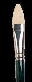
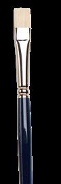
Art of Painting Animals” [page 1 of 3]: book layout /© Walter Foster—Quarto Publishing Tools & Materials Paints Paint varies in expense by grade and brand, but even reasonably priced paints offer sufficient quality. Very inexpensive paints might lack consistency and affect your results, but buying the most costly color may limit you. Find a happy medium. Brushes Synthetic brushes are the best choice for acrylic painting because their strong filaments can withstand the caustic nature of acrylic. Build your starter set with small, medium, and large flat brushes; medium round brushes; a liner brush; a medium filbert brush; and a medium fan brush. Palettes Palettes for acrylic range from white, plastic handheld palettes to sheets of plexiglass. I like to use Chinese enameled butcher trays; some have multiple compartments to separate colors. Additional Materials Oil paint can be messy so it’s a good idea to keep paper towels or rags close by to clean both your brushes and your painting area. You should also have some drawing tools on hand, such as drawing paper to practice your sketch first and drawing pencil. You’ll want spray fixative to protect your drawing before you begin applying paint. Acrylic paints and mediums can be applied with any brush. Paintbrushes are categorized by hair type (soft or stiff and natural or synthetic), style (filbert, flat, round, etc.), and size. It is a good idea to have small, medium, and large sizes of both soft and stiff (bristle) brushes. Synthetic-hair paintbrushes work well with acrylic, as the hairs are soft but springy enough to return to their original form. In addition to brushes, you may want to have a palette knife or painting knife on hand for mixing colors on your palette and experimenting with textural effects on your canvas. Care for your brushes by cleaning them after use with lukewarm water and soap or brush cleaner Mediums & Solvents Drying oils and mediums allow artists to change the consistency and reflective qualities of
purposes. Note any instructions and cautions provided by the manufacturer. Painting Surfaces Although you can paint with acrylics on almost any material, from watercolor paper to wooden board, canvas is a natural choice. use mostly pre-stretched canvas or canvas panels. Both generally come pre-coated in gesso (a waterproofing element that also adds texture to the surface), but I frequently apply my own to build up more texture or “tooth.” Watercolor paper is the perfecr surface for the fluid washes of watercolors. Many artists like using this durable paper or other wet and dry media such as gouache, acrylic, pastel, pen and ink, and even graphite. Palette & Painting Knives Palette knives are mainly used for mixing colors on your palette and come in various sizes and shapes. Some knives can also be used for applying paint to your canvas, creating texture in your work, or even removing paint. Palette knives are slightly rounded at the tip. Painting knives are pointed and bit thicker, with a slightly more flexible tip. 9
”The
Cat Whiskers To create whiskers, use a fine brush (size 10/0). dilute white paint to a thin consistency and then, starting at the base of the whisker, quickly sweep the brush in the direction of the whisker, lifting the brush at the end. Cat Eyes Cats’ eyes have some lovely colors. start by drawing the shape of the eye and the pupil with round brush using burnt umber and ultramarine blue mix. While this is wet, mix cadmium yellow and ultramarine blue for the green, and paint around the inner edge of the eye. For the midtone yellow mix lemon yellow with a bit of cadmium yellow and blend slightly into the green. Eyes reflect color from their surroundings, so highlights are not pure white. like to mix a bit of ultramarine blue or cobalt blue into white and flick highlights near the top of the eye. If there’s too much, simply lift some off with your thumb When the eye is dry, put dab of white at the edge of the blue highlight. To soften the outer edge of the eye I paint a thin wash of burn sienna and burnt umber along the bottom. Cat Noses Using my no. 3 round brush mix burnt umber and ultramarine and paint the dark bridge and
paint little brush strokes down the nose to create the fur texture. Then clean my brush and mix the highlight color with a little ultramarine blue and some white. I dilute the paint so it is thin enough to glide easily off the brush without leaving thick paint on the canvas. Dog Noses Typically I paint from dark to light, however sometimes it is better to do the opposite. For this nose, the undercolor is actually lighter. paint a very thin wash of burnt sienna for the undercolor. Once dry, mix burnt umber and ultramarine blue to create my dark and paint a thin layer on top. press my thumb on the nose to remove some of the paint and allow the lighter undercolor to show. This is a great technique for noses in oils and acrylics. While the paint is still wet use round 00 brush to paint some dark in the nostril area and a line up the center of the nose. When the paint is dry mix bit of ultramarine blue and white and paint the highlights with a small brush, lifting off a bit with my thumb again. Dog Eyes Dog eyes are usually very dark and reflect the colors from their surroundings. For this dog eye mix burnt umber and ultramarine blue and
Ears, Eyes & Noses
these techniques on a piece of scrap paper to make sure you don’t have too much paint on the brush and that the paint is the right consistency. 14 15
Artist’s Tip Place
art instruction book ”The Art of Painting Animals” [page 2 of 3]: book layout /© Walter Foster—Quarto Publishing
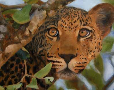
Tip like to have my reference photos as close to the painting as possible so that don’t have to change my seated position as paint. My glass palette is taped to the right of the painting and it has been toned a similar color to the canvas. This makes mixing and matching colors much easier than if were using a white palette. continue to block in the face and also start to work outwards on to the sky and tree branch.
britta@bonettedesign.com
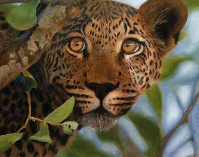
30 31 Step continue to block in more of the distant branches and leaves. While the background is still wet, use a large soft brush to blend the background areas together, blurring them slightly to give the appearance of more depth. will make this effect even more pronounced by painting the most detail around the face and eyes. tStep 6 With the whole of the canvas now blocked in sit back and asses what need to adjust. look for areas that need to be darker or lighter and areas that need to be richer and more vibrant in color to make them stand out. decide that the background is too vibrant and is not giving me the sense of depth want, so adjust the first background mixes with more ultramarine blue and white to cool them down in relation to the foreground leaves, once again softening the edges. then allow this stage to dry overnight. uStep The background works much better now that it has been cooled, so start to add second layer to the cub, being much more careful to get the tones dark enough, especially on the body in shadow. then begin to add some fur texture and details to the face using rigger #4 brush and starting with the areas farthest away and working forward with overlapping strokes. also add some more dark tones to the branch, along with some details, before leaving the painting to dry overnight. Step 8 With the painting completely dry, apply some glazes to some areas using alkyd oil medium and various mixes of burnt Sienna, burnt umber, cadmium yellow, and ultramarine blue. ensure each glaze very transparent so that the details underneath are not lost. The glaze is really just acting as stain on the underpainting. You can see from this photo that the painting is much larger than life size, and is especially important on large paintings that small brushes are reserved for the finest of the final details. Here am painting in the whiskers with a paint mix thinned with odorless paint thinners. Step The final stage brought to completion with a few small glazes here and there and also few bright highlights in the eyes and in the lightest parts of the background. Artist’s Tip Don’t clean your palette during painting session unless you run out of mixing space. only ever clean the mixing area of my palette at the very end of a painting session, as frequently find just the right color need in the blends between previous mixes.
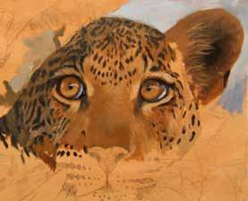
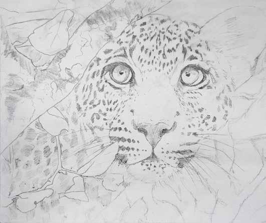
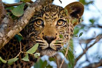
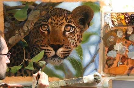
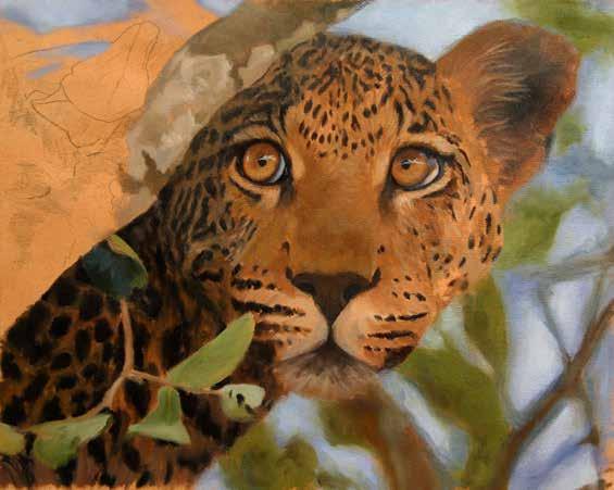
with Jason Morgan Even at rest wild leopard cub is alert and inquisitive, and it is this feeling that am hoping to capture in this painting, as the cub waits eagerly for its mother to return from the hunt. Artist’s
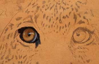
Color Palette burnt sienna • burnt umber • cadmium orange cadmium yellow deep • lamp black • Naples yellow • olive green titanium white • ultramarine blue Winsor red • Winsor yellow 28 29 Step 1 This drawing is complicated, so start by drawing it onto standard paper; this means that any mistakes can be easily erased. then transfer the drawing to my canvas by tracing over the drawing with piece of transfer paper between the drawing paper and the canvas. then seal the drawing using light spray of permanent pencil fixative and allow it to dry. pStep As per my standard procedure, tone the canvas using burnt sienna acrylic paint thinned with water. This gives me nice warm mid-tone to work over. On this layer use a hair dryer to reduce the drying time. With this preparatory layer now finished it is time to begin using the oil paints. typically like to start with the eyes in most of my paintings, but they are especially important in this one as they are clearly the center of interest. begin by blocking them in using Naples yellow as the base color, and then adjust that color by making it darker with burnt sienna and burnt umber. use lamp black for the dark areas around the eye and also for the pupil, and add a touch of black and ultramarine blue to white to paint the white of the eye and the highlight. Step 3 With the left eye finished then move on to the other eye, painting in the same way. Then use a small flat #2 brush and block in the dark spot markings. If don’t block in the markings at this early stage, will lose the pencil drawing underneath as paint in the fur texture. So carefully paint in the spots and then paint in the fur color around them. The fur color made from a combination of Naples yellow, yellow ochre (NOT ON PALETTE), and burnt sienna on the light side of the face, and the same mix plus lamp black and ultramarine blue on the dark, shadowed side. also start blocking in the sky. Step 4 continue to block in the sky and then start to block in the leaves, using olive green and Naples yellow for the lighter areas and olive green, ultramarine blue, and burnt umber for the darker areas, which instantly adds depth to the painting, pushing the leopard back. You can see that don’t wipe off any of the previous wet paint mixes on my palette, but rather use them to adjust colors and sometimes they become the base mix of a new section. Using colors in this way helps to add unity to the whole painting.
Leopard Cub
art instruction book ”The Art of Painting Animals” [page 3 of 3]: book layout /© Walter Foster—Quarto Publishing
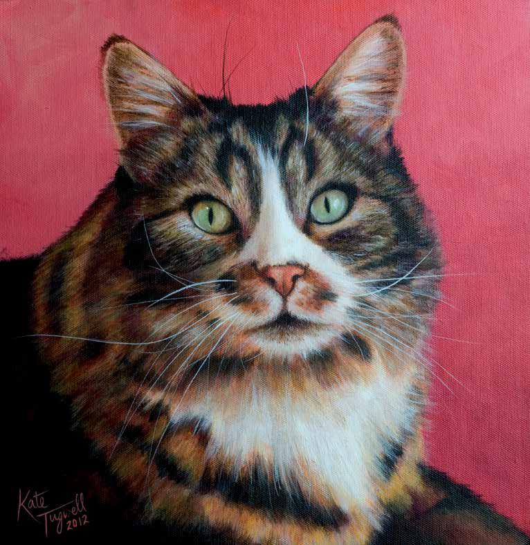
Tabby Cat
britta@bonettedesign.com
30 88 89 Step Next paint the midtone area, using yellow ochre, cadmium yellow, and cadmium red. refer to the photograph as work to ensure put the markings in the right places. Step After completing this first layer, decide the fur on her back is too high, so paint more of the background color along the back to create more pleasing shape. also apply second layer of the background color all over to ensure even, seamless blending. Then darken the dark markings and add white to the light areas in the fur. To build the fur into fluffy texture, use an old, damp synthetic brush to flick various fur color mixes into her coat Step The last thing paint are her whiskers—the trickiest part! Tabatha has incredibly long white whiskers that curl in multiple directions, as well as one single white whisker over her left eye. use rigger brush and paint test whisker on separate piece of paper each time reload the brush with paint, so don’t get any blobs or too-thick whiskers on the painting. also add the whiskers in her ears and black whiskers at the top of the head. When I’m completely satisfied, add my signature and the date in a colour that stands out but matches with the painting. think she’s gorgeous! Artist’s Tip Eyes are worth paying attention to; after all, they’re usually the first thing we notice, and they give us clues to an animal’s character. Paint more colors than you think you can see, and always add white shine or highlight at the end to bring the eyes to life. A beautiful tabby cat named Tabatha is the subject of this painting. Whenever I paint pet portrait ask for lots of photos taken at different angles and different times of the day. Viewing several photographs taken in different light helps you judge the colors you need to create in your portrait.
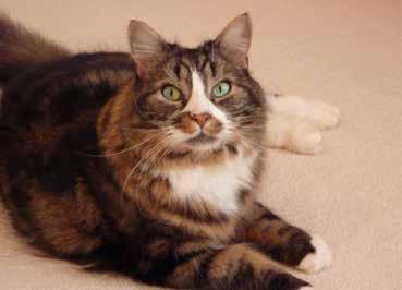
with Kate Tugwell Color Palette alizarin crimson (hue) bright green burnt sienna burnt umber • cadmium red • cadmium yellow • flesh tint mars black Payne’s grey • quinacridone maroon raw siennaraw umber • titanium white ltramarine blue • yellow ochre 86 87 Step 1 After working out my composition sketch a close-up of Tabatha’s face onto the canvas. mix cadmium red, alizarin crimson hue, quinacridone maroon, and flesh tint to create the vivid red background color. Then use a wide flat hog-hair brush to paint in different directions, achieving mottled yet blended effect. Next outline her eyes and nose with mars black and put base colour of bright green on her eyes. Step Tabatha’s eyes have an amazing variety of green shades; pick a bright midtone to start with, and then blend tiny bit of cadmium yellow, yellow ochre, and burnt sienna with a fine brush. The right eye is cooler in temperature, so introduce little ultramarine blue and white to the other colors. map out blocks of color in the fur with mars black, burnt sienna, burnt umber, raw sienna, painting in the direction of fur growth. Cadmium red mixed with white creates the perfect pink for her nose. Step use flesh tint and browns to create shadows in the white fur. Whites are reflective and since the background red, the white fur would reflect some of that color. Flesh tint is the perfect color to use because it contains white and is quite opaque, with great correcting abilities. Using in the white fur warms up the shadows without making them look pink. also apply this colour in the lighter areas around the eyes, on the top of her head, and in her ears. Artist’s Tip It’s a good idea to paint the edges of the canvas while you have the background color mixed, as it’s much harder to match the side with the front at a later stage. Artist’s Tip Eyes are worth paying attention to; after all, they’re usually the first thing we notice, and they give us clues to an animal’s character. Paint more colors than you think you can see, and always add a white shine or highlight at the end to bring the eyes to life.
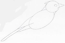
kid’s art instruction book “Learn to Draw Birds & Butterflies” [page 1 of 2]: book layout / © Walter Foster—Quarto Publishing


How to Use This Book Tools & Materials

There’s more than one way to bring birds and butterflies to life on paper—you can use crayons, markers, colored pencils, or even paints. Just be sure you have black plus plenty of bright colors—yellows, oranges, blues, greens, and purples.


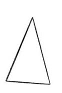
The drawings in this book are made up of basic shapes, such as circles, triangles, and rectangles. Practice drawing the shapes below.


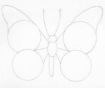
Bird Basics Butterfly Basics
Birds are feathered animals with excellent vision. They have wings and light bones (some of which are hollow), allowing most species to fly through the air. Birds do not give birth to live young; instead, they lay hard-shelled eggs in a nest. Many birds are also known for their pleasant chirps, calls, and whistles.

Bird Nesting
Because bird eggs are vulnerable to cold temperatures and predators, birds tend to them in their nests, keeping them warm and safe until they hatch. Once the chicks break through their shells, the parents continue to help their babies by delivering food and even chewing it up for them!

Dinosaurs might look more like lizards, but birds are actually their closest relatives on earth today!

britta@bonettedesign.com
Fun Fact!
Butterflies are beautiful winged insects. They feed on the nectar of flowers along with some insects, such as aphids. Like bees, they can help pollinate flowers. These animals are not born as butterflies; they hatch out of an egg as a caterpillar first!
Fun Fact!
The lifespan of a butterfly varies depending on the species. Most adult butterflies live for about two weeks. However, some caterpillars become a chrysalis that can live for two years before hatching into a butterfly!
The Life Cycle of a Butterfly

1. An adult butterfly lays an egg.
2. The egg hatches into a caterpillar (or larva).
3. The caterpillar becomes a chrysalis (or pupa).
4. The chrysalis hatches into and butterfly.
5. The butterfly dries off its wings and flies away! The cycle repeats.


FPO (low res)


5
felt-tip markers sharpener colored pencils paintbrushes and paints In this book, you’ll learn about the size, diet, location, and appearance of each featured bird and butterfly. Look for mini quizzes along the way to learn new and interesting facts! Look for this symbol, and check your answers on page 64!
Notice how these drawings begin with basic shapes. Draw a rectangle Draw a circle Draw a square Draw an oval Draw a triangle
7
kid’s art instruction book “Learn to Draw Birds & Butterflies” [page 2 of 2]: book layout / © Walter Foster—Quarto Publishing
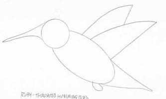
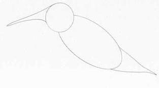
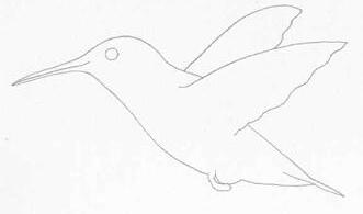


Ruby-Throated Hummingbird
This bird has iridescent feathers and a patch of red over its throat. It also has a long, thin beak designed to collect nectar from flowers.
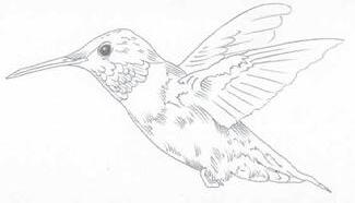
The ruby-throated hummingbird beats its wings about 50 times per second!


Monarch Butterfly

The monarch butterfly is known for its bright orange, black, and white coloring. It is the only butterfly that makes a two-way migration based on the seasons.

The easy-to-spot monarch butterfly does not need to blend into its environment. Its bright appearance warns predators that it is poisonous and unpleasant in taste!
Did You Know?
During cold nights, the ruby-throated hummingbird experiences periods of sleep or inactivity called “torpor.” In this state, the bird’s heart rate and body temperature drop to help it conserve energy.
britta@bonettedesign.com
bright appearance warns predators that it is poisonous and unpleasant Did
Know? Wingspan: 3.5 to 4 inches Diet: Milkweed Location: North and Central America
the start of autumn,
butterflies
When
north. Fun Fact! 6 5 4 3 2 1
You
Around
monarch
gather in large groups and migrate south to Mexico for the winter.
spring arrives in March, the monarchs fly
50
30 Details Size: 3 inches long Diet: Nectar and insects Location: North and Central America
Fact!
Fun
5 6 3 4 2 1
Tools & Materials


is the simplest medium. However, you can also find mediums and additives made specifically for acrylic paint. A range of gels, pastes, and additives allow artists to alter the behavior and properties of acrylic paint, such as extending the drying time or creating a coarse texture.


Color Basics
Acquaint
can help you
to
mood or emphasize your
and
wheel can also help you mix colors efficiently. Below are the most important terms related to the wheel.


colors are red, blue, and yellow. With these you can mix almost any other color; however, none of the primaries can be mixed from other colors. Secondary colors include green, orange, and violet. These colors can be mixed using two of the primaries. (Blue and yellow make green, red and yellow make orange, and blue and red make violet.) A tertiary color is a primary mixed with a near secondary, such as red with violet to create red-violet.

on the color wheel, such as blue-green, green, and yellow-green. When used together, they create a sense of harmony.


britta@bonettedesign.com
2 3 Brushes Synthetic brushes are the best choice for acrylic painting because their strong filaments can withstand the caustic nature of acrylic. A selection of hog bristle brushes is a staple for all oil painters. Build your starter set with small, medium, and large flat brushes; a few medium round brushes; a liner (or rigger) brush; a medium filbert brush; and a medium fan brush. Brushes are commonly sized with numbers, although the exact sizes vary between manufacturers. Generally #1 to #5 are small brushes, #6 to #10 are medium brushes, and #11 and up are large brushes. Flat brushes are often sized by the width of the ferrule (or brush base), such as 1/4" 1/2" and 1" flat brushes. Palettes Palettes for acrylic paint range from white plastic handheld palettes to sheets of plexiglass. The traditional mixing surface for oils is a handheld wooden palette, but many artists opt for a plexiglass or tempered glass palette. Mediums, Solvents & Additives Drying oils and oil mediums allow artists to change the consistency and reflective qualities of oil paint. Because oilbased paints do not mix with water, artists traditionally use solvents, such as odorless mineral spirits, for paint thinning and cleanup. To thin and clean up acrylic, water
Painting Surfaces Although you can paint with oils and acrylics on almost any material, from watercolor paper to wooden board, canvas is the most popular choice. Additional Supplies Some additional supplies you’ll want to have on hand include: • Paper,
and
sharpener
and tracing. Jars of water, paper towels, and a spray bottle of water. • Fixative to protect your initial sketches before you apply paint.
art instruction book “Waterscapes”[page 1 of 2]: book layout / © Walter Foster—Quarto Publishing
pencils,
a
for drawing, sketching,
Paints Paint varies in expense by grade and brand, but even reasonably priced paints offer sufficient quality. Very inexpensive paints might lack consistency and affect your results, but buying the most costly color may also limit you. Find a happy medium. Palette & Painting Knives Palette knives are mainly used for mixing colors on your palette and come in various sizes and shapes. Some knives can also be used for applying paint to your canvas, creating texture in your work, or even removing paint. Palette knives are slightly rounded at the tip. Painting knives are pointed and bit thicker, with a slightly more flexible tip. Flat brush Hake brush 4 5
yourself with the ideas and
involve everything from color relationships to perceived color temperature and color psychology. In the following pages, we will touch on the basics as they relate to painting. Complementary Colors Complementary colors are those situated opposite each other on the wheel, such as purple and yellow. Complements provide maximum color contrast. Analogous Colors Analogous colors are groups of colors adjacent to one another
Yellow-orange Orange Red-orange Red Red-violet Blue-violet Blue Blue-green Green Yellow-green Yellow Violet Color Wheel The color wheel,
understanding
A hue is a color in its purest form (A), a color plus white is a tint (B), a color plus gray is a tone (C), and a color plus black is a shade (D). A single color family, such as blue, encompasses range of hues— from yellow-leaning to red-leaning. Neutral Colors Neutral colors are browns and grays, both of which contain all three primary colors in varying proportions. Neutral colors are often dulled with white or black. Artists also use the word “neutralize” to describe the act of dulling a color by adding its complement.
A
A B C
terms of color theory, which
pictured to the right, is the most useful tool for
color relationships. Where the colors lie relative to one another
group harmonious colors
pair contrasting colors
communicate
message. The
Primary
ARTIST’S TIP Art & craft stores sell spinning, handheld color wheels for painters that serve as color mixing guides. The wheels also show a range of gray values for reference. Color & Value Within each hue, you can achieve a range of values—from dark shades to light tints. However, each hue has a value relative to others on the color wheel. For example, yellow is the lightest color and violet is the darkest. To see this clearly, photograph or scan a color wheel and use computer-editing software to view it in grayscale. It is also very helpful to create a grayscale chart of all the paints in your palette so you know how their values relate to one another.
grayscale representation of a color wheel can help you see the inherent value of each hue.
D
Using just the corner of your fan brush with value 2, gently tap the leaves on all of the background trees. Adding leaves to the open areas simply implies that there are many trees in this forest. Be sure to leave lots of open space, as the dark areas give your painting depth. Working wet-into-wet., you will create many different values of green. As you tap on the leaves, the green will mix with the color in your tree trunks, creating even more values of green. Do not add lighter green values to your distant trees, as you want to reserve the sunlight to the foreground trees.
(value 2)
5. Once again, using the corner of your fan brush, begin tapping in the bushes, working from dark to light. Tap some greens onto the rocks to represent moss, grasses, and weeds. Reserve the lightest values for the left side of the foliage in sunlight.
Fully load your fan brush with value 1, and then tap the bristles gently on your palette. Now, holding your fan brush with the handle pointed downward, gently tap the entire side of the bristles onto the canvas to create the grasses, working from top to bottom. Use value 3 for the lighter leaves. Alternate the green values for variety, and use the darkest green value to represen shadows behind the rocks. Use your fan brush to create the waterfall. You will need titanium white and value 11 (light blue), which will represent the water in shadow. With the tip of your fan brush, indicate the water that swirls on top of the flat rock.
At the right edge of the flat rock, tap a bead of color: titanium white in the sun and value 11 in the shadow. Wipe off your fan brush, and with a gentle touch, pull the bead of color down to represent the falling water. Leave lots of the dark gray showing through, as the contrast is important.


white a touch of phthalo blue
background trees. Adding leaves to the open areas simply implies that there are many trees in this forest. Be sure to leave lots of open space, as the dark areas give your painting depth. Working wet-into-wet., you will create many different values of green. As you tap on the leaves, the green will mix with the color in your tree trunks, creating even more values of green. Do not add lighter green values to your distant trees, as you want to reserve the sunlight to the foreground trees.
Leaves (value 2)
cadmium yellow #1
Lightest leaves (value 3)
cadmium yellow titanium white a touch value 2
Light blue (value 11)
titanium white touch of phthalo blue
ARTIST’S TIP
Use values 1, 2, and 3 for the foliage.
britta@bonettedesign.com
18 19 5. Once again, using the corner of your fan brush, begin tapping in the bushes, working from dark to light. Tap some greens onto the rocks to represent moss, grasses, and weeds. Reserve the lightest values for the left side of the foliage in sunlight. Fully load your fan brush with value 1, and then tap the bristles gently on your palette. Now, holding your fan brush with the handle pointed downward, gently tap the entire side of the bristles onto the canvas to create the grasses, working from top to bottom. Use value 3 for the lighter leaves. Alternate the green values for variety, and use the darkest green value to represen shadows behind the rocks. Use your fan brush to create the waterfall. You will need titanium white and value 11 (light blue), which will represent the water in shadow. With the tip of your fan brush, indicate the water that swirls on top of the flat rock. At the right edge of the flat rock, tap a bead of color: titanium white in the sun and value 11 in the shadow. Wipe off your fan brush, and with a gentle touch, pull the bead of color down to represent the falling water. Leave lots of the dark gray showing through, as the contrast is important. Using just the corner of your fan brush with value 2, gently tap the leaves on all of the
art instruction book “Waterscapes”[page 2 of 2]: book layout / © Walter Foster—Quarto Publishing
+ + + + 18 19
Leaves
cadmium
Lightest leaves
cadmium yellow
Light
titanium
ARTIST’S
+ + + +
yellow #1
(value 3)
titanium white touch value 2
blue (value 11)
TIP Use values 1, 2, and 3 for the foliage.
book “Basic Cartooning” [1 of 2]: book layout / © Walter Foster—Quarto Publishing


Tools & Materials


Facial Expressions
inking with these tools. They often leave lines that stay wet for several minutes. Make sure you allow for plenty of drying time!

Templates & Ruler You can find circle, ellipse, and curve templates at any art supply store. These templates are perfect for making dialog balloons. You’ll also find it handy to keep a ruler nearby. For lettering your illustrations you should also have a T-square, set squares, and Ames guide (see page 66).
Facial Features
India Ink India ink is black ink made of carbon. It is a traditional inking material for comic book artists.


Facial features and expressions are essentially just lines and shapes arranged to convey an emotion or thought. I’ve drawn a series of shapes in a box. have arranged these shapes differently to make 4 expressions. It is amazing; there are an endless variety of expressions you can make by just picking a few simple lines!
A. Happy Face In this example, I’ve made a smiling face, with raised eyebrows and an upturned mouth. The face looks eager and pleased.


B. Grumpy Face use the same shapes here, but flip some of them. The mouth and eyebrows are now upside down from how made them in the last face. The nose is pointed down too, which reinforces the frowning look.


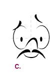
C. Insecure Smile still use the same shapes, but here duplicate some shapes and change the size and scale of others. This allowes me to create facial hair and a new expression.
D. Scared Face In this example, continue to alter the size and scale of some shapes, and duplicate some more. The shape used for the nose before have now used for the bottom lip. My old mouth has become a nose, and I’ve duplicated the round shapes of the pupils to become nostrils and the mouth.
Expressions
By drawing different expressions for the same character, you can begin to develop the range and depth of their emotions. It’s good to figure out what distinguishing characteristics of the character need to remain, so that you can recognize it as the same person no matter what crazy face you have them making!

For her frightened expression, stretched out her face. A tiny mouth in proportion to her face makes her look very meek, while some unkempt hair gives her a rattled appearance. Next draw her face showing intrigue. A single lock of hair sweeping over her forehead, heavy eyelids, and a cocked eyebrow all work together to show intrigue and interest. Anger is often shown best in the eyebrows, so in the next drawing draw her eyebrows pointing downward, a puffed curve under the squinted eyes, and her teeth gritting ferociously. Finally, draw her being goofy. created this expression by rolling her wide-open eyes and making her mouth open with her tougue sticking out.
Before putting these concepts into actual cartoon characters, let’s take a look at the individual features that provide much of the expressions and overall look of cartoon faces.
Eyes
Eyes express the most feeling and emotion, so it is good to practice drawing them. Look at all the different sets of eyes I’ve drawn. Can you get some sense of the character based on just the eyes? Sometimes the eyes tell you if the character is young or old, male or female. You can often tell what the character is feeling or trying to do. Notice the shapes and lines that effectively suggest certain expressions. Also notice how big the whites of the eyes are, how large the pupils are, or how prominent the eyelids are. These are all elements that can be modified to create different expressions. In these examples, can you spot some eyes that look like a character just hit their thumb with a hammer? Can you find the secret service agent, or the person who is having a hard time staying awake?

britta@bonettedesign.com
3
art instruction
is a wide range of tools and materials available for cartooning and illustration. With so many options, it’s a good idea to explore and experiment to discover which you like the best! Below are some good choices to start with. Paper Sketch pads and inexpensive printer paper are great for sketching and working out your ideas. Tracing paper can be useful in creating a clean version of a sketch using a light box. Just be sure to use quality tracing paper that is sturdy enough to handle erasing and coloring. Card stock is sturdier than thinner printer paper, which makes it ideal for drawing on repeatedly or for heavy-duty artwork. You may Pencil lead, or graphite, varies in darkness and hardness. Vinyl and kneaded erasers are both good to have on hand. A vinyl eraser is white and rubbery and is gentler on paper than a pink eraser. A kneaded eraser is like putty. It can be molded into shapes to erase small areas. You can also lift graphite off paper to lighten artwork. Use a black felt-tip (or fiber-tip) pen or fine line marker to tighten your lines and ink your final pencil illustrations. Quill or Dip Pen Quill and dip pens provide some flexibility with line when inking. You can purchase different sizes of nibs. Be careful when
Markers Most cartoon and illustration work is colored digitally today, but if you’d rather use tradi tional materials, art markers are perfect for adding bold, vibrant color to your artwork. Digital Tools The majority of professional cartoon and illustration work is finished digitally, but don’t worry if you’re not set up for this. You can still create beautiful full-color illustrations using markers, colored pencils, or even paint. If you want to give digital illustration a
There
try, you’ll need your computer, scanner, and image editing software such as Adobe Photoshop®.
8 9
David & Goliath
For this cartoon let’s create a pair of characters that showcased different choices in body design and size. David and Goliath are a perfect example of a disparative duo. The two mismatched opponents that have spawned innumerable references to an underdog pitted against a seemingly unbeatable foe are ideal for cartooning!

1. First draw the basic shapes of each character’s body. Then add lines showing where their arms, legs, and faces will go.


2. Mark Goliath’s outstretched fist and add curved lines that map his helmet, nose, armor, sword, feet, and cape. With David, add lines that show where his legs are, one being held and the other outstretched. Exaggerate his feet, making them about as long as his legs, then draw the shapes for his hands, and mark his hairline and eye.


3. On David, add the bubble-like toes and short parallel lines to create his sandals. In his outstretched hand add the V-shaped slingshot and create lines for his fingers. Draw a wavy line for a scowl and an eyebrow. On Goliath, add lines to his fist-circles and feet to create fingers and sandal straps. Draw horizontal sausages for his eyebrows and a wide smile.
shadows, use less water when mixing the pigment to make a darker shade of the color. Where want lighter shades, add more water to dilute the color. Leave some areas white to create highlights, such as on the armor and skin. Don’t paint in any areas you plan to fill in with black. 24 25

art instruction
of 2]: book
26 27 7. For the final step, trace all the pencil lines in black pen. Use a .45mm line pen for the fine lines and a 1mm line pen for the thicker areas of black. The contrast of the dark black and the hand-washed watercolors completes the cartoon. In full color, Goliath chuckles with disbelieving amusement at the puny dude he squares off against. David, suffering some degree of indignity, gets ready to even the score. 5. Add the final details to David: a few lines showing texture in his tunic, a curve for the armpit, the bottom edge of his eye and eyebrow, and a couple lines showing the band’s grip on his slingshot. On Goliath, add short strokes to create arm hair, some reflective lines on his armor, and the stitching on his sword’s scabbard. Create the bottom fringe on his tunic, and add some crisscrossing straps on his legs, and finally some square toes to his feet. Time to add color! There was a time when digital coloration wasn’t an option, so let’s match the antiquity of the subject matter with an older coloring-in method: watercolor. After choosing general color scheme, mix up some different colors for skin tones and clothing on your palette. DETAIL 6. To create
britta@bonettedesign.com
book “Basic Cartooning” [2
layout / © Walter Foster—Quarto Publishing
Simplebumpscreate Goliathshoulderarmour. Undulatinglinescreate movementinthecape.
Jaggedwavesfor David’shair.
Tools & Materials


Painting Techniques


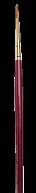
Hake This brush is great for laying in backgrounds on very large areas. Watercolor paper These three different sheets show how the paint looks on hot-pressed (A.) cold-pressed (B.) and rough, textured paper (C.). Flat brush Round brush Rigger or liner brush Paper Watercolor paper comes in a range of textures: hot-pressed, which is smooth; cold-pressed, which has a medium texture; and rough, which has plenty of tooth (raised areas of paper). Watercolor paper also comes in different weights, designated in pounds. The higher the number, the heavier the paper and the less likely is to warp when you apply water. A popular choice is 300-lb. bright white, cold-pressed watercolor paper. The tough surface of this paper allows you to use mask, as well as some lifting techniques, without damaging the paper. The 300-lb. weight of the paper allows for wider time frame to work wet-on-wet before the paper begins to dry. A. B. C. Additional Materials A few other items you may want to have on hand are masking tape, tissue, a craft knife, a palette knife, and cotton swabs. Palette Palettes come in different materials—plastic, glass, china, wood, or metal—and in various shapes. Plastic is lightweight and less expensive than other materials. All these palettes will clean up easily with soap and water. No matter what style you choose, try to find one with large, flat area for mixing and creating washes and plenty of wells for holding all your colors. Masking Fluid Masking fluid, or liquid frisket, is a latex-based substance that can be applied over areas you want to keep white. When dry, the mask repels paint, so you can paint over it without covering the white support underneath. When the paint is dry, gently rub off the mask with masking fluid pickup or an old rag. You can also apply masking fluid over color that is already dry to protect areas from subsequent layers of color.
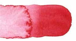
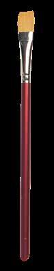
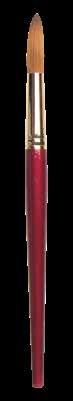
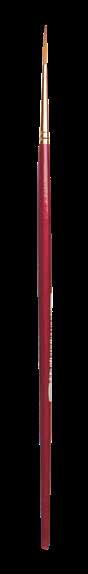
britta@bonettedesign.com art instruction book “The Art of Painting Sea Life in Watercolor” [page 1 of 3]: book layout /© Walter Foster—Quarto Publishing
Paints Watercolor paints are available in cakes, pans, and tubes. Many artists prefer tube paints, because they are fresher and the colors are brighter. It is best to use good quality paint, but if you are just starting out it’s okay to use less expensive student-grade paint and upgrade to professional grade later. You don’t need to have a huge palette of color. You’ll find that each of the artists in this book works with their own palette of colors, listed at the beginning of each project. You may find you prefer to work with different paints, so don’t be afraid to experiment. You’ll also want white gouache for touch-ups and highlights. Brushes There are many kinds of paintbrushes available, but they can be narrowed down to two types: synthetic and natural hair. Synthetic brushes are usually less expensive than natural ones, but they don’t retain water as effectively. Synthetic brushes are great for working with masking fluid. For the projects in this book, you’ll want variety of flat and round brushes in varying sizes, a hake brush, and rigger brush. Make sure you have one small round detail brush and several synthetic brushes for masking. 9 8
Flat Wash A flat wash is a thin layer of paint applied evenly to your paper. First wet the paper, and then load your brush with mix of watercolor and water. Stroke horizontally across the paper and move from top to bottom, overlapping the strokes as you progress. Spattering First cover any area you don’t want to spatter with a sheet of paper. Load your brush with a wet wash and tap the brush over finger to fling droplets of paint onto the paper. You can also load your brush and then run the tip of a finger over the bristles to create spray. Wet-into-Wet Stroke water over your paper and allow to soak in. Wet the surface again and wait for the paper to take on matte sheen; then load your brush with rich color and stroke over your surface. The moisture will grab the pigments and pull them across the paper to create feathery soft blends. Tilting To pull colors into each other, apply two washes side by side and tilt the paper while wet so one flows into the next. This creates interesting drips and irregular edges. Backruns Backruns, or “blooms,” create interest within washes by leaving behind flower-shaped edges where a wet wash meets damp wash. First stroke wash onto your paper. Let the wash settle for a minute or so, and then stroke on another wash (or add a drop of pure water). Gradated Wash gradated (or graduated) wash moves slowly from dark to light. Apply a strong wash of color and stroke in horizontal bands as you move away, adding water to successive strokes. Drybrushing Load your brush with strong mix of paint, and then dab the hairs on a paper towel to remove excess moisture. Drag the bristles lightly over the paper so that tooth catches the paint and creates coarse texture. Using Alcohol To create interesting circular formations within wash, use an eyedropper to drop alcohol into damp wash. Change the sizes of your drops for variation. Using Salt For mottled texture, sprinkle salt over wet or damp wash. The salt will absorb the wash to reveal the white of the paper in interesting starlike shapes. The finer the salt crystals, the finer the resulting texture. For similar but less dramatic effect, simply squirt a spray bottle of water over a damp wash. Applying with Sponge In addition to creating flat washes, sponges can help you create irregular, mottled areas of color. WATERCOLOR TECHNIQUES WATERCOLOR MATERIALS Watercolor’s airy and atmospheric qualities set it apart from other painting media. This fluid medium requires a bit of practice to master, but with enough time you will soon discover how to quickly suggest form and color with just a few brushstrokes. Watercolor is available in tubes, pans, semi-moist pots, and pencils. Kolinsky Sable Types of Watercolor Tubes contain moist paint that is readily mixable. It only takes a small amount of tube paint to create large washes. Start with a pea-sized amount, add water, and then add more paint needed. Pans, also called cakes, are dry or semi-moist blocks of watercolor. To activate the paint, stroke over the blocks with wet brush. Semi-moist pots are gummy-looking watercolors that are similar to pans. Activate the paint by stroking over the color with a wet brush. Watercolor pencils combine the fluid nature of watercolor with the control of pencil drawing. Featuring leads of hard watercolor, they are great for creating fine details or sketching a composition. You can also use them with a wet brush to develop an entire work. Watercolor Palettes range of mixing palettes is available, from simple white plastic to porcelain. Choose one that suits your personal preference. Watercolor Brushes Use sable brushes or soft-hair synthetic brushes to work in watercolor. It’s good idea to keep a couple of bristle brushes on hand for textured strokes. Watercolor Surfaces Watercolor paper, which is treated with sizing to reduce the surface’s absorbency, is available in myriad sizes, weights, textures, and format. Secure your paper to table or board with artist tape or clips and work on a flat surface. 14 15
art instruction book “The Art of Painting Sea Life in Watercolor” [page 2 of 3]:


Jellyfish


britta@bonettedesign.com
Color Palette brown madder • burnt sienna • indigo • opaque white orange • permanent rose • phthalo blue phthalo green Prussian blue • ultramarine blue yellow saw these beautiful Japanese sea nettle jellyfish in the Houston aquarium. I could watch them freely floating around in the water for hours. They looked like they were dancing in the water with the air bubbles. find them fascinating and inspiring. I want to capture the beauty of a playful jellyfish and its movement in watercolor. The challenge is painting a whitish and translucent jellyfish while mimicking its underwater environment. Another challenge is to work with the complementary colors without turning them to mud, here warm orange against cool blue. Step first sketch out my compositional elements: a jellyfish and air bubbles. pay close attention to the details of the jellyfish am working on. depict the bell, tentacles, and lacy oral arms in detail. When am satisfied with the final design, use graphite paper to transfer my design onto watercolor paper. Once transfer all lines as accurately as possible, mask out the tentacles to protect from the heavy wash of the underwater background. let the masking fluid dry completely. Step 2 wet the entire paper with a 2-inch flat wash brush. Working from the top to halfway down the paper, paint the underwater background with pale wash of phthalo blue and phthalo green. then continue with a pale wash of ultramarine blue. Next paint the rim of the bell with the same colors as the background, yet make them even paler. For the bell and oral arms, paint a thin wash of orange wet-into-wet. also drop in the pale orange on the bottom of the water area. While the paper is still wet, spatter with clean water using round brush to encourage water blossoms to form. When the wash starts to dry, sprinkle table salt over the underwater area. let the wash dry thoroughly.
book layout /© Walter Foster—Quarto Publishing
Herrera Step When the background wash is completely dry, start working on the bell of the jellyfish. prepare pool of yellow, orange, brown madder, and permanent rose. then wet the bell of the jellyfish and apply a wash of pale yellow and orange. drop brown madder and permanent rose in the middle section of the bell. Before the wash dries, drop in ultramarine blue on the top and side of the bell. continue painting the oral arms with the same colors, one section at time. leave some areas white to make the oral arms appear transparent, and leave the rim of the bell pale yellow to obtain its shimmering appearance. For shadows where the oral arms overlap, drop in some more ultramarine blue. drop the background color into some areas of the oral arms to suggest transparency. let all the washes dry thoroughly. Step 3 mask out the rest of the jellyfish and spatter masking fluid around the air bubbles with a round brush. When the masking fluid dries, load my wash brush with phthalo blue, and then apply a second wash on the background water from the upper right area. change to Prussian blue and indigo as work toward the bottom from a third of the way down the paper. drop indigo or orange into some areas around the tentacles and oral arms. like my wash to have a natural and organic underwater look, rather than a perfectly smooth blue wash. 68 69 Step 5 continue working on the details of the bell and tentacles. first paint the individual line to create the umbrella-like structure with burnt sienna wet-on-dry. drop in ultramarine blue for the darker area and blend it into the burnt sienna. Note that one side of each line is a hard edge and the other side is soft. Using clean, damp brush, blend the color out to make soft edge. repeat the process for the other lines. For the tentacles, apply medium orange wet-on-dry where the tentacles are overlapped. Using another damp, small round brush, blend out the orange color into white. For the other parts of the tentacles, simply clean the rough edges with my small chisel blender brush. Rubbing an edge with the brush where touches the blue background water will leave pale blue stain on the tentacles, which gives them perfect transparent look. am pleased with the jellyfish, and am now ready to add the air bubbles. Step 6 Using a script brush, draw every bubble carefully with white paint as close as possible to the original pencil lines. use a small scrub brush to add faint light reflection to the air bubbles. After gently rubbing the paint with a damp scrub brush, dab the wet paint with facial tissue. Step 7 continue adding light reflections to all of the other air bubbles. let the wet paint dry before adding a white highlight to each air bubble. gently rub through the paint until see the white paper. Using my small chisel blender brush, blend out a white circle into the air bubble. repeat this process for the other air bubbles. 70 71
with Hailey E
bottle and sprinkle table salt over the water area. To add texture and bubble-like shapes, drop rubbing alcohol on the wet surface with an eyedropper. then let the wash dry thoroughly.
Step 3 mask out the seahorse to protect it from the wet wash of the sea grass and the second wash of the underwater background. apply the masking fluid to the seahorse thickly and carefully, as would paint it. While the masking fluid dries, prepare a pool of ultramarine blue, phthalo blue, phthalo green, new gamboge, quinacridone gold, magenta, and indigo. wet each piece of sea grass with clean water and then mingle two or three colors. drop one color after another and allow them to blend together. repeat the process for the other pieces of sea grass, changing colors as work. To add an interesting texture, lift out some wet colors with facial tissue. let the washes dry.


book
Color Palette black • burnt sienna • indigo • magenta • new gamboge opaque white • phthalo blue • phthalo green • purple quinacridone gold ultramarine blue The vibrant colors of marine life and other sea elements enhance the beauty of sea environments. This yellowish-brown seahorse against a blue underwater background comes to mind. There are more than 30 different kinds of seahorses. Their charming form and beauty make them an inspiring subject, yet one that is challenging to paint. have decided to add colorful sea grass alongside the seahorse; my goal is to capture the texture and rhythm of the underwater environment. Seahorse with Hailey E Herrera Step 1 Before start my drawing on the watercolor paper, often design my composition on tracing paper. Once finalize my composition, transfer the final design to the watercolor paper. In addition to sketching the composition, plan out the colors and textures for the main elements of the painting—in this case, the seahorse, sea grass, and water. Though the seahorse will be the point of interest, some attention will be given to the sea grass as well. decide to add interesting colors to the sea grass and add textures to the underwater backdrop. It will enhance the painting and add interest for the viewer’s eye. Step 2 After wetting the entire paper with 2-inch wash brush, start painting the seahorse and some water areas with a pale wash of new gamboge. drop ultramarine blue, phthalo blue, and phthalo green into the wet water background. also add magenta to the water area and let the wet paints blend softly. lift out wet colors on the seahorse so that the seahorse looks more natural under the water, while preventing the blue wash from overly influencing the yellowish-brown seahorse. When the wash starts to dry, spray it with my misting
britta@bonettedesign.com art instruction book “The Art of Painting Sea Life in Watercolor” [page 3 of 3]:
layout /© Walter Foster—Quarto Publishing
Step decide to mask out all of the sea grass before applying the second wash to the underwater background. Using a 2-inch wash brush, wet the entire paper again carefully, taking precautions not to disturb the initial wash. apply new gamboge first on the left side from the bottom corner, moving into other water areas. continue dropping in phthalo blue and ultramarine blue wet-into-wet. For areas where the main elements are overlapped, drop in thick and dark indigo to make them stand out more. Before the wash dries, add more table salt and rubbing alcohol to the left side of the seahorse. 72 73 Step Using a liquid frisket remover, carefully lift and peel off all of the masking. For some thin pale lines along the edges of the sea grass, use my small chisel blender brush to clean them up. dampen the brush and rub each thin pale line until is softened and blends with the sea grass. mask the highlights of the seahorse and its dorsal fin. To suggest speckles on the seahorse, spatter masking fluid with an old toothbrush. let the masking fluid dry completely. Step 6 For the initial wash of the seahorse, prepare pool of new gamboge and quinacridone gold. apply a pale wash of yellows to the entire seahorse, but make it paler for the light area of the face. Before the yellow wash dries, drop in burnt sienna and thin magenta, mostly on the bottom of the face and darker skin areas around the ridges and rings of the trunk and tail. continue dropping in purple for darker shade. paint dorsal fin with pale wash of phthalo blue to suggest its transparency. Step 8 mix black with burnt sienna and indigo. then paint the eye with the black, going around the highlight of the eye carefully. clean up the rough edges of the trunk ridges, the trunk rings, and the tail rings with damp brush. Next use small amount of white to soften the edges further. add a light shadow to areas around the bumps and horns with thin wash of new gamboge. then prepare a pool of thick indigo and return to the underwater background. add dark indigo close to the seahorse and around the seagrass to make the seahorse stand out. Using a damp round brush, spatter white paint over the seahorse. This final touch gives unified look to the speckled seahorse with its environment. Step 7 Seahorses change colors and patterns to camouflage themselves and blend into their surroundings. To simulate the seahorse’s ability to blend in with the underwater environment, paint some areas of its body and its face with phthalo blue. Phthalo blue turns into a greenish color, which matches the color of some seagrass. continue applying a medium wash of magenta and indigo on the top area of the face, around the eye and on some other parts of the body and the tail. remove the masking fluid on the seahorse. 74 75
Lea rn to Dra w FARM
ANIMALS
Step-by-step instructions for drawing a l of you r favor te ba rnya rd friends!

Lea rn to Dra w FArM


ANIMALS


Step-by-step instruct ons for dra wing a l of you r favorite ba rnya rd friends!
Lea rn to Dra w
Farm Animals


ep-by-step instruct ons for drawing a l of you r favorite ba rnya rd friends!


britta@bonettedesign.com


kids art instruction book covers: concept / typography / design / production / © Walter Foster—Quarto Publishing


souvenir book [page 1 of 6]: art direction / design / production / © Hawaii Tropical Botanical
britta@bonettedesign.com garden
Garden


britta@bonettedesign.com garden souvenir book [page 2 of 6]: art direction / design / production / © Hawaii Tropical Botanical Garden


souvenir book [page 3 of 6]: art direction / design / production / © Hawaii Tropical Botanical Garden
britta@bonettedesign.com garden
britta@bonettedesign.com

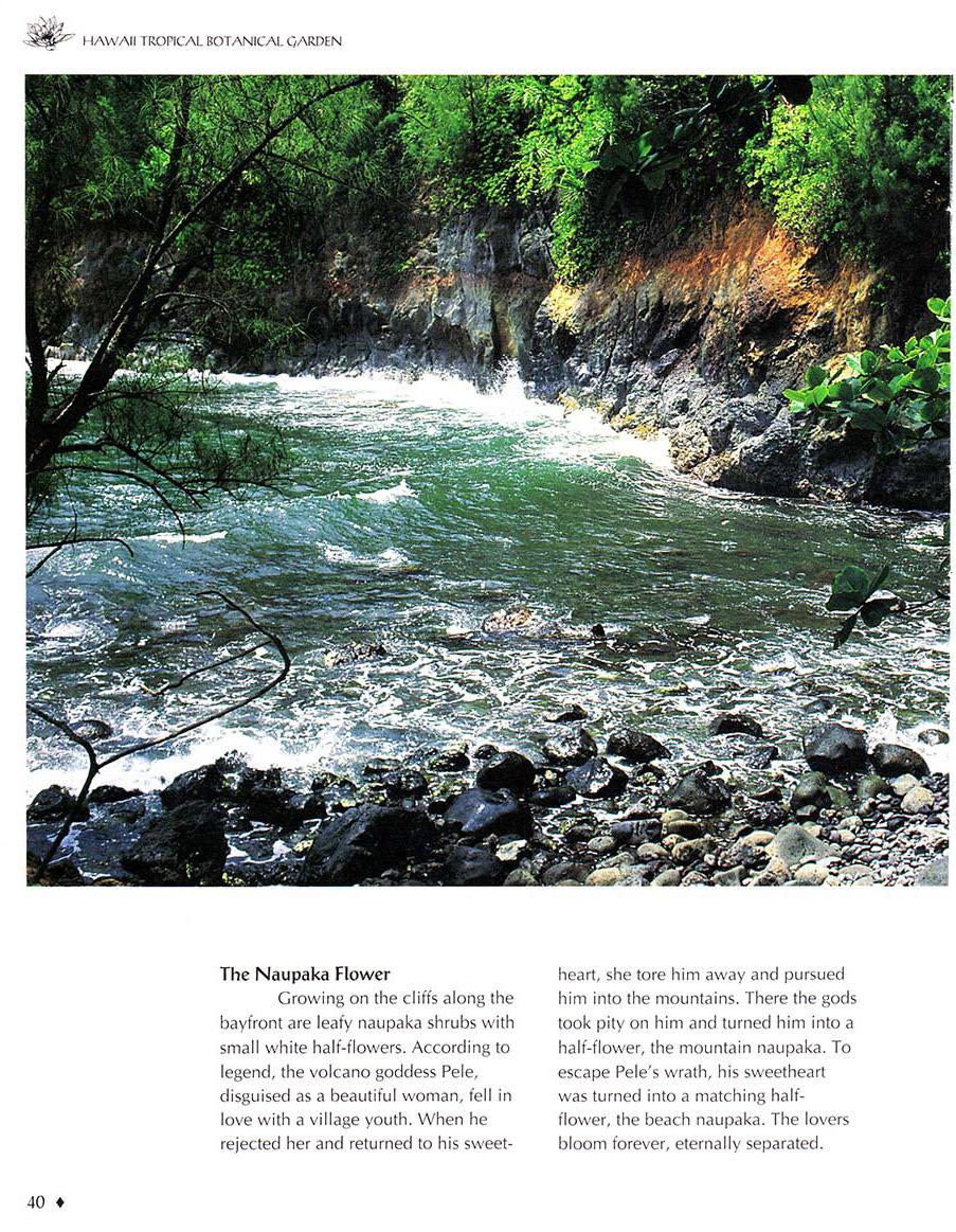
garden souvenir book [page 4 of 6]: art direction / design / production / © Hawaii Tropical Botanical Garden


britta@bonettedesign.com garden souvenir book [page 5 of 6]: art direction / design / production / © Hawaii Tropical Botanical Garden
britta@bonettedesign.com
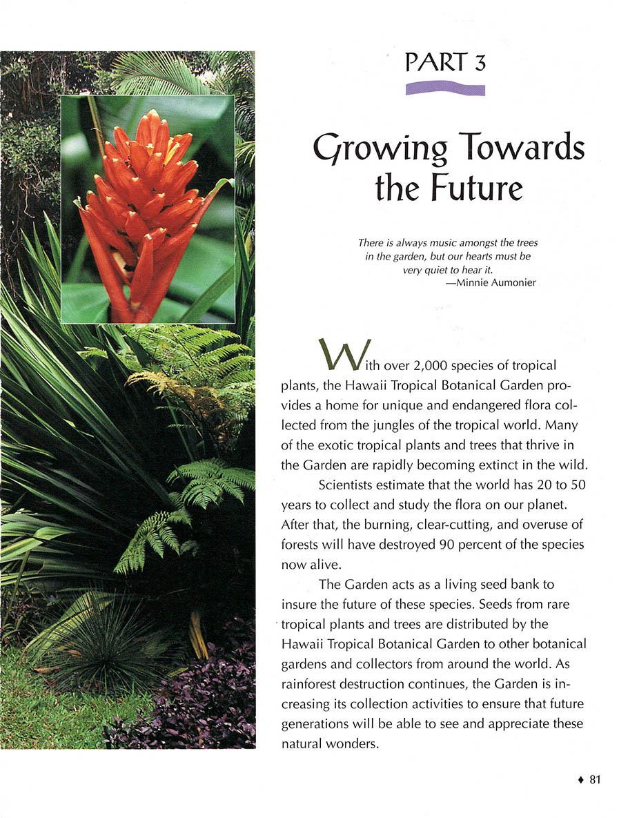
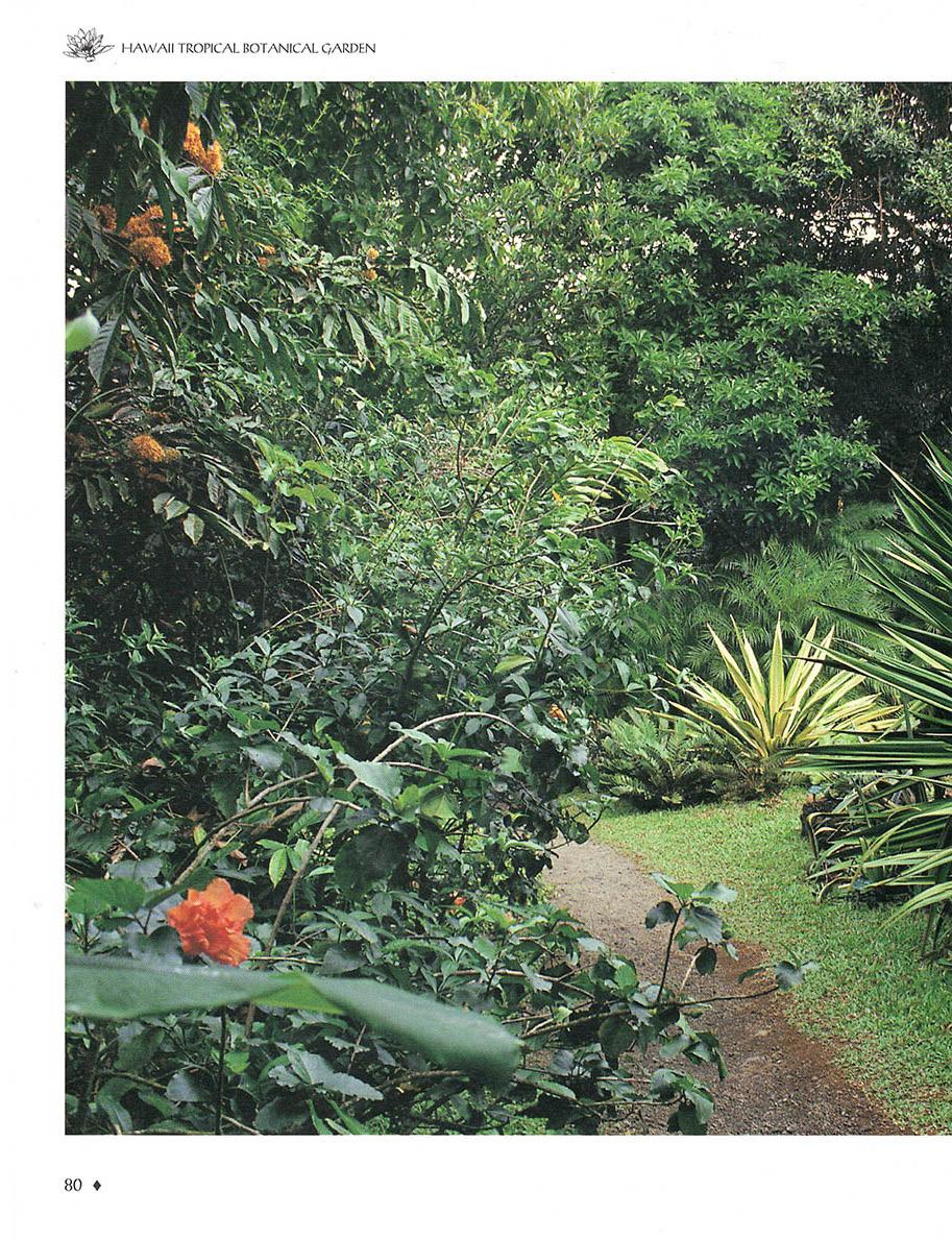
garden souvenir book [page 6 of 6]: art direction / design / production / © Hawaii Tropical Botanical Garden
coffee table book, museum: co-design / icon illustration / production / © Cody Firearms Museum


britta@bonettedesign.com

The foundation of the Taylor Museum collection is rooted in traditional Latin American and Native American works, areas in which Alice Bemis Taylor held a particular interest. Santos, depictions of saints in both two and three-dimensional forms, make up a significant percentage of Taylor’s original gift. The Fine Arts Center has maintained this legacy through the ongoing acquisition of these objects over the decades.

This selection represents some of the most recently acquired santos and demonstrates that the art form is very much alive and is reverential to tradition as well as innovative to appeal to a contemporary audience.

britta@bonettedesign.com museum coffee table book: concept / design - layout / © Fine Arts Center-Taylor Museum, Colorado Springs, CO PART ONE
The Taylor Museum
10
museum coffee table book [page 1 of 2]: page layout / production / © Santa Barbara Museum of Natural History


britta@bonettedesign.com

museum coffee table book [page 2 of 2]: page layout / production / © Santa Barbara Museum of Natural History


britta@bonettedesign.com


garden booklet [1 of 2]: concept / art direction / design+layout / production / © Descanso Gardens for Sequoia Communications
britta@bonettedesign.com


garden booklet [2 of 2]: concept / art direction / design+layout / production / © Descanso Gardens for Sequoia Communications
britta@bonettedesign.com
historic coffee table book: co-design / production / © California Department of Park & Recreation, Gold Discovery Park Assoc.


britta@bonettedesign.com


britta@bonettedesign.com botanical coffee table book [1 of 2]: design assistance / production / © Cachuma Press


botanical coffee table book [2 of 2]: design assistance / production / © Cachuma Press
britta@bonettedesign.com


coffee table book/historic souvenir book: co-design+layout / production / © The
britta@bonettedesign.com
Biltmore Santa Barbara
TULIP FESTIVAL
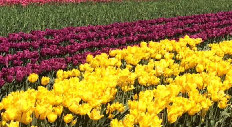
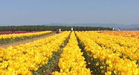
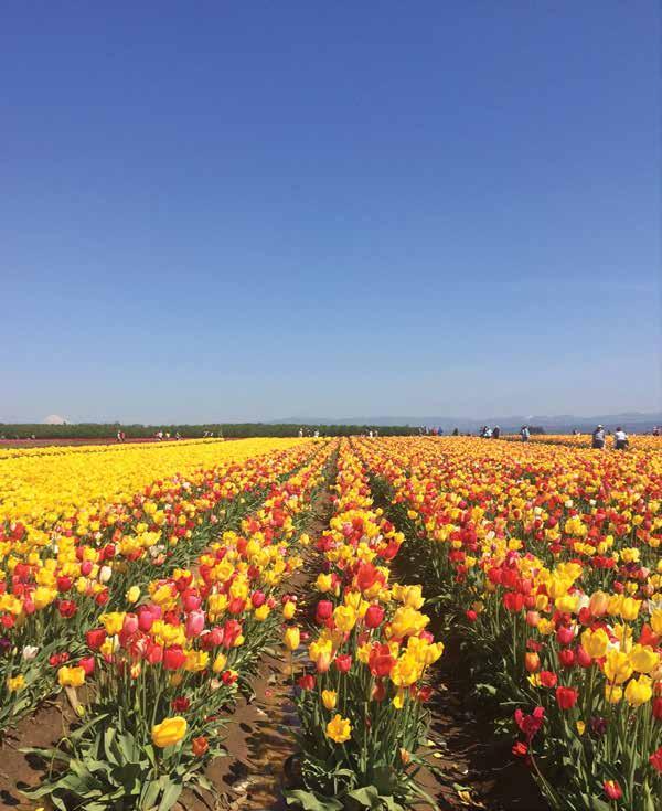
photobook spread [page 1 of 2]: concept / layout / photography / pattern illustration /
britta@bonettedesign.com
© Britta Bonette
The Wooden Shoe
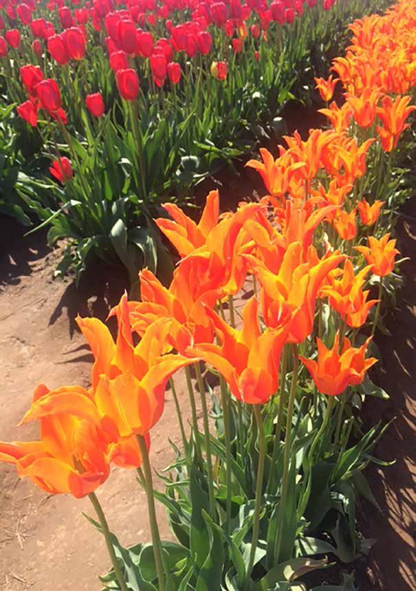
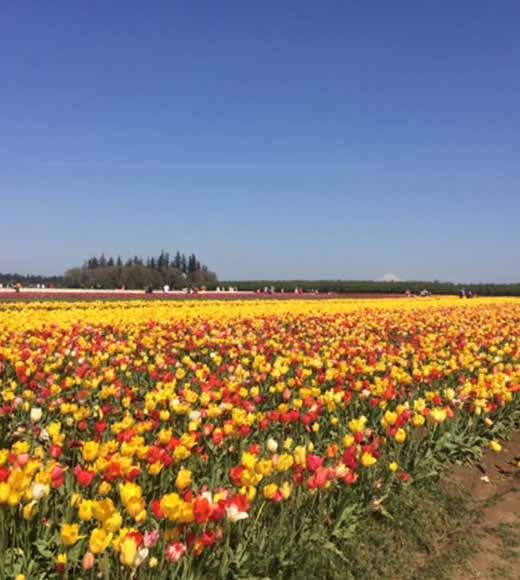
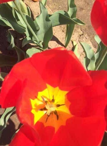
photobook spread [page 2 of 2]: concept / layout / photography / pattern illustration / ©
britta@bonettedesign.com
Britta Bonette
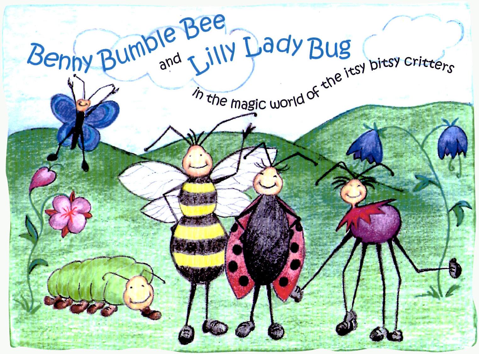
childrens book cover: concept / design / typgraphy /
britta@bonettedesign.com
illustration/ © Britta Bonette
By BRITTA BONETTE
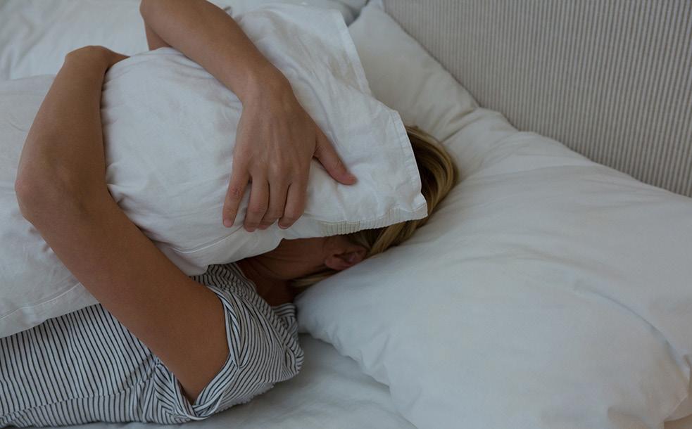 BRITTA BONETTE
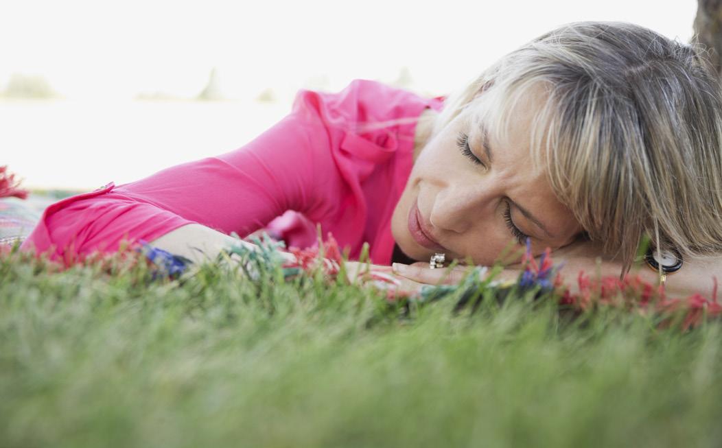
britta@bonettedesign.com book covers: concept / illustration / typography / design / production / photography / © Bonette Design Please, don’t wake me up yet! NAP TIME STORIES FOR ADULTS
Sleepless Nights... no more! • PRACTICAL HELP FOR INSOMNIACS •
By

britta@bonettedesign.com book covers: concept / illustration / typography / design / production / photography / © Bonette Design The Wall JASON CORMICK Mikos Stavros The Seven Steps little boy lost based on a true story AMY JONES A novel by
MONROE ‘til DEATH do us part and other very spooky tales
LISA
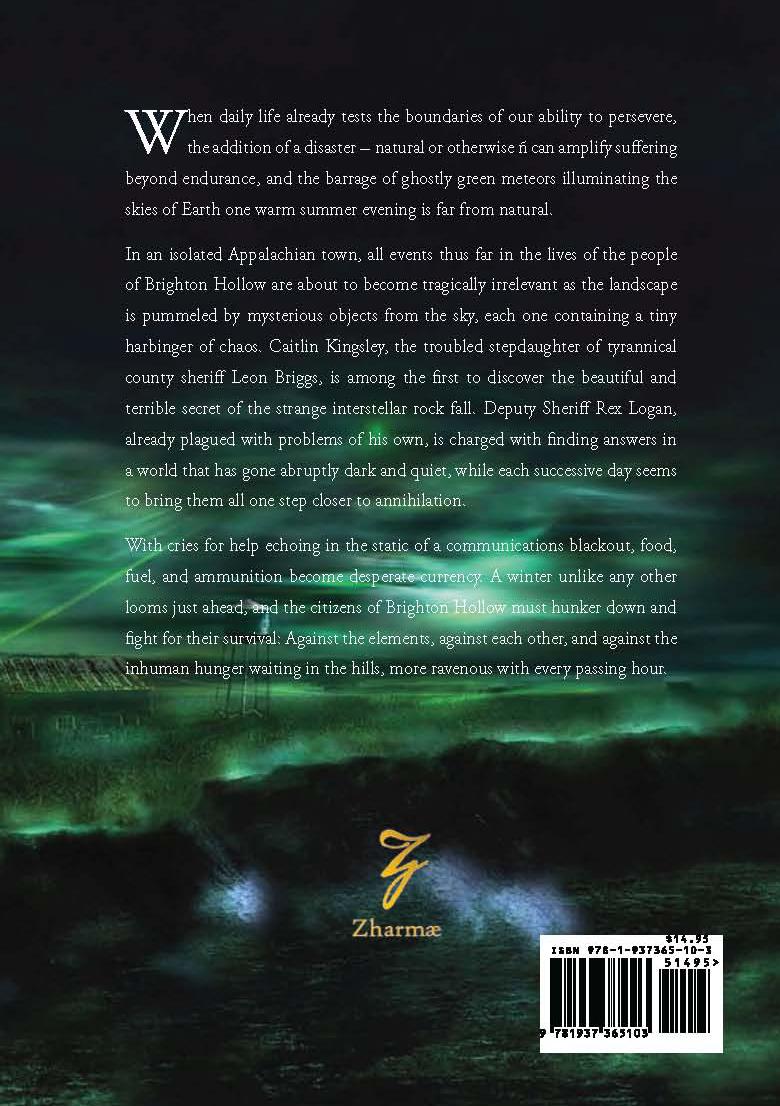
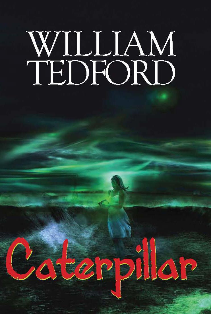
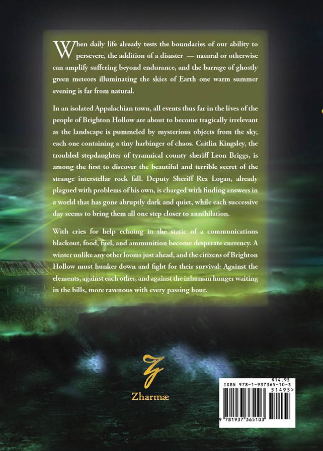
book cover: concepts / design / concept / photography / production / © The Zharmae Publishing Press LLC
britta@bonettedesign.com
h britta@bonettedesign.com 805.574.9788