Amy L Lowen
Design Portfolio
Virginia Tech | Class Of 2023
My name is Amy Lowen. I am excited to be graduating Spring of 2023 with a bachelor’s degree in Interior Design with a minor in Visual Arts and Society. I am passionate about design, art and how I can use my profession to serve those around me. Two summers of internships, first at a small (Sorrell Design) and then later at a medium-sized (GTM Architects) architecture and design firm, have provided a glimpse of current world application and the complexity of the real design process. My long-term goals lie in furthering my design specialties with a master’s in architecture and, afterward, working with affordable, community-centered and resettlement housing.

Contents Introduction Table of Contents Rest To Regrowth Ever Upward NEXT Layers Of Experience Artwork 2 3 4-17 18-23 24-33 34-39 40-47
Table Of
Rest To Regrowth

Concept | Multi Sensory Rest


To extract the physical conditions of a park that make it a place of rest and use those sensory conditions within the interior environment to create space that promotes healing, growth and connection. Connection to biophilic design has a psychological impact on people increasing their calm, reducing stress and mental health concerns. Natural daylight and views promotes wellbeing and healing. This has been scientifically studied over the years through experiments conducted with patients recovering from physical and mental illness and trauma. Nature based therapy is an established method of promoting healing in patients. It increases calm and relaxation. The United states CDC conducted research and found that “residents in urban areas were seventeen per cent more likely to suffer from psychological disturbance than their counterparts living in rural areas.”
Mission Statement
To create a mixed use temporary housing and service oriented complex to aid in a safe resettlement process that promotes the mental, emotional and physical wellbeing of refugee families and individuals arriving in the United States
Auditory Rest Visual Rest Tactile Rest
California has been a champion among the states in accepting refugees. The state accepted the highest number between 2002-2019. In that seventeen year period California accepted approximately 108,000 refugees. Because of the conflicts in both Afghanistan and Ukraine, in the past year, California has been overwhelmed with the surge of refugees. There is a lack of service staff to help with the process of refugee resettlement and a need for funds to help these families and individuals flourish in their new environment.


Parks Site Arch. Context Transportation
South-side Park
J.C. Park Walk Score 95/100 Transit Score 63/100 Bike Score 99/100
Franklin D Roosevelt Park
Site
Site Address: 1100 R St, Sacramento, CA 95811
Diagrams and Process


Parti Diagram

Path of Travel
Community Heart Service Spaces


Development Center 11. Exterior Community Space
Highlight the periphery of the interior and wallwashing the interior walls to highlight the limewashed texture.


Fixtures
 Linear wall washer
Louis Poulsen Opal Glass Decorative pendants over the reception
6” Plasterboard Bulkhead & LED
FLORAL - Pendant Lamp by David Trubridge
RCP
FLORAL - Pendant Lamp by David Trubridge
Louis Poulsen Opal Glass Decorative pendants
Linear wall washer
Louis Poulsen Opal Glass Decorative pendants over the reception
6” Plasterboard Bulkhead & LED
FLORAL - Pendant Lamp by David Trubridge
RCP
FLORAL - Pendant Lamp by David Trubridge
Louis Poulsen Opal Glass Decorative pendants
11’ 9’ 9’ 9’ 9’ 10’3” 10’3” 10’3” 9’ 9’ 11’ 10’6” 10’6”
Metalworks - Linear Classics - Sesame Wood Look Surface
Design Principles Informing Level 1
Therapeutic Space
Creating a therapeutic space to allow healing from past trauma is a key element in this type of design. To promote this through design, highlight consistency, predictability and personal control for the user. Reduce noise, odors, excess stimulation, overcrowded layouts and clutter. Promote gardens, nature, calm cool colors and a balance of social and private space.

Safety
Consider highlighting the safety of the environment. Incorporate a monitored reception, appropriate night time lights and controlled access to the building.
Accessibility
Consider the diversity of people groups using the space. Consider physical diversity, as well as social and religious diversity. Create spaces catered to different body types and age groups. Pay attention to way-finding.


Axon Level 1
The colors and materials tend toward light, neutral, and soft materials reflective of the colors and textures found in nature. Hard, harsh materials and colors are avoided to reduce any anxiety, mental fatigue or darkness in the space. White, grey, green, light pink with a mix of wood tones and upholstery textures create a space that promotes relaxation. Overall, the space echoes a gardens design with natural geometries, ample natural and artificial lighting and soft colors.


 Materials Section
Agglo | Mafi Terrazzo Marble | NASCO
Agglo | Lino Terrazzo | NASCO Sherwin Williams | Coastal Plain | Tutoring Wall
Sherwin Williams | Sashy Sand | Health Center Wall
Pionite | Sugar Maple | Plastic Laminate Wood Kettal | Designer: Patricia Urquiola
Materials Section
Agglo | Mafi Terrazzo Marble | NASCO
Agglo | Lino Terrazzo | NASCO Sherwin Williams | Coastal Plain | Tutoring Wall
Sherwin Williams | Sashy Sand | Health Center Wall
Pionite | Sugar Maple | Plastic Laminate Wood Kettal | Designer: Patricia Urquiola
Floor Plan Level 2
 1. 3 Bedroom
Apartment
2. 3 Bedroom
Apartment
3. Community Outdoor Space
1. 3 Bedroom
Apartment
2. 3 Bedroom
Apartment
3. Community Outdoor Space
1 2 3 4
4. Community Laundry
Floor Plan Level 3
 1. Community Lounge
2. Hotel Style Room
3. 4 Bedroom Apartment
1. Community Lounge
2. Hotel Style Room
3. 4 Bedroom Apartment
1 2 3 4
4. 3 Bedroom Apartment
Sense of Home

These families come from different backgrounds and have unique experiences but one thing in common, that they all have experienced, is the loss of their home and their country. For this design it is imperative to reinvent the sense of home for these people who have lost theirs. Home is a place of attachment and emotional connection. Focus on a welcoming and warm environment. Allow adaptability and personalization within the residential units. Overall focus on creating a stable, safe environments. The space cannot replace home but it can mimic the safety of home and allow the development of a new sense of home.


 Unit Axon
White Oak | Engineered Hardwood- Bellawood Artisan
Terrazzo Hex | Blue- TileBar
Hexagon Matte Porcelain Tile | Umi Terracotta - Bedrosians Tile & Stone
Vintage Linen Manorca Ceramic Terracotta TileCountry Floors
Unit Axon
White Oak | Engineered Hardwood- Bellawood Artisan
Terrazzo Hex | Blue- TileBar
Hexagon Matte Porcelain Tile | Umi Terracotta - Bedrosians Tile & Stone
Vintage Linen Manorca Ceramic Terracotta TileCountry Floors
Ever Upward
New York has a rich history with diverse culture and design. The gallery draws from two linked identities of New York; the state motto and the Art Deco movement. Inspiration stems from New York’s State motto “Ever Upward”. This saying pays tribute to the upward reach of individuals toward a higher goal. In relation to art, it expresses the idea of art drawing individuals out of their daily lives and giving them an experience which pulls their emotions and their thoughts above the trivial. “Ever Upward” can be found on the New York crest along with the image of a rising sun. This stylized sun symbolizes the upward movement of peoples lives and dreams. The interior highlights the idea of rising up and the symbolic language of the sun. The stylized sun also pays tribute to the vibrant art deco movement which inspired so much of New York’s architecture. The gallery reflects the radial patterns and abstracted geometries of a sun ray for the spatial layout, FF&E and custom partition walls. Hints of the Art Deco movement are portrayed through materiality and stylized geometries. The interior volume emphasizes this through the rising ceiling height as one travels into the interior as well as the movement from dark to light as the dark LVT flooring gives way to bright white ceiling. Additionally, custom wood display screens draw the eye upward through diagonal slats which mimic the lines of a stylized sun ray. The space pulls the viewer in, allowing them to meander through the soaring partitions and become enveloped in art.

Individual Project | Fall 2022
Level 1 Design


Level one focuses solely on gallery exhibition space. It contains built in units for 3D display as well as custom movable partitions for 2d artistic works. The color palette on this lowest floor has a neutral palette to accentuate the work of the artists. The spraydient wallcovering provides a seamless connection between the black floors and white ceilings.
Custom Partitions
The above axons show two possible partition arrangements on the first level gallery. Axon 1 shows the partitions perpendicular to the exterior partitions creating a winding movement through the space. This arrangement creates smaller enclosures and a meandering path of travel. Axon 2 shows how the partitions can be moved to parallel the external walls. This arrangement allows the space to have a more open plan with straight paths of visual and physical movement through the interior.
 Floor Plan Level 1
Reflected Ceiling Plan Level 1
Floor Plan Level 1
Reflected Ceiling Plan Level 1
1 2
Movable partitions on ceiling mounted track
Level 2
1 : Office : over 144 sq.ft.

2 : Storage 100 sq.ft.
3 : ADA RR
4 : Gallery - 2D & 3D Display
5 : Gallery Kitchen
6 : Presentation Space
Gallery Finishes
Palazzo , Nero
Armstrong Vinyl Flooring STC 51, ASTM E492, IIC 53


WELL Compliant, CDPH/ CHPS Compliant
Match Laminart White Ash For Finish
FSC Rated Wood
Spraydient
Rollout Wallcovering

Vinyl Wall covering LEED Compliant, 50% Consumer Recycled


Arkistone Decor
New Jersey Tile and Stone
Certified by Green Building Council
Gallery Kitchen Elevation
1 2 3 5 4 6
Floor Plan Level 2

Panels with diagonal wood slats pull the eye upward and reference the symbolic geometry of a sun ray. The panels are rectangular for the functionality of the space except for a trapezoid at the reception and back of the space which reflect the full sun ray geometry. The height of the panel adjusts according to ceiling height of each space.


Custom Wall Detail
Ceiling Track
Anchor for rotation of panel
Height 9’, 10’ 11’
6’
Diagonal wood slats 3/4” 34” high. Opening 2”x6”. Handle for convenient panel movement
2-3/4” depth
Custom Partition Level 1 Elevation
Level 3
1 : Outdoor Deck
2 : Kitchen
3 : Master Bath
4 : Master Bedroom

5 : Laundry Room 2 lineal ft.
6 : Guest Bed / Office
7 : 3/4 Bath
8 : Living Room
9 : Dining Room
10 : Linen Closet
FFE Design
Each level progressively adds color to the neutral palette of level one. Level three incorporates the most color and texture of all three levels. While warm tones are hinted at on level two, the warm rich tones associated with light and warmth are fully expressed in level three. A dropped red ceiling element and wall with terrazzo flooring enclose the dining space. Warm tiles accent the kitchen back splash and gold accents pop on light fixtures. The neutral canvas is maintained with natural wood flooring, white general paint and natural upholstery .

Durango, Cloudburst
Barbarossa Leather Dining Chairs
Aggregato Terrazzo Forte, Autumn
Design and Direct Source
Low Emitting, LEED Credits
PERIGOLD
Ivy Hill Tile, Porcelain Wall & Floor Tile


White Noise, Quiet Fabrica
Living Room Carpet
Green Label Certified, LEED Credits 1 8 9 2 4 6 7 3 5 10 Axon Level 3
Floor Plan Level 3
NEXT
The space celebrates both the Industrial roots and the artistic renovation of the Seaport district. Originally a city for shipping, the Seaport District has transformed into a space geared toward artists and entrepreneurs. This is clearly visible in the juxtaposition of the industrial architecture which is interrupted by pieces of modern artwork. The goal of the interior is to hint at the varied experience of walking through the city streets. The Interior has been zoned into four space types which allude to the different aspects of the city. ZONE 1: Reception, Team spaces: These allude to the pieces of artwork throughout the city. They draw attention to themselves by mimicking the fragmented geometric style of the most famous sculptures and murals across the city. With bright colors and bold geometries they cause one to “stop looking at the pavement and to start looking up and around” ZONE 2: Pathways: They create the atmosphere of walking down one of the wide boulevards. A median of touch down spaces punctuate these wide paths. ZONE 3: Work, Labs and Wellness: These spaces line the wide paths and allude to the rigid industrial skyscrapers; the architectural foundation of the District. ZONE 4: Café, Work stations: These spaces are open concept and situated with maximum access to natural daylight and views. They allude to the parks around the city.
 Individual Project | Fall 2022
The Seaport District you see today is the product of the rejuvenation project that started in January of 2010. Originally centered on wharves and docks with economics founded on the shipping industry, the district has transformed into a diverse center for innovation. The college of Art and Design and Design Museum of Boston both played a significant role in the planning and design of the development of this district. The goal of the renovation project was to take an underdeveloped section of land and pull in artists and entrepreneurs to create a lively, cutting edge district. Keeping in mind the life style of their targeted audience, the city planning centers around the idea of “Live, Work, Play”. The vision for the area is a place where “artists and designers would have a central role in transforming the district into a vital and livable community. ‘We wanted to bring multiple communities together and make design a bigger focus in the development of the district’ said Sam Aquillano, executive Director of the Design Museum of Boston.”


Site information
Fragmented sculptures, designated by fragmented geometry and color. This encompasses the team spaces and reception.


Long boulevards designated with rhythmic elements that break up the long pathways. Central touchdown spaces and benches replicate the idea of a central median within the city streets.
Industrial architecture lines the wide boulevards of the seaport district. The interior zones mimic the rigid structure and industrial materials buildings.
Block Concept Diagram Parti Diagram
“I aim at creating vibrant places that are filled with color and positivity. I want people to stop looking at the pavement and start looking up and around.”
- Okuda San Miguel


Conceptual Process Sketches
Bubble Diagram

Floor Plan 1/16”-1’ Scale
1. Reception
2. Cafe
3. Home Office Lab
4. Project Room
5. Phone Room
6. Inclusive Design Lab
7. Private Office #3
8. Storage
9. Private Office #1
10. Private Office #2
11. Team Space #1
12. Lounge
13. Mothers Room
14. Resource Room
15. Touch Down Spaces
16. Workstations
17. Retail Mockup Space
18. Large Meeting Room
Legend 1 2 3 4 5 6 8 10 1 13 14 11 11 11 16 16 4 1 5 5 9 8 7 17 8 5 12 15 15
19. Wellness Room
Reflected Ceiling Plan 1/16”-1’ Scale

Legend
Dropped ceiling in all offices and café Reception accented with recessed linear lights
Pathways dived by baffles and recessed linear lights which alternate Bulkhead over team spaces.
1. Acoustic panel with metal grid
3. Floating cloud with indirect LED lights
4. Lowered ceiling with paint finish
5. Alternating acoustic beams and linear lights
2. Painted GYP board ceiling
1 1 2 2 1 2 2 3 4 4 5 2 8
Workstations mimic the materials and plant life of a city park. The area is connected to the central blue accented team space. This space is one of the symbolic “fragmented” sculptures one finds around the seaport district. The workstation are tied to the team space by a blue accent bulkhead which envelopes the area in branding color.


 Steelcase Work Station
Steelcase | Turnstone Clipper Screen
Steelcase | Turnstone Bivi Arch | Table | Side Storage
Steelcase Work Station
Steelcase | Turnstone Clipper Screen
Steelcase | Turnstone Bivi Arch | Table | Side Storage


Designtex | Linnen | Malt Designtex | Linnen | Bisque Steelcase | SILK | Butterscotch Woven
The cafe mimics the green space and parks throughout the seaport district. Like a restful park, the goal of the cafe is to provide a place of gathering, peace and relaxation. This is accomplished through incorporating biophelic design that highlights warm materials, natural daylighting and plants. The cafe can also be transformed into a large meeting and presentation area. Storage rooms nearby can be used to house the extra chairs which can be pulled out when necessary.


 Axon Presentation Layout
Axon Cafe Layout
Axon Presentation Layout
Axon Cafe Layout

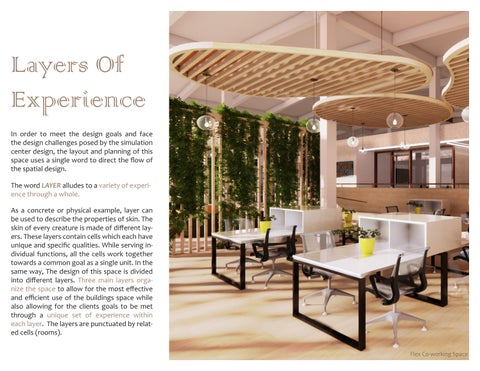
Layers Of Experience
In order to meet the design goals and face the design challenges posed by the simulation center design, the layout and planning of this space uses a single word to direct the flow of the spatial design.

The word LAYER alludes to a variety of experience through a whole.
As a concrete or physical example, layer can be used to describe the properties of skin. The skin of every creature is made of different layers. These layers contain cells which each have unique and specific qualities. While serving individual functions, all the cells work together towards a common goal as a single unit. In the same way, The design of this space is divided into different layers. Three main layers organize the space to allow for the most effective and efficient use of the buildings space while also allowing for the clients goals to be met through a unique set of experience within each layer. The layers are punctuated by related cells (rooms).
Flex Co-working Space


1. Coworking 2. Lounge 3. Prototyping and Maker 4. Prototyping 5. Maker 6. Small Lounge 7. Storage 8. Telehealth 9. Telehealth 10. ADA Restroom 11. ADA Restroom 12. Lactation / Private Lounge 13. Private Office 14. Private Office 15. Pantry 16. Small Lounge 17. Conference Room 18. Control Room 19. Simulation Lab 20. Telehealth Training 21. Telehealth Training 22. VR Training 23. Brainstorming 24. De-Brief 25. Brainstorming 26. Classroom split or united First Floor and Mezzanine Plan 1 2 3 4 5 20 6 7 8 9 10 11 12 26 25 24 23 13 14 15 22 17 18 19 21 16 1 1
Spatial Delineation
Each layer has been divided according to the function of use within each space. These layers are perceived through, change in material and change in elevation from front to back. As one moves through the space the ceiling height of the spaces slowly rises to subtly call attention to the change in layer spatially as well as aesthetically.

Section View | A


Axon | Layer 1
| Layer 2 Axon | Layer 3
Conceptual Axon View
Axon
The three section views further emphasize the division of layers within the space. Each section captures the moment when you enter a new layer.


Materials
Each Layer is defined by a unique set of materials which create a layered and varied experience as one journeys deeper into the space. The first layer begins with the warmest, softest textures. This highlights this space’s goal for community, connection and relaxation. The middle Layer has neutral materials with a slightly harder texture. Tile and a clean aesthetic promote the flexible, adaptable and functional needs of the simulation and VR labs. The last layer is defined by cooler tones with the hardest materials and textures. Metal wall panels and stained concrete define the exterior elevations of the classroom and utility spaces which are the most static spaces in the interior.
 Section 1
Section 2
Section 3
Home Health Lab Elevation
Section 1
Section 2
Section 3
Home Health Lab Elevation

Amenity Lounge | Layer 1
Art Portfolio
Artwork from 2018-2023
Acrylic Paint
Charcoal
Graphite

Acrylic Paint On Canvas 2018

Acrylic Paint On Canvas 2021


2020
Acrylic Paint On Canvas 2020 Acrylic Paint On Canvas


Conceptual Portrait 2022 Organic | Abstract Conceptual Portrait 2023 Geometric | Abstract Conceptual Portrait 2023


Pen and Inc 2022 Graphite 2022

Acrylic Paint On Canvas 2021
Thank You
Phone Number: 703.927.8922
Email: alowen23@vt.edu