Site excursions via the various buildings' architecture using the concepts of "Successful" and "Unsuccessful" images to create potential scenarios for the following assignments
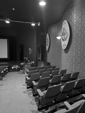
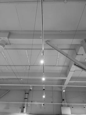
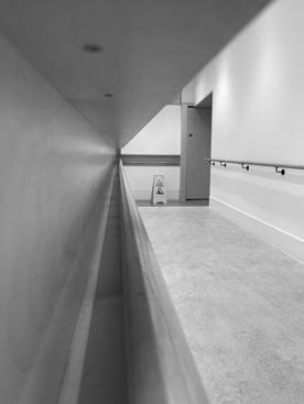
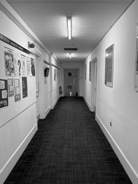
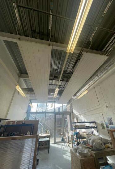
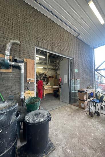
Most images were taken at Adam House, Minto and Maltings gallery and 7-8 Chamber building Street which are all located relatively close, along the same road.
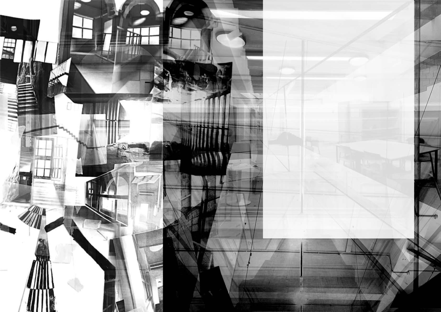
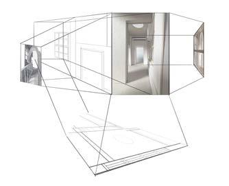
DOUBLE EXPOSURES
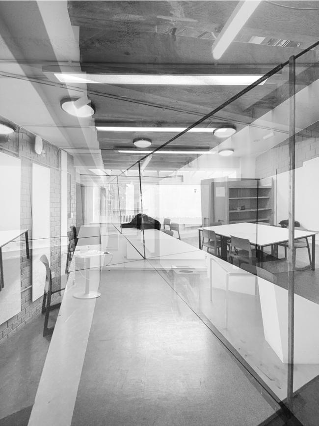
The different moments (images taken) are then to be merged together to be studied through sketches for potential spatial quality. I've decided to choose three set of images to create 'Triple exposures' trials before deciding on the final 'double exposure'
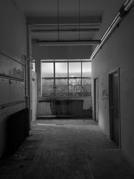
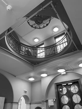
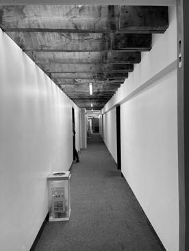
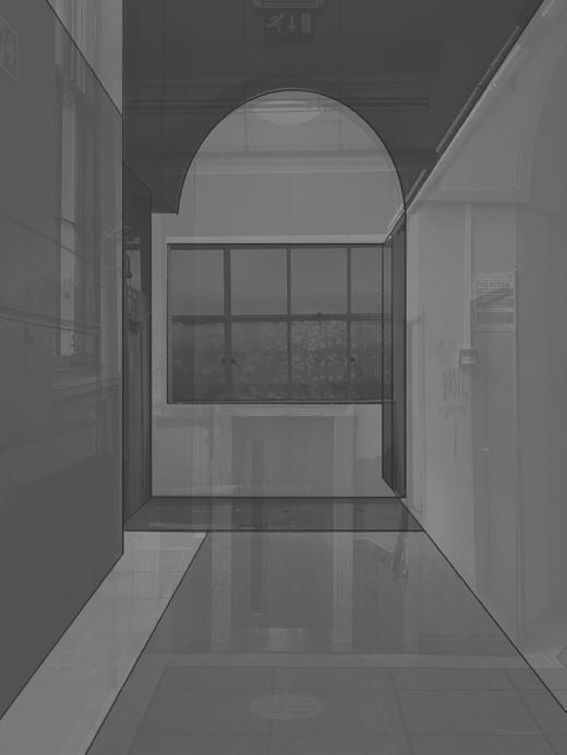
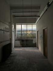
Even though the idea was to see what was successful or unsuccessful, I was intrigued by how these locations had many geometric shapes intersection and long corridors that leads to a certain point (focal point - one point perspectives).
When creating one 'triple exposure', I choose the three moments that seems to enhance each other, one moment with complex ceiling (foreground of the image), one with complex frames (middle ground of the image) and one with interesting floor (low ground of the image).
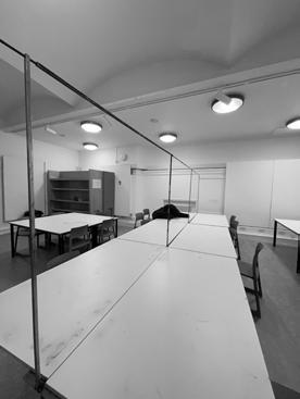
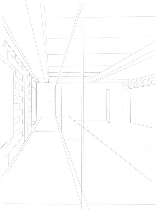
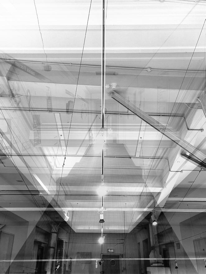
EXPOSURE TRIAL 01
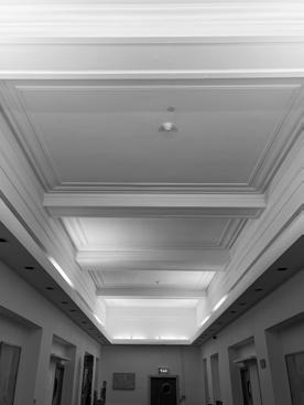
The common features from these moments are one point perspective at an angle and the frameworks that are suggested throughout. The panels on the walls, the display frames and the rhythmic ceiling enhacing and created a fascinating exposure however, I thought that the spatial quality was pretty direct and it did not suggest much.
EXPOSURE TRIAL 02
In these three moments, the details of the lines were very critical and prominent which I thought was interesting. However, it was very difficult for me to imagine spacial potential due to the details clashing on one another instead of enhacing one another. What I got was a very enclosed space with details which was not what I was really looking for.
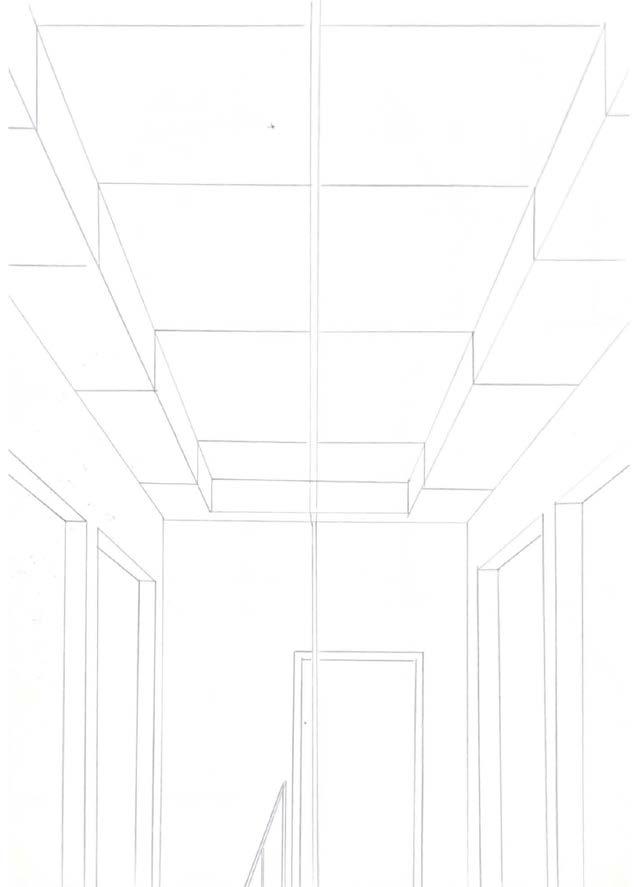
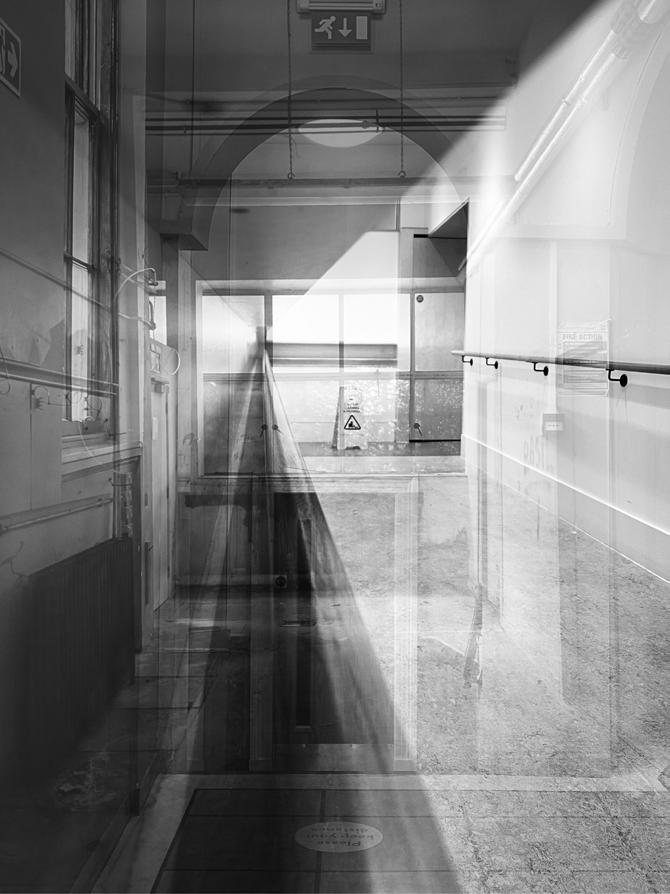
EXPOSURE TRIAL 03
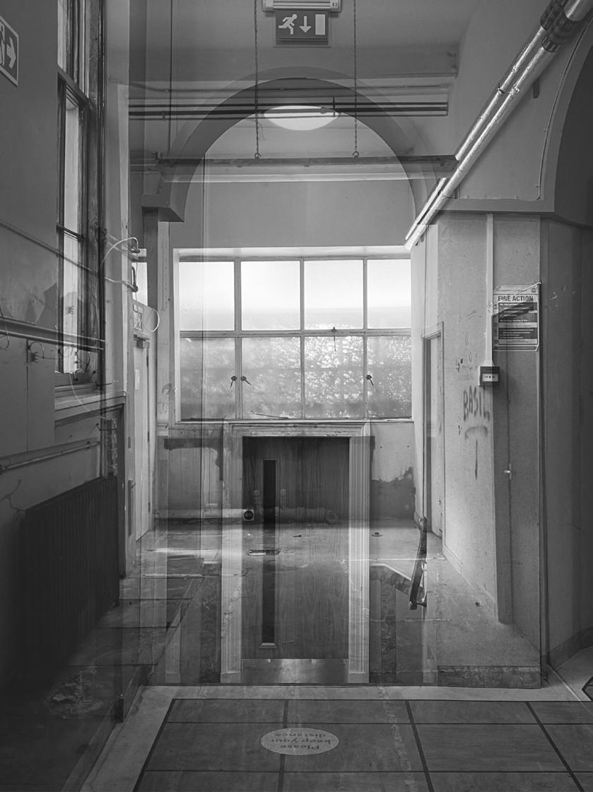
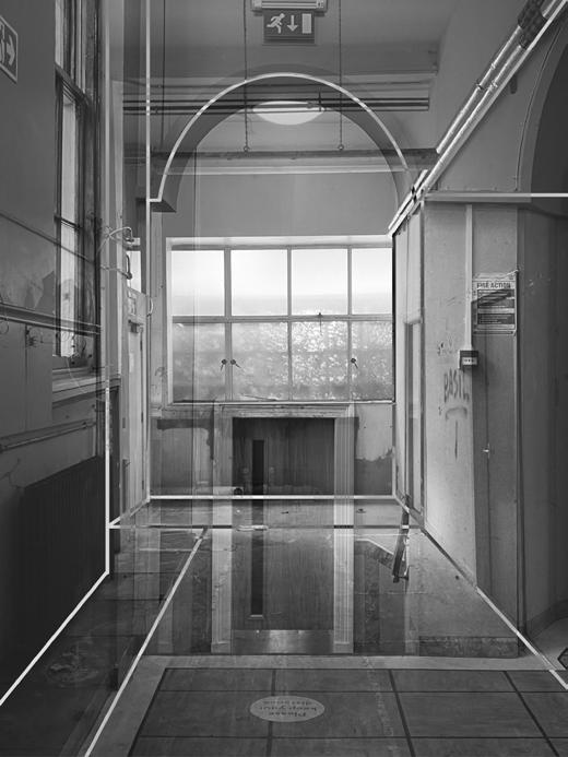
These were the last set of moments that I was able to combined together. At first I saw this set as the least potential or the most 'unsuccessful' due to the fact that each image doesn't show much on potential space howeever, when combined, I thought it was captivating as it shows many focal point that leads my eyes to a different area each time.
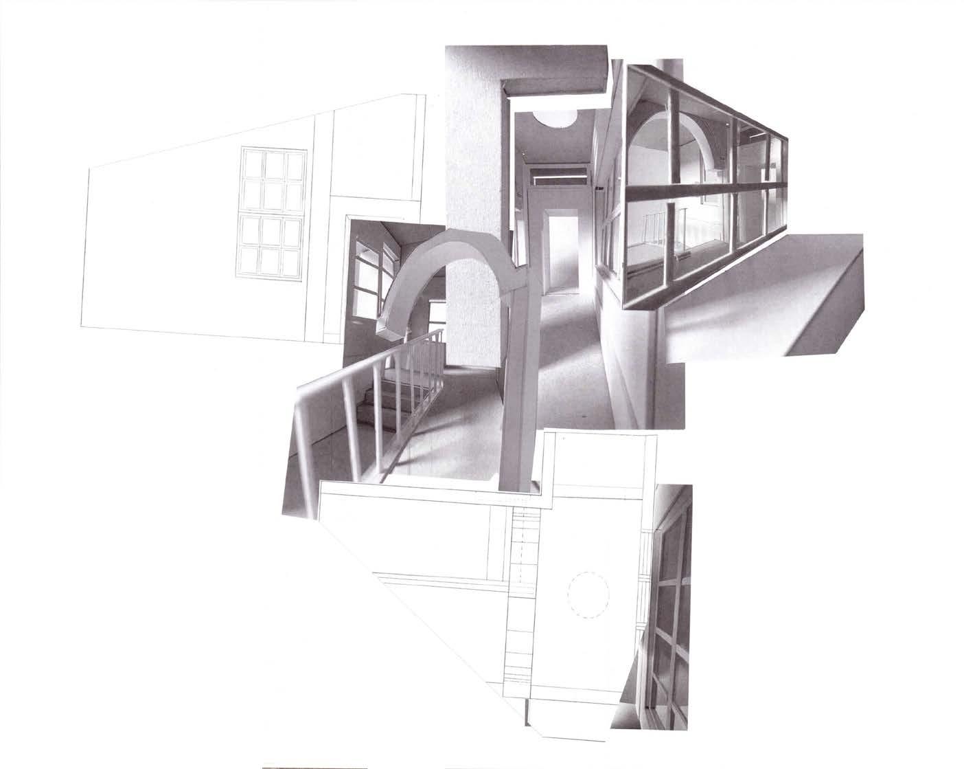
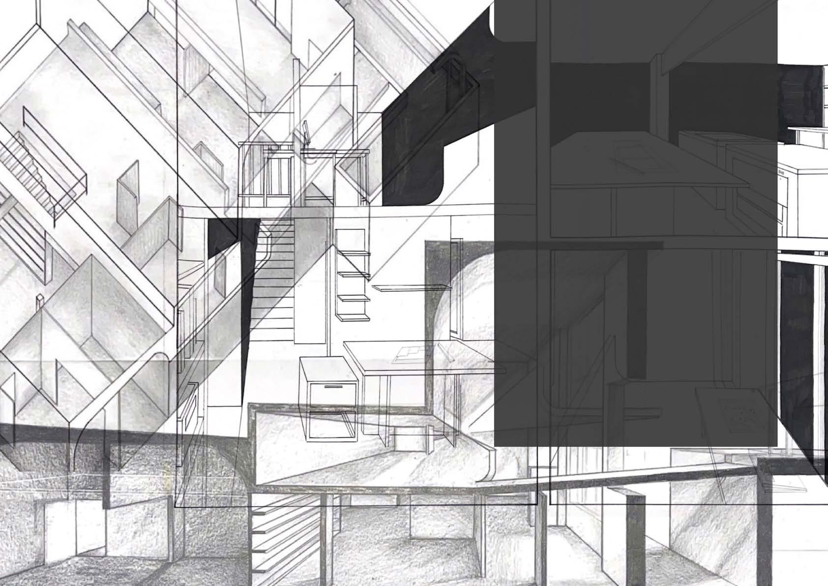
CHOSEN DOUBLE EXPOSURE
TRIAL
03
Decided to remove the last image of the triple exposure as it only creates a one point perspective image but does not add to the spatial quality.
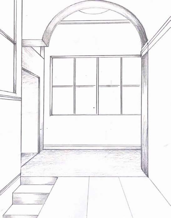
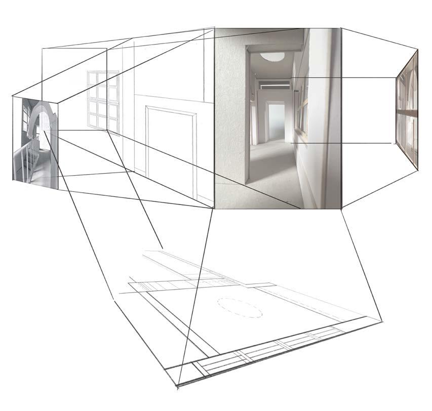
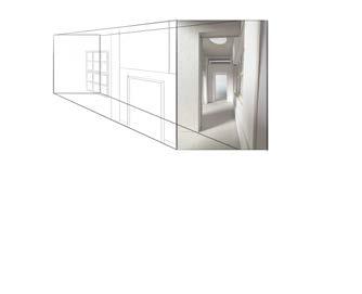
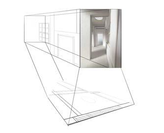
DOUBLE EXPOSURE PROCESS
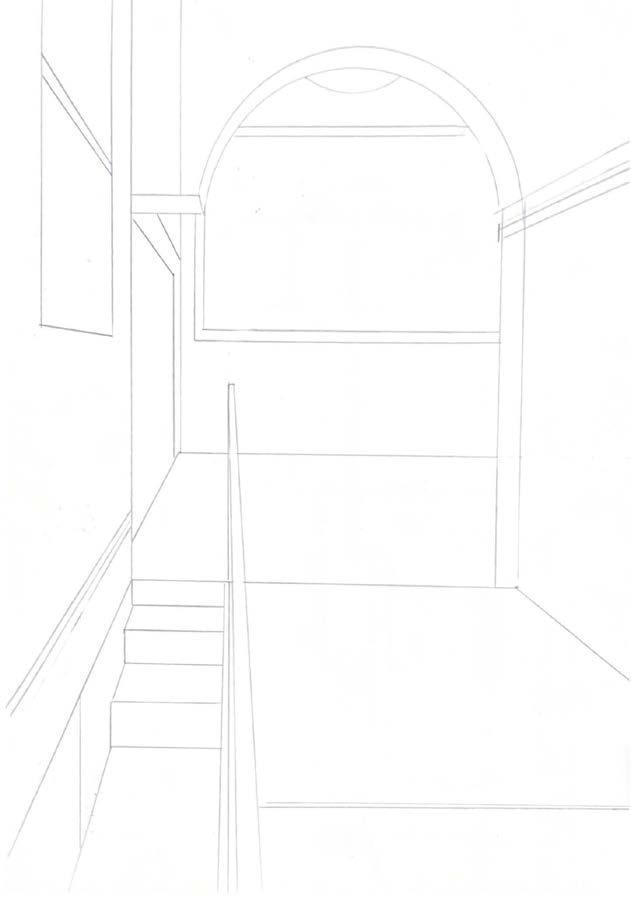
After finalising the double exposure, I traced out how I vision the space would be digitally before drawing it out and colour it to show the depth of the different components. It was drawn simply for easy understanding.
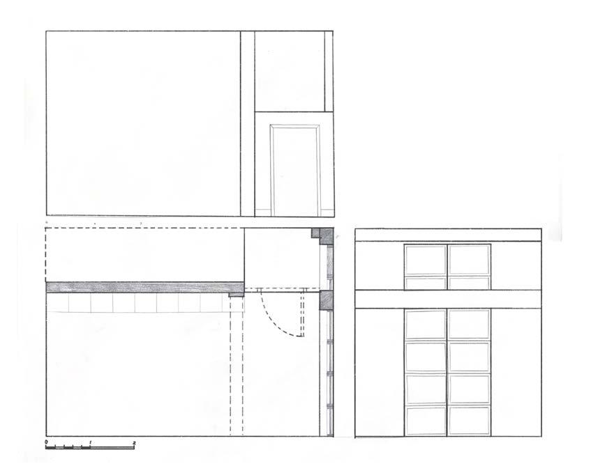
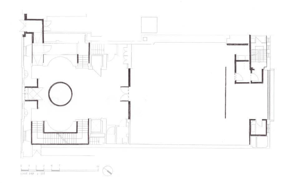
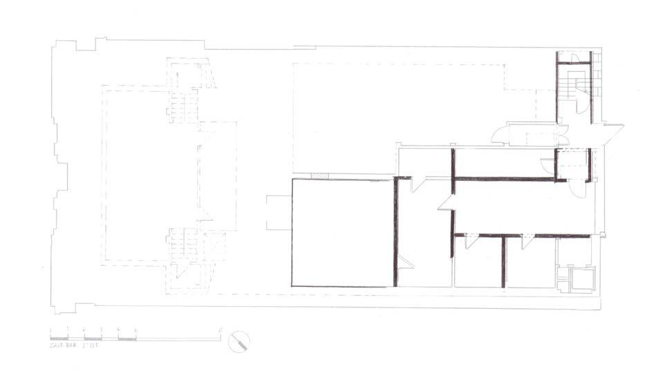
SITE SURVEYS
AdAm house - bAsemenT
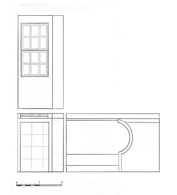
Orthograhic Drawings Scale 1:20
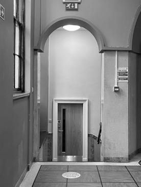
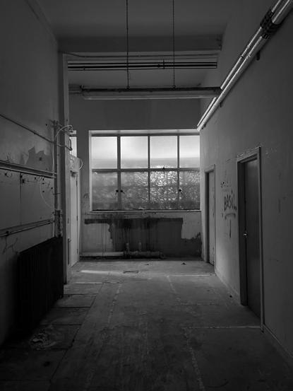
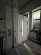
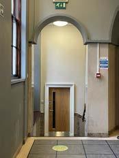
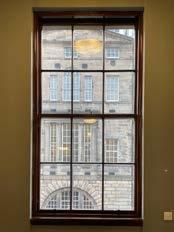
The moment was taken at the entrance of the unused basement of Adam House. (Located a floor below the Lecture Theatre)
AdAm houseFiRsT FLooR
Orthograhic Drawings Scale 1:20
The moment was taken at the staircase from ground to first floor.
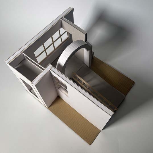
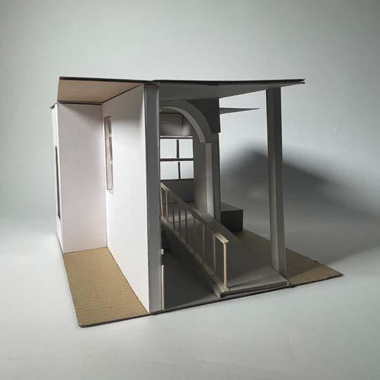
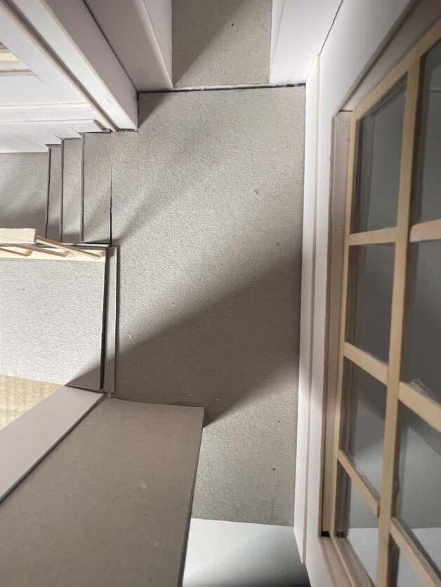
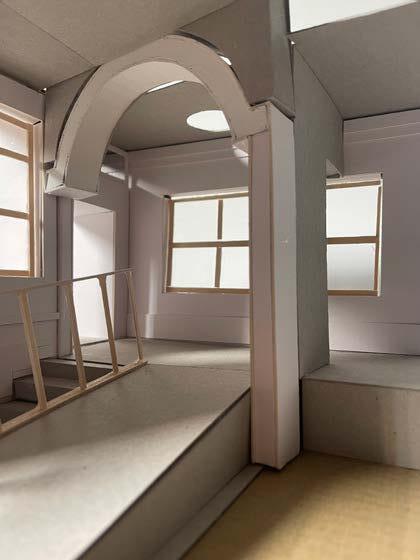
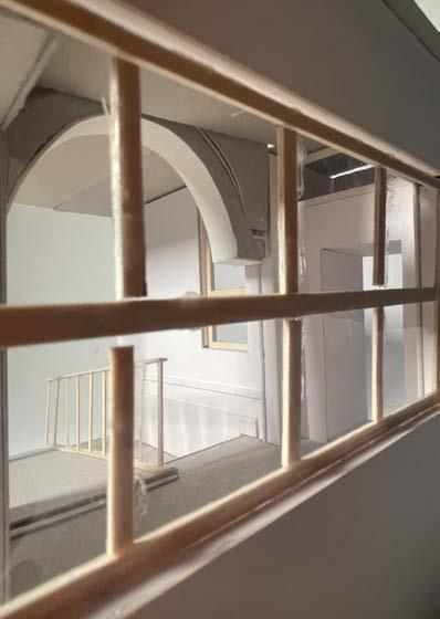
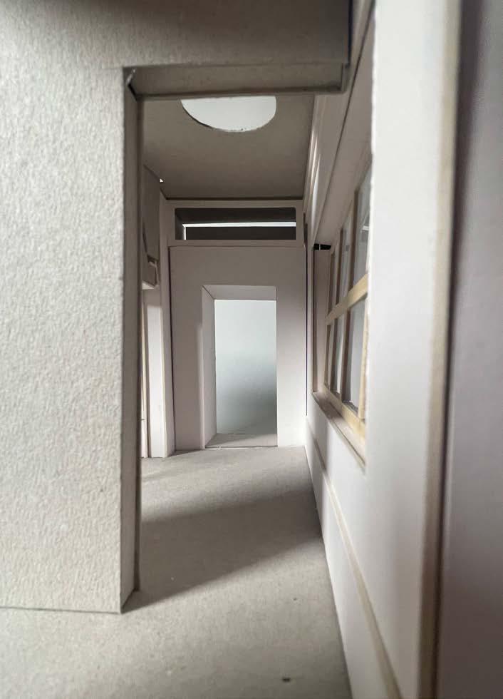
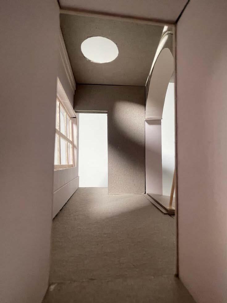
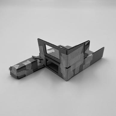
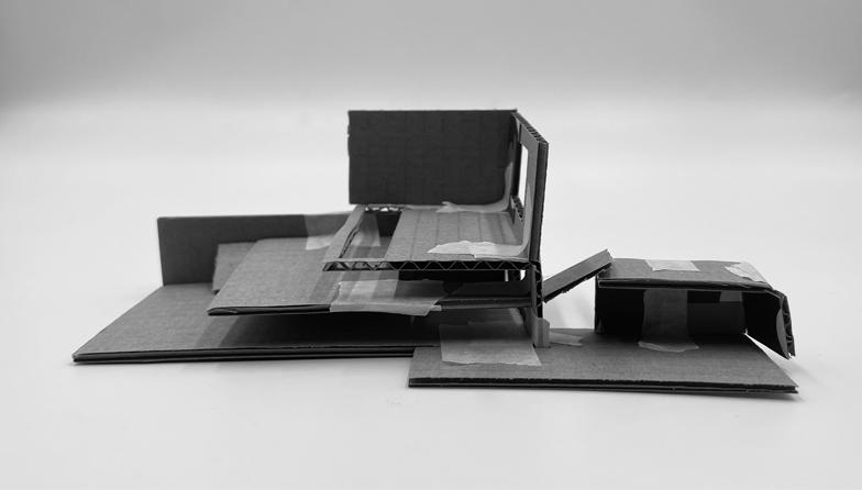
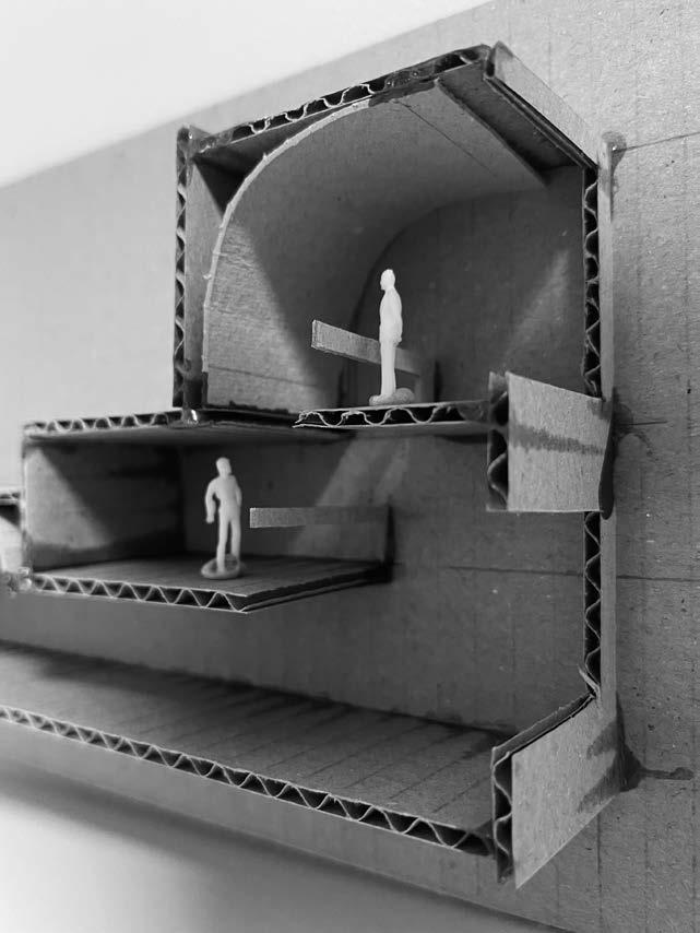
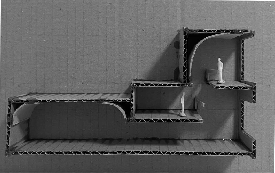
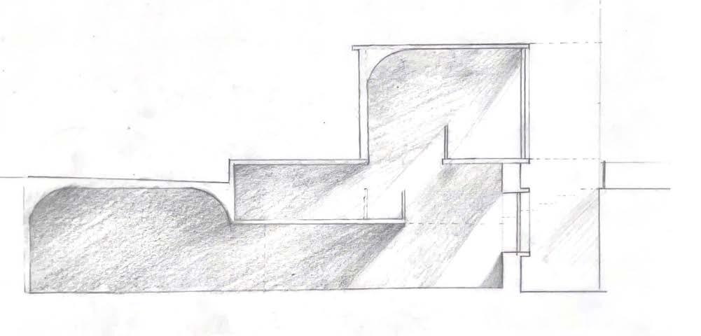
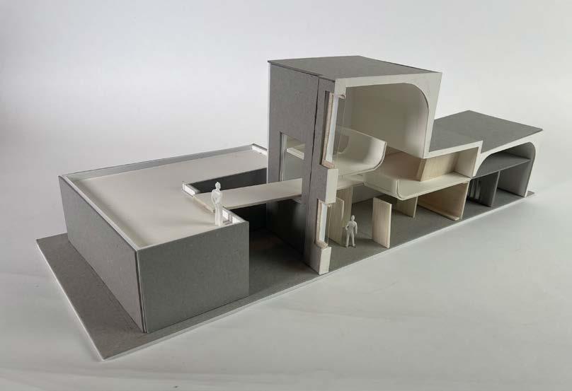
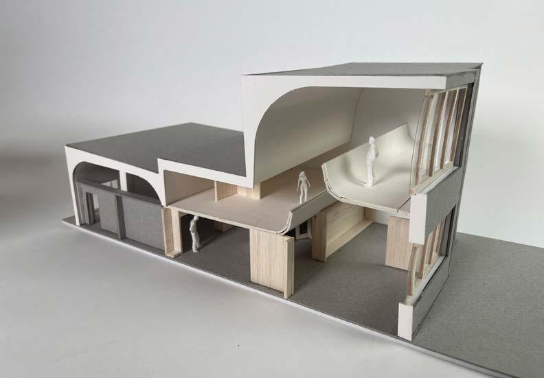
A TRANSLATION THROUGH FORM
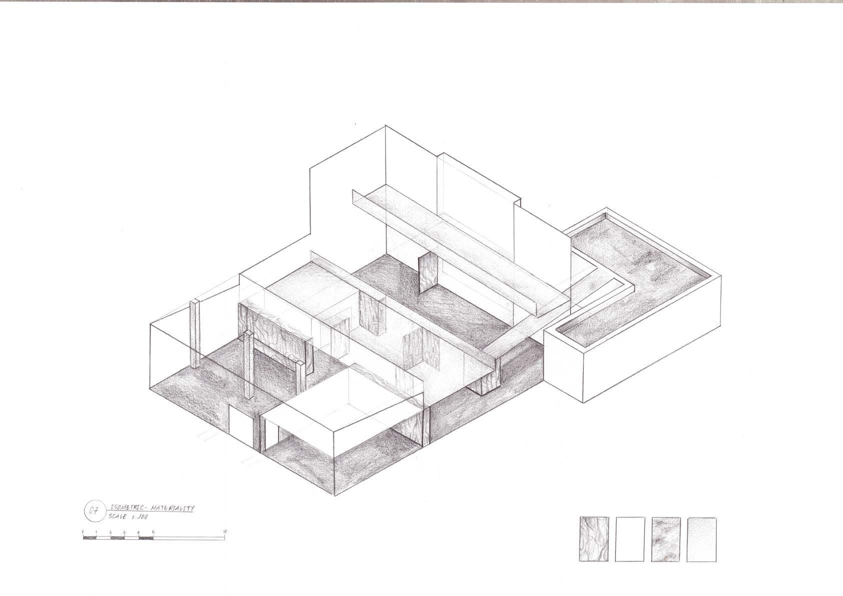
FRom doubLe exposuRe To modeL - wiTh A Focus on mATeRiALiTy
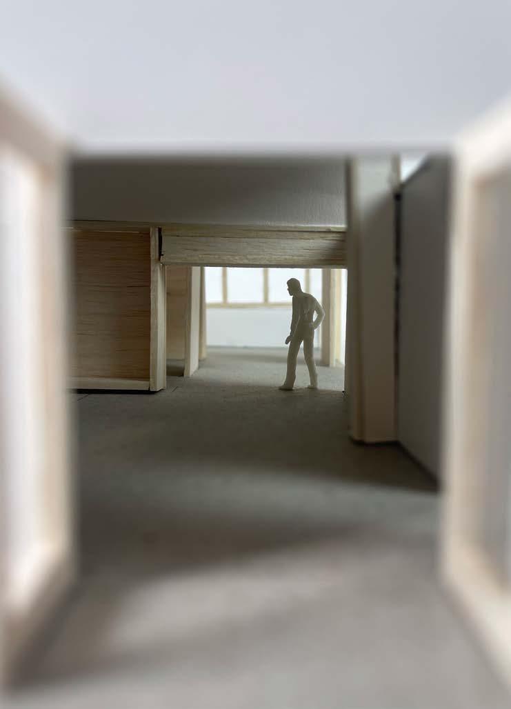
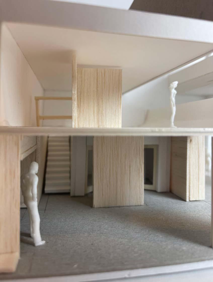
When I was drawing out the double exposure to my vision of the spatial quality, the image of the model was already kind of clear. The main focus of the model would be the different opening that leads to different paths. There would also be a mixture of lines and arches. Lastly, the height changes from one to another was critical. The main materials are raw concrete (grey cardboard), timber (balsa wood), plaster (white cardboard) and glass (transparent paper).
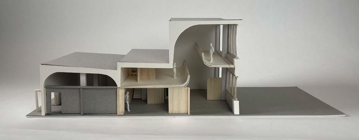
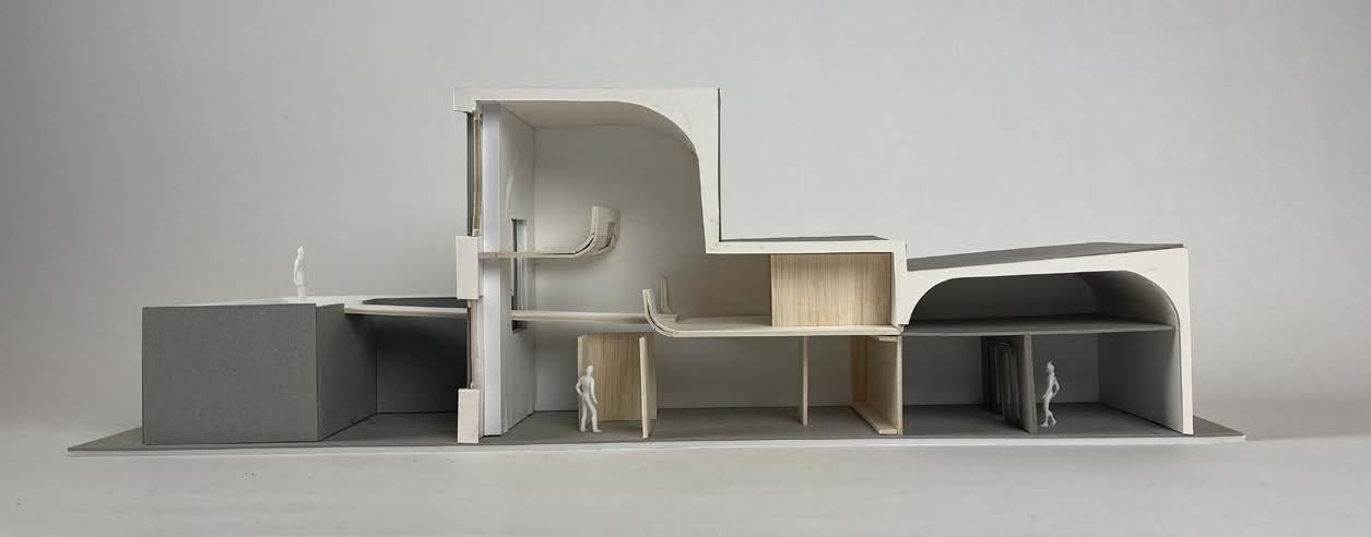
MODEL IMAGES
Scale 1:20
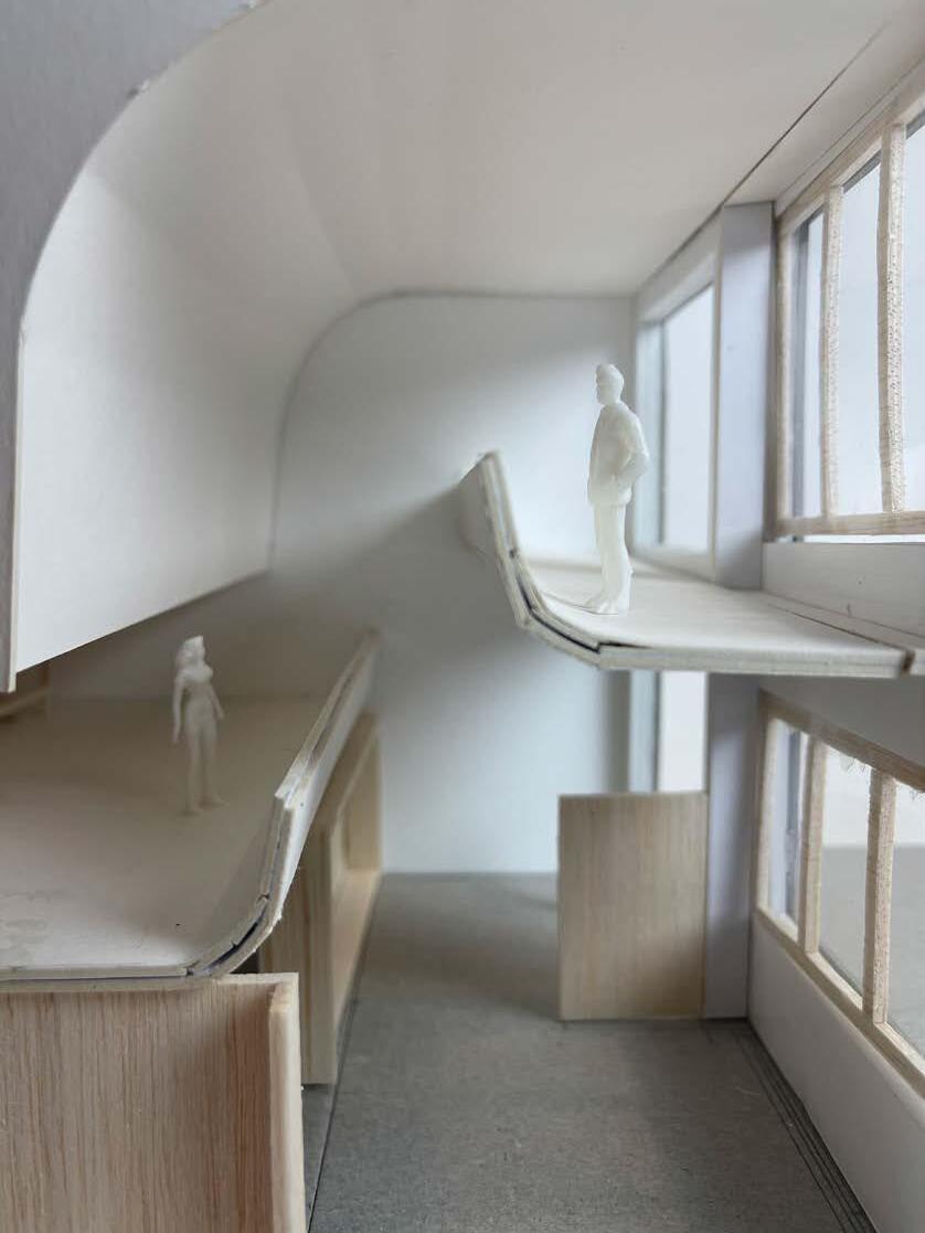
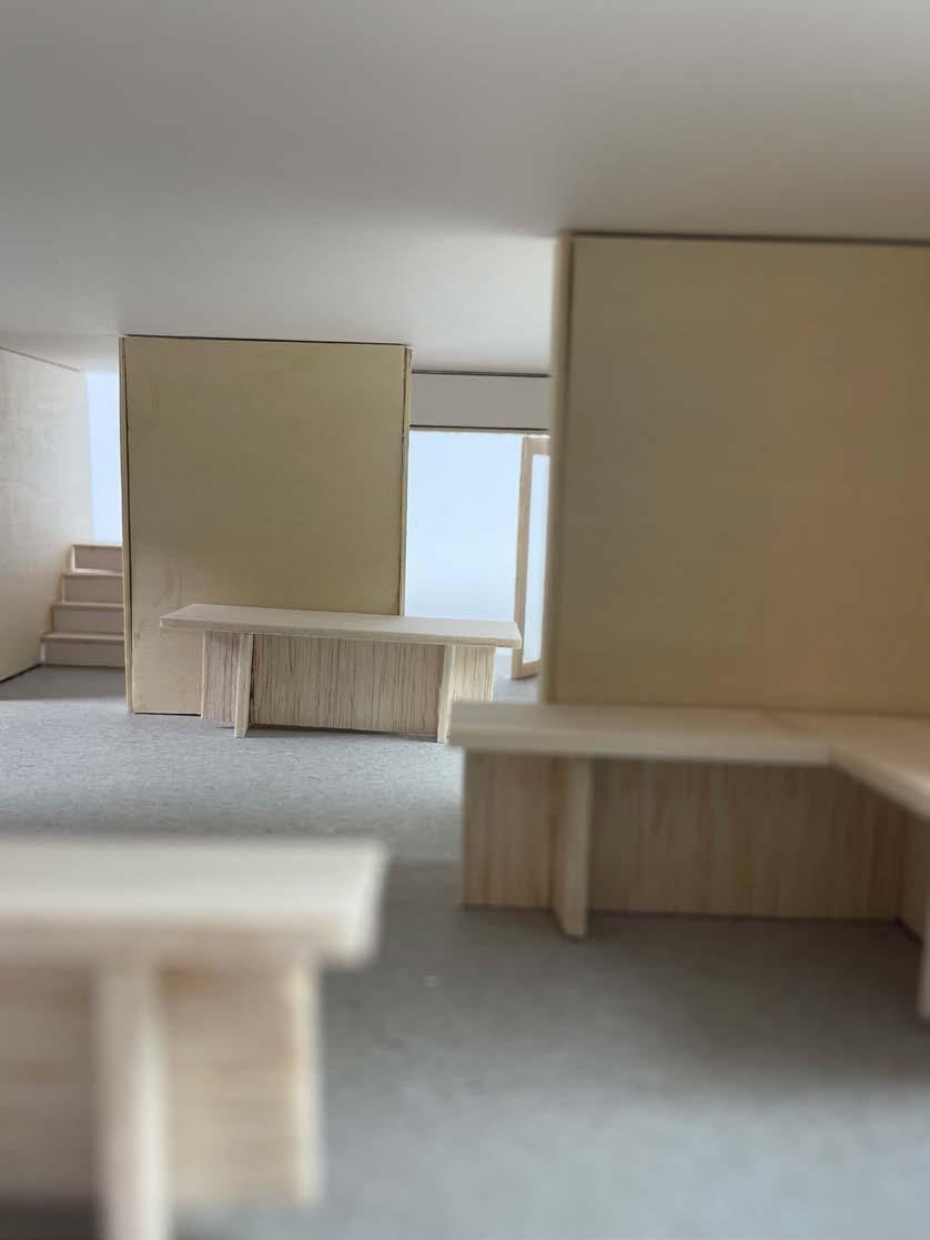
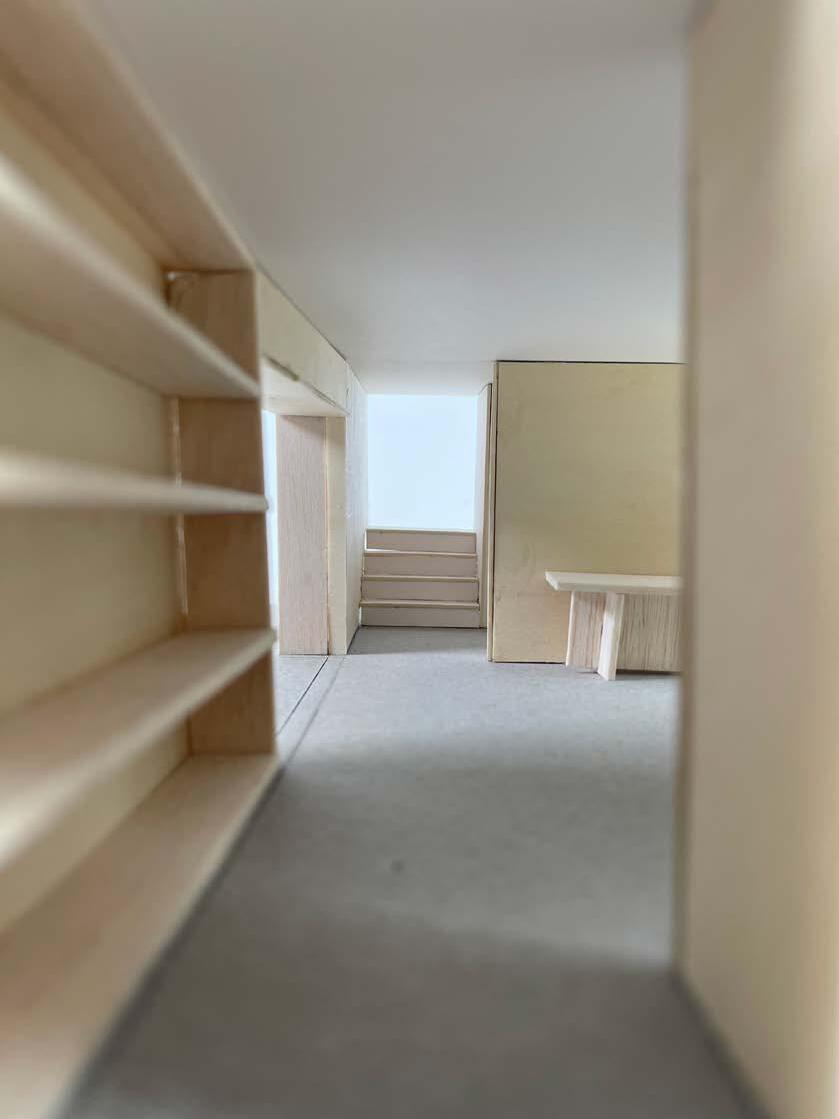
MODEL MAIN FEATURES
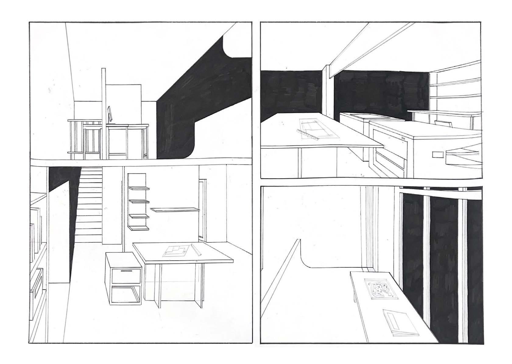
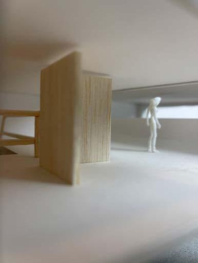
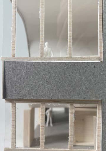
The model explores the possiblity of openings and the placement of them. Different view points from the different openings would show a different perspectives of the model like looking though a screen,
The contrast of materials and the openings creates interesting play of light and shadow through natural light.
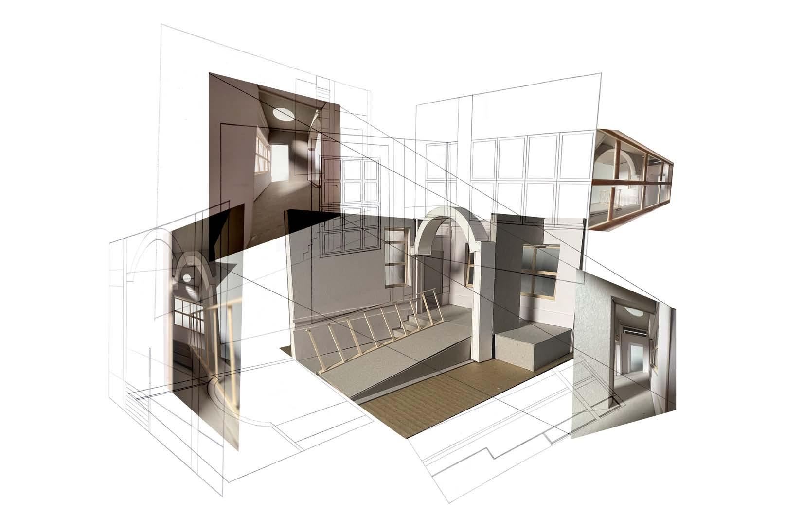
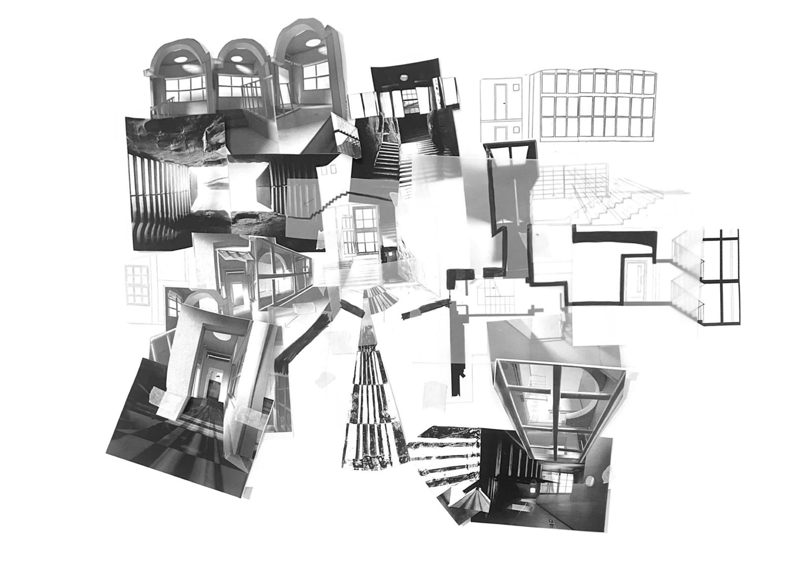
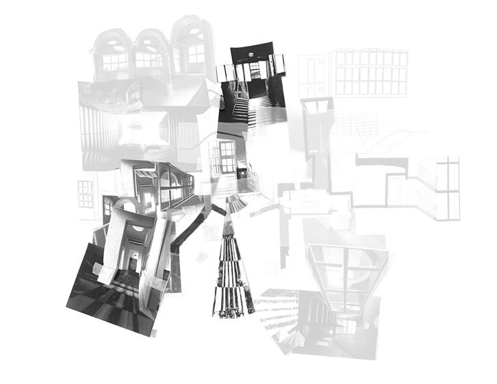
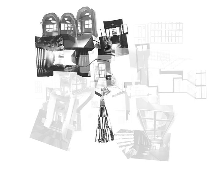
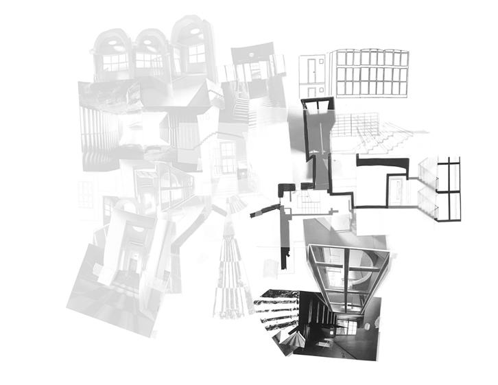
HYBRID LANDSCAPES
INDIVIDUAL COLLAGE
INDIVIDUAL COLLAGE APPROACH
Digital collage explaination
I've decided to combined all the images, the site surveys, the model orthographic drawings to illustrates what can be seen from the model and how it was construct. The concept of the collage was 'Unfolding'.
Physical Collage explaination
The physical collages showcases more on 'what can be seen' directly. What part of the plan shows the perspectives etc.
The precedent that inspired this physical collage are Vermeer's drawings from Philip Steadman. He recreates different famous paintings to plan and elevations according to how we view the art.
KEY WORD(S) IDENTIFICATION:
THRESHOLD/TRANSITION
Other than openings being one of the main feature I would like to focus on, the another feature that stood out was the different THRESHOLD as the path openings are placed differently from the ireegular wall panel placements. Threshold then leads to TRANSITION as the different views are created from it.
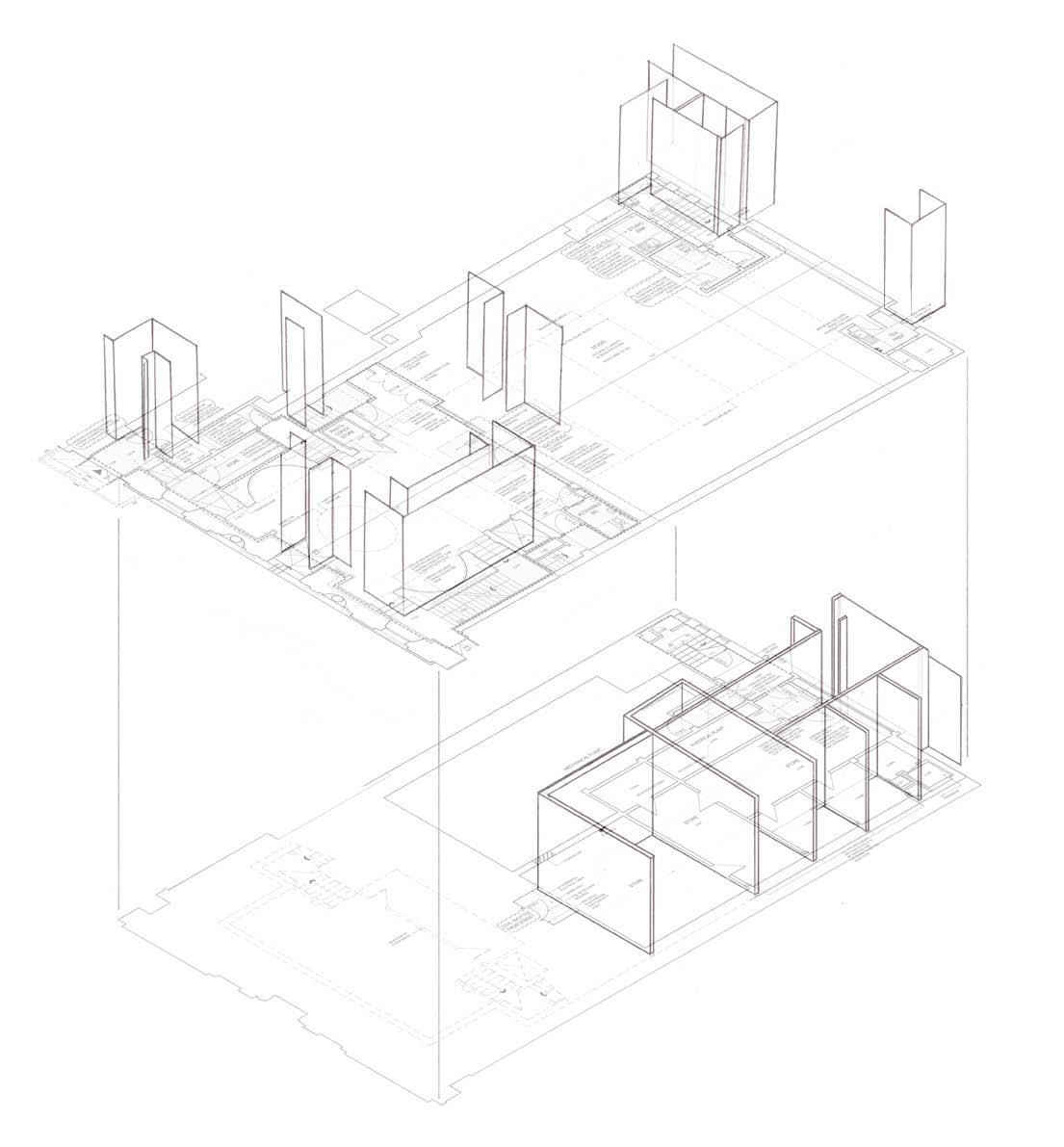
I first identify the different parts of Adam house that I thought shapes the different experiences of the user from the main entrance to the other end. Then I drew out an isometric from the plan to see the different threshold area clearer.
ECOLOGIES OF RECIPROCITY
I' ve decided to find groupmates that has the same location so the three of us could share the different aspects of Adam house from out research and surveys.
GROUP COLLAGE
MEMBERS:
Karen, Rhona and Caroline
GROUP COLLAGE APPROACH
We decided to make the collage with an 'abstract' apprach to our understanding of Adam House. one of the common them among us are circulating and transtion space so we also focused on that.
Adam house have multiple floors with two main access opposite of each other, there are both circular and geometric elements and the different materials of the different elements so we decided to combined all and createed the group collage.
FIELD STUDIES
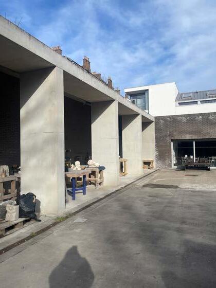
I decided to go to the Edinburgh's Sculpture Workshop as I had workshop as a potential program for my final proposal but also the architecture was captivating.
From first glance through the internet research, the arachitecture looks questionable as it looks very complex but once I visited, everything make sense.
One of the main feature that I thought was the most interesting was the CIRCULATION of the whole space, the spaces are clearly defined through functions yet everything was still connected through deliberate openings.
FIELD STUDIES
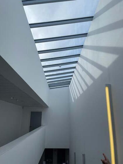
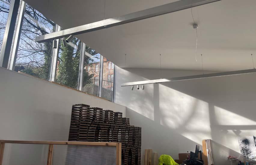
Another main feature that I though was consistent throughout was the play of light, both from the ceiling and the wall openings.
It was clea r that the openings are purposely place at the location it was at from the function of the space which I thought was a very thoughful design.
There were variety of the materials used on the different components however everything was coherent and goes together really well, it illustrated informal and formal space functions.
SCHEMATIC
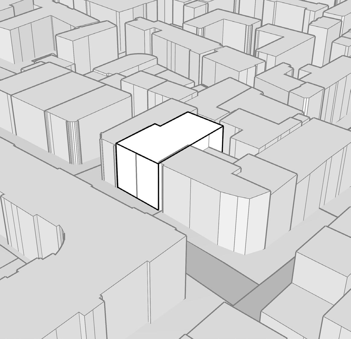
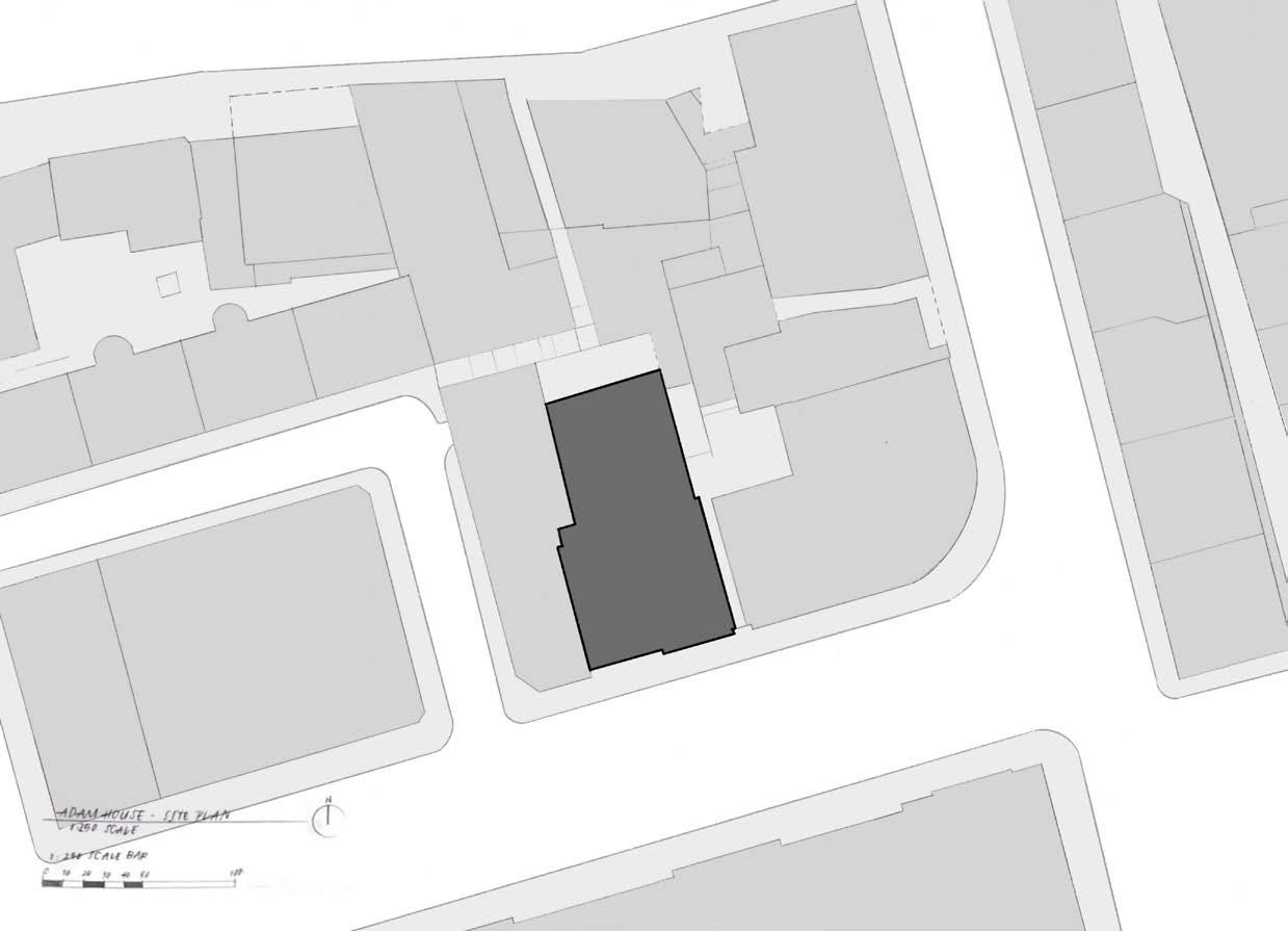
CHosen LoCaTIon:
AdAm house
MAIN FOCUS:
In our opinions, Adam house is very disconnected from other architecture buildings and has way less facilities compared to them.
Adam house seems very 'specific' to users using the space, with no facilities, no other people would be coming to Adam house and there are many ways to improve the space environments which will be out groups' proposals.
GROUP DiSCUSSiON - SiTE SURVEYS
disconnecTed FRom minTo: [more facilities can be added]
- Photography
- Workshop Space
- Printing facilities
- Viewing other people's work
bAsemenT
- Unused
- Disconnected from Adam House itself
- Dark [good for photography]
- Bad accessibility
- Raw materialities
‘box‘ in sTudio
- Blocks light from main window
- unused
- takes up space
- Necessary for fire safety
sTudIos
- Nowhere for food preparations
- Noisy [on fridays etc.]
- Flexibility of spaces
- Less storage space for drawing equipments
GRoupmATes’ Focus / KeywoRds
- KARen: cIRcuLATIon And mATeRIALITy
- RhonA: TRAnspARency And FRAmes
- cARoLIne: ThReshoLd And TRAnsITIon
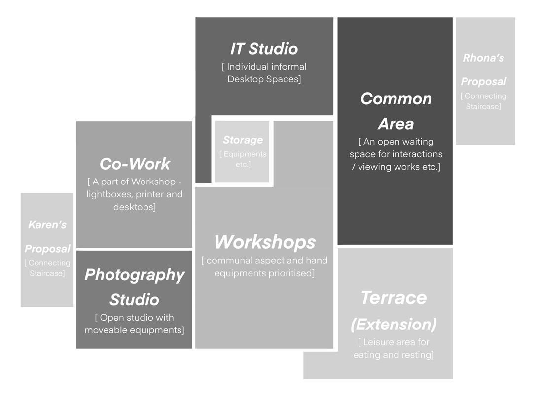
INITIAL PROPOSAL PROGRAMME
MAIN PROGRAMME:
WORKSHOP
- Workbenches
- Small equipments
- Storage
- Spray Booth
- Leisure area
IT STUDIO
- Desktops
- Printers
- Light Boxes
PHOTOGRAHY STUDIO
- Photo equipments [camera, back drops etc.]
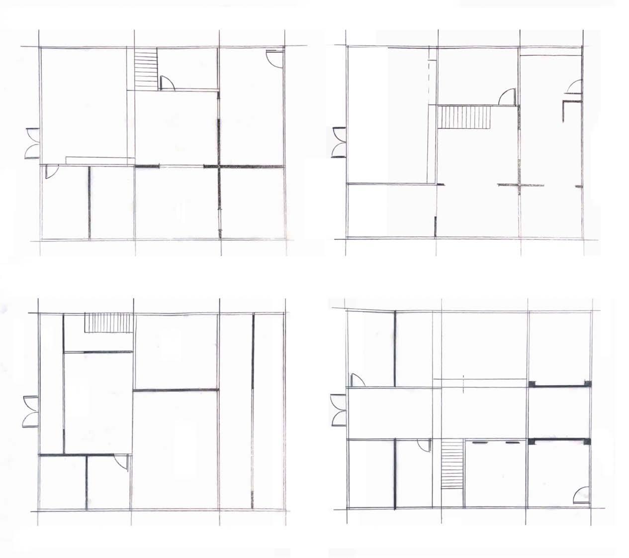
INITIAL PROPOSAL DEVELOPMENTS
SKETCH MODEL 01
FLooR pLAns
[MoDeL sCaLe 1:100]
I first started off by making a simple geometric floor plan with moveable wall panels to figure out how I should place the different area on the area I am intending to change and also figure out the placement of the second floor while having a 'shared corridor' through the void space.
SKETCH MODEL 01
FLooR pLAns - idenTiFyinG spAces
[MoDeL sCaLe 1:100]
After making the sketch model, I chose the best three arrangement that I thought was interesting and drew it out to identify the possible space for the different function.
At this point, a space extension outside to create a terrace or a balcony was still to be decided.
The main idea throughout is to have the workshop being the biggest area for it to be a shared open space followed by a more private IT studio and photography studio.
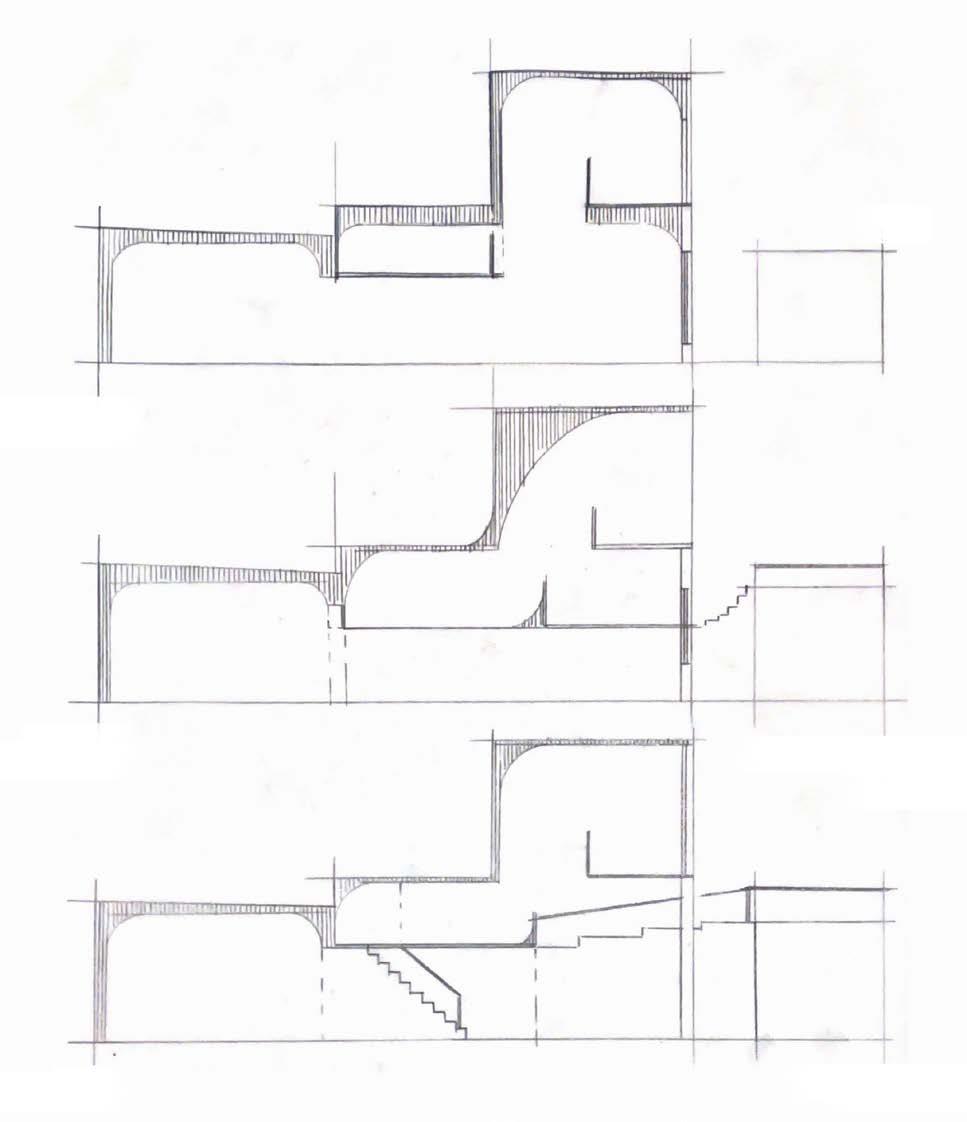
INITIAL PROPOSAL DEVELOPMENTS
secTions - deTeRmininG FLooRs heiGhT
The plan is then followed by different section iterations to create a functional workable space for every users. One of the thing I thought was lacking from Adam house was leisure, communal and waiting area therefore different mezzanine was added to have a shared corridor to comtemplate while still be able to connect with others.
One of the apprach I want to create was to add Adam house's sculptural ceiling apprach to my proposal to connects it to the existing floors.
SKETCH MODEL 02 - HEIGHT EXPLORATIONS
From the plan and section, as they contrast each other, geometric planning and sculptural elevation, I had to figure out how the height would work with one another and how users would circulate through the space therefore this sketch model and several iternation of isometric drawings were made.
FLooR pLAns iTeRATions
[ sCaLe 1:100 ]
After several iterations, due to the unlimited ways that I could draw, I had to limit myself by making several restrictions through the design.
Connecting it back to the idea of THRESHOLD AND TRANSITION I decided that there would be different kind of walls to shape different user experience while making it interactive.
The different options are full height wall pillars, full height wall with big openings, sliding doors wall panels, functional walls [storage/display shelves] etc.
I tried multiple strategies on using full lenght wall or just focus on shorter wall panels to shape the area without blocking everything which I thought was more suitable for the open workshop space.
FiNAL PROPOSAL DEVELOPMENTS
secTions iTeRATions
[ sCaLe 1:100 ]
For the final developments of the sections, I focused on how the arches would flow throughout the space without disrupting the geometric planning. Through the iterations, I decided to not go full sculptural [very organic forms] as it would disconnect the space from the rest of Adam house therefore I decided to have a slight surves to the railings and the ceilings.
The flow of light going through the main window towards the curve is also a key factor to how I added the curves.
For this final development, I added the extension terrace which would need a circulation path to get to the area therefore I tried multiple way and I thought Ramp was the most suitable due to the short height difference and it seems like the most 'fun' apprach for the communal centered workshop area.
SKETCH MODEL 03 - LiGHT STUDiES
[MoDeL sCaLe 1:100]
To make sure that the light does flow with the proposal sculptural ceiling and railings, this sketch model was made and taken with natural light from the angle that it would with the actual building.
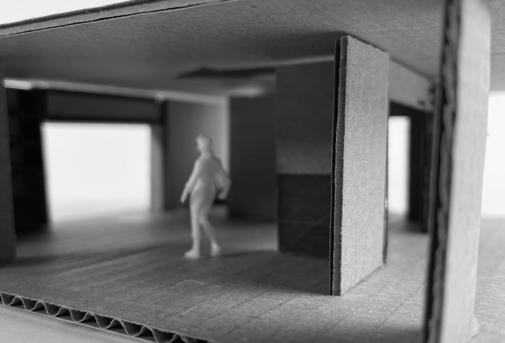
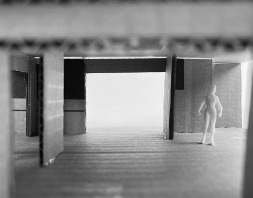
SKETCH MODEL 04
- OPENiNGS (connecTion To The 1:20 modeL)
[MoDeL sCaLe 1:100]
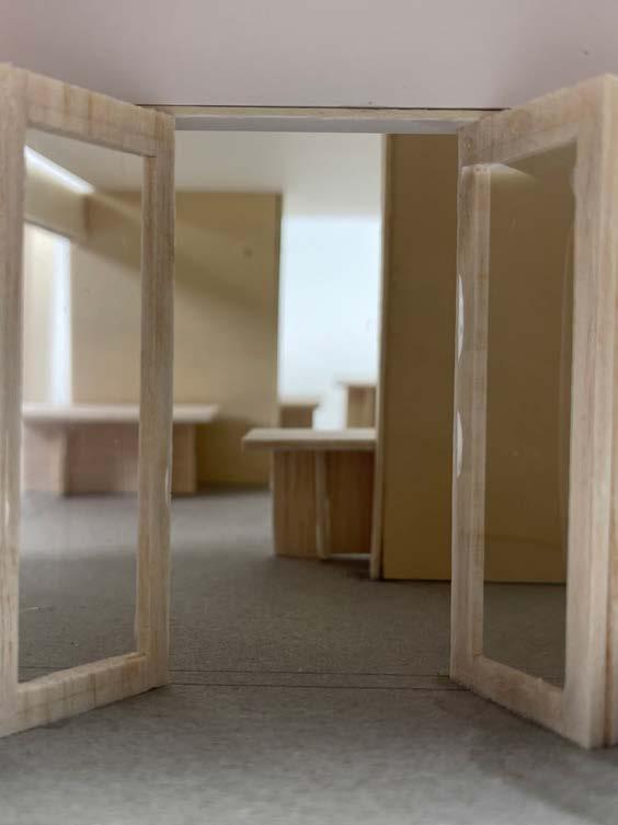
Re-looking at the main feature of the double exposure 1:20 model of openings and perspectives, I decided to make this sketch model to see it it would somehow suggests the same effect as the previous model.
I was satisfy with the results therefore I proceeded with this final proposal planning.
FINAL PROPOSAL
My final proposal showcases the geometric planning and sculptural elevation to enhance's Adam House's features while adding functional facilities for users, which focused on the undergrad students. Every design features are designed from the site surveys, research , field studies and numerous iterations to best suit the chosen location, Adam House unused spaces, the basements.
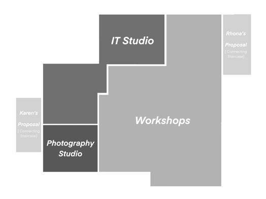
PROPOSAL PROGRAMME
There are three main facilities which then separated to smaller specific facilities.
WORKSHOPS
- work benches with hand equipments
- storage
- Terrace (extension)
IT STUDIO
- Desktops
- printers
- light boxes
PHOTOGRAPHY STUDIO
- Free plan with movable equipments
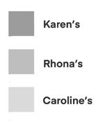
Karen's Proposal
Photography Studio Co-work
Storage
Workshops
Staircase IT Studio
Terrace (Extension)
Common area
Rhona's Proposal
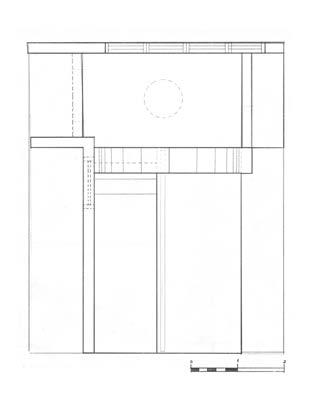
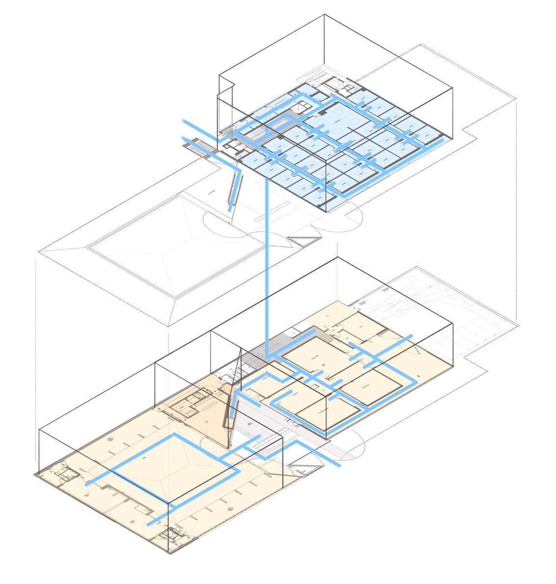
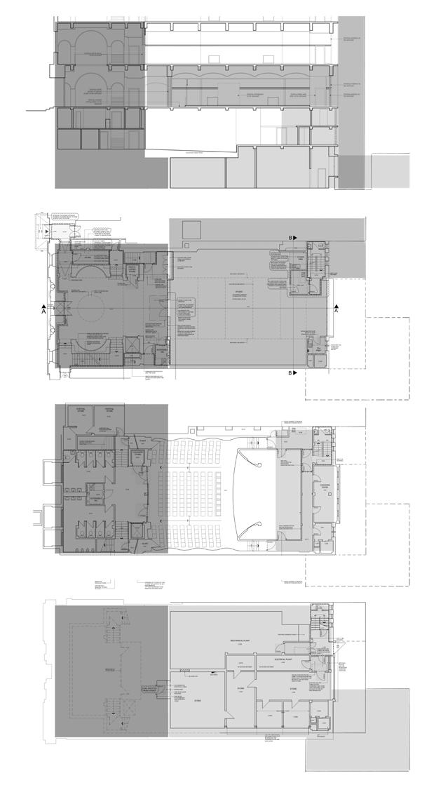
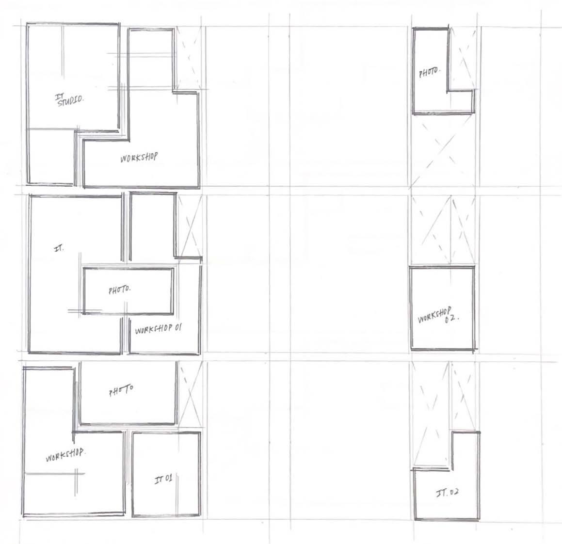
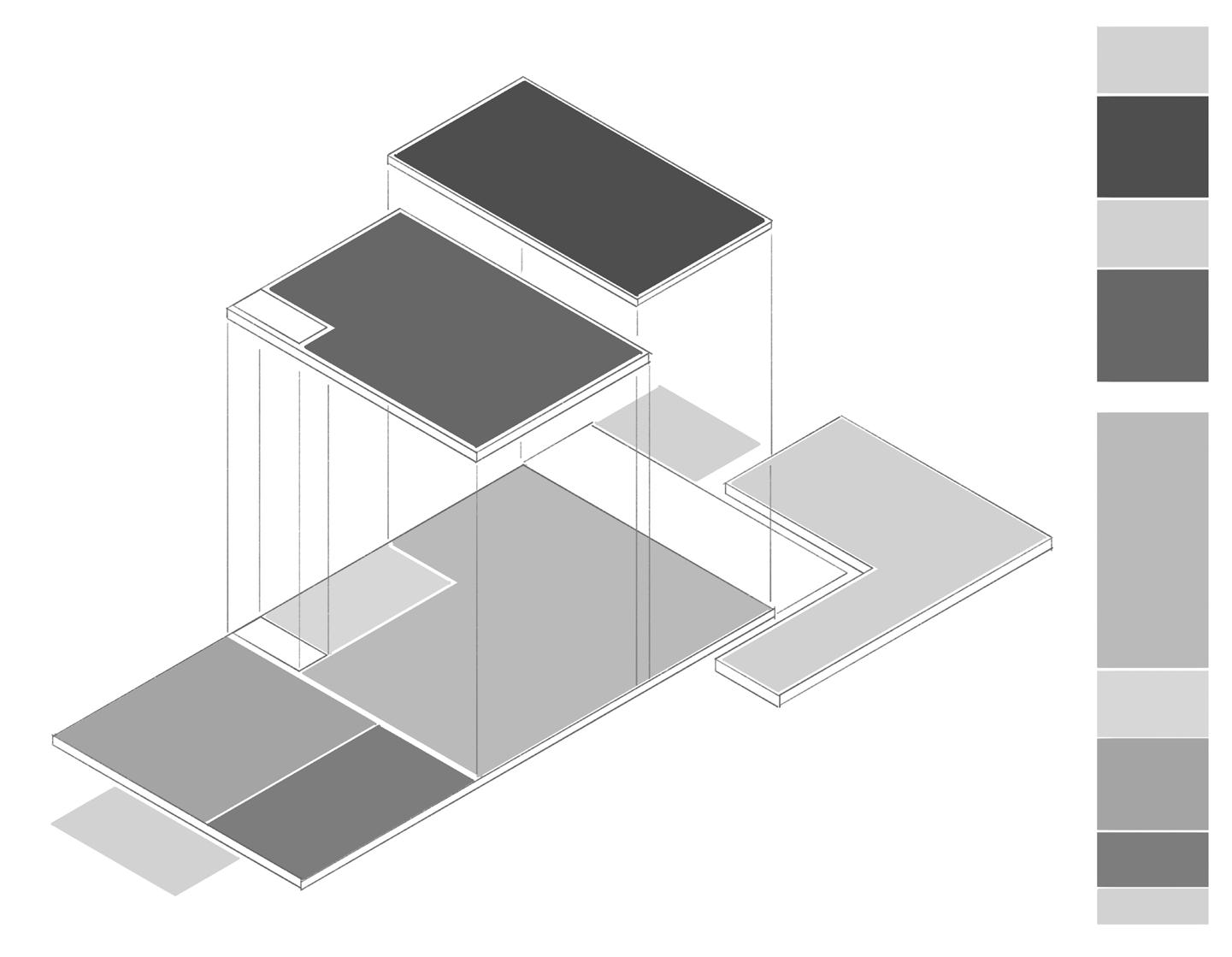
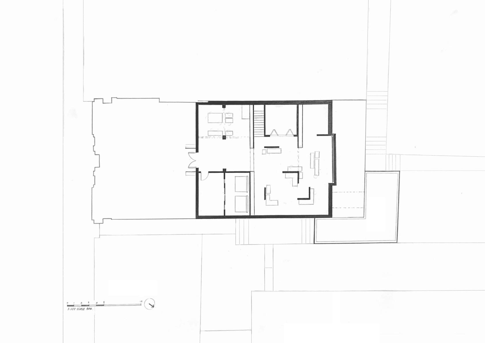
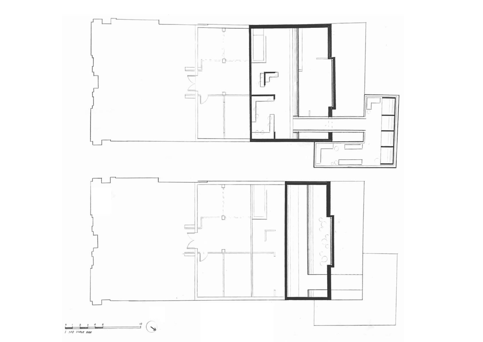
PROPOSAL FLOOR PLAN -
A2 - 1:100 SCALE
FLOOR PLAN DIAGRAMMATIC DEVELOPMENTS
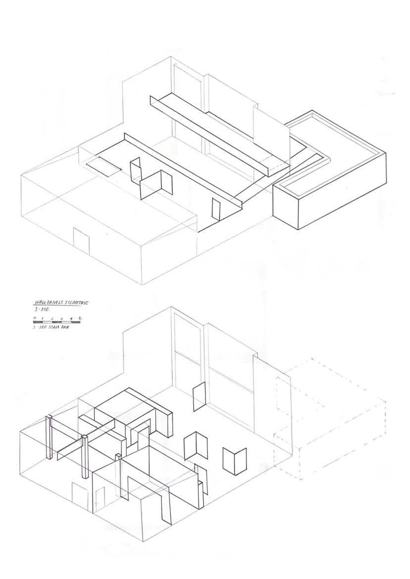
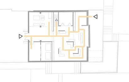
ISOMETRIC
The isometric are drawn to showcase how wall panels are placed and how they shapes different area. It is also drawn to show connection to how I first started developing the initial proposals.
SITE ANALYSIS
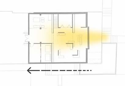
Taking in account that there is only one main window facade, my placen=ment of functions follows that. Photography and co-work area are placed the furthest as they require darker atmosphere while the studio, common area are placed closest to the window to create a good workable and lively environment for users. The circulations depends on the users so it is very interactive and deliberate to my concept of THRESHOLD and TRANSITION.
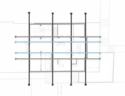
DESIGN GRIDS [LAYOUT]
The grids are determine and created from my own requirements to create a coherent layput. The black lines follows the ceiling height change, the blue follow the window length and the grey follows the entrance extrusion.
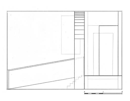
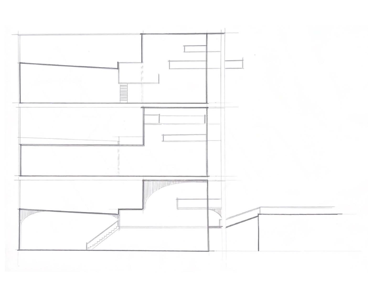
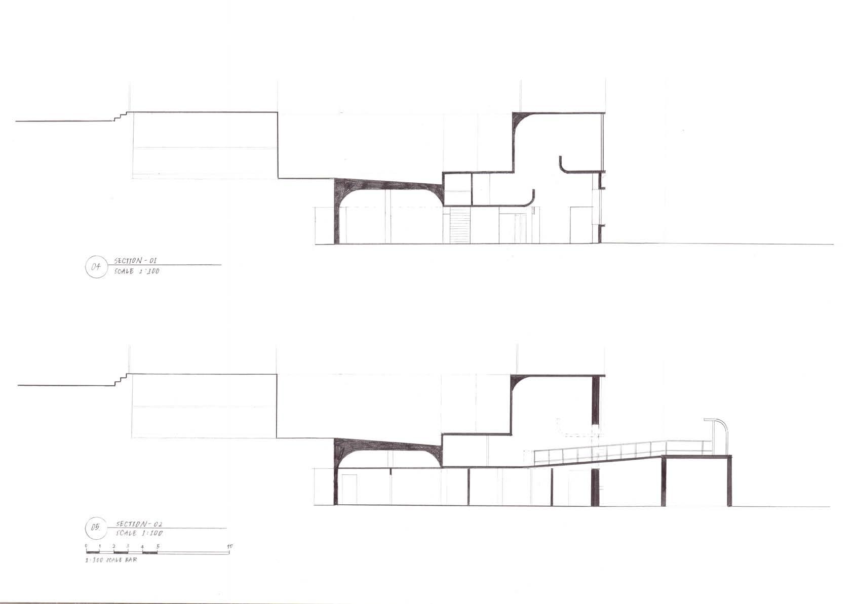
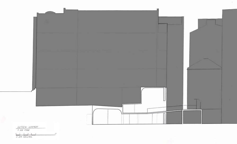
PROPOSAL SECTiONS
SECTION DIAGRAMS
The diagrams are drawn to show the contrast of my proposal design with the existing heavy mass building above.
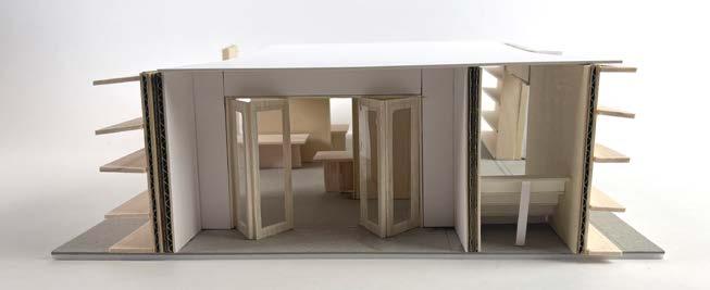
PROPOSAL SECTION LIGHT STUDIES
[sKeTch modeL 03 ReFeRence]
PROPOSAL INHABITED SECTION &
A2 - 1:50 SCALE
A2 - 1:100 SCALE
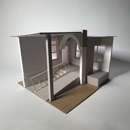
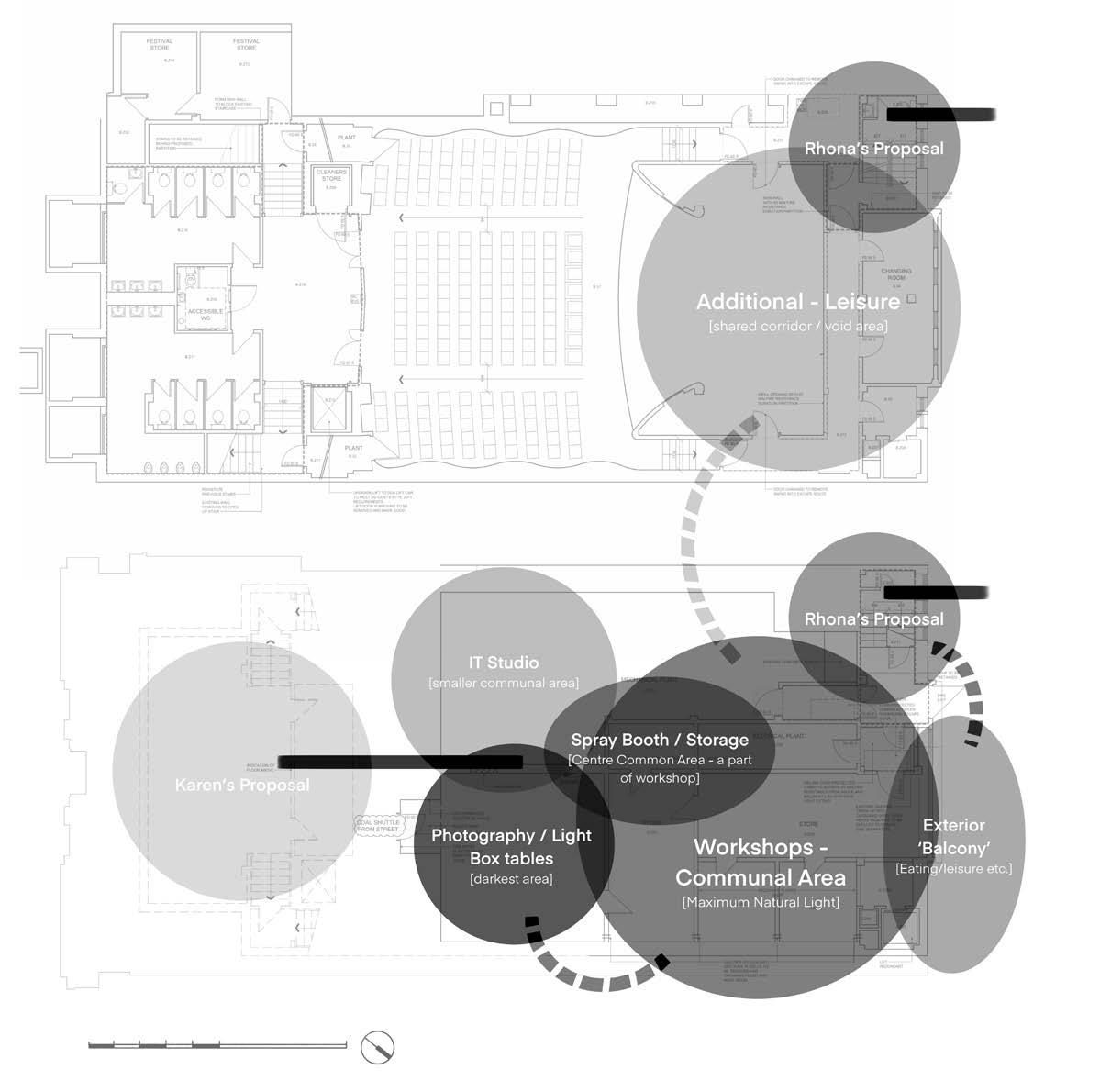
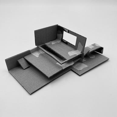
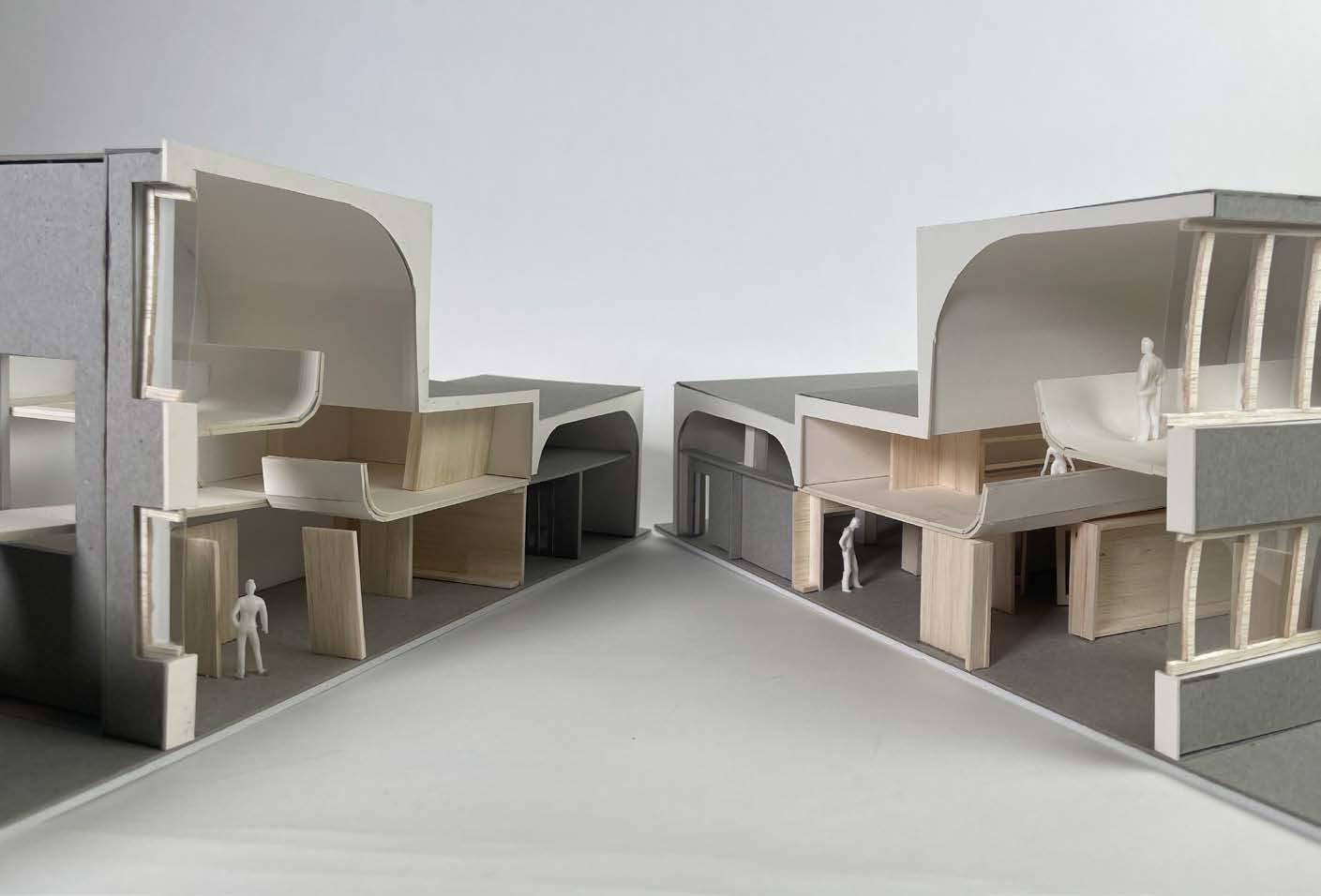
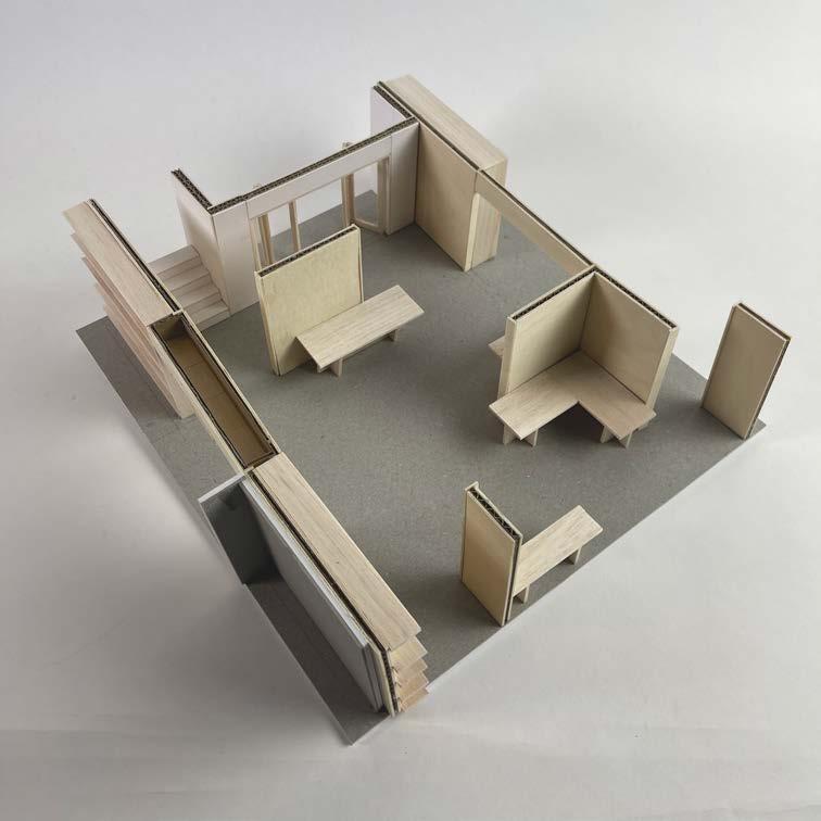
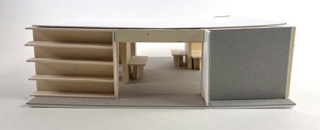
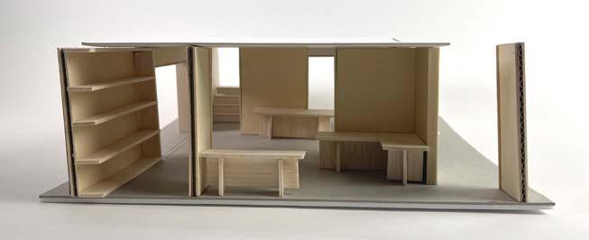
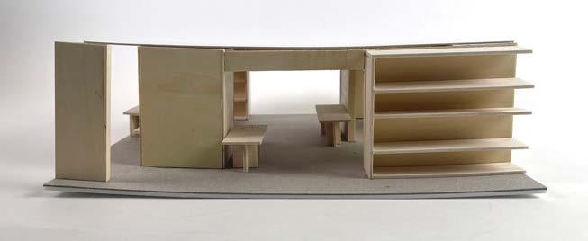
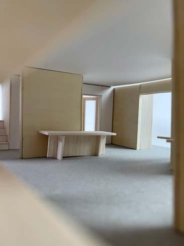
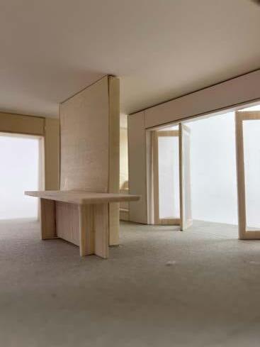
FINAL PROPOSAL MODELSECTIONAL MODEL
[1:50 SCALE]
FINAL
PROPOSAL MODELMATERIALITY
[1:25 SCALE - sKeTch modeL 04 ReFeRence]
Timber - Balsa wood
Plaster - White cardboard
Raw Concrete - Grey cardboard
Smooth Concrete - Beige cardboard
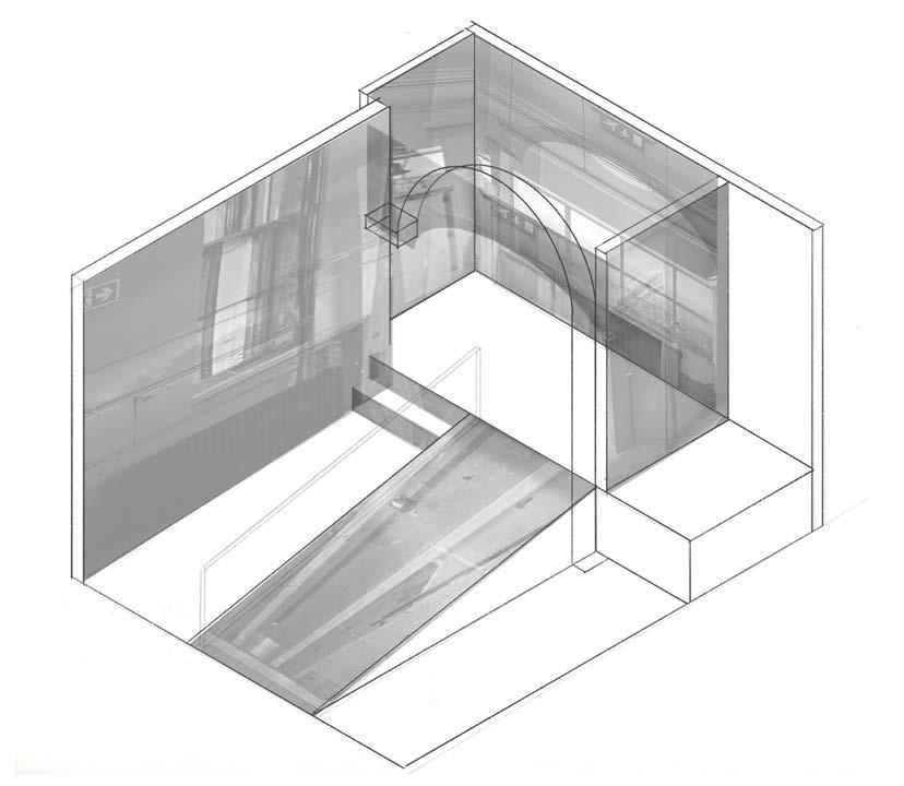
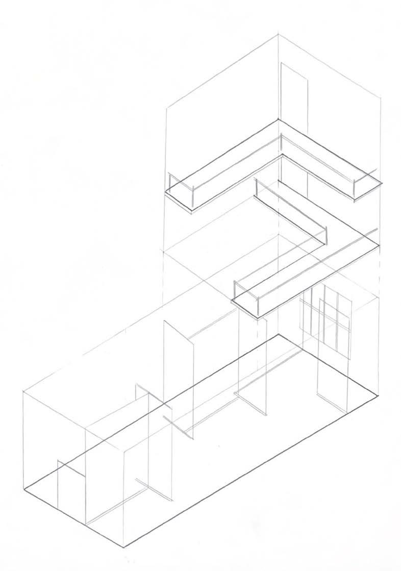
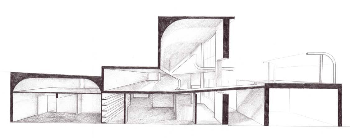
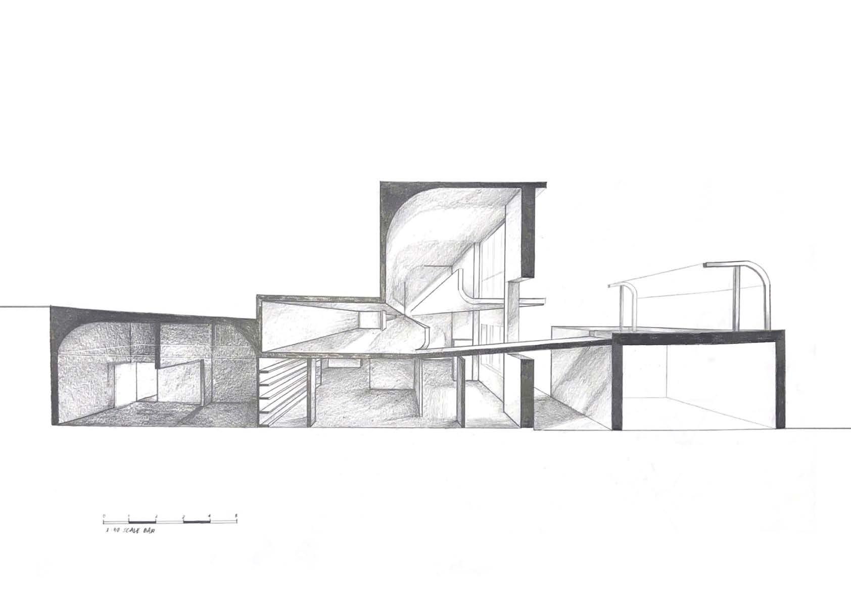
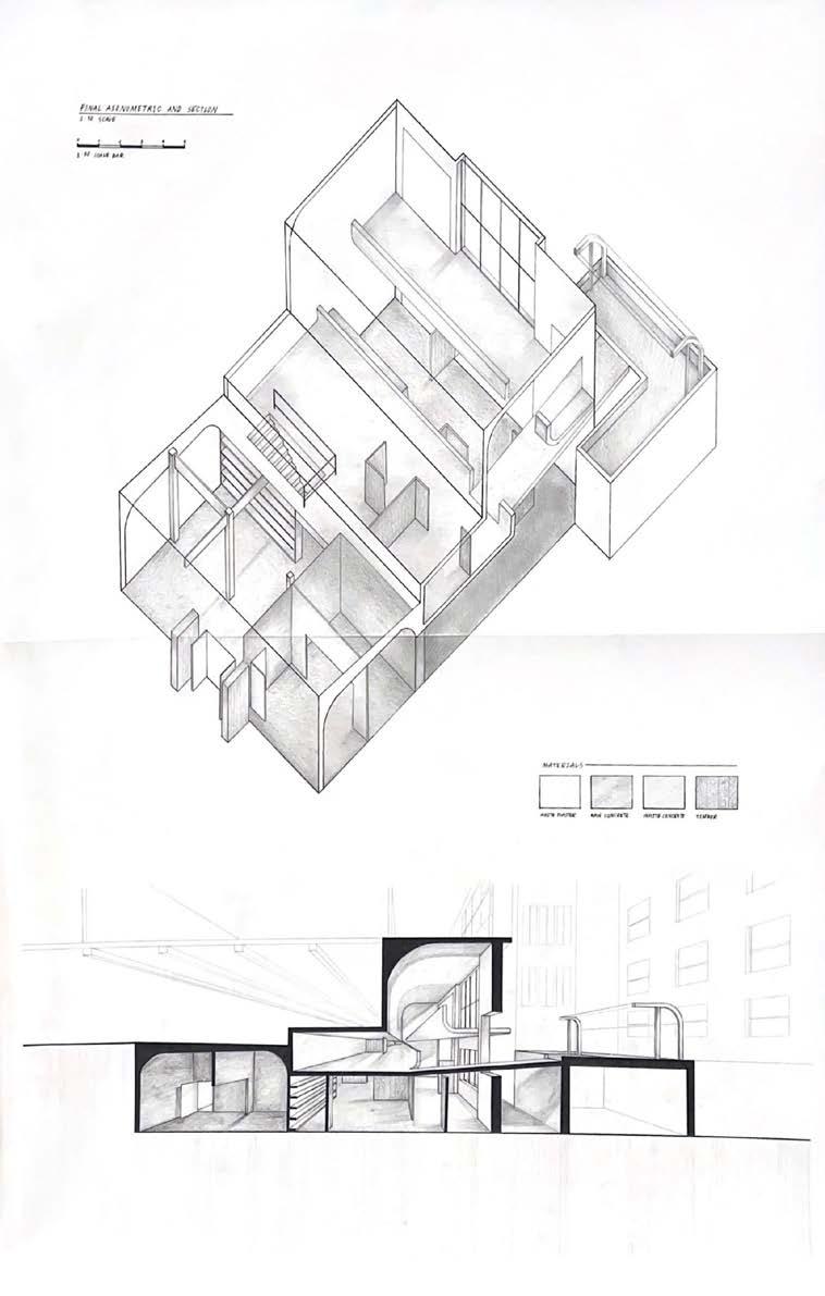
KILLER IMAGE
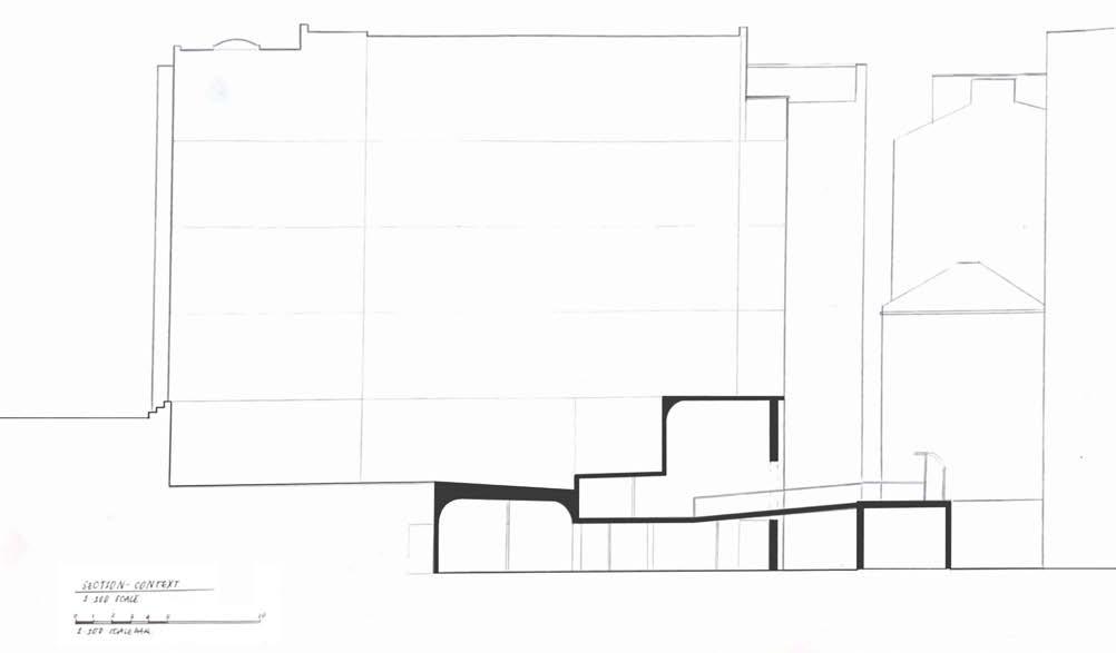
A0 - 1:50 SCALE - BOTH DRAWINGS
I want to showcase how everything ties in together therefore I decided to draw a 1:50 axonometric so every components can be seen.
Initially exploding axonometric (heightwise) was considered however it won't show how the space and circulation are flow so it was not finalised.
The section was added with the context to show its relation to the existing building and how light study was a key feature in my proposal.