CONT ENTS
THE LOGO
Design
Treatment
Anatomy
Exclusion zone
Minimum Size
THE FONTS
Primary font
Secondary font
Corporate typogrophy
THE COLORS
Corporate color palette
MCW Black
Color proportions
BRAND MISUSE
Incorrect application
FLORIAN TESSLOFF - CORPORATE MANUAL
version 1.0 / 2023 - created by yvonnehartmann.com
1
ABOUT
ABOUT
PROFOUNDNESS - CREATIVITY - INNOVATION - GROWTH - COMPASSION
Florian Tessloff is a German composer and producer based in Hamburg. His multi-genre compositions include soundtracks for renowned films and award-winning TV productions.
vulnerability - creativity - hope - courage - INDEPENDENCEAUTHENTICITY- HONESTY
Regularly working out of Los Angeles, Tessloff has been working with Oscarnominated film composers Mark Isham and David Newman on award-winning productions.
DONATA is a female artist who writes heartfelt songs about the different journeys in her life and how they make her grow both personally and spiritually.
Tessloff’s compositional voice has been shaped by his education in jazz, classical and electronic music at the Hamburg Conservatory and Berklee College of Music, Boston. He was awarded the German Music Authors’ Prize in the category ‘Composition Audiovisual Media’ in 2016.
2
CONTENTS
LOGO
Versions
Color Combinations
Anatomy
Safety Zone
Minimum Size
TYPOGRAPHY
Primary font
Secondary font
Corporate typogrophy
COLORS
Corporate color palette
Black + White
Color proportions
STATIONERY
Letter Head
BRAND MISUSE
Incorrect application
3
4 5 6 8 10 11 12 13 13 14 16 17 18 19 20 21 22 23
LOGO
VERSIONS - COLOR COMBINATIONS - ANATOMY - SAFETY ZONE - MINIMUM SIZE
The logo aims to reflect the versatile and innovative character of Tessloff’s music, without neglecting the noisy signature he adds to his work.
The logomark, in an abstract way, represents a combination of the artist’s initials “f” and “t” while also making reference to a clef. The combination of round vs edgy shapes, symmetry vs asymmetry and the colour grading represent the experimental and profound, yet consistent nature of the artist and his work.
Barlow Condensed Italic has been selected for its clean and elegant character. The dynamic slanted orientation of the logo mark and logo type was chosen to represent growth and progress.
4 4
FULL VERSION
The full version of the logo includes the logomark as well as the logotype. In its original version the logomark is displayed in the corporate gradient color while FT-Mint is used for the logotype (see corporate colors on page 17).
SIMPLIFIED VERSION
The simplified version of the logo consists of only the wordmark in the corporate font Barlow Condensed Regular Italics. In its original colour version it is displayed in FT-Mint.
5
COLOR COMBINATIONS
On a white background the full logo version should be displayed in its original colour version (FT
gradient) or alternitavely in the corporate colors FT-Mint or FT-Black.
The simplified version may be displayed either in FT-Mint or alternitavely in FT-Black.
6
COLOR COMBINATIONS
The logo may be displayed in the following color combinations. On all other backgrounds (including
photos), the logo should be displayed in either black or white. The use of the corporate colors
FT-Yellow and FT-Mint should be avoided for backgrounds.

7
ANATOMY
The original logo version is designed with an anatomy based on balanced proportions between all its elements using the golden ratio.
The established proportions shall be respected in any use case of the logo.
8
9
SAFETY ZONE
The safety zone should be respected to keep the logo free of any other graphical elements and guarantee its visual impactand visibility.
10
MINIMUM SIZE
The minimum sizes should be respected for print and online to guarantee its correct visibility and legibility.
For applications smaller than 80px or 30mm of height, it is recommended to use the simplified logo version.
11
TYPOGRAPHY
PRIMARY FONT - SECONDARY FONT - CORPORATE TYPOGRAPHY
The selection of the corporate typographic elements has been aligend with the artist‘s values and vision.
The corporate fonts represent a harmonic and complementary element to the logo.
12
BARLOW MEDIUM
Abcdefghijklmnopqrstuvwxyz
PRIMARY FONT
BARLOW REGULAR
Abcdefghijklmnopqrstuvwxyz
Barlow is a very clean font, yet having its own character. Its elegant, modern style with straight lines and round letters represents the artist’s professional, sophisticated and empathic nature.
BARLOW EXTRA LIGHT
Abcdefghijklmnopqrstuvwxyz
Barlow Regular or Light should be used for body text, Barlow Semi-Bold for secondary headlines (H4 + H5).
BARLOW CONDENSED MEDIUM ITALIC
Abcdefghijklmnopqrstuvwxyz
BARLOW CONDENSED ITALIC
Abcdefghijklmnopqrstuvwxyz
SECONDARY FONT
Continuing the dynamic angular logo design, Barlow Condensed Italic and Medium Italic are used for primary headlines (H1 - H3) as well as taglines and subheadings.
13
CORPORATE TYPOGRAPHY
Barlow Condensed is exclusively used for headlines (H1-H3), subheadings and taglines.
Barlow Regular and Light are used for all body texts as well as smaller headlines (H4-H5), buttons, etc.
A combination of the fonts is ideally used respecting the golden ratio (see examples).
Barlow Condensed Medium Italic, 51pt
Barlow Condensed Italic, 19pt Barlow Light, 12pt
14
Barlow Condensed Medium Italic, 51pt
Header H1
Lorem ipsum dolor sit amet, consectetuer adipiscing elit, sed diam nonummy nibh
Header H4
Barlow Medium, 19pt
Lorem ipsum dolor sit amet, consectetuer adipiscing elit, sed diam nonummy nibh
Barlow Condensed Italic, 19pt
Header H2
Lorem ipsum dolor sit amet, consectetuer adipiscing elit, sed diam nonummy nibh
Barlow SemiBold, 12pt
Header H5
Lorem ipsum dolor sit amet, consectetuer adipiscing elit, sed diam nonummy nibh
Barlow Condensed Italic, 31pt
Header H3
Lorem ipsum dolor sit amet, consectetuer adipiscing elit, sed diam nonummy nibh
All heading sizes corresponding to body texts with a size of 12pt
15
COLORS
The corporate colors are aligned with the artist’s values and vision and thus play an important role of the corporate design.
The IAB color palette consists of the following primary and secondary colors and its use is recommended for any kind of media.
16
PRIMARY PALETTE - SECONDARY PALETTE - BLACK + WHITE - COLOR PROPORTIONS
PRIMARY PALETTE
Colors used primarily for all type of media and corporate assets. FT-Gradient is only used for the logo.
SECONDARY PALETTE
Colors used to highlight and compliment the primary color or for backgrounds.
RGB: 70/129/137
CMYK: 72/31/28/14
HEX: #468189
PANTONE: P126-4 C
RGB: 186/163/79
CMYK: 27/28/76/10
HEX: #BAA34F
PANTONE: P6-6 C
COLOR 1: FT-Mint
COLOR 2: FT-Yellow
FT - BLACK
RGB: 9/9/9
CMYK: 84/73/62/92
HEX: #090909
PANTONE: Black 6 C
FT - WHITE
RGB: 238/240/235
CMYK: 8/4/9/0
HEX: #EEF0EB
PANTONE: P134-9 C
FT - BLUE
RGB: 20/13/79
CMYK: 100/97/38/38
HEX: #140D4F
PANTONE: P103-16 C
17
FT - MINT
FT - YELLO
FT - GRADIENT
BLACK + WHITE
Wherever the colors black and white are applied in corporate assets, the values of the corporate colours FT-Black and FT-White should be applied. Black and white can be used for backgrounds, texts or the logo itself.
FT - BLACK
RGB: 9/9/9
CMYK: 84/73/62/92
HEX: #090909
PANTONE: Black 6 C
FT - WHITE
RGB: 238/240/235
CMYK: 8/4/9/0
HEX: #EEF0EB
PANTONE: P134-9 C
18
COLOR PROPORTIONS
The color proportion scale shows the importance of each corporate color and thus their usage in relation to the other colors.
19
35% 35% 15% 5% 10%
STATIONERY
LETTER HEAD
The sizes, proportions and safety zones applied in the corporate stationery assets should be respected in order to guarantee legibility as well as a holistic application of the brand.
20
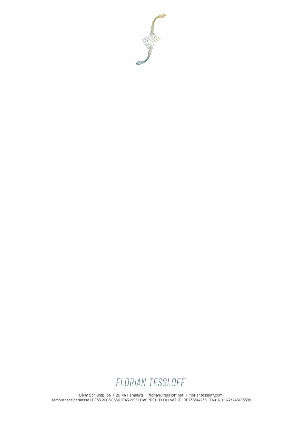
7mm Barlow Regular, 8pt 5mm 35mm
RESTRICTIONS
INCORRECT APPLICATIONS
The correct application of the corporate elements is very important in order to guarantee a coherent brand perception.
The following incorrect application cases should be avoided at any time.
22
DO NOT change the logo’s orientation or rotation


DO NOT disproportionally scale or resize the logo or parts of it


DO NOT display in colors not previously specified
Music by
DO NOT display with color combinations not previously specified


DO NOT add any effects to the logo or parts of it
DO NOT display any other elements within the logo’s safety zone
23
