
1 1. TBL. 12.
ARG. GRAFISK MIDLUN vor 2023


Hjá Iðunni bjóðum við upp á aðstoð sérfræðinga:
• Prent- og miðlunargreina
• Bílgreina
• Bygginga- og mannvirkjagreina
• Matvæla- og framleiðslugreina
• Mál- og véltæknigreina
Editorial:
Embla is a lifestyle magazine with a wide variety of topics for curious readers. Design chairs are an individual investment for every design lover. Moustache proposes a collection exploring new approaches to production and consumption. The Bold line is something totally new and makes every curious person look twice. The next topic is New Balance‘s history. How New Balance reinvented itself. All the ups and downs of the world‘s largest manufacturer of athletic shoes and apparel. On the other hand, analog photography is becoming increasingly popular. In addition, information on analog photography and how it become a trend. My Amma inspired me to use her analog treasures. My favorite thing to do when I visit her is to look through all her folders with old photos, which are particularly aesthetic due to the analogue texture of them.

Editor, layout, design: Alexandra Weseloh

Publisher: Tækniskólinn
Pictures:

Moustache, Complex, private collection
Font:
Univers 45 Light, 9/13 pt
Univers 55 Roman, 9/13 pt
Univers 65 Bold, 9/13 pt

Paper:
Inside pages 130gr
Cover 170gr

My name is Alexandra Weseloh. I am 21 years old, born on the 16.08.2001 in Hamburg, Germany. 50% German, 50% Icelandic. I grew up in Hamburg all my life and only visited Iceland on vacation. 2020 I successfully completed my graduation. In 2021 I decided to move to Iceland to study graphic media design at Tækniskólinn and of course to improve my Icelandic and to get to know my homeland better. Now I live in the middle of Reykjavík city and have been able to draw a lot of inspiration from there. Thanks to my Amma, I‘m in the south almost every weekend and experience nature up close. I have always had an eye for art, fashion and aesthetic design in my life. I love everything that is minimalistic and aesthetic. Pinterest is my best friend.
After graduating, I will move back to Hamburg, do my internship in a design studio and then probably do a Bachelor of Arts in media design.
During school, random design, advertisement and logos immediately caught my eye. My understanding of design has increased a lot and I analyze and criticize more about design. I found out that Helvetica Neue Extended is my favorite font. If I were a Pantone color I would be Pantone Blue 072 C.
Takk fyrir mig!
Since its launch in April 2009, Moustache, a French publishing house in the field of contemporary articles and home furnishings, under the impetus of Stéphane Arriubergé and Massimiliano Iorio, is forging close links in a network of complicity and expert knowledge in design fields.
An active participant in the present-day writing of the history of manufactured articles, Moustache proposes a collection which explores new approaches to production and consumption. Its articles and pieces of furniture involve their users in their own contemporary history. To the market constraints linked to the ever-increasingly insistent demand for novelties and experiences on the market, Moustache prefers to build a long-term domestic world with a high cultural value. Rooted in the history of arts and techniques, the Moustache philosophy combines design and pattern in the present: attentive and responsible production responds to his searches for new, aesthetic, function and relevant shapes.
Committed, Moustache is surrounded with designers for whom it is essential that convictions and points of view be shared. The result of a well thought-out dialogue between technique, strong identity and contemporary use, each article with its disparities forms the contours of the same family.
Moustache is attached to the heritage value of the articles, evidence of a society, its developments and its uses. It offers to share its soul, its ideas and its values. The environment it reveals according to an enlightened editorial line, a catalogue of objects linking some with others according to the principles of simplicity and accessibility. A distinctive and remarkable symbol, Moustache publishes a collection with a character which, today, is imposing its presence in the design environment.
Inspired by the Bauhaus classics, designers had been experimenting since 2004 with shaped metal-tube chairs, with the intuitive desire to make a chair composed 100% of tube. Fascinated by the idea of a continuous line that draws a three-dimensional object. On visiting the Belgian upholstery company Drisag, the idea of adding polyurethane foam padding directly around the metal tube came up to create a chair that is visually only lines. After extensive searching and testing, the textile chosen to cover the foam is produced by a sock factory, which knits an extralong tube. Thinking of the original tube which is made thicker by the foam, the chair is called BOLD, just as the thicker version of a typeface is described.
In 2009, Stephane Arriuberg and Massimiliano Iorio create the company Moustache to produce furniture. The BOLD chair is the first object in their catalogue, followed a few years later by the bench of the same name.

The EXTRA BOLD armchair takes up the radical constructive principles of the BOLD range by combining two large tubes and, contrary to what it suggests, offers surprising comfort. Like the chair, the stool and the bench before it, the EXTRA BOLD armchair alternates taut, soft curves that act successively as seat, back and armrest.

Its strong sculptural dimension contrasts with the sensation of comfort experienced once seated on the large diameter tubes, upholstered with a very thick layer of injected foam.
Several technical details buried in the depth of the seat and an invisible assembly system allow the seat and backrest to be flush with each other, so that barely seem to brush against each other to come together.
Text source: BIG-GAME
Photo credit: MOUSTACHE
STÖÐIN ER AÐ BREYTA NEIKVÆÐRI HUGSUN UM FÖRGUN ÚRGANGS, SÉRSTAKLEGA PLASTS Í JÁKVÆÐA.
WWW.STODIN.IS

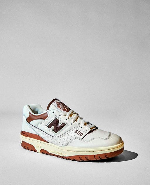
New Balance is one of the world‘s major sports footwear and apparal manufacturers. The brand was founded in 1906. New Balance claims to differetiate its products with technical features, such as blended gel inserts, heel counters and a greater selection of sizes.

New Balance is committed to doing business with a responsible leadership, which means striving to have a positive impact in the communities in which they operate. New Balance believes in protecting our planet. The company is constantly looking for ways to minimize and prevent negative environmental impacts in their operations and global supply chain.
For many people, it‘s what New Balance has been able to do in the last three years that has captured their attention. Its smart collaborations with relevant brands have attracted younger and more diverse audience. People were in search of something new that was actually attainable, but still felt special and New Balance was able to provide that. The hype for sneakers has increased.
New Balance has made it a priority to create the top running shoes on the market since its start. They weren‘t designed to attract attention. They were built to work. Despite their unremarkable exterior, they gathered fans of all ages who cherished the grey suede and mesh shoes and their practicality. The company‘s
MADE in USA line rose to prominence as one of its best quality product lines. Only New Balance, a big shoe manufacturer, still makes more than 4,000,000 pairs of athletic shoes annually in the US.
With the introduction of the original 990 in 1982, one of its most significant launches occurred. It was the first pair of sneakers ever sold for $100. The 990‘s expensive price tag made it a hot commodity on the streets.
New Balance has always had a core following. But for others, its reputation as a go-to for dorky fathers was difficult to shake. New Balance was seen as a dad brand. From a style and aesthetic standpoint, they had a great appeal to an old, white male.
But the controversy it had to deal with a few years back pales in comparison to being called an old people‘s shoe with no style.
When then-vice president of public relations Matt LeBretton opposed the Trans-Pacific Partnership, a trade agreement that threatened the company‘s US manufacturing, people mistook it for a support of Donald Trump. The public perception trial ruled against the mistake. Soon after, some decided to boycott the shoe company, and others threw their pairs in the trash.
It would be an understatement to say that the company needed to restore its reputation. It issued a statement at the moment outlining its stance on Trump. Since then, the company has positioned itself as a venue for all kinds of collaborators, which has helped it stay clear of the pro-Trump connections that beset it only six years ago. The aftermarket indicates that many customers aren‘t obsessing over the situation, even though it doesn‘t convey the whole story.
The sixth-fastest growing shoe company on the platform, New
Balance saw a 200 percent increase in trade from 2021 to 2022. That can be credited to its ongoing collaborative efforts, but the dad shoe craze from 2018 provided the original impetus. Suddenly, fashion-conscious people were gravitating toward pairs of shoes designed for old white guys, like the 990v4.
Collaborations are currently the driving factor. However, the company has used them before. Some of the most sought-after releases from the 2000s and 2010s were released on Japanese labels like United Arrows and Mita. Retailers in Europe like Solebox and Foot Patrol have developed their own distinctive products.

Since more than ten years ago, well-known streetwear stores in the US like Kith, Bodega, and Concepts have been working on some outstanding sneaker projects with the company. They were all well-made sneakers that appealed to the same aesthetic and were wellreceived by the typical sneakerhead customer. While long-time collectors may have been waiting in line for those collaborations, attracting a new client wasn‘t as simple. The current collaboration strategy of New Balance seeks to address this problem by placing a greater focus on diverse storytelling that highlights each collaborator‘s distinctive viewpoints. It‘s more about using sneakers as a platform to communicate these tales than it is about the shoe itself.
They determined that collaborators shouldn’t just translate a singular theme to a sneaker and add some interesting color choices. Everything from the product to the marketing campaigns needed to feel tailored to them.
Larger companies like Nike and Adidas have found great success with the strategy of giving their partners more freedom. Now that it was being done, New Balance was doing it in its own unique manner by utilizing obscure brands and creators that larger audiences might not be familiar with. Additionally, the product line expanded, providing everything from retro basketball sneakers to techy 2000s runners, making it easier to compete with some of its rivals‘ product lines.
With a dedicated internal team in place, Joe Grondin, who set their new strategy in motion began to build his network of collaborators, a who’s who of modern street culture including names like Aimé Leon Dore, Joe Freshgoods, and Salehe Bembury.
Joe Freshgoods is one of the easiest people to deal with and recognizes the value of his community. Usually having a vision for the rollout and concept before he even knows what type of sneaker he‘ll be working on. Bembury is an experimental marketing genius. And Teddy Santis by Aimé Leon Dore, pays attention to even the backgrounds of his lookbooks.
With his campaigns that directly reference his Chicago upbringing and emphasize the Black experience in ways consumers aren‘t used to seeing from major brands, Chicago-based streetwear designer Joe Freshgoods introduced his own energy to New Balance. When it made its debut in February 2020, his ”No Emotions Are Emotions“ 992, a vivid red and pink colorway inspired by the human heart, stood out in contrast to the more subdued color scheme typically associated with New Balance shoes. However, the project‘s success extended beyond how the sneakers were made.

Despite the obvious success of his 992 release, there were still some detractors. New Balance purists docked it some points for being created using New Balance’s NB1 custom program. To them, it wasn’t a true collaboration. It was a critique that he took to heart.
But for Joe Freshgoods, engaging tales are more significant than whether or not his sneakers are well-received by collectors or sell out at a pop-up. His ”Outside Clothes“ 990v3 ad featured images of families relaxing on porches, young women playing double Dutch in the street, and uncles grilling in the backyard to depict a summer afternoon in Chicago. His ”Inside Voices“ 9060 release from earlier this year focused on the household, a distinct part of the Black family, and referenced relatable details found in Black homes, such as grandma making Sunday breakfast or making sure to take your shoes off at the front door.
Joe Freshgoods‘ opinion is echoed by American footwear designer Salehe Bembury. Bembury, a prolific repeat collaborator in his own right, has created a universe influenced by nature, beginning in 2020 with his orange ”Peace Be the Journey“ 2002R. The 574 Yurt, a practical take on the 574 with a working whistle installed on the heel, has been the most inventive version. Customers are eager to see Bembury‘s next creation because nothing else from New Balance appears quite like his.
Santis, Joe Freshgoods, and Bembury are prime examples of New Balance allowing its new partners to showcase 100 percent of themselves with their products. The brand isn’t just letting them tinker with color and material placement. They’ve each been able to build their own world and invite customers into it.
The energy surrounding the brand has allowed New Balance to keep growing its roster of designers, which means more unique stories.
There is no sign that the company is dumping its long-time partners, but the enthusiasm for these new initiatives has already shown to be highly effective. Even the brand‘s internal product has been influenced by it.
In the big picture, New Balance‘s primary revenue sources are not these limited lifestyle partnerships and highenergy in-line drops. But they still have a very positive impact on the company‘s image. New Balance has risen to the top three brands in large box retailers over the past few years.
Although the company will probably go through some growing pains. What New Balance is doing at the moment involves more than just developing overly advertised goods that command high prices on the secondary market. It‘s a lasting solution.

Photo credit: COMPLEX
Text source: COMPLEX
Analog cameras have become the most recent trend object. Several factors are responsible for the wave of enthusiasm. On the one hand, the continuing retro trend among young adults is causing increasing interest in buying old technologies. On the other hand, the photographers want to publish their analog shots digitally on social media in order to stand out from the crowd with their vintage-style photographs.

The term ‘Analogue Photography’ refers to photography using an analogue camera and film. Firstly, there’s the film camera, which means photographers can only take 36 shots at a time. There are different kinds of film: the 35mm one, the 110 (smaller format), the 120 (“medium format” and provides square imagery) and the instant film, used for Polaroids. The most common among these choices is 35mm film, which can be processed in your local photo lab, drugstore or supermarket. 35mm film comes in canisters and is characterized by its sprocket holes – little perforations which run along the edge of the film strip. 120 film, on the other hand, is larger and delivers square photos; this film doesn’t have sprocket holes. 110 format film is used with pocket cameras and produces small photos. Lastly, Instant photos do not require photo lab processing; they magically develop within a few seconds.
The film roll, just like a memory card for a digital camera, is removable. A roll of film is loaded into the camera and the magic begins once you start clicking: light interacts with the chemicals in the

film and an image is recorded. Once all 36 photos are taken, the creative process continues inside the darkroom, sometimes also called photo lab. Once there, the photographer proceeds carefully, as there’s a series of other chemical reactions that involve the development of the filmstrip, the projection of the image onto photographic paper and the development of that image from it. Each of these steps greatly influence the final look of the image and while experiments are encouraged, there are also rules to be followed (because it is chemistry after all).


The idea of waiting for something makes it more exciting, which perfectly applies to analogue photography. There is no screen to check your photos and you’ll only see what you have captured after the film roll has been processed, scanned and printed. Ask any analogue photography devotee and they’ll tell you that the wait is part of the thrill.
Once you get into analogue photography, you’re sure to find it creatively fulfilling. Modern-day apps and software have tried to emulate the effects that you get with film photos, but nothing beats the original; it’s more rewarding when you create it yourself rather than with a filter. Of course, the results may vary (depending on the lighting conditions, the film and camera used and the mood of your photo lab operator, etc.) but overall the analogue look is unmistakable. Colors are richer, the saturation is more dramatic, and the film grain adds soul and character to your images, they seem to evoke nostalgic and dream-like memories. Each film is a combination of ingredients such as contrast, color, grain, saturation and skin tone. Film captures light differently than a digital sensor. Experimentation and the thrill of the unknown drive us in our love for analogue.
Vantar þig uppsetningu á nafnspjöldum, bæklingum, reikningum eða umbrot á blöðum eða bókum?
Í forvinnslunni er tekið á móti alls kyns verkefnum til uppsetningar. Einnig er tekið á móti tilbúnum gögnum og þau undirbúin fyrir prentun.
Prentun er okkar fag.
Hjá Litlaprenti starfa prentarar með mikla fagþekkingu og fagmenntun til margra ára. Öflugur og fullkominn vélakostur skilar viðskiptavinum okkar vönduðu og góðu prentverki.

Litlaprent býður upp á fjölbreytt úrval á frágangi prentverks. En hvað er frágangur?
Frágangur er t.d. brot, vírhefting, fræsing, gormun, kjallíming, gylling, laminering, stönsun, upphleyping og margt fl.
Kynntu þér réttindin þín og fáðu frekari upplýsingar á heimasíðunni okkar grafia.is

Kjaramál, sjúkrasjóður, orlofssjóður, fræðslustyrkir, námsstyrkir, lögfræðiaðstoð
