
Typographic Card Deck

Various typefaces expressed uniquely as a part of a 26-card set.
The objective was to create a clean deck of 26 cards with each card representing a different typeface, and each typeface representing a different letter of the alphabet. The back of each card showcases an intricate pattern similar to that of a typical Bicycle brand card deck.
Client
In pursuit of an elegant design, I took inspiration from prestigious brands such as Aviano, Louis Viton, and Etihad Airways. Departing from my usual design aesthetic, I wanted to take a more elegant approach. I developed a minimal color palette made up of sophisticated colors like golds, blacks, and whites.
Skills Used
Typography/Pattern Making
Having specific fonts as subject matter for the patterns (on the back card face) forced me to combine fonts in different ways to turn them into consistent forms, which would be repeated vertically and diagonally to create whimsical patterns. Each pattern was conformed by a few of the same letters being attached in a symmetrical manner.
Personal Designed In
Adobe Illustrator


Page 1Project 1TypographyPattern Making Card & Pattern Templates Type Layout A AVIANO 2010 DISPLAY-SERIF Aviano is an extended titling face with influence from the power and timeless beauty of classical letterforms. A a E ELEVON SANS-SERIF Inspired by the science fiction genre, Elevon is a font that belongs amongst the stars. It has a square construction that strictly adheres to a grid, and this gives to the letterforms. e I IMPACT SANS-SERIF Impact is a sans-serif typeface in the industrial or grotesk style designed by Geoffrey Lee in 1965 and released by the Stephenson Blake foundry of Sheffield. I i 1965 B BODONI SERIF It was first designed by Giambattisa Bodoni in 1798 and is generally considered a “transitional” b F FUTURA SANS-SERIF Inspired by the science fiction genre, Elevon is a font that belongs amongst the stars. It has a square construction that strictly adheres to a grid, and this gives a futuristic feel to the letterforms. F f 1990 J JohnDoe SERIF J 1995 C COMIC SANS 1994 SANS-SERIF Comic Sans MS is a sans-serif casual script typeface designed by Vincent Connare and released in 1994 by Microsoft Corporation. C c G GEORGIA SERIF Georgia is a serif typeface designed in 1993 by Matthew Carter and hinted by Tom Rickner for the Microsoft Corporation. G g 1993 K KEFA SANS-SERIF K 2020 H HELVETICA SANS-SERIF Possibly the most widely used typeface worldwide, the Helvetica font has been liberally splashed across logos, signage, posters, and clothing, with its neutral, impassive style inciting both fervent fandom and outright hatred. H h 1975 L LUMINARI SERIF L 2008 A 2010 Aviano is an extended titling face with influence from the power and timeless beauty of classical letterforms. AVIANO Display-Serif A a
Color Palete
Dawn Parol Surf Co. Packaging System
Handmade packaging system for a hypothetical surf brand concept, de
signed to hold a block of surf wax.
The goal for this project was to create a brand with a concept of my choice, accompanied by a packaging system for a product developed by the brand. This packaging system consisted of three components; a box for the product, a decorative sleeve-like feature to seal the box, and some kind of bag or pouch for the package or product to rest in.
The goal for this project was to create a brand with a concept of my choice, accompanied by a packaging system for a product developed by the brand. This packaging system consisted of three components; a box for the product, a decorative sleeve-like feature to seal the box, and some kind of bag or pouch for the package or product to rest in.
The package was made using thick cardstock paper. A sheet of plastic was used for a window which would be on the font of the box. A sleeve component displays the brand logo cut out three times along each side. This interactive element elevated the user experience, making the logo apparent as the sleave slid over the box.
Client Personal
Packaging Design/ Branding/Typography
Designed In Studio Skills Used
-
DA W PA T SU R F DA WN PA TR O L S URF C O . DA WN PA TR O L S URF C O . AW N T R O L U RF C O . WN R O L C O . DA W PA T R S URF DA W PA T S UR F DA WN PA TR O L S URF CO . DA WN PA TR O L S URF CO . AW N T R O L U RF CO . WN R O L CO . DA W PA T R S URF DA W PA T S UR F DA WN PA TR O L S URF CO . DA WN PA TR O L S URF CO . AW N T R O L U RF CO . WN R O L CO . DA W PA T R S URF
Package Templates

Type Layout
DAWN PATROL
SURF CO.
SURF WAX


Cool Water 58º - 68º
About the Brand
Dawn Patrol Surf Co. is surf brand like no other. Providing gear for all skill levels, we aim to make surfing fun for everyone by providing an all enclusive comunity where all are welcome.
Color Palete

Page 2Project 2PackagingLogo DesignTypography
The Early Bird
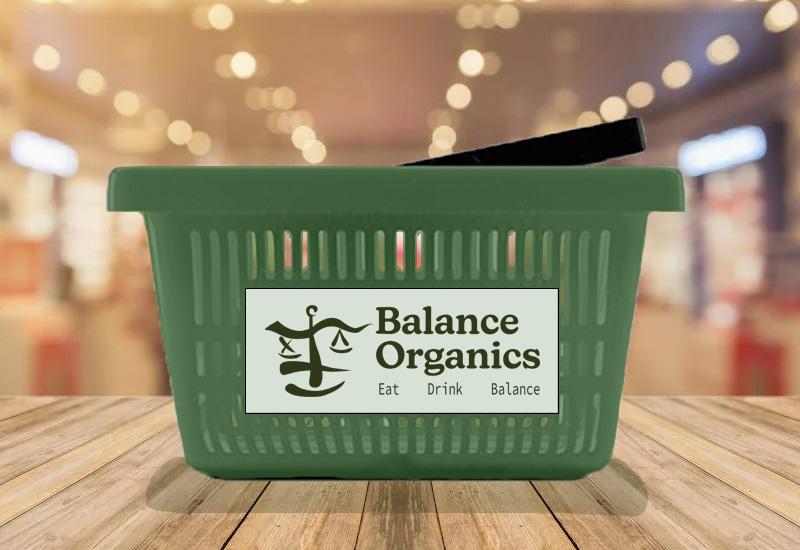
Balance Organics Logo Concept

A handmade logo and tagline, given a predetermined name and concept, later elevated through digital logo iterations and mockups.
The prompt for this project revolved around coming up with a logo and style for a brand, only given the name, and a small discription exclaiming the concept of the brand. Given this information I was not only able to create various logo iterations which would be used for difrent types of publication, but capture the healthy/balanced lifestyle aesthetic through various digital mockups.
Client
Designed In Adobe
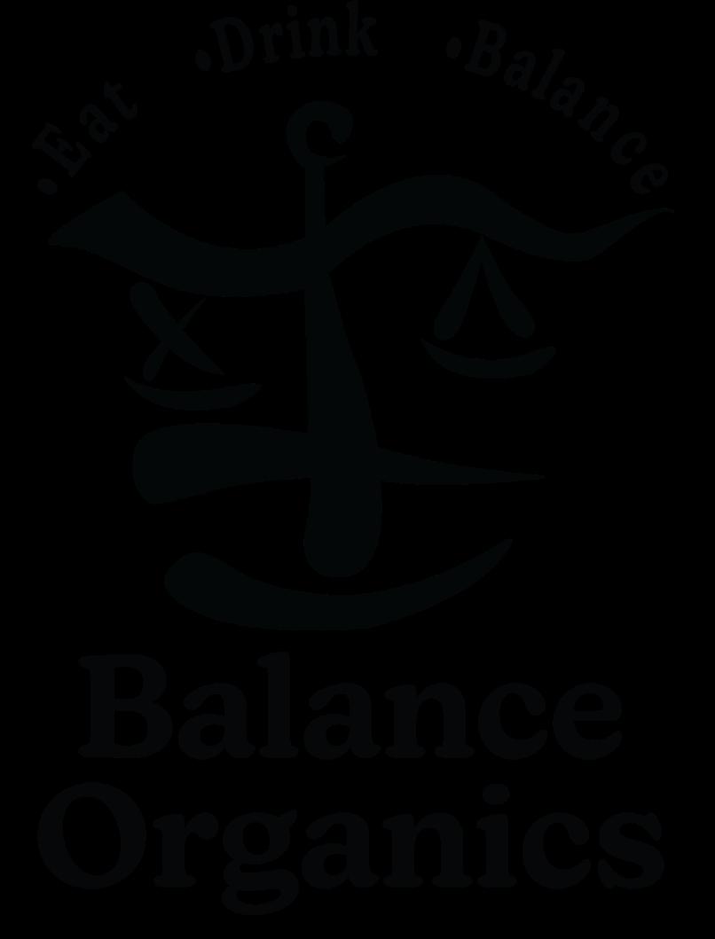
The idea of using a scale for the logo made sence given the name of the brand. I drew out a slightly abstract logo with lots of curves and round edges taking inspiration from healthy grocery store brands like Whole Foods and Down to Earth. The color palette and typeface accompanying my logo were heavily influenced by Whole Foods. I fine tuned the logo by hand trying to balance it having an organic, abstract theme, with the look of a scale.
Logo Design/Braning/ Mockups
Personal
Vertical, horizontal and circular web versions of the logo were developed to fit into the mockups I had in mind. Going back to my inspiration, I found a lot of photos taken inside or outside of grocery stores. With that in mind, the photos I based my mockups off of were all taken in grocery stores, or included utilities and objects anyone could find in a grocery store. Illustrator/ Photoshop
Skills Used
Logo Types
Type Layout

Balance
Organics
Eat Drink Balance • Eat • Drink • Balance


Color Palete

Page 3Project 3BrandingLogo DesignMockups
The Edible Magazine
An 8 page magazine with a food concept, featuring original photography and graphics, as well as two single page advertisments.

The goal for this project was to create a magazine with a concept of my choice. In search of a funky but clean style I neatly organised my subjects before I took photos. The photography was acompanied by brightly colored graphics to give off an energetic/fun aesthetic
Client Personal
Designed In Adobe Indesign
Skills Used Editorial
With a food related concept in mind I developed a creative name for my publication. The Edible Magazine was a fun name that complemented my design style well, and I put a fun twist on this concept by adding a mascott in the bottom right corner of some pages giving him a bright yellow speech bubble for ironic interactive quotes. This bright yellow speech bubble shape was a major catalist for the publications graphic elements.
Knowing my photography had to be vibrant to match the the whieght of my graphics I took insperation from colorfull foods like breakfast toasts and acai bowls. This made it easy to choose a theme and prompts for the stories my magazine would hold. To henhace the realism of my magazine I also added two single spread advertisments. Adapting to brand guidelines and typographic layouts asociated with the advertiser was key for this step.
Type Layout Mast Head
“The Ultimate Acai Bowl”
With the up and coming generations so focused on health and wellness, acai bowls have taken the World by storm. With each year they have been getting more diverse and specific. It’s known that acai typically shares the bowl with other toppings and ingredients that help to make it the superfood that it is, but what want to know is exactly what you should add to your bowl to give it the most health benefits possible. So Alana, do you think you can start off by giving a brief background on the acai berryand why it’s so good foryou?
“The acai berry comes from an acai tree that is grown in rainforests. Acai is known to have many antioxidants and a lot of people look at it as a “superfood”. These antioxidants can help with blood pressure, cholesterol
Ingredients:
» slice of whole wheet bread
» avacado
» Everything bagel seasoning

» Smoked Paprika
Directions:
» Toast bread until desired
Advertisment
levels, and overall health general. It contains healthy fats and is low in sugar.
“contains healthy fats and
Ingredents to Consider
» Strawberries
» Blueberries
» Raspberries
» Mango
» Pineapple
» Granola
» Coconut
Now that the people have a brief description of what acai actually is, let’s explore some mix-in’s toppings. What do you typically pair an acai bowl with Alana?
“Acai bowls are most commonly topped with a variety of fruits like strawberries, blueberries, raspberries, mango, pineapple, and grano
THE EDIBLE M agazine


Color Palete

COLEGE OF CULINARY ARTS JOHNSON & WALES UNIVERSITY PROVIDENCE RHODE ISLAND THE FUTURE OF THIS IS
JOHNSON & WALES UNIVERSITY Page 4Project 4Editorial
WHERE FOOD BEGINS
“Acai bowls are very easy to add different nutrients and ingredients for the body”
•
JWU Mens Soccer Event Poster

Editorial event poster designed for the Johnson & Wales University mens soccer program.
The objective was to design a tabloid poster based on an event of our choice. Inspired by the branding for my schools athletic teams, I worked to combine my design style with with photos I took during practices and games to create an exciting, action packed poster for the senerio that Johnson & Wales would hold a soccer camp.
Skills Used
This project gave me the chace to expand my knolege about typographic hirarchy by forcing me to guide the readers eye. I found myself fusing text and graphics in persute of controling the order in which certain parts of the publication were read. Text color, whieght, and alignment were tailored to the way I wanted the pposter to be read.
Giving the poster an epic aesthetic was mandatory, so my colors were vibrant, and my featured image (bottom left) was taken during intense match moment to simulate the game day feeling. The background image showing the same sport with contrasting chill aesthetic was overlayed with a transparent blue layer. This would give the reader an idea of what game days felt like compared to practice days which is important to anyone trying to get recruted.
Client Personal Designed In Adobe Indesign
Editorial
Type Layout
SUMMER ID CAMP
2022-2023
JWU Providence ID CAMP MENS SOCCER
Graphic Elements
SUMMER ID CAMP


2022-2023
JWU Providence ID CAMP MENS SOCCER


All Sessions Held At Scott’s Miracle Grow Athletic Complex

600 Harbor Side Boulevard Cranston, Rhode Island 02905 AUGUST 3
Color Palete
All Sessions Held At Scott’s Miracle Grow Athletic Complex 600 Harbor Side Boulevard Cranston, Rhode Island 02905 9:30am: Registration
Page 5Project 5Editorial
AND WALES MENS SOCCER
JOHNSON
10:00am: Session1 12:00pm: Lunch 1:30pm: Scrimage 3:30pm: Campus Tour $50 AUGUST 3 2022 9:30 AM
2022 9:30 AM $50
Honolulu, Hawaii Currency Set
A four piece paper cerency set, specifically created for the state of Honolulu, Hawai’i

The objective was to design a curency set revolved around a state capital of my choice. Inspired by the gorgous cenery as well as animals indigionus to the islands of hawaii, I embarked on a mission to create a vibrant set of bills. In pursuite of an out of the box aproach I gave the wild life the spotlight aposed to hawaiian politicians.
Client
Personal
Designed In
Adobe Illustrator/Photoshop
Skills Used
Image Editing
This project flexed my ability to combine simple illustrations with aspects of the culture I grew up in. I took a lot of insperation from the cenery of Honolulu, as well as a diverse range of difrent types of foreign currency. With a paradise/tropical island concept forming in front of me I made the decision to create outlined graphics for four animals found on or around the Hawaiian islands. These graphics would be the centerpiece of each bill, and the background would be filled by pictures of famous landmarks located in honolulu.
Giving my bills a money like texture would lift the authentisity of the design, so I developed a simple pattern made with waving lines stacked on top of one another. This gave my bills a sence of realism, and nicley overlayed ther contents to level out the readability. Using simple graphics, and matching them with vibrant colors created a tropical theme for a set of currency witch would acsent Honolulu imparativley.


Page 6Project 6Image Edditing
Elements Type Layout HONOLULU THE PRIDE OF HONOLULU TWENTY DOLLARS RICK BLANGARD 20 20
Palete
Graphic
Color
‘Blue Wind’ Advertisments
Advertisments made for an intigrated marketing campaign for the Coke brand, tasked with shifting the brand in a transparent direction.
The goal for this project was to work with a marketing team to develop a transparent marketing campaign for hypothetical brand. After conducting reaserch to discover varius effective marketting stratagys, I was tasked with creating a concept for a line of drinks in persuite of a healthy image. This campaign would than be comunicated media, physical publications, and guerilla advertising.
The concept for this brand was inspired by poppy soda brands like Coca-cola, Pepsi, and Dr. Pepper. Blue Wind was a brand that made everyones favorite sodas with less sugar, making it a hielthier alternative. The colors would revolve around a blue theme, and certain design elements would change in color depending on the beverages flavor.

Skills Used
Marketing/Advertisment Design
Logos and can designs were made in Adobe Illustrator, and later brought into photoshop to henhance the reality of what the products and branding would look like. By combining loud, colorful graphics with a clean, healthy aesthetic, my team and I devised a unique brand and marketing aproach for a food & beverage brand looking to take on a heilthy direction. This concept was brought together with attention grabbing imagery, and a short but sweet tagline.
Client Personal
Illustrator/Photoshop
Designed In Adobe
Can Designs


Page 7Project 7MarketingAdvertisment
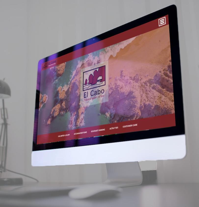
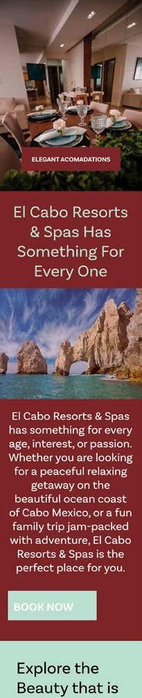
Cabo Resort & Spa Website Mock-up

The intent of this project was to design wireframes for a botique hotel website for web and mobile devices. Adopting insperation from the gorgous beaches in Cabo, Mexico, I set my sights on creating a family friendly concept combining adventure with relaxation. This concept was elivated with images to match the aesthetic, as well as a pristine but minimal color palatte and font.
Client
In search of creating a satisfying user experience for vacationing people/familys, I developed a family friendly boutique hotel concept based around relaxation and adventure, and placed it along the coast of Cabo, Mexico. The project required me to bring this concept to life through the development of a website wireframe. Taking insperation from the arcing rocks along the beaches of cabo, I came up with a logo and color pallete that screemed adventure with a sophistocated look.
Pairing images, colored blocks, and editorial content allowed me to create a steady flow for eyes to scan up and down the page. I emphasised important text with bright color blocks and buttons, and I found large high resolution images that projected the aesthetic I was going for.
Skills Used
Web Design
Personal Designed In Adobe XD
Web-Mockups for a botique hotel website with a concept of my choice, intended to improve the user experience when navigating simaler sites.


Page 8Project 8Web Design Web Mobile Menu
Color Palette
