

SENIOR PORFOLIO
Tabin Molzhon / GDES:4050 / Professor Gail McCarthy / October 23, 2024


AP HIC DESIGNE R
TYPOGRAPHY & COLOR PALETTE:
FONTS : Selfi Nue Round - Bold
Rufina - Bold
Rufina - Bold (Italic)
Rufina - Regular
Rufina - Regular (Italic)
Termina - Black
Termina - Bold
Termina - Regular
All fonts to the left are to be utilized only when working with the logo. All copy text associated with my brand will utilize the Korolev type face
Korolev - Heavy
Korolev - Bold
Korolev - Medium
Korolev - Light
ABCDEFGHIJKLMNOPQRSTUVWX YZ
abcdefghijklmnopqrstuvwxyz
INSPIRED BY THE OCEAN, DRIVEN THROUGH DESIGN
MAIN : SECONDARY :


WORD MARK :


FAVICON :

Client
Honolulu, HI
EDITORIAL HONOLULU HAWAII CURRENCY
Designed In
Adobe Illustrator
Photoshop
The objective was to design a currency set revolved around a state capital of my choice. Inspired by the gorgeous scenery as well as animals indigenous to the islands of Hawaii, I embarked on a mission to create a vibrant set of bills. In pursuit of an out of the box approach I gave the wild life the spotlight appose to Hawaiian politicians.
Skills Used
Image Editing
This project flexed my ability to combine simple illustrations with aspects of the culture I grew up in. I took a lot of inspiration from the scenery of Honolulu, as well as a diverse range of different types of foreign currency. With a paradise/tropical island concept forming in front of me I made the decision to create outlined graphics for four animals found on or around the Hawaiian islands. These graphics would be the centerpiece of each bill, and the background would be filled by pictures of famous landmarks located in Honolulu.
GRAPHICS/ SKETCHES
TYPOGRAPHY
HONOLULU
THE PRIDE OF HONOLULU DOLLARS
RICK BLANGARD
COLOR PALLET


EDITORIAL
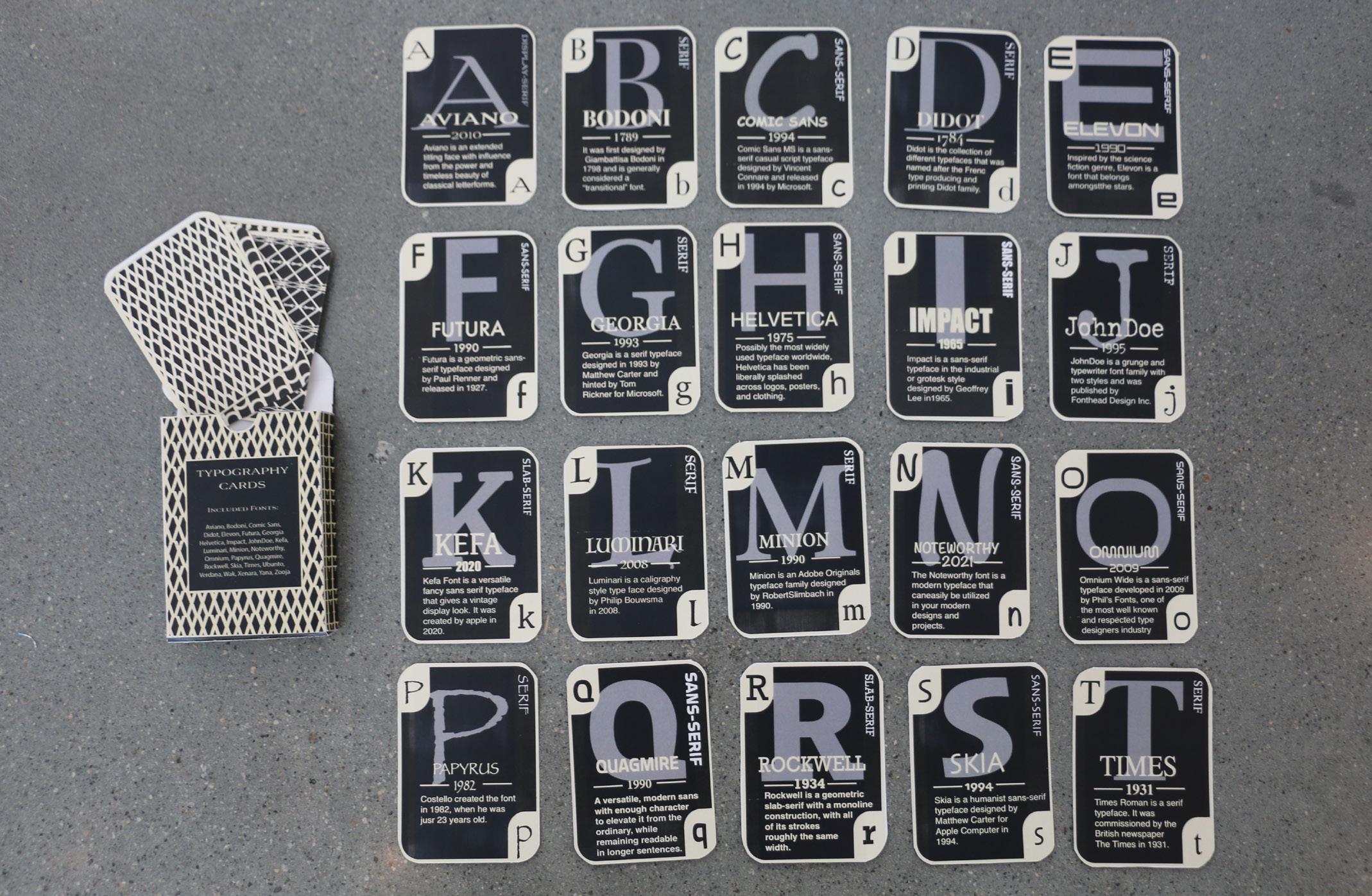
TYPOGRAPHIC CARD DECK
Client Personal
Designed In
Adobe Illustrator
The objective was to create a clean deck of 26 cards with each card representing a different typeface, and each typeface representing a different letter of the alphabet.
Skills Used
Typography/ Pattern
In pursuit of an elegant design, I took inspiration from prestigious brands such as Aviano, Louis Viton, and Etihad Airways. Departing from my usual design aesthetic, I wanted to take a more elegant approach. I developed a minimal color palette made up of sophisticated colors like golds, blacks, and whites. I developed intricate patterns for the box and card backs by combining fonts in different ways to turn them into consistent forms, which would be repeated vertically and diagonally to create whimsical patterns.

Aviano is an extended titling face with influence from the power and timeless beauty of classical letterforms. AVIANO
Display-Serif
TYPOGRAPHY COLOR


Client
Hypothetical Clothing Co.
BRAND IDENTITY STAYN CLOTHING LOGO TRENDS
The objective was to create seven different logos for a hypothetical clothing brand called Stayn Clothing Co. Each logo was inspired by a different design style used throughout time, resulting in a broad range of different directions that the brand could go in if started.
Designed In
Adobe Illustrator
Photoshop
This project required variation and versatility, which would show through my research and inspiration. I took inspiration from Stuzzy’s bold word mark through the creation of my initial logos. I then took that concept and carried it through in different ways based on the deliverables of the project, certain logos made use of the costume word mark I created while others made use of an underlying font with a graphic taking the spotlight. Graphically, the brand developed a rough splatter/ stain like feel with a vibrant color scheme.
Skills Used
Typography


NewYork City, NY
HI


BRAND IDENTITY
HARTINGTON FC BRAND IDENTITY
Client
Hypothetical Brand
Designed In
Adobe Illustrator
Photoshop
Indesign
The objective was simple; Create a brand from scratch. Once a theme and concept were chosen the aesthetic would be carried out through various deliverables ranging from vehicle and merchandise mock-ups, advertisements, logotypes, and brand identity elements.
Departing from my usual design style, I looked at this project as an opportunity to create something historical in a modern way. I did some digging and found out that Hartington, a major rural district in the UK, did not have a professional soccer team. I saw this as an opportunity to create a soccer team around the theme of this district. I made use of neutral colors to resemble the rural nature of the area, and used a reindeer as the main mascot for the team as Hartington was referred to as Stag Hill with a Stag being a type of deer.
Skills Used
Brand Identity
Illustration
Image Editing


BRAND IDENTITY
SPIN MICRO MOBILITY REBRAND
Client Personal
The objective was to redesign the aesthetic of a service brand, of which my choice was the Spin app. This would require changing the existing logo of the brand, as well as the branding elements and concept behind the brand.
Designed In
Adobe Illustrator/ Photoshop/ XD
Skills Used
Illustration/ Brand Identity/ Web
This project put my sporadic design style to the test forcing me to make subtle changes to an already existing brand with intent and cohesion. Since I often used this service myself, I found an opportunity in the convenience and affordability of Spin’s rentable scooters. I exploited this through a new categorized concept which separated the apps features and look based on the type of town you live in. I elevated the logo with a new modernized font, and original graphics which would showcase the versatility in where Spin’s vehicles could go with simple graphics. New taglines were developed for print and web advertisements as well as wire frames for a revamped app.


PURE ENERGY HANGER TAB
Client
Hypothetical Brand
Designed In
Adobe Illustrator
Photoshop
InDesign
The objective was to design a hanger tab packaging system for a hypothetical ocean sports supplement brand called Pure Energy. The package would consist of three products packaged identically with graphic elements signifying the difference. The project was later elevated with an integrated marketing campaign consisting of 12 different deliverables ranging from social media and web browser ads, to out of home ads and magazine ads in various different orientations.
Skills Used
Brand Identity
Illustration
Image Editing
I designed this brand around the ocean, and had a neutral ocean toned color palette with subtle wave like line graphics in mind. The wave would become a trademark for the brand being utilized heavily in the logo and hanger tab shape. When coming up with the concept for the integrated marketing campaign I strived for an epic action sports aesthetic with a grungy vintage twist to it. I brought in a bold maroon color to make my headers and graphics pop while also bringing out the vibrancy of the brand’s original blue hues. Photography was utilized to represent the different cognitive functions each individual product would aid with, and this is represented through a responsive advertising system with certain ads targeted at specific products.


CREATIVE BROCHURE
Client
Hypothetical Brand
Designed In
Adobe Illustrator
Photoshop
InDesign
The objective was to creatively design a promotional brochure around the Malden Historical Society’s annual antique show event. The only specification for the project was that it couldn’t be a normal brochure, so I made a polygon instead.
Skills Used
Brand Identity
Illustration
Image Editing
Seeing that the brochure was being constructed for an antique show, a vintage aesthetic was a must. I borrowed my colors from the Malden Historical Society website and initially planned on using a watch as a main symbol for the brochure. This made sense because the fair was known for having vintage watches and watches/clocks represent time which coincides with history. I ended up creating a clock graphic that ended up turning into a vintage style mandala, I then added a border and title around it, and it became a perfect centerpiece for the top side of the polygon, as well as a removable sticker that would come with every brochure.
The idea for the polygon came to me when thinking about a toy I had as a kid that could be a ball or a disk. This was possible via an equilateral hexagon form that would compress and inflate when acted upon.
Malden Historical Society Logo Redesign (Simplified for smaller size)
MALDEN HISTORIC SOCIETY

Original

Sticker for top panel (intended to look like a watch)
Inspired From

Type
Rosewood - Fill
Andale Mono - Regular
Colors


PACKAGING
KOI TROPICAL SHOWER PACK
Client
Hypothetical Brand
Designed In
Adobe Illustrator
Photoshop
InDesign
The objective was to conceptualize and construct packaging for shampoo, conditioner, soap, and skin lotion as part of a set in a product line for a hypothetical self care brand called Koi, Providence. Individual bottles/ boxes would be designed and embroidered, and would all be combined into a variety package designed to hold the product line as a whole.
Skills Used
Brand Identity
Illustration
Image Editing
Elegance was a key word in determining the theme for this brand. In Asian culture the koi fish represents purity, love, and spirituality, all common themes that embody elegance. This theme made complete sense for a bath & body products brand and my eventual logo spoke to this through a minimal color palette, and calligraphic symbols and typography. The branding came to life when it was paired with close up photographs I took in the fruit section at wholefoods. These photos were edited to be overly vibrant to counteract the dullness of the minimal branding, while also being used as signifier to inform about the aroma of the product.


JWU MENS SOCCER EVENT POSTER
Client
Hypothetical Event
Designed In
Adobe InDesign Photoshop
The objective was to conceptualize an event, and design a promotional poster for it making use of creative typographic hierarchy. The JWU mens soccer program has been very prolific in competition over the last few years so it wouldn’t be farfetched for the program to hold an ID camp, however I am yet to hear about the possibility of one happening any time soon so this template may never see the light of day.
Skills Used
Brand Identity
Image Editing
Typography
Being a member of the Johnson & Wales mens soccer team gave me the opportunity to gather elements and information for this project. The background photo was taken by me before one of our training sessions and set the mood for the whole poster. The typographic layout was constructed to be read in a zig-zag starting with general information at the top, and ending with a powerful match day image, and important information about the event at the bottom.
GRAPHICS
AUGUST 3
HEADER - Octin College (HEAVY)
Sub-heading/copy text - Quasimoda (Bold)
Emphasised Text - Quasimoda Heavy (Italic)
9:30 AM
COLOR PALLETE


