CARTON CLUB is the result of a collaboration between the Visual Arts Press and the campus archives. Each issue includes a curated selection of materials available in the SVA Archives or the Milton Glaser Design Study Center and Archives. Featured objects are chosen for their historical significance, their weirdness, their silliness, or just because we wanted to know how many different pictures of cats are filed away.
WHO IS Seymour Chwast?
Minty freshness suffused the design and illustration industry with the launch of Push Pin Studios in 1954. Graphic designer Seymour Chwast co-founded the design firm with his fellow Cooper Union alumni Edward Sorel (illustrator), Milton Glaser (“I ❤ NY” creator, SVA faculty member), and Reynold Ruffins (designer, illustrator).
Push Pin’s chunky-yet-fluid figures, pop art boldness, and psychedelic whimsy embody the spirit of the ’60s so thoroughly you might mistake the aesthetic for a cliché … until you realize these are the guys who originated the vibe that everyone else would emulate for generations.
Chwast’s unique flavor requires ingredients from:
• Victoriana (think inky illustrations and moody florals as maddening as “yellow wallpaper”)
• Art Nouveau (even moodier and more maddening botanicals, organic forms)
• Art Deco (saturated color, shimmering metallics, high contrast, geometric luxury)
• Comics (thin black outlines, primary colors, pareddown forms)
Often witty and absurd, unafraid of any topic, big or small, Chwast brought his one-of-a-kind visual sensibility to publications such as The New York Times, Esquire, and Frankfurter Allgemeine Magazin. In 1983, he was inducted into the Art Directors Club Hall of Fame. In 1970, the exhibition “The Push Pin Style” set new precedents by becoming the first graphic design show hosted at the Louvre’s Musée des Art Decoratifs in Paris. Chwast was honored with an SVA Masters Series Award and exhibition in 1997. The Milton Glaser Design Study Center and Archives is home to the Seymour Chwast Collection, which contains the samples and slides of packaging designs featured in this zine.
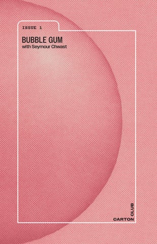
That’s a lot of impressive stuff to chew on, so our inaugural issue of Carton Club pays homage to this innovative designer. Naturally (although artificially flavored), it is bubble gum–themed.
Did you know?
A Chwast poster stars in the landmark television series Mad Men ?
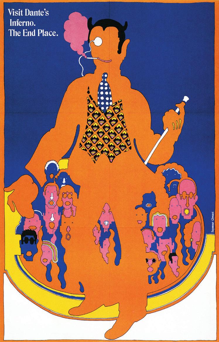
THE 1967 POSTER, called Canto XVIII, features an illustration of the chapter from Dante’s Inferno in the bubbly, psychedelic style of the times championed by Push Pin. The central figure, an orange devil, pops against a complementary cobalt blue background, stepping out of a primary yellow circle evocative of the stratas of hell. A cigarette puffs bubble gum–pink smoke from the corner of Beelzebub’s smile, which is his only facial feature (an eye is hinted at but not visible through his monocle, as if he sees us, but we can’t quite make him out). Like a maniacal band leader, he wields a baton, and, behind him, a crowd--only pink, blue, and orange heads visible --rises, like the smoke drifting off the lemony ring of fire, up to the smoldering cigarette. The demon’s beckoning hand invites you to join them.
The poster was conceived as a spoof on travel advertisements for the 52nd issue of the magazine Push Pin Graphic. This project was not the only speculative brainchild of Chwast’s. Check out the 2013 Archives blog post “Candy Men,” which explores a range of humorous gum package designs done for a 1972 issue of the short-lived Audience magazine, for which Chwast and Glaser served as art directors.
Canto makes for a perfect example of the iconic Push Pin mode, revealing the wit and intricate balance of detail and gesture that went into Chwast’s work. You can take inspiration from observing how Chwast knew when to draw and when to stop. Notice the vagueness of the silhouetted Lucifer but the detailed patterns of his vest and tie, or the expressions--some more complete than others--of the hellish mob behind Satan. Similarly, consider the limited use of color and the moments where Chwast strategically strays from his palette, like Dante off-roading in the Inferno.
The text, though simple and contained to a small corner, adds dimension to the design as well. Chwast’s poster reads: “Visit Dante’s Inferno. The End Place.” There’s visual wit here, too; the serious, classic serif
font in white feels humorously at odds with what it’s saying and how it appears against the funky imagery and gaudy color scheme.
What is “The End Place”? Clearly, he’s referring to the underworld, the afterlife, mortality. But the language also suggests the ends of the earth, the ultimate adventure, extreme travel--a nod to the prompt for creating this phony poster.
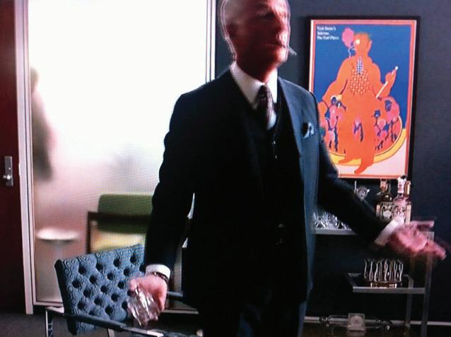
In season six of Mad Men, the show that changed television, Canto XVIII hangs on an office wall. It appropriately sets the tone for a plot that ultimately leads to a trek through the deadly sins of consumerism to an end place of sorts. It’s also a cheeky choice for the set--the style evokes the counterculture, which feels at odds with the linear, streamlined corporate sphere. Chwast’s poster was never for a real client--so, at first glance, it adds historical credibility to the show and, at second glance, emphasizes the fictional element. No sugar was added to this story--it’s pretty sweet on its own.
What are the tells of
the CHWASTIAN AESTHETIC?
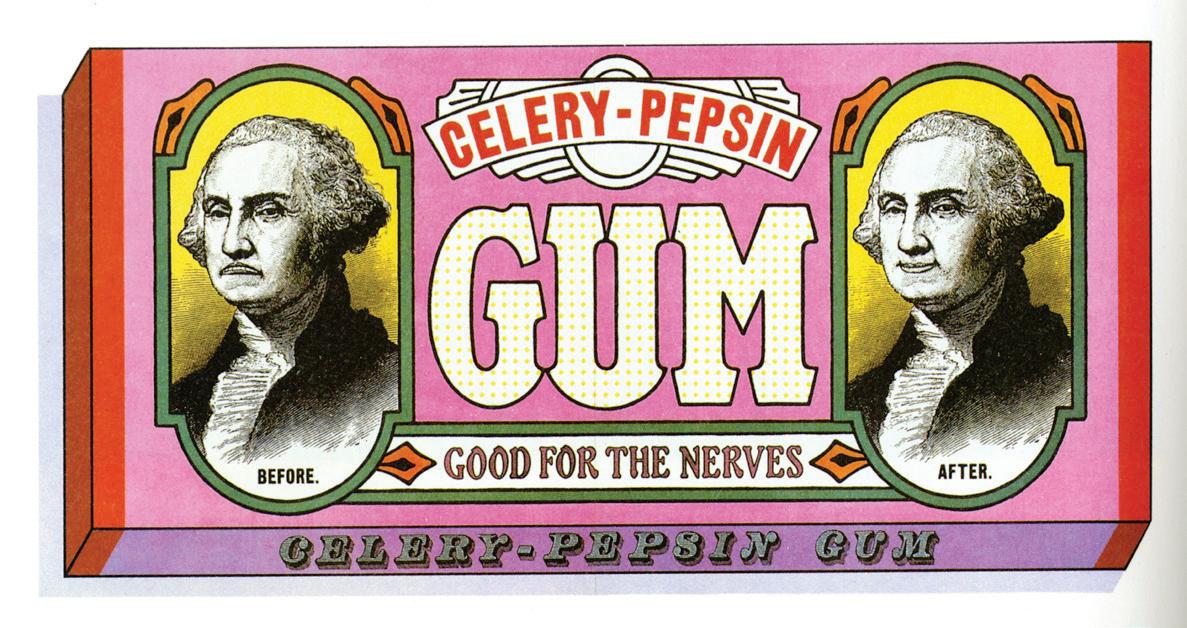
Color Scheme
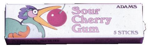
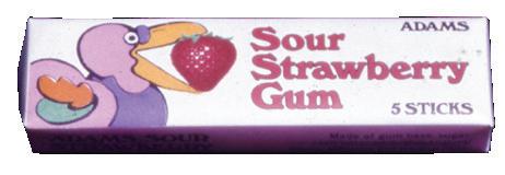
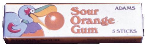
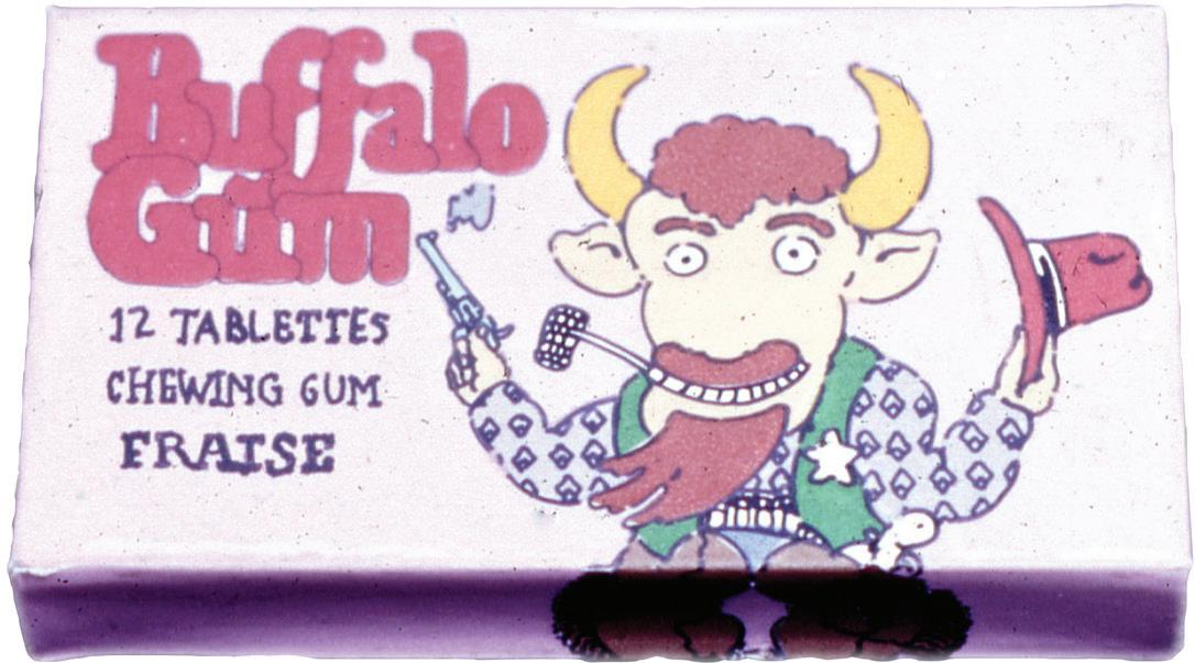
Note the carefully selected and limited color scheme. In the case of the Adams and Buffalo Gum packages, he’s using a mix of primary colors and pastels--the perfect confection for candy.
Humor
I mean, there’s a smoking, gun-toting cowboy buffalo. Need we say more?
Funky Features
Consider the chunky nature of the buffalo, the swirls of the birds, and the geometric flourishes, as well as the typography. It feels fun and contains touches of Deco and comic art.
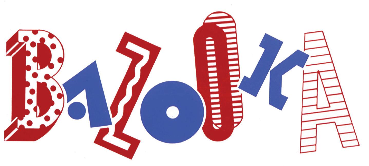
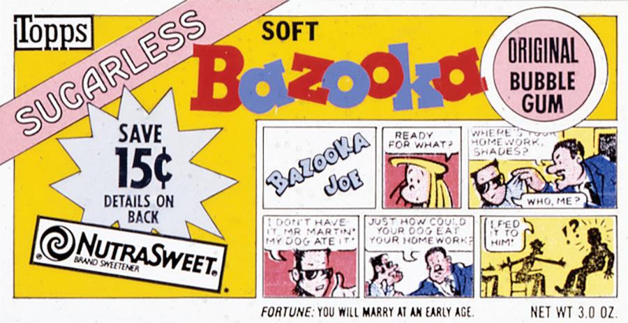
More than a stick of gum
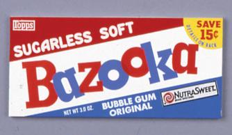
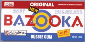
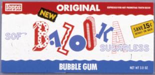
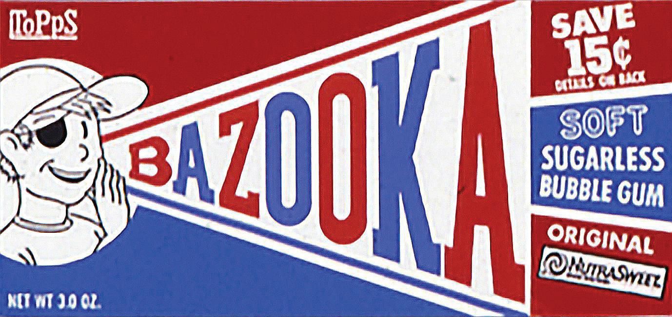
In every package of Bazooka bubble gum, you also got a little comic! Given its long relationship with illustration and art, it’s fitting that the company’s current Bazooka In The Arts program invites artists to create work inspired by the childhood nostalgia Bazooka can evoke.
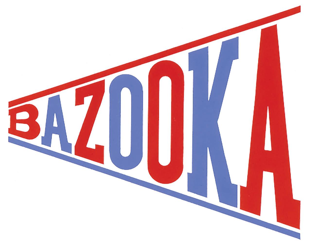
The Bazooka wrapper presents an array of options for a logo and packaging redesign, gently referencing historical design styles while remaining true to the kidforward appeal of Bazooka. A designer’s archive is full of unrealized proposals for clients; which of these would you choose from the candy shelf?
Check out the Archives’ 2014 blog post on Chwast’s work for Topps for more details.
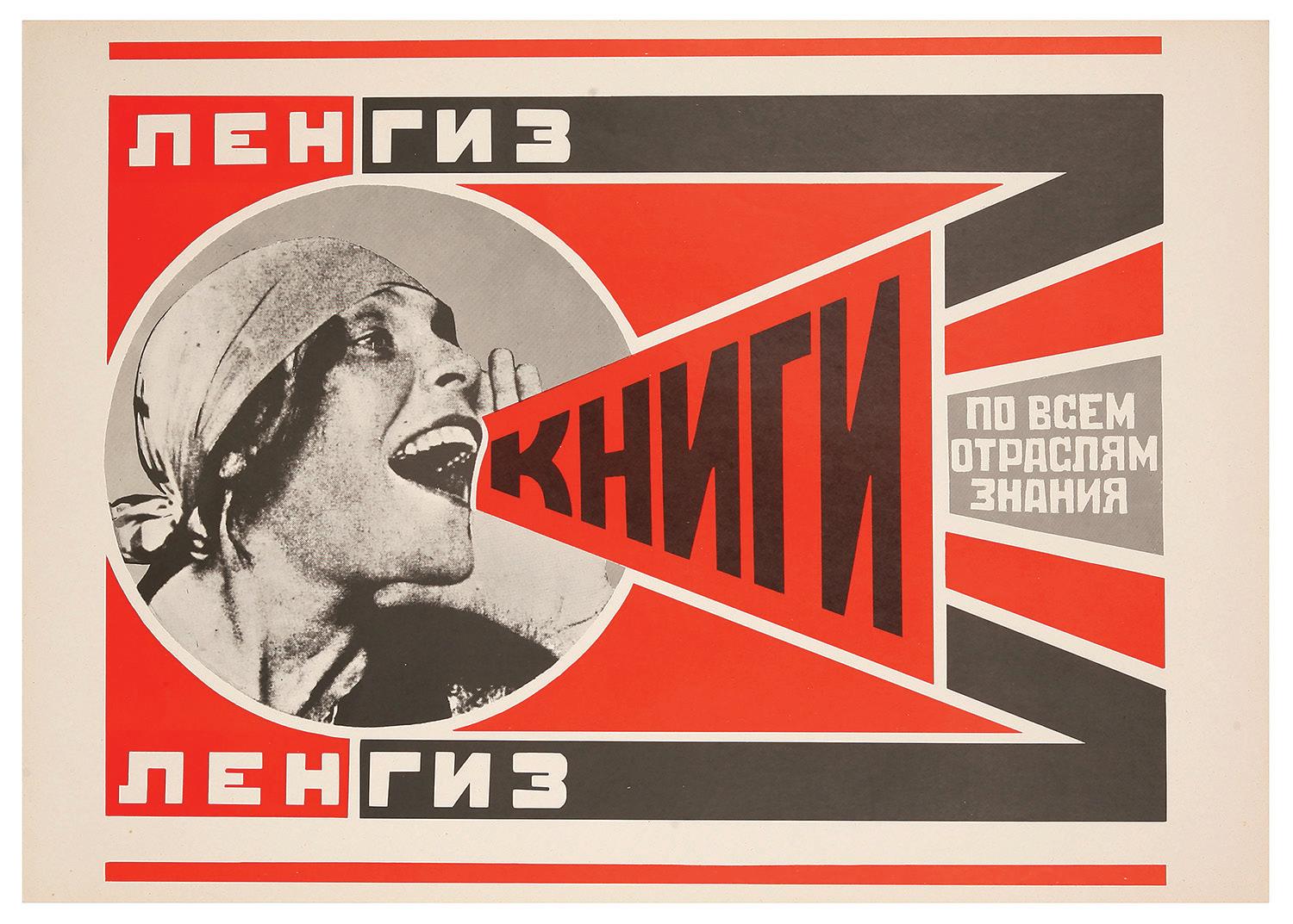
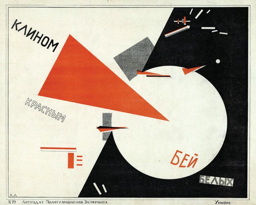
This Bazooka package design’s megaphone style echoes early-20th-century Russian constructivist posters that celebrated socialist ideals, including access to education and basic needs. One of the most iconic examples of this look comes from Alexander Rodchenko’s 1924 advertisement for the Knigi publishing house, which features actor Lilya Brik making an announcement to promote literacy, the text taking the form of a megaphone. But that’s far from the only example. Also from 1924, Gustav Klutsis’s Oppressed Peoples of the Whole World displays the text in strips to represent sound emitted from a megaphone. El Lissitzky’s earlier Beat the Whites with the Red Wedge, created in 1919 or 1920, feels conceptually reminiscent but in extreme, abstract form.
1924 poster by Alexander Rodchenko, showing Lilya Brik saying in Russian “Books in all branches of knowledge.”
El Lissitzky, Beat the Whites with the Red Wedge, 1919 – 1920, lithographic Bolshevik propaganda poster. Public domain, via Wikimedia Commons.
CHECK IT OUT
The SVA Library also has great materials for further research and more inspiration.
X Wacky Packages by Art Spiegelman
• Call Number: NC1002.C4 W333 2008
• Satirical MAD Magazine–style packages in three volumes.
X Wrappers Delight by Jonny Trunk
• Call Number: NC1002.W72 T78 2020
• A history of packaging design.
X Chewing gum’s wrapping paper collection
• Call Number: TX799 C48 2005
• A Japanese book of packaging design.
X Chewing Gum and Chocolate by Leo Rubinfien, John Junkerman, and Shōmei Tōmatsu
• Call Number: TR647.T66 A4 2014
• Aperture art book about iconic Japanese photographer Shōmei Tōmatsu.
• Sneak Peak: “The chocolate and chewing gum they [the Americans] showered from their Jeeps may have been paltry stuff, but the ideas, styles, and manners that they disseminated were not, and these invigorated two generations or more of younger Japanese.”--Leo Rubinfien, “Echoes of War”
X Chewing Gum, Candy Bars, and Beer: The Army PX in World War II by James J. Cooke
• Available as an ebook.
• An academic text exploring the spread of American consumerism and commercialism via World War II.
WRAP (PER) !
Written and edited by Laura Valenza
Designed by Brian E. Smith
Visual Arts Press
In collaboration with: Beth Kleber, head archivist
Lawrence Giffin, archivist
SVA Archives
Special thanks to:
Jennifer Liang, assistant director, Visual Arts Press
Joanna Citrinbaum Zerlin, editor
Carton Club
IS A COLLABORATION BETWEEN THE VISUAL ARTS PRESS AND THE SVA ARCHIVES.