

This book is the result of a search for connection.
Over the past months, I visited a selection of artists whose work speaks to me — visually, materially, or through the way they approach their practice. I see certain parallels between their work and my own.
For each of them I created a delicate, hand-bound booklet, shaped with care and intention. Each one was unique, containing materials and gestures that reflect something I recognized in their way of working. The booklet came with a quiet invitation: a challenge, or maybe a question.
These encounters unfolded through conversation, image, and time. We spoke about making, about networks, about the act of being present. I photographed the spaces, the studios and the traces of thought and process.
What you now hold is both documentation and continuation — part archive, part exhibition. A book that gathers these stories and environments not to explain them, but to share a moment in which they existed together.
— Nous’ché Couteaux

When I had just graduated, I didn’t really focus on building a network consciously. It kind of happened on its own. You follow your classmates, your teachers, others you know who have just graduated, you attend openings, and you follow people whose work you find interesting. And that becomes your network. It develops in an organic way. Only later did I realize how important the network around you is, knowing people, being visible. Ultimately it’s one big web. Finding the balance between working and networking is still hard work. You have to keep your contacts warm, make sure you’re seen, and ensure you’re visible. Maintaining creative connections with makers who both deeply appreciate each other’s work is easier. For example, when something new appears on social media, you immediately reconnect, and that bond is there. I really appreciate that about platforms like Instagram.
An empty book calls for a response, and I really felt that myself. I really wanted to work on the book by myself. Answering the silence in the book. I quickly had the feeling that it would become a sort of diary with the materials telling the story. Each day, a different material that I felt the need for at that moment. Your project feels very pure, which is why I felt free to make it truly my book, without having to meet any specific expectations.
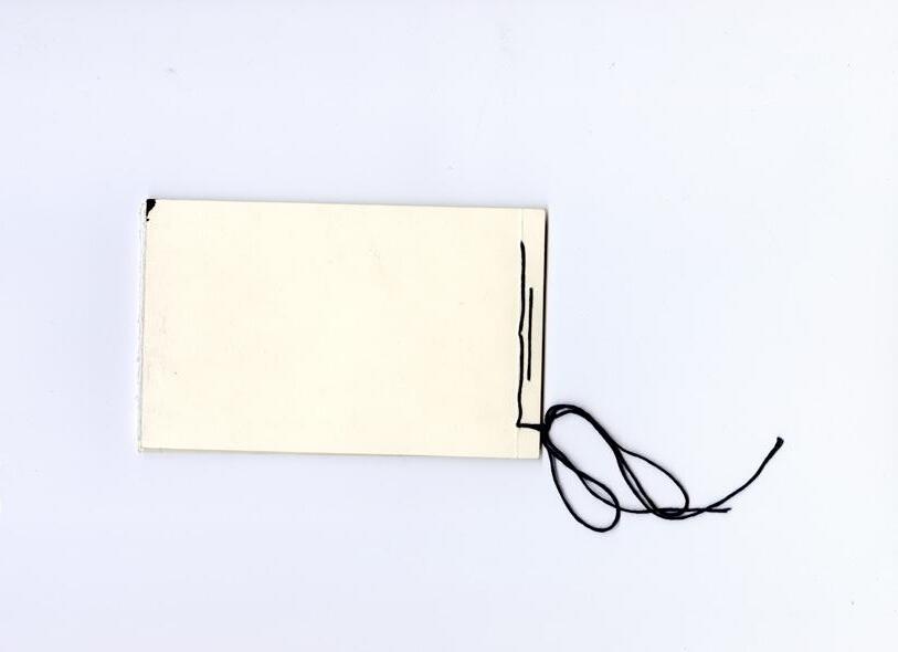
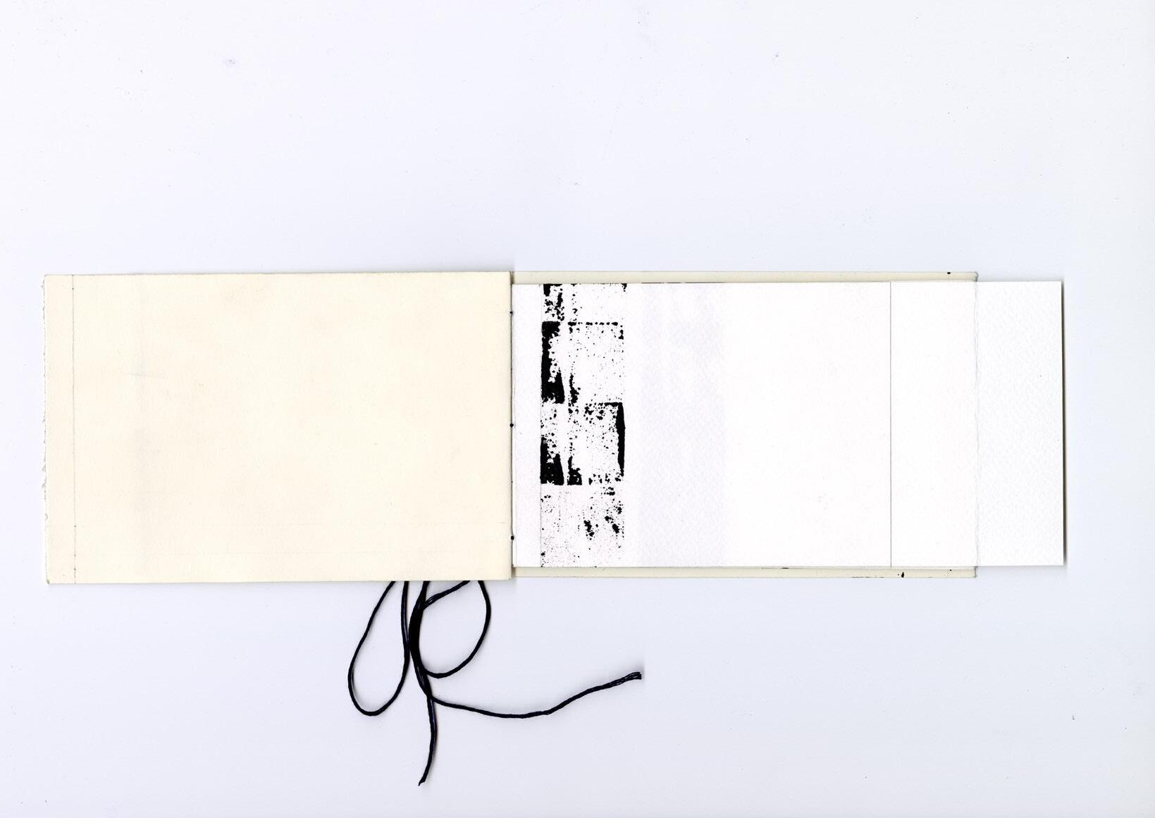
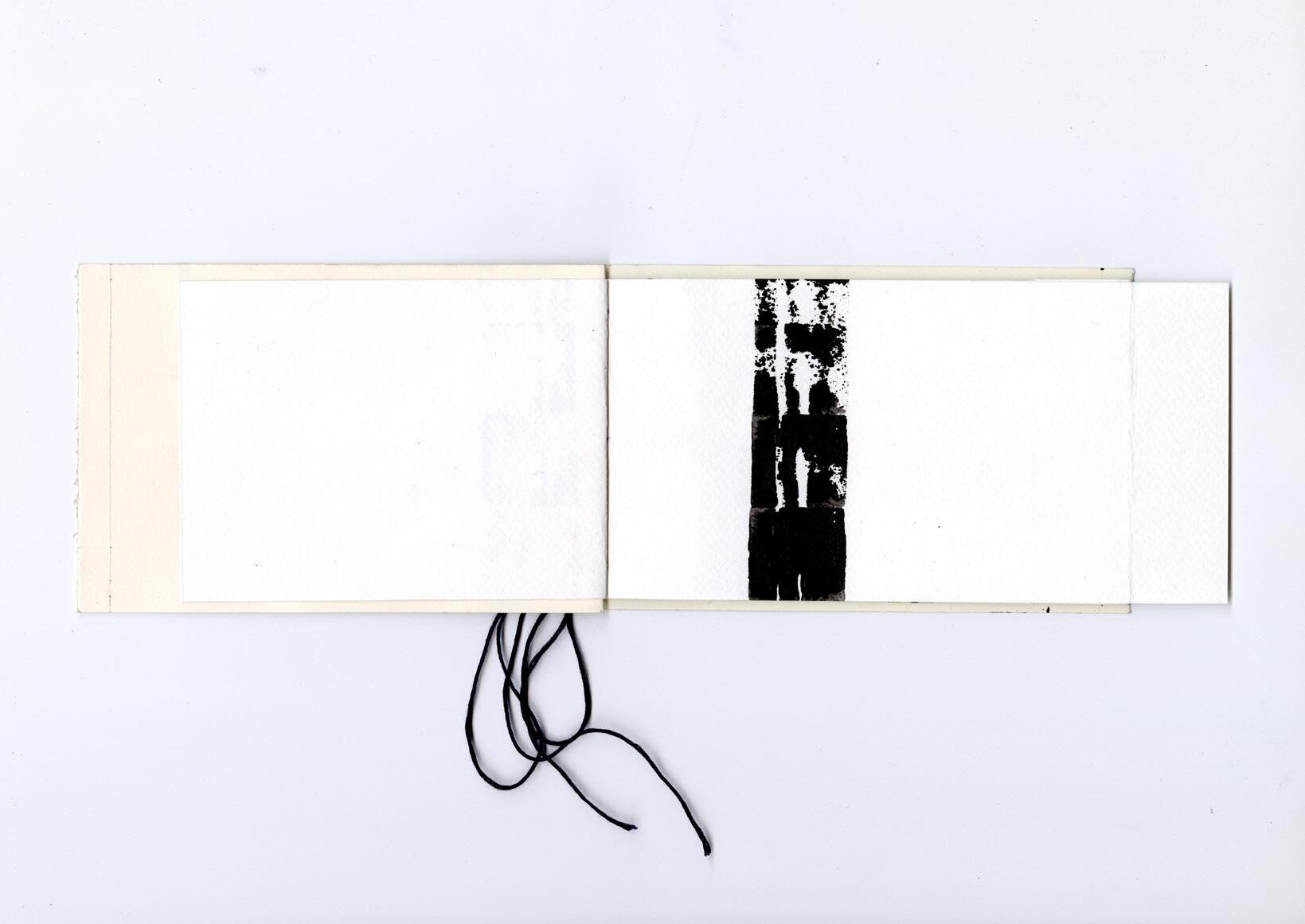
Dineke van Oosten was the first artist I visited with an empty booklet. We had spoken at Ruby Soho Gallery about my ideas. She was interested and told me to give her a call. A few days later, I did, and we talked more about the project. The conversation went well, and we made an appointment to meet in person at her studio, where I could also take some photos.
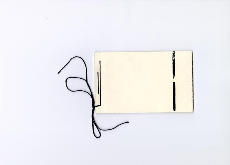
What I hadn’t told her yet was that I had made a special booklet in which I would like her to work in for a short period of time. At that point, I had designed the booklet to function as a kind of “blackbook” — a place where I could collect the artists who inspire me and with whom I wanted to connect. The pages were bound in a Japanese folded binding style, so that I could (maybe) cut them open later. This would create unexpected interactions between two previously separate pages — like a visual jam session. I had even marked small cutting lines on each spread.
When I explained this to Dineke, I think she liked the idea. But after talking for a bit, she said: “Why don’t you make a book for everyone you visit? That way, this booklet is just mine — and you’ll make a custom one for the next artist.”
I liked that idea alot. And I agreed.
So the plan changed: this was now her booklet, and I’d return to pick it up after a little while. I was happy with this outcome — it made more sense, it felt more reliable, and it gave me the opportunity to explore more eccentric book designs for each artist I’d meet.
I was really nervous to ask her to work in it. I wasn’t sure if I was asking too much. After all, I was handing an artist a book and asking them to make something inside it. That thought kept looping in my mind. But I asked anyway. And to my relief, she said yes — almost immediately. I was so surprised I even asked again, “Really?”
She said. “Uhh, yes?!” Dineke was excited to work in it. That made me really happy.
Dineke’s studio was nice and small and had a skylight. It was a bit messy and organized at the same time. Which is a bit like me. One of her walls looked
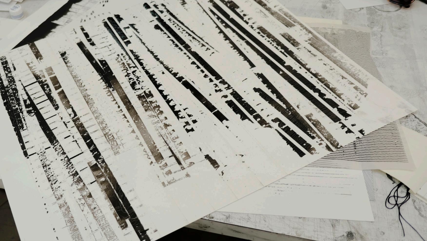
like a gallery wall, with framed and curated pieces of her work hanging neatly. Some even had their prices next to them. Her work had always intrigued me because of how it incorporates natural inconsistencies through a precise, repetitive process using fading ink. I love how the patterns of the material she stamps with interact with the material she stamps on. It creates a mesmerizing and beautiful reaction. In person, it even creates a kind of moiré effect — a strange optical distortion, as if your eyes and brain are trying to match what each eye is seeing.
I chose Dineke as an artist to colaborate with because I sometimes work with paper in a similar way. I love it when materials react to each other in their own unpredictable way. I wanted to talk with her about that, and learn how she approaches her process. She also encouraged me to keep reaching out to artists. “They’re just people, like you and me,” she told me. And it’s true. Artists often feel like celebrities to me, like their schedules are full of impossible things. Why would they have time for someone like me? But this project is also a way of breaking that mindset. I’m not an imposter. I approach my practice with care, with love, and I want to grow. And it’s true — I believe in myself a little more now.
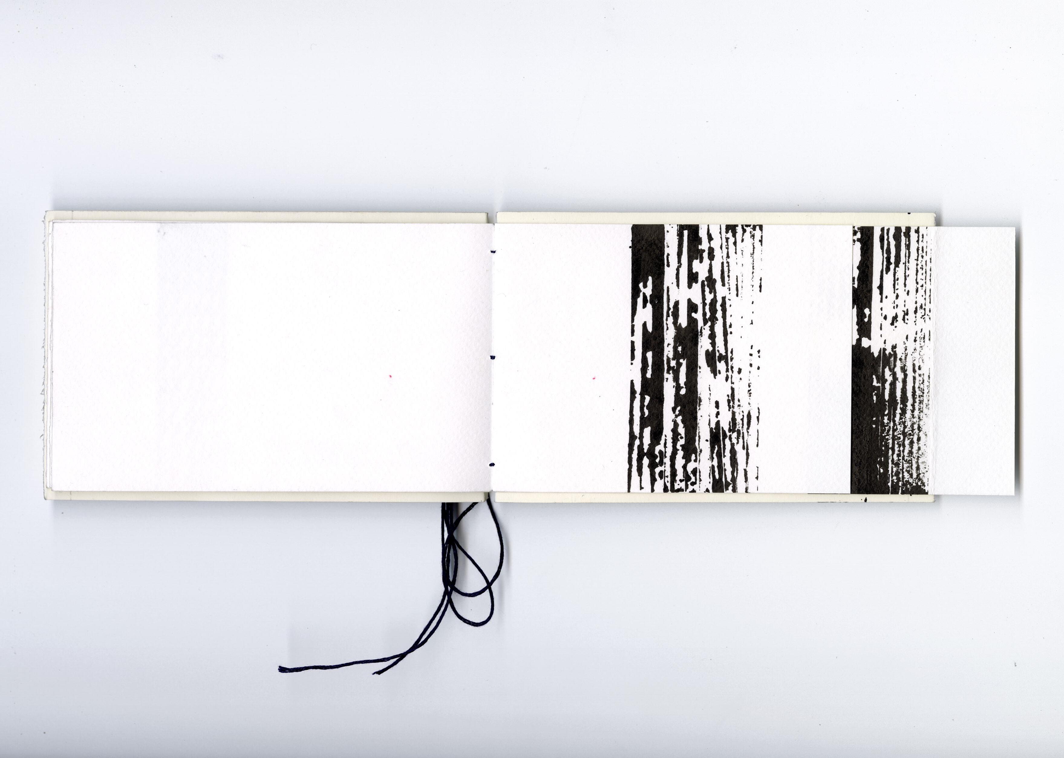
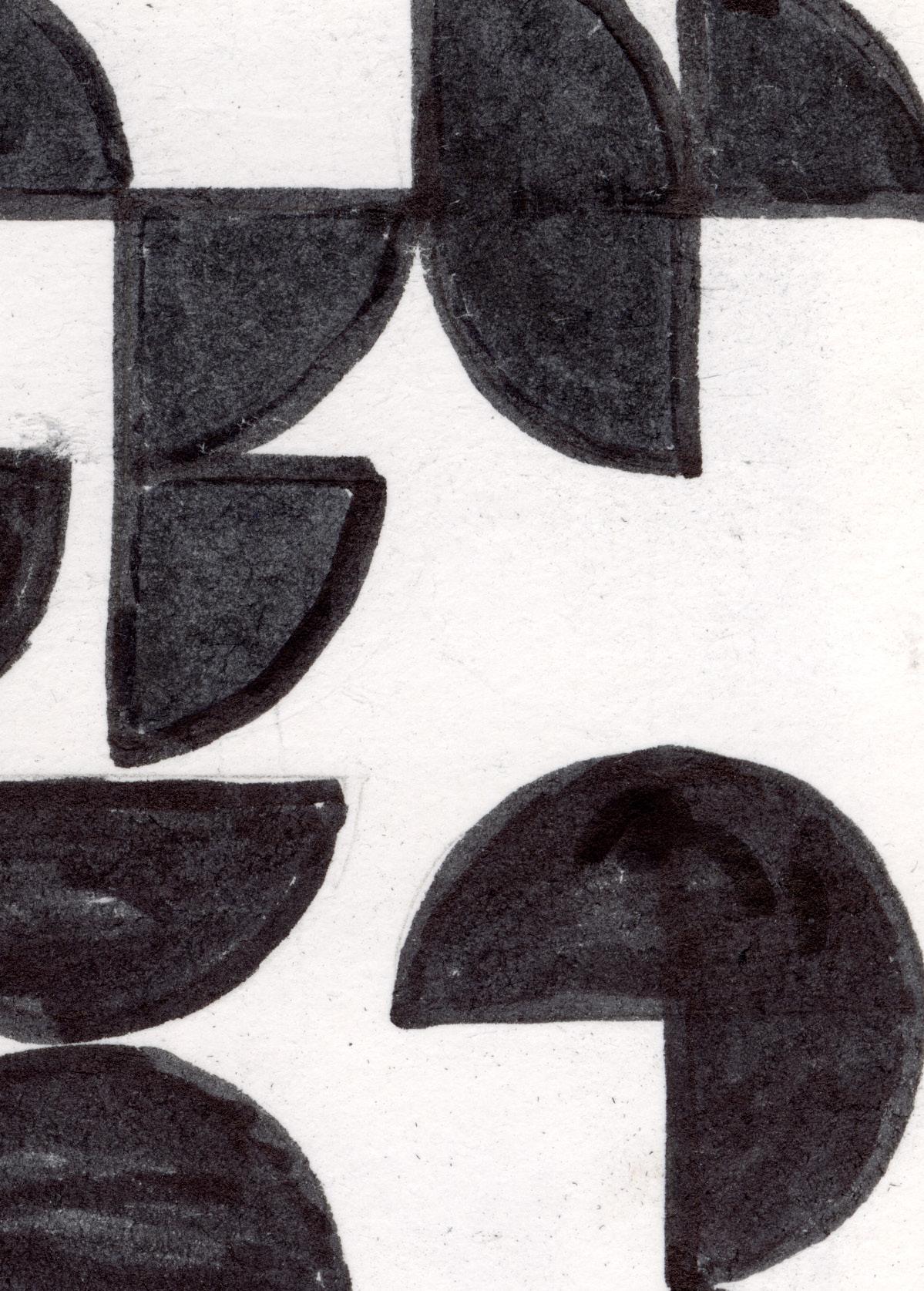
A few weeks later, Dineke came by my house to drop off the finished booklet. It turned out beautifully. She had cut the pages open but on the opposite side of what I had imagined. Now, a small piece of each page slips open to reveal the next. It’s intriguing and mysterious. I love it. She even interpreted my original cutting lines as the basis for her stamp pattern. The result feels balanced and thoughtful, with a clear sense of hierarchy that responds beautifully to the space the booklet offers. It’s a true work of art and a very special booklet.
I gave her a quick tour, and she complimented one of my screen prints I had hanging on the wall. Then she invited me to design a mural for Minitopia, saying: “Could you make something like that?” Of course, I said yes. I was excited to take on a mural project.
A network. A network is created by being grounded in society: being connected to collectives, initiatives, events, etc. I have never actively or consciously networked, but I have made myself heard: by throwing work out into the world and if I meet someone whose work, product or initiative I admire/ appreciate, I make contact and let that person know. Sometimes there is mutual appreciation for each other’s output and then beautiful collaborations can arise from that.
Furthermore, I notice that the older you get and the longer you are active as a designer, the easier the jobs come in: the people in your network do not stand still, they grow, develop, start new companies. Because you already have a track record, you are more easily asked for a job and it is easier for people from your network to vouch for you. You grow with each other and the trust is there from previous shared experiences, professional or private.
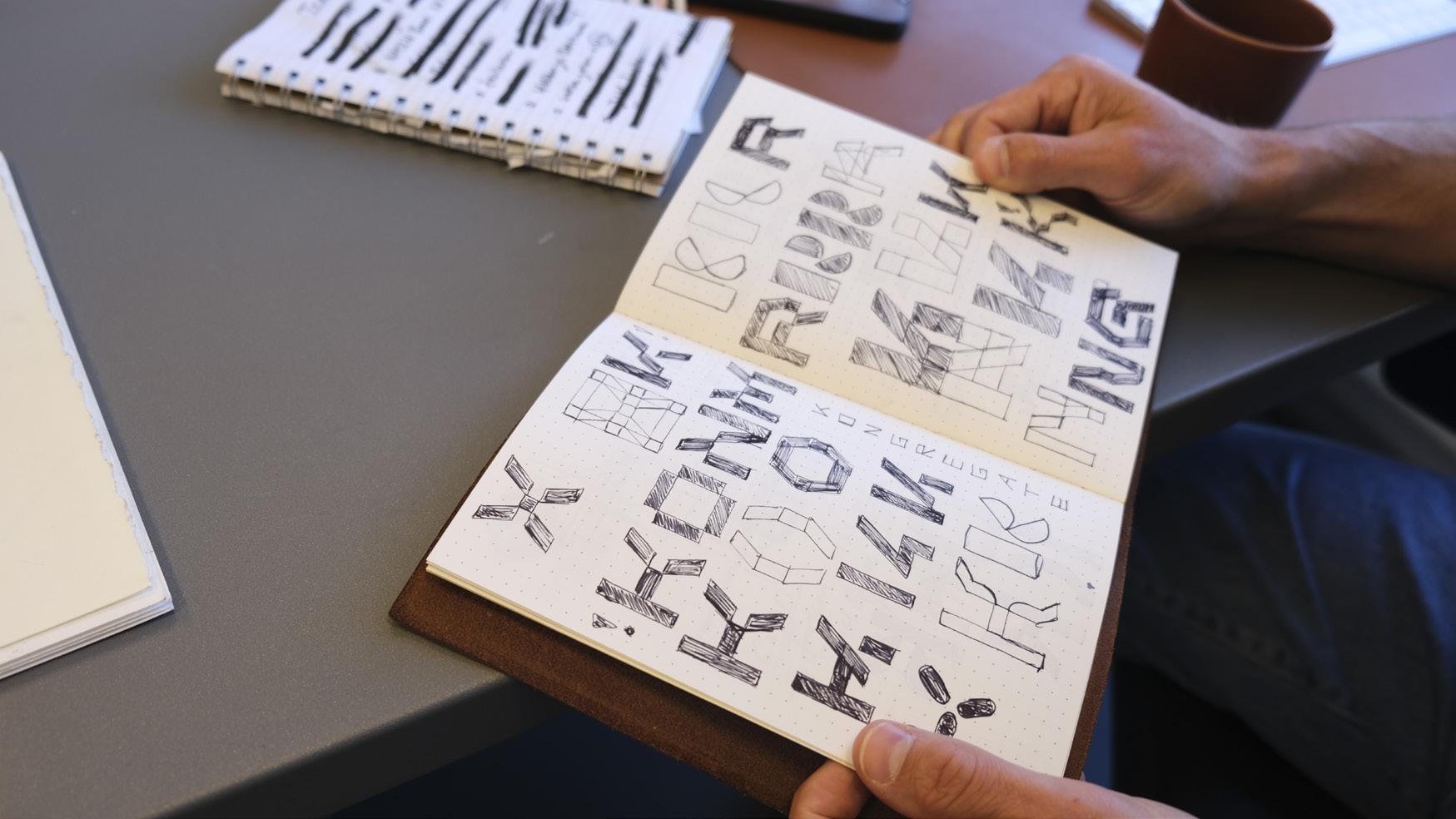
When I received the booklet from Nous, I immediately saw it as a challenge to come up with a concept and get my hands dirty. Something I used to do more, but now sometimes get left behind. Also because font design (APK Type) takes up an increasingly large part of my working week. In practice, the booklet stayed empty. When the deadline came closer, I finally got started and while working on it I immediately noticed how nice it is to work analogue again for a while: you work much more focused towards one thing and that goal-orientedness involves a physical concentration that is quite peaceful. I have had some analogue concepts on the shelf for a while; ideas for handmade things and/ or fine art and this short exercise with the booklet has made me more eager to realize these concepts.
‘Maintaining’ your network is then not a chore, but a natural thing; you know each other, meet each other in social settings and pass the ball to each other when possible. Some contacts do not last or become a thing of the past, but that is fine. You can not see/talk to each other for years, but then the specific ask from a client suddenly appears and it is appropriate to seek each other out again and work together.
But on the other hand, to be honest, it is important to be open, to remain in the (creative) world. Due to a heavy workload and personal projects, it is sometimes difficult to make time to visit openings, expositions, talks etcetera. And that is a shame. It also does not feel creative to repeat yourself, so it is important to keep looking and researching.
My advice to recently graduated designers is always: make it. Make things, work out your ideas, realize your projects. Don’t look at what another designer does, makes or has already achieved, but make sure that your work is out there. If you make sincere and personal things, eventually the world will come to you. I am convinced of that.
Handmade (with or without a computer) is the future. The digital world is consuming us, the promise of convenience is eroding and morally speaking, ‘made by humans’ is becoming the only option. The only output, purchase or collaboration that can provide satisfaction and experience.

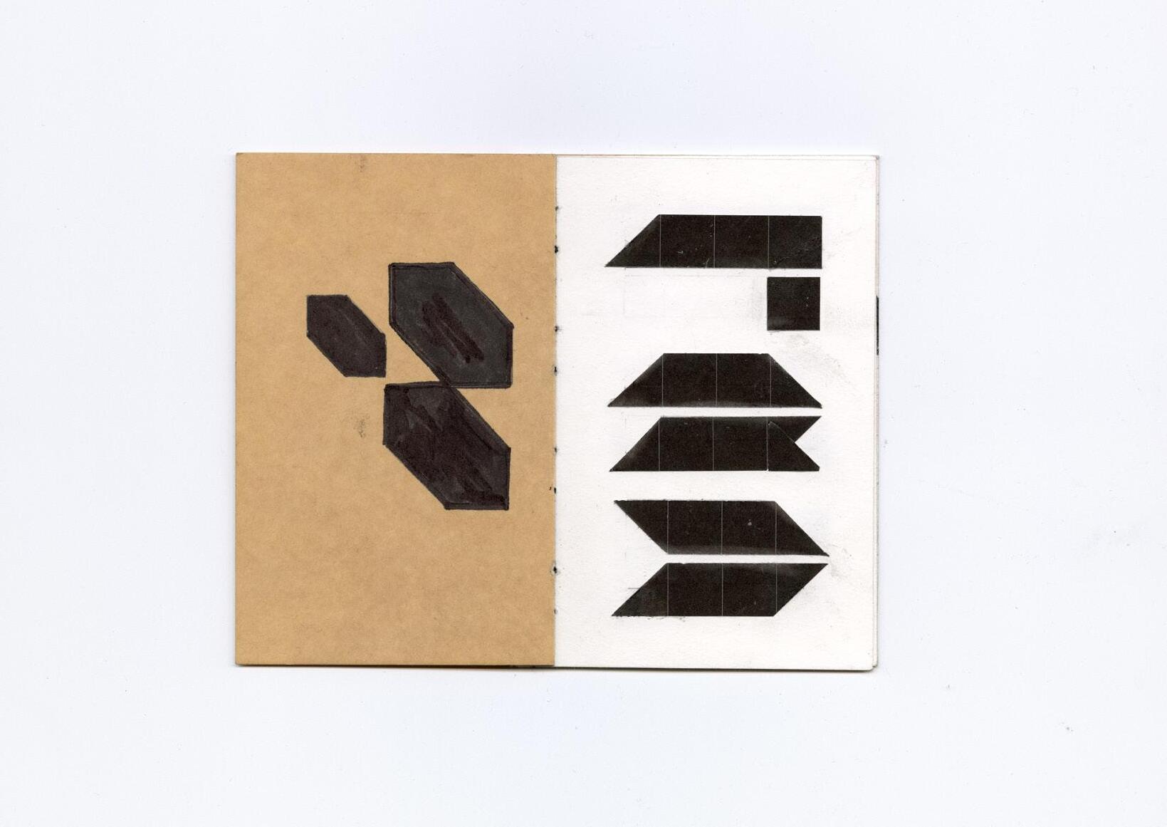
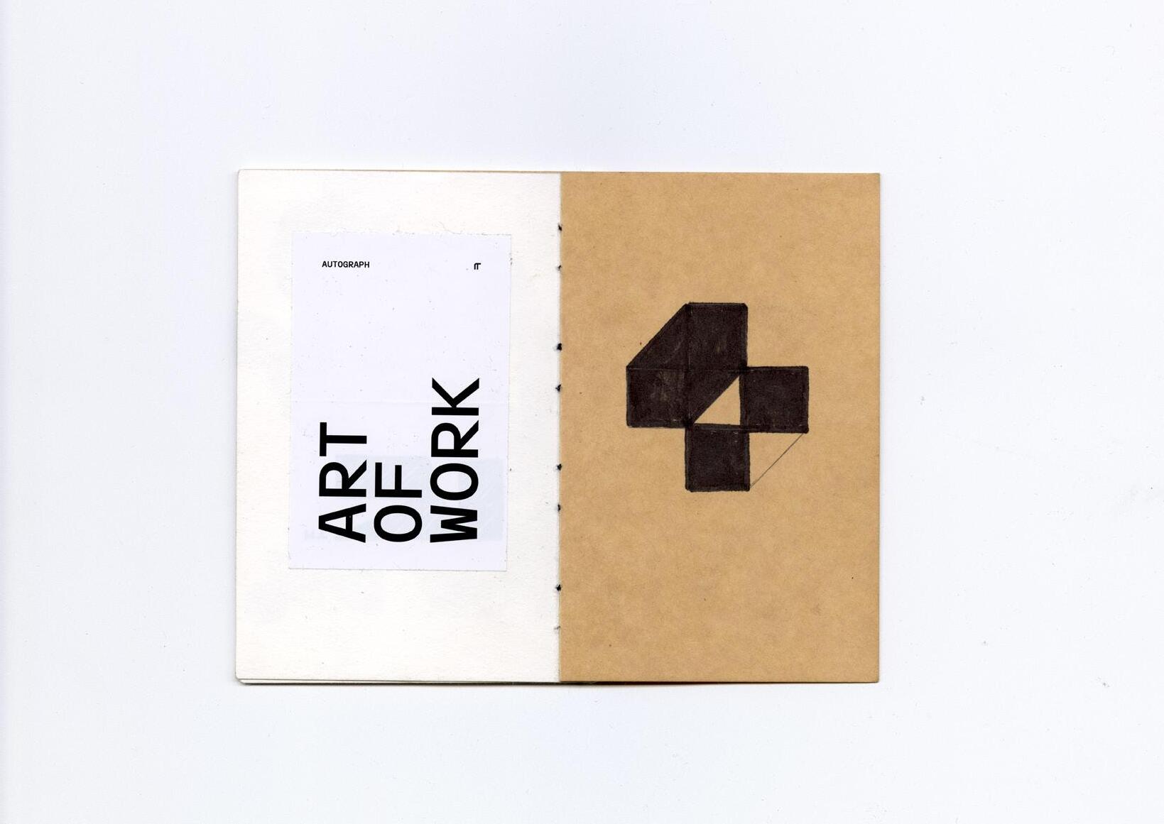
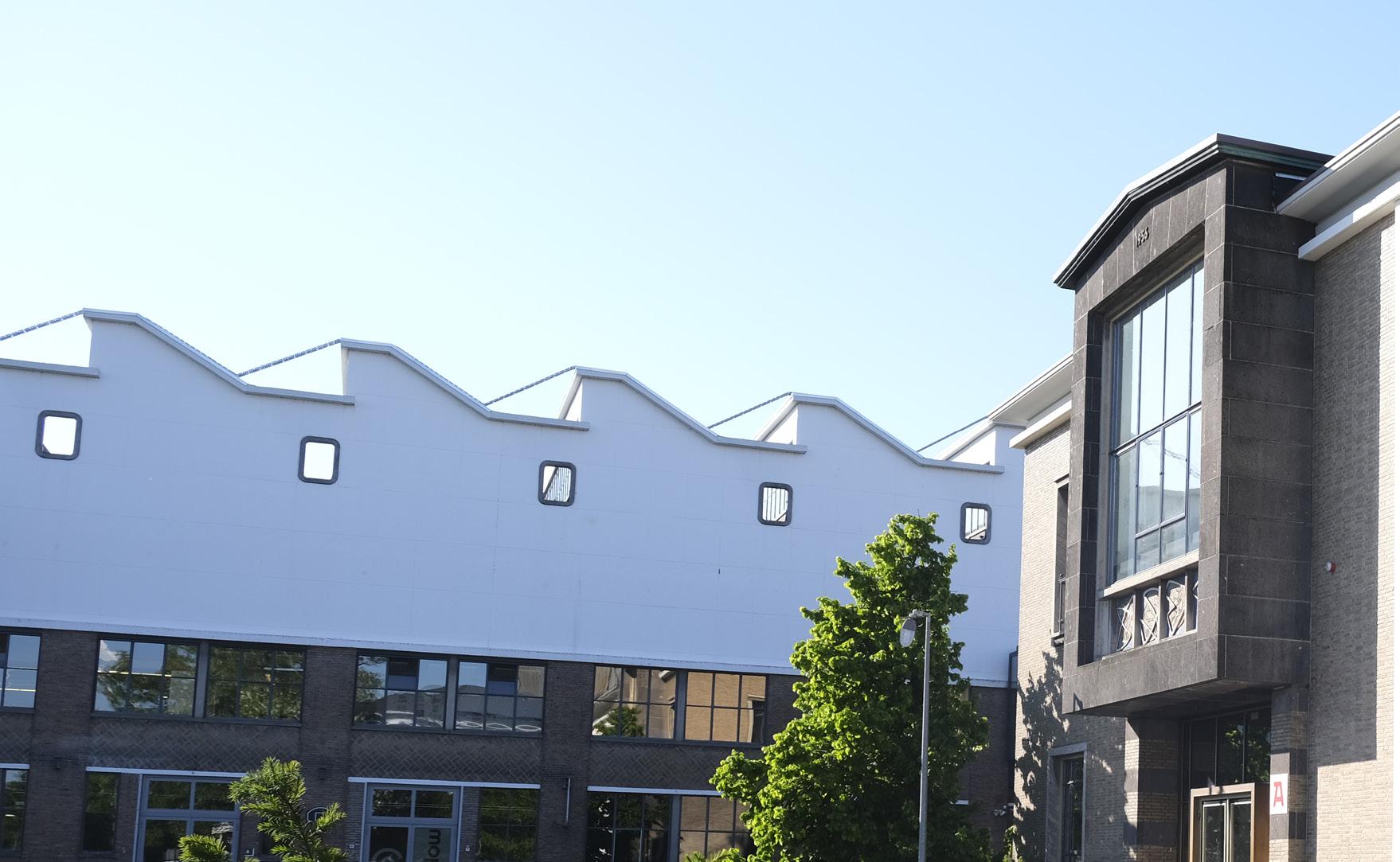
Peter Korsman was the second artist I visited with a booklet. We had spoken before, and when I first visited his studio, I was a bit nervous. The building felt more corporate than your typical maker’s hub. Entering it was like stepping back in time — as if I were in an office, ready to do business in 1955. At least I was dressed correctly with my leather messenger bag and black binder case in hand.
As I walked down the hallway to the first floor, I saw an open door at the end — Peter’s studio. It was tidy, clean, and extremely well-organized. Exactly what you’d expect from a precise and secure-minded type designer.
We talked a little and he told me to go ahead and take some pictures. I took one and immediately put my camera away. “Take some more!” he said. I felt nervous taking pictures. It feels personal and close, and I had to step out of my comfort zone. I tried my best.
Later, looking at those pictures, I wasn’t happy with them. They felt random. I was being critical of myself: Why didn’t I photograph all the different chairs Peter had? They reminded me of graphic design, architecture, and typography all at once. And that’s what I like about Peter’s world — those fields inspire me too, and I often see strong visual parallels between them.
We talked about my project. I struggled a bit to explain it clearly. I thought I understood it well myself, but when I tried to describe it to Peter, I stumbled. I wasn’t sure if he understood me, and I wasn’t sure I was expressing myself clearly. Still, we had a good conversation. We discussed the concept and exchanged ideas.
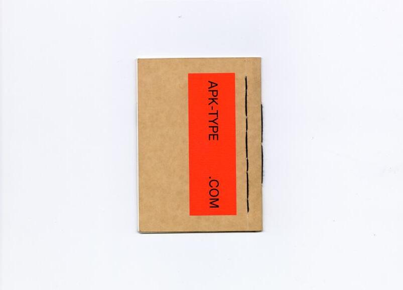
I had made a booklet for Peter to work in as well. It was simple, but also complex. The thread binding was experimental. I wanted to create a line pattern in the thread, similar to the one I made for Dineke. I started with a sketch, but ended up improvising. It didn’t go well.
I had punched too many holes. The thread became very tight and I wasn’t sure how to combine the two ends.
I cut all the threads and started again — and again I did it wrong. I cut it all open a second time. I tried again. The thread didn’t align at the start and end again; one knot landed on top, the other underneath. There was a visible irregularity. But then I noticed something: the tension in the thread was so strong that the booklet didn’t actually need to be tied. The segments held everything together through friction. So I carefully tucked the thread ends inside. It stayed perfectly in place — clamped shut by its own structure.
Then came the question. I told Peter the booklet was for him, and asked if he would like to work in it for a short period. I’d come back to pick it up later. To my relief, Peter said yes. He actually said yes.
A few weeks later, I emailed him to ask how it had gone and if we could set up a time for me to come collect the booklet, but I didn’t get a response. A week passed. Still nothing. I felt unsure and I didn’t want to be a bother. I respect an artist’s time. A few days later, I sent him a text message to follow up gently. And he replied that I could come pick it up that Wednesday — he’d be in the studio all day.
This time, I felt more confident. I knew the building. I knew what to expect. I was prepared. I biked there and just walked in — I had already told him I’d arrive in the morning.
I lightly knocked and said “Hi Peter!” as I entered. He was there, together with an intern. I introduced myself to her and we chatted briefly.
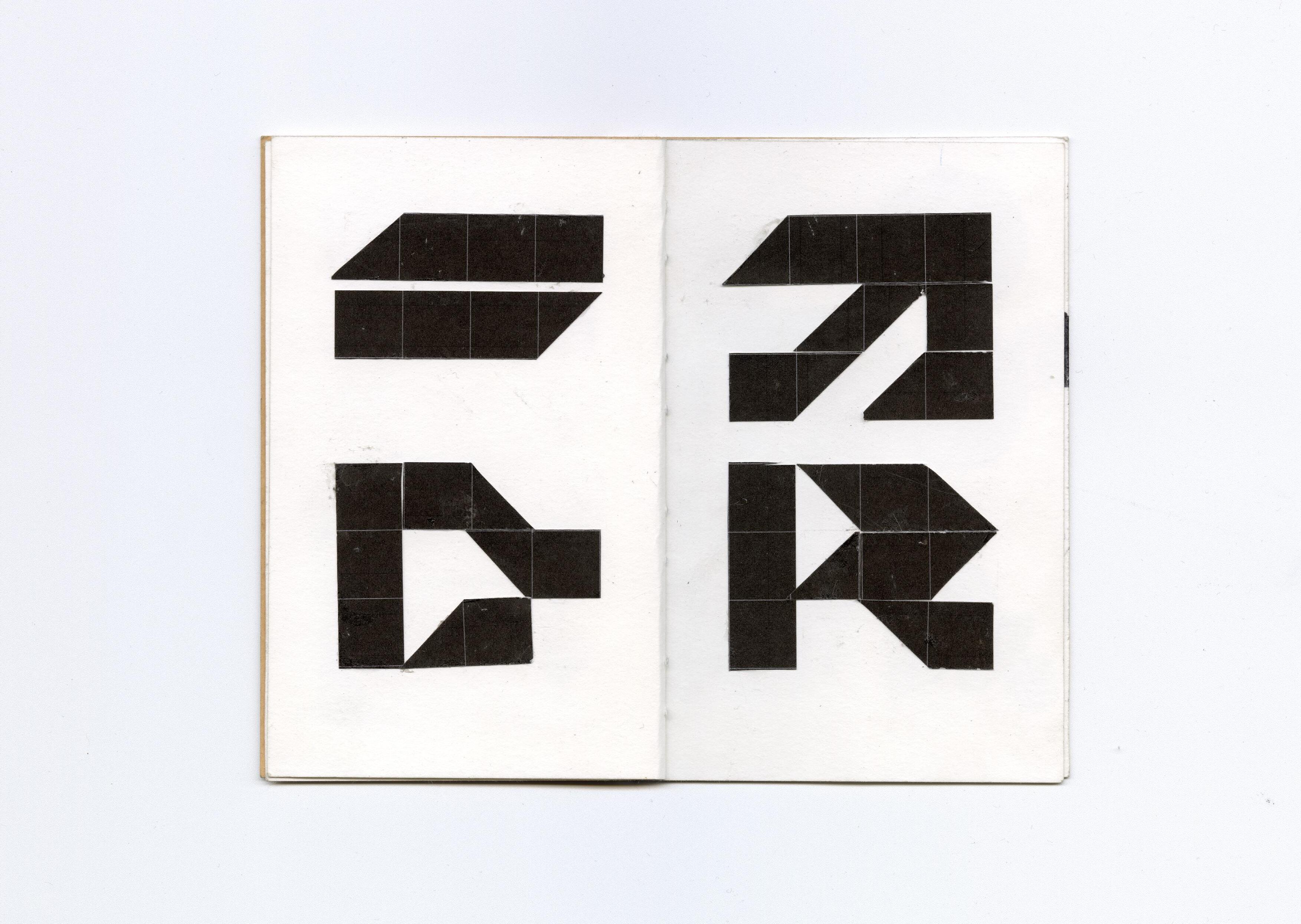
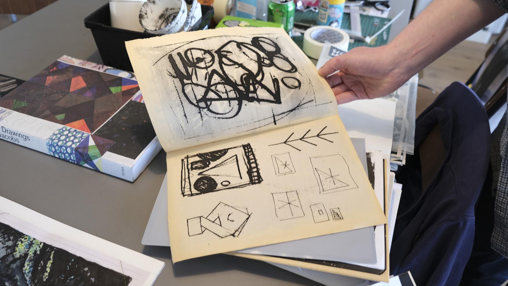
When I received the booklet, I noticed right away how different it was from the others. It had stickers inside and felt more like a sketchbook. Some of the markers he used had bled into the paper, giving parts of the pages a rushed or messy look at first glance. I wasn’t quite sure how I felt about it at first. But the more I looked, the more I began to appreciate what he had done. Among other things, he had designed a numeral system and pushed it to its most abstract form — exploring the boundary between readability and shape.
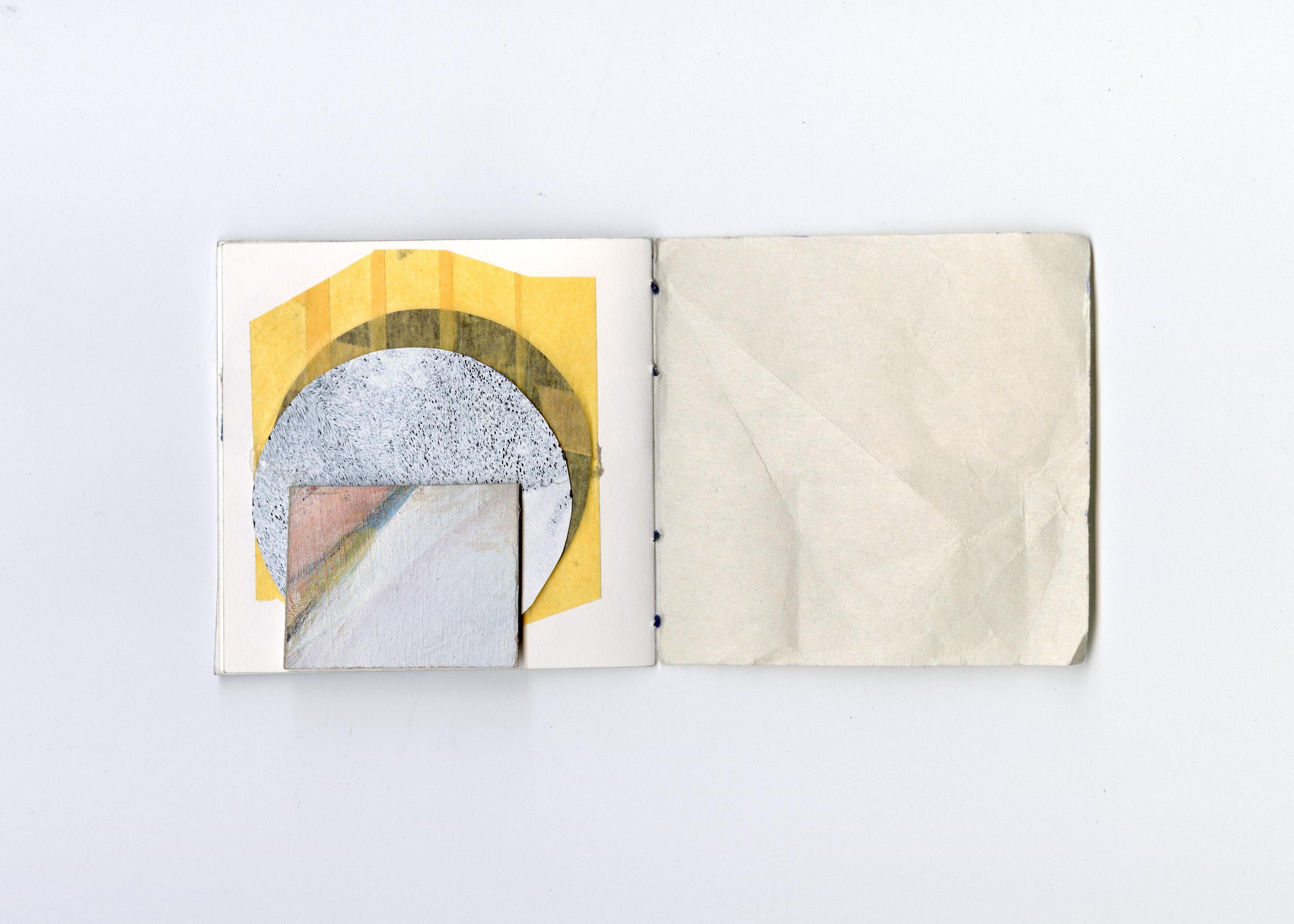
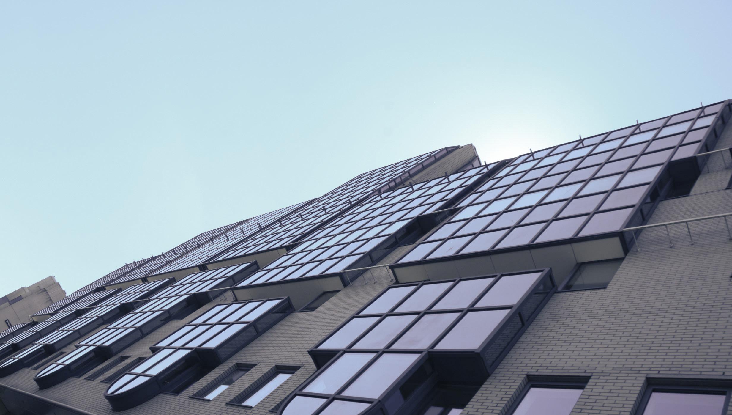
Communication is key to the evolution of humanity. We all have a unique language that is built up through a variety of life experiences. Speaking the same language is no guarantee that the same is understood all the time. Every single one of us has an equal stake in being understood. We are all humans therefore we should all be on the same page of that book.
The story of the Tower of Babel suggests that it is our collective hubris that is driving us apart. We have allowed superficial differences to obscure the most important commonalities we all share. We thought we knew more than we did. We think we know more than we do. Certainty in language is a powerful and potentially destructive force. The further apart we drift in that understanding, the longer and harder it will be to ensure humanity will always survive the vastness of this timeless universe.
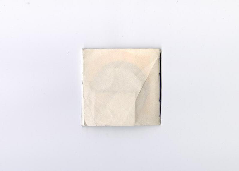

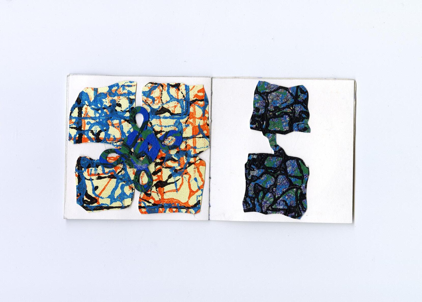
Henny was such a nice guy. I had never met him before, but when we met in Utrecht there was an immediate sense of connection. It felt sincere, like we spoke the same language.
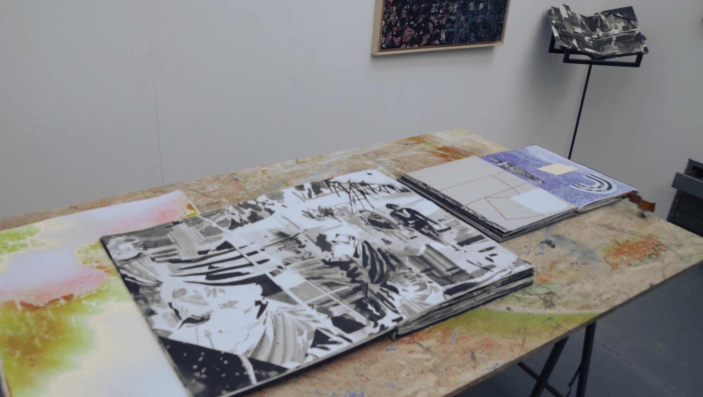
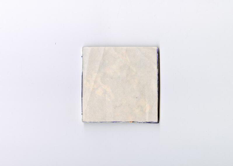
I deliberately chose a fragile cover. Henny is an experienced maker of books, and I wanted to design something unique and eccentric — a booklet that would challenge both him and myself. Henny has been running a long-term project of his own called The Books Happen, which has been a major inspiration for me, and one of the reasons I reached out to him in the first place.
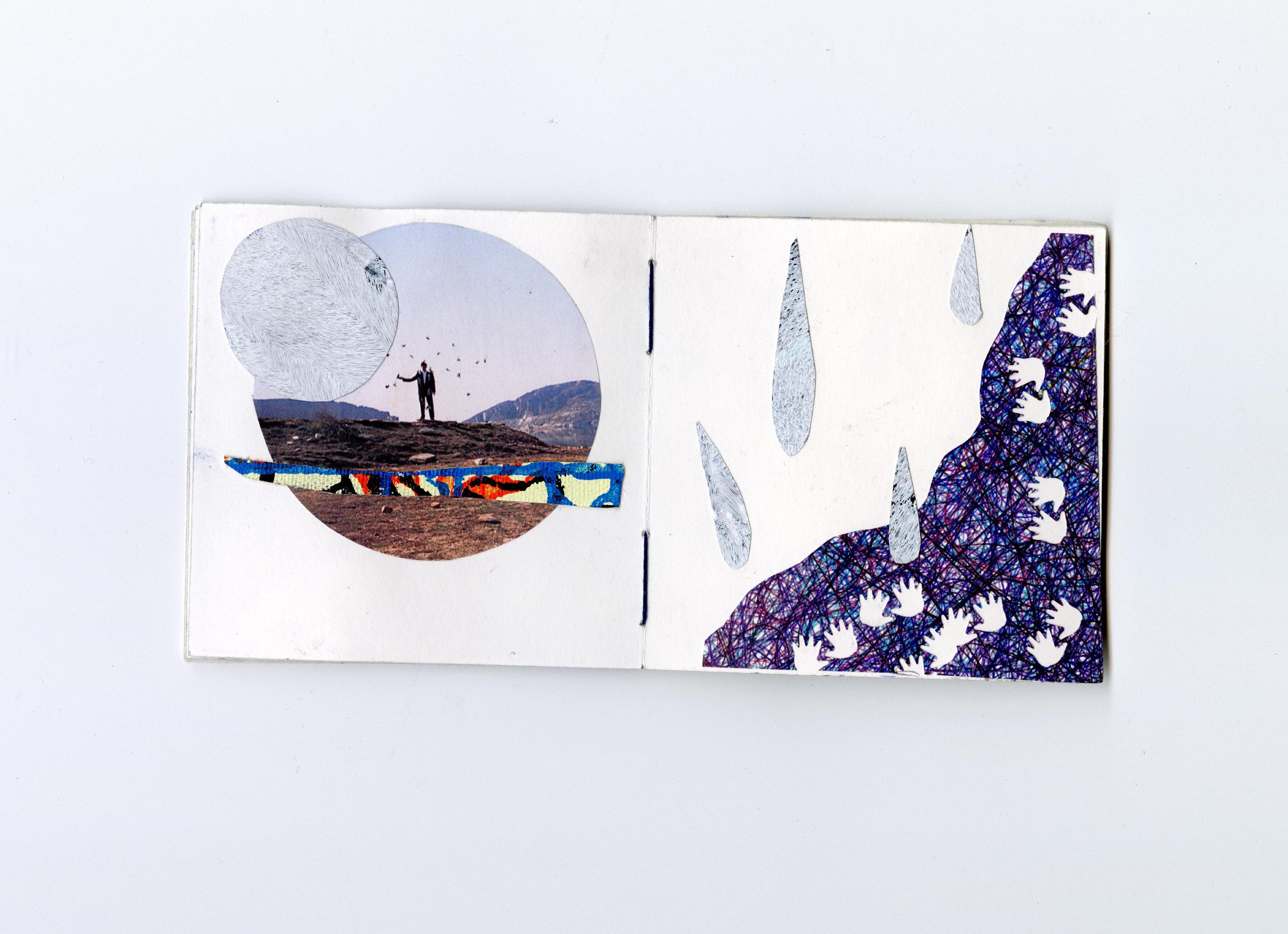
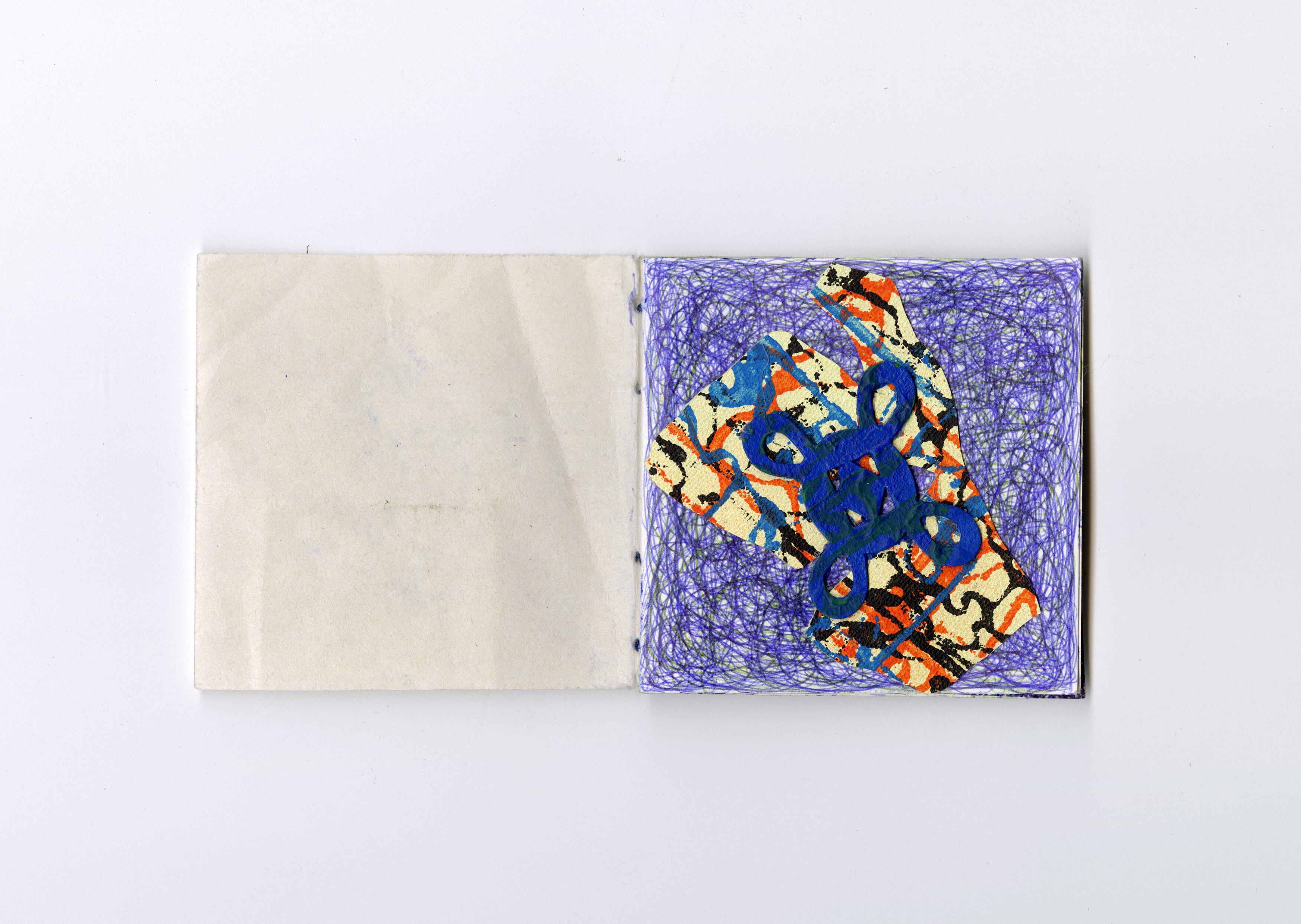
For some reason, I had this fantasy image of the booklet Henny would work in, that it would become something careful, precise, delicate. And in a way, it really is exactly that! But what I got back was filled with speed, layers, movement, wildness, marks of use, ripples, creases, height differences. And it’s beautiful. I have so much appreciation for the way he worked in it. It tells many stories and I could look at it a thousand times.
We had a great email exchange leading up to the visit, and we agreed I’d come by his studio in Utrecht. I liked the idea of going back to Utrecht — I studied there for four years at the Grafisch Lyceum, and the streets of the city still feel familiar and warm to me. The weather was sunny, the walk was pleasant.
When I arrived, I rang the bell at what looked like a regular house. I wasn’t sure if the studio was inside his home, or the other way around. I didn’t really know what to expect, or if I’d even rung the right door. But after a minute I heard footsteps and a soft whistling echo down the hall — it had to be Henny.
It immediately felt warm and welcoming. The door swung open, and there he was. We shook hands right away and I introduced myself — “Hey Henny! I’m Nous!” — but it all went quickly. He just said, “YES!” and off we went. I saw a long corridor. So it was a proper studio building after all, not an apartment!
It turned out to be big, with many studios inside. After passing maybe five
doors, we entered Henny’s. And it was beautiful. Truly amazing. There was a small kitchen (with great coffee!), a desk area, a workspace, and skylights for natural light. An ideal studio.
There was no power that morning, so we had to keep it analogue — which was perfect, because I had also come in analogue mode. No laptop, just a black binder case and a camera.

In 2013, right after we graduated, we started TJ. To land assignments, we actively sought out organizations that we would like to work with. We got in touch with, among others, the Graphic Design Festival in Breda and participated in poster competitions. In addition, we regularly create prints and small publications documenting our work and process. We sent these to potential clients and fellow designers/artists to bring attention to our work. We strongly believe in the added value of physical design over a digital image or email. It involves more care and effort, which shows that you are willing to invest in both good design and personal contact.
As an independent designer/artist, it’s essential to form and maintain creative connections. Building a network and surrounding yourself with makers who inspire you helps secure assignments, create opportunities, and provides depth in your own artistic development. Over the past years, we’ve collaborated with musicians, filmmakers, photographers, and writers. These collaborations enhance the quality of the results. In the future, we want to continue actively seeking such collaborations to professionalize and keep exploring the boundaries of our practice.
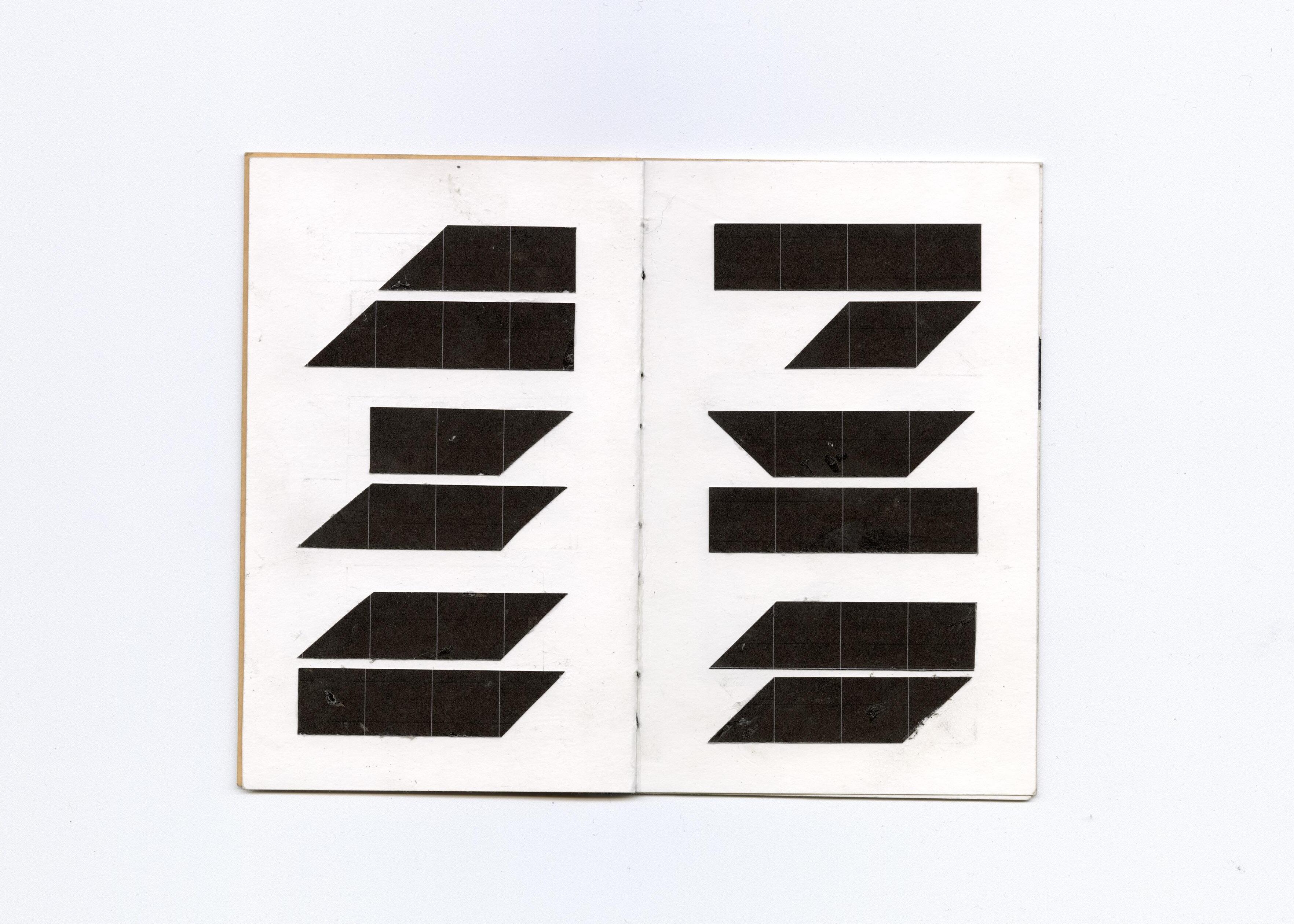
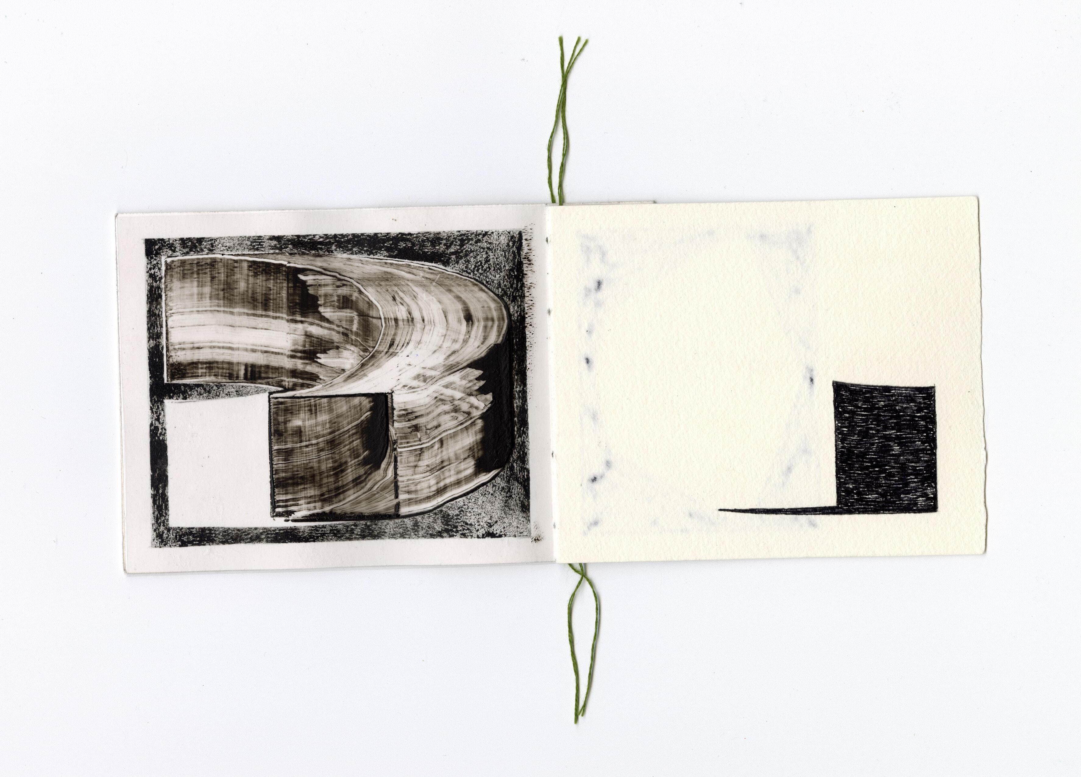
It was special to receive a carefully bound, one-of-a-kind booklet. That immediately gives it value. The materials (the transparent sheets) you used as pages fit well with what we work with as a studio. Because of that, we immediately saw possibilities for working with it. When you handed it over, you briefly mentioned a “duet” – we thought that was a strong working title that aligned well with our collaboration. We took that as a starting point for the images in the booklet. The booklet provides a framework, is of a manageable size, and features other inspiring makers. That made it fun to contribute to your project.

Thomas & Jurgen were the first artists I visited. That visit happened before the project had fully taken shape, and in many ways, it’s because of them that it became what it is now.
They were very welcoming. We talked and reflected on the ideas I had, exploring what the project could become. It was a sunny day. Like with all my visits, I came with only my camera and my black binder case. We drank some beers on their balcony — I got a little tipsy after the third. For a while, we were just hanging out.
At some point, Thomas said he was heading home. He left the balcony, but a few minutes later returned with two artworks in hand. He turned to Jurgen and said, “We can spare one, right?” I was so surprised. They let me choose one of their works as a gift. They even signed it for me. I was really grateful.
Even though they were the first artists I visited, they were the last ones I made a booklet for. When I first met them, I didn’t yet have the concept of individual booklets. I had only brought my green-bound book, which included work by myself and two of my brothers. After finishing Henny’s booklet, I finally made time to design one for Thomas & Jurgen as well.
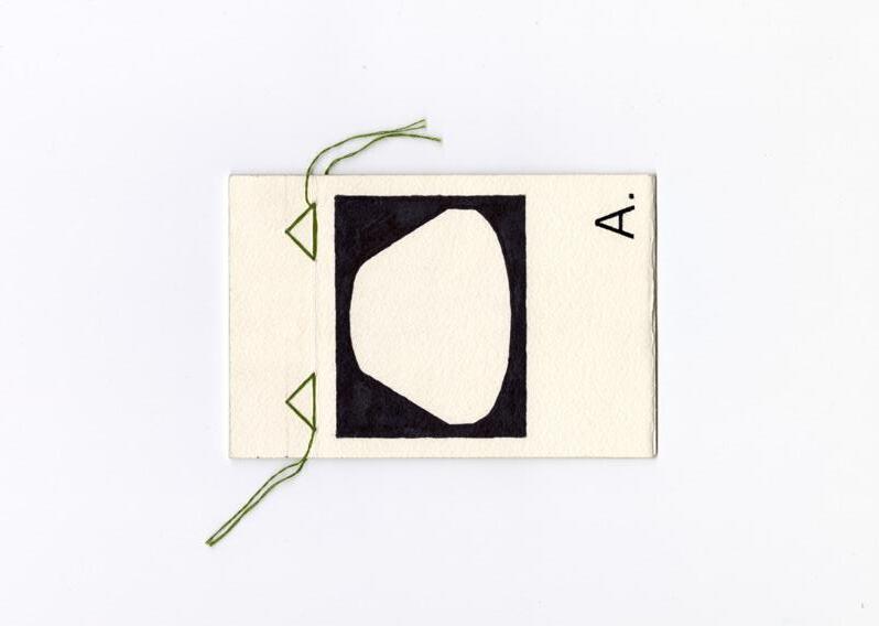
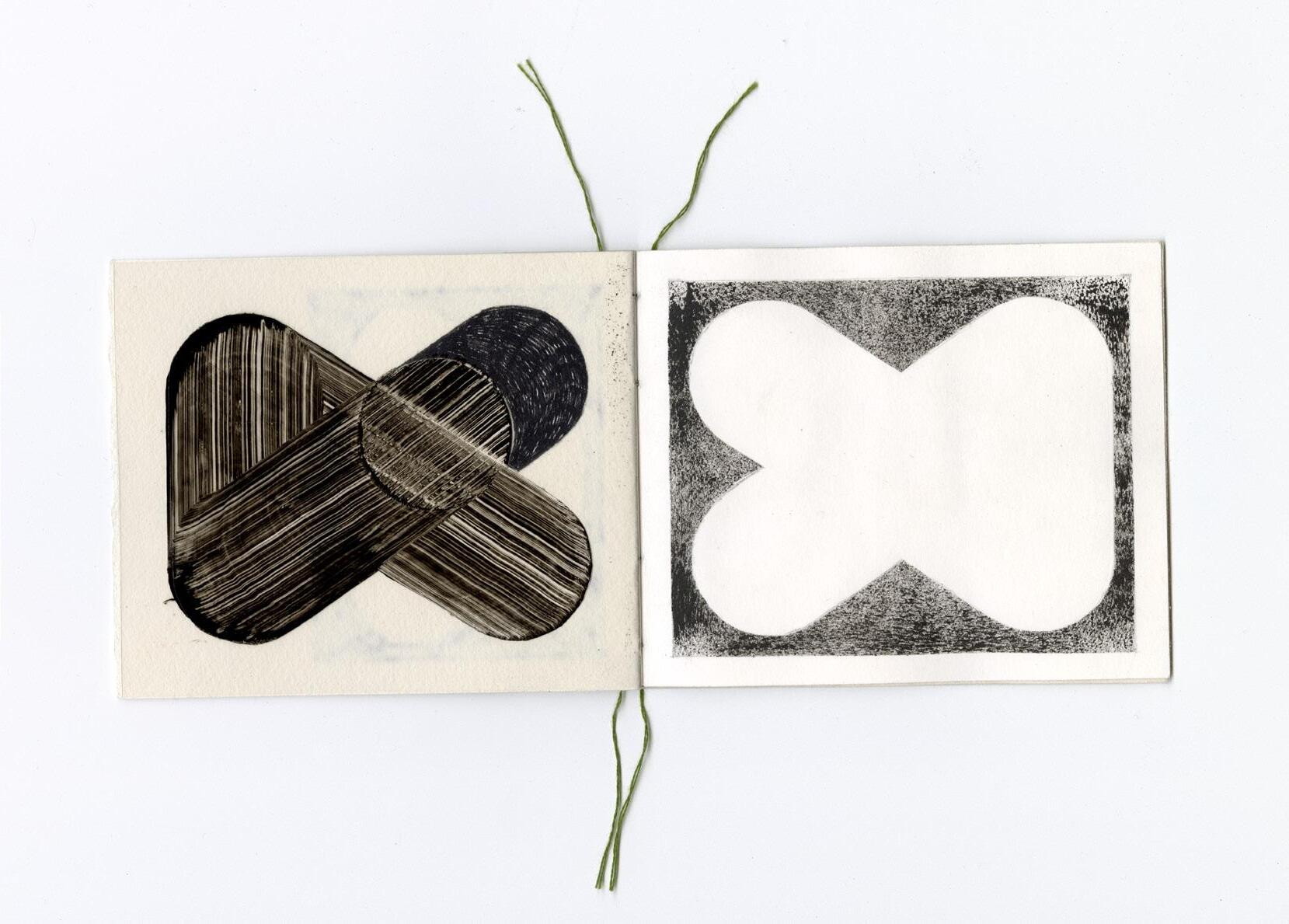
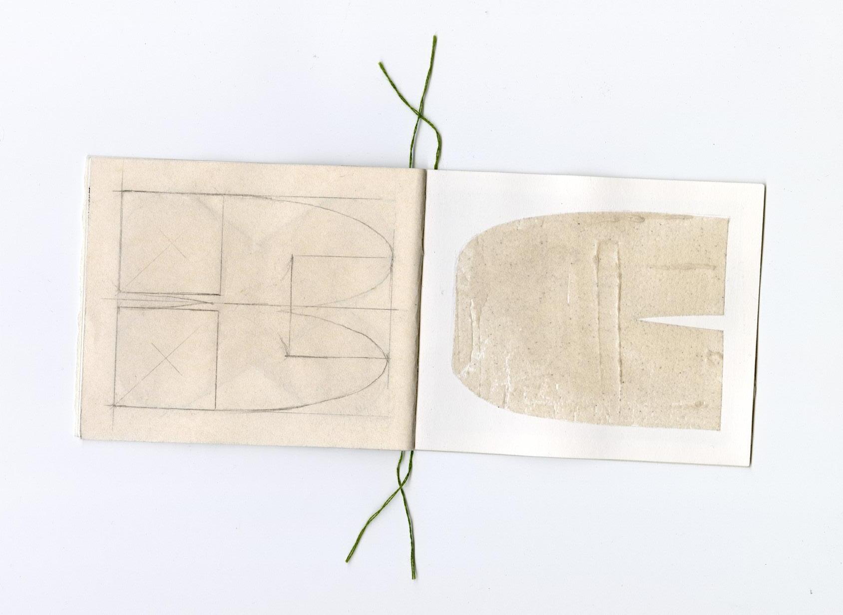
The book I made for them was inspired by the fact that they’re a duo. I bound it in two separate segments and included different materials and paper types to create a kind of duet between the two. I also added transparent sheets, a material they often use in their work. And since this was the last book I bound, I decided to bind it with the same green thread I had used for the very first book — the one that sparked the idea for this entire graduation project. It felt like a fitting choice.
I later came to pick up the booklet from Jurgen at the Design Museum, where he was helping students.
When he handed it over, I saw an interesting shape on the cover and a capital
“A.” I was so curious to see what was inside. He flipped through it quickly, mentioning a few things, and then passed it to me to take a closer look. I was amazed. They had interpreted my idea of a “duet” in such a thoughtful way. They used different materials with great care and sensitivity. I was deeply curious about how they’d managed to work like that — with such restraint and depth.
The visual language of Thomas & Jurgen really speaks to me. Just like with the work of the other collaborating artists I feel a sense of personal reflection and connection. In my own practice, I tend to lean toward similar visual decisions. There’s a sense of mystery in the traces and shapes they left behind. Looking at their booklet now, I feel invited to keep searching, to keep wondering.
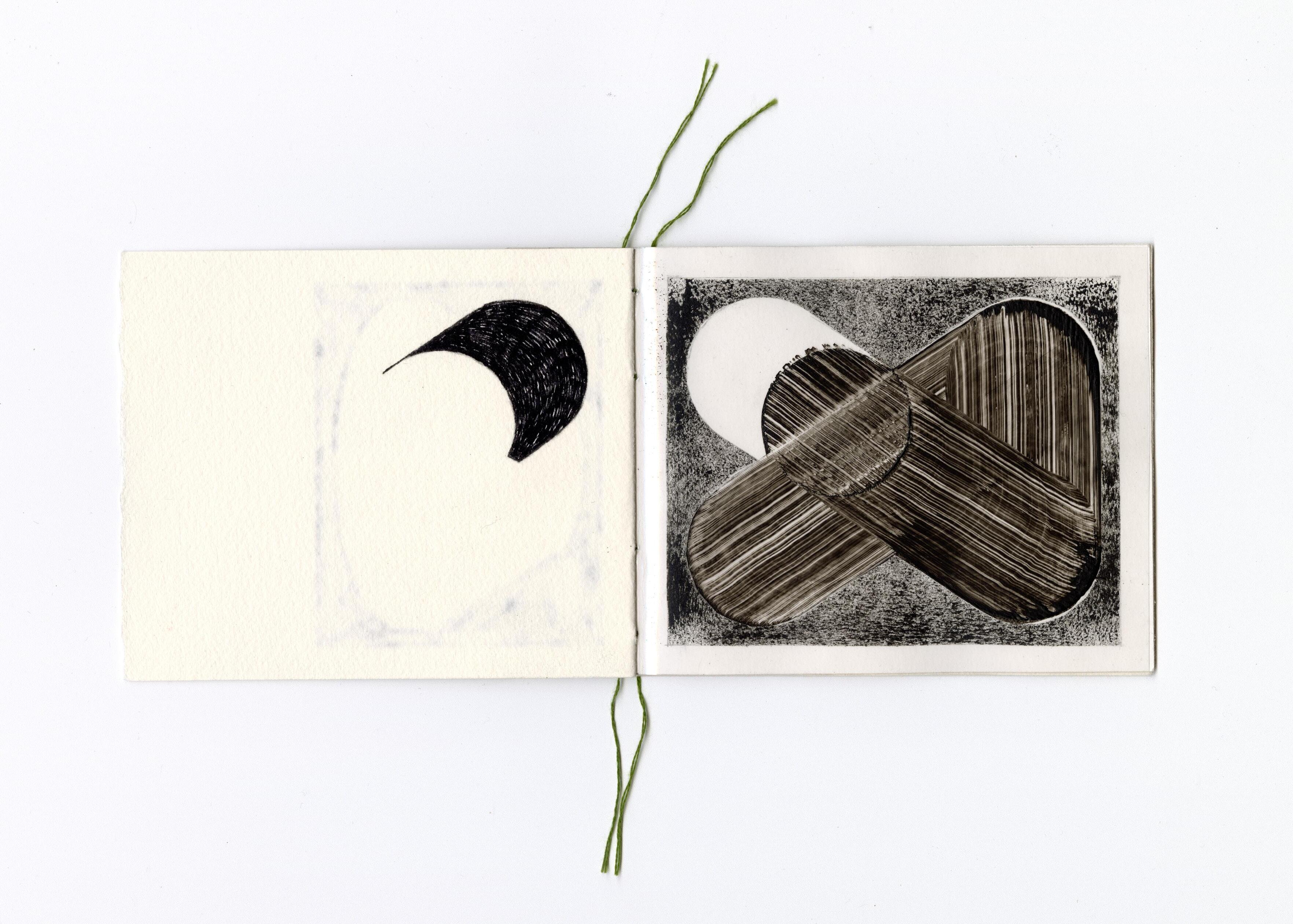
Concept Text
Typeface
Design
Printed at Thanks to
Nous’ché Couteaux
Nous’ché Couteaux
RM Mono - CoType Foundry
NO To Sleep - Nous’ché Couteaux
Nous’ché Couteaux
St Joost, Den Bosch
Mick Johan
Jurgen Wiegeraad
Thomas Bevelander
Dineke van Oosten
Peter Korsman
Henny Overbeek
Casper Herselman
Luciano Pinna
Jeroen Baars
Resi van der Loo
Frank Couteaux
Marieke Heymans
The choice for analog reflects the title and conceptual framing of this project, rather than adherence to a specific language standard. Variations in contributor texts have been preserved.
All works are handmade
Printed at St Joost,
All images are copyrighted by the participating artists.
