DESIGN
PANTONE COLOR OF THE YEAR
Described as emitting the desired, familiar,
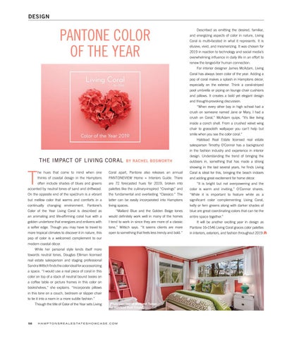
and energizing aspects of color in nature, Living Coral is multi-faceted in what it represents. It is elusive, vivid, and mesmerizing. It was chosen for 2019 in reaction to technology and social media’s overwhelming influence in daily life in an effort to renew the longed-for human connection.
For interior designer James McAdam, Living
Coral has always been color of the year. Adding a pop of coral makes a splash in Hamptons décor, especially on the exterior. Think a coral-striped pool umbrella or piping on lounge chair cushions and pillows. It creates a bold yet elegant design and thought-provoking discussion.
“When every other boy in high school had a
crush on someone named Jane or Mary, I had a crush on Coral,” McAdam quips. “It’s like living inside a conch shell. From a crushed velvet wing chair to grasscloth wallpaper you can’t help but smile when you see the color coral.”
Halstead Real Estate licensed real estate
salesperson Timothy O’Connor has a background in the fashion industry and experience in interior
THE IMPACT OF LIVING CORAL
design. Understanding the trend of bringing the
BY RACHEL BOSWORTH
outdoors in, something that has made a strong showing in the last several years, he finds Living
T
he hues that come to mind when one
Coral apart, Pantone also releases an annual
Coral is ideal for this, bringing the beach indoors
thinks of coastal design in the Hamptons
PANTONEVIEW Home + Interiors Guide. There
and adding great excitement for home décor.
often include shades of blues and greens
are 72 forecasted hues for 2019, broken into
accented by neutral tones of sand and driftwood.
palettes like the culinary-inspired “Cravings” and
color is warm and inviting,” O’Connor shares.
On the opposite end of the spectrum is a vibrant
the fundamental and everlasting “Classico.” The
“While it is important to feature white as a
but mellow color that warms and comforts in a
latter can be easily incorporated into Hamptons
significant color complementing Living Coral,
continually changing environment. Pantone’s
living spaces.
kelly or fern greens along with darker shades of
Color of the Year Living Coral is described as
blue are great coordinating colors that can tie the
an animating and life-affirming coral hue with a
would definitely work well in many of the homes
entire space together.”
golden undertone that energizes and enlivens with
I tend to work in since they are more of a classic
a softer edge. Though you may have to travel to
tone,” Wittich says. “It seems clients are more
Pantone 16-1546 Living Coral graces color palettes
more tropical climates to discover it in nature, this
open to something that feels less trendy and bold.”
in interiors, exteriors, and fashion throughout 2019.
“Mallard Blue and the Golden Beige tones
pop of color is a welcomed complement to our modern coastal décor.
While her personal style lends itself more
towards neutral tones, Douglas Elliman licensed real estate salesperson and staging professional Sandra Wittich finds the color ideal for accessorizing a space. “I would use a real piece of coral in this color on top of a stack of neutral bound books on a coffee table or picture frames in this color on bookshelves,” she explains. “Incorporate pillows in this tone on a couch, bedroom or slipper chair to tie it into a room in a more subtle fashion.”
58
Though the title of Color of the Year sets Living
Photo courtesy of Margaret Turner of Halstead Real Estate
H A M P T O N S R E A L E S TAT E S H O W C A S E . C O M
“It is bright but not overpowering and the
It will be another exciting year in design as