

A YEAR 12 SANTA SABINA COLLEGE 2022 Major Works DESIGN & TECHNOLOGY TEXTILES & DESIGN VISUAL ARTS HISTORY EXTENSION ENGLISH EXTENSION 2 MUSIC DRAMA

Students of the Year 12 subjects featured in Year 12 Major Works 2022 are required to create a major project or performance piece or write an original composition which takes up a substantial amount of the final mark for that subject. So students with creative flair, design capacity or in depth interest are attracted to the subjects of Design & Technology, Drama, English Extension 2, History Extension, Music, Textiles & Design, and Visual Art.
Santa Sabina students are renowned for their dedication to creating spectacular works of art which are frequently nominated and selected for the NSW Educational Standards Authority (NESA) annual showcases of the exemplary major works in NSW (including ARTEXPRESS, ENCORE, OnStage, Texstyle and Shape).
Research and creative work on these projects began in Term 4 2021. Processes included research, experimentation, making, rehearsing and gathering feedback along the way. The examples of exemplary work featured here are a measure of the excellent preparation work and ability of these students. We exhibited many of these works in our showcases for Drama, Visual Art, Design & Technology, Textiles & Design and English in Term 3 2022. Projects for Drama, English (in full) and Music can be found on our website and Youtube channel. All works represent a major accomplishment and I congratulate our talented students and their dedicated teachers.
I hope you enjoy the representation of students’ works in this booklet.
PAULINA SKERMAN College Principal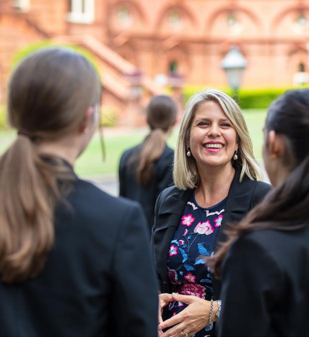
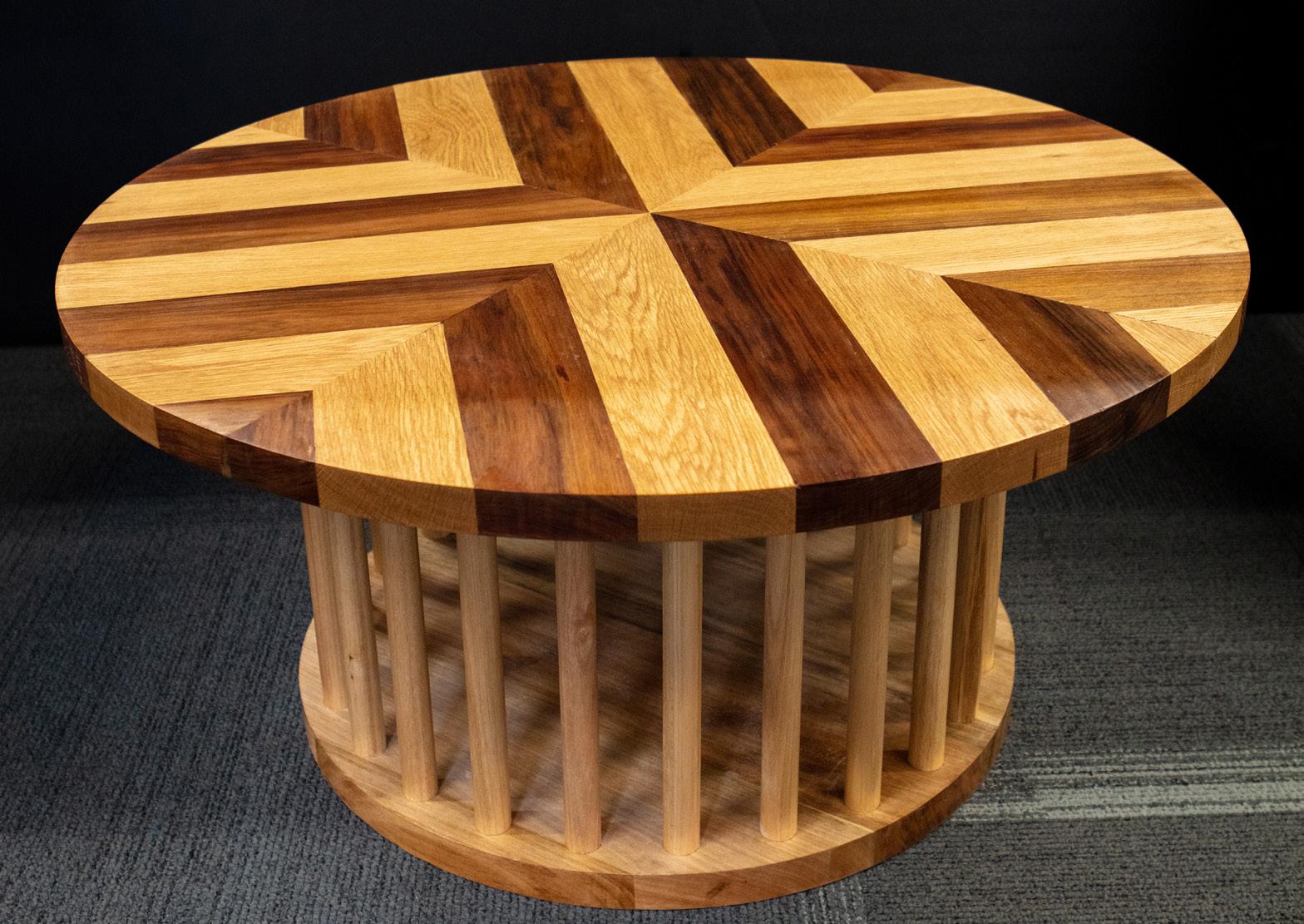
My Major Design Project is a mood floor lamp for my open home living room with the intention of transforming the space’s atmosphere and vibe to a relaxing comfortable space. Due to the environment’s illuminated space of bright white downlights, the current living room doesn’t invite a warm comforting setting for family members and guests to chat and relax. The lamp’s design is to give the target market the free capability to use the lamp to change the colour of the light and its level of exposure to best suit the atmosphere within the living room during different times or occasions. It was this common trend which spiked due to the impact of COVID-19, forcing populations to isolate, and thus the home environment became a main factor of comfort as well as a functional working space. Through this technology it initiated positive and negative effects of an individual’s mood and emotions to boost or improve their wellbeing. From this growing trend of smart light technology and multi-coloured lighting within homes, this has
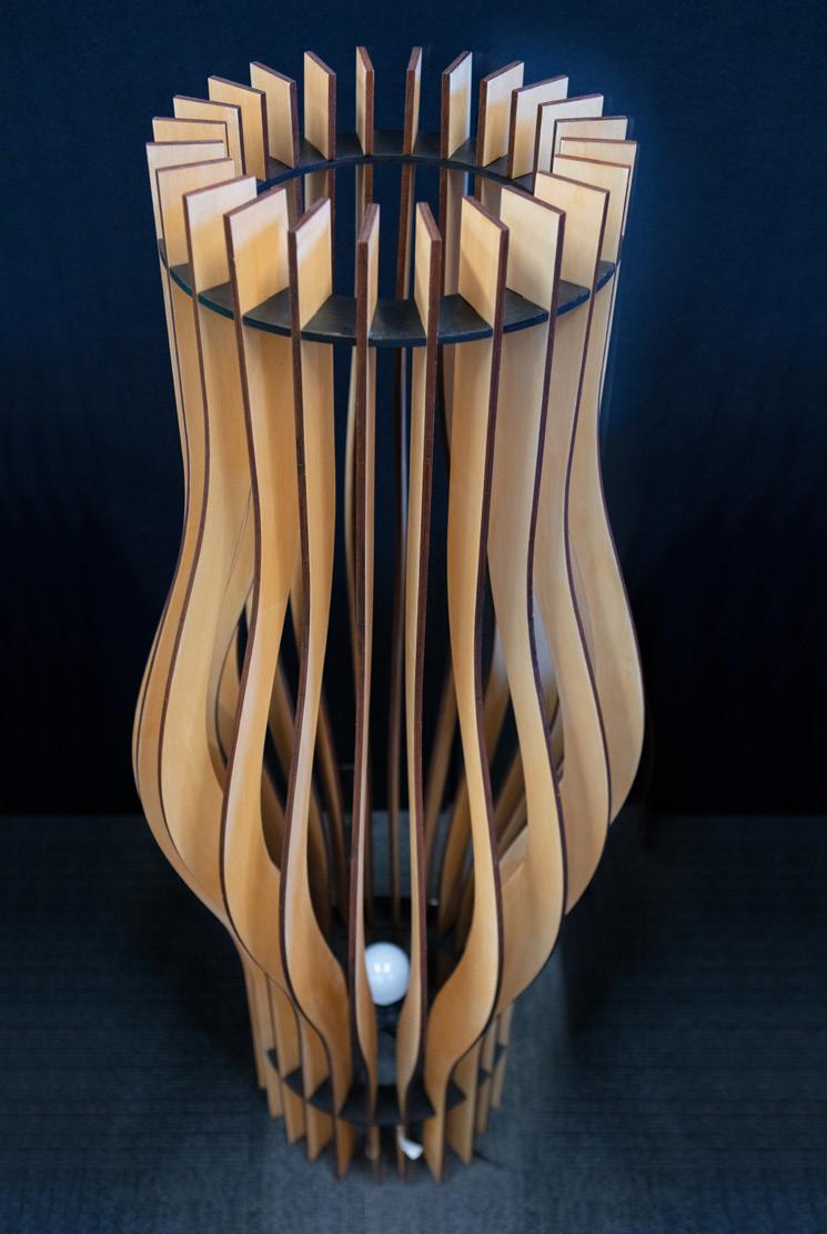
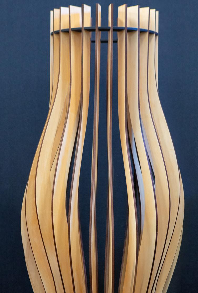
provided users with the ability to link the lights to an application on a mobile phone, providing an effective and efficient method for users to easily change the colour to their preferences. This is alongside its capabilities of connecting to many home devices such as assistant devices as well. Hence, to accommodate this existing technology within my home, the lamp uses smart light technology to power.
The lamp was constructed from poplar plywood and MDF. Poplar plywood is light in weight and suitable for the target market to move within the environment freely with ease to a different area or space within the living room. MDF is heavier in weight which assists in improving the durability and stability, as it was used on the base wheel/ring. As both materials were painted with either a satin stain oil finish or black paint, these elements contrast each other to effectively enhance the aesthetic display when the light is off, harmoniously engaging with the existing furnishings within the environment.
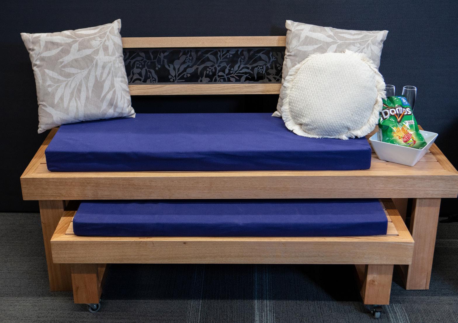
I have designed and constructed a functional and aesthetically pleasing outdoor daybed to fit two people. Its purpose is to provide comfortable seating for an outdoor environment, allowing a place for the user to take a break and relax. The intended market is predominantly my family, as well as visitors to the house. The old furniture surrounding the pool became weathered, and destroyed the fibres of the seating, thus making it uncomfortable and undesirable to use. The outdoor space of my home is the main entertainment area, and without comfortable seating for not only the owners but also visitors results in dissatisfaction.
Moreover, there has been an influx in outdoor rooms as the new standard in modern garden ideas. Its aim is to increasingly make the outdoor area a space for people to spend many hours, not just an occasional al fresco dinner, with studies highlighting the need for individuals to spend more time outside in order to improve wellbeing and work-life balance, specifically after the
difficult hardships of COVID-19.
The overall design of the outdoor daybed has been influenced through a survey conducted by the target market, which specified their desires for the product to be multifunctional. This can be identified through the feature of transforming the product into a bed or into a seat, through attaching wheels to the legs of the footrest. Moreover, at the end of the seat there is a small table that allows the user to place small items on. Further, the metal aesthetic panel on the back of the seat has been inspired from the daybed’s intended environment, helping to achieve cohesion between the product and space. In addition, my design has been constructed mainly from Tasmanian Oak, as it was easy to work with and manipulate, light to carry, preventing the risk of strain and ideal for its intended environment.
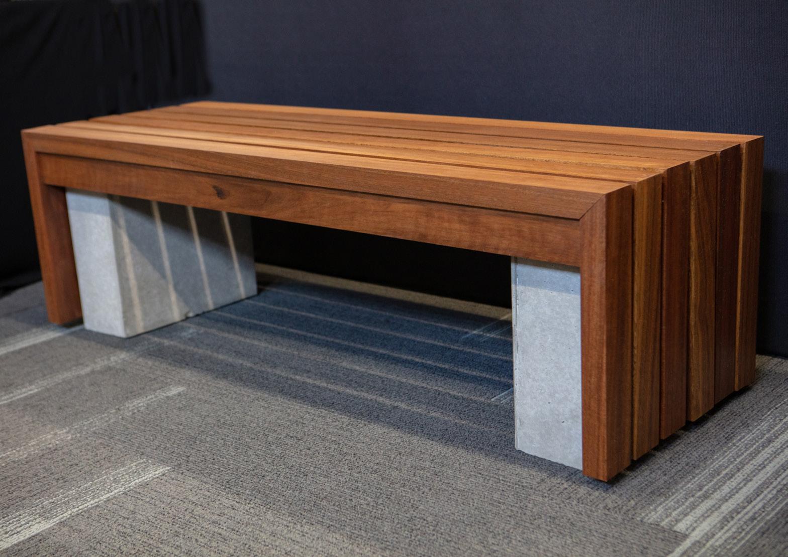
I have designed and constructed a modern outdoor bench made from concrete and timber. The purpose of this bench is to provide an outdoor seating area for my grandparents – a replacement for their previous one which broke and now is an empty space and not being used as an effective area. It allows for the empty space to be more practical and allows users to enjoy the outdoors. By creating this bench it allowed for the space to be filled and become more inviting to family and friends and can be used to allow for more people to sit and enjoy time together.
My project consists of the two key materials of wood and concrete. By using both concrete and wood for my materials my project was able to be constructed and designed to the highest quality possible. It is extremely durable, meeting the target market’s needs. The dark spotted gum contrasts well with the grey concrete and allows for the bench to be aesthetically pleasing and fit within the environment. By using these materials I was able to gain an understanding and experience
with construction skills. My project was made into two different components, the timber top slats and the two concrete legs. By designing my project into two different components it made it easier for the bench to be transported and moved around within the environment.
By following the design brief and abiding to the target market’s needs and wants I was able to successfully design and construct an aesthetic and functional outdoor bench that will be used by my grandparents.
I have designed a resin dining room table. Its purpose is to replace the current worn-out dining table which was not able to seat my whole family, and to replace it with a larger sized table able to seat family and guests through a modern coastal approach. It was crucial to address this issue, in order to maintain connectedness with family and guests whilst sharing a meal.
Throughout the design process, the target market’s needs and desires were closely considered to assure their needs were met in order to produce a highly functioning and aesthetic product. In order to accommodate their needs, the dimensions of the dining table were 1900mm by 1000mm to allow 8-10 users to easily sit in comfort.
My project consists of two key materials, timber and resin. The use of salvaged Tasmanian Oak for the base provides durability and support to the table top. The Red Gum timber – a hardwood – used in the table top provides stability and balance. Resin was used to create a modern

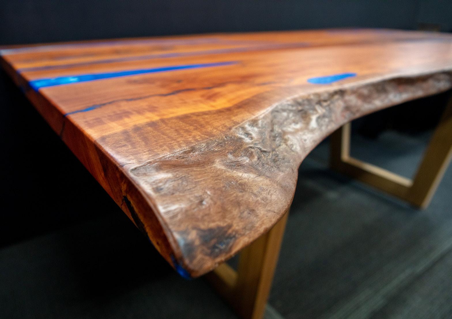
coastal approach meeting the current trends within furniture today. Pouring resin within the timber’s natural cracks and routing out a unique design, allows the product to be differentiated from others on the market. The contrast between both materials allows the product to be more appealing to users and fit within its intended environment.
Due to the proposed location of the table inside a unit opposite a coastal view, the surrounding environment was considered to be sure the table would fit cohesively within the location. Environmental factors were considered such as the art within the resin pour creating a beach wave effect, bright blue shades of resin representing the ocean and the moulding of shells within the table top. The resin dining table fits cohesively and harmoniously within its intended environment.
‘It’s the only home we have. Its future is in our hands.’
My Major Design Project is an off-grid, zero emission floating renewable energy pod. The focus of the concept is to rid the air of CO₂ emissions whilst simultaneously generating electricity using solar, wind and tidal technologies. As the contemporary issues of air and water pollution contributing to climate change grows larger, this project provides a viable solution to prevent the harmful effects negatively impacting individual lives as well as society and the community. It seeks to remediate the environmental consequences of mass urbanisation through the production of clean energy, whilst clearing the air on the site in which it is placed. The innovative material of algae is placed along the surface of the pod, which seeks to extract harmful C02 emissions from the atmosphere. Additionally, the edges of the platform will be covered in solar panels, along with built in wind turbines and tidal wave energy
collectors. These innovative technologies extract energy for both the pod to run offshore, with additional energy being connected to the main city’s national grid. Hence, the platform reduces the use of non-renewable resources through its zero carbon emission footprint, by its adoption of sustainable electrical extraction strategies.
My Major Design Project centred around the richness of Aboriginal culture as a means of inspiration in the redevelopment of the design and architecture of the Sydney International Airport.
An airport should be a true reflection of a country’s culture, history and identity. Welcoming 44.4 million travellers a year, the Tom Bradley International Terminal in Sydney will become a world-renowned hub that through its architecture and design celebrates and embraces the nation’s first people and their culture. Its purpose will be to teach and encourage travellers to open their minds and hearts to the culture. Through connecting to country, the design is centred around the significance of nature to Aboriginal peoples in creating an immersive experience manipulating the elements of nature.
It attempts to educate the broader community and the global community in understanding the complexities of Aboriginal culture so that we may grow as human beings by learning and inspiring
others in celebration of differences. The redesign will leave travellers touched, feeling a sense of belonging and in admiration of the rich ancient culture but most importantly in awe of the architecture and design.
Always was, always will be.
I decided to design and construct a highly functional and ergonomic record player cabinet using completely recycled Oregon timber, incorporating a retro design and colour scheme. The cabinet features various storage features including colourful sliding tambour doors to store the record player and vinyl safely within the cabinetry. The cabinet’s curved edges and easy grip handles were designed specifically for the residents of nursing homes and aged care facilities living with dementia and Alzheimer’s. Over the past few decades, these diseases have grown to be the number one killer of Australians. Studies have proven music specifically listened to on a record player can help these patients relieve anger and even spark past memories.
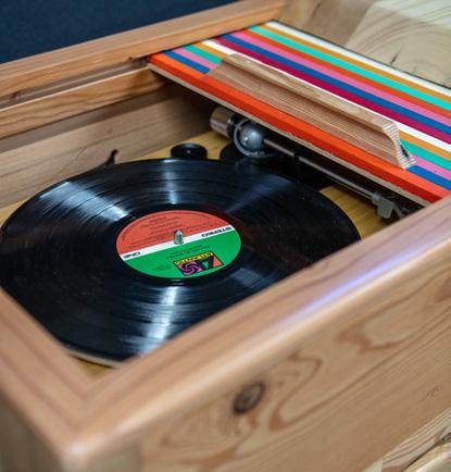
Through the design process, the target market’s needs and safety requirements needed to be heavily taken into consideration to ensure the cabinet can be easily accessed by them. Functional considerations included adequate height, functional and accessible doors as well
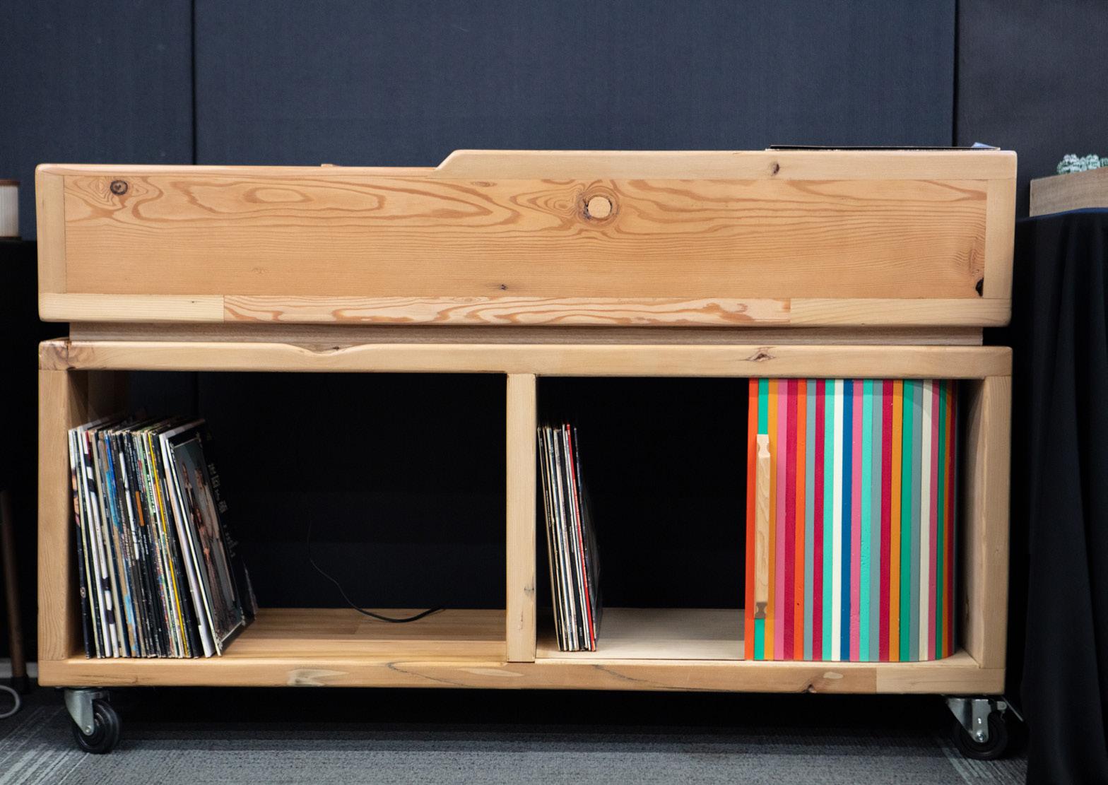
as portability so the music can be enjoyed in different rooms. Aesthetic considerations also guided the design as sticking to a retro vibe whilst incorporating a modern take was relevant in order for the cabinet to fit in its environment.
On top of the importance of the target market, it was essential that the record cabinet adhered to the sustainable design brief. The decision to make my cabinet from recycled timber from my recently renovated houses, adhered to the design brief of sustainability. Through extensive thicknessing and sanding I was able to get the old timber looking fresh again in order to provide aesthetic benefits. Overall the cabinet still demonstrates faults within the timber and grain but these add to the rustic and retro vibe. My decision to use recycled timber definitely resulted in the cabinet being much heavier than intended but with the addition of wheels the cabinet remains portable and functional.
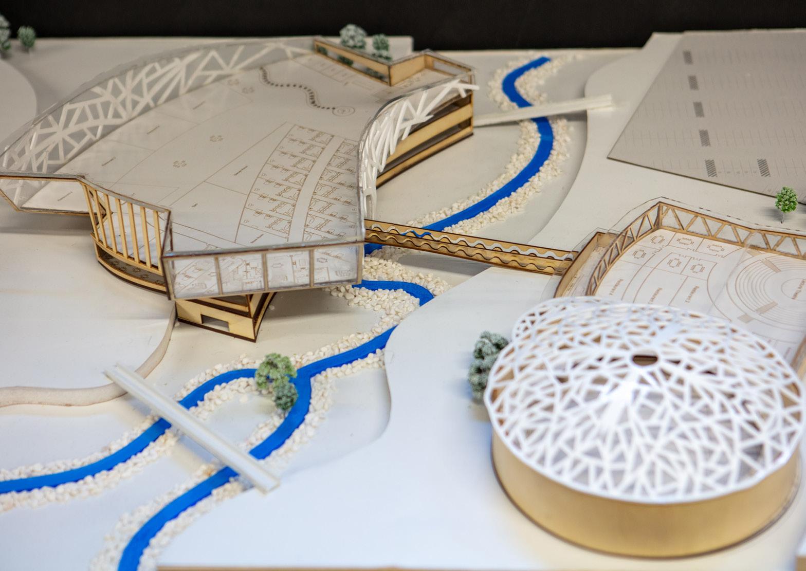
I have designed and presented a concept for the development of an Innovation Hub to be situated on Glebe Island. The architectural concept includes a design of the exterior of the centre and an interior floor plan.

The design addresses the current issues regarding Australia’s need to develop emerging technologies through the use of specialised learning/creation spaces. These rooms include robotics labs, science labs, production/film studios, 3D printing rooms, games development studios, computer rooms, workshops, and augmented reality development rooms. The hub incorporates an open plan with shared design rooms to promote collaboration. The hub includes student classrooms to educate upcoming generations and facilitate their creativity in response to the ongoing need to upskill. The design includes parking for students and employees, and a proposed additional ferry route to promote public transportation. A large cafeteria has been implemented in addition to
multiple cafes. The campus strongly encourages a connection to nature through the use of outdoor green spaces.
The purpose of the innovation hub is to present the public with a centre to develop, evolve or build their concepts and ideas. The centre will have employees who specialise in different industries of IT such as coding. Anyone who books an appointment will be assisted by an employee in that field. In addition to this, the hub will have a heavy focus on the importance of education, thus, students and adolescents are a large part of the target audience. There are many talented people with great ideas, however, because they don’t have connections and contacts, funding, or help from people in the necessary fields, their ideas go to waste. The innovation hub will provide these individuals with the facilities and resources to make their ideas a reality. The tech centre allows ideation and product development to be streamlined.
I have designed and constructed a modern and feature-style indoor coffee table. Its purpose addresses the current absence of a coffee table in my living room, causing a lack of social interaction. The rise of the COVID-19 pandemic forced families to remain in their homes, prompting an increased sense of social interaction. In this, by providing a coffee table in the living space, there is an added ability for my family to enjoy meals and drinks in a social environment.
In terms of design, the target market asked for the table to act as a feature piece in the living room. In order to accommodate their needs, I designed a table featuring a herringbone style tabletop. The tabletop features a distinct contrast between Tasmanian Blackwood and American Oak, allowing for it to stand out immensely in its intended location. Further, the table features a unique base which utilises different shades and types of timber, specifically Tasmanian Oak dowels, allowing for visual contrast with the table top, making the table unique.
My ability to work closely with the target market allowed me to implement specific elements into the table. Specifically, they asked for the table to be 950mm in diameter, and to be level with the existing lounge. Further, they asked for the table to integrate Tasmanian Oak in some way due to there being existing furniture featuring this timber. In this, I was able to design an end product that directly adheres to their desires, ensuring the table will be used to its maximum potential, and hence remain in its intended area for an extended period.
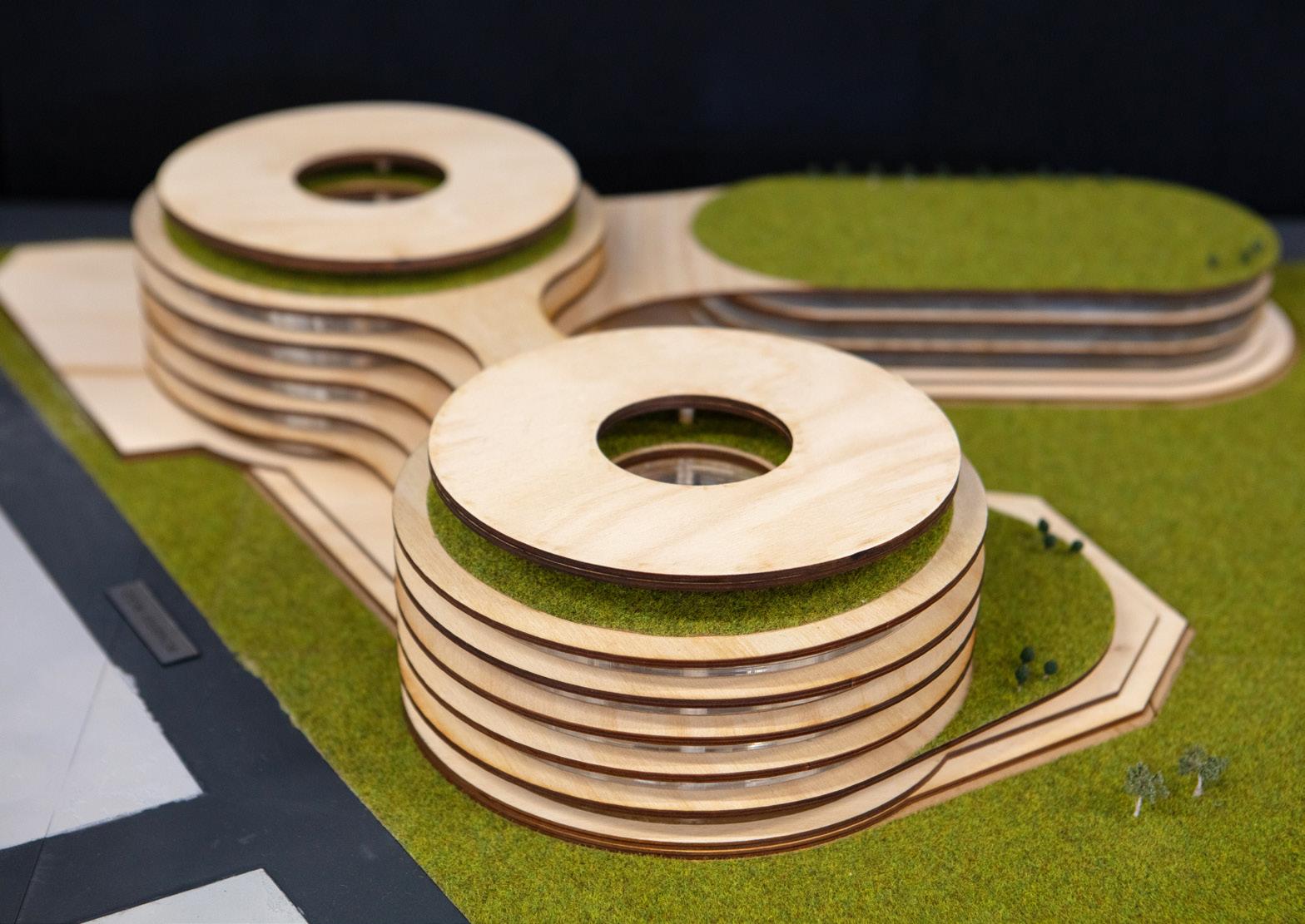
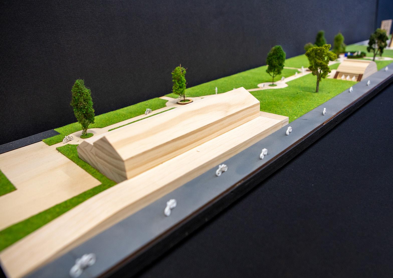
According to projections by the NSW Department of the Environment, an additional 1.7 million people will populate Greater Sydney by 2036. Existing primary schools are already overcrowded. The overpopulation concern amongst schools within the Chatswood and broader Willoughby area has increased over the past five years. Despite the existence of four other primary schools within the area, these ‘schools are struggling to cope with the booming population and are also being upgraded’ (SMH, 2021). The NSW Government has communicated their focus to upgrade and develop schools in recognition of overpopulation concerns as outlined in the $2.1 billion budget over a four year period.
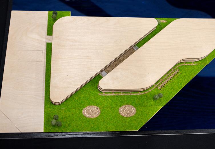
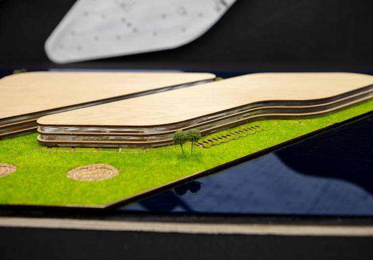
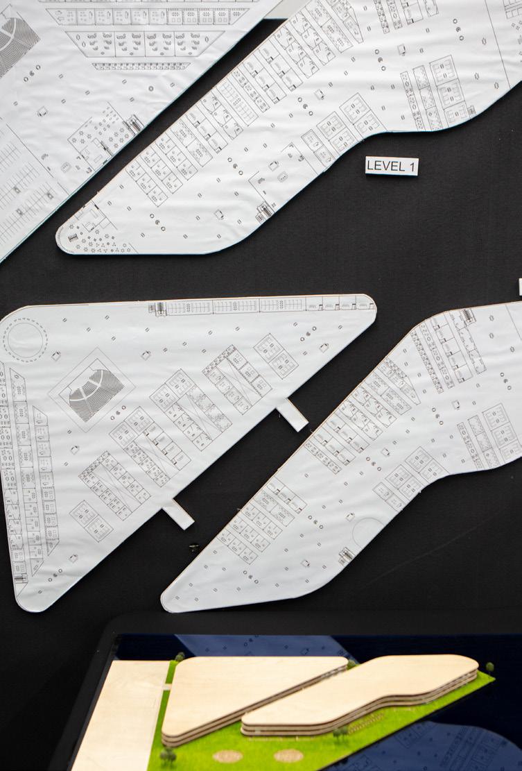
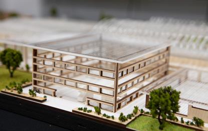
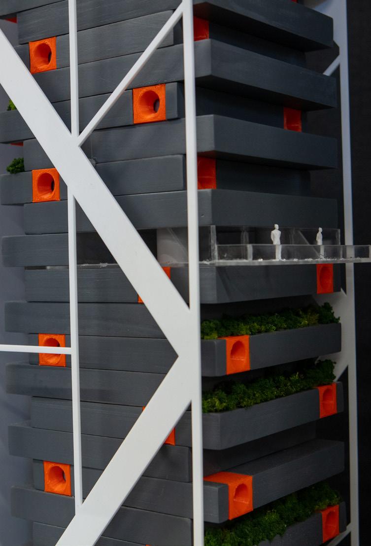
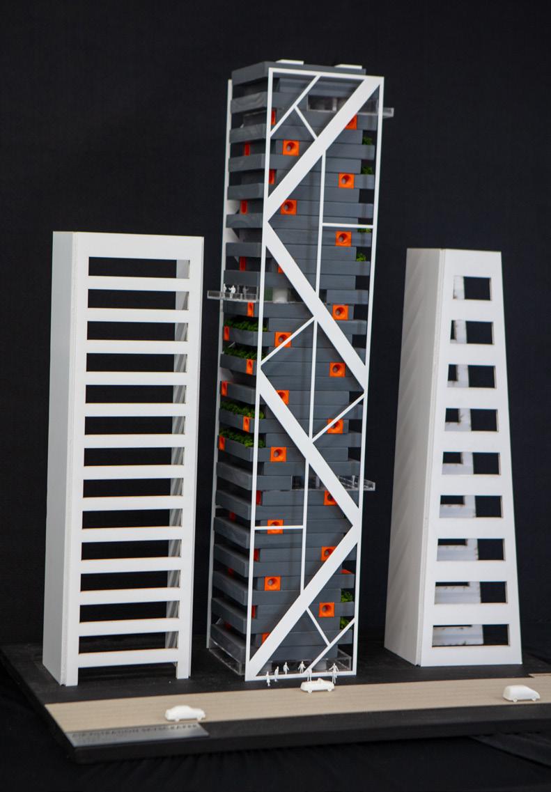
In response, the focus of my Major Design Project was to design and present a concept for an expansive high-rise primary school, located at the Sydney Metro Chatswood Dive Site, 355 Mowbray Rd, Chatswood NSW. The architectural concept includes the design of the exterior of the building, landscaping and a basic internal layout
of the classroom levels. I have constructed a 1:250 model to showcase my concept and design features such as the unique shape of the building and connecting balconies, atrium, green rooves and gymnasium.
The concept focuses on how a space can foster a positive interaction between individuals and an architectural design, highlighting beneficial values for the wider community but more specifically, students’ wellbeing, health and education. Due to limitations of land size and the need to create a flexible, adaptable, connected learning environment, the design focuses on capitalising on vertical space and ensures the school incorporates multi-use, multi-faceted facilities and classrooms. The maximisation of the space ensures the necessary school facilities are available which is crucial to consider within the development of a vertical school. The multi-use facilities will be adaptable allowing growth and change for future needs.
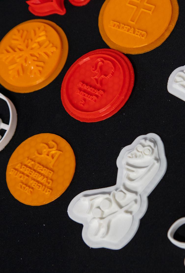
The focus of my Major Design Project (MDP) is to use graphic design in order to expand and further develop a small business. I have used CAD Programs such as Rhino, Adobe Illustrator and AutoCad to design stamps, cake toppers, rolling pin designs and wall hangings for the business. These concepts were created through 3D printing, laser cutting and acrylic embossing, with the rolling pins being developed externally. ‘Mickie’s Bickies’ is a small business founded in 2021 during the COVID-19 lockdown. It was brought to my attention that the current marketing strategies were not in the best interest of the business. To attract further customers and get the business’s name out in the open, I decided to create marketing strategies and implement different concepts to the business for a less than basic result and a successful promotion of the business name. In this project I have created: a website, business cards, 3D prints of cookie cutters and stamps, a menu, cake toppers, wall hangings, designed rolling pins, box designs and

packaging, and a new logo. Furthermore, in the further development of ‘Mickie’s Bickie’s’ I aspire to improve the public vision and brand name by assisting in business marketing and implementing different concepts to improve marketing and profitability. This business originally started by the sole trader designing and printing personalised stamps to create personalised cookies for functions and events. However now with the further development of the business, the design aspect for this new project is to expand the business’s original idea by being able to sell the 3D designs while also creating cake toppers for customers to buy with their cookies, rolling pins to make a more efficient and quicker strategy when creating standard stamps for yearly events (such as: Christmas, Easter, Mother’s Day, Father’s Day etc…) and wall hangings for people to purchase with their cookies and cake toppers to present on flower walls at events.
‘Medicine adds days to life, Occupational Therapy adds life to days.’ (Unknown)
Health is a basic human right. People’s needs for Occupational Therapy have been forgotten and have not been provided with the basic human rights to participate in society, develop and be integrated within society.
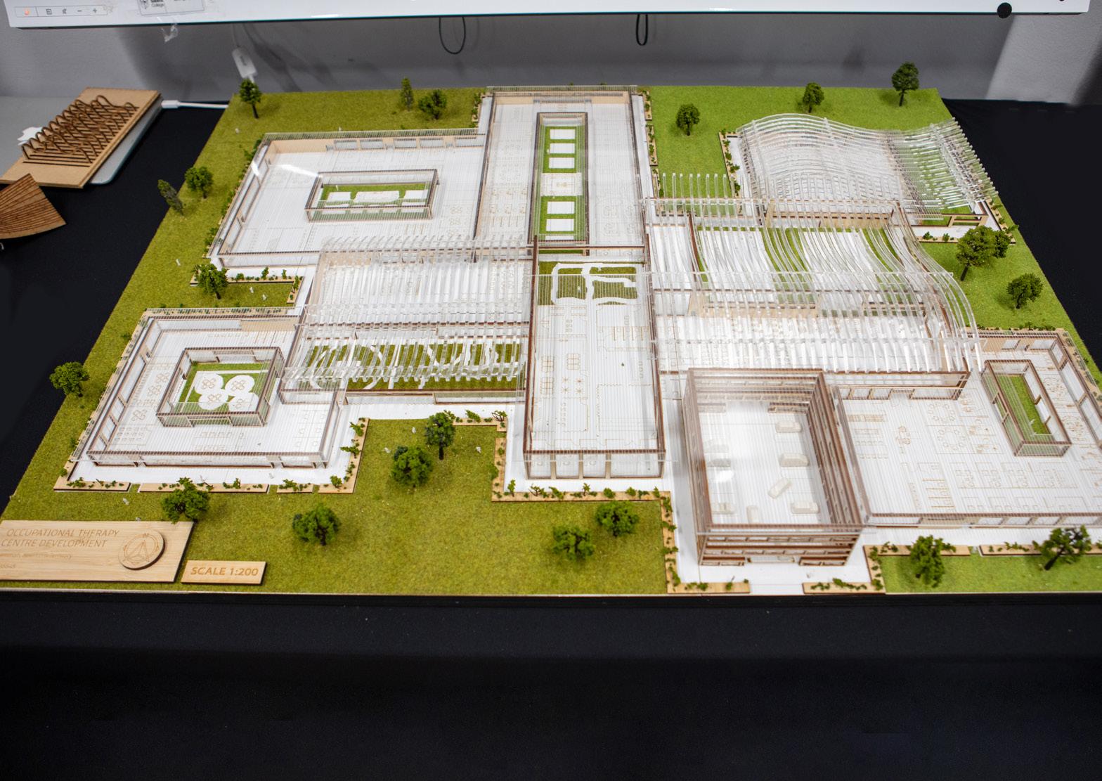
Therefore, my Major Design Project is a development of an Occupational Therapy Centre (OTC) in Berrimah, Northern Territory (Australia) which aims to build the capacity of central allied health services for rural and remote communities suffering from severe physical and mental illnesses and disabilities. This is in response to the Productivity Commission’s ‘Report on Government Services’ (2017), demonstrating that the existing disability system is ‘underfunded, unfair, fragmented and inefficient’. Hence, my MDP is motivated by the opportunity to address workforce shortages outside major cities, improve health outcomes to support remote families and communities, and respond to the genuine need
for an all-inclusive and accessible society to reduce global issues of stereotyping, stigma and discrimination surrounding disabled persons.
Through holistic multidisciplinary healthcare, the eight buildings focus on the main fields of Occupational Therapy including: adults and the elderly, children, mental illness, return to the workplace, autism, driving assistance, disability and cardiac rehabilitation. The MDP fosters a relationship between the built environment and psychological wellbeing through on site medical facilities, rehabilitative strategies (e.g. hydrotherapy pool, basketball court and art/music therapy) and social infrastructure (e.g. green, quiet areas and cafeteria) that recognises the need for support beyond only medical. Overall, the OTC provides targeted solutions within an attractive and central location by offering a welcoming environment to encourage a connectedness.
The focus of my Major Design Project was to design a concept for University of Sydney Student Accommodation, which addresses student housing affordability and the projected influx of international students returning to Sydney for tertiary education. This is in response to the NSW government’s pilot plan regarding the return of international students once Australian borders reopen. After recently acquiring a row of terraces in inner-city Darlington, the University of Sydney aims to transform the 8,000m² block into a student village that incorporates accommodation and student amenities.

Statistics show that Sydney welcomes 50,000 international students to their universities each year, highlighting the significance of my project in accommodating these students. The COVID-19 pandemic limited travel for international students which put pressure on Sydney universities that relied on these students.
My vision is to transform the block to create a lively, safe, student living environment by
providing a wide variety of spaces that set the stage for places for students to socialise, study, meet or retreat. My objective is to provide the university with additional student accommodation and educational facilities. The project includes the refurbishment of the existing terraced houses and the construction of four additional buildings at the rear of the houses for use by student residents and the wider university community. Whilst the additional buildings were non-specified in the plans, through primary research I concluded that a library, cafe, gym and convenience store were appropriate amenities to assist students. Through the inclusion of innovative sustainable design solutions and effectively maximising greenery, natural light and open spaces, the diverse needs of students are responded to. Thus, my project addresses the redevelopment of Sydney University’s student accommodation, in the hope of providing more housing options for international students studying in Sydney.

I have constructed a coffee table made from the waste which is produced by Santa Sabina College’s Design and Technology Department. As I have both participated and observed the projects which are produced by the Design and Technology subject each year, the waste that was inevitably compiled had become increasingly noticeable, hence sparking the premise of the project.
My design brief required the creation of a sustainable, functional and aesthetically pleasing piece of furniture solely using waste materials from the Santa Sabina TAS Department. The purpose of the furniture will be to raise awareness of the ongoing issue of substantial waste which is being produced within the design industry further promoting sustainable and green-thinking design. The intended target market for this project is Australian residents, primarily property owners wishing for a piece of unique and sustainable furniture that considers waste and the rapid greenhouse gas emission rates being produced in Australian landfills. The project must be aimed at
a target market that appreciates green design and stands against global environmental issues, ready to create a difference through their own furniture selection.
‘Design got us into this mess, now it needs to get us out of it.’ Bruce Mau
My project aims to provide a solution for excessive and undesired waste accumulations being created during the design process by limiting waste in design and using previous waste as a catalyst for a project whilst additionally creating a piece that is aesthetically pleasing and appeals to a greater audience’s style.
My project also aims to broaden current design trends of minimalism. Although the trend is entirely aesthetically pleasing, a piece of furniture which experimented with different materials, colours and textures was being craved by the market. The almost ‘maximalist’ approach ensures that my table is able to stand as a statement piece of furniture, rather than a small coffee table which is left in the corner of a living room.
I have created a unique coffee table influenced by the architectural elements of parametricism. I was inspired by the curves and movement of this style and wanted to reflect this as a visual art piece. After the isolation that COVID-19 created, which forced families to spend more time at home, it led me to redesign a central place for my family, being the living room. They wanted a focal piece that provided adequate space for books and remotes while also becoming a topic of conversation to re-introduce social interaction. I designed and constructed an intricate coffee table, fashioned in rib like form, hand routed from laser cut templates. Each rib was then made from plywood and joined by two threaded rods with metal spaces to create the illusion of a wave-like motion. I chose environmentally friendly materials, lowering the carbon footprint and waste. The clear finish was added to enhance the natural wood and fit within the bohemian style of the house. The clear glass table top allows the visual effect of
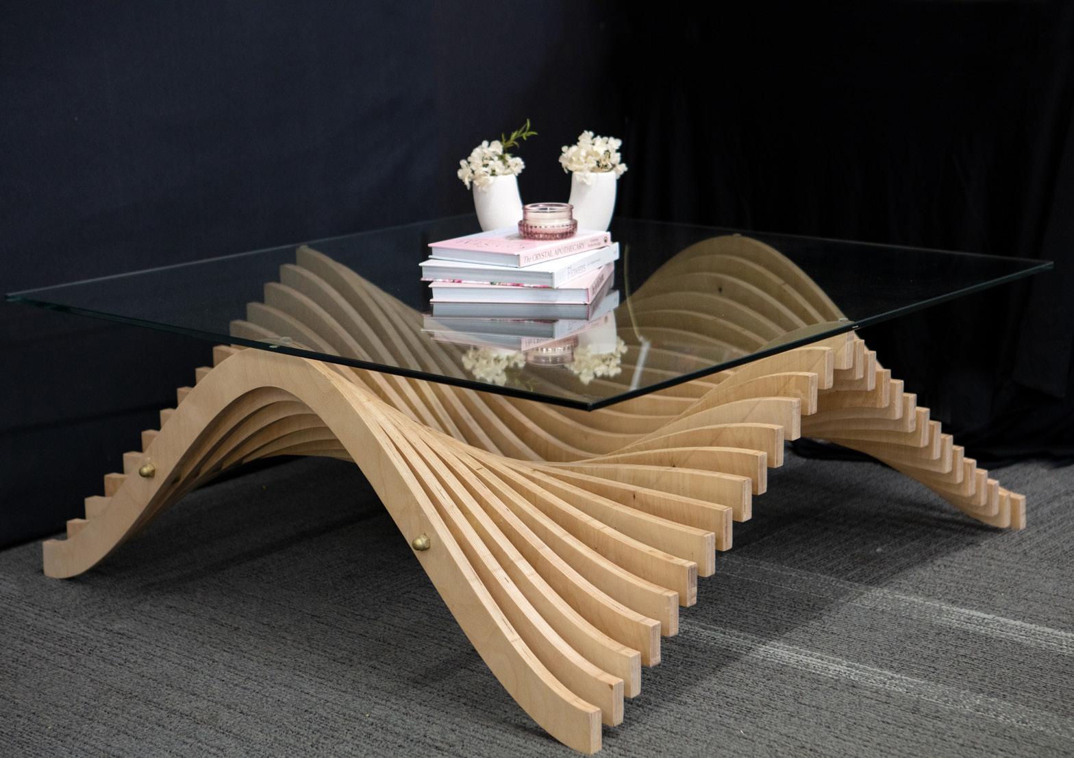
the design to be seen from every angle in the room, giving the effect of light and movement to the space. I enjoyed challenging myself with the unusual shape and the intricacy of the design. The challenges I faced during construction ultimately helped create a decorative piece and a connection for human interaction generating conversation with family and friends.
The aim of my major work is to design a concept for the Northern Rivers Rail Trail that designs components of the public facility to service the genuine need and allow for the public to immerse in the beauty of the natural environment. After conducting primary research through visiting the site first hand, surveying potential users of the facility and interviewing committee members of the Northern Rivers Rail Trail Facebook page, I was further informed on the prevalent genuine need, accompanied by secondary research.
The new Northern Rivers Rail Trail will promote a sustainable mode of transport, a safe recreational facility and provide economic growth as a tourist facility embodying integral cultural heritage and as an iconic and unique way to discover the beauty of the North Coast of NSW.
Through the inclusion of high-class facilities and adaptive reuse of the current obsolete facilities, the new site will better cater for the needs of the local community specifically and the wider Australian tourism industry. Specifically I have

designed rail trail amenities pods, developed a concept to repurpose obsolete train stations into cafés, a landscaping concept for the facility and redesign of the logo of the Northern Rivers Rail Trail. My concept also provides a solution through incorporating innovative and distinctive design that visibly affirms the site’s significance as a cultural landmark of Australia. The final design reflects Australia’s Indigenous culture through the use of Indigenous inspired landscaping and design patterns evident in the amenities’ pod design as well as the new logo concept. My designs also pursue leading edge sustainability and climate change resilience through active and passive solar design principles, such as the utilisation of natural lighting and sustainable design strategies, such as a greenhouse café concept, thermal mass, solar panelling and passive cooling.
The final concept would be real world applicable and meet the intended needs of the Northern Rivers Rail Trail project, the local communities and the wider community.
The focus of my Major Design Project was to conceptualise an air purification system that could be implemented into high-rise buildings as a solution to air pollution. The design incorporates elements of sustainability and modernism to allow for a more futuristic and eco-friendly high rise whilst accommodating the continuously growing problem of air pollution. Initially, the purpose of the air purification skyscraper is to address air pollution whilst also adding to the Sydney City plan to add more high-rises to the skyline. Not only does this respond to a genuine need within the world but it also offers the potential for creativity and wider thinking. This concept targets all residents of Sydney, tourists and potential residents as the quality of air affects all. As the Sydney CBD is a main area of attraction and the busiest place in Sydney, it must achieve an aesthetically pleasing appearance whilst also being functional. The development of such a system could have wide ramifications and applications to situations globally. The design will also aim to work in conjunction in

achieving current government council objectives of meeting plans for the futuristic upkeep of Sydney as a ‘global’ city for the changing demographics of the Sydney CBD.
I have chosen to place this concept at 505 George St, Sydney NSW. This location is most ideal for the design as it is currently undergoing construction to be built into a high-rise apartment building (2022). Located in the heart of Sydney CBD, this location is most ideal for an air purification system due to the chaotic traffic and pollutants. I believe I have designed a unique and innovative skyscraper that meets the needs of residents within the CBD in order to encourage sustainability, accommodate for Sydney’s growing population and add to the aesthetic and height of Sydney’s skyline. The design incorporates the vibrant implementation of neo-futurism and modernism whilst also acting to fight against a significant global environmental issue ensuring the Sydney CBD can become a sustainable, innovative and liveable city, allowing it to act as the ‘global hub’ of Australia.
The World Health Organisation (WHO) found that almost 300 million people worldwide have an anxiety disorder. The aim of my Major Design Project is to design and create a hand-held device that uses multi-sensory cues to mimic a relaxing breathing technique. Red lighting, the longest wavelength of all the colours, is used as it does not act as a stimulus, instead allowing relaxation to be easily achieved. Red light wavelengths lead to the production of melatonin, which is a naturally occurring hormone that helps the individual sleep. A vibration motor with vibrating pulsations that beat 60 times per minute, replicating the average resting heartbeat, allows the individual to subconsciously sync their fast beating heart to the beat that they feel due to the neural resonance theory. Simultaneously, the 4-7-8 breathing technique is displayed using a programmed lighting sequence which allows users to follow. This guided breathing technique acts a natural
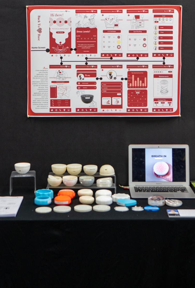
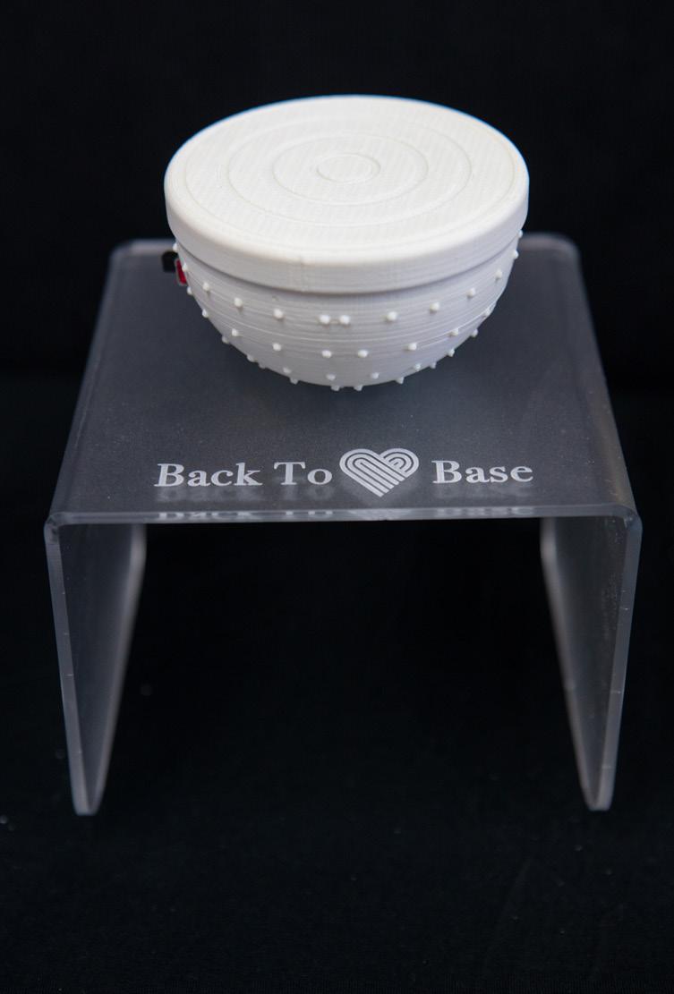

tranquilliser for the nervous system, which in turn reduces anxiety, assists with sleep and regulates anger responses.
I have also designed a user-friendly supporting application that provides users with information about the product and maintenance as well as services, like helpline, and treatments for anxiety. This interactive and personalised application will act as a social platform where the users can connect with each other and build relationships, creating a sense of ease and providing them with a safe network to access assistance.
‘We may be living in an anxious nation.’ (The Washington Post)STUDENT LARA NERO ● DESIGN PROJECT DEVICE TO CALM ANXIETY ATTACKS
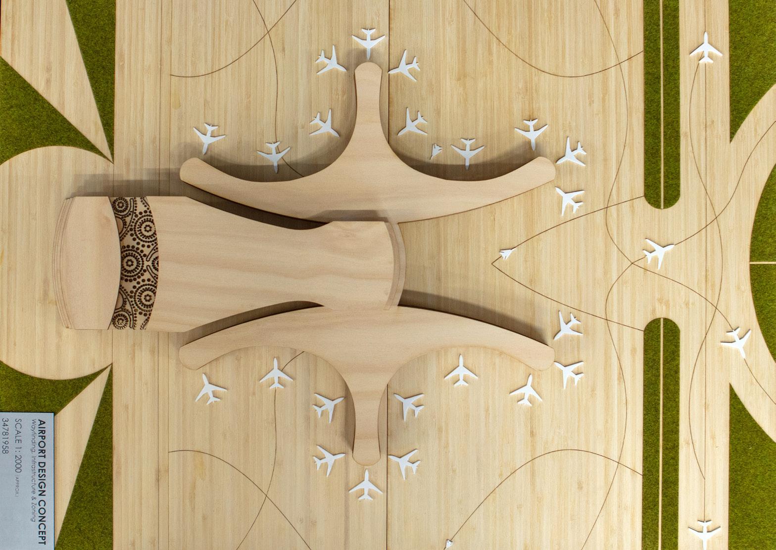
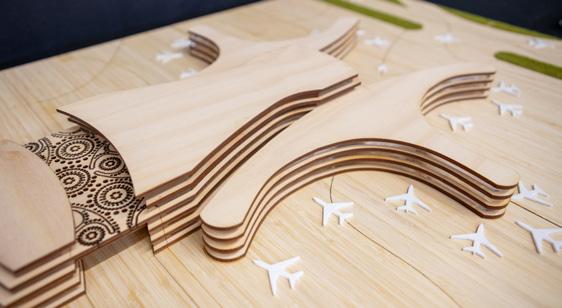
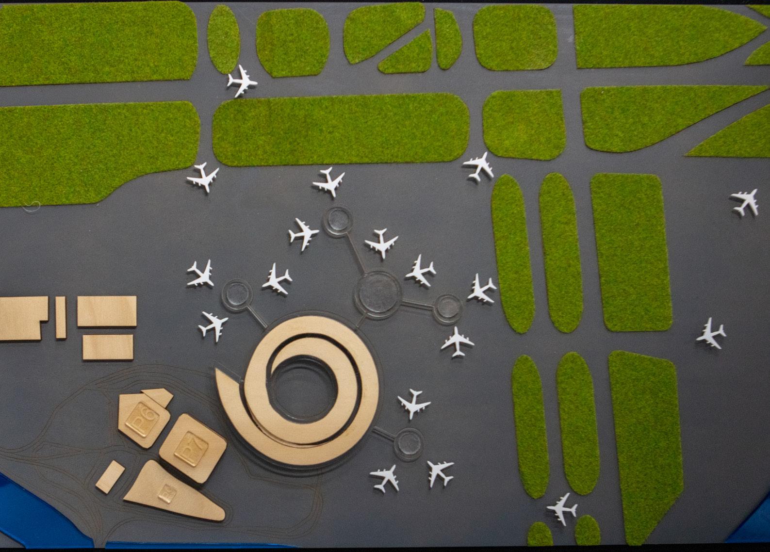
My Major Design Project presents a concept for a domestic airport terminal that identifies and resolves the systematic layout, wayfinding and infrastructural issues of existing airport designs. The development responds to the deficiencies which modern society has exposed as the apportionment of space to particular zones and facilities that do not reflect maximum design functionality. Most of the current domestic airports were designed over 30 years ago and their systematic approach to airport infrastructure is inadequate to meet the needs of dynamic users.
The synergetic nature of the interactions between humans and their environment is best addressed by adopting a systematic approach. Thus my project responds to the need through a system encompassing five levels, with each level incorporating key facilities required for a modern day airport. Through the dissection of traditional terminal layouts, the revised system values critical zones and re-locates them to accessible levels such as L1, L2 and L3. The system is designed
to spread uses over multiple levels, rather than on a single level, reducing walking distances from check-in to boarding. Reorganising facilities based on necessity and accessibility in turn lends itself to a more pleasant and calmer airport environment which elevates the passenger experience.
Wayfinding is not limited to ‘signage’, but also refers to the flow of movement within and outside of the airport terminal. As such, my design fosters a renewed layout of facilities which considers the need for maximum accessibility and function. The use of signage aids the confusing navigation of traditional terminal designs. Simple, clear and legible writing coupled with universal logos coincide to highlight how accessibility is a core issue pertinent to airport terminals. Further to wayfinding, in order to identify the credibility of my proposed system, the design went through a series of iterations and design strategies. The application of the system to a floor plan and potential infrastructural design, displays how this system could be implemented within the real world.
My Major Design Project, ‘Buddi’, is an adjustable clothes hanger aimed to reduce the negative environmental impacts that conventional hangers produce.
Throughout the development of the Buddi hanger, there was a great focus on the ergonomic and sustainable factors of the designs to ensure the success of this concept. For example, through the use of sustainable materials such as bamboo plywood, this allowed me to minimise the harmful consequences of its disposal, while using the notion of skeuomorphism established a sense of familiarity, engaging users with the hanger.

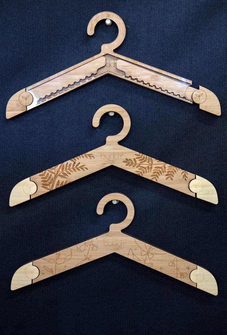
One of the main features of this product is the adjustable arms. The purpose of the feature was so that users were able to use clothes hangers for a long duration of time, extending their life expectancy. This hanger accommodates various types and styles of shirts and jackets including children’s clothing. Another additional feature created was the different case designs. These designs revolve around the motif of flora to
symbols on the sustainability of the concept, further developing and enhancing the aesthetic of the hanger. This was also achieved through the design of the ‘Buddi’ logo, where I used a simplistic style to give a larger focus on the floral design. However, to clearly communicate the purpose and nature of my project to users, I animated my logo design to encapsulate two main ideas: the clothes hanger and its connection to the environment.
‘Grounded’ presents a concept of an underground, 3D-printed house (three bedrooms, two bathrooms). Due to an increasing population density, living spaces – mainly in cities or other urban areas –continue to grow and limit the number of residents admitted in an area or the living conditions of constantly growing residents.
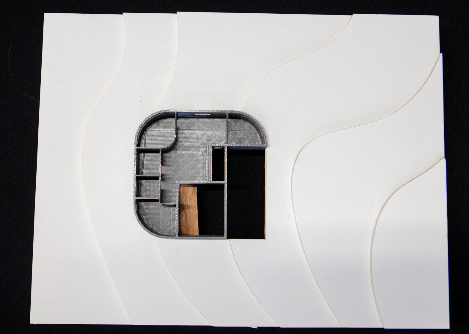
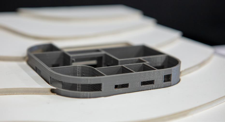
I determined that an underground house could reduce building footprint above ground level and, therefore, ensure that there is more land to build more houses. An underground house also can blend in with a more natural environment, so a user can live in a rural area.
3D printing is gaining more popularity due to its high range of design possibilities and its lack of limits in producing an advanced and complex design. The construction process is also much more effective: decreasing time,
sustainability and accuracy, however, due to 3D printing still being a rather new technology, it remains expensive.
My concept was designed with the intention of applying all processes that conventional construction couldn’t apply and design a different but suitable living space.
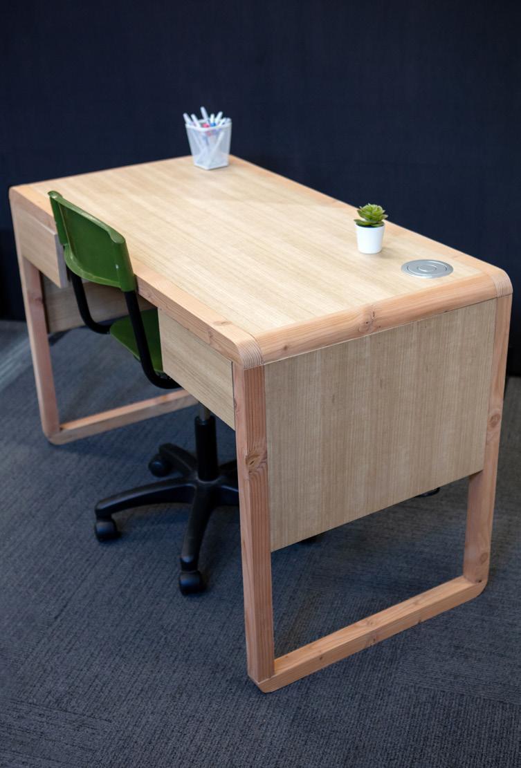
I have constructed a study desk that integrates multifunctional and ergonomic aspects to enhance the current study space throughout my home.
Due to COVID-19, the trend of remote work has increased over the past couple of years which has greatly affected my family members and myself. Therefore, this has increased the need for a proper working environment for my home as current workspaces can’t accommodate all family members comfortably and efficiently. Without a proper working space that considers the appropriate adjustments, physical health issues such as pain and discomfort arise.
Therefore, factors such as multifunctionality have guided my project in order to heighten the overall functionality of the desk to accommodate the target market. For example, the desk features a pop-up power socket with five ports that can be pushed down in order to maximise working space. The desk also features two push-to-open drawers in order to store items that may be needed while working such as chargers and stationery.


Ergonomics have further influenced the design as it was crucial to consider the dimensions of the desk to ensure that it was comfortable and safe to use for extended periods of time. For example, this includes researching and applying the correct height of the desk.
The desk was constructed with plywood and Oregon Pine, consistently showcasing curvatures that appear on the top and bottom of the design. The plywood was covered with veneer in order to complement the Oregon Pine, displaying a ‘natural’ colour palette. The desk was further covered with a clear, matte varnish in order to provide a quality finish and protect the desk to increase longevity.
By meeting the needs of the target market, those who utilise the desk are able to comfortably and efficiently complete work due to the consideration of multifunctionality and ergonomics.
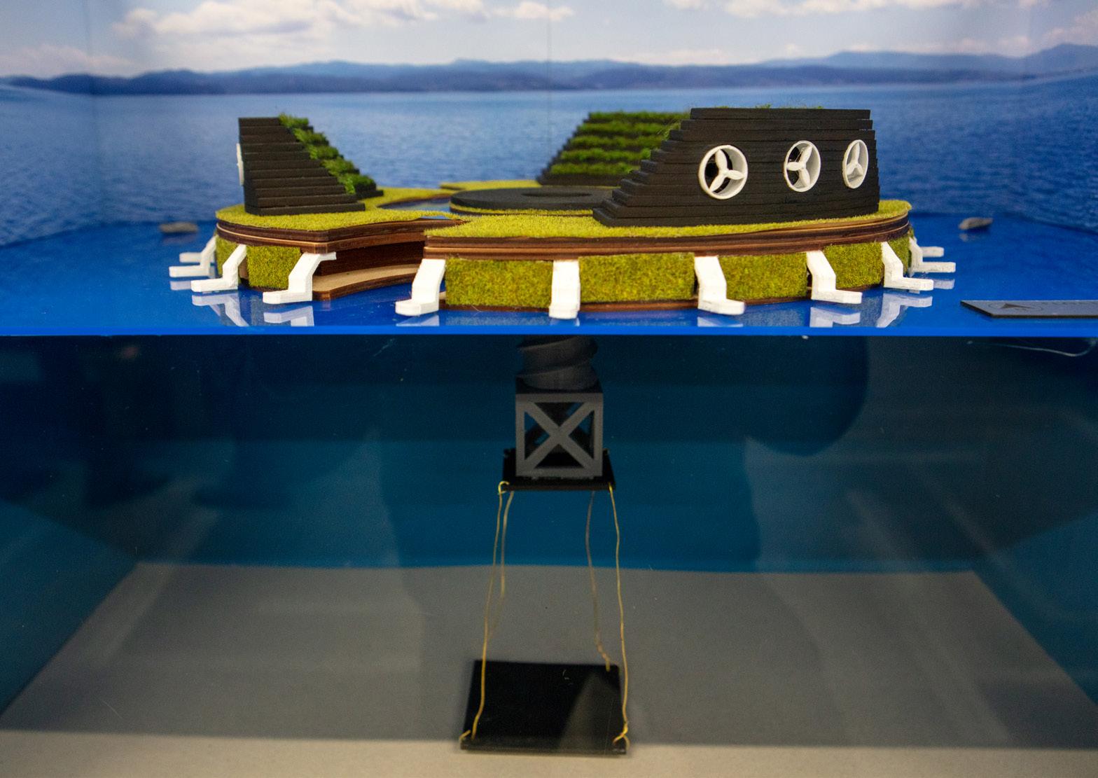
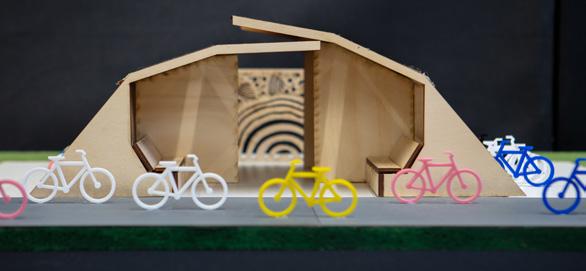
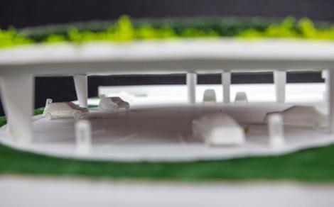
My Major Design Project is a concept for an electric/hydrogen cell vehicle charging station, to replace traditional suburban petrol stations as they become disused with the phasing out of petrol and diesel powered vehicles. This design is to be built throughout Sydney to accommodate both electric and hydrogen-cell vehicles, aligning with the NSW government’s electric vehicle strategy and the Australian National Hydrogen strategy. This concept will cater to the rapid increase in demand for no fossil fuel powered vehicles, as the car industry shifts towards a ‘green’ approach. These new charging stations are user oriented and have design aspects which can be tailored to any site. For example, each charging station is proposed to include a different Indigenous artist, featured on the exterior of the building (in this prototype, it is the ceiling above where cars will be stationed to charge). This concept suits a corner site, the main building contains multi-use spaces and facilities to cater to a variety of patrons – just as these cars will be driven by all members of the community (car
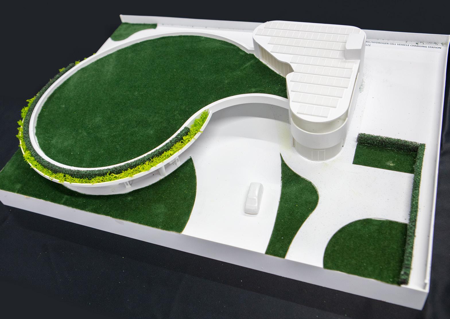
users or just local residents). The facility will cater for a variety of users, offering opportunities for work, rest and play as they wait for their vehicles to charge. These facilities include lounge areas, work hubs, a cafe, children’s play area, storage rooms, ‘green’ rooves/terraces and bathroom amenities.
The concept also proposes to go further, by relying 100% on renewable energies. Currently many electric/hydrogen stations rely on electricity powered by fossil fuels. This concept is ‘off-grid’, relying 100% on solar energy.
Community involvement is a significant factor of my design, by borrowing/leasing roof space of neighbouring homes to accommodate enough PV arrays to power the homes and feed the charging and hydrogen station enough energy to operate on top of the existing PV array on the roof of my design.
In addition, my charging station is designed using sustainable principles to educate about the possibilities of sustainable living.
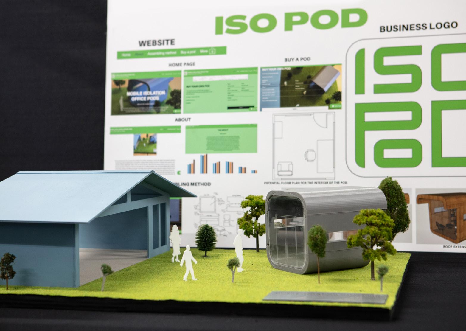
My Major Design Project is a Mobile Isolation Office Pod Business which is an office pod designed to be placed in the consumer’s backyard and or any outdoor environment. Due to the rise of COVID-19 cases over time, the rate of Australian employees required to work from home has significantly increased to 67%. Hence, the target market of this project is aimed at Australian employees required to work from home who wish to have a separate work environment from their home. Having a separate work and home environment increases levels of motivation, productivity and creativity compared to remaining in the same environment consecutively, which will end up resulting in exhaustion and potential burnout for the individual.
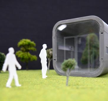
The pod is cube-shaped with wide long windows on either side followed by an openface window at the front. Additionally, the roof is extended over the front window face. The pod is constructed from recyclable and sustainable materials including recycled plywood and glass.
The pod is designed to be pre-fabricated as it is constructed offsite and will be delivered to the investor’s home. This improves the speed of the construction which comes with numerous amount of benefits including time-efficiency, eco-friendliness, safety and higher quality and consistency. Each component of the pod consists of grooves at each end of all the faces that are designed to slide into the corresponding face’s grooves and will be assembled by a nut and bolt joining technique.
The name of the business is named ‘ISO POD’ which is published on an Australian website allowing individuals to view the purpose and further details regarding the assembling method and construction of the pod. In addition, the business has its own logo which is designed for customers to recognise the brand.
Thus, the project is intended to create a balance between a working and home environment which allows individuals to ‘switch off from work’.
The focus of my Major Design Project is a redevelopment of Perisher Ski Resort, located in Kosciuszko National Park, standing as the largest alpine complex in Australia. As a part of my project, I focused on the redevelopment of its existing building, including the main building, and Skitube building, as well as the implementation of a new pedestrian bridge that will act as a sheltered pathway between the buildings. The redevelopment of Perisher Ski resort responds to feedback from my target market and previous visitors to the resort, who noted the run-down nature of the existing facilities, synonymous with the statistics highlighting the overcrowding and need for a non-winter economy. Furthermore, my design responds to the NSW government ‘Snowy Mountain Special Activation Precinct’ which plans to urbansie local towns of the region, which will promote more regular visitation to the Perisher Ski resort facilities.
The design of the main building involves a complete redevelopment of interior and extension
facilities in an attempt to improve both aesthetic and functional qualities. This includes the expansion of interior commercial features, whilst maintaining the integrity of existing features such as improvements to the ‘Perisher Valley hotel’. Consequently, improvements to the Skitube building include the implementation of leisure activity facilities such as the ice skating rink, with a large stand seating area to accommodate for the needs of the design brief as well as the business and restaurant area on the second level, all promoting the need for a non-winter economy.
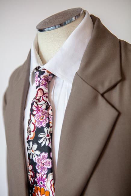
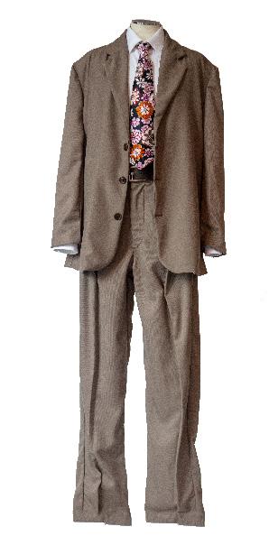
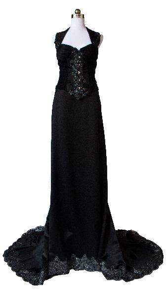
I have designed and created a menswear two piece suit inspired by the fashion of the 1940s. The post-World War II era was synonymous with designs that feature oversized suit jackets, high waisted trousers with large pleats and simple shirts. The oversized fit is created through the use of pleats along the front of the slacks creating dimension and shape. The large shoulder pads create a wider and larger structure giving rise to the relaxed look of the time period. My design features a muted brown colour scheme using a wool suiting fabric that reflects the trends of post war menswear. The design incorporates a front zip on the men’s trouser fly and brown tortoise shell buttons with matching button holes on both the pants and blazer for ease and comfort for the wearer. The suit is made out of 100% wool fabric for versatility and dimensional stability with a 100% satin fabric lining the inside of the jacket to provide a cooling effect and smooth texture on the skin, the lining allows for contrast between the colours and creates a point of interest. for the suit.
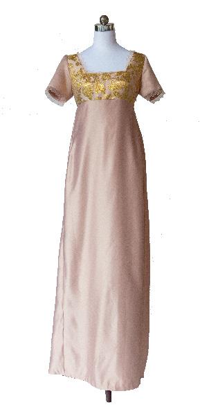
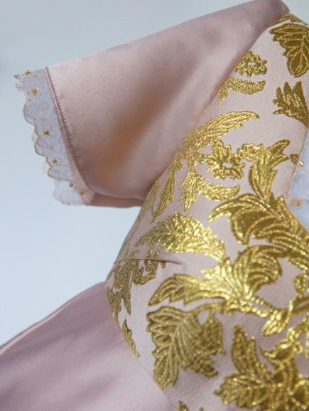
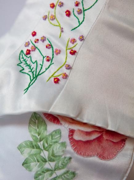
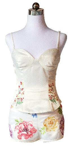
My project is a garment inspired by the fashion of the early 19th century. The Edwardian inspired costume features a fitted bodice and floor length skirt. The dress features a square neckline, capped sleeves, an empire waist and an invisible zipper that runs along the side seam of the dress. The dress is significantly influenced by the Regency era silhouette used in the TV series Bridgerton and is proposed to be used for the upcoming season, for one of the lead characters, Daphne. The bodice has been created out of pink and gold brocade fabric that contains florals, with the skirt and sleeves cut from pink delustered satin. The neckline and the sleeves are both lined with pink lace and feature gold beading detail. The bodice contains bust darts to fit the wearer, and is lined with soft pink acetate fabric for comfort. A hand drafted floor length skirt has been created out of the same pink delustered satin that was used for the sleeves due to its high degree of drape and lustre. This fabric allows for easy movement for the wearer, which is important for a costume in a TV series. Pleating has been used for the back of the skirt to create an interesting aesthetic feature and reflect the dresses from the time period.
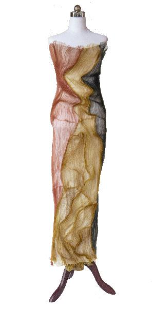
I have created a textile art piece to be exhibited in museums and art galleries. My garment features a long fitted silhouette that allows for it to be exhibited on a mannequin. The work features a fusion of modern and highly decorative techniques that illuminates and celebrates the traditions of First Nations peoples. The strong use of line and texture in the design is inspired by the stories illustrated in First Nations art, specifically long organic lines that depict sandhills. These lines are created using fabric manipulation techniques like those used in the Dior Men Summer 2020 collection, Pleats SavoirFaire. This collection included the manipulation of heated pressed pleats to form irregular shapes and directions of line. I have harnessed this technique to emphasise texture to draw links between First Nations culture and the continuity of that story, fulfilling the aesthetic requirements of a textile art piece. This technique has allowed me to combine this contemporary fabric manipulation technique to link together a cultural First Nations art piece that emphasises texture to mimic the ridges of land. The long held tradition of artwork as a way to share stories and keep a record of First Nations history is evident in my work.

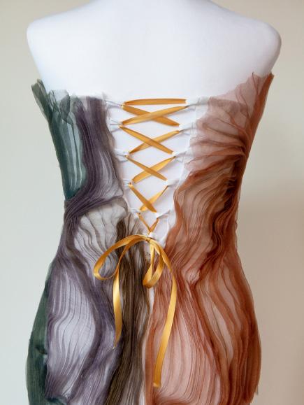
I have designed and created an elegant two-piece set that features a highly-structured corset with detailed surface decoration techniques matched with a simple bias-cut skirt that encapsulates elegance while allowing the corset to be the primary focus. The inspiration for this ensemble came from the Versace 1995 spring fashion show, as well as traditional corsetry. The bodice uses the Mood Fabric, Parker Corset pattern with many of these pattern pieces being modified to fit the inspiration. The lining of the corset is 100% light washed green cotton with the featured exterior fabric being a pastel green, stretch charmeuse satin fabric. The corset closure has a tie-up back using a light green satin ribbon. The corset has a unique neckline as the centre pattern pieces and breast cups have been modified to make curves and different shapes. This makes the centre section a curve instead of the generic squared-off appearance and the breast cups are modified to a cat-eye shape, drawing from inspiration. The bottom of the corset also has been modified to draw up higher on the hips to create space from the corset bottom to the skirt. Couching is a decorative technique that is carried throughout the bodice.

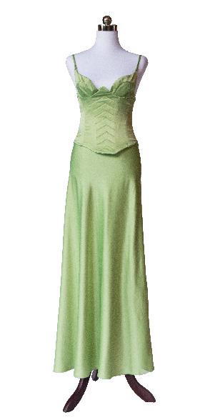
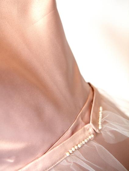
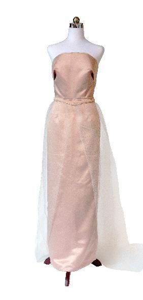
I have designed and created a 1950s inspired satin dress with a tulle net overlay skirt. My couture garment is classified as a historical evening dress with contemporary influence, stylistically inspired by Ralph and Russo’s Spring 2017 couture collection, whilst still embodying classical appeal. As an apparel piece, it is designed to be worn to formal events such as balls and galas, notably in the ‘50s time period. The dress is made using the Simplicity S9289 pattern with added surface decoration to suit the design inspiration. It details a tight fitted, strapless bodice, with a floor length pencil skirt. The outer fabric of the dress is made out of 100% blush pink delustered satin and lined with 100% blush pink semisynthetic polymer called acetate to complement the exterior fabric. On the bodice, the design has two darts on the bust, providing support and adding to the functionality of the garment, whilst remaining aesthetically pleasing through the creation of a straight silhouette. The straight neckline takes inspiration from the ‘50s period evening attire, paying homage to Dior’s new look, with contemporary configurations from Ralph and Russo’s 2017 spring collection. design at its finest.
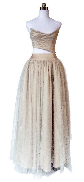
I have designed and created a garment that consists of two pieces. First, a skirt with soft tulle overlay and a stiff tulle underlay with a main base fabric of champagne delustered satin. This garment also consists of a corset top which I have modified from the original pattern piece. For my corset top, I used the ‘pointed overbust’ corset pattern by Etsy. I chose this pattern piece as it is a fitted garment that has sewn in supports, such as boning, to cinch in the waist of the person wearing the garment whilst also enhancing the dimensional look of the wearer’s bust. I have also modified the pattern to construct a diagonal hemline. Additionally, the full princess skirt adds volume and dimension to the silhouette. The inspiration for this work stems from contemporary designer Steven Khalil and is historically inspired by my grandmother’s 1950s wedding dress. I decided to construct the skirt from delustered satin, but to also include stiff tulle as an underlay and soft tulle as an overlay to give volume to the garment and break up the block colour of the delustered satin.

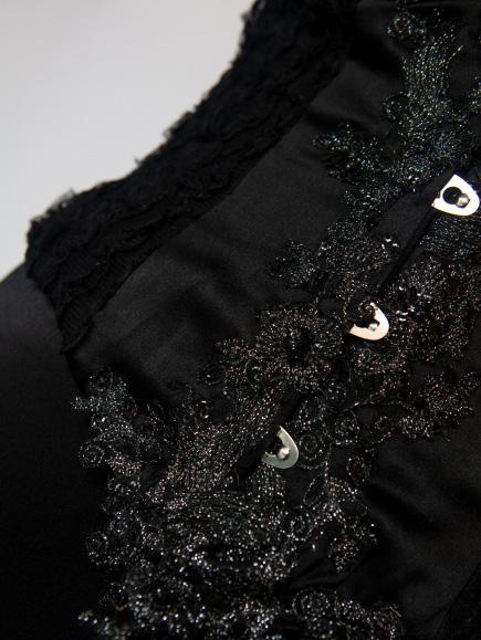
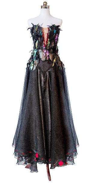
My project is a wearable textile art piece deriving inspiration from various sources and created for the purpose of display with wearable attributes enforced to allow for this. The garment possesses a predominantly black monochromatic colour scheme with splashes of textured silver hues within trims and base fabrics. The garment is made up of an upper corset base, connecting and securing both a structured wired head frame and outward caged hip using snap fasteners. The bodice consists of six panels mirrored on both sides of the corset, with eight boning channels sewn into the seams to contribute to the structural integrity of the bodice, specifically emphasising the illusion and creation of the hourglass silhouette. Some panels on the corset feature varying textured fabrics, maintaining the monochromatic aesthetic and complementing the varying hues of the garment. The bodice’s exterior is curated through the layering of a variation of textured and nontextured black fabric altering along the channels, with panels 2-5 including basted lace and organza attached on top.
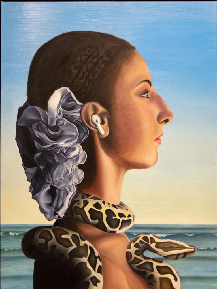
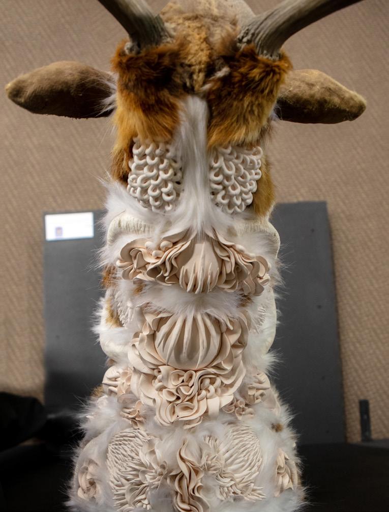
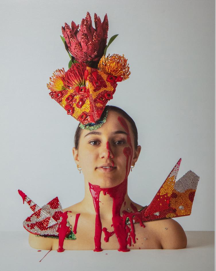
I have designed and created a highly decorative, theatrical and wearable textile art piece inspired by the film The Black Swan, as well as by the Australian bushfires of 2020 and the Royal Black Couture collection. My project is a highly embellished piece, using various techniques such as intricate feather shaped applique, laser cut red beading and laser cut appliques. There are also intricate elements such as detailed laser cutting, rhinestones and other details that would not be noticed from afar. The textile art piece will convey the characteristics of The Black Swan, her powerful yet dark demeanour complemented by the themes of danger and death, corresponding to the Australian bushfires. The Black Swan has a dark body plumage and a skeletal figure as she transforms which gives the viewer an uneasy and depressing feeling, similar to the experience of Australians observing the devastation of the bushfires. My colour scheme, inspired by the traditional bushfire characteristics of black and red, is also extremely powerful in clearly encompassing The Black Swan’s nature. Black is associated with strength, fear and death, while red which is associated with danger and power.
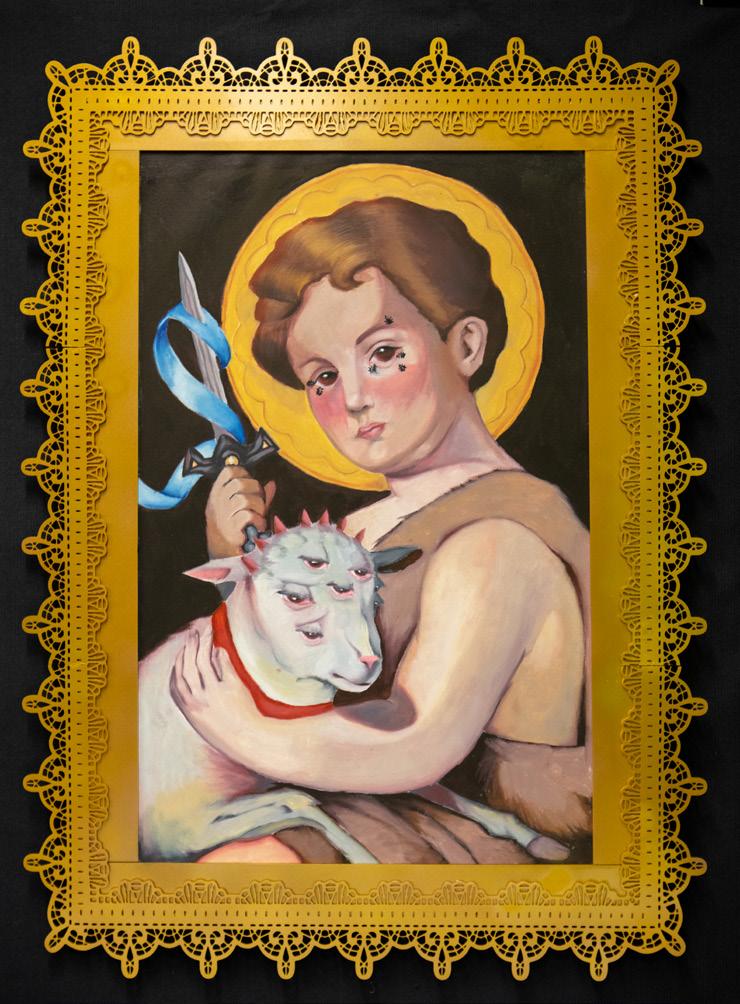
 STUDENT SOPHIA TADROS ● FOCUS AREA TEXTILE ART
I have designed and created a high fashion, two piece set. The garment consists of a corset style top alongside a pair of shorts, which is designed for events such as runways and formal occasions. Versace’s 1995 fashion show collection is a strong historical inspiration for my piece. I was inspired by this collection to design both portions with contrasting decorative aspects, these being hand embroidery and applique. Looks 4 and 18 in the collection have largely served as a main structural inspiration due to their feminine cuts and intricate attention to detail. These looks have both explored contrasting patterns, these being the hand embroidery embellished onto the corset, alongside the bright, vibrant flowers which are seen on the shorts. I constructed both aspects of my garment with similar qualities which will aim to catch the eye of the audience as well as create focal points for the outfit.
 STUDENT
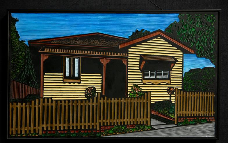
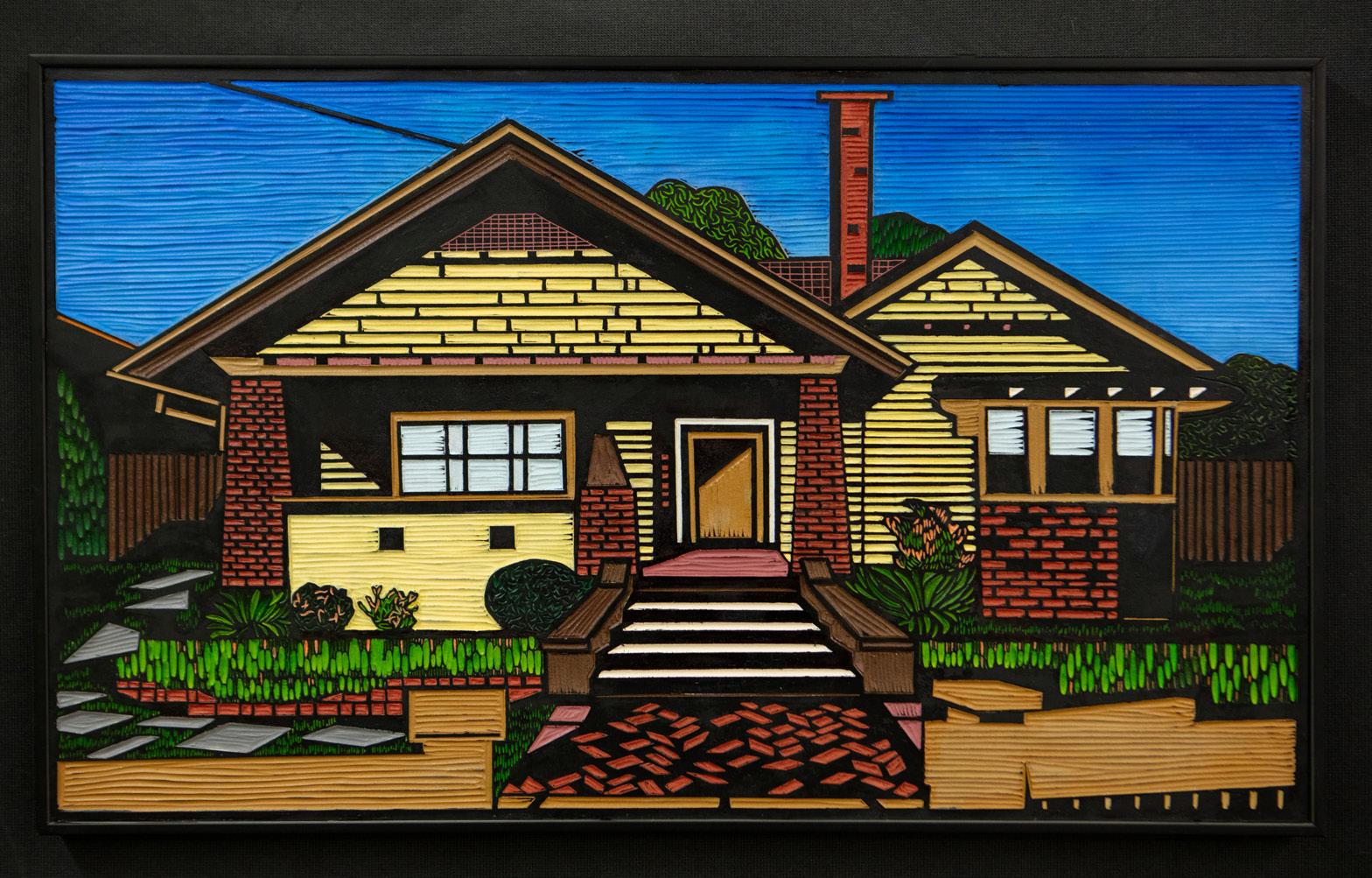
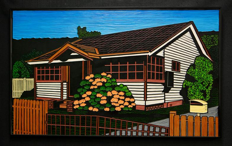
Past communities, settings and structures have always faced change driven by powerful exogenous forces: social, economical, political, technological, environmental and aesthetic. It’s ‘out with the old and in with the new’ as progress and adaptation calls, demanding removal, replacement and renovation with new facades and fashions calling forth. Now, the distinct charm and persona of these past dwellings is changed forever due to redevelopment and urban renewal. My work seeks to document and celebrate our early to Mid 20th century homes, drawing on our nostalgia for these classic suburban homes. My artmaking practice has been influenced by the study and interpretation of the following artists: Christopher Zanko, Hannah Jensen and Rachel Newling.
My body of work is heavily inspired by the Book of Revelation in the Bible. I aimed to utilise religious iconography and symbolism to express my own interest in the topic. I find the visual depictions outlined within that section to be extremely unusual, compelling and elaborately complex. The intended purpose of my work is to draw attention to the more unusual aspects of a text as widely known as the Bible. For instance, angels as we know them, if presented in their originally expressed form, would be bringers of nightmares rather than comfort.
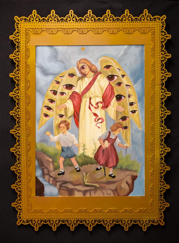
My artmaking practice has been influenced by the study and interpretation of the following artists: Carravaggio, William Blake, and Gustave Dore.
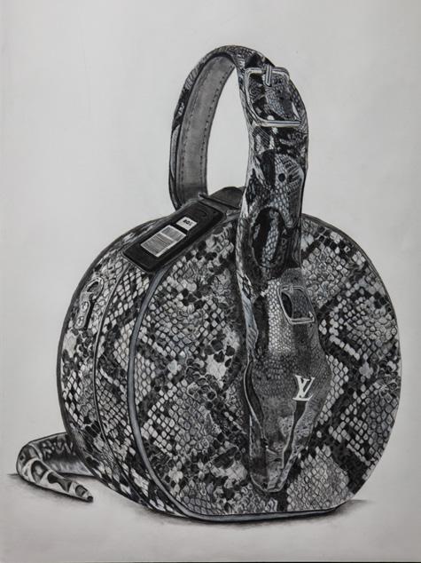
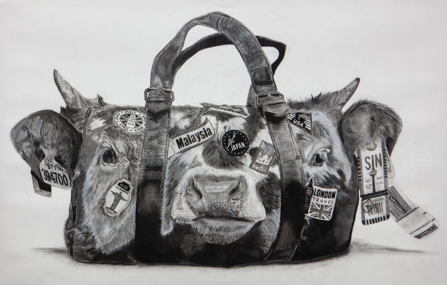
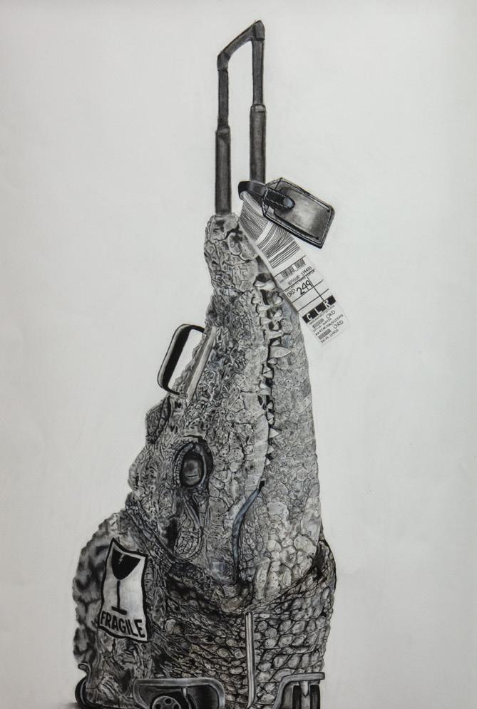
My body of work explores the ethics concerning the use of animals in the production of luxury items within the fashion industry. I focused on the motif of ‘baggage’ to visually articulate the reality of purchasing these products which are used for practical purposes. Through the use of charcoal, I aimed to criticise and expose the inhumane and immoral practices associated with these everyday items. I wanted to present these ideas in a simple yet interesting manner, in order to provoke and engage the audience.
My artmaking practice has been influenced by the study and interpretation of the following artists: CJ Hendry, Domain Goidich, Chiamonwu Ifeyinwa Joy, Scott Laserow, Xavier Cortada and Extinction Rebellion.
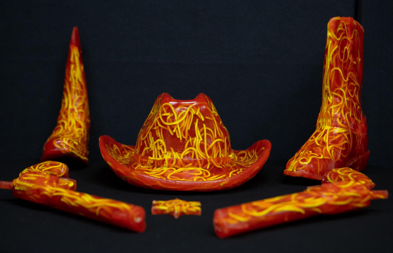
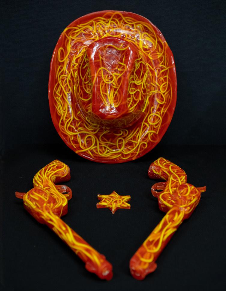
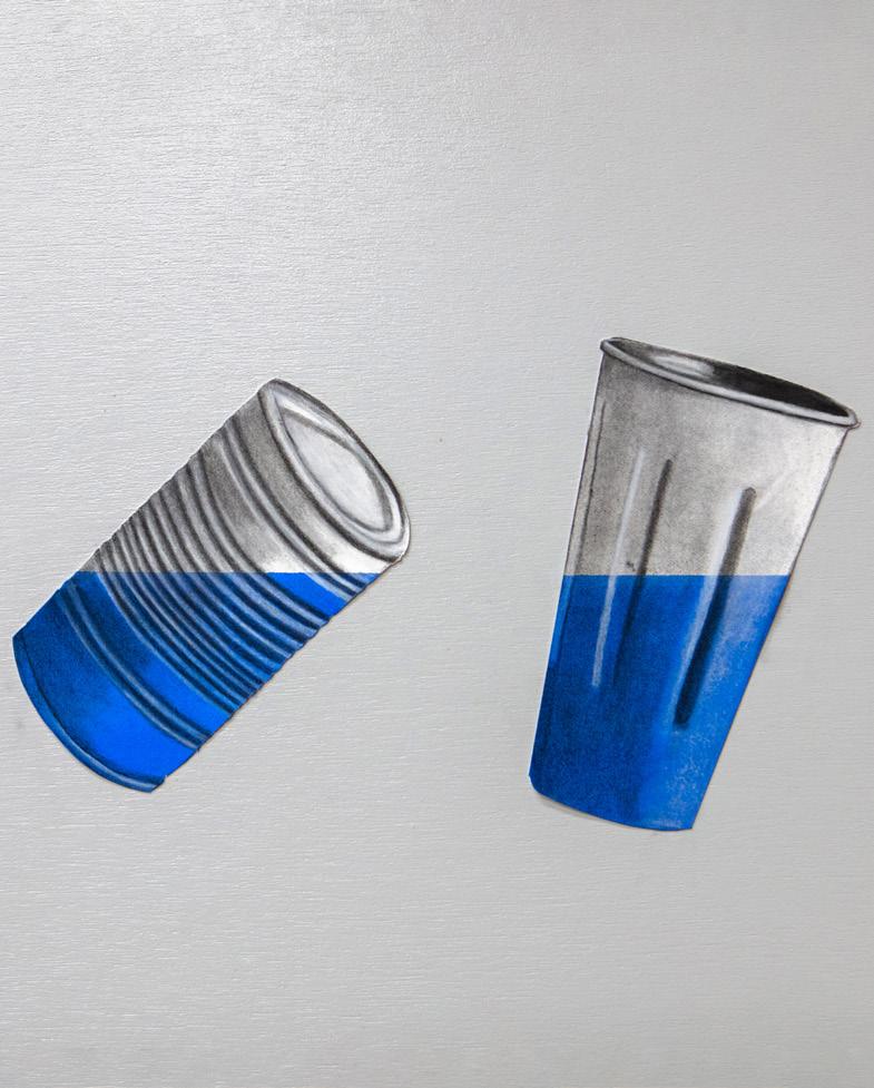
My body of work seeks to bring surprise and wonderment to the audience, as an everyday staple meal is transported into a new and unexpected format. With a nod to Andy Warhol’s soup can, this mass produced consumable based work also plays on the ‘punny’ reference to the tacky Western movies of the ‘60s and ‘70s known as Spaghetti westerns, also called Italian westerns or western all’italiana, being a subgenre of western films.
My artmaking practice has been influenced by the study and interpretation of the following artists: Adam Parker Smith and Geoffrey Rose.

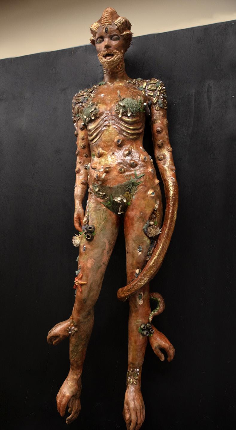
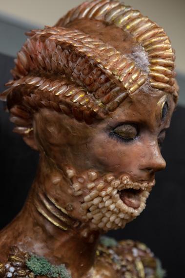
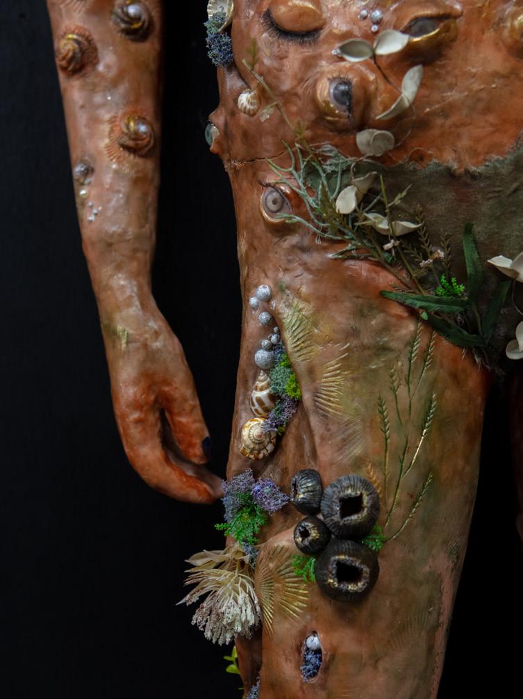
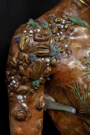
My body of work manipulates the human form to explore my irrational fear of the ocean and what’s within it. Through the repulsive humanoid appearance of my sculpture, I aim to draw in the audience whilst also making it hard for them to look away, leading the viewer to discover more intriguing aspects within the sculpture. By representing the effect of the unfamiliar terrain of the ocean and the grotesque manipulations formed within this creature, I encourage discussion and provoke audiences to become curious about what is actually lurking below the surface of the sea, with more than 80% of its depths yet to be explored…
My artmaking practice has been influenced by the study and interpretation of the following artists: Patricia Piccinini, Andrea Hasler, Ron Muek, Sam Jinks.
My body of work provokes contemplation of the virtues and values of neoclassicism, reimagined through contemporary realities. Notions of clarity, balance, peace and natural elements in my work similarly convey the Greek and Roman philosophies which focus on order, virtue and reason. However, the untimely incorporation of modern symbols acting as visual ruptures in each composition, challenges the audience to reevaluate the conflicting ideals of these different periods of time and their intended commentary on our current society.

My artmaking practice has been influenced by the study and interpretation of the artist David Ligare.
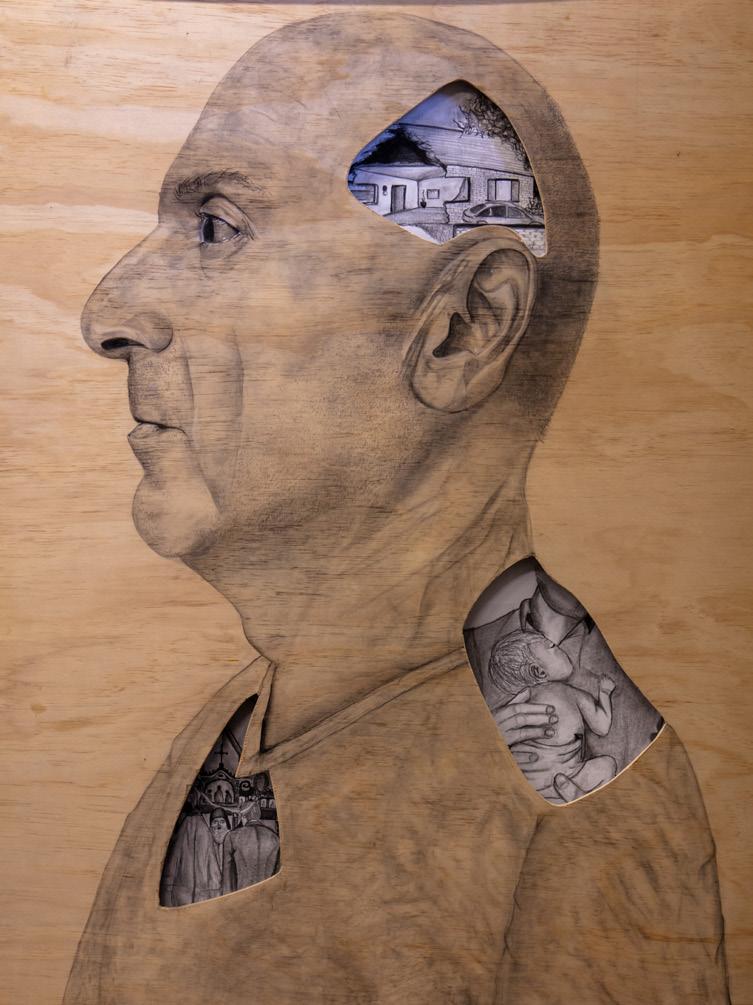
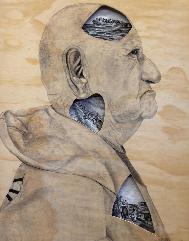
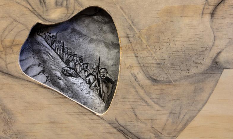
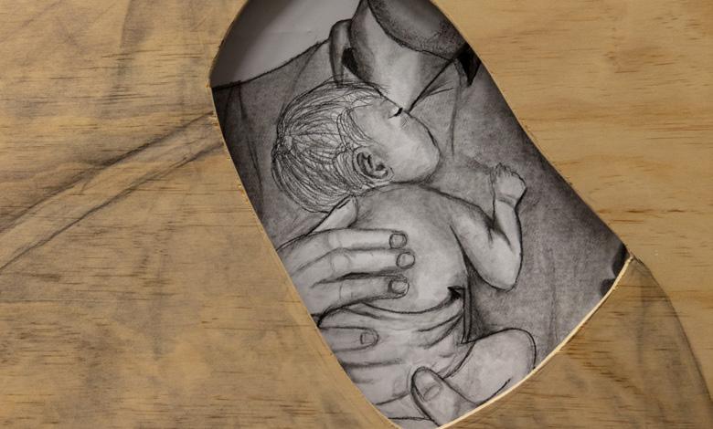
My body of work is a reflection of the generational link between our parents and grandparents, contemplating the experiences of immigration that shaped the youths and early adulthood of that generation. Through the charcoal portraits, the monochromatic tone in conjunction with the vignettes within, create a sort of snapshot into the pasts of the subjects. Through my artmaking practice I have chosen to put a spotlight on the lives of my father and grandfather, and to create a work that relates to early European individuals whose families chose to create a better life for themselves and the generations to come.
My artmaking practice has been influenced by the study and interpretation of the following artists: Thomas Doyle, Joshua Smith, Arinze Stanley.
My body of work seeks to invent the husk of a fictional character. Its intricately adorned exterior draws on the stylistic approaches of a range of traditional tribal ceremonial costumes. The bejewelled ‘skin’ has then been offered up to a range of dancers whose role it was to respond to it and to breathe life into its character. Their interpretive movements and suggested dynamism caught in the moment, digitally memorialised as each individual adopts their own view of what the character should and would be.
My artmaking practice has been influenced by the study and interpretation of the following artists: Magnhild Kennedy, aka. Damselfrau.
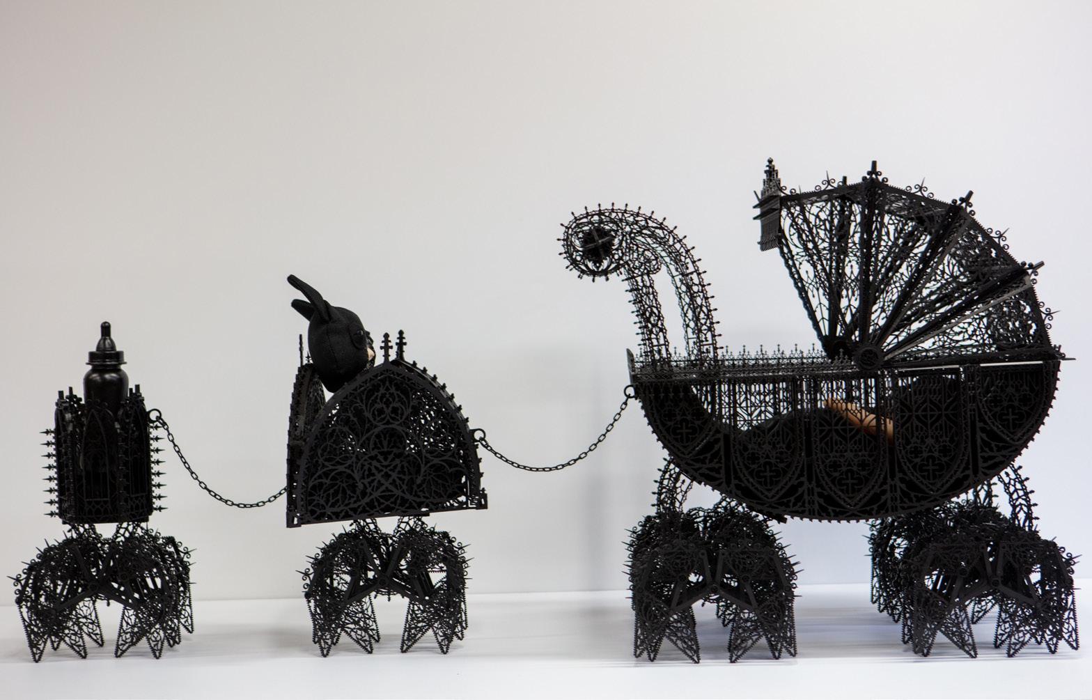
My body of work reinterprets the typically safe product of a stroller for babies into a surreal death trap. This product, associated with protection, safety and nurture, is unexpectedly presented as a sadistic and menacing carriage. The delicate gothic and archaic patterns feature doves, ribbed vaults, pointed arches and crosses reflecting lower safety standards. The title itself refers to a well-known baby goods supply company, BABYBJÖRN, with the suffix ‘un’ alluding to the demonic inclusion of the balaclava clad infant enclosed. Its sinister presence is the antithesis of the purity a newborn possesses. Theo Jansen inspired ‘legs’ propel the train into motion, to make the body appear like a prehistoric mammoth skeleton.
My artmaking practice has been influenced by the study and interpretation of the following artists: Wim Delvoye, Theo Jansen and Shi Jinsong.
Humans are interdependent with animals and my body of work privileges this anthropomorphised fusion of emotion and instinct. The human face and animal body challenge common taxidermy practice, epitomising our shared ecosystem. The addition of naturalistic porcelain forms unite these hybrid spheres, striking a balance between familiar and exotic beings. My artwork connotes notions of rebirth arising from a destructed past. The title implies the sculpture’s underlying significance, where coral-like forms contrast the hybrid being to interpret conflicting sides of the life cycle, whether being life or death. Audiences witness visual codes of death, as the artwork reveals reincarnation in the stitching and pins. The effect of this surgical track conveys an artificial side, an accessible point for audiences to reconcile with the confronting art.
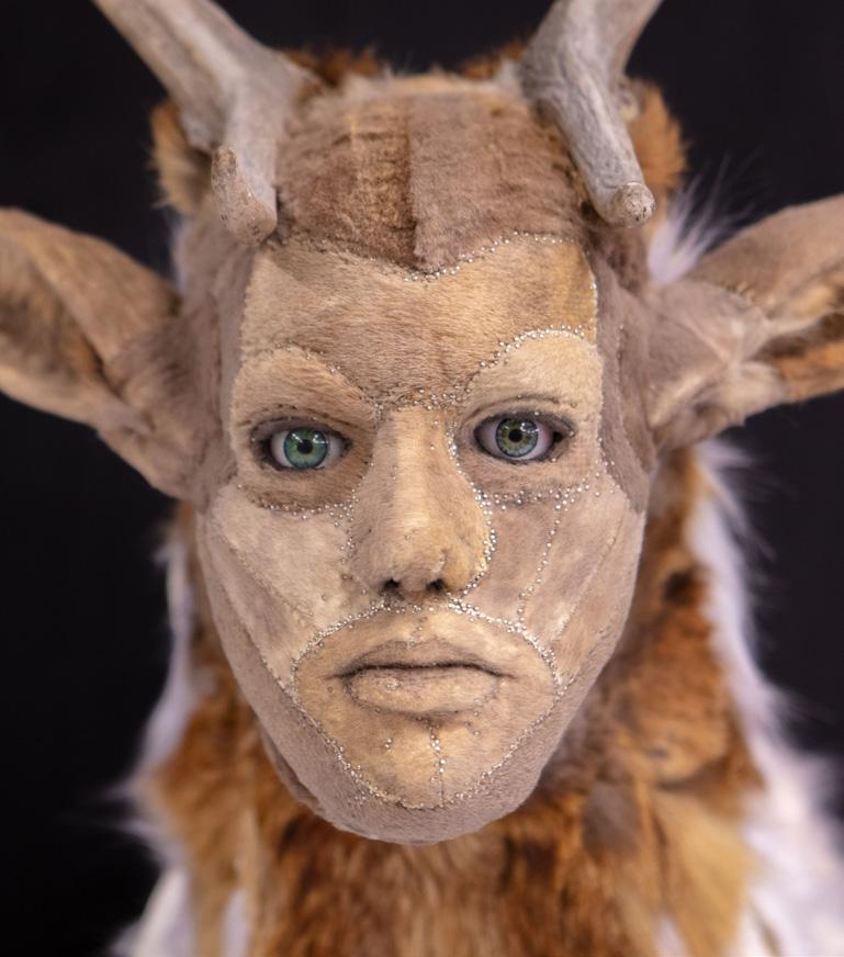
My artmaking practice has been influenced by the study and interpretation of the following artists: Juz Kitson and Kate Clark.

What are the human rights of a child? Who will stand up and advocate for refugees as they are inflicted with horrific treatment and forced to flee their homes and country?
My work seeks to address the traumatic human circumstances faced by millions of refugees each day while the first world seemingly ignores the enormity of this issue. I hope for my audience that this challenges them to remove their preconceived notions of refugees as simply ‘boat people’, and instead look at the identity of the individual as part of all of humanity.
My artmaking practice has been influenced by the study and interpretation of the following artists: Willy Verginer, Ai Wei Wei, Abdul Abdullah and Joan Ross.

In regard to achieving personal growth, it is said that strength and growth come only through continuous effort and struggle. My body of work is a depiction of my own striving for personal excellence. As a dancer and student I have high personal expectations and push both my cognitive and physical limits in order to achieve my personal best. To represent the challenges I have faced, I have utilised the metaphor of Australian native flowers whereby a number of species actually require the destructive force of fire in order to flourish.
My artmaking practice has been influenced by the study and interpretation of the following artists: Nick Cave and Kathleen Ryan.
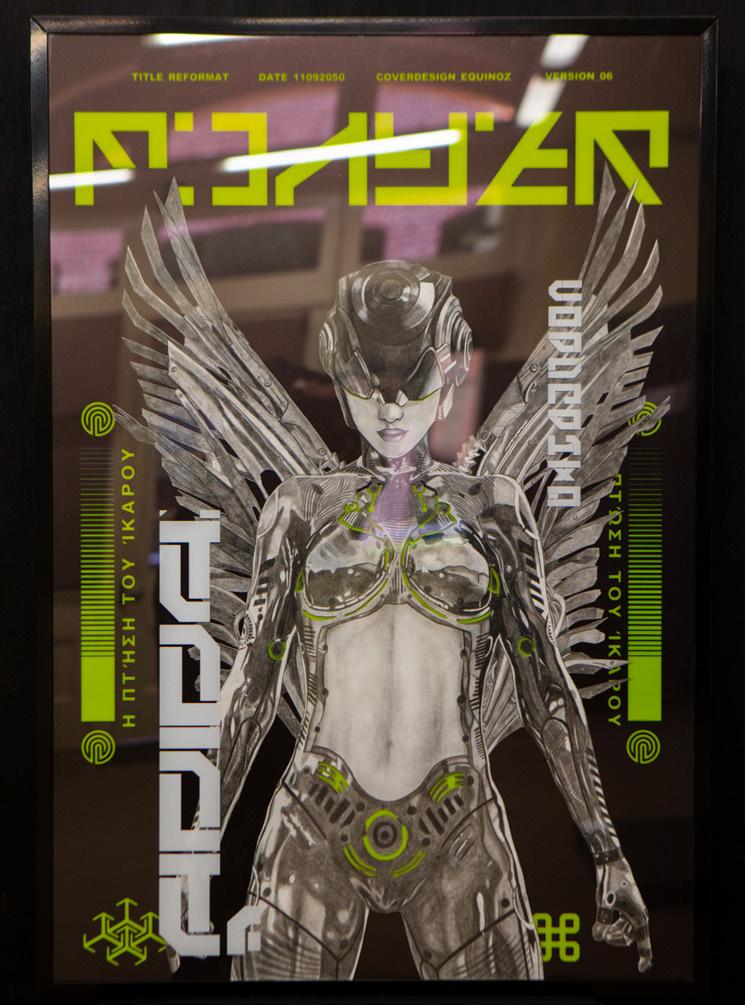
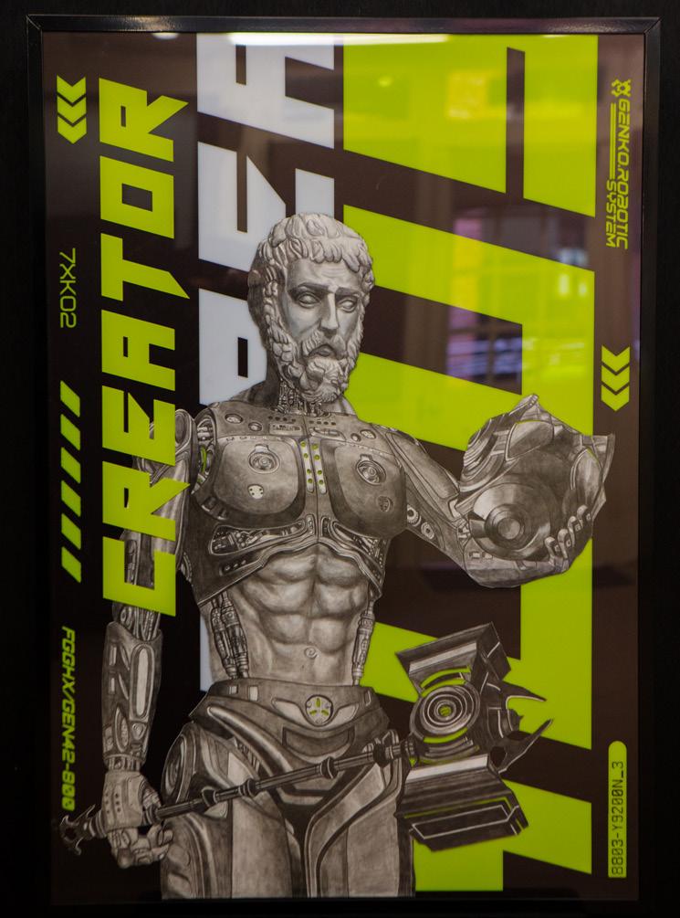
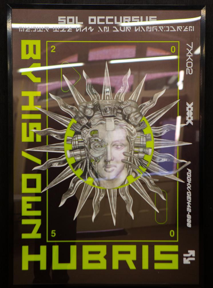
My body of work transforms the Greek mythological story of Icarus by recontextualising it into a science fiction, video game inspired, art installation. The story of Icarus examines the idea of overreach in terms of man playing God and the price he paid as a result. The graphic-based works engage moral concerns of the human relationship with technology. They also seek to explore our potentially dangerous dependence on artificial intelligence and its impending threat given our increasing reliance and blind optimism. My artmaking practice has been influenced by the study and interpretation of the following artists: Bryan Wan, Klaw Machine and Magdiel Lopez.
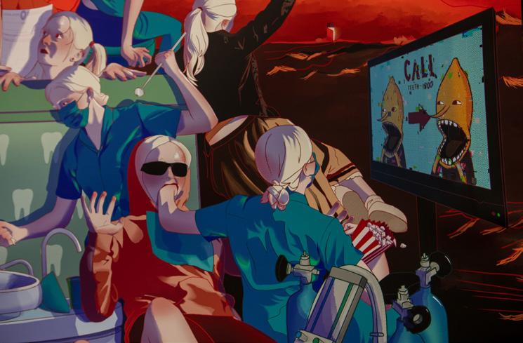
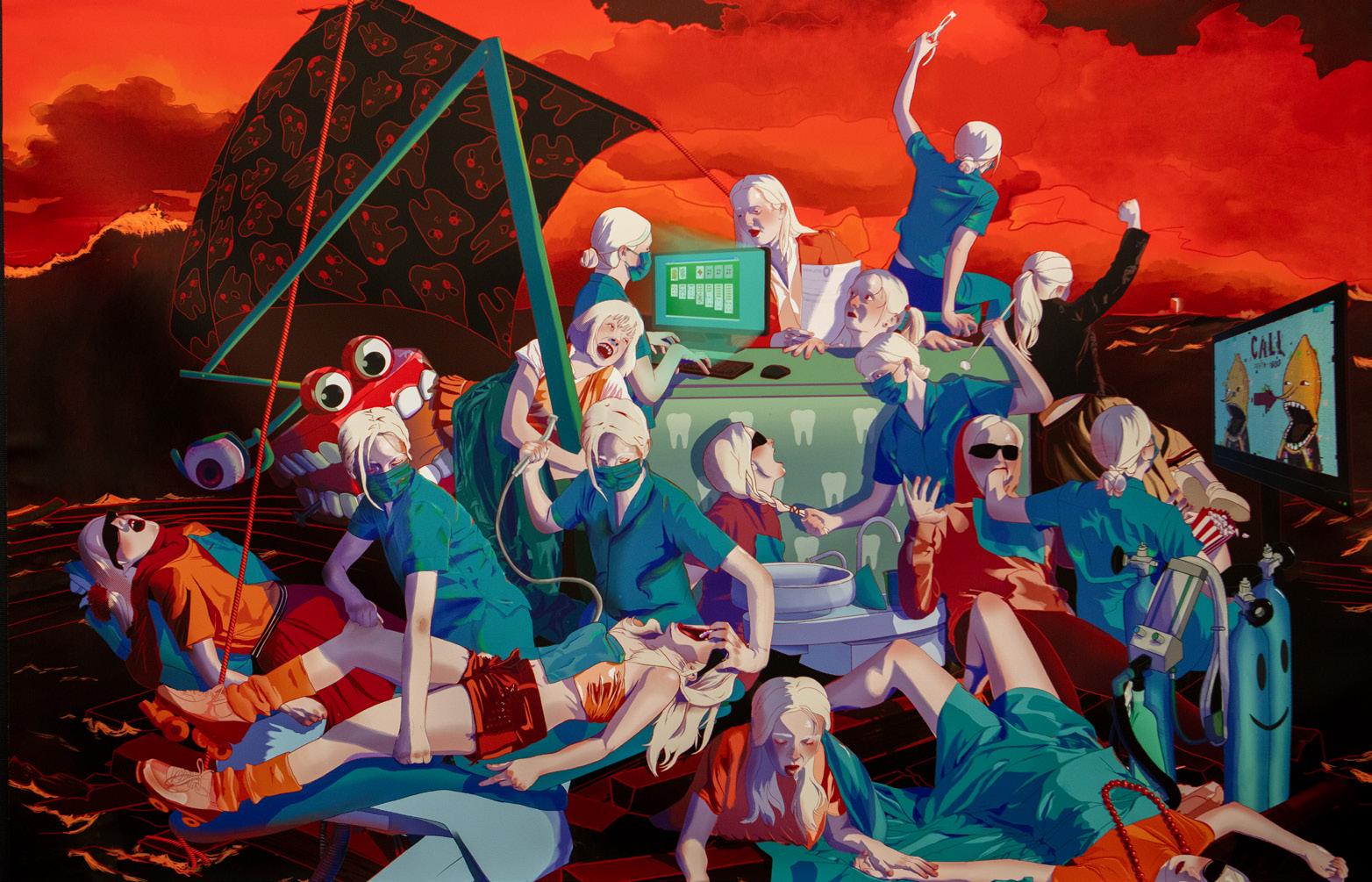
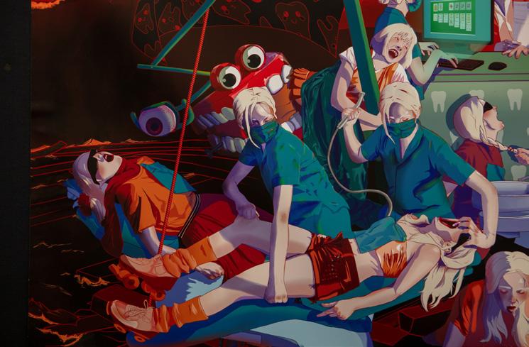
My body of work is based on the famous painting Raft of the Medusa by Theodore Gericault. His work epitomises all that is abject, pain, despairing and anxiety inducing, as his languid figures await their inevitable demise as they drift hopelessly at sea. My unconventional self-portrait based work acknowledges the rational and irrational fear the dentist has on individuals of all ages, expanding as the audience explores my dynamic and featured filled composition.
My artmaking practice has been influenced by the study and interpretation of the following artists: Theodore Gericault, Rafael Alvarez.
My interest surrounding the topic of imperialism and the effect it had on the modern world was generated after a study in Year 11 Modern History on the Belgian Congo. Following this study, I wanted to extend my knowledge in how historical representations of imperialism affect attitudes held towards Western countries and how the voices of those degraded and oppressed are represented throughout time. Moreover, I wanted to understand how different depictions of historical events challenge perspectives and opinions, but also discern how these portrayals have affected society in either a positive or negative manner.
Memorialisation is a cathartic process, sufficing the need of individuals and communities in the acknowledgement and acceptance of the past. Yet, evident in the context of Algeria is the failure of French political institutions in recognising the influence of a period of colonisation characterised by violence and callousness, and the lasting effects this has on a nation’s identity. On 10 May 1830, a royal proclamation declared that French soldiers would depart to Algeria, freeing Algerian people from the oppressive Turkish regime. The root of the hostility between the French and Algerians is directly related to what both parties lost in the process of colonisation, resulting in a pattern of French-Algerian bilateral relations, stigmatised by nostalgia from the French and the desire for unity from the Algerians. The desire for independence, without connection to French influence, ideologically and politically created immense hatred between imperialist forces and Algerians, still significant in both societies…
The consequences of French expansionism are realised through modern day events, symbolised by violence and division, that correlate with the denial and dissociation of French politics and people in relation to colonisation. France was convulsed by several murders over nine days in March of 2012, including the death of French soldiers of northern African descent killed in two separate shootings. Anger and indignation were only fuelled further when the identity of the killer was revealed to be a young French citizen Mohammad Merah who was of Algerian origin. Before being shot in a police siege, Merah declared that he wanted to ‘bring France to its knees.’ Whilst tragic, these incidents do not stand alone in that, terror and violence in France is often linked to its origins in the destruction of culture and a nation’s identity, and must be realised that separation and disassociation is not the way to end the problem.
Present day attitudes and essential segregation between the groups is further palpable in the vandalisation of an Algerian war statue in France this year. It was reported that vandals damaged a statue in honour of an Algerian military hero who protested French colonisation, hours before it was inaugurated. The destruction came amid an election campaign dictated by harsh rhetoric on immigration and Islam. The statue was commissioned alongside the 60th anniversary of Algeria’s independence from France, following the eight-year liberation war, in an attempt by French politicians to take steps forward in acknowledging their role in the conflict. Despite contemporary values prioritising inclusion and the removal of racial barriers, this act of hatred is reflective of years of unknowingness of the destructive extent of French imperial policy and the rise of right-wing nationalism that refuses to admit past wrongs.
My area of study focuses on the historical discourse surrounding Latin America’s involvement in the drug trade and how history has been constructed to portray the region in a negative light. My overall inspiration stems from wishing to analyse the agendas of historians, America’s political and economic involvement, as well as the influence of pop culture on the development of stereotypes. Specifically, I will be researching the representations of the region as whole, as well as the involvement of key drug producing nations such as Mexico and Columbia.
habit forming export commodities were crucial to the economies, societies, and revenues of many fledgling Latin American nations’ (Gootenberg, 2009). Therefore, Gootenberg effectively communicates that the cause of such an uprising in reliance on the cocaine market in essence stems from the encouragement of demand from the US market.
Paul Gootenbeg is an interdisciplinary Latin Americanist writing primarily about Andean drug trade history, Peruvian and Mexican history, and historical sociology...
He notes that the beginning of cocaine in 1884 in Peru was promoted as ‘herbal medical cocaine’ (Gootenberg, 2009) by the US. Such encouragement in consumption saw the US become one of the largest cocaine markets by creating the soft drink ‘Coca-Cola’, allegedly containing 3.5 grams of cocaine.
Such a high demand for the substance saw Peru determined to meet US consumer demand by rapidly producing cocaine, as articulated by Gootenberg, ‘incentives US politicians gave to illicit cocaine by declaring an essentially political war on foreign drugs” (Gootenberg, 2009). Hence, Gootenberg reinforces that ‘The vast majority of the world’s known psychoactive substances are North American in origin’ (Gootenberg, 2009). Moreover, Gootenberg outlines that the illegalisation of the drug in 1905 by the US and the subsequent development of international drug banning, saw the US politically and economically isolate Peru. Gootenberg argues that by the 19th century, ‘such-
Gootenberg’s perspective on the role of the historian and historical communication is to emphasise colonialism as influencing economic activities. His book Toward a New Drug History of Latin America (2015), effectively outlines the historical discourse surrounding the development and increased usage of drugs. Gootenberg offers insights into the importance of utilising history to understand how the myths have been constructed to paint Latin America in a negative light, and in turn, fathom why drugs are embedded in their national identity. Specifically, Gootenberg emphasises colonialism as a key impact on Latin America’s reliance on the drug trade to fuel their economy, as he explains that ‘tobacco and cacao, quickly transformed into major exportable world commodities, becoming bulwarks of the Spanish and Portuguese empires’ (Gootenberg, 2009). He states that the concept of ‘drugs’ has ‘been a part of Latin America’s history forever, but what is deemed drugs today is not what was used back then’. This is illustrated as 19th century physicians once recommended cocaine for the treatment of hay fever, asthma and melancholy, however widespread use of the drug consequently highlighted its addictive nature (Martindale, 2008). Essentially, Gootenberg’s detailed insights offer a developed understanding of the way in which attitudes towards drugs have changed over time, from viewing cocaine as a positive medicine to an illegal substance, linking back to the idea that America’s influence guided the nation into a dependence on the drug economy.
The mass hysteria surrounding the witch trials has always been documented and analysed. The modern day coverage of the event that is available in the media often represents the terror, often hypocritical extreme actions and psychology behind the accusation and punishments. I wanted to inquire more about the mindsets and psychological motives for people during the witch trials, especially focusing on the role of fear through three arguments presented by historians on the role of fear including: ‘fear of women’, ‘fear of the unknown’, and ‘fear of the neighbour.’ My purpose is to critically assess and compare historians’ perspectives on the role of these fears in order to determine the most valid argument by using a range of contrasting opinions.
Barstow’s radical perspective on gender theory reveals her clear political agenda and her contextual background of the influence of radical movements from the first and second wave of feminism; this puts into question the reliability of her arguments as she attempts to retell the witch trials as a ‘gender based holocaust’ (Barstow, 1994). There is a clear exclusionary nature within feminist historiography accounts of the witch trials, it has been critiqued to be influenced strongly by political agenda and feminist works are ‘often too willing to distort evidence and lay blame’ (Morantz, 1974). The feminist perspective is ‘overtly political’ (Gow and Apps, 2003) and claim the events of the witch trials to be solely ‘women’s history’ (Gow and Apps, 2003). Historians like Andrew Gow and Lara Apps have argued that the feminist perspective of witchcraft is fixed on the women victims and the political debate around gender rather than focusing on the bigger picture. Many feminist historians exclude the male victims from their history,
‘the exclusion of male witches from witchcraft historiography is the result of active processes and assumptions’ (Gow and Apps, 2003). Feminist historian Anne Barstow is a representation of this argument as she attempts to deny that the 20% of men accused during the trial were accused on the same basis as a woman, but instead men were only accused due to their relations to women who were also accused of witchcraft and the remaining men had records of previous crimes (Barstow, 1994). Another critic of the feminist perspective is Robin Briggs. Briggs refers to the extreme feminist historiography as ‘the wilder shores of the feminist and witch cult movement’. Briggs depicts them to be irrational and clearly driven by their extreme political view, that they exclude the real nature of the witch trials and instead just focus on the gender discourse. Briggs has further argued that many writers ignore non English texts addressing the witch trials which ‘encourage an error or perspective’ as the situation in England was vastly different to the rest of Europe, as the persecutions in Europe were predominantly female which was not the case for the rest of the world. Although male victims in Europe were 25%, the regional differences of men and women executions is drastically different. In France over half of the executions were male and 90% of executions were male in Iceland (Briggs,1996). Although the feminist argument portrays a clearly politically motivated agenda, the historical evidence presented of the attitude towards women in documents such as the ‘Malleus Maleficarum’, Pastor Hales’ inquiry and through statistics documenting the greater number of female victims do suggest that the ‘witchcraft was not sex specific but sex related’ (Larner, 1984). The exclusion of sources and evidence to promote the feminist agenda, manipulates the account of the witch trials, consequently, validating Briggs’ assessment in comparison as he presents a valid argument rather than privileging one perspective.
The definition of ‘The American Dream’ has significantly changed throughout time as a result of changing societal values and events of the context. Research indicates that historians writing about ‘The American Dream’ in the 1920s and 1930s conclude that it promised a country where people had a chance to work up the ranks through their own labour and ingenuity. However, the effects of World War II changed the representation of ‘The American Dream’ to be presented as the acquisition of material goods and idealistic family portrayal. F. Scott Fitzgerald’s novel The Great Gatsby written in 1925 was produced in the midst of economic success and improvements of technology which contributed greatly to the confidence of American prosperity. I wanted to continue my research of this time period and its significance in the fundamental representation of ‘The American Dream’.
of the republican government of 1920/30s as women were ‘unable to possess money, to vote, and lacked rights to their offspring’ and appeal to the contemporary audience in her honest assessment. However, the role of feminists in the political climate of the 21st century, is captured in the 2016 American election between Hillary Clinton and Donald Trump, where women in power were undermined in their liberating acts. Similarly, the ‘Me Too’ movement extricates the stories of women involved in sexual assault, and thus stands as a driving social context as Lotun describes women as ‘supporting characters’ of a man’s American Dream’.
Significant differences arise through the exclusion of women from ‘The American Dream’ in the 1920/30s. Martina Lotun, as a 21st-century Feminist historian, revises the representation of ‘The American Dream’, partly motivated by her political and social context. In her book, An Illusion of the American Dream. The Great Gatsby from a Feminist Perspective (2021), Lotun highlights the oppressive status of women and their omission from the concept. The portrayal of ‘The American Dream’ featured in F. Scott Fitzgerald’s The Great Gatsby manifests her argument that women are ‘confined by the patriarchal structure’ of the 1920s and thus are unable to pursue their aspirations. Lotun contends that ‘Instead of following their own American Dream, women are limited to pursuing the man who most successfully embodies it’ as she criticises historians such as James Truslow Adams, in his envisioning of the idiom, failing to forge a meaningful role for women in the ‘dream’. Her revisionism redefines ‘The American Dream’ to create doubts in Adams’ argument, thus evoking her own unique voice. She challenges the traditionalist ideology by criticising the foundations
Katharina Gerhardt is recognised as a 21stcentury Marxist historian, in her analysis of the term ‘The American Dream’ through a critical reading of The Great Gatsby. Here, the analysis challenges statements made by Martina Lotun, through a significant focus on the character Jay Gatsby and his recognisable issues with class consciousness and wealth, which resonate with the Marxist ideology. Gerhardt, analyses the character of Jay Gatsby, in his vision of himself and desire to ‘climb the social ladder’, however she criticises his overwhelming proclivity for ‘The American Dream’ in his relationship with Daisy as he ‘wants her status and not her love’. In this way, Gerhardt’s argument makes connections to the feminist reading of Lotun, as women are presented as malleable and easily deceived by men for their own benefit, in which they are not a part of ‘The American Dream’. An American Nightmare: A Marxist Reading of F. Scott Fitzgerald’s ‘The Great Gatsby’ (2018), reflects the Marxist ideological narrative in her conclusiveness of ‘The American Dream’ as an ‘opportunity to have financial success, if you work hard enough’, in which she prioritises the damaging effects of capitalism as inequalities through social division and the hierarchising of ‘commodities’ as the foundation for ‘an improvement of the social status’. Here, parallels are drawn between the representation of ‘The American Dream’ of Adams as they both consequently propagate a diligent mindset in order to achieve prosperity.
Athens was seen as the ‘model for democracy’ by the end of the classical period (510BC323BC) and the beginning of the archaic period (700-480BC). The system employed a direct method rather than representative, urging any adult male over the age of 20 to take part, giving them equal political rights, freedom of speech and the opportunity to directly impact the political sphere. Historians from the time such as Xenophon saw the system as flawed and theorised that it would ultimately lead to the fall of Spartan oligarchic power, while the historian Kurt Arnold Rafflaub debates whether Ancient Athenian Democracy was ahead of its time and essentially revolutionary. I would like to look into their personal views and conclude why they see this topic through these lenses, and how these perspectives formulated.
system was effective in representing its people and how this is discussed through historians’ works. Historians such as Doland Kagan, Roger Just, even Plato and Socrates, argue a different interpretation; thus posing the question, Early Athenian Democracy: a thriving and influential society or oppressive and outdated? The Agora, the centre of the city state, was an open square reserved for public affairs and was central to the governing of Athens. It was there that citizens would congregate for various elections, assemblies, parades, festivals and the like. The United States, United Kingdom and Australia are examples that all follow a democracy heavily influenced by that of Ancient Greece. The idea of a ‘self rule’ government has carried over the ideas and systems that the Ancient Greeks had employed and have had a noteworthy influence on the ways that our political systems operate today.
Truth is possibly the most ambiguous aspect of historiography. Ideas of the ‘truth’ are ultimately shaped by context and perspective, and while it is acceptable to think that there is strictly one ultimate truth that historians strive to achieve, this is not the case. The histories of particular scholars are influenced greatly by their backgrounds and experiences, which therefore determine the way in which they believe history should be approached and produced. These antithetical views that historians share, are the core to which history can be interpreted and understood. In the ancient world, many perspectives are presented suggesting how effective governing was upon their citizens. Athens, and its earliest formations of democracy are a frequently debated topic, as well as whether or not it carried over good or bad methods of governing. This essay will explore if the
Within Ancient Greece, the classical period is known for being the age of the birth of democracy and freedom, however, it is to be known that this shift of governing was not promptly accepted by all. The system was designed to encourage citizens to leave their social groups from which they had security in numbers, and instead, adapt to displaying their loyalty to the state through increased participation in the government as well as partaking in civil duties. The democratic process operated with 500 members being chosen annually by lot from all parts of the Attika, 50 men from each of the 10 local tribes were chosen to represent within the council. The process of elections and voting on new laws would mean that citizens were required to attend the assembly the day that the decisions would take place, and through a method of direct democracy, citizens of Athens were able to voice their votes.
I chose this topic because I found it interesting that there are various perspectives that a historian can focus on and the conflicting interpretation of Aboriginal Australian events and history. Most Aboriginal history is not formally documented and has been highly debated due to a lack of written documents and the view of Indigenous Australians throughout the years. Many early documents of the time of Aboriginal Australian resistance were from the colonists’ perspective. My aim is to investigate how factors such as sources, methodology, context and purpose affect a historian’s perspective.
Windschuttle’s views of Aboriginal resistance being non-existent is partially due to his political standings. Windschuttle has great political conservatism and actively wages war against very left-wing representations of history. Shown through his contribution to the conservative side of history during the history wars in the 1990s and early 2000s, against the views of pro-resistance historians such as Henry Reynolds and Lyndall Ryan (James Boyce, 2006)...
Aboriginal Australian resistance representations are recorded through the personal views of the historian and what they believe is important. This is especially certain for the Australian historian and controversial writer Keith Windschuttle. Windschuttle argues that conflicts did take place between Aboriginal Australians and the British settlers but it was neither an act of war or resistance from the Indigenous Australians. Within his book The Fabrication of Australian History, Vol I, Van Dieman’s Land 1803-1847, he argues this point stating that ‘…the British colonisation of Australia was the least violent of all of Europe’s encounters with the New World’ and that this colonisation ‘did not meet any organised resistance’ from the Aboriginal Australians and the conflict that did occur ‘was sporadic rather than systematic’ (p. 3). Windschuttle is viewed as a very traditional and conservative historian whose base argument is that there is little to no written historical evidence recorded. This suggests a limited scope in his own methodology, which explains his low estimate of the number of deaths of Aboriginal Australians and states that other historians were merely exaggerating (The construction of Aboriginal history: fact or fiction?, 2003). So, ‘The claim that the colonists committed genocide is unsupported by the historical evidence.’ (Dark Emu Exposed, How Many 20,000 Aboriginal Deaths?)
Windschuttle’s methodology process and omission of important contrary historical evidence, such as sources used by historian Lyndall Ryan: colonial diaries, archives from State and Federal repositories, and newspaper reports (Carmen Swandling, 2022), and the lack of consideration of Aboriginal Australian accounts, which are important in understanding and gaining the Aboriginal perspective of the history as most of their history is purely oral, greatly shaped his representation of Aboriginal Australian resistance. Within his book, Windschuttle primarily looks into selected written white colonial documents such as the Colonial Secretary’s Office papers and newspaper articles from the time in order to grasp how many Aboriginal Australians actually died during that period of the Tasmanian colonisation, coming to the conclusion of 118 plausible deaths. The reasons for these deaths he drew down to disease and the Aboriginals’ neglect towards their women. While the deaths of the colonists of the estimated 200 colonists by Aboriginal Australians, were merely acts in order to steal their goods, not a deliberate act of rebellion (James Boyce, 2006). Colonial documents may not have provided evidence of colonial violence because they demonstrate a purely positive colonist perspective. This demonstrates that Windschuttle’s omission of conflicting pieces of evidence (e.g. certain newspaper articles, colonial diaries, Aboriginal accounts) to depict Australia in a positive light and soften the depiction of Aboriginal Australian resistance.
My major work was focused on the historical and social understandings of female hysteria. Specifically, I wanted to explore this because not only does it greatly interest me, but because initially I was greatly intrigued by the fact that within literature, madness is commonly used to connote societal and cultural dysfunction. My major work consists of female protagonists that have particularly turbulent minds and subsequently depicts the stigma surrounding women’s mental health throughout multiple time periods.
I was heavily influenced by Charlotte Gilman’s short story ‘The Yellow Wallpaper.’ The story takes place sometime in the Victorian era and follows a woman undergoing rest cure, in which the (usually) female patient would be confined to a room, not allowed to take part in any activity that required imagination. It’s based off the author’s own experiences, and I think the reason why this influenced the direction in which my major work went was because of Gilman’s ability to portray the mania as something exacerbated by the social treatment of the main character’s illness.
I chose the short story form because it allowed me to really get creative with how I constructed the stories and how I was able to shape the piece’s meaning as a whole. Whilst the form of the stories is purely fictional, in between stories I included excerpts and snippets from real historical sources discussing female hysteria and women’s mental health, from Plato to a 90s dating advice column. The inclusion of that helped to boost not only the validity of the stories but also the credibility of my central message and what I was critiquing.
I personally found it incredibly challenging to solidify the context and perhaps smaller but still crucial details within my stories. Often I’d just start writing and see what happens, but when it came down to the actual planning out of my ideas and plotlines I was usually stumped. The course overall really helped me figure out how to properly research and conceptualise in preparation for my writing.
There’s a feeling I get when it’s late at night.
When I started hearing things in my childhood bedroom, I was 12. I’d hide under the covers. Even in the dead of winter, I’d be sweating under the sheets and wiping a dribbly nose on my pyjama sleeve.
It’s normal, my mother would whisper, ushering me back to bed, I heard when I was your age, too. A 12 year old girl didn’t question her mother’s word, so I trudged back to bed. That’s not true, I sprinted back to bed, afraid that hands would reach out to grab me and drag me down into the depths of the floorboards. But somehow I lived through the night.
That feeling – the incessant paranoia of the ink black smudge my house becomes
once the sun sets – it lingers. It doesn’t leave during the day. You know, sometimes, to my left, I can hear a man breathing heavily into my ear. Even five years later it hasn’t gone away. Perhaps that feeling is designed to remain. A paranoia. A hysteria, if you will.
Eight eyes stared back at Minnie in the hotel bathroom. She gulped before the thing in the sink and called for her husband. As if caught committing a crime, the spider froze, hairy fangs twitching.
‘John!’ She yelled out, the spider was only a little smaller than the palm of her husband’s hand, with a chubby abdomen and a centre branching off into eight spindly legs. And those
beady, black eyes stared at her, all eight of them. Against the cold white of the marble sink, this spider was stark black, a smudge of darkness that scuttled away as the door opened.
‘What’s wrong?’ John asked, an edge of concern in his voice. He sighed. John never looked so tired before they married, Minnie thought . But their tropical honeymoon should lift his spirits – she would hide her discomfort in the heat. She stood, stuck in place, feeling the familiar pair of eyes on her when she turned to face her husband.
‘There was a spider…’ Her voice trailed off. She didn’t like feeling watched.

My Major Work examines the way humans grapple with the repercussions of COVID and how individuals escape from reality. I explore the personal experiences of escapism; a strategy that presents different realities that are more gratifying than our present reality. The creative nonfiction form influences the incorporation of a journalistic reliable narrator that is shaped by the sequence of vignettes that give voice to the myriad of experiences that readers can connect with.
The conceptual exploration of escapism was ignited after reading John Longway’s The Rationality of Escapism and Self-Deception, which became integral to the conceptual undercurrent of my work. This article revealed the pluralities of escapism – the negative and positive aspects that affect a human’s lifestyle. By introducing terms including ‘selfdeception’, and ‘entrenched and balanced escapism’, I was able to formulate my concept and purpose of understanding and guiding readers through people’s escape experiences. The creative nonfiction text, Phosphorescence by Julia Baird enlightened me with the concept of nature escapism and how people
escape. She also employs the creative non-fiction form to meld a personal and reliable narrator voice that guides readers through the escapist experiences.
‘Escape Artists’ is a Creative Nonfiction personal essay that uses a guiding narrative voice to unpack my personal investigation into escapism. The hybridity of my form allowed for a seamless equilibrium of theory and storytelling, to guide readers to understand complex and nuanced escapist behaviours. Interspersed throughout the composition are vignettes that take the reader into each of my case studies of various escapist behaviours. These vignettes, informed by my research, provide a unique perspective but also a universal shared experience of escaping the conflicts of 21st century life.
I found the editing process difficult for my composition. When I was writing my first drafts, I often had to change and edit a lot for my later drafts. I was constantly playing around with and trying to refine my narrator voice, which I did not fully grasp until in my later drafts.
I am picturing you right now, sitting in the gleaming sun that is blanketing your skin, delicately flipping the soft parchment. Or maybe you’ve wrapped yourself in a blanket, lying tummy down and hands curled around the pages. Wherever you are at this moment, you are seeking some time away from it all. Away from the whir and thrum of the day, from the ticking in your head. Perhaps you are just like me, trying to get away from it all.
I have always loved to read. I will read anything, but it’s novels that really grab and captivate me, the sort that allow me to jump into a new world. Reading is a friend with crinkled pages. But, this friend isn’t here to confront me about war and climate disaster. No, books help me forget.
So, while the rain rattles and drenches Sydney in its irregular proportions and as new COVID strains rage for the third year, I find myself turning to books, my friend.
If like me, you turn to books, you might know about the City of Imagination. Fay Weldon coined that term and isn’t it wonderful? A place where ‘readers come and go, by general invitation’. It’s my kind of place.
But instead of reading, you might be the sort of person to hurl yourself, bare-chested and vulnerable at nature. You may bathe and cleanse yourself from the 21st century build-up of grime and dirt. Whichever way you choose, you are distracting yourself from the infectious realities of today. We
are all escaping.
But is escapism a way to wash away the day or an inability to cope with reality? Are we simply avoiding the unavoidable?
Longway in his essay ‘The Rationality of Escapism and Self-Deception’ says that selfdeception is when we ignore and pretend problems don’t exist. Thirty years on from his essay, it is more relevant than ever. I often feel that our prolonged periods of isolation and lack of connectivity have amplified our desire for escapism.
When we escape we inevitably leave behind an echo of ourselves in the real world. Baudrillard reckons this simulation of reality should come with grief.

My major work centres around exploring socially imposed structure and control in the world and the benefits and limitations it has on the individual’s search for meaning.
My interest in the notion of Existentialism was inspired by reading novels such as Albert Camus’s The Stranger and Franz Kafka’s Metamorphosis. I then thought about how I could take the classic notion of existentialism and explore it within a contemporary Australian setting, and how existential theory could apply to the effects of modern social structure on the life of the individual. Additionally, in developing my piece into a suite of short stories I was heavily influenced by James Joyce’s short story collection Dubliners, and the use of Dublin as a common setting to convey a theme of paralysis was something I incorporated into my major work through the Sydney setting of my four stories. I was also inspired by Joyce’s modernist conventions such as extensive use of internal monologue to convey the effects of the setting on the characters introspectively.
My English Extension 2 Major Work, The Four Chimes, is a suite of four short stories that details the life of four siblings and their experiences with social structure in a contemporary Australian setting. Each story explores a different contemporary social structure: consumerism, education, the internet and capitalism. I effectively utilised the form of the short story cycle by exploring big world issues through the lives of these characters in order to examine the effects of social structure on the individual’s personal search for meaning.
It was difficult, at first, to manipulate narrative voice to convey the effect of bigger world issues without coming off as didactic. I had to experiment with narrative voice and perspective to maintain natural and engaging internal dialogue but still have my characters questioning the restrictions of social structure and grappling with their own self awareness.
In Freya’s mind, she was waiting to get out. She was waiting to be free from the dome she lived under, the one that poked and prodded at every aspect of her life. That told her where to go, what to be and how to act. That had the right to know what she was feeling. How she was doing. What she was doing. That was all that was stopping her –High School.
In a sense.
It was a little more than that, actually.
It was this big suffocating collage of questions, demands, and the looming, insidious matter of paying the bills. Which, as much as everyone dressed it up, was all they actually cared about for her future, Freya knew. If the
answer to ‘Do you know what you’d like to do?’ is ‘No’, then it becomes ‘What are you good at?’, which is really just ‘What could you make money off of?’ in a terribly unconvincing disguise. And though Freya could not bring herself to say she didn’t understand these people, that they didn’t have logical reason behind their questions, it was them that fuelled the pit of boiling rage that she carried with her everywhere she went these days. It never boiled over, never even reached the surface. But it ran through her very veins. The constant, agonising resentment for the inexplicable absurdity of her situation.
Freya had grown up in a household full of books. Her
siblings were readers. Her parents were readers. Her grandparents were readers. And, of course, from a very small age, everyone is encouraged to be. To be in the highest reading group in Year 2 was something worth the highest of praises.
‘You’ll make a great author some day, Freya.’ Her teacher had told her with a wide smile as she, an ambitious little seven year old, told her all about her dreams. Freya just swelled with pride. With that validation in her pocket she could continue to dream as if there was nothing to stop it from becoming a reality.
Until there is.
Until she got old enough to think for herself, old enough to think critically.
It intends to critique the representation of women in film, and deconstruct the male gaze and the many facets it impacts. My major work is four interconnected short stories that symbolise a different facet of the male gaze, the eyes, the image, the affect and the impact.
The heart of my work is the exploration of feminist theory and ‘the male gaze’ specifically Laura Mulvey’s Visual Pleasure and Narrative Cinema which refined my Major Work into using cinema as an anchor. Alfred Hitchcock’s Vertigo inspired the focus of how the male gaze is manifested in film and this shaped my imagery around my first two characters. Listening to the podcast, ‘The Lily Pod’ by Linneah Reynolds, provided a deep insight into different theoretical perspectives within the male gaze and encouraged me to delve deeper into the many facets it encompasses in my Major Work.
My Major Work is in the short story form and in order to understand it fully, I read both examples and theory to arrive at a multi-perspective, interconnecting short story cycle that when read individually, remains its own narrative, but when read together, interrelates to create a larger whole and allows the reader to gain further insight into each story. The use of the multi-perspective allowed me to critique notions of the male gaze using different voices to explore different facets of the concept.
A challenge in the process of writing was making sure feminist theory was at forefront of the work while also remaining subtle in its nature. When writing, being too overt with the concept, especially in narrative, could feel like I as the writer am shoving my own opinion down the throats of the reader, which is not the intention of the work. So, finding a balance between fluid prose that relates to the concept without seeming like a theoretical piece was a challenge.
The late afternoon sun streams in through the curtains and you observe how the light gleams across your face in the mirror. The rays hit the deep divots in your skin and you bring your hands up to your temples to pull at the loose skin that sits there.
Age has caught up to you, and sometimes you feel your heart beat faster in a panic of the years catching up. Sometimes you’ll catch a glimpse of yourself in a reflection, the glass of your car window, a storefront as you walk by. Or, hell, even the back of a spoon, and you’ll flinch slightly at the way your face droops now. The way it never did before. Sometimes you wonder who’s staring back at you when you get up in the morning to brush your teeth.
Sometimes, you understand. You understand why your husband doesn’t look at you for longer than he needs to, you understand when his hand stops tracing your waist and he turns over to go to sleep, you understand when his eyes graze over a younger woman. Yes, his eyes graze – he’s hungry. You understand why he rolled over this morning and refused your proposition. You’re not what you used to be, you can admit it. Your mind is the same, your intelligence and wisdom growing as the years do, but you know your body doesn’t look the same anymore. You know that your value to other people has decreased.
In a world where appearances and beauty are
valued above all else, the older you grow, the uglier you get, the less appreciated you are.
You accept it, you move on. But still, sometimes it lingers in your mind as you observe yourself in the mirror.
The long lime green skirt you’re wearing today is nothing like you usually wear; clean pressed blouses, wide-legged suit pants, halternecks, cashmere cardigans. It is a part of your wardrobe you’ve recently invented called, Clothes for Women over 45 that aren’t boring. These articles include; the lime green skirt, an orange gingham overall dress, a multi-coloured collection of coats and big chunky earrings.
STUDENT ANITA BYUN PIECE WANDERING IN A DREAM
STUDENT IRIS FARRER PIECE GLORIA
STUDENT NICOLE GHI PIECE THE EYE OF THE OCEAN

STUDENT CHARLOTTE HE PIECE I CAN’T FIND MY PHONE
12 HSC Music Composition students who have created original compositions. Watch the students explain and perform their compositions here:
STUDENT VICTORIA KIM PIECE OUT OF THE WOODS

STUDENT JULIA MCGANN PIECES THE DESERTED HOLLOW THE GRAND HEIST
STUDENT KEIRA VAN PIECE LAS OLAS
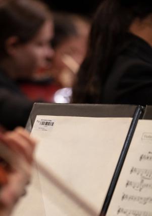

The monologue I have chosen is from an ancient Greek play called Medea, which was originally written by Euripides and my chosen script is adapted by Suzie Miller. The performance follows Medea as a woman of extreme behaviour and emotion when dealing with her unfaithful husband. This play explores the theme of revenge and emotions such as anger and frustration, but also heartbreak. I want the audience to feel these emotions with Medea and feel empathetic towards her story. I want the audience to want revenge as well and feel the hatred towards Jason. This monologue allows me to further understand how to create an impact on an audience.
WATCH DARCEY’S PREFORMANCE HERE:
 ARIANA CAMPOREALE PROJECT MONOLOGUE
The monologue I have chosen to take on for this project comes from Partly, it’s about love, partly it’s about Massacre by Fiona Sprott. The monologue explores character development through a lens of comedy and humour, as the protagonist realises what love means to her and how to accommodate her partner into her life. Although the monologue shows her journey in regard to adapting in a comical way such as the repeated motif of the ‘butter’ – obviously this bothers her but ultimately, it’s a lot deeper than that. What I am trying to communicate to my audience when I perform this monologue is how often people use wit and humour to mask deeper issues of insecurities as it is the best way they know how to cope
WATCH ARIANA’S PREFORMANCE HERE:
JADE BROGAN PROJECT MONOLOGUEMy individual project is a collated monologue script from the play, Ubu Roi by Alfred Jarry, through the lens of Ma Ubu. Ma Ubu’s character is inspired from the villainess persona of Lady Macbeth. She is known as a larger than life character, intelligent, witty, repulsive, power hungry and manipulative – a challenging and fun character to create! Ma Ubu is the driving force behind Pa Ubu and gaining personal dominance and control. Through Jarry’s absurdist style of theatre, this character inspired me to portray the complexity of a power hungry woman through the conventions of humour and physical theatre.
WATCH JADE’S PREFORMANCE HERE:
I have chosen a dark, comedic monologue from the 1987 play, Laughing Wild, by Christopher Durang. The play is written for two characters, the female character having no emotional stability and the male character struggling to improve his worldview. My monologue is raw and disclosing thoughts coming from the female character, who wishes that people could perceive the world from her own perspective while she grapples for inner peace. As she’s speaking to her ‘therapy group’ she feels a gradual sense of safety, and that relationship between my character and the audience gradually blossoms. The comic and realist conventions have inspired my character’s investigation of purpose and meaning.
WATCH CHARLOTTE’S PREFORMANCE HERE:

I chose my individual project monologue because of its serious tone – Boot by Joanna Erskine is a confronting and heartfelt realist piece. The context of the project is that eight friends are coming home from a party and get into a car accident. The style of the monologue is challenging as it is highly emotional and confronting for an audience to hear such a tragic story. The audience is witness to some very graphic storytelling and they feel the sense of hopelessness from my character. This is a story that could happen to anyone and it is a message to the audience to educate the young on keeping safe.
WATCH AN EXTRACT FROM LILY’S PREFORMANCE HERE:
KRISTEN ELIAS PROJECT COSTUME DESIGNI chose costume design because the play, Stories in the Dark by Debra Oswald, is about empowering others through the magic of storytelling. My concept transports the audience from the realities of war symbolised through the characters of Anna and Tomas wearing dull and colourless costumes to promoting healing and hope with the shift towards a colourful story cape that Anna makes from found materials and drawn story characters with old paints and texta colours. Anna wears the cape as a symbol of healing for Tomas and herself to escape the violence and conflict of their reality. I hope the costumes encourage reflection on the struggles of war on young people and the healing and hope they might offer each other.
SEE THE COSTUMES KRISTEN CREATED HERE:
EVELYN DRINIAS PROJECT MONOLOGUEMy individual project, a monologue, is based on Prima Facie by Suzie Miller and explores the indictment of the failure of the legal system to provide justice for women in sexual assault cases. It focuses on Tessa, a criminal defence barrister, and her experience fighting for justice after being sexually assaulted by a co-worker, and her encounter with the other side of the law. This monologue uses realism to challenge and reveal the legal system. It is written in verse which is what originally drew me to the piece because it enhances the emotional impact and guides me as an actor in the way I deliver the dialogue. The intended audience response is to be emotionally touched and feel empathy for Tessa.
WATCH EVELYN’S PREFORMANCE HERE:
The monologue I have chosen is the character Vladimir from Waiting for Godot by Samuel Beckett. This monologue utilises the performance style of Absurdism with comic and burlesque undertones. The character of Vladimir would be the equivalent of a comic straight man. He is also an intellectual who is concerned with a variety of ideas. Vladimir is the one who constantly reminds his friend, Estragon, that they must wait for Godot. Through working on my monologue, I have harnessed the importance of an audience and actor relationship, realising that the audience is the character’s subconscious and although the piece is absurd I have tried to emit Vladimir’s true feelings and thoughts on existence.
WATCH BRIDGET’S PREFORMANCE HERE:

The monologue I have chosen is, Elizabeth: Almost by Chance a Woman by Dario Fo. He employs comedic methods of the ancient Italian commedia dell’arte, a theatrical style popular with the working classes. His dramatic work criticises and ridicules organised crime and exposes political corruption and assassination. This full-length satirical comedy focuses on the neurotic and narcissistic ruler Elizabeth I of England who is now stark raving mad. Her mind conjures up vivid memories and paranoid delusions. When working on my monologue I understood the importance of an audience and actor relationship, realising that the audience will enhance what I, as the actor, create. I want the audience to feel humorously enlightened through my theatrical embodiment of her.
WATCH MARIA’S PREFORMANCE HERE:
The monologue I have chosen is from Honour by Joanna Murray-Smith. It is a powerful story as my character is confronting her father’s mistress. There are deep hidden familial issues. I’m keen to create a character that an audience can connect and relate to and that is why I chose the performance style of realism. It’s a one-sided conversation piece that needs complete truth and belief to present. The story is emotive and powerful. I don’t want the performance to be a passive viewing experience, I want the audience to invest in the information shared and to decipher the character’s emotions and the story in real time. It has challenging conflict and a range of emotions to act that have inspired me as a performer.
WATCH GABRIELLE’S PREFORMANCE HERE:
My individual project allows me as an actor to utilise my skills of character physicality, vocal modulation, conviction of character and control of energy to present a theatrical piece. The monologue I have chosen is the character of Sarah from Donald Marguilies’ realist piece Time Stands Still. Sarah is a war photographer for the past 15 years and has captured the horrors of wars across the world, from Afghanistan to Mosel. In this excerpt, Sarah discusses the horrors she has seen on the frontline and contemplates her purpose in society as well as her morality due to her occupation. I believe the audience will be inspired by Sarah as she is resilient and passionate about photography, irrespective of the challenges she has faced.
WATCH BELLA’S PREFORMANCE HERE:
I have chosen the monologue, Tiggy Entwhistle by Joanna Murray-Smith for my Individual Project due to my love of comedic yet dark performances and the fact that this monologue allows for very dramatic moments with a very dynamic and evolving emotional range. This monologue follows Tiggy Entwhistle, an excited and jittery middle aged woman discussing her love for cacti plants. However, while giving her speech about cacti she is actually talking about being left by her husband. I love the emotional ride this play takes and what the character learns about her relationship and how she should move on. I want the audience to not only sympathise and relate with Tiggy as she pours her heart out about being hurt, but also make them laugh. playwright’s dialogue intends.
WATCH RUBY’S PREFORMANCE HERE:
Debbie Bachmann Head of TAS • Sean Broady TAS Teacher Timothy Chung Artistic Director Claudia De Giorgi Designer • Nicole Ellis-Windsor Head of Drama and Visual Arts Yvette Graniero Director of Community Relations • Victoria Harper Editor Scott Henderson TAS Teacher • Brittany Poynting TAS Teacher Caroline St George English Teacher • Paulina Skerman College Principal Brian Walker Visual Arts Teacher, Photographer Froukje Werlemann-Godfrey Head of Music Curriculum Brigida Zagora Head of HSIE History
Year 12 Major Works 2022 is published by Santa Sabina College. 90 The Boulevarde Strathfield 2135.
The entire content is the exclusive copyright of Santa Sabina College, PHONE 9745 7000 WEBSITE ssc.nsw.edu.au