
A YEAR 12 SANTA SABINA COLLEGE 2021 Major Works DESIGN & TECHNOLOGY TEXTILES & DESIGN VISUAL ARTS ENGLISH EXTENSION 2 MUSIC DRAMA

Students of the Year 12 subjects featured in Year 12 Major Works 2021 are required to create a major project or performance piece or write an original composition which takes up a substantial amount of the final mark for that subject. So students with creative flair, design capacity or in depth interest are attracted to the subjects of Design & Technology, Textiles & Design, Visual Arts, Drama, English Extension 2 and the higher levels of Music.
This applies to the majority of Santa Sabina students. They are renowned for their dedication to creating spectacular works of art which are frequently nominated and selected for the NSW Educational Standards Authority (NESA) annual showcases of the exemplary major works in NSW (including ARTEXPRESS, ENCORE, OnStage, Texstyle and Shape).
Adapting to the reality of COVID-19 and government Stay-at-home orders meant that in 2021 the usual on-campus processes of experimentation, making, rehearsing and gathering feedback along the way were severely restricted. The students were obliged to work more independently than usual. The examples of exemplary work featured here are a measure of the excellent preparation work of the early months of the year and testament to the ability of these students to pivot and adapt to the constraints of the pandemic. This is a major accomplishment and I congratulate the talented students and their dedicated teachers.
In addition, we have been unable to stage the usual public exhibitions and concert performances but we trust we have done justice to the students’ works by presenting them to you in this booklet.
PAULINA SKERMAN College Principal

For my Major Design Project I designed and constructed a coffee table in the style of Bauhaus and Minimalism. It is a multi-use coffee table with storage, entertainment elements and the ability to shift between design styles. Apart from using it for my living room, its purpose is to educate about the origins of Minimalism, and that it is inspired by Bauhaus.
Through primary research and surveys, it was evident that Bauhaus is not a recognised design style. I thought that with this data, and my own dislike for minimalism, I’d design a piece that educates others about the origins of minimalism and its ties to Bauhaus design.
Designed for my living room, its versatility in being able to switch from Bauhaus to minimalism allows it to appropriately fit the space with minimalist features and also become the focus of the space with Bauhaus features. The Bauhaus features are included in an inbuilt puzzle, and chess
board that is able to flip to pine, so that it blends with the table. The design incorporates Bauhaus colour theory and the primary colours. The chess pieces also are specifically designed to reflect the Bauhaus style with geometric shapes and mimic the movement of each piece.


Multi-use is another main feature of the design. As well as its use as a simple coffee table, and use of entertainment features, the design incorporates open shelving and a drawer, which increases its appeal as a versatile, multi-use piece of furniture.


I have redeveloped Bengalla Mine into Bengalla Solar Farm to reduce the use of fossil fuels and increase the use of clean energy through eco-friendly solar panels and Tesla megapack batteries to store the electricity and distribute it to surrounding towns and suburbs. Its purpose is to provide the Upper Hunter region with clean electricity.
Bengalla Mine is an open cut coal mine which produces 8 million tonnes of coal per year, enough energy to power surrounding towns and cities with electricity. When conducting primary research, I discovered the mine was producing a large percentage of Australia’s fossil fuel emissions. Australia is ranked 89th in the world with the worst air quality according to the Australia Air Quality Index (AOI). I wanted to create a project that would help the community.
My newly designed Bengalla Solar farm uses industrial solar panels and Tesla megapacks to double the energy produced by the original energy source. It uses 3150 solar panels and 7000 Tesla megapacks to achieve this goal. Bengalla Solar farm is a model for how we should tackle Co2 emission and slow down the effects of climate change for the future.
For my Major Design Project, I designed and created an outdoor bench that promotes communication and social interaction. When Burwood Library was recently renovated, I was surprised to see that they did not change the external space of the library, which has always looked a little lacklustre since they relocated to 2 Conder Street. The entryway of the library is bright and contemporary, suiting the multicultural and diverse community of Burwood, however, the external seating is outdated and doesn’t match the atmosphere inside. Thus, the addition of my seat aims to provide more seating in a creative manner and promote social inclusivity.
The main inspiration for my bench is parametric design, most commonly used in architecture due to its avant-garde aesthetic and sometimes asymmetrical structure. Parametric designs allow designers and architects to input their desired parameters into a computer-generated design tool, which creates relationships

within the constraints.
I was also inspired by the cultural values of Burwood, with my design resembling the Chinese character for ‘people’ when seen side-on. With the Chinese community making up 45.1% of its residents, the fact that my design closely relates to Chinese culture, further emphasises its relationship with the community.
There are two main components of the seat: the body and the leg, both of which are made of recycled Oregon timber that I picked up from a local recycling facility. I marked, cut and sanded 70 separate pieces of wood which would come together to create the body and leg of the seat. These components would be stabilised through threaded rods.

The focus of my Major Design Project was to design and construct an ergonomic, functional and aesthetically pleasing adjustable height desk that can be transformed into a side table.


The versatile and multifunctional nature of my final product meets the needs and desires of the vast Australian population living in apartments or small style housing including families, university students, singles and renters. Since the product can be used as either a desk or side table, it minimises the amount of furniture needed and ultimately maximises the space provided.Through the implementation of actuators into the design of my product, it enables the consumer to use it as a sit/stand desk. As sitting down for long periods is perceived as ‘the new smoking’, my product essentially provides the consumer with many health
benefits such as reducing the risks of diabetes, heart disease, weight gain and high blood pressure. Furthermore, as the COVID-19 pandemic has seen almost half of the Australian working population forced to work from home, and many Australians now wanting to work from home due to flexible working hours, there is a great need for products such as mine.
My desk/side table has been inspired by the contemporary design style and is reflected through the variety of materials I used such as aluminium, Tasmanian Oak timber and recycled grey HDPE plastic. The curved shape of the shelves and tabletop, and the use of symmetry evident through the dowels, further align the contemporary aesthetic style. Overall, the contrast in colours, textures, shapes and features has enabled the overall design of my product to be aesthetically pleasing.
Ultimately, I believe that my MDP was very successful since it meets the needs of the intended user and fulfils its purpose. I am very proud of the outcome of my Major Design Project and pleased with my contributions to idea generation, creative development process and construction of my product.
For my Major Project Design I created a cabinet that follows the aesthetics of the ‘Japandi’ style to enhance the decor and aesthetics of my Auntie’s property to appeal to buyers.
Her current Asian inspired decor as well as the increasing popularity among the ‘Japandi’ aesthetic has provided the opportunity to replace outdated pieces of furniture such as the current cabinet in the living room, to one that complements the aesthetic of the home but also provides a modern element. Likewise, the importance of aesthetics and coherence in the home ultimately affects a property’s success in real estate, hence this cabinet will allow for greater overall attraction and connection to the home.
The design features a simple rectangular shaped cabinet as well sliding doors which feature a laser cut design inspired by traditional Japanese patterns.


The use of Bamboo Plywood creates a soft look to the cabinet with straight grain lines however also creates contrast with the plywood’s endgrain. The use of black painted steel for the legs also creates contrast but focuses on the minimalistic aspect of the ‘Japandi’ aesthetic. Thin metal legs allow the piece to fit the
modern audience whilst not taking away from the key features of the Japanese designs.
This was a valuable experience as I have learned to create a design that incorporates two different aesthetics as well as learning the vital role of design in enhancing spaces and environments for the better.
The Tallong Outdoor Education Centre is a campus of Santa Sabina College in the Southern Highlands and is currently used for outdoor education and accommodation for students and staff from many schools in wider Sydney and surrounding areas. Recently, Santa Sabina’s Tallong Campus has been faced with several issues such as the COVID-19 pandemic and the 2019-2020 bushfires which resulted in staff shortages, low water supply and less attendance from school groups which has led to financial difficulty.
My Major Design Project consists of a redevelopment of the Tallong Outdoor Education Centre, which focuses on space efficiency, environmental sustainability and a broadening

of the target market. With the inclusion of six new holiday cabins, the campus will open to a wider range of customers and will ultimately lead to an improvement in its financial success. New sustainable design practices have been implemented, such as black water recycling technology and solar systems, which reduce the ecological footprint of the campus. The interior of the existing school cabins have been redeveloped to improve


the aesthetic appeal and space efficiency of the current design. The weaknesses in the existing design were identified by survey results and were subsequently considered in the development of the final design solution.
Ultimately, my Major Design Project allowed me to enhance my design and communication skills. Completing the project was a valuable experience to me as I was able to pursue a project that I was passionate about.


The focus of my Major Design Project (MDP) was to repurpose and rezone disused land in Port Kembla with a strong focus on rezoning dilapidated land for the use of a condominium which will service the needs of the growing population. My concept for Port Kembla caters for the future housing needs of the changing demographics and increasing population in Sydney as I have adopted a strategic and thorough approach to the planning of Port Kembla which is evident through the amount of residential, commercial and other beneficial elements such as public infrastructure.

In relation to the condominium development, the design includes recreational and educational facilities through the inclusion of an infinity pool, while there will also be room for other leisure exercises and the implementation of a library. Additionally, communal areas have been considered through the inclusion of communal terraces on each apartment level, as well as on the overpass. I made use of sustainable design methods in my design through incorporating a large amount of green space within the condominium. The inclusion of this open green space has created a physical and visual connection with the natural environment. Further, the terraces and balconies of the apartments include a grass floor which is extremely eco-friendly and has the benefit of reducing heat load as well as working to be a great insulator.
Furthermore, Port Kembla has a significant amount of Aboriginal and steelworks history. This was a key element I considered when designing the condominium, thus I have included the curved
path around the apartments which resembles the Rainbow Serpent and further includes Aboriginal painting symbols such as a waterhole, ants, fruits and flowers. I have also included stainless steel in many aspects of the design such as
the steel beams that support the overpass. Additionally, the shapes of the building have been designed in order to resemble the waves of the ocean across the road therefore allowing the buildings to suit their surrounding environment.
I have redeveloped the Homebush ‘Midnight Star’ Theatre on Parramatta Road. My design includes a double-level theatre space with a capacity of 540 with an additional eight disabled seating options, and built on the empty block adjacent to the existing structure is a restaurant/ bar area and an outdoor amphitheatre/community space.
The aim of my design was to highlight the historical significance of the theatre, in renewing the facade and interior. Visitors are invited to gain an appreciation for the beauty and the intricacy

of the Art Deco design style and theatre experience. I have utilised eco-friendly/sustainable energy sources and design strategies where possible, such as green space, orientation, passive/ active design, glazed windows, and recycled materials in order to modernise and maximise the adaptive reuse of the building.
My concept endeavours to encourage the gentrification of the Homebush area and surrounds, through attracting employment, tourism, housing and community relations in the area. My primary data collection survey indicated
the importance of providing communal recreational spaces, as the experience ‘unites members of the community with common interests’ and ‘allows people to take their eyes off their screens/devices and actually make meaningful connections with people’ with 100% of participants agreeing that theatre is an important part of society for recreation/entertainment.
Overall, through the completion of my design, I hope to revive the Art Deco design style in bringing life back to the Midnight Star and hence, into the Homebush area.
For my Major Design Project, I have designed and constructed an outdoor table which will achieve the target market’s needs and wants. The outdoor table is created to seat 10 people comfortably around it which is functionally sound and aesthetically pleasing to enhance the location it will be placed in. An outdoor table is very beneficial for homeowners as it is an inviting space to come together as family and friends to enjoy a meal. Through my primary and secondary research it was evident that tables are very important as they promote people coming together and eating with each other. Whether this is with your family, friends or strangers, it has been proven that it can improve one’s mental health and brighten up an individual’s day.
The target area for this project is to be located in the outdoor entertainment area under the alfresco of my house. The table will be replacing the existing table which is outdated, too old and too small for its intended area. The table’s end results will be
able to enhance the entertainment area aesthetically and improve functionality in the area by being able to seat more people at the table.
My product has two major components: the table legs and the table top. The outdoor table is inspired by the modern industrial style which is reflected through the use of materials such as steel and recycled blackbutt timber. The materials used in the


project are very supportive and strong which can withstand harsh conditions being located outside such as weather. The use of contrast between the black steel and light brown blackbutt timber adds to the aesthetics and style.
Overall, the outdoor table enhances the entertainment area of my house aesthetically and functionally. The product as well achieves the needs and wants of the intended target market.
For my Major Design Project, I designed and constructed a mobile and adjustable multipurpose tray table with the focus of my design targeting the elderly community, specifically my grandfather. I saw that there was a genuine need for this table as he spends much of his day performing tasks such as eating, writing and reading from


the lounge. The table could also potentially be adapted for use by the wider elderly community.
Through my research I was able to determine that there is an increasing number of elderly who prefer to ‘age in place’ by staying at home and living independently.
By surveying the elderly and nursing homes, I was able to gather information on the most
practical design features and by investigating already existing designs I was able to ensure that my design not only addressed their needs but focused on them.
With my grandfather as the target market I could visualise the end product. Since the table was being constructed for his living room, function and aesthetics were the most important factors to consider. The design of the table had to suit the proposed environment in terms of shape, size and colour. It had to be functional, ergonomically friendly and include features such as adequate storage for daily items (such as newspapers, remote and glasses), ease of mobility and a suitable height adjustment system.


For my Major Design Project, I have proposed a new redevelopment for Strathfield Plaza and Square. The main aim of my project was to revitalise the area which is currently dilapidated and not serving to its full potential function, which was supported by the responses from the survey I conducted on stakeholders. To achieve this, my design concept focuses on improving both the functional and aesthetic aspects of the area.
It was a key priority to utilise the current area to its maximum potential to increase the function it can serve to the community. Additional retail levels have been implemented to increase the services provided, along with a new Rooftop Bar which serves as a cover to the existing top uncovered car park level, and also a new entertainment precinct incorporating restaurants and a bar. Accessibility was also a priority, as the new concept has a seamless flow from the transportation hub, through the square and straight into the Plaza building, which has a lift tower from the square (ground level) all the way up to the Rooftop.
When considering the aesthetic aspect of the site, it was a priority to ensure that my redevelopment modernises the area in a way which is sensitive to the historical nature of Strathfield. This would encourage patrons to visit, as the new revamped area would be more inviting and pleasant. The concept takes advantage of green space, making it a more prevalent feature which serves not only aesthetic purposes, but many functional and individual benefits. When conducting research, it became evident that there is a strong correlation between a
pleasing aesthetic environment and improved mental health, which stood as a high priority to me. Many facades have been used on the buildings to assist with modernising the area in a way which is familiar to
Strathfield and its heritage. Overall, through my extensive work on this project, I have gained many skills as an individual, and I hope it has provided a solution to the issues faced at the current site.

For my Major Design Project, I have designed and prototyped an energy-saving light switch that integrates psychological theories to promote users to switch off lights, ultimately saving electricity and the consumption of nonrenewable resources.

The aim of my light switch was to address the urgent and pressing emergency of climate change in order to prevent the detrimental effects. Leaving lights on in homes is a collective issue, where four out of five people admit to wasting power in Australia and 41% state they leave rooms without turning off their lights. This wasted electricity contributes to the approximately 50 billion tonnes of carbon dioxide produced per year in Australia, accelerating the rate of climate change.
My light switch design consists of two semi-circle components that slide together to create its circular body. The switch design requires users to flick half of the shape up to turn the lights on and back down to switch the lights off, hence completing
the shape and appealing to the human condition for symmetry. Reinforced by the Zeigarnik Effect, the design, therefore, provides a psychological cue which triggers users to switch off their lights when exiting a room. The various design solutions, including the bamboo, Art Deco, Memphis, Bauhaus, kid-friendly and PLA designs, cater for the
majority of the target market and match their existing design styles in their homes, hence encouraging users to to interact with the light switch.
Overall, I believe my light switch design is highly successful, where it is both functional and aesthetic, as well as evidently considers its positive environmental impact.
I have designed and constructed a timber bar cabinet, both functional and aesthetic, which successfully meets the needs of my target market. This project effectively addresses the need to replace an old cabinet in our home, improving organisation and entertainment for guests. My project first appears as an aesthetic contemporary and industrial styled hall cabinet, however, using linear actuators, the project is then able to transform into a functional drink and entertaining cabinet.
The aim of this project was to address the need for storage, while also providing an engaging design element. As the housing

market is beginning to grow, consumers are more interested in both efficient and sustainable living. When considering furniture for a new home, or for an existing home, consumers are looking for products that are able to store items effectively while being aesthetically engaging, affordable and sustainable. These important aspects were considered in the design, through it’s the ability to transform from an ordinary looking storage cabinet, to a highly functioning entertaining bar cabinet. The actuators are hidden in the back of the cabinet, providing a seamless transition, lifting up the section for bottles to be on display. The use of
the American Walnut veneer on plywood material provides a cost effective and functional aspect to the bar cabinet, as it has excellent structure, quality, and is solid.
As the target market for this project is my family, the product will be located in the corner of our dining room, allowing its contemporary and industrial style to complement its environment. The overall project, particularly the unique and distinctive design of the doors, incorporates balance, cohesion and harmony, using the American walnut timber to establish detail through texture and contrast, ultimately providing an overall aesthetic product.

For my Major Textiles Project (MTP), I have designed and created a long sleeved wrap blazer. My garment is inspired by the bathhouse uniform seen in the Japanese animated movie Spirited Away, as well as Traditional Japanese textiles and art. The decorative darts at the shoulders mimic delicate paper folds seen in the Japanese art of origami, as origami and paper are recurring motifs seen within the animated movie. The overall wrap style of the blazer is inspired by the traditional Japanese garment of the kimono. The dark blue pigment embedded into the sleeves and the detailed patterned interior of the wrap blazer is created through the laborious dyeing techniques seen within the traditional Japanese textile indigo dyeing of Shibori. Over 400 double knots were hand-tied one by one to create the intricate design of the interior of the jacket. The embellishments seen on the belt are also inspired by elements seen within Spirited Away as seen in the appliqué of the laser cut paper figure (cut with 100% cotton Homespun) and the beading outline on the appliqué.


My Major Textiles Project is a wall hanging. This highly embellished piece comes under the focus area of a textile artwork which is derived from not only my Sri Lankan heritage and culture but also my religion – Hinduism. My textile artwork is highly decorative, highly embellished and visually pleasing as it has aspects of different materials, colours and techniques that are seen throughout. The centerpiece of the wall hanging embodies an important figure in the Hindu religion called ‘Ganesh’, this was 100% hand sewn. Also, the majority of the fabric used


in this wall hanging is fabric from a repurposed sari. This wall hanging may be created for personal significance, design influence and/or creativity mostly for homeowners. As my project is a highly embellished artwork, it will be displayed or hung up due to bright visuals. Also, this textile artwork is large so it has the advantage of easily being seen from afar drawing the eye to the work. Seen throughout this wall hanging is a variety of surface decoration techniques which adds to the emphasis. These include patchwork, sequins, hand embroidery, beading and block printing.

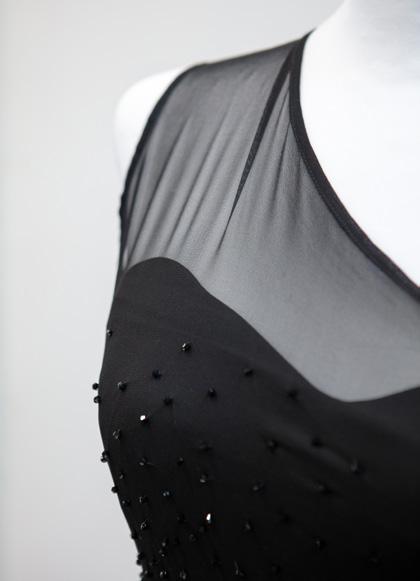
For my Major Textiles Project, I designed and created a formal event dress inspired by the Kosovar designer Teuta Matoshi, who specialises in creating elegant, feminine, ready-to-wear evening wear for women of all ages. Matoshi often utilises elements of corsetry, as seen in the bodices of some of her garments which incorporate
boning to provide structure and create a more fitted look to the dress. Her designs aim to embrace the feminine figure and use texture and a range of decorative techniques such as embroidery, beading and appliqué to add a whimsical and classy feel to her garments. I have been inspired by her fabric choice, silhouette and structure
of her formal wear pieces, which I can incorporate to effectively create an appealing formal garment for my target market. To reflect my inspiration, I utilised powder blue tulle fabric to create a sheer corset-style bodice, with a tiered tulle ruffle floor length skirt that flares out at the waist to create an elegant and flattering formal wear garment.


I designed and constructed a decorative red carpet outfit with a detachable high-low overlay flounced skirt. The outfit includes durable and lustrous fabrics as well as a balance of functional and aesthetic techniques, designed for red carpet and Met Gala events where iconic fashion pieces of extravagance are worn. I designed and drafted


the pattern pieces for each flounce, rather than using store bought pattern pieces. The chaotic movement, unique to each flounce, mimics the flow of the ocean’s waves. Innovation is demonstrated through the unique use of nail polish marbling to give the appliqué starfish swirling lines, creating movement and rhythm. My inspiration derives
from Gianni Versace’s Spring Summer 2021 Ready-to-Wear Collection. The collection consists of ocean motifs in bold colours, unique shapes and silhouettes, exaggerated use of flounces to communicate waves, and chaotic colour and volume. Donatella Versace mentions, ‘I wanted to do something disruptive and to break the rules’.


My textile artwork is inspired by the Dolce & Gabbana Spring 2012 collection and its highly embellished garments, especially the two piece garments. This collection entails unique and vibrant designs that were created with intricate embroidery, using an array of coloured beads as well as the use of the large jewels, which were also used in this piece. The short and scandalous silhouettes, in the shape of a bra and shorts, were also influenced and applied to the design. The historical inspiration for this textiles artwork is a part of the Baroque historical period and the
architecture within the Baroque buildings. The golden accents in these buildings enticed and influenced this project, through the grandeur and curvaceous style and pattern of the Baroque buildings. All of these elements initially inspired this textile artwork, due to the sophistication to the historical buildings overall aesthetic and complexity in pattern. The Dolce & Gabbana Spring 2012 collection and baroque buildings link to having the ability to be turned into a textile artwork as this piece is highly decorative and will be displayed on a mannequin.
For my MTP I have designed a ready-to-wear relaxed mini dress, showcasing the focus area of Apparel. My garment illustrates the exploration and expression of 1970s fashion trends, through the aesthetic and design of the dress. The apparel piece will use a flirty silhouette and feminine design to complement the female figure through its formal yet relaxed fit. The use of bishop sleeves, elongated cuffs and a low v-neckline within the apparel piece, further encapsulates the elements of the 1970s fashion trends. These components of my piece are enhanced by the aesthetic features of my originally designed 1970s hippie era inspired fabric print and sequins, producing a highly aesthetically pleasing apparel piece that communicates the inspiration of the era. Through using Adobe Illustrator software I was able to design the print of my fabric. I then outsourced my fabric to be printed.


For my Major Textiles Project, the chosen focus area for my design is Apparel. Apparel items must be functional and aesthetically pleasing and made of quality manufacturing to fulfil the end-use purpose. I have designed a skirt and jacket made completely of tweed. Tweed is a rough, woolen fabric, of a soft,

open, flexible texture, highly comfortable and keeps the wearer warm with the heaviness of the fabric. For my tweed suit I have chosen to use a woven pink tweed, it is through the creation of the mini pencil skirt and petite jacket that the criteria of an apparel item will be met. Overall, my MTP is highly inspired by the

1990s and Chanel, especially the link of these two designs being Chanel 90s collections. My choice of tweed fabric is drawn straight from my inspiration from Chanel, with the sweet colours, classy and sophisticated look, I have adapted these elements into my design of the tweed suit to bring out my inspiration.

For my Major Textiles Project (MTP) I have designed and constructed a red carpet dress. Inspired by the intricate detail of Steven Khalil dresses and the iconic Versace pin-dress, the floor-length garment includes durable and soft fabrics as well as a balance of function and aesthetic techniques and features. The garment is designed to be a luxury bespoke piece that encapsulates common motifs and inspirations. The MTP encompasses many design techniques that make it both creative and innovative, including the use of pattern modifications and the use of decorative embellishments. This gown includes a one-shoulder gown which will be constructed from sheer organza as an overlay on the garment, essentially stemming from the Steven Khalil gown. This sheer overlay acts as a base for intricate beading, reflecting luxury and opulence, which is appropriate for the intended high-class audience. The slit of the dress was widened and brought up higher to include gold pins that cascade down a quarter of the split. The gold pins have been repeatedly used to fill the empty space of the cut out.

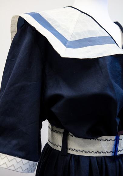
My Major Textiles Project is a sailor style dress with a free flowing mid length skirt with short sleeves and a typical sailor collar. The purpose of the dress is not to be worn but to sit adorning a space like a typical textile art piece. The dress follows a commercial pattern directly in all areas besides the collar. It is constructed from a repurposed sail that is an off white colour with medium blue stripes, this aims to create an innovative and creative area of emphasis of the textile art piece through the outstanding colour in comparison to the navy blue of the rest of the dress. The idea was to reflect the sail and the club number through repurposing the fabric in a way that will advertise the sailing team. As the project developed the idea to make a sailing dress like you would see in the 1950s seemed appropriate given the context of the fabric, linking the design historically and contemporary, as it brings attention to a modern sport through bringing back an easily recognisable sailing outfit design from the 1950s. The dress sets a design that can be easily recognised by viewers and a garment that correlates to the sport, without having known the intent of the major project.


My Major Textiles Project is a costume for the character Lady Mary from the television show Downton Abbey, set in the early 1910s. My overall aim was to capture the grandeur of Lady Mary Crawley, the eldest daughter of the household, and to encapsulate her elegance and presence through creating an evening gown for her. Costuming is a way to accentuate and dramatise, and allows the artistry of the costume to shine through and add definition to scenes and characters. My
choice of bright colour conveys her power and influence, while the drape demonstrates her elegance and poise. Further, the tassels which weigh down the sleeves add to the line of the dress, falling vertically, and the intricate beading across the front of the chest add detail to the garment, demonstrating a level of sophistication. The sheer,


layered fabric choice came from the frock of Lady Mary’s sister in the show, Lady Sybil, which also has a similar use of drape and volume. The costume I have made meets the aesthetic qualities as it incorporates embellishments such embroidery and tassels relevant to the time period, as well as being very delicate and elegant to convey class.


My Major Textiles Project has been inspired by the Pallas Couture Forever Fleurs collection and Vincent Van Gogh 1890 painting, Almond Blossoms. The Forever Fleurs collection was inspired by flowers, ‘true luxury’, and a balance between ‘classical couture, impeccable tailoring and modern sophistication’. The mermaid fitted silhouettes, open neckline trains have influenced the silhouette of my wedding dress. Van Gogh’s painting, Almond Blossoms, embodies large blossoms and branches over a blue sky which reflects new life. These key features of Van Gogh’s painting inspired my MTP through the floral patterns on the train and the surface decorations of beading reflecting branches on the train. I have also been inspired by the ongoing tradition of a white wedding dress for a bride. The gown fits into the focus area of apparel, featuring a floor length dress with a long train, providing modesty and communicating the bride’s status on her wedding day. My MTP is embellished using beading, machine embroidery and hand embroidery.


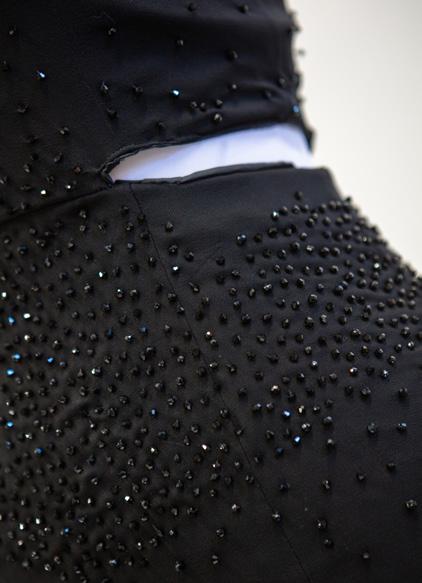
My Major Textiles Project focused on the inspiration of Ancient Greece in order to create an extravagant modern day representation of a Greek Goddess which is to be worn at the highly extravagant 2018 Met Gala themed Heavenly Bodies. It is an apparel, high-end, evening floor-length gown which fits the correct and appropriate aesthetics that represents Ancient Greece. Even though formal wear is not worn regularly, the garment still needs to have a strong and structured finish to maintain its durability. The garment focuses on the drape utilised during Ancient Greece, yet also portrays the luxurious and excessive lifestyle that the Met Gala demonstrates every year. The high embellishments on the corset allow the garment to catch the attention of the audience’s eye and strongly link back to the inspiration of the piece. The embellishments help communicate the lustre and texture that is seen at the Met Gala while the multiple layers of fabric showcase the drape that was utilised during the Ancient Greek period. These contrasting inspirations will create a structured, form fitting bodice accompanied with a free-flowing, floor-length skirt.


My Major Textiles Project falls under the Costume focus area of textiles and design and is inspired by Chanel’s Paris Opera Ballet ‘Variations’ 2018 collection. This design comprises a tulle ballet romantic style tutu that falls to the ankle and is strapless with off the shoulder draped sleeves that hang over the arm. Made from delustered satin with a cotton lining, the bodice has a lustrous effect, as well as being secured and supportive for the ballerina to dance in. The extensive layers of tulle used to create the skirt, allows for decorative techniques to be used. These include beading and appliqué embellishments placed at the bottom hem of the skirt, as well as on the tight fitted bodice. These embellishments entail silk dyed, laser cut butterflies which are in the contrasting colours of blue and purple, placed against the white tutu. The sweetheart neckline alongside the chiffon sleeves, enhance the aesthetically pleasing nature of this design which portrays creativity and innovation in regards to the inspiration.


My Major Textiles Project is a contemporary evening dress, inspired by Paolo Sebastian’s autumn/winter collection ‘The Nutcracker’ (2018-19), created to be worn for formal events, classified as an Apparel piece. This piece is compromised of two garments, the bodice and skirt, featuring detailed embellishments within both. The design has a tight fitted, strapless bodice, with an A-line, ankle-length skirt, made from
a Vogue pattern with 100% polyester light blue Winston satin, and 100% nylon white bridal tulle as the exterior fabrics, lined with 100% acrylic silver Bemsilk lining. This garment includes boning on each side of the bodice, for structure and support, and also two princess seams at the front, and two darts at the back, which are both used for shape and fitting, creating the fitted silhouette of the bodice. This garment has delicately


hand-stitched embroidery, around both the bodice and skirt to create the stem and leaves, paired with intricate beading, inspired from Paolo Sebastion’s collection. It also includes laser cut fabric manipulated to imitate flowers, connected to the embroidery and beading, creating the visual elements of the floral design, clearly influenced by Paolo Sebastion’s garments, establishing a tactile and visual texture to the bodice.

For my Major Textiles Project I have designed and created an overcoat, drawing inspiration from Thom Browne’s Spring Ready-toWear 2021 collection alongside the global environmental issue of coral bleaching. The coat is a monochrome white, single breasted, notch lapel collar design which establishes a loose fitting and elongated A-line silhouette. The garment has long loose-fitting raglan sleeves, leaving a diagonal seam from the coat’s underarm to its collarbone. Both sleeves have a dart located above the shoulder, providing the coat’s sleeve with shape and structure. A seam runs vertically down the center back, with an asymmetrical diagonal seam on the left back side panel and three antique white buttons fastening the garment at the front. The coat’s monochromatic appearance draws inspiration from Thom Browne’s entirely white collection alongside the environmental issue of coral bleaching. This coat explores an abundance of surface decoration techniques, exhibiting vertical, organic lines couching on the left front panel, sleeve and back
produced through the utilisation of creamy-white 100% merino wool yarn. In addition I have created intricate circular applique pieces established through a range of beading, couching, embroidery and patchwork, intended to mimic the highly textured nature of coral. These are placed
sporadically around the entire garment. The coat’s base fabric is a heavyweight off-white wool, polyamide blend and is entirely lined with 100% polyester offwhite bridal satin, establishing thermal properties and comfort which further portrays my focal area of Apparel.


My Body of Work was inspired by my experiences with the COVID-19 pandemic and the deteriorating mental state of the individual that comes from isolation. My short film aims to capture the continual and depressing experience of self isolation, and how life without socialisation allows individuals to lose themselves and live life in a repetitive state. Viewers are taken on a journey where motion is little and the ending is hard to anticipate as the time and space in the film becomes confusing.


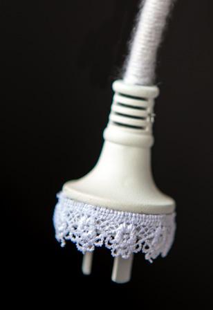
My Body of Work transforms a ‘power tool’ (gardening), recontextualising the traditionally masculine equipment with unexpected decorative and feminine qualities. It is through my art making that I am able to question and challenge the audience’s preconceived notions of gender, editing preconceived masculine connotations using materials traditionally associated with female domestic practices.


My body of work is a ‘solution’ to the refugee crisis by providing refugees with shelter and a temporary home, food and transport through the idea of ‘popping out a pill’. However instead of popping out a tablet, the pills are houses and hotels.


Society has this belief that the majority of pain can be resolved through medicine. This is why when one is in pain they are told to take a ‘pill’ – I wanted to bring satire to this to suggest by taking this ‘instant shelter’ it will solve everything.


My artwork explores the integral connection between humanity and the natural world, especially in relation to the positive impacts of nature on our mental health. In the current pandemic, I have drawn upon nature, and especially flowers, for joy and comfort. I want the artwork to prompt thought about humanity’s place in nature at large. This is shown through overarching dendritic similarities between human neural physiology and plant biology. I have used a railway map design, radiating from the brain, to visually align neurological pathways with nature’s plant systems.

My body of work was inspired by a rainforest bushwalk in Kianga National Park on the NSW South Coast. Through an unnatural colour scheme and panoramic presentation, I hope to be able to prompt a sense of the enchantment and immersion that I felt while there. I want to communicate a sense of otherworldliness that celebrates the vibrancy and vitality found in dense rainforest.


 DILLON
My Body of Work explores how the traditional notions conveyed in still-life artworks, such as the temporary pleasure received from material items and the passing
of time, are altered when placed in a surreal context. I perplex the viewer with my unusual juxtapositions and the unexpected to bring to life to the unique experiences seen


in dreams. The thoughts of the subconscious mind are captured by the appearance of additional body parts that clearly do not belong with the main subject in the image.

The prevalent issue of gender inequality ultimately impacts children and their future.

Through adopting a lenticular structural approach, my unique design transcends
the traditional conventions of portraiture. My large-scale realistic drawings have been rendered using charcoal and white pencil and as the viewer moves from one viewpoint


to another, their perspective shifts from the portrait image of a boy to a girl. Humanity is made in the same image and form and should be provided with the same opportunities.

Inspired by Hieronymus Bosch’s Garden of Earthly Delights, and a popular cartoon series, my panoramic digital drawing is scaled up to be printed at an exaggerated size and scale. The bright and bold colours and absurd characters and images give the piece a sense of childlike innocence. The randomisation of colour, placement and context of each feature creates pathways for individual interpretation which is complemented by its lengthy scale. This allows the Individual viewer to walk along the drawing whilst thoughts and feelings unfold in real time.


My Body of Work is an exploration of transdimensional worlds, with an ever present threat looming on the other side. Our own existence is celebrated through the mundane activities and detritus of our everyday lives as we aim to

literally ‘keep the wolf from the door’. The form I chose to express this idea is traditional animation which includes more experimental aspects in order to explore the possibilities of the medium and its ability to convey meaning.


My Body of Work draws inspiration from the current climate of control imposed by the Government in response to the pandemic. It seeks to subvert the significance of

the many sites which have become ‘off-limits’ therefore effectively turning these imposing and threatening figures into nothing more than ‘the fun-police’.


My body of work is inspired by the guerrilla girls. Specifically, their artwork Do women have to be naked to get into the MET. Museum? In my body of work I have used three famous artworks of naked women that are found in the MET museum and ‘clothed’ them using collograph prints and dressmakers’ patterns. The idea behind this is not that women shouldn’t be naked or that being naked is immodest, but rather to challenge the historical objectification of women. I hope that this makes the audience question the role of women in art and their value regardless of whether they are clothed or not.


My Major Work, the podcast ‘Too Ambitious’ is the first episode of a hypothetical five part series, analysing and centred around women in politics. The podcast focuses on their experiences through the perspective of a 17 year old ‘everygirl’ and her interviews with others. Originally I intended for the podcast to draw attention to the culture in the Australian parliament – the sexism and misogyny that has become a focal point in the media and as such, a national conversation. Over time, with the news of Brittany Higgins and the accusations against Christian Porter, my purpose morphed into an analysis of a young woman’s perspective on parliament and the role she may one day play in Australian politics.
I was brought up in a family of journalists, we would watch at least two different news programs each night to ensure a wide range of views and opinions were covered. I have always been interested in politics and the world around us, with a particular interest in powerful women. Working with audio, I needed to keep audiences engaged so I interviewed other women in order to understand different perspectives and ideas. Along with women at the peak of their careers, I interviewed my friends, and it was how they
In today’s world, where we use our experiences and ideologies to guide us, our 17 year old can’t help but critique the worlds of politics and media through the very thing that shaped her – feminism. If she’s being completely honest with herself, she’s scared; she’s seen what happened to Kate Ellis, only 30 and forced to plead for her political life to a newspaper editor over a false scandal, women nearly forced out of parliament from media smear campaigns. One story can ruin a woman’s career –public shaming and private abuses go hand in hand. She’s been told that women are hit on by senior MPs twice their age, rumours and gossip spread like wildfire. [BW – For men, it’s to increase their appeal to women because of the long standing Liberal women
saw women in leadership that shaped my Major Work.
I chose the podcast because I wanted to write something new. Throughout high school, you are given the chance to write fiction, non-fiction, persuasives and discursive but very rarely do you have the chance to write with the intention of speaking. As time went on, I realised that the podcast form became a homage of sorts to the riot girrrl culture of the early 1990s. Instead of producing and distributing my ideas in a zine, I was able to do the same with a podcast and literally uplift the voices of other women through it.
For me, I found the initial research to be the most challenging part. In the beginning, my research was more ‘light hearted’, focusing on the particular role the media played in how our female politicians are treated. However, a month or so into the process, the news of Brittany Higgins’ assault broke, and a week after that allegations against Christian Porter surfaced. Instead of taking a step back from all of this, my first reaction was to double down on research and it led to me burning out before I had even written anything. I had to learn my own boundaries in terms of these stories in order to say anything useful at all.
problem, so you have people like, back in the day, Tony Abbott saying that he’s a feminist, and everyone’s like ‘ok, sure’, when it’s quite obvious that he’s doing that to say, ‘hey women, I’m cool with the ladies, vote for me’. But for women to say that in their party, I feel like is one step too far, because they do risk accusations that they’re man-haters or they’re lesbians or they’re hairy-legged, or whatever –all those stereotypes.]
How does someone deal with this abuse once, let alone daily for years? And why are we, as consumers, allowing the media to continue this? Doubt grows at the corners of her mind – is any of this even worth it?
The first seeds of this doubt were sown way back in 2011 – she was barely old enough to understand
the significance of a female prime minister and yet, she vividly remembers the comments, the unyielding hate directed towards arguably one of the most powerful people in Australia, let alone women. [AS – I think it’s important to note that – eight years ago, Julia Gillard, during her time as prime minister, you know, had the most sexist campaigns launched about her, you know, there was ‘ditch the witch’, there were, you know, that menu served up at the Liberal Party dinner where it was ‘small breasts and big thighs’,]
Fast forward through the years, 2021 rolls around, she’s in Year 12 now and there are documents going around with the names and schools of boys who have assaulted girls like her, friends of friends.


My major work is an exploration of the complexities of ideas surrounding racial identity and the subconscious effects that racial identity can have on relationships within a family. With a focus on the evolution of my father’s fragmented racial identity throughout his childhood and into adulthood, I employ the key tenets of Critical Race Theory within a series of five interwoven anecdotes paired with corresponding critical and theoretical reviews, delving into the formation of internalised racism.
To begin with there was a plethora of different inspirations and influences – most of which stemmed from themes of psychology, racial identity, and the psychology behind racial identity – and with that came a plethora of different directions in which my work could go. There was no lightbulb moment of sudden inspiration, but rather a slow burn of themes born from race psychology which eventually pointed to the main influence – my dad. My dad has always had an interesting relationship with his identity as a second generation Lebanese-Australian man, and my initial, seemingly directionless research seemed to ignite a sense of ‘piecing together a puzzle’ in terms of understanding and, in a way, deciphering my own
The silver Ford Falcon with a busted rear end light could be heard coming down Campbell Street at 8:00am every morning. Robert makes the rounds; Charbel, Joe and David cram their backpacks into the boot and slam the door with all their body weight. Yagoona street smarts is knowing that David’s mother walks her son out the door with his schoolbag every morning, so Robert has learned to sit in the driver’s seat a little higher and push the chair back a little further to appear older than his scrawny 15 years. He takes the back streets to school.
The grass of the field, dull and yellowing, crunches under the feet of the four boys who play their routine game of football at lunch. The field is their unofficial territory in the playground – the
father’s relationship with his racial identity. From there, my research led me to discover the inevitability of internalised racism to be passed on intergenerationally, a discovery which prompted further investigation into my father’s life and family line, and the rest is history.
I chose the form of creative nonfiction, and specifically a personal essay and narrative hybrid, because I believed that it would be the best possible way to support the subject matter and notions that I was exploring – both universal and deeply personal. Through trial and error, I decided that I would have to get slightly inventive in my choice of form, drawing from unique novels such as Sarah Krasnostein’s The Trauma Cleaner to guage an idea of a medium that would streamline a piece of writing, equal parts storytelling and investigative.
Aside from ensuring authenticity when writing about real events, I found maintaining a balance between a subjective authorial voice and a factual, objective voice to be the most challenging aspect of the process. The fear of inserting too much of my own opinion and not enough of the subject matter at hand was always present but through trial and error, I found a balance.
Aussie boys always got first dibs on the asphalt basketball courts. Sometimes, Joe would bring in a tennis ball and the group would tentatively make their way down to the courts, playing handball in a modest square fashioned from the remnants of chalk on the ground. In time, the Aussie boys would join in.
The football is sitting unattended in the middle of the teachers’ car park, thanks to a particularly powerful kick from Robert. It bounces off a nearby bench with a conspicuous metallic clang, allowing them the four frantic seconds they require to elect Charbel to retrieve the ball. He braves the walk up, while the boys disperse near the teachers’ carpark with false nonchalance. Robert sits at the bench closest to the carpark and carefully watches
the shrinking figure of Charbel, bracing for the worst.
In the corner of the car park, smoke lightly billows out of the cracked windows of a dark blue Torana SS, the muffled sound of Back Of Love playing over the cassette. Charbel glances at Robert, and their eyes meet through the chain link fence. Cigarette in hand, Mr Mason glares at Charbel through Coke-bottle lenses, his arms crossed over his chest in a reclined driver’s seat. Charbel carefully approaches the ball, sensing eyes on him like a force of gravity. As he lowers to pick it up, so too does the music. He freezes. Robert holds his breath, while Mr Mason sucks a deep breath of smoke in and blows rings out.
‘Out of the car park, Lahood’.
My Major Work explored the ethical criticism of art, particularly in relation to art produced under dictatorships. To frame my piece, I used the lives of two controversial artists, Leni Riefenstahl and Dmitri Shostakovich, who produced art under the Nazi and Soviet regimes respectively. The work interrogates the relationship between morality and power, challenging assumptions that art is a powerless commodity by asserting that under certain historical conditions it assumes a complex social role capable of perpetrating and resisting power. I explored differing perspectives on artistic responsibility to interrogate whether moral judgements can and should be applied to art.
My choice of subject matter was influenced by my interest in history, and I enjoyed the opportunity to be able to explore this discipline in a different way by focusing on the internal worlds of people in the past. This was inspired by Anna Funder’s book Stasiland, which incorporates elements of both storytelling and historical analysis. Stylistically, I was influenced by the works of Milan Kundera, specifically his development of a distinctive narrative voice that fuses fiction with philosophical contemplation.
The music grieves together; he writes his initials into the notes in a guilt-stricken apology to Stravinsky, his friends, to music and to art. The letters slip in and around the staves, a cello drones beneath them and a viola carries them across the page. A mournful resignation but a dissonant push.
It was 1960. They wanted to make him General Secretary of the Composers’ Union, and they wanted him to join the Communist Party. And so, like the model citizen he had become, he did both.
In the West they called him a coward, a committed Communist; a victim of political blackmail or a slave to ambition. They didn’t call him a composer. They didn’t call him a musician. He wondered if he was still an artist.
I chose to write in creative nonfiction as I wanted to experiment with narrative and research conventions. This form allowed me to combine my passions for history and creativity, shaping a greater appreciation of both. I followed an objective research process, but how this research was presented differed to traditional history, as primary material and fact was combined with fictionalised imaginings of the conscience and inner workings of historical figures. I enjoyed the flexibility that this hybrid form gave me to experiment with characterisation and narrative voice.
Extension 2 is a very long process, and this was daunting at the beginning of the course. I cycled through lots of ideas before settling on my final concept, and it took me a while before I developed a sense of purpose and direction with my Major Work. The amount of information you end up with about your concept can be overwhelming, and I found it difficult to start writing or translate my research into a story with developed plot and characters. The independence you are given with the project is exciting, but also challenging, requiring time management skills and trust in your own ideas.
As one of his first duties they flew him to Dresden to work on the score for a Soviet-East German film. At night, under the low light of an electric lamp, he wrote the Eight String Quartet. It was subtitled, ‘To the victims of fascism and war,’ ostensibly in memory of those who died in the Dresden firebombing of 1945. But you would have to be blind and deaf to think the Eighth was simply about that.
Viola and cello skip and cross their feet in happy dance, but above them violins wail and howl, drip down the page, teeth biting against the strings. It is laughter through tears. Music should always have two layers.
Perhaps he had not been careful enough here. He heard his initials crying out over the music in silent, high-pitched protest, smuggled
into the staves and ringing out over his First and Fifth Symphonies, over Lady Macbeth; ‘I’m still here!”’Irony was all well and good. But without Party guidance he could have been brilliant, he could have been angry; he could have revealed his ideas openly instead of having to resort to camouflage.
He could have been brilliant.
But instead he hid behind his own art and failed self-expression and the veins in his hand blackened and shook so that the pen stumbled from his fingers when he wrote. The violins sunk chromatic claws into the flesh of the state.
And the state called back, of course; it pushed the music into a sensible register, purged it of heresy and guided it back to the diatonic march of the proletariat.
STUDENT: HOPE ELIAS ● TITLE: E-MERGE ● MEDIUM: CREATIVE NONFICTION, FICTO-CRITICAL
The nature of the ‘sublime’ has been rendered obsolete and described as an ‘outdated relic’ within the modern world. However, my ficto-critical piece delves into the rebirth of the sublime within the modern world of virtual reality, embodying a paradox. In my attempt to impugn the contemporary perception of the sublime it was necessary to understand the classic sublime. Technology, modernism and industrialism, by definition, led humanity astray from the beauty of the natural world. Thus, my ideology rose to the fore. Whereby humanity has now reached an ironic impasse. That the sublime is not characterised by its conventional, archetypal shape in poetry, art and literature, rather –through technology in the modern world.
My first interaction with the concept of romanticism stemmed from my Year 9 study of Frankenstein by Mary Shelley. This broadened my understanding into classical romantic literature and allowed me to perceive technology through a different lens. As I matured, my passion for classical romanticism grew as I compared it to the modern world. I truly believed humanity had lost its connection to the natural world. Sublimity reappeared in both my Advanced English and English Extension 1 lessons. My Year 11 study
As Lefebvre commences, I find my place in a vacant seat adjacent to both stage and crowd with a fortunate cross-section of presentation and audience reaction. He stands as experience and passion personified; it is easy to tell that he was a teacher in a past life as he tells his story. The audience could be forgiven for being intimidated by the sheer breadth of knowledge he possesses on the romantic canon, but this is foiled by the palpable enthusiasm he has for his work.
The expository stages of his talk are driven by one focal question: ‘Is quintessential sublimity conscionable – and possible – in a modern world?’
With the small crackle of its flame being preserved in High
of Charlotte Bronte’s Jane Eyre in English Extension 1 was significant in shaping my authorial voice and is foundational to my piece. Moreover, Module A in my English Advanced studies shaped my perception of the transcendent ideals of subliminity, through analysing the reimagining of the 18th century poet, John Keats. Bright Star, a film by Campion, aims to shine light upon the poet and his ideals – allowing its remnants to suit the contemporary audience.
By evaluating my authorial intent, the reinvigoration of the sublime within the modern world required multiplexity in its exposition. In the search for an equilibrium between creative and analytical elements, I employed fictocriticism. The hybrid structure allowed my authorial voice to showcase both fictional and critical elements. The hybridity of fictocriticism in its self-reflectiveness undertakes its own critique and is pivotal to the analysis of the VR world.
The largest obstacle I faced was shaping the personal voice of Manon Lefebvre. Since he is an external character and his ideology is built upon theory, I initially struggled with – the world of virtual reality.
School English and University Literature courses, the essence of the sublime has been at a waning flicker for some time. Deemed a relic attained only by literary elites and those of the high arts, archetypal approaches to the movement gave way to the dominance of industrialism and the widening complexities of social phenomenology. Yet, it begs the question: if this is truly a redundant concept, then why have so many poets, artists and authors over the course of literary history defied convention and expectation to preserve this yearning for the metaphysical?
Lefebvre articulates his response to this when conceptualising his approach to the audience: ‘In attaining a heightened sense of self, the sublime offered a manifold
of individual and collective wisdom, and a window to view and experience the world like no other’. It is a rather conventional view of sublimity, something that seems peculiar when heard in a contemporary setting of a convention hall and surrounded by technology.
Lefebvre continues to explain: ‘Literary romantics have pursued a route of awe and fascination for the natural world, and a longing for an elevated sense of self that aids purpose and meaning. I seek this too with the tools available to the modern man and woman. I want to truly experience the world in the way literature has told it – and shortly, you all will too as your imagination is transported into a space of metaphysicality like wanderers above a sea fog’.

‘No object can resist an irresistible force. No force can move an immovable object. So if an immovable object meets an irresistible force it will move and not move.’
–The ancient ‘Infinity from Nothing’ paradox
The ‘Infinity from Nothing’ paradox is not only the title of my Major Work but analogises its concept as well. By using the paradox to represent the constant battle between love and trauma in life, the purpose of my Major Work is to examine the role of love in healing from trauma, explored through the lens of the individual traumatic stories of my grandparents. My grandfather’s storyline follows his experience with escaping Hungary during the Holocaust and his subsequent trauma. My grandmother’s storyline follows her experience with multiple home invasions and the psychological trauma that she endured as a result. The storylines merge together at the end of the piece to reflect on the role of love in healing from their trauma.
I have always been in awe of the love that existed between my grandparents. Their trauma was something that I wasn’t aware of until I was old enough to understand it, but when I was told what happened to them, I was shocked by how much they’d been through, but amazed by how strong
Trauma is life changing. It does irreversible damage to its victims. It has no mercy and no limits to its cruelty; it grabs you by the neck and doesn’t let go. If you were listening to a psychologist explain trauma, they’d use a plethora of medical terms: adrenaline, prefrontal cortex, the amygdala, the fight or flight response. All very relevant, but all science.
On the opposite side of the spectrum to trauma is love, also one of life’s greatest powers. It heals, mends, and even saves lives. If you were listening to a psychologist explain love, they’d use words like oxytocin, dopamine and neurotransmitters. Again; science.
I have a lot of respect for
their love for each other was despite their pain. And although love didn’t take away all of their trauma, it did allow them to survive – and when I realised that, I knew that I wanted to write about their story.
I chose the form of creative nonfiction because it allows the freedom for both fact and fiction. I wanted to share the stories, but I also wanted a reflective undertone in order to share perspective and evoke understanding within the audience. For example, the prologue and the bridging voice between chapters allowed me to explore the stories theoretically, balancing the narrative within the chapters.
WHAT DID YOU FIND CHALLENGING ABOUT THE PROCESS?
One of the biggest obstacles I faced during the process was facing the ethics of telling this story. Specifically, the trauma that my grandmother endured that is captured in her storyline very much stays with her as well as other members of my family to this day. I knew that it was a sensitive topic to touch on, and I felt a sense of guilt for writing about her pain. But, after considering how important and moving my grandparents’ story was, I knew that writing about it would turn out to be something special.
science. I appreciate its logic and order and evidence base. These days, though, it’s easy to feel like everything has a scientific explanation. Even experiencing trauma or falling in love, two deeply emotional and subjective experiences that the poets would posit depend on fate and destiny, can be completely deconstructed and put back together by neurologists and psychologists.
But something that scientists can’t explain is how a life scarred by trauma, something that haunts you forever, can be somehow changed by love. How the seemingly permanent wounds of trauma can be somewhat healed with love, even if it only takes the edge off the pain.
There are thousands of stories about trauma and love out there. I’ve read so many, and I’m sure you’ve come across a fair few as well. But what I’ve realised is that we don’t have to keep looking through our bookshelves to find answers to questions about love and trauma. We can turn inwards to stories that we already know.
I have two stories. Stories that show how love can help to heal the scars of trauma. I think these stories might teach us more about love and trauma than any scientific paper ever could.
My work takes the form of a personal essay that draws on a pastiche of poetic, imaginative and theoretical voices to explore the kaleidoscopic, complicated and often contradictory nature of personal identities. It is through this metafictive personal essay form, and sustained focus on my own particular personal, and political as an extension, identity that I discuss this more universal theme of interrogating one’s opinions for bias.
My initial intention for the major work was an investigative journalistic piece that detailed my grandfather’s life, but I found that my true interest in him was not his work as a spy during the American War in Vietnam, but how these events had shaped his political identity, and mine as a result. Through extensive research I decided to focus on the effects of diasporic anticommunism as a cultural phenomenon amongst the Vietnamese diaspora, and how this was in conflict with the more socialist beliefs that my generation held and how deep rooted filial piety would always venerate these anticommunist beliefs in a sense of misguided nationalism.
Nam Le’s The Boat anthology had a valuable second generation Vietnamese voice that
I was so proud of my work. I pressed the oil based colour pencils in until my page was glossy. That’s how you know it’s a good piece of art. Red, so much red, and a pretty yellow star in the middle. I wasn’t too good at staying in between the lines, the start looked like a mass of yellow. I was excited to show my grandpa, I watched the little hand slowly tick away on the clock, closer and closer to pick up time. As I bound out with my colouring in hand to my grandpa, he made a small face. He was always stoic so I paid no mind. In the car, over the bump on the bridge, dinner at the grandparents and pickup from a tired looking mum in the dark.
The next day, grandpa walked me into class. In his hand was a rolled up flag that he had
dominated my more self reflexive vignettes who were contending with being Vietnamese and its implications. I found the poetic, confessional voice of Sylvia Plath’s The Bell Jar and Sally Rooney’s unreliable and confused narrator voice in Normal People to be influential in the voice of my anecdotal vignettes. In ‘Australia Day’ by Stan Grant and ‘Natives’ by Thomas Akala I found the narrative voices and the integration of critical race theory in the form of a personal essay useful models of how to discuss theory in a personal voice. I was also influenced by Albert Camus in The Stranger and Franz Kafka’s The Metamorphosis, an imaginative style of writing imparting a philosophy of guilt in complex family relationships.
Initially, I started the course with an investigative journalism piece following a family history. Upon further investigation and research the concept morphed into a personal essay about the influence of family values on one’s own personal politics, particularly surrounding notions of communism. I felt that the highly personal subject matter called for a highly personal form that the investigative journalistic form did not allow for, and thus the personal essay form was chosen.
coloured himself, a lot more yellow than mine was. This is the real Vietnamese flag, he says, bordering on forcefully. Ms Tracey looked confronted, but she took it with a smile and smoothed it out, ready to be put on the garland of flags already in class. Jessica’s grandpa also brought one in, one of many Vietnamese girls in my class.
I never remember this being explained to me but amongst my grandma’s ramblings I picked up that the yellow flag with red stripes was our flag. The real flag. The red flag with the bright yellow star was that of the North, it was not ours. For most of my life this distinction felt insignificant, Google said the flag was red. And besides, Vietnam wasn’t divided anymore.
Here you have a key moment that renewed a sense of
disjointed nationalism in me. The nuances of Vietnamese diaspora politics was lost on me as a child, but the sense of pride over a homeland that you were forced out of was not. When I looked at that yellow flag I felt a sense of nostalgia, it wasn’t my nostalgia, but I felt it. And though I had never been there, Google said Saigon didn’t exist anymore, it was instilled in me, perhaps unconsciously, that I was to be proud of the country that wasnot is.
The effects of subconscious conditioning by my childhood had formed some opinions. They had seemed to add layers to my kaleidoscopic world view and culminated in what I believe was my first moment taking a stance on something.
STUDENT: ROSIE BENNETT PIECE: OPERATION CRUCIBLE
STUDENT: EMILIE CHOI PIECE: RAIN46DB
STUDENT: GRACE CHOI PIECE: WATSON


STUDENT: SARAH DENNISS PIECE: VARIATIONS ON A JOURNEY
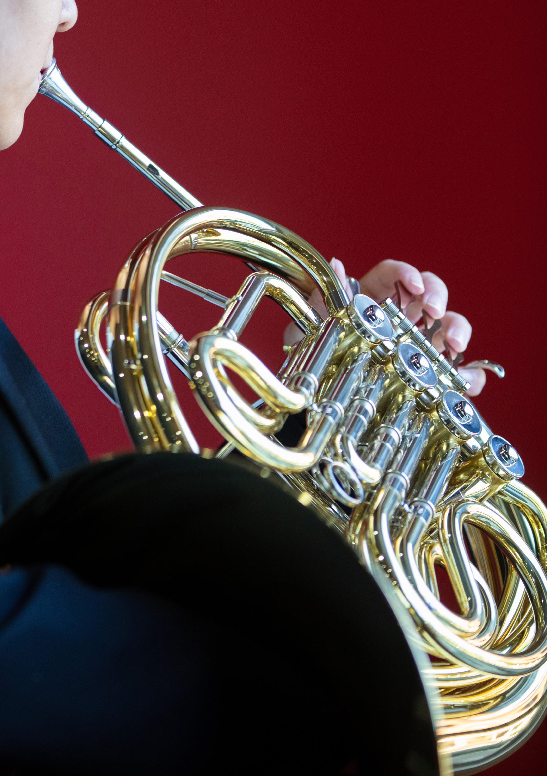
have created original compositions. Watch the students explain and perform their compositions here:
STUDENT: AMELIA DILLON PIECE: THE VESUVIUS EFFECT
STUDENT: SOPHIA JUAREZ PIECE: LIFE BENEATH THE LEAVES
STUDENT: CHARLOTTE KANG PIECE: CATHARSIS
STUDENT: FELICITY YAU PIECE: A DAY IN THE DISTANT FUTURE
For my individual project, I was intentionally trying to connect with a monologue that was clearly leaning towards the more tragic and serious side. I found Boot, written by playwright Joanna Erskine. The emotional scope of the character throughout the monologue as well as the metaphorical journey shares the contemporary issue of dangerous and irresponsible driving in teens and young adults, which gave me an avenue to fully embrace the emotional scope of the character and create a meaningful performance for the audience.
For my individual project, I decided to act a comic monologue, The Audition by Alex Tinker. I enjoy acting endearing comic characters, such as Jacqui Space, who starts off as a very animated, confident young actor but throughout the emotional rollercoaster of her audition, realises her acting is terrible and that she needs to find another dream. I wanted the audience to laugh and cry at the character’s life situation and to have empathy for her ever present optimism in finding her career.
I chose to do costume design for my individual project because I wanted to create a sense of authenticity and integrity that allows an audience to immediately start to form ideas on who the characters are. I designed costumes for Death of a Salesman by Arthur Miller. I focused on the character of Willy Lowman and his suffering depression and anxiety as a result of his failing career. I interpreted the main theme of the play as the criticism of the capitalist dream.
My individual project, a monologue, is taken from Fiona Sprott’s comedic play, Partly it’s about Love, Partly it’s about Massacre which explores the realities of being in a committed relationship. I believe that the piece challenges the perceptions of archetypal relationships and subverts traditional gender roles and expectations in a marriage to provide an insight into the contemporary female lens. Overall, the lasting message that I wish for audience members to take away from my performance, is that LOVE will prevail!
WATCH
WATCH ROSE-MARIE’S PERFORMANCE HERE:
What drew me to this particular monologue for my individual project, This Feral Life by Julia-Rose Lewis, was the character of Mia. She is this fierce young woman, trying so hard to be completely self-sufficient, but underneath the audience gets to witness her vulnerability, loss and hope. I have always been intrigued with the end of things, the end of love, the end of innocence, or of a way of thinking. My interest in these concepts was a driving force that led me towards this monologue.

I chose to utilise Dario Fo’s work for my individual project, as his theatre pieces are extremely political and the characters created are comedic and eccentric. I gravitated towards Accidental Death of an Anarchist about police corruption. I’m naturally a flamboyant person, so this manic characterisation contained an abundance of opportunities to use my skills in dance and physical theatre. The playwright’s interest in Commedia dell’Arte also piqued my interest as I have an Italian background and grew up learning about the history of Italian theatre.
12
I chose the comic monologue Tiggy Entwistle by Joanna Murray-Smith for my individual project, because I love the performance aspect of Drama and sharing heart-felt stories with an audience. My intentions with this character were to embrace her very kooky and crazy nature as she dramatically retells her emotional story about her break-up with ‘Harry’. I was drawn to the role of Tiggy because she is dealing with such an extreme situation while also trying to remain composed enough to give a speech about cacti.
WATCH
PIECE: YEAR 12 DRAMA INDIVIDUAL PROJECT
My individual project costume design is for Sophocles’ play Antigone, written in 400 BC Thebes. It explores the juxtaposition between loyalty to the Crown and to one’s family. My concept for the play altered the setting, so that it takes place in the 1950s. This concept is derived from the strong conflicting themes between feminism and submission within the play as they reflect the social state of the 1950s. Antigone is a head-strong figure, loyal to those she loves, and willing to rebel against the orders of the crown to carry out her justice.
SEE THE COSTUMES ZOE CREATED HERE:
Debbie Bachmann Head of TAS • Angela Bunquin Head of English • Timothy Chung Artistic Director • Deborah Cunneen Head of Music Curriculum• Claudia De Giorgi Designer • Nicole Ellis-Windsor Head of Drama and Visual Arts • Yvette Graniero Director of Community Relations • Victoria Harper Editor • Scott Henderson Design and Technology Teacher • Brittany Poynting Textiles and Design Teacher • Paulina Skerman College Principal • Angela Thomas Director of Teaching and Learning • Brian Walker Visual Arts Teacher, Photographer • Caroline St George English Teacher • Mark Strong English Teacher
Year 12 Major Works 2021 is published by Santa Sabina College. 90 The Boulevarde Strathfield 2135.
The entire content is the exclusive copyright of Santa Sabina College, PHONE 9745 7000 WEBSITE ssc.nsw.edu.au
