Telecom KPI Dashboard Write-Up


I have installed both the regional distribution treemap and the Internet Service barchart as filters, so you may click on any region and/or type of internet service to see the specific number of customers per region, churn rate of each region, etc. If you want to see the results for different combinations of regions and internet service types, you may click on the regions or internet service types you wish to view to change the other data representations.
The Senior Vice President of this telecommunications company is focused on increasing customer engagement with the products that this company offers, so I created a horizontal bar chart that indicates how many customers subscribe to each service that the company offers. The type of internet service that the customers use serves as a filter, so the SVP can click on the different bars of that chart and the churn rate, marital status chart, techie status, etc will adjust accordingly so he/she can easily get a grasp of those customer characteristics and how the churn rate is affected
The Executive Vice President is concerned with the regional distribution of customers and the demographics of the customers across regions, so I created a treemap of the regional distribution of customers that efficiently organizes all five regions from largest to smallest by the number of customers within each region. The regional treemap is a filter as well, so the user can click on one or more regions to view the churn rate, number of customers using each service offered, total number of customers in that/those region(s), as well as the overall total charges for the chosen region(s). The visualization also displays the marital status demographics and techie status for the customers within each region.
There is a panel of regional vice presidents who will be using this visualization and they will benefit from the regional treemap I created because they can compare their region’s key performance indicators such as churn rate and monthly charge totals to the other regions within the United States.
I included a chart that displays the national churn rate for the telecom industry that will be beneficial to all the potential users of this dashboard because it gives context to compare how each region is performing in comparison to the national industry average.
One of the data sets I used contains data I found on Kaggle.com from a sample survey of over 7000 telecom customers from many telecom companies across the United States. The churn variable indicates if the customers exited the company within the past month, so I was able to use
this information to create a visualization of the national churn rate for telecom customers nationwide. This information is helpful because it gives context so my company’s stakeholders can determine how this company’s churn rates compare to the rest of the industry in the US.
I created a kpi chart that displays the monthly total charges of the customers within the selected region. This chart gives crucial information to the executive decision makers at a glance because they can easily see which markets are the largest and have the most impact on the company’s bottom line. This can help them make informed decisions about where to launch new marketing campaigns, programs and/or products, etc.
Another data representation I created is the “Techie” bar chart that displays the number of customers who self-identify as technologically proficient. The chart depicts the overwhelming majority of customers do not feel they are technologically proficient, which is a very important customer characteristic that will serve the executive decision makers well as they determine which type of marketing campaigns will be successful
The “Internet Service” bar chart is a filter for all the other data representations in the dashboard except the “National Telecom Industry Churn Average” kpi chart. This means that the user can click on one or more of the bars in the Internet Service chart to filter the results of the other data representations. For instance, when the user clicks on the “DSL” bar, they can see that the churn rate for DSL users is 32.2% , while clicking on the “Fiber Optic” bar shows that the churn rate for Fiber Optic users is only 23.6%. The user can select two or more bars at a time by holding down the shift key as they click on the different bars to see different combinations of internet service users.
The region treemap is a representation of the customers within each region of the United States, and it can also be used as a filter for all the sections of the dashboard except the “National Telecom Industry Churn Average” kpi chart If the user clicks on one of the rectangles within the treemap, all of the other data representations are filtered so that the visualizations only reflect the results from the customers within the selected region. The user can select more than one region/rectangle by holding the shift key down while they click on the desired regions, which enables them to see the results of different combinations of regions.
I did not use colors to convey meaning within my dashboard so that it is accessible to people with colorblindness Also, I specifically chose to use the color blue within my monochromatic dashboard I created because it is usually not a problem for people affected by colorblindness. Another aspect of my dashboard design that provides accessibility to users affected by colorblindness is that the meaning of each section of the treemap can be determined by its size in addition to the darkness or lightness of the shade of blue.
The “Streaming Movies” bar chart supports one key part of my dashboard’s intended story, which is that the churn rate of the customers who subscribe to the movie streaming service is significantly higher than the overall churn rate for the company. The bar/column that contains the breakdown of the streaming service subscribers who left or didn’t leave clearly shows that almost half of the streaming movie service subscribers left within the past month.
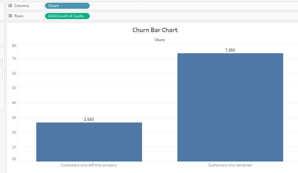
c The “Churn Bar Chart” graph gives evidence that the overall churn rate for the company is about 26.5% because it displays the count of customers who left compared to the count of customers who remained, as shown below:
One way I adapted my presentation to meet the needs of my audience by using descriptive terms that are specific to the data analysis vocabulary, such as univariate analysis, bivariate analysis, variables, etc. My audience is a panel of my peers who are also data analysts, so they would understand and even expect me to use those terms while describing my analysis methods.
Another way I used audience analysis during my presentation to make my presentation effective was being concise and keeping my presentation as brief as possible while still maintaining key
story points. My audience appreciates a presentation that does not waste their valuable time by adding irrelevant information.
I designed the visualizations in my presentation to be accessible to people with colorblindness by using a palette of blue and orange, which are not usually problematic for individuals with colorblindness. Also, I included the numbers in the labels of the column sections for each chart so that the color is not the only method to interpret the meaning of the data representations. I kept the charts as simple as possible so that individuals using an audio text reader would be able to easily interpret the meaning of the graphs as well.
I employed the effective storytelling method of having a clear beginning, middle, and end of my story. The beginning of my story involved me relating the telecommunication industry goals to the educational system goals, which was meant to capture the interest of my audience and help them relate to me as the speaker. The middle presented the problem and the exploration of the problem through analysis using Tableau, which would resonate with my audience. The ending was when I presented the actions I believed would solve the problem and gain the audience’s personal involvement.
Another effective storytelling method I used was summarizing the key points of the story at the conclusion of the story. In this case, the key points were that this company needed to reduce its churn rate by focusing on the customers who subscribe to movie and tv streaming services as well as the DSL customers. This storytelling method helps the audience remember what I intended for them to take away from my presentation.