Econometric Time Series Analysis in R
Research Question:
My question for this analysis is, “What is the projected revenue for this company by the end of next quarter?”
Project Goal:
My goal is to generate a time series model that will reasonably project the revenue for this company by the end of next quarter based on the revenue data from the past two years.
Data Set:
The data I used for this project is an excel worksheet that contains the daily revenue from a telecommunications company over a period of 371 days. The file is labeled “teleco_time_series.xlsx” .
Method Justification:
There are several assumptions that must be met for the time series model to be accurate:
1. The data must be stationary, which means that the data is normally distributed, has no trends or cycles, is not growing or shrinking, and the mean, variance and autocorrelation are constant. (Autocorrelation is when the previous value has an impact on the current value In other words, whether a value increases or decreases is dependent on a previous value.)
2. There are no extreme values or outliers.
3. The error term should be randomly distributed, and its mean and variance should also be constant. It should be uncorrelated.
4. The residuals of the model should not be autocorrelated. They should be randomly distributed.
Exploratory Data Analysis:
I have attached a screenshot of the line graph that visualizes the time series data from the churn dataset.
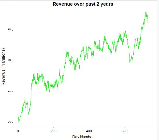
The time series data is recorded on a daily basis. So, for each day over a 2-year time period, the revenue (in millions) is given. There are a total of 731 days recorded. There are no gaps in the sequence as values are given for all 731 days.
The time series is not stationary because there is an obvious upward trend. In order for a series to be stationary, it must have a constant mean. In this series, the mean is not constant.
Data Preparation:
The first thing I did to prepare this data was to call the str() to see that it was a data frame, and also see how many rows and columns of data were included. I checked for missingness/gaps in the data by making sure there were no null or n/a values for each of the 731 rows of data using the colSums(is.na()) function the is.null() function I also checked for duplicated values using the anyDuplicated() function.
Next, I converted the “Revenue” variable into a vector using the code ts1_data[[“Revenue”]], and then I created a time series object with that vector using ts() function. I confirmed that it was, in fact, a time series object by calling the is.ts() function.
I plotted a visualization of the time series I had created using the plot() function to see if I noticed any obvious trends or differences in variances. I could see there was an obvious upward trend, so I created another time series object with the differenced data using the diff() command. I stored the new object as “ds.diff.” I made a plot of “ds.diff” to check for stationarity, and it appeared to be detrended. I then decomposed the differenced data to check that there was no seasonal components and that the random and observed values were stationary as well.
I split my cleaned time series data (NOT the differenced data) into an 80/20 training set by splitting the data at row 585. This means that the first 585 rows were stored as “ds.train” and the remaining rows were stored as “ds.test” so that I would be able to test the model I created against the test data for accuracy.
Data Split:
The split files are available as: “teleco_time_series_train.csv” and “teleco_time_series_test.csv.”
Model Identification and Analysis:
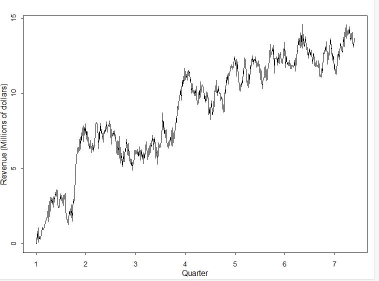
Seasonality: I have included a line graph of the the training set of data which is displayed by quarter. It shows the lack of a seasonal component. By inspecting the line, you can see there is no pattern to the peaks and valleys. I also generated a spectral density plot that is shown a little further in this project that reinforces this statement (Wearing, 2010).
Also, I have attached the “seasonal” component of the decomposed data set:
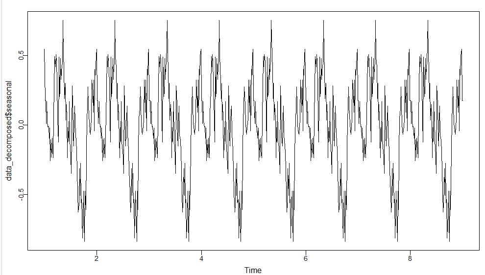
Since the peaks and valleys resemble a fine-toothed comb, there is no seasonal component. (A seasonal component is indicated when there are long troughs in the graph.)
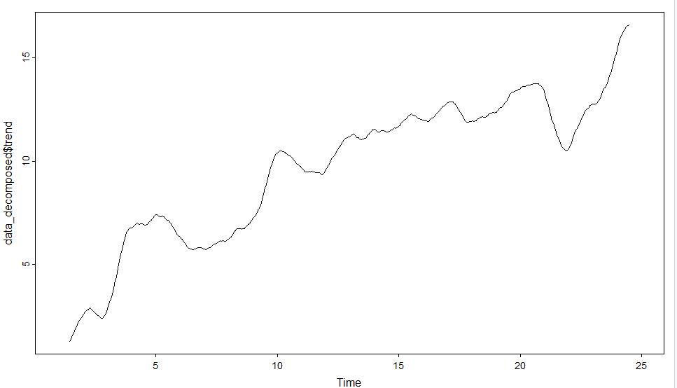
Trends: There is very clearly an upward trend in the data, which is seen in the visual below.
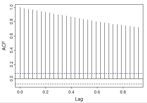
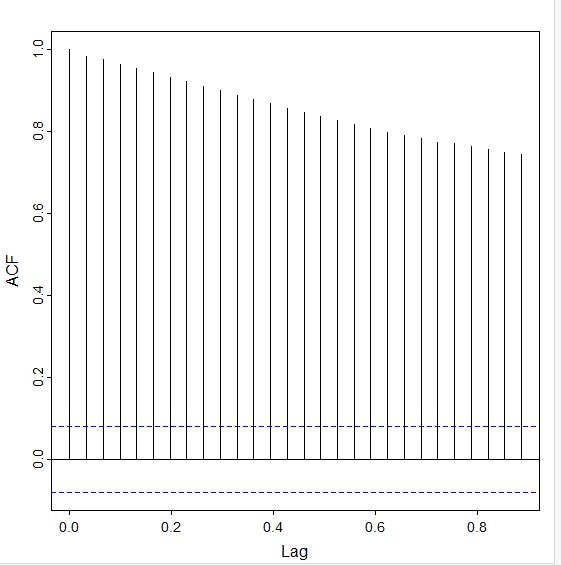
Autocorrelation Function (ACF): The autocorrelation function graph shows the correlation between the data and lag-1, which is a comparison of the data to itself after one step of lag. (If a value is between 0 and 1 then they share a positive correlation, and if the value is negative there is no correlation.) The autocorrelation values decrease slowly, as seen in this visual. Values that are outside of the blue dotted lines are statistically significant and indicate that the time series is not stationary.
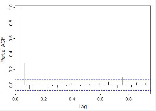
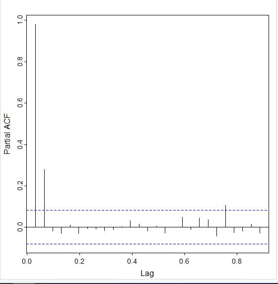
The partial autocorrelation (PACF) is similar to the ACF, but the data is being compared to a lagged version of itself after the effects of correclation at smaller lags is subtracted. By looking at the PACF, you can see that only the first two lags are mostly outside of the blue dotted region:
Spectral Density: I have included a screenshot of the spectral density plots for the training time series data below. Spectral density plots show at which frequencies the variations are strong/weak. If the variations are strong, that would indicate a seasonal component. Since the variations in these spectral density taper quickly to zero, there is not a seasonal component

Decomposed Time Series: I am including screenshots that show the comparison of the decomposed time series for both the training data set and the detrended data set. You will notice the “trend” line in the detrended decomposed data plot (the blue graph) does not contain the upward slant that the training data set has (the red graph) (Data Science Institute Tutor Team, 2022).
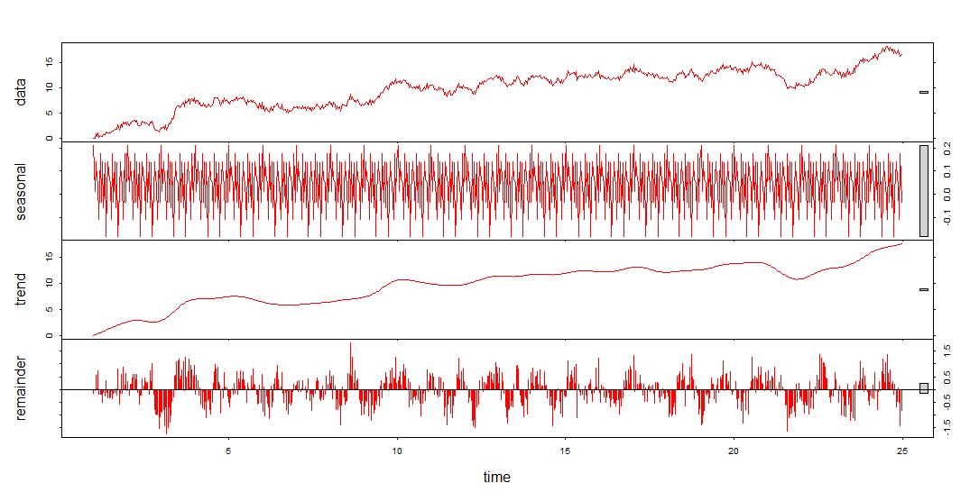
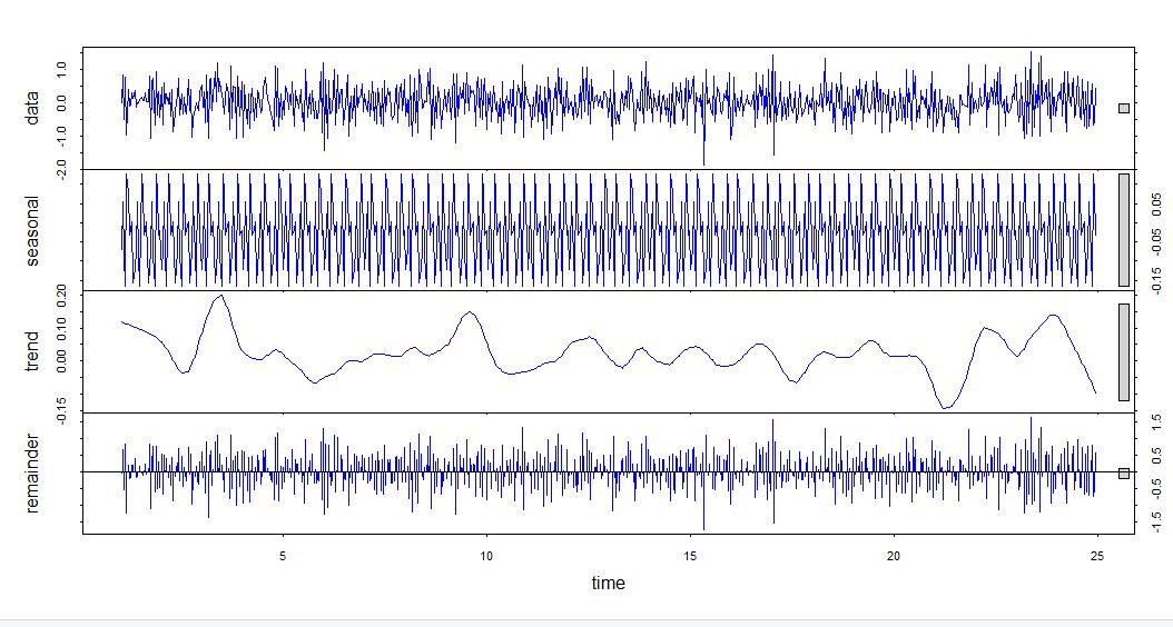
Confirmation of the lack of trends in the residuals of the decomposed series: The decomposition of the detrended data which is the original data after it has been differenced in this case shows that the upward trend has been removed. As mentioned above, this can be seen by looking at this blue decomposed series graph. The remainder has about as many points below zero as above, indicating that its mean is zero The trend line also has a mean of zero and the seasonal component resembles a finetoothed comb, so there are no trends or seasonalities in the residual data.
I used the ACF (which tails off) and PACF (which cuts off after 1 lag) plots to determine that the model that would fit this data best is an ARIMA model with the parameters p = 1, d = 1, and q = 0 since it is an AR model that has been differenced once.
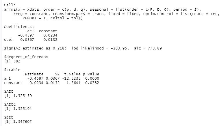
I ran the function on the training data first, and I have attached the output from the sarima() function I called.
 Here is what the ACF (top picture) and the PACF (bottom picture) of the training dataset looks like:
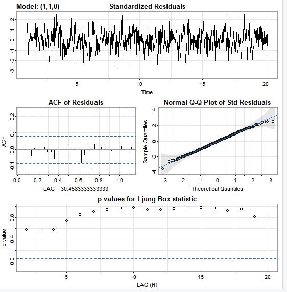
And here is the plot of the residuals of this model.
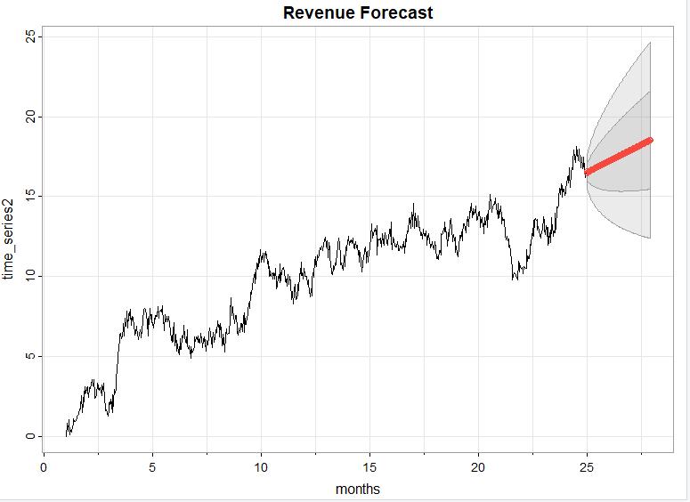
Forecast:
I used the sarima.for() function with order 1,1, 0 to predict the revenue over the next quarter, which is 90 days. Here is what the forecast looks like (in red) for the next quarter (90 days). The darker gray contains values that are within one standard deviation and the lighter gray contains values within two standard deviations.
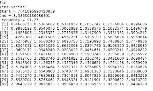
And here is a screenshot of the forecasted values for each of the 90 days in the next quarter:
It is important to note that I performed this forecast on the split data, not on the original dataset.
Code:
Here is all the annotated code I used to implement this time series model:
##read in data
ts1_data <- read.csv('C:/Users/Ruth Wright/OneDrive/Desktop/WGU MSDA/teleco_time_series_extracted.csv')
##plot data
plot(ts1_data, type = "l", col = "green", xlab = "Day Number", ylab = "Revenue (in Millions)", main = "Revenue over past 2 years")
##convert to vector and confirm cl_ts_data <- ts1_data[['Revenue']]
##convert to time series object and confirm time_series2 <- ts(cl_ts_data, frequency = 731/24)
#difference time_series1 data
ds.diff <- diff(time_series2)
#split cleaned data into training and testing data
ds.train <- ts(time_series2[1:(length(time_series2)-146)], frequency=731/24)
ds.test <- ts(time_series2[(length(time_series2) - 145):length(time_series2)], frequency=731/4)
#detect seasonality of original data
data_decomposed <- decompose(time_series2)
plot(data_decomposed$seasonal)
#detect trend of original data
plot(data_decomposed$trend)
#detect seasonality in differenced data
clean_data_decomposed <- decompose(ds.diff)
plot(clean_data_decomposed$seasonal)
plot(clean_data_decomposed, col = "blue")
#detect trend in differenced data
plot(clean_data_decomposed$trend)
#generate autocorrelation function (acf) for original and differenced datasets acf(time_series2)
acf(ds.diff)
#generate partial auto correlation function (pacf) for original and differenced datasets
pacf(time_series2)
pacf(ds.diff)
#view spectral density of training dataset and differenced dataset
par(mfcol = c(2, 2))
library("astsa")
mvspec(ds.train, log = "yes")
mvspec(ds.train, spans = 15, log = "no")
mvspec(ds.train, spans = 73, log = "no")
mvspec(ds.train, log = "no")
par(mfcol = c(2,2))
mvspec(ds.diff, log = "yes")
mvspec(ds.diff, spans = 15, log = "no")
mvspec(ds.diff, spans = 73, log = "no")
mvspec(ds.diff, log = "no")
##open forecast library to use sarima() functions library("forecast")
##inspect acf and pacf of training data set
acf(ds.train)
pacf(ds.train)
##try different parameters based on acf and pacf graphs
sarima(ds.train, p = 2, d = 1, q = 0)
sarima(ds.train, p = 3, d = 1, q = 0)
sarima(ds.train, p = 2, d = 1, q = 1)
sarima(ds.train, p = 1, d = 1, q = 0)
#use the auto_arima function to verify best model auto.arima(ds.train)
##forecast model onto testing data and original data set
sarima.for(ds.test, n.ahead = 90, p = 2, d =1, q = 0, xlab = "quarters")
sarima.for(time_series2, n.ahead = 90, p = 1, d = 1, q = 0, xlab = "months")
Data Summary & Implications:
I selected the ARIMA model by looking at and comparing the lag behavior of the detrended ACF and PACF. Since the time series model had an upward trend we needed to remove to make the model stationary, I used the diff() function on the training dataset. Then, I called the diff() function on the differenced dataset and stored it as an object. Here is the output after I called the acf() and pacf() functions:
acf(ds.diff)
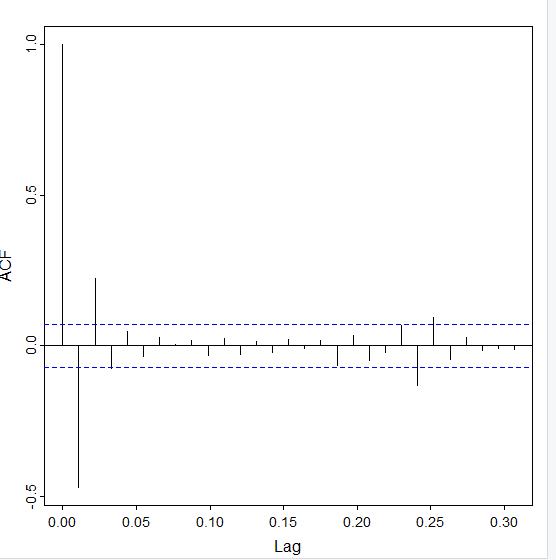
The ACF tails off and the lags are within the blue dotted lines at lag 3.
For the PACF, I ran the pacf(ds.diff) command. Here is the output:
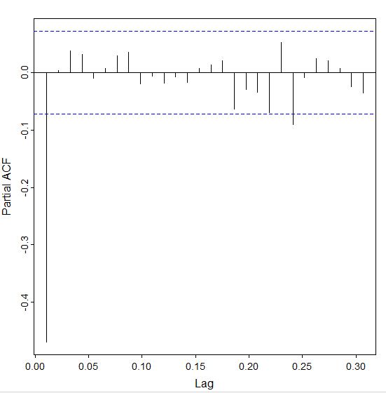
Notice that it nearly cuts off after the first lag. With this combination of behavior, the best model is going to be an AR model.
I started with the ARIMA model of the order p = 1, d = 1 (since I differenced it one time), and 1 = 0, since the AR model follows the order (1,0,0) if it does not need to be differenced. This is the output I got:
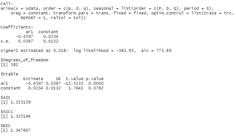
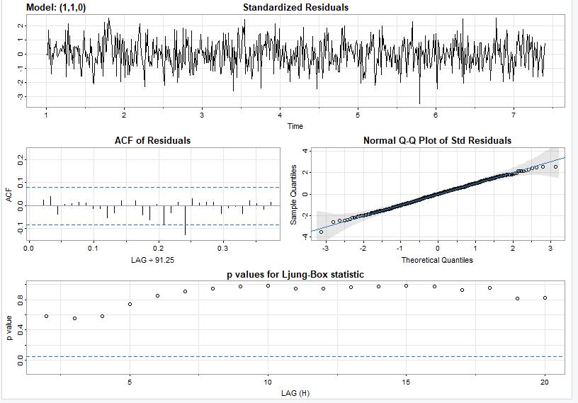
By inspecting the residuals, I see this model fits this data fairly well because the model values are centered around zero, the p values are mostly above the line, the q-q plot values are mostly fitted to the line, and the ACF of the residuals are nearly all within the blue dotted lines.
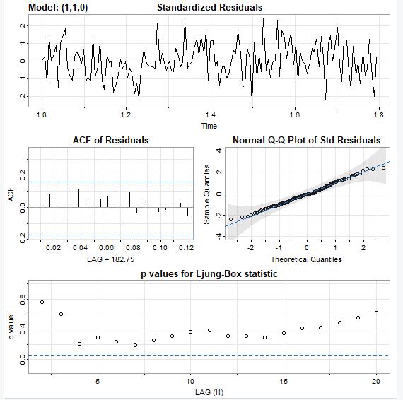
I verified the model by running it against the testing data to compare the residuals from the training data against the testing data set.
Here is the output when I ran the model against the test data:

And the residuals from the model after it was run on the test set look good so we can say confidently say that this is a good model. Once again, the ACF values are within the blue dotted lines, the q-q plot values closely follow the line, the noise factor is random, and the p values are well above the dotted lines.
It is not enough to say this is a good model, though. We want to verify this is the best model to fit this data. I generated several other models and changed the parameters to see if I could generate a better ARIMA model. I used the AIC and BIC scores to determine if the models were a better fit than the ARIMA (1,0,0) model I had already built. I have detailed how I verified this was the best model in the following paragraph:
The “p” argument of the model comes from the PACF model. I built a model where the “p” value was 1 and the “q” value (which comes from the ACF model) was 2. When I compared its AIC score (aic = 777.38) with the original model’s AIC score (aic = 213.1) , I found that it was higher so it was not a better fitting model.
I built another model with the parameters (3,1,0) and found its AIC score to be higher than my original model as well, since it was 776.15
Another way that I verified that my model was the best fit was by running the auto.arima() function and looking at its parameters. Here is the output:
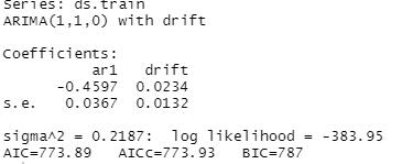
The order in the auto_arima function is clearly (1,1,0), which matches the order I used to generate my model.
Prediction Interval of the Forecast length—The prediction interval of the forecast is daily, as the data is recorded as revenue per day. Since there are two years worth of data, the forecast length should be pretty accurate for at least six months, and very accurate for one quarter, or 90 days, as I chose to use for this analysis. By viewing this graph in which the forecast is performed against the training data which contains the data from the first 7 quarters and comparing it to the actual data from the last quarter, you can see that the forecast generated by the model is pretty accurate.
Section E2
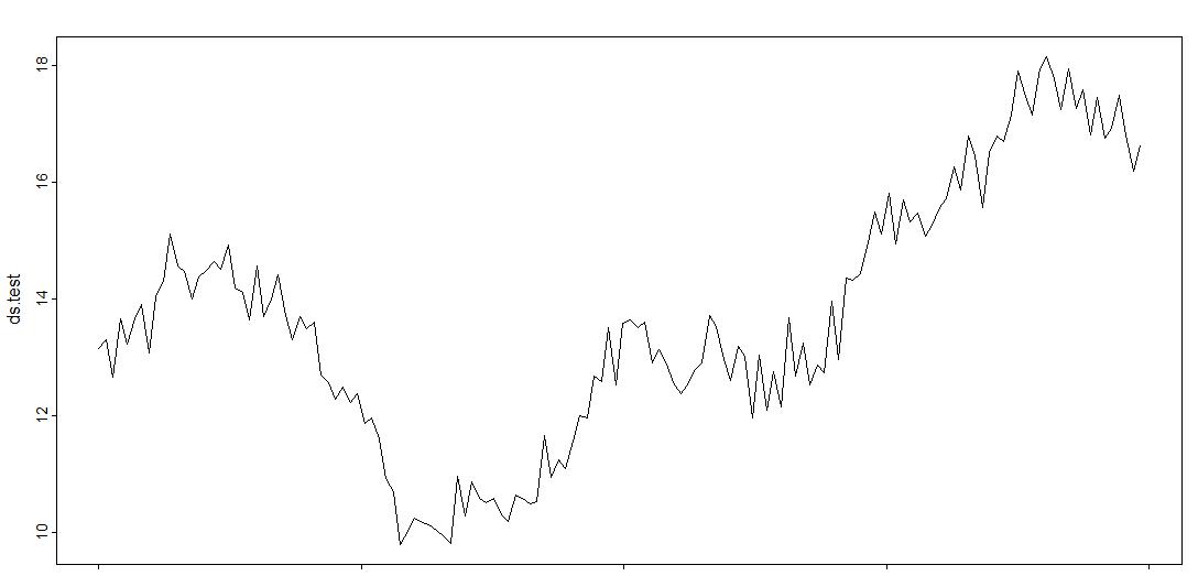
Here is a graph that shows the training dataset with the forecast for the last quarter, and below it is a graph of the actual data from the last quarter.
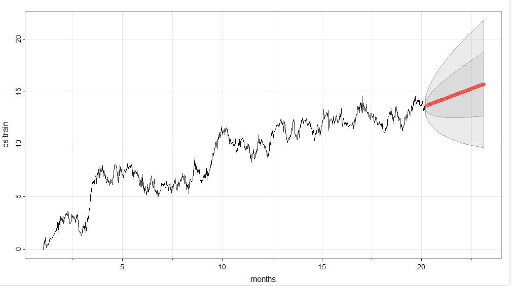
Notice that the red line begins around 13.5 million dollars and grows to about 16 million dollars by the end of the quarter.
Here is the graph of the actual values from months 21-24, which is very close to the predicted values in the forecasted model above. See how it begins around 13 million dollars and ends slightly above 16 million dollars.
Recommendations:
My recommendation is for this company to prepare their infrastructure to handle the revenue growth that is predicted within the next ninety days based on this model. This may include hiring new personnel or training existing personnel to handle the increased sales, etc.
Sources:
Data Science Institute Tutor Team. (2022, February 11). Time Series Decomposition in R. Data Science Institute.
https://www.datascienceinstitute.net/blog/time-series-decomposition-in-r
Wearing, Helen. (2010, June 8). Spectral Analysis in R.
https://math.mcmaster.ca/~bolker/eeid/2010/Ecology/Spectral.pdf
