

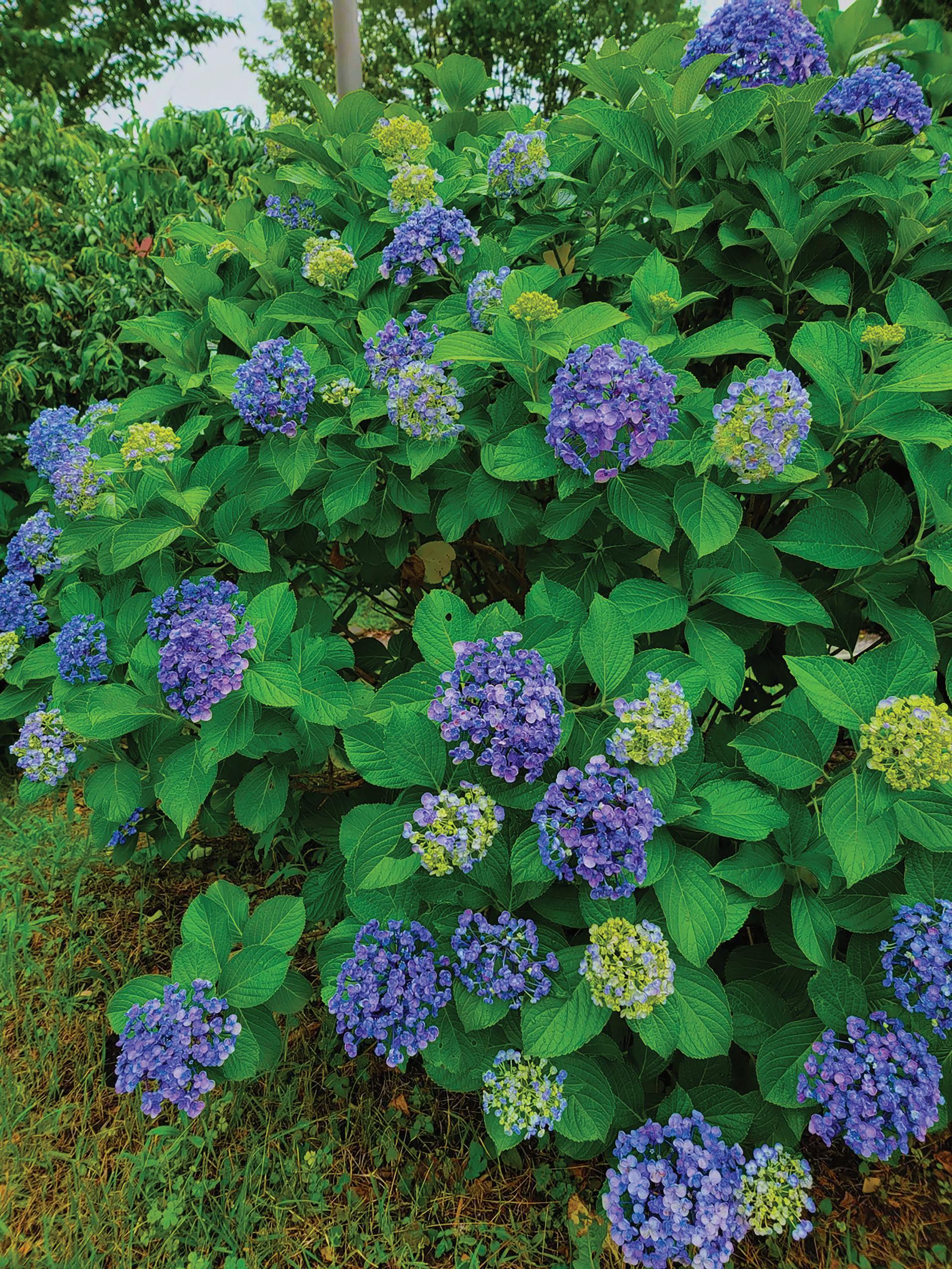


Only you can determine what makes you happy in life. You won’t always find it so easily, But when you do...
Pursue it with all your heart and mind, or die trying.


Only you can determine what makes you happy in life. You won’t always find it so easily, But when you do...
Pursue it with all your heart and mind, or die trying.


The brand is playful and friendly in nature and so bright colors are used to be bubbly and cheerful to consumers.
A mockup of a truck in included since this brand is a delivery service, so trucks would be a great way to promote the business.
The inspiration for the brand was ads on Instagram for monthly snack boxes. I wanted my brand to stand out from the rest by allowing the customer to customize the types of traditional Japanese dessert they want to sample each month.

Vanilla is the mascot of the brand while the other variants are used for seasonal promotions and package design.

Initial design was very cluttered since I was taking inspiration from Japanese websites that mimic how stores in Japan look like with information in every nook and cranny in a store. I simplfied the design to be more approachable and used soft pastel colors that convey cuteness and playful emotions.
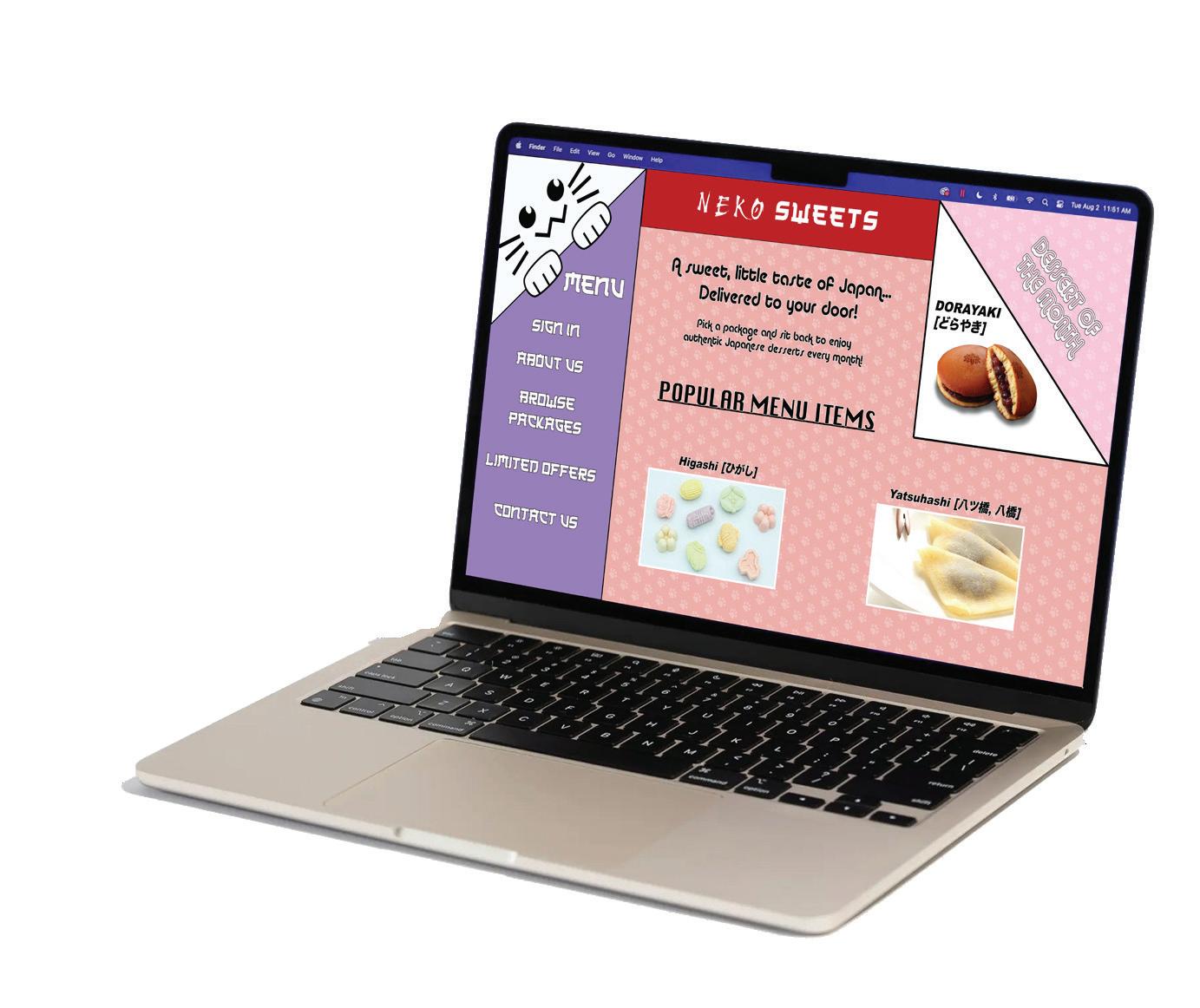

I took into account that apps are often designed with menus that pop out so I took time to determine what needed to be seen first, and then organizing the rest of the information and options in drop down menus. It retains that emotions from the website version, but on the go!


Aiming to show what types of traditional Japanese desserts a customer may buy, a product catalog is a great tool to give consumers a peek at your offerings as well as additional information.


The final product resembles the dummy I made closely with 3 articles with varying lengths, 9 pages of product listings, ads placed around ranging from full page to half page.
Using Adobe Photoshop, I modified images such as adjusting the colors or removing the submject from the background in order to place them into the editioral articles. Multiple character, paragraph, and object styles were created for efficient organization. Many parents pages were made to give each segment its own unique style.

Tables were created in Microsoft Exel and then exported into Adobe InDesign and then formatted with table and cell styles. Photoshop was used to isolate the subject of the images and recolor them for variations.
Different fonts had to be used to keep body text easy to read but allow titles and headers be more stylized. The colors uses are similar to the colors used for the website and mobile page designs.


I usually take advantage of the back cover of a magazine or catalog to promote or tease the topic of the next issue assuming the print is on a monthly basis.
The final NEKO SWEETS Monthly Catalog issume has a total page count of 24.


The app’s purpose to to help users reconnect with old friends that they haven’t talked to in some time. In theme with the idea of connecting with people, I have a bridge with a warm, yellow sun that is often associated with a cozy feelings that people like to share with others.
The other idea that inspired the brand is the saying of “buring bridges” when referring to cutting someone out of your life.

The design elements of the app were created in Adobe Illustrator such as the fire and link icons and the logos for different communication apps such as Whatsapp and Discord.
The app mostly has a neutral color scheme with a mostly more simple designs in line with modern apps.

Place holder images such as the people and the pop-up for when a bridge is burned was created with Adobe Firefly.

The site map helps with creating the prototype and how to link the pages together. The program that was used is Figma. The changes from the drawn site map to the final product aid in creating a more sleek and minimal design, preventing clutering the screen to allow the user to interact with the app without stress.


Interactions in Figma allow the integration of pop-out windows with the “open overlay” interaction, sliding transitions, and a solid simulation of how the app would function if it was really developed.

I revisited the brand NEKO SWEETS from my first two project to create packages that the products would be stored in. I bring the mascot to life with the body which is the box that holds the products inside. The hats that rest on top of the body are inspired by Japanese padogas with curbed roofs and tiles. The customer would pay a little extra to upgrade from the standard package to a collectable one.

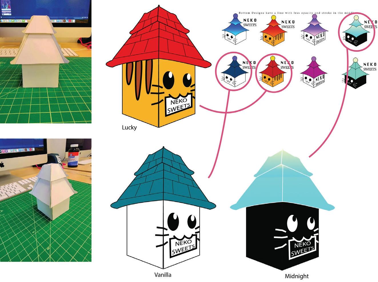
Taking the other designs from my moodboard, I developed two variations to the collectable package, “Lucky” the orange tabby cat, and “Midnight” the black cat.
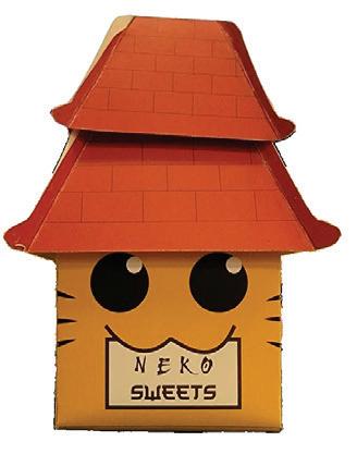


“Lucky” is based on orange cats that are very common as pets. The package that holds the products is the box body while the padoga design of the hat is there for the Japanese aesthetic. A consumer would pay extra for get the collectable design.


“Midnight” is based on my black cat that I used to have. The package that holds the products is the box body while the padoga design of the hat is there for the Japanese aesthetic. The roof has a gradient to look like it emits low light. A consumer would pay extra for get the collectable design.


D i g r e s s i o n s c o v e r d e s i g n s u b m i s s i o n f o r V o l u m e 2 1 , 2 0 2 4


Literary & Art Journal
Volume 21, 2024

I wanted the message of the design to be a letter to self-doubt and personal goals. We often feel stuck or trapped in our lifes and come to the conclusion that no one can do anything about it. But it takes true strenght and effort to realize that we often have the passion and aspirations to achieve our goals and dreams within ourselves.

The illustration of the woman’s face and the hand were hand-drawn and then imaged traced in Adobe Illustrator. The photographs were taken on my phone and then editied to be monotone or more vibrant and then placed into the image traces.
