ARTS-102
 By: Philip Lloyd
Table of Contents Intro/Statement Spread ................................... i-ii Project 1: 6-word Memoir .................................. 1-4 Project 2: Typographic Abstraction ................. 5-8 Project 3: Play Poster ......................................... 9-12 Project 4: Logo Marks ....................................... 13-16 Project 5: Syntax & Semantics .................... 17-20 Project 6: Process Journal ............................. 21-24
i
Introduction Philip Lloyd
Statement of Intent
Hello,
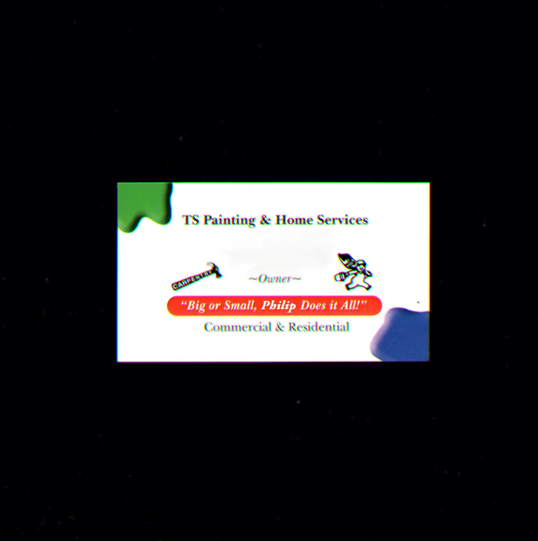
I am seeking consideration for the GD+I program. I feel like I could do great things if given the chance. My life has been hard the past couple of years, and what I am trying to learn is to roll with the punches, even when things don’t make sense. The primary goal is to make a career out of Graphic Design in some form and most jobs are predicated on obtaining a bachelor’s degree. Anyhow, I figured I would incorporate the image on the left. And like several things included in this journal, it tells a story (I edited it a little just for the project.) In my previous program, (MTC Commercial Graphics; GO MAVS) I had to take on an internship/co-op at a print shop. I would like to emphasize the fact that I was not a “graphic designer.” I worked as a prepress technician, I was not allowed to draw anything from scratch, and I could only place already made images into documents.
One of the (very few) highlights of it was when an order came in for a business card. I was given 2 bitmap images from a CD and 3 colors to work with. I were being honest, the client had no real idea what they wanted. I had to make it happen, so I basically just threw something together. Later that week, I got to see the finished product and my boss told me the client was very pleased with my design. Like most designers, I felt that my work was subpar. At the same time, I know it is very rare to have a design accepted on the first draft. I still have the original press sheet tucked away in my desk at home. There is a certain pride you feel after creating thoughtful, tasteful, and useful designs. I hope to do that as much as possible, and if at any point that feeling gets lost, it would be time to move on to something else. Thank you ;)
Respectfully,
ii

1 Project 1|6-word Memoir
Project 1 6-word Memoir
2
Sample Prompts:

Faith , carrying me along the way.
Don’t underestimate my power of will.
Thoughts from Project 1...
This was very strange for me. I have never had to explain my process. It was hard because, usually it is not linear and I never document my journey from beginning to end. That being said, bear with me. For this project, I wrote about 5 different prompts to start, and then went to the A.I. platform(I chose Dall-E).
It was very difficult to choose just 2 images. I ended up making about 4 different designs. The hardest part was writing a prompt that fit the criteria. It was also a challenge to pick just one image (there were so many good options).
Below are examples of completed works (text & images combined) that didn’t quite work or were the least strong during my critiques.
Prompt: But I say unto, Love.

This is one of many images that was output from the A.I. platform. I really loved the color and composition, but later realized that it would hard to impose text over it.


“With rhythm and rule …something incalculable.”
3 Project 1|6-word Memoir
On a speeding train to knowhere.
Ones that didn’t make the cut....
Fun Fact:
The image above is one of the final images I put together. This one is also my favorite out of the two we were required to submit. My original prompt (left) was too long.. Even though I had counted it over and over in my head, I still managed to mess it up. The prompt read, “Standing in a stream of water, thoughts raging.” After the critique I realized my mistake, and changed it to the current one, “Standing in a stream of water.” Moral of the story, proofread people!


6-word Memoir 4


PhilipL_ARTS102project2-Print.pdf 2 1/31/23 5:49 PM PLloyd_ARTS102project2-Crit.pdf 4 1/28/23 4:13 PM PLloyd_ARTS102project2-Crit.pdf 1 1/28/23 4:13 PM PLloyd_ARTS102project2-Crit.pdf 3 1/28/23 4:13 PM PhilipL_ARTS102project2-Print.pdf 1 4/11/23 6:20 PM PLloyd_ARTS102project2-Crit.pdf 4 1/28/23 4:13 PM PhilipL_ARTS102project2-Print.pdf 2 1/31/23 5:49 PM 5 Intro: Project 2-Typographic Abstraction
Project 2 Typographic Abstraction
6
Scrambled Letters Please....
I really enjoyed this project, the process was much more involved than I had expected it to be. And even something simple, like working with type was harder than I realized. We were required to make 3 designs but I wound up making 5. Each with several variants, which are reflected on the previous intro spread. (on the left) However, I feel like it is slightly easier to explain my process this time. My method for creating the abstracted type started with randomly typing out a blurb of letters, and then enlarging them on a seperate layer. After that I picked
the characters that I felt worked best, had good serifs, curves or interesting features. Next, I copied them to an outline layer, and seperated them by font. Lastly, I created the designs for each artboard by font. With this project, it was very imporant to be organized. Having a set process kept me from having a jumbled mess in my Illustrator file (like the image above). Another tool I used to keep it in order was the clipping mask function, which was crucial in keeping the design process clean and helped me see the final product clearly. (Like on the next page)


7 Project 2|Typographic Abstraction
Screenshot of process
3 Final Images

Here are the final versions, which were the result of a lot of playing around and input from critique. I was pleased with how they turned out. I especially liked that they all turned out quite different, while still being relatively cohesive.

Typographic Abstraction 8
These two received the most negative feedback during the critique...

9 9
Practice poster from “Play” series.
Project 3 Play Poster
10
To Play or not to Play...


This project was a real challenge for me. I struggled with how to narrow down my ideas. And wrestled with the fact that sometimes lacked the skill to complete my vision. At the same time, it was also fun to see what I could actually create and test my limits. Throughout this whole process, I have had to move away from my previous design mindset. There were certain things that I had
to unlearn to achieve the “playful” aspect of this project. The thought came to me, that was reinforced from the textbook. “It is so hard designing for yourself, because it never feels like its finished.”
The images above are from our initial exercise, where we had to just play around to create interesting posters.

1,2,3: Images from “play” class exercise. We were tasked with finding random objects to display the word play. I had missed this day and did it on my own, an idea came to me randomly. It is 3 sheets of paper taped together. The letters were cut out of the middle sheet and then I shined a light underneath.

11 Project 3|Play Poster
Initial sketch


Play Poster 12
Final Poster
Thrown out ideas...

13 Project 4|Logo Marks
Project Logo Mark
4
14
Logo Creation
(The hardest thing you’ll ever do...)
The process for project 4 once again proved to be a real challenge for me. I struggled with becoming discouraged because it involved a lot of sketching. Which tends to limit my ability to see the final vision. At the same time, I think that this may have been the most useful/applicable project that we were assigned. A large portion of design is working out how to make identifying marks. Anyhow, it would have been easier to take a more familiar approach to designing (i.e. much less sketching). I had to complete them to get a passing grade obviously. But I feel in the long run, it will benefit me and my work. I also included some examples of photo studies that I completed for reference along the bottom.
Excerpt from Concept Statement:
Funky Monkey-Gorilla, Funky/Disco Dance Club: With the second logo mark, I was going for a dance club or studio that also had a vintage feel (because of the Funky). This logo employs some continuity by using the overlapping strokes across the body to differentiate the limbs of the gorilla. The typeface I used just so happened to be very similar to the gorilla itself with the curves in the right places. Then the tagline was made much thinner to create contrast. The colors I used in this one were intended to be playful/fun/etc. and also indicate some wordplay in the title (fun and key = fun is the key).
Record Co.
Reference/Study Images


15 Project 4|Logo Marks
Excerpt from Concept Statement:
Funky Monkey-Gorilla, 70’s “Vintage” Music Studio: This concept is representing some type of music studio, it is a cassette tape combined with a monkey. The biggest challenge was the ears. What do monkey ears even look like? At the bottom of the other page, I included only a few of the reference images I used to get them to look more “correct”. The idea was that since cassettes are vintage, the colors scheme should be also. With a muted “vintage/ funky” color palette. The typeface (which is always the hardest part) seemed to work with the rounded squares reflected in the logo itself. Later on I tried to make them match more by modifying the shapes. Looking back on it, I may have messed up the overall feel. Anyhow, something I think I did well was using simplification to enhance and merge the form of the monkey with the cassette. In hopes to make them work well together.


Record Co. Logo Marks 16


17 Project 5|Syntax&Semantics
Project 5 Syntax & Semantics


18
Describe it to me...
This project was actually kind of fun, or at least a break from the typical type of assignments. We had to take random objects that are loosely related and break them down to explain them in basic terms. This allowed us to “compare” them to on another.
At first I had some odd ideas, (my first thought was kitchen appliances.) Then I spent about 4 hours looking through a collection of vintage radios and other electronics. But I think that lead me to miss the point of the project. The objects had to be unique enough so that I could say something about them that made them special. I settled on remotes and found that vintage one (circled to the right). Later, I realized it felt like it was not the right orientation or shape to allow for cohesion with the rest of the images.
The Final Product-
This was probably the most tedious project yet. (at least for me) Because I moved each remote about .00005 inches to the left or the right over and over. Trying to get their various shapes to align.
I also had to remove the Xbox remote, just because of its irregular shape which ruined the feel of the rest of the remotes. Although technically it remains in the same “category”.

Syntax (visual elements & relationships)
An irregularly shaped rectangular form. It is outlined in a gray hue, and that mirrors the some of the inputs on the device. The bulk of the instrument is a white block. Other buttons have a their uses displayed in a text form above, or imposed upon them. The lay out is somewhat symmetrical and conveys a feeling of usefulness and simplicity. There is a simple electronic readout that displays information to the user, such as position, time, battery levels and others.


Semantics: Denotation (specifics)
Remote Device >Furniture Remote control> FlexFit plus Bed Remote

Semantics: Connotations (associations)
Expensive, useful, furniture, mattresses, comfort, convenience, technology, luxury
Semantics: Expression (feelings)
Peace, discomfort or pleasure, calm, dependence,
Presence (contextual)
Little: a Mattress Store
Large: a Military Base
Syntax (visual elements & relationships)
Off-white form with playful safe curves. There are many brightly colored buttons all over. The contrast of the many colors draw your attention. Its purpose is not what it appears to be, but still visually resembles ones that have a completely different function. The way it is designed effectively conveys a sense of child-like wonder and encourages exploring.
Semantics: Denotation (specifics)
Electronic Learning > Preschool Toys > Play Remote

Semantics: Connotations (associations)
Childhood, obnoxious noises (personal experience), learning, fun
Semantics: Expression (feelings)
Nostalgia, curiosity, engagement, joy
Presence (contextual)
Little: a Preschool or childcare facility
Large: at a College
19 Project 5|Syntax&Semantics
outlined in inputs on block.
text form somewhat and that position, time, FlexFit plus many the many it that have designed and Remote experience),


These didn’t work out...
Syntax (visual elements & relationships) Descid ut rem enderum veniatur? Quibearum es explit pore, quis cumquiat pratior eicillandi doluptaquam
(visual elements & relationships)
A black oblong rectangular device, with rounded corners. The bottom portion is shiny and smooth, while the top half is matte. There are round raised areas on the surface, all with icons and text imposed on the surfaces. Near the very top is a small notch. The dark tone and smooth lines convey a sense of futurism and sleekness. Overall the simplicity of the design is complemented throughout.

Semantics: Denotation (specifics)
Device>remote control > Apple TV Remote


Semantics: Connotations (associations)
Technology, big business, connection, leisure
Semantics: Expression (feelings)
Delight, entertained, confusion, anger (when lost), novelty
Presence (contextual)
Little: In an Apple Store, or homes across the US
Large: On a camping trip
Syntax (visual elements & relationships)
A long rectangular form, with a rounded chalky tone. Near the top is a display that shows vertical and horizontal lines. Beneath are different sized rubber nodules for input. Over each there is black text that details its function. The layout and design of the buttons clearly show the specifics of its purpose. The pop of color adds some interest to the overall feel of the instrument. The plainness of the object conveys its utilitarian nature.


Semantics: Denotation (specifics)
Household amenity > Remote > A/C-Thermostat Remote


Semantics: Connotations (associations)
Wealth, Homeowner, Personal experiences; a vacation I had years ago, there was one at the home we were staying in.
Semantics: Expression (feelings)
Indifference, Novelty, possibly joy
Presence (contextual)
Little: A Hotel, or Resort
Large: At a Zoo
Syntax (visual elements & relationships) Descid ut rem enderum veniatur? Quibearum es explit pore, quis cumquiat pratior eicillandi doluptaquam abore odiscipsunt ab idendit vel endae nimporro blatemped quaerum volorepudita con conse periam vello et, qui illabore et pore, officiae sint min niscips aeprat quidunt atemposam sum es nos enimust empore rehenim fuga. Hit endemquo millor apis reic tenis doluptate sime nobis dunt, occullorit landae volore des evel eumquam la paribusda desequos quata comnimincius net offic temossin pelesed magnis excere doluptatem volupis reic toriati rerchil is simaxim oloreruptios in. Semantics: Denotation (specifics) accus > dolupta > minulpa
Semantics: Connotations (associations) Ut qui aut et et ipiet magnihilla dolorib ereheni riorit, Semantics: Expression (feelings) Energetic, intense Presence (contextual) Small: Liberferis essequas qui to magniasimi, Large :Udanis et et voloribus
Quibearum es explit pore, quis cumquiat pratior eicillandi doluptaquam abore odiscipsunt ab idendit vel endae nimporro blatemped quaerum volorepudita con conse periam vello et, qui illabore et pore, officiae sint min niscips aeprat quidunt atemposam sum es nos enimust empore rehenim fuga. Hit endemquo millor apis reic tenis doluptate sime nobis dunt, occullorit landae volore des evel eumquam la paribusda desequos quata comnimincius net offic temossin pelesed magnis excere doluptatem volupis reic toriati rerchil is simaxim oloreruptios in.
Semantics: Denotation (specifics) accus > dolupta > minulpa
Semantics: Connotations (associations) Ut qui aut et et ipiet magnihilla dolorib ereheni riorit, Semantics: Expression (feelings) Energetic, intense Presence (contextual) Small: Liberferis essequas qui to magniasimi, Large :Udanis et et voloribus
Syntax (visual elements & relationships) A black oblong rectangular device, with rounded corners. The bottom portion is shiny and smooth, while the top half is matte. There are round raised areas on the surface, all with icons and text imposed on the surfaces. Near the very top is small notch. The dark tone and smooth lines convey a sense of futurism and sleekness. Overall the simplicity of the design is complemented throughout. Semantics: Denotation (specifics) Device>remote control > Apple TV Remote Semantics: Connotations (associations) Technology, big business, connection, leisure Semantics: Expression (feelings) Delight, entertained, confusion, anger, novelty Presence (contextual) Small: In an Apple Store, or homes across the US Large: On a camping trip Syntax (visual elements & relationships) Predominately bright red form. Minimal white elements including white band at right and left sides and around top center. Two to three narrow white stripes running from center top to outside edges of shape. In upper right area is a white geometric element composed of three white enlongated, pointed ovals that radiate out from common point; three narrow horizontal red lines cut through the three three ovals. This occupies about 5% of the overall form. Below this shape are six geometric forms, each composed of circles and lines and curves in white with red circles creating neative space in some of the forms. Semantics: Denotation (specifics) asdfasdf > asdsdf > afsdfsdf Semantics: Connotations (associations) Athletics, big business, UofL sponsor, German Semantics: Expression (feelings) Energetic, intense Presence (contextual) Small: in a room full of comparable shirts Large: in a hospital (visual elements & relationships) (specifics) (associations) Athletics, big business, UofL sponsor, German (feelings) Small: in a room full of comparable shirts Syntax (visual elements & relationships) Predominately bright red form. Minimal white elements including white band at right and left sides and around top center. Two to three narrow white stripes running from center top to outside edges of shape. In upper right area is a white geometric element composed of three white enlongated, pointed ovals that radiate out from common point; three narrow horizontal red lines cut through the three three ovals. This occupies about 5% of the overall form. Below this shape are six geometric forms, each composed of circles and lines and curves in white with red circles creating neative space in some of the forms. Semantics: Denotation (specifics) asdfasdf > asdsdf > afsdfsdf Semantics: Connotations (associations) Athletics, big business, UofL sponsor, German
Syntax (visual elements & relationships) Descid ut rem enderum veniatur? Quibearum es explit pore, quis cumquiat pratior eicillandi doluptaquam abore odiscipsunt ab idendit vel endae nimporro blatemped quaerum volorepudita con conse periam vello et, qui illabore et pore, officiae sint min niscips aeprat quidunt atemposam sum es nos enimust empore rehenim fuga. Hit endemquo millor apis reic tenis doluptate sime nobis dunt, occullorit landae volore des evel eumquam la paribusda desequos quata comnimincius net offic temossin pelesed magnis excere doluptatem volupis reic toriati rerchil is simaxim oloreruptios in. Semantics: Denotation (specifics) accus > dolupta > minulpa Semantics: Connotations (associations) Ut qui aut et et ipiet magnihilla dolorib ereheni riorit, Semantics: Expression (feelings) Energetic, intense Presence (contextual) Small: Liberferis essequas qui to magniasimi, Large :Udanis et et voloribus Syntax
elements & relationships)
(visual
Descid ut rem enderum veniatur?
abore odiscipsunt ab idendit vel endae nimporro blatemped quaerum volorepudita con conse periam vello et, qui illabore et pore, officiae sint min niscips aeprat quidunt atemposam sum es nos enimust empore rehenim fuga. Hit endemquo millor apis reic tenis doluptate sime nobis dunt, occullorit landae volore des evel eumquam la paribusda desequos quata comnimincius net offic temossin pelesed magnis excere doluptatem volupis reic toriati rerchil is simaxim oloreruptios in. Semantics: Denotation (specifics) accus > dolupta > minulpa Semantics: Connotations (associations) Ut qui aut et et ipiet magnihilla dolorib ereheni riorit, Semantics: Expression (feelings) Energetic, intense Presence (contextual) Small: Liberferis essequas qui to magniasimi, Large :Udanis et et voloribus Syntax (visual elements & relationships) A black oblong rectangular device, with rounded corners. The bottom portion is shiny and smooth, while the top half is matte. There are round raised areas on the surface, all with icons and text imposed on the surfaces. Near the very top is a small notch. The dark tone and smooth lines convey a sense of futurism and sleekness. Overall the simplicity of the design is complemented throughout. Semantics: Denotation (specifics) Device>remote control > Apple TV Remote Semantics: Connotations (associations) Technology, big business, connection, leisure Semantics: Expression (feelings) Delight, entertained, confusion, anger, novelty Presence (contextual) Small: In an Apple Store, or homes across the US Large: On a camping trip Syntax (visual elements & relationships) Predominately bright red form. Minimal white elements including white band at right and left sides and around top center. Two to three narrow white stripes running from center top to outside edges of shape. In upper right area is a white geometric element composed of three white enlongated, pointed ovals that radiate out from common point; three narrow horizontal red lines cut through the three three ovals. This occupies about 5% of the overall form. Below this shape are six geometric forms, each composed of circles and lines and curves in white with red circles creating neative space in some of the forms. Semantics: Denotation (specifics) asdfasdf > asdsdf > afsdfsdf Semantics: Connotations (associations) Athletics, big business, UofL sponsor, German Semantics: Expression (feelings) Energetic, intense Presence (contextual) Small: in a room full of comparable shirts Large: in a hospital Syntax (visual elements & relationships) A rounded Semantics: Denotation (specifics) asdfasdf > asdsdf > afsdfsdf Semantics: Connotations (associations) Athletics, big business, UofL sponsor, German Semantics: Expression (feelings) Energetic, intense Presence (contextual) Small: in a room full of comparable shirts Large: in a hospital Syntax (visual elements & relationships) Predominately bright red form. Minimal white elements including white band at right and left sides and around top center. Two to three narrow white stripes running from center top to outside edges of shape. In upper right area is white geometric element composed of three white enlongated, pointed ovals that radiate out from common point; three narrow horizontal red lines cut through the three three ovals. This occupies about 5% of the overall form. Below this shape are six geometric forms, each composed of circles and lines and curves in white with red circles creating neative space in some of the forms. Semantics: Denotation (specifics) asdfasdf > asdsdf > afsdfsdf Semantics: Connotations (associations) Athletics, big business, UofL sponsor, German Semantics: Expression (feelings) Energetic, intense Presence (contextual) Small: in a room full of comparable shirts Large: in a hospital Syntax (visual elements & relationships) A black oblong rectangular device, with rounded corners. The bottom portion is shiny and smooth, while the top half is matte. There are round raised areas on the surface, all with icons and text imposed on the surfaces. Near the very top is a small notch. The dark tone and smooth lines convey a sense of futurism and sleekness. Overall the simplicity of the design is complemented throughout. Semantics: Denotation (specifics) Device>remote control > Apple TV Remote Semantics: Connotations (associations) Technology, big business, connection, leisure Semantics: Expression (feelings) Delight, entertained, confusion, anger, novelty Presence (contextual) Small: In an Apple Store, or homes across the US Large: On a camping trip Syntax (visual elements & relationships) Predominately bright red form. Minimal white elements -includ ing white band at right and left sides and around top center. Two to three narrow white stripes running from center top to outside edges of shape. In upper right area is white geometric element composed of three white enlongated, pointed ovals that radiate out from common point; three narrow horizontal red lines cut through the three three ovals. This occupies about 5% of the overall form. Below this shape are six geometric forms, each composed of circles and lines and curves in white with red circles creating neative space in some of the forms. Semantics: Denotation (specifics) asdfasdf > asdsdf > afsdfsdf Semantics: Connotations (associations) Athletics, big business, UofL sponsor, German Semantics: Expression (feelings) Energetic, intense Presence (contextual) Small: in a room full of comparable shirts Large: in a hospital Syntax (visual elements & relationships) A rounded Semantics: Denotation (specifics) asdfasdf > asdsdf > afsdfsdf Semantics: Connotations (associations) Athletics, big business, UofL sponsor, German Semantics: Expression (feelings) Energetic, intense Presence (contextual) Small: in a room full of comparable shirts Large: in a hospital Syntax (visual elements & relationships) Predominately bright red form. Minimal white elements including white band at right and left sides and around top center. Two to three narrow white stripes running from center top to outside edges of shape. In upper right area is a white geometric element composed of three white -enlon gated, pointed ovals that radiate out from common point; three narrow horizontal red lines cut through the three three ovals. This occupies about 5% of the overall form. Below this shape are six geometric forms, each composed of circles and lines and curves in white with red circles -creat ing neative space in some of the forms. Semantics: Denotation (specifics) asdfasdf > asdsdf > afsdfsdf Semantics: Connotations (associations) Athletics, big business, UofL sponsor, German Semantics: Expression (feelings) Energetic, intense Presence (contextual) Small: in a room full of comparable shirts Large: in a hospital Syntax&Semantics 20

21 Project 6|Process Journal
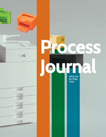
Project 6 Process Journal

22 Process Journal
Save and Save alike....


This what was left from my first cover design. I went to reopen and finish working on it, instead I was met with the dreaded “Your scratch-disks are full” error message from Photoshop. I started it on a computer at school, my old Macbook Air chewed it up and spit it out. The .psd file was useless and fully corrupted. I found humor/irony in the fact that we were instructed to do the cover last; that was a sign that I shouldn’t have started it yet.

Set the Mood(board)

This process journal began as a very poorly made mood board. This was my first time ever using/making one. We were required to do some research about layouts and make sketches. This was also where I chose a color palette. I wanted to go off the theme of “print.” and CMYK. Hopefully that shows through.


Process Journal Moodboard Header: subheader Occus, voluptaectur remporate cum quiae nulles que periate ipsunt offic te nonsequo voluptiis ipsanis quatquam veratio santotatur as sint asi nobisim ossecabo. Et et qui resequis vent, quam essequi doluptaquis quae volor aliaecessit dolupti blauda apicab ius erum enderibus suntus sed et eum que velibus. Udae ipsa disciae. Accusda ndesequibus maiosapienis nimi, sequam quunt odipiscia que aut vitassit laborem si commoluptas nissedipid milla alibus moluptiae. Ut voluptas dolorum sed que imi, quam, quos moluptatent, cuscil inctem. 23 Project 6|Process Journal
...
This is probably my most favorite spread....I decided not to include the bottom portion with the blue line, but kept the same idea. It is supposed to be like those classic caveman timelines. To show off my design from sketched to finished image. Originally, I had them in a different order (above) but then decided to reverse it to the current design (from oldest to newest.)
Project Logo Mark


Shown here is the blank mockup template I used for the crumpled paper element throughout. It was one of the first ideas I had. It came from a place I felt anyone artistic can relate to. YOU WILL THROW STUFF OUT!! Starting over however, is the hard part.

4 20 Project 4|Logo Marks 21
Process Journal 24


Philip Lloyd
Personal: philcommerce4@gmail.com
USC email: pelloyD@sc.edu
Phone: (803) 908-1014
University of South Carolina
ARTS 102-Spring 2023
Professor Catherine Chi
Fonts Used


89 pt-60 pt (For title pages) 16 pt-10 pt (Headers and Body Text)_ 9 pt-8 pt-7.5 pt (Captions and explanations)