1 minute read
Project 2 Typographic Abstraction


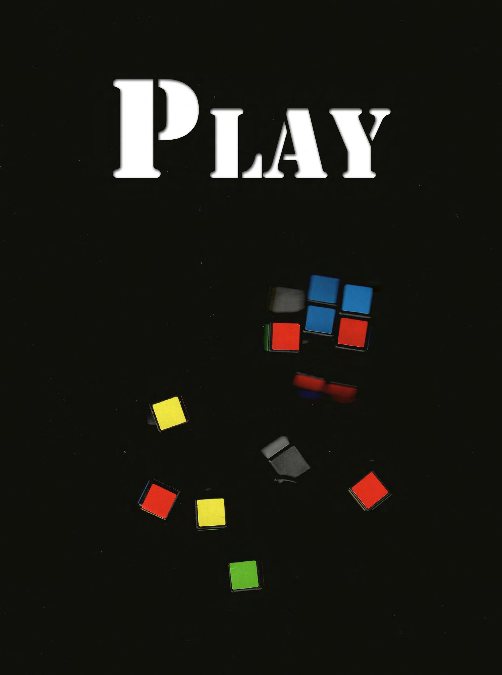
Scrambled Letters Please....
I really enjoyed this project, the process was much more involved than I had expected it to be. Working with type is harder than I realized. We were required to make 3 designs but I wound up making 5. Each with several vartiants, which are reflected on the previous intro spread. (on the left) However, I feel like it is slightly easier to explain my process this time. My method for creating the abstracted type started with randomly typing out a blurb of letters, and then enlarging them on a seperate layer. After that I picked the characters that I felt worked best, had good serifs, curves or interesting features. Next, I copied them to an outline layer, and seperated them by font. Lastly, I created the designs for each artboard by font. With this project, it was very imporant to be organized. Having a set process kept me from having a jumbled mess in my Illustrator file (like the image above). Another tool I used to keep it organized was the clipping mask function, which was crucial in keeping the design process clean and helped me see the final product clearly. (Like on the next page)
Advertisement


3 Final Images
Here are the final versions, which were the result of a lot of playing around and input from critique. I was pleased with how they turned out. I especially liked that they all turned out quite different, while still being relatively cohesive.