The Penmen Press | 7
says Grace Mage, Penmen Press Co-Editor-in-Chief. Meanwhile, Daniel Hopler, Penmen Press Co-Editor-In-Chief, was missing from the Press meeting and has been silent regarding his preference throughout the dispute. However, rumors have circulated that Hopler has been messaging Press members on both sides, further stirring the flames of conflict. A Press who asked to remain anonymous even quoted Hopler as saying, “’I’m a fan of whatever makes Grace’s life more difficult.’” During the virtual meeting, two
breakout rooms were created by Mage on RingCentral. One room was for mint chocolate chip ice cream lovers, the other for haters. Both groups refused to work with anyone in the opposite group until someone conceded. “I’m gonna say that I love mint chip ice cream. Why people think it’s the same thing as eating toothpaste astounds me, because they’re not the same,” says Hailey Tremaine, Penmen Press Layout Editor. While the debate was going on, Penmen Press Staff Writer, Elizabeth
Lemieux, failed to choose a side and was kicked out of the meeting. Penmen Press Photography Editor, Kyle Griffin, also refused to get involved. “It’s just ice cream. I don’t really see why everyone is splitting into groups over something so pointless. Plus, I’m not really a fan of the brain freeze aspect of eating ice cream,” says Griffin, who left in the middle of the meeting. Whether the Penmen Press will survive after the argument is questionable, but it is unlikely that there will be a school newspaper after this semester.
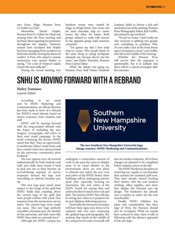
SNHU is Moving Forward With a Rebrand Hailey Tremaine Layout Editor According to an email sent by SNHU Marketing and Communications, an official decision has been made in favor of a rebrand for SNHU’s visual identity based on survey responses from students and staff. SNHU will be moving forward with the long-awaited rebrand with the hopes of including the new imagery, iconography, and colors in their next visual campaign. In the email containing the survey, SNHU stated that they “have an opportunity to modernize [their] visual assets and have created some new options based on the university community’s prior feedback.” The four options were all received enthusiastically by both students and staff, and while most found it hard to pick just one as their favorite, an overwhelming majority of survey responses favored the logo icon resembling an abstract fountain pen tip. This new logo pays much more respect to the image of the quill that SNHU holds dear, standing above the current logo of the quill that most people confuse with a leaf. One response from the anonymous survey states, “the current logo never made any sense. This new logo perfectly resembles a fountain pen, the identity of this university, and feels more like SNHU than what we currently have.” Although the SNHU campus has
The new Southern New Hampshire University logo. (image courtesy: SNHU Marketing and Communications) undergone a tremendous amount of work in the past few years to display more of its visual identity in the environment, there are now plans to rebrand and match the new icon and colors of the SNHU brand. Most buildings will be undergoing interior paint jobs, especially focusing on classrooms. The new colors of the SNHU brand are staying blue and yellow, but they’re much more rich and dark. The famous SNHU Bus will also be seeing new colors as it prepares for its next diploma-delivering journey. Externally, the entrances of campus will have their signs torn down to be replaced with new ones containing the updated logo and typography. The archway that stands in the middle of the campus by the main crosswalk will
also see similar treatment. All of these changes are planned to be completed before students return in the fall. The SNHU Bookstore also plans on removing any regalia or merchandise that contains the outdated quill icon. They have already started stocking their shelves with fun and modern clothing, office supplies, and more that display the fountain pen tip design. The bookstore has already seen a surplus in orders for the new merchandise. Finally, SNHU Athletics has taken into consideration that their logo of Petey the Penmen should also be revamped. While no visuals have surfaced to date, there is talk of following with the abstract approach of the new logo.


